
Hi everybody,
here is my BTC TA for the coming week.
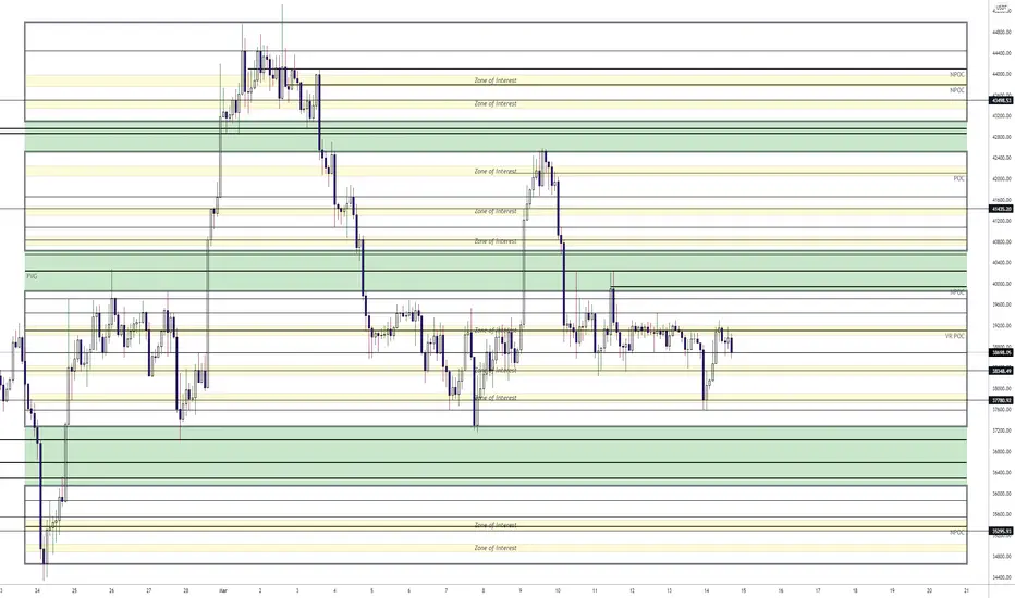
It indicates all levels of relevance.
The areas surrounded by thick grey lines indicate large high volume areas.
The "zones of interest" within those areas indicate high volume zones which attract price.
The POC and NPOC levels of course also serve as a good reference point for where price may be headed.
The green zones in between the larger areas indicate low volume zones where price tends to return to or shoot straight through.
Then in between are some basic S/R lines that may be of relevance.
If you like the chart, give me a thumbs up.
Enjoy your week, everyone!
here is my BTC TA for the coming week.
It indicates all levels of relevance.
The areas surrounded by thick grey lines indicate large high volume areas.
The "zones of interest" within those areas indicate high volume zones which attract price.
The POC and NPOC levels of course also serve as a good reference point for where price may be headed.
The green zones in between the larger areas indicate low volume zones where price tends to return to or shoot straight through.
Then in between are some basic S/R lines that may be of relevance.
If you like the chart, give me a thumbs up.
Enjoy your week, everyone!

Feragatname
Bilgiler ve yayınlar, TradingView tarafından sağlanan veya onaylanan finansal, yatırım, alım satım veya diğer türden tavsiye veya öneriler anlamına gelmez ve teşkil etmez. Kullanım Koşulları bölümünde daha fazlasını okuyun.
Feragatname
Bilgiler ve yayınlar, TradingView tarafından sağlanan veya onaylanan finansal, yatırım, alım satım veya diğer türden tavsiye veya öneriler anlamına gelmez ve teşkil etmez. Kullanım Koşulları bölümünde daha fazlasını okuyun.