
XLM is not interesting because the crowd is excited.
It is interesting because the chart is still alive while almost nobody cares.
This is exactly the kind of structure most people ignore until the breakout already becomes obvious.
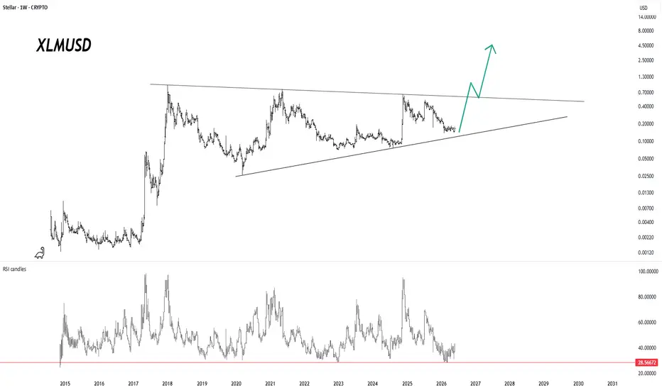
XLM/USD has spent years inside a large compression range.
The upper side of the structure has rejected every major expansion attempt since the previous cycle.
The lower side has continued to rise quietly, creating a long-term squeeze between falling resistance and rising support.
That is the entire chart.
Not hype.
Not confirmation.
Compression.
The important part is that price is no longer collapsing freely. It is moving inside a narrowing structure, and the current zone is close to the lower side of that structure.
If the lower support continues to hold, the next meaningful question becomes simple:
Can XLM return to the upper resistance line?
And if that resistance finally breaks, the structure changes completely.
The RSI structure also fits the same idea. Momentum is not euphoric. It is not overheated. It is closer to a reset / rebuild zone after a long period of weakness.
That does not mean the move starts immediately.
But it does mean the chart is no longer only a dead chart.
It is a compression chart.
The crowd usually waits for the breakout candle.
The structure usually appears before the crowd returns.
For now, the map is simple:
Support holds → compression continues.
Upper line breaks → market structure changes.
Support fails → the thesis weakens.
XLM is still in the “prove it” zone.
But this is exactly where ignored charts should be watched carefully.
XLM/BTC weekly

It is interesting because the chart is still alive while almost nobody cares.
This is exactly the kind of structure most people ignore until the breakout already becomes obvious.
XLM/USD has spent years inside a large compression range.
The upper side of the structure has rejected every major expansion attempt since the previous cycle.
The lower side has continued to rise quietly, creating a long-term squeeze between falling resistance and rising support.
That is the entire chart.
Not hype.
Not confirmation.
Compression.
The important part is that price is no longer collapsing freely. It is moving inside a narrowing structure, and the current zone is close to the lower side of that structure.
If the lower support continues to hold, the next meaningful question becomes simple:
Can XLM return to the upper resistance line?
And if that resistance finally breaks, the structure changes completely.
The RSI structure also fits the same idea. Momentum is not euphoric. It is not overheated. It is closer to a reset / rebuild zone after a long period of weakness.
That does not mean the move starts immediately.
But it does mean the chart is no longer only a dead chart.
It is a compression chart.
The crowd usually waits for the breakout candle.
The structure usually appears before the crowd returns.
For now, the map is simple:
Support holds → compression continues.
Upper line breaks → market structure changes.
Support fails → the thesis weakens.
XLM is still in the “prove it” zone.
But this is exactly where ignored charts should be watched carefully.
XLM/BTC weekly
İşlem aktif

▸ Crypto Cycles: cycle phase mapping, structural analysis
▸ Fractals: historical pattern, cycle anatomy
▸ Onchain
▸ Macro
▸ Market Psychology
▸Altcoin Charts
Subscribe on X → @Cryptollica
x.com/Cryptollica/creator-subscriptions/subscribe
▸ Fractals: historical pattern, cycle anatomy
▸ Onchain
▸ Macro
▸ Market Psychology
▸Altcoin Charts
Subscribe on X → @Cryptollica
x.com/Cryptollica/creator-subscriptions/subscribe
Feragatname
Bilgiler ve yayınlar, TradingView tarafından sağlanan veya onaylanan finansal, yatırım, alım satım veya diğer türden tavsiye veya öneriler anlamına gelmez ve teşkil etmez. Kullanım Koşulları bölümünde daha fazlasını okuyun.
▸ Crypto Cycles: cycle phase mapping, structural analysis
▸ Fractals: historical pattern, cycle anatomy
▸ Onchain
▸ Macro
▸ Market Psychology
▸Altcoin Charts
Subscribe on X → @Cryptollica
x.com/Cryptollica/creator-subscriptions/subscribe
▸ Fractals: historical pattern, cycle anatomy
▸ Onchain
▸ Macro
▸ Market Psychology
▸Altcoin Charts
Subscribe on X → @Cryptollica
x.com/Cryptollica/creator-subscriptions/subscribe
Feragatname
Bilgiler ve yayınlar, TradingView tarafından sağlanan veya onaylanan finansal, yatırım, alım satım veya diğer türden tavsiye veya öneriler anlamına gelmez ve teşkil etmez. Kullanım Koşulları bölümünde daha fazlasını okuyun.