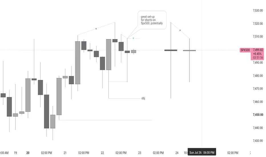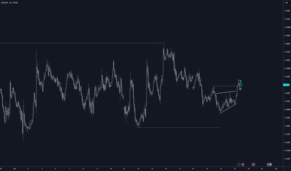
 Long
Long
 Short
Short
 Short
Short
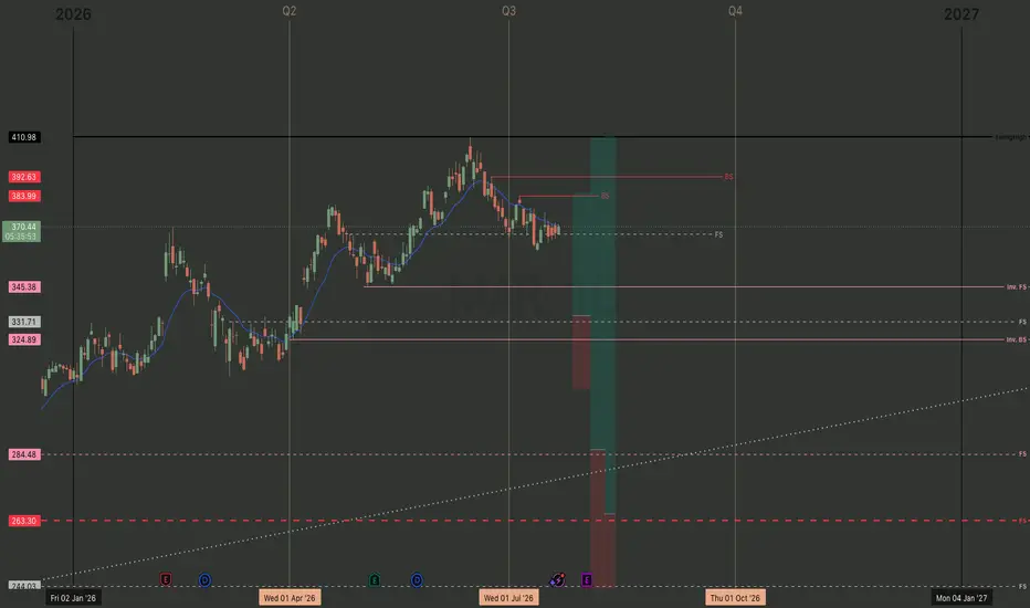
TRX Gold Corp | Q3 2026 - Day Chart
MARKET-BEATING SCORE = 7/10
-----------------------------------
PEGY 1.00 — fairly valued.
EPS growth 46.0% — above-market.
Revenue growing 163.0% YoY — strong.
Gross margin 60.0% — strong moat.
FCF margin -2.7% — cash burn.
D/E 0.04 — conservative leverage.
-----------------------------------
"Could a policy change or major competitor disrupt growth in the next 2 years?"
TRX Gold's growth is primarily exposed to regulatory shifts in Tanzania, where historical policy volatility regarding mineral royalties and state ownership remains a concern despite an improving investment climate. While gold is a global commodity making traditional market-share competition less relevant, the company faces risks from supply chain bottlenecks and rising costs for energy and mining inputs. Overall, disruption is more likely to stem from geopolitical or fiscal policy changes than from technological advancements or new competitors within the next two years.
Risk Level:
Moderate
-----------------------------------
Multiple Time-Frame Analysis; Color Code | Strength favors the higher timeframe.
Yearly timeframe = black
Monthly timeframe = pink
weekly = grey
daily = red
4hr = orange
1hr = yellow
15min = blue
5min = green if they are shown. (Level visibility on intervals is set to timeframe the level was found on and below to keep chart view organized.)
** Candle Science explained **
A Range = two or more consecutive color candles.
There are two types of ranges - accumulation and distribution. **A single candle is a range on a lower timeframe. *Find the range and define its, creation dates, prices, and risk parameters. A range is broken down into 4 candle, which create 6 levels that define the range and illustrate market structure.
Focus only on the first and last candle of each range. The last candle of each type of range has two levels - see FS & Inv. FS Candles below.
DISTRIBUTION RANGES DEFINED:
When price is above a distribution range, these candles/levels act as support.
(BS) BACKSIDE Candle - First distribution candle in a distribution range. Expectation = strong reaction to price. long wicks reaching to or away from level. high angle accumulation trends, f.v,g's
(FS) FrontSide Candle - Last distribution candle in a distribution range. Expectation = reversal, create a low angle accumulation trend. The top of Distribution candles are used as support. The bottom of the FrontSide candle is the SwingLow of the range. The FS candle wants to protect the SwingLow. When/if Price Action closes below the SwingLow, the level is invalidated. Find another range to trade.
ACCUMULATION RANGES DEFINED: When price is below an accumulation range, these candles/levels act as resistance.
INVERSE BACKSIDE (Inv.BS) - First Accumulation candle in an accumulation range. Expectation. = strong reaction to price. long wicks reaching to or away from level. Creates high angle distribution trends, f.v.g, protects the Inv.FS candle
INVERSE FRONTSIDE (Inv.FS) - Last accumulation candle in an accumulation range. Expectation = reversal, create a low angle distribution trend. The bottom of Accumulation candles are used as resistance.
The top of the Inv.FrontSide candle is the SwingHigh of the range. The Inv.FS candle wants to protect the SwingHigh. When/if Price Action closes above the SwingHigh, the level is invalidated. Find another range to trade. FMST | Q3 2026 - Day ChartForemost Clean Energy Ltd. ||
MARKET-BEATING SCORE = 1/10
-----------------------------------
PEGY 0.96 — fairly valued.
P/E (TTM)
-5.35×
Ind: 15.98× ▲ 21.33
EPS growth 9.2% — modest.
Revenue growing 11.4% YoY — steady.
Gross margin 36.2% — decent.
FCF margin 6.8% — real cash generation.
D/E 0.98 — conservative leverage.
-----------------------------------
"Could a policy change or major competitor disrupt growth in the next 2 years?"
Policy changes remain a moderate risk as shifts in nuclear energy subsidies or environmental permitting could delay Foremost's exploration timelines in the Athabasca Basin. While the global pivot toward nuclear energy acts as a tailwind, competition from larger, well-capitalized producers and other junior explorers for drilling resources and capital remains intense. Additionally, any sudden pivot in green energy mandates toward non-nuclear alternatives could disrupt projected demand growth over the next two years.
Risk Level:
Moderate; intense but undervalued by industry averages. Pair with the monthly support level at $1.03 and weekly support at .72 - competition could result in better entry.
-----------------------------------
Multiple Time-Frame Analysis; Color Code | Strength favors the higher timeframe.
Yearly timeframe = black
Monthly timeframe = pink
weekly = grey
daily = red
4hr = orange
1hr = yellow
15min = blue
5min = green if they are shown. (Level visibility on intervals is set to timeframe the level was found on and below to keep chart view organized.)
** Candle Science explained **
A Range = two or more consecutive color candles.
There are two types of ranges - accumulation and distribution. **A single candle is a range on a lower timeframe. *Find the range and define its, creation dates, prices, and risk parameters. A range is broken down into 4 candle, which create 6 levels that define the range and illustrate market structure.
Focus only on the first and last candle of each range. The last candle of each type of range has two levels - see FS & Inv. FS Candles below.
DISTRIBUTION RANGES DEFINED:
When price is above a distribution range, these candles/levels act as support.
(BS) BACKSIDE Candle - First distribution candle in a distribution range. Expectation = strong reaction to price. long wicks reaching to or away from level. high angle accumulation trends, f.v,g's
(FS) FrontSide Candle - Last distribution candle in a distribution range. Expectation = reversal, create a low angle accumulation trend. The top of Distribution candles are used as support. The bottom of the FrontSide candle is the SwingLow of the range. The FS candle wants to protect the SwingLow. When/if Price Action closes below the SwingLow, the level is invalidated. Find another range to trade.
ACCUMULATION RANGES DEFINED: When price is below an accumulation range, these candles/levels act as resistance.
INVERSE BACKSIDE (Inv.BS) - First Accumulation candle in an accumulation range. Expectation. = strong reaction to price. long wicks reaching to or away from level. Creates high angle distribution trends, f.v.g, protects the Inv.FS candle
INVERSE FRONTSIDE (Inv.FS) - Last accumulation candle in an accumulation range. Expectation = reversal, create a low angle distribution trend. The bottom of Accumulation candles are used as resistance.
The top of the Inv.FrontSide candle is the SwingHigh of the range. The Inv.FS candle wants to protect the SwingHigh. When/if Price Action closes above the SwingHigh, the level is invalidated. Find another range to trade. WWR | Q3 2026 | Day ChartWestwater Resources, Inc.||
MARKET-BEATING SCORE = 6/10
-----------------------------------
PEGY 0.02 — undervalued vs growth. Strong market beater.
EPS growth 53.3% — above-market.
Revenue growing 0.0% YoY — steady.
Gross margin 28.5% — thin.
FCF margin 1.3% — real cash generation.
D/E 0.02 — conservative leverage.
-----------------------------------
"Could a policy change or major competitor disrupt growth in the next 2 years?"
WWR faces significant risk from potential shifts in U.S. trade policy or EV tax credit eligibility, as their growth is tied to domestic sourcing requirements that disadvantage Chinese competitors. The company faces stiff competition from established international producers and emerging North American peers who may secure long-term offtake agreements first. Furthermore, delays in the completion of the Kellyton processing plant or a rapid technological shift toward synthetic graphite or silicon anodes could disrupt their projected market entry within the next two years.
Risk Level:
High; This is one of the cheapest non-mineral energy stocks with an analyst rating of "Strong Buy".
The only support is a daily FrontSide candle created 20 July. So a two day old support against a 188 day distribution trend just this year. Waiting for the monthly Swing Low at $.25 is better for risk averse investors in longpants or wait until the daily distribution trends are tested, broke and leave behind confirmation of support breaking the 188day distribution which then becomes rocket fuel. Until then, sit on the hands.
-----------------------------------
Multiple Time-Frame Analysis; Color Code | Strength favors the higher timeframe.
Yearly timeframe = black
Monthly timeframe = pink
weekly = grey
daily = red
4hr = orange
1hr = yellow
15min = blue
5min = green if they are shown. (Level visibility on intervals is set to timeframe the level was found on and below to keep chart view organized.)
** Candle Science explained **
A Range = two or more consecutive color candles.
There are two types of ranges - accumulation and distribution. **A single candle is a range on a lower timeframe. *Find the range and define its, creation dates, prices, and risk parameters. A range is broken down into 4 candle, which create 6 levels that define the range and illustrate market structure.
Focus only on the first and last candle of each range. The last candle of each type of range has two levels - see FS & Inv. FS Candles below.
DISTRIBUTION RANGES DEFINED:
When price is above a distribution range, these candles/levels act as support.
(BS) BACKSIDE Candle - First distribution candle in a distribution range. Expectation = strong reaction to price. long wicks reaching to or away from level. high angle accumulation trends, f.v,g's
(FS) FrontSide Candle - Last distribution candle in a distribution range. Expectation = reversal, create a low angle accumulation trend. The top of Distribution candles are used as support. The bottom of the FrontSide candle is the SwingLow of the range. The FS candle wants to protect the SwingLow. When/if Price Action closes below the SwingLow, the level is invalidated. Find another range to trade.
ACCUMULATION RANGES DEFINED: When price is below an accumulation range, these candles/levels act as resistance.
INVERSE BACKSIDE (Inv.BS) - First Accumulation candle in an accumulation range. Expectation. = strong reaction to price. long wicks reaching to or away from level. Creates high angle distribution trends, f.v.g, protects the Inv.FS candle
INVERSE FRONTSIDE (Inv.FS) - Last accumulation candle in an accumulation range. Expectation = reversal, create a low angle distribution trend. The bottom of Accumulation candles are used as resistance.
The top of the Inv.FrontSide candle is the SwingHigh of the range. The Inv.FS candle wants to protect the SwingHigh. When/if Price Action closes above the SwingHigh, the level is invalidated. Find another range to trade. Vale | Q3 2026 | Day ChartVALE S.A. ||
MARKET-BEATING SCORE = 8/10
Dividend yield TTM
6.38%
-----------------------------------
PEGY 0.10 — undervalued vs growth. Strong market beater.
EPS growth 195.5% — above-market.
Revenue growing 1.6% YoY — steady.
Gross margin 35.1% — decent.
FCF margin 7.8% — real cash generation.
D/E 0.61 — conservative leverage.
-----------------------------------
KEY RISK ASSESSMENT
"Could a policy change or major competitor disrupt growth in the next 2 years?"
Vale faces significant growth risks from evolving Brazilian environmental regulations and potential shifts in Chinese industrial policy that could restrict steel production or favor scrap over iron ore. While its high-grade product mix aligns with the transition to greener steelmaking, the eventual market entry of major competitor projects like Simandou in Guinea threatens to disrupt global supply-demand balances and suppress prices. These factors, combined with ongoing legal liabilities from past dam failures, create a landscape where policy shifts or supply chain disruptions could cause notable volatility over the next two years.
Risk Level:
Moderate; "Overvalued" P/E 21.18× vs industry avg =16.21× ▼ 4.97
-----------------------------------
Multiple Time-Frame Analysis; Color Code | Strength favors the higher timeframe.
Yearly timeframe = black
Monthly timeframe = pink
weekly = grey
daily = red
4hr = orange
1hr = yellow
15min = blue
5min = green if they are shown. (Level visibility on intervals is set to timeframe the level was found on and below to keep chart view organized.)
** Candle Science explained **
A Range = two or more consecutive color candles.
There are two types of ranges - accumulation and distribution. **A single candle is a range on a lower timeframe. *Find the range and define its, creation dates, prices, and risk parameters. A range is broken down into 4 candle, which create 6 levels that define the range and illustrate market structure.
Focus only on the first and last candle of each range. The last candle of each type of range has two levels - see FS & Inv. FS Candles below.
DISTRIBUTION RANGES DEFINED:
When price is above a distribution range, these candles/levels act as support.
(BS) BACKSIDE Candle - First distribution candle in a distribution range. Expectation = strong reaction to price. long wicks reaching to or away from level. high angle accumulation trends, f.v,g's
(FS) FrontSide Candle - Last distribution candle in a distribution range. Expectation = reversal, create a low angle accumulation trend. The top of Distribution candles are used as support. The bottom of the FrontSide candle is the SwingLow of the range. The FS candle wants to protect the SwingLow. When/if Price Action closes below the SwingLow, the level is invalidated. Find another range to trade.
ACCUMULATION RANGES DEFINED: When price is below an accumulation range, these candles/levels act as resistance.
INVERSE BACKSIDE (Inv.BS) - First Accumulation candle in an accumulation range. Expectation. = strong reaction to price. long wicks reaching to or away from level. Creates high angle distribution trends, f.v.g, protects the Inv.FS candle
INVERSE FRONTSIDE (Inv.FS) - Last accumulation candle in an accumulation range. Expectation = reversal, create a low angle distribution trend. The bottom of Accumulation candles are used as resistance.
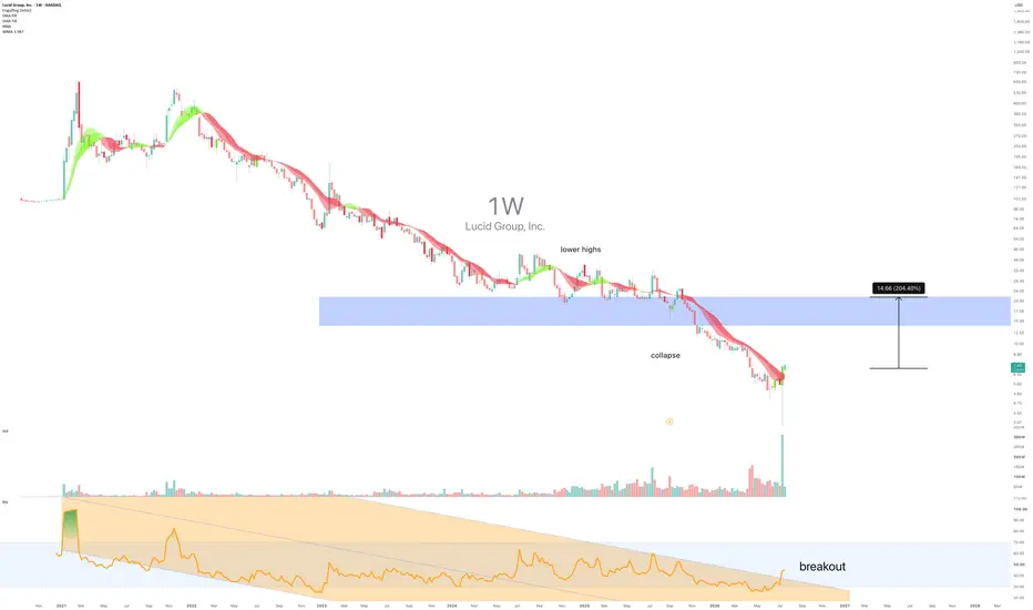
The top of the Inv.FrontSide candle is the SwingHigh of the range. The Inv.FS candle wants to protect the SwingHigh. When/if Price Action closes above the SwingHigh, the level is invalidated. Find another range to trade. LCID: Short squeeze time! - July 2026SYMBOL: NASDAQ:LCID | DIRECTION: LONG | TIMEFRAME: Weekly
Published: July 2026
Right…. Short interest increases to 36.85% after 99.2% correction.
Melvin Capital, is that you?
Lucid Group Inc has been absolutely demolished. From thirty-one dollars down to seven, ignoring the 1/10 split. That is extraordinary. In a bad way, obviously. The stock has surrendered all short term gains, left in tatters by the market's sudden discovery that electric cars do not, in fact, solve climate change by existing. Who knew? Well, apparently everyone except the people who bought at the peak. But here is where it gets interesting. After such a violent, sustained collapse, the chart is now displaying something the casual observer tends to miss: the exhaustion patterns of a seller running out of ammunition. The volume is contracting on the downside. Multiple hammer and engulfing formations are stacking up across the daily and weekly timeframes. And yet the crowd is still convinced Lucid is headed to zero.
Bear with me.
On the above Weekly chart Lucid Group Inc has established a defined support zone between approximately fourteen and seventeen dollars, marked by a blue rectangle spanning the last six months of price action. A few distinct reasons now exist to expect a bounce of meaningful size to market structure. They include:
1. Hammer and Engulfing Confluence on Multiple Timeframes
The current weekly bar is rendering both a hammer and an engulfing pattern. The daily chart is doing the same. This is not noise. When reversal candlesticks appear in tandem across timeframes, they telegraph a genuine shift in pressure from seller dominance to buyer entry. After a seventy-seven percent evisceration, the fact that buyers are willing to step in at all is a signal worth acknowledging. Why would they bother unless something had changed? What do they know that I don’t?
2. Volume Contraction on Downside Moves
The volume profile shows a clear pattern: as price falls, volume is declining. This is a textbook hallmark of seller exhaustion. When every seller who wanted out has already left, who is left to drive price lower? The green volume bars clustering in the lower ranges suggest that capitulation is in its late innings. See the daily chart below, where the recent bounce saw volume surge notably, confirming the shift in demand.
3. Support Zone Holding Through Multiple Tests
The blue support rectangle at fourteen to seventeen dollars has been tested repeatedly over the past eighteen months. Price has bounced from this zone multiple times. It is not abstract. It is real structure.
The Absurdity of the Fundamental Setup
Lucid makes cars that nobody can afford, sells hardly any of them, and burns cash at a rate that would shame a small nation. And yet the stock was valued at over one hundred billion dollars at the peak. The fact that it is now worth 2.8 billion is still arguably too much. However, this is precisely why the chart matters. The market has already priced in catastrophic failure. When that much pain is priced in, reversals often happen not because the story improves, but because the hatred is exhausted. I am just the one willing to write it down.
Targets
4.66: Prior support zone and measured-move target from the engulfing pattern (+106% from current price)
17.50: Upper boundary of the blue support rectangle and key resistance level before structural recovery (+146% from current price)
- Invalidation: A weekly close below 5 (the 52-week low) cancels the thesis entirely.
The crowd
The consensus among serious investors is that Lucid is a zombie. They point to the cash burn, the tiny production numbers, and the fact that the global auto industry is already pivoting toward affordable electrification while Lucid remains stranded in ultra-luxury nonsense as a double dip recession approaches. These people are not wrong. They are simply stuck in a macro narrative at the exact moment the chart is signalling micro reversal. Fear has compressed this name so thoroughly that the technical setup is now flashing warning signals in the opposite direction. The algos and the shorts are positioned for one more flush downward. They are not expecting a bounce. That is precisely the environment where bounces tend to happen.
The broader truth is that nobody should own Lucid as a long-term investment. But a seven dollar stock that is generating multiple reversal signals after a ninety-seven percent collapse is a very different animal.
Remember the GameStop short squeeze?
This is not a belief in electric cars saving the planet. This is not even a belief in Lucid's business. This is reading what the price action is actually saying, independent of what the fundamental story deserves.
Good luck.
Ww
Type: LONG | Timeframe: Weekly
============================================
Disclaimer
This idea is for educational and informational purposes only. It is not financial advice. Equities involve significant risk. Always do your own research and consult a qualified financial adviser before making any investment decisions. Past performance is not indicative of future results.  Long
Long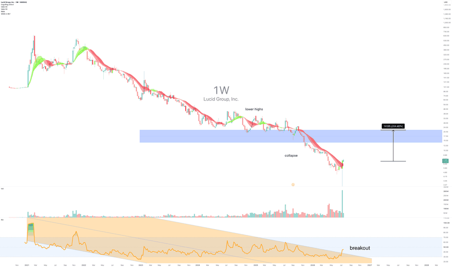
MAR | Q3 2026 | Day ChartMarriott International ||
MARKET-BEATING SCORE = 3/10
Dividend yield TTM
0.74%
-----------------------------------
PEGY 2.72 — overvalued vs growth.
EPS growth 13.5% — solid.
Revenue growing 7.0% YoY — steady.
Gross margin 79.0% — strong moat.
FCF margin 34.4% — real cash generation..
-----------------------------------
KEY RISK ASSESSMENT
"Could a policy change or major competitor disrupt growth in the next 2 years?"
Marriott faces moderate risk from potential labor law changes and evolving regulations on short-term rentals which impact the broader lodging market. Competition from digital platforms like Airbnb and the high commission structures of Online Travel Agencies (OTAs) remain persistent threats to margin growth. Additionally, high interest rates could slow the development pipeline of franchised properties, potentially hindering the company's aggressive room-growth targets over the next two years.
Risk Level:
Moderate; wait for better price entry and news of operations outlook.
-----------------------------------
Multiple Time-Frame Analysis; Color Code | Strength favors the higher timeframe.
Yearly timeframe = black
Monthly timeframe = pink
weekly = grey
daily = red
4hr = orange
1hr = yellow
15min = blue
5min = green if they are shown. (Level visibility on intervals is set to timeframe the level was found on and below to keep chart view organized.)
** Candle Science explained **
A Range = two or more consecutive color candles.
There are two types of ranges - accumulation and distribution. **A single candle is a range on a lower timeframe. *Find the range and define its, creation dates, prices, and risk parameters. A range is broken down into 4 candle, which create 6 levels that define the range and illustrate market structure.
Focus only on the first and last candle of each range. The last candle of each type of range has two levels - see FS & Inv. FS Candles below.
DISTRIBUTION RANGES DEFINED:
When price is above a distribution range, these candles/levels act as support.
(BS) BACKSIDE Candle - First distribution candle in a distribution range. Expectation = strong reaction to price. long wicks reaching to or away from level. high angle accumulation trends, f.v,g's
(FS) FrontSide Candle - Last distribution candle in a distribution range. Expectation = reversal, create a low angle accumulation trend. The top of Distribution candles are used as support. The bottom of the FrontSide candle is the SwingLow of the range. The FS candle wants to protect the SwingLow. When/if Price Action closes below the SwingLow, the level is invalidated. Find another range to trade.
ACCUMULATION RANGES DEFINED: When price is below an accumulation range, these candles/levels act as resistance.
INVERSE BACKSIDE (Inv.BS) - First Accumulation candle in an accumulation range. Expectation. = strong reaction to price. long wicks reaching to or away from level. Creates high angle distribution trends, f.v.g, protects the Inv.FS candle
INVERSE FRONTSIDE (Inv.FS) - Last accumulation candle in an accumulation range. Expectation = reversal, create a low angle distribution trend. The bottom of Accumulation candles are used as resistance.
The top of the Inv.FrontSide candle is the SwingHigh of the range. The Inv.FS candle wants to protect the SwingHigh. When/if Price Action closes above the SwingHigh, the level is invalidated. Find another range to trade.
Short 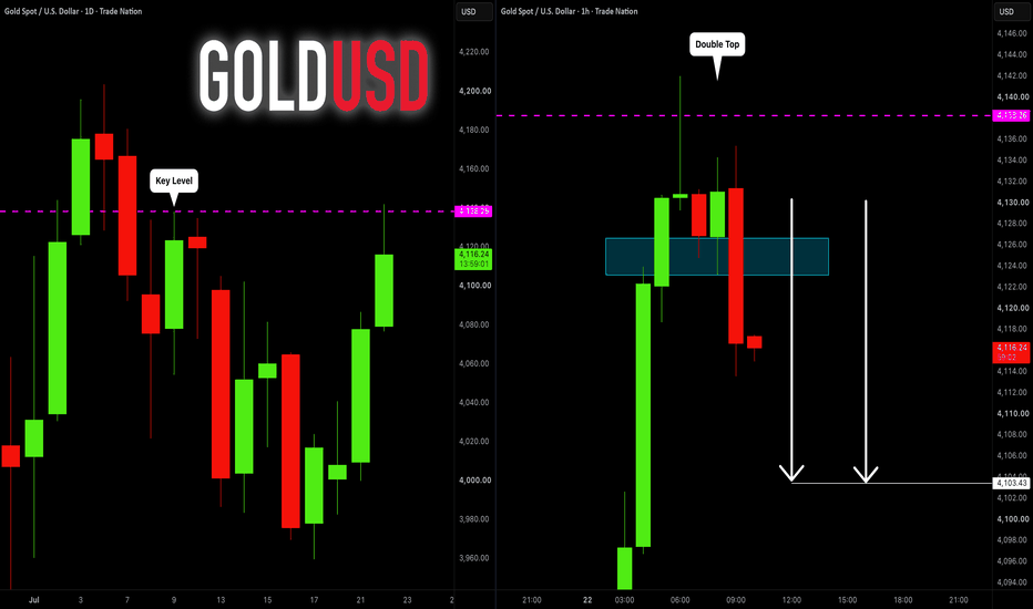
XAU/USD 22 July 2026 Intraday AnalysisH4 Analysis:
-> Swing: Bullish.
-> Internal: Bearish.
Bias and analysis to remain the same as analysis dated 30 June 2026.
Price did not print bullish CHoCH to indicate bullish pullback phase initiation. Price instead printed a new low followed by a bullish CHoCH
Price is currently trading within and established internal range, however, I will continue to monitor price with respect to depth of pullback.
Intraday expectation:
Price to trade up to either premium of internal 50% EQ, or H4 demand zone before targeting weak internal low, currently priced at 3,942.100.
Note:
Gold remains volatile as tensions between the US, Israel, and Iran keep safe‑haven demand elevated.
Markets are reacting quickly to every headline, while uncertainty around the Fed’s easing path and shifting U.S. policy under President Trump, especially tariffs continues to fuel choppy price action.
For newer traders, the key is simple, stay flexible and manage risk carefully, as fast spikes and sudden reversals are a normal part of the current XAU/USD environment.
H4 Chart:
M15 Analysis:
-> Swing: Bearish.
-> Internal: Bearish.
Analysis and bias remains the same as analysis dated 20 July 2026.
Price has printed according to analysis dated 14 July 2026 where I mentioned price to trade up to either premium of internal 50% EQ, or M15 demand zone before targeting weak internal low, priced at 3,983.545. This is how price printed.
Price has subsequently printed a bullish CHoCH to indicate bullish pullback phase initiation. Price has since printed lower. Depth of pullback has been insignificant, therefore, I will not classify the bearish iBOS, however, I have marked this in red for illustration purposes.
Price has since printed a further bullish CHoCH and once again price is trading within an established internal range, however, I shall again monitor price action with regards to depth of pullback.
Intraday expectation:
Price to trade up to either premium of internal 50% EQ, or M15 demand zone before targeting weak internal low, priced at 3,959.800.
Note:
Gold remains highly reactive on M15 as geopolitical risk continues to drive quick, headline‑led moves.
The tension between the US, Israel, and Iran is keeping safe‑haven demand elevated, with markets still sensitive to any sign of escalation.
At the same time, shifting US tariff policy under President Trump is adding extra uncertainty, fuelling sharp intraday swings and increasing the likelihood of sudden sentiment flips. Liquidity pockets and whipsaws remain common, making disciplined risk management essential.
Gold’s geopolitical premium is still firmly in place, and until tensions ease, short‑term volatility is likely to stay front‑loaded.
M15 Chart:  Long
Long
Short 
SYNC: Healthcare venture capital at inflection - July 2026SYMBOL: LSE:SYNC | DIRECTION: LONG | TIMEFRAME: 2-Week
Published: July 2026
Most investors have watched Syncona descend from 290p in 2018 through a relentless bear market. The pattern is familiar: a bubble inflates, then deflates with mechanical precision. Few have bothered to look at what happens when the selling finally stops. Even fewer have noticed the double bottom forming at the floor of a nearly seven-year downtrend channel. The crowd is still short, still pessimistic, still waiting for one more leg down that may never come.
Perhaps a market crash does come, who knows. Everyone is talking about it. After a correction in excess of 70% already, it makes you realise just how irrational the marketplace is.
Syncona Limited, the LSE-listed venture capital vehicle backing transformative biotech and medtech businesses, has spent the last seven years grinding lower from 290p in 2018.
That was the peak of speculative excess.
What we are seeing now, at 106p, is different: a fund trading close to net asset value with a portfolio of genuinely de-risked investments entering their most valuable years. The crowd has moved on to fashionable themes. Syncona's moment has arrived because its portfolio companies are not concepts anymore. They are clinical-stage programmes with real data, real regulatory pathways, and real exit optionality.
The venture capital model rewards patience that the public market has lost. Syncona's Limited Partners are institutions. They do not trade on news cycles, they compound returns over five to ten-year holding periods.
On the above 13 day chart, Syncona Limited has formed a double bottom with a breakout above 110p now forming. Five reasons exist to expect the rally to accelerate from here.
They include:
1. Double Bottom Structure and Breakout Confirmation
The chart shows a clear double bottom established around 100p in late 2025 and early 2026, with price now rallying back toward the neckline resistance near 110p. A close above 110p on the 2-Week timeframe would confirm the reversal pattern and typically projects price toward the prior swing high visible around 125p to 130p. This is textbook reversal geometry after a sustained downtrend.
2. Portfolio de-risking
Syncona's Holdings include companies now in late-stage development: several have Phase 2/3 programmes underway, with clinical trial readouts, regulatory submissions, and partnership announcements expected across 2025-2026. Unlike the speculative biotech complex (which has cooled sharply), these are not concept-stage gambles; they are programmes with defined success metrics and visible exit pathways. Each approval or partnership deal acts as a NAV-accretive event that will likely trigger institutional buying.
3. Price above both short-term and intermediate moving averages
Price sits 7.8% above the 50-day SMA (99.03) and 10.2% above the 200-day SMA (96.89), confirming that the recent recovery from 100p is not a dead-cat bounce but an emerging trend.
4. One caveat worth acknowledging: Weekly Oscillators show bearish divergence
This matters and must be named plainly. A weak regular bearish divergence is present on the weekly timeframe, with multiple momentum oscillators rolling over despite price attempting to hold near 52-week highs. that suggests underlying weakness in momentum even as price remains elevated. If price fails to close decisively above 110p on the 2-Week chart within the next two to three bars, this divergence may accelerate a pullback to the double-bottom support near 102p-104p. The thesis does not fail; it simply requires price confirmation first. An orderly close above the neckline resolves this tension in the bull's favour.
5. Valuation relative to asset class
Venture capital vehicles typically trade at a discount to NAV during periods of market stress. Syncona, at current levels, is trading closer to intrinsic value than it did at 290p. This compression has created a margin of safety. When even one major portfolio company reaches a successful exit or partnership milestone, the NAV step-change will be visible immediately, and the share price discount will re-compress. Patient capital is being rewarded.
Targets
Will keep that external.
Link on the profile page, www.tradingview.com
The Crowd
The consensus view on venture capital equities remains poisoned by 2022's rate shock. Most of the retail and institutional attention has fled toward profitable SaaS, industrials, and energy. Venture vehicles are lumped with "speculative" buckets. And yet: the fundamentals of Syncona's portfolio have dramatically improved since those panic sales. Phase 2 data has become Phase 3 data. Concept-stage programmes have become clinical-stage programmes with defined risk profiles. This is the opposite of the narrative. The crowd has not updated its mental model because it left the sector entirely. That means when the first major portfolio exit or partnership is announced and the NAV steps visibly higher, institutional capital will re-enter en masse and the share price gap-fill that follows will be swift and sharp.
The question is not whether Syncona's portfolio will deliver value. It is whether you are willing to hold through the indifference and technical noise that precedes the re-rating.
Good luck.
Ww
Type: Long Equity | Timeframe: 2-Week
==========================================
Disclaimer
This idea is for educational and informational purposes only. It is not financial advice. Equities involve significant risk. Always do your own research and consult a qualified financial adviser before making any investment decisions. Past performance is not indicative of future results.  Long
Long
Elliott Wave Analysis – First Green Light for Bullish ContinuatiRBOB Gasoline (RB2!) 4H Chart | Elliott Wave Analysis – First Green Light for Bullish Continuation?
Under the aggressive scenario, the market has delivered its first encouraging signal that the bullish trend may be ready to continue. The breakout above the corrective channel, the completion of a Classic Zigzag, and the development of an initial five-wave advance all support the possibility that a new impulsive sequence has begun. If this wave count is correct, the current rally could represent only the early stage of a much larger bullish trend.
Even so, no market advances in a straight line. After every impulsive move, corrective structures are both natural and necessary, allowing the market to regain balance before the next leg higher. These pauses may develop as either price corrections or time corrections, both of which are consistent with Elliott Wave guidelines.
The next correction does not necessarily have to be deep. The market may simply enter a sideways corrective phase to consume time rather than price. Structures such as a Flat, Triangle, or even a Complex Correction remain entirely possible. These patterns typically allow the market to consolidate before the primary trend resumes.
The conservative scenario, however, still suggests that the market may require a larger correction before the primary bullish trend can fully develop. If the current decline unfolds as nothing more than a three-wave corrective structure, such as a Simple Zigzag, the probability of a larger corrective phase would increase.
That said, the presence of a three-wave correction alone is not enough to confirm the bearish case. The key will be the market's behavior once the correction is complete. If buyers fail to produce a new impulsive advance and price instead breaks below the corrective structure, it would become the first warning that a short-term bearish phase may be developing.
Finally, it is important to remember that RBOB Gasoline is one of crude oil's primary refined products and maintains a strong correlation with the oil market. As long as crude oil continues to preserve its bullish structure and extend higher, the broader outlook for gasoline is also expected to remain constructive.
For now, both scenarios remain valid. The market's future price action, wave structure, and reaction around key technical levels will ultimately determine which path gains confirmation.
Patterns whisper. I listen.
— Mr. Nobody  Long
Long
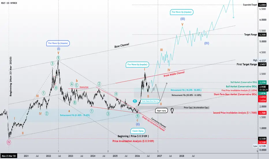
Elliott Wave Analysis | Preparing for Wave (III)?RBOB Gasoline (RB2!) Daily Chart
Following the completion of a Classic Zigzag correction, RBOB Gasoline appears to have broken above its corrective channel, suggesting that the larger bullish trend may have resumed.
My preferred wave count considers Wave (II) complete, with the current advance representing the early stages of Wave (III). If this interpretation is correct, the market may currently be developing Waves 1 and 2 before the strongest portion of the trend begins.
The initial impulsive rally has already demonstrated encouraging strength. However, before the next major advance unfolds, a temporary pullback would remain entirely consistent with Elliott Wave guidelines. The ideal retracement zone for Wave 2 lies between the 38.2% and 50.0% Fibonacci retracement levels, while a deeper correction toward 50.0%–61.8% would still preserve the bullish structure.
An additional technical factor supporting this scenario is the presence of what may become an Acceleration Gap. If this gap continues to hold, it would reinforce the view that bullish momentum is strengthening rather than fading.
From this point forward, maintaining price above the first invalidation level keeps the primary bullish scenario intact. As long as that level remains respected, the market could continue building the foundation for a much larger impulsive advance.
If Wave (III) develops as expected, the first objective would be the initial target zone, followed by higher Fibonacci expansion levels as the impulse matures. While the exact path will depend on future price action, the overall structure continues to favor the bullish scenario.
As always, this is a probability-based Elliott Wave interpretation rather than a prediction. The market itself will determine whether this wave count continues to validate or whether an alternative structure begins to emerge.
Patterns whisper. I listen.
— Mr. Nobody
No Lead Gasoline
Jun 15
NOLEADGASOLINE (4H) | Updated Elliott Wave Roadmap
Long