OPEN-SOURCE SCRIPT
ETH - Log Regression Bands
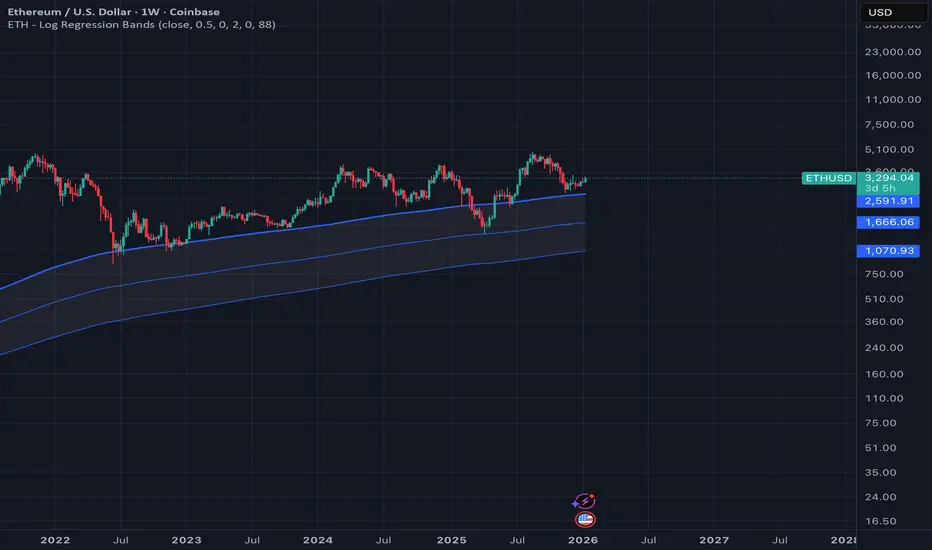
ETH – Log Regression Bands: Detailed Description (Math + How to Use)
Overview
This indicator plots a long-term “fair value” growth curve for ETH and surrounds it with multiple upper and lower bands. The goal is to estimate where price sits relative to a long-term trend that is best interpreted in **logarithmic (percentage) terms**, not raw dollars.
The bands create clear zones showing when ETH is historically cheap or expensive relative to that long-term curve.
---
Why use logarithms?
Price action is typically more meaningful in **percentage moves** than in absolute dollar moves.
* A move from $100 → $200 is +100%
* A move from $2000 → $2100 is only +5%
By modelling the natural logarithm of price, multiplicative growth becomes additive. That makes long-term growth easier to model and band spacing more consistent across very different price regimes.
So instead of modelling (P), the indicator models:
[y = ln(P)]
---
The growth model: Power-law curve
The indicator uses “time since inception” as the x-axis. However, rather than using time directly, it uses the logarithm of time:
[x = ln(t)]
where (t) is the number of days (or bars) since the first data point.
It then fits a straight-line model in log-log space:
[y = a + b x]
Substituting back in:
[ln(P) = a + ln(t)]
Exponentiating both sides gives the curve in normal price units:
[P(t)=e^a \cdot t^b]
This is a **power-law** trend curve. It naturally produces a smooth, slowly bending long-term curve similar to the “log regression” curves often seen in macro crypto reports.
---
What “expanding regression” means
The model uses all data available from the beginning of the chart up to the current bar. That means:
* Early in the asset’s history the curve can change more because there are fewer points.
* Over time the curve becomes more stable as more history is included.
Important note: this does **not** repaint past bars. It simply means the current curve will update as new data comes in.
---
Measuring “typical deviation” from the curve (residual volatility)
Once the trend curve is fitted in log space, the indicator measures how far price typically wanders away from it.
At any time point:
* Actual log price is (y = \ln(P))
* Predicted log price from the curve is (\hat{y} = a + b\ln(t))
The **residual** is:
[r = y - \hat{y}]
The indicator computes the standard deviation of these residuals:
[\sigma = \text{stdev}(r)]
This (\sigma) is a measure of typical “distance from trend” in log terms.
---
Building the bands (the key idea)
The bands are evenly spaced in **log space** using multiples of (\sigma). A band number (k) is created by shifting the log-trend up or down:
Upper band (k):
[\hat{y} + k,s,\sigma]
Lower band (k):
[\hat{y} - k,s,\sigma]
Where:
* (k) is the band number (1, 2, 3, …)
* (s) is a user-chosen spacing factor (band spacing)
* (\sigma) is the residual standard deviation
Converting back to normal price:
Upper band (k):
[P_{U_k}(t) = \exp(\hat{y} + k,s,\sigma)]
Lower band (k):
[P_{L_k}(t) = \exp(\hat{y} - k,s,\sigma)]
Why bands look like “translated copies”
Because shifting by a constant in log space equals multiplying by a constant in price space:
[\exp(\hat{y} + c)=e^c\cdot \exp(\hat{y})]
So the bands are the same underlying curve scaled up or down by fixed multipliers. That produces the smooth “stacked curve” look associated with macro log regression charts.
---
Optional curve shift (manual adjustment)
A manual offset can be applied in log space. This is useful if you want to align the entire structure slightly higher or lower.
Because the shift is applied to (\ln(P)), this is not an additive dollar adjustment. It scales the entire curve by a constant factor:
* Positive shift → multiplies all bands upward
* Negative shift → multiplies all bands downward
---
How to interpret the zones
The base curve represents a long-term “trend center” in log-growth terms.
* Price near the base curve → near long-term trend
* Price in upper bands → expensive relative to long-term trend
* Price in lower bands → cheap relative to long-term trend
Because the bands are built using residual volatility in log space, “cheap/expensive” is measured in a way that remains meaningful across different eras and price levels.
---
Long-term buy zones (Lower 1 and Lower 2)
**Lower 1** and **Lower 2** are intended as **long-term accumulation zones**.
When ETH trades in these zones, it is significantly below the long-term growth curve in log terms, which typically corresponds to:
* deep bear markets,
* high fear / capitulation phases,
* long accumulation periods.
A simple long-term framework many users apply:
* **Accumulate gradually when price enters Lower 1**
* **Accumulate more aggressively when price enters Lower 2**
* Reduce risk / take profits progressively in higher upper bands
These are not guarantees — they are **statistical “distance from trend” zones**, designed to help structure long-term decisions.
---
## Notes / limitations
* This indicator is a **macro trend tool**, not an intraday trading system.
* The curve is derived from historical behavior; it can shift slowly as new data arrives.
* Extremely new market regimes or structural changes can reduce reliability.
* Use alongside risk management and additional confirmation if trading.
---
Overview
This indicator plots a long-term “fair value” growth curve for ETH and surrounds it with multiple upper and lower bands. The goal is to estimate where price sits relative to a long-term trend that is best interpreted in **logarithmic (percentage) terms**, not raw dollars.
The bands create clear zones showing when ETH is historically cheap or expensive relative to that long-term curve.
---
Why use logarithms?
Price action is typically more meaningful in **percentage moves** than in absolute dollar moves.
* A move from $100 → $200 is +100%
* A move from $2000 → $2100 is only +5%
By modelling the natural logarithm of price, multiplicative growth becomes additive. That makes long-term growth easier to model and band spacing more consistent across very different price regimes.
So instead of modelling (P), the indicator models:
[y = ln(P)]
---
The growth model: Power-law curve
The indicator uses “time since inception” as the x-axis. However, rather than using time directly, it uses the logarithm of time:
[x = ln(t)]
where (t) is the number of days (or bars) since the first data point.
It then fits a straight-line model in log-log space:
[y = a + b x]
Substituting back in:
[ln(P) = a + ln(t)]
Exponentiating both sides gives the curve in normal price units:
[P(t)=e^a \cdot t^b]
This is a **power-law** trend curve. It naturally produces a smooth, slowly bending long-term curve similar to the “log regression” curves often seen in macro crypto reports.
---
What “expanding regression” means
The model uses all data available from the beginning of the chart up to the current bar. That means:
* Early in the asset’s history the curve can change more because there are fewer points.
* Over time the curve becomes more stable as more history is included.
Important note: this does **not** repaint past bars. It simply means the current curve will update as new data comes in.
---
Measuring “typical deviation” from the curve (residual volatility)
Once the trend curve is fitted in log space, the indicator measures how far price typically wanders away from it.
At any time point:
* Actual log price is (y = \ln(P))
* Predicted log price from the curve is (\hat{y} = a + b\ln(t))
The **residual** is:
[r = y - \hat{y}]
The indicator computes the standard deviation of these residuals:
[\sigma = \text{stdev}(r)]
This (\sigma) is a measure of typical “distance from trend” in log terms.
---
Building the bands (the key idea)
The bands are evenly spaced in **log space** using multiples of (\sigma). A band number (k) is created by shifting the log-trend up or down:
Upper band (k):
[\hat{y} + k,s,\sigma]
Lower band (k):
[\hat{y} - k,s,\sigma]
Where:
* (k) is the band number (1, 2, 3, …)
* (s) is a user-chosen spacing factor (band spacing)
* (\sigma) is the residual standard deviation
Converting back to normal price:
Upper band (k):
[P_{U_k}(t) = \exp(\hat{y} + k,s,\sigma)]
Lower band (k):
[P_{L_k}(t) = \exp(\hat{y} - k,s,\sigma)]
Why bands look like “translated copies”
Because shifting by a constant in log space equals multiplying by a constant in price space:
[\exp(\hat{y} + c)=e^c\cdot \exp(\hat{y})]
So the bands are the same underlying curve scaled up or down by fixed multipliers. That produces the smooth “stacked curve” look associated with macro log regression charts.
---
Optional curve shift (manual adjustment)
A manual offset can be applied in log space. This is useful if you want to align the entire structure slightly higher or lower.
Because the shift is applied to (\ln(P)), this is not an additive dollar adjustment. It scales the entire curve by a constant factor:
* Positive shift → multiplies all bands upward
* Negative shift → multiplies all bands downward
---
How to interpret the zones
The base curve represents a long-term “trend center” in log-growth terms.
* Price near the base curve → near long-term trend
* Price in upper bands → expensive relative to long-term trend
* Price in lower bands → cheap relative to long-term trend
Because the bands are built using residual volatility in log space, “cheap/expensive” is measured in a way that remains meaningful across different eras and price levels.
---
Long-term buy zones (Lower 1 and Lower 2)
**Lower 1** and **Lower 2** are intended as **long-term accumulation zones**.
When ETH trades in these zones, it is significantly below the long-term growth curve in log terms, which typically corresponds to:
* deep bear markets,
* high fear / capitulation phases,
* long accumulation periods.
A simple long-term framework many users apply:
* **Accumulate gradually when price enters Lower 1**
* **Accumulate more aggressively when price enters Lower 2**
* Reduce risk / take profits progressively in higher upper bands
These are not guarantees — they are **statistical “distance from trend” zones**, designed to help structure long-term decisions.
---
## Notes / limitations
* This indicator is a **macro trend tool**, not an intraday trading system.
* The curve is derived from historical behavior; it can shift slowly as new data arrives.
* Extremely new market regimes or structural changes can reduce reliability.
* Use alongside risk management and additional confirmation if trading.
---
Açık kaynak kodlu komut dosyası
Gerçek TradingView ruhuyla, bu komut dosyasının mimarı, yatırımcıların işlevselliğini inceleyip doğrulayabilmesi için onu açık kaynaklı hale getirdi. Yazarı tebrik ederiz! Ücretsiz olarak kullanabilseniz de, kodu yeniden yayınlamanın Topluluk Kurallarımıza tabi olduğunu unutmayın.

Feragatname
Bilgiler ve yayınlar, TradingView tarafından sağlanan veya onaylanan finansal, yatırım, alım satım veya diğer türden tavsiye veya öneriler anlamına gelmez ve teşkil etmez. Kullanım Koşulları bölümünde daha fazlasını okuyun.
Açık kaynak kodlu komut dosyası
Gerçek TradingView ruhuyla, bu komut dosyasının mimarı, yatırımcıların işlevselliğini inceleyip doğrulayabilmesi için onu açık kaynaklı hale getirdi. Yazarı tebrik ederiz! Ücretsiz olarak kullanabilseniz de, kodu yeniden yayınlamanın Topluluk Kurallarımıza tabi olduğunu unutmayın.
Feragatname
Bilgiler ve yayınlar, TradingView tarafından sağlanan veya onaylanan finansal, yatırım, alım satım veya diğer türden tavsiye veya öneriler anlamına gelmez ve teşkil etmez. Kullanım Koşulları bölümünde daha fazlasını okuyun.