Divergence Hunter [Proozac]# Divergence Hunter — RSI · MACD · OBV
**Pine Script v5 — Overlay Indicator**
---
## What It Does
Scans three oscillators simultaneously — RSI, MACD, and OBV — and draws labelled lines directly on the price chart whenever a divergence is detected between price action and oscillator momentum.
Two divergence types are covered per oscillator:
- **Regular divergence** — signals a potential trend reversal
- **Hidden divergence** — signals a potential trend continuation
---
## Divergence Types Explained
### Regular Bullish Divergence
```
Price: Lower Low (LL)
Oscillator: Higher Low (HL)
Signal: Potential reversal UP
```
Price is making lower lows but the oscillator is making higher lows — sellers are losing momentum. The downtrend is weakening.
### Regular Bearish Divergence
```
Price: Higher High (HH)
Oscillator: Lower High (LH)
Signal: Potential reversal DOWN
```
Price is making higher highs but the oscillator is making lower highs — buyers are losing momentum. The uptrend is weakening.
### Hidden Bullish Divergence
```
Price: Higher Low (HL) ← trend is up
Oscillator: Lower Low (LL)
Signal: Continuation UP
```
Price holds higher lows (uptrend structure intact) while the oscillator dips lower — a temporary oscillator pullback during a healthy uptrend. A continuation signal.
### Hidden Bearish Divergence
```
Price: Lower High (LH) ← trend is down
Oscillator: Higher High (HH)
Signal: Continuation DOWN
```
Price is making lower highs (downtrend structure intact) while the oscillator makes higher highs — a temporary oscillator bounce during a healthy downtrend.
---
## The Three Oscillators
| Oscillator | What it measures | Why it diverges |
|-----------|-----------------|-----------------|
| **RSI** | Relative momentum of closes | Classic divergence tool — very reliable at extremes |
| **MACD** | Trend + momentum combined | Useful in trending markets, less noise than RSI |
| **OBV** | Cumulative volume flow | Measures whether volume confirms the price move |
Each oscillator runs through the same `detect_divs()` function. You can enable or disable each one independently. When multiple oscillators show the same divergence simultaneously, that is a high-conviction signal.
---
## Detection Logic
The indicator uses `ta.pivothigh` and `ta.pivotlow` on the **price** series to find swing points, then reads the **oscillator value at that same bar** to compare:
```
For each new pivot high in price:
Compare price level vs previous pivot high price
Compare oscillator vs previous pivot high oscillator
→ Regular Bear: price HH + osc LH
→ Hidden Bear: price LH + osc HH
For each new pivot low in price:
Compare price level vs previous pivot low price
Compare oscillator vs previous pivot low oscillator
→ Regular Bull: price LL + osc HL
→ Hidden Bull: price HL + osc LL
```
When detected, a **line** is drawn connecting the two price pivot points and a **label** marks the divergence type and oscillator name.
---
## Inputs
| Input | Default | Description |
|-------|---------|-------------|
| **RSI Divergence** | true | Enable RSI divergence scanning |
| **RSI Length** | 14 | RSI calculation period |
| **MACD Divergence** | true | Enable MACD line divergence scanning |
| **MACD Fast** | 12 | MACD fast EMA length |
| **MACD Slow** | 26 | MACD slow EMA length |
| **MACD Signal** | 9 | MACD signal line length |
| **OBV Divergence** | true | Enable OBV divergence scanning |
| **Pivot Lookback (left bars)** | 5 | Bars to the left required to confirm a swing point |
| **Pivot Lookback (right bars)** | 5 | Bars to the right required to confirm a swing point |
| **Show Hidden Divergences** | true | Toggle hidden divergence lines on/off |
| **Bullish Regular** | Bright green | Line/label color for regular bullish divergences |
| **Bearish Regular** | Bright red | Line/label color for regular bearish divergences |
| **Bullish Hidden** | Faded green | Line/label color for hidden bullish divergences |
| **Bearish Hidden** | Faded red | Line/label color for hidden bearish divergences |
---
## Visual Output
| Element | Meaning |
|---------|---------|
| Solid bright green line + label `"RSI Bull Div"` | Regular bullish divergence on RSI |
| Solid bright red line + label `"RSI Bear Div"` | Regular bearish divergence on RSI |
| Dashed faded green line + label `"RSI Hid Bull"` | Hidden bullish divergence on RSI |
| Dashed faded red line + label `"RSI Hid Bear"` | Hidden bearish divergence on RSI |
| Same patterns with `"MACD"` or `"OBV"` prefix | Divergence from that oscillator |
| Green background flash | Any bullish regular divergence firing |
| Red background flash | Any bearish regular divergence firing |
Lines connect the **two price swing points** that form the divergence, making it immediately clear which highs or lows are being compared.
---
## How to Use
**Entry logic:**
- Regular divergence → look for a reversal entry after the divergence confirms (pivot right bars have closed).
- Hidden divergence → look for a continuation entry in the direction of the main trend.
- Always wait for the pivot to fully confirm — the signal appears `pivot_rb` bars after the actual swing point.
**Confluence filter:**
A divergence is most reliable when:
1. Two or more oscillators show the same divergence simultaneously
2. Price is at a key structural level (support/resistance, Order Block, session high/low)
3. The MTF Dashboard (indicator 02 in this suite) confirms the higher timeframe trend
**Reducing noise:**
- Increase `Pivot Lookback` (left/right bars) to 8–10 for cleaner, less frequent signals
- Disable OBV if trading Forex (OBV is volume-dependent and FX volume data is tick-based)
- Disable hidden divergences if you only want reversal signals
---
## Configuration Tips
| Scenario | Recommended settings |
|----------|---------------------|
| Fast scalping (1–5m) | Pivot: 3/3, RSI only |
| Day trading (15m–1H) | Pivot: 5/5, RSI + MACD |
| Swing trading (4H–D) | Pivot: 8/8, all three oscillators |
| Crypto (high volatility) | Pivot: 7/7 to filter noise |
---
## Alerts
Two built-in `alertcondition` entries:
- `Bullish Divergence` — fires when any enabled oscillator confirms a regular bullish divergence
- `Bearish Divergence` — fires when any enabled oscillator confirms a regular bearish divergence
Set up in TradingView: Alerts → Condition → Divergence Hunter → select the desired condition.
Gösterge

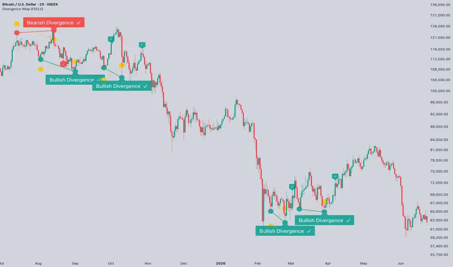
Divergence Map [FEELS]Price up, strength not.
Divergence Map marks every spot where price made a new high or low but the volume delta behind it didn't agree. Across the whole chart, not just the right edge.
OVERVIEW
Each divergence is drawn as a pair of crossing lines on the price pane: the line through the two price swings, and a second line whose opening reflects the volume delta behind those swings, widening in proportion to the strength gap so the disagreement is visible at a glance. A new high with weaker delta is marked at the top, a new low with weaker selling is marked at the bottom. Most divergence tools push a delta line into a separate panel and leave you to eyeball the slopes; this keeps the comparison on price, as one shape, for the whole chart.
HOW IT WORKS
1. Per-bar delta uses the standard bar-direction proxy: a bar closing up counts its volume as positive, a bar closing down as negative, a flat bar as zero. These are summed into a cumulative volume delta. Pine has no true tick order flow on historical bars, so this proxy is what the calculation is built on, and the logic is designed around its limits.
2. The cumulative delta is measured against its own recent trend (its value minus a moving average of itself), so divergences are read against recent flow rather than the all-time drift of a running total.
3. Swing highs and lows are found with a symmetric pivot of configurable length. A swing is used only once it is confirmed by that many closed bars on each side.
4. A top divergence is recorded when a confirmed swing high is above the previous swing high while the trend-adjusted delta at the new swing sits below its reading at the previous one. A bottom divergence is the mirror. The test compares the relative direction of delta between two swings rather than an absolute value, which is what lets it tolerate the proxy.
5. Strength is the size of that delta gap, scaled by its recent range and reported 0 to 100. A minimum-strength input hides weak readings.
6. Each divergence is then tracked for an outcome. By default it is scored from the bar it actually becomes visible (one swing length after the swing, since a swing cannot be known before then), and judged symmetrically from there: whichever comes first within the window, a reversal of the set size in its direction is a check, the same move against it is a cross. The size is taken from volatility by default (a multiple of ATR), so it scales with the timeframe; it can be switched to a fixed percent. An event also fails if price closes back through the swing that defined it. This removes the look-back head start, so the hit rate in the dashboard is descriptive of how these divergences have actually behaved, not a promise about the next one.
HOW TO USE
- Read the shape, not a number. Two lines opening apart at a top means price rose while delta did not; at a bottom, price fell while selling did not.
- The check or cross on each past event shows whether the expected reversal followed, so the chart carries its own record on the symbol and timeframe you are viewing.
- During a strong, clean trend the map stays mostly empty. That is expected: divergences appear at exhaustion, not inside a healthy trend.
- Raise minimum strength to keep only the clearer events. Swing length sets how major the marked swings are. Reversal percent and window define what counts as a resolved reversal. Turn off Remove swing lag to see the look-back figure instead of the real-time one.
PARAMETERS
- Swing length: bars per side to confirm a swing.
- Min strength: hides divergences below this 0 to 100 score.
- Delta smoothing and strength window: detrend the delta and scale the strength score.
- ATR reversal and Reversal ATR: size the reversal by volatility so the threshold scales with the timeframe (about 5% daily, around 15% weekly); turn off to use the fixed Reversal percent.
- Reversal percent and reversal window: the fixed-percent threshold and the bars allowed for a resolved reversal.
- Remove swing lag: scores each event from the bar it becomes visible and judges it symmetrically, giving a realistic hit rate instead of the look-back one.
- Labels, label and dot size, line width, colors, strength line on or off, mark hit on chart, dashboard position.
REPAINT NOTE
A swing is confirmed one swing length after it forms, which is how pivots work, and a divergence is recorded only on closed bars using that confirmed swing. Once a divergence and its lines are drawn they do not move, and the check or cross is added later on closed bars as the outcome settles. The only live element is the dashboard. No higher-timeframe or external data requests are used.
ORIGINALITY
This is original work and the source is open. It is not a wrapper around a built-in oscillator and it does not plot delta in a separate pane. The comparison is kept on the price pane as one crossing shape, applied across full history, with a built-in record of whether each marked divergence was followed by a reversal, scored from the bar it actually became visible. The honest treatment of the delta proxy, comparing relative slope rather than absolute flow, is part of the design.
Descriptive tool for studying divergence behaviour. It is not financial advice and does not predict price. Gösterge

Gösterge

Gösterge
Gösterge

Gösterge

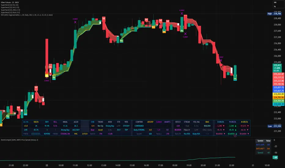
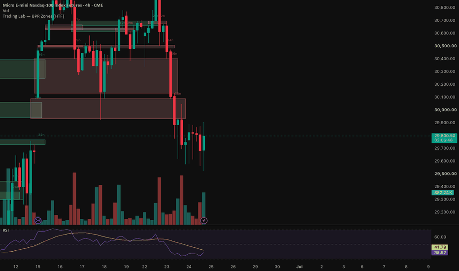
Order Flow System [v6]What it does overall
It's a separate panel indicator that sits below your price chart and tracks who is in control of the market — buyers or sellers — on every single bar using volume analysis and smart money concepts.
1. Buy/Sell Volume Estimation
Since Pine Script can't see actual tick data, it estimates which side was more aggressive on each bar. If price closed near the high, most volume was likely buying. If it closed near the low, most was selling. The formula splits the bar's total volume proportionally based on where price closed within the high/low range.
2. Bar Delta Histogram
The difference between estimated buy volume and sell volume on each bar. Green bars mean buyers were more aggressive, red bars mean sellers were. The taller the bar, the stronger the imbalance between the two sides.
3. Cumulative Delta (CVD)
It adds up every bar's delta over time into a running total. This line shows you the overall trend of buying vs selling pressure across the session. When CVD is rising, buyers are consistently in control. When it's falling, sellers are. The EMA of CVD acts as a signal line — when CVD crosses above it that's bullish, below is bearish.
4. Volume Imbalance
When buyers dominate more than 60% of a bar's volume the background flashes green. When sellers dominate more than 60% it flashes red. This highlights bars where one side completely overwhelmed the other.
5. Large Print Detection
When a bar's volume is significantly larger than the 20-bar average, it gets labeled. These are institutional-sized prints — someone placed a very large order. The label shows the volume size and whether it was net buying or selling.
6. Absorption Detection
This is one of the more powerful signals. It looks for situations where a large amount of selling is happening but price refuses to go down — or large buying but price won't go up. That means the opposing side is quietly absorbing all those orders, which often precedes a reversal.
7. SMT Divergence
Compares your chart's swing highs and lows against a correlated market like NQ vs ES. If ES makes a new low but NQ doesn't confirm it, smart money likely didn't participate in that move — signaling the low may be fake and a reversal is coming. Same logic in reverse for highs. A dashed line connects the two swing points and a label marks the signal.
8. Dashboard Table
A live readout in the top right corner showing Bar Delta, Cumulative Delta, Buy%, Sell%, Volume, CVD Signal, SMT Signal, and which symbol it's comparing against. All colors are fully customizable in the settings.
9. Alerts
Ten alert conditions covering every major signal — large prints, imbalance, absorption, CVD crossovers, and both SMT directions — so you can get notified without watching the screen. Gösterge

VWAP Acceptance Flow PRO
VWAP Acceptance Flow PRO
VWAP Acceptance Flow PRO is a multi-timeframe flow oscillator designed to measure market acceptance around a rolling VWAP. Instead of tracking price alone, the indicator evaluates whether the market is accepting or rejecting value and combines this information into a clean flow model optimized for fast-moving markets such as NASDAQ.
The indicator provides a real-time view of short-term flow, higher-timeframe alignment, momentum shifts, pullbacks, and re-acceptance signals.
CORE CONCEPT
Markets constantly move between two states:
• Acceptance → price is accepted above or below fair value.
• Rejection → price fails to hold value and rotates back.
VWAP Acceptance Flow PRO quantifies this process by combining:
1. Distance from VWAP
2. Velocity of VWAP displacement
3. Acceptance duration
4. VWAP slope
The result is a normalized flow engine that visualizes whether buyers or sellers are gaining control.
COMPONENTS
Chart Flow
The fastest flow line.
Measures current market pressure and reacts quickly to shifts in acceptance.
• Above zero = bullish acceptance
• Below zero = bearish acceptance
• Rising = increasing momentum
• Falling = weakening momentum
X5 Flow
Intermediate flow filter.
Represents the dominant short-term trend and helps remove noise from the Chart Flow.
• Above zero = bullish environment
• Below zero = bearish environment
X15 Flow
Institutional flow filter.
Represents the broader market bias.
This is the slowest and most stable component of the system.
• Positive = higher-timeframe buyers in control
• Negative = higher-timeframe sellers in control
ACCEPTANCE HISTOGRAM
The histogram displays:
Chart Flow − X5 Flow
This measures short-term acceleration relative to the dominant trend.
Green Histogram
• Bullish acceleration
• Momentum expanding
• Buyers gaining control
Red Histogram
• Bearish acceleration
• Momentum weakening
• Sellers gaining control
DYNAMIC ACCEPTANCE BANDS
The upper and lower bands are calculated from the average absolute flow value.
They adapt automatically to market volatility.
Inside Bands
• Normal market activity
Outside Bands
• Extreme acceptance conditions
• Trend extension
• Potential exhaustion
• Possible mean reversion
PULLBACK RADAR
The background highlights pullback opportunities inside strong trends.
Yellow Background
Bullish pullback.
Conditions:
• X15 Flow > 0
• X5 Flow > 0
• Chart Flow < 0
The larger trend remains bullish while short-term flow temporarily weakens.
Purple Background
Bearish pullback.
Conditions:
• X15 Flow < 0
• X5 Flow < 0
• Chart Flow > 0
The larger trend remains bearish while short-term flow temporarily rebounds.
RE-ACCEPTANCE SIGNALS
Signals occur when Chart Flow crosses X5 Flow.
Long Signal
Condition:
• Chart Flow crosses above X5 Flow
Interpretation:
Short-term acceptance is returning in favor of buyers.
Short Signal
Condition:
• Chart Flow crosses below X5 Flow
Interpretation:
Short-term acceptance is returning in favor of sellers.
These signals are designed to identify re-entry opportunities after pullbacks and consolidations.
FLOW SCORE
The Flow Score measures directional alignment across all three flow layers.
Range: -3 to +3
+3
• Strong bullish alignment
• All flow lines above zero
+2
• Bullish bias
+1
• Weak bullish bias
0
• Neutral market
-1
• Weak bearish bias
-2
• Bearish bias
-3
• Strong bearish alignment
• All flow lines below zero
ACCEPTANCE SCORE
The Acceptance Score measures the overall strength of market participation.
Range: 0–100
Low Values
• Weak conviction
• Choppy conditions
• Poor acceptance
High Values
• Strong conviction
• Trend continuation environment
• High-quality directional movement
The Acceptance Score can be used as a confidence filter for trade selection.
TRADING IDEAS
Trend Following
Look for:
• X15 Flow above zero
• X5 Flow above zero
• Flow Score = +2 or +3
Use bullish pullbacks and long re-acceptance signals as entry opportunities.
Short Selling
Look for:
• X15 Flow below zero
• X5 Flow below zero
• Flow Score = -2 or -3
Use bearish pullbacks and short re-acceptance signals as entry opportunities.
Momentum Expansion
Strong momentum often occurs when:
• Histogram expands rapidly
• Acceptance Score rises
• Flow Score reaches extreme alignment
This combination frequently appears during trend continuation phases.
BEST MARKETS
• NASDAQ
• Index Futures
• High-Volume Stocks
• ETFs
• Cryptocurrency Markets
Recommended Timeframes:
• 1 Minute
• 2 Minute
• 5 Minute
• 15 Minute
SUMMARY
VWAP Acceptance Flow PRO transforms VWAP behavior into a complete market-flow model. By combining acceptance, momentum, trend alignment, pullback detection, and re-acceptance signals, it helps traders identify when markets are building conviction and when higher-probability trend opportunities are emerging. Gösterge

Miggoy's regime overlayA market-regime dashboard that scores the overall environment for swing trading and colors your chart background green, yellow, or red so you can tell at a glance whether conditions favor putting on risk.
The script grades three independent conditions, each worth one point:
1 · Price Structure — SPY stacked above its 10 EMA, with the 10 EMA above the 20 EMA. Confirms a clean short-term uptrend with price leading.
2 · Net 52-Week Highs minus Lows — More new highs than new lows across the market. A positive read means broad participation rather than a narrow rally.
3 · Volatility — Fear draining out of the tape, defined as VIX below its 20 EMA, and the 20 EMA below the 50 EMA (50 > 20 EMA > VIX). Signals a calm, trending environment rather than a spiking, defensive one.
Regime scoring
3 / 3 → GREEN — Full risk per trade, full aggression.
2 / 3 → YELLOW — Half risk, best setups only.
0–1 / 3 → RED — List building, no trades.
The chart background tints to match the regime, and a table summarizes each condition with a pass/fail check, the underlying values, and the suggested action. A "days in regime" counter tracks how long the current state has held.
Notes
All conditions are calculated on the daily timeframe regardless of your chart's timeframe, so the regime read stays consistent whether you're looking at a daily or an intraday chart.
Calculations use confirmed daily data with no lookahead, so the indicator does not repaint.
The high/low inputs default to YRHI.US and YRLO.US (52-week new highs and new lows). Adjust the symbols in settings if your data provider uses different tickers.
Alerts are included for each regime transition (green, yellow, red).
This is a decision-support tool for gauging market conditions, not a buy/sell signal generator. It tells you whether the environment supports trading, not what to trade. Gösterge

RSI Divergence (Bull/Bear) RSI Divergence (Bull/Bear) is an advanced momentum analysis indicator that automatically detects bullish and bearish RSI divergence between price action and the Relative Strength Index (RSI). These divergence signals can help traders identify potential market reversals, trend exhaustion, and high-probability trading opportunities across multiple financial markets.
The indicator continuously analyzes swing highs and swing lows in both price and RSI, highlighting areas where momentum no longer confirms the current price movement. These conditions often appear before significant trend reversals or corrective moves.
Features
• Automatic Bullish RSI Divergence Detection
• Automatic Bearish RSI Divergence Detection
• Swing High & Swing Low Analysis
• Visual Buy & Sell Signal Labels
• Divergence Confirmation Zones
• Optional RSI Sensitivity Settings
• Clean & Lightweight Chart Layout
• Multi-Timeframe Compatible
• Non-Repainting Divergence Detection
• Customizable Signal Display
How It Works
The indicator monitors price swings alongside RSI momentum.
When price forms a **Lower Low** while RSI forms a **Higher Low**, a **Bullish Divergence** is detected, suggesting weakening selling pressure and a possible bullish reversal.
When price forms a **Higher High** while RSI forms a **Lower High**, a **Bearish Divergence** is detected, indicating weakening buying momentum and a potential bearish reversal Signals are displayed directly on the chart, allowing traders to quickly identify possible turning points.
Signal Types
🟢 Bullish Divergence
• Price makes a Lower Low
• RSI makes a Higher Low
• Possible bullish reversal
• Momentum strengthening
🔴 Bearish Divergence
• Price makes a Higher High
• RSI makes a Lower High
• Possible bearish reversal
• Momentum weakening
Best Markets
• Forex • Gold (XAUUSD) • Silver (XAGUSD)
• Crypto • Indices • Stocks • Futures
Recommended Timeframes
Scalping • M5 • M15
Intraday • M30 • H1
Swing Trading • H4 • Daily
Indicator Highlights
• Automatic RSI Divergence Detection
• Early Reversal Identification
• Visual Buy & Sell Signals
• High-Probability Momentum Analysis
• Non-Repainting Logic
• Adjustable RSI Parameters
• Beginner Friendly
• Professional Trading Tool
• Works in Trending and Ranging Markets
Suggested Trading Workflow
1. Identify the overall market trend.
2. Wait for a Bullish or Bearish RSI Divergence signal.
3. Confirm the setup using market structure, support/resistance, or candlestick confirmation.
4. Enter the trade with proper risk management and position sizing.
Notes
This indicator is designed to assist traders in identifying potential momentum shifts through RSI divergence analysis. It should be used alongside market structure, price action, and sound risk management principles. Like all technical analysis tools, it does not predict future price movements or guarantee profitable trades. Gösterge

Gösterge

Speculation/Caution Ratio█ OVERVIEW
Speculation/Caution Ratio (NDX/DJU, raw) plots the Nasdaq-100 divided by the Dow Jones Utility Average as an absolute level in a separate pane, with reference lines at documented historical milestones and a label showing the current ratio. It is the long-history companion to the detrended sector z-score. It deliberately preserves the non-stationary level so that the full record from 1985 to the present, including the 2000 peak, is visible on a single pane.
█ HISTORY / BACKGROUND
The ratio of the Nasdaq-100 to the Dow Jones Utility Average as a speculation-versus-caution gauge is associated with Robert Prechter and Elliott Wave International. The reasoning is that the Nasdaq-100 represents high-beta, long-duration growth, standing in for speculation, while the Dow Jones Utility Average, a price-weighted average of fifteen utilities, represents low-beta, yield-driven caution. Observed levels include approximate parity in the 1980s, roughly 15 to 1 at the March 2000 peak, a decline toward 3 to 1 across the post-2000 decade, and a higher reading in the 2020s. These are descriptive observations of where the ratio has traded, not signals.
█ HOW IT WORKS
• Both legs are requested with request.security at the chart resolution using closing values.
• The ratio is the numerator close divided by the denominator close, computed only when both legs are present and positive.
• An optional simple moving average smooths the ratio when the smoothing length is greater than 1. At the default of 1, the raw ratio is plotted.
• Horizontal reference lines are drawn at 1, 3, and 15, corresponding to the historical levels described above.
• On the last bar, a label prints the current ratio to one decimal place.
█ HOW TO USE
Read the line as the prevailing balance of offensive versus defensive leadership. A rising ratio indicates speculation outpacing caution; a falling ratio indicates the reverse. The reference lines provide historical context: proximity to the 15 line recalls the 2000 peak, the 1 line marks historical parity, and the 3 line marks the post-2000 trough.
Recommended timeframe is weekly or monthly for the secular view. Note that the level is not comparable across decades; see Notes. For a calibrated, cross-era reading, use the companion z-score script.
Visual elements: the ratio line is teal. The 1 and 3 references are gray, dashed and dotted respectively, and the 15 reference is orange dashed. The last-bar label shows the live value.
█ SETTINGS
• Speculation leg (numerator): default NASDAQ:NDX (Nasdaq-100).
• Caution leg (denominator): default DJ:DJU (Dow Jones Utility Average). If it does not load, try TVC:DJU.
• Smoothing (SMA, bars): 1 plots the raw ratio; higher values reduce visual noise. Default 1, minimum 1.
• Show historical reference levels: toggles the 1, 3, and 15 lines. Default on.
• Label current ratio: toggles the last-bar value label. Default on.
█ WHAT MAKES IT ORIGINAL
This is a faithful implementation of a known public construct rather than a new method, and it is published open. Its contribution is framing and disclosure. It pairs the raw ratio with documented historical reference levels and an explicit statement of the level's non-stationarity, and it is built as the deep-history half of a two-part pairing whose other half supplies the calibrated, detrended reading. The value it adds is the long, uninterrupted record that cap-weighted, sector-clean pairs cannot reach on this platform.
█ NOTES / LIMITATIONS
• Non-stationary level. The ratio drifts upward over decades because of index composition changes, divergent sector earnings growth, and the interest-rate cycle. Absolute levels are not comparable across eras, and a new high does not by itself establish a new sentiment extreme. Use the companion z-score for a comparable reading.
• Construction mismatch. The numerator is a modified cap-weighted index; the denominator is a price-weighted average of fifteen stocks. The two are not built on the same basis, which is part of why the level is not a clean sentiment measure.
• Symbol availability. The Dow Jones Utility Average symbol convention varies by data feed. If DJ:DJU returns na, substitute TVC:DJU. The Nasdaq-100 numerator requires history from 1985 for the full record.
• Real-time behavior. Confirmed historical values do not repaint. The current bar updates while it is open and settles on close. No lookahead is requested.
• Chart symbol. Output depends only on the two leg inputs. The chart's own symbol does not affect the calculation.
• Reference lines are descriptive context, not buy or sell signals. Gösterge

Gösterge
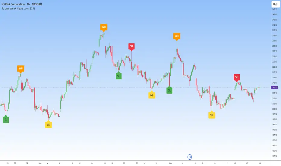
Strong Weak Highs Lowsstrong Weak Highs & Lows is a market structure indicator that automatically classifies swing points based on price behavior and trend context. Instead of simply plotting highs and lows, it helps traders distinguish between levels that are likely to hold and levels that are more vulnerable to being broken.
The indicator identifies:
* **WH (Weak High)**
* **SH (Strong High)**
* **WL (Weak Low)**
* **SL (Strong Low)**
This provides a clearer view of liquidity, market intent, and potential breakout targets.
Understanding the Labels
Weak High (WH)
A Weak High is a swing high that has a higher probability of being broken in the future.
Characteristics:
* Usually forms during bullish market conditions.
* Indicates buyers remain in control.
* Often becomes a future liquidity target.
Strong High (SH)
A Strong High is a swing high that successfully rejects price and is more likely to hold.
Characteristics:
* Often forms during bearish conditions.
* Indicates seller presence.
* Acts as a potential resistance level.
Weak Low (WL)
A Weak Low is a swing low that has a higher probability of being broken.
Characteristics:
* Common during bearish trends.
* Indicates continued downside pressure.
* Frequently becomes a liquidity target.
Strong Low (SL)
A Strong Low is a swing low that successfully defends against further selling.
Characteristics:
* Often forms during bullish conditions.
* Indicates buyer strength.
* Acts as potential support.
What the Chart Demonstrates
Using the NVIDIA (NVDA) 1H chart:
📈 During bullish phases, the indicator identified multiple **Weak Highs (WH)** while marking **Strong Lows (SL)** beneath price, highlighting continued buyer dominance.
📉 As momentum weakened, **Strong Highs (SH)** began appearing near market turning points, signaling increasing seller control.
🎯 Weak levels often became natural liquidity targets before price reversed or continued its trend.
🔄 The ongoing alternation between strong and weak swing points provides valuable context for anticipating future market structure developments.
Why This Matters
Many traders focus solely on where highs and lows are located.
Professional price action analysis also considers:
* Which highs are likely to be broken
* Which lows are likely to hold
* Where liquidity is resting
* Where stop orders may be clustered
* Which side currently controls market structure
Strong Weak Highs & Lows helps visualize these concepts automatically.
Features
✔ Automatic swing detection
✔ Strong vs Weak classification
✔ Liquidity target identification
✔ Market structure context
✔ Clean chart visualization
✔ Non-repainting swing confirmation
✔ Multi-timeframe support
✔ Suitable for Smart Money Concepts (SMC)
How to Use
Bullish Environment
* Focus on Strong Lows (SL).
* Expect Weak Highs (WH) to be targeted and potentially broken.
* Look for continuation opportunities after pullbacks.
Bearish Environment
* Focus on Strong Highs (SH).
* Expect Weak Lows (WL) to be targeted and potentially broken.
* Look for selling opportunities during retracements.
Liquidity Analysis
* Weak highs and weak lows often act as future liquidity magnets.
* Use them as potential target zones for trend continuation trades.
Best Applications
* Market Structure Trading
* Smart Money Concepts (SMC)
* Liquidity Analysis
* Swing Trading
* Trend Following
* Intraday Trading
* Higher Timeframe Confirmation
Notes
Strong and Weak classifications are based on market structure behavior and are not direct buy or sell signals. The indicator is designed to help traders understand the strength behind swing points and improve decision-making around support, resistance, and liquidity.
For best results, combine with:
* Break of Structure (BOS)
* Change of Character (CHoCH)
* Supply & Demand Zones
* Risk Management Rules
Strong Weak Highs & Lows transforms ordinary swing analysis into actionable market structure insight by identifying which levels are likely to hold and which levels are likely to become future liquidity targets. Gösterge

Gösterge

Elliott Wave AnalysisElliott Wave Analysis Indicator for TradingView
A comprehensive Pine Script indicator that helps identify and label Elliott Wave patterns with full customization.
Features:
Wave Patterns (toggle on/off)
Impulse Waves (1-2-3-4-5)
Corrections (A-B-C)
Flats (3-3-5 structure)
Zigzags (5-3-5 structure)
Triangles, Flags, Wedges (a-b-c-d-e)
Wave Degrees (15 hierarchical levels - toggle individually)
Supermillennium → Miniscule
Proper numbering for each degree (Roman numerals, Arabic numerals, circled numbers, etc.)
Technical Tools
Trend Channels: Auto-detects and draws upper/lower channels
Fibonacci Retracement: 0%, 23.6%, 38.2%, 50%, 61.8%, 78.6%, 100%
Fibonacci Extension: 127.2%, 161.8%, 200%, 261.8%
Visual Design
White color only (no distractions)
Clean, professional appearance
Fully optional inputs—show only what you need
How It Works:
Customize via indicator settings to toggle wave patterns, degrees, channels, and Fibonacci levels on/off. Adapt the indicator to match your Elliott Wave analysis timeframe and trading style. Gösterge

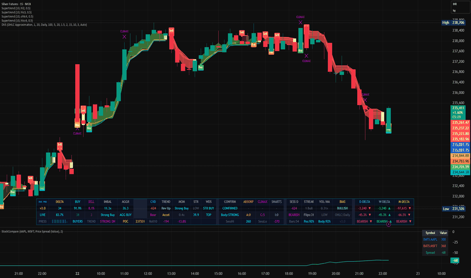
STX Intraday - War Room v2 STX Intraday — War Room
El panel de la sala de mercados STX Desk, en tu gráfico de XAUUSD.
War Room es la herramienta de análisis intradía que usa el equipo STX Desk para leer el oro en tiempo real. Reúne en un solo panel
todo el contexto de una operación —bias, estructura, zonas y gatillo de entrada— para que veas cómo se construye una decisión, paso
a paso, igual que en la sala.
¿Qué muestra?
- Bias multi-temporal. Lee la dirección en H4, H1 y M15 a la vez y resume el sesgo dominante del día.
- Zonas OTE + Fibonacci. Marca la zona de entrada óptima (0.618–0.786) y proyecta los objetivos por extensión (1.618 / 2.0 / 2.618)
con buffer de broker.
- Detección de estructura. Pivotes, doble techo / doble suelo y barridos de liquidez (ICT) sobre el rango reciente.
- Order Block M15. Identifica el bloque de origen tras un desplazamiento con cuerpo dominante.
- Sniper M5 / M1. Afina el gatillo de entrada con confirmaciones y mecha de rechazo mínimas.
- Panel «MARKET STATE». Un tablero que resume el estado del mercado y los niveles activos (PDH, PDL, Asian High, entrada OTE).
- Plan de operación completo. Cada lectura se expresa con entrada, invalidación (SL por ATR) y TP1/TP2/TP3 — un plan, no una flecha
suelta.
Para quién
Para el trader que ya domina las bases y quiere operar el oro con el mismo marco que la sala STX Desk. Es el corazón del programa
Pro.
▎ Herramienta de apoyo a la decisión y estudio; no constituye recomendación de inversión ni garantiza resultados. El trading
▎ implica riesgo de pérdida de capital. Gösterge
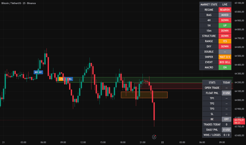
Index Breadth % Above Key Moving AveragesDescription:
This indicator measures the percentage of constituents in a selected index trading above a chosen moving average — a core read on market breadth and internal market health, beyond what price action on the index itself reveals.
What it does
Rather than calculating breadth from individual constituents (which runs into symbol-count limitations), this script pulls pre-aggregated breadth data feeds covering the S&P 500 (including 10 individual sectors), Nasdaq, Nasdaq 100, Dow Jones, Russell 2000/3000, and the broader market. You can select any of these markets and check the percentage above the 20, 50, 100, 150, or 200-day moving average.
Breadth Moving Average (new)
A configurable moving average of the breadth line itself has been added, with a choice of SMA, EMA, WMA, or HMA. This lets you track breadth momentum rather than just the absolute reading — a cross above the MA after a period of depressed breadth often precedes broader market expansion, while a cross below can flag internal deterioration before it shows up in price.
Features
-Selectable market and moving average length
-Configurable Greed/Fear zone thresholds with visual fill highlighting
-Breadth MA with four smoothing options
-Crossover markers (triangles) flagging momentum shifts
-Built-in alerts for MA crossovers and Greed/Fear zone entries
How to use it
Watch for breadth crossing above its own moving average while still in or near the Fear zone — this combination has historically flagged durable turns rather than short-lived bounces. Conversely, breadth crossing below its MA while elevated can warn of distribution before the index itself rolls over. Cross-referencing breadth across multiple indices (e.g., S&P 500 vs. Nasdaq 100) helps identify whether market strength is broad-based or concentrated in a handful of names.
Credit
Original breadth data implementation by Esti0000. This version adds the breadth moving average, crossover detection, alert conditions, and visual enhancements. Published under the same Mozilla Public License 2.0. Gösterge

Gösterge

Gösterge

Gösterge
Gösterge

Gösterge