Cyclical Peak Macro Composite█ OVERVIEW
Cyclical Peak Macro Composite is a macro and valuation signal panel that tracks a set of independent conditions historically associated with late-cycle equity market peaks and reports the share of them that are currently active. It plots in a separate pane as a single column series, % Triggered , the percent of counting signals that meet their trigger condition, alongside a status table that summarizes each individual signal.
In one sentence: when a majority of independent macro, credit, and valuation conditions seen near prior market peaks are simultaneously active, the late-cycle environment is more elevated than when few of them are.
█ HISTORY / BACKGROUND
The practice of monitoring a fixed panel of macro, valuation, credit, and sentiment signposts for equity market peaks comes from sell-side equity strategy research, which publishes periodic checklists scoring how many of a set of conditions are active relative to prior peaks. This script implements only the subset of such a checklist whose inputs exist as data on TradingView, substitutes documented proxies where the original series are proprietary, and omits the signals that have no public feed and no faithful proxy rather than approximating them with unrelated data.
The component methods have established lineage:
• Term spread. The difference between a long and a short Treasury yield is a standard cycle reference. A negative 10Y minus 2Y spread, an inverted curve, has been present ahead of prior downturns.
• Rule of 20. A long standing market heuristic that sums the trailing price to earnings ratio and the year over year inflation rate, treating a value near 20 as a fair value reference and higher readings as richer valuation.
• High yield option adjusted spread. The ICE BofA US High Yield index OAS, distributed through FRED, is a widely used gauge of credit risk pricing. Unusually tight spreads are read here as complacency, not stress.
• Senior Loan Officer Opinion Survey (SLOOS). The Federal Reserve survey of bank lending standards. A positive net reading indicates tightening credit availability.
• Consumer sentiment. The University of Michigan survey, used as an optional proxy for a different consumer confidence series in the original checklist.
The conceptual basis is that these conditions tend to cluster near cyclical peaks, so counting how many are active gives a coarse read on where the cycle sits. The specific composite arrangement is third party research; this script is an independent reconstruction of its available subset.
█ HOW IT WORKS
The script reads external macro series through request.security and does not use the chart symbol's price in any calculation, so its output is identical on any chart and depends only on the chart timeframe. Every lookback is specified in months and converted to a bar count for the active resolution by round(months times seconds per month divided by seconds per bar), clamped between 1 and 5000 bars, so each window holds its intended calendar duration across resolutions.
It evaluates up to six signals:
• Yield curve inversion. Requests the 10Y and 2Y yield symbols at the chart timeframe and takes their spread. Active if the spread was below zero at any point within the latch window, tested with a rolling maximum of the inverted condition.
• Credit complacency. Requests the high yield OAS series. Active if the spread was below the tight spread threshold at any point within the latch window. The direction is deliberate: a low spread is the peak signal.
• Rule of 20. Computes the year over year change of monthly CPI and adds it to a trailing P/E value, which is a manual input by default or a symbol sourced value if enabled. It then takes a rolling z-score of that sum over the z-score lookback and is active when the z-score exceeds its trigger.
• Value versus growth. Requests a value proxy and a growth proxy at the chart timeframe and computes the difference of their returns over the return window, in percentage points. Active when the value proxy trails the growth proxy by more than the underperformance trigger.
• SLOOS net tightening. Requests the SLOOS series at a quarterly resolution. Active when the net reading is above zero. Counts only when included and when its data resolves.
• Consumer sentiment (optional). Takes a rolling z-score of the sentiment series over the z-score lookback and is active when it exceeds the sentiment trigger. Counts only when enabled and when its data resolves.
The denominator is dynamic. Four core signals always count, plus SLOOS when active, plus sentiment when active. % Triggered is 100 times the number of active triggers divided by the number of counting signals. Any series whose data does not resolve returns na and is excluded from both numerator and denominator rather than scored as off.
█ HOW TO USE
Add the script to any chart. The chart symbol is irrelevant because all inputs are requested macro series. Read the column height as the percent of counting signals currently triggered. The dashed line marks the composite alert threshold and the dotted line marks the 50 percent midline. The column is gray below 50, orange at or above 50, and red at or above the alert threshold.
The status table in the top right lists each signal with a state of ON, off, or n/a. ON is shown in red because in this context an active signal is a late-cycle condition rather than a healthy one, off is green, and n/a means the signal is disabled or its data did not resolve and it is not counting. The header cell repeats the current percent.
Recommended timeframe: the script is built for the daily resolution and higher, and is cleanest on monthly. CPI, SLOOS, and sentiment are requested at monthly or quarterly resolution and mapped onto the chart's bars, so on a monthly chart one bar corresponds to one source observation and the z-score statistics are exact. On intraday resolutions the month to bar conversion saturates at the 5000 bar clamp and the windows no longer span the intended number of months, so intraday use is not advised.
The diagnostic series, namely the spread, the OAS, the Rule of 20 level and z-score, the SLOOS reading, the value minus growth return, and the sentiment z-score, are not drawn on the pane. They are available in the Data Window for inspection.
█ SETTINGS
Yield Curve
• 10Y yield symbol: long rate symbol for the term spread. Default US10Y.
• 2Y yield symbol: short rate symbol. Default US02Y.
Credit (HY OAS complacency)
• HY OAS symbol: the high yield option adjusted spread series. Default FRED:BAMLH0A0HYM2.
• Tight spread threshold (%): the level below which the spread is treated as complacent. Default 3.5.
Rule of 20 (P/E + CPI YoY)
• Trailing S&P 500 P/E: the manual trailing P/E used when the symbol feed is off. Default 22.
• Feed P/E from a symbol: when on, sources the P/E from a symbol instead of the manual value. Default off.
• P/E symbol (trailing): the symbol used when the feed is enabled. Default SP:SPX.
• Z-score lookback (months): the window for the Rule of 20 and sentiment z-scores. Default 120, minimum 12.
• Z-score trigger (>): the Rule of 20 z-score level that activates the signal. Default 1.
Value / Growth (low-PE vs high-PE proxy)
• Value proxy symbol: the value style proxy. Default AMEX:SPYV.
• Growth proxy symbol: the growth style proxy. Default AMEX:SPYG.
• Return window (months): lookback for the relative return. Default 6, minimum 1.
• Underperformance trigger (pp): how far the value proxy must trail the growth proxy to activate. Default 2.5.
SLOOS (bank lending)
• Include SLOOS: whether the SLOOS signal counts. Default on.
• SLOOS net tightening symbol: the lending standards series. Default FRED:DRTSCILM.
Consumer sentiment (optional, low fidelity)
• Include sentiment proxy: whether the sentiment signal counts. Default off.
• Sentiment symbol: the sentiment series. Default FRED:UMCSENT.
• Sentiment z-score trigger (>): the z-score level that activates the signal. Default 1.
Composite
• Latch window for prior signals (months): the lookback over which the yield curve and credit signals count as active if their condition occurred at any point inside it. Default 6, minimum 1.
• Composite alert threshold (%): the percent at which the alert condition and red coloring engage. Default 70.
█ WHAT MAKES IT ORIGINAL
This is not a wrapper around other indicators and reuses no third party signal code. It computes each condition directly from primary macro and valuation series and combines them with three specific design choices:
• Honest scope. It implements only the checklist signals that have real TradingView data, omits the proprietary and unavailable ones outright, and labels the two proxies it uses as proxies. The value and growth style spread stands in for a low P/E versus high P/E basket, and the optional University of Michigan z-score stands in for a different consumer confidence index. The percent reading is therefore not comparable to the source checklist's percent, which is computed over a larger set of signals.
• Deliberate credit direction. The credit signal fires on tight spreads, not wide ones, because the underlying idea is complacency near a peak rather than stress. This inverts the intuitive reading and is stated rather than hidden.
• Calendar anchored windows and graceful degradation. Every lookback is expressed in months and converted to bars for the current resolution, so latch and z-score windows keep their duration across timeframes, and any series that fails to resolve drops out of the denominator instead of being scored as off.
█ NOTES / LIMITATIONS
• Symbol independent. The composite ignores the chart symbol entirely. Every input is requested through request.security , so changing the chart instrument does not change the output. Only the chart timeframe matters.
• Timeframe sensitivity. Built for daily and higher, best on monthly. On intraday resolutions the month to bar conversion is clamped at 5000 bars and the windows no longer span the intended months, so the latch and z-score logic are not valid intraday.
• Data availability. The macro series depend on TradingView's data catalog and on your data access. SLOOS is quarterly, heavily lagged, and may not resolve in the FRED catalog. The OAS, CPI, and sentiment series are likewise subject to availability. Unresolved series return na and are excluded. The value and growth proxy symbols use an exchange prefix that may need changing to match your data.
• Insufficient history. The z-scores require their full lookback of observations before they return a value. Until then the Rule of 20 and sentiment signals are na and do not count. The value versus growth signal requires history at least as long as its return window on both proxies, otherwise it returns na.
• Economic data revisions. CPI, SLOOS, and sentiment are released with a lag and can be revised, so the most recent readings may change as the source updates. No bar level lookahead is used. The requests run with default settings and the latch references only historical values.
• Static manual P/E. If the trailing P/E is left as a manual constant, the Rule of 20 z-score reduces to a z-score of inflation plus a constant, since the only varying term is CPI. Enabling a symbol sourced trailing P/E restores the intended behavior.
• Correlated signals. These macro and valuation conditions tend to move together late in a cycle, so the percent reading reflects fewer independent pieces of information than the raw signal count suggests. Gösterge

Gösterge

Gösterge
Gösterge

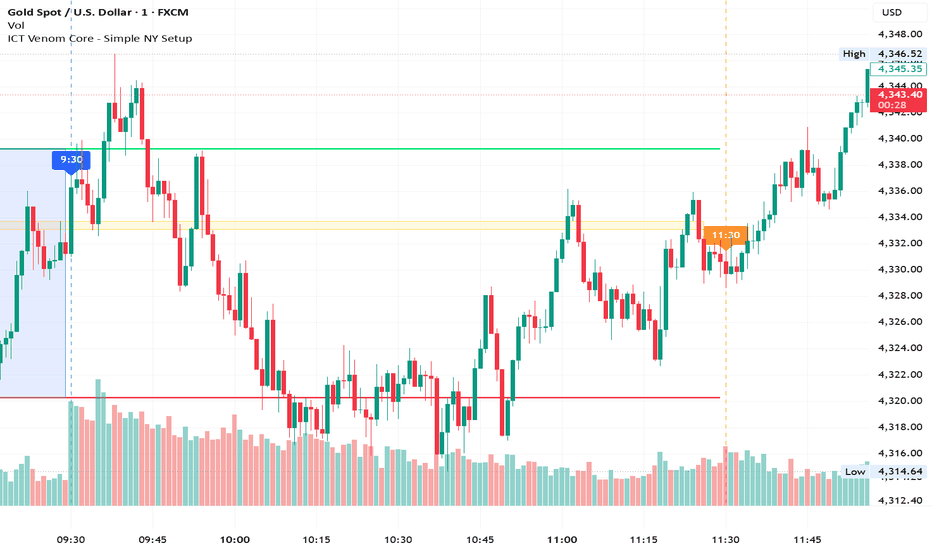
Selling Volume Spike Alert [Ale]VS Alert — Selling Volume Spike Alert
This is the mirror image: it watches for unusually large bursts of selling volume.
It uses the same structure but flips the subject. It defines a bearish bar as close < open and treats that bar's volume as selling volume. In its pane the selling volume points up (red columns) as the protagonist, with buying volume pointing down (teal). The same 20-period volume MA is the baseline.
The spike math is identical — selling volume divided by the average gives the spike ratio, tagged ALTO at 2x and EXTREMO at 3x, with the same threshold lines and shaded band. Spikes recolor the bar, drop a 💧 or 🔻 label at the top, and tint the background. The info table (top-right) mirrors the buying version: current volume, MA, spike ratio, delta, and state. Alerts and alertcondition() hooks fire on high/extreme selling volume, with distinct names so they don't collide with the buying indicator's alerts. The read here is the opposite: big selling spike = potential bearish pressure / distribution or de-risking.
How to read them together: an extreme spike on BVS with nothing on SVS is clean buying; the reverse is clean selling pressure; simultaneous spikes on both panes suggest a climax or absorption event — worth caution since those often precede reversals. Gösterge

Gösterge

Smart Market Dashboard PRO Gap Trader EditionA comprehensive intraday dashboard designed specifically for Borsa Istanbul (BIST) equity traders. This indicator focuses on opening gap analysis, combining volume, delta, and price action to help traders make informed decisions at market open.
Key Features:
Gap Detection & Classification – Automatically identifies and labels opening gaps (Full Gap Up/Down, Partial Gap Up/Down) with configurable minimum gap % threshold
Volume & Delta Analysis – Displays real-time cumulative delta, buy/sell volume ratio, and VWAP deviation
Multi-Timeframe Data – Fetches previous day’s OHLCV data to calculate gap reference levels accurately
Visual Dashboard – A clean on-chart table showing key metrics: gap size, volume trend, delta direction, and gap fill probability
Smart Alerts – Configurable alerts for gap setups, gap fill events, and volume anomalies
How It Works:
Gap levels are calculated using End-of-Day (previous session close) as the reference price
All calculations are based on confirmed bar data (barmerge.lookahead_off) to prevent repainting on historical bars
Recommended Usage:
Timeframe: 1–15 minute charts
Market: BIST stocks (optimized for Turkish market open at 10:00 AM)
Works best during the first 30–60 minutes of the trading session
Disclaimer: This indicator is for educational and informational purposes only. It does not constitute financial advice. Always manage your risk accordingly.
Note: As with all intraday indicators, values may update within the current live bar until it closes Gösterge

Delta Volume Profile ProDelta Volume Profile Pro is a volume profile indicator built upon the quadrant structure originally introduced by BigBeluga in the Quadro Volume Profile script. Full credit for the original concept and core logic goes to BigBeluga.
🔍 What it does
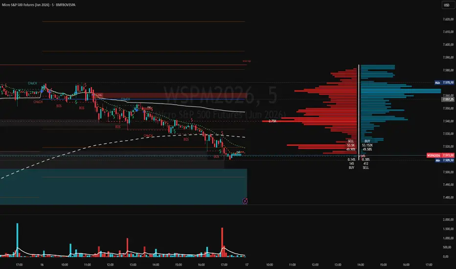
This indicator divides the visible price range into four quadrants relative to the current price and distributes volume across price bins, revealing where the most significant buying and selling activity has occurred above and below the market.
Each quadrant displays:
Upper Sell Quad — sell volume concentrated above the current price
Upper Buy Quad — buy volume concentrated above the current price
Lower Buy Quad — buy volume concentrated below the current price
Lower Sell Quad — sell volume concentrated below the current price
A Point of Control (PoC) dashed line marks the price bin with the highest volume in each quadrant.
Four percentage labels at the current price level show how total volume is distributed across all quadrants, allowing traders to quickly assess the balance between buying and selling pressure on both sides of the market.
⚙️ Original additions over BigBeluga's base
1. Proxy Volume Engine — works on any broker
Many brokers and CFD platforms do not provide usable native volume data. This indicator includes an internal map of 80+ symbols to their most liquid equivalents:
Forex pairs → (tick volume, CFD-compatible scale)
Metals (Gold, Silver, Platinum)
Crypto (BTC, ETH, etc.)
Oil, Gas →
Indices & Futures
The proxy is fetched automatically via request.security. You do not need to change any settings when switching between brokers — the indicator detects the symbol and loads the appropriate volume source.
2. Proxy-First Priority
Unlike a simple fallback system, this indicator uses the proxy as the primary volume source for all mapped symbols. This guarantees consistent, real volume data regardless of the broker you are charting on — whether EasyMarkets, FXCM, or any CFD provider. The native volume is only used if the proxy fails or if you explicitly enable "Force Native Volume" in settings.
3. Daily Session Mode
When enabled, the profile anchors to the start of the current daily session and resets automatically at each new day — useful for intraday traders who want to see only today's volume distribution.
4. Daily VWAP Anchor
An optional Volume Weighted Average Price line anchored to the daily session open, calculated using the same proxy volume logic as the profile for accuracy across all brokers.
📐 How to read the indicator
Profile bars (left and right of the vertical axis):
Left side bars = dominant directional volume per price bin
Right side bars = opposing volume per price bin
Deeper color = higher volume concentration at that price level
Longer bars = more activity at that price — key support/resistance zones
The four labels at current price:
SELL% | BUY%
SELL | BUY
──────────────────── ← current price
BUY% | BUY%
BUY | SELL
Upper left (SELL%) — percentage of total volume that was selling above current price
Upper right (BUY%) — percentage of total volume that was buying above current price
Lower left (BUY%) — percentage of total volume that was buying below current price
Lower right (SELL%) — percentage of total volume that was selling below current price
Point of Control (PoC) — dashed line:
Marks the single price level with the highest volume in each quadrant
Strong reference for support and resistance
📊 How to interpret the percentages
Example from chart — USDCAD 15M:
Upper: SELL 2.90% | BUY 3.75%
Lower: BUY 51.79% | SELL 41.57%
Reading:
51.79% of all volume below price was buying → strong buy accumulation below
41.57% of all volume below price was selling → significant sell pressure also present
Only 2.90% + 3.75% above price → very little activity above current price
Interpretation: price is near the top of the range with most activity below
General rules:
Large BUY% below + small SELL% above → bullish bias, buyers in control
Large SELL% above + small BUY% below → bearish bias, sellers in control
Balanced percentages on both sides → price in equilibrium, expect breakout
PoC line in lower quad with high BUY volume → strong support level
PoC line in upper quad with high SELL volume → strong resistance level
⚠️ Important notes
This indicator is a visual analysis tool. It does not generate buy or sell signals.
Past volume distribution does not guarantee future price behavior.
The proxy volume reflects tick volume from the mapped exchange, not actual traded notional value.
On weekends or when markets are closed, volume may be incomplete, affecting the profile.
⚙️ Settings reference
ParameterDefaultDescriptionUse Daily Session ModeOFFON: resets profile each day. OFF: fixed lookbackLookback Period200Bars used when Session Mode is OFFForce Native VolumeOFFON: uses chart's native volume instead of proxyPrice Bins60Number of horizontal price levelsProfile Offset60Distance from last bar (in bars)Upper/Lower QuadsONShow/hide each profile sectionPoCON/OFFShow/hide Point of Control per quadrantShow Daily VWAPONPlots the session VWAP lineBuy ColorGreenProfile buy side colorSell ColorRedProfile sell side colorVWAP ColorWhiteVWAP line color
🙏 Credits
Original quadrant volume profile concept and core structure:
BigBeluga — Quadro Volume Profile
www.tradingview.com
Released under Mozilla Public License 2.0
mozilla.org Gösterge

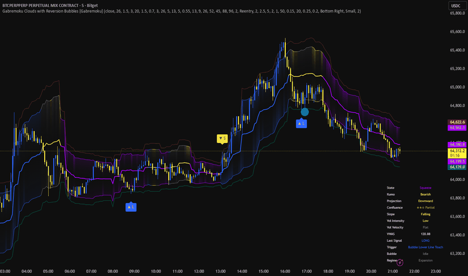
Gabremoku CloudsGabremoku Clouds is a volume-driven equilibrium cloud built to highlight fair-value zones, directional acceptance, and compression/expansion phases in a cleaner and more forward-looking way than traditional cloud indicators. Instead of using classic Ichimoku spans or standard deviation bands, this script builds its structure around a custom volume-weighted equilibrium line and a surrounding cloud whose width is based on Volume-Weighted Average Spread (VWAS). The result is a cloud that reacts not only to price movement, but also to how price is distributed under volume, making it useful for reading consensus, imbalance, and market acceptance.
A key idea behind this indicator is that not all price movement has the same meaning. When volume concentrates inside a tighter range, the cloud compresses and signals balance or consensus. When price expands with broader spread and weaker concentration, the cloud widens and reflects uncertainty or directional transition. This gives the indicator a different purpose from standard volatility envelopes: it is designed less as a generic overbought/oversold tool and more as a market structure and equilibrium map.
The script also includes a 26-period forward projection of the equilibrium cloud. This projected area is calculated from current and historical information only, then shifted forward visually to provide a future reference zone without using lookahead logic. Its purpose is not to predict price in an absolute sense, but to suggest where balance may migrate next if the current slope and cloud conditions remain consistent.
What it helps identify
Trend acceptance when price holds above or below the cloud with supporting volume.
Fair-value reclaims when price rotates back into equilibrium after displacement.
Squeeze-to-expansion transitions when the cloud compresses and then releases into directional movement.
Exhaustion when price reaches a fresh extreme while volume momentum decelerates.
How to use it
Use the current cloud to judge whether price is trading in balance, in directional acceptance, or in transition.
Use the projected cloud as a forward reference area for continuation, reversion, or future balance.
Treat the signals as contextual tools, not standalone trade instructions. They work best when combined with price structure, market context, and risk management.
What is new
Gabremoku Clouds is not a mashup of existing tools. Its core logic is built around a custom equilibrium model that combines volume-weighted price location with volume-weighted spread behavior, then extends that structure into a forward cloud projection. The goal is to give traders a more informative cloud: one that reflects where value is forming now, how stable that value is, and where it may shift next. Gösterge
Gösterge

Gösterge

Gösterge

Gösterge

O'Neil Climax Top Detector█ OVERVIEW
O'Neil Climax Top Detector plots the percentage distance of a price source from its simple moving average in a separate pane and flags the bars where three conditions associated with a climax top occur together: the price is extended into an upper band, it has run up rapidly over a short window, and the bar carries record volume. The histogram measures extension; the flag identifies where extension, runup, and volume coincide.
█ HISTORY / BACKGROUND
The components are drawn from William J. O'Neil's discussion of climax (blow-off) tops in How to Make Money in Stocks . O'Neil described a stock trading 70% to 100% or more above its 200-day moving average line (4th edition, page 264), a rapid price runup over roughly two to three weeks, and heavy volume on the advance as markers of a late-stage move. O'Neil presented these as qualitative, infrequently decisive sell pointers for individual growth leaders on the daily chart, not as a mechanical signal. This script operationalizes that description as a single bar-level test.
█ HOW IT WORKS
On the chart timeframe the script computes, for each bar:
- The distance from the average: the simple moving average of the source over SMA Length , then percentage distance as (source minus average) divided by average, times 100. This is the histogram.
- The extension condition: the distance is at or above the lower band. In fixed mode the band is the Fixed lower / upper band inputs (70 and 100). In adaptive mode the band is the symbol's own mean distance plus a number of standard deviations ( Adaptive lower / upper ) over Adaptive lookback .
- The runup condition: the source's percentage gain over Runup lookback bars is at or above Min runup over lookback .
- The volume condition: the bar's volume is a new high over Volume record lookback bars. When Require record-volume condition is off, this term is dropped.
A climax bar is the conjunction of all active conditions:
climax = extCond and runCond and volTerm
Climax bars are recolored on the histogram and marked with a vertical line spanning the pane. Two alert conditions are exposed: one for the full climax conjunction, one for the distance reaching the lower band.
█ HOW TO USE
Apply on the daily chart, the resolution on which O'Neil's band and runup window are defined. Read the histogram as the degree of extension above or below the average: bars above zero trade above the average, bars below zero trade below it. The lower and upper band lines bound the extension zone. A recolored bar with a vertical line marks where extension, runup, and volume align on the same bar. Treat a flag as a candidate for review of a late-stage move, not as an instruction.
█ SETTINGS
- Source : series used for the average and the distance. Default close.
- SMA Length : period of the simple moving average. Default 200.
- Extension band mode : fixed O'Neil 70/100 band, or per-symbol adaptive band. Default fixed.
- Fixed lower / upper band : the band in fixed mode. Defaults 70 and 100.
- Adaptive lookback : window for the adaptive band statistics. Default 504.
- Adaptive lower / upper : standard deviations above the mean distance defining the adaptive band. Defaults 2.0 and 3.0.
- Runup lookback : bars over which the runup is measured. Default 10.
- Min runup over lookback : minimum percentage gain to satisfy the runup. Default 25.
- Require record-volume condition : include the volume term. Default on.
- Volume record lookback : window over which the bar's volume must be the highest. Default 50.
█ WHAT MAKES IT ORIGINAL
A plain distance-from-moving-average histogram only shows extension. This script requires extension, a rapid runup, and record volume to coincide on the same bar before it flags, which is the conjunction O'Neil described qualitatively but is not present in a single distance plot. The adaptive band is a further departure: O'Neil's 70 to 100 figure is calibrated to growth leaders and is rarely reached on indices or low-volatility instruments, so the script can replace the fixed band with one derived from the symbol's own distance distribution, extending the concept beyond the instrument class it was written for.
█ NOTES / LIMITATIONS
- Insufficient history: the average needs SMA Length bars, the adaptive band needs Adaptive lookback bars, and the runup needs Runup lookback bars. Until those windows fill, the corresponding output is na and no flag appears.
- Volume-free symbols: on instruments without volume the record-volume term resolves to na and nothing flags. Turning off Require record-volume condition runs the extension and runup pair only, a weaker two-condition test.
- Timeframe: the default band and runup window reflect O'Neil's daily-chart definition. On other resolutions the thresholds keep their numeric values but lose their reference meaning.
- Symbol class: the fixed band reflects individual growth-stock behavior. Use adaptive mode for indices, large-cap averages, and low-volatility instruments.
- Real-time bars: conditions confirm on bar close. On the forming bar a flag and its line can appear and disappear as price and volume change until the bar closes. Historical flags do not change.
- No higher-timeframe data: all computation is on the chart timeframe with no request.security and no lookahead.
- Object ceiling: the script retains up to 500 vertical lines. On long histories the oldest markers are dropped as new ones are added.
- The default thresholds are conceptual settings consistent with O'Neil's description, not optimized or validated values. Gösterge

Gösterge
Gösterge

Gösterge

Volume Suite: Bubbles + Profile + VWAP/ORBHere's a full-length description written for futures/NQ traders.
Volume Suite: Bubbles + Profile + VWAP/ORB
An all-in-one volume and market-structure toolkit built for intraday futures traders.
Volume Suite combines three professional-grade volume analysis tools into a single indicator, each with its own master on/off toggle so you can run all three together or isolate exactly the one you need. It was built with index futures like NQ (E-mini Nasdaq-100) and ES in mind, where session timing, volume distribution, and the opening range carry real predictive weight. Instead of cluttering your chart with three separate scripts that each eat into TradingView's indicator limit, this consolidates everything into one efficient package.
Module ① — Volume Bubbles
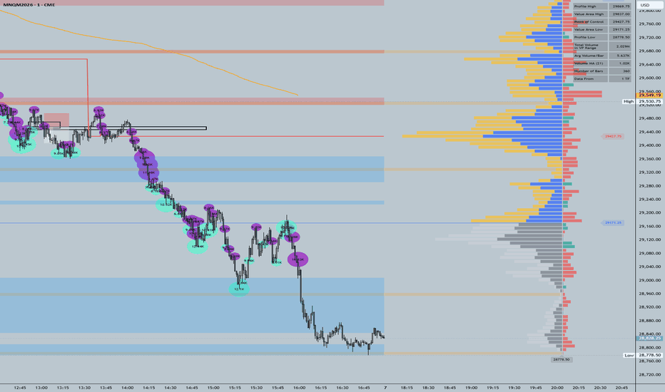
Volume Bubbles surfaces the bars where real money is moving. Rather than relying on a single fixed volume threshold, it ranks each bar against recent history using percentile analysis across three independent lookback windows (short, medium, and long—20, 50, and 100 bars by default). A bar only gets flagged when it clears your chosen percentile, and you control how strict that confirmation is: require just one window to agree, a majority of two, or all three for the highest-conviction signals.
Detected bars are drawn as circular bubbles whose size reflects the magnitude of the event—Small (top 25%), Medium (top 10%), and Big (top 3%)—so a glance tells you whether you're looking at routine participation or a genuine volume spike. Each bubble is colored by direction: buy, sell, or mixed. You decide how direction is determined, choosing between simple candle direction, volume delta (net buying versus selling pressure pulled from a lower-timeframe scan), or "Both," which only commits to a direction when candle and delta agree, labeling everything else as mixed.
The detection engine itself is flexible. You can trigger on volume only, delta only, both together (strictest), or either one (most inclusive). When delta data isn't available for a symbol, the module automatically falls back to volume-only mode so it never silently breaks. Optional in-bubble text and detailed tooltips display the underlying volume, delta, and volume ratio, along with which lookback windows confirmed the signal—useful when you want to understand why a bar was flagged rather than just that it was. Built-in alert conditions let you get notified on big clusters, medium-or-bigger clusters, or any cluster at all.
Module ② — Volume Profile
The Volume Profile module answers the question that matters most for futures traders: where did the trading actually happen? It distributes traded volume horizontally across price levels over a lookback range you define—either a fixed number of bars or the currently visible range—and uses a smart lower-timeframe engine that dynamically selects the optimal granularity to maximize accuracy within that range.
From this distribution it derives the key reference levels professionals trade around. The Point of Control (POC) marks the single most-traded price, available as a developing line that updates bar by bar or as a static last-value line. The Value Area (68% of volume by default, fully adjustable) is bounded by the Value Area High and Value Area Low, the levels that so often act as intraday support and resistance on NQ. The module also identifies supply and demand zones from low-volume nodes, highlights profile gaps where activity drops sharply between price levels, and overlays a sentiment profile showing the dominant side—bullish or bearish—at each level, classified either by bar polarity or by buying/selling pressure within each bar.
Supporting features round it out: a volume histogram that can sit at the top or bottom of your chart with an optional moving average, volume-weighted bar coloring that tints price bars by how their volume compares to the average (with separate upper and lower thresholds), and a profile stats table summarizing profile high and low, the value area levels, total and average volume, the volume MA, the bar count, and which lower timeframe the data was sourced from. Price-level labels can be aligned directly to the profile rows. The module also fires alerts when price crosses the POC, the Value Area High, or the Value Area Low, when high volume is detected, and when an extreme volume spike suggests possible exhaustion.
Module ③ — NY VWAP + Opening Range
The third module is purpose-built around the New York session, the window where NQ does the bulk of its meaningful work. It plots a session-anchored VWAP that resets at the start of each NY session (9:30–16:00 ET by default, configurable) and can optionally extend its final value past the close so you can see where the session settled. Because it's volume-weighted and session-reset rather than a rolling average, it gives you a clean read on the day's true average traded price—the level institutions and algos lean on.
Alongside the VWAP it tracks the Opening Range (ORB): the high and low established during the first X minutes after the open (15 by default, adjustable up to two hours). Once that window closes, the module draws horizontal lines at the opening range high and low and labels them ORB-H and ORB-L. These lines extend through the rest of the session, giving you a persistent visual frame for one of the most-traded setups in index futures—the opening range breakout and breakdown. The range automatically resets each new trading day, so every session starts clean.
Why use it together
Each module is powerful alone, but they reinforce each other. A Big buy bubble printing right at the Value Area Low, with price reclaiming the opening range high and pushing above session VWAP, is a far stronger signal than any one of those events in isolation. Running all three on one chart gives you volume conviction, structural context, and session timing in a single glance—without burning three indicator slots or forcing you to mentally stitch together separate tools.
Everything is organized under clearly labeled input groups with extensive tooltips, so you can tune the behavior to your symbol, timeframe, and trading style. Toggle off what you don't need, dial in the thresholds that match how NQ trades on your timeframe, and keep your workspace focused. Gösterge
Gösterge

Margin Debt to M2 Ratio█ OVERVIEW
Plots customer margin debt divided by the M2 money stock, expressed as a percent, in a separate pane, with a standard deviation band around its mean. Normalizing margin debt by the broad money supply removes the secular growth the raw series accrues through inflation and monetary expansion, so leverage readings are comparable across decades rather than trending upward by construction.
█ HISTORY / BACKGROUND
Aggregate customer margin debt has long been followed as a gauge of speculative leverage and risk appetite. The statistic is published monthly by FINRA, and previously by the NYSE for member firms. Reading the raw dollar figure across long spans is misleading because it rises with the size of the economy and the money supply regardless of relative leverage. Dividing margin debt by M2 is a normalization that expresses borrowing against the monetary base, isolating changes in leverage intensity from growth in the quantity of money. The approach is a normalization technique rather than a named proprietary system. Its conceptual basis is that relative leverage, not the nominal dollar level, carries the sentiment information.
█ HOW IT WORKS
The script requests two series at monthly resolution, forms their ratio, and derives a mean and a standard deviation band from the monthly history.
1. Margin debt is requested with request.security at the 1M timeframe using the closing value of the symbol set in the first input. M2 is requested the same way from the second input.
2. The ratio is computed as margin debt divided by the quantity (M2 multiplied by 1000), then multiplied by 100. The factor of 1000 reconciles units, because the default margin debt series is reported in millions of dollars and M2 in billions. The factor of 100 expresses the result as a percent. When either series is na, or when M2 is zero, the ratio is na.
3. One ratio observation is appended to a persistent array on each new calendar month, detected with a change in the monthly time value. Computing the statistics from this array rather than from chart bars keeps them correct on any chart resolution, because forward filled monthly values on a lower timeframe do not inflate the sample.
4. On each new month the band statistics are recomputed. The window is the entire array in full sample mode, or the trailing number of months given by the lookback input in rolling mode. The mean is the arithmetic average over the window. The standard deviation is the sample deviation, computed as the square root of the summed squared deviations from the mean divided by the window length minus one, and is na until at least two observations exist.
5. The upper and lower band lines are the mean plus and minus the sigma multiplier times the standard deviation.
█ HOW TO USE
The script is built for the monthly timeframe. The underlying data is monthly for M2 and quarterly for the margin debt proxy, and the statistics are accumulated per calendar month, so 1M is the resolution at which the display matches the data cadence. On an intraday chart the script draws a warning label and the band should not be read at that resolution.
Visual elements:
• The blue line is the margin debt to M2 ratio in percent.
• The shaded band spans the mean plus and minus the chosen sigma multiple.
• The gray midline is the mean, when enabled.
• The label at the last bar prints the current ratio to two decimals.
Readings above the upper band indicate leverage that is high relative to the money supply. Readings below the lower band indicate depressed leverage, typically following a deleveraging episode. This is a slow moving macro context series, not a timing trigger. An alert condition fires when the ratio reaches or exceeds the upper band.
█ SETTINGS
• Margin debt series : the symbol used as the numerator. Default FRED:BOGZ1FL663067003Q.
• M2 money stock : the symbol used as the denominator. Default FRED:M2SL.
• Band mode : selects Rolling (point-in-time), which uses a trailing window, or Full sample (lookahead), which uses the entire history. Default Rolling (point-in-time).
• Rolling lookback (months) : the trailing window length used in rolling mode. Default 180, minimum 12.
• Sigma multiplier : the number of standard deviations for the band width. Default 1.0, minimum 0.25, step 0.25.
• Show mean midline : toggles the mean line. Default on.
• Show current value label : toggles the last bar value label. Default on.
█ WHAT MAKES IT ORIGINAL
The script normalizes margin debt by M2 and presents the result in a dedicated pane with an explicit standard deviation band, rather than overlaying a rate of change or a z score of the raw series on price. Two design choices distinguish the implementation. First, the band can be computed either as a trailing point-in-time window or as a fixed full sample band, and the full sample option is labeled as containing lookahead, so the distinction is explicit rather than hidden in the output. Second, the band statistics are accumulated from one observation per calendar month held in an array, which makes the mean and standard deviation independent of the chart timeframe and avoids the understated deviation that results when forward filled monthly values are sampled on a lower timeframe.
█ NOTES / LIMITATIONS
• Symbol resolution : both inputs ignore invalid symbols. If a symbol does not resolve or returns na, or if M2 is zero, the ratio is na and neither the line nor the band renders. No runtime error is raised.
• Unit assumption : the ratio applies a fixed factor of 1000 to reconcile a numerator in millions against a denominator in billions. Replacing the default symbols with series in other units breaks the percent scaling.
• Data cadence : the default margin debt proxy is quarterly and M2 is monthly, so the ratio holds the most recent quarterly margin debt value across the intervening months.
• Provenance : TradingView does not carry the FINRA monthly margin debt statistic as a native symbol. The default numerator is the Federal Reserve Z.1 series for margin accounts at brokers and dealers, a close substitute that differs in level and cadence from the FINRA figure.
• Lookahead : only the Full sample band mode uses future observations in its statistics and is therefore not point-in-time. Rolling mode does not. The request.security calls use the default non lookahead behavior.
• Timeframe : the logic is intended for 1M. On intraday charts a warning label is drawn and the band should not be read.
• History dependence : the band requires accumulated monthly observations to populate. Early in available history, or on symbols with short history, the standard deviation is na until at least two monthly observations exist and stabilizes only after the lookback window fills.
█ THANKS
Chart concept surfaced by the Stacked Insights YouTube channel. Margin debt data originates with FINRA and the Federal Reserve. M2 originates with the Board of Governors of the Federal Reserve System. Gösterge

Gösterge

Gösterge

Gösterge