Gösterge

Gösterge

Gösterge
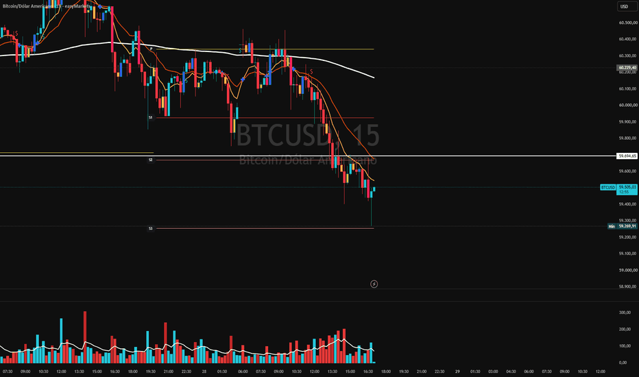
EMA Ribbon FLOW PRO# EMA Ribbon FLOW PRO
EMA Ribbon FLOW PRO is a multi-layer exponential moving average (EMA) ribbon designed to visualize market structure, trend direction, dynamic support/resistance, and momentum across different trading horizons.
Instead of using only one or two moving averages, the indicator combines several EMA ribbons into one clean visual layout. Each ribbon represents a different trend layer, allowing traders to quickly identify short-, medium-, and long-term market direction.
## Included EMA Ribbons
* **M1 Ribbon:** EMA 20–55
* **M5 Ribbon:** EMA 100–275
* **x15 Ribbon:** EMA 300–600
* **H1 Ribbon:** EMA 900–2100
Each ribbon uses its own color gradient, making it easy to distinguish between different market structures.
---
# How to Trade with EMA Ribbon FLOW PRO
The indicator can be used in many different ways depending on your trading style.
### Trend Identification
When all ribbons are aligned and pointing in the same direction, the market is usually trending.
* Rising ribbons → Bullish trend
* Falling ribbons → Bearish trend
The wider the ribbon becomes, the stronger the trend generally is.
---
### Dynamic Support and Resistance
The EMA ribbons often act as dynamic support and resistance zones.
Common approaches include:
* Buying pullbacks into bullish ribbons
* Selling pullbacks into bearish ribbons
* Watching for reactions when price touches an EMA cluster
Instead of focusing on a single moving average, traders can use the entire ribbon as an area of interest.
---
### Momentum
Ribbon expansion usually indicates increasing momentum.
Ribbon compression often signals:
* slowing momentum
* consolidation
* possible trend transitions
This allows traders to recognize changing market conditions before large moves develop.
---
### Multiple Trend Layers
The different ribbons help separate short-term market noise from the larger trend.
For example:
* M1 ribbon for short-term entries
* M5 ribbon for trend confirmation
* x15 ribbon for higher timeframe bias
* H1 ribbon for the overall market direction
Using multiple EMA groups together helps traders avoid trading against stronger trends.
---
# Fully Customizable
EMA Ribbon FLOW PRO was designed to be highly customizable.
You can:
* Show or hide every ribbon independently.
* Display only the EMA groups that fit your trading style.
* Customize line colors.
* Change ribbon fill colors.
* Disable fill colors completely.
* Adjust line width.
* Use your preferred price source.
Whether you prefer a clean chart with only a few EMAs or a complete multi-ribbon layout, the indicator can easily be adapted to your workflow.
---
# Suitable For
* Scalping
* Day Trading
* Swing Trading
* Crypto
* Forex
* Indices
* Stocks
* Commodities
The indicator works on every timeframe, although it is especially useful for traders who combine lower timeframe entries with higher timeframe trend confirmation.
---
# Disclaimer
EMA Ribbon FLOW PRO is a market structure and trend analysis tool. It does not predict future price movements and should be used together with proper risk management and your own trading strategy.
Gösterge
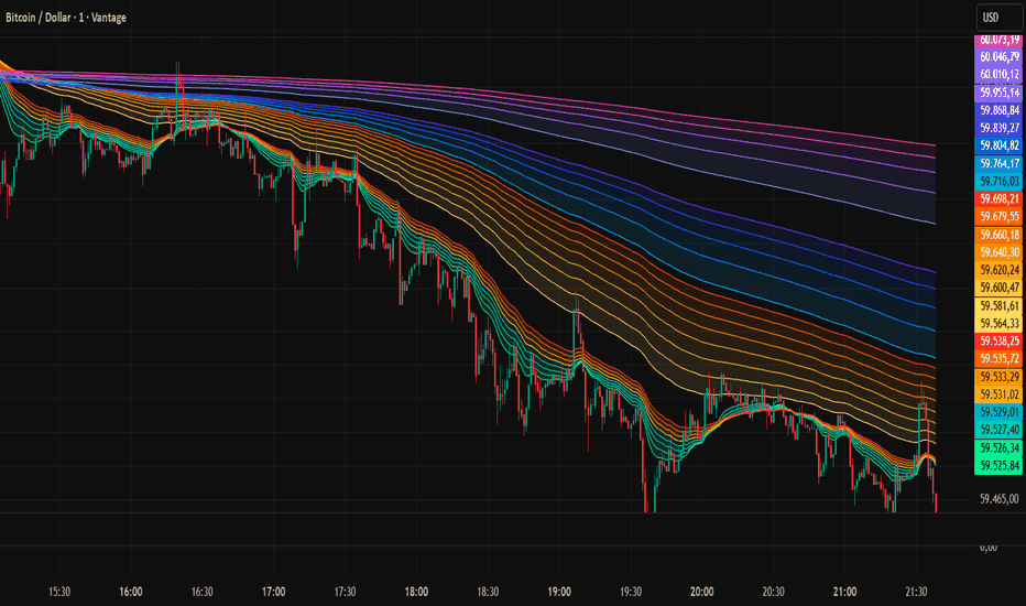
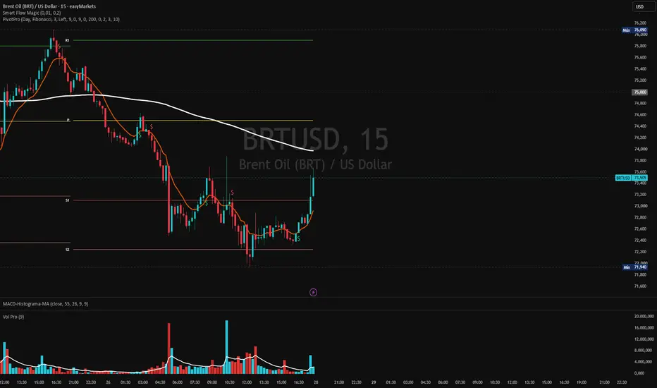
Pivot Premium Suite Nicolau EditionPivotPro Nicolau — Pivot Points + SuperTrend + EMA with the “Displacement” option
A professional all-in-one indicator combining three powerful technical
analysis tools into a single, clean, and highly configurable solution.
━━━━━━━━━━━━━━━━━━━━━━━━━━━━
📊 1. ADVANCED PIVOT POINTS
━━━━━━━━━━━━━━━━━━━━━━━━━━━━
Calculates and displays Pivot Points with full customization:
- Two calculation methods: Traditional and Fibonacci
- Configurable timeframe: Daily, Weekly, Monthly or Yearly
- Choose how many periods to display (current + previous)
- Labels positioned on Left or Right side of each line
- Individual color control for each level (P, R1, R2, R3, S1, S2, S3)
- Labels follow the line edge automatically — no overlap
- Alerts for price crossing any pivot level
━━━━━━━━━━━━━━━━━━━━━━━━━━━━
📈 2. PIVOT POINT SUPERTREND
━━━━━━━━━━━━━━━━━━━━━━━━━━━━
A unique SuperTrend implementation that uses Pivot Highs and Lows
as its center line instead of the traditional midpoint — making it
more reactive to actual market structure:
- ATR-based dynamic bands calculated from pivot-weighted center
- Buy/Sell signals rendered as plotshape (independent from labels)
- Optional Support/Resistance circles from pivot points
- Optional center line display
- Alerts for trend changes and Buy/Sell signals
━━━━━━━━━━━━━━━━━━━━━━━━━━━━
📉 3. EMA SUITE WITH SHIFT
━━━━━━━━━━━━━━━━━━━━━━━━━━━━
Three fully configurable Exponential Moving Averages with an
exclusive displacement feature:
- EMA 9, EMA 21, EMA 200 — all periods configurable
- Individual color for each EMA
- Each EMA has its own shift toggle and period input
- Positive shift = forward displacement (future projection)
- Negative shift = backward displacement (historical alignment)
- Visual crossover marker between EMA 9 and EMA 21
━━━━━━━━━━━━━━━━━━━━━━━━━━━━
⚙️ KEY FEATURES
━━━━━━━━━━━━━━━━━━━━━━━━━━━━
- Pivot numbers stay visible even when chart objects are hidden
- Buy/Sell labels are independent from Pivot labels
- All colors individually configurable
- Clean, non-overlapping label system
- Full alert support for all signals
Designed for traders who need precision, clarity and full control
over their chart without visual clutter.
Gösterge

OrderFlow Absorption Matrix | ProjectSyndicateOrderFlow Absorption Matrix reconstructs the order flow hiding inside every candle and maps it onto price as a living liquidity profile — then power-ranks the levels where aggressive volume was absorbed and price is most likely to react. It drills into each bar with a lower-timeframe scan to measure true buy/sell delta and, crucially, absorption — the volume that pushed into a wick and got soaked up by passive limit orders instead of moving price. That footprint is binned across the range into a Liquidity Profile, a Delta column and an Absorption column, anchored by the Value Area (POC / VAH / VAL), and distilled into 0–10 strength-ranked support/resistance zones. The whole tool runs on one idea from order-flow theory: price doesn't reverse where volume is heavy — it reverses where aggression is absorbed. The Absorption engine finds those hidden walls, scores them, and shows you the conviction behind each one at a glance.
🌊 LTF Delta & Absorption Engine — the core of the tool. A lower-timeframe scan breaks each chart bar into its intrabar prints and measures two things conventional volume cannot: net Delta (buying minus selling pressure) and Absorption (aggressive volume that drove into the upper or lower wick and was rejected — sellers absorbing buyers at highs, buyers absorbing sellers at lows). Granularity is adjustable, with optional seconds data for fine delta on low timeframes, and a clean fallback to candle direction when intrabar data is unavailable.
🟪 The Absorption Column — the namesake read. Beside the profile, a dedicated column ranks every price bin by how much aggressive flow was absorbed there. Tall absorption bars mark the hidden walls — iceberg-style passive defense where the market repeatedly refused to move despite aggression hitting it. These are the levels that hold, and the Absorption Side read tells you whether the heaviest absorption sits below price (defended support) or above it (defended resistance).
📊 The Liquidity Profile — a binned volume profile built over a rolling lookback, split four ways into strong / weak buying and strong / weak selling. Bars that traded on above-percentile volume render brighter as "strong," so you see not just where volume built, but where conviction did. The profile projects to the right of price so your candles stay clean.
🎯 Delta Heatmap Column — net buy/sell delta per price bin, shaded by intensity and labelled with the signed value, so you can read exactly which shelves were accumulated and which were distributed — even when total volume looks balanced.
🧲 Value Area — POC / VAH / VAL — the auction skeleton. The Point of Control (highest-volume price), the Value-Area High and Low are computed by true value-area expansion from the POC and drawn as clean reference lines. POC is the magnet; the VA edges frame fair value, and "Price vs POC" (in ATR) tells you how stretched the auction is.
🏆 0–10 Strength-Ranked Liquidity Zones — the power-ranking. The strongest levels are peak-detected from the profile and each earns a live 0–10 grade from five principled factors, each with a fixed directional sign: Volume (how much traded at the level), Absorption (how much aggression was soaked up there — the differentiator), Touches (how many times price tested it across the window), Rejection Wicks (how violently it was defended), and Recency (recent tests outrank stale ones). All five weights are adjustable. Zones are filtered by a minimum score and capped to the strongest N, so the chart only carries levels that earned their place — never overload.
🏷️ In-Zone Strength Labels & Stats — each zone carries its grade inside the band: stars, the X.X/10 score, a tier word (FORMING → WEAK → MODERATE → STRONG → ELITE) and a SUPPORT / RESIST side marker — plus the detailed stats that built it: Volume, Absorption, Touch count and Rejection count (V / A / T / R). Quality and reasoning read instantly, right on the level.
🎨 Strength-Shaded Fill — stronger zones render more opaque while weak ones stay faint, so the chart shows which levels carry weight before you read a number. Support zones shade with the bullish tone, resistance with the bearish tone, and the brightest band is your highest-conviction wall.
🧮 Flow Pressure Verdict — a composite read that fuses profile imbalance, cumulative-delta bias, absorption side and the most recent significant print into a single directional score, resolved to ACCUMULATION, DISTRIBUTION or BALANCED. One line tells you whether the order flow is quietly loading up or unloading beneath the price action.
🔭 MTF Flow Bias — a non-repainting flow read on three higher timeframes (default 15 / 60 / 240), each tagged BULL / BEAR / FLAT, so you can align your level with the larger order-flow tide before you act.
🖥️ Command Dashboard — a clean, terminal-style panel grouping everything that matters: Order Flow (last print, bar delta, bar volume, CVD bias), Liquidity Profile (POC / VAH / VAL, buy/sell share, net imbalance, price vs POC), Key Zones (top zone price, top-zone strength, absorption peak and side), MTF Flow and the Flow Pressure verdict — quality and context at a glance, no separate windows.
🎨 Five High-Contrast Themes — Plasma (aqua / rose / gold, default), Cyber, Ice & Fire, Phosphor and Mono — all tuned to read cleanly on a black background, with an optional flow-tint on the candles themselves.
🧹 Score Filter & Toggles — hide every zone below a score threshold, cap the number of zones, switch the profile, delta column, absorption column, value area, zones, dashboard and candle tint on or off — so the chart only shows the layers you trade.
🔒 Honest & Non-Repainting Core — historical bars are fixed: the profile, zones and scores are built from completed-bar history, and the higher-timeframe flow read uses a strict non-repainting request (prior confirmed bar only). The live bar and the rolling profile naturally refresh as each new bar closes — exactly as order flow should — but nothing redraws the past, and the score never hides a level to flatter the picture. The strength grade is a descriptive order-flow framework for ranking attention, not a backtested signal.
🔔 Native Alerts — a Whale Print alert for the largest order-flow clusters, a Medium-or-greater Print alert, an Any-Print alert, plus directional Buy-Print and Sell-Print alerts — so you catch significant flow the moment it hits the tape.
🔧 Fully Customizable — detection method and side-classification, percentile sensitivity and consensus windows, LTF granularity and seconds toggle, profile lookback / resolution / width / offset, strong-volume filter, value-area percent, the five zone-score weights, minimum strength, max zones, touch normalization, label content / size, MTF timeframes, theme, transparency and dashboard position / size — all adjustable.
🎯 Why this is different — most profile and S/R tools show you where volume is, then leave you guessing which shelf actually matters. OrderFlow Absorption Matrix answers it: it measures the absorption hidden in the wicks, ranks each level 0–10 on real order-flow evidence, and puts the score, the side and the supporting stats right inside the zone. You read where the wall is, why it's strong, and which way the flow is leaning — at a glance.
🚀 Apply to Gold (XAUUSD), Silver, Forex, Crypto, Indices and Futures on any intraday timeframe (volume-bearing symbols).
🎯 How To Trade It — Two Approaches
Everything hinges on one question the tool answers: is this level absorbing aggression (it holds) or is flow breaking through it (it gives)? High-strength zones with heavy absorption favor reaction; weak or de-rated zones being hit with strong same-side delta favor continuation.
◾ 1) Fade into an absorbed zone → rotate to value (reaction) — use on STRONG / ELITE zones (≥7) with heavy absorption
This is the indicator's core thesis. When price drives into a high-strength zone whose grade is built on Absorption and Rejection — most reliable when the Absorption Side confirms the direction (heavy absorption below = defended support, above = defended resistance) and Flow Pressure isn't screaming with the move.
▪️ Wait for price to tag the rated zone and print rejection — a wick or reversal back inside the band, ideally with the Delta column showing the aggressor being absorbed rather than breaking through.
▪️ Entry: on the rejection back inside the zone, facing the Value Area.
▪️ Stop: just beyond the zone / the next stronger level out. If price closes decisively through and holds, the absorption thesis failed — stand aside or flip to Approach 2.
▪️ Targets: step toward fair value — the POC as the primary magnet, then the opposite Value-Area edge (VAH/VAL) if momentum carries.
⚖️ The cleanest version: price spikes into an ELITE resistance zone with a tall absorption bar, the Delta column shows buyers getting soaked up, price fails to hold and rotates back down through VAH into the POC. That absorption-to-value reversion is the move this tool is built to frame. Use the Whale-Print and directional Buy/Sell-Print alerts to catch the stretch as it prints.
◾ 2) Break & retest a failing zone → trade with the flow (continuation) — use when zones are weak / de-rated or flow is one-sided
When a level is graded low, when the Delta column shows persistent same-side pressure into it, and the Flow Pressure verdict and MTF Flow all lean the same way, a clean break is the order flow expanding, not exhausting.
▪️ Wait for a decisive close beyond the zone on strong same-side delta (not a single wick), with the band failing to absorb.
▪️ Entry: in the direction of the break, on the close beyond the level or on a retest of the broken zone (a broken resistance often flips to support, and vice-versa).
▪️ Stop: back inside the broken zone, against the move.
▪️ Targets: the next ranked zone, the opposite Value-Area edge, or a measured move — trailing as flow extends.
Rule of thumb: ⭐ STRONG / ELITE absorbed zone + confirming Absorption Side → expect a reaction, fade it back toward the POC. ⭐ Weak / de-rated zone + one-sided delta and aligned MTF flow → expect follow-through, trade the break and retest.
⚠️ IMPORTANT NOTICE: OrderFlow Absorption Matrix reconstructs estimated order flow from lower-timeframe data and ranks where price is most likely to react. Lower-timeframe delta and absorption are an approximation of true tape, not exchange order-book data, and the 0–10 score is a descriptive order-flow framework — NOT a backtested signal and NOT a standalone trade trigger. Always combine it with your own strategy, price-action analysis and risk management to confirm setups. The indicator requires a volume-bearing symbol. Past behavior does not guarantee future results. Gösterge

Gösterge
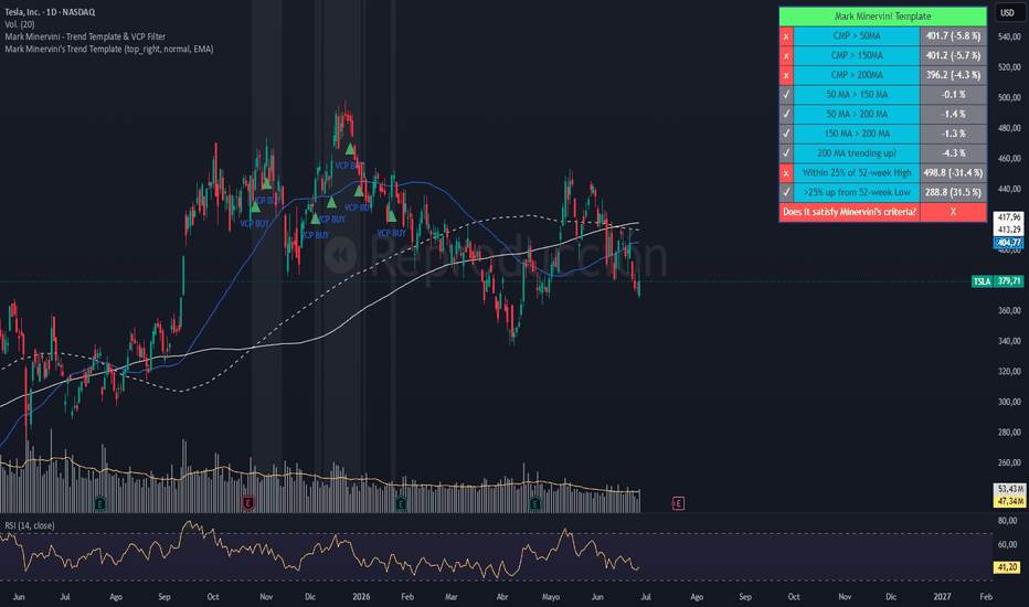
Gösterge

Strateji

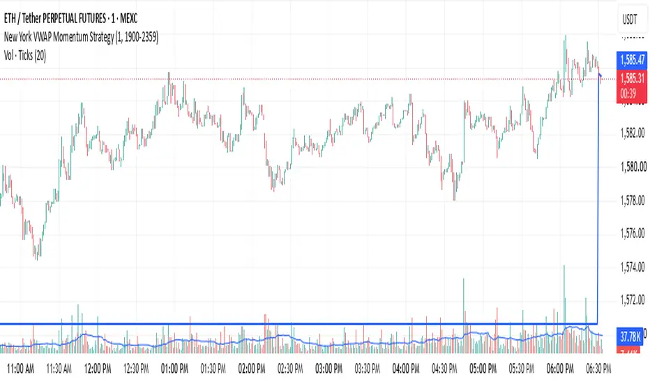
Key ssns [stealth]Indices Sessions
A clean session-range tool built specifically for index trading (NAS100, SPX, US30, GER40, etc.). It draws a dotted box around each trading session, capturing the high-to-low range, with the session name and pip range labeled neatly on top.
Note: this indicator is designed for indices only. The session windows and pip-range math are tuned to index trading, so it is not intended for forex, crypto, or other instruments.
Three sessions, all anchored to New York time (DST handled automatically):
- London – 03:00–05:00
- NY – 09:30–12:00
- PM – 13:00–16:00
Each session is plotted as a transparent dotted box spanning that window's high and low, so you can instantly read where each session expanded, contracted, or was raided — without any fill cluttering the chart.
Minute-accurate range capture. The script reads 1-minute intrabar data rather than relying on bar boundaries, so the box edges (especially the 09:30 NY open) land exactly on time even on higher intraday timeframes instead of snapping to the nearest candle.
Labels:
- Session name plus range in pips, shown above each box and centered to stay within the box width
- Tiny by default, with size options (Tiny / Small / Normal)
- Pip display can be toggled off for a cleaner look
- Configurable pip size (NAS100 on FXCM ≈ 0.1)
Customization:
- Toggle each session independently
- Edit any session's time window directly in settings
- Box border color, style (dotted / dashed / solid), and width
- Label color and size
- "Days to display" control to limit how far back boxes draw
Timeframe-aware: boxes only render on timeframes below the 1-hour, where intraday session structure is actionable, and stay out of the way on higher timeframes.
Pairs with the companion Indices Open script for 9:30 / 10:00 / daily opens and day-of-week separators. Gösterge

Market Breadth Composite## Market Breadth Composite
Market Breadth Composite is a market breadth indicator designed to measure the internal health of the broader U.S. equity market.
The indicator tracks the percentage of stocks trading above their 200-day moving average across three breadth universes:
1. S&P 500 breadth
2. NYSE breadth
3. Nasdaq breadth
It then calculates a composite average from the enabled and available feeds. This helps users view broad market participation through one cleaner composite reading instead of relying on a single market index.
This script is not a standalone buy or sell signal. It is intended to be used as a market regime and risk-environment filter.
---
## How It Works
The script requests breadth data from the selected symbols and calculates the current value for each enabled universe.
The default feeds are:
* S5TH: S&P 500 percentage of stocks above the 200-day moving average
* MMTH: NYSE percentage of stocks above the 200-day moving average
* NDTH: Nasdaq percentage of stocks above the 200-day moving average
The composite value is calculated by averaging the active and available feeds.
If one of the selected feeds is unavailable, the script continues to calculate the composite using the remaining available feeds.
An optional EMA smoothing setting is included to reduce short-term noise in the composite line.
---
## Market Regime Logic
The indicator uses configurable regime levels:
* Risk-Off Level: default 40
* Healthy Level: default 60
* Strong Level: default 80
The current market state is classified as follows:
* Risk-Off: composite is below the Risk-Off Level
* Neutral: composite is between the Risk-Off Level and the Healthy Level
* Healthy: composite is above the Healthy Level but below the Strong Level
* Strong: composite is above the Strong Level
These levels are not trading guarantees. They are reference zones designed to help users evaluate broad market participation.
---
## Visual Output
The script displays:
* A composite breadth line
* Optional component lines for S&P 500, NYSE, and Nasdaq breadth
* Configurable regime reference levels
* Optional risk-regime background shading
* A status table showing the component values, composite value, market state, and active feed count
The table is designed to provide a quick summary of market conditions while keeping the chart clean and easy to read.
---
## How To Use
This indicator is best used as a market environment filter.
Users may use it to understand whether broad market participation is weak, mixed, improving, or strong.
General interpretation:
* Below 40: breadth is weak and market risk may be elevated
* Between 40 and 60: breadth is mixed or neutral
* Above 60: breadth participation is healthier
* Above 80: breadth participation is broadly strong
The indicator should be interpreted together with price action, trend structure, support and resistance, volume, and risk management.
It is not designed to replace a complete trading plan.
---
## Alerts
The script includes the following alert conditions:
1. Composite Breadth -> Risk-Off
Triggered when the composite crosses below the Risk-Off Level.
2. Composite Breadth -> Recovery Above Risk-Off
Triggered when the composite crosses back above the Risk-Off Level.
3. Composite Breadth -> Healthy
Triggered when the composite crosses above the Healthy Level.
4. Composite Breadth -> Strong
Triggered when the composite crosses above the Strong Level.
5. Composite Breadth -> Back To Neutral
Triggered when the composite crosses below the Healthy Level after being in a healthier breadth zone.
6. Composite Breadth -> Lost Strong Status
Triggered when the composite crosses below the Strong Level after being in the Strong zone.
These alerts are intended to help users monitor changes in broad market breadth conditions without treating them as direct trade signals.
---
## Important Notes
This script does not predict future market direction.
It does not guarantee entries, exits, tops, bottoms, crashes, recessions, or recoveries.
It does not provide financial advice.
It is an analytical tool for studying market breadth and market regime.
Users are responsible for their own analysis, decisions, and risk management.
Gösterge

Gösterge

RX: Dual RSI Fusion 14/50 Compression Framework## RX: Dual RSI Fusion 14/50 Compression Framework
Is an advanced momentum framework designed to identify potential market exhaustion, compression phases, and high-probability reversal conditions by combining two Relative Strength Index structures into a single analytical model.
Unlike traditional RSI indicators that rely on a single momentum source, this framework integrates both a fast RSI (14-period by default) and a slow RSI (50-period by default) to provide a multi-layer view of market behavior.
### Core Concepts
• **Fast RSI (14):** Captures immediate momentum shifts, short-term exhaustion, and early divergence signals.
• **Slow RSI (50):** Represents the underlying market structure and helps identify broader momentum regimes.
• **Dynamic Compression Engine:** Measures the convergence between moving averages applied to the fast RSI, highlighting periods where momentum becomes increasingly compressed and potentially preparing for expansion.
• **Exhaustion Detection:** The indicator is specifically designed to monitor the sequence of events frequently observed near market turning points, including divergence development, momentum contraction, and structural breakout.
### Features
✔ Dual RSI architecture (Fast + Slow)
✔ Configurable moving averages applied directly to RSI values
✔ Compression detection between fast RSI moving averages
✔ Divergence memory engine with customizable validity period
✔ Momentum Delta histogram (Fast RSI - Slow RSI)
✔ Structural breakout detection from RSI compression zones
✔ Background state visualization for market context
✔ Alert conditions for potential exhaustion breakouts
### Interpretation
The framework is based on the premise that important market reversals are rarely caused by a single event. Instead, reversals often emerge from a succession of conditions:
1. Momentum divergence appears.
2. RSI structure begins to compress.
3. Market enters an exhaustion phase.
4. Fast momentum escapes the compression structure.
5. Expansion begins.
The indicator seeks to visualize this process and provide objective confirmation of potential exhaustion scenarios.
### Notes
This tool should not be interpreted as a standalone buy or sell system. It is intended to be used as a market structure and momentum exhaustion framework, ideally combined with price action, liquidity analysis, volume, or higher timeframe context.
Developed as part of the SXA analytical ecosystem by @Peter_n_n
Gösterge

Gösterge

Pivot Points Original RecreationPivot Points Original Recreation is a technical analysis indicator designed to identify potential pivot highs and pivot lows directly on the price chart.
The indicator highlights important swing points where price may have formed a temporary top or bottom. These pivot levels can help traders analyze market structure, trend direction, support and resistance zones, and possible reversal or continuation areas.
Main features:
- Detects pivot highs and pivot lows
- Displays clear PH and PL labels on the chart
- Helps identify swing structure and key turning points
- Useful for support and resistance analysis
- Can assist with trend continuation and reversal setups
- Works across forex, gold, indices, crypto, stocks, and other liquid markets
This indicator is intended for technical analysis and educational purposes only. It does not provide guaranteed buy or sell signals and should not be used as a standalone trading system. Traders should combine it with proper risk management, market structure analysis, and their own trading strategy. Gösterge

Gösterge

US Sector Rotation vs SPY - Relative StrengthUS Sector Rotation vs SPY vergleicht die Performance der wichtigsten US-Sektor-ETFs mit dem S&P-500-Benchmark SPY.
Das Script dient dazu, relative Stärke und Schwäche einzelner Sektoren schneller zu erkennen. Dadurch lassen sich Marktrotationen besser einordnen und potenziell interessante Sektoren für die weitere Underlying-Auswahl identifizieren.
Enthalten sind unter anderem die großen US-Sektor-ETFs wie XLK, XLC, XLY, XLI, XLB, XLE, XLP, XLV, XLU, XLF und XLRE. SPY dient als Benchmark.
Das Script berechnet die Performance direkt im Pine Script. Deshalb sollte die TradingView-Skala regulär bleiben und nicht zusätzlich auf Prozent oder indexierte Darstellung umgestellt werden.
Funktionen:
Vergleich der absoluten Sektor-Performance
Darstellung der relativen Performance gegenüber SPY
wählbare Performance-Fenster: 21, 63, 126, 252 oder eigene Handelstage
Standardwert für eigene Handelstage: 90
Ranking-Tabelle nach relativer Stärke gegenüber SPY
Startpunkt-Markierung der Performance-Berechnung
optionale Endlabels mit Verbindungslinien
Interpretation:
Ein positiver Wert in der Spalte „vs SPY“ zeigt, dass der jeweilige Sektor den Gesamtmarkt im gewählten Zeitraum outperformt. Ein negativer Wert zeigt relative Schwäche gegenüber SPY.
Das Script ist kein Entry- oder Exit-Signal. Es ist als Analysewerkzeug gedacht, um Sektorrotation, relative Stärke und mögliche Underlying-Kandidaten besser vorzuselektieren.
Für Stillhalterstrategien wie Short Puts oder Bull Put Spreads kann die Ansicht helfen, Sektoren mit stabiler oder überdurchschnittlicher relativer Stärke zu identifizieren. Die finale Bewertung sollte jedoch immer zusätzlich Liquidität, IV Rank, Bid/Ask-Spreads, Unterstützungszonen, Earnings- und Eventrisiken sowie Positionsgröße berücksichtigen. Gösterge

Gösterge
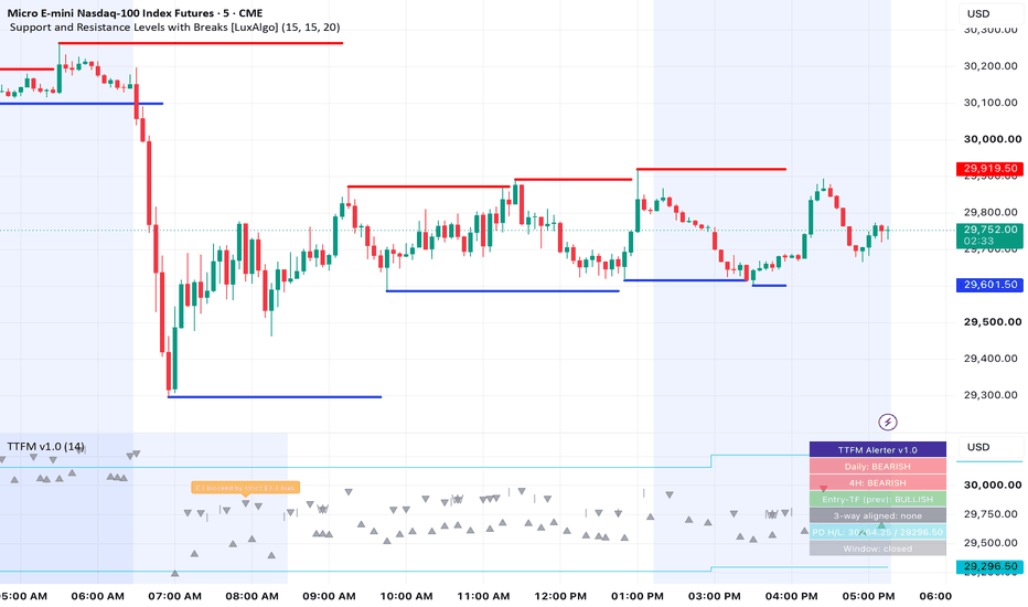
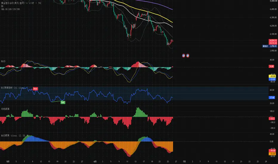
MACD Signal to Zero DistanceIndicator Overview
The MACD & Signal to Zero Distance indicator is a highly customized momentum space oscillator designed for TradingView. Unlike the traditional MACD, which focuses on the net difference between the fast and slow lines (the standard histogram), this indicator isolates and visualizes the absolute spatial distance of both the MACD Line (Fast Line) and the Signal Line (Slow Line) relative to the Zero Line.
By converting these spatial relationships into color-coded column groups, it provides traders with an instantaneous visual gauge of absolute trend strength, acceleration, and mean-reversion levels.
Core Logic & Data Interpretation
The indicator operates on a linear mapping of spatial distance. When either line sits perfectly on the zero baseline, its distance is 0 (the corresponding column vanishes).
MACD Line to Zero Distance (Fast Component):
Positive Values (Green Columns): Indicate bullish momentum. Higher columns signify that short-term price action has stretched significantly above the long-term baseline.
Negative Values (Red Columns): Indicate bearish momentum. Deeper columns reflect stronger absolute downside expansion.
Signal Line to Zero Distance (Slow Component):
Positive (Blue Columns) / Negative (Orange Columns): Represent the absolute positioning of the medium-term trend. As a moving average of the MACD line, its height relative to the zero axis filters out short-term noise and outlines the structural "margin of safety."
Key Features & Technical Advantages
1. Multi-Source Adaptability
This indicator breaks the constraint of traditional MACD scripts that calculate based solely on the closing price. Traders can seamlessly toggle the Source input to Open, High, Low, or even VWAP (Volume Weighted Average Price). This flexibility makes it highly compatible with Volume Price Analysis (VPA) and intraday anchored trading systems.
2. Clutter-Free Dual Column Design
By rendering two separate, color-distinct bar groups on a shared axis, the script allows traders to identify key market conditions at a glance:
Convergence/Divergence: Whether the fast and slow columns are leveling out or expanding away from each other.
Phase Split: Scenarios where the MACD line has already crossed the zero axis into negative territory while the Signal line remains buffered above it.
3. Precision Mean-Reversion & Trend Monitoring
Since the columns map absolute mathematical distances, they serve as an excellent gauge for:
Baseline Tests: When columns compress near 0, the market is coiled tightly at a fair-value inflection point, offering high-probability breakout or retest entries.
Momentum Exhaustion (Overextension): When columns reach historical peak heights, it signals that the market is overextended relative to its zero baseline, indicating a high probability of a mean-reversion pause or pullback.
核心设计逻辑与数值含义
指标严格遵循“空间距离”的线性映射逻辑,当快慢线完美回归或踩在零轴上时,距离为 0(柱体消失)。
快线离零轴距离(MACD to Zero):
正值(绿色柱体):代表多头动能主导,柱体越高,说明短期价格偏离长期均线的绝对多头空间越大。
负值(红色柱体):代表空头动能主导,柱体越长,说明空头向下发散的绝对动能越强。
慢线离零轴距离(Signal to Zero):
正值(蓝色柱体) / 负值(橙色柱体):代表中线趋势的绝对位置。慢线作为快线的移动平均,其距离零轴的高度反映了趋势的稳定性和“安全边际”。
核心功能与技术优势
1. 多维度价格源支持 (Multi-Source Adaptability)
指标打破了传统 MACD 只能基于收盘价(Close)计算的限制。用户可以在设置中自由切换价格源(如开盘价 Open、最高价 High、最低价 Low)甚至是 VWAP(成交量加权平均价)。这使得指标能够完美融入基于量价分析(Volume Price Analysis)或日内锚定交易的系统。
2. 并排分组视觉设计 (Clarity at a Glance)
通过在零轴上下同时绘制两组独立颜色、相同坐标系的柱状图,交易者可以一眼看出:
快线与慢线是否正在收敛(柱体高度趋于一致)。
快慢线相对于零轴的绝对空间(如:快线已跌破零轴进入负数区,而慢线仍踩在零轴上方保持正数)。
3. 直观的回归交易逻辑 (Mean Reversion & Trend Following)
由于该指标的数值代表绝对距离,交易者可以非常精确地捕捉:
踩线动能:当柱体高度缩减至接近 0(-1 到 +1 之间),代表价格与趋势线完美贴合,是极佳的突破或共振确认点。
动能衰竭(乖离率过大):当绿柱或红柱达到历史极值高度,代表短线动能消耗过大,距离零轴过远,面临向零轴修正(动能衰竭或反弹)的技术需求。
以下は、このカスタムインジケーターの専門的かつ客観的な日本語解説です。
インジケーター概要 (Indicator Overview)
本インジケーターは、TradingView用にカスタマイズされた「MACDモメンタム空間オシレーター」です。従来のMACDが「MACD線とシグナル線の差(ヒストグラム)」に焦点を当てるのに対し、本インジケーターはMACD線(短期線)とシグナル線(長期線)のそれぞれが、ゼロ軸(Zero Line)からどれだけ絶対的な空間距離を置いているかを列状のヒストグラムとしてダイレクトに視覚化します。
これにより、現在の価格モメンタムが位置する絶対的な強弱のゾーンや、ゼロ軸への回帰状態を瞬時に視覚的に把握することが可能になります。
コアロジックと数値の定義
本インジケーターは「空間距離」の線形マッピングロジックに厳格に従っています。各ラインがゼロ軸に完全に張り付いた時、距離は「0」となり、ヒストグラムの柱は消失します。
MACD線のゼロ軸乖離距離(MACD to Zero):
正の値(緑の柱): 強気(ブル)モメンタムが主導。柱が高くなるほど、短期的な価格が長期平均から上方へ大きく乖離していることを示します。
負の値(赤の柱): 弱気(ベア)モメンタムが主導。柱が長くなるほど、下方向への拡散エネルギーが強いことを示します。
シグナル線のゼロ軸乖離距離(Signal to Zero):
正の値(青の柱)/ 負の値(オレンジの柱): 中期トレンドの絶対的な位置。MACD線の移動平均であるシグナル線のゼロ軸からの高さは、トレンドの安定性と「セーフティ・マージン(安全余裕度)」を反映します。
主な機能と技術的メリット
1. マルチ・ソース(価格源)対応 (Multi-Source Adaptability)
従来のMACDが終値(Close)のみに基づいていた制限を排除しました。設定画面から、始値(Open)、高値(High)、安値(Low)、さらにはVWAP(出来高加権平均価格)へ自由に切り替えることができます。これにより、量価分析(ボリューム・プライス・アナリシス)や日中アンカー型取引システムとも完全に融合させることが可能です。
2. 並列グループ化された視覚デザイン (Clarity at a Glance)
ゼロ軸の上下に、色分けされた2つの独立したヒストグラムを同一座標系に描画することで、トレーダーは以下の状態をひと目で判別できます。
MACD線とシグナル線が収束(柱の高さが一致)しつつあるか。
ゼロ軸に対するそれぞれの絶対的フェーズ(例:MACD線はすでにゼロ軸を割り込んで負の領域にあるが、シグナル線は依然としてゼロ軸の上で耐えているなど)。
3. 直感的な平均回帰・トレンドフォロー戦略 (Mean Reversion & Trend Following)
数値が絶対的な「距離」を表すため、以下のような局面を極めて正確に捉えることができます。
ラインへの接地(もみ合いの確認): 柱の高さが0付近に収縮した時は、トレンドラインに価格が完全に収束したことを意味し、ブレイクアウトや共振(レジサポ転換)を狙う絶好のエントリーポイントとなります。
モメンタムの枯渇(過剰乖離): 緑または赤の柱が過去の極値(ピーク)に達した時は、短期的モメンタムが過剰に消費され、ゼロ軸から離れすぎていることを示し、ゼロ軸への回帰(反発や調整)のテクニカルな需要が高まっていると判断できます。 Gösterge

Gösterge

High/Low Resistance LiquidityDescription
Not all liquidity pools are created equal. The market behaves very differently when attacking a clean, pristine target versus when it is grinding through jagged, already-swept price action.
The High/Low Resistance Liquidity indicator is an automated structural mapping engine that programmatically identifies and categorizes liquidity pools into Low Resistance (LRLR) and High Resistance (HRLR) targets in real-time.
🎯 What is LRLR and HRLR?
LRLR (Low Resistance Liquidity Run): These are "clean" targets. When stops are perfectly clustered at the exact same price, it creates a massive, unobstructed magnetic pull for price. When price attacks these areas, it displaces quickly and aggressively.
HRLR (High Resistance Liquidity Run): These are "dirty" or swept targets. If a pivot high has already swept a previous high and rejected (a false breakout or sweep), the liquidity resting there was already purged. Price will struggle, chop, and overlap heavily if it attempts to push back into that isolated zone.
✨ Key Features
Automated Target Detection: The indicator maps structural highs and lows using customizable left/right bar pivot confirmations, and immediately evaluates their relationship to the previous market structure.
EQH/EQL Detection (LRLR): If a new structural pivot forms within a tight tick threshold of the previous pivot, it validates them as Equal Highs or Equal Lows. A solid, highly visible line is drawn forward, marking a pristine Low Resistance target.
Swept Pivot Detection (HRLR): If a new pivot extends past the old pivot and reverses, it validates a sweep. A dotted warning line is drawn forward, marking a High Resistance target where price is likely to struggle.
Real-Time Mitigation: The script actively monitors price action. The exact moment a future candle wicks or closes through an active liquidity line, the line stops extending and its label updates to "Mitigated", keeping your charts completely free of historical clutter.
Standard Liquidity Toggle: Choose whether you only want to see explicit LRLR/HRLR targets, or if you want to also track all standard, unmitigated intermediate pivots in the background.
⚙️ Settings
Pivot Strength: Fully customize how many bars are required left and right to confirm a major structural point.
EQH/EQL Tolerance (Ticks): You dictate exactly how tight the price must align to be considered "Equal". (e.g., 5-10 ticks on lower timeframes, or expand it for Daily charts).
Display Settings: Toggle the visibility of Standard Unmitigated Pivots, turn text labels on or off, and fully customize the line colors to fit your exact chart aesthetic. Gösterge

High / Low Resistance Liquidity TrendDescription
This indicator is a powerful, algorithmic tool designed for HRLR methodologies. It removes the subjectivity of identifying High Resistance Liquidity Runs (HRLR) and Low Resistance Liquidity Runs (LRLR) by dynamically mapping out the structural flow of liquidity on your chart using clean, point-to-point trendlines.
🎯 Core Concepts
In this methodology, understanding whether price will face "resistance" when drawing to a liquidity pool is critical for trade management:
Low Resistance Liquidity (LRLR): Clean, engineered liquidity. When price fails to sweep a previous structural extreme, it leaves behind smooth, resting stop-losses. This acts as a frictionless magnet for price.
High Resistance Liquidity (HRLR): Swept liquidity. When price violently takes out a previous extreme and reverses, it purges the local stop-losses. Returning to this level is a "High Resistance" run because the liquidity fuel has already been burned.
⚙️ How It Works
The script evaluates price action in real-time, detecting structural Pivot Highs and Pivot Lows. It then dynamically draws trendlines connecting adjacent pivots to reveal the underlying liquidity texture:
🟢 LRLR (Green Lines) - Failed Sweeps:
Highs: Connects a Pivot High to a subsequent Lower High.
Lows: Connects a Pivot Low to a subsequent Higher Low.
Signal: Clean trendline liquidity is building. Expect a fast, low-resistance run through this level.
🔴 HRLR (Red Lines) - Liquidity Sweeps:
Highs: Connects a Pivot High to a subsequent Higher High.
Lows: Connects a Pivot Low to a subsequent Lower Low.
Signal: A Turtle Soup / Sweep has occurred. Price may struggle to break this extreme cleanly.
✨ Visual Polish
This indicator is built with extreme attention to aesthetic detail. Rather than messy labels cluttering the wicks, the text (LRLR / HRLR) is mathematically positioned at the exact midpoint of the connecting trendlines. It features a custom Label Masking engine that dynamically cuts out the line exactly where the text sits, providing a stunning, ultra-clean look. (Note: Use the 'Chart Background Color' setting to ensure the label mask matches your specific TradingView theme).
🔧 Settings
Pivot Left/Right Bars: Fully customize the structural lookback to define exactly what constitutes a valid swing high/low for your timeframe.
Visual Customization: Full control over colors and text labels.
Chart Background Mask: Allows you to swap the label cutout color between Light Mode and Dark Mode backgrounds flawlessly. Gösterge

Ehlers Adaptive Trend Filter + Consensus Engine v13Ehlers Adaptive Trend Filter + Consensus Engine
WHAT IT DOES
This screener reads a universe of up to 40 tickers through three independent Ehlers filter pairs running in parallel on every name, then groups the names by how many of the three filters agree the trend is up. The grouping is the "phase"; the intensity and direction of each name's move is the "temperature". It describes the structural state of each name. It does not tell you what to trade.
Because the three filters react at different speeds, the number that agree is a measure of how broadly a trend is confirmed across timescales: a move that only the fastest filter sees is early or fragile; a move all three see is broadly confirmed.
THE THREE FILTERS
Fast (2-pole SuperSmoother): the most reactive. It turns first and catches short-cycle moves, at the cost of more false turns.
Core (3-pole + 2-pole): the balanced middle. Slower to turn, steadier once it does. In most conditions it is the strongest single read.
Adaptive (MAMA/FAMA): retunes itself to the dominant detected cycle rather than using a fixed period. It often turns before the other two at a genuine cycle change, which is why an Adaptive-only signal is treated as an early, unconfirmed one.
THE FOUR PHASES
Heated: all three filters agree the trend is up. The fullest agreement the engine measures.
Liquid: two of three agree; one dissents. The dissenter is where the interest lies.
Thawing: one of three agrees. The earliest single-timescale turn, not yet confirmed.
Frozen: none agree. No bullish consensus.
Within each phase a per-row temperature word (Boiling, Hot, Simmering, Warming, Cooling, Cold, Freezing) describes how far the name sits from its own normal range and whether that separation is rising or falling. Direction is shown by an arrow, so "Boiling" means an extreme move regardless of sign.
READING A ROW
A Heated-phase row might read:
NVDA (up) 14b C:1.8 F(up)+12.4 Co(up)+9.1 A(up)+15.2 -> Heated . Boiling (up)
That is: NVDA, 63-bar direction up, 14 bars in its current phase, Calmar 1.8; all three filters bullish with their separations from baseline in percent (Fast +12.4, Core +9.1, Adaptive +15.2); stop distance to the Core baseline +6.3 percent; and the state tag, Heated . Boiling (up) - all three aligned, an extreme-magnitude move, rising.
The engine also flags "clusters": several names dissenting the same way at once (Adaptive turning bearish under apparent strength, or bullish under apparent weakness), which is structural pressure forming across the universe rather than in a single name.
HOW TO READ IT, NOT WHAT TO DO
This tool is descriptive. It reports what the filters show: which names are in which phase, how hot or cold each move is, and where broad pressure is building. It does not generate buy or sell instructions, position sizes, or price targets, and nothing in it should be read as financial advice. What you do with the information is your own decision.
CREDITS
Method: the MAMA/FAMA (MESA Adaptive Moving Average) algorithm and the SuperSmoother filters are John Ehlers' work (MAMA paper: mesasoftware.com/papers/MAMA.pdf).
Implementation: the MAMA/FAMA Pine derives from Ehlers MESA Adaptive Moving Average by LazyBear , an open-source script, refactored here from series form into a per-ticker state architecture. Credit and thanks to LazyBear for the original.
Original in this script: the multi-ticker consensus engine, the phase and temperature classification, and the cluster detection are my own work. Released open-source under MPL-2.0. Gösterge