Gösterge

Gösterge

Total Futures Volume & Open Interest (Aggregated Curve)Description
Most futures indicators only look at the front contract, but that often tells an incomplete — and sometimes misleading — story.
This indicator solves that problem by aggregating Volume and Open Interest across the entire futures curve, not just the nearest expiry.
Instead of focusing on a single contract, the script automatically scans up to 40 futures contracts ahead (roughly one year forward) for the same underlying root symbol and sums their data into a single, unified series.
🔍 Why this matters
Open Interest is about commitment, not just activity.
A drop in front-month OI can simply mean rolls, not liquidation
Rising total OI confirms new money entering the market, not just contract switching
Divergences between price and aggregated OI often signal positioning stress, exhaustion, or regime shifts
By looking at total participation across all maturities, you get a much cleaner view of:
Real capital inflows vs. mechanical rolls
Structural positioning changes
Whether volatility is driven by speculation or true exposure changes
This is especially useful during high-volatility phases, contract roll periods, and major macro moves, where front-month data alone can be deceptive.
⚙️ How it works
Automatically iterates through the last 40 futures contracts of the same root symbol starting from ~1 year ahead expiry.
Aggregates: Total Open Interest and Total Volume
Lets you choose what to display directly from the indicator settings
Fully dynamic — no manual symbol selection, no roll management
The result is a continuous, roll-agnostic view of futures participation.
🧠 How to use it
Confirm breakouts with rising aggregated OI
Detect false moves when price expands but total OI contracts
Analyze post-spike behavior to see whether moves were driven by forced liquidation or fresh positioning
Compare volatility spikes against true market engagement
Gösterge

Gösterge

Paradigm Shift: Delivery StateDescription by way of Example using weekly and 4h readings. THIS INDICATOR IS NOT MADE TO OPERATE BELOW A 4H chart. It is looking for Weekly and 4h price delivery that an ICT trader would call messy. Spikes well below OB but which then turn in the logical direction. A series of FVG that are never returned to or themselves are printed over but then turn support or resistance against the run through. So it is designed to indicate the overall level of stress on algorithm delivery. When you see a significantly higher stress level on the 4h trading is still doable but be careful of sloppy delivery. When you see a significant stress level on the weekly then be very very careful on the lower levels and consider staying out for the time being. The state of price delivery can be seen by anyone. But I have incorporated readings of the global bond market and currency correlations as confluent evidence of the reading for the state of price delivery. The term "grinder" is my word for algorithmic delivery. Contrary to ICT I believe that buying and selling pressure are real determinants of market movement up or down. However, I believe that that pressure is pushed through the algo like meat through a meat grinder to ensure a fair and equitable and efficient delivery of that pressure. So price always moves according to algorithmic principles, but those principles are driven by external pressure. The greater the pressure the more the algo stutters and gaps in its effort to smooth out an efficient delivery of price. This Indicator is looking for those stressors.
The Weekly State: "Symmetrical" / Stress: 2%
* What it means: At the highest level, the "New Paradigm" has not yet broken the system. A 2% stress level is effectively "Background Noise." This indicates that the global bond market and currency correlations are currently holding their historical norms.
* The Price Delivery: Because it is Symmetrical, the "Grinder" is in an efficient mode. Weekly expansions are likely being met with orderly retracements. There are no "Ominous" breakaway gaps on the weekly timeframe yet.
* The Dalio View: We are still in the "Accumulation" or "Buffering" phase of the cycle. The systemic heart attack is not happening this week.
2. The 4h State: "Saturated" / Stress: 44%
* What it means: While the Weekly is calm, the 4h is heating up. A 44% stress level means that local bond volatility (the US10Y proxy) is higher than it has been 44% of the time over the last year. This is a significant "Step-Up" in pressure.
* The Price Delivery: Because it is Saturated, the 4h "Grinder" is starting to struggle with the "meat" being fed into it.
* The Result: You will likely see "Deep Stop Runs" and "PD Array Overtravel." Price might not just tap an Order Block; it might blast 15 pips through it before reversing.
* Delivery is "Unclean": The 4h Fair Value Gaps might only get partially filled, or price might leave "jagged" wicks that make lower-timeframe entries frustrating.
3. How to Trade This Divergence (Practical Logic)
When the Higher Timeframe (HTF) is stable (2%) but the Lower Timeframe (LTF) is stressed (44%), it creates a specific environment:
* The "Opaque Trap": You might see a perfect ICT Silver Bullet setup on the 15m, but because the 4h is "Saturated," the setup will likely be messier than usual. You should expect "Judas Swings" to be more violent and "FVG Retracements" to be less precise.
* Confidence in the HTF: Since the Weekly is at 2%, you can trust the Overall Direction. If the Weekly is bullish, any "Saturated" mess on the 4h is likely just an aggressive re-accumulation rather than a systemic reversal.
* The "Stay Out" Warning: You only need to worry when that 4h Stress (44%) begins to "infect" the Weekly. If the Weekly Stress moves from 2% to 20% to 50%, that is your signal that the Paradigm is Shifting and the "Grinder" is about to start teleporting price.
Gösterge

Supertrend Elite Trend System🏆 SUPERTREND ELITE TREND SYSTEM (SETS)
A sophisticated multi-indicator voting system designed for crypto trending markets, combining 10 powerful technical indicators with weighted scoring and trend confirmation.
📊 BACKTESTED PERFORMANCE (2018-2026):
- Total Return: +2,170%
- Win Rate: 30.23%
- Profit Factor: 2.4
- Max Drawdown: 41.72%
- Total Trades: 43
🎯 HOW IT WORKS:
The system uses 10 carefully selected indicators that "vote" on market direction:
1. Supertrend - Trend following baseline
2. ALMA - Smooth trend detection (Weight: 2)
3. CTI - Correlation Trend Indicator
4. STC - Sebastine Trend Catcher (Weight: 2)
5. GUNXO - Dual EMA trend sniper
6. DEMA DMI - Combined momentum & trend (Weight: 2)
7. MM - Market momentum indicator
8. DMI Loop - Directional movement analysis
9. Trend Oscillator - Fast/slow EMA divergence
10. Stochastic - Overbought/oversold conditions
Each indicator votes BULL (+1 or +2) or BEAR (-1 or -2), creating a weighted score out of 13 possible points.
🔥 SIGNAL GENERATION:
- STRONG BULL: Score difference > +4 (sustained 2 bars)
- WEAK BULL: Score difference > +1 (sustained 2 bars)
- WEAK BEAR: Score difference < -1 (sustained 2 bars)
- STRONG BEAR: Score difference < -4 (sustained 2 bars)
The 2-bar confirmation requirement filters out false signals and reduces whipsaws.
💎 BEST FOR:
- Crypto markets (BTC, ETH, major altcoins)
- 4H to Daily timeframes
- Trending markets (bull or bear)
- Long-term position holders
⚠️ NOT RECOMMENDED FOR:
- Ranging/sideways markets
- Scalping or day trading
- Low-volume altcoins
- High-frequency trading
📈 VISUAL FEATURES:
- Color-coded trend line below price (Green = Bull, Red = Bear)
- Real-time score dashboard showing bull/bear votes
- Clear action signals (BUY/HOLD, CAUTION, REDUCE, SELL/EXIT)
- Built-in alerts for trend changes
💡 STRATEGY:
The system is designed for "buy and hold during uptrends" approach. Enter on STRONG BULL or WEAK BULL signals, exit on WEAK BEAR or STRONG BEAR signals. Works best when combined with proper risk management and position sizing.
📱 ALERTS AVAILABLE:
- Strong Buy Signal
- Strong Sell Signal
- Trend Weakening Warning
- Bearish Turn Warning
Created and backtested by advanced algorithmic trading research. Not financial advice - always do your own research and never risk more than you can afford to lose. Strateji

Logarithmic Fair Value Anchor | PWLogarithmic Fair Value Anchor
This indicator overlays a dynamic "fair value" estimate on the price chart, anchored to the momentum and historical relationship of a user-selected reference asset (e.g., gold, broad liquidity proxies, or major indices). It combines logarithmic deviation analysis with relative valuation to adapt to the anchor's behavior, offering a flexible tool for exploring cross-asset divergences, mean-reversion setups, and contextual extremes.
Core Mechanics and Math Overview
The fair value starts with a baseline: an EMA-smoothed ratio of price to the anchor over the lookback period (default 180 bars). This ratio reflects the historical "normal" relationship between the chart symbol and the anchor.
Anchor momentum is added via the smoothed 1-period ROC of the anchor, scaled by a user-adjustable Momentum Influence Scale (default 5.0 — lower values increase responsiveness). This scaled influence is exponentially applied to adjust the baseline ratio. An optional correlation filter weights the adjustment using absolute log-price correlation (with threshold and manual multiplier). The result is DEMA-smoothed (default length 14) for a responsive yet stable fair value line.
Deviation bands are built multiplicatively around this fair value using exp(deviation * level), preserving log-scale compatibility. Three band types are available:
Log Stdev: Standard deviation of log(price / fair value) — dynamic, volatility-responsive.
Static Sigma: Fixed user-defined deviation (default 0.15) — consistent relative widths.
ATR: Relativized ATR converted to log deviation — range-based smoothing for volatile markets.
Bands use asymmetric multipliers (defaults 1.8 upper / 1.25 lower) with three levels, fills, and markers for visual clarity.
Key Features
Anchor Flexibility: Choose from Gold (XAUUSD), Silver (XAGUSD), S&P 500 (SPX), BTC, or experimental proxies (GLI/M2 aggregates from FRED/ECONOMICS data).
Trend and Visuals: Trend detection (price vs. offset fair value) with optional bar coloring, background highlights for extremes, and diamond markers for overbought/oversold.
Enhanced Info Table (toggleable): Shows current fair value, selected anchor, band type, bias (LONG/SHORT/NEUTRAL), trend duration, trend quality (% clean bars), strength rating (icon-based), z-score deviation (effective band multiple in sigmas + approximate percentile), and valuation (Overvalued/Undervalued/Fair).
Customization: Lookback, offset, smoothing, momentum scale, correlation weighting, band type, multipliers, bar color toggle — adaptable to different assets/timeframes.
What Makes This Approach Distinct
The script uses a smoothed price-to-anchor ratio as its baseline, then applies scaled logarithmic momentum influence to create a fair value that respects both history and external dynamics. This differs from pure moving averages or direct ratio models by incorporating cross-asset momentum in a log framework. Band variety and detailed trend quality/strength metrics provide practical tools for navigating volatility regimes and assessing trend reliability — features not commonly combined in one overlay.
Usage Suggestions
Crypto: Anchor to GLI/M2 for liquidity context; ATR bands help manage volatility. Watch high z-score/percentile or low trend quality for reversals.
Equities/Commodities: Gold for inflation views, S&P for market ties; static sigma for stable benchmarks.
General Tips: Use log scale for visual alignment. Offset (default 90) projects fair value forward. Leverage table metrics — e.g., quality >80% for stronger trends, strength icons for momentum conviction, valuation extremes for mean-reversion ideas. Test anchors and scales to fit your market.
This is an exploratory relative-valuation overlay — results vary by anchor, conditions, and settings. Not financial advice; backtest thoroughly and verify independently.
Notes
Pine Script v6; requires access to external symbols via request.security().
Minor repainting possible on realtime bars due to smoothing and external data.
Community feedback welcome for refinements!
Gösterge

XAUUSD Position calculator **XAUUSD Funded Position Calculator — Pro Risk Suite**
The XAUUSD Funded Position Calculator is a professional risk management and position sizing tool specifically designed for Gold traders and prop firm accounts.
This indicator allows traders to visually plan, size, and manage trades directly from the chart using a simple click-based workflow. Users can mark Entry, Stop Loss, and Take Profit levels, and the tool automatically calculates precise lot size based on account balance and selected risk percentage.
Key features include a real Break-Even engine that adjusts for fees and spread using position size, Risk-Reward analysis with a dynamic quality meter, and visual R-Lock levels (1R / 2R) to help traders secure profits systematically.
The integrated data panel displays both target risk and actual risk exposure, profit projections, lot size formatted for MT4/MT5 standards, and real-time trade quality evaluation.
Designed for funded traders, scalpers, and Gold specialists, this tool enhances execution discipline, capital protection, and trade planning efficiency — all within a clean, professional chart interface.
**Core Features**
• Click-to-set Entry / SL / TP
• Funded account risk % sizing
• Real Break-Even price calculation
• 1R & 2R profit lock levels
• Dynamic Risk-Reward meter
• Actual vs Target risk display
• MT4/MT5 lot formatting
• Clean visual trade panel
Built for precision. Designed for discipline. Optimized for funded trading.
Gösterge

Relative Valuation Oscillator [QuantAlgo]🟢 Overview
The Relative Valuation Oscillator identifies statistical price deviations from fair value using logarithmic price analysis and standard deviation bands. It calculates how far current price has deviated from its mean on a logarithmic scale, normalized by volatility, to generate a centered oscillator that highlights periods when price is statistically stretched above or below its historical average, helping traders identify potential mean reversion opportunities and extreme valuation conditions across different timeframes and markets.
🟢 How It Works
The indicator's core methodology lies in its statistical approach to price valuation, where deviations are measured using logarithmic returns and normalized by standard deviation:
log_price = math.log(close)
mean_log_price = ta.sma(log_price, lookback_period)
standard_deviation = ta.stdev(log_price, lookback_period)
valuation_score = (log_price - mean_log_price) / standard_deviation
First, the script converts price to logarithmic form to account for percentage-based price movements rather than absolute dollar changes, ensuring the indicator works consistently across different price levels and asset classes.
Then, it calculates the mean log price over the specified lookback period to establish a baseline fair value reference:
mean_log_price = ta.sma(log_price, lookback_period)
Next, standard deviation measurement quantifies the typical volatility of log price around this mean, providing a statistical framework for defining normal versus extreme price behavior:
standard_deviation = ta.stdev(log_price, lookback_period)
The valuation score is then derived by measuring how many standard deviations the current log price sits from its mean, creating a normalized oscillator that fluctuates around zero:
valuation_score = (log_price - mean_log_price) / standard_deviation
Finally, threshold-based signal detection identifies extreme conditions when the valuation score exceeds user-defined standard deviation multiples:
is_overvalued = valuation_score > threshold_mult
is_undervalued = valuation_score < -threshold_mult
This creates a statistical mean reversion system that identifies when price has deviated significantly from its historical average on a volatility-adjusted basis, providing traders with objective measurements of relative over or undervaluation.
🟢 Signal Interpretation
▶ Undervalued Zone (Below Negative Threshold): Oscillator falling below the negative threshold line indicates price has deviated significantly below its statistical mean = Potential long/buy opportunities for mean reversion strategies
▶ Overvalued Zone (Above Positive Threshold): Oscillator rising above the positive threshold line indicates price has deviated significantly above its statistical mean = Potential short/sell or profit-taking opportunities
▶ Fair Value Range (Between Thresholds): Oscillator remaining between positive and negative threshold lines indicates price is trading within normal statistical bounds. Within this range, the zero line acts as a directional filter: oscillator above zero but below the upper threshold suggests bullish trend/momentum with price trading above its statistical mean = Trend-following long positions can be maintained; oscillator below zero but above the lower threshold suggests bearish trend/momentum with price trading below its statistical mean = Trend-following short positions can be maintained. The oscillator can remain in these directional zones during sustained trends until mean reversion occurs, signaled by crosses back toward zero or transitions to the opposite extreme threshold.
▶ Zero Line Crosses: Oscillator crossing above zero indicates transition from below-average to above-average valuation, confirming shift to bullish momentum = Potential trend-following long entry; crossing below zero indicates transition from above-average to below-average valuation, confirming shift to bearish momentum = Potential trend-following short entry or long exit. These crosses can signal both the start of directional trends and early mean reversion from extreme conditions.
🟢 Features
▶ Preconfigured Presets: Three optimized parameter sets for different trading approaches and timeframes. "Default" provides balanced sensitivity for swing trading on 4-hour and daily charts, generating signals at statistically significant deviations. "Fast Response" delivers more frequent signals for intraday trading on 5-minute to 1-hour charts, reacting quickly to short-term deviations with increased signal frequency. "Smooth Trend" focuses on major extremes for position trading on daily to weekly timeframes, filtering noise to identify only the most significant statistical outliers.
▶ Built-in Alerts: Five alert conditions enable automated monitoring of valuation extremes and transitions. "Overvalued Threshold Crossed" triggers when the oscillator crosses above the positive threshold, signaling potential overvaluation. "Undervalued Threshold Crossed" activates when the oscillator crosses below the negative threshold, signaling potential undervaluation. "Crossed Above Fair Value (0)" and "Crossed Below Fair Value (0)" provide alerts for zero line transitions, indicating shifts between above-average and below-average valuation. "Any Extreme Valuation" offers a combined alert for any threshold breach regardless of direction, allowing traders to monitor both extremes with a single alert setup.
▶ Color Customization: Six visual themes (Classic, Aqua, Cosmic, Cyber, Neon, plus Custom) accommodate different chart backgrounds and visual preferences, with distinct colors for overvalued, undervalued, and fair value conditions. Optional background highlighting with adjustable transparency (0-100%) tints the main chart background during extreme valuation periods, providing immediate visual context without requiring continuous oscillator monitoring. Optional overlay signals display small circle markers directly on the price chart above bars during overvaluation and below bars during undervaluation, allowing correlation of statistical extremes with specific price levels and candlestick patterns.
Gösterge

Gösterge
Gösterge

Gösterge

Intraday Refuges/Shelters (RID)==========================================
RID (INTRADAY SHELTERS/REFUGES) INDICATOR
==========================================
*Fair warning: this may be more words than a humble, simple indicator truly
needs… but Claude insisted.
// ** INTRODUCTION ** //
RID (Intraday Shelters/Refuges) is a lightweight, fast, and easy-to-implement
indicator designed for monitoring price action on intraday timeframes — the same
ones used by institutional operators to execute their trades within each market session.
The indicator generates a framework of support and resistance levels automatically
calculated from the asset's Daily Opening Price (D.O.P.). These levels are established
using fixed percentages that have proven their effectiveness in institutional trading
for decades, constituting "textbook" references widely adopted by market professionals.
RID integrates as an optional module within our Weekly Shelters (RS) indicator, allowing
the operator to simultaneously control their weekly positions and, when conditions warrant,
move down to intraday operations without loading additional indicators or losing sight
of the higher timeframe.
// ** INDICATOR FUNDAMENTALS ** //
The foundation of RID rests on a proven market principle: the daily opening price acts
as a "psychological anchor" that influences participant behavior throughout the entire session.
Why does this method work?
• UNIVERSAL REFERENCE POINT: The daily opening price is objective data, visible to all
market participants simultaneously. Institutions, algorithms, and retail traders use it
as a common reference to calibrate their decisions.
• STANDARD PERCENTAGE LEVELS: The percentages used (0.382%, 1.0%, 1.5%, 2.0%, 2.5% and
extensions) are not arbitrary. They represent intraday volatility thresholds that have
historically acted as inflection points across multiple asset classes.
• SELF-FULFILLING PROPHECY EFFECT: When a critical mass of operators place orders at the
same percentage levels —whether for profit-taking, protective stops, or entries—
these levels become high-probability price reaction zones.
• INSTITUTIONAL RISK MANAGEMENT: Institutional trading desks frequently define their daily
loss limits and profit targets in percentage terms relative to the open. RID captures
this logic and makes it visible for retail operators.
The ±0.382% level deserves special mention: it's a derivation of the Fibonacci golden ratio
(0.382) applied to the intraday context, representing the first significant movement threshold
from the opening.
// ** INDICATOR OBJECTIVES ** //
1) Facilitate manual intraday trade execution by providing a framework of target prices
established under a scheme of mathematical certainty, eliminating subjectivity in
defining entries, exits, and stops.
2) Serve as a lightweight and modular tool, easily integrable —either as an overlay or
source code— with strategies and indicators specialized in intraday trade execution,
both manual and automated.
3) Provide a visual reference framework that allows the operator to quickly assess the
intraday market "temperature": Is price near a key support or resistance? Has it already
reached the session's typical movement target? Is it time to seek entries or protect profits?
// ** INDICATOR TECHNICAL FEATURES ** //
• 21 CONFIGURABLE LEVELS: 11 main levels (±0.382%, ±1.0%, ±1.5%, ±2.0%, ±2.5% and D.O.P.)
plus 10 extended levels (±3.0% to ±5.0%) for high volatility sessions. Each level can
be individually enabled or disabled according to operator needs.
• AUTOMATIC D.O.P. DETECTION: The indicator automatically identifies the start of each daily
session and captures the opening price without user intervention.
• CONFIGURABLE HISTORY LIMIT: Option to limit processing to the last N days (default: 3),
optimizing performance on very low timeframes (1m, 5m) where excess historical data can
slow down the chart.
• PROFESSIONAL VISUALIZATION: Labels with formatted price (thousands separators) and
percentage, placeable with configurable offset. The D.O.P. level (0%) is highlighted
with differentiated width.
• VERTICAL REFERENCE LINES: From D.O.P. to each level, facilitating visualization of the
percentage distance traveled.
• FULL CUSTOMIZATION: Colors, widths, line styles (solid, dashed, dotted), label opacity,
and forward extension fully adjustable.
• PRICE SCALE INTEGRATION: Levels can be displayed on the right margin of TradingView,
controllable from the indicator's Style tab.
• BAR REPLAY COMPATIBILITY: Works perfectly with Bar Replay for back-testing
intraday strategies.
• OPTIMIZED PERFORMANCE: Efficient architecture with persistent arrays and intelligent
updating, suitable for timeframes down to 1 minute.
// ** OPERATING INSTRUCTIONS ** //
INITIAL SETUP:
1) Load the indicator on a chart with 4H or lower timeframe (1H, 30m, 15m, 5m, 1m).
2) Enable "Limit history by days" and adjust "Maximum days to display" according to your needs:
• For scalping (1m-5m): 1-2 days
• For day trading (15m-1H): 2-3 days
• For intraday swing (4H): 3-5 days
OPERATIONAL USE:
3) Identify the D.O.P. (0% line): This is your central reference point for the session.
4) Observe current price position relative to levels:
• Price above D.O.P. → Session with bullish bias
• Price below D.O.P. → Session with bearish bias
5) Use levels as:
• ENTRIES: Look for reversal signals when price reaches S1-S5 (buys) or R1-R5 (sells)
• TARGETS: Set take-profits at the next resistance level (longs) or support (shorts)
• STOPS: Place protective stops beyond the immediate opposite level
PRACTICAL RULES:
6) The ±1.0% and ±2.0% levels are historically most respected; prioritize them.
7) If price exceeds ±2.5% from open, it might be time to take profits and close your position
or consider enabling extended levels (±3.0% to ±5.0%).
8) High volatility days (news, earnings): wait for price to respect at least one level
before trading in its direction.
9) Combine RID with other indicators from our ecosystem (RS, RMP, RLP/RLPS) to confirm level
confluence across multiple timeframes.
VISUAL OPTIMIZATION:
10) For clean charts: keep enabled only main levels (±0.382% to ±2.5%).
11) For detailed volatile asset analysis: also enable extended levels.
12) Adjust "Label margin" to prevent overlap with current price.
// ** INTEGRATION WITH OTHER SHELTER VALUE INDICATORS ** //
RID is part of a complete shelter-based analysis ecosystem we have developed:
• RLP (Long-Term Shelters): For automatic determination of the preponderant phase
of a Zigzag, which institutional investors choose as the base of a Fibo whose
levels calculate order placement projection over the following months and years.
• RLPS (Simplified Long-Term Shelters): Simplified version of RLP where known
coordinates of the preponderant phase are captured, obtained through own analysis
or automatically with the RLP indicator.
• RMP (Medium-Term Shelters): Provides psychological shelter and resistance levels
that institutional investors establish at the beginning of each year. They
constitute the main framework used by professionals to plan operations
throughout the year.
• RS (Weekly Shelters): For short-term tactical analysis (4H, 1H) based on selected
phases of one or two Zigzags that define Fibo tracing, over recent major and minor
degree pauses, whose levels take effect during the current and following weeks.
• RID (Intraday Shelters): This indicator. For intraday operations based on levels
calculated from daily opening price, designed for 4H or lower timeframes,
including scalping strategies.
By combining RID with RLP/RLPS, RMP and RS, a multilevel scaffolding is built that
allows trading with clarity on any time horizon, from minute positions to operations
projected over months and years.
// ** NOTES ** //
• All comments regarding detected errors and improvement suggestions are welcome and deeply appreciated. Your feedback helps us refine these tools.
• To our Hispanic speaking friends, we sincerely regret to inform you that we have not
included the Spanish translation in the published version, due to our latent concern
regarding the ambiguous rules about prohibitions on publishing indicators documented
or described in languages other than English.
• Sharing is motivating because there’s no better way to receive genuine feedback
of real acceptance.
• RECOMMENDED VALIDATION METHOD: Use TradingView's Bar Replay to verify, session by
session, how price of your favorite asset interacts with RID levels. This personal
validation will give you statistical confidence before incorporating the indicator
into your actual trading.
Happy hunting in this magnificent jungle!
Gösterge

Historical Annual Avg Growth Lines + 1-Year ProjectionThis script creates an overlay indicator on your TradingView chart that visualizes the historical average annual growth rate of the selected instrument (e.g., TSLA) in a specific way. Here's a step-by-step summary of what it represents and how it works:
Overall Purpose
It calculates the average annual percentage gain (arithmetic mean) across the instrument's entire trading history, using non-overlapping periods of 252 trading days each (approximating one year, excluding weekends/holidays).
It then draws horizontal green lines on the chart for each complete "year" segment, showing a projected "fair value" price level for that year based on the overall average growth rate.
This helps you compare actual historical price action against what the price "would have been" if it had grown steadily at the stock's long-term average annual rate. Lines above actual prices suggest periods where growth exceeded the average (potentially overvalued in hindsight), while lines below suggest underperformance (potentially undervalued).
The calculation excludes the most recent incomplete year (any bars beyond the last full 252-day segment), ensuring only fully realized historical periods are used.
Key Calculations
Identifying Complete Years: It divides the chart's data from the first trading day (bar_index 0) into segments of exactly 252 bars each. For example:
Year 1: Bars 0 to 251
Year 2: Bars 252 to 503
And so on, up to the last full segment before the current bar.
If the total bars aren't a perfect multiple of 252, the partial current year is ignored.
Average Annual % Gain: For each complete year segment:
It computes the % gain as (end_price - start_price) / start_price.
Sums these % gains across all years and divides by the number of years to get the overall average (e.g., if TSLA averaged 42% per year historically, that's the value used).
Projected Price Lines: For each year segment:
Takes the starting price of that year.
Applies the overall average % gain to project a "target" end-of-year price: start_price * (1 + average_annual_gain).
Draws a horizontal line at that projected price level, spanning only the bars of that specific year (e.g., a flat green line covering 252 bars, positioned above or below the actual price action for visual comparison).
Visual Representation
Horizontal Lines: Each green line is flat and covers one historical year block on the chart. Earlier years (left side) will have lower projected prices (reflecting lower starting prices), while later years (right side) will have higher ones as the base price compounds over time—but each is independent and based on that year's start.
No Smoothing or Rolling: Unlike a moving average, these are static historical segments (non-overlapping), recalculated only on the last bar for efficiency.
Example on TSLA: Assuming TSLA's long-term average annual gain is ~42% (based on its history since 2010 IPO), the line for Year 1 would be at * 1.42, spanning the first 252 bars. Year 2 would start from the actual price at bar 252 and project * 1.42, and so on. If lines are consistently above actual prices in recent years, it might indicate recent growth slowing relative to historical averages.
Forward Projection (1 Year Out)
The script also extends a dashed orange horizontal line to the right of the current bar, projecting the price one year into the future based on the same historical average annual growth rate.
It starts from the end price of the last complete historical year as the base.
Applies the average % gain once more to estimate the "target" price after another 252 trading days (e.g., base_price * (1 + average_annual_gain)).
The line is dashed and orange for distinction, extending approximately 252 bars to the right (scroll or zoom right to view the full projection). This provides a visual guide for where the price "might" trend if growth continues at the historical average, helping with long-term investment planning like setting targets or assessing potential upside. Gösterge

Gösterge

Group 0HVN Boundary Assist FRVP + ATR Tempo Auto TF DefaultsThis indicator is a structure-assist tool, not a signal generator. It is designed to standardize High-Volume Node (HVN) boundary placement and evaluation when using TradingView’s Fixed Range Volume Profile (FRVP) on weekly and monthly timeframes.
The script does not attempt to discover HVNs automatically. The trader selects the HVN visually using FRVP and inputs the HVN center (effective VPOC). From there, the script applies consistent, rules-based logic to define boundaries, track interaction, and prevent lower-timeframe levels from conflicting with higher-timeframe structure.
What the indicator does
1. Standardizes HVN boundary placement
Using the active timeframe’s ATR, the indicator identifies the first candle that regains tempo on each side of the HVN center.
A valid boundary requires:
A bar range ≥ a fixed fraction of ATR
A close that breaks prior rotational overlap
The close of that candle becomes the candidate HVN high or low. Wicks are ignored for structure.
2. Automatically adapts to timeframe
The indicator enforces locked system defaults:
Weekly: 0.33 ATR expansion, 10-bar overlap lookback
Monthly: 0.25 ATR expansion, 8-bar overlap lookback
These values adjust automatically based on chart timeframe, eliminating discretionary tuning.
3. Tracks retests without redefining structure
HVN interaction is tracked via wick touches within a tight ATR-based tolerance.
Retests are informational only and never move boundaries. This captures recognition and rejection behavior without violating close-based structure rules.
4. Ranks HVN strength (0–3)
Each HVN is scored using:
Tightness relative to ATR
Relative volume confirmation
Presence of at least one retest
This produces a simple, comparable strength ranking without overfitting.
5. Enforces clean monthly → weekly nesting
An optional monthly gate restricts weekly logic to operate only inside a defined monthly HVN.
If conflicts arise, monthly structure always overrides weekly, preventing level overlap and structural ambiguity.
What the indicator does NOT do
It does not read FRVP data (TradingView limitation)
It does not auto-detect HVNs
It does not generate trade signals
It exists to remove subjectivity and inconsistency from HVN boundary placement and evaluation.
Intended use
Apply FRVP and visually identify the HVN
Enter the HVN center price into the indicator
Let the script define precise boundaries and interaction metrics
Use monthly HVNs as structural rails and weekly HVNs for execution
Design philosophy
Structure is defined by closes and volatility, not wicks
Retests measure recognition, not acceptance
Higher timeframe structure always dominates
This tool enforces those rules mechanically so the trader doesn’t have to. Gösterge

Gösterge

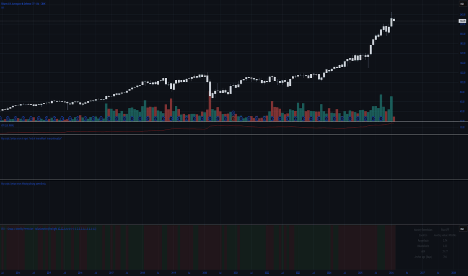
Group 1: Monthly Permission + Value LocationThis indicator is your monthly gatekeeper: it decides whether trading is allowed and shows where price sits in long-term value, before you ever think about entries.
This script answers one question, clearly and consistently:
“Should I even be trading right now, and where is price sitting inside the big monthly map?”
It is not an entry tool.
It does not tell you when to buy or sell.
It sets permission and context so you don’t make trades in bad environments.
Think of it as the front gate to your system.
What you see on the chart
1. Monthly value levels (manually entered)
You manually enter:
Monthly VAL (Value Area Low)
Monthly VAH (Value Area High)
Optional: Monthly POC, HVN1, HVN2 (display only)
These levels define the monthly value area.
The script never recalculates them or moves them.
Why manual?
Your system defines value from FRVP anchoring.
Automation would break your rules.
This keeps the indicator honest and predictable.
2. Monthly permission: Risk ON vs Risk OFF
The script evaluates the last three completed monthly candles and checks for environments where price is unreliable.
It will mark Risk OFF if any of the following are true:
A. Monthly alternation (chop)
The last three non-doji monthly candles alternate direction
Example: up → down → up
This means direction is not sticking
B. Repeated high volatility
Monthly RangeRatio ≥ your threshold
Happens in 2 of the last 3 months
Indicates unstable movement, not controlled expansion
C. Volume spike during chop
Monthly VolumeRatio spikes above your threshold
Occurs while alternation or chop is present
Indicates emotional participation without structure
If any of those are true → Risk OFF
Otherwise → Risk ON
This matches your rule:
“Avoid environments where closes don’t stick.”
3. Monthly location badge (where price is sitting)
The script classifies the current monthly close into one of five clear states:
Outside Above VAH
Outside Below VAL
Inside (Near VAH)
Inside (Near VAL)
Inside Value
“Near” is defined as a percentage of value width (default 10%), not a guess.
This gives you a fast answer to:
Am I inside value or outside?
If inside, am I near an edge or in the middle?
No interpretation required.
4. Readout dashboard (optional table)
If enabled, the dashboard shows:
Monthly Permission: Risk ON / Risk OFF
Location status (from the badge logic)
Monthly RangeRatio
Monthly VolumeRatio
Monthly ADX(14)
Anchor age (days since you anchored monthly value)
This is a status panel, not a signal board.
How you’re meant to use it
Step 1: Check permission first
If Risk OFF → you do nothing
You do not look for setups
You do not drop to weekly or daily
This enforces discipline.
Step 2: Note monthly location
Inside value → only value rotation logic is allowed later
Outside value → expansion logic may be allowed later
Near an edge → expect interaction, not immediate continuation
This sets the boundaries for all lower-timeframe decisions.
Step 3: Move on to Group 2 only if allowed
This script does not:
Choose Roadmap A or B
Trigger entries
Select targets
That happens later, on weekly and daily charts.
Group 1 only answers:
“Is the environment tradable, and where are we in the big picture?”
What this script deliberately does NOT do
No entries
No exits
No alerts
No pattern guessing
No automated value calculation
No repainting
It is intentionally boring.
That’s the point.
Why this matters (especially for newer traders)
Most traders lose money before the trade:
Trading during chop
Trading inside value as if it’s trending
Trading high volatility without structure
This script prevents that by:
Forcing you to check environment first
Giving you objective monthly context
Removing emotional decision-making
If this script says Risk OFF, you’re already doing the right thing by standing aside. Gösterge
Gösterge

Gösterge

Gösterge

Gösterge

Gösterge