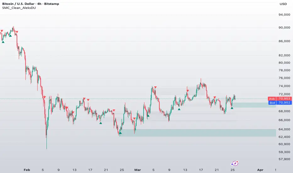
[ A L P H A X ] Order Blocks Institutional Supply & Demand ZoneAlphaX Order Blocks – Institutional Supply & Demand Zone Intelligence, Strength Scoring & Flip Detection
AlphaX Order Blocks is a professional-grade supply and demand zone detection system built on a proprietary multi-factor zone strength scoring engine. It identifies institutional order block zones where smart money has left footprints, tracks zone freshness through multi-touch degradation, detects flip zones when broken levels reverse polarity, and delivers confidence-scored entry signals at the highest-probability reaction points. Designed for traders who want to see where the institutions are positioned on instruments like XAUUSD, indices, forex majors, and crypto.
━━━━━━━━━━━━━━━━━━━━━━━━━━━━━━━━━━━━━━━━
🔬 The Order Block Engine — How It Works
At the core of AlphaX Order Blocks is an institutional zone detection algorithm that identifies price levels where aggressive buying or selling originated. Unlike simple support and resistance lines, these zones represent areas where large orders were placed — and where unfilled orders may still be waiting.
The detection process follows three steps:
Step 1 — Impulse Move Detection
The engine scans for consecutive same-direction candles (configurable from 2 to 5) that confirm a strong directional impulse
At least one candle in the sequence must have above-average volume (measured against a configurable Volume SMA)
This combination of directional conviction plus volume commitment identifies moves driven by institutional participation, not retail noise
Step 2 — Origin Candle Identification
Once an impulse is detected, the engine looks back up to 6 bars (configurable) for the origin candle — the opposite-color candle where the move started
For supply zones, this is the last bullish candle before the bearish impulse — the level where sellers overwhelmed buyers
For demand zones, this is the last bearish candle before the bullish impulse — the level where buyers overwhelmed sellers
The origin candle's high and low define the zone boundaries, expanded by an ATR-based padding for robustness
Step 3 — Volume Delta Calculation
During the origin-to-impulse sequence, the engine calculates the net volume delta — total buying volume minus total selling volume
This delta is displayed on each zone and used in the strength scoring system
A large negative delta on a supply zone confirms strong selling pressure at that level
A large positive delta on a demand zone confirms strong buying pressure at that level
Fresh zones appear with bold borders and bright colors. As they get tested, they visually degrade — giving you an instant read on zone quality without checking any numbers.
━━━━━━━━━━━━━━━━━━━━━━━━━━━━━━━━━━━━━━━━
📊 Six Core Features
AlphaX Order Blocks combines six independent analysis layers into a single cohesive system:
1 ─ Supply Zones (Red Boxes)
Supply zones mark price levels where institutional selling originated. Each zone box displays:
Tier Rating — S, A, B, or C based on the 6-factor strength score
Touch Count — How many times price has tested this zone (×0, ×1, ×2, etc.)
Volume Delta — Net selling pressure at the zone origin
Strength Percentage — The composite score from 0 to 100
Visual styling degrades automatically as zones weaken:
Fresh (0 touches) — Bold solid border, bright color, full opacity
Tested (1 touch) — Solid border, slightly reduced opacity
Multi-tested (2+ touches) — Dashed border, reduced opacity
Weak (max touches reached) — Dotted border, heavily faded — zone is nearly exhausted
━━━━━━━━━━━━━━━━━━━━━━━━━━━━━━━━━━━━━━━━
2 ─ Demand Zones (Green Boxes)
Demand zones following the same tier/touch/delta/strength display format
Demand zones mark price levels where institutional buying originated. They follow the identical visual degradation system as supply zones but in the green color family.
Green Bold Box — Fresh, untested demand zone with highest reaction probability
Green Dashed Box — Tested zone, still valid but weakening
Green Dotted Box — Heavily tested zone, likely to break on next visit
━━━━━━━━━━━━━━━━━━━━━━━━━━━━━━━━━━━━━━━━
3 ─ Flip Zone Detection (Purple Boxes)
One of the most powerful concepts in institutional trading is polarity reversal — when a broken support level becomes resistance, or a broken resistance level becomes support. AlphaX Order Blocks automates this:
When price closes above a supply zone, the zone is deleted and a new demand zone is created at the same level with a purple color
When price closes below a demand zone, the zone is deleted and a new supply zone is created at the same level with a purple color
Flip zones receive a +10 point bonus in the strength scoring system because institutional traders frequently use broken levels as new entry points
This feature can be toggled on/off independently
━━━━━━━━━━━━━━━━━━━━━━━━━━━━━━━━━━━━━━━━
4 ─ Confidence-Scored Entry Signals (▲ / ▼)
Entry signal labels with S/A/B tier classification and strength percentage
When price enters a high-quality zone and produces a confirmation candle, the signal engine fires a scored entry:
▲ Green Label (Demand Signal) — Dark text on green background. Price entered a demand zone and closed with a bullish candle.
▼ Red Label (Supply Signal) — White text on red background. Price entered a supply zone and closed with a bearish candle.
Signals only fire when the zone's strength score meets your configured minimum threshold (default 40%). This prevents signals at weak, over-tested zones.
Each signal is classified into tiers:
S-Tier (75%+) — Highest probability. Fresh zone, high volume, strong departure, EMA confluence.
A-Tier (55–74%) — High probability. Most factors aligned.
B-Tier (40–54%) — Moderate probability. Basic conditions met.
━━━━━━━━━━━━━━━━━━━━━━━━━━━━━━━━━━━━━━━━
5 ─ Risk/Reward Projection
Dotted projection lines from entry to nearest opposite zone with R:R ratio displayed
When an entry signal fires, the system automatically projects a take-profit target to the nearest opposite zone :
Demand signal → Target projects to the nearest supply zone above
Supply signal → Target projects to the nearest demand zone below
The R:R ratio is calculated and displayed (e.g., "TP 2.3R")
This gives you an instant read on whether the trade offers sufficient reward relative to risk
━━━━━━━━━━━━━━━━━━━━━━━━━━━━━━━━━━━━━━━━
6 ─ Proximity Warnings
Orange warning label appearing when price approaches a zone — time to prepare
The proximity engine continuously monitors the distance between current price and all active zones. When price comes within the configurable ATR distance of a zone:
An orange ⚠ warning label appears showing the zone type and distance percentage
This gives you advance notice to prepare for a potential reaction — set alerts, tighten stops, or prepare entries
Works for both supply zones above and demand zones below
━━━━━━━━━━━━━━━━━━━━━━━━━━━━━━━━━━━━━━━━
🧠 6-Factor Zone Strength Scoring
Every zone is continuously scored from 0 to 100 based on six independent factors. This score determines the tier rating, visual styling, and signal eligibility.
Freshness — Untested Zones Score Highest (up to 25 points)
0 touches = 25 points — Fresh zone, never tested, highest probability
1 touch = 18 points — Tested once, still strong
2 touches = 10 points — Multi-tested, weakening
3 touches = 4 points — Nearly exhausted
4+ touches = 0 points — Weak zone, likely to break
Volume at Origin (up to 20 points)
Compares the volume at the origin candle to the volume SMA
Volume ratio > 3.0× = 20 points (institutional-grade volume)
Volume ratio > 2.0× = 16 points
Volume ratio > 1.5× = 12 points
Volume ratio > 1.0× = 7 points (above average)
Departure Velocity (up to 20 points)
Measures how aggressively price left the zone (in ATR units)
Fast departures indicate strong institutional commitment — they want to get filled and move price away quickly
Velocity > 3 ATR = 20 points
Velocity > 2 ATR = 15 points
Velocity > 1 ATR = 10 points
Zone Age (up to 15 points)
Younger zones score higher — they are more relevant to current market conditions
Under 20 bars old = 15 points
Under 50 bars old = 12 points
Under 100 bars old = 8 points
Under 200 bars old = 4 points
Over 200 bars old = 1 point
EMA Confluence (up to 10 points)
Demand zones score higher when price is below the 200 EMA (buying into weakness)
Supply zones score higher when price is above the 200 EMA (selling into strength)
This adds structural trend context to zone quality
Flip Zone Bonus (up to 10 points)
Zones created from polarity reversal receive a flat 10-point bonus
Broken support becoming resistance (or vice versa) is one of the most reliable patterns in institutional trading
━━━━━━━━━━━━━━━━━━━━━━━━━━━━━━━━━━━━━━━━
📐 Dashboard Intelligence
A comprehensive AlphaX-branded dashboard provides real-time zone analytics organized into four sections:
Zone Inventory
Active supply and demand zone counts
Breakdown by status: F (Fresh), T (Tested), W (Weak)
Total flip zone count
Market Bias
Strength-weighted zone bias — shows whether demand or supply zones dominate the current price area
EMA trend direction (Strong Bull / Bull / Bear / Strong Bear / Cross)
RSI with zone classification (OB / OS / HIGH / LOW / MID)
Nearest Zones
Nearest supply zone above current price — with price level, strength score, and distance percentage
Nearest demand zone below current price — with price level, strength score, and distance percentage
Position indicator — shows whether price is closer to supply or demand
Signal Status
Last signal type and how many bars ago it fired
Current volume status relative to the SMA (Spike / High / Normal / Dry)
━━━━━━━━━━━━━━━━━━━━━━━━━━━━━━━━━━━━━━━━
🚀 How to Trade with AlphaX Order Blocks — Step by Step
Step 1 — Identify the Zone Landscape
Look at the chart for active supply (red) and demand (green) zones
Check the Dashboard: Which zones are fresh (F)? Which are tested (T)?
Note any purple flip zones — these are high-probability levels
Step 2 — Wait for Price to Approach a Zone
When the ⚠ proximity warning appears, prepare for a potential reaction
Check the zone's tier rating — S and A tier zones have the highest reaction probability
Ignore C-tier zones unless other confluence is present
Complete trade flow: Zone detection → Proximity warning → Price enters zone → Entry signal → Risk/Reward projection
Step 3 — Enter on Confirmed Signal
Wait for a scored entry label (▲ or ▼) to appear
Confirm the tier — S-Tier and A-Tier signals have the highest probability
Place your stop loss beyond the opposite side of the zone
Step 4 — Set Target Using R:R Projection
The system automatically projects a dotted line to the nearest opposite zone
The R:R ratio is displayed — only take trades offering at least 1.5R or better
Use the projected target as your primary take-profit level
Step 5 — Monitor Zone Degradation
If you are in a trade and the target zone changes from solid to dashed border, it may break — consider tightening your take-profit
If your entry zone starts getting tested from the wrong side, the thesis may be failing — consider a stop adjustment
Step 6 — Understand Zone Breaks
When a zone breaks (candle closes through it), the zone is automatically deleted
If flip detection is enabled, a new opposite zone appears at the same level
Zone breaks often indicate a change in institutional bias — respect them
━━━━━━━━━━━━━━━━━━━━━━━━━━━━━━━━━━━━━━━━
⚠ When NOT to Trade — Zone Quality Filters
Not all zones are created equal. AlphaX Order Blocks gives you clear visual and numerical cues to avoid low-quality setups:
Avoid these conditions:
C-Tier zones only — If no S, A, or B tier zones are near price, the area lacks institutional interest
All zones heavily tested — If every zone shows ×3 or ×4 touches with dashed/dotted borders, the levels are exhausted
Dashboard shows "BALANCED" bias — When supply and demand strength are equal, there is no clear institutional edge
Volume shows "DRY" — Low volume environments produce unreliable zone reactions
Multiple flip zones clustered — Heavy flip activity indicates a choppy, indecisive market where zones break frequently
What to do:
Wait for new fresh zones to form with strong volume
Look for zones where the departure velocity was high (the market left aggressively)
Switch to a higher timeframe to find larger, more significant zones
Only trade zones that align with the EMA trend direction
━━━━━━━━━━━━━━━━━━━━━━━━━━━━━━━━━━━━━━━━
⚡ Key Features
🔬 Institutional zone detection using consecutive impulse candles + volume confirmation
🏗 6-factor zone strength scoring (freshness, volume, velocity, age, EMA, flip)
🏷 S/A/B/C tier zone classification with readable labels and strength percentages
👆 Multi-touch tracking with automatic visual degradation (solid → dashed → dotted → faded)
🔄 Automatic flip zone detection — broken supply becomes demand and vice versa (purple zones)
▲▼ Confidence-scored entry signals at high-quality zone reactions
📐 Risk/Reward auto-projection to nearest opposite zone with R:R ratio
⚠ Proximity warnings when price approaches active zones
📊 EMA confluence scoring — zones aligned with trend structure score higher
📈 Comprehensive AlphaX-branded dashboard — zone inventory, market bias, nearest zones, signal status
🎨 Cohesive triple-tone color theme — Green for demand, Red for supply, Purple for flip zones
🔔 15+ alert conditions — zone detection, touches, signals by tier, and combined
⚙ Fully configurable — detection sensitivity, zone behavior, scoring weights, and all visuals
━━━━━━━━━━━━━━━━━━━━━━━━━━━━━━━━━━━━━━━━
⚙ Settings Reference
Zone Detection
Consecutive Candles Required — Number of same-direction candles for impulse detection (default: 3)
Origin Candle Lookback — How far back to search for the origin candle (default: 6)
Volume Threshold Multiplier — Volume must exceed SMA × this value (default: 1.0)
Volume SMA Length — Baseline period for volume comparison (default: 50)
Zone Height (ATR Multiple) — Controls the vertical thickness of zone boxes (default: 1.5)
Max Active Zones Per Side — Cap on simultaneous supply and demand zones (default: 8)
Zone Cooldown — Minimum bars between new zones of the same type (default: 10)
Zone Behavior
Max Touches Before Weak — After this many tests, zone is visually degraded (default: 4)
Require Close to Break Zone — Prevents wick-through fake breaks (default: enabled)
Detect Flip Zones — Enable/disable polarity reversal detection (default: enabled)
Confluence
Fast EMA Period — Short-term trend reference (default: 21)
Slow EMA Period — Long-term structural reference (default: 200)
Show EMAs — Toggle EMA plot visibility
Use EMA Confluence in Scoring — Add/remove EMA from strength calculation
Signals
Show Entry Signals — Toggle entry labels
Min Zone Strength for Signal — Minimum score required (default: 40%)
Signal Cooldown — Minimum bars between signals (default: 5)
Show Proximity Warnings — Toggle approach alerts
Proximity Distance — How close price must be to trigger warning (default: 1.5 ATR)
Risk/Reward
Show Risk/Reward Projection — Toggle the dotted target line and R:R label
Dashboard
Show Dashboard — Toggle the information panel
Position — Top Left, Top Right, Bottom Left, Bottom Right
Dashboard Text Size — Tiny, Small, Normal
Colors
Bull / Demand Primary / Bright / Dim — Green family for demand zones
Bear / Supply Primary / Bright / Dim — Red family for supply zones
Flip Zone — Purple for polarity-reversed zones
Proximity Warning — Orange for approach alerts
Neutral / Neutral Light — Gray for structural elements
━━━━━━━━━━━━━━━━━━━━━━━━━━━━━━━━━━━━━━━━
🔔 Alert Conditions
New Supply Zone Detected — Fires when a fresh supply zone is created
New Demand Zone Detected — Fires when a fresh demand zone is created
Supply Zone Touched — Fires when price enters a supply zone
Demand Zone Touched — Fires when price enters a demand zone
S/A/B-Tier Demand Signal — Confidence-based demand entry alerts
S/A/B-Tier Supply Signal — Confidence-based supply entry alerts
Any Demand / Supply / Zone Signal — Combined alert conditions
All alert messages include {{ticker}} and {{interval}} placeholders for clean webhook integration.
━━━━━━━━━━━━━━━━━━━━━━━━━━━━━━━━━━━━━━━━
🎯 Default Settings — Optimized For
The default configuration is tuned for XAUUSD (Gold), major forex pairs, and indices on the 5-minute to 1-hour timeframes :
3 consecutive candles strikes the balance between sensitivity and reliability
Volume multiplier at 1.0× captures most institutional moves without over-filtering
Zone cooldown at 10 bars prevents cluster creation in volatile periods
Max 4 touches before weak aligns with institutional order absorption theory
EMA confluence enabled for trend-aligned zone scoring
For other instruments or timeframes, adjust:
Higher timeframes (4H, Daily) — Increase Origin Lookback to 8–10, increase Zone Height to 2.0+ ATR
Scalping (1m, 5m) — Reduce Consecutive Candles to 2, reduce Cooldown to 5–7 bars
Crypto — Increase Zone Height to 2.0–3.0 ATR (higher volatility), increase Volume Multiplier to 1.5×
Forex majors — Use defaults, optionally reduce Volume Multiplier to 0.8× for pairs with lower tick volume
Cleaner zones — Increase Consecutive Candles to 4–5, increase Volume Multiplier to 1.5×
More zones — Decrease Consecutive Candles to 2, decrease Volume Multiplier to 0.7×, increase Max Zones
━━━━━━━━━━━━━━━━━━━━━━━━━━━━━━━━━━━━━━━━
👥 Who This Is For
🏛 Institutional/Smart Money Traders — Designed to identify where large orders originated and where unfilled orders may remain
📐 Supply & Demand Traders — Automated zone detection with strength scoring replaces manual drawing
🥇 Gold & Forex Traders — Tuned for assets with clear institutional participation patterns
🧠 Systematic Traders — The 6-factor scoring system provides a quantitative framework for zone quality assessment
📊 Breakout Traders — Flip zone detection automatically identifies broken levels as new opportunity zones
📈 Traders who value clean charts — No clutter. Zones auto-degrade and auto-remove. Only relevant levels remain.
⚠ Traders who struggle with zone selection — The tier system physically tells you which zones are worth trading and which to ignore
━━━━━━━━━━━━━━━━━━━━━━━━━━━━━━━━━━━━━━━━
📝 Notes
All zone detections are confirmed on bar close — zones do not repaint or move after creation
Zone break confirmation uses candle close by default (not wicks) to prevent fake-outs — this can be toggled off for aggressive trading
Flip zones inherit a reduced departure velocity (70% of original) to account for diminished institutional interest at reversed levels
Volume delta uses candle direction (close vs open) as a proxy for buy/sell pressure — this is an approximation, not true order flow
Dashboard updates on the last bar only for performance optimization
Maximum 500 boxes, 500 labels, and 500 lines are used — on very low timeframes with extended history, oldest drawings may be automatically removed by TradingView's rendering limits
Overlapping zone prevention runs at creation time — if a new zone would overlap an existing one of the same type, it is not created
━━━━━━━━━━━━━━━━━━━━━━━━━━━━━━━━━━━━━━━━
⚠ Disclaimer
This indicator is a technical analysis and visualization tool intended for educational and informational purposes only. It does not constitute financial advice or a recommendation to buy or sell any financial instrument. All signals and zone detections are generated from historical and real-time price data using mathematical calculations — their accuracy or profitability is not guaranteed. Supply and demand zones represent areas of historical interest, not guaranteed future reaction points. Past zone behavior does not guarantee future price reactions. Always conduct your own analysis, use proper risk management, and consult a licensed financial advisor before making any trading decisions. The author accepts no responsibility for any losses incurred from the use of this indicator.
━━━━━━━━━━━━━━━━━━━━━━━━━━━━━━━━━━━━━━━━
Built for traders who demand clarity, confidence, and precision from their charts. Gösterge

Gösterge

AG Pro Volume Profile POC Magnet Map [AGPro Series]AG Pro Volume Profile POC Magnet Map
Overview
AG Pro Volume Profile POC Magnet Map is a chart-overlay indicator built around one practical question: how strongly is the current Point of Control attracting, holding, or losing price?
Instead of trying to replicate a full volume-profile workstation, this script focuses on the behavior of the active POC and the surrounding value area. The goal is to turn a familiar volume-profile concept into a cleaner decision-support map that helps users judge whether price is still interacting with the current fair-value center, rejecting it, reclaiming it, or beginning to establish value elsewhere.
The script is designed for users who want a visual framework around POC behavior without covering the chart with heavy histogram structures or overly complex dashboards. It highlights the active POC, the current Value Area High (VAH), the current Value Area Low (VAL), a compact magnet band around the POC, and a small set of reaction labels that describe how price is interacting with that area.
In short, this indicator is not trying to tell users what to buy or sell. It is trying to make one specific market reference more readable: the relationship between price and the current POC region.
What the script does
At a high level, the script does five things:
1) It builds a fixed-lookback volume-distribution map from recent chart data.
2) It derives the active POC, VAH, and VAL from that distribution.
3) It measures how close price is to the current POC and how often price revisits or accepts that region.
4) It converts those observations into a compact Magnet Score and state readout.
5) It marks a small set of price/POC interaction events such as Tag, Reject, and Reclaim.
The result is a visual tool that combines reference levels and contextual interpretation in one overlay.
Unique edge
Many indicators can show a POC. This script is built to answer a more specific question: what is the quality of the current POC as a magnet for price?
That difference matters. A raw POC line can be useful, but by itself it does not explain whether price is repeatedly returning to it, drifting away from it, rejecting it, or stabilizing around it. This script adds that missing context by combining the active POC with a behavior layer.
The design goal is not “more features.” The design goal is clearer interpretation:
- Is price still accepting the current value center?
- Is the POC functioning as a pullback magnet?
- Is price rejecting the area instead of accepting it?
- Is value beginning to migrate?
That is the role of the score, the state engine, and the reaction labels.
Methodology
The script uses a fixed lookback window and divides the recent price range into user-defined bins. It then allocates each bar’s volume to one price bin using the selected bar source, which can be Close or HLC3. From that distribution it identifies:
- POC: the highest-volume bin in the lookback window
- VAH: the upper boundary of the selected value area percentage
- VAL: the lower boundary of the selected value area percentage
After the levels are derived, the script evaluates how price is behaving relative to the active POC region.
The Magnet Score is built from multiple components:
- Distance: how far current price is from the POC, normalized by ATR
- Revisit behavior: how often price has returned to the POC region
- Acceptance behavior: how often price has closed near the POC region
- Stability: whether the POC is relatively stable or drifting quickly
- Rejection pressure: whether interactions with the POC region are ending in rejection rather than acceptance
These components are combined into a bounded 0-100 score. Higher readings suggest that the current POC remains a stronger center of attraction. Lower readings suggest weaker pull, weaker acceptance, or a market beginning to operate away from the current value center.
The script then classifies context into states such as:
- Magnet Strong
- Magnet Active
- POC Tagged
- POC Rejected
- Accepted Away
- Magnet Weakening
This state layer is designed to summarize the current context rather than generate automatic trading instructions.
How to read the chart
POC
The POC is the main reference line. It marks the highest-volume price zone inside the selected lookback distribution. If price repeatedly returns to it, reacts from it, or consolidates around it, that line is functioning as an active center of interest.
VAH and VAL
VAH and VAL define the current value-area boundaries. These help users judge whether price is still operating inside value or beginning to establish acceptance above or below it.
Magnet band
The magnet band is a narrow region around the POC. It exists to make POC interaction easier to read visually. It is not a claim that every touch is meaningful. It is simply a compact visual tolerance zone around the active POC.
Reaction labels
The script can display a small set of event labels:
- Tag: price reached the current POC region
- Reject: price interacted with the area and moved away
- Reclaim: price crossed back through the active POC after being on the other side
These labels are meant to help describe interaction, not to replace confirmation logic, risk management, or broader market context.
Panel
The panel summarizes:
- Magnet Score
- POC Distance
- POC Drift
- Value Context
- Last Reaction
- Current POC / VAH / VAL values
This gives users a quick status view without needing to inspect every line manually.
Typical use cases
This indicator may be useful when users want to:
- monitor whether pullbacks are still returning to the active POC
- judge whether price is still auctioning inside value or beginning to accept away from value
- compare different symbols for how “sticky” the current POC region appears to be
- add context to an existing structure, trend, or mean-reversion workflow
- keep a cleaner chart while still tracking basic volume-profile behavior
The script is intended as a context and interpretation layer. It is not a complete trading plan on its own.
Key inputs
Lookback Bars
Controls the size of the historical window used for the profile calculation. A larger value creates a broader context. A smaller value makes the profile more reactive.
Rows / Bin Count
Controls profile granularity. Higher values create more detailed binning. Lower values produce a smoother, simpler map.
Value Area %
Defines how much of total lookback volume is included inside the value area used to derive VAH and VAL.
Price Source For Bin Allocation
Lets users choose whether each bar’s volume is allocated using Close or HLC3. This changes how the profile is distributed across bins.
ATR Length
Used in normalization and spacing calculations, including the distance component and label positioning.
Magnet Band Width (ATR)
Controls the thickness of the tolerance zone around the active POC.
Distance Ceiling (ATR)
Caps how far price can be from the POC before the distance component is treated as maximally weak.
Revisit Window and Acceptance Window
These affect how the script measures repeated interaction and acceptance around the active POC region.
POC Drift Lookback
Used to estimate whether the active POC is relatively stable or shifting.
Label controls
Users can adjust label visibility, density, cooldown behavior, and right-edge line labels to keep the chart cleaner or more descriptive depending on preference.
Alerts
The script includes alert conditions for:
- POC Tag
- POC Reject
- POC Reclaim
- Magnet Strong
- Magnet Active
- Magnet Weakening
- Accepted Away
These alerts are event-based notifications tied to the script’s contextual logic. They are not performance claims and they should not be interpreted as guaranteed entry or exit signals.
Limitations and transparency
This script uses a fixed-lookback, bar-based approximation of volume distribution. It does not reconstruct native exchange-level order flow, bid/ask delta, or true tick-by-tick auction detail.
Volume is allocated to bins using a selected bar source rather than full intrabar volume-at-price reconstruction. That means the profile is intentionally simplified so it can remain lightweight and readable inside a standard Pine overlay.
Because the script uses a rolling lookback window, the active POC, VAH, and VAL can change as older bars leave the window and newer bars enter it. That is normal behavior for this design.
The reaction labels are descriptive, not predictive. A Tag does not imply reversal. A Reject does not guarantee continuation. A Reclaim does not guarantee trend resumption. They are context markers showing how price interacted with the current POC area according to the script’s definitions.
This tool should be read in conjunction with price structure, volatility, liquidity conditions, and user-defined execution rules.
What this script is not
This script is not:
- a full session volume-profile suite
- an order-flow or footprint tool
- a prediction engine
- a guaranteed reversal detector
- a stand-alone trade system
It is a focused overlay for interpreting how price is behaving around the current Point of Control and value-area structure.
Practical interpretation notes
In many markets, the POC acts like a reference area rather than a directional signal. The more often price returns to it and the more often price stabilizes near it, the more useful that region can become as a working fair-value reference.
By contrast, when price begins to hold above VAH or below VAL and stops interacting meaningfully with the POC region, the script may shift toward weaker magnet states or accepted-away context. That does not automatically imply trend continuation, but it does suggest that the current value center may be losing influence.
Users may find this especially useful when comparing:
- balanced conditions vs. directional conditions
- shallow pullbacks vs. deeper value retests
- symbols that keep rotating through value vs. symbols that are clearly accepting away from it
Risk disclosure
This indicator is for chart analysis and market context only. It does not provide investment advice, trading advice, or guaranteed outcomes.
All indicators simplify market behavior. This script is no exception. Markets can ignore previously important value references, react differently across symbols and timeframes, and change behavior as volatility regimes shift.
Users are responsible for their own confirmation process, execution decisions, and risk management. Gösterge

Gösterge

Opening Range Gravity SystemOpening Range Gravity System
What This Script Does
━━━━━━━━━━━━━━━━━━━━━━━━━━━━━━━━━━━━━━━━
This indicator automatically detects the Opening Range formed during the first configurable minutes of the trading session and uses it as a gravitational anchor for the entire day. The opening range is where the largest institutional orders execute and the first price discovery battle takes place. Once the range is formed, price tends to gravitate toward its levels, break out from them, and target natural extensions beyond them.
The script locks the opening range at the end of the configured period with no repainting. Only the current day's range and signals are displayed. Previous days are automatically cleared when a new session begins.
━━━━━━━━━━━━━━━━━━━━━━━━━━━━━━━━━━━━━━━━
How It Works — 5 Components
━━━━━━━━━━━━━━━━━━━━━━━━━━━━━━━━━━━━━━━━
● Opening Range High and Low
Formed during the first N minutes of session (user-configurable). Default is 15 minutes which works for both NSE India (9:15 to 9:30) and NYSE/Nasdaq (9:30 to 9:45). Displayed as solid yellow lines extending through the session.
● Opening Range Midpoint
The exact center of the opening range. Acts as the strongest intraday support and resistance level. Price frequently returns to this level after a breakout before continuing. Displayed as a white dashed line.
● Extension Targets (1x, 1.5x, 2x, 2.5x)
The opening range projected upward from the high and downward from the low at multiple distances. These are natural gravitational targets where price tends to slow, pause, or reverse. Displayed as dotted lines color-coded by direction.
● Breakout Signals
When price first closes above the opening range high, a bull breakout is marked. When price first closes below the opening range low, a bear breakout is marked. Each fires only once per session.
● Trap and Midpoint Bounce Detection
If price breaks the opening range but closes back inside within a configurable window, a trap signal is drawn. If price pulls back to the midpoint after a breakout and bounces, a midpoint bounce signal is drawn. These are educational observations about market structure, not buy or sell signals.
━━━━━━━━━━━━━━━━━━━━━━━━━━━━━━━━━━━━━━━━
Visual Elements on Chart
━━━━━━━━━━━━━━━━━━━━━━━━━━━━━━━━━━━━━━━━
● Yellow zone box — opening range period highlighted
● Yellow candles — candles formed inside the opening range period
● Yellow solid lines — OR High and OR Low extending through session
● White dashed line — OR Midpoint
● Teal dotted lines — upside extension targets (1x, 1.5x, 2x, 2.5x)
● Red dotted lines — downside extension targets
● Teal label — bull breakout signal
● Red label — bear breakout signal
● Orange label — trap signal (failed breakout)
● White label — midpoint bounce signal
━━━━━━━━━━━━━━━━━━━━━━━━━━━━━━━━━━━━━━━━
Dashboard
━━━━━━━━━━━━━━━━━━━━━━━━━━━━━━━━━━━━━━━━
● Price vs OR — shows whether price is above OR high, below OR low, above midpoint, or below midpoint
● Last Signal — most recent signal type for the session
● OR High, Low, and Midpoint — exact levels in price
● OR Range — total opening range in points
● 1x Target Up and Down — first extension targets above and below
● Bull and Bear Breakout counts — per session
● Traps Detected and Mid Bounces — per session
Dashboard position is fully movable from settings. No code editing required.
━━━━━━━━━━━━━━━━━━━━━━━━━━━━━━━━━━━━━━━━
How to Use — Step by Step
━━━━━━━━━━━━━━━━━━━━━━━━━━━━━━━━━━━━━━━━
● Step 1 — Set OR Duration to match your market
For NSE India use 15. For NYSE or Nasdaq use 15 or 30. Set the session time to match your exchange open.
● Step 2 — Wait for the opening range to lock
Yellow zone and lines appear automatically after the OR period ends. The dashboard will show exact High, Low, and Midpoint values.
● Step 3 — Watch for breakout labels
When BO BULL or BO BEAR appears, note the direction. Check whether volume and context support the move.
● Step 4 — Watch for trap signals
Orange BULL TRAP or BEAR TRAP label means the breakout failed. This is often a high-probability reversal observation in the opposite direction.
● Step 5 — Watch extension targets
Use the 1x dotted line as the first reference target. The 1.5x and 2x lines are secondary reference levels for the session.
● Step 6 — Midpoint is the day's anchor
If price is above the midpoint and holds it, the session has a bullish character. If price is below the midpoint, the session has a bearish character.
━━━━━━━━━━━━━━━━━━━━━━━━━━━━━━━━━━━━━━━━
Recommended Settings
━━━━━━━━━━━━━━━━━━━━━━━━━━━━━━━━━━━━━━━━
● Best timeframes — 5 minute or 15 minute for intraday observation
● OR Duration — 15 minutes for NSE, NYSE, Nasdaq
● Works on — Nifty, BankNifty, stocks, futures, crypto, forex, any liquid instrument
● Alerts available — OR Breakout, Trap Detection, Midpoint Test
━━━━━━━━━━━━━━━━━━━━━━━━━━━━━━━━━━━━━━━━
Technical Details
━━━━━━━━━━━━━━━━━━━━━━━━━━━━━━━━━━━━━━━━
● No repainting — opening range locks at end of OR period and does not change
● No lookahead bias — all calculations use confirmed bar data only
● No external data — built entirely on price
● Pine Script v6 — written on the latest version
● Session-based reset — all drawings and signals reset automatically each new day
● Original code — not derived from any existing published script
━━━━━━━━━━━━━━━━━━━━━━━━━━━━━━━━━━━━━━━━
Disclaimer
━━━━━━━━━━━━━━━━━━━━━━━━━━━━━━━━━━━━━━━━
This script is published for educational and informational purposes only. It does not generate buy or sell signals. It does not guarantee any trading results. Past behavior of price at opening range levels does not guarantee future results. The author is not responsible for any financial losses incurred from use of this tool. Always conduct your own research and consult a licensed financial professional before making any trading decisions. Gösterge

Gösterge

Gösterge

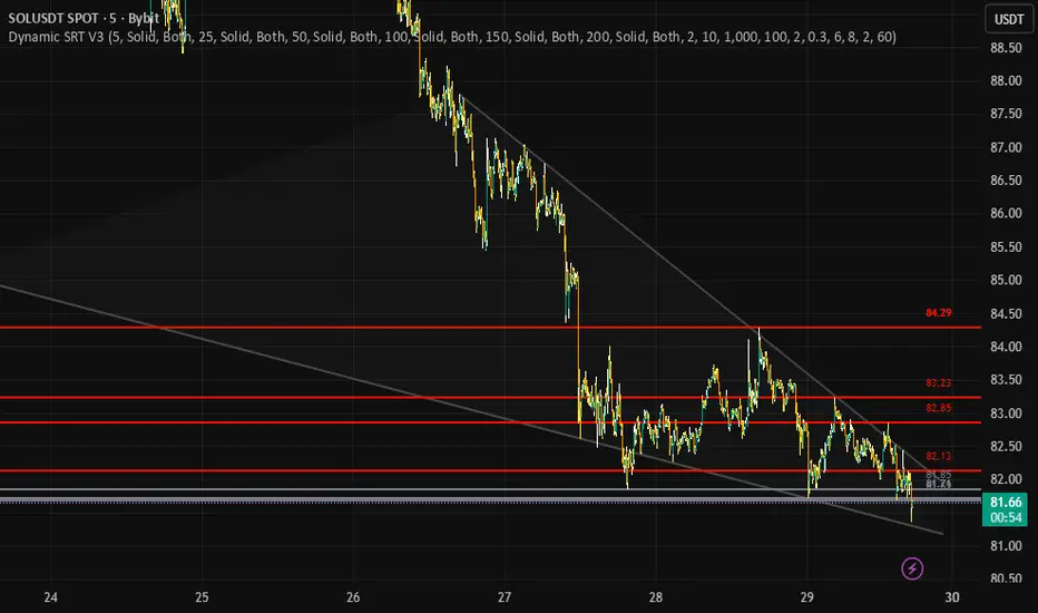
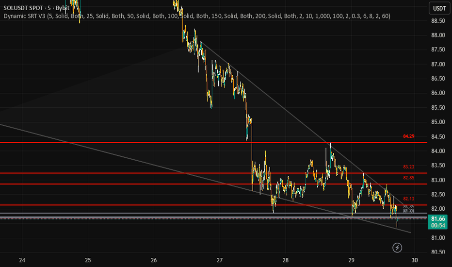
Dynamic Support & Resistance V3Dynamic SRT V3 by Anonycryptous inspired by Ilja V.
Compared to the previous version, a completely new and accelerated concept.
Dynamic SRT V3 is a professional structural mapping suite that identifies high-density liquidity zones through a dual-engine calculation process. By merging a 6-Tiered Pivot Architecture with a Validated Diagonal Scoring Engine, it provides a surgical view of market boundaries, allowing traders to distinguish between minor price fluctuations and major institutional walls.
*How the Engine Operates
This indicator functions as a mathematical filter for price action, operating on two distinct layers:
-1. Tiered Institutional Anchors (Horizontal)
Instead of looking at a single fractal period, V3 tracks six different "memory depths" simultaneously (ranging from 5 to 200 bars).
The Concept: Markets move in cycles. Small cycles (Pivot 1-2) represent retail positioning, while large cycles (Pivot 5-6) represent institutional buy/sell walls.
State-Aware Logic: Each level uses an ATR-Volatility Buffer to determine its current state. If price is above the level, it acts as Support (Green); if below, it is Resistance (Red). If price is currently slicing through it, the level turns Grey (Neutral), signaling a "No-Trade Zone" or a consolidation phase.
-2. Slope-Intercept Validation Engine (Diagonal)
The dynamic trendlines are not just simple "peak-to-peak" connectors. They are calculated using a Linear Regression Scoring System.
*The Concept: A trendline's strength is defined by its "cleanliness."
-The Filter: Unlike standard tools, V3 uses a Price-Action Scan. It calculates the path of a potential trendline and automatically discards it if it cuts through the bodies of intermediate candles. This ensures that the wedges and channels you see are statistically valid structural boundaries.
-Strategic Application: LTF vs. HTF
*Performance & User Manual
-Optimized Execution: V3 utilizes Last-Bar Offloading. It scans 1000+ bars of history in milliseconds by executing the heavy diagonal math only on the most recent candle, ensuring zero chart lag.
-Price Tags: Dynamic labels are pinned professionally above the levels. Use these as your Take-Profit (TP) or Stop-Loss (SL) targets.
-Customization: Adjust the Touch Tolerance in the settings to make the trendlines more or less strict depending on the asset's "wickiness" (e.g., higher for BTC, lower for Forex).
*Lower Timeframes (1m – 15m): Scalping & Intraday
-LTF Focus: Prioritize Pivot Levels 1, 2, and 3. These are highly reactive and will map the micro-pullbacks of the current session.
-Early Signal: Look for price to reject a Dynamic Trendline while a micro-pivot (Level 1) is acting as support. This provides an aggressive "Early Entry" with a very tight risk-to-reward ratio.
-The Trap: Avoid trading when the LTF candles are consistently Grey, as this indicates the market is trapped inside a static pivot zone.
-Higher Timeframes (1H – Daily): Swing & Position Trading
*HTF Focus: Prioritize Pivot Levels 5 and 6. These represent the "Major Floors and Ceilings" of the weekly or monthly trend.
-The Macro Wall: If price hits a Level 6 Pivot (200-bar lookback), expect a significant reaction. Institutional orders are often clustered at these depths.
-Structural Confluence: The most powerful HTF setup is "The Confluence Cross." This occurs when a diagonal Resistance Trendline and a horizontal Level 5/6 Resistance meet at the same price point. This is the mathematical "End of Trend" zone where heavy reversals typically begin.
! Notice: This tool is for institutional-grade structural mapping and educational purposes only. It is not financial advice. Structural levels are areas of high probability, not guaranteed reversal points. Always trade with a stop-loss.
Gösterge
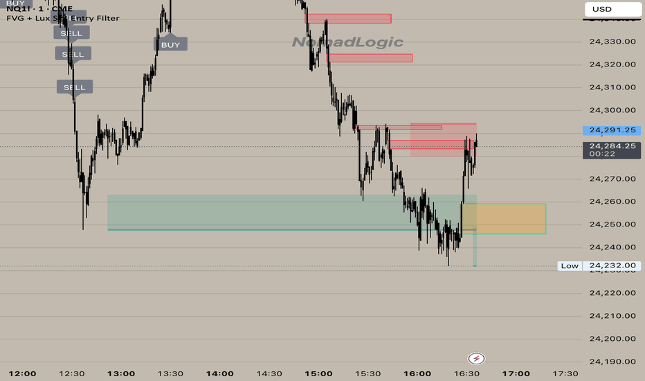
Fractal Support and Resistance Zones EngineFractal Support and Resistance Zones Engine is a market structure tool built to convert confirmed fractal pivots into filtered support, resistance, and S/R flip zones.
The main reason this script was created is practical rather than theoretical. Fractal highs and lows are already a familiar market structure concept, but many fractal-based tools become difficult to use once they start filling the chart with too many overlapping levels. When every pivot is treated as equally important, the result is often visual clutter, weak prioritization, and little help in deciding which areas still matter around current price.
This script was written to make that process more usable. Instead of simply marking fractal pivots, it manages them as zones with a lifecycle. It filters oversized zones, ignores zones that are too far from current price, merges overlapping structure, tracks repeated interaction, handles role reversal behavior, removes weak or aging zones, and then selects only the strongest visible candidates for display.
Why this indicator exists
This script does not claim to introduce a new theory of support and resistance. Its purpose is to provide a more structured implementation of a familiar concept.
The problem it tries to solve is straightforward:
raw fractal levels can accumulate too quickly,
overlapping levels can make the chart harder to read,
old or weak zones can remain on screen longer than they are useful,
and many simple fractal tools do not do much after the initial pivot is detected.
This indicator was built to address those issues by treating zones as dynamic objects instead of static drawings. Once a zone is created, it is managed over time based on interaction, break behavior, age, visibility ranking, and proximity to price.
That is the main reason the script was written. It is not meant to replace all support and resistance methods. It is meant to make fractal-based structure more organized and more practical to work with.
What the indicator does
The script detects confirmed fractal highs and lows using left and right pivot bars.
A confirmed pivot high can create a resistance zone.
A confirmed pivot low can create a support zone.
There is also an optional developing zone mode. When enabled, the script can show provisional zones before full pivot confirmation. These are intentionally temporary and may disappear if price invalidates them before confirmation.
After a zone is created, the script does not simply leave it untouched. It keeps evaluating that zone and updates its status over time.
The script can display three structural categories:
Resistance zones
Support zones
S/R flip zones, when a previously broken zone changes role
How the script works
The engine begins with fractal pivot detection.
For resistance, the zone is built from the pivot high area.
For support, the zone is built from the pivot low area.
From there, several control layers are applied:
1) ATR-based size control
Zone height is capped by an ATR multiple so unusually large candle ranges do not create oversized zones that dominate the chart. This helps keep zones more comparable and visually usable.
2) Minimum significance and maximum distance filtering
A new zone must still meet a minimum size requirement relative to ATR, and it must remain within the configured distance from current price. This prevents the script from storing zones that are either too small to matter or too far away to be useful in the current context.
3) Overlap and merge logic
If a newly detected zone overlaps with an existing one, the script does not always draw another separate zone. When the roles match, it can reinforce and blend the existing zone rather than duplicating structure. This is one of the main anti-clutter mechanisms in the script.
4) Touch tracking
Zones gain interaction history when price returns to them from outside and touches them again. This interaction history later contributes to ranking and lifecycle decisions. A zone that has been respected multiple times is treated differently from a fresh zone that has never been retested.
5) Break and S/R flip handling
When price breaks beyond a zone by a configurable ATR-based threshold, the script can treat that as a structural break. If retest confirmation is enabled, the zone does not immediately change role. Instead, it enters a waiting state and only flips after the retest condition is satisfied. If retest confirmation is disabled, the role change happens immediately on the break condition. This gives the user a choice between faster reaction and stricter confirmation.
6) Flip count and removal behavior
Zones are not allowed to survive forever in the same way. The script tracks flip count and interaction history. If a zone has already flipped multiple times, it can eventually be removed instead of continuing to recycle indefinitely. This prevents heavily reused or degraded structure from staying on the chart forever.
7) Age-based pruning
Zones are also removed as they get older. Stronger zones can survive longer because the lifespan is adjusted by interaction and flip history, but aging still matters. This helps the chart focus more on structure that is still relevant.
8) Spatially aware pool management
The script keeps a limited zone pool depending on the selected performance mode. When the internal pool gets too large, weaker zones are evicted using a score that considers relevance and local crowding. In practice, this means the engine is not only adding zones, but also actively managing what deserves to stay in memory.
9) Visibility ranking
The script scores zones using interaction history, flip history, distance from current price, and age. It then selects only the top visible resistance, support, and flip zones rather than showing everything at once. This is a key part of the workflow because the script is designed to prioritize readability, not maximum historical coverage.
What makes it different from simpler fractal indicators
The main difference is not the use of fractals themselves. Fractals are well known. The difference is what happens after the fractal is detected.
Many simpler scripts stop at the first step: they identify the pivot and draw a level or box.
This script continues beyond that step by adding:
zone size control,
distance filtering,
overlap management,
touch-based reinforcement,
optional retest-confirmed flips,
flip counting,
age-aware removal,
spatial eviction when the zone pool becomes crowded,
and visibility ranking so only the strongest nearby zones are shown.
That combination is the real distinguishing feature of the script.
It is not just a fractal marker. It is a fractal-based zone management engine.
Was this script really necessary?
In the strictest sense, the underlying market idea is not new. Fractal pivots, support, resistance, and role reversal are all established concepts.
So if the question is whether this script introduces a brand-new trading theory, the honest answer is no.
But that is not the reason it exists.
The reason it exists is that there is practical value in taking a familiar concept and implementing it in a cleaner, more selective, and more manageable way. A trader who already uses fractal structure may not need another script that simply draws more levels. What may still be useful is a script that helps reduce clutter, maintain zone quality, and keep attention on the strongest nearby structure.
That is the point of this indicator.
So the honest answer is:
it was not necessary as a new theory,
but it can be useful as a more organized implementation of fractal-based support and resistance.
That is the real justification for the script.
Inputs and behavior
The script includes a small set of controls that shape how selective or lightweight the engine becomes.
Strategy changes how strict the filtering logic is. Conservative settings keep fewer zones and require stricter behavior. Aggressive settings allow more zones and looser filtering.
Performance controls how many zones can be tracked internally. Lighter modes reduce tracking load, while fuller modes allow broader detection.
Top Resistance Zones, Top Support Zones, and Top S/R Flip Zones limit how many ranked zones are actually shown.
Pivot Left Bars and Pivot Right Bars control fractal confirmation.
Max Zone Height (ATR) caps zone height.
Merge Sensitivity changes how aggressively nearby zones are combined.
Max Age controls the base lifespan of zones before age pruning removes them.
Require Retest for Flip changes whether role reversal happens immediately after a qualified break or waits for a retest.
Show Developing Zones enables early provisional zones before full confirmation. Because these are not fully confirmed yet, they may disappear.
Left Extension, Box Length, labels, colors, and the optional info panel control the visual presentation.
Alerts and chart workflow
The script provides alerts for:
new resistance zones,
new support zones,
S/R flips,
and zone breaks.
A practical workflow is to use the indicator to monitor the strongest nearby structural zones, then combine those zones with your own trend analysis, execution criteria, risk plan, or broader market context.
Important notes
This is a structural analysis tool. It does not predict price, guarantee reversals, or guarantee trade outcomes.
Confirmed fractal pivots appear only after the required right-side confirmation bars exist, so confirmed zones naturally appear with that built-in confirmation delay. If developing zones are enabled, the script may show temporary structure earlier, but those developing zones can disappear if price invalidates them before full confirmation.
Because of that, this indicator is best used as a framework for organizing price structure rather than as a standalone trade system. Gösterge

Gösterge

Gösterge

Gösterge

Gösterge
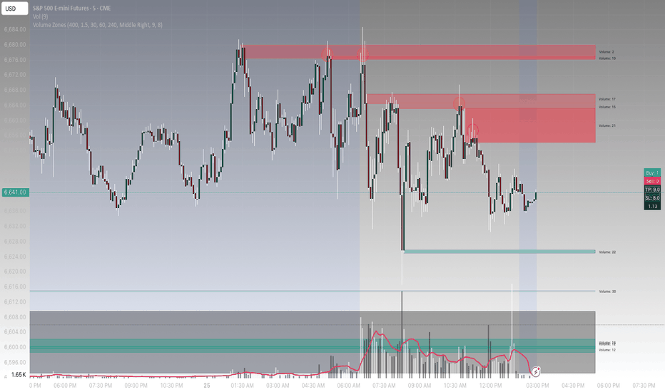
Volume ZonesVolume Zones
This script identifies and visualizes areas of interest based on relative volume activity and price structure. It is designed to highlight zones where increased participation may have influenced price behavior, which can be useful for tracking potential areas of reaction, continuation, or rejection.
The approach combines volume thresholds, candle structure, and optional multi-timeframe context to build a clearer view of where meaningful activity has occurred.
How It Works
The script scans historical data over a configurable lookback period and compares current volume to a moving average baseline.
When volume exceeds a defined threshold, the candle is evaluated for structural characteristics such as:
• Body size relative to total range
• Upper and lower wick dominance
• Directional close
Based on this, zones are classified as:
• Bullish zones (buy-side interest)
• Bearish zones (sell-side interest)
• Neutral/high-activity zones
Each detected zone is stored and projected forward on the chart for a set number of bars.
Zone Behavior
Bullish zones are typically formed when:
• Strong upward candles occur on elevated volume
• Lower wicks suggest rejection of lower prices
Bearish zones are typically formed when:
• Strong downward candles occur on elevated volume
• Upper wicks suggest rejection of higher prices
Neutral zones may form during high-volume indecision candles.
These zones can act as areas of potential support, resistance, or liquidity interaction.
Mitigation Logic
Zones can be automatically invalidated when price closes through them.
• Bullish zones are removed when price breaks below the zone
• Bearish zones are removed when price breaks above the zone
This helps keep the chart focused on currently relevant areas.
Multi-Timeframe Stacking
Optional higher timeframe inputs allow zones to be evaluated against broader structure.
When a zone aligns with higher timeframe ranges, its visual intensity is increased.
This can help identify areas where multiple layers of activity overlap.
Visual Output
• Zones are displayed as extended boxes on the chart
• Color intensity reflects the degree of alignment (stacking)
• Volume labels provide a relative measure of activity strength
• Older or mitigated zones are removed to reduce clutter
Volume Context
The script also estimates directional volume within each candle by separating buying and selling pressure based on price position within the range.
This information is summarized in a small dashboard, along with:
• Relative buy and sell strength
• Configurable target and stop values
• Implied risk-to-reward ratio
Notes
This tool is intended to provide context around volume and structure rather than act as a standalone system.
It can be used alongside:
• Price action analysis
• Support and resistance
• Market structure concepts
As with any tool, results will vary depending on market conditions and how it is applied. Gösterge
Hash Auto Fibonacci## Overview
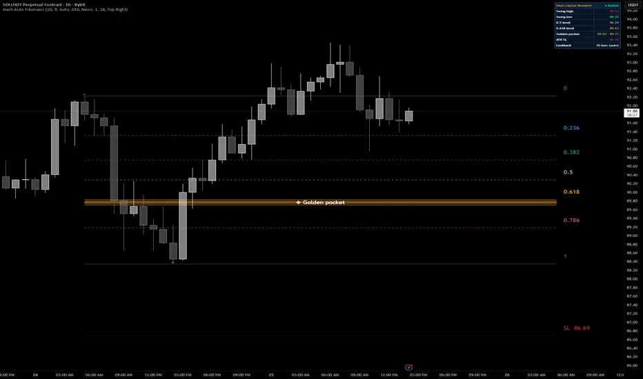
Hash Auto Fibonacci eliminates the most time-consuming part of Fibonacci trading — drawing the levels yourself. Drop it on any chart and it automatically detects the most recent significant swing high and swing low, then instantly draws a complete Fibonacci retracement web anchored to those pivots. No manual drawing, no subjectivity, no missed setups.
Built for active traders who use Fibonacci as a core part of their strategy, this tool is engineered to keep up with fast-moving markets through a volatility-adaptive detection engine, a highlighted Golden Pocket zone, a built-in stop-loss reference, and optional multi-timeframe confirmation.
## Key Features
**Automatic Swing Detection**
The indicator uses a pivot-based algorithm to identify swing highs and lows in real time. A pink dot marks the swing high and a green dot marks the swing low on the chart — always showing only the current active pair, never cluttering your screen with historical markers.
**Dynamic Lookback Engine**
Rather than using a fixed lookback period, Hash Auto Fibonacci automatically adjusts its sensitivity based on current market volatility. During high-volatility conditions (fast trending moves, breakouts), the lookback shortens to detect swings quickly. During low-volatility conditions (consolidation, ranging markets), it lengthens to filter out noise and identify only meaningful pivots. This is calculated using the ratio of a 50-period ATR to a 10-period ATR, scaled by a user-adjustable multiplier. You can also switch to a fixed manual lookback at any time.
**Fibonacci Retracement Levels**
The following retracement levels are drawn automatically:
- 0 (swing high anchor)
- 0.236
- 0.382
- 0.5
- 0.618
- 0.65
- 0.786
- 1.0 (swing low anchor)
Optional extension levels (1.272, 1.618, 2.618) can be enabled for targets beyond the swing low.
**The Golden Pocket Zone**
The 0.618–0.65 confluence zone is highlighted as a gradient-filled amber band directly on the chart. This region — known as the Golden Pocket — is widely regarded as the highest-probability reversal zone within any Fibonacci retracement. The zone enforces an ATR-based minimum thickness so it remains visible even on assets with small absolute price ranges.
**ATR Stop-Loss Reference**
A dashed red line is automatically drawn below the swing low (bullish setup) or above the swing high (bearish setup) at a distance of 2× ATR-10. This gives a data-driven starting point for your stop-loss placement without requiring a separate indicator.
**Multi-Timeframe Confirmation**
When the current chart's swing pivot aligns within 0.5% of a confirmed pivot on a higher timeframe (default: 4H), the entire Fibonacci web is visually upgraded — lines become bolder, a confirmation badge appears, and an alert can be triggered. MTF-confirmed webs represent structurally significant levels that multiple timeframes agree on, which historically carry more weight as support and resistance.
**Direction Detection**
The indicator automatically determines whether the current setup is bullish (retracing upward from a low) or bearish (retracing downward from a high) by comparing which pivot — the high or the low — was confirmed most recently. You can override this manually if needed.
**Info Dashboard**
A clean navy dashboard in the corner of your chart displays:
- Current swing high and swing low prices
- 0.5 and 0.618 Fibonacci levels
- Golden Pocket price range
- Suggested ATR-based stop-loss price
- Active lookback period (and whether it's dynamic or manual)
---
## How To Use
**Basic setup**
Add the indicator to any chart. It works on all timeframes and all assets — crypto, stocks, forex, futures. The Fibonacci web draws automatically. The Golden Pocket zone is the primary area to watch for price reactions.
**Reading the chart**
- Price pulling back into the Golden Pocket (0.618–0.65 zone) in a bullish setup is the classic high-probability long entry zone
- Price rejecting from the Golden Pocket in a bearish setup is a potential short entry or profit-taking zone
- The 0.5 level acts as the midpoint — a close above (bullish) or below (bearish) confirms continuation of the retracement
- The 0.786 level is deep — a sweep past this level often signals the retracement is becoming a full reversal
**Using the stop-loss line**
The dashed red SL line is a reference, not a guaranteed stop placement. Use it as a starting point and adjust to your own risk tolerance. On volatile assets, consider placing your stop slightly beyond it to avoid wicks triggering your exit prematurely.
**Multi-timeframe confirmation**
When the ◆ MTF badge appears, the swing that anchors the current web also exists on the higher timeframe. These setups tend to produce cleaner reactions at Fibonacci levels because they represent areas where both short-term and institutional timeframe participants are watching the same price zone.
**Alerts**
Five alert conditions are available:
- New swing high detected
- New swing low detected
- MTF confirmation active
- Price entering the Golden Pocket
- Price at the 0.382 level
- Price at the 0.786 level
Set these in the Alerts panel to get notified without watching the chart constantly.
---
## Settings Reference
**Swing Detection**
| Setting | Default | Description |
|---|---|---|
| Dynamic lookback | On | Automatically adjusts pivot sensitivity based on volatility |
| Manual lookback | 10 | Fixed lookback used when dynamic mode is off |
| Dynamic multiplier | 9 | Controls the average lookback length in dynamic mode |
| Direction mode | Auto | Auto, Bullish, or Bearish override |
| Show swing markers | On | Displays pivot dots on the chart |
**Multi-Timeframe Confirmation**
| Setting | Default | Description |
|---|---|---|
| MTF confirmation | On | Enables higher timeframe pivot alignment check |
| HTF timeframe | 240 (4H) | The timeframe used for confirmation pivots |
**Fibonacci Levels**
| Setting | Default | Description |
|---|---|---|
| Retracement levels | On | Draws the standard 0–1 retracement web |
| Extension levels | Off | Adds 1.272, 1.618, 2.618 extension targets |
| Ratio labels | On | Shows ratio numbers next to each level |
| Golden Pocket zone | On | Highlights the 0.618–0.65 zone |
| ATR stop-loss line | On | Draws the 2× ATR stop reference |
**Info Table**
| Setting | Default | Description |
|---|---|---|
| Show info table | On | Displays the dashboard |
| Position | Top Right | Corner placement of the dashboard |
---
## Notes
- This indicator is an overlay — it draws directly on the price chart
- Works on all timeframes, all markets, and all asset classes available on TradingView
- The dynamic lookback is calibrated on BTC/USDT 1H data and performs well across most liquid crypto and equity instruments
- Past Fibonacci levels do not guarantee future price reactions — use this tool as part of a broader trading system, not as a standalone signal
- This indicator does not repaint. Swing pivots are confirmed before being drawn and are not subject to change after confirmation
---
## By Hash Capital Research
Gösterge

Gösterge

Traders Peak [OmegaTools]Traders Peak is a professional chart overlay built to identify statistically unusual candles that combine elevated volume, pronounced wick rejection, and meaningful price range. The purpose of the tool is to isolate moments where market participation expands sharply while price simultaneously shows signs of rejection from one side of the auction. These events often reveal areas where aggressive buying or selling met equally strong opposition, creating levels that may remain relevant for future price interaction.
The script evaluates three core elements of candle behavior. First, it measures whether volume is abnormally high relative to recent activity. Second, it detects whether wick development is unusually large compared with the recent average, helping uncover rejection and failed continuation attempts. Third, it filters for candles with sufficient body size so that only structurally relevant bars are considered. When all of these conditions align, the indicator marks the candle as a Traders Peak event and projects a zone and reference level forward on the chart.
Each signal is then classified by the dominant side of rejection. A candle with a stronger upper rejection is treated as a bearish reaction area, while a candle with a stronger lower rejection is treated as a bullish reaction area. The indicator draws a colored box over the rejected portion of the candle and extends a horizontal line from the wick extreme, allowing traders to monitor whether price respects, revisits, or invalidates the level over time. This makes the tool especially effective for highlighting exhaustion points, liquidity grabs, failed breakouts, reversal zones, and highly reactive areas created by one-sided participation.
The Threshold input controls how extreme the statistical conditions must be before a signal is generated. Higher values make the script more selective and focus only on the most exceptional candles, while lower values increase signal frequency. The Length input defines the normalization window used to compare current candle behavior against recent market conditions. Together, these settings allow the indicator to adapt across asset classes, volatility environments, and timeframes.
Traders Peak can be used in several ways. It can serve as a reversal detection tool when a strong rejection appears after an extended directional move. It can be used as a confirmation layer for market structure traders who want extra evidence before acting on support, resistance, or supply and demand zones. It can also help intraday traders identify possible exhaustion at session highs or lows, where abnormal activity and rejection often reveal failed continuation attempts. For breakout traders, it can be useful in detecting false breakouts and trap conditions, especially when price briefly expands beyond a level but is immediately rejected with strong participation. Swing traders may use it to locate significant reaction zones that can remain relevant for multiple sessions, while scalpers may use it as a precision aid to refine entries, exits, or invalidation points around highly active candles.
In practice, bullish signals may be useful when a market sells off into an important level and forms a high-volume candle with strong lower rejection, suggesting that sellers were absorbed and price rejected lower values. Bearish signals may be useful when price rallies into resistance and prints a high-volume candle with strong upper rejection, suggesting that buyers were unable to maintain higher prices. In both cases, the projected zone and line provide an immediate visual reference for tracking future reactions and managing trade decisions around those levels.
Traders Peak is not designed to predict direction in isolation, but to highlight candles that deserve attention because they reflect abnormal participation and rejection dynamics. For best results, it should be used alongside broader contextual tools such as trend structure, key levels, session analysis, volatility conditions, and execution logic. When combined with solid market reading, it offers a clean and systematic way to transform exceptional candles into actionable chart information. Gösterge

Periodic Anchored VWAPPeriodic Anchored VWAP
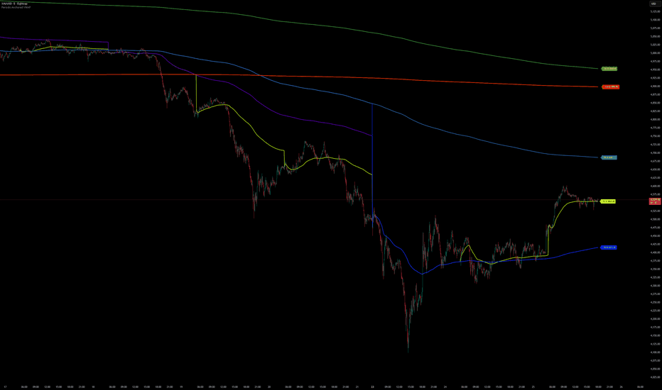
Overview
The Periodic Anchored VWAP is a professional volume-weighted average price indicator that anchors VWAP calculations to fixed calendar periods. Unlike traditional anchored VWAP tools that require manual point-and-click anchoring, this indicator automatically resets VWAP calculations at predefined interval boundaries (hourly, daily, weekly, monthly), providing a clean, systematic approach to volume-weighted support and resistance analysis.
Key Features
13 Anchor Periods: 1H, 4H, 6H, 12H, 1D, 3D, 1W, 2W, 1M, 2M, 3M, 6M, 12M
Smart Timeframe Filtering: Automatically hides VWAPs when chart timeframe equals or exceeds anchor period
Individual Period Controls: Toggle each VWAP on/off independently with custom colors
Master Toggle: Global show/hide for all VWAP lines
Dynamic Labels: Real-time price labels at the right edge of chart
Compact Settings: Streamlined input panel with inline color pickers
How It Works
The Golden Rule
VWAP is displayed ONLY when: Chart Timeframe < Anchor Period
This ensures VWAP lines always represent meaningful continuous calculations. For example:
1H VWAP appears only on timeframes smaller than 1 hour (e.g., 15min, 5min, 1min)
1D VWAP appears only on timeframes smaller than daily (e.g., 4H, 1H, 15min)
1W VWAP appears only on timeframes smaller than weekly (e.g., daily, 4H, 1H)
Anchor Logic
Each VWAP resets at its respective period boundary:
Intraday Anchors (1H, 4H, 6H, 12H): Reset at the start of each hour/4-hour/6-hour/12-hour period
Daily Anchors (1D, 3D): Reset at daily market open
Weekly Anchors (1W, 2W): Reset at weekly market open
Monthly Anchors (1M, 2M, 3M, 6M, 12M): Reset at month boundaries
Input Settings
Master Control:
VWAP Display Show / Hide Global toggle for all VWAP lines
Intraday Anchors (Default: Off):
1H => Teal => Short-term intraday reference
4H => Pink => Medium-term intraday reference
6H => Magenta => Half-day session reference
12H => Cyan => Full session reference
Anchor VWAP Periods (Default: On):
1D => Yellow/Green => Daily support/resistance
3D => Purple => Multi-day trend reference
1W => Blue => Weekly pivot levels
2W => Light Blue => Bi-weekly trend
1M => Green => Monthly support/resistance
2M => Dark Green => 2-month horizon
3M => Yellow => Quarterly reference
6M => Orange => Semi-annual trend
12M => Red => Annual benchmark
Visual Display
VWAP Lines: Colored lines plotted at 2px thickness for clear visibility:
Right-Edge Labels: Compact labels showing period and current VWAP value
Smart Label Colors: Black or white text automatically based on line color for optimal readability
Use Cases
Intraday Trading:
Use 1H, 4H, 6H, 12H VWAPs on lower timeframes (e.g., 5min, 15min) to identify intraday support/resistance levels
Multiple intraday VWAPs reveal stacked liquidity zones
Swing Trading:
1D, 3D, 1W, 2W VWAPs help identify trend direction and mean reversion levels
Weekly VWAP provides context for daily price action
Position Trading:
1M, 3M, 6M, 12M VWAPs offer long-term benchmarks for valuation assessment
Multiple monthly VWAPs show multi-year price distribution
Multi-Timeframe Analysis:
Visualize up to 13 VWAP levels simultaneously
Identify confluences where multiple VWAP periods align
Observe how price interacts with different anchored levels
Important Notes
Timeframe Limitations: VWAPs automatically hide when the chart timeframe is equal to or greater than the anchor period (prevents misleading point-to-point lines)
Intraday Anchors Disabled by Default: Enable only the periods relevant to your trading style to reduce visual clutter
Monthly Anchors: Use 30-day approximation for minute calculations; display logic ensures they only appear on daily or lower timeframes
Label Positioning: Labels appear 1-13 bars to the right of the current bar to prevent overlap with price action
Performance
Efficiently coded with looped label management
No repainting — all calculations are historical
Compatible with all markets and symbols
Version History
v.1.0 => Initial release with 13 anchor periods, timeframe validation, and dynamic labels
Start using Periodic Anchored VWAP to elevate your volume-weighted analysis across all timeframes!
Gösterge
Institutional Key Levels [Quantum Algo]Institutional Key Levels
Developed by QuantumAlgo
█ OVERVIEW
The Institutional Key Levels indicator by Quantum Algo identifies the price levels where institutions have repeatedly defended or rejected price — and displays them as clean, ranked horizontal lines with real-time power scoring and strict buy/sell signals that only fire on confirmed rejection candles.
This is not another support and resistance indicator that fills your chart with dozens of overlapping zones. Quantum Algo's Institutional Key Levels uses a pivot clustering algorithm that merges nearby swing points into single high-confidence levels, ranks them by touch count, and automatically expires old levels that are no longer relevant. The result is a clean chart with only the levels that matter.
Institutional Key Levels by Quantum Algo — clean horizontal levels with power scoring and buy/sell signals on BTCUSDT
█ WHY THESE KEY LEVELS ARE DIFFERENT
Most support and resistance indicators on TradingView draw thick boxes everywhere, produce noisy signals on every touch, and never remove old levels — leaving you with a cluttered chart where every level looks equally important. You end up ignoring all of them.
Quantum Algo's Institutional Key Levels solves this with five design principles that no other key level indicator combines:
Thin lines instead of thick boxes — your chart stays clean and readable. Each level is a single horizontal line, not a wide zone that covers half the screen.
Pivot clustering — nearby swing points are merged into one level at their average price. Five pivots at similar prices become one strong level, not five separate lines fighting for attention.
Power scoring — every level displays its touch count directly on the chart. A level labeled "S × 7" has been tested seven times. A level labeled "R × 2" has only been tested twice. You instantly know which levels institutions care about.
Automatic expiry — levels older than the configurable lifespan disappear. Your chart only shows levels that are relevant to the current market structure, not levels from weeks ago that price has long forgotten.
Strict rejection signals — buy and sell signals do not fire on every touch. They require a confirmed rejection candle: a long wick into the level followed by a close back outside with strong body positioning. A built-in cooldown prevents consecutive signals at the same level.
█ FIVE CORE FEATURES
▸ 1 — Pivot-Clustered Key Levels
The indicator collects all pivot highs and pivot lows within the scan window, then groups pivots that fall within a configurable merge distance into single levels. The level price is the average of all pivots in the cluster. The touch count represents how many independent pivot confirmations the level has received.
Levels are sorted by touch count — the strongest levels are always visible. Line thickness scales with strength: levels with five or more touches draw as thick lines, three to four as medium, and newer levels as thin lines. Stronger levels also appear more opaque.
Institutional Key Levels by Quantum Algo — power-ranked levels with touch counts showing institutional interest concentration
Above: Each level displays its type and touch count. The strongest levels draw thicker and more vivid. Weak or old levels automatically expire, keeping the chart focused on what matters now.
▸ 2 — Buy and Sell Signals with Rejection Confirmation
Signals only fire when three conditions are met simultaneously: price must wick into or through a qualified level, the candle must show clear rejection (wick at least 50% of the candle range), and the close must confirm the direction (bullish for buys, bearish for sells).
A configurable cooldown timer prevents multiple signals from firing in rapid succession. This eliminates the noise that plagues other support and resistance indicators where every single touch produces a signal.
▸ 3 — Liquidity Sweep Detection
When enabled, the indicator identifies bars where price breaks through a key level but closes back on the opposite side — the classic institutional stop hunt pattern. Sweeps appear as small markers, distinct from regular buy/sell signals. This helps you spot institutional traps in real time.
▸ 4 — Dynamic Institutional Level
A volume-weighted average of typical price that shows where institutional money is currently concentrating. Unlike static key levels that only update when new pivots form, the dynamic level adapts continuously, acting as a floating institutional anchor. When the dynamic level aligns with a static key level, the confluence creates an especially high-probability zone.
Institutional Key Levels by Quantum Algo — dynamic institutional level (gold line) providing confluence with static key levels
Above: The dynamic institutional level (gold line) moves with volume-weighted price action, creating confluence when it aligns with a static key level. Signals at these intersection points carry extra weight.
▸ 5 — Automatic Level Management
Levels are born when pivot clusters form and expire after the configurable lifespan. The indicator continuously monitors all active levels, counting new price interactions and removing levels that fall below the minimum touch threshold or exceed their lifespan. This self-managing system means you never need to manually clean your chart.
█ HOW TO USE
Trade rejections at strong levels — When price approaches a level with a high touch count, watch for a rejection candle. If the indicator fires a Buy or Sell signal, the level and the candle confirmation align. Enter in the signal direction with a stop beyond the level.
Use touch count for conviction — A level with seven touches is far more significant than one with two touches. Size your position accordingly. The strongest levels are where institutions have repeatedly stepped in.
Watch for dynamic level confluence — When the dynamic institutional level sits at the same price as a static key level, the probability of a reaction increases significantly. These are the highest-confidence setups.
Adjust for timeframe — On lower timeframes, reduce the pivot sensitivity and lifespan. On higher timeframes, increase them. The indicator adapts to any market and any timeframe.
Combine with other Quantum Algo tools — Use alongside the Institutional Volume Profile by QuantumAlgo to see where volume concentrates at each key level, or the Adaptive Trend Sentinel for directional context.
█ SETTINGS
🔍 Level Detection — Pivot Sensitivity controls how significant a swing must be. Level Merge Distance controls how close pivots must be to merge into one level. Max Levels caps visible levels. Level Lifespan sets expiry. Min Touches filters weak levels.
⚡ Signals — Toggle buy/sell signals and liquidity sweeps independently. Set minimum touch count for signal generation. Signal Cooldown prevents consecutive signals within the configured number of bars.
📈 Dynamic Level — Toggle the volume-weighted institutional level with configurable period.
🔮 Quantum Algo Palette — Customize resistance, support, sweep, and dynamic level colors.
█ RECOMMENDED SETTINGS
Crypto perpetual futures on 1H to 4H: Pivot Sensitivity 3, Merge Distance 0.7%, Max Levels 10, Lifespan 200, Cooldown 25 bars.
For scalping on 5m to 15m: reduce lifespan to 100, increase pivot sensitivity to 5-8 for fewer but stronger levels.
For swing trading on Daily: increase lifespan to 300-400, reduce max levels to 5-6 for only the most significant institutional levels.
█ WHAT MAKES THIS INDICATOR COMPETITIVE
The Institutional Key Levels indicator by Quantum Algo competes directly with the most popular support and resistance tools on TradingView by offering cleaner visuals, smarter level detection, and signal quality that other indicators cannot match. The pivot clustering algorithm, power scoring display, automatic expiry, and strict rejection-based signals combine into a system that keeps your chart readable while surfacing only the levels where institutions are actively participating.
This is not a static tool that draws lines and walks away. It is a living system that adapts as new pivots form, removes levels that lose relevance, and only alerts you when a genuine institutional rejection occurs.
Built from scratch by Quantum Algo as part of the institutional analysis suite developed by QuantumAlgo.
█ NOTES
Pine Script v5. Overlay indicator with scale anchoring. Pivot-clustered detection with automatic expiry. All drawing objects managed within TradingView limits. Compatible with any market and any timeframe. Gösterge

G.O.D Trades1. G.O.D SR Zones (Wide Pink & Green Areas)
What it is:
These are the large semi-transparent rectangles — pink for G.O.D Resistance and green for G.O.D Support.
They are created using the highest high and lowest low over your chosen lookback period (default 25 bars).
Why it matters:
These act as institutional supply and demand zones. Big players often defend or attack these areas. Price tends to react strongly (reverse or accelerate) when it touches them.
How to use:
Price approaching G.O.D Resistance (pink) from below → potential short opportunity.
Price approaching G.O.D Support (green) from above → potential long opportunity.
When price breaks a zone with strong momentum candles → expect continuation toward the next opposite zone.
Best trades happen at the edges of these zones.
Pro Tip: The wider the zone, the stronger it is. You can increase lookback for broader zones or decrease it for more responsive ones.
2. Liquidity Pools + Sweeps (Blue & Orange Boxes + Triangles)
What it is:
Liq High (blue box): Area slightly above recent swing highs.
Liq Low (orange box): Area slightly below recent swing lows.
Sweep markers: Small red triangle (above bar) for high sweep, green triangle (below bar) for low sweep.
Why it matters:
Institutions hunt stop-loss orders. Liquidity pools are where many retail traders place their stops (above highs or below lows). A "sweep" is when price briefly takes that liquidity and then reverses.
How to use:
A sweep (triangle appears) is often a high-probability reversal signal.
Example: Price wicks above Liq High → red triangle appears → price reverses down → look for short.
The opposite for longs at Liq Low.
These are especially powerful when they occur near G.O.D SR zones.
Pro Tip: The best setups are sweep + reversal signal + G.O.D zone confluence.
3. L Pivots (Red & Green "L" Labels)
What it is:
Automatically detects swing highs and lows using ta.pivothigh(5,5) and ta.pivotlow(5,5).
Labels them as L1, L9, L15, L25, etc. Red = bearish pivots (resistance), Green = bullish pivots (support).
Why it matters:
These show market structure in real time (Break of Structure, Change of Character). Higher L numbers usually mean more recent and significant levels.
How to use:
Bounce trades: Price reacts at an L pivot inside a G.O.D zone → good reversal setup.
Break trades: Price breaks an L pivot with momentum → continuation trade.
Use them as precise entry or stop-loss levels (tighter than the big SR zones).
Pro Tip: L25+ levels are generally stronger than L1–L10.
4. Daily NY Session High/Low (SH & SL Lines)
What it is:
Red line = Session High (SH)
Green line = Session Low (SL)
Automatically resets at 9:30 ET (New York open) and tracks the high/low during regular trading hours (09:30–16:00 ET).
Why it matters:
These are psychological and institutional reference points for the entire day. Many algorithms and traders watch these levels closely.
How to use:
Breaking SH with momentum → bullish bias for the day.
Breaking SL with momentum → bearish bias for the day.
Retests of SH/SL after breakout often provide excellent entries.
5. Momentum Oscillator (Yellow Line in Separate Pane)
What it is:
A simple 10-period Momentum indicator (ta.mom(close, 10)). It plots above or below the zero line.
Why it matters:
It shows the speed and strength of price movement. Helps filter fakeouts.
How to use:
Momentum rising above zero → bullish strength.
Momentum falling below zero → bearish strength.
Divergence: Price makes new high but momentum fails to → warning of reversal (often matches REV↓ signal).
Use it to confirm direction before entering on sweeps or pivots.
Pro Tip: Combine with reversal signals — the REV labels already use momentum divergence internally.
6. Reversal Signals (REV↑ and REV↓ Labels)
What it is:
Green REV↑ at lows and red REV↓ at highs. These appear automatically.
Why it matters:
It detects when a pivot low/high forms and momentum is diverging — a classic reversal pattern in SMC/ICT.
How to use:
REV↑ near G.O.D Support or after a Liq Low sweep → strong long setup.
REV↓ near G.O.D Resistance or after a Liq High sweep → strong short setup.
These are excellent for scalping or catching early turns.
7. Background Highlight (Red Tint on Strong Down Moves)
What it is:
Light red background when a candle has a strong bearish close.
Why it matters:
Helps you quickly spot aggressive selling pressure without staring at every candle.
How to use:
Use it as a visual filter — strong red background + sweep or reversal signal = higher conviction short. Gösterge

Gösterge

AG Pro Price Acceptance Profile [AGPro Series]AG Pro Price Acceptance Profile
OVERVIEW
AG Pro Price Acceptance Profile is a price-structure tool designed to reveal where the market is spending time, where it is repeatedly returning, and where it is rejecting price efficiently.
Instead of using volume distribution, signal arrows, or breakout-style triggers, this script builds an acceptance/rejection map from price-time interaction inside a rolling lookback window. The goal is simple: make it easier to identify where price is being accepted, where it is being rejected, and whether current price is trading inside balance or at its outer edges.
This is not a volume profile clone, not a support/resistance line generator, and not a momentum signal script. It focuses on one specific question:
Which price areas are currently showing repeated acceptance, and which areas are failing to hold price?
That narrow focus is intentional. The script is built as an analytical context tool rather than an entry engine.
UNIQUE EDGE
The core idea is to measure acceptance through price-time behavior rather than centralized volume data.
The profile logic evaluates how often price revisits a zone, how long it tends to remain there, and how efficiently it exits that zone. This creates a structured map of:
- Acceptance zones
- Rejection zones
- The active balance area
- The current market state relative to that balance
Because the methodology is based on price persistence and revisit behavior, the script can be useful on markets where volume-based profiling is either unavailable, fragmented, or not the preferred analytical lens.
METHODOLOGY
The script divides the rolling price range into rows and evaluates each row using multiple internal dimensions derived from recent bars:
1) Time at price
Measures how frequently the market occupies each row across the selected lookback.
2) Revisit density
Tracks how often price returns to a row after leaving it. Repeated revisits can indicate ongoing acceptance or unfinished balancing behavior.
3) Dwell persistence
Approximates whether the market tends to spend stable time in an area rather than only touching it briefly.
4) Rejection speed
Measures how efficiently price exits an area after interaction. Faster and cleaner exits tend to support rejection classification.
5) Balance mapping
Uses the strongest acceptance region to define the current balance area and then classifies the live market location relative to it.
The result is a simplified profile-style framework built from price behavior itself.
HOW TO READ IT
The large balance area highlights the current acceptance region derived from the profile engine.
Acceptance zones mark price areas that showed stronger persistence, repeated interaction, and better structural acceptance within the chosen lookback.
Rejection zones mark areas where price interacted but failed to remain stable, leading to less durable occupation and faster displacement.
The panel is designed to summarize the current profile state:
- Acceptance Strength: relative quality of the dominant accepted area
- Revisit Density: how actively the market is returning to profiled zones
- Balance Width: width of the accepted region relative to the full profiled range
- Rejection Speed: how efficiently price is leaving unstable areas
- Location: whether current price is inside, above, or below balance
In practice, traders can use the script to distinguish between stable trade location and unstable trade location, instead of treating every nearby level as equally important.
KEY INPUTS
Lookback
Controls how much recent history is used to build the profile.
Rows
Defines profile resolution. Higher values increase granularity but can also make the map more sensitive.
Acceptance Threshold / Rejection Threshold
Adjust how selective the script is when classifying stronger acceptance and rejection areas.
Maximum Acceptance / Rejection Zones
Controls chart density and visual focus.
Panel and label settings
Allow adaptation for different chart layouts and screen sizes.
LIMITATIONS AND TRANSPARENCY
This script does not predict future price movement.
It does not generate guaranteed reversal points.
It does not replace execution logic or risk management.
Acceptance and rejection are contextual measurements derived from the selected lookback and row resolution. Different settings can produce different maps because the profile is adaptive by design.
As with any charting tool based on rolling historical context, zones may evolve when older bars leave the lookback window and new bars enter it.
This script is best used as a contextual framework for market location, not as a standalone trade mandate.
RISK DISCLOSURE
This indicator is for analytical and educational use only. It does not provide financial advice, investment advice, or trading guarantees. All trading decisions remain the responsibility of the user. Gösterge

Supply & Demand Zones XLDescription
Supply & Demand Zones XL is a non-repainting supply and demand indicator designed to model market structure with a focus on stability, clarity, and quantitative strength evaluation.
The script identifies supply and demand zones using pivot-based structure and sizes each zone dynamically using ATR, ensuring consistent scaling across different market conditions. Zones are extended forward in real time and maintained as either active or historical depending on user preference.
Each zone is scored using a composite strength model that incorporates volume participation, zone width efficiency, time in market, and touch frequency. The resulting strength rating is normalized to a simple X/10 format and displayed at the end of each zone for immediate readability.
A non-repainting mode ensures that zones are only confirmed after pivot completion, preventing forward-looking bias. An optional volume filter allows users to require above-average participation before a zone is formed.
The script includes logic to prevent redundant structure by disallowing overlapping zones of the same type while the current zone remains valid. Once a zone is broken, new zones are allowed to form, preserving structural continuity.
Zones are considered broken only on confirmed closes beyond their boundaries, not intrabar wicks. Broken zones are downgraded in strength and can be visually differentiated using customizable color controls. Users can independently control coloring for active and historical broken zones, as well as define separate colors for supply, demand, broken supply, and broken demand.
Historical zones can be toggled on or off, with optional strength labels, allowing users to balance context versus chart clarity.
The result is a structured, state-driven supply and demand model that avoids noise, reduces duplication, and provides a consistent framework for evaluating zone quality and market behavior. Gösterge