
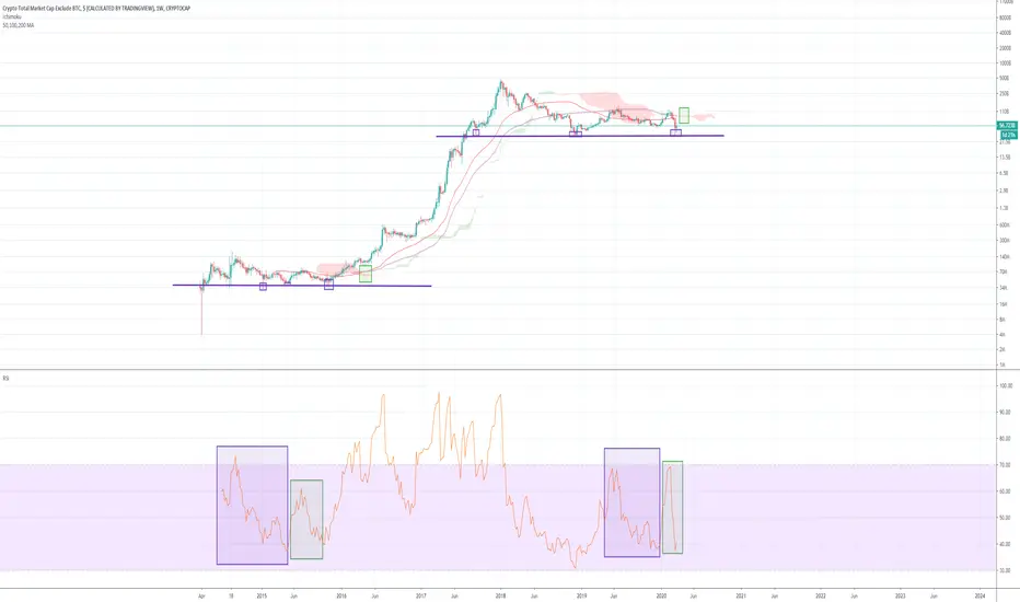
Impending golden cross on the weekly chart for the alt coin market cap! Also included a few points (purple squares) that show similarities to the previous bull run, and a RSI fractal i'm not sure if that's a thing? I know its meant to be used just for divergences but i noticed some similarities and thought i'd share. Ichimoku resistance can also be seen to be thinning which is a good sign for the golden cross. Happy trading in this crazy market!

免責聲明
這些資訊和出版物並非旨在提供,也不構成TradingView提供或認可的任何形式的財務、投資、交易或其他類型的建議或推薦。請閱讀使用條款以了解更多資訊。