OPEN-SOURCE SCRIPT
Liquidation Levels
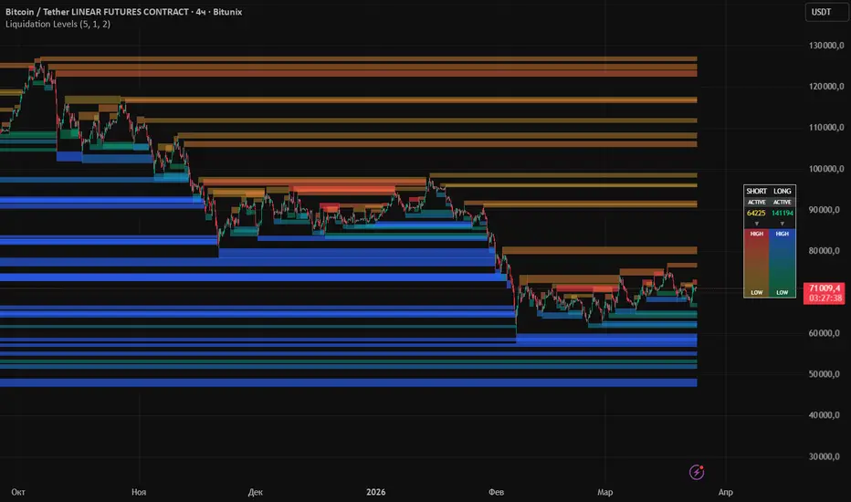
Liquidation Levels [Accumulation]
📖 Introduction
Hello friends! I would like to present an indicator that visualizes liquidity accumulation zones based on local price extremes and volume. The core idea is simple yet powerful: significant price levels where large volumes have been traded become magnets for future price movement, as stop-losses and liquidation orders accumulate there.
The indicator helps you see where liquidity is located — both above price (short liquidations) and below price (long liquidations). By understanding where the "fuel" for price movement is concentrated, you can better anticipate potential reaction zones and market turning points.
Unlike many liquidity indicators that rely on external data, this one works purely with price and volume — making it universal for any market and timeframe. Let's explore how it works and how to customize it for your trading style.
🎯 What the Indicator Shows
The indicator displays three key elements on the chart:
1️⃣ Liquidation Boxes
For each local high (pivot), a box is drawn upward — representing short liquidation zones. For each local low (pivot), a box is drawn downward — representing long liquidation zones.
Shorts (above price): Yellow → Red gradient (higher volume = brighter red)
Longs (below price): Lime → Blue gradient (higher volume = brighter blue)
2️⃣ Volume Accumulation
When multiple pivots appear close to each other, their volumes are merged into a single box. The box expands and becomes brighter, showing concentrated liquidity zones rather than scattered individual levels.
3️⃣ Active Liquidity Legend
The right-side legend displays:
Total active short volume — liquidity that hasn't been collected yet
Total active long volume — liquidity that hasn't been collected yet
Color scale — visual reference for volume intensity
⚙️ Settings
Pivot Length
default: 5 | range: 2–20
Determines how many bars to the left and right are used to identify local highs and lows.
Lower values (3–5): more sensitive — captures smaller swings, creates more boxes
Higher values (7–15): captures only major swings, fewer but more significant boxes
Box Height (ATR)
default: 1.0 | range: 0.3–3.0
ATR multiplier that determines the box height from the pivot point.
Lower values (0.3–0.8): narrow liquidity zones
Higher values (1.2–2.0): wider zones, covering more price space
Merge Distance (% ATR)
default: 0.5 | range: 0.1–10.0
Distance as a percentage of ATR within which pivots are merged into a single box.
0.1–0.3%: almost every pivot creates its own box
0.5–1.0%: merges nearby pivots, reduces noise
2.0–10.0%: aggressive merging, creates wide accumulation zones
Short / Long Liquidations
Toggles the display of short boxes (above price) and long boxes (below price).
Show Legend
Toggles the display of the legend with active liquidity and color scale.
🧠 How to Use
1️⃣ Liquidity Accumulation Zones
Bright, saturated boxes show levels where significant volume has accumulated. These are potential zones where price may reverse or accelerate after liquidity is collected.
2️⃣ Merged Boxes
When multiple pivots merge into one box, it signals concentrated liquidity in that price zone. The wider and brighter the box, the more significant the zone.
3️⃣ Active Liquidity
The right-side legend shows the total volume of untouched boxes. This helps assess how much liquidity is still "hanging" on the chart.
4️⃣ Touch Behavior
When price touches a box, it stops expanding but remains on the chart. This allows you to see which levels have already been tested and which are still active.
📌 Important
The indicator does not use external data — only price and volume
Boxes are not removed when touched, they simply stop expanding
Volumes accumulate when nearby pivots are merged
Color saturation depends on volume — higher volume = brighter box
🔚 Conclusion
Liquidation Levels [Accumulation] is a tool for those who understand that liquidity drives the market. It does not provide ready-made entry signals but offers a unique perspective on market structure, showing where stop-losses and liquidation orders are concentrated.
As one of the founders of technical analysis said: "Price moves where liquidity is". This indicator helps you see these zones in advance.
Happy trading! 📊
📖 Introduction
Hello friends! I would like to present an indicator that visualizes liquidity accumulation zones based on local price extremes and volume. The core idea is simple yet powerful: significant price levels where large volumes have been traded become magnets for future price movement, as stop-losses and liquidation orders accumulate there.
The indicator helps you see where liquidity is located — both above price (short liquidations) and below price (long liquidations). By understanding where the "fuel" for price movement is concentrated, you can better anticipate potential reaction zones and market turning points.
Unlike many liquidity indicators that rely on external data, this one works purely with price and volume — making it universal for any market and timeframe. Let's explore how it works and how to customize it for your trading style.
🎯 What the Indicator Shows
The indicator displays three key elements on the chart:
1️⃣ Liquidation Boxes
For each local high (pivot), a box is drawn upward — representing short liquidation zones. For each local low (pivot), a box is drawn downward — representing long liquidation zones.
Shorts (above price): Yellow → Red gradient (higher volume = brighter red)
Longs (below price): Lime → Blue gradient (higher volume = brighter blue)
2️⃣ Volume Accumulation
When multiple pivots appear close to each other, their volumes are merged into a single box. The box expands and becomes brighter, showing concentrated liquidity zones rather than scattered individual levels.
3️⃣ Active Liquidity Legend
The right-side legend displays:
Total active short volume — liquidity that hasn't been collected yet
Total active long volume — liquidity that hasn't been collected yet
Color scale — visual reference for volume intensity
⚙️ Settings
Pivot Length
default: 5 | range: 2–20
Determines how many bars to the left and right are used to identify local highs and lows.
Lower values (3–5): more sensitive — captures smaller swings, creates more boxes
Higher values (7–15): captures only major swings, fewer but more significant boxes
Box Height (ATR)
default: 1.0 | range: 0.3–3.0
ATR multiplier that determines the box height from the pivot point.
Lower values (0.3–0.8): narrow liquidity zones
Higher values (1.2–2.0): wider zones, covering more price space
Merge Distance (% ATR)
default: 0.5 | range: 0.1–10.0
Distance as a percentage of ATR within which pivots are merged into a single box.
0.1–0.3%: almost every pivot creates its own box
0.5–1.0%: merges nearby pivots, reduces noise
2.0–10.0%: aggressive merging, creates wide accumulation zones
Short / Long Liquidations
Toggles the display of short boxes (above price) and long boxes (below price).
Show Legend
Toggles the display of the legend with active liquidity and color scale.
🧠 How to Use
1️⃣ Liquidity Accumulation Zones
Bright, saturated boxes show levels where significant volume has accumulated. These are potential zones where price may reverse or accelerate after liquidity is collected.
2️⃣ Merged Boxes
When multiple pivots merge into one box, it signals concentrated liquidity in that price zone. The wider and brighter the box, the more significant the zone.
3️⃣ Active Liquidity
The right-side legend shows the total volume of untouched boxes. This helps assess how much liquidity is still "hanging" on the chart.
4️⃣ Touch Behavior
When price touches a box, it stops expanding but remains on the chart. This allows you to see which levels have already been tested and which are still active.
📌 Important
The indicator does not use external data — only price and volume
Boxes are not removed when touched, they simply stop expanding
Volumes accumulate when nearby pivots are merged
Color saturation depends on volume — higher volume = brighter box
🔚 Conclusion
Liquidation Levels [Accumulation] is a tool for those who understand that liquidity drives the market. It does not provide ready-made entry signals but offers a unique perspective on market structure, showing where stop-losses and liquidation orders are concentrated.
As one of the founders of technical analysis said: "Price moves where liquidity is". This indicator helps you see these zones in advance.
Happy trading! 📊
開源腳本
秉持TradingView一貫精神,這個腳本的創作者將其設為開源,以便交易者檢視並驗證其功能。向作者致敬!您可以免費使用此腳本,但請注意,重新發佈代碼需遵守我們的社群規範。

💡 Подписывайтесь на телеграм канал:
👉 t.me/+utPDmk843LI0Y2Fi
👉 t.me/+utPDmk843LI0Y2Fi
免責聲明
這些資訊和出版物並非旨在提供,也不構成TradingView提供或認可的任何形式的財務、投資、交易或其他類型的建議或推薦。請閱讀使用條款以了解更多資訊。
開源腳本
秉持TradingView一貫精神,這個腳本的創作者將其設為開源,以便交易者檢視並驗證其功能。向作者致敬!您可以免費使用此腳本,但請注意,重新發佈代碼需遵守我們的社群規範。
💡 Подписывайтесь на телеграм канал:
👉 t.me/+utPDmk843LI0Y2Fi
👉 t.me/+utPDmk843LI0Y2Fi
免責聲明
這些資訊和出版物並非旨在提供,也不構成TradingView提供或認可的任何形式的財務、投資、交易或其他類型的建議或推薦。請閱讀使用條款以了解更多資訊。