OPEN-SOURCE SCRIPT
Institutional Volatility Structure Engine
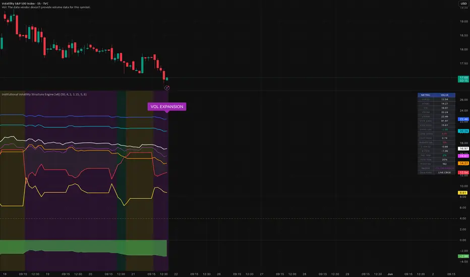
What is This Indicator?
This is a professional-grade volatility term structure analyzer designed to show how institutional traders view market fear across different time horizons.
Instead of just looking at the regular VIX, this indicator tracks:
• VIX1D (1-day implied vol)
• VIX9D (9-day)
• VIX (30-day)
• VIX3M (3-month)
• VIX6M (6-month)
• VVIX (Volatility of Volatility)
It analyzes the shape of the volatility curve and classifies the market into clear regimes, helping you understand whether the market is calm, stressed, coiled, or about to explode.
🎨 Main Visual Elements
1. Colored Lines (Term Structure)
Red: VIX1D (shortest term fear)
Orange: VIX9D
White: VIX (standard)
Aqua: VIX3M
Blue: VIX6M
Fuchsia: VVIX (how volatile volatility itself is)
2. Value Labels (New Feature)
Real-time price labels on the right side of each line so you can instantly see current values without checking the scale.
3. Background Heatmap
Red = Full Backwardation (Extreme fear/stress)
Orange = Front-End Inversion (Short-term trouble brewing)
Green = Compression Regime (Market is calm but coiled → high probability of volatility expansion)
Teal/Blue = Healthy Contango (Normal bull market behavior)
Purple = Volatility Expansion
Gray/Yellow = Transition
4. Curve Oscillator (Area Plot)
Red = Medium-term fear building
Green = Fear easing
5. Compression Score (Yellow Line)
Low = Terms are very close together (coiled spring)
High = Volatility is spreading out
📊 Dashboard Table (Top Right)
Gives you an instant professional summary:
Current values of all VIX terms
Z-Scores (how extreme current levels are)
Front Ratio (VIX1D ÷ VIX)
Breadth (how many terms are rising together)
Regime status
Percentile rankings
🔍 How to Use It Profitably (Practical Guide)
1. Regime Trading (Highest Edge)
Green Background (Compression) → Best environment for buying volatility (long VIX futures, UVXY, VXX, or long options). The market is quiet but tension is building.
Red/Orange Background → High caution or short volatility setups after the event passes (volatility crush).
Purple (Expansion) → Volatility is already expanding — trend days or big moves likely.
2. Key Signals to Watch
Front Shock (VIX1D >> VIX): Sudden short-term panic.
VVIX Explosion: Volatility of volatility spiking → dangerous for short vol strategies.
Vol Crush: All front terms falling fast → good for premium selling.
Trend Day Warning: Front inversion + rising curve oscillator → expect strong directional move.
3. Best Timeframes
Daily: Best for understanding overall regime
4H / 1H: Excellent for tactical entries and exits
Weekly: Great for long-term portfolio hedging decisions
⚙️ Key Inputs Explained
Show Value Labels on Lines: Toggle the numbers that appear next to each line.
Compression Threshold: Lower = more sensitive to "coiled" markets.
Z-Score Lookback: How many bars used for statistical extremes (50 is good default).
Alert toggles: Enable only the alerts you care about.
💡 Pro Tips for New Users
Start Simple: First just watch the background color and the regime label.
Combine with Price Action: Green background + bullish candlestick pattern = strong setup.
Use Alerts: Set alerts for regime changes and front shocks so you don’t have to stare at the chart.
Context Matters: This indicator is extremely powerful around earnings seasons, FOMC meetings, and major news events.
Low VIX Environment (<15): Even small inversions become very meaningful.
🎯 Ideal Use Cases
• Options Traders: Know when to sell premium vs buy volatility
• Day Traders: Spot potential trend days early
• Swing Traders: Identify high-probability volatility expansion setups
• Portfolio Managers: Decide when to add tail-risk hedges
Bottom Line:
This indicator turns complex institutional volatility data into clear, actionable regimes. The background color is your main "mood of the market" indicator.
This is a professional-grade volatility term structure analyzer designed to show how institutional traders view market fear across different time horizons.
Instead of just looking at the regular VIX, this indicator tracks:
• VIX1D (1-day implied vol)
• VIX9D (9-day)
• VIX (30-day)
• VIX3M (3-month)
• VIX6M (6-month)
• VVIX (Volatility of Volatility)
It analyzes the shape of the volatility curve and classifies the market into clear regimes, helping you understand whether the market is calm, stressed, coiled, or about to explode.
🎨 Main Visual Elements
1. Colored Lines (Term Structure)
Red: VIX1D (shortest term fear)
Orange: VIX9D
White: VIX (standard)
Aqua: VIX3M
Blue: VIX6M
Fuchsia: VVIX (how volatile volatility itself is)
2. Value Labels (New Feature)
Real-time price labels on the right side of each line so you can instantly see current values without checking the scale.
3. Background Heatmap
Red = Full Backwardation (Extreme fear/stress)
Orange = Front-End Inversion (Short-term trouble brewing)
Green = Compression Regime (Market is calm but coiled → high probability of volatility expansion)
Teal/Blue = Healthy Contango (Normal bull market behavior)
Purple = Volatility Expansion
Gray/Yellow = Transition
4. Curve Oscillator (Area Plot)
Red = Medium-term fear building
Green = Fear easing
5. Compression Score (Yellow Line)
Low = Terms are very close together (coiled spring)
High = Volatility is spreading out
📊 Dashboard Table (Top Right)
Gives you an instant professional summary:
Current values of all VIX terms
Z-Scores (how extreme current levels are)
Front Ratio (VIX1D ÷ VIX)
Breadth (how many terms are rising together)
Regime status
Percentile rankings
🔍 How to Use It Profitably (Practical Guide)
1. Regime Trading (Highest Edge)
Green Background (Compression) → Best environment for buying volatility (long VIX futures, UVXY, VXX, or long options). The market is quiet but tension is building.
Red/Orange Background → High caution or short volatility setups after the event passes (volatility crush).
Purple (Expansion) → Volatility is already expanding — trend days or big moves likely.
2. Key Signals to Watch
Front Shock (VIX1D >> VIX): Sudden short-term panic.
VVIX Explosion: Volatility of volatility spiking → dangerous for short vol strategies.
Vol Crush: All front terms falling fast → good for premium selling.
Trend Day Warning: Front inversion + rising curve oscillator → expect strong directional move.
3. Best Timeframes
Daily: Best for understanding overall regime
4H / 1H: Excellent for tactical entries and exits
Weekly: Great for long-term portfolio hedging decisions
⚙️ Key Inputs Explained
Show Value Labels on Lines: Toggle the numbers that appear next to each line.
Compression Threshold: Lower = more sensitive to "coiled" markets.
Z-Score Lookback: How many bars used for statistical extremes (50 is good default).
Alert toggles: Enable only the alerts you care about.
💡 Pro Tips for New Users
Start Simple: First just watch the background color and the regime label.
Combine with Price Action: Green background + bullish candlestick pattern = strong setup.
Use Alerts: Set alerts for regime changes and front shocks so you don’t have to stare at the chart.
Context Matters: This indicator is extremely powerful around earnings seasons, FOMC meetings, and major news events.
Low VIX Environment (<15): Even small inversions become very meaningful.
🎯 Ideal Use Cases
• Options Traders: Know when to sell premium vs buy volatility
• Day Traders: Spot potential trend days early
• Swing Traders: Identify high-probability volatility expansion setups
• Portfolio Managers: Decide when to add tail-risk hedges
Bottom Line:
This indicator turns complex institutional volatility data into clear, actionable regimes. The background color is your main "mood of the market" indicator.
開源腳本
秉持TradingView一貫精神,這個腳本的創作者將其設為開源,以便交易者檢視並驗證其功能。向作者致敬!您可以免費使用此腳本,但請注意,重新發佈代碼需遵守我們的社群規範。

免責聲明
這些資訊和出版物並非旨在提供,也不構成TradingView提供或認可的任何形式的財務、投資、交易或其他類型的建議或推薦。請閱讀使用條款以了解更多資訊。
開源腳本
秉持TradingView一貫精神,這個腳本的創作者將其設為開源,以便交易者檢視並驗證其功能。向作者致敬!您可以免費使用此腳本,但請注意,重新發佈代碼需遵守我們的社群規範。
免責聲明
這些資訊和出版物並非旨在提供,也不構成TradingView提供或認可的任何形式的財務、投資、交易或其他類型的建議或推薦。請閱讀使用條款以了解更多資訊。