OPEN-SOURCE SCRIPT
已更新 NeuPortal Empirical Range - measured bands, honest sample size
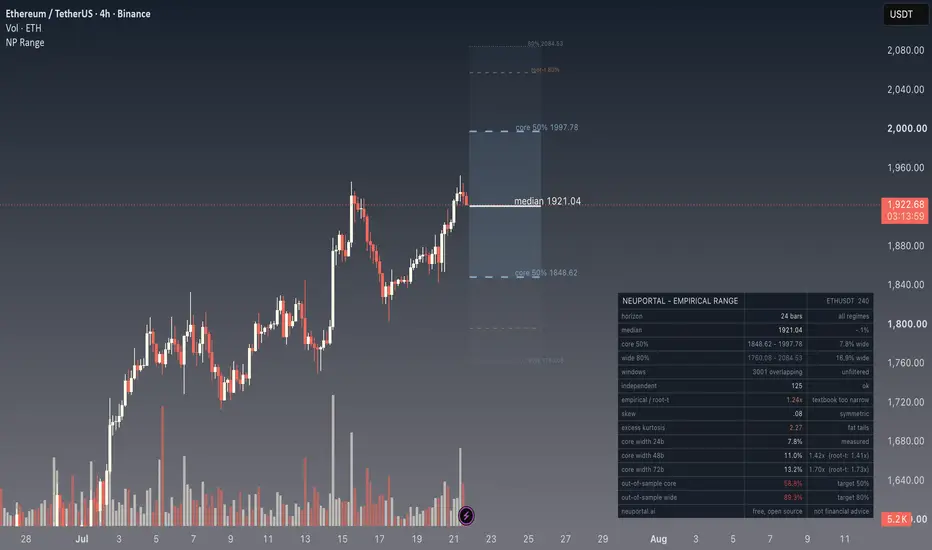
Most volatility bands are drawn the same way: per-bar sigma times the square root of the horizon. That rule assumes returns are independent draws from one fixed distribution. Crypto returns are neither — volatility clusters, tails are fat at short horizons, and the shape of the distribution changes as the horizon grows.
This script measures instead, and draws the assumption next to the measurement so you can see the gap on your own symbol.
An example of why that matters. On BTCUSDT 4h with a 24-bar horizon, the empirical band comes out 0.95x the textbook one — slightly narrower. But at 48 bars the measured width is 1.70x the 24-bar width where root-t predicts 1.41x, and at 72 bars it is 2.03x against a predicted 1.73x. The formula is roughly right at one horizon and badly wrong at another, on the same symbol. On ETHUSDT the pattern is the opposite. You cannot know which case you are in without measuring.
WHAT IT PLOTS
- core 50% zone: the interquartile range of how this market has actually moved over your horizon
- wide 80% band: the 10th to 90th percentile, as risk context
- median of the measured distribution
- the textbook sigma x root-t band, for contrast
The band is drawn FLAT on purpose. It describes one moment in the future, not a path to it. A diagonal would be a claim about the route, and this makes no claim about the route.
WHAT IT DOES THAT OTHER BANDS DO NOT
Conditional bands. An unconditional band averages today's market with every regime the symbol has ever been in. Switch conditioning on and only windows whose starting volatility resembled today's are counted. The table shows how many windows survived, because a conditional band on 20 windows is worse than an unconditional one on 500.
Touch versus close probability. Type a price and get two numbers: the share of historical windows that FINISHED beyond it, and the share that TOUCHED it at any point on the way. These differ a lot. If you are asking whether a stop gets hit, the second number is the answer and the first is misleading. Both come from actual highs and lows of real windows, not from a closed-form approximation.
The honest sample size. Overlapping windows flatter a sample: 3,000 rolling 24-bar returns come from 125 genuinely independent windows, and quantile standard errors scale with the second number. Both are printed, and the small one is flagged when it gets thin.
Out-of-sample coverage. The band is fitted on the older part of the chart and tested on the newer part it never saw. Target 50% for the core, 80% for the wide. Both directions are marked as failures: a band that contains everything is not skill, and that is the failure mode that flatters the author. On some symbols this script will tell you its own band is too wide. That is the point.
Multi-horizon widths at 1x, 2x and 3x your horizon with the observed ratio against root-t's prediction, plus skew and excess kurtosis so you can see how far from Gaussian this symbol is at this horizon.
Alerts fire when price leaves the zone that was supposed to hold it half the time.
HOW TO USE IT
Set the horizon in bars — it means whatever your timeframe means. 24 bars on 1H is a day, 30 bars on 1D is a month. Give it as much history as the chart has. Then read the independent window count before you read anything else.
Works on any symbol and any timeframe. Nothing is hard-coded to a particular market.
WHAT IT DOES NOT DO
It says nothing about direction. There is no signal here and no entry. It is a description of uncertainty, measured rather than assumed.
Educational content - not financial advice.
This script measures instead, and draws the assumption next to the measurement so you can see the gap on your own symbol.
An example of why that matters. On BTCUSDT 4h with a 24-bar horizon, the empirical band comes out 0.95x the textbook one — slightly narrower. But at 48 bars the measured width is 1.70x the 24-bar width where root-t predicts 1.41x, and at 72 bars it is 2.03x against a predicted 1.73x. The formula is roughly right at one horizon and badly wrong at another, on the same symbol. On ETHUSDT the pattern is the opposite. You cannot know which case you are in without measuring.
WHAT IT PLOTS
- core 50% zone: the interquartile range of how this market has actually moved over your horizon
- wide 80% band: the 10th to 90th percentile, as risk context
- median of the measured distribution
- the textbook sigma x root-t band, for contrast
The band is drawn FLAT on purpose. It describes one moment in the future, not a path to it. A diagonal would be a claim about the route, and this makes no claim about the route.
WHAT IT DOES THAT OTHER BANDS DO NOT
Conditional bands. An unconditional band averages today's market with every regime the symbol has ever been in. Switch conditioning on and only windows whose starting volatility resembled today's are counted. The table shows how many windows survived, because a conditional band on 20 windows is worse than an unconditional one on 500.
Touch versus close probability. Type a price and get two numbers: the share of historical windows that FINISHED beyond it, and the share that TOUCHED it at any point on the way. These differ a lot. If you are asking whether a stop gets hit, the second number is the answer and the first is misleading. Both come from actual highs and lows of real windows, not from a closed-form approximation.
The honest sample size. Overlapping windows flatter a sample: 3,000 rolling 24-bar returns come from 125 genuinely independent windows, and quantile standard errors scale with the second number. Both are printed, and the small one is flagged when it gets thin.
Out-of-sample coverage. The band is fitted on the older part of the chart and tested on the newer part it never saw. Target 50% for the core, 80% for the wide. Both directions are marked as failures: a band that contains everything is not skill, and that is the failure mode that flatters the author. On some symbols this script will tell you its own band is too wide. That is the point.
Multi-horizon widths at 1x, 2x and 3x your horizon with the observed ratio against root-t's prediction, plus skew and excess kurtosis so you can see how far from Gaussian this symbol is at this horizon.
Alerts fire when price leaves the zone that was supposed to hold it half the time.
HOW TO USE IT
Set the horizon in bars — it means whatever your timeframe means. 24 bars on 1H is a day, 30 bars on 1D is a month. Give it as much history as the chart has. Then read the independent window count before you read anything else.
Works on any symbol and any timeframe. Nothing is hard-coded to a particular market.
WHAT IT DOES NOT DO
It says nothing about direction. There is no signal here and no entry. It is a description of uncertainty, measured rather than assumed.
Educational content - not financial advice.
發行說明
Source now ASCII-only. The published source view was rendering em dashes and separator characters as mojibake. No change to any calculation.開源腳本
秉持TradingView一貫精神,這個腳本的創作者將其設為開源,以便交易者檢視並驗證其功能。向作者致敬!您可以免費使用此腳本,但請注意,重新發佈代碼需遵守我們的社群規範。

免責聲明
這些資訊和出版物並非旨在提供,也不構成TradingView提供或認可的任何形式的財務、投資、交易或其他類型的建議或推薦。請閱讀使用條款以了解更多資訊。
免責聲明
這些資訊和出版物並非旨在提供,也不構成TradingView提供或認可的任何形式的財務、投資、交易或其他類型的建議或推薦。請閱讀使用條款以了解更多資訊。