OPEN-SOURCE SCRIPT
Early Rotation & Breakout Dashboard v3
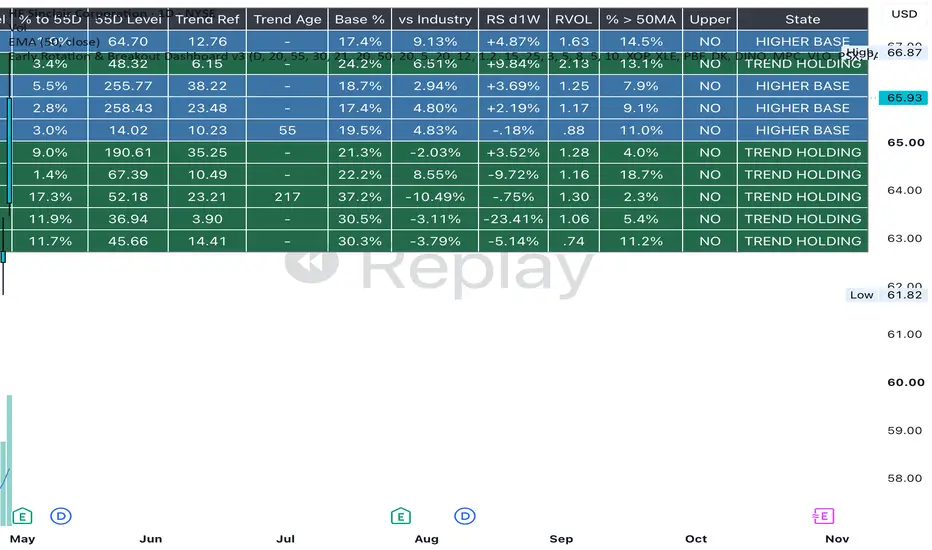
The Sector Rotation Dashboard is a market-ranking tool designed to show which major U.S. equity sectors are currently demonstrating the strongest relative strength and momentum versus the broader market.
It compares the 11 major sector ETFs—such as Technology, Energy, Financials, Health Care, Industrials and others—against SPY as the broad-market benchmark. Each sector receives a score based on a combination of short- and medium-term relative strength, absolute momentum, trend quality, trading volume, and recent acceleration. The sectors are then ranked from strongest to weakest.
In isolation, the dashboard is best used as a top-down screening tool, not as a standalone trade signal. Its purpose is to answer:
Which parts of the market are attracting leadership right now, and which sectors are weakening?
A high-ranking sector with strong positive relative strength versus SPY is showing market leadership. A sector moving rapidly up the rankings may be entering an emerging leadership phase. Conversely, a sector falling down the table or showing negative relative strength is losing momentum versus the broader market.
The most useful columns are:
- Rank — where the sector currently sits versus the other 10 sectors.
- Score — the combined strength score; higher means stronger overall technical leadership.
- RS 1M — approximately one-month performance relative to SPY.
- RS 3M — approximately three-month performance relative to SPY.
- RVOL — current volume relative to its normal volume.
- State — a simplified classification such as LEADER, WATCH, NEUTRAL, or WEAK.
The strongest situation is generally when several factors agree: the sector is near the top of the ranking, its score is high, both short- and medium-term relative strength are positive, and the ranking is improving rather than deteriorating.
For example, if Energy is ranked #1, has a score above 70, positive 1-month and 3-month relative strength versus SPY, and is maintaining or improving its rank, the dashboard is indicating that Energy is currently one of the strongest areas of the market. That does not mean every energy stock will outperform, but it identifies the sector as a logical area for further research.
A practical way to use the dashboard on its own is to review it once a week and focus attention on:
- sectors ranked near the top,
- sectors moving quickly upward,
- sectors transitioning from WATCH toward LEADER,
- and sectors where short-term strength is beginning to confirm longer-term strength.
The dashboard is therefore best thought of as a market map. It narrows the universe from thousands of stocks down to a handful of sectors where leadership is currently concentrated. From there, a user can choose to investigate industry groups or individual companies within those sectors.
Its main limitation is that it is primarily a confirmation tool. Because relative strength and momentum need time to develop, it may identify a sector after the initial breakout has already started. That is why the later industry- and stock-level breakout tools are useful companions, but the Sector Rotation Dashboard can still be used effectively by itself as a weekly market-leadership screen.
This is general information only and not financial advice. For personal guidance, please talk to a licensed professional.
It compares the 11 major sector ETFs—such as Technology, Energy, Financials, Health Care, Industrials and others—against SPY as the broad-market benchmark. Each sector receives a score based on a combination of short- and medium-term relative strength, absolute momentum, trend quality, trading volume, and recent acceleration. The sectors are then ranked from strongest to weakest.
In isolation, the dashboard is best used as a top-down screening tool, not as a standalone trade signal. Its purpose is to answer:
Which parts of the market are attracting leadership right now, and which sectors are weakening?
A high-ranking sector with strong positive relative strength versus SPY is showing market leadership. A sector moving rapidly up the rankings may be entering an emerging leadership phase. Conversely, a sector falling down the table or showing negative relative strength is losing momentum versus the broader market.
The most useful columns are:
- Rank — where the sector currently sits versus the other 10 sectors.
- Score — the combined strength score; higher means stronger overall technical leadership.
- RS 1M — approximately one-month performance relative to SPY.
- RS 3M — approximately three-month performance relative to SPY.
- RVOL — current volume relative to its normal volume.
- State — a simplified classification such as LEADER, WATCH, NEUTRAL, or WEAK.
The strongest situation is generally when several factors agree: the sector is near the top of the ranking, its score is high, both short- and medium-term relative strength are positive, and the ranking is improving rather than deteriorating.
For example, if Energy is ranked #1, has a score above 70, positive 1-month and 3-month relative strength versus SPY, and is maintaining or improving its rank, the dashboard is indicating that Energy is currently one of the strongest areas of the market. That does not mean every energy stock will outperform, but it identifies the sector as a logical area for further research.
A practical way to use the dashboard on its own is to review it once a week and focus attention on:
- sectors ranked near the top,
- sectors moving quickly upward,
- sectors transitioning from WATCH toward LEADER,
- and sectors where short-term strength is beginning to confirm longer-term strength.
The dashboard is therefore best thought of as a market map. It narrows the universe from thousands of stocks down to a handful of sectors where leadership is currently concentrated. From there, a user can choose to investigate industry groups or individual companies within those sectors.
Its main limitation is that it is primarily a confirmation tool. Because relative strength and momentum need time to develop, it may identify a sector after the initial breakout has already started. That is why the later industry- and stock-level breakout tools are useful companions, but the Sector Rotation Dashboard can still be used effectively by itself as a weekly market-leadership screen.
This is general information only and not financial advice. For personal guidance, please talk to a licensed professional.
開源腳本
秉持TradingView一貫精神,這個腳本的創作者將其設為開源,以便交易者檢視並驗證其功能。向作者致敬!您可以免費使用此腳本,但請注意,重新發佈代碼需遵守我們的社群規範。

免責聲明
這些資訊和出版物並非旨在提供,也不構成TradingView提供或認可的任何形式的財務、投資、交易或其他類型的建議或推薦。請閱讀使用條款以了解更多資訊。
免責聲明
這些資訊和出版物並非旨在提供,也不構成TradingView提供或認可的任何形式的財務、投資、交易或其他類型的建議或推薦。請閱讀使用條款以了解更多資訊。