Fib Trend & Legs (BoaBias)█ OVERVIEW
Fib Trend & Legs (BoaBias) draws Fibonacci structure on two nested scales at once: a parent fib across the full market-structure trend cycle (trend-up ↔ trend-down), and child fibs on the BOS / CHoCH swing legs inside that trend. Optional golden / deep zones plus a CT-fade Edge panel (ALMA overheat · MTF EMA overheat · fib-anchored VWAP · golden proximity) with matching overlays. Structural context for discretionary work and alert workflows — not a black-box signal service.
█ WHY UNIQUE
Most Fib tools lock to a single hand-picked or last-swing range. This map keeps parent trend and child legs alive together : the parent tracks the whole structure trend cycle while child legs lock on each confirmed BOS/CHoCH segment (plus an optional forming leg). The Edge panel is a CT-fade confluence over that map: ALMA run overheat and MTF EMA above/below overheat (same lengths as BoaBias public EMA/ALMA), proximity to the parent golden zone, and a VWAP anchored at the parent fib start — so stretch + pullback context sit on one overlay instead of juggling three scripts.
█ HOW TO USE
First use: If the indicator appears in the wrong scale (squashed or fullscreen), right-click the indicator → Pin to scale → Pin to right scale.
Leave Show Parent Fib and Show Child Fibs on; tune Pivot Length so swings match your timeframe (higher length = fewer, larger structure events).
Watch Golden Zone / Deep Zone on the parent for pullback context; enable the same zones on child legs when you trade inside-leg retracements.
Use Pattern Edge (top-right) for parent-fib CT-fade confluence and Child Edge (bottom-left) for the active leg — high when pullback-side ALMA/EMA is stretched into golden near fib VWAP. Not a standalone entry trigger.
Alerts: Chart → Create alert → this indicator → choose a condition (Golden/Deep entry, Strong Edge, Cross Fib VWAP, Break 0%, Full Retrace, Trend Up/Down, BOS, Upsweep/Dnsweep). Prefer Once per bar close for cleaner automation.
█ HOW IT WORKS
Market structure: Pivot highs/lows feed a trend state. Trend flips (and BOS / CHoCH / optional liquidity sweeps) define when ranges update. Algorithm mode: Extreme Points or Adjusted Points.
Parent fib (Trend): Anchored to the full active trend cycle — from the cycle origin to the opposing extreme — with retracements, optional extensions, and zone fills between configurable ratios (defaults emphasize 61.8–78.6 golden and 78.6–88.6 deep).
Child fibs (Legs): Each leg = protective origin (CHoCH / last protect wick) → running extreme ( ms.main wick). Locked on BOS with those bars frozen. L1 = newest locked, L2 = previous, Lf = forming. Optional H/L anchor marks show the two wicks. Parent trend flip clears child history.
Edge layer (CT fade): Two panels — Pattern (parent fib) and Child (active leg). Each scores golden proximity (≤25) + ALMA pullback CT (≤25) + EMA pullback CT (≤25) + fib-start VWAP (≤25). ALMA/EMA CT use the chart timeframe only (panel shows e.g. ALMA 1D). For a bull fib, CT scores short / below-EMA stretch; bear fib scores the opposite. Optional plots: chart-TF ALMA SuperTrend, enabled EMAs, Pattern + Child fib VWAPs.
Sweep markers: Optional “x” markers when structure detects upsweep / dnsweep liquidity grabs (style group for color, size, max count).
█ CTA
More BoaBias public Scripts: TradingView → Goldfinch_song → Scripts .
Ideas that use this stack: profile → Ideas tab.
█ LIMITATIONS
Pivot-based structure lags until pivots confirm; forming parent/child ranges can update until the next structure event.
Fib levels and zones are structural maps , not guaranteed support/resistance or trade signals.
Edge score is a confluence helper on the loaded history — descriptive, not predictive.
Heavy child history + many levels can hit drawing limits — lower Max Completed Child Legs or disable unused levels.
Educational / research overlay. Not financial advice.
Pine Script v6. License: MPL-2.0 . 指標

Day-Extreme Reversal SignalsReal-time detector for the bar shapes that historically printed SPY's day low and day high. When a new session extreme forms, it tells you the measured probability that THIS bar holds as the day's extreme - and how those odds differ between 5-minute scouts and hourly signals.
OVERVIEW
Every intraday trader eventually asks the same two questions: "was that the low?" and "is this the high?" This indicator answers them with measured frequencies instead of intuition.
It watches for new session extremes in real time. When one prints, it classifies the bar's shape - reversal close, spring, V-confirm at lows; rejection, high-confirm at highs - and labels it with the historical probability that this specific shape, at this event, held as the day's extreme. A decision panel keeps the session context on screen: where the current extremes sit, when they printed, the odds the day's extreme has already happened given the time of day, and the structural rules for acting on lows versus highs.
The stats were built by real-time simulation - walking bar by bar and asking "would this signal have fired here, and did the extreme hold?" - not by locating day extremes in hindsight and describing them afterward.
WHY THIS IS DIFFERENT
TradingView has time-of-day extreme statistics: tools that count in which hour or session window daily highs and lows historically print. Those answer "WHEN does the extreme usually happen?"
This script answers a different question: "is THIS bar the extreme?" The probabilities are conditional on an event (a new session extreme printing) and on the shape of the bar that printed it - not on the clock. To my knowledge no public script does event-conditional extreme classification, and none publishes the two findings that drive this tool's usage rules:
1 - The scout/signal hierarchy. The same shapes carry very different weight by timeframe. A 5-minute reversal close at a new session low held as the day low 28% of the time (versus a 14% baseline for any new session low) - interesting, not tradeable alone. The same shape on an HOURLY bar held 64% of the time (versus a 35% hourly baseline) - nearly two-thirds of occurrences marked the day low. The 5m shapes are scouts that put you on alert; the hourly shapes are the signal.
2 - Lows and highs are structurally different animals. In the data, lows are V-shaped: 55% of day lows were never retested within 30 minutes. Highs are processes: 82% of day highs were retested within 30 minutes. The practical asymmetry is baked into the panel - at lows, waiting for a retest usually means missing the trade; at highs, patience is statistically paid for.
THE SHAPES
All shapes evaluate only at a NEW session extreme (or on the bar immediately following one). At lows:
- RevClose - the bar makes a new session low but closes green and in the top third of its range. Sellers broke the floor and were immediately overwhelmed. Strongest low shape on both timeframes (5m: 28% holds; hourly: 64%).
- Spring - new session low with a long lower wick (more than half the bar) and a close off the floor. The push below found no acceptance (5m: 17%; hourly: 55%).
- V-confirm - the bar AFTER a red new-session-low bar opens and closes green above the prior open. Confirmation that the flush reversed (5m: 27%; hourly: 54%).
At highs:
- Reject - new session high with a long upper wick and a close out of the top third. (5m: 11% vs 9% base - barely above baseline; hourly: 47% vs 28% base.)
- HighConf / Confirm - a red bar immediately after a green new-session-high bar. (5m: 12%; hourly: 33%.)
Note what the high-side numbers say: even the best hourly high shape holds less than half the time. Tops are processes, and the script tells you so rather than pretending otherwise.
THE DECISION PANEL
- Current session low and high with their print times (ET).
- Time-of-day odds that the day's extreme has ALREADY printed, interpolated from the measured distribution (37% of lows are in by 10:00 ET, 60% by 11:30; highs run later - 18% by 10:00, with a heavy skew into the final hour).
- A provisional read of what the current, still-forming hourly bar is shaping into.
- The two structural rules, always on screen: lows are V-shaped, do not wait for the retest; highs retest 82% of the time, exits and fades can be patient.
HOW TO USE IT
Work on a 5-minute chart (any intraday timeframe runs; daily charts are rejected with an error).
- A 5m scout triangle at a new session low means: stop, context check. Alone it is a minority bet.
- The teal background band - an hourly low shape confirming - is the signal. Odds the day low is in jump to roughly fifty-fifty or better. Because lows are V-shaped, the statistically supported action is to act on the signal bar rather than wait for a pullback that usually never comes.
- The orange band at highs is a warning, not a green light to fade aggressively: expect a retest attempt, and use it - the second look at a high is where shorts and exits get their fill.
- The time-of-day odds frame everything: a new low printing at 14:30 ET is a rarer, more reliable event than one at 09:45, simply because most days have already made their low by then.
Alerts are provided for the hourly low signal, the hourly high signal, and the strongest 5m scout.
THE DATA, STATED PLAINLY
- Instrument: SPY. Samples: 60 days of 5-minute bars and 730 days of hourly bars.
- Method: real-time simulation. The detector walked forward bar by bar; every firing was recorded with whether that extreme survived as the day's extreme. No hindsight selection.
- Every probability is shown next to its baseline (the hold rate of ANY new session extreme on that timeframe), so you can see the edge, not just the number.
- The percentages are fixed numbers derived from that study, embedded in the script. They are descriptive statistics of a specific instrument over a specific period - not guarantees, and they will drift as market character changes.
- On symbols other than SPY (and index products that track it closely), the shape logic still runs, but the printed percentages do not apply. Treat them as unknown there.
LIMITATIONS
- Hourly signals use confirmed hourly bars (the standard non-repainting idiom - no future data is accessed), so they appear at the close of the hour, not at its low. The "forming" panel row is explicitly provisional and changes until the hour closes.
- 5m labels print on bar confirmation.
- The session-extreme state resets each calendar session; extended-hours settings on your chart change what counts as the session.
- The 60-day 5-minute sample is modest; the hourly sample (roughly two years) is the sturdier one, which is one more reason the hourly shapes are the signal tier.
- This is a probability tool, not an entry system. It quantifies "was that the extreme?" - stops, targets, and sizing are yours.
NOTES
The time-of-day asymmetry the data surfaced - lows early, highs late, lows violent, highs sticky - echoes the old observation running from George Douglass Taylor through Linda Raschke's day-structure work: down moves complete in the morning and buying builds through the day more often than the reverse. This script did not assume that; the simulation found it independently in modern SPY data.
Educational tool, not financial advice. 指標

Fractal ZigZag with Retest & Filters By WiselyWealthIndicator ; Fractal ZigZag with Retest & Filters
Introduction
Welcome to the comprehensive guide for the 'Fractal ZigZag with Retest & Filters' indicator. This custom-built Pine Script indicator is an advanced technical analysis tool designed explicitly for the TradingView platform. At its core, the primary objective of this script is to provide traders with high-probability entry signals by systematically filtering out market noise, avoiding false breakouts, and ensuring alignment with the overarching macroeconomic trend.
Many retail traders fall into the trap of entering positions during sudden, volatile price spikes, only to suffer heavy drawdowns when the market naturally pulls back. This script mitigates that risk by enforcing a strict, rules-based approach: identifying structural shifts, confirming the initial breakout, and mathematically demanding a pullback (or "retest") before issuing a final trading signal. Additionally, it features built-in alert conditions, making it perfectly suited for algorithmic traders who wish to automate their strategies via Webhooks, Telegram bots, or MT5 API integrations.
Technical Mechanism
The mechanical operation of this script is multi-layered, relying on a confluence of structural mapping, trend filtering, and volatility-based retest calculations. Here is a detailed, step-by-step technical breakdown of how the script detects and generates its buy and sell signals:
Mapping Market Structure with Williams Fractals:The foundation of the script relies on identifying key swing highs and swing lows using Williams Fractals. By default, the indicator evaluates a 5-bar lookback and look-forward period to pinpoint these structural pivots. Once a valid upward or downward fractal is identified, the script connects them using a dynamic ZigZag line. This creates an unambiguous visual map of the market's underlying structure, cleanly displaying the sequence of higher highs or lower lows.
Initial Breakout Identification: The indicator actively monitors the current closing price in relation to the most recently confirmed fractal levels. A raw bullish breakout is registered the moment a candle closes definitively above the last established fractal high. Conversely, a raw bearish breakout is noted when the closing price drops below the most recent fractal low. To prevent redundant alerts, the script locks the current trend state upon a successful breakout.
The ATR-Based Retest Engine: This is the most sophisticated aspect of the indicator. When "Enable Retest Mode" is activated, the script refuses to issue an immediate entry signal at the exact moment of the breakout. Instead, it uses the Average True Range (ATR) over a 14-period lookback to measure current market volatility. For a bullish setup, it calculates a "Retest Target" by subtracting a user-defined ATR multiplier (default 1.0) from the breakout close price. It then starts a countdown timer, allowing a maximum number of candles (default 3) for the price to drop back down and touch this target. If the pullback is successful within the time limit, the raw buy signal is triggered. If the time expires without a retest, the setup is safely invalidated.
Macro Trend Filtering: Before finalizing any signal, the script consults a 200-period Exponential Moving Average (EMA). If the trend filter is enabled, a buy signal is entirely suppressed unless the closing price is strictly above the EMA200. Sell signals similarly require the price to remain below the EMA200. Users can also force the script into a "Buy Only" or "Sell Only" mode to align with their long-term directional bias.
How to Use and Best Practices
To extract maximum profitability and accuracy from this script, traders must apply the correct settings and deploy it in appropriate market environments.
Recommended Settings and Configuration:
Conservative Swing Trading: Ensure the EMA200 Trend Filter remains enabled to keep you on the side of institutional momentum. You may also want to increase the Fractal Periods from 5 to 7 or 9. This filters out minor price fluctuations and forces the script to base its breakouts on major structural swing points.
Retest Calibration for Volatility:** The default ATR multiplier is 1.0, and the wait limit is 3 candles. If you are trading on lower timeframes (e.g., 5-minute or 15-minute charts), breakouts can take slightly longer to retest. Consider increasing the "Max Candles to wait" to 5 or 6. For highly volatile assets, increasing the ATR Multiplier to 1.5 can help you secure a deeper, more favorable pullback entry.
Directional Lock: If higher timeframe analysis dictates a strong bull market, use the "Trade Direction" setting to restrict signals to "Buy Only," eliminating counter-trend noise during minor market corrections.
Suitable Markets and Timeframes:
Forex and Indices: This indicator performs exceptionally well on major Forex pairs (EUR/USD, GBP/JPY) and Global Indices (US30, NAS100) on the 1-Hour and 4-Hour timeframes. These assets heavily respect market structure, and liquidity grabs (retests) are highly common after structural breakouts.
Cryptocurrency: Bitcoin and Ethereum on the 15-minute to 1-Hour charts are excellent candidates, provided you adjust the ATR multiplier to account for crypto's volatile, whipsaw movements.
Markets to Avoid: Avoid using this script in heavily consolidated, range-bound, or sideways markets. Breakout and trend-continuation logic inherently struggles during prolonged periods of low volatility, where price chops indiscriminately around the 200 EMA without clear directional follow-through. 指標

High Volume Breakout Targets [AlgoAlpha]🟠 OVERVIEW
High Volume Breakout Targets identifies price zones formed by related pivot highs or pivot lows. These zones represent areas where price previously reacted around overlapping wick and candle-body levels.
The indicator then checks whether price closes through a zone with enough of the breakout candle extending beyond its boundary. Qualified breakouts can display directional labels, an entry level, and three targets based on the height of the broken zone.
Normalized volume candles are also shown inside recent active zones. This helps traders compare current volume with its recent average while watching price interact with a potential support or resistance area.
🟠 CONCEPTS
Pivot High Zone — A resistance area formed when a confirmed pivot-high wick falls within the body of a previous pivot-high candle. The zone spans the associated wick highs and body-top levels.
Pivot Low Zone — A support area formed when a confirmed pivot-low wick falls within the body of a previous pivot-low candle. The zone spans the associated wick lows and body-bottom levels.
Pivot Confirmation — A pivot requires the selected number of bars on both sides of the turning point. A higher Pivot Length identifies broader structures but confirms them later and less often.
Zone Maximum Age — The maximum number of bars during which two pivots can be associated and an active zone can continue extending. An expired zone remains visible but no longer produces a breakout.
Qualified Breakout — A breakout requires a confirmed close above a bearish zone or below a bullish zone. It must also place the selected percentage of the candle’s full range beyond the broken boundary.
Normalized Volume — Current volume is divided by its 20-bar average. The resulting ratio controls the size and transparency of the volume candle displayed inside an active zone.
Breakout Targets — The breakout close becomes the entry level. The broken zone’s height is divided into three equal steps to calculate TP1, TP2, and TP3 in the breakout direction.
Target Expiry — Each target setup remains active for a selected number of bars. When TP1 or TP2 is reached, the remaining unhit targets receive a new expiry period from the hit candle.
🟠 FEATURES
Pivot Zones — Displays bullish support zones and bearish resistance zones created from associated pivot structures.
Breakout Labels — Marks bullish and bearish closes that satisfy the selected outside-range requirement.
Three-Level Targets — Displays the breakout entry, a target area, and TP1, TP2, and TP3 levels derived from the broken zone’s height.
Zone Volume Display — Shows normalized volume candles inside the four most recently active zones.
Target Completion Marker — Prints a checkmark on the first candle whose wick reaches TP3.
🟠 HOW TO USE
Adjust Pivot Length to match the structure you trade. Use lower values for smaller and more frequent zones, or higher values for broader and less frequent zones.
Treat bullish zones as potential support and bearish zones as potential resistance while they continue extending.
Watch how price behaves inside a zone. Use the normalized volume candles to compare participation with the recent volume average.
Wait for a breakout label rather than treating every wick through a zone as a breakout. A label appears only after the candle closes beyond the boundary and meets the Minimum Breakout Range setting.
Use a higher Minimum Breakout Range to require more of the breakout candle to trade beyond the zone. Use a lower value to accept less decisive moves.
After a qualified breakout, use the entry line as the breakout reference and TP1, TP2, and TP3 as zone-based projection levels.
Check whether targets are reached before their expiry. TP1 and TP2 extend the active period for the remaining targets when reached.
Combine the zones and breakout signals with market structure, trend direction, liquidity, and risk controls. The indicator does not define a stop-loss or position size.
🟠 CONCLUSION
High Volume Breakout Targets combines pivot-based support and resistance zones, normalized volume context, qualified breakout signals, and zone-height target projections. It gives traders a structured way to assess price interaction with established zones and track the progression of confirmed breakouts. 指標

3m Cycles3m Cycles is a TradingView indicator that draws vertical lines on your chart at fixed clock-based time intervals — every 20 seconds, every 1 minute, and every 3 minutes — to help you visually track recurring market cycles.
Each cycle is fully independent and configurable: you can set the line color, width, and style (solid, dashed, or dotted), control how far back and ahead the lines project, and choose which chart timeframes each cycle appears on. The 3-minute cycle acts as the master clock — all three cycles' visible windows shift forward together every time a new 3-minute boundary is crossed, keeping everything in sync. Lines are pre-drawn into the future so they're already on the chart before the candle forms, and they automatically disappear once they fall outside your configured lookback window. 指標

XI0033 Williams FractalA Williams fractal confirms late by definition: the pattern is complete only after the bars to its right have closed, so the marker always appears in the past. This script keeps the classic fractal template — three- or five-bar — and adds the one thing the classic version cannot show: the bar that is about to become a fractal, before the confirmation arrives.
It draws triangles for confirmed fractal highs and lows, plus one highlighted triangle for the last potential fractal on the live edge. Nothing else: no lines, no levels, no signals.
Confirmed fractals
A fractal high is a bar whose high stands above the highs of its neighbours; a fractal low mirrors that on the lows. The 3-bar mode compares one neighbour on each side, the 5-bar mode two on each side — the original Bill Williams definition. The Periods input sets how many bars back the reference bar sits. Confirmed fractals are painted as muted grey triangles above the highs and below the lows, and once the pattern that produced them is closed, they are history: they do not move and do not disappear.
Confirmed fractal highs and lows in the muted default colour: every triangle marks a bar whose extreme beat its neighbours on both sides, printed only after the pattern completed.
The last potential fractal
This is the addition. One bar to the right of the last confirmable centre there is always a candidate: a bar already higher (or lower) than its closed neighbours, waiting only for the current bar to keep its distance. The script highlights that candidate with an orange triangle — pointing down above a potential high, pointing up below a potential low — so the developing swing is visible before it becomes official.
The highlight exists only on the live bar. It is recalculated tick by tick, disappears the moment price violates the candidate, and is deliberately dropped on the bar's final update, so it never leaves a trace in the chart history. Scroll back and you will find only confirmed fractals.
Left: the orange triangle under the newest low is the last potential fractal. Right, a few bars later: that low now carries a grey confirmed triangle — the preview left no trace — and a new potential fractal already sits above the latest high.
What repaints, and what does not
The potential marker repaints by design — that is its job. It is a live preview that appears, moves and vanishes with the current bar, and it is intentionally not committed to history. Confirmed fractals in the default 3-bar mode are built from closed bars only, so once a triangle prints, it is final. In the 5-bar mode with the default period, the newest confirmation still involves the forming bar's extreme, so it can appear and be withdrawn until that bar closes; after the close it is final. And every confirmed fractal is late by definition — the triangle appears above a bar that is already in the past, because that is what confirmation means.
What is reused, and what is new
The confirmed-fractal logic is the classic Bill Williams fractal template as coded by Mit Nayi, reused open-source with attribution in the source header. What this edit adds: the port to Pine Script v6, and the whole potential-fractal layer — the candidate detection one bar to the right of the confirmable centre, and the barstate mechanism that shows the preview on the live bar only and drops it on the bar's final update, so it never piles up in history.
What it does not do
It gives no signals. A fractal marks a local extreme, and most local extremes get traded through; on their own they are not entries. This is a structural marker — swing logic, liquidity maps and ICT-style analysis use fractals as raw material, and the potential marker only tells you where the next one may appear. The decision stays yours.
The Inputs allow you to set:
Periods: how many bars back the fractal centre sits; the triangles are drawn on that centre bar
3 or 5 Bar Fractal: one or two neighbours compared on each side
Show last potential fractal: the live-edge preview on or off
Potential down and up fractal colours
About the chart
BYBIT:BTCUSDT.P, 5-minute chart. The only script on it is this one, with default settings: muted grey triangles mark confirmed fractal highs and lows across the chart, and the orange triangle at the right edge is the last potential fractal, not yet confirmed. No other indicators, no drawings. 指標

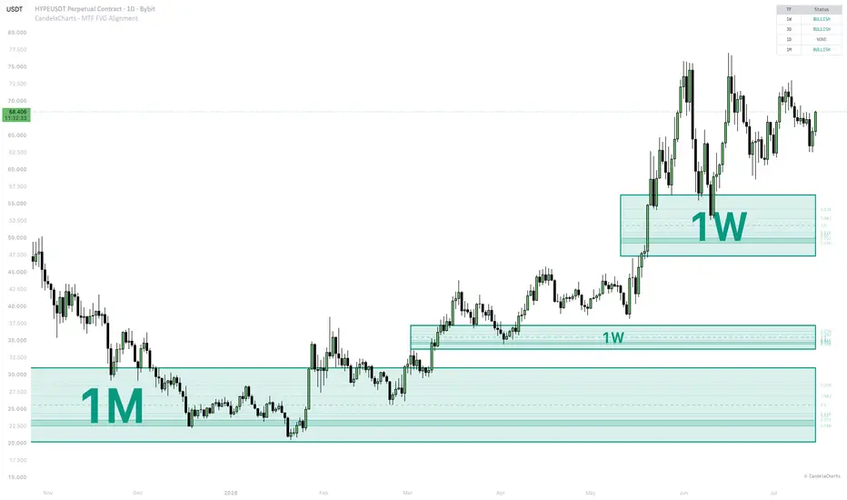
CandelaCharts - MTF FVG Alignment📝 Overview
The CandelaCharts - MTF FVG Alignment indicator detects Fair Value Gaps (FVGs) across up to four customizable timeframes and visualises them directly on the chart. A Fair Value Gap is a three-candle pattern where price moved so rapidly that an unfilled area remains between the high of the first candle and the low of the third candle, representing a price imbalance the market often returns to fill.
The core strength of this indicator is Confluence . An alignment signal is generated only when every enabled timeframe shows FVGs in the same direction (all Bullish or all Bearish), giving traders a powerful multi-timeframe confirmation before taking a position.
📦 Features
Four-Timeframe Analysis : Track up to four independent timeframes simultaneously with per-TF toggle and FVG count.
Confluence Alignment : Automatic detection of Bullish or Bearish alignment across all enabled timeframes.
Bias Filter : Filter displayed FVGs to show only Bullish, only Bearish, or both (Neutral).
FVG Mitigation : FVGs are automatically invalidated and removed from the chart once they are fully filled by price action.
Hide Overlapped : Clean up chart clutter by automatically hiding lower-timeframe or older FVGs that overlap with others.
Fibonacci Levels : Optional Fibonacci retracement levels (0.236, 0.382, 0.5, 0.618, 0.65, 0.705, 0.786) drawn inside each FVG with a highlighted Golden Pocket zone (0.705–0.786).
FVG Visuals : Semi-transparent boxes showing active FVGs for each timeframe, with configurable borders and midlines.
Status Dashboard : A clean table showing the current directional status (Bullish / Bearish / None) for each enabled timeframe.
⚙️ Settings
Timeframes
TF 1–4: Each timeframe row has a toggle (show/hide), a timeframe selector, and an FVG count (1–10) controlling how many recent FVGs are displayed for that timeframe. Defaults are 1D, 4H, 1H, and 15m.
Settings
Bias Filter: Filter displayed FVGs by direction — Neutral (show all), Bullish (show only bullish FVGs), or Bearish (show only bearish FVGs).
Bull / Bear Colors: Customise the colours used for bullish and bearish FVG zones.
Border: Toggle the FVG box border and configure its style (Solid, Dotted, Dashed) and width (1–5).
Midline: Toggle the Consequent Encroachment midline inside each FVG and configure its style and width. When enabled, the timeframe label moves outside the box.
Fibonacci: Toggle the drawing of Fibonacci retracement levels inside each FVG, including the highlighted Golden Pocket (0.705–0.786).
Hide Overlapped: Toggle whether to hide overlapping FVGs across different timeframes to keep the chart clean (prioritising higher timeframes).
Dashboard
Show: Toggle the multi-timeframe status dashboard.
Position: Choose the dashboard corner — Top Right, Top Left, Bottom Right, or Bottom Left.
⚡️ Showcase
Multi-Timeframe FVG Boxes
Fibonacci Levels & Golden Pocket
Status Dashboard
🔎 Usage
Trend Identification : Glance at the dashboard to see the current bias of each higher timeframe at a glance.
Confluence : When all enabled timeframes align in the same direction, it provides strong multi-timeframe confluence for a directional trade.
Fibonacci Entries : Use the Fibonacci levels inside each FVG — particularly the Golden Pocket (0.705–0.786) — for precise entries when price retraces into the gap.
Bias Filtering : Set the Bias Filter to Bullish or Bearish to remove counter-trend FVGs and keep the chart focused on your directional thesis.
Execution : Use the alignment as confirmation for your existing strategy. Bullish alignment suggests upward momentum; Bearish alignment suggests downward momentum.
⚠️ Disclaimer
Trading involves significant risk, and many participants may incur losses. The content on this site is not intended as financial advice and should not be interpreted as such. Decisions to buy, sell, hold, or trade securities, commodities, or other financial instruments carry inherent risks and are best made with guidance from qualified financial professionals. Past performance is not indicative of future results.
指標

Market Dictionary [GBB]Can price be translated into a language?
I wondered if it could. So I built a dictionary for the market. This
indicator is that dictionary — including everything it does NOT say.
How it reads the chart: Every bar, the recent closes are reduced to
their shape and spelled as a short word — a few letters describing where
price sat along the way, from a (lowest zone) up to the top of the
alphabet (highest zone). A sharp drop that goes quiet spells "ddaa". With
short words and a small alphabet, the market has a finite vocabulary:
256 words in the standard config, 6,561 in the long one. Every bar on
your chart is speaking exactly one of them.
The readout:
The current word translated into plain English:
"THE MARKET JUST SAID: sharp drop, now quiet at the lows" — plus how
many times this exact word has been seen on your chart and how rare
that is. A description of shape, not a signal.
The regime wash. The background tinted by the word's temperature —
toward red when the word lives in the low zones, toward green in the
high zones, stronger when the shape is more extreme.
The letter ribbon. A letter-colored track under price showing the
letter each bar is writing right now. Calm markets babble; you will see
the tone shift.
The Lexicon Panel
The full dictionary entry: seen-count, rarity
percentile, and causal win rate / average forward return over the next
1, 4 and 16 bars, computed on your chart's history with nothing peeking
into the future — each line carrying its validation verdict. Faint
numbers mean thin data, on purpose: your eyes should trust a statistic
exactly as much as the sample deserves.
Events. When the chart prints a word it has NEVER printed before,
you get a violet flare: "NEVER SEEN BEFORE". And on exactly two
market/timeframe combinations, a gold marker when a study-validated
word completes (more on both below — read the caveats).
Most words mean nothing
"no significant edge" is its most common verdict, by design.
Rare words looked like they preceded volatility in-sample on 5 of 7
markets. Out of sample: 0 of 28 configurations passed. The
"NEVER SEEN BEFORE" flare is a curiosity flag, and its own tooltip
tells you rarity's predictive power is not confirmed.
The vocabulary itself is remarkably stable: in 25 of 28 configurations
the word frequencies stayed the same from the research years into the
held-out years. Markets from 2008 and 2025 speak the same language.
It just mostly is not saying anything predictive.
Two words survived everything: "ddaa" on gold H1 (564 out-of-sample
occurrences; remained net-positive after median spread cost in the
study — informational, not a recommendation) and one BTC 1h pattern
that passed at 69% degradation against a 70% cutoff with 38 samples —
the panel labels that one "marginal" because that is what it is.
The surviving edges are breakpoint-fragile: they appear under the
empirically fitted letter boundaries, not under textbook Gaussian ones.
I tell you this because it is a real limitation.
What this tool is
A translator, not a signal. It tells you what the
current shape is called, how common it is, and what the record shows,
with the verdict attached to every number. Whether any of that adds
something to YOUR strategy is your test to run — that is not a
disclaimer, it is the design.
Frozen parameters
The letter boundaries, variance gates, and rarity
thresholds are hardcoded from the validation study (2026-07) and cannot
be edited or refit — there is deliberately no adaptive mode, because
refitting live would detach the display from its validation. Crypto
combos were validated on Binance USDT-M perpetual data; the indicator
accepts the same symbol on other venues since perp prices track closely
across exchanges — the panel tooltip names the exact validated
instrument. The panel's live statistics (seen-counts, win rates,
averages) are built from your chart's visible history; the validation
verdicts are not — they are the study's hardcoded results. On markets
outside the study, the indicator runs in EXPLORER MODE: fully functional,
clearly labeled, and it will never show you a validation star it did not
earn.
No Repainting:
Words finalize on bar close; statistics
update only when their forward horizons complete; nothing is drawn on
unconfirmed bars. Don't take my word for it: open bar replay, step
through a session, and try to catch a value changing after its bar
closes.
指標

指標

AutoFractal MTF Adaptive Projection [Aaron Diaz]TITLE
AutoFractal MTF Adaptive Projection
ENGLISH DESCRIPTION
OVERVIEW
AutoFractal MTF Adaptive Projection searches for historical price structures that resemble a user-defined current structure. The historical search timeframe is independent from the chart timeframe, so a trader can view a daily chart while searching for analogs on 4-hour, 2-hour, daily, or other supported timeframes.
The script is designed as a market-structure comparison and scenario-projection tool. It does not generate buy or sell signals, and its projected path must not be interpreted as a guaranteed forecast.
HOW IT WORKS
1. Historical search range
The user selects a start date, an end date, and a historical source timeframe. The script evaluates candidate structures only inside that selected period.
2. Current target structure
The structure to be matched can be defined using the latest N chart bars or a manual date range on the current chart.
3. Normalized comparison
Historical and current structures are compared using normalized log returns rather than absolute prices. This allows patterns from different price levels and different market regimes to be compared on a proportional basis.
4. Composite similarity score
Each historical candidate receives a score based on:
- Shape and correlation.
- Retracement and Fibonacci behavior.
- Relative amplitude.
- Directional agreement.
Inverse fractals can be enabled when the user wants to compare a bullish structure with an inverted bearish analog, or vice versa.
5. Adaptive projection
After a match is selected, the script uses the historical continuation as an analog scenario. Three adaptation methods are available:
- Percentage: adapts the historical continuation using proportional price movement.
- Fibonacci: adapts the continuation using the relationship between historical and current structural ranges.
- Smart hybrid: combines percentage and Fibonacci adaptation.
The script can automatically adapt both price amplitude and time duration to the current structure.
6. Manual drawing controls
The automatically fitted historical path and future projection can be adjusted independently. Users can change their height, width, horizontal position, and vertical position without changing the historical match itself.
VISUAL OUTPUTS
- Historical match box: marks the selected analog period.
- Fitted historical pattern: overlays the normalized historical structure on the current target.
- Future projection: displays the continuation that followed the historical analog, adapted to the current structure.
- Diagnostics table: shows the search timeframe, matched dates, total score, correlation, retracement score, amplitude scale, time scale, and number of evaluated candidates.
BASIC USE
1. Select the historical search timeframe.
2. Select the historical start and end dates.
3. Define the current target structure.
4. Set the historical pattern length and future projection length.
5. Adjust the minimum score and scoring weights if necessary.
6. Choose Percentage, Fibonacci, or Smart hybrid adaptation.
7. Use the manual drawing controls only after reviewing the automatic fit.
INTERPRETATION
The total score measures similarity under the script's selected criteria. It is not a probability of the projected path occurring. A high score means that the compared structures are mathematically similar according to the configured inputs; it does not mean that market context, liquidity, news, volatility, or order flow are identical.
LIMITATIONS
- Historical analogs can fail and should not be treated as deterministic forecasts.
- Results depend on the selected date range, timeframe, pattern length, score weights, and available historical data.
- Enabling the current unconfirmed bar can cause the selected match and projection to change intrabar.
- Lower-timeframe searches may require more data and processing resources.
- Manual resizing improves visual alignment but does not increase the statistical validity of the match.
- The indicator does not provide entries, exits, stop losses, or position sizing.
OPEN-SOURCE REUSE AND CREDITS
This script is a derivative work based in part on the open-source script "Auto Fractal " originally published by TheUltimator5.
Original author and original portions:
TheUltimator5
Substantial redesign, new logic, and additional code:
Aaron Diaz
The derivative adds independent multi-timeframe searching, date-restricted candidate selection, normalized log-return matching, composite scoring, adaptive percentage/Fibonacci projections, time and amplitude scaling, manual fit controls, and expanded diagnostics.
This publication is open-source and retains attribution to the original author under TradingView's open-source reuse rules and the Mozilla Public License 2.0.
DISCLAIMER
This indicator is provided for educational and analytical purposes only. It is not financial advice. Historical similarity does not guarantee future similarity. Users remain responsible for their own analysis, risk management, and trading decisions.
DESCRIPCION EN ESPANOL
RESUMEN
AutoFractal MTF Adaptive Projection busca estructuras historicas del precio que se parezcan a una estructura actual definida por el usuario. La temporalidad historica funciona de manera independiente a la temporalidad visible del grafico, por lo que es posible observar un grafico diario mientras se buscan analogias en 4 horas, 2 horas, diario u otras temporalidades compatibles.
El indicador funciona como una herramienta de comparacion estructural y proyeccion de escenarios. No genera senales de compra o venta y la ruta proyectada no debe interpretarse como una prediccion garantizada.
COMO FUNCIONA
1. Rango historico
El usuario selecciona una fecha inicial, una fecha final y la temporalidad historica. El script evalua candidatos solamente dentro de ese periodo.
2. Estructura actual
La estructura que se quiere comparar puede definirse mediante las ultimas N velas del grafico o mediante un rango manual de fechas.
3. Comparacion normalizada
Las estructuras se comparan mediante rendimientos logaritmicos normalizados y no mediante precios absolutos. Esto permite comparar patrones ocurridos en niveles de precio y condiciones de mercado diferentes.
4. Puntuacion compuesta
Cada candidato recibe una puntuacion basada en:
- Forma y correlacion.
- Retrocesos y comportamiento Fibonacci.
- Amplitud relativa.
- Direccion.
Tambien se pueden permitir fractales inversos.
5. Proyeccion adaptativa
El indicador utiliza la continuacion posterior del fractal historico como un escenario analogo. Existen tres metodos:
- Percentage: adapta porcentualmente el movimiento historico.
- Fibonacci: adapta la continuacion de acuerdo con la relacion entre los rangos historico y actual.
- Smart hybrid: combina ambos metodos.
La amplitud y la duracion temporal pueden adaptarse automaticamente a la estructura actual.
6. Ajuste manual
El patron historico ajustado y la proyeccion futura pueden modificarse por separado en altura, ancho y posicion, sin cambiar el fractal historico seleccionado.
INTERPRETACION Y LIMITACIONES
La puntuacion total mide similitud matematica bajo los parametros elegidos; no representa la probabilidad de que la proyeccion se cumpla. Los resultados pueden cambiar al modificar las fechas, la temporalidad, la longitud, los pesos o al incluir una vela sin cerrar. La herramienta no proporciona entradas, salidas, stop loss ni tamano de posicion.
CREDITOS
Este script es una obra derivada basada parcialmente en el script abierto "Auto Fractal ", publicado originalmente por TheUltimator5.
Autor original y partes originales:
TheUltimator5
Rediseno sustancial, nueva logica y codigo adicional:
Aaron Diaz
La publicacion se realiza como codigo abierto, conserva la atribucion correspondiente y mantiene la licencia Mozilla Public License 2.0.
AVISO
Este indicador tiene fines educativos y de analisis. No constituye asesoria financiera. La similitud historica no garantiza que el mercado repita el mismo comportamiento.
指標

Fractal Support & Resistance Zones invincible]Fractal Support & Resistance Zones
Fractal Support & Resistance Zones is an advanced market-structure and price-reaction framework designed to identify, evaluate, and dynamically manage support and resistance zones derived from confirmed fractal pivots.
Unlike traditional support and resistance indicators that simply draw horizontal levels at swing highs and lows, this indicator treats every zone as a dynamic market structure object. Each zone develops through its own lifecycle based on price interaction, independent retests, reaction strength, penetration, estimated buying and selling activity, structural confirmation, trend alignment, and eventual support/resistance role reversal.
The objective is not simply to show where price previously turned.
The objective is to evaluate which zones are still technically relevant, which have gained confirmation, which are weakening, and which may provide better structural trade locations.
---------------------------------------------------------------------------------------------
Fractal-Based Zone Detection
The indicator identifies two independent classes of fractal pivots:
Weak Fractals
Shorter-length pivots designed to capture local price reactions and minor structural turning points.
Major Fractals
Higher-strength pivots based on a larger fractal window. These represent more significant swing highs and swing lows and receive greater importance within the zone-quality model.
Fractal support zones are created from confirmed pivot lows, while fractal resistance zones are generated from confirmed pivot highs.
The detection timeframe can be independently selected, allowing zones from a higher timeframe to be displayed on a lower-timeframe chart.
Higher-timeframe fractal data is requested with lookahead disabled to prevent future data from being intentionally introduced into the pivot calculation.
---------------------------------------------------------------------------------------------
Dynamic Support and Resistance Zones
The indicator creates price zones rather than single horizontal lines.
Markets rarely react from one exact price. Orders, liquidity, and previous positioning are often distributed across a price range. The zone model therefore attempts to represent the broader reaction area surrounding a fractal pivot.
Three zone-width methods are available:
ATR
Zone width is calculated from Average True Range and automatically adapts to market volatility.
Pivot Candle
The structure of the original fractal candle is used to determine the zone width.
Hybrid Candle + ATR
Combines pivot-candle structure with an ATR-based volatility limit.
The hybrid method is designed to prevent unusually large pivot candles from creating excessively wide support or resistance areas.
A minimum tick-based width can also be configured for instruments with very small price movements.
---------------------------------------------------------------------------------------------
Fractal Zone Clustering
Markets frequently produce several nearby fractal pivots around the same price area.
Drawing every pivot independently can create overlapping boxes and unnecessary chart congestion.
The indicator therefore includes a fractal clustering engine.
Nearby same-side fractals may be merged into a common structural zone when:
* They are within the configured ATR merge distance.
* The resulting merged zone does not exceed the maximum permitted ATR width.
* The maximum cluster count has not been exceeded.
* Fresh major zones are not being merged into previously tested or damaged zones when protection is enabled.
The cluster count becomes one component of the zone-quality model.
A cluster does not automatically mean a zone is strong. It simply indicates that multiple independent fractal structures developed around a similar price area.
---------------------------------------------------------------------------------------------
Independent Retest Detection
A major feature of the indicator is the distinction between bars inside a zone and independent zone retests.
If price remains inside a support or resistance area for several candles, those candles are not counted as multiple tests.
A new test is counted only after price:
1. Interacts with the zone.
2. Moves sufficiently away from the zone.
3. Travels the configured ATR reset distance.
4. Returns to the zone again.
This creates a more realistic retest model and avoids artificially increasing the test count during sideways congestion.
The label displays the number of independent tests recorded for each selected zone.
---------------------------------------------------------------------------------------------
ATR-Based Reaction Measurement
After an independent zone retest, the indicator measures how strongly price reacts away from the zone.
Reaction strength is normalized using ATR.
For a support zone, the engine measures upward movement from the reaction anchor.
For a resistance zone, the engine measures downward movement from the reaction anchor.
The strongest reaction generated by the zone is stored as its **Best Reaction ATR**.
Two configurable reaction thresholds are used:
Verified Reaction
The zone has produced the minimum ATR reaction required for technical validation.
Proven Reaction
The zone has generated a stronger ATR reaction and has also accumulated sufficient independent testing.
This prevents a zone from receiving a high structural status simply because price briefly touched it.
The market must demonstrate an actual directional response.
---------------------------------------------------------------------------------------------
Dynamic Zone Status System
Every zone is continuously classified according to its current structural condition.
FRESH
A newly created major zone that has not yet received an independent retest.
Fresh zones may represent relatively untouched structural areas.
WEAK
A zone originating from the shorter weak-fractal detection model.
Weak zones can still produce valid reactions but receive a lower fractal-grade contribution in the quality model.
VERIFIED
A zone that has been tested and remains structurally active.
Reaction behaviour and zone validation contribute dynamically to its score.
PROVEN
A zone that has accumulated multiple independent tests and generated a reaction exceeding the configured Proven Reaction ATR threshold.
Proven zones represent areas with demonstrated historical reaction behaviour.
DAMAGED
Price has penetrated a configurable percentage of the zone.
A damaged zone has not necessarily broken, but deeper penetration reduces its quality score.
BROKEN
Price has invalidated the zone according to the selected break-confirmation method.
Break confirmation can use either:
* Close Beyond Zone
* Full Candle Beyond Zone
Broken zones may optionally remain visible for historical analysis.
FLIPPED SUPPORT / FLIPPED RESISTANCE
A previously broken zone has confirmed a structural role reversal.
Previous support may become resistance.
Previous resistance may become support.
The indicator does not immediately flip a zone when price crosses it. A separate role-reversal confirmation process is required.
---------------------------------------------------------------------------------------------
Zone Damage and Penetration Tracking
Zone quality is not binary.
A support or resistance area may gradually weaken before it completely breaks.
The indicator continuously measures the maximum percentage of zone penetration.
For support, penetration is measured downward through the support area.
For resistance, penetration is measured upward through the resistance area.
When penetration exceeds the configured damage threshold, the zone is classified as ** DAMAGED
Damage also applies a progressive penalty to the quality score.
This means a deeply penetrated zone may remain technically valid while receiving a lower structural ranking.
---------------------------------------------------------------------------------------------
Support and Resistance Role Reversal
The indicator contains a dedicated zone-flip engine.
After a support or resistance zone breaks, the engine monitors whether price moves sufficiently beyond the former zone.
The broken zone must first establish separation from price using a configurable ATR distance.
Price must then return to the previous structural area.
Depending on the selected confirmation mode, the indicator can require:
Zone Reclaim Only
The opposite-side retest itself is sufficient.
Close Away
Price must close a configurable ATR distance away from the zone.
Rejection or Engulfing
The retest can be confirmed through rejection behaviour, an engulfing candle, or a sufficiently strong close away from the zone.
Once confirmed:
* Broken support can become resistance.
* Broken resistance can become support.
The zone is then reset into a new lifecycle as a flipped structural area.
---------------------------------------------------------------------------------------------
Estimated Buy and Sell Activity
The indicator includes an estimated directional volume model.
Because standard TradingView volume does not directly provide true executed bid and ask volume for every market, buying and selling activity is estimated from candle position within the candle range.
A close nearer the candle high allocates a greater portion of volume to estimated buying activity.
A close nearer the candle low allocates a greater portion of volume to estimated selling activity.
The model can use:
* Pivot volume only.
* Pivot volume plus independent retest activity.
Selected zone labels display estimated activity as:
B 64% | S 36%
This should be interpreted as an estimated directional participation model rather than true exchange-level order-flow delta.
---------------------------------------------------------------------------------------------
Multi-Factor Zone Quality Model
Every zone receives a dynamic quality score from 0 to 10.
The score is not based on a single condition.
The model combines several structural factors.
Fractal Grade
Major fractals receive a stronger contribution than weak fractals.
Rejection Wick
The pivot candle's rejection wick is normalized against ATR.
Larger relative rejection can increase the origin score.
Independent Retests
The model evaluates how many genuinely independent zone tests have occurred.
Importantly, unlimited retests do not continuously improve quality.
Excessive testing can weaken a zone.
Reaction Strength
The strongest measured ATR reaction contributes to zone validation.
Estimated Volume Confirmation
Pivot volume participation and directional estimated activity contribute to the score.
Fractal Cluster
Multiple nearby fractals can increase structural confidence.
Freshness
Newer zones receive a greater freshness contribution.
As a zone ages, this component gradually decreases.
The weight of every major quality component can be adjusted by the user.
---------------------------------------------------------------------------------------------
Origin Score and Validation Score
Internally, the quality engine separates zone evaluation into two conceptual stages.
Origin Quality
Evaluates how the zone was created.
This includes:
* Fractal grade.
* Pivot rejection wick.
* Pivot volume participation.
* Fractal clustering.
* Zone freshness.
Validation Quality
Evaluates what price did after the zone was created.
This includes:
* Independent retests.
* Reaction strength.
* Directional estimated activity.
Fresh zones are influenced more heavily by origin quality.
As price begins interacting with a zone, validation behaviour receives greater influence.
This allows the quality score to evolve with market behaviour rather than remaining permanently fixed at zone creation.
---------------------------------------------------------------------------------------------
Retest Exhaustion Penalty
A common assumption is that more support or resistance tests always make a zone stronger.
This indicator does not use that assumption.
Repeated interaction may gradually consume resting liquidity around a price area.
After the configured number of retests, the indicator begins applying an excess retest penalty.
The penalty increases with each additional independent test.
As a result, a heavily tested zone may receive a lower quality score even if it has not formally broken.
---------------------------------------------------------------------------------------------
Congestion Penalty
Price remaining inside a zone for an extended period may indicate balance, absorption, or structural deterioration.
The indicator tracks consecutive bars interacting with each zone.
After the configured congestion threshold, a progressive quality penalty is applied.
This helps distinguish a clean rejection from prolonged price acceptance inside the area.
---------------------------------------------------------------------------------------------
Trend Regime Alignment
An optional EMA-based trend regime is included in the quality model.
Support zones located in an unfavourable bearish regime can receive a counter-trend penalty.
Resistance zones located in an unfavourable bullish regime can also receive a penalty.
The trend filter does not automatically delete zones.
Instead, it modifies their relative quality.
This allows historically valid support and resistance areas to remain visible while acknowledging the current directional regime.
---------------------------------------------------------------------------------------------
Market Structure Break Detection
The indicator includes an independent Market Structure Break, or **MSB**, engine.
Confirmed swing highs and swing lows are detected using a configurable pivot length.
A bullish MSB occurs when price closes above the latest eligible structural high with sufficient momentum confirmation.
A bearish MSB occurs when price closes below the latest eligible structural low with sufficient negative momentum confirmation.
Momentum is normalized using a Z-score calculated from recent price changes.
This reduces the number of minor structural crossings classified as meaningful breaks.
Each structural pivot can generate only one MSB event, preventing repeated labels from appearing after the same swing has already been broken.
---------------------------------------------------------------------------------------------
Zone-to-Structure Confirmation
Market Structure Breaks can also validate previously tested zones.
When a bullish MSB occurs, the indicator searches for a recently touched support zone.
When a bearish MSB occurs, it searches for a recently touched resistance zone.
The most recent eligible zone can receive structural confirmation.
A configurable quality bonus is then applied.
This creates a basic structural sequence:
Zone interaction → Price reaction → Market Structure Break
The intention is to distinguish zones that merely produced a temporary bounce from zones followed by a measurable structural shift.
---------------------------------------------------------------------------------------------
Premium and Discount Trade Location
The indicator uses the latest structural swing high and swing low to estimate the current swing midpoint.
The midpoint represents the 50% equilibrium level of the structural range.
When Premium/Discount grading is enabled:
* Support zones are favoured when positioned in the discount portion of the swing.
* Resistance zones are favoured when positioned in the premium portion of the swing.
This condition contributes to the displayed Trade Grade.
It does not remove zones from the chart.
---------------------------------------------------------------------------------------------
Trade Grade System
Selected zones receive a simplified structural trade grade.
Grade A+
Reserved for high-quality zones with strong alignment between:
* Zone quality.
* Trend regime.
* Premium/discount location.
* Low structural damage.
* Limited retest exhaustion.
Grade A
Strong-quality zones with favourable trend alignment and low damage.
Grade B
Moderate-to-strong structural zones that are not classified as weak fractals.
Grade C
Lower-quality but still technically visible zones.
Grade D
Zones with poor overall structural quality.
The Trade Grade is a contextual ranking system.
It is not an automatic buy or sell signal.
---------------------------------------------------------------------------------------------
Star-Based Quality Display
To make the detailed labels easier to read, the numerical quality model is represented using stars.
★★★★★ = Quality 8.0 or higher
★★★★ = Quality 6.0 to 7.99
★★★ = Quality 4.0 to 5.99
★★ = Quality 2.0 to 3.99
★ = Quality below 2.0
The stars provide a quick visual representation of the underlying 0–10 quality score.
---------------------------------------------------------------------------------------------
Compact Detailed Labels
Selected zones can display compact one-line labels such as:
VERIFIED SUP | B 64% | S 36% | ★★★★ | Tests: 2 | Grade A
The label contains:
* Current zone status.
* Support or resistance classification.
* Estimated buying activity.
* Estimated selling activity.
* Quality stars.
* Independent retest count.
* Structural Trade Grade.
Because displaying a detailed label on every zone can create significant chart congestion, two label modes are available.
Nearest + Strongest
Prioritizes the nearest support, nearest resistance, and the highest-quality remaining zones.
All Visible Zones
Displays labels for every currently visible zone.
The maximum number of detailed labels can also be controlled.
---------------------------------------------------------------------------------------------
Nearest Zone Highlighting
The indicator continuously identifies:
* The nearest active support below price.
* The nearest active resistance above price.
These zones can receive stronger border highlighting.
This makes the most immediately relevant structural areas easier to identify without removing historical zones from the chart.
---------------------------------------------------------------------------------------------
Structural Equilibrium Zone
The latest confirmed structural swing high and swing low are used to calculate a 50% equilibrium area.
The indicator plots:
* Swing origin.
* Swing destination.
* 50% midpoint.
* Configurable equilibrium zone thickness.
Before price interacts with the equilibrium area, the zone is displayed as the current structural midpoint.
After price touches the area, the indicator changes its state to:
Equilibrium touched · wait for structure
This is intended to remind the trader that equilibrium interaction alone is not necessarily directional confirmation.
Additional market structure may be required.
---------------------------------------------------------------------------------------------
Alert Conditions
The indicator provides alert conditions for important zone and market-structure events:
* New fractal support zone.
* New fractal resistance zone.
* Independent zone retest.
* Zone verified by ATR reaction.
* Zone reaching Proven status.
* Zone becoming Damaged.
* Zone break.
* Support/resistance role reversal.
* Bullish Market Structure Break.
* Bearish Market Structure Break.
These alerts can be used to monitor structural changes without continuously watching the chart.
---------------------------------------------------------------------------------------------
Suggested Interpretation
This indicator is designed as a market context and structural analysis tool.
A possible analytical workflow is:
1. Identify the nearest active support and resistance.
2. Review the zone's current status.
3. Check estimated buy/sell activity.
4. Evaluate the quality stars.
5. Review the independent test count.
6. Check whether the zone is fresh, validated, damaged, or exhausted.
7. Evaluate trend alignment.
8. Check premium or discount location.
9. Observe whether price produces a structural break after the zone reaction.
10. Use the Trade Grade as an additional contextual ranking.
No single factor should be interpreted independently.
A five-star zone can still break.
A damaged zone can still generate a reaction.
A weak fractal can still become structurally relevant.
The purpose of the model is to organize multiple price-action variables into a consistent framework.
---------------------------------------------------------------------------------------------
Important Volume Note
The Buy and Sell percentages displayed by this indicator are estimated directional volume statistics.
They are calculated by allocating candle volume according to the closing position within the candle's high-low range.
They do not represent true bid/ask volume, footprint delta, or exchange-level aggressive buying and selling.
The values should therefore be used as a relative activity estimate only.
---------------------------------------------------------------------------------------------
Non-Repainting Considerations
Fractal pivots require confirmation bars.
A zone is created only after the corresponding pivot has been confirmed by the selected fractal length.
Higher-timeframe fractal calculations use `lookahead_off`.
Therefore, historical zones should be interpreted from the point at which the fractal became technically confirmed rather than assuming the pivot was known at the exact swing candle in real time.
Market Structure Break conditions are also evaluated using confirmed price and momentum conditions.
---------------------------------------------------------------------------------------------
Final Note
Fractal Support & Resistance Zones is designed for traders who prefer **dynamic structural zones instead of static support and resistance lines**.
The indicator combines fractal structure, volatility-normalized zone construction, independent retests, reaction measurement, damage analysis, estimated directional activity, structural breaks, trend regime, premium/discount location, and role reversal into a unified zone lifecycle model.
It is intended to help answer three practical questions:
Where is the important price structure?
How has price behaved around that structure?
Is the zone gaining validation, remaining fresh, or gradually losing structural quality?
This indicator is intended for technical analysis and research purposes only. It does not constitute financial advice. Traders should independently evaluate market conditions and apply appropriate risk management.
指標

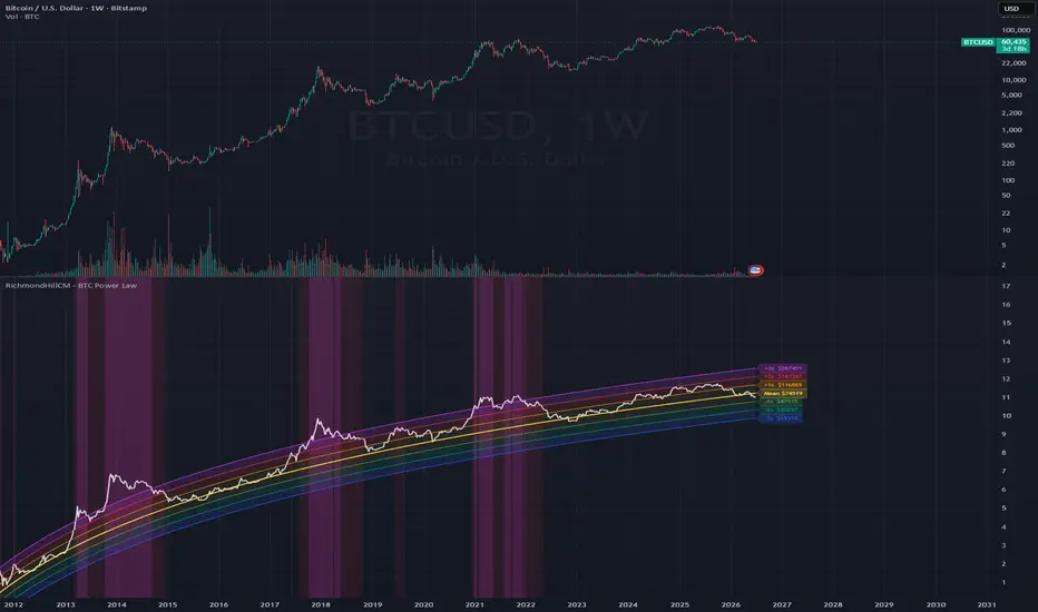
Bitcoin Almanac [WillyAlgoTrader]₿ Bitcoin Almanac is an overlay indicator that maps the entire Bitcoin macro landscape on one chart: a fixed-length cycle time model (bull/bear phases projected from a single anchor date), two hyperbolic curves fitted through historical cycle lows and cycle highs in log-price space, Fibonacci grids stretched between every macro pivot, halving markers, accumulation and distribution zones, and a hypothetical price path for the next bull leg — all summarized in a live dashboard with projected turn dates, curve prices, and historical correction depths.
The core insight: Bitcoin's completed cycles show a remarkably stable time rhythm (roughly 1064 days up, 364 days down) and a decelerating growth pattern that a hyperbola in log10(price) captures with surprisingly small error. Neither observation is a law of nature — but when the time model and the price curves are combined on one chart, they produce concrete, falsifiable reference points: a projected top date with a curve price, a projected bottom date with a curve price, and buy/sell zones derived from both. The indicator makes the whole framework explicit, configurable, and honest about its assumptions.
Everything is driven by dates and user-defined pivots — not by real-time price action — so nothing repaints: the lines you see today are the lines you saw yesterday.
🧩 WHY THESE COMPONENTS WORK TOGETHER
A cycle-date model alone answers WHEN but not AT WHAT PRICE. A curve through historical lows answers WHERE support migrates but not WHEN price will meet it. Fibonacci retracements answer WHERE pullbacks tend to end, but only if you know which macro leg to anchor them to. Used separately, each tool leaves you guessing at the missing dimension.
Bitcoin Almanac chains them into one pipeline:
Cycle time model (anchor + phase lengths) → projected turn dates → hyperbolic lows/highs curves → curve price AT each projected date → Fibonacci grids between macro pivots → 0.786–0.836 accumulation zones bounded by cycle end dates → ±% distribution zones around each high → replayed bull-path projection between the two curve endpoints → dashboard synthesis
The time model supplies the X-coordinate of every future event. The two hyperbolas supply the Y-coordinate: the lows curve is evaluated exactly at the projected bottom date, the highs curve exactly at the projected top date — the "◎ cycle × curve" labels mark these intersections with date and price. The Fibonacci grids are then anchored to the same pivots the curves are built from, so the 0.786–0.836 buy zone of the current leg stretches in time precisely to the model's next cycle-bottom date. Finally, the projection module takes the two curve × date intersections as endpoints and fills the path between them by replaying the shape of the previous bull phase in log space.
No single component can do this: the intersection of an independent time model with an independent price model is what turns two vague trajectories into specific, checkable coordinates.
🔍 WHAT MAKES IT ORIGINAL
1️⃣ Fixed-rhythm cycle engine — pure time math, zero price input.
The phase of any bar is computed directly from calendar time:
daysSince = (barTime − anchor) / 86 400 000
phasePos = daysSince mod (bullDays + bearDays)
isBull = phasePos < bullDays
Defaults: anchor = 07 Nov 2022, bullDays = 1064, bearDays = 364 (each ≈ the average of the three completed BTC cycles). A true mathematical modulo (always ≥ 0) phases bars BEFORE the anchor correctly, so past cycles line up too. With defaults this reproduces the well-known projected dates: top ≈ 06 Oct 2025, bottom ≈ 05 Oct 2026. An alternative anchor (21 Nov 2022 — the actual lowest trade of the cycle) is documented right in the input tooltip and shifts the bottom to 19 Oct 2026.
Why this matters: because the phase depends only on time, the bull/bear background, turn lines and flip alerts are deterministic and cannot repaint — the model's claims are fully falsifiable in advance.
2️⃣ Hyperbolic curve through cycle lows — exact geometry or least-squares fit, with the error printed on the chart.
The lows model is log10(price) = a + b / (c − t), where t is days from the first pivot. The hyperbola has a vertical asymptote in the past and a horizontal asymptote in the future — it encodes decelerating growth, which a straight log-regression line cannot.
— With exactly 3 enabled lows (default: Aug 2015 ≈ $169, Dec 2018 ≈ $3 122, Nov 2022 ≈ $15 476) the three parameters are solved exactly — the curve passes through the pivots by construction. This is geometry, not statistics, and the label says so: "exact through 3 lows".
— With 4+ enabled lows (three optional early-history slots: 2011, 2013, 2015 are provided) the indicator switches to a least-squares fit: a coarse log-spaced search over 250 candidate asymptote positions, followed by a 200-step linear refinement around the best candidate. The curve label then reports the number of points and the RMSE in log10 units — the fit quality is never hidden.
A fit is accepted only if b > 0 and the asymptote c lies before the earliest pivot — degenerate solutions are rejected and the curve simply doesn't draw.
3️⃣ Second independent hyperbola through cycle highs.
The same model is fitted to cycle tops (defaults: Nov 2013 ≈ $1 238, Dec 2017 ≈ $19 700, Nov 2021 ≈ $69 000, Oct 2025 ≈ $126 200 — four points, so LS fit with visible RMSE). A fifth, disabled slot exists only if you want to force the fit through your own future target; you never need it for the projection, because the future top is marked automatically at the crossing of the highs curve with the projected top date.
Why two curves: lows and highs decelerate at different rates. Fitting them independently (instead of offsetting one curve) lets the model express a narrowing channel without assuming its shape.
4️⃣ "Cycle × curve" intersection labels — the model's testable predictions.
At the projected bottom date the lows curve is evaluated: ◎ label with date ≈ price. At the projected top date the highs curve is evaluated: ◎ label with date ≈ price. These two points are the indicator's headline output — a date AND a price for each future turn, derived from two independent models. Both curves extend beyond their intersection as dashed lines (lows: default 10 years, highs: 5 years) to show the long-term trajectory.
5️⃣ Macro Fibonacci grids with a time-bounded 0.786–0.836 accumulation zone.
All enabled lows and highs are merged chronologically; every leg between two pivots of opposite type receives a grid (low→high = bull grid, high→low = bear grid; same-type neighbours are skipped). Levels are fully user-defined (default: 0, 0.236, 0.382, 0.5, 0.618, 0.786, 0.836, 0.886, 1; values > 1 add extensions).
Two non-standard options:
— Log-scale interpolation : level price = 10^(log10(pA) + f × (log10(pB) − log10(pA))) — matches a fib tool drawn on a log chart. Off by default (arithmetic levels for a linear chart).
— Reverse mode (default ON): ratio 0 sits at the END of the leg, so on a bull leg 0.618 is the classic retracement below the high.
The 0.786–0.836 zone of each bull leg is highlighted as a "BUY ZONE" box — and here is the original part: the box stretches in time from the leg start to the end date of the cycle the leg belongs to (the next projected cycle bottom). Depth from the fib model, deadline from the time model — the zone is a rectangle in (price × time), not just a price band.
6️⃣ Distribution zones tied to the cycle skeleton.
Every enabled high gets a "SELL ZONE" box spanning high ± sellPct (default 5% → from high × 0.95 to high × 1.05). The time span runs from the LATER of (a) the latest enabled low before that high or (b) the model's cycle bottom immediately preceding it — so a projected 2029 high starts its zone at the projected Oct-2026 bottom, not at a 2022 pivot. If no enabled high exists in the upcoming cycle, a projected sell zone is created automatically at the highs-curve × projected-date crossing (duplicate-guarded within half a cycle).
7️⃣ Bull-path projection — fractal replay of the previous bull, rescaled in log space.
The path for the NEXT bull phase (with defaults: 05 Oct 2026 → 03 Sep 2029) is drawn between two model-derived endpoints: start = lows curve at the projected bottom, end = highs curve at the following projected top. Two shapes:
— Replay last bull (default): the log-price trajectory of the previous bull phase is recorded bar by bar (confirmed bars only, thinned to ≤ 400 samples for memory safety on intraday timeframes), then linearly rescaled: y(progress) = yStart + (ref(progress) − ref(0)) × (yEnd − yStart) / (ref(1) − ref(0)). The result keeps the timing character of the last cycle — early acceleration, mid-cycle chop, late blow-off — mapped onto the new endpoints.
— Log-linear : a straight line on a log chart between the endpoints. The replay mode automatically falls back to log-linear if the reference phase covers less than 90% of the bull duration.
The path is explicitly labeled "◇ PROJECTED PATH (hypothetical)" — it is a scenario generator, not a forecast.
8️⃣ Corrections table — every macro drawdown since 2014, including the unfinished one.
The dashboard lists every completed high → following-low leg between enabled pivots since 2014 as a % drop (e.g. 2017–2018: −84%). If the latest pivot is a high with no low after it, the current correction is projected : measured from that high to the lows-curve price at the next model bottom, and marked "(proj.)" in accent color. You always see how the ongoing decline compares with history.
9️⃣ Full-transparency dashboard with a phase gauge and next-leg scenario PNL.
Four toggleable sections: Cycle (phase, day X / Y, ██████░░░░ progress gauge), Projection (top and bottom dates with days-left counters and curve prices, plus the hypothetical PNL of the next bull leg: (topCurve / bottomCurve − 1) × 100% and the × multiple), Corrections (see 8️⃣), Ranges (nearest upcoming buy range = the 0.786–0.836 zone prices; nearest sell range = the ±% zone around the next projected high). The footer states the calibration chart (INDEX:BTCUSD · W · linear scale, with a live ✓ when you're on it), a timeframe warning, and the sample-size caveat "⚠ Sample size: 3 cycles" — the model's biggest limitation is printed on the chart itself.
🔟 Efficient, tick-stable rendering.
All drawings (500+ polyline points, fib grids, boxes, dashboard) are anchored to bar-open times and first-bar curve fits — nothing changes within a bar. A redraw gate rebuilds them once per new bar instead of on every real-time tick, and both curve fits run exactly once on the first bar. The chart stays responsive even with all modules enabled.
📐 HOW IT WORKS — CALCULATION FLOW
Step 1 — Parse pivots: on the first bar, all enabled lows and highs are converted to (days-from-first-pivot, log10(price)) pairs.
Step 2 — Fit the curves: each set is fitted to log10(price) = a + b/(c − t) — exact solve for 3 points, two-stage least-squares search for 4+. Fit validity is checked (b > 0, asymptote before the data).
Step 3 — Phase every bar: calendar-time modulo against the anchor determines bull/bear phase, day-in-phase, and the timestamps of the current, next bottom and next top.
Step 4 — Evaluate intersections: the lows curve at the projected bottom date and the highs curve at the projected top date become the model's price targets.
Step 5 — Record the reference bull: during the anchor cycle's bull phase, confirmed closes are stored as (progress, log10 price) — the shape later replayed by the projection.
Step 6 — Draw (once per bar): turn lines and labels for N past and M future cycles, both hyperbolas with dashed extensions, fib grids per alternating pivot leg, buy/sell zone boxes, halving lines (2012 / 2016 / 2020 / 2024 solid, Apr 2028 dashed "(est.)"), the projected path, the dashboard and the watermark.
Step 7 — Alert: on confirmed bars, phase flips and the pre-turn countdown fire alert() calls in text or JSON format.
📖 HOW TO USE
🎯 Quick start:
1. Open the INDEX:BTCUSD chart, Weekly timeframe, regular (linear) price scale — the model is calibrated there, and the dashboard shows a ✓ when the symbol and timeframe match (the scale must be checked manually — Pine cannot detect it).
2. Add the indicator. The green/red background immediately shows the model's current phase; the dashboard shows the day count and progress gauge.
3. Find the two ◎ labels — the projected bottom (orange, lows curve) and the projected top (red, highs curve). These are the model's date + price coordinates for the next turns.
4. Check the yellow boxes: BUY ZONE (0.786–0.836 of the current bull leg, extended to the cycle end date) and SELL ZONE (±5% around each high).
5. Create ONE alert with condition "Any alert() function call" to receive flips and the pre-turn countdown.
👁️ Reading the chart:
— 🟢 Green background = model bull phase; 🔴 red = bear phase
— Solid green verticals = cycle bottoms; dashed red verticals = cycle tops; future turns are labeled ★ PROJECTED and drawn brighter
— 🟠 Orange curve = hyperbola through cycle lows (solid to the projected bottom, then dashed extension)
— 🔴 Red curve = hyperbola through cycle highs (solid to the projected top, then dashed extension)
— Small circles = the exact pivots each curve is built from
— ◎ labels = cycle × curve intersections with date, ≈ price, and fit info (point count + RMSE, or "exact through 3")
— Fib grids between macro pivots: solid edges (0 / 1), dashed 0.5, dotted intermediate levels, price + ratio labels on the right
— 🟡 Yellow boxes = BUY ZONE (0.786–0.836, time-bounded by the cycle end) and SELL ZONE (±% around highs; "(proj.)" = auto-generated at the projected top)
— ⛏ Grey verticals = halvings; the 2028 line is dashed and marked "(est.)"
— 🔵 Blue dashed path = hypothetical next-bull trajectory with its ◇ end label
📊 Dashboard fields:
— Phase / Phase day / Progress : current model phase, day within it, and a 10-segment gauge
— Proj. top / Proj. bottom : projected turn dates, days remaining, and the curve price at each date
— Next leg PNL : hypothetical bottom→top move of the next bull leg in % and as a × multiple — a scenario, not a forecast
— Corrections : every completed macro drawdown since 2014 (high → following low, %), plus the unfinished one projected to the curve bottom and marked (proj.)
— Next buy range / Next sell range : the price boundaries of the nearest upcoming accumulation and distribution zones
— Footer: recommended chart check, timeframe warning, sample-size caveat, version
🔧 Tuning guide:
— Curve doesn't draw: fewer than 3 pivots enabled, or the fit was rejected as degenerate — enable at least 3 lows (or highs) with sensible dates/prices.
— You disagree with a pivot price: every pivot is an editable date + price input — correct it and both the curve and the fib grids rebuild instantly.
— Want dates matching the actual price low: switch the anchor to 21 Nov 2022 (documented in the tooltip); the projected bottom moves to 19 Oct 2026.
— Fib levels look wrong on a log chart: enable "Log-scale levels" (keep it OFF on the recommended linear chart).
— Chart feels crowded: disable individual modules (grids, zones, halvings, projection) or dashboard sections — every block has its own switch.
— Curious about 2030+: enable "Show 2nd projected cycle" for one more bottom/top pair (~Sep 2030 / ~Aug 2033) — off by default because those dates carry double model uncertainty.
💡 Trading ideas:
— Accumulation planning : scale into the 0.786–0.836 BUY ZONE while the model is in its bear phase; the zone's right edge tells you the model's deadline.
— Distribution planning : scale out inside the ±5% SELL ZONE as the projected top date approaches; the pre-alert (default 30 days) gives you a heads-up.
— Scenario testing : move pivots, change phase lengths, or force High #5 to your own target and watch how the whole framework (curves, zones, PNL) responds — the model is a sandbox, not an oracle.
⚙️ KEY SETTINGS
⚙️ Cycle Model:
— Anchor — cycle bottom (default 07 Nov 2022): date all phases are projected from; alternative 21 Nov 2022 documented in the tooltip
— Bull phase length (default 1064 days) / Bear phase length (default 364 days): ≈ averages of the 3 completed cycles
— Cycles to draw back (default 3) / forward (default 1): how many turn lines and labels are drawn
— Show 2nd projected cycle (default off): one extra bottom/top pair with doubled uncertainty
🎨 Visual Settings:
— Theme (Auto / Dark / Light): Auto detects from the chart background; all text colors adapt
— Phase background , Cycle turn lines , Turn labels , Watermark : independent toggles with color inputs
📊 Dashboard:
— Position (4 corners), font size (Small–Huge; dividers render one step smaller), and per-section switches: Cycle / Projection / Corrections / Ranges
📈 Hyperbola — Lows:
— 3 main cycle lows (2015 / 2018 / 2022, on by default) + 3 optional early-history lows (2011 / 2013 / 2015) — each is a checkbox + date + price
— Dashed extension (default 10 years), curve color, anchor-point markers
📉 Hyperbola — Highs:
— 4 cycle highs (2013 / 2017 / 2021 / 2025, on by default) + a spare projected slot (off), extension (default 5 years), curve color
🔢 Fibonacci Grids:
— Bull grids (default on) / Bear grids (default off) with separate colors
— Levels (default "0, 0.236, 0.382, 0.5, 0.618, 0.786, 0.836, 0.886, 1"; values > 1 = extensions)
— Highlight 0.786–0.836 zone (default on), Log-scale levels (default off), Reverse (default on), level labels
⛏ Halvings: lines + labels toggles, color
🟡 Sell Zones: toggle, color, Zone size % from high (default 5%)
🔮 Price Projection: toggle, Path shape (Replay last bull / Log-linear), color
🔔 Alerts: master switch, Webhook JSON Format (default off), Pre-alert days (default 30)
🔔 ALERTS
— 🟢 CYCLE FLIP → BULL — model bottom date reached; payload: ticker, timeframe, price, next projected top date
— 🔴 CYCLE FLIP → BEAR — model top date reached; payload: ticker, timeframe, price, next projected bottom date
— ⏳ CYCLE TURN APPROACHING — fires once, N days (default 30) before the next projected turn; payload: turn type (TOP/BOTTOM), days left, date
All alerts fire on confirmed bars only (once per bar close) and support both human-readable text and JSON webhook payloads for bot integration. Create a single alert with condition "Any alert() function call".
⚠️ IMPORTANT NOTES
— 🚫 No repainting. The cycle phase is pure calendar-time math against a fixed anchor; the curves are fitted once from user-defined historical pivots; the reference bull shape is recorded from confirmed bars only; all alerts use bar-close frequency. Nothing in the model reads unconfirmed real-time data, so no line, zone or label moves after the fact.
— 📐 Sample size: 3 completed cycles. Every statistical claim in this model rests on three observations. The hyperbolic fits are geometry/regression over 3–6 points. Treat all projected dates and prices as reference scenarios with wide error bars — the dashboard says "Rhythm ≠ law" for a reason.
— 📏 Calibrated chart: INDEX:BTCUSD, Weekly, regular (linear) price scale. Exchange charts start later and distort early-history fits. Keep the fib "Log-scale levels" input OFF on a linear chart. The dashboard's ✓ confirms symbol and timeframe; the scale must be checked manually.
— ⚖️ Scope: this is a macro-cycle framework for Bitcoin. It produces no intraday entry signals, no stop placement, and no position sizing. The projected path is explicitly hypothetical.
— 🛠️ This is a cycle-analysis and scenario-visualization tool, not an automated trading bot. It provides projected turn dates, curve-based price references, and accumulation/distribution zones — trade decisions remain yours.
— 🌐 The script runs on any symbol and timeframe, but the model is designed for Bitcoin on Daily/Weekly charts — a dashboard warning appears on intraday timeframes.
Bitcoin Almanac · v1.5.2 指標

Opening Delta Supply Demand HybridOpening Delta Supply Demand Hybrid
This indicator combines Daily Supply and Demand zones, LVN confluence, Money Flow high-trade zones, and Opening Delta dominance pressure.
It detects important supply and demand areas from daily price and volume behavior. The zones stay active until price fully breaks them with a candle close. A supply zone is invalidated only when price closes above it, and a demand zone is invalidated only when price closes below it.
The Opening Delta model measures buyer and seller pressure from the session open. It tracks delta strength, dominance, RVOL, candle quality, superior delta, and dominance flips. If real volume delta is unavailable or returns zero, the indicator can use a candle-volume fallback to keep signals working.
BUY signals appear when price rejects a demand zone and Opening Delta confirms buyer strength. SELL signals appear when price rejects a supply zone and Opening Delta confirms seller strength. The indicator blocks signals when the global strength favors the opposite side.
It also includes a Money Flow High Trade Zone, which highlights the price area with the highest money flow activity from the daily profile.
Main features:
Daily Supply and Demand zones
LVN confluence
Money Flow high-trade zone
Opening Delta buyer/seller pressure
Dominance strength table
BUY and SELL confirmation arrows
Alerts for hybrid signals and delta conditions
Configurable filters for stricter or more aggressive signals
How To Use
Add the indicator to your chart and choose the market/session you trade.
Set the session start time to match your market open.
For example, US index futures usually use 9:30 New York time for the cash open.
Watch the supply and demand zones:
Demand zones are potential bounce areas.
Supply zones are potential rejection areas.
Zones remain active until price fully breaks them with a candle close.
Use the Opening Delta table to read market control:
BUYERS means buyer pressure is stronger.
SELLERS means seller pressure is stronger.
BALANCED means there is no clear dominance.
Look for confirmed signals:
A BUY signal appears when price rejects a demand zone and buyer pressure confirms the bounce.
A SELL signal appears when price rejects a supply zone and seller pressure confirms the rejection.
Avoid trading against the strength:
If price touches demand but strength favors sellers, the indicator blocks the BUY signal.
If price touches supply but strength favors buyers, the indicator blocks the SELL signal.
Use the Money Flow High Trade Zone as an important reaction area.
This zone shows where the highest money flow activity occurred in the daily profile.
Adjust the filters:
Use stricter settings for fewer but stronger signals.
Disable some confirmations for more aggressive signals.
Lower the cooldown if you want more frequent arrows.
Basic Rule
Buy only when price reacts from demand and Opening Delta supports buyers.
Sell only when price reacts from supply and Opening Delta supports sellers. 指標
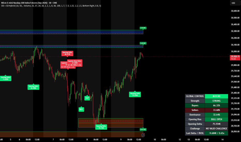
指標

策略

ICT Setup DetectorICT SETUP DETECTOR (ICT-SD)
A mechanical, bias-gated ICT setup scanner for NQ and ES futures intraday
(built and tuned on the 1-minute chart). It marks liquidity, draws the key
daily/session levels, grades directional bias across three timeframes, and
arms four ICT trade setups with fixed targets, stops, and alerts.
This is an INDICATOR, not a strategy — it places no orders. It draws on the
chart and fires alert() messages so you can act (or forward them to a bot).
------------------------------------------------------------
WHAT IT DRAWS
------------------------------------------------------------
LEVELS
- PDH / PDL — previous day high & low
- Overnight H / L — 18:00 to 09:30 ET range
- Midnight Open (00:00 ET) and RTH Open (09:30 ET)
- ORG — Opening Range Gap zone (prior RTH close to today's RTH open)
- Prior Week H / L
BIAS ENGINE (top-right table)
- Reads three timeframes (default 4H / 1H / 15m) plus the ORG gap state
- Modes: Structure (pivot HH/HL), Momentum (EMA 20 vs 50 + close), or Hybrid
- Produces a gate: "Longs OK", "Shorts OK", or "NO TRADE"
- When the gate is on, setups only arm in the permitted direction
KILLZONES (shaded)
- London 03:00-04:00, NY AM 10:00-11:00, NY PM 14:00-15:00 (NY time, DST-aware)
LIQUIDITY SWEEPS
- BSL/SSL grabs of PDH/PDL/ON H/L (breach within N bars + close back through)
- Red "BSL" / green "SSL" triangles
TRADE SETUPS (each has arm -> entry -> exit with TP / SL / time-stop)
- Silver Bullet — sweep, then FVG + displacement inside a killzone
- OTE — 62-79% fib retrace of a swept leg
- OB+FVG — order-block 50% mitigation behind a displacement FVG
- Sweep Reversal (SR) — simple sweep-and-fade scalp (yellow SR-L / SR-S)
15-MINUTE FVG IDENTIFIER
- 3-bar Fair Value Gaps from the 15m timeframe, drawn on your chart
- Non-repainting (only confirmed/closed 15m candles create a box)
- Teal = bullish gap, red = bearish gap, with a dashed CE (mid) line
- Boxes extend right until price fully fills the gap, then freeze/grey
------------------------------------------------------------
HOW TO USE
------------------------------------------------------------
1. Add to an NQ or ES chart on the 1-minute timeframe (point sizing is
auto-detected from the ticker; other symbols fall back to NQ values).
2. Check the bias table (top-right) for the current gate state before acting.
3. Wait for a setup flag/label to arm in the gate-allowed direction. Each
setup shows its FVG/zone box, dashed entry (CE), dotted stop, dotted TP.
4. Targets default to +20 pts (NQ) / +15 pts (ES). Setups auto-skip when the
required stop is wider than the configured max.
5. To get notified: create an alert on this indicator and choose the
"Any alert() function call" condition. Enable the alert types you want
in the Alerts group (armed / entry / exit / bias-flip / new 15m FVG).
------------------------------------------------------------
KEY SETTINGS
------------------------------------------------------------
- Bias gate on/off, and Bias mode (Structure / Momentum / Hybrid)
- Enable/disable each setup individually
- Displacement filter: x ATR(20) and optional volume-spike requirement
- Sweep breach window (how many bars a wick may lead the close-back)
- Targets and "skip if stop >" caps (per NQ / ES)
- Killzone session times, colors, and visualization toggles
- 15m FVG: timeframe, min gap size, CE line, extend-until-mitigated,
remove-vs-grey on fill, max active gaps, and per-direction colors
TUNING
- Too few signals: set Bias mode to Momentum, turn the bias gate off, or
lower the displacement volume multiplier toward 1.0
- Too many signals: raise Displacement x ATR to ~2.0, raise the volume
multiplier to 1.5-2.0, or raise the minimum FVG size
------------------------------------------------------------
NOTES
------------------------------------------------------------
- Designed for NQ/ES on the 1m chart; other symbols/timeframes are untested.
- Live intrabar markers (especially Sweep Reversal) can update until the bar
closes; all alerts fire on bar close, so alerts are stable.
- Educational tool. Not financial advice. Test before trading live.
```
Want me to:
- **Trim it to a short version** (a few lines) for the tooltip/one-liner, or
- **Save it to a file** in the repo (e.g. `pine/ICT-SD-description.txt`) alongside the source? 指標

GC 08-02 ZonesGC 08-02 Zones — Gold Futures Round-Level Map
This indicator automatically maps out horizontal reaction zones around gold's round-number price levels — the "xx8 to xx2" bands that often act as short-term support/resistance on GC and MGC futures.
How it works
The script rounds the current price to the nearest $10 level and plots a series of shaded zones above and below it, each spanning from the round number +2 to −2 (e.g. a zone around $3350 would run from 3352 down to 3348). These bands are drawn symmetrically around price and automatically re-center as price moves, so you always have a consistent map of nearby round-number levels without manually drawing lines.
Features
Adjustable number of zones displayed above/below price (1–50)
Customizable zone fill color, border line color, style (solid/dashed/dotted), and width
Optional price labels on each zone boundary
Adjustable right-side offset and left-extension of lines
Built-in warning label if applied to a symbol other than GC/MGC
Why round numbers matter
Round price levels tend to attract order flow — stops, limit orders, and psychological decision points cluster around them. Having these zones pre-mapped can help with spotting potential reaction areas, planning entries/exits, or simply keeping round-number context visible without cluttering the chart with manual drawings.
Usage notes
This tool is designed specifically for gold futures (GC/MGC) given their $10 round-level structure. It is a visual reference only and does not generate buy/sell signals — always combine with your own strategy, market structure analysis, and risk management. 指標

HTF C2 Sweeps & Candles (v6 Streamlined)First and foremost, huge thanks and full credit to the original creator, wintonbanks, for the foundational logic and concept of this indicator. This script is a modified and optimized version of their excellent work. You can find the original, feature-rich indicator here:
This version has been published to offer a more streamlined, visually minimal experience while upgrading the backend to Pine Script v6.
Key Changes from the Original:
Pine Script v6: Upgraded the code to v6, including logic optimizations to prevent compiler warnings and improve performance.
Simplified Global Styling: Removed the individual timeframe line settings. Sweep lines are now controlled via a single "Global Styling" menu for a faster setup and cleaner settings panel.
Dynamic Sweep Labels: Added a custom labeling engine. Instead of drawing lines with side labels, this version dynamically calculates the center of active sweep lines and places clean, customizable labels (with background and text color options) directly on them.
Decluttered Chart: Completely removed the Previous High/Low lines, line extension toggles, and timeframe dots. This version focuses strictly on core sweeps and PO3 candles.
Custom Alert Sessions: Replaced the hardcoded London/New York session alert toggles with native Pine Script session inputs, allowing you to define your exact custom alert windows and timezones. 指標

Order Blocks by @numberxbtOverview
This indicator automatically detects and plots Bullish and Bearish Order Blocks based on SMC and ICT principles. It helps traders identify high probability naked supply and demand zones, tracks their mitigation status, and automatically removes invalidated zones to keep your chart clean.
Key features
Automatic detection - Instantly identifies valid bullish and bearish order blocks based on a strict 3-candle displacement pattern.
Auto Invalidation - Automatically deletes order blocks if the price closes completely through them.
Equilibrium Midlines - Optional 50% midlines drawn through the center of each order block for precise, sniper-like entries.
Chart Clutter Control - Configurable limits on the maximum number of unmitigated and mitigated zones displayed.
Mitigation Tracking - Monitors price action to track when an order block has been tapped (mitigated).
Settings
Show Bull/Bear OB: Toggle the visibility of Bullish (Demand) and Bearish (Supply) Order Blocks.
Colors: Customize the background transparency and border colors for both Bullish and Bearish zones.
Hide Mitigated: Check these boxes to automatically hide Order Blocks once they have been tapped, keeping your chart focused only on fresh zones.
Max Unmitigated / Max Mitigated: Set the maximum number of active and mitigated zones allowed on the chart. Older zones will be deleted once the limit is reached.
Show Midline: Toggles the 50% equilibrium line inside the Order Blocks.
How it works
The indicator uses a classic 3-candle sequence to define institutional footprints:
Bullish Order Block: Formed by a bearish candle, followed by a bullish candle, followed by a strong bullish continuation. The zone is drawn over the initial bearish candle.
Bearish Order Block: Formed by a bullish candle, followed by a bearish candle, followed by a strong bearish continuation. The zone is drawn over the initial bullish candle.
Note: This indicator focuses purely on Order Blocks. Breaker blocks and other complex features have been removed to provide a clean, lightweight, and highly focused trading tool.
Disclaimer
This indicator is for educational and informational purposes only. It does not constitute financial advice. Trading involves risk, and past performance is not indicative of future results. Always do your own research and manage your risk accordingly. 指標

指標

RichmondHillCM - Liquidity Stress Index V 1.2RichmondHillCM - Liquidity Stress Index V 1.2
The LSI tracks the spread between SOFR (Secured Overnight Financing Rate — the cost of borrowing cash overnight against Treasuries in the repo market) and IORB (Interest on Reserve Balances — the risk-free rate the Fed pays banks on reserves held at the Fed), expressed in basis points.
Why it matters
IORB acts as a soft floor for money-market rates: a bank has little incentive to lend cash below what it can earn risk-free at the Fed. So the position of SOFR relative to IORB is a direct read on how scarce cash is in the funding system.
LSI below 0 (aqua): SOFR trades under the IORB floor. Reserves are abundant, repo plumbing is easy, funding conditions are comfortable.
LSI above 0 (red): SOFR is bid above the floor. Cash is getting scarce, balance-sheet and repo capacity are starting to bind, and reserves are sliding from "abundant" toward "scarce."
Sustained positive prints are a classic early-warning signal of funding stress — the September 2019 repo blow-up being the textbook example. Watching this spread helps anticipate when the Fed's reserve backdrop is tightening enough to force a policy response (standing repo facility usage, balance-sheet adjustments, or an end to QT).
How to read it
Zero line = the IORB floor.
Dashed line = a configurable stress threshold (default 5 bps). When LSI breaks above it, the background shades red to flag an elevated-stress regime.
The further and longer LSI stays positive, the more acute the funding pressure.
Inputs
Smoothing (SMA length): 1 = raw daily spread; raise to filter day-to-day noise.
Stress threshold (bps): the level above which funding stress is flagged.
Notes
SOFR and IORB are sourced from FRED and published daily, with IORB stepping only on FOMC decisions — so on intraday charts the daily values hold flat. The daily timeframe is the honest resolution for this gauge. Each leg is requested separately and differenced in-script for robust alignment rather than relying on a spread symbol.
Original concept credit: @gstoyanov. Released under the Mozilla Public License 2.0. 指標

HTF Candle PO3 AMD SessionsHTF Session Dashboard (Higher Timeframe Candles)
Core idea: This indicator allows you to view the price action of a Higher Timeframe (HTF) drawn as full candles directly on your current lower timeframe chart. It's designed to keep you aware of the macro market structure without needing to constantly switch timeframes.
How It Works
Instead of just showing standard HTF levels, this indicator dynamically builds and projects the current day's higher timeframe candles (e.g., 4-Hour candles) off to the right side of your active chart (e.g., a 1-minute or 5-minute chart).
The candles are constructed in real-time. As price moves on your lower timeframe, the active "current" HTF candle will grow its wicks and adjust its body live.
Key Features
Live HTF Candle Projection: Displays the sequence of HTF candles that make up the current trading day, spaced neatly to the right of the current price action.
Session Extremes: Automatically draws dotted reference lines stretching across your chart to highlight the absolute High, Low, Body High, and Body Low of the entire current session.
Live Countdown Timer: Shows a dynamic timer above and below the candle cluster indicating exactly how much time is left until the active HTF candle closes.
Hour Labels: Every HTF candle has a small label indicating its open hour (with an adjustable timezone offset setting) to help you quickly identify Kill Zones within the macro candles.
Visual Customization: Fully adjustable body width, transparency, spacing, offset distance, and bull/bear color schemes.
Clean Daily Reset: The indicator automatically clears the prior day's candles at midnight (exchange time) and begins building the new sequence, keeping your chart uncluttered.
Why Use This?
When trading intraday (like on a 1m chart), it's easy to get lost in the noise and trade right into a major 4-Hour support or resistance level. By projecting the 4-Hour candles directly onto your 1-minute chart, you always know exactly where you are relative to the higher timeframe narrative and structure.
Recommended Settings
HTF Setting: 240 (4 Hours) or 60 (1 Hour) when trading on a 1m–15m chart.
Hour Label Offset: Adjust this (e.g., +1 or -1) if you want the candle hour labels to match a specific local time zone (like EST) rather than exchange time.
指標
FVG & OB Quality ScorerICT FVG & OB Quality Scorer
Core idea: Not all Fair Value Gaps and Order Blocks are created equal. This indicator answers the question "Which FVG or Order Block will actually work?" by scoring every detected zone on 10 confluence pillars derived from ICT's (InnerCircleTrader) 2022–2024 Mentorship methodology.
How It Works
Every time an FVG or Order Block forms on the chart, the indicator runs it through a 10-factor scoring engine (each factor scored 0–10, total 0–100):
# Pillar What It Checks
❶ Displacement / CISD Was the move impulsive? Body > 70% of candle range = institutional candle. Also checks for Change in State of Delivery (close crossing prior candle's open).
❷ Liquidity Sweep Was BSL or SSL taken before the zone formed? Checks swing pivots, Prior Day High/Low, and IPDA 20-day levels.
❸ Premium / Discount Bullish zones in discount (< 50% of range) score high. Bearish zones in premium (> 50%) score high.
❹ Market Structure Is the zone aligned with the current trend (BOS)? With-trend = 10, counter-trend = 1.
❺ HTF Bias Does the Daily (configurable) candle direction agree with the zone? Misalignment = low probability.
❻ OTE Fibonacci Is the zone inside the 62%–79% Optimal Trade Entry retracement? The 70.5% "sweet spot" scores perfect 10.
❼ FVG + OB Overlap Is there a confluence zone where an FVG and Order Block exist at the same price level? This is ICT's highest-probability setup.
❽ Volume Was displacement volume above the 20-bar average? 3x+ average = clear institutional activity.
❾ Kill Zone Timing Formed during London KZ, NY AM KZ, or Silver Bullet windows? "Time supersedes price."
❿ Freshness First-touch zones score highest. Zones decay in score and fade in color as they age.
Grading Scale
Score Grade Meaning
86–100 S Elite — high conviction, full size
71–85 A/A+ Strong — tradeable with confirmation
51–70 B/B+ Above average — needs extra confluence
26–50 C/C+ Below average — watch only
0–25 D Weak — skip entirely
What You See On The Chart
Color-graded zones: Red (weak) → Orange → Gold → Green → Bright Green (elite)
FVGs = solid-border boxes labeled BISI / SIBI
Order Blocks = dashed-border boxes labeled +OB / -OB
CE line = dotted midline (Consequent Encroachment — ICT's 50% level)
MT line = solid midline on OBs (Mean Threshold — ICT's precision entry)
Score labels with letter grade — hover for full 10-pillar tooltip breakdown
Dashboard table ranking all active zones by score with market context (Structure, HTF Bias, Kill Zone status)
Zones fade in color as they age (freshness decay) and are removed/dimmed on mitigation
Key Settings
Min Score to Display — Set to 60+ to only see B+ and above (recommended for clean charts)
Mitigate On — Wick vs Close (ICT uses Close for higher conviction)
HTF Timeframe — Defaults to Daily; change to 4H for swing setups
IPDA Reference Lines — Toggle 20-day high/low institutional levels
Kill Zone sessions — All configurable in NY time 指標