指標
[3Commas] Static Geometric Grid - Indicator Static Geometric Grid — APE — Indicator
🔷 What it does:
This indicator visualizes a static geometric grid trading system for range-bound altcoins. It pre-computes 64 price levels between a configurable High and Low boundary using geometric spacing (≈ 0.61% step), tracks a virtual deal lifecycle as price crosses through levels, and displays a live on-chart stats card with virtual P&L, drawdown, fill count, win rate, and profit factor. Unlike adaptive grid variants with trailing logic, this version stays locked to the original range — no auto-shift up or down. Webhook-ready alerts are exposed for integration with an external grid bot. No orders are placed by the indicator itself — it is a pure signal and visualization layer.
64 geometrically-spaced levels rendered as horizontal lines on chart
Buy / Sell event labels on every close-cross through a grid level
Static range — grid does NOT shift on price breakout (trailing disabled by default)
Virtual P&L tracker matching the Strategy version's accounting
Stats card displaying Grid Fills, Win Rate, Profit Factor live on chart
🔷 Who is it for:
Range-bound market specialists who identify ranging altcoins and want a visual grid overlay.
Bot operators who automate grid execution through webhook integration with a connected bot.
Free-tier TradingView users who want access to the same grid logic as the Strategy version without requiring backtest functionality.
Traders who prefer predictable risk envelopes — the static range defines exact worst-case accumulation visually.
🔷 How does it work:
Long Entry Signal: When close crosses down through an unfilled grid level, the indicator marks a Buy fill at that level with a small label on chart. The level becomes "filled" in the virtual deal state, recording the buy price and quantity for later P&L calculation.
Short Entry: Not used — long-only grid visualizer.
Exit Management: For each filled level, when close crosses up through the next level above, the indicator marks a Sell fill at that target. The virtual P&L for that grid round-trip is computed as (sellLvl − buyLvl) × qty and added to the running stats. The level is reopened for another buy.
Static range — by default the grid does NOT shift when price exits the boundary. The Trailing Up toggle is provided in inputs for users who want to switch to adaptive mode, but the default static behavior produces a predictable risk envelope: if price breaks above High the grid idles; if it breaks below Low all 64 levels fill and accumulate unrealized loss until reversal.
🔷 Why it's unique:
Pure static range visualization — most grid indicators include trailing logic that compromises the original risk envelope. This variant stays locked to the configured range by default, giving traders a clear visual of the exact worst-case scenario. The trailing toggle is available as an opt-in if needed.
Live virtual P&L stats — runs a complete virtual deal accounting layer that tracks every Buy / Sell pairing and computes realized P&L in real time. The stats card matches the Strategy version's metrics closely (modulo commission, which is not factored in the indicator).
Bot Integration — entry alerts ship with webhook-ready JSON payloads. The grid_start alert fires on first activation; Bot ID, Email Token, and pair label are exposed as inputs.
🔷 What you'll see on the chart:
Red line (top) — Grid High boundary
Green line (bottom) — Grid Low boundary
Aqua lines (middle) — All 62 intermediate grid levels
Aqua "Buy L_X" label — Close crossed down through level X, virtual buy placed
Fuchsia "Sell L_X +N.NNNN" label — Close crossed up through level X+1, virtual sell with realized P&L
Stats card (top-left, configurable) — Live virtual results: Net P&L, Max Drawdown, Grid Fills, Win Rate, Profit Factor
Orange warning label — Appears if chart is on a timeframe other than the recommended 15m
Watermark (top-right, configurable) — Optional brand text overlay for screenshots
🔷 Considerations Before Using the Indicator:
Market & Timeframe: This indicator is highly timeframe-sensitive and is calibrated for a 15-minute chart. Fill density and overall virtual P&L depend directly on how often close crosses grid levels. Higher timeframes (1h+) will show far fewer fills; lower timeframes (1m, 5m) increase fills but slow chart performance. The runtime warning label flags any TF other than 15m.
Limitations: The indicator does not place orders. It tracks a "virtual deal" state on chart for visualization purposes only — actual execution must be done through a connected bot or manually. The static range design means the indicator is structurally exposed to two failure modes if price exits the configured boundary:
(1) Price breaks above High — virtual grid idles, no new fills until reversal
(2) Price breaks below Low — all 64 levels fill, unrealized loss accumulates until average is recovered
This is the trade-off of a pure static grid: predictable risk envelope, but no adaptive protection against trend breakouts.
Virtual P&L Accuracy: The on-chart stats card uses a simplified internal accounting model — it does not factor exchange commission or slippage. Realized profit is computed as the raw (sellLvl − buyLvl) × qty. Use the Strategy version for fee-adjusted backtest results.
Backtesting & Demo Testing: Always validate the grid range and step size on historical data for the specific instrument. The companion Strategy version of this script is available on the same profile for full backtest analysis with realistic commissions and slippage. Demo-trade for at least one month before any live deployment. Past performance is not indicative of future results.
Parameter Adjustments: Grid range (High/Low) and level count should be re-tuned per instrument volatility. Wider ranges and more levels for highly volatile assets; tighter setups for stable ranges. The Trailing Up toggle is provided for users who want to convert this into an adaptive grid — enable to make grid follow trends upward.
🔷 Backtest Validation:
This indicator shares identical grid logic with the Strategy version of the same framework, available on this profile for full historical performance review with realistic commission and slippage:
Strategy version:
Reference results from the Strategy version on OKX:APEUSDT (Spot), 15m chart, tested period Jan 12 — May 14, 2026:
Net Profit: +365.72 USDT (+18.29%) | Max Drawdown: 540.57 USDT (26.04%) | Total Trades: 1,026 | Win Rate: 55.26% (567 / 1,026) | Profit Factor: 1.952
The reference period included a sustained drawdown phase in Feb–Mar 2026 where APE traded near the Grid Low boundary, producing the 26% max drawdown reading. The strong recovery starting late April 2026 produced most of the realized P&L through aggressive grid unwinding. This is the representative profile of a static range grid — strong recovery returns possible but only after enduring full grid accumulation drawdowns. Refer to the Strategy publication for the complete equity curve and trade-by-trade breakdown.
🔷 How to Use It:
🔸 Adjust Settings: Set the grid High and Low boundaries based on the instrument's observed range over the past 1–3 months. The default 0.10591–0.15466 range is calibrated for ApeCoin's recent volatility envelope. The amount per level should be sized so that filling the entire ladder (all 64 levels) does not exceed your risk budget. Always confirm you are on a 15-minute chart.
🔸 Visual Confirmation: Use the on-chart grid lines and Buy/Sell labels to verify that the active virtual deal aligns with your bot's actual position. The indicator's virtual deal state is a 1-to-1 mirror of the Strategy version's grid logic (minus commission), so any major divergence between chart visuals and bot position is a flag for investigation. Pay particular attention to the Max Drawdown value in the stats card — for a static grid this can grow quickly when price breaks the Low boundary.
🔸 Create alerts to trigger the connected bot: The indicator exposes a "grid_start" alert that fires once when the first bar enters the configured backtest window. Configure the alert in TradingView with the webhook URL pointing to your bot's signal endpoint. The Bot ID, Email Token, and Pair label can be set in the script's inputs. Note that grid bots are typically configured directly within the bot interface, so this alert is primarily informational for monitoring purposes.
🔷 INDICATOR SETTINGS
Grid High Price — Upper boundary of the grid range.
Grid Low Price — Lower boundary of the grid range.
Grid Levels — Total number of price levels between Low and High (default 64).
Grid Mode — Distribution of levels: Geometric (constant % spacing) or Arithmetic (constant absolute spacing).
Amount per Level (USDT, ref) — Reference notional for virtual P&L calculation.
Trailing Up — Disabled by default; enable to make grid shift on breakout (turns this into adaptive grid behavior).
Trail Up Threshold % — Percentage above High at which trailing-up triggers (only used if Trailing Up enabled).
Shift Up Magnitude % — How much of the current range to shift when trailing-up fires (only used if Trailing Up enabled).
Limit by Date Range — Constrain virtual backtest to a specific date window.
Initial Capital (ref for % calc) — Reference capital base for percentage metrics in the stats card.
Show grid lines on chart — Toggle visual display of all level lines.
Show fill labels on chart — Toggle Buy / Sell event labels.
Recommended TF (for warning) — Timeframe baseline for the runtime mismatch warning (default 15m).
Stats card / Watermark — Display layer controls for on-chart virtual backtest summary and branding.
Webhook — Bot ID, Email Token, and Pair label for connected bot signal routing.
👨🏻💻💭 We hope this tool helps enhance your trading. Your feedback is invaluable, so feel free to share any suggestions for improvements or new features you'd like to see implemented.
__
The information and publications within the 3Commas TradingView account are not meant to be and do not constitute financial, investment, trading, or other types of advice or recommendations supplied or endorsed by 3Commas and any of the parties acting on behalf of 3Commas, including its employees, contractors, ambassadors, etc. 指標

[3Commas] Static Geometric Grid Static Geometric Grid
🔷 What it does:
This strategy implements a static geometric grid trading system, designed for instruments expected to oscillate within a defined range. It pre-computes 64 price levels between a configurable High and Low boundary using geometric spacing (≈ 0.61% step), buys at each level on close-cross-down, and sells at the next level up on close-cross-up. Unlike adaptive grid variants with trailing logic, this version stays locked to the original range — no auto-shift up or down. Profit comes from capturing the spread between adjacent grid lines on every oscillation; losses occur when price exits the range and filled levels remain underwater until reversal.
- 64 geometrically-spaced levels between Low (0.10591) and High (0.15466)
- Buy on close-cross-down through an unfilled level; sell on close-cross-up through the next level
- Fixed notional per level (24.15 USDT default), all fills equally sized
- No trailing up — grid stays locked to the configured range
- No stop loss — positions held until matching sell level is hit
🔷 Who is it for:
Range-bound market specialists who identify ranging instruments and want to monetize the oscillations.
Bot operators who automate grid execution through webhook integration with a connected bot.
Traders who prefer predictable risk envelopes — the static range defines exact worst-case accumulation.
Spot traders with a strong directional view that the instrument will remain inside the configured boundaries.
🔷 How does it work:
Long Entry: When close crosses down through an unfilled grid level, the strategy opens a long position sized to the per-level notional amount. Each level is independent — multiple buys can stack across the ladder simultaneously, creating the grid accumulation effect during downtrends.
Short Entry: Not used — this is a long-only spot grid.
Exit Management: For each filled level, the strategy places a limit exit at the next level up. When close crosses up through that target, the position closes and the level becomes available to buy again. No stop loss is used; the grid's Low boundary defines the structural worst-case accumulation point.
Static range — the grid does NOT shift when price exits the boundary. If price breaks above High, the strategy stops opening new buys until price returns. If price breaks below Low, all 64 levels are filled and the position holds unrealized loss until either the average is recovered or the user closes manually.
🔷 Why it's unique:
Pure static range — most grid implementations include trailing-up to follow trends, which compromises the original risk envelope. This variant stays locked to the configured range, which gives a predictable worst-case scenario: maximum unrealized loss is bounded by (Current Price − Grid Low) × Total Position. Traders know exactly what they are signing up for.
Geometric distribution — constant percentage step across the entire range (≈ 0.61% per step in default config) rather than constant absolute spacing. This is structurally fairer when the instrument is far from zero and is the same model used by professional grid bots.
Bot Integration — entry and exit alerts ship with webhook-ready JSON payloads. The grid_start alert fires on first activation. Bot ID, Email Token, and pair label are exposed as inputs.
🔷 Considerations Before Using the Indicator:
Market & Timeframe: This strategy is highly timeframe-sensitive and is calibrated for a 15-minute chart. Fill density depends directly on how often close crosses grid levels. Higher timeframes (1h+) produce far fewer fills; lower timeframes (1m, 5m) generate more fills but slow backtests. The runtime warning label flags any TF other than 15m.
Limitations: No stop loss and no trailing range adjustment. The strategy is structurally exposed to two failure modes:
(1) Price breaks above High — strategy idles, no new fills until reversal back into range
(2) Price breaks below Low — all 64 levels fill, unrealized loss accumulates until average is recovered or position is manually closed
This is the trade-off of a pure static grid: predictable risk envelope, but no adaptive protection against trend breakouts. Pair this strategy with manual range validation and an exit plan before deploying capital.
Backtesting & Demo Testing: Always validate the grid range and step size on historical data for the specific instrument. Each pair has a different volatility profile, and the optimal grid parameters vary accordingly. Re-test on your own venue using venue-specific commission and slippage. Demo-trade for at least one month before any live deployment. Past performance is not indicative of future results.
Parameter Adjustments: Commission defaults to 0.10% (Bybit spot taker). Adjust for your venue — OKX Spot ~0.08%, Binance Spot ~0.10%, Coinbase Advanced ~0.50%. Slippage of 2 ticks is conservative for liquid pairs — increase for thin order books. Grid range and level count should be re-tuned per instrument volatility; wider ranges and more levels for higher-volatility assets.
🔷 STRATEGY PROPERTIES
Symbol: OKX:APEUSDT (ApeCoin/USDT Spot). The strategy is generic and runs on any spot pair — APE is the reference instrument.
Timeframe: 15m chart (mandatory — strategy is calibrated for this TF).
Test Period: Jan 12, 2026 — May 14, 2026 (≈ 4 months).
Initial Capital: 2,000 USDT.
Order Size per Trade: 24.15 USDT per grid level. Total investment envelope ≈ 1,545.84 USDT (64 levels × 24.15). Maximum simultaneous position count: 64 levels.
Commission: 0.10% taker — Bybit spot reference; adjust for OKX (~0.08%) or your venue.
Slippage: 2 ticks — typical taker execution on liquid spot pairs.
Margin for Long and Short Positions: 100% (1× leverage assumed; no margin amplification).
Indicator Settings: Default Configuration.
Grid Mode: Geometric
High Price: 0.15466
Low Price: 0.10591
Levels: 64
Amount per Level: 24.15 USDT
Trailing Up: disabled
Step (computed): 0.61%
Strategy: Long Only.
🔷 STRATEGY RESULTS
⚠️ Remember, past results do not guarantee future performance.
Net Profit: +365.72 USDT (+18.29%)
Max Drawdown: 540.57 USDT (26.04%)
Total Closed Trades: 1,026
Percent Profitable: 55.26% (567 / 1,026)
Profit Factor: 1.952
Average Trade:
Average # Bars in Trades:
Reference backtest run on OKX:APEUSDT on 15m base chart, Jan 12 — May 14, 2026. The period included a sustained drawdown phase in Feb–Mar 2026 where APE traded near the Grid Low boundary, producing the 26% max drawdown reading. The strong recovery starting late April 2026 produced most of the realized P&L through aggressive grid unwinding. This is a representative profile for a static range grid: strong recovery returns are possible but only after enduring full grid accumulation drawdowns.
🔷 How to Use It:
🔸 Adjust Settings: Set the grid High and Low boundaries based on the instrument's observed range over the past 1–3 months. Use 50–80 levels for high-volatility altcoins, 30–50 for major pairs. The amount per level should be sized so that filling the entire ladder (all 64 levels) does not exceed your risk budget. The default 24.15-USDT structure is calibrated for a 2,000-USDT account; scale linearly to your equity. Always confirm you are on a 15-minute chart.
🔸 Results Review: Verify Maximum Drawdown stays within your personal risk budget. This static grid showed a 26% drawdown on the tested period, which is well above the typical 10% threshold many traders target. The trade-off is a strong absolute return of +18.29% over 4 months — the question is whether the recovery profile fits your psychological and capital risk tolerance. Calculate the full-grid-filled scenario before going live: if all 64 levels fill at the Low boundary and price drops another 10% below, what is the unrealized loss? That is your hard floor.
🔸 Create alerts to trigger the connected bot: The strategy exposes a "grid_start" alert that fires once when the first bar enters the configured backtest window. Configure the alert in TradingView with the webhook URL pointing to your bot's signal endpoint. The Bot ID, Email Token, and Pair label can be set in the script's inputs. Note that grid bots are typically configured directly within the bot interface, so this alert is primarily informational for monitoring purposes.
🔷 INDICATOR SETTINGS
Grid High Price — Upper boundary of the grid range.
Grid Low Price — Lower boundary of the grid range.
Grid Levels — Total number of price levels between Low and High (default 64).
Grid Mode — Distribution of levels: Geometric (constant % spacing) or Arithmetic (constant absolute spacing).
Amount per Level (USDT) — Notional value of each buy fill.
Total Investment (USDT, ref) — Reference total capital deployed across all levels (informational).
Trailing Up — Disabled by default; enable to make grid shift up on breakout (turns this into the adaptive Geometric Grid Machine variant).
Trail Up Threshold % — Percentage above High at which trailing-up triggers (only used if Trailing Up enabled).
Shift Up Magnitude % — How much of the current range to shift when trailing-up fires (only used if Trailing Up enabled).
Limit by Date Range — Constrain backtest to a specific date window.
Show grid lines on chart — Toggle visual display of all level lines.
Recommended TF (for warning) — Timeframe baseline for the runtime mismatch warning (default 15m).
Stats card / Watermark — Display layer controls for on-chart backtest summary and branding.
Webhook — Bot ID, Email Token, and Pair label for connected bot signal routing.
👨🏻💻💭 We hope this tool helps enhance your trading. Your feedback is invaluable, so feel free to share any suggestions for improvements or new features you'd like to see implemented.
__
The information and publications within the 3Commas TradingView account are not meant to be and do not constitute financial, investment, trading, or other types of advice or recommendations supplied or endorsed by 3Commas and any of the parties acting on behalf of 3Commas, including its employees, contractors, ambassadors, etc. 策略

Carry Cost MonitorThe bill you did not expect
You run a Swiss franc account. You trade Micro E-mini S&P 500 futures because the US equity market is where the liquidity is. One quarter later your broker sends a statement and there it is: CHF 1,600 in debit interest . Nobody warned you. The contract you traded settles in US dollars. Your account holds Swiss francs. Interactive Brokers lent you the dollars, charged you the USD overnight rate plus 1.5% markup on every dollar for every day you held the position. Meanwhile your Swiss franc cash earned close to nothing because the SNB policy rate sits well below the Fed Funds rate. The gap between those two rates, accumulated silently over months, is the carry cost that drained your account.
This is not a rare edge case. Any trader whose account currency differs from the instrument currency faces the same mechanic. A European trading US equities, a Japanese investor buying Australian bonds, a Canadian holding FTSE futures. The cost is real, it compounds daily, and most platforms do not surface it until the quarterly statement arrives.
The Carry Cost Monitor exists to make this cost visible before it accumulates . It shows the yield differential between your account currency and the instrument currency in real time, estimates the financing cost or income over any horizon you choose, and lets you compare all major currencies side by side so you can make informed decisions about where and what you trade.
The indicator applied to a US dollar denominated chart with a CHF base account. The dashboard in the top right shows the carry spread, percentile rank, estimated annual cost, and break-even return. Below, the comparison table lists all available currencies sorted by carry cost.
What carry costs actually are
When you hold an instrument denominated in a foreign currency, your broker creates a loan in that currency to settle the trade. You owe interest on the borrowed amount and may earn interest on your deposited base currency. The net cost is the difference between those two rates plus whatever the broker charges on top.
The indicator formalizes this as:
Carry Spread (%) = Y_instrument - Y_account
where Y is the sovereign yield for the selected maturity. A positive spread means you borrow a currency that yields more than yours. You pay. A negative spread means the borrowed currency yields less than your base. You earn.
The gross carry rate adds the broker fee:
Gross Carry (%) = Carry Spread + Broker Markup
Interactive Brokers structures this markup in tiers (Interactive Brokers, 2024):
Balance 0 to 100,000: benchmark + 1.50%
Balance 100,000 to 1M: benchmark + 0.50%
Balance above 1M: benchmark + 0.30%
The estimated cost over a chosen horizon follows standard money market convention, adjusted for each currency's day count basis (Stigum and Crescenzi, 2007):
Cost = Nominal * (Gross Carry / 100) * (Days / Day Count Basis)
Day Count Basis is 360 for USD, EUR, CHF, JPY, and SEK (ACT/360), and 365 for GBP, CAD, AUD, and NZD (ACT/365). These match the interbank settlement rules in the ISDA day count fraction definitions (ISDA, 2006).
Finally, the break-even tells you how much your instrument must move to cover the carry drag:
Break-Even (%) = |Gross Carry| * (Days / 365)
This is the minimum performance needed to not lose money purely from financing.
Where the data comes from
The indicator pulls sovereign bond yields for 9 currencies across two maturities (2-year and 10-year), totaling 18 external data requests. The symbols follow TradingView's TVC convention:
USD: US02Y / US10Y EUR: DE02Y / DE10Y (Germany as eurozone proxy)
CHF: CH02Y / CH10Y GBP: GB02Y / GB10Y
JPY: JP02Y / JP10Y CAD: CA02Y / CA10Y
AUD: AU02Y / AU10Y NZD: NZ02Y / NZ10Y
SEK: SE02Y / SE10Y
The 2-year yield is the default because it sits closest to actual overnight funding rates. The correlation between 2-year sovereign yields and their respective benchmarks (SOFR for USD, SARON for CHF, ESTR for EUR) typically exceeds 0.85 over rolling 1-year windows, with average deviations of 20 to 50 basis points (Ilmanen, 2011). That deviation is smaller than the broker markup itself, making sovereign yields a practical proxy.
Why not use the overnight rates directly? Most are only available at monthly frequency through FRED on TradingView, with shorter history. Sovereign yields update daily with 10+ years of data. The trade-off is slight imprecision for much better coverage and responsiveness.
The instrument currency is detected automatically through the built-in syminfo.currency variable. When it matches your account currency, the indicator reports zero cost because no foreign exchange borrowing occurs. Currencies whose yield data returns nothing on TradingView are hidden from the chart and dashboard automatically.
The settings panel showing the Carry Model inputs. Account Currency is set to CHF, Yield Maturity to 2Y, Position Size to 100,000, and the broker tier to 0-100k. These four settings control the entire cost calculation.
Reading the carry lines
The main panel draws up to 8 spread lines, one per foreign currency relative to your account currency.
The zero line is the boundary. Everything above it costs you money. Everything below it earns you money. The further a line sits from zero, the larger the financing effect.
For the active instrument pair, a 1-sigma band (252-day rolling mean plus/minus one standard deviation) wraps around the spread. When the current value breaks outside this band, the carry environment is statistically unusual compared to its own recent history. That might mean a central bank shifted rates, or term spreads moved.
Each currency has its own color, chosen to stay distinguishable even under the most common forms of colorblindness:
USD: blue EUR: amber CHF: red GBP: purple
JPY: emerald CAD: orange AUD: cyan NZD: lime
SEK: fuchsia
The historical view with all currency lines visible. Each colored line represents one currency's carry spread against the selected base. Crossing the zero line marks a shift from paying carry to earning it.
The dashboard
The dashboard sits in the corner of the chart (position adjustable) and answers two questions without requiring you to read the lines themselves.
The top section shows the active pair in detail: the raw carry spread in percent, its percentile rank over 2 years (504 trading days), the estimated absolute cost or income for your chosen time horizon and position size, and the break-even return. This is the quick answer to "what is this position costing me right now?"
The bottom section is a comparison table listing every currency with valid data. Each row shows the currency name, its carry spread, its current yield, and the projected cost over your horizon. The instrument currency is marked with a triangle. Rows are color-coded: green for pairs that produce income, red for pairs that cost you money. This answers the follow-up question: "would my carry situation improve if I traded a similar instrument denominated in a different currency?"
The dashboard detail showing the active pair section. CHF to USD carry spread is positive, placing it in the 72nd percentile of its 2-year range. The estimated annual cost for a 100,000 position at the 0-100k broker tier is displayed alongside the break-even return.
The comparison table below the active pair section. All currencies are listed with their individual spreads and estimated costs. JPY shows the largest negative spread (income), while USD shows the highest positive spread (cost) from a CHF base perspective.
Setting it up
The Carry Model group contains the five settings that determine everything:
Account Currency : your brokerage base currency. This is the single most important input. Get this wrong and every number on the screen is meaningless.
Yield Maturity : 2Y sits closer to actual funding costs. 10Y captures term premium effects and is useful for longer-horizon strategic planning.
Position Size : the notional value of your position in the instrument currency. Drives the absolute cost estimate.
Cost Horizon : 1 month, 3 months, 6 months, or 1 year. Controls how far out the projection reaches.
Broker Balance Tier : matches the IB tiered structure. Set to "None" to strip out the broker markup entirely and see the pure yield differential.
The Display group controls background shading (green when earning, red when paying) and whether all currency lines appear or only the detected one.
Eight color themes are available (EdgeTools, Gold, Behavioral, Quant, Ocean, Fire, Matrix, Arctic) with dark and light mode support. Line width and glow effects are adjustable.
Three alert conditions can fire:
Carry spread enters the 90th percentile (historically expensive environment)
Carry spread enters the 10th percentile (historically cheap environment)
Carry spread crosses zero (direction flipped)
Practical examples
Example 1 : CHF account trading MES (Micro E-mini S&P 500)
Account currency: CHF. Instrument currency: USD. Assume CH02Y = 0.60%, US02Y = 3.85%.
Carry spread = 3.85 - 0.60 = +3.25% .
Broker markup (0-100k tier) = 1.50%.
Gross carry = 3.25 + 1.50 = 4.75% .
Annual cost on 100,000 USD nominal = 100,000 * 0.0475 * (365/360) = 4,819 USD .
Break-even = 4.75% per year. The S&P 500 must return more than 4.75% annually just to cover carry.
Example 2 : USD account buying CSPX (iShares S&P 500 UCITS, EUR-listed)
Account currency: USD. Instrument currency: EUR. Assume US02Y = 3.85%, DE02Y = 2.05%.
Carry spread = 2.05 - 3.85 = -1.80% .
Broker markup = 1.50%.
Gross carry = -1.80 + 1.50 = -0.30% .
Annual income on 100,000 EUR nominal = 100,000 * 0.003 * (365/360) = 304 EUR .
You earn a small amount because USD yields exceed EUR yields by more than the broker markup.
Example 3 : EUR account trading Nikkei 225 futures (JPY-denominated)
Account currency: EUR. Instrument currency: JPY. Assume DE02Y = 2.05%, JP02Y = 0.15%.
Carry spread = 0.15 - 2.05 = -1.90% .
Broker markup = 1.50%.
Gross carry = -1.90 + 1.50 = -0.40% .
You earn a small net income because borrowing JPY is cheaper than what your EUR balance yields.
These examples show that the carry direction depends entirely on which currency has the higher rate and how large the broker fee is. Pairs close to zero can flip between cost and income whenever a central bank moves.
Limitations
Sovereign yields are not overnight rates. The 2-year bond yield is a proxy, not the exact benchmark brokers use. Interactive Brokers references SOFR for USD, SARON for CHF, ESTR for EUR, SONIA for GBP. The gap between sovereign 2Y yields and these overnight rates typically sits at 20 to 50 basis points (Ilmanen, 2011, p. 364), occasionally more during yield curve inversions.
The broker cost model is simplified. Real IB interest calculations depend on multi-currency balances across the account, unrealized PnL, margin usage, and the interaction between positive and negative currency positions. The indicator applies a single-tier markup, which captures the dominant cost component but may overstate the net cost for larger accounts earning credit interest on their base currency.
Currency detection relies on syminfo.currency . For most futures, ETFs, and equities on major exchanges, this returns the correct settlement currency. Some synthetic instruments, CFDs, or crypto pairs may return unexpected values. Always verify the detected currency in the dashboard header.
Currencies that consistently lacked yield data on TradingView (such as NOK) have been excluded. Missing data for remaining currencies is handled gracefully and does not produce errors.
The indicator works best on the daily timeframe . Intraday charts display yield data that updates once per day, creating flat segments within the session. This does not affect the accuracy of cost estimates.
References
Ilmanen, A. (2011) Expected returns: an investor's guide to harvesting market rewards . Chichester: John Wiley and Sons.
Interactive Brokers (2024) Interest rates on credit and debit balances. (Web Accessed: May 2026).
ISDA (2006) 2006 ISDA definitions . New York: International Swaps and Derivatives Association.
Koijen, R.S.J., Moskowitz, T.J., Pedersen, L.H. and Vrugt, E.B. (2018) 'Carry', Journal of Financial Economics , 127(2), pp. 197-225.
Stigum, M. and Crescenzi, A. (2007) Stigum's money market . 4th edn. New York: McGraw-Hill.
指標

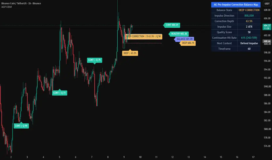
Impulse Correction Balance Map [AGPro Series]Impulse Correction Balance Map
🧠 Core Idea
Is the current correction still healthy compared with the prior impulse, or is the impulse losing structural balance?
📌 Overview / What it does
Impulse Correction Balance Map is a rule-based impulse and correction visualization tool designed to compare the current pullback with the prior directional swing leg.
The script identifies a valid bullish or bearish impulse, measures correction depth, maps the healthy-to-balanced correction pocket, and highlights whether price is still respecting the impulse structure or moving into failure risk.
It does not predict price direction, automate trades, or guarantee continuation after a pullback. It is a structured market-structure and wave-analysis tool for reading impulse strength, correction depth, balance, continuation, and failure context.
🎯 Purpose & Design Philosophy
Many pullback tools mark a retracement or draw generic Fibonacci levels.
This script was built to answer a more practical question:
Is the correction proportionate to the impulse that created it?
The design goal is to help traders evaluate pullbacks as part of a complete impulse-correction relationship instead of treating every retracement as equal.
⚡ Why This Script Is Different
Most tools focus on static retracement levels, generic trend strength, or simple pullback labels.
This script does NOT mark every pullback as a clean opportunity.
Instead, it builds the impulse leg first, measures the correction against that leg, separates healthy correction, balanced pullback, deep correction, continuation, and failure risk, then displays the story through premium chart visuals and a compact AG Pro panel.
⚙️ Methodology
1. Swing Detection
The script uses confirmed swing pivots to identify meaningful bullish or bearish impulse legs.
2. Impulse Validation
An impulse must meet a minimum ATR-normalized size before it becomes the active reference leg.
3. Correction Mapping
After the impulse forms, the script tracks the deepest correction point and calculates retracement depth as a percentage of the impulse.
4. Balance Evaluation
Correction depth is classified into healthy, balanced, deep, continuation, or failure states.
5. Visual Output
The chart displays the impulse box, correction pocket, depth ladder, centered pocket label, right-side tags, event labels, alerts, and a compact AG Pro decision panel.
🗺️ How to Read the Chart
Impulse Box = the prior validated directional swing leg.
Correction Pocket = the projected healthy-to-balanced retracement area.
Depth Ladder = reference rails for shallow, balanced, and deep correction zones.
Centered Pocket Label = the main visual anchor for the active balance pocket and quality score.
Right-Side Tags = current correction depth, balance state, and continuation reference.
Event Labels = key moments such as healthy correction, deep correction, continuation, or correction failure.
Panel = summarizes balance state, impulse direction, correction depth, impulse size, quality score, next context, and timeframe.
🚦 Signals & States
• HEALTHY CORRECTION → correction depth remains shallow relative to the impulse.
• BALANCED PULLBACK → correction is deeper but still inside the normal balance area.
• DEEP CORRECTION → correction is pressing into a riskier retracement zone.
• HIGH FAILURE RISK → correction is beyond the preferred balance area.
• CONTINUATION → price extends beyond the impulse end in the impulse direction.
• CORRECTION FAIL → price invalidates the impulse start area.
• WAIT IMPULSE → no valid impulse reference is active yet.
🔔 Alerts Logic
Alerts trigger when a major impulse-correction state appears.
• Healthy Correction → correction remains inside the healthy retracement area.
• Deep Correction Risk → correction depth moves into the deep-correction risk area.
• Continuation Trigger → price breaks beyond the impulse end in the impulse direction.
• Correction Failure → correction invalidates the impulse start area.
Alerts are attention markers, not trade instructions.
🧩 Confluence Logic
The context becomes stronger when:
• The impulse leg is large enough relative to ATR
• Correction depth remains proportionate
• Price respects the balance pocket
• Continuation appears after a controlled correction
• The panel state agrees with the event label
• Broader trend structure supports the impulse direction
If these elements do not align, the script avoids forcing a continuation interpretation.
📊 When to Use
• Trend continuation analysis
• Pullback evaluation
• Swing structure review
• Crypto, forex, stocks, and index markets
• Wave-style impulse and correction studies
• 1H, 4H, and daily charts
• Markets with clear directional legs and retracement behavior
⚠️ When NOT to Use
• Very low-liquidity symbols
• Extremely choppy markets with no clear swing structure
• News-driven candles where pivots may be distorted
• Ultra-low timeframes with excessive noise
• Markets where every pullback is immediately invalidated by volatility
• Situations where a single retracement should not be treated as a standalone decision
🎛️ Key Inputs
• Swing Pivot Length → controls how swing highs and lows are confirmed.
• Minimum Impulse ATR → defines how large the impulse must be before it becomes active.
• ATR Length → normalizes impulse size, label spacing, and correction context.
• Healthy Correction Max % → defines the upper boundary of the shallow correction zone.
• Balance Correction Max % → defines the upper boundary of the balanced correction zone.
• Deep Correction Max % → defines the deep-correction risk boundary.
• Projection Bars → controls how far correction pockets, rails, and tags project.
• Label Font Size → controls chart label and tag text size.
• Panel Font Size → controls panel text size.
🖥️ Interface & Visual Design
The visual hierarchy is built around the impulse-correction relationship.
The impulse box shows the directional leg.
The correction pocket shows where a controlled retracement can remain balanced.
The depth ladder shows where the correction becomes shallow, balanced, deep, or risky.
The centered badge makes the pocket readable at first glance.
The AG Pro panel summarizes the current state without forcing the user to inspect every level manually.
🧪 Practical Usage Workflow
1. Wait for a valid impulse leg to appear.
2. Check the correction pocket and depth ladder.
3. Read the current balance state in the panel.
4. Watch whether the correction stays healthy, becomes deep, or fails.
5. Look for continuation only after the correction context remains controlled.
6. Interpret the result inside broader trend, liquidity, and volatility context.
🔍 Interpretation Guidelines
A healthy correction does not guarantee continuation. It means the retracement is still proportionate to the prior impulse.
A deep correction does not guarantee reversal. It means the pullback is approaching an area where the original impulse is less structurally clean.
A continuation trigger does not guarantee follow-through. It means price extended beyond the impulse end according to the script's rule set.
A correction failure is a structural warning, not a trading command.
🚫 What This Script Is NOT
This script is not a prediction engine.
It is not financial advice.
It is not an auto-trading system.
It does not provide guaranteed entry or exit signals.
It is not a standard Fibonacci retracement tool.
It is not a full Elliott Wave counter.
⚠️ Limitations & Transparency
Swing detection depends on pivot confirmation, so signals can appear after pivots are confirmed.
Timeframe differences can change impulse and correction structure.
High volatility may cause correction depth to expand quickly.
Low-liquidity markets may produce unreliable swing pivots.
The script is designed for structured interpretation, not certainty.
🧠 Market Context Notes
Impulse-correction behavior is strongest when the market has a clear directional leg, a readable retracement, and enough liquidity for swing structure to matter.
The same correction depth can mean different things in a strong trend, a range, or a volatility shock.
The script should be read together with broader structure, volume, volatility, and market regime.
🧾 Use Case Examples
• If a bullish impulse forms and the correction remains shallow, the map may show healthy correction context.
• If a bearish impulse forms and price retraces deeply against it, the map may show deep correction or failure risk.
• If price breaks beyond the impulse end after a controlled correction, the map may show continuation.
🧱 System Philosophy
Impulse Correction Balance Map is part of the AGPro Series approach to decision-support tools:
clear structure, premium chart readability, honest interpretation, and no promise of certainty.
The goal is to help traders understand the relationship between impulse strength and correction depth without turning analysis into signal spam.
🔐 Non-Promise Statement
No script can know the future.
No correction depth guarantees continuation or reversal.
No signal should be interpreted without broader market context.
📉 Risk Disclosure
Trading involves risk.
Markets can move unpredictably.
This script is for educational and analytical purposes only.
It does not provide financial advice or guaranteed trading outcomes.
Users remain responsible for their own decisions.
📚 Educational Note
Use this script to study how impulses and corrections relate to each other.
The value is not only in the label. The value is in learning whether a pullback is proportionate, stretched, balanced, or structurally weak compared with the impulse that came before it.
指標

brechtdeygersThe “A+ Supply & Demand” indicator is a high-probability institutional trading tool designed to identify only the strongest market zones with the highest potential for profitable reactions. It combines advanced supply and demand logic, trend confirmation, liquidity analysis, and automated risk management into one complete TradingView system.
The indicator detects powerful institutional supply and demand zones by analyzing aggressive price displacement and volatility using ATR-based filtering. Only high-quality zones created by strong buying or selling pressure are displayed, helping traders avoid weak or low-probability setups.
To improve accuracy, the system includes a 200 EMA trend filter that aligns trades with the dominant market direction. Demand zones are prioritized during bullish trends, while supply zones are prioritized during bearish trends, increasing the probability of successful entries.
A built-in liquidity and volume strength system estimates how much institutional activity and remaining liquidity exist inside each zone. Stronger zones are visually highlighted using volume-based scoring, color intensity, and liquidity labels, making it easier to identify where large unfilled orders may still be present. Zones that become partially mitigated automatically lose liquidity strength over time.
The indicator also provides complete trade execution planning:
* Automatic entry signals on the first retest of fresh zones
* Dynamic stop losses placed beyond previous swing highs/lows with ATR safety buffers
* Accurate take profit targets based on true risk distance
* Configurable Risk:Reward ratios (default 1:2)
For performance tracking, the indicator includes a live dashboard displaying:
* Total trades
* Win rate
* Wins and losses
* Active setup statistics
Additional visual enhancements include:
* Entry, stop loss, and take profit plotting
* Zone transparency based on liquidity strength
* Retest/touch tracking
* Automatic removal of invalid or mitigated zones
The goal of the indicator is to help traders focus exclusively on A+ institutional setups by combining trend alignment, liquidity analysis, displacement strength, and precision risk management into a clean and highly selective trading system.
指標

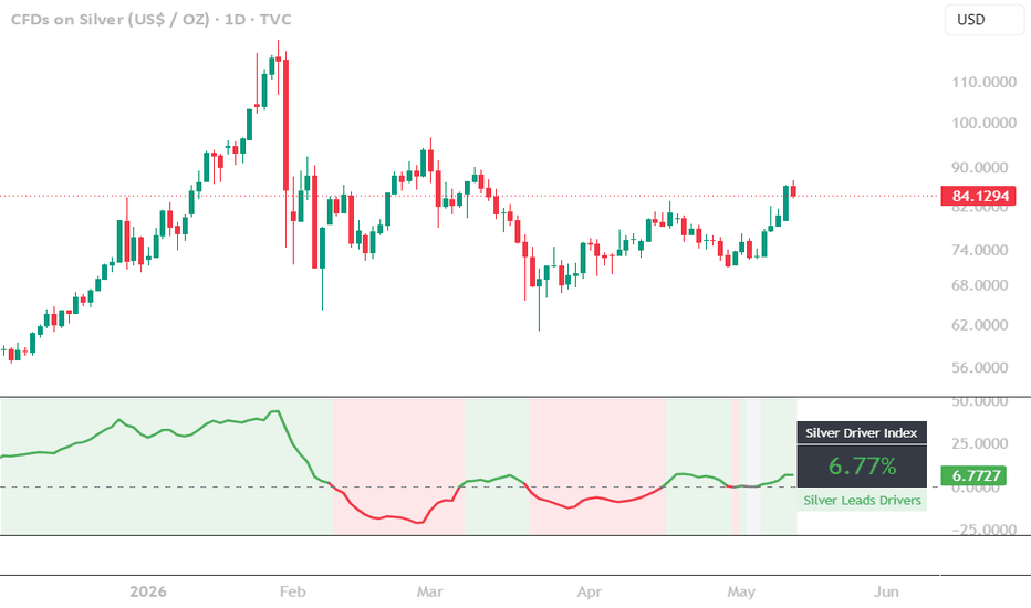
U.S. Treasury Bills Held Outright | Astral Vision U.S. Treasury Bills Held Outright | Astral Vision 🌠💠
Treasury Bills Held Outright represents the stock of short-term US government securities held directly on the Federal Reserve's balance sheet.
Expansions of this holding reflect active Fed intervention in the short-term debt market, injecting liquidity into the financial system. Contractions signal withdrawal. Because T-Bills are the shortest-duration instrument the Fed holds, changes in this series respond faster than broader balance sheet metrics and can serve as an early read on the direction of monetary conditions.
This indicator plots the weekly WSHOBL series from FRED and colors it by whether its 10-bar rate of change is above a configurable growth threshold, distinguishing active expansion phases from stagnation or contraction. The same regime is projected onto the price chart as a background highlight.
Calculation ⚙️
`ROC = (val − val ) / |val |`
The signal colors positive when ROC exceeds the configured threshold, indicating active T-Bill accumulation by the Fed. Below the threshold the signal turns negative. Data is pulled weekly from FRED on confirmed closed bars.
Plots 📊
Weekly WSHOBL line in the indicator panel, colored by ROC regime
Background highlight on the price chart during active expansion phases (toggleable transparency)
Inputs 🎛️
`Overlay BG Transparency`: opacity of the price chart background highlight during expansion
Colors 🎨
5 Astral Vision presets + custom override. Default: Paradiso. Positive color activates when the rate of change exceeds the growth threshold; negative color applies otherwise.
Purpose 🎯
Most Fed balance sheet indicators track total assets or reserves, series that move slowly and are dominated by longer-duration holdings like MBS and Treasuries.
T-Bills Held Outright is a narrower and more reactive slice of the balance sheet that captures short-term liquidity operations directly.
When the Fed is actively accumulating T-Bills, it is injecting short-duration liquidity into the system, a condition that has historically been favorable for risk assets including Bitcoin.
This indicator makes that dynamic visible on any chart without requiring manual cross-referencing of FRED data.
Disclaimer ⭕️
It is not financial advice, not an investment recommendation, and not affiliated with any financial institution, research firm, or organization of any kind. All content is provided for educational and informational purposes only. Always conduct your own research before making any financial decision. 指標

指標

指標
指標

指標
指標
指標

指標
指標

指標

指標

指標

指標
指標

指標

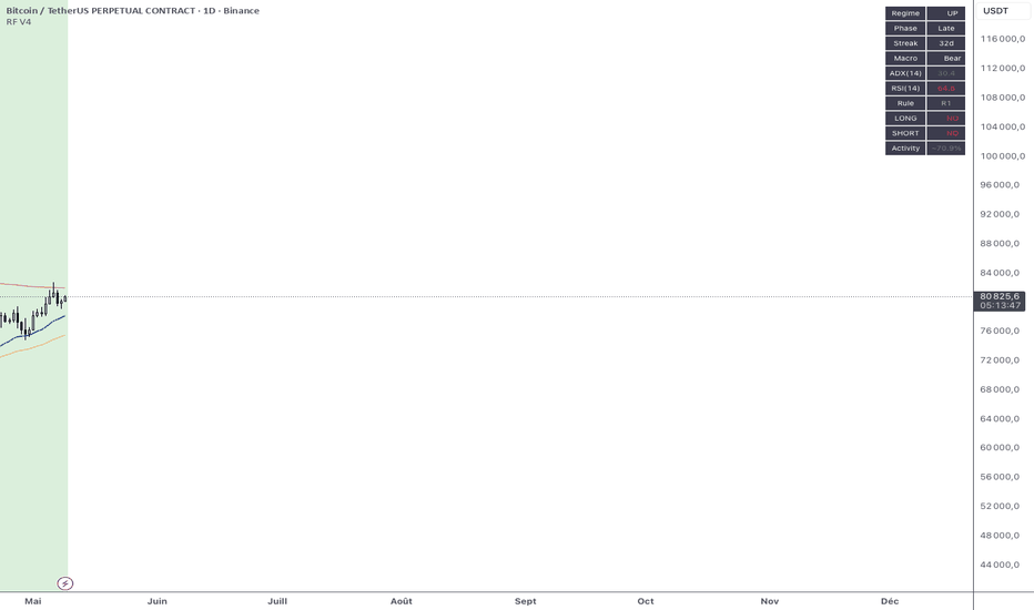
Regime Filter V4CRegime Filter V4 — Macro regime detection with rule-based LONG/SHORT filter
OVERVIEW
Regime Filter V4 is a macro regime detection indicator designed to filter trading signals on daily timeframe. It classifies the market into 3 regimes (UP / DN / RG), splits each regime into Early / Late phases, considers BTC macro context (Bull / Bear), and applies 4 explicit rules to decide whether LONG or SHORT trades are authorized.
This is the public version of the filter I use to systematically gate signals on my own multi-method trading bot. It has been validated across 8 years of BTC daily data (2018–2026) with documented performance (cumsum +3,051R, Sharpe 0.455, Max DD reduced 42% vs no-filter baseline).
HOW IT WORKS — THE 4 LAYERS
Layer 1 — Regime detection
Classify each daily bar into UP / DN / RG using EMA20 slope over a 7-day lookback:
- UP : EMA20 > EMA20 × (1 + 0.1%)
- DN : EMA20 < EMA20 × (1 - 0.1%)
- RG : in between (range / consolidation)
Layer 2 — Phase Early / Late
Count consecutive days in the same regime (streak):
- Early : streak ≤ 7 days (fresh trend)
- Late : streak > 7 days (mature trend)
Layer 3 — Macro context
Compare EMA50 vs EMA200 on the asset itself:
- Bull macro : EMA50 > EMA200
- Bear macro : EMA50 < EMA200
Layer 4 — The 4 rules (R1–R4)
- R1 : Regime UP → SHORT always blocked
- R2 : Regime UP → LONG: Early always OK; Late OK only if Bull macro
- R3 : Regime DN → SHORT: OK only if ADX(14) > 30
- R4 : Regime RG → LONG: OK only if Bear macro AND RSI(14) < 30 (contrarian)
VISUAL ELEMENTS
Background colors:
- Green = UP regime (lighter = Early, darker = Late)
- Red = DN regime (lighter = Early, darker = Late)
- Yellow / grey = RG regime (range)
Plotted lines:
- Blue (EMA20) — Regime EMA
- Orange (EMA50) — Macro fast
- Red (EMA200) — Macro slow
Transition markers:
- Red triangle down = UP → DN transition
- Green triangle up = DN → UP transition
- Grey diamond = transition into RG
Dashboard (top-right):
Live display of current regime, phase, streak, macro context, ADX, RSI, active rule, LONG / SHORT status, and approximate activity rate.
HOW TO USE
1. Apply on daily timeframe of any liquid asset (works best on BTC, but tested cross-asset on ETH and SOL).
2. Read the dashboard to know the current regime and which trades are authorized.
3. Use the LONG / SHORT YES/NO status as a filter for your own trading signals or systems — only take trades aligned with the regime decision.
4. Set up alerts on regime transitions (UP/DN/RG) and on LONG/SHORT signals to be notified.
VALIDATION CONTEXT
- Tested on 8 years of BTC daily data (2018–2026) with custom backtest engine
- Cross-asset validation on ETH and SOL
- Walk-forward in-sample / out-of-sample stable
- Reduces drawdown by ~42% vs unfiltered baseline
- Sharpe ratio improvement from ~0.22 (baseline) to ~0.455 (with filter)
- All numbers expressed in R-multiples (1R = sized risk per trade)
INPUTS YOU CAN ADJUST
- EMA Regime length (default 20)
- Regime lookback days (default 7)
- Regime threshold (default 0.1%)
- Macro EMAs Fast / Slow (default 50 / 200)
- ADX period & threshold for R3 (default 14 / 30)
- RSI period & threshold for R4 (default 14 / 30)
- Early/Late boundary in days (default 7)
ALERTS AVAILABLE
- Transition → UP
- Transition → DN
- Transition → RG
- LONG signal (R2 or R4)
- SHORT signal (R3)
DISCLAIMER
This indicator is a filter / decision-support tool , not a complete trading strategy. It tells you when the macro regime allows LONG or SHORT — it does not generate entry / exit prices. You must combine it with your own setup detection (Fibonacci retracement, trend continuation, structure breaks, etc.).
Past performance does not guarantee future results. Always backtest with your own assumptions and position sizing. Use at your own risk.
AUTHOR NOTE
This filter is part of a broader systematic trading framework I've developed over 10+ years of crypto trading. The published version is the macro regime layer only — you bring your own entry / exit logic on top.
If you find it useful, leave a like and feel free to comment with the asset / timeframe combinations that work best for you. 指標
指標