指標

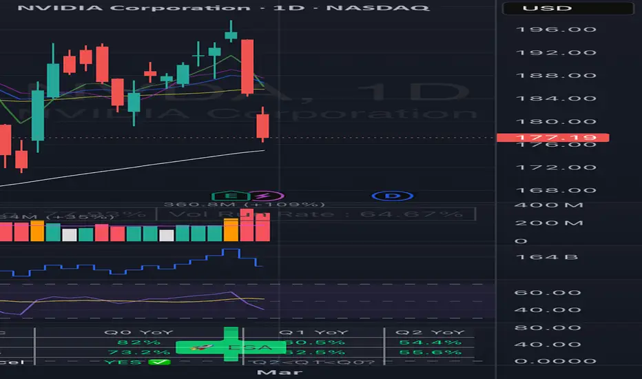
Earnings and Sales Acceleration [skm]Earnings & Sales Acceleration (ESA)
Identifies stocks where both EPS and revenue growth are accelerating over three consecutive quarters on a year-over-year basis -- the "second derivative" of earnings growth popularised by investors like Stanley Druckenmiller. The idea is that a company posting an increasing YoY growth rate each quarter is building fundamental momentum the market often underestimates.
HOW ACCELERATION IS DEFINED
EPS Acceleration: YoY EPS growth must be strictly increasing across three consecutive quarters -- Q2 < Q1 < Q0 (oldest to newest). Each quarter is compared to the same quarter one year prior (4 earnings events back).
Revenue Acceleration: Same logic applied to YoY revenue growth. For newly listed stocks with limited history, TradingView's pre-calculated REVENUE_ONE_YEAR_GROWTH field is used as a fallback.
Strong Signal: Triggered only when both EPS and Revenue are simultaneously accelerating. This dual confirmation reduces false positives.
WHAT IS PLOTTED
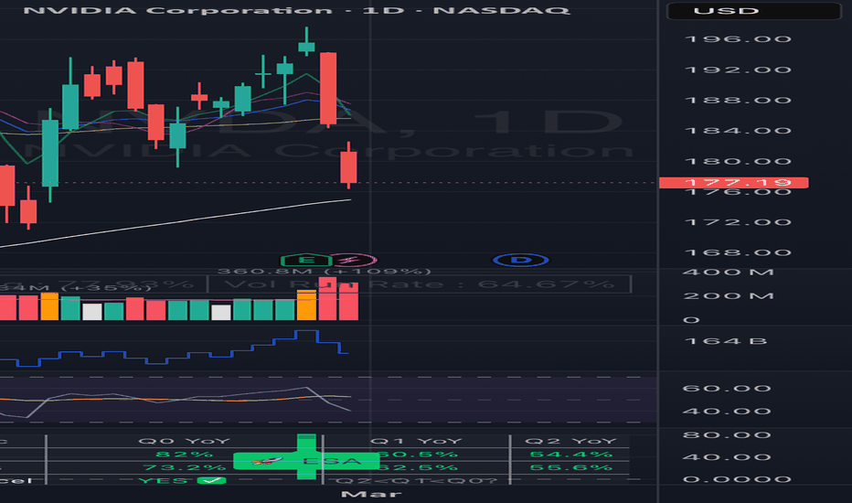
- EPS YoY% columns at each earnings bar. Green = EPS accelerating, Red = not.
- Sales YoY% columns at each earnings bar. Green = Sales accelerating, Red = not.
- ESA label above the bar on a Strong Acceleration signal.
- DEC label below the bar on a Strong Deceleration signal.
- All visuals appear only at earnings event bars, keeping the chart clean.
A summary table in the top-right shows Q0, Q1, Q2 YoY growth for both EPS and Sales, plus YES/NO acceleration status and the overall signal.
HOW TO USE IN PINE SCREENER
The indicator exposes three screener outputs:
"Accel Signal = 1" -- Both EPS and Revenue accelerating for 3 consecutive quarters (strictest filter).
"EPS Accel Signal = 1" -- EPS alone accelerating for 3 consecutive quarters.
"Rev Accel Signal = 1" -- Revenue alone accelerating for 3 consecutive quarters.
To use: open the Stock Screener, click Filters, scroll to Add Indicator, search for "Earnings & Sales Acceleration" and add it. Set your chosen condition to = 1.
For best results, combine with additional filters such as minimum market cap, average volume above 500K, and a trend condition (e.g. price above the 50-week EMA) to ensure chart structure supports the fundamental thesis.
ALERTS
Two alert conditions are included: Strong Dual Acceleration (both metrics accelerating) and Strong Dual Deceleration (both decelerating). Set these via right-click on the indicator name.
LIMITATIONS
- Requires TradingView fundamental data. Not available for ETFs, indices, forex or crypto.
- Stocks with fewer than 6 quarters of history will show N/A for EPS acceleration.
- When the prior year quarter had negative EPS, YoY percentages should be interpreted with caution.
- Best viewed on Weekly charts to align with the quarterly earnings cadence. 指標
指標

指標

指標

指標

指標

指標

Crude Oil Macro Regime IndicatorWhat this indicator is trying to answer
“What macro environment is crude oil (CL) trading in right now?”
It classifies each bar into one of 4 macro regimes by looking at how CL’s returns have been correlating with:
SPY (risk / equities)
DXY (US dollar)
TLT (rates / bonds proxy)
VIX (volatility / fear)
Then it paints:
a thick colored band under price (big visual regime cue) dots above bars (same color cue)
a big panel label on the last bar showing the current regime + the correlation readings
No alerts, just visuals.
Step-by-step: what it calculates
1) Pulls macro “close” data on a chosen timeframe
You pick tf (default 60 minutes). For each bar, it requests closes for:
CL (your chart symbol, using close)
SPY, DXY, TLT, VIX (using request.security)
So all comparisons are made on the same timeframe.
2) Converts prices into returns (log returns)
It computes log returns so the series are comparable:
𝑟=ln
(𝑝𝑟𝑖𝑐𝑒𝑝𝑟𝑖𝑐𝑒 )r=ln(price price)
Default retLen=1 means “bar-to-bar” returns.
3) Computes rolling correlations
Over len bars (default 120), it calculates:
cRisk = corr(CL, SPY)
cDollar = corr(CL, DXY)
cRates = corr(CL, TLT)
cVol = corr(CL, VIX)
These are correlations of returns, not prices.
4) Detects volatility expansion (shock filter)
It computes:
atr (14)
atrAvg (100 SMA of ATR)
volSpike = atr / atrAvg
So if current ATR is unusually high vs its normal, that supports a “shock” regime.
How it decides the regime (the “scoring” logic)
Each regime gets a score based on simple rules.
Whichever score is highest becomes the regime.
Regime 1 — GROWTH / RISK-ON (green)
Think: “Oil acting like a growth/risk asset.”
Score increases when:
CL is positively correlated with SPY (above thRiskOn, default 0.25)
CL is not moving with fear (CL~VIX < 0 adds a point)
Dollar isn’t strongly inversely tied (cDollar > -0.10 adds a point)
Regime 2 — INFLATION / COMMODITY (orange)
Think: “Oil behaving like inflation/commodity pressure.”
Score increases when:
SPY link is weak (cRisk < 0.15)
VIX link is muted (cVol < thVolPos)
Dollar relationship is more inverse (cDollar < -0.10)
Rates proxy relationship is positive (cRates > 0)
Regime 3 — LIQUIDITY / DOLLAR (blue)
Think: “Dollar/liquidity is the driver.”
Score increases when:
CL is strongly inverse to DXY (cDollar < thDollarInv, default -0.25)
CL is positively correlated with TLT (cRates > 0.10)
CL is not really acting like SPY (cRisk < 0.10)
Regime 4 — SHOCK / GEOPOLITICAL (red)
Think: “Fear + volatility expansion, oil moving on stress headlines / dislocations.”
Score increases when:
CL is positively correlated with VIX (cVol > thVolPos, default 0.15)
ATR is spiking (volSpike > thVolSpike, default 1.25)
CL is not acting like SPY (cRisk < 0.10)
Tie-break behavior
If two regimes tie for “best”, your selection order is effectively:
Shock → Liquidity → Growth → Inflation
(because of the chained ternary logic).
“No Data”
If correlations or volSpike are na (not enough bars / symbol mismatch / missing history), it sets regime = 0 and shows “NO DATA”.
What you see on the chart
Thick band under price
A wide colored strip plotted below price, with thickness based on ATR (bandHeightATR), colored by regime.
Dots above bars
A small circle above each bar, same color as the current regime, for quick scanning.
Big last-bar panel
On the most recent bar, it prints:
Current regime name
The four correlation numbers
ATR/ATRavg (volSpike)
timeframe + lookback length
How to “read” the panel fast
CL~SPY positive and strong → oil is trading like risk-on (Growth)
CL~DXY strongly negative → dollar/liquidity dominated tape (Liquidity)
CL~VIX positive + ATR spike → stress/shock regime (Shock)
Weak SPY link + inverse dollar + supportive rates → inflation/commodity regime (Inflation)
指標

指標

指標

AVWAP TF_ATRAdvanced Multi-Source AVWAP with ATR Filters
This indicator is a versatile tool designed to calculate the Anchored Volume Weighted Average Price (AVWAP) from four different dynamic and manual sources. Unlike traditional AVWAPs that require manual repositioning, this script uses ATR-based volatility filters to automatically detect significant price pivots and volume spikes.
Key Features
1. Automated Swing High & Low Anchoring
The indicator scans the last N bars to find the highest and lowest points. To prevent "fake" pivots, it uses an ATR Filter Multiplier.
How it works: A new anchor is only set if the new high/low exceeds the previous one by a specific multiple of the Average True Range (ATR). This ensures that the AVWAP starts from a statistically significant trend reversal point.
2. Volume Spike Detection
Automatically starts a new AVWAP calculation when a massive influx of volume occurs.
Logic: It identifies bars where volume is significantly higher than the 20-period average AND the price range (High-Low) is wider than the ATR. This helps track the "average cost" of the institutional move that caused the breakout.
3. Manual Date Anchor
For traders who want to track the volume-weighted average from a specific event (Earnings, FOMC, Yearly Open), a manual date/time input is available.
4. Multi-Timeframe (MTF) Support
You can calculate AVWAP based on a higher timeframe (e.g., Daily AVWAP displayed on a 15m chart) while maintaining calculation precision.
Input Settings & Tooltips
AVWAP Timeframe: Set the calculation period. Tip: Should be equal to or higher than your chart timeframe.
ATR Period: Defines the lookback for volatility calculation (Default: 14).
Peak/Bottom ATR Filter: Increases the requirement for a new pivot. Higher values result in more stable, long-term AVWAP lines.
Volume Multiplier: Defines what constitutes a "spike" (e.g., 2.0x the average volume).
How to Trade with this Indicator
Dynamic Support/Resistance: The Swing Low AVWAP often acts as a strong support in an uptrend, while the Swing High AVWAP acts as resistance in a downtrend.
Trend Confirmation: If the price is trading above all three AVWAPs (Swing High, Low, and Date), the sentiment is strongly bullish.
Mean Reversion: Large deviations from the Volume Spike AVWAP often lead to a "snap-back" to the mean.
Alerts: The script includes built-in alerts for price crossings. You can set a single alert for "Any alert() function call" to be notified of any AVWAP breach.
Technical Details
Language: Pine Script v5
Overlay: Yes
Alerts: Dynamic crossing alerts for all active lines. 指標

MFS - Market Footprint Strength Indicator [BySel]The MFS framework conceptualizes price dynamics through a physics-based paradigm in which price is modeled as particles influenced by force vectors rather than static data points. The core computation defines an instantaneous net force derived from three primary components: candlestick body magnitude (representing trend kinetic energy), wick resistance (interpreted as energy dissipation or reactive counterforces at support/resistance), and a user-controlled wick coefficient functioning analogously to a friction parameter. The resulting force equation captures directional impulse adjusted for opposing and reinforcing wick effects.
To obtain a stable and comparable metric across volatility regimes, the model applies renormalization using ATR (Average True Range). This converts raw amplitude into a dimensionless scale, ensuring invariance to time-varying volatility. A discrete-time summation—conceptually equivalent to numerical integration—aggregates force over a lookback window to compute an energy centroid. The final indicator is expressed as a bounded wavefunction (Ψ ∈ ), calculated as the ratio of total net force to total absolute force. Volume serves as inertial mass within this formulation, and a small epsilon constant prevents singularities from division by zero.
Signal smoothing and phase alignment are achieved through ALMA (Arnaud Legoux Moving Average), which employs a shifted Gaussian kernel rather than a conventional moving average. The Gaussian weighting function balances smoothness and responsiveness: the offset parameter biases weighting toward recent data (minimizing phase lag), while sigma controls filter bandwidth, governing the trade-off between noise suppression and sensitivity to micro-structural fluctuations.
From a state-space perspective, the zero line represents a thermodynamic equilibrium (vacuum state) where buying and selling forces are balanced. Positive and negative regions denote structural dominance by buyers or sellers, respectively. Zero crossovers function as phase transitions, analogous to symmetry breaking in physics, marking the emergence of new macroscopic trend regimes.
Finally, the architecture is compact and computationally efficient, yet extensible. More advanced signal-processing techniques—such as Laguerre filtering or Laplace-domain transformations—could further enhance detection of non-harmonic cyclical structures and improve temporal resolution of wave dynamics.
//============================================================
Roadmap from Familiarization to Mastery of the MFS Wave System for Capital Allocation and Trading Efficiency
1. Foundational Level: Understanding the “Vacuum State”
At this level, MFS should be interpreted as a directional compass identifying which side controls market order flow.
Wave above 0 (Positive Region): The Bull side is injecting net energy into the market. Prioritize long (Buy) positions exclusively.
Wave below 0 (Negative Region): The Bear side dominates the net force structure. Prioritize short (Sell) positions exclusively.
Crossover: This marks a phase transition. When the wave transitions from Red to Green, it signals the early emergence of a new bullish cycle.
Golden Rule
Never trade against the wave polarity.
If MFS is Red, avoid bottom-fishing, even if candlestick structures appear to show rejection tails.
2. Intermediate Level: Wave Morphology Analysis
A professional trader does not merely observe color; they analyze wave slope and amplitude.
A. Slope — Market Acceleration
Steep Slope: Indicates extreme momentum impulse. This is the optimal condition for pyramiding positions or maintaining trend-following exposure.
Flattening / Horizontal Slope: Energy saturation. The market is transitioning toward an accumulation or sideways consolidation regime.
B. MFS Divergence — Early Reversal Warning
This is the most critical technique at this level:
Bearish Divergence: Price prints a higher high while MFS forms a lower high. This implies that candlestick body force and volume participation are weakening despite price appreciation. Prepare to realize profits.
Bullish Divergence: Price forms a lower low while MFS prints a higher low. Selling pressure is reaching exhaustion.
3. Advanced Level: Risk Management & “Quantum Entry” Strategy
At a professional tier, MFS is deployed to optimize entry timing and dynamic position sizing.
Strategy: “The Pullback in Quantum Flow”
Rather than entering immediately upon a bullish crossover (which may introduce latency risk), wait for a structured retracement:
Trend Confirmation: MFS remains firmly established in the Positive (Green) region.
Pullback: Price retraces, yet MFS declines only marginally and does not cross below zero.
Entry Trigger: MFS curls upward again (positive acceleration resumes).
This configuration statistically offers the highest win probability with the tightest stop-loss placement.
Risk Management Framework Based on MFS
Partial De-risking: When MFS begins curving toward the zero line, reduce 50% of the position.
Full Exit: When MFS crosses the zero line (polarity shift).
4. Portfolio Manager Mindset: Parameter Optimization
As a capital allocator, parameters must be calibrated according to portfolio risk appetite and investment horizon.
Parameter Scalping Mode (Short-Term) Swing Mode (Medium-Term) Portfolio Mode (Long-Term)
MFS Length 7 – 10 14 (Default) 21 – 34
ALMA Offset 0.90 (Ultra-sensitive) 0.85 0.75 (Ultra-smooth)
Wick Factor 0.3 (Low noise filtering) 0.5 0.8 (Aggressive noise suppression)
Expert Advisory Summary
MFS Quantum Gaussian achieves maximum robustness when integrated with Market Structure analysis.
If MFS generates a Buy signal while price is confronting a major higher-timeframe resistance (H4/D1), exercise patience. Await a confirmed breakout before executing in alignment with wave direction.
Always monitor Volume.
This implementation assigns significant weighting to volume. If the wave exhibits strong displacement without proportional volume confirmation, the signal should be treated as structurally weak or potentially false. 指標

Prop Firm Account Rotation [Zupe]DISCLAIMER: Prop firm templates within the Indicator are kept as up to date as possible, but firms can update their rules and account parameters at anytime. Always verify details directly with the prop firm you're trading with before relying on this tool. The author assumes no responsibility for outdated or incorrect values.
An on-chart dashboard for managing prop firm account rotation. The strategy of trading one funded account at a time, hitting a target, then rotating to the next.
Inspired by the Prop Firm Account Rotation Guide by Pedro Taveira at Living From Trading .
Why does Prop Firm Account Rotation work? The rotation strategy isolates risk to a single account at a time, enforces disciplined stop points, reduces emotional overtrading, and creates predictable payout cycles.
Instead of monitoring multiple live accounts simultaneously, you focus on one, hit the target, stop, rotate.
What It Does Displays a compact table overlay on your chart showing the real-time status of up to 10 prop firm accounts at once. Each row tracks: Balance — Current account value DD % — Drawdown used as a percentage of the account's maximum allowed drawdown (supports both Static and Trailing DD types) Target % — Progress toward the account's profit target Daily Loss — Proximity to the account's daily loss limit Rotation — Current status: Scout, Trading, Recovery, Idle, Payout, or Breached The active account is marked with a ▶ indicator so you always know which account you're trading at a glance.
Rotation Statuses
Scout — Testing market conditions before committing funded accounts
Trading — Actively trading this account at normal risk
Recovery — Account in drawdown, trading with reduced size and patience
Idle — Waiting in the queue, untouched
Payout — Target hit, hands off until withdrawal clears
Breached — Account violated, done
Prop Firm Presets
Includes built-in templates across major futures prop firms covering a range of account types and sizes.
Selecting a template auto-fills Initial Balance, DD Limit, Profit Target, Daily Loss Limit, and DD Type. Select "Custom" to enter your own values for any firm or account not listed.
Color-Coded Risk Awareness DD % cell turns orange at 50% used and red at 75% when near drawdown. Target % cell turns green when 100% is reached, signalling it's time to rotate.
How to Use
1. Set the number of accounts you're rotating (1–10).
2. For each account, select a prop firm template or enter custom values.
3. Set the Rotation status (Trading for the one you're actively trading, Idle for the rest).
4. Update the "Current $" field as your balance changes.
5. For trailing DD accounts, enter the "Trailing $" (highest balance reached) from your broker dashboard.
6. When an account hits its target, set it to Payout and rotate to the next Idle account.
Note: This is a manual tracking overlay, it does not connect to any broker or execute trades.
指標

指標

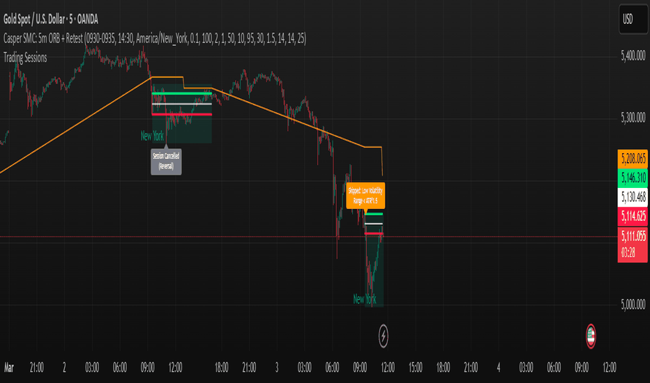
Daily Single Trade [SMRT Algo]The Daily Single Trade Indicator by SMRT Algo is a powerful yet simple tool designed for traders who value precision, discipline, and a focus on high-quality trade setups. With a unique approach, this indicator identifies just one signal daily, making it ideal for traders who prefer a structured and stress-free trading routine.
Please note that this indicator only works for timeframes below 1H.
Key Features:
Market Open & Pre-Market Analysis: The indicator focuses on the market’s opening range and identifies breakout opportunities based on price action during these critical periods.
Customizable Risk-Reward Ratio: Plan your trades with precision by setting your desired RR, ensuring that your take-profit (TP) levels are multiples of your stop-loss (SL). Stop loss is not shown with this indicator.
Price Offset for SL: Add a customizable buffer to your SL and TP levels. This offset accounts for market volatility, reducing the chances of premature stop-outs while maintaining alignment with your trading plan.
Increasing this value will lead to a greater invisible stop loss, which will increase the TP size. The opposite is occurs when decreasing this value (less than 0). If you set it as 2.5 for example for TSLA: price is 340 and SL is 330 for example, SL becomes 327.5. This calculation will then be applied to calculate the TP.
In simple terms, if the offset is positive, SL becomes larger, TP becomes larger as well.
Exit Point Visibility: Display exit points on your chart to better visualize trade targets and stop levels.
Adjustable Market Open Time: Easily modify the market open hour and minute to suit your asset’s trading session. For example, U.S. stock traders can set the market open time to 9:30 AM EST (UTC-5). 指標

BTC Momentum Trading - RSI CrossFor the third algorithm (the “trading” strategy), I built a momentum-based system using RSI crossovers on BTCUSD. This algorithm is different from my mean-reversion and trend-trading strategies because it reacts directly to short-term momentum shifts rather than trend direction or oversold conditions.
IF / THEN Logic Used (Momentum Trading)
Long Entry (Buy):
IF the RSI(14) crosses above 55,
THEN the algorithm enters a long position.
(This signals short-term upward momentum.)
Short Entry (Sell):
IF the RSI(14) crosses below 45,
THEN the algorithm enters a short position.
(This signals downside momentum.)
Long Exit:
IF I am in a long position AND RSI crosses below 50,
THEN exit the long position.
Short Exit:
IF I am in a short position AND RSI crosses above 50,
THEN exit the short position.
Purpose of the Strategy
This strategy demonstrates real-time trading behavior, where entries and exits are driven by momentum signals rather than mean reversion or trend structure. It is meant to show how an algo reacts quickly to shifts in strength/weakness in price movement.
Backtest Requirements
I ran the strategy on BTCUSD, 10-minute timeframe (Feb 16–23, 2026).
This produced:
Total trades: 1,284
Profitable trades: 27.92%
Profit factor: 0.886
Drawdown: 2.13%
The large number of trades provides a sufficient sample size for analysis, as required by the assignment. 策略

策略

指標

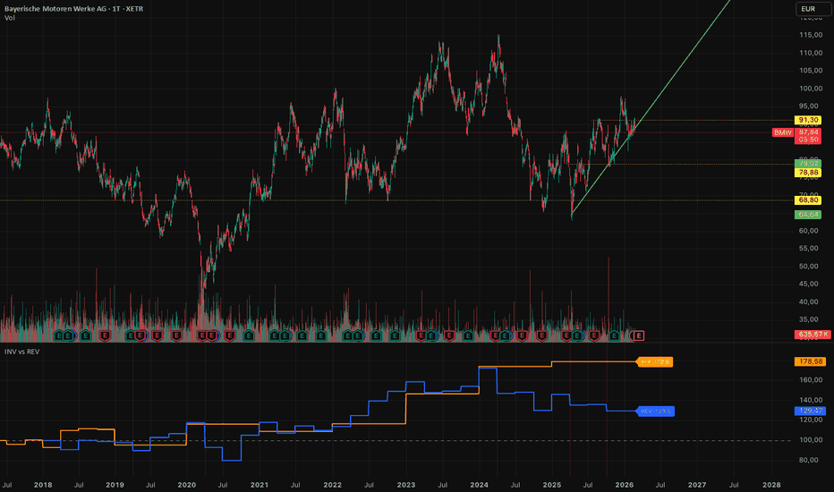
Advanced Fundamental & Technical DashboardAre you tired of constantly switching tabs to check a company's fundamental data?
The Advanced Fundamental Dashboard is a clean, fully customizable overlay that displays the most critical financial metrics and ratios directly on your chart. Designed for investors and swing traders, this script provides a quick, color-coded snapshot of a company's financial health and its current position relative to historical price extremes.
📊 Key Metrics Included:
Market Capitalization
Valuation Ratios: P/E Ratio (Price-to-Earnings) & P/S Ratio (Price-to-Sales)
Revenue 1Y Growth: Automatically calculates the 1-year trailing revenue growth.
Core Financials: EBITDA, Free Cash Flow, Total Debt, and Total Equity.
Dividend Yield: Smartly handles missing data (displays 0.00% instead of annoying "N/A" errors for non-dividend paying stocks).
Distance to ATH & ATL: Shows exactly how far the current price is from its All-Time High and All-Time Low in percentage.
✨ Smart Features & Customization:
Dynamic Coloring: Positive values and growth are automatically highlighted in green, while negative values and drawdowns are highlighted in red.
Clean UI: Gracefully handles missing data from the broker feed (e.g., showing "-" instead of script-breaking errors).
Fully Customizable: Don't like the position or the colors? Use the script settings (gear icon) to change the table's position, text size, background color, and text colors to perfectly match your chart theme (Light or Dark mode).
💡 Pro-Tip for ATH / ATL:
To get the most accurate "Distance to ATH/ATL" readings, make sure to zoom out to a Weekly (1W) or Monthly (1M) timeframe once, so TradingView can load the maximum amount of historical price data into the script's memory. 指標

策略
指標
Bitcoin Miners Max Pain (BMMP)Bitcoin Miner Max Pain (BMMP)
Core idea : Bitcoin always gravitates back toward its production cost. When price gets way too far above or below what it costs to mine a coin — and miners start showing stress signals — that's historically been where the real turning points happen.
I built the MEI to capture exactly that. It's a composite oscillator that blends four on-chain mining metrics into a single score.
---
How it works:
PPC Ratio (Price-to-Production Cost) — The backbone of the indicator. Estimates what it actually costs to produce 1 BTC using either a difficulty regression model (based on Hayes 2018), a bottom-up electricity model, or an external data feed. When price trades below production cost, miners bleed. When it's multiples above, euphoria is probably peaking.
Difficulty Momentum — Compares fast vs slow rate of change in mining difficulty. Rapidly rising difficulty = miners are expanding aggressively (often late-cycle). Collapsing difficulty = capitulation (often near bottoms).
Puell Multiple — Daily miner revenue relative to the 365-day average. Low values mean miners are earning far less than usual (stress). High values mean revenue is running hot.
Hashrate Z-Score — How far current hashrate deviates from its smoothed trend. Captures whether the network is overextended or contracting.
Each component gets normalized via rolling z-scores so they're on a comparable scale, then weighted into one number.
Reading the signals
- Below -1.5 → Strong Buy — historically these have been generational bottoms
- -1.5 to -0.5 → Accumulation zone
- -0.5 to 0.5 → Fair value / neutral
- 0.5 to 1.5 → Distribution zone
- Above 1.5 → Strong Sell — historically cycle tops
Customization
Pretty much everything is adjustable — the cost model, component weights, lookback periods, signal thresholds. You can toggle individual component lines on/off to see what's driving the composite score at any given time.
Three production cost models to choose from depending on what data you have access to. The difficulty regression works out of the box with free data. The electricity model lets you plug in your own assumptions about fleet efficiency and power costs. Or just feed in an external cost estimate if you have one.
Setup
Apply to BTCUSD daily. You'll need data feeds for difficulty, hashrate, and miner revenue — default tickers point to Quandl/Blockchain.com but alternatives from IntoTheBlock or Glassnode work too. Adjust the ticker inputs to whatever your TradingView plan supports.
Alerts included for all signal transitions — strong buy, buy, sell, strong sell, and zero-line crosses.
This isn't financial advice. It's a tool I built for my own analysis and decided to share. Do your own research, manage your risk, and don't blindly follow any indicator. 指標