Macro Liquidity Waterfall Board [The_lurker]Macro Liquidity Waterfall Board لوحة شلال السيولة الكلّية
An integrated monitoring board for the state of macro liquidity across global markets, built to answer one question with precision and clarity: where is liquidity positioned right now, and which market sectors are moving with it?
Unlike traditional liquidity indicators that compress the entire picture into a single composite number that hides its sources, this board displays liquidity as a transparent, interconnected system: every data source is visible, every information channel is separate, and every component can be traced back to its origin. The result is a complete view of the macro context in a single board, instead of scattered numbers across several tools.
🏛️ HIERARCHICAL LIQUIDITY STRUCTURE
The board displays liquidity as a tree flowing top to bottom, revealing how it propagates across market levels:
▸ Level 1 — Global Liquidity
Net liquidity is computed from the standard accounting identity: the Federal Reserve balance sheet, minus reverse repo agreements and the Treasury General Account, with an optional M2 money supply component. This is the primary engine from which the rest of the system branches.
▸ Level 2 — Asset Classes
Bonds, stocks, crypto, stablecoins, gold, and oil — each as an independent node showing its relative position within the broader landscape.
▸ Level 3 — Crypto Assets
Customizable individual coins (Bitcoin, Ethereum, Ripple, altcoins) with each one's allocation share within the crypto sector.
📊 SEPARATE INFORMATION CHANNELS
The governing design principle: no single composite number that hides the source. Each node displays its channels separately, so the trader sees why liquidity is moving, not merely that it is moving:
◆ Value and Change
The current magnitude and its percentage change over the selected period.
◆ Z-Score
The position of the current move against its historical distribution, using either standard or outlier-resistant scaling.
◆ Freshness Indicator
A colored dot revealing data age (live / delayed / stale), so you never unknowingly rely on outdated data.
◆ Relative Performance
Each node's color reflects its position against the class average: relatively outperforming or underperforming.
◆ In-Card Sparkline
The recent value trajectory inside each card at a glance.
💧 ACCOUNTING WATERFALL PANEL
The most precise element on the board, and the only real flow it displays: the decomposition of the change in global liquidity into its contributing components (Fed, reverse repo, Treasury) via an exact accounting identity — so you see exactly which source injected liquidity and which drained it, in actual dollar figures, with stale components flagged automatically.
⚙️ ANALYTICAL ENGINES
▸ Regime State Classification
The board classifies the instantaneous relationship between liquidity direction and crypto direction into four clear states:
• Concurrent Expansion — liquidity and price rising together
• Liquidity Without Price — liquidity rising while price lags
• Unsupported Rally — price rising without liquidity support
• Concurrent Contraction — liquidity and price falling together
Along with the current state's age against its historical median, so you know whether the present regime is within its usual duration or has stretched unusually long.
▸ Crypto Breadth
A cross-sectional measure revealing how many crypto assets are actually moving with the direction of liquidity. High breadth means a broad, reliable regime signal; low breadth means movement driven by one or two names — an essential distinction that guards against reading a narrow signal as a general trend.
▸ Hypothesis-Validity Line
A rolling correlation coefficient between liquidity and crypto changes, revealing when the liquidity-market relationship is currently active and when it breaks down — an honesty gauge that prevents blind reliance on the liquidity narrative when it isn't holding.
▸ Edge-Triggered Alerts
Alerts fire on state change only — no repetition, no noise. The board monitors the system on your behalf and notifies you at regime transitions, or when a data gap is detected.
▸ Timeline Ribbon
A row of colored cells showing the regime path across recent periods, so you read the state history at a single glance. Each cell's color reflects that period's state: teal for expansion, red for contraction, amber for divergence (liquidity without price, or an unsupported rally), and gray for the neutral state.
🎯 NATURE AND USE
This board is a concurrent macro-context awareness tool — designed to build a deep understanding of the current liquidity environment before making a decision, not to time specific entry or exit moments. Its natural place in any trader's system is the top layer: reading the general liquidity regime and macro context, upon which precise timing decisions are built with other tools. It answers the question: what is the macro market environment today? with depth and clarity.
🔧 TECHNICAL NOTES
◆ Inter-class flow is a relative representation, not a direct measurement — trading platforms do not provide cross-asset order flow; class color shows relative performance against the average, while the real accounting flow appears in the waterfall panel exclusively.
◆ Required data sources — FRED economic data, CRYPTOCAP, TVC, and NASDAQ; please confirm their availability within your subscription.
◆ Unit calibration — default settings are tuned for raw quoting; check the data window if a unit warning appears, to calibrate the sources.
◆ Context calibration — regime duration metrics and thresholds are built on recent market data, and may require review when the broad macro environment changes.
◆ Technical commitments — no repainting · confirmed data only · a one-period delay is intentional by design to prevent future leakage · efficient per-bar computation.
═════════════════════════════════════════════════════════════
⚠️ DISCLAIMER
═════════════════════════════════════════════════════════════
This indicator is for educational and analytical purposes only. It does not constitute financial, investment, or trading advice. Use it alongside your own strategy and risk management. Neither TradingView nor the developer is responsible for any financial decisions or losses.
══════════════════════════════════════════════════════════
══════════════════════════════════════════════════════════
Macro Liquidity Waterfall Board لوحة شلال السيولة الكلّية
لوحة رصد متكاملة لحالة السيولة الكلّية عبر الأسواق العالمية، مصمّمة لتُجيب سؤالًا واحدًا بدقّة ووضوح: أين تتموضع السيولة الآن، وأيّ قطاعات السوق تتحرّك معها؟
على عكس مؤشرات السيولة التقليدية التي تختزل الصورة كلّها في رقم واحد مركّب يُخفي مصادره، تعرض هذه اللوحة السيولة كمنظومة مترابطة شفافة: كل مصدر بياناته مرئي، كل قناة معلومات منفصلة، وكل مكوّن يمكن تتبّعه إلى أصله. النتيجة صورة كاملة للسياق الكلّي في لوحة واحدة، بدل أرقام متناثرة عبر عدّة أدوات.
🏛️ البنية الهرمية للسيولة
تعرض اللوحة السيولة كشجرة تتدفّق من الأعلى إلى الأسفل، تكشف كيف تنتقل عبر مستويات السوق:
▸ المستوى الأول — السيولة العالمية
يُحتسب صافي السيولة من الهوية المحاسبية القياسية: الميزانية العمومية للاحتياطي الفدرالي، مطروحًا منها اتفاقيات إعادة الشراء العكسية وحساب الخزانة العام، مع خيار إدراج المعروض النقدي M2. هذا هو المحرّك الأساسي الذي تتفرّع منه بقية المنظومة.
▸ المستوى الثاني — فئات الأصول
السندات، الأسهم، الكريبتو، العملات المستقرة، الذهب، والنفط — كل فئة كعقدة مستقلّة تُظهر موقعها النسبي داخل المشهد الكلّي.
▸ المستوى الثالث — أصول الكريبتو
عملات فردية قابلة للتخصيص (بيتكوين، إيثريوم، ريبل، البدائل) مع نسبة التخصيص لكل منها داخل قطاع الكريبتو.
📊 قنوات المعلومات المنفصلة
المبدأ التصميمي الحاكم: لا رقم مركّب واحد يُخفي المصدر. كل عقدة تعرض قنواتها منفصلة، فيرى المتداول لماذا تتحرّك السيولة لا مجرّد أنها تتحرّك:
◆ القيمة والتغيّر
الحجم الحالي ونسبة تغيّره عبر الفترة المختارة.
◆ الدرجة المعيارية (Z-Score)
موقع الحركة الحالية مقابل توزيعها التاريخي، بمقياس قياسي أو مقاوم للقيم الشاذّة.
◆ مؤشر حداثة البيانات
نقطة ملوّنة تكشف مدى حداثة بيانات كل مصدر (حديثة / متأخّرة / قديمة). بعض المصادر تتحدّث بترددات مختلفة — بيانات الفدرالي أسبوعية، والمعروض النقدي شهري، بينما الكريبتو لحظي — فيكشف هذا المؤشر أيّ الأرقام على اللوحة حيّة الآن وأيّها قديم، حتى لا تبني قرارًا على قيمة لم تُحدَّث منذ فترة.
◆ الأداء النسبي
لون كل عقدة يعكس موقعها مقابل متوسط الفئات: متفوّقة أم متخلّفة نسبيًا.
◆ الخط البياني المصغّر
مسار القيمة الأخير داخل كل بطاقة بلمحة.
💧 لوحة الشلال المحاسبي
العنصر الأكثر دقّة في اللوحة، ويعرض التدفّق الحقيقي الوحيد فيها: تفكيك تغيّر السيولة العالمية إلى مكوّناته المساهِمة (الفدرالي، إعادة الشراء العكسية، الخزانة) بهوية محاسبية دقيقة — فترى بالضبط أيّ مصدر ضخّ سيولة وأيّها سحبها، بأرقام دولارية فعلية، مع تمييز المكوّنات القديمة تلقائيًا.
⚙️ المحرّكات التحليلية
▸ تصنيف حالة النظام
تُصنّف اللوحة العلاقة اللحظية بين اتجاه السيولة واتجاه الكريبتو إلى أربع حالات واضحة:
• توسّع متزامن — السيولة والسعر يرتفعان معًا
• سيولة بلا سعر — السيولة ترتفع بينما السعر يتخلّف
• رالي غير مدعوم — السعر يرتفع دون دعم السيولة
• انكماش متزامن — السيولة والسعر ينخفضان معًا
مع عمر الحالة الحالي مقابل وسيطها التاريخي، فتعرف إن كان النظام الراهن ضمن مدّته المعتادة أم امتدّ بشكل غير اعتيادي.
▸ اتّساع الكريبتو
مقياس مقطعي يكشف كم أصلًا من أصول الكريبتو يتحرّك فعليًا مع اتجاه السيولة. اتّساع عالٍ يعني إشارة نظام واسعة يُوثَق بها؛ اتّساع منخفض يعني حركة يقودها أصل أو اثنان — تمييز جوهري يحمي من قراءة إشارة ضيّقة على أنها اتجاه عام.
▸ مؤشر صلاحية الفرضية
معامل ارتباط متدحرج بين تغيّرات السيولة والكريبتو، يكشف متى تكون العلاقة بين السيولة والسوق فاعلة الآن ومتى تتعطّل — أداة تحقّق تمنع الاعتماد الأعمى على سردية السيولة حين لا تكون قائمة.
▸ تنبيهات عند التغيّر فقط
تنبيهات تُطلَق على تغيّر الحالة فقط — لا تكرار ولا ضجيج. اللوحة تراقب المنظومة نيابةً عنك وتُعلمك عند الانتقال بين الأنظمة، أو عند اكتشاف فجوة في البيانات.
▸ شريط الخط الزمني
صفّ من الخلايا الملوّنة يعرض مسار النظام عبر الفترات الأخيرة، فترى تاريخ الحالة بلمحة بصرية واحدة. لون كل خلية يدلّ على حالة تلك الفترة: أزرق للتوسّع، أحمر للانكماش، برتقالي للتباعد (سيولة بلا سعر أو رالي غير مدعوم)، ورمادي للحالة المحايدة.
🎯 طبيعة اللوحة واستخدامها
هذه اللوحة أداة وعي بالسياق الكلّي المتزامن — تُصمَّم لبناء فهمٍ عميق لبيئة السيولة الراهنة قبل اتّخاذ القرار، لا لتوقيت لحظات دخول أو خروج محدّدة. موقعها الطبيعي في منظومة أي متداول هو الطبقة الأعلى: قراءة نظام السيولة العام والسياق الكلّي، الذي تُبنى فوقه قرارات التوقيت الدقيقة بأدوات أخرى. تُجيب سؤال: ما بيئة السوق الكلّية اليوم؟ بعمق ووضوح.
🔧 ملاحظات فنّية
◆ التدفّق بين فئات الأصول تمثيل نسبي، لا قياس مباشر — منصّات التداول لا توفّر تدفّق أوامر عبر-أصلي؛ لون الفئة يعرض الأداء النسبي مقابل المتوسط، بينما التدفّق المحاسبي الحقيقي يظهر في لوحة الشلال حصريًا.
◆ مصادر البيانات المطلوبة — بيانات FRED الاقتصادية، وCRYPTOCAP، وTVC، وNASDAQ؛ يُرجى التأكّد من توفّرها ضمن اشتراكك.
◆ معايرة الوحدات — الإعدادات الافتراضية مضبوطة على القيم الخام كما ترد من المصدر؛ راجع نافذة البيانات عند ظهور إنذار الوحدات لضبط المصادر.
◆ معايرة السياق — مقاييس مدّة الأنظمة وحدودها مبنية على بيانات السوق الحديثة، وقد تحتاج مراجعة عند تغيّر البيئة الكلّية الكبرى.
◆ الالتزامات التقنية — بلا إعادة رسم · اعتماد على البيانات المؤكّدة فقط · تأخير فترة واحدة مقصود بالتصميم لضمان عدم التسرّب المستقبلي · حساب فعّال لكل شمعة.
═════════════════════════════════════════════════════════════
⚠️ إخلاء المسؤولية
═════════════════════════════════════════════════════════════
هذا المؤشر لأغراض تعليمية وتحليلية فقط. لا يُمثل نصيحة مالية أو استثمارية أو تداولية. استخدمه بالتزامن مع استراتيجيتك الخاصة وإدارة المخاطر. لا يتحمل TradingView ولا المطور مسؤولية أي قرارات مالية أو خسائر. 指標

Average Price Sideways Detector - Gap Neutral## Average Price Sideways Detector – Gap Neutral
The **Average Price Sideways Detector (APSD)** is designed to identify bullish, bearish, and sideways market conditions by analyzing the behavior of the average price derived from each candle's **High, Low, and Close (HLC3)**.
Unlike conventional trend indicators, APSD focuses on **average-price direction, price compression, and persistence** to identify periods where the market is genuinely moving sideways.
### How It Works
For every candle, the indicator calculates the typical price:
**Typical Price = (High + Low + Close) / 3**
It then analyzes three primary characteristics:
**Average Price Slope:** Measures the directional movement of the average price. A nearly flat slope indicates a potential sideways market.
**Price Compression:** Measures how tightly recent average prices are grouped. Lower compression ranges indicate consolidation and reduced directional movement.
**Sideways Persistence:** A sideways condition must remain valid for a specified number of consecutive candles before it is confirmed. This helps reduce temporary and false sideways signals.
### Gap-Neutral Calculation
The indicator resets its internal price calculation at the beginning of each new trading day. Therefore, overnight **gap-ups and gap-downs do not directly distort the current session's sideways analysis**.
This feature is particularly useful for intraday markets where significant opening gaps can otherwise influence rolling indicators for several candles.
### Indicator Interpretation
🟢 **Green Line** – Bullish price momentum
🔴 **Red Line** – Bearish price momentum
⚪ **Gray Line** – Neutral or sideways market condition
When a sideways market is fully confirmed through both flatness and compression conditions, the oscillator moves to the **zero line**.
The upper and lower threshold levels help separate meaningful directional movement from the neutral zone.
### Key Features
* Based primarily on High, Low, and Close average-price behavior
* Identifies price compression and average-price flatness
* Confirms sideways conditions using consecutive candles
* Gap-neutral session-based calculation
* Separates bullish, bearish, and sideways market conditions
* Adjustable sensitivity and confirmation settings
* Designed primarily for intraday market analysis
### Important Note
The indicator should be used as a market-condition detection tool rather than as a standalone buy or sell signal. Settings may need adjustment depending on the instrument, timeframe, and prevailing market volatility.
**Developed by Firozstar**
指標

Post-Earnings Return DashboardPost-Earnings Return Dashboard
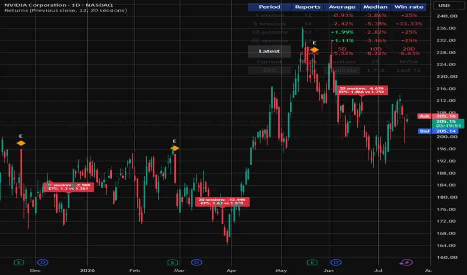
Post-Earnings Return Dashboard is designed to show how a stock has historically performed after earnings reports.
The script automatically detects earnings events using TradingView’s built-in earnings data, calculates post-earnings returns over several periods, and displays the results in an on-chart dashboard.
What the indicator measures
For each detected earnings report, the indicator calculates the stock’s return after:
1 trading session
5 trading sessions
10 trading sessions
20 trading sessions
The return is calculated using:
Return = Future closing price divided by the selected reference price, minus 1, multiplied by 100.
Dashboard statistics
For each return period, the dashboard displays:
Reports — the number of completed earnings observations included in the calculation
Average — the average return across the selected earnings history
Median — the middle result when all returns are arranged from lowest to highest
Win rate — the percentage of earnings events that produced a positive return
A return of exactly 0% is not counted as a win.
The number of observations may differ between periods because the latest earnings report may not yet have completed the 10-session or 20-session measurement window.
Latest row
The Latest row shows the completed returns following the most recently detected earnings report.
1D — return after 1 trading session
5D — return after 5 trading sessions
10D — return after 10 trading sessions
20D — return after 20 trading sessions
Once a measurement period has completed, its value is stored and does not continue changing.
If the latest earnings event occurred fewer than 20 sessions ago, some longer-period values may remain blank.
Current row
The Current row shows the live return from the latest earnings reference price to the current closing price.
It also displays:
Sessions — the number of trading sessions since the latest detected earnings report
Ticker — the symbol currently displayed on the chart
For example, Current -4.42%, Sessions 17, TSM means the stock is currently trading 4.42% below its selected earnings reference price, 17 trading sessions after the latest report.
EPS row
The bottom row displays information about the latest detected earnings event.
EPS — the reported earnings per share
Estimate — the analyst EPS estimate
Last X — the maximum number of recent earnings reports included in the historical statistics
For example, EPS 4.221, Estimate 3.81, Last 12 means the company reported EPS of 4.221 against an estimate of 3.81, while the dashboard is configured to use up to the latest 12 earnings reports.
Return starting price
The indicator provides two reference-price options.
Previous close
Uses the closing price immediately before the earnings bar.
This is generally the most consistent option for measuring the full market reaction when the exact earnings-release timing is unknown.
Earnings-bar close
Uses the closing price of the bar on which TradingView registers the earnings event.
This may be more appropriate when the report is known to have been released after that trading session closed.
Historical sample size
Users can choose how many recent earnings reports are included in the statistics.
For a company reporting quarterly:
4 reports is approximately 1 year
8 reports is approximately 2 years
12 reports is approximately 3 years
20 reports is approximately 5 years
A smaller sample may better reflect recent behaviour, while a larger sample may provide a broader long-term view.
Chart markers and labels
The indicator can optionally:
Mark earnings dates with an E symbol
Display historical post-earnings return labels
Show the selected 1, 5, 10, or 20-session return directly on the chart
Display reported and estimated EPS where available
These options can be disabled to keep the chart clean.
Recommended timeframe
This indicator is designed for use on the daily chart.
The script counts chart bars as trading sessions.
On a daily chart:
1 bar equals 1 trading session
5 bars is approximately 1 trading week
20 bars is approximately 1 trading month
Using the indicator on an intraday chart will cause it to count intraday candles rather than trading days, which will produce misleading results.
How to interpret the statistics
The statistics should be considered together rather than individually.
A positive average, positive median, and high win rate may indicate historically consistent post-earnings strength.
A positive average with a negative median may mean that a small number of large gains are distorting the average.
A high win rate with a low average may indicate frequent small gains but occasional large losses.
A low win rate with a positive average may indicate less frequent but much larger winning reactions.
A negative average and negative median may indicate persistent post-earnings weakness over the selected sample.
Potential uses
This indicator may be useful for:
Reviewing a stock before an upcoming earnings report
Studying post-earnings announcement drift
Comparing the latest earnings reaction with previous reports
Assessing whether earnings gaps tend to continue or reverse
Identifying stocks with historically consistent earnings reactions
Supporting swing-trade research
Comparing post-earnings behaviour across different stocks
Evaluating whether holding after earnings has historically been favourable
Data source
The script retrieves earnings information through TradingView’s built-in request.earnings function.
It uses:
Reported EPS
Estimated EPS
The earnings event bar supplied by TradingView
The indicator does not scrape company filings or external websites.
Results depend on the earnings and price history available for the selected symbol on TradingView.
Limitations
TradingView does not consistently expose the precise release time for every earnings report.
The script may therefore be unable to determine whether an individual report was released before market open, during the trading session, or after market close.
This can affect which closing price most accurately represents the price immediately before the market received the information.
The indicator measures raw stock returns and does not currently adjust for overall market performance, sector performance, index movement, dividends, currency changes, volatility, earnings gap size, revenue surprises, or forward guidance.
A positive return does not necessarily mean the stock outperformed the wider market.
指標

VWAP Mean Reversion Strategy with Session and Volume FilterDescription:
Volume Weighted Average Price, is one of the most referenced levels on any intraday chart. It appears on almost every institutional trading desk as a benchmark for execution quality: did you buy below VWAP or above it? Did you sell above it or below it? That institutional significance is what makes it useful as a trading level, not because it is a magical support and resistance line, but because enough participants are watching it and acting around it that it creates real, observable price behavior.
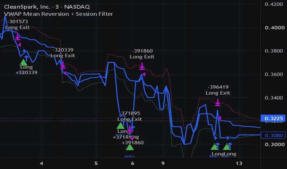
This strategy is built around one of the most consistent behaviors VWAP produces: mean reversion. In sessions with no strong directional trend, price tends to oscillate around VWAP rather than trending away from it indefinitely. When price moves significantly above VWAP in a non-trending session, institutional sellers often step in, bringing price back toward the average. When price moves significantly below VWAP, buyers who missed the open use VWAP as a reference level for value. The result is a gravitational pull back toward VWAP that is observable, repeatable, and, with the right filters, tradable.
What VWAP Actually Measures
VWAP is calculated by summing the product of price and volume for every transaction during a session, then dividing by total volume. The result is the average price at which the instrument has traded during the day, weighted by how much traded at each price. A stock trading at $102 when VWAP is $100 means that, on average, every share transacted during the session changed hands at $100, and the current price is 2% above that average. Whether that premium is justified depends on whether volume is expanding in the direction of the move or shrinking, which is exactly what this strategy checks.
VWAP resets every session. This is important: VWAP is an intraday concept. Using it on daily charts or holding positions across sessions removes the institutional context that makes it meaningful. This strategy trades only within the active session for that reason.
The Mean Reversion Logic
Entries fire when two conditions are met simultaneously. First, price must have moved a defined distance away from VWAP, measured in ATR multiples to scale the threshold to the instrument's actual volatility rather than a fixed percentage. Second, volume on the move away from VWAP must be declining relative to its recent average. This second condition is the critical filter. A price move away from VWAP accompanied by expanding volume suggests a real directional move with genuine participation, shorting into that is dangerous. A move away from VWAP on declining volume suggests the move is losing conviction and the pull back to VWAP is more likely.
When price is above VWAP by more than the ATR threshold and volume is declining, a short entry fires. When price is below VWAP by more than the ATR threshold and volume is declining, a long entry fires. The target for both is VWAP itself — not a fixed ATR level, but the actual VWAP value at the time the target would be hit. Stop-loss is placed at an ATR multiple beyond the entry in the opposite direction from VWAP.
Session Filter
The strategy only trades between 9:45 AM and 3:15 PM ET. The first 15 minutes after the NYSE open are excluded deliberately. The opening session is when the largest institutional orders are being executed, VWAP has barely formed, and the spread between price and VWAP frequently reflects genuine price discovery rather than mean reversion opportunity. Trading into the first 15 minutes with a mean reversion approach is trading against the most aggressive order flow of the day. The final 45 minutes are excluded because end-of-day institutional rebalancing often moves price away from VWAP and keeps it there through the close, a mean reversion entry in that window frequently doesn't have time to play out before the session ends and the position needs to be closed.
What This Strategy Works Best With
VWAP mean reversion is most effective on highly liquid instruments where institutional participation is consistently high, major equity indices, large-cap individual stocks, and equity index futures. On thinly traded instruments, VWAP is less meaningful as a reference level because the institutional volume that creates the gravitational pull isn't present. On crypto markets, VWAP mean reversion can work but requires adjusting the session definition since crypto trades continuously, not in defined daily sessions.
What to Watch in Backtesting
Performance will vary significantly by market regime. In strongly trending sessions, where a catalyst like an earnings surprise, a Fed announcement, or a macro data release drives sustained directional movement, mean reversion against the trend produces losing trades. This is expected and not a flaw. Check the strategy's performance separately on trending days versus range-bound days if you can identify them. The most useful insight from backtesting this strategy is often not the aggregate win rate but the distribution of trade outcomes across different session types.
Shared for educational purposes and community discussion. This is not investment advice. Always backtest on your own instruments and timeframes using realistic commission assumptions before drawing any conclusions. 策略

Fund + Pullback Screener v5Fund + Pullback Screener — fundamental filter + pullback entry signal
WHAT IT DOES
This indicator combines fundamental screening and technical entry timing in a single tool. The logic is two-stage: a stock is first checked against fundamental criteria, then against a pullback setup (a retracement within an uptrend). All checks are displayed in an on-chart table: value, threshold, pass/fail.
PRESETS
5 built-in fundamental filter modes (switchable in settings):
- GARP — quality companies at a reasonable price: P/E 8–35, ROE > 15%, operating margin > 15%, EPS growth > 10%, Debt/Equity < 1, PEG < 2
- Growth — profitable companies with aggressive growth: P/E up to 120, EPS growth > 25%, revenue growth > 20%, PEG < 3
- Deep Value — cheap and profitable: P/E 5–18, PEG < 1.2, Debt/Equity < 0.7
- Emerging Growth — pre-profit hypergrowth (P/E, PEG, EPS, ROE are not used): revenue growth > 30%, revenue acceleration, gross margin > 40%, improving operating margin, Rule of 40, share dilution < 8%
- Custom — manual thresholds
SIGNAL LOGIC
Status in the table: NO / WATCH / ENTRY.
- Trend filter: weekly timeframe, price above SMA200 and SMA50 above SMA200. For young companies without 200 weeks of history, it automatically falls back to SMA50.
- WATCH: fundamentals passed, uptrend intact, RSI below 50, price within 4 ATR of support (pivot low or SMA50). A candidate to monitor.
- ENTRY: RSI in the 30–50 zone turning up, price within 1.5 ATR above support (an undercut down to 0.5 ATR is allowed). Shown as a triangle below the bar.
Distances are measured in ATR units, so the logic automatically adapts to each instrument's volatility.
HANDLING UNAVAILABLE DATA (N/A POLICY)
Some sectors structurally lack certain metrics (e.g., gross margin for insurers). Lenient mode (default) skips up to 2 unavailable metrics, marking them with a gray "–" and showing a skip counter. Core metrics (market cap, revenue growth) are never skipped. Strict mode: any unavailable metric = fail.
HOW TO USE
1. Recommended timeframe — daily.
2. Pick the preset matching the company type: mature names — GARP/Deep Value, expensive growers — Growth, pre-profit — Emerging Growth.
3. Shortlist candidates with the native TradingView screener, add them to a watchlist and flip through the charts — the table instantly shows the full picture for each ticker.
4. All thresholds are configurable in the settings.
LIMITATIONS
- Works on stocks only — crypto, forex and futures have no fundamental data.
- EPS and revenue growth are computed from the history of quarterly reports accumulated on the chart: full history is required (at least 8–9 quarters), otherwise growth metrics show n/a.
- Fundamental data updates quarterly as reports are released.
- The indicator is informational only and is not investment advice. 指標

Gold Dual-Model Fair Value [Regime Adaptive]█ OVERVIEW
Gold Dual-Model Fair Value is a chart overlay that plots two competing fair value estimates for gold, one regressed on the 10 year real yield and one regressed on a global M2 money supply composite, then combines them into a single fair value line by continuously measuring which model currently fits better. The thesis: gold's dominant macro driver is not constant, so a useful fair value model must detect the driver in force rather than assume it.
█ HISTORY / BACKGROUND
The inverse relationship between gold and real interest rates is one of the most widely documented regularities in the asset's modern history and is treated in academic work such as Erb and Harvey's "The Golden Dilemma" (2013). That relationship visibly weakened after 2022, when gold rose while real yields climbed to multi year highs, a divergence commonly attributed to price insensitive official sector buying. Macro strategists, notably Jurrien Timmer, have illustrated this as a regime change in which a real yield model stops explaining gold and a global liquidity model takes over.
The weakness of that illustration is that the regime break is declared after the fact, by inspection. This script's contribution is to make the regime decision endogenous: both models are estimated continuously, and the model in force is chosen by trailing out of sample fit, with no hardcoded break date. The regime change around 2022, if present in the data, emerges from the computation rather than being asserted.
█ HOW IT WORKS
All computation runs on the chart timeframe. The script requests the following series with request.security at the chart resolution, with no lookahead: FRED:DFII10 (10 year TIPS real yield), five M2 series (ECONOMICS:USM2, CNM2, EUM2, JPM2, GBM2) and four conversion rates (FX_IDC:CNYUSD, EURUSD, JPYUSD, GBPUSD).
Step 1. Global M2 composite. Each enabled non US component is converted to US dollars and the enabled components are summed. Two aggregation modes exist. Spot FX converts at the current exchange rate, replicating the standard global liquidity composite. Constant FX converts every bar at the rate captured on the first bar at or after a user defined anchor date, which freezes the currency translation effect and isolates changes in underlying money stocks. The composite is na until every enabled component has data, so its membership never changes mid history and no artificial level jumps are introduced.
Step 2. Two rolling regressions. Over a rolling fit window the script estimates ordinary least squares coefficients from running moments (beta equals covariance over variance, alpha equals mean of y minus beta times mean of x):
• Model A regresses the natural log of the chart close on the level of the 10 year real yield.
• Model B regresses the natural log of the chart close on the natural log of the M2 composite.
Each model produces a log fair value each bar from its current alpha, beta and regressor value.
Step 3. Fit measurement. Each model's residual (log price minus log fair value) is squared and averaged over a shorter trailing evaluation window; the square root is that model's rolling RMSE.
Step 4. Regime and combination. Two output modes:
• Blend (default): the combined log fair value is a weighted average of the two model fair values with weights proportional to inverse RMSE, so the better fitting model dominates smoothly.
• Hard switch: the combined fair value is the fair value of the incumbent model, and the incumbent only changes when the challenger's RMSE beats it by a user set hysteresis margin, which prevents rapid flip flopping when the models fit similarly.
Independently of the mode, the hard switch state machine always runs and its current state is reported in the table and as the background tint, so blend users can still see the discrete regime call.
Step 5. Deviation statistics. The deviation is log price minus combined log fair value. Its rolling standard deviation over the evaluation window defines a z score, and bands are drawn at the fair value times e to the plus and minus (band multiple times sigma). The z score's percent rank over a user defined lookback gives a deviation percentile.
If one model's inputs are unavailable (for example the M2 composite before all enabled components exist), the combined fair value falls back to the available model alone.
█ HOW TO USE
Apply the indicator to a gold chart (spot, futures or a fund proxy) on the weekly timeframe. Weekly is the design resolution for a structural reason: the M2 inputs are monthly series, so on lower resolutions the liquidity regressor is a long staircase while the real yield updates daily, which biases the fit comparison toward the real yield model for reasons unrelated to explanatory power. The default windows (156 and 52 bars) are calibrated as roughly three years and one year of weekly bars. An on chart warning label appears on intraday charts.
Visual elements:
• Orange line: the combined fair value, the primary output.
• Blue thin line: Model A fair value (real yields). Red thin line: Model B fair value (global liquidity). Comparing their paths shows where each model succeeded or failed.
• Gray bands and fill: the plus and minus sigma envelope around the combined fair value. Price above the upper band is statistically rich against the currently fitting model mix, below the lower band statistically cheap, between the bands unremarkable.
• Background tint: blue when the hard switch regime is the real yield model, red when it is the liquidity model.
• Status table: hard switch regime, active mode, each model's RMSE, the real yield model's blend weight, the deviation z score (colored when beyond the band multiple), its percentile, and the M2 aggregation mode.
Interpretation cautions. The fair value is a rolling fit, so a deviation can close either by price moving toward the line or by the line re estimating toward price; a band touch is a valuation observation, not a mechanical entry signal. The regime readout tells you which catalyst matters: in the liquidity regime, a cheap reading resolves with money supply reacceleration rather than falling yields. Comparing Spot FX and Constant FX modes shows how much of the liquidity signal is currency translation rather than money creation; if a stretched reading shrinks materially under Constant FX, part of it was the US dollar itself.
█ SETTINGS
Model group:
• Regression fit window (bars), default 156: the rolling OLS estimation window for both models.
• Fit evaluation window (bars), default 52: the trailing window for RMSE, regime detection and deviation sigma.
• Regime mode, default Blend (inverse RMSE weights): selects between the blended fair value and the hard switch fair value.
• Switch hysteresis (%), default 10: hard switch mode only, the margin by which the challenger RMSE must beat the incumbent before the regime flips.
• Deviation band (sigma), default 2.0: the band multiple and the z score threshold for table coloring.
• Deviation percentile lookback (bars), default 260: the window for the z score percent rank.
Global M2 composite group:
• FX aggregation, default Spot FX: Spot FX or Constant FX (anchor date), as described above.
• Constant FX anchor date, default 1 January 2018: the date whose exchange rates are frozen in Constant FX mode.
• US M2, China M2, Eurozone M2, Japan M2, UK M2, all enabled by default: component toggles. Disabling a short history component lets the composite, and therefore Model B, begin earlier.
Display group:
• Show individual model lines, default on.
• Show deviation bands, default on.
• Show status table, default on.
• Regime background tint, default on.
• Table position, default top right.
█ WHAT MAKES IT ORIGINAL
Published global M2 composites plot the liquidity series itself, usually with a fixed time offset against an asset, and published regime indicators classify price behavior such as trending versus ranging. This script occupies a different intersection and does three things no script in either group does:
• It converts both macro drivers into explicit fair value estimates via rolling least squares regression rather than displaying the raw series, so the drivers and the asset live on the same axis and disagreement between them is measurable in price terms.
• It selects or weights the two models by trailing out of sample RMSE, so the widely discussed post 2022 handoff from real yields to liquidity is detected by the data instead of hardcoded, and any future handoff back requires no code change.
• Its liquidity composite offers a Constant FX aggregation mode alongside the standard Spot FX mode. Spot converted composites embed the US dollar's own fluctuations, which are correlated with gold, into the liquidity measure. The Constant FX mode removes that translation effect, giving users a built in test of how much of the liquidity signal is monetary and how much is currency denomination. To this author's knowledge no published composite exposes this distinction.
█ NOTES / LIMITATIONS
• The M2 inputs are monthly economic series requested at the chart resolution. They hold their value between releases, so the liquidity fair value moves in steps between prints, and releases arrive with publication lag.
• Economic series are subject to vendor revisions. A revised M2 or real yield history changes the regression inputs, so the historical fair value shown today can differ from what the script displayed in real time. This is a property of the data, not lookahead: the script uses no lookahead and requests no timeframe above the chart's.
• Model B is na until every enabled M2 component and its conversion rate have history, and each regression additionally needs the full fit window plus evaluation window of bars before its output and RMSE are defined. On deep weekly gold history the real yield model also cannot begin before the real yield series itself starts in 2003. Expect a substantial warm up period at the left edge of the chart, during which the script falls back to whichever single model is available, or plots nothing.
• The logic is designed for the weekly timeframe. On daily and lower resolutions the mixed update frequencies of the regressors distort the fit comparison, the default windows lose their intended calendar meaning, and an on chart label warns on intraday charts.
• The script uses the chart symbol's close as the dependent variable. Its economic reasoning applies to gold denominated symbols; applied to unrelated symbols it will still compute, but the output has no stated meaning.
• The fair value lines are descriptive regression fits over past data. They quantify the historical relationship between gold and each driver and say nothing about future prices. 指標

Realized Price by Baal Hadad v2 (multi-source)Based on "Realized Price" by Baal Hadad (open-source, MPL 2.0).
The original relied on IntoTheBlock's MVRV feed, which stopped updating on August 15, 2025 and was marked as discontinued by TradingView — the indicator froze. This version fixes that with a multi-source data cascade and adds self-diagnostics.
WHAT IT SHOWS
Realized Price is the average price at which each coin last moved on-chain — the market's aggregate on-chain cost basis. When spot price falls below realized price, the average holder is underwater; historically this marks capitulation zones and potential cycle bottoms. Multiples above it mark overheated zones.
Realized Price = Realized Cap / Circulating Supply
DATA SOURCES (NEW)
Realized Cap, by priority: Custom symbol → CoinMetrics RealCap (direct) → Custom MVRV → IntoTheBlock MVRV (derived as Market Cap / MVRV).
Circulating Supply: Custom → Glassnode → IntoTheBlock → Market Cap / Price (unbreakable fallback).
A source is considered dead if it hasn't updated for N days (default 7, configurable) — the script automatically switches to the next live one. You can also force a specific source or plug in your own symbols.
DIAGNOSTICS (NEW)
An on-chart table shows every feed's status (live / lagging / dead), its last value, date and age in days; the source currently in use is marked with ►. If all Realized Cap sources go silent, the table shows FROZEN and a "data stale" alert fires — instead of silently plotting a frozen line.
DISPLAY
- Realized Price smoothed by MA (default EMA 30 as in the original; SMA / WMA / RMA / HMA / HEMA selectable), optional raw line
- Lower bands: −30% / −50% / −70% (green, accumulation zones)
- Upper bands: ×2 / ×3 / ×4 / ×5 (red, distribution zones)
- Background highlight when price crosses a band; band and signal logic unchanged from the original
- Synthetic MVRV = Market Cap / Realized Cap in the Data Window — replaces the dead ITB feed
ALERTS
Buy zone, Sell zone, Data stale.
NOTES
The coin is detected automatically from the chart ticker, so it works on any coin covered by CoinMetrics / Glassnode — not just BTC / ETH / LTC. On-chain metrics are daily; use on the D timeframe or higher.
==================================================================================
Основано на "Realized Price" от Baal Hadad (открытый код, MPL 2.0).
Оригинал опирался на фид MVRV от IntoTheBlock, который перестал обновляться 15 августа 2025 и помечен TradingView как discontinued — индикатор замер.
Эта версия решает проблему каскадом источников данных и добавляет самодиагностику.
ЧТО ПОКАЗЫВАЕТ
Realized Price (реализованная цена) — средняя цена, по которой каждая монета в последний раз двигалась в блокчейне, то есть совокупная ончейн-себестоимость рынка. Когда спотовая цена уходит ниже реализованной, средний держатель в убытке — исторически это зоны капитуляции и потенциального дна цикла. Кратные превышения — зоны перегрева.
Realized Price = Realized Cap / Circulating Supply
ИСТОЧНИКИ ДАННЫХ (НОВОЕ)
Realized Cap, по приоритету: Custom-символ → CoinMetrics RealCap (напрямую) → Custom MVRV → IntoTheBlock MVRV (расчёт как Market Cap / MVRV).
Circulating Supply: Custom → Glassnode → IntoTheBlock → Market Cap / Price (несгораемый фолбэк).
Источник считается мёртвым, если не обновлялся N дней (по умолчанию 7, настраивается) — скрипт автоматически переключается на следующий живой. Можно принудительно выбрать конкретный источник или подключить свои символы.
ДИАГНОСТИКА (НОВОЕ)
Таблица на графике показывает статус каждого фида (live / lagging / dead), последнее значение, дату и возраст в днях; активный источник помечен ►. Если все источники Realized Cap замолчали, таблица показывает FROZEN и срабатывает алерт "data stale" — вместо того чтобы молча рисовать замороженную линию.
ОТОБРАЖЕНИЕ
- Realized Price, сглаженная скользящей средней (по умолчанию EMA 30, как в оригинале; на выбор SMA / WMA / RMA / HMA / HEMA), опционально сырая линия
- Нижние полосы: −30% / −50% / −70% (зелёные, зоны накопления)
- Верхние полосы: ×2 / ×3 / ×4 / ×5 (красные, зоны распределения)
- Подсветка фона при пересечении полос; уровни полос и логика сигналов не менялись
- Синтетический MVRV = Market Cap / Realized Cap в окне данных (Data Window) — замена умершему фиду ITB
АЛЕРТЫ
Зона покупки, зона продажи, протухание данных (data stale).
ПРИМЕЧАНИЯ
Монета определяется автоматически из тикера графика, поэтому индикатор работает на любой монете с покрытием CoinMetrics / Glassnode — не только BTC / ETH / LTC. Ончейн-метрики дневные; использовать на таймфрейме D и выше. 指標

指標

SBP Price Response EngineSBP Price Response Engine is a rule-based analytical indicator that evaluates how price responds to confirmed market reference levels. Rather than attempting to predict future direction or continuously follow trends, the indicator studies completed price interaction around established reference areas and identifies qualified bullish or bearish response observations after objective confirmation.
The methodology is based on the concept that significant price movements are often preceded by measurable interactions with previously confirmed price references. Instead of treating every touch of a level as equally meaningful, the indicator evaluates the quality of the interaction before displaying a BUY or SALE observation.
Methodology
The analytical workflow begins by building dynamic price references from confirmed pivot recurrence. Nearby confirmed pivots are merged into evolving reference zones, allowing the indicator to develop market memory that adapts as additional confirmations occur. References mature over time as they receive additional confirmation while automatically discarding stale levels that no longer remain relevant.
Each completed bar is then evaluated against these active references using several independent response models. Rather than relying on a single condition, the indicator measures different categories of observable market behaviour, including:
Controlled rejection after limited penetration
Closing acceptance beyond a reference
Timely recovery following an accepted break
Decisive directional displacement
Repeated pressure release near active references
Delayed break confirmation using short-term reference memory
Confirmed pivot-response events
Every response family is evaluated independently before contributing to the final analytical decision. The qualification process considers multiple objective measurements, including:
Candle body structure
Upper and lower wick characteristics
Closing location within the candle
ATR-normalized penetration and displacement
Reference maturity
Local price expansion
Optional relative-volume participation
Each response receives an internally calculated quality score. Only observations satisfying their respective qualification requirements become eligible for the final signal-routing process.
Signal Routing
All qualified response families are processed through a unified decision engine rather than operating as independent indicators. The routing process combines the qualified analytical observations into a single BUY or SALE output while enforcing signal alternation and a minimum spacing between consecutive observations. This helps reduce repeated indications during persistent directional movement while maintaining continuous internal analysis of every completed bar.
Visual Output
The indicator can display:
Dynamic upper and lower price reference lines
Qualified BUY observations
Qualified SALE observations
Confirmed pivot-response observations
Alert conditions for all supported analytical event families
The visual output is intentionally designed to remain uncluttered while presenting only qualified analytical observations.
Inputs
Users can adjust several analytical parameters, including:
Reference confirmation depth
Reference clustering tolerance
Minimum reference confirmations
Maximum reference age
Penetration requirements
Recovery requirements
Acceptance confirmation
Recovery window
Minimum response quality
Optional relative-volume participation
Display of reference lines and observations
These settings allow users to adapt the analytical sensitivity without altering the underlying methodology.
Notes
SBP Price Response Engine is an analytical indicator, not a trading strategy. It does not place trades, calculate position sizing, manage portfolio risk, estimate profitability, or predict future price movement. All observations are generated from completed market data according to predefined analytical rules.
Like any technical analysis tool, the indicator should be used alongside independent market analysis, risk management, and appropriate trading discipline. 指標

Dividends, Returns, and Growth Calculator**1 / 3 / 5 / 10 Year Returns, Income and Value**
This indicator estimates how a fixed investment would have performed over the past 1, 3, 5, and 10 years.
It combines historical price performance, gross dividend distributions, optional dividend reinvestment, accumulated shares, latest payout income, trailing-12-month dividend yield, and current position value in one compact table.
The script is designed for dividend-paying stocks, ETFs, and funds.
## Main Features
* Calculates 1-year, 3-year, 5-year, and 10-year price returns
* Calculates total return with or without dividend reinvestment
* Simulates whole-share or fractional-share DRIP
* Uses actual historical gross dividend events
* Estimates the delay between dividend events and cash distribution
* Calculates trailing-12-month dividend yield
* Shows the cash generated by the latest completed distribution
* Shows the number of shares currently held
* Shows the current market value of the simulated position
* Automatically estimates monthly, quarterly, semi-annual, or annual payout frequency
* Uses daily data internally, allowing the table to work on intraday and higher-timeframe charts
## Table Columns
### Term
The historical investment period being simulated:
* 1Y
* 3Y
* 5Y
* 10Y
### Start
The historical closing price used to establish the original position.
The initial investment is divided by this price to calculate the original number of shares purchased.
### Price %
The change in share price from the historical starting price to the current price.
Dividends are not included.
### Total %
The total return generated by the investment, including dividends.
The calculation changes depending on whether dividend reinvestment is enabled.
**Reinvest Dividends enabled**
Total return includes:
* The current value of the original shares
* The current value of all shares purchased through DRIP
* Dividends generated by DRIP-acquired shares
* Any remaining whole-share DRIP cash
* Any dividend cash waiting for the estimated distribution date
This represents a compounded total-return simulation.
**Reinvest Dividends disabled**
Total return includes:
* The current value of the original shares
* All dividends received during the selected period
* Any dividend payment that has been earned but is still pending
Dividends are assumed to be withdrawn after each payout. They are still counted as investment return, but they do not purchase additional shares or compound.
### DIV Yld TTM
The trailing-12-month dividend yield.
It is calculated as:
Total gross dividends per share recorded during the last 365 days divided by the current share price.
This calculation uses actual historical dividend events rather than a financial-statement estimate.
Special dividends, payout increases, payout reductions, and irregular distributions may therefore affect the displayed yield.
### Last Payout
The cash generated by all shares held for the latest completed distribution.
The payout is calculated using the number of shares owned when that distribution was earned.
With DRIP enabled, this is the cash received before the payment was reinvested.
With DRIP disabled, it is the cash generated by the original shares.
The displayed prefix represents the estimated distribution frequency:
* M = Monthly
* Q = Quarterly
* S = Semi-Annual
* A = Annual
### Shares
The number of shares currently held in the simulation.
With dividend reinvestment enabled, this includes the original shares and all additional shares purchased through DRIP.
With dividend reinvestment disabled, the share count remains equal to the original shares purchased at the beginning of the selected period.
### Value
The current market value of the shares still held.
With dividend reinvestment disabled, the Value column always shows:
Current shares held multiplied by the current share price.
Previously withdrawn dividends are not added to Value.
With dividend reinvestment enabled, the user can select:
**Total Value**
Includes the current market value of all shares plus remaining and pending dividend cash.
**Stock Value Only**
Includes only the number of shares held multiplied by the current share price.
## Dividend Reinvestment
When dividend reinvestment is enabled, each historical distribution is calculated using the number of shares held at that time.
The resulting dividend cash becomes available on the estimated distribution date and is reinvested using the closing price on that date.
Two DRIP methods are available.
### Whole Shares Only
Only complete shares are purchased.
Unused dividend cash is carried forward until enough cash is available to purchase another full share.
### Fractional Shares
All available dividend cash is reinvested, including fractional shares.
This generally produces a more complete compounding simulation because no cash is left waiting for a whole-share purchase.
## Distribution-Date Estimate
TradingView provides historical dividend events but does not consistently provide the actual historical cash payment date for every symbol.
This script can therefore delay reinvestment until an estimated distribution date.
Automatic defaults are:
* ETFs and funds: 7 calendar days
* Individual stocks: 28 calendar days
The delay can also be disabled or set manually.
When the delay is disabled, dividend cash is treated as available on TradingView’s dividend-event date.
## Important Notes
This indicator is a historical simulation and does not guarantee future performance, income, or dividend growth.
Results depend on the completeness and accuracy of TradingView’s historical price and dividend data.
The simulation does not include:
* Income taxes
* Dividend withholding taxes
* Brokerage commissions
* Foreign-exchange conversion costs
* Bid-and-ask spreads
* Broker-specific DRIP discounts
* Broker-specific reinvestment timing
* Slippage
* Corporate actions not represented correctly in TradingView’s data
Gross dividend values are used.
Actual investor results may differ depending on tax residency, account type, broker policies, currency conversion, and dividend eligibility.
This indicator is intended for research, comparison, and educational purposes only. It is not financial advice.
指標

Macro Panel - Risk-On 0-8 [Galin]Macro Panel - Risk-On 0-8
What it does
Turns "how's the market feeling?" into a number, computed the same way every single day: eight binary rules, one point each. 8/8 = everything supports risk. 0/8 = nothing does. The panel shows the full checklist with a pass/fail mark per rule and a color-coded header; the score is also plotted as a stepline - a historical regime curve, so you can scroll back and see every transition of the past years. The indicator is symbol-independent: add it to any chart (a daily SPY chart is the natural home) and it reads the market, not the chart.
Why it matters
Setups don't fail because they were bad setups - they fail because they were taken in the wrong market. Position sizing needs a systematic input, and "feel" drifts exactly when it matters most: after a winning streak and during a scary tape. A fixed eight-rule score can't drift. It also can't be argued with at 9:31 AM.
The eight rules - one point each
1. SPY above its 20-day SMA - tactical trend
2. SPY above its 50-day SMA - intermediate trend
3. QQQ above its 20-day SMA - growth participating
4. IWM above its 50-day SMA - small-cap risk appetite
5. RSP beating SPY over 1 month - breadth beneath the megacaps
6. VIX below a threshold (default 20, adjustable) - volatility calm
7. HYG above its 50-day SMA - credit not stressed
8. SPY 1-month return positive - momentum
Four trend rules, one breadth, one volatility, one credit, one momentum - each catches a different way markets break. Oil, gold, the dollar and rates are deliberately NOT in the score: they are context, not gates. A real macro shock shows up through VIX and SPY anyway - counting it twice double-weights fear.
Reading it
The total is the throttle; the composition is the story. A 6/8 missing its trend points (SPY, QQQ) is a different market from a 6/8 missing its insurance points (VIX, HYG): the first says the tape is broken, the second says the tape is fine and the nerves haven't signed off yet. The panel shows you which mark is missing - that's why it displays all eight rows instead of just the sum.
Suggested bands: 7-8 full risk | 5-6 selective | 3-4 half size | 0-2 no new longs. One rule overrides the total: rule 1 off (SPY below its 20-day) = no new entries, whatever the sum says.
Alerts
Three built in: Kill switch - SPY lost its 20-day | Score dropped to 4 or below | Score entered the 7-8 band. The regime calls you; you don't have to check it.
Settings
VIX calm threshold (default 20) | checklist panel on/off | panel position.
Notes
Chart indicator, designed for daily charts. The score plots with dotted band lines at the 7-8 / 5-6 / 3-4 boundaries. Not intended for the Pine Screener - it needs six data requests and the screener allows five. 指標

指標

指標

Smart Money Concepts Liquidity Sweep, Order Block & FVGOVERVIEW
Every Smart Money indicator draws order blocks and tells you they work. This one scores them 0–100 and then forward-tests whether the score is actually true — on your instrument, on your timeframe.
It maps liquidity, detects stop-hunts, builds entry zones from the displacement that follows, confirms them with real order flow, and grades every zone that price returns to. Instead of "here is an order block, trust me", the panel tells you something like:
Tier-A zones returned +0.23R vs +0.08R for a matched control, n=61, t=2.1 — PROVEN
...or, just as usefully, NOT PROVEN. It is built to be able to tell you it doesn't work.
This is a research and framing tool. It is NOT a strategy, NOT a signal service, and NOT a validated edge.
WHY THESE PARTS ARE ONE TOOL (mashup rationale)
The Smart Money / ICT model is a SEQUENCE. Each step is meaningless on its own, and that is why they are combined here rather than sold as separate scripts:
1. LIQUIDITY POOLS — Stops cluster above equal highs (buy-side) and below equal lows (sell-side). Swing points within an ATR tolerance are clustered into a single pool; the more swings, the more stops resting there. A pool is not a signal. It is a magnet and a target.
2. THE SWEEP — Price wicks THROUGH the pool and closes back INSIDE it. That is a stop-hunt, and it is the only part of the sequence that reveals intent. A sweep alone is still not a trade.
3. DISPLACEMENT — An impulsive, ATR-normalised move away from the swept level. This is what separates a SWEEP (reversal) from a RUN (continuation).
4. THE ZONE — Displacement leaves footprints: a FAIR VALUE GAP (a three-bar imbalance) and an ORDER BLOCK (the last opposing candle before the impulse). Where an FVG sits INSIDE an order block, two independent structures agree — flagged as a confluence zone.
5. LOCATION — The zone is then judged on WHERE it sits. Against the VOLUME PROFILE (value area, point of control, and untested "naked" POCs), and against the DEALING-RANGE EQUILIBRIUM. A bullish zone in DISCOUNT is a zone you are being paid to buy; the same zone in premium is not.
6. ORDER FLOW — The question structure cannot answer: did anyone actually show up? Intrabar delta signs each lower-timeframe bar's volume by its own direction. A bullish zone born on NEGATIVE delta is a vacuum, not a footprint — and scores nothing for it.
7. THE ENTRY — Price is never chased. The engine arms only when price RETRACES into a fresh zone, then frames entry / stop / target — the target being THE NEXT OPPOSING POOL OF STOPS, because that is where the next batch of liquidity is resting.
8. THE CALIBRATION — Without it, everything above is folklore.
Remove any one of these and the tool marks noise, chases price, targets nothing, ignores where value actually is, or reports a confidence it has not earned.
THE SCORE (0–100, eight measurable components, no discretion)
Displacement strength ...... impulse body ÷ ATR — the energy behind the zone
Participation (RVOL) ....... volume at formation vs its own recent average
Born from a sweep .......... did a stop-hunt precede it? (the core ICT claim)
Imbalance size ............. FVG height ÷ ATR
HTF alignment .............. does the higher timeframe agree?
Premium / discount ......... bullish zone in DISCOUNT? bearish zone in PREMIUM?
Volume-profile location .... at value, at the POC, or at an untested POC?
Order flow (delta) ......... was the displacement backed by real aggressive flow?
Tiers: A (70+) · B (40–69) · C (below 40). Every weight is an input — if you think the sweep matters more than I do, turn it up, and let the calibration tell you whether you were right.
THE CALIBRATION — AND WHY IT IS HONEST
Every zone trade is paired with a MATCHED CONTROL: the same bar, the same direction, and the SAME R:R — but entered at market with an ATR stop instead of at the zone. This isolates exactly one variable: does entering AT THE ZONE beat entering anywhere else on identical geometry? Under a random walk, this control has zero expectancy, so anything the zones earn is real.
Each tier is tested against its OWN control, because an A-zone may carry a very different R:R from a C-zone, and a trade's hit rate depends on its R:R.
Results are reported as EXPECTANCY IN R, not hit rate. When R:R varies from trade to trade, a hit rate on its own is meaningless: a 6R winner at 20% is +0.4R (excellent), while a 1R winner at 55% is +0.1R (barely worth the commission).
A Welch t-test decides whether the difference is real or luck. The panel does not say "proven" unless t > 1.96.
The panel also answers the one question that matters most: DOES TIER A BEAT TIER C? If the scoring model has any value, A-grade zones must outperform C-grade zones. If they don't, the score is noise — and it will say so.
Conventions are deliberately chosen so the tool cannot flatter itself:
· Both barriers touched on the same bar → the STOP is assumed first.
· Expired trades are marked to market, not counted as wins or losses.
· Everything is logged and resolved on confirmed bars only.
HOW TO USE IT
1. Read the bias, the liquidity map, and the premium/discount shading. Pools above are buy-side, pools below are sell-side, and price usually travels from one to the other.
2. Wait for a SWEEP, then for a zone to be created by the displacement that follows.
3. Do NOT chase. The engine arms an entry only when price RETRACES into a fresh zone.
4. Watch for ABSORPTION at the zone — heavy volume, a small range, price holding. Someone is soaking up the aggression. That is a defended zone, and it is the best live confirmation available.
5. READ THE CALIBRATION BEFORE YOU WEIGHT ANY OF IT. If Tier A is not proven on your instrument and timeframe, a zone is a LOCATION, not a PROBABILITY — treat it as context only.
6. Entry / stop / target and the resulting R:R are drawn on the chart. They are arithmetic, not advice.
Do not tune the weights until the numbers turn green. That is curve-fitting, and the calibration exists to catch it — not to be defeated by it.
ORIGINALITY
The underlying SMC concepts are public and credited below. What is assembled here is the specific synthesis: an eight-component measurable score, the fusion of SMC structure with auction-theory location (volume profile and premium/discount), true intrabar order-flow confirmation, a per-tier matched control, expectancy-in-R reporting, and a significance test that can — and frequently does — return "not proven".
Clean-room implementation. No third-party Pine code is reused.
UNIVERSAL / DATA REQUIREMENTS
Works on any symbol and any timeframe — the engine is ATR-normalised throughout, so it adapts to the instrument rather than assuming point values.
Volume improves the score but is NOT required. On a symbol without real volume, the RVOL, volume-profile and order-flow components neutralise and the panel says so, rather than blanking or pretending.
Intrabar delta requires a timeframe strictly below the chart's. The script AUTO-MAPS this (1m→5s, 3m→15s, 5m→30s, 15m→1m, and so on) because if the intrabar timeframe equals the chart timeframe there is only ONE intrabar — the bar itself — and delta degenerates to ±100% on every bar. Where true intrabar data is unavailable, the script falls back to a close-location proxy AND LABELS IT AS A PROXY in the panel.
NON-REPAINTING
Pools, sweeps, displacement, zones, the volume profile, absorption and entries are ALL computed on confirmed bars only.
Swing points use ta.pivot* and are therefore known only AFTER their confirmation bars. This is why a liquidity pool appears a few bars after its swing. That delay is the honest cost of not repainting, and it is paid deliberately — a level that moves after the fact is worse than no level at all.
The higher-timeframe read uses lookahead_off with a live-bar offset. The calibration harness logs AND resolves on confirmed bars, so its statistics cannot inflate intrabar. Nothing here is drawn and then moved.
HONEST LIMITATIONS — PLEASE READ
Smart Money Concepts is a popular framework, not a proven one. That is precisely why this script measures it instead of asserting it.
The calibration figures are IN-SAMPLE, close-to-close, with NO costs or slippage, and they use overlapping windows. A proven in-sample edge is NOT a guarantee of out-of-sample results.
The rolling volume profile is an APPROXIMATION — each bar's volume is spread uniformly across the bins its range covers. It is not tick data.
Small samples are unreliable. A tier with a low "n" is provisional even if it looks good.
If the edge is near zero, negative, or unstable across timeframes, the honest conclusion is that this model carries no edge on that instrument. The tool is designed to be able to tell you that, and you should believe it when it does.
Nothing here predicts price.
CONCEPT CREDITS
Smart Money / ICT concepts — liquidity pools, stop-hunts, displacement, fair value gaps, order blocks, premium/discount and optimal trade entry — are public trading concepts popularised by Michael J. Huddleston (Inner Circle Trader) and the wider SMC community.
Market Profile, the point of control and the value area — J. Peter Steidlmayer and the CBOT.
Market structure theory — Charles Dow.
Average True Range — J. Welles Wilder.
Wilson score interval — Edwin B. Wilson.
Triple-barrier forward labelling — Marcos López de Prado.
Welch's t-test — B. L. Welch.
The zone-scoring model, the order-flow fusion, the per-tier matched control and the tier calibration are the author's own. Not affiliated with, nor endorsed by, any of the above.
DISCLAIMER
This is a research and educational tool only. It is NOT financial advice, NOT a recommendation, and offers NO guarantee of profitability or accuracy. Indicators describe past behaviour; they do not predict the future. Entry, stop and target output is arithmetic, not advice. Trading carries a risk of loss. Test out-of-sample and make your own decisions. The author accepts no liability for any use of this script. 指標

BTC Correlation - short clubBTC Correlation % — Indicator Description
Author: Short Club / @DemianNagoga
Version: Pine Script v6
Type: Indicator (non-overlay, separate pane)
Overview
The BTC Correlation % indicator measures how closely an altcoin's price movements follow Bitcoin in real time. It uses Pearson correlation on 1-bar rate-of-change (RoC) values over a configurable lookback window, giving you a clear signal of whether the altcoin is riding BTC's coattails or moving independently.
How It Works
RoC Calculation — Computes the 1-bar % change for both the current chart symbol and BTC.
Pearson Correlation — Runs ta.correlation() over the user-defined lookback (default 50 bars).
Percentage Scale — Multiplies the correlation coefficient by 100, yielding a range from −100% to +100%.
Color-Coded Columns — The histogram is split into four segments, each plotted as a separate column-style plot for clean color separation.
Color Zones & Interpretation
Zone Range Meaning
🟢 Green > 70% High correlation — altcoin closely follows BTC
🟡 Yellow 30–70% Moderate correlation — partial BTC influence
⚪ Gray 0–30% Weak correlation / decoupling — altcoin lives its own life
🔴 Red < 0% Inverse correlation — altcoin moves opposite to BTC
A dashed zero line sits at 0% for visual reference.
On-Chart Table
A small overlay table (position configurable: top-right, top-left, bottom-right, bottom-left) displays:
Ticker — current chart symbol
BTC Corr. — current correlation value in % (color-coded by zone)
Rating — qualitative label: Strong (>70%), Moderate (30–70%), Weak (0–30%), Inverse (<0%)
Input Parameters
Parameter Default Description
BTC Symbol BINANCE:BTCUSDT.P BTC pair used as benchmark
Correlation Lookback 50 Number of bars for Pearson correlation
Show Table true Toggle the on-chart info table
Show Correlation Line true Toggle the histogram columns
Table Position top_right Placement of the info table
Use Cases
Altcoin scalping — Know instantly whether your alt is following BTC or running on its own catalyst.
Decoupling detection — Gray zone = potential breakout candidate independent of BTC direction.
Hedging signals — Red zone (inverse) = altcoin moving opposite to BTC; useful for pairs or hedging.
Swing context — Avoid fading BTC trend on a highly-correlated alt; size down when correlation drops.
Credits
Built for the Short Club community. If you reuse or build upon this script, please credit @DemianNagoga. 指標

指標

指標

RS/Correlation Panel**RS/Correlation Panel**
A single-table dashboard that benchmarks the current chart's symbol against any reference ticker you choose (SPY, QQQ, BTC, or any other symbol) across multiple timeframes — correlation, today's relative performance, short-term relative strength, and a longer IBD-style relative strength rating — plus historical daily move statistics for the symbol itself.
**Inputs**
- **Benchmark Ticker** — the symbol to compare against. Defaults to SPY, but accepts any ticker (QQQ, individual stocks, or crypto via its exchange prefix, e.g. COINBASE:BTCUSD).
- **Correlation Lookback (bars)** — number of bars used for the rolling correlation calculation. Default 20.
- **Daily Stats Lookback (days)** — number of trading days used to calculate average rise/fall and green/red day percentages. Default 60.
- **Short-Term RS/RW Lookback (bars)** — the window used for the medium-term relative strength/weakness reading, sitting between the 1-day and quarterly reads. Default 10.
- **Table Position** — corner of the chart where the table is displayed.
**Table Rows**
- **Correlation** — rolling correlation coefficient between the symbol and the benchmark over the chosen lookback, tagged Strong / Moderate / Weak based on absolute value.
- **Symbol's Today's Move / Benchmark's Today's Move** — each instrument's current-session percent change, calculated from that day's open to the live/last close.
- **RS/RW Today** — the difference between the symbol's and benchmark's daily percent change. Positive means the symbol is outperforming the benchmark today; negative means it's underperforming.
- **N-Bar RS/RW** — the same outperformance/underperformance concept, but measured as the difference in rate-of-change over the user-defined short-term lookback (default 10 bars). This fills the gap between a single day's move and a full quarterly trend.
- **IBD-Style RS** — a quarterly-weighted relative strength calculation modeled on the classic IBD Relative Strength methodology: the symbol's and benchmark's trailing performance are each computed across four rolling quarters (weighted 40/20/20/20, most recent quarter weighted heaviest), then compared as a percentage difference. This is a slower-moving, trend-level strength read — it won't react much to a single day's move, by design.
- **Avg % Rise / Fall** — average percentage gain on up days and average percentage loss on down days, calculated over the Daily Stats Lookback period.
- **Green Days % / Red Days %** — percentage of days in the lookback period that closed up versus down.
**Notes**
- All relative-strength and correlation metrics reference the same user-selected benchmark, so switching the input updates every row consistently.
- The IBD-Style RS calculation is a reproduction of the standard quarterly-weighted RS methodology and is intended to complement — not replace — short-term price action analysis.
- This is a decision-support tool, not a standalone trading signal. Always confirm readings against price structure, volume, and catalysts before acting. 指標

Bitcoin Halving Cycle PhasesBitcoin Halving Cycle Phases is a calendar-based visual indicator that highlights approximate Bitcoin halving cycle phase zones directly on the chart.
The indicator uses historical Bitcoin halving dates and predefined calendar phase boundaries to display different cycle regions, including Halving, Bullish, Bearish, Recovery, and Pre-halving phases. Future zones are projected using an approximate cycle length and are intended only as visual calendar references.
This script does not calculate price targets, buy or sell signals, trading entries, exits, stop losses, take profits, backtest results, or financial advice. The displayed future zones are approximate calendar projections only and should not be interpreted as forecasts or guaranteed market outcomes.
The indicator is designed for educational cycle visualization and long-term market context.
指標

指標

指標

Automated Institutional Levels + Weekly (v6 Published)Overview:
Tired of spending your pre-market hours manually plotting higher timeframe levels and session boundaries every single morning?This lightweight, comprehensive script automates the tedious technical analysis process for futures, forex, and equities traders. It dynamically projects institutional key levels, daily and weekly ranges, macro market structure, and session extremes directly onto your execution charts—all with zero lag and zero diagonal chart slopes.Unlike 95% of the multi-timeframe indicators available on TradingView, this script is fully Bar Replay Optimized. By utilizing custom lookahead configurations and historical indexing, the levels render flawlessly during backtesting sessions, allowing you to practice historical trading setups without data leak distortions or misalignments.
Key Features:
Previous Week High / Low (PWH / PWL):Automatically locks and projects the completed extremes of the prior week. It holds perfectly flat, ignoring the current developing week's price data to give you macro expansion targets.
Previous Day High / Low (PDH / PDL):Tracks the definitive 24-hour highs and lows, shifting dynamically at the daily session crossover with precise stair-step tracking.
London Session Extremes (LH / LL):Isolates the exact high and low wicks formed during the standalone London hours (03:00 AM to 08:00 AM EST). The script automatically projects these liquidity pools forward into the New York AM and PM sessions—perfect for identifying Judas Swing traps and session liquidity sweeps.
Automated 4H Structural BOS Ceiling:Mechanically scans the 4-hour timeframe for true 3-candle swing high peaks. It projects the macro structural lower high forward onto your lower timeframes (1m, 5m, 15m), maintaining a clear look at macro bearish resistance until a true 4H candle body close invalidates it.
Dynamic Confluence Label Stacking:Keeps your charts clean. When multiple high-timeframe zones collapse onto the exact same price tick, the individual labels disappear and convert into an eye-catching CONFLUENCE or TRIPLE WALL box on your price scale, alerting you to a high-probability institutional reversal wall.
Recommended Setup for Day Traders:
Load the script onto an intraday execution chart (such as the 1-minute or 5-minute charts).
Use a clean continuous futures contract ticker (like ES1! or NQ1!).
Pair this framework with a Fair Value Gap (FVG) or Order Block indicator. Look for fast 09:30 AM EST New York opening volume to sweep the white London High/Low or blue PDH/PDL lines right beneath the orange 4H BOS wall before hunting A+ displacement triggers.
指標

指標