Zen [LTW] v0.5📊 Zen v0.5
Zen (禪) translates to "Seon" (Line) in Korean. Inspired by homonyms that share the same pronunciation but have different meanings, this is an indicator that automatically draws lines by directly identifying meaningful points—the fundamental condition for drawing a line—specifically between two or more highs, or two or more lows.
When candles touch the created line 3 times, the line transforms into a plane (zone). This makes it easier to flexibly manage stop losses caused by psychological fluctuations that rely purely on intuition based on a single, baseless thin line.
---
⚙️Key Features
▪️Drag & Drop Time Range
You do not need to complexly count the number of candles. By specifying the 'Start Point' and 'End Point' times in the settings window, you can extract the S/R (Support/Resistance) within your desired specific session.
▪️Min Pivot Confirmation
If it receives support/resistance at least N times within a margin of error, rather than being an accidentally formed high/low, it can become a strong resistance zone. However, if it breaks through only with a large candle without trading volume, a sweeping movement may occur, absorbing liquidity and pushing retail investors attempting breakout trading out of their positions beyond the line. Such lines are formed into planes (zones) according to the set number of Pivot values (e.g., 3). Counter-trend trading can also be executed as long as the price does not deviate from this plane area.
▪️Info Icons
Markers are displayed at the start and end points, respectively, allowing you to grasp the analysis section at a glance. If the End Point is unchecked, the end point becomes the currently forming candle, so the marker will only appear at the manually selected start point.
Hovering the mouse cursor over the icon allows you to check detailed information via a tooltip, such as the number of bars in that section and the number of identified support/resistance pivots.
▪️3 Independent Analysis Zones
Provides a total of 3 independent systems: Zen 1, Zen 2, and Zen 3. You can simultaneously analyze short-, medium-, and long-term trends or support/resistance of different periods on a single chart and express them in different colors.
---
📌 Settings Guide
1. Drag Start Point / End Point : Sets the reference times to start and end the analysis.
2. Pivot Strength : The number of left and right candles that serve as a standard when identifying pivots (highs/lows). The higher the number, the larger the swing highs/lows it finds.
3. Min Pivot Confirmation : The minimum number of touches (confirmations) required for the identified virtual line to be recognized as a support/resistance zone. The higher the number, the stricter the conditions, outputting only highly reliable lines.
4. Icon Vertical Gap : Adjusts the height to float the analysis start/end marker icons so they do not overlap with the candles.
5. Right Extension Bars : Determines how many more candles to the right to extend and draw the identified support/resistance zone based on the current candle. This is useful for capturing future entry/exit timing points.
---
🔥 Practical Trading Tips (Cautions)
This indicator does not provide standalone entry signals (Buy/Sell) like those used by indicator sellers. Please use it as a basis for Breakout or Bounce trading strategies by combining it with price action (candle patterns like pin bars, engulfing, etc.) or volume indicators near the identified support/resistance zones. 指標

Sattam | Gann ToolsSATTAM | GANN TOOLS - a complete Gann geometry toolkit on two clicks
Four independent Gann constructions, all built from a single anchor you place
yourself: the Cycle Star, the Gann Grid, four Gann Fans, and tiling Gann
Squares. Each turns on or off without disturbing the others.
=== HOW TO PLACE IT ===
Add the indicator and it asks for two points:
1. THE ANCHOR - one click sets both the starting price and the starting date.
2. THE FIRST LEVEL DATE - one click sets the time unit.
Everything else is derived. The gap between the two clicks becomes the box's
time unit, and the starting price becomes the head of the cycle.
=== THE CORE IDEA: THE CYCLE LIVES IN SQUARE-ROOT SPACE ===
The cycle's reach is measured in the SQUARE ROOT of price, not in price:
end = ( sqrt(startPrice) +/- 2 * sqrt(Space) * totalDegrees / 360 ) ^ 2
With Space = 100 one full turn spans exactly 20 units of sqrt(price). Because
the travel is linear in the root, the price gaps compress as price falls and
open up as it rises - the Square-of-Nine behaviour Gann worked in.
Space is the only input that sets the reach:
2*sqrt(50) = 14.1421
2*sqrt(100) = 20.0000
2*sqrt(200) = 28.2843
=== CYCLE SHAPE: A POLYGON'S ANGLE SUM ===
Cycle shape decides how far around the cycle travels and in how many steps.
Each polygon is walked in 2n steps covering its interior angle sum,
(n-2)*180, so a single step is (n-2)*90/n:
SHAPE SIDES STEP STEPS TOTAL SWEEP
Triangular 3 30 6 180
Circular / Square 4 45 8 360
Pentagon 5 54 10 540
Hexagon 6 60 12 720
Heptagon 7 64.2857 14 900
Octagon 8 67.5 16 1080
Nonagon 9 70 18 1260
Decagon 10 72 20 1440
Straight line - 90 4 360
Custom - your Angle derived derived
The root-space reach scales with the total sweep, so a Decagon travels four
whole turns and reaches four times as far as a Circular cycle. Circular and
Square are the same figure - both are the four-sided case.
Custom takes its step straight from the Angle input: set 60 and you get a
Hexagon; leave it at 0 and it falls back to 45.
=== ANGLES, SECONDARY ANGLES AND TIME LEVELS ===
Two ways to distribute the levels:
Calculate Angles by Averages ON
Levels spaced EQUALLY IN PRICE. Even ladder, constant gaps.
Calculate Angles by Averages OFF
Levels spaced EQUALLY IN SQRT(PRICE). The gaps shrink steadily as the
cycle descends and grow as it rises - the truer Gann reading.
Main and secondary levels alternate by index: even-numbered levels take the
main style and colour, odd-numbered ones the secondary. Draw Secondary Angles
hides the odd ones on their own.
TIME DIVISIONS - the box is (steps / 2) units wide.
- Solid time levels on 0, 1/4, 1/2, 3/4, 1 of the width.
- Dashed levels on 1/2 +/- {1/10, 1/6, 1/4, 3/10, 1/3} - the very same five
fractions the price levels use, mirrored about the middle of time instead
of the middle of price.
=== THE STAR ===
The signature figure: the box frame, its mid vertical and mid horizontal, and
FOURTEEN diagonals - corner to opposite corner, corner to the far side's
middle, corner to the mid vertical's opposite end, and the mid vertical's ends
back to both side middles. Twenty lines that mark every internal crossing of
the range.
INTERNAL PRICE LEVELS - five pairs mirrored about the box centre at
1/10, 1/6, 1/4, 3/10 and 1/3 of the span, drawn dotted with their prices
labelled. The quarter pair lands exactly on the 90 and 270 degree levels.
=== THE GANN GRID ===
Full grid
Main channel
A 4 x 4 lattice over the box: the time quarters against the price quarters,
which are the 0/90/180/270/360 degree levels. Every cell carries both of its
diagonals - 32 lines, and nothing else; the grid draws no frame of its own.
Draw only main channel keeps the 1x1 band alone: the diagonal cells keep both
diagonals, the cells directly above and below keep the main one. Fourteen
lines instead of thirty-two.
=== THE GANN FANS ===
1st fan
2nd fan
3rd fan
4th fan
All four
Extra Angles
Extend
A fan from any of the four corners of the box, each on or off independently.
Every fan carries the nine classic Gann angles - 1x8, 1x4, 1x3, 1x2, 1x1,
2x1, 3x1, 4x1, 8x1. Each ratio is drawn as two lines: one crossing the full
width and landing on that fraction of the price span, one crossing the full
span and landing on that fraction of the width. The 1x1 belongs to both
families, so a fan is ten lines.
- Extra Angles adds 5x8, 8x5, 7x8 and 8x7 - four more lines.
- Extend turns the fan into rays that carry on past the box.
=== THE GANN SQUARE ===
One square
Tiled squares
A square of price against time, drawn as the same twenty-line figure the Star
uses, at its own size.
- Box Size is the width in CALENDAR DAYS.
- Height = Box Size x Price Unit.
- Leave Price Unit at 0 and it resolves automatically to one hundred ticks
of the symbol - 10 on a 0.1-tick future, 1 on a 0.01-tick stock.
- Boxes Left / Right / Up / Down tile the identical square in each
direction, so you can carry the grid of squares across the chart.
The square runs the way the cycle runs: down from the anchor on a falling
cycle, up on a rising one.
=== DIRECTION ===
Trend decides which way the cycle travels from the anchor.
- Bullish - up.
- Bearish - down.
- Auto - compares your anchor price with the LAST CLOSE: an anchor above the
market runs down, an anchor below it runs up.
=== EXTENDING THE CYCLE ===
- Extra whole cycle multiplies the walk. On a Circular cycle, 1 takes it
from 360 to 720 degrees and doubles the reach.
- Extra primary angle adds one primary angle - 90 degrees, so two steps. On
a Circular cycle, 1 takes it from 360 to 450 degrees.
- Time space, when set, replaces the First-Level unit with a plain span of
calendar days.
=== STYLING ===
Every family has its own style, width and colour: main angles, secondary
angles, time levels, the star, the star's time levels, the star's price
levels, the grid, the fans and the squares. Label size follows the Size input.
=== NOTES ===
- The two anchor points are interactive inputs. If you edit and recompile
the script, TradingView clears them and asks for the two clicks again.
- The drawing is placed by date, so it keeps the same calendar position
across timeframes.
- On very long sweeps (Decagon, or a large Extra whole cycle) the root can
cross zero and square back up. That is the geometry doing what it is
defined to do, not an error. 指標

Gann Toolkit [SS]Yeah, me of all people posting something about GANN.
I am interested in using these unique styles of Polylines and pushing the limits of pinescript visually, like with my previous Gyroscope. So Gann gave me a really good run at this.
But, I did add CDF to this for distribution metrics on top of GANN, as an added feature, which is more inline with the Steversteves way haha.
On to the indicator:
How it works:
The script gives you a choice between three primary tools, the Gann Fan, the Gann Box, and the Gann Square of 9, all driven by a dynamic pivot anchor system.
Instead of relying purely on static fixed angles, it runs a Cumulative Distribution Function (CDF) across recent bar ranges to project true statistical percentile bands (p10 through p90) from your anchor. At the same time, a Volume Gravity engine checks volume density around each price level. High volume nodes trigger thicker lines, higher opacity, and star ratings, while low volume levels naturally fade out.
It also tracks Harmonic Time projections across key Gann bar cycles (45, 90, 144, 180, 270, 360). When a time cycle aligns with a CDF level, a 1x1 fan ray, or a volume cluster, the indicator scores the confluence and flags high probability time windows.
How to read it:
Active Tool Selector = lets you swap between the Fan, 3x3 Box, and Square of 9 on the fly without loading separate scripts.
Stars on CDF Bands = indicate volume density at that level, where three stars mean a heavy volume cluster is backing that price band.
Confluence Badges (⚡ / ◈) = highlight key time cycle bars where price, volume, and Gann geometry align at the same point in time.
Auto Anchor = automatically tracks local swing highs or lows, with an option for manual offset if you want to anchor to a specific bar in history.
Built mostly to cut through the noise of standard geometric drawing tools and focus only on the levels where statistical range and real volume overlap.
Settings let you tweak pivot lookbacks, volume tolerance percentage, CDF distribution windows, and individual color themes for all tools.
Disclosure: I know nothing about GANN, just researched what a Gann box and fan were, how it applies to trading and then reviewed some existing GANN indicators and just sort of worked from that point. Hopefully its on point for those hardcore gann traders but leave a comment if you noticed I made some logical error.
As always, hope you enjoy and safe trades everyone! 指標

Angled Square Time-Price Zones Ver 1Angled Square Time-Price Zones — Ver 1
By Timepricedecoder
Overview
This indicator applies W.D. Gann's Time = Price principle using Pythagorean geometry, projecting an angled grid of time-price "squares" directly on the chart. Gann believed price and time are two expressions of the same underlying cycle — when they fall out of balance, and then come back into sync, the market tends to reach a meaningful turning point or acceleration.
This script finds an anchor swing using a Pythagorean Balance search — rather than simply taking the highest high / lowest low in a window, it searches local pivot candidates for the swing whose price range and bar count best fit your chosen Pythagorean triple (e.g. 3-4-5, 5-12-13, 8-15-17). From that swing, it builds a repeating cascade of angled diamonds (or upright rectangles) forward and backward in time, each split into a red Seller Zone (upper half) and green Buyer Zone (lower half).
Each diamond's diagonal edge is the true time = price sync line for that cycle. When price closes beyond it, price is moving faster than the cycle accounts for — effectively borrowing the pace of a larger, steeper cycle. When price closes back inside, time is catching up.
Core Concepts
Sync vs. Break
The diagonal edge of each diamond represents time and price moving in step. A close beyond it means price has run ahead (or behind) of time for that cycle.
Confluence References
Prior Day Close, Prior Day High, and Prior Day Low act as reference levels. When a sync-break happens at one of these levels, it carries more weight than a break in open space.
Harmonic Cascade
The cascade repeats both in time (columns — Past/NOW/Future) and price (rows, up to your configured range), forming a self-organizing grid of time-price nodes rather than arbitrary fixed levels.
Signal Types
Sync-Break (triangle) — price has closed beyond the diagonal edge of its row. Large triangle = coincides with PD Close/High/Low (high confidence). Small triangle = no PD-level confluence (lower confidence).
Time Catch-Up (arrow) — price has closed back inside a diagonal it previously broke; the reversion/cooling-off counterpart to Sync-Break.
Wick-Touch/Rejection (x) — the candle's high/low touched or pierced the diagonal intrabar, but the close rejected back inside — catches a "kiss and reverse" that a close-only signal would miss.
Optional filters (off by default) let you require time-cycle node proximity, price-edge proximity, or PD-level confluence before any signal fires, if you want to tighten from the default permissive behavior.
Recommended Settings
Scalping — Gann Number 22, Triple 4-3-5, Swing Scale Half
Short Term — Gann Number 44, Triple 4-3-5, Swing Scale Full
Medium Term — Gann Number 88, Triple 3-4-5, Swing Scale Full
Long Term — Gann Number 176, Triple 3-4-5, Swing Scale Full
Instrument Type
Instrument type (Options vs. Indices/Stocks/Futures) is auto-detected from the ticker — no manual setting needed. Only the Options vs. non-Options split changes the underlying math (square height uses the option's own premium-decay rate); Indices, Stocks, and Futures currently share identical geometry.
Square Style
Angled (Diamond) — the classic Gann-square cascade, rotated 45 degrees.
Normal (Rectangle) — the same grid drawn upright. Confluence logic automatically adjusts to match whichever style is selected.
Auto-Fit
Enable Auto-Fit to have the cascade automatically size itself to your visible chart, instead of manually tuning past/future/up/down cycle counts. Enable Freeze if you want the size to hold steady during live market hours rather than resizing as you scroll or zoom.
How To Use
Let the script auto-detect the swing anchor from your chosen Gann Number and session.
Watch the diagonal edges of each diamond — a close beyond one is a Sync-Break.
Larger markers and PD-level proximity indicate stronger confluence.
Use Time Catch-Up signals to spot when a stretched move is reverting back to sync.
Treat Wick-Rejection marks as early-warning "tested and failed" levels.
On Repainting / Lookahead
This script uses request.security() with lookahead enabled to pull the prior day's Close, High, and Low. This is safe and non-repainting: it is always paired with a or greater offset referencing an already-closed daily bar, never the current forming bar. The swing search and all signal logic are computed from closed price data only.
Disclaimer
This script is published for educational purposes only. It does not constitute financial advice. Past signal accuracy does not guarantee future results. Always use proper risk management. Trade at your own risk. 指標

VD Gann LevelsVD Gann Levels — by Vinith Dcosta & | Financepedia
A time-based Gann level indicator that automates what would otherwise be a manual charting process.
What it does
On the daily timeframe, the indicator identifies a significant unbroken swing high or low within a 6–12 month window and uses that pivot as an anchor. From the anchor date, it projects a series of Gann solar-degree intervals (90, 120, 144, 180, 216, 240, 270, 360) forward in time, converting each degree into a calendar date using mean solar motion (1° ≈ 1.0146 days). For every projected date that has already occurred, the indicator marks that day's high and low as horizontal levels.
Levels are calculated on the daily timeframe but render on all timeframes, so you can move down to intraday and see where price sits relative to each level.
The table
A summary table lists every degree, its classification (Major/Minor), the projected date, and the high/low of that date's candle. Dates that haven't occurred yet still show their projected date, with the high/low marked as "unplotted" until the candle forms. Each row carries an accuracy note: Minor degrees resolve to an exact date, while Major (cardinal) degrees may differ by up to one day due to seasonal variation in solar motion.
Inputs
Anchor: Auto-detect (default) selects the most extreme unbroken swing in the window, or switch to Manual to choose any anchor date from the calendar.
Pivot Lookback: Adjusts swing-detection sensitivity in auto mode.
Visual settings: Colors for the anchor and degree lines, line width, and a right-extension toggle.
How to use it
The plotted levels are intended as potential points of interest for confluence with your own analysis. The anchor and its degree projections give you a time-and-price map derived from a single significant swing. Use it alongside your existing method rather than in isolation.
Notes
Designed for the daily timeframe as the calculation base; displays across all timeframes.
The solar-degree dates approximate the classical Gann time method; cardinal degrees carry a ±1 day tolerance as noted in the table.
This script is for educational and informational purposes only. It does not produce buy or sell signals and is not financial advice. Trading decisions and their outcomes are solely your own responsibility. Always apply independent analysis and sound risk management.
Built by The Liquidity Architect" 指標

Gann Grid Master smaller- Max Range AutoGann Grid Master is a Pine Script v6 indicator that automatically draws a sophisticated Gann-style horizontal grid on the chart.
It starts from a user-defined Base Price (anchor) and Base Range (main unit), then creates layered subdivisions by repeatedly halving the interval (1/2, 1/4, 1/8, 1/16, etc.) up to a chosen max depth.
Key Smart Features:
Automatic range calculation — It intelligently determines the maximum number of steps it can draw without exceeding TradingView’s 500-line limit.
Dynamic line styling (different width + solid/dashed/dotted) based on importance/depth.
Only draws lines near current price (performance optimized).
Thick base anchor line.
Info label showing current max range and lines used.
The result is a clean, dense grid of horizontal support/resistance levels based on geometric proportions (Gann’s mathematical approach).
Main Use Cases:
Gann Theory Traders: Core tool for those who use Gann Squares, geometric angles, and cardinal levels. The grid helps identify high-probability reversal or breakout zones.
Support/Resistance Trading: Excellent for spotting confluence zones — areas where multiple grid lines cluster often act as strong magnets or barriers.
Scalping & Intraday: On lower timeframes (1m–15m), the finer subdivisions (depth 3–5) give precise micro-levels.
Swing/Position Trading: On higher timeframes, it reveals major structural levels derived from important anchors (e.g., round numbers, all-time highs, earnings gaps, etc.).
Range-Bound Markets: Very effective in sideways or contracting volatility environments where price respects mathematical divisions.
Psychological Level Trading: Set the Base Price to a major round number (e.g., 100.00, 4500, etc.) and let the grid expand outward automatically.
Pro Tip: Combine it with volume profile, order blocks, or Fibonacci for even stronger confluences. Many Gann traders also use the base price/range from significant swing highs/lows.This version is particularly clean and practical because it solves the common problem of hitting TradingView’s line limit by automatically optimizing the visible range.
指標

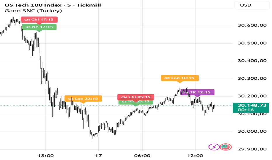
Gann Solar Noon CandlesGann 12:15 Candles is an original indicator inspired by W.D. Gann's theory of time. The core idea is that the critical angle points of the Sun's daily cycle (0°, 90°, 180°, 270°) create significant turning points in financial markets.
How It Works?
The Sun reaches its peak at local noon (12:15) each day. This moment corresponds to the 0° angle for that region. 00:15 (midnight) represents 180° — the exact opposite point. The 12:15 moments of New York, London, and China carry the same astrological significance for their respective regions.
The candles formed at these critical times act as support and resistance points in the market. The high and low levels of the candle at that time become critical zones that price tests in subsequent bars. The direction of the breakout determines the short-term trend direction.
For example, if the low of the 12:15 candle (Turkey time) is broken, the decline may continue; if the high is broken, the rally may gain strength. The same logic applies to the 12:15 candles of other countries — New York's 05:15 candle, London's 10:15 candle, and China's 17:15 candle can all be evaluated as support and resistance zones.
In line with Gann's principle that "time is the most important factor," these times are not randomly selected. Each corresponds to a specific angle in the Sun's daily journey and may trigger simultaneous reactions across global markets.
Colors:
🟣 Purple → Turkey / India times (0° and 180°)
🟢 Green → New York times
🟠 Orange → London times
🔴 Red → China times
Usage Recommendation:
The indicator does not provide buy/sell signals on its own. For best results, observe the direction and breakout of the candle at that time, then confirm with other technical indicators. It has been particularly tested on 15-minute charts.
Settings:
Base Country → If Turkey is selected, 8 critical times calculated according to Turkey time are marked. If India is selected, the times corresponding to India's 12:15 and 00:15 are marked.
Note: All times are displayed in Turkey time (UTC+3). Make sure your chart time is set to UTC+3. 指標
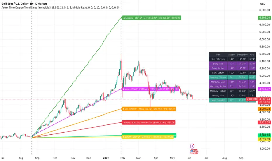
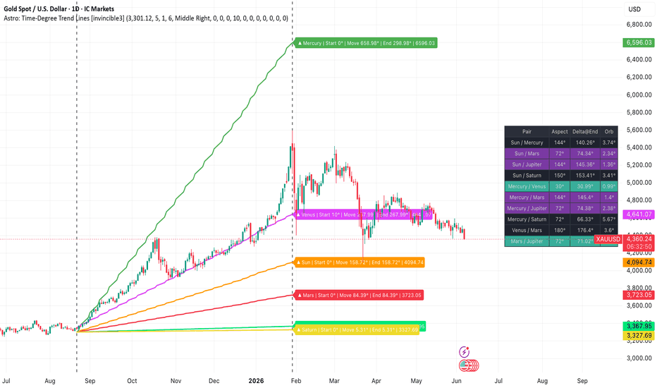
Astro: Time-Degree Trend Lines [invincible3]Astro-Gann Time-Degree Trend Lines – Invincible3
Astro-Gann Time-Degree Trend Lines is a range-based financial astrology and Gann timing tool designed to project planetary motion into price space.
Instead of plotting ordinary planetary positions, this indicator converts planetary movement into price-degree trend lines using a selected anchor price, anchor time, end time, user-defined planetary starting degrees, a motion harmonic multiplier, and a custom price-per-degree scale.
The concept is based on the Gann principle that time, price, and degrees can be harmonically related. Each planet’s movement over the selected range is converted into price movement, allowing traders to study planetary speed, time cycles, price vibration, and harmonic market geometry directly on the chart.
The indicator also includes a Gann-style aspect table that compares planet-to-planet angular relationships at the end of the selected range using each planet’s manually entered starting degree. This makes the aspect logic more meaningful because planets no longer begin from a common zero point. Each planet can start from its own real zodiac degree, ephemeris-based value, or symbolic Gann degree.
This tool is especially useful for traders who apply W.D. Gann methods, planetary time cycles, price-time squaring, astro-harmonics, Square of 9 logic, 360° degree geometry, and financial astrology to identify possible zones of trend continuation, support, resistance, vibration, or reversal timing.
What This Indicator Does
The indicator starts from a selected anchor price and anchor time.
Each planet also has a user-defined starting degree at the anchor. From that point, the script calculates how many degrees each planet moves during the selected date range, adds that motion to the planet’s starting degree, and then converts the resulting degree value into a projected price level.
The projection model is:
Planetary Motion = Days × Average Daily Motion × Motion Harmonic Multiplier
Line Degree = Starting Degree + Planetary Motion
Projected Price = Anchor Price ± (Line Degree × Points Per Degree)
This means the starting degree directly affects the trend-line position.
For example, if the Sun starts at 4°, moves 30°, and the selected scale is 10 points per degree, then:
Line Degree = 4° + 30° = 34°
Projected Price = Anchor Price ± 340 points
So the line does not only represent planetary movement from zero. It represents the full start-degree-adjusted Gann line degree.
Core Concept
This is not a standard astronomical aspect indicator. It is a Gann-style time-degree projection tool.
The purpose is to study:
How many degrees each planet moves during a selected market range.
How planetary motion can be translated into price.
How each planet’s starting degree changes the projected line position.
Which planets produce stronger or weaker price-time slopes.
Where planetary degree projections align with price structure.
Which planet pairs form Gann/astro harmonic relationships at the end of the range.
This makes the indicator useful for analyzing market vibration, planetary speed relationships, price-time geometry, harmonic projection, and range-based astro-Gann timing.
Key Features
Range-Based Astro-Gann Projection
Select a custom time range using:
Anchor Time
End Time
Anchor Price
The indicator calculates planetary movement across this exact range and projects it onto the price chart.
This allows traders to study planetary motion from an important market event such as:
Major swing high
Major swing low
Breakout point
Crash low
All-time high
Cycle start
First trading date
Gann anniversary date
Important planetary event
Major economic or market cycle date
The selected range becomes the measurement window for planetary movement and Gann degree projection.
User-Defined Starting Degrees
Each planet has a manual starting degree input.
This allows traders to enter the actual zodiac degree or symbolic Gann degree of each planet at the anchor date.
The starting degree affects:
The plotted planetary trend-line position
The projected price level
The end label
The final line degree
The aspect-table end longitude
This correction is important because each planet no longer starts from 0°. Each body can begin from its own real, ephemeris-based, or symbolic starting degree.
For price projection, the indicator uses:
Line Degree = Starting Degree + Planetary Motion
For aspect calculations, the indicator uses:
End Longitude = Starting Degree + Signed Planetary Motion
Planetary Time-Degree Trend Lines
The indicator plots planetary motion lines for:
☉ Sun
☾ Moon
☿ Mercury
♀ Venus
♂ Mars
♃ Jupiter
♄ Saturn
♅ Uranus
♆ Neptune
♇ Pluto
☊ Lunar Node
Each planet has:
Its own average daily motion
Its own starting degree
Its own projected line degree
Its own color setting
Its own visibility toggle
The final trend-line position is based on the planet’s starting degree plus its movement over the selected range.
Uptrend and Downtrend Projection
The indicator can plot:
Upward planetary projection lines
Downward planetary projection lines
Upward lines project planetary degree movement above the anchor price.
Downward lines project planetary degree movement below the anchor price.
This allows traders to study both bullish and bearish price-time pathways from the same anchor.
For example:
Up projection = Anchor Price + Line Degree × Points Per Degree
Down projection = Anchor Price - Line Degree × Points Per Degree
This gives a balanced way to study both expansion and contraction from a selected market point.
Points Per Degree Scaling
The user can define how many price points represent one planetary degree.
Examples:
1 point per degree
10 points per degree
100 points per degree
Custom market-specific scaling
This is useful because every market has a different vibration.
Gold, Bitcoin, forex pairs, stocks, commodities, and indices may require different degree-to-price scaling.
The purpose is to find a scale where planetary degree projections align meaningfully with market structure, swing points, or harmonic price zones.
Motion Harmonic Multiplier
The motion harmonic multiplier can be used to increase or decrease the speed of planetary projection.
Examples:
1x = normal planetary motion
2x = double-speed harmonic
0.5x = half-speed harmonic
This can be useful for traders who study:
Harmonic repetition
Accelerated cycles
Compressed planetary timing
Higher-frequency market vibration
Fractional planetary movement
The motion harmonic multiplier changes the planetary movement component of the line.
It affects the slope and speed of the planetary projection. It should be understood as a speed or cycle multiplier, not as a 360° price octave shift.
Gann Aspect Table
The indicator includes a compact aspect table that compares planet-to-planet angular relationships at the end of the selected range.
The table uses each planet’s starting degree and signed planetary motion:
End Longitude = Starting Degree + Signed Planetary Motion
Then it calculates the angular separation between planet pairs and finds the nearest Gann/astro aspect.
Supported aspect angles include:
0° Conjunction
30° Semi-sextile
45° Semi-square
60° Sextile
72° Quintile
90° Square
120° Trine
135° Sesquiquadrate
144° Biquintile / Gann harmonic
150° Quincunx
180° Opposition
The table displays:
Planet pair
Nearest aspect
Angular delta at range end
Orb from exact aspect
This helps identify which planet pairs are in close harmonic relationship at the end of the selected range.
Aspect Interpretation for Gann Traders
In financial astrology and Gann analysis, aspects are not used only as traditional astrology signals. They are also treated as geometric divisions of the 360° circle.
Important divisions include:
45° and 90° for square pressure and market action
60° and 120° for smoother harmonic flow
72° and 144° for fifth-harmonic and pentagonal geometry
180° for opposition, polarity, and possible culmination
30° and 150° for adjustment zones
When a planet pair forms a tight orb near one of these angles, it may indicate a time window where market rhythm, volatility, or direction can shift.
The table is not meant to be used as a standalone signal. It is designed to provide astro-Gann confluence with price structure, swing points, trendlines, Fibonacci levels, cycle dates, and market context.
How to Use
1. Choose an Important Market Anchor Point
Select a meaningful market point such as:
Major swing high
Major swing low
Breakout level
Crash low
All-time high
All-time low
First trading date
Cycle start
Gann anniversary date
This anchor becomes the origin point for the projection.
2. Set the Anchor Price
Enter the price level from which the planetary degree lines will begin.
This is usually the price of the selected swing high, swing low, breakout, or cycle point.
3. Set the Anchor Time and End Time
Choose the start and end dates of the range.
The indicator calculates planetary movement across this selected time window.
The range defines the time component of the Astro-Gann projection.
4. Enter Starting Degrees for Each Planet
Enter the starting degree for each planet at the anchor date.
These can be:
Actual zodiac degrees from an ephemeris
Geocentric planetary degrees
Heliocentric planetary degrees
Symbolic Gann degrees
Custom cycle degrees chosen by the trader
The starting degree affects both the trend-line position and the aspect-table calculation.
5. Adjust Points Per Degree
Increase or decrease the price-per-degree value until the projected planetary lines match the market’s vibration.
Different markets may require different scales.
For example:
Gold may respond better to one scale.
Bitcoin may require a larger scale.
Forex may require a smaller scale.
Stocks and indices may need symbol-specific calibration.
6. Adjust the Motion Harmonic Multiplier
Use the motion harmonic multiplier to test faster or slower planetary projection rhythms.
For example:
1x = normal planetary speed
2x = double-speed projection
0.5x = half-speed projection
This is useful when studying compressed cycles, expanded cycles, or harmonic repetitions of planetary motion.
7. Enable the Planets You Want to Study
Enable or disable planets depending on your trading timeframe.
General use:
Moon, Mercury, Venus = faster short-term timing
Sun and Mars = intermediate timing
Jupiter and Saturn = larger cycle structure
Uranus, Neptune, Pluto = macro or long-term harmonic background
Node = long-cycle timing reference in financial astrology
8. Use the Aspect Table
Look for tight orbs between planet pairs near important Gann aspects such as:
45°
60°
72°
90°
120°
135°
144°
150°
180°
The tighter the orb, the closer the pair is to an exact harmonic relationship at the end of the selected range.
Use this as timing confluence, not as a mechanical buy/sell signal.
Practical Trading Applications
This indicator can be used to study:
Price-time squaring
Planetary degree projection
Market vibration
Time-cycle completion
Harmonic resistance and support zones
Planetary speed-based trend slopes
Start-degree-adjusted planetary projection
Possible reversal windows
Range-based astro-Gann confluence
Planet-to-planet harmonic relationships
It is best used together with normal market structure tools such as:
Swing highs and lows
Trendlines
Fibonacci levels
Support and resistance
Volume
Momentum indicators
Cycle dates
Seasonality
Volatility zones
The strongest use case is when planetary lines, motion harmonics, aspect-table harmonics, and technical market structure all point to the same zone.
Important Notes
This indicator uses average daily planetary motion, not a full astronomical ephemeris engine.
The starting degrees are entered manually by the user. For more accurate astrology-based analysis, users should obtain planetary degrees from an ephemeris and enter them into the starting degree fields.
The starting degrees affect both:
Visual projection lines
Aspect-table calculations
This makes the tool more consistent with range-based Astro-Gann analysis.
The Lunar Node is commonly treated as retrograde in zodiac motion. For price-line projection, absolute motion may be used for clean visual direction, while aspect logic respects signed motion.
Because this is a Gann-style projection tool, the purpose is not to predict with certainty. The purpose is to map possible price-time harmonics and observe where market structure reacts around those projected levels.
Known Limitations
Planetary positions are based on average motion, not high-precision ephemeris calculations.
Manual starting degrees are required for meaningful projection and aspect-table results.
The indicator does not automatically fetch real-time planetary longitude.
The motion harmonic multiplier changes projection speed, not a 360° price octave.
Results should be treated as analytical confluence, not standalone trade signals.
Best Use Case
This tool is best suited for traders who already use or are studying:
W.D. Gann methods
Financial astrology
Planetary price-time projection
Square of 9 logic
360° degree geometry
Astro-cycle timing
Harmonic market geometry
Planetary speed relationships
Price-time squaring
It is designed for traders who want to visually connect planetary motion, starting degrees, time range, and price movement directly on the chart.
Summary
Astro-Gann Time-Degree Trend Lines – Invincible3 converts planetary motion into price-degree projections using a selected market range.
The corrected logic combines:
Starting Degree
Planetary Motion
Motion Harmonic Multiplier
Price-per-degree scaling
This creates a practical Astro-Gann projection model where each planet has its own degree origin, its own movement, and its own projected price path.
The result is a charting tool for studying planetary price-time geometry, market vibration, harmonic resistance/support, and possible reversal timing.
Disclaimer
This indicator is for educational and analytical purposes only. It does not provide financial advice or guaranteed market predictions. Always combine astro-Gann analysis with risk management, market structure, and independent trading judgment. 指標
Adaptive Gann & Fibonacci ConfluenceAdaptive Gann & Fibonacci Confluence
Overview
This indicator automatically detects the dominant swing on your chart — the highest high and lowest low over a lookback you set — and projects three classic geometric tools from that single shared anchor: a Gann fan, a Fibonacci fan, and Fibonacci retracement levels. Because all three are built on the same swing, their levels can be compared directly on one chart.
Why these tools are combined
A Gann fan and Fibonacci retracements measure two different things. A Gann fan measures trend slope — the geometric balance between price and time, where the 1×1 angle represents one unit of price per unit of time. Fibonacci retracements measure pullback depth — proportional price levels inside a move (23.6 / 38.2 / 50 / 61.8 / 78.6%). Used separately, each tool is anchored differently and the two rarely line up. By forcing both to share one auto-detected swing origin and direction, the script exposes price areas where a Gann angle and a Fibonacci level coincide. A level confirmed by both slope geometry and retracement proportion is the intended point of interest — more meaningful than a level from either method alone.
How the components work together
The script finds the swing once, then anchors the Gann fan, the Fibonacci fan, and the retracement grid to the same origin and trend direction. The Gann rays and the Fibonacci levels therefore sit on a common reference, so you can spot where a fan ray crosses a retracement level at roughly the same price — that overlap is the "confluence." Shaded zones mark the retracement bands, and a compact table summarizes the live read: directional bias, nearest support and resistance among the levels, current retracement depth, and a plain-language note on where price sits in the swing.
What makes it original
Rather than drawing Gann angles at fixed chart degrees (which break when you change instrument or zoom), the 1×1 angle here is scaled to the swing's actual price-per-bar, so the angles stay consistent across symbols and timeframes. That swing-scaled Gann geometry is then rendered together with Fibonacci fan and retracement structure on a single, automatically updating anchor — with confluence surfaced visually and condensed into a live snapshot table. The drawing engine rebuilds only when the underlying swing changes, keeping it light.
How to use it
Set Swing lookback to the structure you trade: smaller values track recent swings, larger values capture higher-timeframe structure.
The gold line is the 1×1 (trend-balance) angle; how price reacts to it gauges trend strength.
Treat confluence (a fan ray meeting a retracement level) as an area of interest to study, not an automatic signal.
1×1 unit = 0 auto-scales to the swing; set it above 0 to fix a manual ticks-per-bar Gann unit.
Toggle the Gann fan, Fibonacci fan, retracement, zone shading, glow, and table independently in settings.
Disclaimer
For educational and informational purposes only. This script plots geometric levels and a mechanical summary of price position. It is not financial advice, not a recommendation to buy or sell, and offers no guarantee of future performance. Always do your own research and manage your risk. 指標

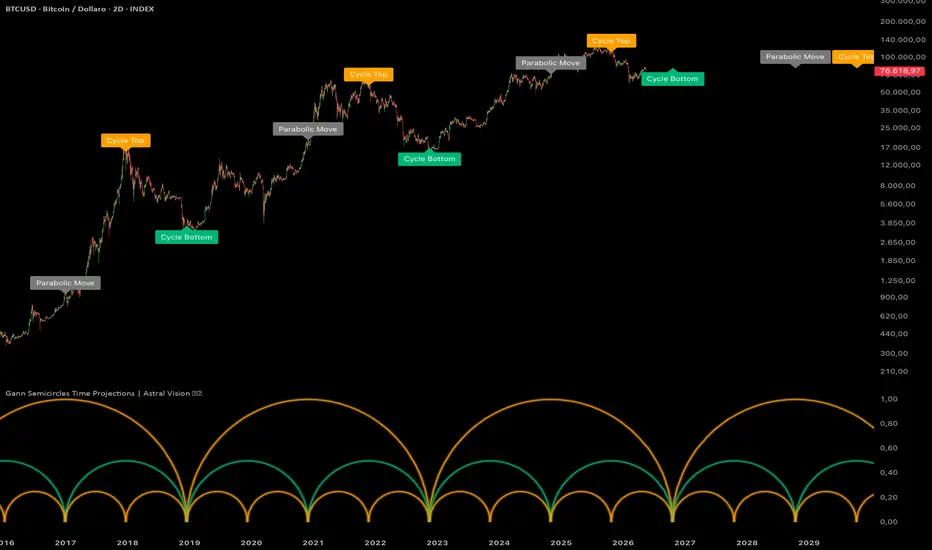
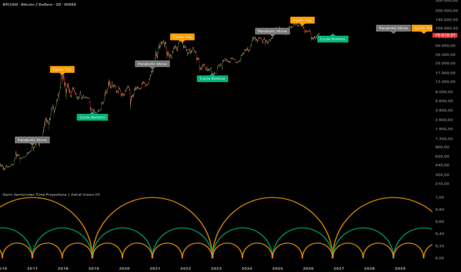
Gann Semicircles Time Projections | Astral Vision Gann Semicircles Time Projections | Astral Vision 🌠💠
This indicator projects Bitcoin's market cycle structure forward in time using a geometric framework based on W.D. Gann's semicircle theory, which treats time as the primary axis of market analysis. The core premise is that significant market cycles repeat in proportional time intervals, and that within each cycle the key inflection points (the parabolic acceleration phase, the cycle top, and the cycle bottom) occur at geometrically predictable subdivisions of the total cycle duration.
Calculation ⚙️
The model is anchored to two historically significant Bitcoin cycle bottoms: January 14, 2015 and December 16, 2018. The distance in bars between these two anchors defines the base cycle length R. This cycle is then projected forward three times from the second anchor, producing four complete cycles in total: one historical (2015 to 2018), and three projected forward from 2018 onward.
Within each cycle of length R, the indicator draws a hierarchy of semicircles at three levels of subdivision. The first level draws a single large semicircle spanning the full cycle length R with a peak height of 1.0. The second level splits the cycle at the midpoint R/2 and draws two semicircles each with half the peak height, marking the parabolic acceleration zone at the cycle midpoint. The third level splits each half further into quarters R/4 and draws four smaller semicircles each with one quarter of the peak height, marking the early and late phases of each sub-cycle.
Each semicircle is constructed by computing 101 points distributed along a sine curve. For each point at position i from 0 to 100, the horizontal fraction along the cycle is computed as (1 - cos(π × i/100)) / 2, which produces a smooth non-linear distribution that accelerates toward the center and decelerates at the edges. The vertical coordinate at each point is sin(π × i/100) multiplied by the peak height. This produces a true geometric semicircle in the time-price space of the sub-panel.
The key time projections within each cycle are: the cycle top, placed at the three-quarter mark of the cycle (R × 3/4 from the cycle start), the parabolic move marker at the midpoint (R/2), and the cycle bottom at the end of the cycle (R). Each projection is labeled directly on the price chart at the high of the nearest historical bar, or at the last available high for future projections.
Each semicircle is rendered with three layered polylines at decreasing transparency and increasing line width to create a glow effect.
Plots 📊
Full-cycle semicircle spanning each complete cycle period, colored with the positive theme color
Two half-cycle semicircles at R/2 subdivision, colored with the negative theme color
Four quarter-cycle semicircles at R/4 subdivision, colored with the positive theme color
All semicircles rendered with a three-layer glow effect
Labels on the price chart marking Cycle Top, Parabolic Move, and Cycle Bottom at each key time projection
Inputs 🎛️
No period or length inputs: the cycle structure is fully derived from the two fixed historical anchors
Colors 🎨
5 Astral Vision presets + custom override. Default: Hermes.
Purpose 🎯
Standard cycle indicators use fixed bar counts or calendar-based periodicity, which do not adapt to the proportional structure of each individual cycle. This indicator derives its forward projections entirely from the geometry of the two anchor points, meaning the projected cycle length is empirically grounded in Bitcoin's own historical behavior rather than imposed from outside. The three-level semicircle hierarchy provides a visual map of the entire cycle structure simultaneously, making it possible to identify not just when a top or bottom might occur but also the parabolic acceleration zone that precedes it, which is absent from linear cycle tools.
Disclaimer ⭕️
This indicator is for informational and educational purposes only. It does not constitute financial advice. Past performance is not indicative of future results. Always do your own research before making investment decisions. 指標
指標
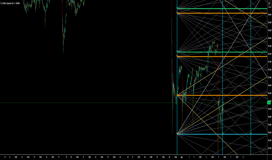
Yearly Gann BoxYearly Gann Box (Structural Crypto, 0↔0.618)
This indicator projects a full-year structural Gann framework using the previous year's price range as the foundational measurement. The prior year's low-to-high range is mapped into a geometric 0 ↔ 0.618 scaling model and extended into the current trading year.
The script creates both bullish and bearish yearly Gann structures with synchronized price and time divisions, allowing traders to analyze long-term market geometry, timing relationships, and structural reaction zones.
The framework is designed for macro market analysis, cycle observation, and identifying potential areas of expansion, compression, support, resistance, and directional transitions.
Core Features
Uses previous yearly high and low as the base measurement
Projects the structure across the current calendar year
Separate Bull and Bear structural boxes
Fibonacci/Gann-based ratio mapping
Time and price synchronization
Primary and midpoint diagonal structures
Optional geometric mesh overlay
Automatic yearly reset and recalculation
Optimized object management for TradingView limits
Included Ratio Levels
The script plots the following structural levels:
0
0.25
0.382
0.5
0.618
0.75
1
1.272
These levels are projected both horizontally (price) and vertically (time), forming a synchronized Gann-style grid.
Structural Components
Bull Structure
The bullish framework expands upward from the previous year's low using the 0 ↔ 0.618 mapping model.
Bear Structure
The bearish framework expands downward from the previous year's high using the inverse mapping model.
Primary Diagonals
The indicator draws major corner-to-corner diagonals representing dominant structural balance lines.
Midpoint Diagonals
Additional midpoint diagonals divide the structure into secondary geometric relationships.
Background Mesh
Optional full-grid mesh projection for advanced structural and geometric analysis.
Customization Options
Users can independently control:
Bull Box visibility
Bear Box visibility
Labels
Background mesh
Border thickness
Level line thickness
Diagonal thickness
Mesh thickness
Intended Use
This indicator is designed for traders who study:
Gann geometry
Market structure
Time-price symmetry
Cycle analysis
Long-term crypto market behavior
Structural expansion and contraction zones
It is best used on higher timeframes where yearly structural relationships become more meaningful.
Notes
The indicator recalculates automatically at the start of each new year.
Structures are based entirely on the previous yearly candle.
Time divisions are normalized to the 1.272 structural expansion.
Designed primarily for overlay analysis rather than direct trade signals. 指標

指標

Gann Fan v15 [Phases + Signals]Gann Fan v15 is a strategy inspired by the classic Gann Fan and Gann Angles methodology attributed to W.D. Gann. Gann’s original approach studied the relationship between price, time, geometry, and market angles to identify trend strength, diagonal support and resistance, and potential changes in market behavior.
Credit:
The base concept of the fan angles comes from the Gann Fan / Gann Angles method attributed to W.D. Gann. This script does not claim to reproduce Gann’s original work exactly. It is an independent strategy built around that historical concept, with additional logic for phase detection, signal confirmation, visual analysis, and risk management.
What makes this strategy different:
This script is not only a traditional Gann Fan drawing tool. A classic Gann Fan usually plots diagonal angle levels from a selected high or low. This strategy adds a complete decision framework on top of the Gann Fan concept.
The main differences are:
1. Automatic pivot detection
The script automatically detects recent pivot highs and pivot lows instead of requiring the user to manually anchor the fan.
2. ATR-normalized angle calculation
Instead of using only fixed visual chart angles, the script calculates movement angles using ATR normalization. This helps adapt the angle reading to the volatility of the current symbol.
3. Market phase classification
The script classifies the market into four phases based on the calculated angle:
ACCUM: weak angle or low momentum.
MODER: moderate directional movement.
EXPAN: stronger directional expansion.
ACCEL: extreme acceleration.
4. Visual phase background
The chart background changes according to the detected phase and direction. This helps the user quickly identify whether the market is in accumulation, moderate movement, expansion, or acceleration.
5. LONG and SHORT signal logic
The strategy generates LONG and SHORT signals using Gann-inspired angle behavior, swing direction, EMA confirmation, and candle confirmation depending on the selected entry mode.
6. Multiple entry modes
The user can choose between three signal modes:
Strict, Medium, and Easy.
Each mode changes how much confirmation is required before a signal appears.
7. Built-in risk management
The strategy includes configurable Stop Loss, Take Profit, optional Trailing Stop, and visual TP/SL guide lines.
8. Dashboard
A table shows the current swing direction, live angle, current phase, bullish fan angle, bearish fan angle, active mode, and phase thresholds.
How the strategy enters LONG:
A LONG signal appears when the market structure is bullish and the selected entry mode confirms that the bullish movement has enough strength.
Mode 1 - Strict:
A LONG entry requires the market phase to transition from ACCUM or MODER into EXPAN or ACCEL. The swing must be bullish, EMA 8 must be above EMA 21, and the candle must close bullish.
Mode 2 - Medium:
A LONG entry can appear when the current phase is MODER, EXPAN, or ACCEL. The swing must be bullish, EMA 8 must be above EMA 21, and the candle must close bullish.
Mode 3 - Easy:
A LONG entry can appear when the current angle is above the weak angle threshold, the swing is bullish, price closes above EMA 8, and the candle is bullish.
How the strategy enters SHORT:
A SHORT signal appears when the market structure is bearish and the selected entry mode confirms that the bearish movement has enough strength.
Mode 1 - Strict:
A SHORT entry requires the market phase to transition from ACCUM or MODER into EXPAN or ACCEL. The swing must be bearish, EMA 8 must be below EMA 21, and the candle must close bearish.
Mode 2 - Medium:
A SHORT entry can appear when the current phase is MODER, EXPAN, or ACCEL. The swing must be bearish, EMA 8 must be below EMA 21, and the candle must close bearish.
Mode 3 - Easy:
A SHORT entry can appear when the current angle is above the weak angle threshold, the swing is bearish, price closes below EMA 8, and the candle is bearish.
Risk management:
The strategy includes a configurable Stop Loss percentage and Take Profit percentage.
When Trailing Stop is enabled, the Take Profit level is used as the trail activation price.
The strategy also includes an optional open-profit protection feature that can close the position after a minimum open profit condition is reached.
TP and SL levels are displayed on the chart while a position is active.
Visual elements:
Dynamic bullish and bearish Gann Fan levels.
Phase-colored background.
EMA 8 and EMA 21.
LONG and SHORT labels.
Live angle label.
Dashboard with current market state.
TP and SL lines.
Important usage notes:
Gann Fan and angle-based analysis can be sensitive to chart scaling, timeframe, volatility, and market conditions.
This strategy should be tested on each symbol and timeframe before use.
The default parameters are only a starting point.
Users should adjust the angle thresholds, pivot periods, Stop Loss, Take Profit, and Trailing Stop according to their own testing.
Disclaimer:
This script is for educational and analytical purposes only.
It does not provide financial advice.
It does not guarantee profits.
Past performance does not guarantee future results.
Always use proper risk management. 策略

Pythagorean Time Price Geometry Ver 1.0Pythagorean Time Price Geometry — Ver 1.0
By Timepricedecoder
Overview
This indicator applies W.D. Gann's Time = Price principle using Pythagorean geometry to project natural time cycles and price grid levels directly on the chart.
Gann believed that financial markets move in geometric harmony — that price and time are not independent variables, but two sides of the same equation. When they balance, the market reaches a natural turning point.
This script operationalises that idea using the Pythagorean theorem — the ancient mathematical relationship where in a right-angled triangle, the square of the hypotenuse equals the sum of squares of the other two sides (a² + b² = c²). In market terms:
Side A (time) — the number of bars in the anchor swing
Side B (price) — the range of the anchor swing (High − Low)
Side C (hypotenuse) — the natural cycle projection derived from both
By selecting a Pythagorean Triple (sets of whole numbers satisfying a² + b² = c², such as 3-4-5, 5-12-13, 8-15-17), the script scales the time-price relationship into a precise geometric ratio. This ratio then defines the grid cell size, the cycle length, and the angle of the diagonal — all derived from a single anchor swing.
The result is a self-organising grid that maps where price should find support or resistance, and when time cycles are due to complete — giving the trader a structured, geometry-based framework rather than arbitrary indicator levels.
When time and price arrive at the same Pythagorean node simultaneously — the market is squaring — and that is where the highest-probability signals are generated.
Core Concepts
Time = Price Squaring
Price range and time duration are treated as the two legs of a right triangle. When they balance — the market is at a Square — reversals or accelerations are most likely.
Pythagorean Nodes
From the anchor swing (High → Low or Low → High), the script calculates:
Sq — Square of the swing (time leg = price leg). Highest grade signal
Hyp — Hypotenuse projection. Major cycle marker
½Hyp — Half Hypotenuse. Minor cycle node
½Sq — Early warning zone
These project forward as repeating time cycles across the chart.
Harmonic Grid
Price is divided into cells derived from the Pythagorean triple ratio (B/A × Range). The grid repeats both in time (columns) and price (rows), creating a natural map of support, resistance, and time confluence.
Signal Tiers
🟨 BUY/SELL-Sq — Time node + Price grid level align. Strongest signal
🟩 BUY/SELL-T — Time node only. Moderate signal
⬜ BUY/SELL-P — Price grid level only. Weakest, disabled by default
Confluence Zones ⚡
⚡ — Quarter cycle node
⚡⚡ — Half cycle node
⚡⚡⚡ — Full cycle node (highest confluence)
Recommended Settings
StyleGann NumberDivisorTripleSwing WidthScalping221/44-3-5NarrowShort Term441/24-3-5NormalMedium Term881/23-4-5NormalLong Term176Full3-4-5Wide
InstrumentType SettingNotesOptionsOptionsGrid origin auto-adjustedIndicesIndicesUse 88, 1/2 divisorStocksStocksUse Adaptive stabilityFuturesFuturesUse 44 or 88
Grid Stability
Strict — Anchors rarely shift. Best for trending markets
Adaptive — Default. Balances stability and responsiveness
Relaxed — Reanchors more freely. Best for ranging markets
How To Use
Let the script auto-detect the swing anchor (or set manually)
Watch for Sq labels on vertical cycle lines — these are key dates
Enter on BUY-Sq / SELL-Sq signals with candle confirmation
Use ⚡⚡⚡ confluence zones as high-alert turning point windows
The active zone box shows current grid cell position (Upper = bullish bias, Lower = bearish bias)
Disclaimer
This script is published for educational purposes only. It does not constitute financial advice. Past signal accuracy does not guarantee future results. The swing detection uses Daily OHLC data with lookahead enabled — results may differ slightly on live bars versus historical bars. Always use proper risk management. Trade at your own risk. 指標

Gann Time Cycles Pro: Confluence
Think of the stock market like a giant, calm pond.
When the market has a **massive crash** (a bottom) or hits a **crazy all-time high** (a top), it is like dropping a giant boulder into that pond.
That boulder creates ripples. Those ripples travel forward in time. According to W.D. Gann, those ripples hit the shore at very specific mathematical intervals: **90 days, 180 days, 270 days, and 360 days** later. When a ripple hits, the market usually changes direction violently.
### How to Use the Custom Features (User-Defined)
**1. The 5 Anchors (Your "Boulders")**
Instead of just tracking one boulder, the system lets you drop up to 5.
* **How to use it:** Look at a Daily chart. Find the lowest low of last year. Make that **Anchor 1**. Find the highest high of six months ago. Make that **Anchor 2**.
* *Layman Translation:* You are telling the system, "Hey, these two dates were super important. Show me where their future ripples are going to land."
**2. The Custom Cycles (Your "Custom Ripples")**
You already have the standard ripples (90, 180, 270, 360). But what if a specific stock, like Tesla or Reliance, has its own weird, unique rhythm? Or what if you want to use the famous "144" Fibonacci number?
* **How to use it:** Go into the settings and type `144` into Custom Cycle 1, and maybe `45` into Custom Cycle 2.
* *Layman Translation:* You are telling the system, "I don't just want the standard ripples. I want to see a special ripple exactly 144 days after my boulder dropped."
---
### Your Step-by-Step Action Plan (How to trade it tomorrow)
Here is exactly what you do when you open TradingView:
**Step 1: Turn on the Engine**
Apply the indicator to your chart. Go to the settings.
**Step 2: Set your Anchors (The Past)**
Look back at the chart and find 2 or 3 major turning points (big V-shaped bottoms or upside-down V-shaped tops).
* Check the box for `Use A1` and put in the date of the first bottom.
* Check the box for `Use A2` and put in the date of the top.
**Step 3: Set your Cycles (The Rhythm)**
Leave the standard 90, 180, 270, and 360 as they are. If you like a specific number (like 45 or 144), type it into the Custom slots. If you don't want custom ones, just type `0` to turn them off.
**Step 4: Hunt for the "Time Cluster" (The Future)**
Now, look at the blank, empty space on the right side of your screen (the future). The system has drawn a bunch of vertical lines (Orange for Calendar days, Blue for Trading days).
**THIS IS THE MOST IMPORTANT PART:**
You are looking for a spot where a line from Anchor 1 lands **right next to, or exactly on top of**, a line from Anchor 2.
* *Example:* Let's say Anchor 1's 360-day line lands on October 15th. And Anchor 2's 180-day line lands on October 16th.
* *What it means:* Two massive historical ripples are crashing into each other at the exact same time.
**Step 5: How to Trade It**
When the actual date arrives (October 15th), you do not just blindly buy or sell. You watch the price action.
* If the stock has been going up, up, up into that October 15th date... expect it to suddenly reverse and crash down. (Take profits, or prepare to Short).
* If the stock has been bleeding and crashing down into that October 15th date... expect it to suddenly find a bottom and shoot up. (Get ready to Buy).
**In short:** You use the overlapping lines to circle dates on your calendar. When that date arrives, expect the current trend to suddenly flip directions. 指標

指標

Trend Angle Monitor | Fibonacci & Gann Cycles
Trend Angle Monitor | Fibonacci & Gann Cycles
Overview
Trend Angle Monitor measures the slope angle of price relative to the Average True Range (ATR) across three independent periods. By normalizing price movement with ATR, the tool produces degree-based angle readings that reflect genuine momentum strength — regardless of the asset's absolute price level or volatility regime. All three periods are derived from Fibonacci and Gann cycle numbers and are automatically adjusted to the active chart timeframe.
How it works
Angle calculation
Each angle is derived from the arctangent of the price change over a given lookback period divided by the ATR of that same period. Positive values indicate upward momentum; negative values indicate downward momentum. The magnitude reflects the steepness of the trend relative to normal volatility — not just raw price distance.
Three independent periods (P1, P2, P3)
Three trend angle lines are plotted simultaneously, each operating on a different lookback period. P1 is the fastest (short-term momentum), P2 is intermediate, and P3 is the slowest (structural trend). Period values are sourced from the Fibonacci sequence and Gann cycle theory:
P1 — Fast: 8, 13, or 21 bars depending on timeframe
P2 — Medium: 13, 21, 34, or 55 bars
P3 — Slow: 21, 55, 89, or 144 bars
Auto timeframe detection
When enabled, the tool detects the current chart timeframe (M1 through 1W) and automatically selects the most appropriate Fibonacci/Gann period set and angle thresholds. A manual preset override is available for users who prefer fixed parameters.
Background gradient
The chart background reflects the combined momentum state of all three angle lines. Each angle scores +1 (above upper threshold), −1 (below lower threshold), or 0 (neutral). The total score ranges from −3 to +3, producing seven distinct states:
+3
Yellow → Green — all three bullish
+2
Yellow → Light Green — two bullish
+1
Yellow → Gold — one bullish dominant
0
Orange — mixed / neutral
−1
Orange → Red — one bearish dominant
−2
Red-Orange — two bearish
−3
Orange → Deep Red — all three bearish
The gradient deepens progressively the longer the regime persists, building intensity over up to 30 bars.
Long / short signals
A green triangle (▲) is plotted below the bar when all three angles simultaneously cross above their upper thresholds for the first time (score transitions to +3). A red triangle (▼) is plotted above the bar when all three angles simultaneously cross below their lower thresholds (score transitions to −3).
Signals are non-repeating: once a long signal fires, it will not fire again until a confirmed short signal (−3) has occurred first, and vice versa. This prevents signal spam during choppy conditions while preserving clean re-entry logic after a genuine trend reversal.
Bar coloring
Individual bars are colored based on the P1 (fastest) angle state — bullish color above the upper threshold, neutral color within the neutral zone, bearish color below the lower threshold.
Trend lines and labels
Each of the three periods draws a straight price line from the lookback bar to the current bar, color-coded by its momentum state. Optional floating labels display the current angle value in degrees at the origin of each line, positioned above or below price depending on whether the angle is rising or falling.
Info panel
A compact table in the bottom-right corner shows the current and previous bar angle values for all three periods, color-coded by regime. It also displays the active timeframe preset, the threshold in use, and an overall BIAS reading (BULLISH / NEUTRAL / BEARISH) based on whether all three angles are in agreement.
Settings
Preset settings
Auto timeframe detection — enables automatic period and threshold selection
Manual preset — choose from M1, M5, M15, M30, 1H, 4H, 1D, 1W
Show info panel — toggle the summary table
Background gradient — toggle the background color system
Per-line settings (repeated for P1, P2, P3)
Show line, price source, period (manual), use auto period
Show label, line thickness
Line color, bullish color, bearish color, neutral color
Upper / lower threshold (manual), use auto threshold
Notes
Plots directly on the price chart as an overlay.
No external data sources are used. All calculations are self-contained.
Signals are bar-confirmed and do not repaint.
Designed for use on any liquid instrument across all major timeframes.
This tool is for informational and educational purposes only. It does not constitute financial advice, a trading recommendation, or a signal to buy or sell any asset. Past performance of any pattern or signal does not guarantee future results.
Always confirm setups across multiple timeframes and combine this tool with other forms of analysis before making any trading decision. Never risk more than you can afford to lose, and always apply proper position sizing and risk management. You are solely responsible for your own trading decisions.
指標

Gann Sq9 Levels - @darshaksscGann Square of 9 (Sq9) is one of W.D. Gann's most powerful tools for identifying
price support and resistance levels. This indicator applies the core Sq9 formula —
stepping ±0.25 increments on the square root of a base price — to automatically
plot key levels directly on your chart.
𝗛𝗼𝘄 𝗶𝘁 𝘄𝗼𝗿𝗸𝘀:
The indicator takes a base price (session high/low midpoint, session open, previous
close, or manual input) and calculates symmetrical resistance levels (R1–R6) above
and support levels (S1–S6) below using the Gann Sq9 formula:
Level = (√Base ± n × 0.25)²
𝗙𝗲𝗮𝘁𝘂𝗿𝗲𝘀:
- Automatic Gann Sq9 support and resistance levels
- 4 base price modes: Session Mid, Session Open, Previous Close, Manual
- Clean dashboard showing R3 → LTP → S3 at a glance
- Price proximity alerts when approaching key levels
- Fully customisable colors and level count (1 to 10 each side)
- No repainting — all levels calculated and drawn on confirmed data
- Works on all instruments and timeframes (best on 5m, 15m, 1H intraday)
𝗛𝗼𝘄 𝘁𝗼 𝘂𝘀𝗲:
R1 and S1 are your primary levels for the session. Price respecting R1 = bearish
bias; price holding above S1 = bullish bias. Use R2/S2 as targets and R3/S3 as
extended targets or stop zones.
𝗕𝗮𝘀𝗲 𝗣𝗿𝗶𝗰𝗲 𝗚𝘂𝗶𝗱𝗲:
→ Session Mid (H+L/2) — recommended for intraday
→ Session Open — for gap-based analysis
→ Previous Close — for overnight/positional setups
→ Manual — for custom anchoring to any reference price
𝗧𝗶𝗺𝗲𝗳𝗿𝗮𝗺𝗲𝘀: Best on 5m / 15m / 30m / 1H
𝗜𝗻𝘀𝘁𝗿𝘂𝗺𝗲𝗻𝘁𝘀: Indices, Stocks, Futures, Forex, Crypto
⚠ This indicator is for educational and analytical purposes only.
It does not constitute financial advice. Always use your own judgment and
risk management when trading. 指標

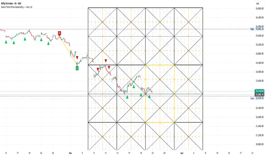
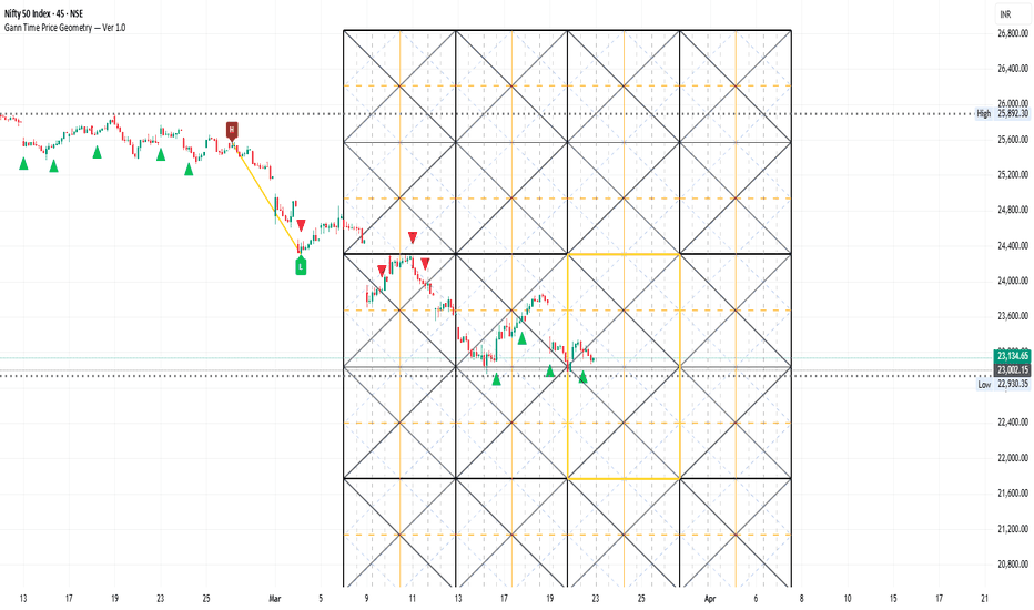
Gann Time Price Geometry Ver 1.0Gann Time Price Geometry — Ver 1.0
This indicator builds a dynamic Gann Square grid directly on your chart, anchored to automatically detected swing highs and lows. It combines classical Gann geometry with a scoring-based signal engine to highlight high-confluence buy and sell opportunities.
How it works
The script uses a Vector Circle Search to find the best pivot pair within a harmonic window around your chosen Gann number (88 bars by default). It scores each candidate swing by how closely its price-per-bar ratio and duration match the ideal Gann proportion, then anchors the full grid to the winning pair.
What you get on the chart
What is Drawn on the Chart
🔲 Full Square
The outer Gann Square spans your chosen Gann number in bars horizontally, and 2× the detected swing range vertically. This is the master structure everything else is built inside.
🔲 Sub-Squares (4 Inner Cells)
The full square is divided into 4 equal inner cells — 2 columns × 2 rows. Each cell gets its own set of angle lines projected from its corners. This creates nested geometry that gives you finer entry and exit precision within the larger structure.
📐 Angle Lines
1x1 — the true balance angle between price and time, projected from all four corners of both the full square and each sub-cell
2x1 / 1x2 — steeper and shallower angles showing acceleration and deceleration zones
All angles are clamped within their respective square boundaries so the chart stays clean
⏱️ Time Cycle Verticals
Vertical lines mark Gann's 1/8 harmonic divisions of time across the square:
1/2 cycle (orange, prominent) — the most powerful time node, midpoint of the square
1/4 and 3/4 cycles (dashed) — secondary time divisions where reactions are common
1/8 minor cycles (optional) — finer subdivisions for short-term timing
When price reaches an angle line and a time cycle vertical at the same bar — that is a Gann confluence point, and where this indicator focuses its signals.
Signal scoring (max ~10 pts per signal)
Set Min Confluence Score to 3–4 for quality signals. Lower it to 0 to see all geometrically valid touches.
Settings to tune first
Match Gann Number to your timeframe (88 for most, 44 for fast charts)
Check the Info Table — if Swing pts/bar doesn't match Diagonal, update the Swing Diagonal Is dropdown
Adjust Period Divisor to the harmonic you are trading (1/2 suits swing traders)
Alerts included — Gann Buy and Gann Sell, fire on bar close.
First-Time Setup — 3 Steps
Step 1 — Choose your Gann Number
Start with 88 on Daily or 4H charts. Use 44 on 1H or faster. This defines the width of your square in bars.
Step 2 — Match the Diagonal
Open the chart, look at the Info Table. Find Swing pts/bar and the suggest note next to it. If it says "use 2x1", set the Swing Diagonal Is dropdown to 2x1. Green ✅ means you are calibrated correctly.
Step 3 — Set your Confluence Level
Start at 3. If you are getting too many signals, raise it to 4 or 5. If you want to study all geometric touches without filtering, set it to 0.
Works on: Any instrument — stocks, crypto, forex, indices, commodities
Works on: Any timeframe — tune Gann Number to match
Alerts: Gann Buy and Gann Sell included, fire on bar close
Note on Line Limits
TradingView Pine Script has a 500-line limit. Keep Squares Forward and Squares Backward at 2 or below to stay within this limit. The indicator will silently drop lines if the limit is exceeded.
指標
指標

指標

Retrograde Volatility Zones [PyraTime]The Problem: The "Invisible" Trend Killer
Most traders rely exclusively on lagging price indicators (Moving Averages, RSI, MACD). These tools are excellent at telling you what just happened, but they are notoriously blind to cyclic exhaustion. Markets don't just move in a vacuum; they undergo rhythmic shifts in volatility and psychology.
The "Invisible" problem is the Stationary Period. When a major planetary cycle slows down to a "Station," liquidity often thins, trends become erratic, and "Black Swan" volatility spikes occur. Without a way to quantify these cycles, traders frequently "buy the top" or "short the bottom" exactly as the underlying cyclic regime is shifting from green to red.
The Solution: PyraTime · RVZ
The Retrograde Volatility Zones indicator solves the problem of cyclic blindness by providing a real-time, quantitative map of planetary velocity. Unlike amateur scripts that use hardcoded (and expiring) date arrays,
PT·RVZ calculates the Geocentric Longitude Speed of the planets in real-time.Key Technical Pillars:Speed-Based Detection: If a planet’s speed is negative ( AMEX:SPD < 0$), it is retrograde. This is the professional standard for astronomical accuracy.
The Traffic Light Regime: It converts raw velocity into a weighted "Composite Score." It tells you not just that a planet is moving, but how much "thrust" the current cyclic environment has.Shadow Zone
Identification: It highlights the "Storm before the Storm" the period where a planet is still moving forward but has decelerated to less than 20% of its normal speed.
Volatility Sync: It overlays ATR spikes during these windows, filtering out noise and highlighting the specific moments where cyclic pressure translates into actual price expansion.
Tutorial: How to Master the Cycle
1. Reading the "Traffic Light"
The background and dashboard provide an instant read on the market "weather":
🟢 Green (Bullish): The weighted composite of planets is moving at high forward velocity. This is your "Trend is Friend" regime. Focus on long entries and trend-following.
🟡 Yellow (Mixed/Shadow): Major planets are decelerating or "Stationing." Expect chop, mean-reversion, and "fake-out" breakouts. Tighten stops and reduce position sizes.
🔴 Red (Bearish/Retrograde): The cycle is in retreat. Historically, these are windows of high-volatility corrections. Look for short opportunities or stay in cash.
2. Trading the "Stations" (℞ & D)
The glowing neon vertical lines mark the Station Point—the exact bar where velocity hits zero.
℞ (Station Retrograde): Often marks the "Blow-off Top" or the start of a deep corrective phase.
D (Station Direct): Often marks the "Final Flush" or the moment where the market regains its forward momentum.
3. The Dashboard Strategy
Watch the Speed°/d column in the dashboard. If you see Mercury ($\☿$) speed drop rapidly while price is hitting new highs, a "Mercury Retrograde" volatility spike is likely loading. Use the Composite Score at the bottom of the table to gauge the total "cyclic weight" of the market.
4. Setting High-Signal Alerts
Don't stare at the screen. Set the "High Vol + Retro" alert. This fires only when price range (ATR) expands significantly during a retrograde window—this is the signature of a major cyclic pivot. 指標