Event Probability Engine [Quantum Algo]Event Probability Engine
====================================================
🔶 OVERVIEW
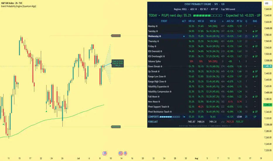
Event Probability Engine is a statistical probability indicator that answers one question at the close of every bar: based on the measurable conditions active right now, what is the historical probability that price closes higher one, three, and five days from today? Instead of subjective pattern reading, the script builds and maintains a live rolling database of forward returns conditioned on eighteen observable market events — day-of-week seasonality, oversold and overbought readings, volume spikes, streaks, range position, volatility regime, pivot touches, and an optional lunar control — then pools the currently active events into a single composite probability, displayed as a TODAY headline, a full per-event statistics table, and a shaded forecast cone projected on the chart.
It is designed for the daily timeframe. On other timeframes, the one, three, and five day horizons become one, three, and five bars.
🔶 WHAT IS AN EVENT STUDY?
An event study measures what a market historically did after a defined, observable condition occurred — for example, what happened over the next five days every time the Relative Strength Index closed oversold, or every Monday, or every time volume spiked two standard deviations above normal. This indicator runs eighteen such studies continuously, in real time, on the chart's own data, and keeps every study honest with the statistical safeguards described below.
🔶 WHY THIS SCRIPT IS ORIGINAL
1. A live event database in Pine. Each of the eighteen events maintains its own rolling, capped sample of forward returns at three horizons, tagged with the market regime at the moment the event fired — a self-updating event-study framework, not a fixed backtest.
2. Shrinkage estimation. Every win rate is pulled toward fifty percent by a configurable number of pseudo-samples. An event with fifteen samples cannot display an extreme probability, because fifteen samples cannot justify one.
3. Overlap correction. State-based events (for example, an oversold reading persisting for a week) generate autocorrelated, overlapping samples that inflate apparent sample size. The effective sample size is deflated by the horizon length before any confidence calculation.
4. Wilson score bounds. Next to each five-day win rate, the table shows the Wilson confidence lower bound computed on the corrected sample size — the number an event must clear before its edge deserves trust, not its raw point estimate.
5. Regime conditioning with fallback. When enough samples exist in the current regime (bull or bear, defined by the two-hundred period exponential moving average), statistics are computed on regime-matched samples only, marked ® in the table. A bear-market Thursday is not assumed to behave like a bull-market Thursday.
6. Quality-weighted log-odds pooling. Active events are combined by weighted log-odds — a method related to Bayesian evidence combination — rather than naive win-rate averaging, so one strong, well-sampled edge is not diluted by three weak ones.
7. A built-in falsification control. Lunar phase events are included deliberately so the engine can audit a popular claim empirically: if full and new moons carry no edge, their quality scores sit near zero and they contribute nothing to the composite. A probability framework should be able to demonstrate which inputs fail, not only which appear to work.
🔶 HOW IT WORKS
Event detection: On every bar close the script evaluates all eighteen conditions — Monday through Friday, adaptive or fixed oversold and overbought thresholds, volume z-score spikes, up and down streaks, range-low and range-high position, volatility expansion and compression by percentile rank, confirmed pivot support and resistance touches within an Average True Range distance, and the optional lunar events.
Database recording: Whenever an event was active one, three, or five bars ago, the realized forward return is stored in that event's arrays, first-in-first-out at a configurable cap, together with the regime tag from the moment the event fired.
Per-event statistics: The table reports, for every event, the shrinkage-adjusted win rate at each horizon, the Wilson lower bound, sample count, average forward return, profit factor, a zero-to-one-hundred quality score blending edge magnitude, sample sufficiency, and recent consistency, and the resulting directional bias.
Composite probability: Active events passing the minimum-sample filter are pooled by quality-weighted log-odds into the TODAY headline (next-day probability of an up close with a visual meter), the one, three, and five day composite row with expected returns and a strength grade, and a projected forecast path with a shaded plus-and-minus one standard deviation cone drawn from the current close.
Chart layer: Optional regime background tint, the regime line, live pivot support and resistance rails with prices, and historical event markers on the candles so past occurrences of every event can be reviewed directly on the chart.
🔶 HOW TO USE IT
1. Apply it to a daily chart of any liquid symbol — cryptocurrency, stocks, indices, forex, gold, futures. Let it load its history; sample counts grow with available bars.
2. Read the TODAY headline first: the next-day probability, the meter, and the expected one-day return.
3. Scan the table for the highlighted rows — those events are active right now. Judge each by its Wilson lower bound and quality score, not the raw win rate.
4. Use the composite row and forecast cone as context: STRONG requires both a meaningful probability distance from fifty percent and high average quality.
5. Treat readings near fifty percent as exactly what they are: weak evidence. This engine is intentionally built to display small honest numbers rather than large misleading ones.
6. Combine with your own analysis — the engine measures conditional history; it does not know tomorrow's news.
🔶 SETTINGS
- Database: sample cap per event, minimum samples for composite inclusion, minimum regime-matched samples, shrinkage strength.
- Events: oscillator length and thresholds (fixed or adaptive percentile), volume z-score, streak length, range lookback, pivot lookback and touch distance, lunar events on or off.
- Statistics: Wilson z-score (default 1.645, a ninety percent one-sided bound).
- Display: dashboard position and five text sizes, forecast cone, regime tint, regime line, pivot rails, candle markers.
🔶 ALERTS
- Composite Bias Change — fires once per bar close whenever the five-day composite bias flips state, with the current one-day and five-day probabilities in the message.
🔶 FREQUENTLY ASKED QUESTIONS
Does the indicator repaint? Statistics are recorded and evaluated on closed bars, and pivot events use confirmed pivots with their standard confirmation lag. The dashboard and forecast update on the live bar by design, as a dashboard should.
Why do most probabilities sit near fifty percent? Because genuine conditional edges in daily data are small, and the shrinkage and overlap corrections are built to say so. Extreme displayed probabilities on thin samples are the signature of a dishonest tool.
What does the ® mark mean? That event currently has enough regime-matched samples, so its statistics are computed only from the current bull or bear regime rather than the full history.
Why are moon phases in a statistics tool? As a falsification control. The engine should be able to show which inputs carry no edge — and the user can watch it do exactly that.
Can I use it intraday? Yes, but the horizons become bars instead of days, and day-of-week events lose their meaning. The design intent is the daily timeframe.
🔶 CREDITS
This script stands on standard, publicly documented statistical methods, gratefully credited: the Wilson score interval by Edwin B. Wilson (1927), Laplace-style shrinkage estimation, and the event-study methodology long established in quantitative finance. Their combination into a live, regime-conditional, overlap-corrected event database with quality-weighted log-odds composite pooling, implemented entirely in Pine Script with capped arrays and user-defined types, is original work — no third-party or open-source script code was reused.
🔶 LIMITATIONS
Probabilities derived from historical conditioning are estimates, not guarantees, and conditional edges in daily data are typically small. Sample databases need history to mature; young charts produce thin, heavily shrunk statistics by design. Day-of-week events assume a five-day session calendar. Regime conditioning depends on the two-hundred period regime definition. This is a research and confluence tool, not a standalone trading system.
🔶 DISCLAIMER
This script is provided strictly for educational and informational purposes. It is not financial advice, an investment recommendation, or a solicitation to buy or sell any financial instrument. Past statistical behavior does not assure future results. Trading involves substantial risk. Always do your own research and manage risk independently. 指標

Seasonality: Forex Indices [invincible3]Seasonality: Forex Index
Seasonality: Forex Index is a visual seasonality dashboard designed to help traders analyze historical yearly patterns across major currency indexes.
The indicator displays compact 365-day seasonal mini charts directly on the price chart. Each currency index is shown in its own separate panel, allowing traders to quickly compare seasonal strength, weakness, turning points, and recurring calendar-based tendencies throughout the year.
Included forex indexes:
• Australian Dollar
• Canadian Dollar
• Swiss Franc
• Dollar Index
• Euro
• British Pound
• Japanese Yen
Each currency includes two seasonal curves:
Blue Line — All Years Average
Shows the long-term historical seasonal tendency for the selected currency index.
Yellow Line — Weighted Average
Shows a weighted seasonal curve designed to give more importance to recent seasonal behavior while still preserving the broader historical pattern.
The dashboard is fully customizable. Users can enable or disable individual currency indexes, choose whether to display the All Years curve, the Weighted Average curve, or both, and adjust the widget width, distance from candles, column spacing, panel height, row gap, and dashboard placement.
Key Features:
• Seasonality dashboard for major forex indexes
• Includes AUD, CAD, CHF, DXY, EUR, GBP and JPY
• 365-day calendar-based seasonal curves
• All Years average and Weighted Average comparison
• Separate mini chart for each currency index
• Monthly grid lines and month labels
• Adjustable dashboard size, spacing, and placement
• Right-side dashboard placement option
• Auto-theme color support
• Manual customization for line colors, grid, background, and text
• Clean visual panels for quick seasonal comparison
This indicator is useful for identifying periods where major currencies have historically shown stronger or weaker seasonal tendencies. It can help traders add seasonal context to forex pairs, dollar strength analysis, macro bias, trend structure, and technical setups.
The seasonality curves are intended as a relative historical guide, not exact price forecasts. This indicator does not generate direct buy or sell signals. Seasonality should be used as a supporting research tool together with price action, trend analysis, macro fundamentals, confirmation, and proper risk management.
指標

Seasonality: Soft Commodities [invincible3]Seasonality: Soft Commodities
Seasonality: Soft Commodities is a professional mini-chart seasonality dashboard designed for traders and analysts who want to study recurring yearly patterns in major soft commodities.
The indicator displays 365-day seasonal curves directly on the chart for Cocoa, Coffee, Cotton, Orange Juice, and Sugar. Each commodity is shown in its own compact panel, making it easy to compare seasonal strength, weakness, turning points, and recurring periods of historical tendency throughout the calendar year.
Two seasonal views are available:
Blue Line — All Years Average
Shows the long-term historical seasonal path using the full available dataset.
Yellow Line — Weighted Average
Shows a weighted seasonal curve designed to emphasize more relevant recent behavior while still preserving the broader historical pattern.
The dashboard includes flexible layout controls, allowing users to adjust widget width, distance from price candles, panel height, row spacing, and placement. Individual commodities can be enabled or disabled, and users can choose whether to display the All Years curve, the Weighted Average curve, or both.
Key Features:
• Seasonality curves for Cocoa, Coffee, Cotton, Orange Juice, and Sugar
• Separate mini-panel for each commodity
• Blue All Years seasonal average
• Yellow Weighted Average seasonal curve
• Monthly grid and labels for easy calendar interpretation
• Right-side dashboard placement option
• Adjustable chart width, spacing, and panel height
• Auto-theme colors with manual style customization
• Lightweight visual design built for quick seasonal comparison
This tool is useful for identifying periods where soft commodities have historically shown stronger or weaker seasonal tendencies. It can help traders prepare trade ideas, compare current market behavior against historical patterns, and add a seasonal context layer to technical or macro analysis.
This indicator does not generate direct buy or sell signals. Seasonality should be used as a supporting research tool together with price action, trend analysis, volume, fundamentals, and proper risk management.
指標

Seasonality: Stock Indices [invincible3]Seasonality: Stock Indices
Seasonality: Stock Indices is a clean dashboard-style indicator designed to display historical seasonal tendencies for major global stock indices directly on the TradingView price chart.
The indicator includes six separate seasonal mini-charts:
Australian ASX 200 — seasonal data from 2001 to 2020
FTSE 100 — seasonal data from 1985 to 2020
German DAX — seasonal data from 1999 to 2020
Nasdaq 100 — seasonal data from 1996 to 2020
S&P 500 — seasonal data from 1980 to 2020
Dow 30 — seasonal data from 1980 to 2020
Each panel displays a full 365-day seasonal curve, allowing traders to study how each index has historically performed throughout the calendar year. The indicator plots both the long-term All Years average and a Weighted Average curve, making it easier to compare broad historical behavior with a more weighted seasonal tendency.
The dashboard is arranged in a compact multi-panel layout and is designed to stay visually separated from candles, so it does not disturb the main price chart. Users can adjust the widget width, distance from candles, panel height, row spacing, column gap, and dashboard placement on either the right or left side of price.
Automatic dark/light theme detection is included, helping the dashboard remain readable across different TradingView chart themes. Manual customization is also available for the grid color, background, text color, All Years line, Weighted Average line, and line width.
This indicator is useful for index traders, swing traders, macro analysts, seasonal researchers, and market-timing studies. It helps users compare current index behavior with long-term historical seasonal patterns across major U.S., European, Australian, and technology-focused equity benchmarks.
Key Features:
Seasonal dashboard for major global stock indices
Includes ASX 200, FTSE 100, DAX, Nasdaq 100, S&P 500, and Dow 30
Full 365-day seasonal curves
All Years average line
Weighted Average line
Adjustable dashboard size and placement
Designed to stay away from candles
Auto dark/light theme support
Manual color customization
Election seasonality is intentionally excluded
Built for visual seasonal analysis
The seasonal values are approximate and digitized from historical seasonal data screenshots. This indicator is intended for educational and analytical purposes only. It does not provide financial advice, investment recommendations, or direct buy/sell signals. Historical seasonal tendencies do not guarantee future market performance.
指標

Seasonality: Metals [invincible3]Seasonality: Metals
Seasonality: Metals is a visual dashboard-style indicator designed to display historical seasonal tendencies for major metals directly on the TradingView price chart.
The indicator includes five separate seasonal mini-charts:
Copper — seasonal data from 1960 to 2020
Gold — seasonal data from 1975 to 2020
Palladium — seasonal data from 1978 to 2020
Platinum — seasonal data from 1970 to 2020
Silver — seasonal data from 1969 to 2020
Each panel displays a full 365-day seasonal curve, helping traders observe how each metal has historically behaved throughout the calendar year. The indicator plots both the long-term All Years average and a Weighted Average curve, allowing users to compare broad historical seasonality with a more weighted seasonal tendency.
The dashboard is built with a clean five-panel layout: Copper and Gold on the top row, Palladium and Platinum on the middle row, and Silver on the bottom-left panel. The layout is designed to stay away from candles so it does not interfere with price action while still giving traders a clear view of seasonal structure.
Users can customize the widget width, distance from candles, panel height, row spacing, column gap, and dashboard placement on either the right or left side of the chart. The script also includes automatic dark/light theme detection, while still allowing manual customization of the background, grid, text, and seasonal line colors.
This indicator is useful for commodity traders, macro analysts, metals investors, and seasonal-market researchers who want to compare current price behavior with long-term historical seasonal patterns in the metals market.
Key Features:
Seasonal dashboard for major metals
Includes Copper, Gold, Palladium, Platinum, and Silver
365-day seasonal curves
All Years average line
Weighted Average line
Clean mini-chart layout
Adjustable widget size and placement
Dashboard can be placed left or right of price
Auto dark/light theme support
Manual color customization
Designed to stay visually separated from candles
The seasonal values are approximate and digitized from historical seasonal data screenshots. This indicator is intended for educational and analytical purposes only. It does not provide financial advice, investment recommendations, or direct buy/sell signals. Historical seasonal tendencies do not guarantee future market performance.
指標

Seasonality: Energy [invincible3]Seasonality: Energy Commodities
This indicator displays compact seasonal mini-charts for major energy markets directly on the price chart. It is designed to provide a quick visual reference for historical seasonal tendencies without disturbing the main candle scaling or chart zoom.
The dashboard includes four energy seasonality panels:
Gasoline | from 1985 to 2020
Crude Oil | from 1984 to 2020
Heating Oil | from 1980 to 2020
Natural Gas | from 1991 to 2020
Each panel contains two seasonal curves:
Blue Line — All Years Average
Shows the average historical seasonal path using all available years from the start year through 2020.
Yellow Line — Weighted Average
Shows a weighted seasonal curve that gives more importance to recent historical behavior while still preserving the broader long-term seasonal structure.
The indicator uses a fixed 365-day seasonal structure, allowing traders to observe how each energy market has historically behaved throughout the calendar year. The mini-charts are drawn as independent widgets using price-space positioning, so they do not interfere with the main price chart, candle scaling, or zoom behavior.
Key Features
Four energy commodity seasonality panels
Historical data from each market’s start year to 2020
All Years and Weighted Average seasonal curves
Compact dashboard-style layout
Auto dark/light theme support
Adjustable widget width, spacing, height, and position
Designed to avoid chart-scaling distortion
Useful for seasonal bias, timing context, and macro/commodity market analysis
How to Use
Use the blue and yellow curves as a seasonal reference, not as standalone buy or sell signals. When both curves point in the same direction during a specific part of the year, that period may represent a historically stronger seasonal tendency. The signal is more useful when combined with trend, support/resistance, volume, fundamentals, and broader market context.
Important Note
This indicator is based on historical seasonal data only. Seasonality does not guarantee future price movement. Market structure, supply-demand conditions, geopolitical events, interest rates, weather, and macroeconomic factors can override historical seasonal tendencies. 指標

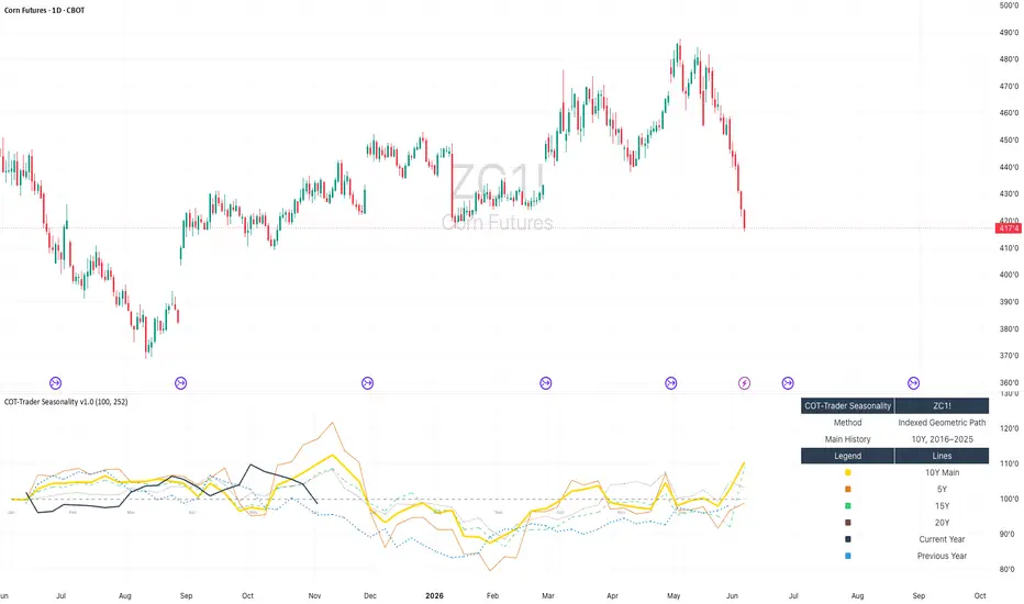
COT-Trader Seasonality - Indexed Geometric PathCOT-Trader Seasonality is a visual research indicator designed to study seasonal tendencies in futures, commodities, indices and other markets.
The script focuses on one specific question:
How has a market typically behaved throughout the calendar year when historical years are compared on a normalized basis?
Instead of averaging raw historical prices, the indicator indexes each historical year to a base value of 100 at the first available trading day of that year. This makes different years comparable across changing price regimes.
This is especially useful for markets such as commodities and futures, where long-term price levels can change significantly over time.
Methodology
The indicator uses an Indexed Geometric Seasonal Path approach:
1. Each historical year is indexed to 100 at its first available trading day.
2. Each following trading day is converted into a relative factor versus that year’s starting value.
3. For each calendar day, the geometric mean of the indexed historical factors is calculated.
4. The resulting seasonal curves are plotted on a synthetic January-to-December seasonal scale.
The geometric approach is used because price development is multiplicative. A 10% gain followed by a 10% loss does not return a market to its original level. Working with relative factors is therefore more appropriate than directly averaging absolute historical prices.
Displayed Curves
The indicator can display:
• 10Y Main Seasonal Curve
• 5Y Seasonal Curve
• 15Y Seasonal Curve
• 20Y Seasonal Curve
• Current Year / YTD indexed path
• Previous Year indexed path
• Synthetic seasonal month scale
The 10Y curve is the main reference curve. The 5Y, 15Y and 20Y curves are included as comparison views to help evaluate whether shorter-term seasonal tendencies differ from longer-term historical behavior.
The current year line stops at the latest available data point. It is not extended into the future.
How to Use
This indicator can be used to:
• compare the current year against historical seasonal tendencies
• identify periods where several seasonal curves move in a similar direction
• compare shorter-term and longer-term seasonal behavior
• study whether the current year is behaving normally or as an outlier
• support broader market research together with positioning, fundamentals, volatility and risk analysis
The month labels shown in the indicator are a synthetic seasonal month scale. They are not the same as the chart’s real time axis.
What This Indicator Does Not Do
This script does not generate buy or sell signals.
It does not predict future prices.
It does not automatically identify the best seasonal trading window.
It does not include stop-loss, take-profit, position sizing or strategy backtesting logic.
It is intended as a visual research tool, not as a standalone trading system.
Limitations
Seasonality describes historical tendencies, not certainties. Markets can deviate significantly from historical seasonal patterns due to macroeconomic conditions, weather, supply-demand shocks, positioning, volatility, futures contract rolls or other market-specific factors.
For futures and continuous contracts, historical data quality and roll methodology can influence the visual result.
The indicator should be used as one part of a broader analytical process.
Initial public release.
Features:
• Indexed geometric seasonal path calculation
• Fixed 10Y main seasonal curve
• 5Y, 15Y and 20Y comparison curves
• Current year / YTD indexed path
• Previous year indexed path
• Synthetic January-to-December seasonal month scale
• Built-in legend and methodology table
This indicator is designed for visual seasonal research and does not generate trading signals. 指標

指標

Performance Comparison (Zeiierman)█ Overview
Performance Comparison (Zeiierman) is a period-mapping comparison engine that shows how the current month, quarter, or year is evolving relative to its historical structure.
It takes completed historical periods, compresses each into a normalized timeline, and overlays them on the active period so you can compare paths, pace, expansion, and finish. Instead of only asking where the price is now, the script asks how this period is behaving relative to past periods at the same stage of development.
The indicator displays all curves in Percentage Accumulated terms, meaning each period starts at the same zero point and then tracks total return from that period start. This makes it easier to compare period structure on an equal footing, regardless of the asset’s raw price level.
█ How It Works
⚪ 1) Period Segmentation
The script groups price into repeating time buckets based on the selected Period:
Monthly
Quarterly
Yearly
Each new month, quarter, or year starts a fresh period, while completed periods are stored for later comparison.
⚪ 2) Timeline Normalization
Because historical periods do not all contain the same number of bars, each is remapped to a shared normalized progress scale from start to end.
This allows the script to compare:
the beginning of one period to the beginning of another
the midpoint of one period to the midpoint of another
the final stage of one period to the final stage of another
So even if one quarter had more bars than another, both can still be compared on the same visual path.
⚪ 3) Value Mapping
The script uses Percentage Accumulated only.
Each period begins at 0% and then tracks cumulative return from that period’s starting price:
Percentage Accumulated = current price/period starting price − 1
This means all periods are anchored to the same starting point, making relative path comparison much cleaner than raw price comparison.
⚪ 4) Historical Curve Engine
Completed periods are collected into comparison buckets across the normalized timeline. From these buckets, the script can draw:
Historical paths
Median path
Average path
This creates a period-based structure model rather than a simple price overlay.
⚪ 5) Current Period Tracking
The active period is plotted on top of the historical framework, so you can see:
whether the current action is stronger or weaker than normal
whether it is tracking near the median path
whether it is diverging from the average or historical range
where the current period sits in time through the timeline bar
⚪ 6) Similarity Table
The table compares the current period against past visible periods using four path metrics:
MAE: Average distance from the current path. Lower is better.
Max Dev: Largest divergence at any point. Lower is better.
Dir Match %: How often did both paths move in the same direction? Higher is better.
End Diff: Difference at the latest comparable point. Closer to zero is better.
This helps identify which historical period most closely resembles the current one.
█ Why It Is Useful
⚪ Structural Context
The script does not just show whether the price is up or down. It shows whether the current period is unfolding in a way that is typical, weak, extended, delayed, or abnormal relative to history.
⚪ Period-Based Comparison
It is especially useful for traders and analysts who think in recurring cycles, such as:
monthly structure
quarterly seasonality
yearly progression
█ How to Use
⚪ Historical Comparison
Use the historical paths to see how prior periods behaved across the full normalized timeline.
⚪ Median Path
Use the median as the most typical historical path. This is often the cleanest benchmark for “normal” behavior.
⚪ Average Path
Use the average to measure the broad mean tendency of past periods.
⚪ Current Period
Use the current path to judge whether the live period is:
leading
lagging
tracking normally
diverging sharply from history
⚪ Similarity Table
Use the table to find the closest historical analog to the current period.
Low MAE and Max Dev suggest close path similarity.
High Dir Match % suggests similar movement behavior.
End Diff near zero suggests similar positioning at the current stage.
█ Settings
Period — groups data into Monthly, Quarterly, or Yearly periods.
Completed Periods to Compare — number of finished historical periods used in the comparison engine.
Chart Resolution — number of normalized steps used to draw each path.
-----------------
Disclaimer
The content provided in my scripts, indicators, ideas, algorithms, and systems is for educational and informational purposes only. It does not constitute financial advice, investment recommendations, or a solicitation to buy or sell any financial instruments. I will not accept liability for any loss or damage, including without limitation any loss of profit, which may arise directly or indirectly from the use of or reliance on such information.
All investments involve risk, and the past performance of a security, industry, sector, market, financial product, trading strategy, backtest, or individual's trading does not guarantee future results or returns. Investors are fully responsible for any investment decisions they make. Such decisions should be based solely on an evaluation of their financial circumstances, investment objectives, risk tolerance, and liquidity needs.
指標

指標

指標

指標

Seasonal Strategies V1Seasonal Strategies V1 is a rule-based futures seasonality framework built around predefined calendar windows per asset.
The strategy automatically detects the current symbol and activates long or short trading phases strictly based on historically observed seasonal tendencies. All entries and exits are fully time-based — no indicators, no predictions, no discretionary input.
Key Features
Asset-specific seasonal windows (MMDD-based)
Automatic long and short activation
Fully time-based entries and exits
One position at a time (no pyramiding)
Clean chart visualization using subtle background shading
No indicators, no filters, no curve fitting
Philosophy:
This strategy is designed as a structural trading tool, not a forecasting model.
It focuses on when a market historically shows seasonal tendencies — not why or how far price might move.
Seasonal Strategies V1 intentionally keeps the chart clean and minimal, making it suitable as a baseline framework for research, portfolio-style seasonal approaches, or further extensions in later versions.
Intended Use:
Futures and commodity markets
Seasonality research and testing
Systematic, calendar-driven strategies
Educational and analytical purposes
Disclaimer
This script is provided for educational and research purposes only.
Past seasonal tendencies do not guarantee future performance.
Risk management, position sizing, and portfolio decisions are the responsibility of the user. 策略

指標

指標

Volume Surprise [LuxAlgo]The Volume Surprise tool displays the trading volume alongside the expected volume at that time, allowing users to spot unexpected trading activity on the chart easily.
The tool includes an extrapolation of the estimated volume for future periods, allowing forecasting future trading activity.
🔶 USAGE
We define Volume Surprise as a situation where the actual trading volume deviates significantly from its expected value at a given time.
Being able to determine if trading activity is higher or lower than expected allows us to precisely gauge the interest of market participants in specific trends.
A histogram constructed from the difference between the volume and expected volume is provided to easily highlight the difference between the two and may be used as a standalone.
The tool can also help quantify the impact of specific market events, such as news about an instrument. For example, an important announcement leading to volume below expectations might be a sign of market participants underestimating the impact of the announcement.
Like in the example above, it is possible to observe cases where the volume significantly differs from the expected one, which might be interpreted as an anomaly leading to a correction.
🔹 Detecting Rare Trading Activity
Expected volume is defined as the mean (or median if we want to limit the impact of outliers) of the volume grouped at a specific point in time. This value depends on grouping volume based on periods, which can be user-defined.
However, it is possible to adjust the indicator to overestimate/underestimate expected volume, allowing for highlighting excessively high or low volume at specific times.
In order to do this, select "Percentiles" as the summary method, and change the percentiles value to a value that is close to 100 (overestimate expected volume) or to 0 (underestimate expected volume).
In the example above, we are only interested in detecting volume that is excessively high, we use the 95th percentile to do so, effectively highlighting when volume is higher than 95% of the volumes recorded at that time.
🔶 DETAILS
🔹 Choosing the Right Periods
Our expected volume value depends on grouping volume based on periods, which can be user-defined.
For example, if only the hourly period is selected, volumes are grouped by their respective hours. As such, to get the expected volume for the hour 7 PM, we collect and group the historical volumes that occurred at 7 PM and average them to get our expected value at that time.
Users are not limited to selecting a single period, and can group volume using a combination of all the available periods.
Do note that when on lower timeframes, only having higher periods will lead to less precise expected values. Enabling periods that are too low might prevent grouping. Finally, enabling a lot of periods will, on the other hand, lead to a lot of groups, preventing the ability to get effective expected values.
In order to avoid changing periods by navigating across multiple timeframes, an "Auto Selection" setting is provided.
🔹 Group Length
The length setting allows controlling the maximum size of a volume group. Using higher lengths will provide an expected value on more historical data, further highlighting recurring patterns.
🔹 Recommended Assets
Obtaining the expected volume for a specific period (time of the day, day of the week, quarter, etc) is most effective when on assets showing higher signs of periodicity in their trading activity.
This is visible on stocks, futures, and forex pairs, which tend to have a defined, recognizable interval with usually higher trading activity.
Assets such as cryptocurrencies will usually not have a clearly defined periodic trading activity, which lowers the validity of forecasts produced by the tool, as well as any conclusions originating from the volume to expected volume comparisons.
🔶 SETTINGS
Length: Maximum number of records in a volume group for a specific period. Older values are discarded.
Smooth: Period of a SMA used to smooth volume. The smoothing affects the expected value.
🔹 Periods
Auto Selection: Automatically choose a practical combination of periods based on the chart timeframe.
Custom periods can be used if disabling "Auto Selection". Available periods include:
- Minutes
- Hours
- Days (can be: Day of Week, Day of Month, Day of Year)
- Months
- Quarters
🔹 Summary
Method: Method used to obtain the expected value. Options include Mean (default) or Percentile.
Percentile: Percentile number used if "Method" is set to "Percentile". A value of 50 will effectively use a median for the expected value.
🔹 Forecast
Forecast Window: Number of bars ahead for which the expected volume is predicted.
Style: Style settings of the forecast.
指標

Seasonal Pattern DecoderSeasonal Pattern Decoder
The Seasonal Pattern Decoder is a powerful tool designed for traders and analysts who want to uncover and leverage seasonal tendencies in financial markets. Instead of cluttering your chart with complex visuals, this indicator presents a clean, intuitive table that summarizes historical monthly performance, allowing you to spot recurring patterns at a glance.
How It Works
The indicator fetches historical monthly data for any symbol and calculates the percentage return for each month over a specified number of years. It then organizes this data into a comprehensive table, providing a clear, year-by-year and month-by-month breakdown of performance.
Key Features
Historical Performance Table: Displays monthly returns for up to a user-defined number of years, making it easy to compare performance across different periods.
Color-Coded Heatmap: Each cell is colored based on the performance of the month. Strong positive returns are shaded in green, while strong negative returns are shaded in red, allowing for immediate visual analysis of monthly strength or weakness.
Annual Summary: A "Σ" column shows the total percentage return for each full calendar year.
AVG Row: Calculates and displays the average return for each month across all the years shown in the table.
WR Row: Shows the "Win Rate" for each month, which is the percentage of time that month had a positive return. This is crucial for identifying high-probability seasonal trends.
How to Use
Add the "Seasonal Pattern Decoder" indicator to your chart. Note that it works best on Daily, Weekly, or Monthly timeframes. A warning message will be displayed on intraday charts.
In the indicator settings, adjust the "Lookback Period" to control how many years of historical data you want to analyze.
Use the "Show Years Descending" option to sort the table from the most recent year to the oldest.
The "Heat Range" setting allows you to adjust the sensitivity of the color-coding to fit the volatility of the asset you are analyzing.
This tool is ideal for confirming trading biases, developing seasonal strategies, or simply gaining a deeper understanding of an asset's typical behavior throughout the year.
## Disclaimer
This indicator is designed as a technical analysis tool and should be used in conjunction with other forms of analysis and proper risk management.
Past performance does not guarantee future results, and traders should thoroughly test any strategy before implementing it with real capital. 指標

指標
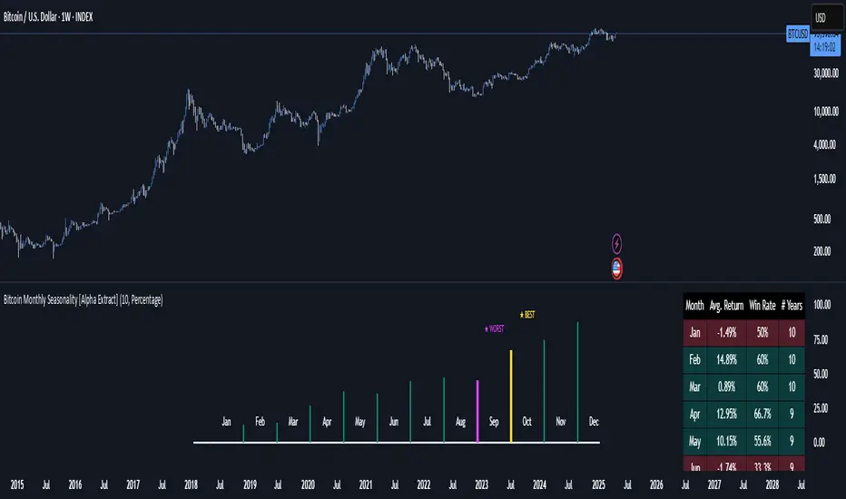
Bitcoin Monthly Seasonality [Alpha Extract]The Bitcoin Monthly Seasonality indicator analyzes historical Bitcoin price performance across different months of the year, enabling traders to identify seasonal patterns and potential trading opportunities. This tool helps traders:
Visualize which months historically perform best and worst for Bitcoin.
Track average returns and win rates for each month of the year.
Identify seasonal patterns to enhance trading strategies.
Compare cumulative or individual monthly performance.
🔶 CALCULATION
The indicator processes historical Bitcoin price data to calculate monthly performance metrics
Monthly Return Calculation
Inputs:
Monthly open and close prices.
User-defined lookback period (1-15 years).
Return Types:
Percentage: (monthEndPrice / monthStartPrice - 1) × 100
Price: monthEndPrice - monthStartPrice
Statistical Measures
Monthly Averages: ◦ Average return for each month calculated from historical data.
Win Rate: ◦ Percentage of positive returns for each month.
Best/Worst Detection: ◦ Identifies months with highest and lowest average returns.
Cumulative Option
Standard View: Shows discrete monthly performance.
Cumulative View: Shows compounding effect of consecutive months.
Example Calculation (Pine Script):
monthReturn = returnType == "Percentage" ?
(monthEndPrice / monthStartPrice - 1) * 100 :
monthEndPrice - monthStartPrice
calcWinRate(arr) =>
winCount = 0
totalCount = array.size(arr)
if totalCount > 0
for i = 0 to totalCount - 1
if array.get(arr, i) > 0
winCount += 1
(winCount / totalCount) * 100
else
0.0
🔶 DETAILS
Visual Features
Monthly Performance Bars: ◦ Color-coded bars (teal for positive, red for negative returns). ◦ Special highlighting for best (yellow) and worst (fuchsia) months.
Optional Trend Line: ◦ Shows continuous performance across months.
Monthly Axis Labels: ◦ Clear month names for easy reference.
Statistics Table: ◦ Comprehensive view of monthly performance metrics. ◦ Color-coded rows based on performance.
Interpretation
Strong Positive Months: Historically bullish periods for Bitcoin.
Strong Negative Months: Historically bearish periods for Bitcoin.
Win Rate Analysis: Higher win rates indicate more consistently positive months.
Pattern Recognition: Identify recurring seasonal patterns across years.
Best/Worst Identification: Quickly spot the historically strongest and weakest months.
🔶 EXAMPLES
The indicator helps identify key seasonal patterns
Bullish Seasons: Visualize historically strong months where Bitcoin tends to perform well, allowing traders to align long positions with favorable seasonality.
Bearish Seasons: Identify historically weak months where Bitcoin tends to underperform, helping traders avoid unfavorable periods or consider short positions.
Seasonal Strategy Development: Create trading strategies that capitalize on recurring monthly patterns, such as entering positions in historically strong months and reducing exposure during weak months.
Year-to-Year Comparison: Assess how current year performance compares to historical seasonal patterns to identify anomalies or confirmation of trends.
🔶 SETTINGS
Customization Options
Lookback Period: Adjust the number of years (1-15) used for historical analysis.
Return Type: Choose between percentage returns or absolute price changes.
Cumulative Option: Toggle between discrete monthly performance or cumulative effect.
Visual Style Options: Bar Display: Enable/disable and customize colors for positive/negative bars, Line Display: Enable/disable and customize colors for trend line, Axes Display: Show/hide reference axes.
Visual Enhancement: Best/Worst Month Highlighting: Toggle special highlighting of extreme months, Custom highlight colors for best and worst performing months.
The Bitcoin Monthly Seasonality indicator provides traders with valuable insights into Bitcoin's historical performance patterns throughout the year, helping to identify potentially favorable and unfavorable trading periods based on seasonal tendencies.
指標

[COG]S&P 500 Weekly Seasonality ProjectionS&P 500 Weekly Seasonality Projection
This indicator visualizes S&P 500 seasonality patterns based on historical weekly performance data. It projects price movements for up to 26 weeks ahead, highlighting key seasonal periods that have historically affected market performance.
Key Features:
Projects price movements based on historical S&P 500 weekly seasonality patterns (2005-2024)
Highlights six key seasonal periods: Jan-Feb Momentum, March Lows, April-May Strength, Summer Strength, September Dip, and Year-End Rally
Customizable forecast length from 1-26 weeks with quick timeframe selection buttons
Optional moving average smoothing for more gradual projections
Detailed statistics table showing projected price and percentage change
Seasonality mini-map showing the full annual pattern with current position
Customizable colors and visual elements
How to Use:
Apply to S&P 500 index or related instruments (daily timeframe or higher recommended)
Set your desired forecast length (1-26 weeks)
Monitor highlighted seasonal zones that have historically shown consistent patterns
Use the projection line as a general guideline for potential price movement
Settings:
Forecast length: Configure from 1-26 weeks or use quick select buttons (1M, 3M, 6M, 1Y)
Visual options: Customize colors, backgrounds, label sizes, and table position
Display options: Toggle statistics table, period highlights, labels, and mini-map
This indicator is designed as a visual guide to help identify potential seasonal tendencies in the S&P 500. Historical patterns are not guarantees of future performance, but understanding these seasonal biases can provide valuable context for your trading decisions.
Note: For optimal visualization, use on Daily timeframe or higher. Intraday timeframes will display a warning message. 指標

[COG]Nasdaq Weekly Seasonality ProjectionNasdaq Weekly Seasonality Projection
This indicator provides a visualization of Nasdaq seasonality patterns based on historical weekly performance data. It projects price movements for up to 26 weeks ahead, highlighting key seasonal periods that have historically affected tech stocks.
Key Features:
Projects price movements based on historical Nasdaq weekly seasonality patterns
Highlights six key seasonal periods: January Effect, March Lows, April-May Strength, Tech Summer Rally, September Dip, and Q4 Tech Rally
Customizable forecast length from 1-26 weeks with quick timeframe selection buttons
Optional moving average smoothing for more gradual projections
Detailed statistics table showing projected price and percentage change
Seasonality mini-map showing the full annual pattern with current position
Customizable colors and visual elements
How to Use:
Apply to Nasdaq indices or tech-focused instruments (daily timeframe or higher recommended)
Set your desired forecast length (1-26 weeks)
Monitor highlighted seasonal zones that have historically shown consistent patterns
Use the projection line as a general guideline for potential price movement
Settings:
Forecast length: Configure from 1-26 weeks or use quick select buttons (1M, 3M, 6M, 1Y)
Visual options: Customize colors, backgrounds, label sizes, and table position
Display options: Toggle statistics table, period highlights, labels, and mini-map
This indicator is designed as a visual guide to help identify potential seasonal tendencies in Nasdaq and tech stocks. Historical patterns are not guarantees of future performance, but understanding these seasonal biases can provide valuable context for your trading decisions.
Note: For optimal visualization, use on Daily timeframe or higher. Intraday timeframes will display a warning message. 指標

Multi-Timeframe VWAP Master ProThe Multi-Timeframe VWAP Suite is a comprehensive and highly customizable indicator designed for traders who rely on Volume-Weighted Average Price (VWAP) across multiple timeframes and periods. This tool provides a complete suite of VWAP calculations, including daily, weekly, monthly, quarterly, yearly, and custom VWAPs, allowing traders to analyze price action and volume trends with precision. Whether you're a day trader, swing trader, or long-term investor, this indicator offers unparalleled flexibility and depth for your trading strategy.
Multi-Timeframe VWAPs:
Daily, Weekly, Monthly, Quarterly, and Yearly VWAPs: Track VWAP across various timeframes to identify key support and resistance levels.
Customizable Timeframes: Use the SMA timeframe input to adjust the period for moving averages and other calculations.
Previous Period VWAPs:
Previous Daily, Weekly, Monthly, and Quarterly VWAPs: Analyze historical VWAP levels to understand past price behavior and identify potential reversal zones.
Previous Year Quarterly VWAPs: Compare current price action to VWAP levels from specific quarters of the previous year.
Custom VWAPs:
Custom Start Date and Timeframe: Define your own VWAP periods by specifying a start date and timeframe, allowing for tailored analysis.
Dynamic Custom VWAP Calculation: Automatically calculates VWAP based on your custom inputs, ensuring flexibility for unique trading strategies.
Seasonal and Yearly VWAPs:
April, July, and October VWAPs: Analyze seasonal trends by tracking VWAP levels for specific months.
Yearly VWAP: Get a broader perspective on long-term price trends with the yearly VWAP.
SMA Integration:
SMA Overlay: Combine VWAP analysis with a Simple Moving Average (SMA) for additional confirmation of trends and reversals.
Customizable SMA Length and Timeframe: Adjust the SMA settings to match your trading style and preferences.
User-Friendly Customization:
Toggle Visibility and Labels: Easily enable or disable the display of specific VWAPs and their labels to keep your chart clean and focused.
Color Customization: Each VWAP line and label is color-coded for easy identification and can be customized to suit your preferences.
Dynamic Labeling:
Automatic Labels: Labels are dynamically placed on the last bar, providing clear and concise information about each VWAP level.
Customizable Label Text: Labels include detailed information, such as the timeframe or custom period, for quick reference.
Flexible Timeframe Detection:
Automatic Timeframe Detection: The indicator automatically detects new days, weeks, months, and quarters, ensuring accurate VWAP calculations.
Support for Intraday and Higher Timeframes: Works seamlessly on all chart timeframes, from 1-minute to monthly charts.
Previous Year Quarterly VWAPs:
Q1, Q2, Q3, Q4 VWAPs: Compare current price action to VWAP levels from specific quarters of the previous year.
User-Selectable Year: Choose the year for which you want to calculate previous quarterly VWAPs.
Persistent Monthly VWAPs:
Option to Persist Monthly VWAPs Year-Round: Keep monthly VWAP levels visible even after the month ends for ongoing analysis.
Comprehensive Analysis: Combines multiple VWAP timeframes and periods into a single tool, eliminating the need for multiple indicators.
Customizable and Flexible: Tailor the indicator to your specific trading strategy with customizable timeframes, periods, and settings.
Enhanced Decision-Making: Gain deeper insights into price action and volume trends across different timeframes, helping you make more informed trading decisions.
Clean and Organized Charts: Toggle visibility and labels to keep your chart clutter-free while still accessing all the information you need.
Ideal For:
Day Traders: Use daily and intraday VWAPs to identify intraday support and resistance levels.
Swing Traders: Analyze weekly and monthly VWAPs to spot medium-term trends and reversals.
Long-Term Investors: Leverage quarterly and yearly VWAPs to understand long-term price behavior and key levels.
Seasonal Traders: Track April, July, and October VWAPs to capitalize on seasonal trends.
The Multi-Timeframe VWAP Suite is a powerful and versatile tool for traders of all styles and timeframes. With its comprehensive suite of VWAP calculations, customizable settings, and user-friendly design, it provides everything you need to analyze price action and volume trends with precision and confidence. Whether you're looking to fine-tune your intraday strategy or gain a broader perspective on long-term trends, this indicator has you covered. 指標

Window Seasonality IndicatorThis is a time window seasonal returns indicator. That is, it will provide the mean returns for a given time window based on a given number of lookbacks set by the user. The script finds matching time windows, e.g., 1st week of March going back 5 years or 9:00-10:00 window of every day going 50 days, and then calculates an average return for that window close price with respect to the close price in the immediately preceding time window, e.g. last week of February or 8:00-9:00 close price, respectively.
There are 4 input options:
1) Historical Periods to Average: Set the number of matching historical windows with which to calculate an average price. The max is 730 lookback windows. Note: for monthly or weekly windows, setting too large a number will cause the script to error out.
2) Use Open Price: calculates the seasonal returns using the open price rather than close price.
3) Show Bands: select from 1 Gaussian standard deviation or a nonparamateric ranked confidence interval. As a rough heuristic, the Gaussian band requires at least 30 lookback periods, and the ranked confidence interval requires 50 or more.
4) Upper Percentile: set the upper cutoff for ranked confidence interval.
5) Lower Percentile: set the lower cutoff for ranked confidence interval.
Please be aware, this indicator does not use rigorous statistical methodology and does not imply predictive power. You'll notice the range bands are very wide. Do not trade solely based on this indicator! Certain time windows, such as weekly and monthly, will make more sense applied to commodities, where annual cycles play a role in its supply and demand dynamics. Hourly windows are more useful in looking at equities markets. I like to look at equities with 1-hr windows to see if there is some pattern to overnight behavior or for market open and close. 指標