指標
指標

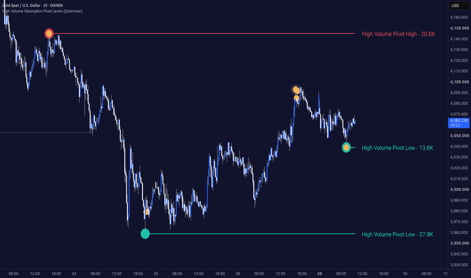
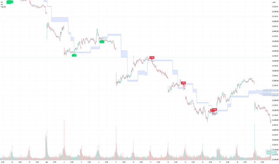
High Volume Absorption Pivot Levels (Zeiierman)█ Overview
High Volume Absorption Pivot Levels (Zeiierman) is a volume-based market structure indicator designed to identify significant pivot highs and lows where price shows signs of absorption during their formation.
Rather than plotting every swing point, the indicator filters pivots using two important characteristics:
• Elevated trading volume.
• Absorption candles that indicate a temporary balance between buyers and sellers.
Only pivots that satisfy these conditions become active support or resistance levels, allowing traders to focus on price levels that formed during periods of increased market participation.
⚪ Absorption and High Participation
The indicator combines traditional pivot detection with volume analysis.
A valid pivot requires:
• A confirmed swing high or swing low.
• Above-average volume on the pivot.
• An absorption candle occurring either around the pivot or directly on the pivot candle.
This helps remove many insignificant swing points while emphasizing areas where market participants were actively exchanging positions.
Once confirmed, these levels often serve as important reference points for future reactions, mitigation events, and retests.
█ How It Works
⚪ Pivot Structure Detection
The script continuously detects confirmed swing highs and swing lows using user-defined pivot lengths. These pivots become candidates for future support and resistance levels.
⚪ High Volume Filter
Not every pivot is plotted.
The pivot candle must also trade with above-average volume.
volume > sma(volume) × multiplier
This helps prioritize pivots that formed during periods of significantly higher participation than normal.
⚪ Absorption Candle Detection
The indicator searches for absorption candles around each pivot.
An absorption candle is defined as:
• Small candle body relative to the total range.
• Above-average trading volume.
█ How to Use
⚪ Identify Institutional Pivot Levels
Instead of displaying every swing point, the indicator focuses on pivots that formed during elevated participation.
This often highlights areas where larger market participants were active.
⚪ Target These Levels for Liquidity Sweeps
High-volume absorption pivots often become attractive liquidity targets.
As the market trends, the price frequently returns to sweep these levels before continuing in the direction of the prevailing trend or, in some cases, initiating a reversal.
These sweeps can represent:
• Liquidity collection before trend continuation.
• Stop-loss hunts around previous pivots.
• Profit-taking before the next market expansion.
• Potential reversal points if the sweep fails and strong opposing participation emerges.
Rather than treating these levels as fixed support or resistance, they should be viewed as important liquidity zones where market participants may become active.
█ Settings
Pivot Left / Right Length: Controls how swing highs and lows are confirmed.
Maximum Active Levels: Sets the maximum number of pivot levels displayed simultaneously.
Absorption Search Range: Defines how many candles around each pivot are searched for absorption.
Absorption Body %: Controls how small the candle body must be relative to the full candle range.
Absorption Volume Multiplier: Defines the minimum volume required for an absorption candle.
Require Absorption On Pivot Candle: Restricts valid pivots to those where the absorption candle occurs exactly on the pivot.
Pivot Volume Multiplier: Sets the minimum volume required for the pivot itself.
-----------------
Disclaimer
The content provided in my scripts, indicators, ideas, algorithms, and systems is for educational and informational purposes only. It does not constitute financial advice, investment recommendations, or a solicitation to buy or sell any financial instruments. I will not accept liability for any loss or damage, including without limitation any loss of profit, which may arise directly or indirectly from the use of or reliance on such information.
All investments involve risk, and the past performance of a security, industry, sector, market, financial product, trading strategy, backtest, or individual's trading does not guarantee future results or returns. Investors are fully responsible for any investment decisions they make. Such decisions should be based solely on an evaluation of their financial circumstances, investment objectives, risk tolerance, and liquidity needs.
指標
指標

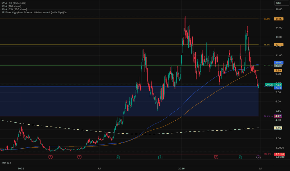
ATH/ATL Fibonacci Retracement - Labels, Golden Pocket & AlertsPlots Fibonacci retracement levels anchored to the all-time high and all-time low of the loaded chart history. The range updates automatically as new highs or lows print, so the levels always reflect the full extent of price action without manual redrawing.
Features:
- Auto ATH/ATL tracking — the 0% and 100% anchors update dynamically across all available history.
- Flip toggle — switch 0% between the top (all-time high) and the bottom (all-time low) to suit your bias or the direction of the move you're measuring.
- Standard Fib levels — 0%, 23.6%, 38.2%, 50%, 61.8%, 78.6%, and 100%, each color-coded.
- On-chart labels — every level shows its retracement percentage alongside the exact price, placed to the right of the last bar. Adjustable offset.
- Golden pocket shading — the 61.8%–78.6% reaction zone is highlighted for quick visual reference. Toggle on/off.
- Built-in alerts — alert conditions on crosses of each major level, plus a golden-pocket entry alert, ready to wire up from the Create Alert dialog.
Notes: Levels are based on the chart's loaded history, so the all-time high/low depends on how far back your data goes and your timeframe. This is an analysis tool, not financial advice — use it alongside your own process and risk management. 指標
Liquidity Structure Framework [PakunFX]Liquidity Sequence Framework
Liquidity Sequence Framework (LSF) is a market structure analysis indicator designed to visualize the progression of liquidity events, structure shifts, and Fair Value Gaps (FVGs) within a single analytical framework.
Instead of focusing on individual signals, the indicator organizes multiple market events into a sequential process, helping traders observe how price structure develops over time. The script combines swing structure, liquidity sweeps, trend filtering, and Fair Value Gap detection into a unified charting tool.
Features
External and Internal Swing Structure detection
Liquidity Sweep identification (SSL / BSL)
Bullish and Bearish Structure Shift detection
Automatic Fair Value Gap (FVG) detection
EMA-based trend filter
Premium / Discount (Equilibrium) filter
Configurable setup conditions
Visual sequence tracking with alerts
How it Works
The indicator monitors market structure using external and internal swing highs and lows. When liquidity is swept beyond a previous swing level, a new sequence begins. The script then tracks whether price confirms a structure shift and subsequently forms a Fair Value Gap within a configurable sequence window.
Trend filtering can be applied using Fast and Slow EMA conditions, while optional Premium / Discount and Fair Value Gap requirements allow users to customize how potential setups are displayed.
Display Elements
External Swing High / Low
Internal Swing High / Low
Liquidity Sweep markers (SSL / BSL)
Structure Shift markers
Active Fair Value Gap zones
Fast and Slow EMA
Equilibrium level
Setup markers
Alerts
Alerts are available for:
Liquidity Sweep
Bullish Structure Shift
Bearish Structure Shift
Bullish Sequence Setup
Bearish Sequence Setup
These alerts are intended to notify users when predefined analytical conditions are detected.
Notes
Liquidity Sequence Framework is designed as a market analysis tool. It visualizes structural relationships between liquidity events and price development but does not generate trading recommendations or predict future market direction.
Disclaimer
This script is provided for educational and research purposes only.
All calculations are based on historical price data. The displayed structures, Fair Value Gaps, and sequence conditions are intended to support chart analysis and should not be interpreted as guarantees of future market behavior or trading performance.
指標

HTF Candle Architecture [MQLSoftware]HTF Candle Architecture overlays up to three higher-timeframe candles simultaneously on any chart, rendering each at full structural fidelity — body, wicks, and open mid-line — and extending the live candle in real time as bars print. A right-side panel shows the bias, range position, and cross-timeframe alignment for all active levels. Level-touch signals mark when price closes near a key HTF boundary.
This is a visual analytical tool intended for chart reading and structural context. It does not execute trades and does not provide financial advice.
Key Features
Three simultaneous HTF levels, auto-selected from the standard timeframe ladder above the chart, with an override for manual pinning
Three display modes per level: Candles (body box + wicks), Bars (H-L spine with open/close ticks), and HL (high and low range lines only)
Live candle extends in real time — the body, wicks, and projection lines follow price as the current HTF period develops
OHLC Projection lines project the current HTF candle's High, Low, Open, and Close as dotted levels to the right, labeled with the timeframe and price
Range Position gauge — a filled-block bar (`████░░░ 71%`) showing where price sits inside each HTF candle's range; extremes (above 80% or below 20%) highlight in amber
Alignment row — cross-timeframe bias summary: ↑↑ ALIGNED when all enabled levels agree bullish, ↓↓ ALIGNED when all agree bearish, ⇅ MIXED when they conflict
Level-touch signals — fires when price first closes within a configurable ATR threshold of a HTF High, Low, or Open; one signal per HTF candle, per level
HTF Bias Background — subtle background tint matching the primary level's direction (blue for bull, red for bear)
Four alert conditions, all confirmed-bar only
Core Concept
Most HTF candle overlay scripts show a single timeframe. The useful information in a multi-timeframe view is not just that a candle exists at a higher timeframe — it is the structural relationship between that candle and the current position of price, repeated across multiple timeframes at once.
This indicator builds that view directly. Three independent HTF levels render simultaneously with separate depth cues: the closest timeframe uses a lighter body and thinner border; deeper timeframes use heavier borders and darker fills, so the layered structure reads without confusion at a glance.
The range position gauge is the specific addition that single-timeframe tools miss. Whether price is at 91% or 47% of the current Weekly candle's range changes the structural read. The gauge answers that for all three active levels without requiring the user to manually measure.
The alignment row adds the cross-timeframe read in a single line. When all enabled timeframes agree on direction, a single colored label replaces the need to read each row and compare manually. When they conflict, ⇅ MIXED in amber flags it explicitly so a false conviction read is not made.
The level-touch signal system layers actionable entries on top of the structural view. It applies a zone-entry filter — the signal fires only when price moves into the zone on this bar, not while it is already inside — and a per-period gate that allows at most one signal per active HTF candle per level. Combined, these two filters remove the signal spam that plagues basic proximity alerts.
Anatomy of the Display
HTF candle bodies are box objects spanning the HTF period's bar range. The live body updates right-edge and color on every bar. Closed candles are committed once the HTF period ends and stay anchored.
Wicks are line objects centered within the body's bar range, connecting the body edge to the High or Low. In Bars mode, the same lines form the H-L spine, open tick, and close tick of a standard bar representation.
The open mid-line is a dashed horizontal line at the Open price inside the body, visible when the body height exceeds 5% of ATR14, so it is suppressed on doji-like candles where it would overlap the border.
OHLC Projection lines are dotted horizontals extending from the HTF period start to `bar_index + N bars` (configurable). Each carries a tiny label on the right showing the timeframe abbreviation, level name, and price. They update every bar, so they track the live candle's developing values until the period closes.
The panel occupies the top-right corner. Rows 1-3 show the active timeframe, its bias (↑ BULL / ↓ BEAR), and the range position gauge. Row 4 shows the alignment verdict with a colored background. Rows 5-6 show the last signal fired. The header row shows the ticker.
Level-touch signal arrows appear below or above the bar that closes near a HTF level: ▲ for a Low touch (potential support), ▼ for a High touch (potential resistance). Signal size scales with HTF depth: L1 uses the smallest arrow, L3 the largest.
Notes on Repainting
HTF candle visual rendering uses `request.security` with `lookahead=barmerge.lookahead_on`. The live body and wicks update intrabar as the current HTF candle develops. This is display-only and is the standard practice for visualizing a forming HTF candle. The `lookahead_on` value is never used in any signal condition.
All signals are gated by `barstate.isconfirmed` and fire only on closed bars, never intrabar.
Zone-entry filter : a signal fires only if `math.abs(close - level) <= threshold` on this bar AND `math.abs(close - level) > threshold` on the prior bar. Price must move into the zone on this bar; already being inside the zone does not retrigger.
Per-period gate : a boolean flag resets at the start of each new HTF candle and is set on the first signal. At most one signal fires per HTF period per level.
Alerts are gated by `barstate.isconfirmed` and fire once per confirmed bar.
Typical Analysis Workflow
A common analytical workflow may include:
Checking the alignment row to establish a directional context — ↑↑ or ↓↓ ALIGNED suggests all active timeframes agree; ⇅ MIXED means caution
Reading the range position gauge to see whether price is extended (above 80% or below 20% of the HTF range, highlighted in amber) or mid-range
Watching the OHLC projection lines for the current session's active levels — these are the structurally meaningful prices for the live HTF candle
Noting level-touch signals as markers where price has closed near a key HTF boundary; combine with other analysis to assess significance
Configuration
Auto Timeframes — when enabled, selects the three most relevant standard TFs above the chart automatically. Disable to pin timeframes manually per level.
Candles to Show — how many closed HTF candles to keep on chart per level. Older candles are removed as new ones close.
Display Type — Candles, Bars, or HL. Applied to all levels simultaneously.
Per level (HTF 1 / 2 / 3) — enable/disable, custom timeframe, body opacity (0=opaque to 95=near-transparent), and separate bull/bear color pickers.
Visual group — show/hide wicks, mid-line, timeframe labels, live-candle highlight, bias background, anchor dots at period starts, and new-period shade.
Projections — show/hide H, L, O, C levels independently; extend-right bars; price labels on/off.
Panel — show/hide.
Signals — show/hide; touch threshold as ATR multiplier (0.05–1.0); H/L and Open toggles per level independently.
Markets and Timeframes
Works on any instrument and timeframe where at least one higher timeframe exists above the chart:
Forex
Stocks and Indices
Commodities
Cryptocurrencies
Auto timeframe selection scales from 1m charts (1H / 4H / D auto) through Daily (W / M auto). At the top of the timeframe ladder, fewer than three higher timeframes exist and the unused levels can be disabled.
Alerts
HTF 1 H/L Touch — price closed near HTF 1 High or Low
HTF 2 H/L Touch — price closed near HTF 2 High or Low
HTF 3 H/L Touch — price closed near HTF 3 High or Low
Any HTF H/L Touch — price closed near any active HTF High or Low
All alerts fire on confirmed bars only. 指標

Schrodinger Zone Probability [JOAT]SCHRÖDINGER ZONE PROBABILITY
The most quantitatively ambitious indicator in the JOAT suite. Detects Fair Value Gaps and Order Blocks the way a serious SMC engine should — and then, before they are touched, treats each one as a superposition zone with two simultaneous probabilities: P_S (the probability it will act as Support when revisited) and P_R (the probability it will act as Resistance). The two probabilities sum to one. The zone exists in a superposition of both states until price actually touches it; at that moment the wavefunction collapses to a single classical state — S or R — driven by the bars-after-touch confirmation logic. Then the script tags the zone with the committed direction and archives the collapse.
Detection — FVGs and OBs done properly
Two independent zone types feed the superposition engine:
Fair Value Gaps — the standard 3-candle imbalance definition, ATR-filtered (minimum gap = configurable × ATR, default 0.30×) so only meaningful gaps qualify. Bull and bear FVGs both detected.
Order Blocks — three methods exposed:
Last Opposite — latest opposite-color candle before displacement.
Extreme Opposite — most extreme (lowest low / highest high) candle in the walk-back window.
Strict Volume — Last Opposite filtered by volume above MA.
Displacement (the move that creates the zone) requires a body of displacement ATR multiple × ATR (default 1.20×). A configurable walk-back window controls how far back to search for the OB origin. Configurable mitigation rule (Wick = any pierce, Close = bar must close beyond).
The headline math — three-factor superposition probability
The collapse probabilities P_S / P_R are computed as a weighted blend of three orthogonal factors:
Distance factor — distance from current price to the zone, decayed exponentially with a configurable half-life in ATR units (default 2.0 ATR). Closer zones have higher commit probability.
Direction factor — which side of the zone current price is on. Above the zone leans the read toward Support collapse; below leans toward Resistance.
Flow factor — EMA-slope alignment over a configurable flow window (default 20 bars). Bullish flow biases toward Support; bearish flow biases toward Resistance.
Each factor's weight is independently tunable. Defaults (0.45 distance / 0.30 direction / 0.25 flow) are the script's institutional calibration. The output is two probabilities that sum to 1.
A zone with P_S ≈ P_R ≈ 0.5 is in pure superposition — the model is genuinely undecided. A zone with P_S = 0.85 / P_R = 0.15 is in a state nearly committed to Support; the wavefunction has already partly collapsed.
Wavefunction collapse — the engine's headline event
When price enters the zone within a configurable touch tolerance (default 0.05 × ATR slack) and holds inside for the configurable holdBars window (default 3 bars), the zone collapses to a single classical state:
Collapse to S — price bounced; the zone acted as Support. Marker prints "(+)→S" at the centroid.
Collapse to R — price was rejected from the other side; the zone acted as Resistance. Marker prints "(+)→R".
A configurable connector line is drawn at the committed level. Collapsed zones are optionally archived (default ON) so the chart shows the full history of how superpositions resolved.
Visual system — superposition rendering
Vertical gradient fill — each zone is rendered as a stack of N sub-boxes (configurable, default 8 slices) with progressive transparency, creating a vertical gradient that visually communicates "high probability of support at the bottom of the zone, high probability of resistance at the top". This is the script's signature visual.
Glow border — configurable glow intensity; becomes thicker when uncertainty is high (P_S ≈ P_R).
Animated superposition pulse — for zones in pure superposition (P ≈ 0.5), transparency oscillates with bar_index to indicate undecided state. Configurable period and amplitude.
Probability labels — P_S / P_R values printed on each active zone.
Zone type tags — FVG_BU, FVG_BE, OB_BU, OB_BE so origin is unambiguous.
Collapse markers — fancy glyphs (+)→S / (+)→R or plain S / R, configurable.
Show-only-superposition mode — hide collapsed and archived zones for a minimalist view.
Right extension — zones project a configurable number of bars to the right.
A locked institutional palette (cyan-teal bull / magenta bear) gives the chart a distinctive quantum-finance identity.
Dashboard
Monospaced table positionable to any of nine corners. Surfaces:
Active superposition zone count and archived count.
Nearest zone with its P_S / P_R values and distance.
Last collapse direction with bars-ago.
Current flow direction.
Detection thresholds and weights in use.
Mitigation rule.
Alerts
Multiple alert conditions:
New Superposition Zone Created (FVG or OB)
Collapse to Support
Collapse to Resistance
Approaching Zone (within collapse-touch tolerance)
High-Uncertainty Zone formed (P_S ≈ P_R ≈ 0.5)
How to read it
Three reads, in order of conviction:
Collapse alert with extreme one-sided probability — e.g. a zone with P_S = 0.85 collapses to S. The model was confidently pointing at one outcome, and the market confirmed it. The highest-conviction confluence read the script produces.
Approaching a zone with sharp probability bias — when P_S or P_R is dominant before touch, the model is committed to one direction. Position toward the dominant side; if the collapse confirms, you are in early.
High-uncertainty zone (P ≈ 0.5) — stand-aside signal. The model is genuinely undecided; trade only with strong external confluence (HTF structure, news flow) or skip the zone entirely.
Suggested settings
Defaults (FVG ATR 0.30×, displacement 1.20×, OB Last-Opposite, 15-bar walk-back, weights 0.45 / 0.30 / 0.25, half-life 2.0 ATR, 3-bar hold) are tuned for 15m–4H on liquid markets. For lower timeframes drop displacement to 1.0× and hold to 2. For HTF raise FVG ATR to 0.50× to keep only large gaps. The weights are calibrated together — change one and the others rebalance the probabilities; experimenting with the weights is a legitimate way to specialise the script to your instrument.
Originality
The implementation — the dual-source zone detector (FVG + OB) with three OB methods, the three-factor probability blend (distance / direction / flow) with independent weights, the exponential ATR-halflife distance decay, the touch-with-hold collapse-confirmation state machine, the vertical-gradient zone render using N stacked sub-boxes, the uncertainty-modulated glow border, the animated superposition pulse for high-uncertainty zones, the archive-on-collapse logic, and the dashboard's probability-aware layout — is JOAT-original. No third-party code reused. The Schrödinger framing (superposition → collapse) is the original conceptual contribution; the math is purpose-built.
Limitations
The "probability" output is a heuristic blend of three factors that historically correlate with which side a zone acts as — it is a ranked confidence, not a true Bayesian posterior. The factor weights are exposed precisely because no single weighting is universally correct. The collapse confirmation requires the holdBars window to elapse, so collapse markers lag the actual touch by that window (intentional — single-bar pierces should not commit a zone). The animated pulse for high-uncertainty zones is purely visual.
-made with passion by jackofalltrades
指標

Hidden Liquidity Profile [Alpha Extract]A sophisticated liquidity-mapping and support/resistance profiling framework that analyzes historical candle structure, volume, wick behaviour, and price distribution to identify hidden supply and demand zones across the chart. Hidden Liquidity Profile is designed to reveal where meaningful liquidity may be concentrated by separating sell-side and buy-side pressure into price bins, then projecting those zones forward as heat boxes, horizon lines, key price tags, and a real-time support/resistance dashboard.
Rather than relying on simple pivot highs and lows, the system evaluates how volume interacted with candle ranges, upper wicks, lower wicks, candle bodies, and recency weighting. This creates a dynamic liquidity profile that highlights where price may encounter resistance, support, absorption, or reaction zones.
🔶 Hidden Liquidity Profiling Engine
Builds separate supply and demand profiles across the selected lookback range. The system divides price into configurable bins, then distributes liquidity strength into those bins based on volume, candle range, wick size, body size, and age decay.
energy = vol * rng * decay
sellStrength = energy * (upWick * wickWeight + body * bodyWeight * sellBias)
buyStrength = energy * (dnWick * wickWeight + body * bodyWeight * buyBias)
This allows the indicator to estimate where sell liquidity and buy liquidity are most likely concentrated rather than only marking obvious visible highs and lows.
🔶 Supply & Demand Separation
The profile separates upper-wick and lower-wick pressure into two distinct liquidity maps.
Upper wick activity contributes to the supply profile, helping identify areas where sellers may have previously absorbed price movement. Lower wick activity contributes to the demand profile, helping identify zones where buyers may have previously defended price.
This separation gives traders a clearer view of whether nearby levels are more likely to behave as resistance, support, or balanced liquidity.
🔶 Age-Weighted Liquidity Decay
Applies a recency decay model so newer candles have stronger influence than older candles. This keeps the profile focused on liquidity that is more relevant to the current market environment while still preserving broader historical context.
The Age Decay Power setting controls how aggressively older liquidity fades. Higher values emphasize recent price action more strongly, while lower values retain more historical structure.
🔶 Price Bin Distribution System
Divides the analyzed price range into configurable price bins and assigns liquidity strength into each level. The Price Bins setting controls the resolution of the profile.
More bins create a finer, more detailed liquidity map. Fewer bins create a smoother, broader view of major supply and demand areas.
🔶 Distribution Radius Smoothing
Uses a configurable distribution radius to spread liquidity strength around nearby bins. This prevents the profile from becoming too fragmented and helps form smoother liquidity clusters.
This is especially useful on volatile assets where important liquidity zones often form across small ranges rather than at one exact tick.
🔶 Liquidity Heat Box Visualization
Displays supply and demand as horizontal heat boxes projected to the right side of the chart.
Supply liquidity is shown on the sell side using the selected sell color, while demand liquidity is shown on the buy side using the selected buy color. Wider and brighter boxes represent stronger normalized liquidity at that price level.
This creates a visual depth-style map that helps traders quickly identify where meaningful liquidity may be stacked above and below current price.
🔶 Forward Horizon Lines
Projects stronger liquidity levels forward using horizontal lines. These lines act as future reference zones where price may react, pause, reject, or accelerate through.
The Line Trigger setting controls how strong a liquidity level must be before it is projected. The Line Width Scale setting adjusts how visually dominant stronger levels appear.
🔶 Key Level Detection Framework
Identifies the strongest supply and demand levels from the profile and labels them directly on the chart.
The system can prioritize local peaks, helping avoid overcrowding and ensuring that selected levels represent distinct liquidity clusters rather than multiple nearby bins from the same zone.
This scoring model favors levels with strong dominant liquidity while still accounting for total combined activity.
🔶 Supply HVN & Demand HVN Labels
Marks high-volume liquidity nodes as Supply HVN or Demand HVN depending on which side of the profile dominates at that price.
Each label includes the level type, normalized strength percentage, and exact price. This allows traders to quickly identify the most important liquidity levels without manually reading the full heat map.
🔶 Nearest Support & Resistance Logic
Calculates the most relevant resistance above price and support below price using both liquidity strength and distance from current price.
Levels closer to current price receive more practical importance, while still needing enough liquidity strength to qualify. This helps the dashboard focus on actionable nearby zones instead of simply displaying the strongest level anywhere in the lookback range.
🔶 Aura Point Of Control
Identifies the strongest combined liquidity level across the profile. This Aura POC represents the price zone with the highest combined supply and demand activity.
The POC can act as a major reference point for balance, rotation, acceptance, rejection, or future retests.
🔶 Liquidity Pressure Balance
Compares total normalized demand against total normalized supply to estimate the broader pressure bias across the analyzed range.
When demand is meaningfully stronger, the dashboard shows a demand bias. When supply dominates, it shows a supply bias. When the two sides are close, the market is classified as balanced.
🔶 Real-Time S/R Dashboard
Includes a compact dashboard showing the most important liquidity information directly on the chart:
• Nearest resistance level
• Nearest support level
• Aura POC
• Supply, demand, or balanced pressure
• Active liquidity level count
• Current ticker reference
This gives traders a quick summary of where the strongest nearby reaction zones are and whether the broader liquidity profile is tilted toward supply or demand.
🔶 Customizable Visual Controls
Provides flexible display controls for heat boxes, horizon lines, key level tags, dotted key level lines, and the dashboard.
Traders can adjust the number of analyzed bars, price bin resolution, liquidity smoothing, projection distance, box width, line width, and trigger thresholds to match different assets and timeframes.
🔶 Clean Overlay Design
The full liquidity map is displayed directly on price without requiring a separate oscillator pane. Heat boxes appear to the right of the chart, while key levels and labels extend across the active lookback area.
This keeps the chart readable while still providing a detailed view of hidden supply and demand structure.
🔶 Why Choose Hidden Liquidity Profile ?
Hidden Liquidity Profile provides a more advanced way to identify potential support, resistance, and liquidity reaction zones by analyzing volume-weighted candle structure across the full price range. Instead of marking only visible swing highs and lows, it evaluates where supply and demand pressure may be concentrated based on wick behaviour, candle body participation, volume energy, and recency-weighted price distribution.
The heat boxes reveal liquidity density, the horizon lines project important levels forward, the HVN labels highlight the strongest zones, and the dashboard summarizes nearest support, resistance, POC, and pressure bias in real time.
Perfect for liquidity traders, support/resistance traders, intraday traders, swing traders, and market structure analysts who want a cleaner way to visualize hidden supply and demand zones directly on the chart. 指標

指標
指標

Support or Resistance with Deviation - Candle Iron CoreThe Support or Resistance with Deviation - Candle Iron Core indicator is designed to help traders visualize custom support and resistance zones by applying a percentage deviation around a user-defined reference price.
Unlike traditional support and resistance indicators, this tool does not automatically detect support or resistance levels . Instead, it gives traders complete freedom to choose the most relevant price level according to their own market analysis and trading methodology.
By allowing traders to manually define a key price level and instantly project percentage-based deviation zones around it, the indicator provides a structured framework for risk management and price reaction analysis.
Core Concept
The trader first selects a reference price that they consider important.
This reference may represent:
A major support level.
A major resistance level.
A supply or demand zone.
A daily, weekly, or monthly opening price.
A liquidity pool.
A swing high or swing low.
Any price level identified through the trader's own analysis.
Once the reference price is selected, the indicator calculates upper and lower deviation levels based on a user-defined percentage.
Mathematically:
Deviation = Base Price × (Deviation % / 100)
Upper Level = Base Price + Deviation
Lower Level = Base Price − Deviation
The area between both levels creates a visual deviation zone that can be used as a framework for analyzing price behavior.
Base Price Modes
Current Asset Price
Automatically uses the latest market price of the current asset.
This mode was specifically designed to make the indicator immediately usable on any market without requiring manual adjustments. Traders can quickly apply the script to stocks, cryptocurrencies, futures, forex pairs, indices, or commodities and instantly obtain a deviation zone around the current market price.
Manual Price
Allows traders to manually specify any custom price level.
This mode is particularly useful when analyzing previously identified support or resistance levels, institutional zones, swing highs/lows, or any important market reference.
Indicator Components
Upper Deviation Level: Base Price + Deviation.
Base Price: Central reference selected by the trader.
Lower Deviation Level: Base Price − Deviation.
Deviation Zone: The shaded area between the upper and lower levels.
Practical Applications
This tool can be used to:
Visualize custom support and resistance zones.
Define objective stop-loss areas.
Estimate take-profit targets.
Identify potential liquidity areas.
Analyze market expansion and contraction.
Measure acceptable price deviation around key levels.
Build zone-to-zone trading frameworks.
Evaluate risk-to-reward scenarios.
Assist mean reversion and range-based trading strategies.
Important Notes
This indicator does not automatically detect support levels.
This indicator does not automatically detect resistance levels.
This indicator does not generate buy or sell signals.
This indicator does not predict future market direction.
The quality of the analysis depends entirely on the trader's ability to identify meaningful reference prices.
This script should be viewed as a visualization and risk management tool rather than a standalone trading system.
Why This Indicator Is Different
Many support and resistance tools attempt to automatically identify market levels using predefined algorithms.
This indicator takes a different approach.
Instead of forcing a specific interpretation of market structure, it allows traders to apply their own discretion while providing a precise and objective framework for measuring price deviation around any selected level.
This makes the indicator flexible enough to adapt to virtually any trading style, market, or timeframe.
指標

指標

FBD Reclaim Tool v52FBD Reclaim Tool v52 - Advanced Time-Based Level Trading Engine for Failed Breakdown
Overview
The FBD Reclaim Tool v52 is a specialized, dual-core state machine designed for structural level trading. Built for traders who are tired of getting chopped up by "fakeouts" and liquidity sweeps, this tool abandons simple price-cross alerts. Instead, it relies on Time-Based Reclaim Logic—requiring the market to prove acceptance of a level over a physical duration of time before triggering an entry.
Whether you trade Futures, Indices, or Commodities, this script evaluates market structure in real-time, calculates dynamic structural targets, and routes beautifully formatted webhook payloads to Discord or your automated broker bridge.
Core Trading Concept: The "Flush, Base, Direction" (FBD)
Most indicators buy the exact touch of a support level, often catching a falling knife. This engine waits for the trap to be sprung:
The Sweep/Flush: Price must drop below a defined Major Support by a specified depth (Flush Depth). The system then "arms" the setup.
The Reclaim: Price must climb back above the level.
Time Acceptance & Dip Buffer: Price must hold above the level for a user-defined duration (e.g., 150 seconds). To account for market noise, the engine includes a Dip Reset Buffer: if price dips back under the level, the timer doesn't reset instantly unless it stays submerged beyond your defined grace period.
Execution: Once time acceptance is confirmed, the trade triggers.
Key Features
⏱️ True Time-Based Execution: Uses lower-timeframe (1S) data arrays to track exact physical seconds spent above/below a level. Includes a dynamic on-chart tracker (⏳) showing live countdowns and reclaim velocity.
📝 Natural Language Level Parser: Paste your daily levels straight from your notes! The "Mancini NL Format" automatically parses strings like 7205 (major), 7213—extracting numbers and assigning them as Major Support/Resistance or Minor zones based on your text tags. Standard CSV input is also supported.
🎯 Structural TP & SL Routing: Forget fixed point targets. The engine dynamically scans the array of levels you inputted and sets your Take Profit or Stop Loss at the next logical major structural level. (Fallback fixed points are used if no level is nearby).
🎛️ Chart Declutter Mode (New in v52): An added toggle to hide TP, SL, and Target Hit/Stopped Out labels. Keep your charts pristine, viewing only the entry triggers and level lines, while the script silently runs the management logic in the background.
📊 Tactical Dual-HUD: * Session HUD (Top Right): Calculates a dynamic "Session Rating" (A+, B, F) based on time-of-day edges and Sunday gap logic, tracks Daily TR vs. ATR, and counts "M1 Red Days" to gauge trend exhaustion.
Trade HUD (Bottom Right): Real-time table displaying your current Entry, SL, TP, Risk (pts), R/R Ratio, and the Reclaim Velocity.
🌊 Higher Timeframe Trend Filter: Uses an HTF Moving Average to filter trades. Counter-trend setups aren't entirely blocked but are visibly tagged as ⚠️ LQ (Low Quality) so you can manage your risk accordingly.
🤖 Built-in Discord / Webhook Alerts: Formats clean, data-rich JSON payloads detailing the Trade ID, execution time, R/R, Entry, and exact risk metrics, ready to be sent to your Discord channel.
How to Use:
Select your Input Mode (Mancini NL or CSV).
Input your daily Supports and Resistances.
Configure your Flush Depth, Acceptance Time, and Dip Buffer based on the volatility of your chosen asset.
Set up a TradingView Alert with the condition Any alert() function call to route the script's internal execution logs directly to your webhook.
Disclaimer: This script is for educational and informational purposes only. Trading futures, options, and equities carries significant risk. Always forward-test indicator logic in a paper trading environment before risking live capital. 指標

Advanced Liquidity Sweep [HexaTrades]Advanced Liquidity Sweep is a Smart Money Concepts (SMC) indicator designed to automatically identify liquidity pools, equal highs and lows, liquidity sweeps, and potential reversal areas. Rather than simply detecting wick breaks, it evaluates each sweep using multiple confirmation factors and assigns a strength score, helping traders distinguish between minor stop hunts and higher-quality liquidity events.
The indicator is designed for cryptocurrencies, stocks, forex, futures, commodities, and indices across all timeframes.
What is Liquidity?
Financial markets constantly search for liquidity before making significant moves.
Retail traders often place:
• Stop losses below swing lows
• Stop losses above swing highs
• Breakout orders above resistance
• Breakdown orders below support
These orders accumulate into liquidity pools. Large market participants frequently move prices into these areas to fill large positions before reversing or continuing the trend.
This indicator automatically identifies those liquidity pools and highlights when they are swept.
How it works :
- Map the liquidity.: Confirmed pivot highs become BSL lines, pivot lows become SSL lines. You choose Major and/or Minor swing sizes.
- Cluster equal highs/lows. Several highs (or lows) at nearly the same price form an EQH / EQL cluster, a bigger, juicier liquidity pool that scores higher.
- Detect the sweep (on closed candles only).
• Bearish: price trades above a BSL level but closes back below it.
• Bullish: price trades below an SSL level but closes back above it.
- Score it 0–100. Six factors rate how convincing the rejection was (see below). At/above your Strong threshold, it’s tagged STRONG.
- Draw a sweep zone. Optionally turn each sweep into a supply/demand zone you can watch for re-entry, with optional auto-expiry.
- Filter the noise. Optional Trend, Higher-Timeframe and Filter presets keep only the cleaner grabs.
Features
🔶 Major & Minor Swing Detection
The indicator detects both major and minor swing highs and lows.
Major swings represent stronger institutional liquidity and usually produce higher-quality reactions.
Minor swings identify shorter-term liquidity that is commonly targeted during intraday trading.
Users can monitor:
• Major swings only
• Minor swings only
• Both simultaneously
🔶Buy-Side Liquidity (BSL)
Buy-side liquidity forms above previous swing highs.
These areas usually contain:
• Short stop losses
• Breakout buy orders
• Momentum entries
When price trades above these highs before quickly closing back below, the indicator identifies a bearish liquidity sweep.
🔶 Sell-Side Liquidity (SSL)
Sell-side liquidity forms below previous swing lows.
These areas usually contain:
• Long stop losses
• Panic selling
• Breakdown entries
When price trades below these lows before closing back above, the indicator identifies a bullish liquidity sweep.
🔶 Equal Highs & Equal Lows
Equal highs and equal lows are some of the strongest liquidity pools because many traders place stops at nearly identical price levels.
The indicator automatically detects these structures using:
• ATR-based tolerance
• Percentage-based tolerance
Equal liquidity levels are highlighted separately and tracked independently from normal swing liquidity.
🔶 Zone Colors
Here are the zone and line colors used in this indicator and what each one means:
🔴 Red: Buy-Side Liquidity (BSL)
- Represents swing highs where buy-side liquidity is concentrated.
- Commonly contains short stop-loss orders and breakout buy orders.
- These are active, unswept liquidity levels and potential targets for a bearish liquidity sweep.
🟢 Green: Sell-Side Liquidity (SSL)
- Represents swing lows where sell-side liquidity is concentrated.
- Commonly contains long stop-loss orders and breakdown sell orders.
- These are active, unswept liquidity levels and potential targets for a bullish liquidity sweep.
🟠 Orange: Equal Highs / Equal Lows (EQH / EQL)
- Marks two or more highs or lows formed at nearly the same price.
- These levels are displayed using dashed lines and often contain larger clusters of resting liquidity.
- Sweeps of Equal Highs and Equal Lows typically produce stronger, higher-probability trading opportunities.
⚪ Gray: Swept (Inactive) Liquidity
- Indicates liquidity that has already been swept by price.
- Once a level has been taken, it changes to gray and becomes inactive.
- This helps distinguish spent liquidity from active levels that may still attract future price movement.
Sweep Signal Colors
🟩 Bullish Liquidity Sweep
-Appears when Sell-Side Liquidity (SSL) or an Equal Low (EQL) is swept.
-Price trades below the liquidity level but closes back above it, confirming a bullish liquidity sweep.
🟪 Bearish Liquidity Sweep
- Appears when Buy-Side Liquidity (BSL) or an Equal High (EQH ) is swept.
- Price trades above the liquidity level but closes back below it, confirming a bearish liquidity sweep.
🔶 Liquidity Sweep Detection
A liquidity sweep occurs when price temporarily breaks a liquidity level but fails to hold beyond it.
For a valid sweep:
Bearish Sweep
• Price trades above Buy-Side Liquidity
• The candle closes back below the level
Bullish Sweep
• Price trades below Sell-Side Liquidity
• The candle closes back above the level
Because the signal is generated only after the candle closes, the indicator does not repaint.
🔶Sweep Strength Score
Every sweep receives a strength score from 0 to 100.
The score combines multiple factors including:
• Wick rejection
• Candle body strength
• Penetration distance beyond liquidity
• Volume confirmation
• Distance from the EMA
• Equal High / Equal Low cluster strength
Higher scores generally indicate stronger liquidity events.
Strength tiers are classified as: Weak, Medium, Strong, and Elite
Users can also define a minimum score to filter out lower-quality sweeps.
🔶 Score Presets
Three scoring profiles are available:
Conservative: Places greater emphasis on clean rejection candles and body structure.
Balanced: Provides an even weighting across all scoring components and is suitable for most trading styles.
Aggressive: Places greater importance on volume and equal liquidity clusters, making it more responsive to institutional activity.
🔶 Trend & Higher Timeframe Filters
The indicator includes optional trend confirmation filters to help improve signal quality.
The Trend Filter uses the EMA 50 and EMA 200 to evaluate the current market direction and offers two modes:
Continuation : Displays only sweeps that align with the prevailing trend.
Reversal : Displays only sweeps that occur against the prevailing trend, helping identify potential market reversals.
For additional confirmation, the Higher Timeframe (HTF) Bias Filter compares price with a higher timeframe EMA. When enabled, sweeps are generated only if they align with the broader market trend, helping reduce false signals and improving overall trade selection.
🔶 Liquidity & Sweep Zones
The indicator provides two complementary ways to visualize liquidity on the chart.
Liquidity Zones highlight swing highs and lows as either horizontal lines, price zones, or both, making it easier to identify areas where liquidity is likely to accumulate. Users can choose between Lines Only, Zones Only, or Both to match their preferred chart style.
When a liquidity sweep occurs, the indicator automatically creates a Sweep Zone around the rejection candle. These zones can be extended into the future, automatically removed after a user-defined period, or kept indefinitely. Sweep zones often serve as potential support or resistance areas, making them useful for identifying future reaction zones, retests, and trade opportunities.
⭐️ Bullish Liquidity Sweep
Price sweeps below the Sell-Side Liquidity (SSL), triggering stop-loss orders before quickly reversing and closing back above the liquidity level. The Sweep Zone acts as a potential support area, while the strength score helps evaluate the quality of the setup. Traders may look for long opportunities on the confirmation or retest, targeting the next Buy-Side Liquidity (BSL).
Example:
⭐️Bearish Liquidity Sweep
Price sweeps above Buy-Side Liquidity (BSL), triggering breakout orders and stop-losses before reversing and closing back below the liquidity level. The Sweep Zone acts as a potential resistance area, while the strength score helps evaluate the quality of the setup. Traders may look for short opportunities on the rejection or retest, targeting the next Sell-Side Liquidity (SSL
example chart:
Alerts
Built-in alert conditions include:
• Bullish Liquidity Sweep
• Bearish Liquidity Sweep
• Equal High Sweep
• Equal Low Sweep
• Strong Bullish Sweep
• Strong Bearish Sweep
• Next-Candle Confirmed Sweep
• Any Liquidity Sweep
These alerts allow traders to automate notifications without monitoring charts continuously.
How to Use
The Advanced Liquidity Sweep indicator helps identify where liquidity exists, when it has been swept, and how strong the resulting market reaction is. For the best results, combine it with market structure, support and resistance, and proper risk management.
Bullish Setup:
- Wait for price to sweep a Sell-Side Liquidity (SSL) level.
- The candle should close back above the liquidity level, confirming a bullish sweep.
- Prefer Medium, Strong, or Elite sweep scores for higher-quality setups.
- Use the Trend Filter or Higher Timeframe Bias Filter for additional confirmation.
- Watch for a retest of the Sweep Zone before considering a long entry.
-Place the stop-loss below the sweep low and target nearby resistance or Buy-Side Liquidity.
Bearish Setup:
- Wait for price to sweep a Buy-Side Liquidity (BSL) level.
- The candle should close back below the liquidity level, confirming a bearish sweep.
- Focus on higher-strength sweep scores for better probability.
- Confirm the setup using the Trend or Higher Timeframe filters.
- Look for rejection from the Sweep Zone before entering a short position.
- Place the stop-loss above the sweep high and target nearby support or Sell-Side Liquidity.
Advanced Liquidity Sweep is designed to help traders understand where liquidity exists, identify when it has been taken, and evaluate the quality of each sweep using multiple confirmation factors. Rather than relying on simple wick breaks, it combines liquidity analysis, market structure, trend confirmation, and strength scoring to provide greater context for trading decisions. As with any technical tool, it should be used alongside sound risk management and additional market analysis for the best results.
We would love to hear your suggestions. If you have ideas for new features, indicators, analytics, or improvements, please share your feedback. Your input helps guide future updates and improve the indicator for all traders.
This indicator is for educational and analytical purposes only. It should not be considered financial advice. Always use proper risk management and make trading decisions based on your own analysis
指標

Market Regime & Trend Filter🚀 MARKET REGIME & TREND FILTER PRO
The Market Regime & Trend Filter Pro (MRTF), engineered by gunebak4n, is an institutional-grade multi-dimensional trend classification and market structure isolation framework. It is designed to visually map macro price regimes, isolate structural expansions, and filter out low-liquidity market noise without a single pixel of signal repainting.
MRTF operates on the core principle that directional price movement cannot be evaluated in a vacuum. True, sustainable trends are defined by the mathematical convergence of statistical linear regression velocity and validated swing market structures (Higher Highs / Lower Lows). By unifying an asset-agnostic, normalized slope calculation with a lag-free swing matrix, MRTF projects multi-state market environments directly onto the user's chart.
Unlike traditional moving averages or standard trend-following tools that suffer from severe lag or generate devastating false signals during prolonged sideways consolidations, MRTF dynamically shifts across five distinct market regimes—instantly distinguishing a high-conviction breakout from a dangerous, low-velocity trap.
💡 CORE DESIGN PRINCIPLES
🧭 Normalized Statistical Velocity Engine
Standard linear regression slopes fail when comparing different assets or volatile timeframes because their raw values depend entirely on the asset's nominal price. MRTF solves this by processing the raw slope (Beta Coefficient) through a dynamic ATR (Average True Range) normalization matrix. This transforms ordinary regression into a universal, percentage-based momentum tracker that remains stable across Bitcoin, Apple, or Gold.
🧬 Non-Repainting Multi-Layer Validation
The framework continuously evaluates two distinct algorithmic layers:
Statistical Trend Component: A localized rolling covariance engine that measures the geometric slope of the price index over a user-defined lookback window.
Structural Swing Component: A strict, non-repainting pivot tracking system that marks qualified market structures based on strict historical confirmations.
The structural intersection of these layers determines the definitive macro market regime.
💡 KEY FEATURES
📊 Five-State Market Regime Matrix
Instead of a binary "bull or bear" output, MRTF classifies the market into 5 actionable phases to optimize strategy execution:
Strong Bullish: Market structure is breaking higher (HH/HL) and the normalized channel slope is expanding aggressively upward.
Weak Bullish: Structural trend is upward but momentum is flattening, OR macro momentum is extremely bullish despite temporary structural breaks.
Ranging / Choppy: The absolute trend slope is compressed inside the dead-zone threshold. Capital preservation mode.
Weak Bearish: Structural trend is downward but selling momentum is stalling, OR macro momentum is sharply negative despite minor upward structural retracements.
Strong Bearish: Market structure is breaking lower (LH/LL) and the normalized channel slope is accelerating aggressively downward.
🧪 Advanced Chart-Scale Alignment (Log/Linear)
A critical feature engineered into MRTF is its manual Price Scale Mode switch. Because Pine Script cannot natively detect whether a user's visual chart layout is set to Logarithmic or Linear, MRTF provides an input enum to match your chart. This prevents the mathematical distortion of regression slopes on long-term logarithmic charts, ensuring accurate momentum readings.
🛡️ Non-Repainting Historical Swing Mapping
The indicator utilizes advanced pivot logic to identify valid structural peaks and troughs. By utilizing a fixed right-bar confirmation offset, the system completely eliminates the risk of signal repainting. Shapes are placed historically precisely where the structural pivot occurred, offering an uncorrupted look back at structural market transitions.
🔬 MATHEMATICAL ARCHITECTURE
If Scale Mode is Logarithmic:
Y_val = ln(Close)
If Scale Mode is Linear:
Y_val = Close
• Mean_X = SMA(bar_index, Length)
• Mean_Y = SMA(Y_val, Length)
• Mean_XY = SMA(bar_index * Y_val, Length)
• Cov_XY = Mean_XY - (Mean_X * Mean_Y)
• Variance_X = Variance(bar_index, Length)
• Raw_Slope = Cov_XY / Variance_X
• ATR_Val = ATR(Length)
If Scale Mode is Logarithmic:
Normalized_Slope = Raw_Slope * 100
If Scale Mode is Linear:
Normalized_Slope = (Raw_Slope / ATR_Val) * 100
🛠️ USAGE FRAMEWORK
1. Candlestick Regime Coloring
Monitor the color shifts of the live candlesticks to instantly identify the dominant institutional phase:
Bright Lime Candles: Strong Bullish Expansion. (Ideal for riding strong macro trend extensions).
Muted Green Candles: Weak Bullish Phase / Potential Exhaustion or Minor Retracement.
Gray Candles: Ranging / Choppy Environment. Tighten stop-losses, avoid breakout chasing, and look for mean-reversion setups.
Muted Maroon Candles: Weak Bearish Phase / Defensive Posture.
Bright Red Candles: Strong Bearish Expansion. (Ideal for capital preservation or short-side exposure).
2. Analytical Control Dashboard
The real-time HUD (Heads-Up Display) in the corner of your chart provides a synchronized summary of market health:
Scale Mode: Confirms whether your mathematical engine is aligned with your visual chart scale.
Norm Slope: Displays the exact normalized statistical momentum score. Values crossing outside your threshold indicate volatility expansions.
Market Structure: Shows the structural orientation based on valid pivot series (Bullish, Bearish, or Undetermined).
3. Structural Pivot Turning Points
The small red and lime triangles plotted on the chart mark confirmed structural swing points. Because they are fully non-repainting, they represent concrete psychological levels where institutional order flow shifted, making them excellent levels for placing structural stop-losses or identifying major support/resistance zones.
⚙️ SYSTEM CHARACTERISTICS
Zero Repainting: All background calculations, candlestick color shifts, and swing markers are mathematically locked upon bar close.
Fully Parameterized Controls: Seamlessly adjust regression lengths, swing confirmations, and slope thresholds to adapt the script to Scalping, Day Trading, or Macro Swing Trading.
Asset-Agnostic Engine: Works flawlessly across Equities, Forex, Crypto, Indices, and Commodities by converting absolute price tracking into standardized volatility metrics.
Custom Visual Themes: Every single regime color and dashboard location parameter can be customized within the user settings panel to fit clean dark or light chart aesthetics.
📌 CREDIT
The Market Regime & Trend Filter Pro (MRTF) is officially engineered and published by gunebak4n on TradingView.
This script is built for professional traders who prioritize statistical clarity and structural confirmation over erratic, lagging indicators or noise-heavy lagging moving averages.
⚠️ DISCLAIMER
MRTF is a probabilistic statistical mapping model designed for data visualization. It does not issue absolute trading recommendations, financial advice, or automated profit guarantees. Always backtest your parameters and manage your risk exposure strictly according to your personal trading plan. 指標

Volume To Bar Range RatioThis script plots
volume / (high - low)
for each bar. A simple measure of how much volume was traded per unit of price range.
Usage
In normal trading bars, volume tends to be correlated to the size of the bar. Small bars have small volume, large bars have large volume. However, key bars tend to have an unusually high ratio of range to volume. This is useful for identifying areas of support and resistance, when they are broken, and key runaway days when price goes parabolic.
Support and Resistance
When price is near an area of support or resistance, or approaching a recent high/low, a small bar with unusually high volume tends to be an indicator that the support/resistance is holding.
When price breaks through an area of support or resistance, or makes a new high or low, and the bar that does is large with an unusually high ratio of volume to range, this is an indicator that support/resistance has been decisively broken. Conversely, if the bar is large, but the ratio of price to volume is similar to other large bars, it is a warning that this might not be a decisive break.
Key Runaway Days
When price has become parabolic and has made several consecutive large moves up, a large bar with a volume to bar range ratio that is extremely high, higher than any other bar made previously, this is an indicator that a runaway day is occurring. Price is unlikely to continue moving parabolically after this day, and it would be a good time to take profits.
Notes
Bars where `high == low` produce `na` (a gap in the plot) to avoid division by zero.
Works on any symbol and timeframe that reports volume.
Note on Originality
This is the first, only, and original implementation of Volume to Bar Range Ratio available in PineScript. This can be easily verified with a search for "Volume to Bar Range Ratio", "Volume Bar Range Ratio", "VBRR", and"VTBRR" on TradingView. Also, a Google search for the same terms, adding "pinescript" or "tradingview" shows that my implementation is the only implementation, and the only other result is a complaint on reddit that this does not exist. 指標

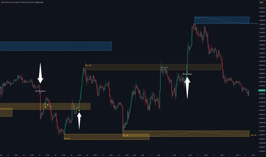
High Volume Pivot Support & Resistance Zones [BigBeluga]High Volume Pivot Support & Resistance Zones is a market-structure indicator built for TradingView. It helps traders find key support and resistance levels by looking for major pivot points backed by institutional volume.
Instead of drawing simple unweighted lines, this tool tracks the volume of swing highs and lows. When a high-volume pivot is found, the script creates a dynamic zone box on your chart and fits a live Cumulative Volume Delta (CVD) trendline inside it. This lets you monitor real-time buying and selling pressure exactly where the market is most likely to reverse.
🔵 MAIN ENGINE & VOLUME ZONE LOGIC
1. Volume-Validated Pivots
Swing Isolation Fields: The tool uses customizable lookback settings ( Resistance/Support Pivot Length ) to find prominent structural swing highs and lows.
Institutional Volume Filters: Every new swing point is checked against a volume baseline ( Volume MA Length ). A zone is only plotted if the pivot bar's volume beats the baseline multiplier ( Volume Threshold Multiplier ), filtering out weak retail moves.
2. Embedded Zone CVD Lines
Intra-Box Order Flow Tracking: The script counts the volume delta (buying volume minus selling volume based on candle closes) from the exact bar the pivot formed.
Normalized Inside the Box: Using custom polylines, the script scales and plots the rolling CVD trend directly inside the height of the zone box. This lets you see order-flow accumulation without cluttering your screen with bottom dashboard panels.
Live Labels: A small text readout updates on the leading edge of the box, showing the current net CVD volume.
// Normalize and scale running CVD values perfectly inside the zone box coordinates
normalizeDeltaToBox(float currentDelta, float minDelta, float maxDelta, float boxBottom, float boxTop) =>
float rangeDelta = maxDelta - minDelta
float rangeBox = boxTop - boxBottom
rangeDelta == 0 ? boxBottom + rangeBox / 2 : boxBottom + (currentDelta - minDelta) / rangeDelta * rangeBox
🔵 DYNAMIC ZONE FLIPS & SIGNALS
1. Support and Resistance Flips
Automatic Re-Coloring: When a strong candle close breaks entirely through a zone, the script changes its role. Broken resistance boxes switch to your Support Zone Color (yellow), and broken support boxes turn into your Resistance Zone Color (blue).
Border Style Changes: The box outline instantly switches from a solid line to a dashed line the moment a zone is breached, flagging a clear shift in institutional liquidity.
2. Retest and Breakout Plots
Breakout Arrows: The system prints clean triangle up or down arrows ( ▲ or ▼ ) on your chart labeled "Res Breakout" or "Sup Breakdown" the exact bar a zone boundary fails.
Proximity Retest Shapes: It plots tiny circle markers when price pulls back to successfully test a normal support/resistance hold. If price tests a broken zone that has reversed roles, it prints a diamond marker to flag an advanced flipped S/R retest.
// Zone Breakout and Role Inversion Logic snippet
if close > rTop
box.set_bgcolor(lastResBox, color.new(supColor, 90))
box.set_border_color(lastResBox, supLine)
box.set_text_color(lastResBox, supLine)
box.set_border_style(lastResBox, line.style_dotted)
if not resBroken
triggerResBreak := true
resBroken := true
🔵 TRADING STRATEGIES & RISK
CVD Absorption Entries: When price rallies up into a blue resistance box, check the internal dotted CVD line.
If price pushes high into the box but the internal CVD trend slopes down, sellers are absorbing the buy orders. This sets up a high-probability short entry.
Flipped Support Re-Entries: When a bullish breakout triggers a "Res Breakout" arrow, wait for price to pull back to the top border of the broken box. A clean bounce marked by a diamond shape confirms the old resistance has flipped to support, offering a safe continuation trade.
Clear Risk Invalidation floors: You can use the exact borders of the generated boxes to place your stop loss. If you buy a support hold retest, your clear risk invalidation point sits right below the bottom line of that specific support box.
🔵 SETTINGS & CONFIGURATION
Pivot Geometry Controls: Easily fine-tune lookback lengths and volume multipliers to adapt the indicator for volatile crypto assets, indexes, or liquid forex pairs.
Visual Zone Overrides: Adjust background colors, transparency levels, and text label sizing to match your dark or light charting interface seamlessly.
Clean up your layout and trade with volume-weighted precision using the High Volume Pivot Support & Resistance Zones terminal. 指標

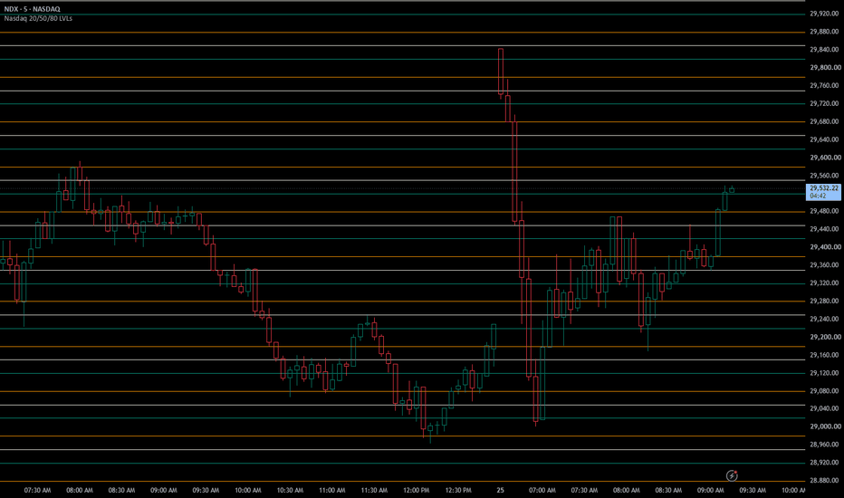
Nasdaq XXX20 / XXX50 / XXX80 Horizontal LevelsThis indicator automatically plots Nasdaq horizontal levels at XXX20, XXX50, and XXX80. Ideal for intraday trading on NQ, MNQ, NDQ, and NDX, with timeframes less than or equal to 5min.
This script highlights powerful reaction levels for entries, exits, stops, and targets.
Key Features
----------------
- Draws XXX20 (teal), XXX50 (light gray/ivory), and XXX80 (orange) levels extending across the chart.
- Dynamically anchors around the current price, showing ±25 blocks by default (50+ levels total, adjustable).
- Optional price range filter to declutter charts by limiting levels to a specific zone.
Inputs
--------------
- Toggle individual level types (XXX20 / XXX50 / XXX80).
- Line colors and width.
- Block size (default 100).
- Price range filter (show only levels between Min and Max price). 指標
Dynamic Visible AVWAPDynamic Visible AVWAP is a visible-range anchored VWAP tool designed to help traders read active price interaction with important visible swing areas.
The script automatically anchors AVWAP lines from the highest high and/or lowest low inside the currently visible chart range. This makes the tool dynamic: when the visible chart area changes, the anchors are recalculated from the new visible range.
Additional AVWAPs can be enabled with the AVWAP Count setting. When more than one AVWAP is selected, the script adds extra anchors from the next valid swing highs or swing lows. This allows multiple AVWAP references to be displayed at the same time, creating a clearer view of potential confluence zones.
Main features:
Dynamic AVWAP based on the currently visible chart range
Long, Short, or All display modes
Optional multiple AVWAPs per side
Optional deviation channels around each AVWAP
Optional channel fill
Separate style controls for AVWAP lines, channels, arrows, and anchor text
Optional anchor arrows and custom anchor label text
Adjustable text size for anchor labels
Optimized line budgeting to keep the script stable when multiple AVWAPs are displayed
How it can be used:
Dynamic Visible AVWAP can help identify areas where price is interacting with volume-weighted mean levels from important visible swing points. These levels may be useful for context, confluence, pullback analysis, trend continuation review, or mean-reversion observation.
Important note:
The anchors are based on the currently visible chart range. If you zoom, scroll, or change the visible area of the chart, the AVWAP anchors may change because the script recalculates the highest high, lowest low, and additional swing anchors from the new visible range.
This indicator should be used together with broader market analysis, such as structure, volume, liquidity, higher-timeframe levels, and personal risk management. 指標

Support & Resistances&r mtf is a support and resistance indicator designed to display clean zones directly on the chart.
the script automatically detects support zones from pivot lows and resistance zones from pivot highs. each zone is displayed with a rectangle, a dotted center line, and an optional label.
the goal is to help the trader identify important areas where price may react, reject, break, or come back for a retest.
the mtf version allows zones from a higher timeframe to be displayed on a lower timeframe. for example, daily zones can be displayed on an h1, 30 minute, or 15 minute chart.
this script is not an automatic buy or sell system. it is designed to read market structure, prepare decision zones, and avoid trading without context.
main features
automatic support zones
automatic resistance zones
chart mode or mtf mode
display higher timeframe zones on the current chart
support only below price
resistance only above price
left zone extension
right zone extension
merge zones that touch
merge zones that are too close according to the minimum distance setting
keep the lowest support when zones merge
keep the highest resistance when zones merge
strong candle break filter
optional candle close confirmation
doji filter
atr strength filter
force percentage inside the label
support break alerts
resistance break alerts
clean display with rectangles, center lines, and labels
how the script works
the script creates a resistance zone when a pivot high is confirmed.
the script creates a support zone when a pivot low is confirmed.
a resistance is valid only when it is above the current price.
a support is valid only when it is below the current price.
if two support zones touch or are too close, they are merged and the lowest support is kept.
if two resistance zones touch or are too close, they are merged and the highest resistance is kept.
if price breaks a zone with the selected break conditions, the zone can be removed and an alert can be triggered.
chart mode
chart mode uses the current chart timeframe.
example:
if the chart is on 30 minutes, the zones are calculated from the 30 minute chart pivots.
this mode is useful for reading the exact timeframe you are trading.
mtf mode
mtf mode calculates zones from a higher timeframe and displays them on the current chart.
example:
you are on an h1 chart.
you enable mtf mode.
you choose the daily timeframe.
the script displays daily zones directly on the h1 chart.
this helps keep major market zones visible while trading intraday.
mtf use case example
if you trade on 30 minutes, you can display daily zones.
this helps avoid buying directly under a daily resistance or selling directly above a daily support.
mtf zones are often more important than small lower timeframe zones because they come from a wider market structure.
beginner tutorial
step 1: enable the module
enable the support and resistance module.
if the mode is set to chart, the script uses the current chart timeframe.
if the mode is set to mtf, the script uses the timeframe selected in the mtf settings.
step 2: choose the mode
use chart if you want zones from the current timeframe.
use mtf if you want to see zones from a higher timeframe.
simple example:
for scalping on 10 minutes, display h1 or daily zones.
for trading on h1, display daily zones.
for trading on h4, display daily or weekly zones.
step 3: watch support zones
support zones are located below price.
a support can be used as an area of interest to look for a bullish reaction.
a beginner can wait for a wick rejection, a bullish close, or a reclaim above the zone before looking for a possible long setup.
step 4: watch resistance zones
resistance zones are located above price.
a resistance can be used as an area of interest to look for a bearish reaction.
a beginner can wait for rejection, a bearish close, or a failed breakout before looking for a possible short setup.
step 5: do not trade a zone alone
a zone is not an automatic signal.
you should wait for confirmation.
possible confirmations:
price reaction
wick rejection
clean close
volume
trend alignment
confirmed breakout
zone retest
step 6: use the merge logic
if several zones touch or are too close, the script groups them together.
this helps avoid a chart filled with useless overlapping zones.
for supports, the lowest level is kept.
for resistances, the highest level is kept.
step 7: use the minimum distance setting
minimum distance helps prevent zones from being created too close to each other.
if you lower the distance, the script accepts more zones.
if you increase the distance, the chart becomes cleaner and more selective.
even if the minimum distance is low, two zones that really touch should remain merged.
input explanation
enable s/r module
turns the support and resistance module on or off.
zone source mode
selects the source of the zones.
chart uses the current timeframe.
mtf uses the selected higher timeframe.
mtf zone timeframe
selects the timeframe used to calculate mtf zones.
example:
daily to display daily zones on h1 or 30 minute charts.
weekly to display weekly zones on h4 or daily charts.
pivot length
controls pivot sensitivity.
a lower value creates more zones and reacts faster.
a higher value creates fewer zones but makes them more selective.
number of visible zones
sets the maximum number of visible zones.
a lower value gives a cleaner chart.
a higher value shows more historical structure.
show s/r labels
shows or hides zone labels.
labels can display the zone type, percentage distance, and force value.
show only 2 active zones
keeps only the latest active resistance and the latest active support.
this is useful for a very clean chart.
minimum distance between zones
sets the minimum space between zones.
the higher the value, the fewer close zones will remain.
the lower the value, the more close zones the script accepts.
zone left extension
extends zones to the left.
this helps show the visual origin of a zone.
zone right extension
extends zones to the right.
this projects the zones into the future.
confirm breaks only on candle close
when enabled, a break is confirmed only after the candle closes.
this reduces false breaks during a live candle.
break equals full body outside zone plus strong candle
when enabled, the script requires the full candle body to close outside the zone with enough strength.
this makes break detection stricter.
max doji body to range
defines when a candle is considered a doji.
a doji is a candle with a small body.
doji candles can be ignored to avoid weak break signals.
min strength body to range
defines the minimum body size compared to the full candle range.
a higher value requires a stronger candle.
min strength body greater or equal atr multiplier
defines the minimum body strength compared to atr.
the higher the value, the stronger the break candle must be.
show force percent
shows the zone penetration force inside the label.
cap force percent
limits the displayed force value to avoid very large numbers.
max cap percent
sets the maximum displayed value when the force cap is enabled.
alert break resistance
enables the alert when a resistance zone is broken.
alert break support
enables the alert when a support zone is broken.
bullish use case example
price comes back to a support zone.
the support remains below price.
the market shows a bullish reaction.
a rejection candle appears.
the trader can then watch for a possible long setup, especially if the general trend is bullish.
bearish use case example
price comes back to a resistance zone.
the resistance remains above price.
the market shows rejection.
a bearish candle appears.
the trader can then watch for a possible short setup, especially if the general trend is bearish.
mtf example
you trade on h1.
you enable mtf mode.
you choose daily.
daily zones appear on the h1 chart.
if price reaches a daily resistance, the trader avoids buying too late.
if price returns to a daily support, the trader watches for a possible reaction.
beginner tips
do not trade every zone automatically.
always wait for price reaction.
avoid buying directly below resistance.
avoid selling directly above support.
use mtf zones as major decision areas.
always use a stop loss.
use proper position sizing.
combine the zones with trend, volume, candlesticks, and market structure.
important note
this script does not guarantee results.
supports can break.
resistances can break.
the best use of this tool is to treat it as a map of important market zones, combined with strict risk management and personal confirmation before each trade.
指標
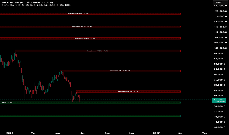
Dynamic Gravity Attractor (DGA) [MarkitTick]💡 An advanced technical indicator designed to identify, weight, and visualize significant price zones using a physics-inspired gravitational model. By treating historical price pivots as physical masses that exert gravitational pull on the current price, this tool dynamically highlights levels of high structural importance. This offers traders a unique, quantitative perspective on support, resistance, and the overarching market equilibrium based on continuous volume and touch data.
✨ Originality and Utility
Unlike standard static support and resistance indicators that simply draw horizontal lines at arbitrary swing highs and lows, this system introduces a dynamic, weighted engine based on volume execution and touch frequency.
Traditional indicators often clutter the chart with dozens of obsolete lines. This tool resolves the issue by clustering proximate price levels using an Average True Range based spatial resolution. This synthesizes fragmented levels into cohesive, highly actionable Gravity Zones.
The core utility lies in its ability to quantify the relative strength of these zones using a gravitational constant. Instead of merely sorting by recency, it sorts by actual structural pull. This allows traders to cleanly distinguish between minor intraday speed bumps and major macroeconomic price attractors that have a high probability of influencing future price routing.
🔬 Methodology and Concepts
The script operates on a robust foundation of interconnected logical pillars, ensuring a precise reading of historical market structure:
• Pivot Detection and Clustering: The indicator identifies standard non-repainting pivot highs and lows using a defined lookback window. Instead of plotting each pivot individually and causing chart noise, it evaluates if a new pivot falls within an existing cluster radius. This radius is dynamically determined by a user-defined percentage of the 14-period Average True Range. If a match is found, the cluster aggregate price, volume, and touch count are updated using a volume-weighted average formula.
• Mass Calculation: Each clustered zone is assigned a quantitative mass. This mass is a blended metric derived from the total trading volume transacted at that specific level and the frequency of price touches it has endured. Users can dynamically adjust the weighting of these two components to favor volume-heavy execution levels or frequently tested psychological levels.
• Gravitational Pull: Applying a concept directly akin to classical physics, the indicator calculates the gravitational force of each active zone relative to the current closing price. The formula incorporates the zone calculated mass, a user-defined Gravitational Constant, and the inverse square of the absolute distance between the zone and the current price.
• Net Force and Equilibrium: By aggregating the gravitational pull of all active zones above the current price and subtracting the zones below, the script calculates a continuous Live Net Force. This net force dictates the overall directional bias of the underlying market structure.
🎨 Visual Guide
The tool provides a rich, multi-layered visual experience, utilizing dark-mode optimized palettes to allow traders to interpret complex market structures at a rapid glance:
• Gravity Zone Lines: Horizontal lines representing the clustered price levels. The strongest mathematical attractor is plotted with a solid line, while weaker zones use dashed line styles to indicate secondary importance. The thickness of the line directly correlates with its top-ranking status.
• Zone Colors: Levels situated above the current price are colored in a visual gradient from vibrant purple to deep violet, representing resistance or overhead gravity. Levels situated below are colored in a gradient from yellow to dark orange, representing support or underlying gravity. The color intensity and opacity scale dynamically with the calculated mass of each zone.
• Gravity Fields (Halos): Semi-transparent background boxes surrounding the strongest top-ranked gravity zones. The vertical height of the box represents the zone mathematical sphere of influence, calculated using the true range and the zone specific mass.
• Gravity Center: A distinct dotted cyan line plotting the weighted center-of-mass between the strongest overhead attractor and the strongest underlying attractor. This acts as the market current fulcrum.
• Dynamic Labels: Textual tags attached to the right of the gravity lines. These indicate the exact price level, an arrow denoting if the force is pushing up or down, and a percentage representing its gravitational strength relative to the maximum active zone.
• Heatmap Candles: The main chart candles are recolored based on the Live Net Force. A bullish bias paints the candles in a specific underlying color, while a bearish bias paints them in an overhead color. Border and wick colors adapt similarly to show micro-shifts in pressure.
• Gravity Dashboard: A comprehensive on-chart data table displaying the active number of tracked levels, the exact prices of the top upper and lower attractors, the Net Force bias, the current cluster size, and a visual block-bar representation of the highest active mass percentage.
📖 How to Use
• Trend Identification: Observe the Heatmap Candles and the Net Force metric on the Gravity Dashboard. A sustained bullish color bias suggests the price is being pulled upward by a stronger overhead attractor or violently pushed from a massive underlying support base. Traders should look to align their directional trades with this dominant net force.
• Targeting and Exits: Use the strongest Gravity Zone Lines as primary profit targets or areas to scale out of positions. Because these zones possess high mass, price tends to inevitably gravitate toward them over time.
• Entry Confirmation: Wait for the price to enter a Gravity Field. If price action demonstrates rejection patterns, long wicks, or volume anomalies within these specific halo zones, it provides a high-probability entry for mean-reversion trades.
• Equilibrium Trading: The Gravity Center line represents a literal point of balance between the primary opposing structural forces. Observing the price crossing, retesting, and holding this level can indicate a fundamental shift in structural control from sellers to buyers, or vice versa.
• Automated Alerts: The script includes built-in alert conditions for when the price comes within a tight proximity to the strongest above or below zones. It also fires alerts when the overall Net Force shifts direction. All alerts and webhooks are constructed as strictly formatted JSON strings designed for flawless third-party execution, dynamically calculating and including the Entry Price, the precise Take Profit target, and the exact Stop Loss invalidation price.
⚙️ Inputs and Settings
• History Depth (bars): Determines how far back in time the script looks to evaluate active pivots. A higher number tracks long-term macro zones, while a lower number focuses on immediate intraday structure.
• Number of Gravity Zones: Limits the maximum number of attractor lines drawn on the chart to prevent visual clutter.
• Level Cluster Resolution (ATR%): Controls how closely pivots must be to merge into a single, heavier zone. A higher value aggregates more historical levels together, creating fewer but stronger zones.
• Gravitational Constant G: A mathematical multiplier that scales the overall gravity calculations. Adjusting this tweaks the sensitivity of the Net Force output.
• Mass Components (Volume & Touch Weight): Fractional sliders allowing the user to adjust whether a zone mass is more heavily derived from transacted volume or the sheer number of times the price has historically tested the level.
• Minimum Touch Count: The baseline number of times a price level must be tested before it is officially registered as having enough mass to generate gravity.
• Visual Settings: Comprehensive toggles to independently turn lines, text labels, halo fields, the dashboard table, and center-of-gravity boxes on or off according to individual visual preference and chart cleanliness. All colors are fully user-configurable without hardcoding.
🔍 Deconstruction of the Underlying Scientific and Academic Framework
The tool borrows directly from classical mechanics, specifically the law of universal gravitation, to mathematically model financial market microstructure. In standard physics, the attractive force of gravity between two independent objects is directly proportional to the product of their masses and inversely proportional to the square of the distance between their centers.
In the context of this script, the current market closing price acts as a dynamic point mass navigating a static field of larger, stationary masses, representing the historical support and resistance clusters. The script operationalizes this concept by calculating Mass as a composite statistical index of cumulative trading volume and historical test frequency. Volume acts as the density of the price level, representing committed capital and trapped liquidity, while touch frequency represents the psychological reinforcement and memory of the level among market participants.
By rigidly utilizing the inverse square law of distance, the indicator mathematically guarantees that nearby price levels exert exponentially more influence on current price action than distant levels. This accurately reflects the highly localized nature of market liquidity, order book depth, and slippage. Furthermore, the clustering algorithm employs a dynamic threshold based on Average True Range, introducing a volatility-normalized spatial resolution. This specific mechanism ensures that the radius of a mass point expands in highly volatile environments and contracts in tight consolidations, strictly adhering to established principles of adaptive signal processing, robust statistical smoothing, and dynamic time warping.
⚠️ Disclaimer
All provided scripts and indicators are strictly for educational exploration and must not be interpreted as financial advice or a recommendation to execute trades. We expressly disclaim all liability for any financial losses or damages that may result, directly or indirectly, from the reliance on or application of these tools. Market participation carries inherent risk where past performance never guarantees future returns, leaving all investment decisions and due diligence solely at your own discretion. 指標

Auto Supply & Demand Zones [Proozac]# Auto Supply & Demand Zones
**Pine Script v6 — Overlay Indicator**
---
## What It Does
Automatically identifies and draws **Supply** and **Demand** zones using a consolidation-then-impulse approach. Instead of drawing arbitrary rectangles around wicks or candles, this indicator marks the precise origin of impulsive moves — the base where institutions accumulated or distributed positions before the explosive move began.
Zones update dynamically: they extend to the current bar as long as they are active, fade when price re-enters them (tested), and can be removed automatically when fully mitigated.
---
## Core Concept
Supply and Demand zones are based on the observation that before a strong directional move, price always consolidates in a narrow range. This consolidation is where orders were placed. When price eventually returns to that origin area, those resting orders become relevant again.
```
DEMAND ZONE (base before impulsive UP move)
────────────────────────────────────
← zone drawn here
↑↑↑↑↑↑↑↑↑↑↑↑↑↑↑↑↑ ← impulsive bullish candle
SUPPLY ZONE (base before impulsive DOWN move)
↓↓↓↓↓↓↓↓↓↓↓↓↓↓↓↓↓ ← impulsive bearish candle
← zone drawn here
────────────────────────────────────
```
---
## Detection Logic
### Step 1 — Identify the Base (Consolidation)
A "base" is a sequence of `Consolidation Bars` consecutive candles where every candle body is **smaller than the ATR**:
```
For each candle in the base window:
body = |close - open|
if body > ATR → not a base
```
This filters out directional candles and keeps only tight, sideways price action — the footprint of institutional accumulation/distribution.
### Step 2 — Detect the Impulse
An impulse candle is a strong directional candle **immediately after** the base:
```
Bullish impulse: base confirmed AND close > open AND (close - open) > ATR × Impulse Strength
Bearish impulse: base confirmed AND close < open AND (open - close) > ATR × Impulse Strength
```
The `Impulse Strength` multiplier controls how strong the breakout candle must be relative to ATR. At 1.5× ATR, only genuinely strong moves qualify.
### Step 3 — Draw the Zone
The zone is drawn over the **range of the consolidation base** (highest high to lowest low across all base candles):
```
Zone top = max(high) across base candles
Zone bottom = min(low) across base candles
```
- Bullish impulse → **Demand zone** (green box)
- Bearish impulse → **Supply zone** (red box)
---
## Zone Lifecycle
| State | Visual | Condition |
|-------|--------|-----------|
| **Active** | Full color, solid border | Price has not returned to the zone |
| **Tested** | Price is currently inside the zone | Background flashes, border highlights |
| **Mitigated** | Faded to high transparency | Price closed through the zone's far edge |
| **Deleted** | Removed from chart | Only if "Keep Tested Zones" is off |
Zone mitigation rules:
- Demand zone → mitigated when `low < zone bottom` (price broke below it)
- Supply zone → mitigated when `high > zone top` (price broke above it)
---
## Inputs
| Input | Default | Description |
|-------|---------|-------------|
| **Consolidation Bars** | 3 | Number of tight candles required to form a base. More bars = stricter, rarer zones |
| **Impulse Strength (×ATR)** | 1.5 | How strong the breakout candle must be vs ATR. Higher = stronger impulses only |
| **ATR Length** | 14 | Period for the ATR used in base and impulse detection |
| **Max Active Zones** | 10 | Maximum number of zones kept per side (oldest removed first) |
| **Demand Zone Color** | Teal/green | Fill color for demand zones |
| **Supply Zone Color** | Red | Fill color for supply zones |
| **Demand/Supply Border** | Darker tint | Border color |
| **Tested Zone Transparency** | 92 | Opacity of mitigated zones (higher = more transparent) |
| **Show Zone Labels** | true | Draws "Demand" / "Supply" text inside each box |
| **Keep Tested Zones (Faded)** | true | When off, mitigated zones are deleted entirely |
---
## Visual Output
| Element | Description |
|---------|-------------|
| Green box | Active demand zone (base of a bullish impulse) |
| Red box | Active supply zone (base of a bearish impulse) |
| Faded green box | Demand zone that has been mitigated |
| Faded red box | Supply zone that has been mitigated |
| Green triangle below bar | New demand zone created this bar |
| Red triangle above bar | New supply zone created this bar |
| Green background flash | Price is currently inside a demand zone |
| Red background flash | Price is currently inside a supply zone |
---
## How to Use
**Basic trade setup:**
1. Wait for price to return to an active zone.
2. Look for a confirmation signal inside the zone — a rejection candle, a sweep of the zone's inner extreme, or a divergence from an oscillator.
3. Enter with a stop beyond the zone's outer edge.
4. Target the next supply zone (from demand) or next demand zone (from supply).
**Confluence checklist:**
- Zone is fresh (not previously tested)
- Zone aligns with a higher timeframe level
- MTF Dashboard (indicator 02) shows agreement on the entry direction
- A Liquidity Sweep (indicator 03) fired near the zone entry
**Zone freshness matters:** The first time price returns to a zone, the fill rate is significantly higher than on second or third tests. After a zone is mitigated, treat it as much weaker.
---
## Configuration Tips
| Scenario | Suggested settings |
|----------|--------------------|
| Clean, infrequent zones | Consolidation: 4–5, Impulse: 2.0× |
| More zones, active markets | Consolidation: 2, Impulse: 1.2× |
| Crypto (volatile, wide spreads) | ATR: 20, Impulse: 2.0–2.5× |
| Forex (tight spreads) | ATR: 14, Impulse: 1.5× |
| Equities / indices | ATR: 14, Impulse: 1.5–2.0× |
---
## Alerts
Two built-in `alertcondition` entries:
- `Price in Demand Zone` — fires on every bar where close is inside an active demand zone
- `Price in Supply Zone` — fires on every bar where close is inside an active supply zone
Recommended alert settings: **Once per bar close** to avoid repeated triggers within the same bar.
指標