指標
Dealing Range Equilibrium & Premium/Discount Zones (SMC)This indicator is a streamlined visualization tool designed specifically for traders utilizing Smart Money Concepts (SMC) and ICT methodologies. It automatically detects the current structural Dealing Range and divides it into logical quadrants: Premium, Discount, and Equilibrium.
Rather than manually drawing Fibonacci grids on every new structural swing, this script dynamically anchors to the most recent validated pivot points, keeping your charts clean and your focus on price action.
Underlying Logic & Calculations
The script relies on a standard pivot-detection algorithm to establish the boundaries of the dealing range:
Swing Detection: It uses standard ta.pivothigh and ta.pivotlow functions to scan for structural highs and lows based on a user-defined "Swing Lookback Period" (default is 20 bars). A pivot high is confirmed when the central candle is higher than the n candles to its left and right.
Range Anchoring: Once a new swing high or low is validated, the top or bottom variables update respectively. These horizontal levels persist forward in time until a new structural pivot breaks them.
Equilibrium Calculation: The script calculates the mathematical median of the current range by adding the active Swing High and Swing Low, then dividing by two (top + bottom) / 2.
Visuals & Practical Usage
In SMC theory, markets move from consolidation to expansion, seeking liquidity. The dealing range helps traders contextualize where price is relative to recent structure:
Premium Zone (Red Fill): The upper 50% of the dealing range. In a bearish structural environment, traders look for price to retrace into the Premium zone to identify high-probability short setups or institutional distribution.
Discount Zone (Green Fill): The lower 50% of the dealing range. In a bullish environment, traders wait for price to retrace into the Discount zone to look for long setups or institutional accumulation.
Equilibrium (Midline): The exact 50% level (fair value). Price action around this line often acts as a transition point or near-term support/resistance.
Settings
Swing Lookback Period: Controls the sensitivity of the pivot detection. A lower number (e.g., 5 or 10) will capture micro-structure and minor pullbacks, ideal for scalping. A higher number (e.g., 20 or 50) will anchor only to major macro-swings.
Show Labels: Toggles the text labels on the current price axis to keep the chart clean if desired. 指標

Micro Support Resistance [DYNA]Micro Support Resistance automatically identifies the most important short-term support and resistance levels on your chart. It finds swing highs and swing lows, clusters nearby price reactions together, and draws clean horizontal lines where price is most likely to react next.
Most traders draw support and resistance by hand, which is slow and subjective. This indicator does it for you in real time, updating as new pivots form. It also shows you which levels are strongest -- thicker lines mean more touches, so you can instantly tell the difference between a fresh untested level and a well-established zone that price has bounced off multiple times. When price breaks through a level, the indicator automatically removes it so only active, relevant zones remain on your chart.
Key Features
Automatic Pivot Detection -- Identifies swing highs and swing lows using a configurable lookback window, so levels are always based on actual price structure
Smart Clustering -- Merges nearby levels within an ATR-based threshold into a single zone, avoiding cluttered charts with redundant lines
Touch Count Visualization -- Line thickness grows with each touch, giving you an instant read on level strength without any interpretation
Automatic Level Invalidation -- When price closes through a support or resistance level, it is removed from the chart. No stale or broken levels cluttering your view
Distance-Based Decay -- Levels that drift too far from current price automatically lose touches and eventually disappear, keeping all level slots focused on actionable zones near price
Dynamic Level Management -- Keeps only the strongest levels on screen. When new pivots form, weak untested levels are replaced automatically
First-Approach Alerts -- Get notified the moment price first reaches a key level, not on every bar it stays nearby
Data Export -- All level values appear in the TradingView data window and are included in CSV exports for further analysis
How It Works
As price moves across your chart, the indicator continuously scans for swing highs and swing lows on confirmed bars. When it detects a confirmed pivot -- a point where price reversed direction with bars on both sides confirming the swing -- it checks whether this level is near any existing support or resistance zone. If it is, the existing level absorbs the new touch and its line gets thicker. If not, a new level is drawn. When price closes through a level decisively, that level is automatically invalidated and removed.
Green lines mark support zones where price has bounced upward. Red lines mark resistance zones where price has been rejected downward. Each line carries a small label showing its level number and touch count -- for example, "S1 (3)" is the first support level with three touches, and "R2 (1)" is the second resistance level with a single touch. Thicker lines correspond to higher touch counts, so a bold line with "S1 (4)" is a well-tested support, while a thin line with "R3 (1)" is a fresh, untested resistance. If a green line disappears, it means price closed below that support and the level is no longer valid.
Micro Support Resistance on a 3-minute chart. Green support lines and red resistance lines are drawn automatically, with thicker lines indicating more touches.
Line Thickness and Level Strength
The visual weight of each line tells you how significant the level is. One touch produces a thin hairline. Two touches make it slightly thicker. Three or four touches produce a bold, unmistakable line that commands attention. This means you never need to count bounces or remember which levels have been tested -- the chart shows you directly.
When the maximum number of levels is reached on either side (support or resistance), the indicator automatically removes the weakest level to make room for a new one. Levels that have been broken through -- where price has closed on the other side -- are also removed automatically. This keeps your chart clean and focused on the levels that actually matter right now.
Notice the difference in line thickness: S2 (3) is a thick, well-tested support, while R1 (1) is a thin single-touch resistance.
Settings
The default settings work well for most intraday charts on the 1-minute to 15-minute timeframe. The Pivot Lookback controls how many bars on each side are required to confirm a swing -- the default of 5 captures short-term micro-structure. Increase it to 7 or 10 for slightly broader levels on 30-minute or 1-hour charts.
The Cluster Threshold determines how close two levels need to be before they are merged into one. It uses a multiple of the 14-period ATR, so it automatically adapts to different instruments and volatility conditions. The default of 0.5 provides a good balance between merging nearby levels and keeping distinct zones separate. Lower it if you want finer granularity; raise it if you see too many lines stacked close together.
Max Levels Per Side caps how many support and resistance lines appear at once. The default of 3 keeps the chart clean. You can increase it up to 10 if you want to see more of the price structure.
The Decay Distance setting controls how far a level can be from price before it starts losing relevance. Levels beyond this ATR multiple lose one touch per confirmed bar. Once a level's touches reach zero, it is removed and the slot opens up for a fresh nearby level. The default of 10x ATR keeps levels focused on the current trading range while ensuring slots stay populated. Increase it if you want levels to persist longer on swing or position trades.
Alerts
Approaching Support -- Fires once when price first comes within a configurable percentage of a support level. Does not repeat while price remains in the approach zone. "Micro Support Resistance : Price is approaching a support level. Watch for a potential bounce or breakdown."
Approaching Resistance -- Fires once when price first comes within a configurable percentage of a resistance level. Does not repeat while price remains in the approach zone. "Micro Support Resistance : Price is approaching a resistance level. Watch for a potential rejection or breakout."
To set up alerts: click the TradingView Alerts button, select "Micro Support Resistance " from the indicator dropdown, choose "Any alert() function call" as the condition, and set your preferred notification method.
Best Practices
Use on lower timeframes (1m to 15m) for scalping and intraday setups. The levels are designed to capture micro-structure, not weekly zones.
Pay attention to thick lines -- levels with 3 or more touches tend to produce stronger reactions when retested.
Combine with a momentum or volume indicator to judge whether a level will hold or break.
If your chart looks too busy, reduce Max Levels Per Side or increase the Cluster Threshold to merge nearby zones.
Set approach alerts so you can step away from the screen and still catch the moments that matter.
Part of the DYNA Ecosystem
Micro Support Resistance is a free indicator built with the same design standards as the DYNA premium suite. For complete trade management with automatic stop loss, break-even, trailing stops, and multi-target systems, explore the full DYNA indicator collection.
Disclaimer
This indicator is a technical analysis and educational tool only -- it is not financial advice and makes no guarantee of any outcome. Past performance does not predict future results. Always do your own research and use proper position sizing and risk management.
Created by Varun Nidhi · varunnidhi.com
A free DYNA indicator — self-contained, no repainting.
指標

Edo Ichimoku StateEdo Ichimoku State — Five-State Structural Classifier for Ichimoku Kinko Hyo
Ichimoku Kinko Hyo is one of the most complete systems available for reading market structure at a single glance. Its name means roughly "one-glance equilibrium chart", yet in practice that single glance is anything but simple: a reader has to combine the position of price relative to the cloud, the slope of the cloud itself, the relationship between Tenkan and Kijun, and the position of the Chikou Span relative to past price before deciding whether the context is a confirmed trend, a directional bias, a transition, or no direction at all.
Edo Ichimoku State keeps that full engine intact and does the synthesis for you. It calculates the five classical Ichimoku lines with their original 9 / 26 / 52 periods, evaluates four independent conditions bar by bar, and returns a single market state, a dual Bull / Bear score, and a summary panel listing the conditions that support the reading. The aim is to turn a visually demanding but technically powerful system into a direct reading surface, without simplifying or discarding any of its original components.
WHAT IT DOES (AND WHAT IT IS NOT)
The indicator is a complete implementation of the Ichimoku system: its five lines, the cloud projected forward by the classical displacement, a discrete classification into five states, a 0-to-4 Bull / Bear score, an optional state-colored background, and a corner panel. By default only the cloud and the colored background are shown, keeping the chart clean; every other line can be turned on individually for those who want the full detail.
It is not a closed trading system or an automatic entry/exit signal generator. It does not predict specific highs or lows, nor does it replace risk management or the trader's own judgment. It is also not a simplified Ichimoku: all five original components are present and calculated with the canonical periods.
THE FIVE LINES
Tenkan-sen (Conversion Line): the midpoint of the last 9 periods' range, (highest high + lowest low) / 2. It is the most reactive line and the first to turn on a reversal.
Kijun-sen (Base Line): the midpoint of the last 26 periods' range. It acts as an intermediate structural reference and as classical dynamic support/resistance.
Senkou Span A (Leading Span A): (Tenkan + Kijun) / 2, displaced 26 bars forward. The first edge of the cloud; it reacts faster than Senkou B to trend changes.
Senkou Span B (Leading Span B): the midpoint of the last 52 periods' range, displaced 26 bars forward. The second, much more stable edge of the cloud; it defines the structural floor or ceiling.
Chikou Span (Lagging Line): the current close, displaced 26 bars backward. It compares current price to the price 26 bars ago and provides historical confirmation.
THE CLOUD (KUMO)
The cloud is the most characteristic element of Ichimoku and the only line shown enabled by default. It is the fill between the two Senkou Spans projected 26 bars forward. When Senkou A is above Senkou B the cloud is bullish and painted in a soft teal green; when Senkou A is below Senkou B the cloud is bearish and painted in a soft coral red. A crossover of the two spans flips the cloud color entirely, an event called a Cloud Flip.
Reading the Kumo is straightforward: price above the cloud is a bullish structural bias with the cloud acting as dynamic support; price below the cloud is a bearish bias with the cloud acting as dynamic resistance; price inside the cloud means no clear direction, and the indicator classifies that situation as Undefined. The thickness of the cloud is proportional to the strength of that support or resistance: a thin cloud breaks easily, a thick one is rarely crossed in a single move. Because the cloud is projected 26 bars forward, it also lets you anticipate the structural support or resistance price will face in the immediate future.
THE FIVE-STATE CLASSIFICATION
The market state is reduced to one of five discrete configurations, ordered from maximum bullish strength to maximum bearish strength:
Confirmed Up — all four bullish conditions active simultaneously.
Bias Up — at least two bullish conditions active and dominating over the bearish ones.
Undefined — price inside the cloud, or a balance between bullish and bearish conditions.
Bias Down — at least two bearish conditions active and dominating over the bullish ones.
Confirmed Down — all four bearish conditions active simultaneously.
The state is built from four independent conditions evaluated on every bar. Price vs Cloud checks whether price is above the cloud (bullish) or below it (bearish); if price is inside the cloud, neither side counts and the state is forced directly to Undefined, following the original Ichimoku logic that there is no operational direction inside the Kumo. Cloud Bias checks whether Senkou A is above or below Senkou B, measuring the projected direction of the cloud. TK vs KJ checks whether Tenkan-sen is above or below Kijun-sen, measuring recent momentum. Chikou Free checks whether current price is above or below the price 26 bars ago, measuring historical confirmation.
BULL SCORE AND BEAR SCORE
Alongside the discrete state, the indicator publishes two complementary scores. The Bull Score counts how many bullish conditions are active on the current bar, out of four; the Bear Score counts how many bearish conditions are active, built from the inverse of each bullish condition. The two are not strictly complementary: both can sit at intermediate values at the same time, for example Bull 2/4 and Bear 2/4 when the cloud is mixed or price is right on its edge. The discrete state resolves which reading prevails. The scores are especially useful for comparing bars within the same state: a Bias Up with Bull 3/4 and Bear 1/4 is more solid than a Bias Up with Bull 2/4 and Bear 2/4, even though both carry the same label.
INFORMATION PANEL
A summary panel sits in one corner of the chart and condenses the Ichimoku state on the most recent closed bar into seven rows. The first row shows the current state label together with its duration in bars (for example 21b), which tells you how long the market has held the same configuration. The next four rows show the individual conditions: Price vs Cloud (Above / Inside / Below), Cloud Bias (Bullish / Bearish), TK vs KJ (TK greater or less than KJ), and Chikou Free (Above / Below / Level). The last two rows show the Bull Score and Bear Score as N / 4. Panel position (any of the four corners), size (Small / Medium) and theme (Dark / Light) are all configurable.
HOW TO READ IT
The state and the score give an immediate reading, but the indicator gains depth when combined with recent transition history. A clean bullish activation typically runs Undefined to Bias Up to Confirmed Up over a few bars, with a Cloud Flip from bearish to bullish and a Bull Score climbing toward 4/4. Bullish exhaustion often shows a long-lived Confirmed Up whose Bull Score oscillates between 3/4 and 4/4 without settling. A drop into the cloud turns the state to Undefined and tends to resolve either as a bounce on Senkou A back into Bias Up, a full crossing that exits below into Bias Down, or sideways action inside the Kumo. A bearish confirmation sees price break the cloud downward while Cloud Bias turns bearish, TK falls under KJ and Chikou stays below historical price, moving the state Undefined to Bias Down to Confirmed Down. The logic is ticker-agnostic and works the same on stocks, indices, crypto, forex and commodities, provided the asset has enough liquidity for stable highs/lows.
ALERTS
The indicator publishes ten native alert conditions, all configured from TradingView's standard alert dialog by picking the event from the dropdown. Five state alerts fire when the state newly enters Confirmed Up, Confirmed Down, Bias Up, Bias Down or Undefined. Two price-vs-cloud alerts fire when the close crosses above or below the cloud. Two Cloud Flip alerts fire when Senkou A crosses above Senkou B (Cloud Flip Bull) or below it (Cloud Flip Bear). Two TK/KJ cross alerts fire when Tenkan crosses above or below Kijun. State-change alerts fire on the exact bar the new state first appears; to avoid intrabar triggers, set the alert to Once Per Bar Close.
CONFIGURATION
Ichimoku periods default to the canonical 9 (Tenkan), 26 (Kijun) and 52 (Senkou Span B), with both the forward cloud displacement and the backward Chikou displacement at 26; these match the original system and changing them is only recommended for specific studies. The Lines section toggles Tenkan-sen, Kijun-sen and Chikou Span (hidden by default) and the Kumo fill (enabled), with a Cloud Opacity from 40 to 95. The State section enables a state-colored background (on by default, opacity 70 to 98) and an optional Paint Candles by State mode. The five state colors are each customizable, and the panel can be shown or hidden, repositioned to any corner, and sized Small or Medium.
OPEN SOURCE
Edo Ichimoku State is published on TradingView as a free, open-source indicator. Any user with an active account can add it to their charts at no cost and use it on whatever timeframes and assets they consider appropriate. You are welcome to study the code and learn from how the four conditions are formalized into the five-state classification.
This indicator is a technical analysis tool for educational and informational purposes only. It does not generate automatic buy or sell signals and should not be considered financial advice. Trading financial markets involves significant risk of capital loss. Past performance does not guarantee future results. Always use proper risk management. 指標

指標

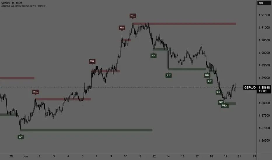
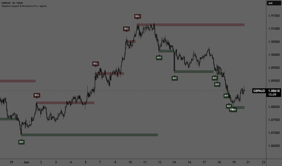
Adaptive Support & Resistance Pro + SignalsOverview
Adaptive Support & Resistance Pro is a dynamic technical analysis tool designed to automatically identify, calculate, and plot key Support and Resistance (S/R) levels on your chart. Unlike traditional pivot-based indicators, this script uses a hybrid approach combining Momentum, Relative Strength, and Volatility filters to pinpoint institutional supply and demand zones.
To ensure professional-grade execution, the script is fully optimized to prevent repainting. It operates strictly in real-time, aligning historical signals with the exact moments these key levels were formed.
How It Works (The Engine)
The indicator calculates its levels based on three core components:
Chande Momentum Oscillator (CMO) via HMA: It analyzes the rate of change between two Hull Moving Averages (HMA) of different periods to detect strong shifts in market momentum.
Relative Strength Index (RSI): A 9-period RSI filters out minor market noise, ensuring that support levels are only tracked in oversold conditions ( NYSE:RSI < 25$) and resistance levels in overbought conditions ( NYSE:RSI > 75$).
Legacy Close Pivots: The script analyzes extreme high/low deviations over a specific lookback period to establish the structural price floor or ceiling.
When all three conditions align, a new Support or Resistance price level is established.
Key Features & Settings
Multi-Timeframe (S/R Timeframe): You can plot S/R levels from higher timeframes (e.g., Daily or 4-Hour) directly onto your lower timeframe execution chart (e.g., 15-minute) for top-down analysis.
Signal Trigger Modes: Under the settings, you can choose how signals are displayed:
On Candle Close: Displays a BUY or SELL label immediately on the candle that confirmed the new level.
After Candle Close: Waits for the confirmation candle to close and prints the signal on the next candle, providing an extra layer of validation.
Strict One Signal Per Level Rule: The script features built-in logic that guarantees only one signal will ever be triggered per new structural level, completely eliminating label clutter and overlapping signals.
How to Use It (Trading Strategy)
Support & BUY Signals: Look for green BUY labels after the market prints a fresh support line. This indicates that momentum has shifted upwards from an oversold structural area.
Resistance & SELL Signals: Look for red SELL labels when price prints a fresh resistance line. This indicates institutional selling pressure in an overbought area.
Breakouts & Re-tests: The drawn lines stay on the chart, allowing you to monitor future re-tests of these adaptive zones.
Disclaimer
Past performance does not guarantee future results. This indicator is meant to be used as a supportive tool alongside your own risk management and trading plan. 指標
Alpha Forge Liquidity Matrix v2.2# Liquidity Matrix
Liquidity Matrix is a native TradingView overlay designed to map probable liquidity zones, identify sweep traps, and help traders understand where price may be hunting stops.
Instead of focusing only on traditional trend signals, this tool looks at market structure through the lens of liquidity.
Where are traders likely trapped?
Where are stops likely clustered?
Where did price sweep liquidity and reject?
Did the reclaim actually confirm, or did it fail?
Liquidity Matrix was built to answer those questions directly on the chart.
---
## What It Does
Liquidity Matrix tracks recent swing highs and swing lows, then clusters nearby levels into projected liquidity zones.
These zones represent areas where stop orders may be concentrated:
* Swing highs can create buy-side liquidity above price
* Swing lows can create sell-side liquidity below price
* Repeated reactions near the same area increase the weight of that zone
* Stronger zones are shown as heavier projected boxes
The result is a visual map of where liquidity may be sitting before price reaches it.
---
## Liquidity Zones
The indicator draws forward-projected heat boxes directly on the chart.
Upper zones represent probable buy-side liquidity.
Lower zones represent probable sell-side liquidity.
Zone strength is classified as:
* Minor
* Active
* Major
The stronger the zone, the more important that area may become when price approaches it.
These zones are not standard support and resistance lines. They are designed to highlight areas where traders may be trapped, where stops may be clustered, and where fake breakouts or sweep moves may occur.
---
## Sweep and Reclaim Logic
A key feature of Liquidity Matrix is its ability to identify liquidity sweeps.
A sweep occurs when price pushes beyond a liquidity zone, grabs that liquidity, and then rejects or reclaims.
The script separates these events into clearer signal types:
### Buy Signal
A buy signal can occur when sell-side liquidity is swept and price confirms a bullish reclaim.
This suggests price pushed below a lower liquidity zone, triggered stops, and then recovered back above the level.
### Sell Signal
A sell signal can occur when buy-side liquidity is swept and price confirms a bearish rejection.
This suggests price pushed above an upper liquidity zone, triggered stops, and then failed to hold the breakout.
### Exit Long
An exit long signal appears when price sweeps upper liquidity and rejects strongly enough to trigger a structural warning.
This is designed as a circuit-breaker style warning for long positions.
### Exit Short
An exit short signal appears when price sweeps lower liquidity and reclaims strongly enough to trigger a structural warning for short positions.
---
## Signal Strictness
Liquidity Matrix includes three signal strictness modes:
### Early
Signals can trigger faster using wick-based reclaim or rejection logic.
This mode is more responsive, but may produce more early signals in choppy markets.
### Balanced
Signals require a cleaner close-based reclaim or rejection.
This is the default mode and is designed to balance responsiveness with confirmation.
### Confirmed
Signals require follow-through confirmation after the sweep.
This mode is stricter and may reduce false signals, but signals can appear later.
---
## Trade Direction Control
The indicator includes trade direction settings so users can match the tool to their trading style.
Options include:
* Longs & Shorts
* Longs Only
* Shorts Only
In Longs Only mode, buy signals remain active while short-style sell signals are treated as warnings instead of short entries.
In Shorts Only mode, sell signals remain active while long-style buy signals are treated as warnings instead of long entries.
This makes the tool easier to use for stock traders, crypto traders, futures traders, and users who only trade one side of the market.
---
## Signal Label Styles
Liquidity Matrix includes flexible label wording.
Users can choose between:
* Liquidity Terms
* Plain Buy/Sell
* Both
Liquidity Terms display labels such as SSL Reclaim and BSL Reject.
Plain Buy/Sell mode displays simple BUY, SELL, EXIT LONG, and EXIT SHORT labels.
Both mode displays the trade meaning and the liquidity event together.
This allows advanced traders to keep the market-structure terminology, while newer users can choose simpler chart labels.
---
## Dashboard
The dashboard provides a quick read of the current liquidity environment.
It can show:
* Current analysis timeframe
* Nearest upper liquidity zone
* Nearest lower liquidity zone
* Circuit breaker state
* Latest event
* Current bias
* ATR sweep power
* Confirmation status
The bias reading helps identify whether the chart is currently leaning toward sweep risk above, sweep risk below, post-sweep bullish behavior, post-sweep bearish behavior, or a circuit-breaker state.
---
## Confirmation Filters
Liquidity Matrix includes several optional filters to improve signal quality.
### Volume Confirmation
Requires relative volume to meet a minimum threshold before sweep signals are confirmed.
### Trend Filter
Allows signals to be filtered by trend conditions.
Modes include:
* Off
* Signal Quality
* Strict Signals
### Session Killzones
Allows users to define preferred trading windows.
Signals can be filtered to specific sessions, and optional session shading can be displayed on the chart.
### ATR Sweep Strength
The dashboard can show how powerful a sweep is relative to ATR.
This helps separate small liquidity taps from stronger displacement-style sweeps.
---
## Alerts
The indicator includes simplified alert names for easier setup.
Available alert types include:
* Buy Signal
* Sell Signal
* Exit Long
* Exit Short
* Any Buy/Sell Signal
* Any Exit Signal
* Long Warning
* Short Warning
This makes it much easier to create TradingView alerts without needing to understand every internal liquidity term.
Webhook-ready JSON alert calls are also available for users who want structured alert messages for automation, bots, dashboards, or external systems.
---
## How to Use It
Liquidity Matrix is best used as a structure and risk tool, not as a blind signal generator.
Common use cases include:
* Avoiding breakout traps near major liquidity zones
* Spotting failed sweeps before price reverses
* Confirming potential entries after sell-side or buy-side liquidity is swept
* Exiting long positions after upper liquidity rejection
* Exiting short positions after lower liquidity reclaim
* Identifying areas where price may be drawn toward liquidity
* Filtering trade ideas with volume, trend, session, and ATR confirmation
A strong use case is combining Liquidity Matrix with a separate trend or momentum tool.
For example:
A buy signal after sell-side liquidity is swept may carry more weight when trend, volume, and momentum are also aligned.
A sell signal after buy-side liquidity is swept may be more meaningful when price rejects a major upper zone with strong ATR expansion.
---
## Important Notes
Liquidity Matrix does not know where actual stop orders are placed.
It estimates probable liquidity areas using swing structure, repeated reactions, clustering, volatility, and rejection behavior.
The indicator does not guarantee future price movement.
It is designed to help traders better understand where liquidity may be building, when price may be sweeping that liquidity, and when a move may be a trap instead of a true breakout.
As always, this tool should be used with proper risk management and as part of a complete trading plan.
---
## Summary
Liquidity Matrix is a visual liquidity-mapping system built for traders who want to look beyond basic support, resistance, and lagging indicators.
It identifies probable stop clusters, projects liquidity zones forward, detects sweeps and reclaims, provides buy/sell/exit signals, and gives traders a clearer view of when price may be hunting liquidity.
The goal is simple:
See the trap before reacting to it.
指標

Bitcoin Power Law FloorBitcoin Power Law Floor
This indicator plots a long-term Bitcoin Power Law Floor based on the empirical Bitcoin power-law framework associated with Giovanni Santostasi, Harold Christopher Burger, Andrei Perrenod, Bitcoin Observatory, and related Bitcoin power-law research.
The model uses days since Bitcoin’s genesis block as the time variable:
Trend(t) = 10^-16.493 × t^5.688
Floor(t) = Trend(t) × 10^-0.42
The default floor offset in this script is -0.42. For the commonly referenced ~0.40× trend floor, set “Floor log10 offset vs trend” to -0.40.
The plotted floor is intended to represent a historically observed lower-bound region in Bitcoin’s long-term price evolution. It is not a guarantee, not a prediction, and not a trading signal by itself. The model should be used as a long-term reference framework, ideally on BTCUSD or BTCUSDT charts with logarithmic price scale enabled.
The script includes:
- Bitcoin Power Law Floor plot
- Optional central power-law trend line
- Optional future floor projection
- Projection horizons of 3, 5, 10, 15, 20, and 25 years
Sources and further reading:
Bitcoin Observatory — BTC Power Law Floor:
btcpowerlaw.nl
Giovanni Santostasi — The Bitcoin Power Law Theory:
giovannisantostasi.medium.com
Scientific Bitcoin Institute:
scientificbitcoininstitute.org
Special thanks to the scientists, researchers, explorers, data analysts, builders, educators, and content writers who study, test, explain, challenge, and share Bitcoin power-law models. This script exists because of the open work of people exploring Bitcoin with curiosity, rigor, and imagination.
This indicator is for educational and research purposes only. It is not financial advice. Historical model fit does not guarantee future performance. 指標

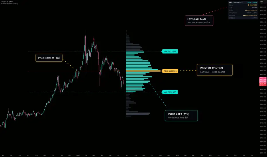
Smart Volume Profile VPVR POC, Value Area, SR [LunqFX]Smart Volume Profile VPVR is a modern, professional-grade volume profile indicator for TradingView that turns raw traded volume into the cleanest possible map of where the market actually did business. It plots the Point of Control (POC), the full 70% Value Area (VAH / VAL), and every High and Low Volume Node (HVN / LVN) as glowing, easy-to-read horizontal support and resistance levels — on any symbol and any timeframe: forex, crypto, stocks, indices, futures, gold (XAUUSD), Bitcoin (BTCUSD), NASDAQ, S&P 500, oil and more. Unlike a plain histogram, this VPVR (Volume Profile Visible Range) tool layers a live order-flow dashboard on top that reads the market in real time and tells you whether price is accepting value, rejecting value, rotating back to fair value, or breaking out — the exact context that separates profitable volume-profile trading from guessing. Built entirely in Pine Script v6 with neon gradient candles and a fully readable, gradient-coloured profile, it is designed to be both beautiful and genuinely useful for day trading, scalping, swing trading and intraday analysis.
◆ WHY VOLUME PROFILE MATTERS
Most indicators are based on price and time. Volume profile is based on price and volume — it answers a completely different and more important question: at which prices did the most trading actually happen? Those prices are where institutions, liquidity and "fair value" concentrate. High-volume areas act as magnets and strong support/resistance; low-volume areas are vacuums that price rips through. By making this structure obvious, Smart Volume Profile helps you trade with the auction instead of against it.
◆ WHAT IT DRAWS ON THE CHART
POC — Point of Control (gold ray): the single most-traded price in the window. This is the market's fairest value and its strongest magnet. Price returns to the POC again and again; it is the most important pivot on the chart.
VAH / VAL — Value Area High & Low (dashed rays): the top and bottom of the zone that contains 70% of all traded volume (fully configurable, 40–95%). Inside this band the market is "comfortable"; outside it the market is in discovery / imbalance.
High Volume Nodes (HVN): thick, bright rows = heavy acceptance = strong support & resistance and reaction/reversal zones.
Low Volume Nodes (LVN): thin, dim rows = rejection / fast-move zones where price tends to travel quickly and gap.
Gradient histogram: every row is colour-graded by its volume, so the profile literally glows where volume is heaviest — you read the structure at a glance instead of squinting at bars.
All levels extend as live rays with clean, high-contrast labels showing the exact price.
◆ THE LIVE DASHBOARD PANEL (this is what makes it "Smart")
A plain volume profile just draws lines. This indicator adds a compact, modern analytics panel that computes context you cannot see on the chart and condenses it into one glance:
Signal — the headline call, colour-coded: ▲ LONG revert, ▼ SHORT revert, ▲ BREAKOUT, ▼ BREAKDOWN, or ● BALANCED. This is the playbook for the current moment (logic explained below).
→ POC — the live distance from current price to the Point of Control, in %. This is your mean-reversion target and a quick read of how stretched price is from fair value.
In VA — a clean segmented meter showing where price currently sits inside the value area (from VAL on the left to VAH on the right). Instantly tells you if you're at the top, middle, or bottom of value.
Acceptance — the split of volume traded above vs below the POC (e.g. 52% ▼ / ▲ 48%). Reveals which side the market is building value on — a directional bias the chart hides.
Pressure — a segmented meter of buy volume vs sell volume across the whole window. Shows whether buyers or sellers are in control of the auction.
Footer — the lookback size and the actual % of volume captured by the value area, so you always know the context behind the numbers.
The panel is fully themeable (position, background, accent) and stays readable on dark charts.
◆ HOW IT WORKS (under the hood)
Binning: the chosen lookback window is divided into price rows ("buckets"). Resolution is adjustable for coarse or razor-sharp profiles.
True volume distribution: instead of dumping each bar's volume at its close, the indicator can spread each bar's volume across every price it actually traded through (high→low), producing a far more accurate profile than close-only methods.
POC detection: the row with the maximum accumulated volume becomes the Point of Control — by construction always the longest bar in the histogram.
Value Area expansion: starting from the POC, the algorithm steps outward toward whichever neighbouring row holds more volume, accumulating until the target (default 70%) of total volume is enclosed. The final boundaries become VAH and VAL — the same methodology used in classic Market Profile.
Order-flow analytics: the script measures volume above vs below the POC (Acceptance) and buy-bar vs sell-bar volume (Pressure) across the window.
Smart Signal engine: it blends Acceptance and Pressure into a single order-flow reading and combines it with price location relative to the value area to classify the situation as a rotation or a breakout (see below).
◆ THE SMART SIGNAL LOGIC
A naive volume-profile tool always says "revert to POC", which gets you run over in trends. This one is smarter:
Price BELOW value + order flow NOT confirming the drop → ▲ LONG revert (rotation back to POC).
Price BELOW value + order flow confirming the drop → ▼ BREAKDOWN (continuation — don't catch the knife).
Price ABOVE value + order flow NOT confirming the push → ▼ SHORT revert (rotation back to POC).
Price ABOVE value + order flow confirming the push → ▲ BREAKOUT (continuation — trade with it).
Price INSIDE value → ● BALANCED (range conditions — fade the edges back toward POC).
This single distinction — rotation vs breakout — is the difference between fading a pullback and getting trapped against a trend.
◆ HOW TO USE IT
Mean-reversion / range trading: in BALANCED or revert states, fade moves at VAH/VAL back toward the POC. The → POC distance is your target; HVN rows are logical stop zones.
Breakout / trend trading: in BREAKOUT / BREAKDOWN states, trade in the direction of the move and target the next HVN. Avoid counter-trend fades when order flow confirms the break.
Support & resistance mapping: treat thick HVN rows as high-probability reaction zones and expect rapid, low-resistance moves through LVN gaps.
Bias & confluence: use Acceptance and Pressure for directional bias, and combine the POC/VAH/VAL levels with your own structure, liquidity, order blocks or session tools for higher-conviction entries.
Multi-timeframe: raise the Lookback for higher-timeframe value (swing context), lower it for intraday/scalping context. Increase Rows for more precise POC placement.
◆ SETTINGS
Volume Profile Engine: Lookback (bars), Rows (resolution), Value Area %, true-range volume distribution toggle.
Profile Look: width, gap from price, anchor side (right of price / classic overlay), Value-Area / outside / POC colours.
Levels: POC ray, VAH/VAL rays, optional Value-Area shading, ray extension, label size (Small → Huge).
Neon Candles: gradient candles (turquoise bullish / magenta bearish) with momentum-scaled glow halo.
Panel: show/hide, position, background and accent colour.
◆ ALERTS
Price crossed POC
Breakout above VAH
Breakdown below VAL
◆ NON-REPAINTING
The profile, levels and dashboard are single objects rendered on the last bar over a fixed rolling lookback — historical bars are never repainted. As with any live tool, the current bar is included in the calculation, so the real-time read updates tick by tick and settles on close; closed history never changes.
Smart Volume Profile VPVR is an educational analysis tool, not financial advice. Volume profile reflects historical traded volume and does not predict future prices. Always do your own research and manage risk. © LunqFX.
指標

Volume-Trend Order Block Engine [BigBeluga]Volume-Trend Order Block Engine is a powerful trading tool for TradingView. It combines trend direction with volume-weighted Order Blocks (OB) to show you exactly where institutional buyers and sellers are active in real time.
Instead of drawing basic support and resistance lines, this tool filters out market noise using a built-in **Supertrend Engine**. This ensures you only see order blocks that align with the main market trend. It also splits each block based on buy/sell volume, showing you who is in control.
🔵 MAIN FEATURES
1. Supertrend Filter
Trend Direction Filter: Tracks the main market trend and filters out choppy sideways movements using the Volatility SMA Length and Multiplier settings.
Trend Cloud Background: Colors the background ( Show Trend Cloud Fill ) to show you instantly if the market is in an Uptrend or Downtrend.
2. Smart Order Blocks & Volume Split
Trend-Locked Blocks: Finds key swing highs and lows based on your Pivot Strength . In an uptrend, it only looks for buy blocks; in a downtrend, it only looks for sell blocks.
No Overlapping Zones: If a new order block forms over an old one, the tool automatically locks the old zone and starts a clean new one to keep your chart tidy.
Volume Split Line ( Split Price ): Breaks down each order block into buy and sell percentages ( Buy % vs. Sell % ). This shows you the exact strength of the buyers and sellers inside that zone.
3. Retest Alerts & Auto-Clean Engine
Retest Signals: Places a cross marker ( ✚ ) on your chart the moment price enters and tests an active order block.
Volume Thresholds: Filters out weak moves. You can set a minimum volume requirement ( Min Buy % / Min Sell % ) so you only get signals when big institutional money is involved.
Auto-Delete Broken Zones: When enabled ( Delete OB on Complete Break ), the tool instantly deletes broken order blocks once the price completely passes through them. This keeps your chart clean.
🔵 HOW TO TRADE WITH IT
Trend Continuation Entries: When the trend is bullish, wait for the price to pull back into a Bullish OB. If it hits the zone and bounces back up with strong volume, a "Retest" cross will appear, signaling a good entry point.
Precise Entries & Tighter Stops: Use the internal volume split line to find better entries. Entering closer to the bottom of a buy zone allows you to use a much smaller stop loss.
Automatic Risk Invalidation: If you are in a long trade and the price breaks completely below the buy zone, the tool deletes that block. This is your visual sign that the trade setup is no longer valid.
🔵 SETTINGS & CONFIGURATION
Trend & Pivot Settings: Adjust lookbacks and volume filters to fit any market, including Crypto, Forex, or Indices.
Style & Clean-Up: Turn the trend background cloud on/off, customize retest markers, and enable auto-deletion to keep your workspace clear.
Color Themes: Fully customize colors for uptrends, downtrends, text, and signals to match your favorite chart theme.
Upgrade your charts from simple lines to a volume-driven, trend-filtered map with the Volume-Trend Order Block Engine . 指標

MACD & Stoch RSI Confluence S/RMACD & Stoch RSI Confluence S/R
MACD & Stoch RSI Confluence S/R draws horizontal support and resistance
levels from MACD and Stochastic RSI crossover points, then automatically
merges levels that cluster close together into a single confluence zone.
Instead of treating every crossover as an isolated signal, it highlights
the price areas where two independent momentum oscillators historically
agreed on a turning point.
━━━━━━━━━━━━━━━━━━━━━━━━━━━━━━━━
BACKGROUND — WHY CROSSOVER-BASED LEVELS?
━━━━━━━━━━━━━━━━━━━━━━━━━━━━━━━━
MACD and Stochastic RSI are both momentum oscillators, but they measure
momentum differently — MACD from the relationship between two EMAs,
Stochastic RSI from the position of RSI within its own recent range.
Because of this difference, the two oscillators don't always cross at the
same time or the same price, but when they do cross near the same price
level, it suggests that two independent calculations both detected a
shift in momentum at that point.
Traditional crossover indicators only mark the moment of the crossover
itself and then move on — the price level where it happened is rarely
preserved or revisited. This indicator instead treats every crossover
price as a potential support or resistance level going forward, on the
logic that price has already shown a reaction (a momentum shift) at that
level once, and may do so again if it returns there.
━━━━━━━━━━━━━━━━━━━━━━━━━━━━━━━━
HOW IT WORKS — TECHNICAL DETAIL
━━━━━━━━━━━━━━━━━━━━━━━━━━━━━━━━
CROSSOVER DETECTION
The indicator calculates a standard MACD (fast EMA, slow EMA, signal line)
and a standard Stochastic RSI (RSI smoothed through a Stochastic
calculation, then K/D smoothing) independently. Bullish crossovers occur
when MACD crosses above its signal line, or when Stochastic RSI's K line
crosses above its D line. Bearish crossovers are the inverse.
Each time a valid crossover occurs, the indicator looks back a
user-defined number of bars (How many bars before crossover?) and records
the low of that bar for bullish crossovers, or the high for bearish
crossovers. This offset exists because the actual turning point in price
often occurs slightly before the oscillator confirms it — anchoring the
line to the prior bar's extreme captures the reaction point more
accurately than the bar where the crossover is technically confirmed.
PROXIMITY FILTERING (PER OSCILLATOR)
Before a new level is recorded, it's checked against existing levels from
the same oscillator and same direction using an ATR-based distance
threshold. If a new crossover price falls too close to an already-recorded
level, it's discarded. This prevents a single trending move that triggers
several crossovers in quick succession from flooding the chart with
near-identical lines.
CONFLUENCE MERGING (ACROSS OSCILLATORS)
After proximity filtering, all surviving levels from both oscillators —
MACD support, MACD resistance, Stoch RSI support, Stoch RSI resistance —
are pooled together. Any levels within a percentage threshold of each
other are merged into a single line, positioned at their average price.
The merged line is labeled with the count of crossovers that contributed
to it, so a label showing "⬡3" indicates three separate crossover events —
potentially from different oscillators — all landed within the merge
threshold of one another.
This merge threshold is calculated automatically based on the chart's
timeframe: wider on higher timeframes (where price ranges are naturally
larger) and tighter on lower timeframes. A manual override is available if
you prefer a fixed percentage regardless of timeframe.
DYNAMIC COLORING
Every line — merged or single — is colored based on its position relative
to the current close. A line below price is colored as support; a line
above price is colored as resistance. Because lines extend forward in
time, a single line can change from resistance to support (or vice versa)
as price crosses through it, and the color updates automatically.
━━━━━━━━━━━━━━━━━━━━━━━━━━━━━━━━
INFO TABLE
━━━━━━━━━━━━━━━━━━━━━━━━━━━━━━━━
A table in the corner of your choice displays, for the most recent bar:
— The number of support and resistance lines currently shown for each
oscillator separately
— The nearest support and nearest resistance level to current price,
calculated from the same merged lines drawn on the chart — not a
separate calculation, so the table always matches what you see
— Whether the MACD zero-line filter and Stoch RSI overbought/oversold
filter are currently active
— Whether each oscillator is enabled
— The current merge threshold percentage and whether it was set
automatically or manually
━━━━━━━━━━━━━━━━━━━━━━━━━━━━━━━━
HOW TO USE
━━━━━━━━━━━━━━━━━━━━━━━━━━━━━━━━
1. CHOOSE WHICH OSCILLATORS TO USE
Both MACD and Stochastic RSI are enabled by default. You can disable
either one independently if you only want levels from a single
oscillator, or run both for confluence.
2. SET THE BAR OFFSET
How many bars before crossover? controls how far back from the
confirmed crossover the indicator anchors the level. Start with the
default and increase it if you find levels are consistently anchored
slightly too late relative to the actual price reaction.
3. TUNE THE PROXIMITY FILTER
The ATR Multiplier controls how close a new crossover has to be to an
existing level of the same type before it's discarded. Increase this on
choppy assets to reduce clutter; decrease it if you feel valid levels
are being filtered out.
4. APPLY OPTIONAL FILTERS IF NEEDED
The MACD Zero Line Filter restricts bullish crossovers to above the
zero line and bearish crossovers to below it, filtering out weaker
signals that occur against the broader momentum direction. The Stoch
RSI Overbought/Oversold Filter restricts crossovers to occur only in
oversold or overbought territory, focusing on reversal-type signals
rather than mid-range noise. Both are off by default — enable them if
you want fewer, more selective levels.
5. ADJUST THE MERGE THRESHOLD IF NEEDED
The automatic threshold works well across most timeframes, but if you
trade a single timeframe consistently and want more control, switch to
Manual Threshold and set a fixed percentage that matches your
instrument's typical price behavior.
6. READ THE LABELS
Single-oscillator lines are labeled "M" (MACD) or "S" (Stoch RSI).
Merged lines are labeled with a count (e.g. "⬡2", "⬡3") showing how many
crossovers — and potentially how many different oscillators — agreed on
that level. Higher counts represent stronger confluence.
━━━━━━━━━━━━━━━━━━━━━━━━━━━━━━━━
WHERE TO USE IT
━━━━━━━━━━━━━━━━━━━━━━━━━━━━━━━━
The indicator works on any asset class and any timeframe, since both
oscillators and the merge threshold are calculated directly from the
chart you have open. It's particularly useful for:
— Identifying support/resistance levels that are backed by momentum
shifts rather than purely price-action-based pivots
— Spotting confluence zones where MACD and Stoch RSI crossovers
historically aligned, which may carry more weight than a level
identified by either oscillator alone
— Confirming reactions at prior turning points — if price returns to a
level where a crossover previously occurred, the level provides context
for whether momentum may shift again
— Combining with other structure or volume-based tools as part of a
broader confluence-based approach, rather than as a standalone signal
generator
━━━━━━━━━━━━━━━━━━━━━━━━━━━━━━━━
SETTINGS REFERENCE
━━━━━━━━━━━━━━━━━━━━━━━━━━━━━━━━
MACD: Fast/Slow/Signal EMA lengths, source, bar offset, max support/
resistance lines kept, line width, colors, extend mode, ATR-based
proximity filter, zero-line filter
Stochastic RSI: RSI period, Stochastic period, K/D smoothing, source, and
the same set of line/extend/proximity/zone options as MACD
Merging: enable/disable, automatic or manual threshold, merged line color
and width
Table: show/hide, position
━━━━━━━━━━━━━━━━━━━━━━━━━━━━━━━━
ORIGINALITY
━━━━━━━━━━━━━━━━━━━━━━━━━━━━━━━━
MACD and Stochastic RSI crossovers are both well-established concepts
individually, but this script's specific contribution is treating
crossover prices as persistent support/resistance levels rather than
one-off signals, combined with a cross-oscillator confluence merge that
identifies where two independently-calculated momentum tools agreed on
the same price area. The ATR-based proximity filter and timeframe-adaptive
merge threshold are the author's own approach to keeping this practical
and readable on a live chart rather than producing chart clutter.
━━━━━━━━━━━━━━━━━━━━━━━━━━━━━━━━
DISCLAIMER
━━━━━━━━━━━━━━━━━━━━━━━━━━━━━━━━
This indicator is intended for educational and analytical purposes only.
No indicator can predict future market movements with certainty. Always
use proper risk management and combine multiple forms of analysis before
making trading decisions. 指標

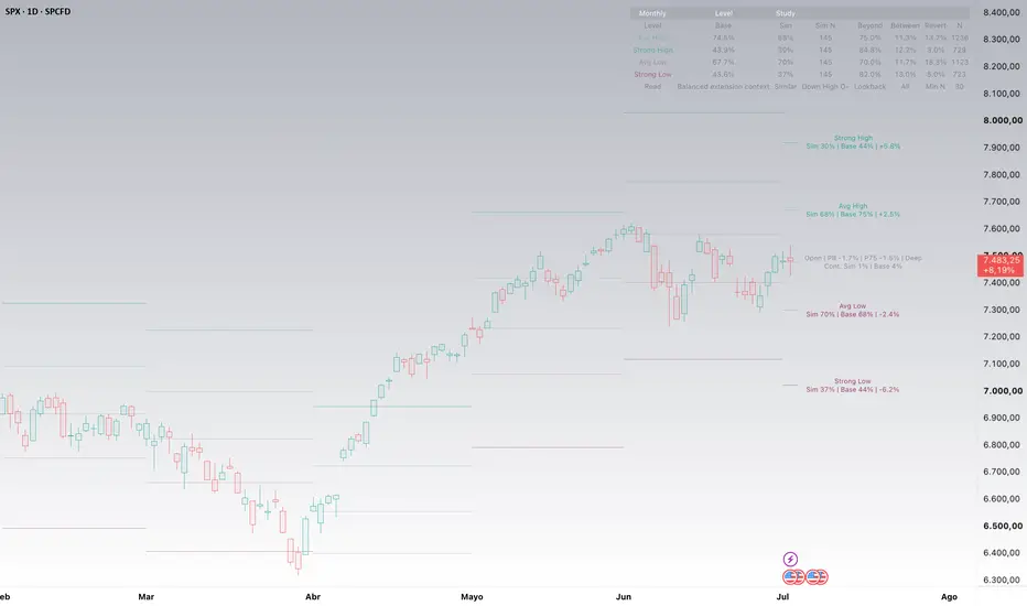
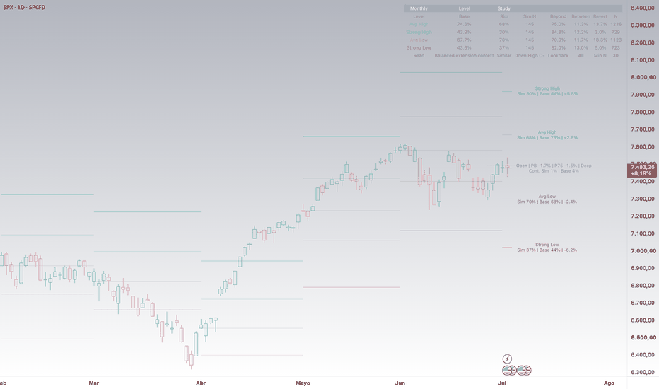
Monthly Statistical LevelsMonthly Statistical Levels is an open-source indicator that plots monthly reference levels based on historical monthly price extensions from the monthly open.
The goal of the script is to provide a clean statistical map for the current and recent months. It is designed as a market structure and reference-level tool, not as a buy/sell signal system.
How it works
The script uses completed monthly candles from TradingView data.
For each completed month, it calculates two historical extensions:
High extension:
Monthly High minus Monthly Open, divided by Monthly Open.
Low extension:
Monthly Open minus Monthly Low, divided by Monthly Open.
These historical extensions are stored separately for upside and downside movement.
At the start of each new month, the script uses the current monthly open and projects five reference levels:
Strong High
Avg High
Open
Avg Low
Strong Low
Avg High is based on the historical average upside extension from the monthly open.
Avg Low is based on the historical average downside extension from the monthly open.
Strong High uses the average upside extension plus a configurable standard deviation multiplier.
Strong Low uses the average downside extension plus a configurable standard deviation multiplier.
By default, the strong multiplier is set to 1.0, meaning strong levels use the historical average extension plus one standard deviation.
Lookback options
Users can choose the statistical lookback used for the calculations:
24 months
36 months
60 months
120 months
All available history
Using all available history can make the levels more stable, but it may also mix different market regimes. This is especially important for assets with structural changes, short trading histories, or very different behavior across cycles.
No lookahead logic
The indicator uses completed monthly candles to build the historical sample.
Each month keeps the levels calculated with the information available at the start of that month. The current month is used only for its monthly open, which is known once the month begins.
This means the levels are not recalculated using future monthly highs or lows.
How to use it
The levels can be used as a visual reference for monthly range structure.
Possible uses include:
Identifying where price is trading relative to its monthly statistical range.
Comparing the current month with recent monthly behavior.
Observing when price reaches average or stronger historical extension zones.
Keeping a cleaner chart with only the most recent visible months.
Main settings
Visible months:
Controls how many recent months are displayed. The default is 6 and the maximum is 12 to keep the chart readable.
Statistical lookback:
Controls the historical sample used to calculate average and strong levels.
Minimum closed months:
Defines the minimum number of completed monthly candles required before plotting levels.
Strong multiplier:
Controls how far strong levels are placed from average extension levels using standard deviation.
Labels:
Users can show labels only for the current month, for all visible months, or turn labels off.
Alerts
The script includes optional alert conditions for touches of:
Strong High
Avg High
Open
Avg Low
Strong Low
Limitations
This indicator does not predict future price movement.
It does not identify support or resistance with certainty.
It does not generate buy or sell signals.
It does not evaluate trend, fundamentals, macro conditions, liquidity, positioning, or news.
The levels depend on the TradingView symbol selected, the available historical data, and the chosen lookback window.
Why it may be useful
Many traders look at monthly opens, monthly ranges, and volatility-based zones separately. This script combines those ideas into one clean open-source tool: monthly open-based statistical levels built from completed historical monthly extensions.
It helps traders visualize where price is trading relative to its own historical monthly behavior, while keeping the chart simple and readable. 指標
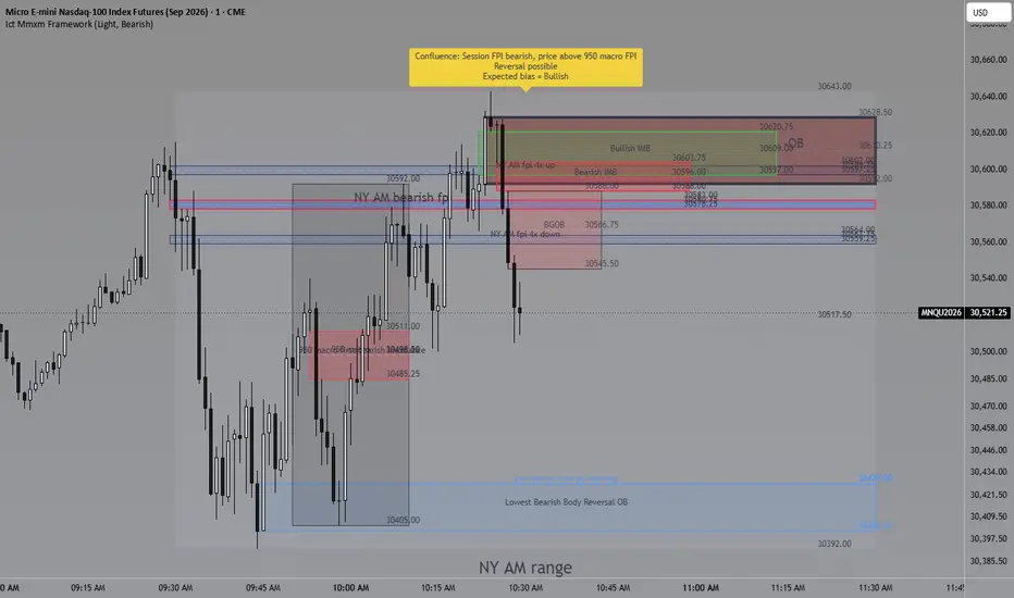
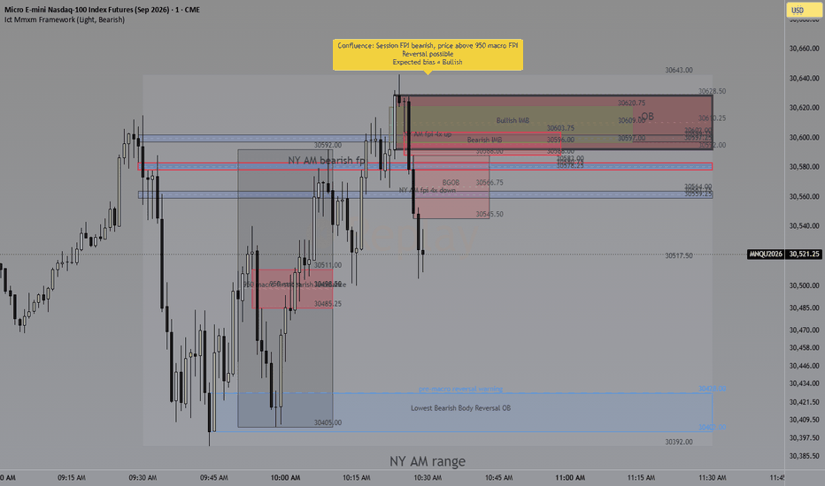
Ict Mmxm Frameworkict mmxm framework is a session-based market structure tool designed to organize intraday price delivery around fpi zones, macro windows, order blocks, imbalances, breakaway gap order blocks, opening ranges, and session range structure.
The script is built to help traders study how price behaves during the asian, london, new york morning, lunch, and new york afternoon sessions. It separates each major session into its own visual components so the user can compare pre-session ranges, active session ranges, macro windows, fpi areas, imbalance areas, order block zones, breakaway gap order blocks, and opening range levels.
Main components:
* pre-asian range from 7:00 pm to 9:00 pm new york time
* asian range from 9:00 pm to 12:00 am new york time
* asian macro windows at 6:50 pm to 7:10 pm, 8:50 pm to 9:10 pm, and 12:50 am to 1:10 am
* pre-london range from 2:00 am to 3:00 am new york time
* london range from 3:00 am to 5:00 am new york time
* london macro windows at 1:50 am to 2:10 am, 2:50 am to 3:10 am, and 4:50 am to 5:10 am
* new york morning, lunch, and afternoon session structure
* fpi visualization for asian, london, and new york sessions
* separate fpi detection for asian and london macro windows
* selected-bias imbalance mapping
* selected-bias order block mapping
* breakaway gap order block mapping
* high, midpoint, and low price labels for imbalance, order block, and breakaway gap order block zones
* opening range levels for the new york morning and afternoon sessions
* configurable session visibility and visual settings
The asian and london sections include range boxes, high and low references, midpoint references, macro windows, fpi areas, selected-bias imbalance zones, selected-bias order block zones, and breakaway gap order block context. These components are intended to help traders compare how price develops from one session into the next.
The selected expected bias controls how the main imbalance and order block zones are emphasized. When bearish bias is selected, the framework focuses on the highest relevant bullish order block and premium-side imbalance context. When bullish bias is selected, the framework focuses on the lowest relevant bearish order block and discount-side imbalance context.
The order block, imbalance, and breakaway gap order block zones use soft transparent colors based on the selected expected bias. Bearish bias uses red-toned zones, while bullish bias uses green-toned zones. This is intended to keep the chart visually aligned with the selected directional framework.
The purpose of this script is to provide a structured visual framework for studying session-based delivery, liquidity reference points, fpi behavior, macro timing, order blocks, imbalances, breakaway gap order blocks, and projected levels. It is intended for market context, discretionary planning, and research.
This script does not generate guaranteed trade signals, does not predict future price movement, and does not provide financial advice. It should be used together with independent analysis and proper risk management.
Asian Session:
London Session:
Ny Session:
指標
Auction Regime Atlas v1.0 # 🧭 Auction Regime Atlas v1.0
Auction Regime Atlas is a Pine Script v6 overlay indicator designed to visualize market acceptance, value migration, rejected auction areas, and contextual auction regimes directly on the chart.
❌ It is not a buy/sell signal tool.
❌ It is not a strategy.
❌ It is not an orderflow or liquidation-data replacement.
🎯 The goal is to help traders understand where price has been accepted, where value is forming, where price has moved away from value, and whether the current market context is balanced, transitional, displaced, or low quality.
---
## 💡 Core Idea
Markets often rotate around accepted value before moving into new auction areas.
Auction Regime Atlas maps that process by combining:
* price acceptance over a lookback window
* volume participation
* candle efficiency
* wick/rejection behavior
* higher-timeframe context
* regime classification
* distance from current value
📊 The result is a compact visual framework for understanding auction context without flooding the chart with signals.
---
## 🚀 Main Features
### 1. 🎯 Core Value Band
The Core Value Band highlights the price area where recent market activity shows the strongest acceptance.
It is calculated from a price-bin acceptance model using:
* time spent near price
* volume concentration
* close location
* wick/rejection behavior
⚠️ This band is meant as auction context, not as a mechanical support or resistance level.
---
### 2. 📏 Acceptance Edges
Upper and lower acceptance edges define the boundaries of the current accepted value area.
These edges help identify whether price is:
* inside accepted value
* above value
* below value
* far away from value
---
### 3. 🔄 Auction Regime
The dashboard shows a simplified auction regime state.
Current v1.0 regime states include:
* Neutral
* Balance
* Migration Up
* Migration Down
* Failed Auction
🛡️ The regime engine uses confirmed-bar logic and cooldown handling to avoid excessive state flipping.
---
### 4. 🌍 HTF Context
The indicator includes a higher-timeframe context layer based on confirmed higher-timeframe data.
ℹ️ This is used only as context and does not create entry or exit signals.
---
### 5. 📍 Location Awareness
The Location field shows where current price is relative to the accepted value area:
* Inside Value
* Above Value
* Below Value
* Away From Value
* No Value
When price is far away from the value zone, the visual relevance of the Core Band is reduced so the zone does not appear like an active trade signal.
---
### 6. 🎨 Visual Modes
Auction Regime Atlas includes three modes:
#### 🎯 Focus Mode
A clean minimal view for live chart reading.
Shows:
* Core Value Band
* Acceptance Edges
* compact dashboard
* no debug rows
#### ⚖️ Balanced Mode
Adds additional context zones while keeping the chart clean.
Shows:
* Core Value Band
* Acceptance Edges
* transitional/rejection context
* vacuum/context areas where applicable
#### 🔬 Research Mode
Adds validation and diagnostic rows for development, review, and deeper inspection.
Shows:
* object count
* validation status
* pending state information
* alert condition status
---
## 📋 Dashboard Fields
The compact dashboard includes:
* Mode
* Regime
* HTF Context
* Core Value Band
* Acceptance Score
* Location
* Activity
* Context Quality
🔬 Research Mode can additionally show:
* Validation Status
* Object Count
* State Debug
* Alert Debug
---
## 🔔 Alerts
The indicator includes four confirmed-bar alert conditions:
* New Auction Regime
* Value Migration Started
* Acceptance Edge Broken
* Failed Auction Detected
⚠️ Alerts are context alerts only.
They are not trade entry or exit instructions.
---
## 🛠️ Suggested Use
Auction Regime Atlas is best used as a context layer.
Useful questions:
* Is price currently inside accepted value?
* Is price moving away from value?
* Is the market balanced or transitioning?
* Did price leave value without building new acceptance?
* Is the current move happening near or far away from accepted value?
* Does higher-timeframe context support or contradict the current auction?
✅ Recommended starting use:
* Focus Mode for clean chart reading
* Balanced Mode for broader context
* Research Mode only for diagnostics and validation
---
## 📖 Practical Workflow
A simple way to interpret auction conditions is to combine Regime, Location Awareness, and HTF Context into a structured process.
### 1️⃣ Step 1: Start With HTF Context
First identify the higher-timeframe backdrop shown in the dashboard.
Ask:
* Is the higher timeframe supportive of directional movement?
* Is it balanced or already migrating?
* Does it align with the current chart or create conflict?
🌍 HTF Context provides the broader auction environment in which lower-timeframe activity is occurring.
### 2️⃣ Step 2: Check Current Location
Next evaluate where price is relative to accepted value.
* Inside Value suggests ongoing acceptance and rotational behavior.
* Above Value or Below Value suggests price is testing outside accepted value.
* Away From Value suggests displacement from the current auction area.
* No Value suggests acceptance has not yet formed clearly.
📍 Location helps determine whether price is interacting with value or operating away from it.
### 3️⃣ Step 3: Read the Active Regime
Then assess the current Auction Regime state.
* Balance implies acceptance and rotational trade around value.
* Migration Up or Migration Down implies value is attempting to relocate.
* Failed Auction suggests an attempted move has not established acceptance.
* Neutral indicates limited directional auction information.
🔄 The regime describes the current phase of the auction process rather than predicting the next move.
### 4️⃣ Step 4: Compare Regime and Location
The most useful information often comes from the relationship between regime and location.
Examples:
* Balance + Inside Value often reflects stable acceptance.
* Migration Up + Above Value may indicate value expansion higher.
* Migration Down + Below Value may indicate value expansion lower.
* Failed Auction + Away From Value may indicate rejection of a recent auction attempt.
📊 This comparison helps identify whether price behavior is consistent with the current auction state.
### 5️⃣ Step 5: Evaluate Market State Transitions
Watch for changes between regimes while monitoring location relative to value.
Common transitions include:
* Balance → Migration Up
* Balance → Migration Down
* Migration → Failed Auction
* Failed Auction → Balance
🔍 A transition becomes more meaningful when it is supported by location changes and aligned with HTF Context.
### 6️⃣ Step 6: Build a Contextual Narrative
Rather than treating any single field as a signal, combine all three layers:
1. Determine the higher-timeframe backdrop.
2. Identify where price is relative to value.
3. Assess the active auction regime.
4. Monitor whether the relationship between those factors is strengthening or weakening.
🧠 This workflow helps traders interpret whether the market is accepting value, rejecting value, migrating toward a new value area, or transitioning between auction states.
---
## 📈 Recommended Markets and Timeframes
The indicator is designed for liquid markets, especially:
* crypto perpetuals
* major crypto spot markets
* liquid index or futures markets
* high-volume intraday instruments
⏱️ Suggested timeframes:
* 5m
* 15m
* 1h for higher timeframe context
---
## ⚠️ Important Limitations
Auction Regime Atlas does not use true orderflow, footprint, delta, liquidation, or exchange-level positioning data.
All calculations are based on OHLCV data available in Pine Script.
❌ The indicator does not predict price direction.
❌ It does not guarantee reversals, continuations, or breakouts.
❌ It does not provide financial advice.
📌 The visual zones should be interpreted as auction context, not as automatic trade levels.
---
## 🛡️ Non-Repainting Design
The indicator is designed with confirmed-bar logic and non-repainting higher-timeframe requests.
Higher-timeframe context uses confirmed data and avoids lookahead behavior.
🔧 Visuals are updated with a stable object lifecycle to reduce flicker and avoid uncontrolled object creation.
---
## 📝 Release Notes — v1.0
🎉 Initial public release.
✅ Included:
* Acceptance Map Engine
* Core Value Band
* Acceptance Edges
* Minimal Auction Regime Engine
* HTF Context
* Location Awareness
* Focus / Balanced / Research modes
* Compact dashboard
* Confirmed-bar alerts
* Validation diagnostics in Research Mode
* Controlled object budget
* Non-repainting architecture
❌ Not included:
* strategy mode
* backtesting
* buy/sell signals
* automated entries or exits
* orderflow claims
* delta claims
* liquidation data
* machine learning
* multi-symbol logic
指標

Levels V1.5 Wall Street RedneckLevels V1.5 — Wall Street Redneck
🔵 OVERVIEW
Levels V1.5 is a multi-layer price structure tool that maps three distinct areas of market interest onto a single, clean chart overlay.
Rather than relying on a single reference point, this script combines dynamic price averaging, volatility-based swing detection, and historically significant price levels to give traders a complete picture of where price has been, where it is, and where it may interact next.
The script is designed to support high-probability entry and exit decisions by identifying zones of confluence — areas where two or more layers of interest overlap, increasing the significance of a reaction.
It also helps traders identify zones to avoid, preventing entries into areas of historically poor risk-to-reward or active congestion.
🔵 CORE CONCEPTS
Candle Average Price Structure
A dynamic average derived from ongoing price action is used to identify the mean of recent candle behavior. This creates a reference band that adapts to current market conditions and helps define whether price is extended above or below its natural center of gravity.
ATR-Based Swing Interaction
An Average True Range component measures the current volatility environment and projects interaction boundaries around active price swings. This layer adjusts dynamically as volatility expands and contracts, providing context for how far price can realistically move before encountering resistance or support.
Key Price Level Mapping
Previously established and currently active price reference points are plotted directly on the chart. These include:
• Current Day High, Open, and Low
• Previous and Current Daily High and Low
• Previous and Current Weekly High and Low
• Previous and Current Monthly High and Low
• Previous and Current Yearly High and Low
• Previous and Current 4-Hour High and Low
These levels represent areas where institutional and retail participants have previously reacted, making them high-probability zones for future interaction.
🔵 HOW IT WORKS
The three layers of this script work together to define a structured decision-making framework:
• The candle average identifies price location relative to recent action
• The ATR layer defines the active swing range and volatility context
• The key level map identifies historically significant price points within that range
When price approaches an area where multiple layers converge, the significance of that zone increases. Entries taken at isolated levels carry less context than entries taken at zones of multi-layer confluence.
Customizable Zone Mapping
Each plotted zone displays both a top price and a bottom price, giving traders exact reference points for zone boundaries. These values can be used directly for limit order placement, stop positioning, or target identification.
Zone inputs are fully customizable, allowing traders to adjust sensitivity and range to match their preferred instrument and timeframe.
🔵 TRADE MANAGEMENT APPLICATIONS
• Use zones of confluence as high-probability entry areas
• Avoid initiating new trades inside areas of active congestion or between two opposing levels
• Use ATR interaction boundaries to set realistic target expectations
• Reference the key level map to identify where price may stall, reverse, or accelerate
• Use zone top and bottom prices for precise bracket order placement
🔵 IMPORTANT NOTES
This script is designed for EDUCATIONAL PURPOSES and is intended to support a structured trading process, not replace one. No indicator guarantees trade outcomes.
Developed and maintained by Wall Street Redneck. Licensed for personal and student use only. Redistribution is not permitted. 指標

Friction Map [NovaLens]Friction Map reads price structure the way a floor trader reads a room: it finds the price shelves where the market actually spent time, marks which ones are still live versus which the market has abandoned, and measures how much clear air you have to the nearest live shelf in each direction. It is a map of where structure is, how alive it is, and where the open space sits - not a buy or sell signal.
Most support/resistance tools draw static lines and leave them there forever, so the chart fills with levels that stopped mattering 300 bars ago. Friction Map keeps the same structure honest over time: every shelf carries a freshness that decays once the market stops trading at it, so the orange (live) shelves are the ones price has interacted with recently and the gray (fading) ones visibly age out.
═════════════════════════════════════════
◈ HOW TO READ IT
Friction Map draws directly on the price chart. There are two views of the same structure.
The shelves.
Orange = LIVE - price traded here recently; this is the current structure context.
Gray = FADING - price has not returned in a while; the market has moved on and the shelf dims the longer it stays untouched.
Faint dotted = BROKEN - price closed through it; an x-cross marks the exact bar it failed, and the dotted tail is kept so you can still see it existed.
KEY LEVEL - the strongest live shelf on the map (boldest line, brightest tag). The eye's anchor.
The room boxes. On the right edge, a box runs from current price to the nearest LIVE shelf above and below, with a label that reads the distance as a near-to-far range in ATR, for example "1 to 2.1 ATR" - meaning roughly 1 ATR of clear air, then the shelf running out to 2.1 ATR. ATR units make the read comparable on any symbol and timeframe. Teal means clear room; orange means a live shelf sits within about 1 ATR. When there is no live shelf in a direction the label reads "open air".
The breakout badge. On a confirmed close that breaks the recent range, and only at the extremes, the map prints a one-word context badge: CLEAR RUNWAY when there is no live shelf within the runway band ahead, or WALLED (with the distance) when a live shelf stands within about 1 ATR of the path. Only one CLEAR RUNWAY prints per clear-air leg - no repeats while price keeps running in the same open space, and it resets once price pulls back into a shelf. It is breakout context, never a direction call.
The info panel. A compact info panel compiles the read: the structure memory in bars; Room above and Room below as ATR ranges; Price now (open air, on a live shelf, or on a fading shelf); Last breakout (the most recent badge and how many bars ago); Shelves (how many live versus fading); and a one-line Reading takeaway.
The two views (Level view).
Anchored (default): each shelf line starts at its origin diamond, shows its current live (orange) / fading (gray) state from that origin, and marks the x-cross where it broke. An anchored structure story - where structure formed, how it reads now, and where it broke if broken - not a full per-era ledger.
Zones : every live shelf drawn as a clean full-width band straight across the chart, like a supply/demand map. Instant "where are my levels right now". No origin/break markers; broken shelves drop off.
═════════════════════════════════════════
◉ HOW IT WORKS
The density field. Across the lookback window, the indicator measures how often each price level sat inside the high-low range of the lookback bars - a time-at-price-style structure read. For every bar it asks which price levels the bar's high-low range covered, and accumulates that into a density field using a difference-array method (O(L+bins) per bar) so the script stays fast even on long charts and heavy lookbacks. Price levels where many bars overlapped are dense; levels price passed through quickly are thin.
Where shelves are born. A shelf forms at a density peak whose strength clears a RELATIVE floor - it must be at least a set fraction of the strongest peak currently on the map. That relative test is self-calibrating: it adapts to each asset and regime instead of relying on a fixed tick count, so the same indicator is designed to read BTC, SPY, EURUSD and gold without constant retuning. A small absolute floor screens out noise on near-empty windows.
Data-driven width. Each shelf's band is not a fixed width. It expands outward from the peak for as long as the neighbouring density holds at least half the peak value, then is capped to a readable range in ATR units. A wide consolidation earns a wide shelf; a tight one stays thin.
Aliveness (freshness). Every shelf carries a freshness equal to an exponential decay of the bars since the band was last traded (2^(-barsSinceTouch / halfLife)). Freshness is 1 while price is in the band and halves every half-life once price leaves. Above the live threshold a shelf renders LIVE (orange); below it the shelf renders FADING (gray) and dims further until it drops off the map.
Causal lifecycle. Shelves are born on confirmed bars and never re-placed. A shelf becomes BROKEN only when price, after arming on one side with real separation, closes through to the other side - the break bar is frozen and the line continues as a faint dotted tail. The ORIGIN anchor (the earliest bar within the lookback where price actually traded that level) and the BREAK anchor are both set once and never rewritten. That frozen history is the trust element: the map cannot quietly redraw the past to look right.
═════════════════════════════════════════
✦ HOW WE USE IT
A common read on a liquid crypto or index chart, default memory: price is pushing toward the top of its recent range. The panel Room above reads "0.4 to 1.6 ATR" in orange - there is a live shelf close overhead, so the map reads the upside as walled in the near term. Room below reads "open air" - nothing live underneath. Price is sitting in open air between an overhead live shelf and abandoned structure far below.
Now price closes through the recent high. Because the nearest live shelf overhead was inside the runway band, the map prints WALLED with the distance, not CLEAR RUNWAY - the break is into immediate structure, not open space. The badge does not say the break fails; it says there is a live shelf standing in the path, which is the context a discretionary trader wants before deciding whether the move has room.
Flip the situation: a confirmed break with Room ahead reading "open air" prints CLEAR RUNWAY . In our testing, clear-runway breakouts travelled further on average than walled ones (the effect was modest and weakest on rates). That is an observation about context, not a guarantee about the next bar.
The point of the map is the same in every case: see where the live structure is, see how much clear air you have to it in ATR, and read the breakout against that structure instead of against a static line.
═════════════════════════════════════════
❖ OTHER APPLICATIONS
Trade-location context : read entries against the nearest live shelf rather than a static S/R line - the orange shelves are the structure price has interacted with most recently.
Breakout context : CLEAR RUNWAY versus WALLED on a confirmed break, as a read on whether there is open space ahead or a live shelf in the path.
Stop and target context : the room ranges in ATR give a structure-aware sense of where the nearest live shelves sit above and below, for evaluating whether planned stops or targets sit near recent structure or out in open air, instead of at round numbers.
Chop filter : many overlapping live shelves with price standing on one ("on a live shelf" in the panel) is a congested read; sustained open air is cleaner trend space.
Structure classifier : use the Shelves row (live versus fading) and Room rows as a top-down structure filter for any external trade plan, independent of the badges.
Alert-driven workflow : subscribe to the clear-runway and walled breakout alerts and check the chart only when a confirmed breakout actually changes the structural picture.
═════════════════════════════════════════
⚙ GETTING STARTED
Friction Map ships with pre-tuned memory profiles plus a Custom override. Pick a memory and start reading the map - the default Auto setting matches the chart timeframe for you.
Structure memory:
Auto (match timeframe) (default): reads the chart - 30-minute and faster get Short, everything slower gets Medium.
Short (60 bars) : about one trading day on 5m, a week on 1H. Faster-moving map.
Medium (120 bars) : about a month on 1H, six months on 1D. Balanced.
Long (240 bars) : slow, full-cycle structure.
Custom : unlocks the Advanced group for full manual control.
Core display:
Level view : Anchored (causal story, default) or Zones (clean full-width bands).
Structure shelves : master toggle for the shelf lines. On by default. Under it, three per-state toggles let you choose which states draw:
Live shelves (orange) , Fading shelves (gray) , Broken shelves (dotted) - all on by default. Turn Broken off to declutter when a level has rebuilt live on top of old broken tails.
Room boxes + labels : the price-to-nearest-live-shelf boxes and ATR range labels. On by default.
Breakout badge : CLEAR RUNWAY / WALLED context badges on confirmed breakouts. On by default.
Shelf state tags : a small LIVE / FADING / KEY LEVEL tag at the right end of each shelf. On by default; turn off for a cleaner chart once the colours are familiar.
Show real shelf width : off by default (live shelves get a thin subtle halo). On draws each live shelf at its true data-driven width as a wider transparent band.
Info panel : pick where the summary panel anchors - Top Right (default), Top Left, Bottom Right, Bottom Left, Middle Right, or Off to hide it.
Dark theme panel : panel colours for dark charts; turn off on a light background.
Level reach (bars) : how far back the shelf lines and halos draw, so old structure does not stretch across the whole chart.
Appearance / Colours (4 pickers):
Live shelf, Fading shelf, Clear air, Broken shelf - each on its own line. The shelf lines, halos, room boxes, tags and badges all reference these inputs, so the palette adapts for colour-blind, light-mode or brand themes without forking the script.
Advanced (Memory = Custom only): Custom opens on the same defaults as the Medium profile (not a live copy of whichever profile you are currently on), so coming from Medium the switch is seamless; coming from Short or Long the map steps to that baseline first. Then every dial below is yours.
Lookback (bars) : structure memory in bars. Larger = more history considered, slower-moving map.
Freshness half-life : how fast a shelf fades once the market stops trading at it. After this many bars untouched a shelf is at half freshness.
Breakout lookback : a breakout is a confirmed close that newly breaks beyond the prior N-bar high or low (a fresh cross, so a sustained trend does not re-fire it every bar).
Min strength (vs strongest) : a shelf is born only if its density is at least this fraction of the strongest peak on the map. Raise for fewer, stronger shelves.
Merge distance (ATR) : shelf candidates closer than this to an existing shelf refresh it instead of spawning a duplicate.
Max shelves : cap on simultaneously tracked (non-broken) shelves; the weakest is pruned when a stronger one is born.
Live threshold : freshness above this renders a shelf LIVE (orange).
Runway band (ATR) : how far ahead of a breakout to scan for live shelves when deciding CLEAR RUNWAY versus WALLED.
═════════════════════════════════════════
△ LIMITATIONS
Descriptive, not predictive : Friction Map shows where price spent time and how alive that structure is. It makes no claim that a shelf will hold or that a breakout will follow through. There is no buy or sell signal anywhere in the tool.
Time-at-price, not volume : the density field is built from how much of the traded range sat at each level, not from volume. That keeps the read universally stable across every asset and data feed (crypto volume is fractured by exchange, FX volume is a tick proxy), but it does not weight a busy bar more than a quiet one.
Backward-looking by construction : in fast moves and gaps, room can jump to "open air" quickly as price leaps into untraded territory. That is accurate but may not persist.
Room measures to LIVE shelves only : the room ranges and the badge ignore fading shelves on purpose - the room read focuses on the current (orange) structure. A fading shelf still shows on the chart as a gray line; it just is not counted as room.
The breakout effect is context, not edge : in testing, clear-runway breakouts travelled further than walled ones on average, but the difference was modest and weakest on rates. Treat the badge as context to read alongside your own plan, not as a validated signal.
Recency fade : a structurally important level that has not been traded in a long time will fade from the map even if you still consider it important. Lengthen the memory or half-life if you want older structure to persist.
═════════════════════════════════════════
🔔 ALERTS
Two alert conditions are built in so you can monitor structure without watching every bar:
Clear-runway breakout : a confirmed breakout into clear air (no live shelf within the runway band ahead).
Walled breakout : a confirmed breakout into nearby live structure (a live shelf within about 1 ATR of the path).
Both fire on bar close (gated on `barstate.isconfirmed`) - no intrabar repaint. The indicator also emits a richer alert with a pure-JSON payload for routing to your own automation or webhook stack. The payload carries the brand, the indicator name, the event, the direction, the up and down clearance in ATR, the current price, the ticker, the timeframe and the bar time (the clearance fields are sent as text and read "open" when there is no live shelf that way). Pick ONE mechanism per event - the dropdown alert condition for a simple notification, or the JSON alert for a webhook - so you do not get duplicate notifications. Badges and alerts fire even when the on-chart badge is toggled off; alerts should not require chart clutter.
═════════════════════════════════════════
⌁ NOTES
Built on a containment-count density field (time-at-price), with data-driven band width, exponential freshness decay, and a causal frozen lifecycle (origin and break anchors set once and never moved).
Method lineage: the density field is a time-at-price construction, in the tradition of Market Profile (J. Peter Steidlmayer, popularised at the CBOT in the 1980s), which reads structure from where the market spent time rather than from volume. Friction Map adds the freshness decay and the causal live/fading/broken lifecycle on top of that classical time-at-price idea.
Repaint: non-repainting on confirmed bars. Births, breaks, clearance, badges and alerts are computed on bar close; the current bar updates in real time. Live/fading colour reflects current state, so a re-traded faded shelf can re-colour live - no past origin or break anchor is ever changed.
Original construction. The engine is built from first principles for this tool; there is no external reference implementation, so no validation-correlation claim is made.
Open-source under MPL 2.0. Free to use, fork, study.
NovaLens 指標

Pivot Point - Standard Overview
This indicator plots classic "Floor Trader" Standard Pivot Points (P, R1-R3, S1-S3) on your intraday charts. However, unlike traditional pivot indicators, it is specifically engineered to solve the "Settlement Close vs. Last Traded Price (LTP)" discrepancy that plagues traders in the Indian markets (NSE/BSE) or anyone trying to sync their TradingView charts with brokerages using the ChartIQ engine (like Zerodha, Upstox, etc.).
The Problem It Solves
Most standard TradingView pivot indicators use the daily Last Traded Price (LTP) as the daily Close. In markets like India, the official daily close is not the LTP, but a 30-minute Volume Weighted Average Price (VWAP) settlement. Because TradingView captures the final LTP spike at 15:30, traditional pivot math gets skewed, causing your TradingView support and resistance lines to completely mismatch the lines generated by your broker's platform.
How It Works
To bypass the LTP spike and replicate the official settlement price, this indicator features an Auto Time-Capture system.
Instead of looking at the daily timeframe for the close, it silently captures the closing price of a specific intraday candle right before the market closes (Default: 15:25 exchange time). This 15:25 close acts as a highly accurate proxy for the official VWAP settlement price. It pairs this captured close with the official daily High and Low to calculate mathematically perfect ChartIQ-style pivot levels for the next day.
Key Features:
Auto Time-Capture: Automatically grabs the closing price at a user-defined time (default 15:25) to avoid post-market LTP spikes.
True Pivot UI: Draws clean, horizontal lines for the current day only. It does not draw ugly diagonal lines connecting yesterday's levels to today's levels.
Full Floor Trader Math: Calculates the main Pivot (P), plus 3 levels of Support and Resistance (R1, R2, R3 / S1, S2, S3).
Fully Customizable: Users can adjust the specific hour and minute they want the script to capture the closing price via the settings menu.
How to Use:
Apply this to an intraday timeframe (e.g., 1-minute, 5-minute, or 15-minute). Note: The timeframe must be small enough that your chosen capture time (like 15:25) actually exists as a candle close.
The indicator will automatically capture the price at the designated time and use it to project the standard pivot levels when the next trading day begins. 指標

指標

Previous Candle High Low [JoeyWave]Previous Candle High Low
The previous candle's High and Low for any timeframe — set it once, read it on any chart.
█ WHAT IT DOES
Draws two horizontal levels: the High and the Low of the previous candle on your chosen timeframe (default H4). Same idea as Previous Day High/Low (PDH/PDL), but the period is yours to pick — H1, H4, Daily, Weekly, anything.
These levels are clean liquidity references: the prior candle's extremes are where stops rest and where price often reacts.
█ FEATURES
▮ Any timeframe
Pick the period once (default H4). The label auto-names itself — "Previous H4 High", "Previous D1 Low", etc.
▮ Smart timeframe clamp
View a chart below your chosen timeframe (e.g. M5 chart, H4 setting) and it auto-raises to the chart timeframe instead of breaking — always a valid level, no errors.
▮ Non-repainting
Levels are taken from the last fully closed candle of the chosen timeframe — they don't repaint.
▮ Fully customizable
Line style (solid / dashed / dotted), colors, label on/off, price on/off, and label offset to push the text toward the right edge.
█ SETTINGS
· Timeframe — which period's previous candle to read (default H4)
· Show Previous High / Low — toggle each level
· Line Style / Colors — appearance
· Show Labels / Show Price / Label Offset — label control
█ NOTES
· Works on every market and timeframe
· Choosing a timeframe ≥ chart timeframe gives the truest reading
· Pairs well with market-structure and liquidity-based setups
Built on Pine v6.
指標

Volume Profile Support & Resistance Matrix [HexaTrades]Most indicators tell you where the price went. This one shows you where the volume traded and then does the hard part for you: it reads that volume map and draws the support and resistance levels that genuinely matter right now.
VRVP Visible Range Support/Resistance Matrix is an all-in-one volume toolkit. It builds a buy/sell Volume Range Visible Profile over the last N candles (or the visible range), locates the heavy high-volume nodes, converts them into ranked support and resistance zones, and surrounds them with everything you need to act: Point of Control, Value Area, Low-Volume-Node levels, optional Fair Value Gaps, a corner dashboard, and breakout/touch/ approach alerts. Everything is configurable, and every level is explained
✨ features
✔️ Buy & Sell Volume Profile
- Volume-by-price histogram built from the chosen window, one row per price bin.
- Buy vs sell split: each candle’s volume is classified as buying (close ≥ open) or selling (close < open) and stacked per row, so you see the order-flow balance at every level.
- Radiant intensity coloring: heavy rows render bright/opaque, light rows fade out, so the significant nodes jump off the chart.
- Right-of-price placement: the profile sits in the gap to the right of the last candle (adjustable), so it never covers your price action, and it pans/zooms with the chart.
- Gap-free distribution: volume is spread across each candle’s full range, so the profile is solid rather than a sparse set of dots.
✔️ Automatic Support & Resistance Zones
- High-volume node detection: the script repeatedly finds the biggest volume peaks and turns them into zones.
- Strength % score: every zone is graded by its volume relative to the Point of Control (e.g. “Support 82%”), and the fill opacity scales with that strength.
- Retest count: counts how many times price has re-entered the zone (e.g. “x4”), so you can tell fresh levels from heavily-tested ones.
- Smart spacing: a minimum distance (in profile rows) and an anti-overlap floor keep zones cleanly separated, never stacked on top of each other.
- Per-side cap: limit how many support and resistance zones show, so the chart stays readable.
- Auto role flip: a level above the last confirmed close is Resistance, below it is Support; zones recolor only when a candle actually closes through them.
- Adjustable thickness: zone band height from ATR or bin size, fully tunable.
Anchor options extend zones from the window start or from the last price touch.
✔️ Point of Control & Value Area
- POC line: the single highest-volume price (the market’s fair-value magnet).
- Value Area (VAH / VAL) : the high/low boundaries that contain your chosen % of total traded volume (default 70%).
- Used both as optional on-chart lines and as the engine behind the dashboard’s trend bias.
✔️ Low Volume Nodes (LVNs)
- Imbalance detection: finds the thin “valleys” in the profile where little volume traded.
- Dashed level lines mark these air pockets: price tends to move quickly through them and react at the thick nodes around them.
✔️ Fair Value Gaps (FVG)
- 3-candle imbalance detection: bullish & bearish gaps where price moved so fast it left an unfilled inefficiency.
-Unfilled-only boxes: only gaps price hasn’t returned to are shown, as small yellow boxes labeled “FVG”. Capped to keep the chart clean. (Off by default.)
✔️ Stat Dashboard
- A compact corner panel showing 📊 POC, 🔼 VAH, 🔽 VAL, 🟥 Nearest Resistance, 🟩 Nearest Support, 🧭 Trend Bias (Bullish / Bearish / Balanced) and 📐 zone counts.
- Dark, high-contrast styling that stays readable on light and dark chart themes; placeable in any of the four corners.
✔️ Alerts
The tool features a comprehensive, built-in alert system that triggers notifications for a variety of critical price movements, such as breakouts above resistance, breakdowns below support, support touches, resistance rejections, and upcoming zone warnings. Traders can also enable an optional volume confirmation filter to help minimize false signals during low-liquidity periods.
✔️ Window & Customization
- Two modes: a fixed candle window (default 360) for consistency, or the visible range so the profile follows whatever you’re looking at.
- Adjustable resolution: set the number of profile rows for coarse or fine detail.
- Full color control: buy/sell profile, support/resistance fills, POC, value area, LVN and FVG colors are all editable.
Find all mentioned features in the chart below.
⚙️ How it works
- Range & rows. It takes the high/low of the last N candles (or the visible range) and slices that range into bins (rows).
- Volume mapping. Each candle spreads its volume across the rows its range covers, then splits it into buy vs sell, giving a solid, gap-free volume-by-price map.
- POC & Value Area. The busiest row is the Point of Control; the script expands outward until it captures your chosen % of total volume → VAH / VAL.
- Zone selection. It picks the biggest volume peaks, keeps them spaced apart so they never overlap, scores each by strength, and counts retests.
- Role & signals. Levels above the last confirmed close are Resistance; below are Support, and breakout/touch / reject / approach events fire from the nearest live zone.
🚀How to use it- step by step
Add the indicator to any symbol that has volume, on any timeframe. The defaults work out of the box. Two decisions set the context:
- Timeframe: use your trading timeframe. Higher timeframes (1H/4H/1D) give fewer, stronger zones; lower timeframes give more, faster-moving ones.
- Window: keep Use Fixed Candle Count on (default 360) for a stable, repeatable profile, or turn it off to let the profile follow the visible range as you scroll.
⭐️ Read the structure with the dashboard
- Trend Bias is your regime filter: Bullish when price is above the Value Area High (favour longs), Bearish below the Value Area Low (favour shorts), Balanced inside the value area (favour fading the edges / mean-reversion).
- 🎯 POC / 🔼 VAH / 🔽 VAL give you the fair-value zone where most business was done.
- 🟥 Nearest Resistance / 🟩 Nearest Support are your immediate targets and invalidation prices
⭐️ Find the zones that actually matter
Not all zones are equal — let the labels rank them for you:
- Strength % : higher = more volume traded there = a stronger level. A “Support 95%” is far more significant than a “Support 48%”. Prioritise the high-% zones.
- Retest count (x N): a low count means a fresh, untested level (often the cleanest reactions); a high count means it’s been hit many times and may be weakening toward a break.
- Profile shape: the long bars are High-Volume Nodes (acceptance/magnets); the thin LVN dashed lines are Low-Volume Nodes (rejection / fast-travel zones).
⭐️ Trade the three core plays
Almost every setup is one of these. Use the zone edges for entries and stops:
Bounce (long at support)
- Price drops into a strong green Support zone with the bias bullish or balanced.
- Wait for a reaction candle (rejection wick/engulfing) inside or at the zone.
- Entry on the reaction; stop just below the zone; first target = POC or the nearest resistance.
Reject (short at resistance)
- Price rallies into a strong red Resistance zone with the bias bearish or balanced.
- Look for a rejection / the “Resistance Reject” marker.
- Entry on the reaction; stop just above the zone; target = POC or nearest support.
Breakout / Breakdown (momentum)
-A decisive close through a zone (ideally with the BUY/SELL signal and volume confirmation on) flips it from resistance to support (or vice-versa).
-Enter on the break or the retest of the flipped zone; target the next zone up/down.
- Breaks through a thin LVN tend to run fast to the next High-Volume Node.
Stack confluence for the best setups
The highest-probability trades are where several things line up:
Zone + POC: a level sitting on the Point of Control is a heavy magnet.
Zone + Value Area edge: VAH/VAL rejections are classic mean-reversion spots.
Zone + Fair Value Gap turn on FVGs: a gap that overlaps a zone is a strong target.
Zone + LVN beyond it: if there’s an air pocket just past a zone, a break can accelerate quickly.
High Strength % + low retest count: fresh, heavy levels react best.
Feel free to explore, learn from, and build upon this indicator. Feedback, suggestions, and ideas for future improvements are always welcome and appreciated.
This indicator is provided for educational and analytical purposes only and does not constitute financial, investment, or trading advice. All signals, levels, and zones are based on historical market data and should be used alongside your own analysis and risk management. Trading involves risk, and past performance or historical price reactions do not guarantee future results.
指標

RSI Extremes Reaction Zones# RSI Extremes Reaction Zones
RSI Extremes Reaction Zones is a price-level analysis tool designed to identify historically significant market areas based on extreme Relative Strength Index (RSI) readings.
Rather than using RSI solely as an oscillator below the chart, this indicator converts historical RSI extremes into actionable price levels directly on the chart. By doing so, traders can visualize where strong momentum expansions or momentum exhaustion events previously occurred and monitor how price interacts with those areas in the future.
The indicator automatically scans a user-defined historical range, ranks the strongest RSI highs and RSI lows, maps those values to their corresponding market prices, and transforms them into support and resistance zones.
In addition to identifying RSI-derived reaction areas, the script also measures how frequently price has interacted with each level and highlights the most actively tested zones.
---
## Why RSI Extremes Matter
RSI is commonly used to measure momentum strength and identify overbought or oversold conditions. However, many traders focus only on the current RSI reading and overlook the price levels where extreme RSI values originally occurred.
Historical RSI extremes often represent areas where:
• Strong buying pressure entered the market
• Strong selling pressure entered the market
• Trend acceleration occurred
• Momentum exhaustion appeared
• Important market reactions developed
When price revisits these areas in the future, market participants may once again react to those levels, creating potential support, resistance, rejection, or breakout opportunities.
This indicator is built around the idea that historical momentum extremes can leave behind meaningful market reference points long after the original RSI signal has disappeared.
---
## Features
• Detects the highest RSI readings within the selected lookback period
• Detects the lowest RSI readings within the selected lookback period
• Converts RSI extremes into chart-based support and resistance zones
• ATR-based dynamic zone sizing
• Highlights the two most frequently tested levels
• Displays historical touch information
• Shows time elapsed since each extreme occurred
• Automatic label collision management
• Built-in statistical dashboard
• Adjustable analysis range
• Fully customizable zone width and touch sensitivity
---
## How The Indicator Works
The script continuously calculates RSI values and stores the corresponding market prices.
Within the selected lookback window, the indicator identifies:
• The strongest RSI highs
• The strongest RSI lows
The prices associated with these RSI events are then ranked and displayed directly on the chart.
Instead of treating these prices as single horizontal lines, the indicator creates dynamic support and resistance zones around each level using the Average True Range (ATR).
This allows the zones to automatically adapt to the volatility characteristics of the current market.
Higher volatility markets produce wider zones, while lower volatility markets generate tighter zones.
The result is a more realistic representation of potential reaction areas compared to using fixed-price levels.
---
## Most Touched Levels
Not all RSI-based levels are equally important.
To help identify the strongest reaction areas, the script measures how often price has revisited each detected level.
A configurable ATR-based threshold is used to determine whether a historical price interaction qualifies as a valid touch.
The two levels with the highest number of interactions are highlighted separately as:
🏆 Most Touched #1
🥈 Most Touched #2
These levels often represent areas where buyers and sellers repeatedly agreed on value and therefore may attract future market attention.
---
## Dashboard Overview
The built-in dashboard provides a complete overview of the detected RSI-based levels.
### Highest RSI Section
Displays:
• Highest recorded RSI values
• Associated market prices
• Ranking order
• Number of bars since occurrence
These levels frequently act as potential resistance or reaction areas.
### Lowest RSI Section
Displays:
• Lowest recorded RSI values
• Associated market prices
• Ranking order
• Number of bars since occurrence
These levels frequently act as potential support or reaction areas.
### Most Touched Section
Displays:
• Most interacted price levels
• Number of touches
• Current price relationship
• Most recent interaction information
This helps identify areas that have repeatedly influenced market behavior.
---
## Understanding The Zones
The indicator uses color-coded zones to make interpretation easier.
### Upper Zones
Levels generated from historically high RSI readings are displayed as potential resistance regions.
These areas represent locations where strong bullish momentum previously existed.
Potential observations:
• Price rejection
• Trend slowdown
• Consolidation
• Breakout continuation
### Lower Zones
Levels generated from historically low RSI readings are displayed as potential support regions.
These areas represent locations where strong bearish momentum previously existed.
Potential observations:
• Bounce reactions
• Trend stabilization
• Reversal attempts
• Breakdown continuation
The indicator does not assume that a level will hold. Instead, it highlights historically significant areas where market reactions may deserve additional attention.
---
## How To Use
### Trend Following
Use the indicator to identify pullback zones during strong trends.
In uptrends:
• Monitor lower RSI zones for support reactions
• Look for bullish confirmations before entering
In downtrends:
• Monitor higher RSI zones for resistance reactions
• Look for bearish confirmations before entering
---
### Reversal Trading
Watch for price reaching historical RSI extreme zones after extended moves.
Potential confirmation signals may include:
• Rejection candles
• Momentum divergence
• Volume expansion
• Market structure shifts
The indicator should be used as a location tool rather than a standalone entry signal.
---
### Support & Resistance Analysis
Historical RSI-based levels often align with traditional support and resistance structures.
When multiple analytical methods point to the same area, the level may carry greater significance.
Examples include:
• Swing highs and lows
• Market structure levels
• Fibonacci retracements
• Trendlines
• Volume profile zones
---
### Confluence Analysis
The indicator becomes particularly useful when combined with other technical tools.
Look for overlap between RSI-derived zones and:
• Existing support and resistance
• Trendlines
• Moving averages
• Volume-based levels
• Higher timeframe structure
Areas where multiple analytical concepts align may offer stronger trading opportunities than any individual signal alone.
---
## Input Settings
### RSI Period
Controls the sensitivity of RSI calculations.
Lower values:
• More responsive
• More frequent extremes
• More short-term signals
Higher values:
• Smoother behavior
• Fewer extremes
• Greater emphasis on major momentum events
---
### Bar Count
Defines the historical range used for analysis.
Smaller values:
• Focus on recent market behavior
• Faster adaptation
Larger values:
• Include older market data
• Highlight longer-term reaction levels
---
### Zone Width
Controls the ATR multiplier used to create support and resistance zones.
Higher values:
• Wider zones
• More tolerance for volatility
Lower values:
• Tighter zones
• Greater precision
---
### Touch Threshold
Controls how close price must come to a level for an interaction to be counted as a touch.
Lower values:
• Stricter touch requirements
Higher values:
• More forgiving interaction detection
---
## Best Used For
• Support and resistance trading
• Swing trading
• Trend continuation analysis
• Market structure analysis
• Momentum studies
• Confluence-based trading
• Reaction zone identification
• Historical price level analysis
• Multi-factor technical analysis
---
## Originality
This indicator presents an alternative approach to RSI analysis by transforming historical momentum extremes into chart-based price structures.
The script combines:
• Historical RSI ranking
• Price-level mapping
• ATR-based zone construction
• Touch-frequency analysis
• Dynamic visualization
• Statistical reporting
into a single framework designed to help traders identify historically significant reaction areas directly on the chart.
---
## Disclaimer
This indicator is intended for educational and analytical purposes only.
Historical RSI extremes and past market reactions do not guarantee future results. All trading decisions should be based on independent analysis, proper risk management, and additional confirmation methods.
No indicator can predict future market behavior with certainty.
指標

Liquidity Vault [Dojo La Nuit]Liquidity Vault maps resting liquidity on your chart as clean horizontal levels and tracks what happens to them — without any buy/sell signals or predictions. It is a pure visualization tool for traders who read price around liquidity.
HOW IT WORKS
The script detects swing pivots and clusters nearby highs (and nearby lows) into single liquidity zones using an ATR-based tolerance, so the levels travel across instruments without re-tuning. Each zone gets a strength score from 0 to 100 built from three factors:
• Touches — how many times price reacted at the level
• Freshness — recent levels score higher and decay over time (configurable half-life)
• Volume — relative volume that accumulated at the level
HOW TO READ IT
• Red lines = sell-side liquidity (resting above price)
• Green lines = buy-side liquidity (resting below price)
• Opacity = strength: the stronger the zone, the more solid the line
• Dimmed, dotted lines = zones that have already been swept (price wicked through the level). They are kept as context, not removed.
SETTINGS
• Zone Detection — adaptive or fixed pivot length, clustering tolerance, lookback, max live zones
• Zone Strength — minimum score to display, freshness half-life, volume weighting on/off
• Visuals — theme (auto/dark/light), strength-based intensity, keep swept zones, line width
• Colors — fully customizable buy-side / sell-side colors
NOTES
Strength is shown through line opacity by design, to keep the chart minimal. Zones are recalculated on confirmed bars. This tool highlights where liquidity rests and when it gets taken — it does not generate entries, targets or signals.
This indicator is for educational and analytical purposes only. It is not financial advice. Always do your own research and manage your own risk.
─────────────────────────
🌙 LIQUIDITY VAULT — Dojo La Nuit
Liquidity Vault mostra la liquidità presente sul grafico come livelli orizzontali puliti e ne traccia l'evoluzione, senza segnali di acquisto/vendita e senza previsioni. È uno strumento puramente visivo per chi opera attorno alla liquidità.
COME FUNZIONA
Lo script individua i pivot di mercato e raggruppa i massimi (e i minimi) vicini in un'unica zona di liquidità tramite una tolleranza basata sull'ATR, così i livelli funzionano su strumenti diversi senza dover ritoccare i parametri. A ogni zona viene assegnato un punteggio di forza da 0 a 100, calcolato su tre fattori:
• Tocchi — quante volte il prezzo ha reagito al livello
• Freschezza — i livelli recenti pesano di più e si attenuano nel tempo (half-life configurabile)
• Volume — il volume relativo accumulato sul livello
COME SI LEGGE
• Linee rosse = liquidità sell-side (sopra il prezzo)
• Linee verdi = liquidità buy-side (sotto il prezzo)
• Opacità = forza: più la zona è forte, più la linea è piena
• Linee attenuate e puntinate = zone già spazzate (il prezzo ha bucato il livello con un'ombra). Restano come contesto, non vengono rimosse.
IMPOSTAZIONI
• Rilevamento zone — pivot adattivo o fisso, tolleranza di clustering, lookback, numero massimo di zone attive
• Forza zone — punteggio minimo da mostrare, half-life della freschezza, peso del volume on/off
• Visual — tema (auto/scuro/chiaro), intensità in base alla forza, mantieni zone spazzate, spessore linea
• Colori — colori buy-side / sell-side completamente personalizzabili
NOTE
La forza è rappresentata tramite l'opacità della linea, per scelta, per mantenere il grafico minimale. Le zone vengono ricalcolate sulle barre confermate. Lo strumento evidenzia dove si trova la liquidità e quando viene presa: non genera entrate, target o segnali.
Questo indicatore è a scopo puramente didattico e di analisi. Non è consulenza finanziaria. Fai sempre le tue valutazioni e gestisci il tuo rischio. 指標

Smart SR Zones [JOAT]SMART SR ZONES
Support / resistance done properly. Most public SR scripts paint a horizontal line at every pivot, which produces wallpaper, not analysis. Smart SR Zones does the opposite — pivots are first detected with a volatility-aware engine, then clustered into zones, then scored by volume and touches, then filtered by spacing and distance. What ends up on the chart is the small handful of levels that actually matter for the current market state.
Pivot detection — preset-driven
A single Strength Preset selects the personality of the pivot engine:
Scalp — 4 left / 2 right, 0.4× ATR clustering tolerance, 4-bar minimum spacing. For 1–5m charts.
Local — 6 / 4, 0.5×, 8-bar. Tight zones from recent structure.
Swing — 15 / 8, 0.9×, 20-bar. The balanced default.
Major — 35 / 15, 1.4×, 50-bar. Wide macro zones.
Custom — every parameter is exposed for manual tuning.
The preset abstraction means you do not need to refit anything across timeframes — pick the read you want and the engine does the rest.
Clustering, not stacking
When two pivots fall within Cluster Tolerance × ATR of each other they are merged into a single zone, with the box span widened to cover both extremes. This is the difference between a "level" and a "zone": a level pretends price is precise, a zone respects the fact that liquidity sits in a band. The cluster tolerance is ATR-relative so the same setting works across symbols.
Touch counting, properly gated
A pivot must contribute to a cluster from a minimum bar spacing (preset-driven). Without this filter a chop within a zone gets counted as ten separate touches and inflates the strength score. With it, a zone earns its touch count from genuinely independent visits.
Volume-weighted strength + star rating
Each cluster accumulates the bar volume at every contributing pivot. The aggregate is converted to a 1–3 star rating relative to the strongest zone currently on the chart, and is shown in the zone label alongside the touch count. Zones can optionally be coloured by volume share so the visually loudest box is the one carrying the most demonstrated activity.
Zone of Interest (ZOI) — the headline filter
A zone earns the ZOI badge when all of these are true at the same time:
It has met the minimum-touches threshold (so it is real structure).
Its volume share is above the ZOI volume threshold (so it is meaningfully active).
It has not been touched recently — at least ZOI Quiet bars since the most-recent touch.
In other words, a ZOI is a high-quality level that the market is conspicuously not testing — and these are usually the next levels that matter. The ZOI gets a bright burlywood border with an optional animated pulse so it visually separates from the rest of the SR stack.
Distance hiding
A "Hide zones farther than %" input drops anything whose centre price is too far from current — so when you scroll into history the chart does not get cluttered with macro zones from another era. Set to 0 to keep everything visible.
Broken zones and dropped zones
Two optional historical layers:
Broken — zones that were physically closed through. Renders in a desaturated palette so you can see where structure failed without confusing it for active level.
Dropped — zones that were removed not by a break but by reorganisation, because newer / stronger pivots reshuffled the cluster set.
Both are off by default so a working chart stays clean.
Optional signal layer
Three small markers (all off by default) for traders who want execution hints rather than just structure:
Successful test — circle on bars that touched an active zone and rejected.
Retest — diamond when price returns to a broken zone from the opposite side, inside a configurable window.
Zone reaction — small diamond on a touch-with-hold, plus a text label on physical break events.
A configurable cooldown prevents back-to-back markers from the same zone.
Dashboard
A compact diagnostic table, positionable to any of nine corners, monospaced. Shows nearest support / resistance with distance, current ZOI status, active zone count per side, and the preset in use. A compact mode hides descriptions for narrow layouts.
Alerts
A single high-signal alert is exposed: Zone of Interest activation — fires on the first bar a zone qualifies as a ZOI. The other layers are visual diagnostics, not alert-grade; this is intentional, because the ZOI rule is the strongest filter in the script and is what you actually want to be notified about.
How to read it
Look at the chart and ignore everything except the ZOI-tagged zones and the stars. The stars tell you which historical levels have the most demonstrated activity; the ZOI badge tells you which of those have been deliberately avoided recently. The intersection — a star-rated ZOI close to price — is the cleanest level read this script can produce. Use the volume score and the touch count as a tiebreaker when multiple ZOIs are in play.
Suggested settings
Default Swing preset works well from 1H through 1D on liquid futures, FX, and crypto. Drop to Local for intraday execution and Scalp for tape-reading on minute charts. Major is for weekly / monthly macro reads. The ZOI volume threshold (70%) is intentionally strict — drop it to 50–60% if you want more frequent ZOI candidates.
Originality / what's reused
The vocabulary (pivot, cluster, touch count, broken zone, retest) is public-domain market-structure language. The implementation — the preset-driven engine, the ATR-clustering, the volume-weighted star rating, the ZOI rule (touches + volume share + quiet-period), the dropped-zone reorganisation logic, and the volume-share intensity colouring — is JOAT-original and tuned together as a single system. No third-party code reused.
Open source
Published open-source under the default Mozilla Public License 2.0. The source is fully documented inline — every helper is sectioned, every input has a tooltip, and the structural layers are separable so you can learn from any specific piece. Forks welcome with credit.
Limitations
SR is structural context, not a signal generator. Smart SR Zones does not print buy / sell labels — it prints zones, ratings, and a single high-quality ZOI alert. On extremely illiquid instruments the volume-share rankings will be noisy and the ZOI rule will fire less often; that is the right behaviour. Zones beyond the Pivot Memory horizon are dropped to stay under TradingView's 500-object cap.
—
-made with passion by jackofalltrades
指標