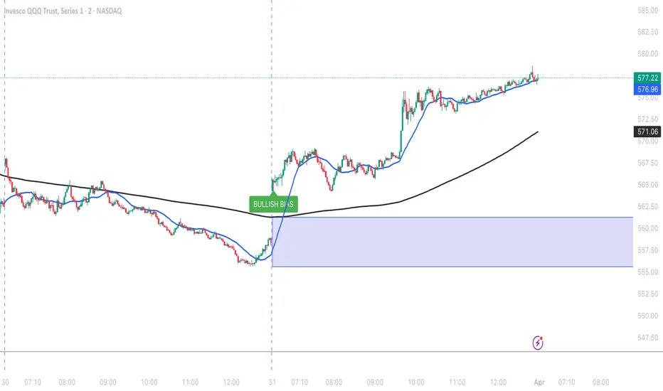
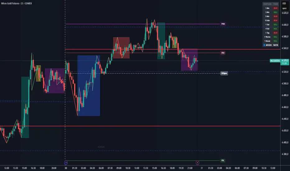
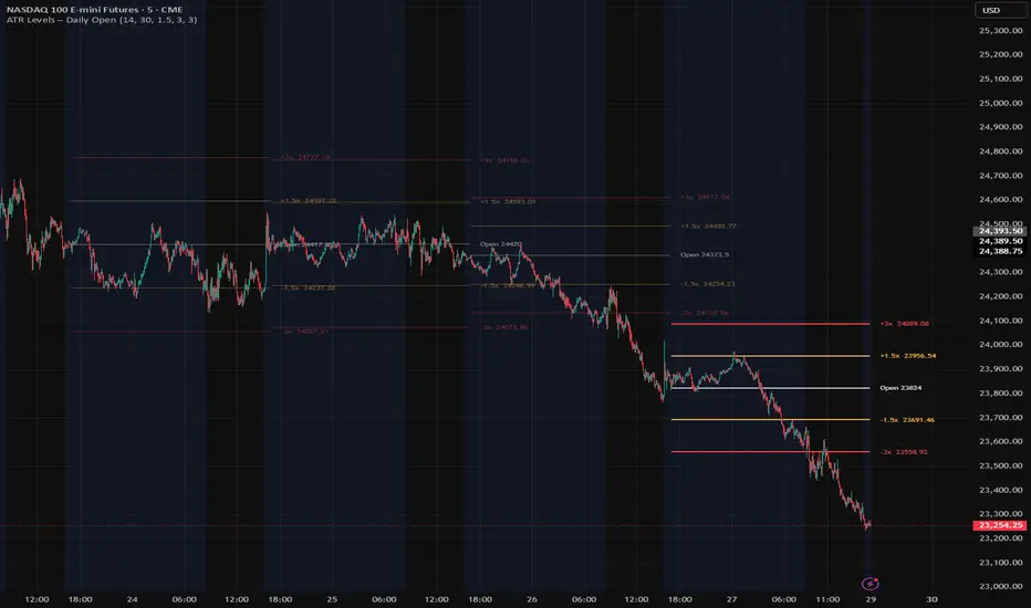
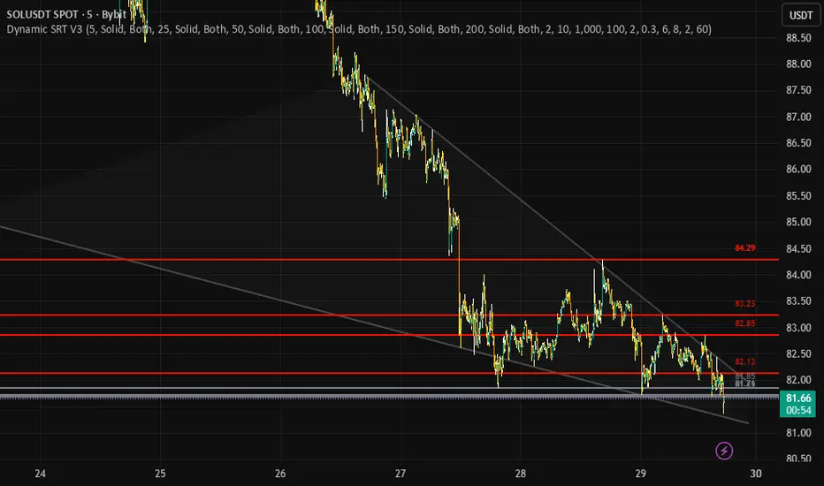
HTA - OPENHTA - OPEN (Opening Ranges & AVWAPs)
Release Notes (Latest Update):
Name Change: Simplified indicator name to HTA - OPEN.
New Asia Session: Added the Asia Opening Range and Start of Asia Session AVWAP (Defaulted to 18:00 EST to align with the CME Globex futures open).
"Extend Lines" Toggle: Added the ability to choose whether your opening range lines extend infinitely across the chart, or if they automatically stop drawing when the session ends to keep your chart clean.
UI Overhaul: Completely reorganized the settings menu. Session AVWAPs are now cleanly grouped together, and default color opacities have been optimized for better visibility.
About HTA - OPEN
The HTA - OPEN indicator is an all-in-one intraday tool designed to automatically map out key liquidity periods, session opening ranges, and dynamic volume-weighted average prices (AVWAPs). It is built to keep your charts clean while providing critical levels for the New York, London, and Asia sessions.
Key Features:
1. Automated Opening Ranges
The script automatically draws the high and low of the opening minutes for major sessions. Each session is highly customizable, allowing you to change line styles, colors, fill opacity, and toggle text labels.
New York Session: 09:30 - 09:45 EST
Asia / Globex Session: 18:00 - 18:15 EST
London Session: 03:00 - 03:15 EST
Day Initial Balance: 09:30 - 10:30 EST
2. Session AVWAPs
Automatically anchors a VWAP to the exact start time of your selected sessions, providing a dynamic gauge of intraday trend and institutional average price.
Start of New York Session AVWAP
Start of London Session AVWAP
Start of Asia Session AVWAP
Previous Day's New York Open AVWAP
3. Macro & Day AVWAPs
For broader market context, the indicator can seamlessly plot Higher Timeframe AVWAPs without needing to manually anchor them.
Day AVWAPs: Start of Day, High of Day, Low of Day.
Macro AVWAPs: Start of Month, Start of Year, High of Year.
Customization & Display:
Every range and AVWAP can be toggled on or off individually. The new "Extend Lines" feature gives you complete control over how much historical data remains visible on your chart, ensuring your workspace only shows the data you need for the current session. 指標
AG Pro Support Resistance Reaction Map [AGPro Series]AG Pro Support Resistance Reaction Map
Overview / What it does
This indicator maps horizontal support and resistance zones from confirmed price structure, then evaluates how price reacts when it returns to those zones. Instead of treating every level touch as equally important, the script focuses on whether the interaction looks constructive, weak, or potentially broken.
The core objective is to make structural reactions easier to read on-chart. Confirmed pivot highs and lows are converted into zones, nearby levels are merged, older levels can expire, and the chart prioritizes the most relevant active zones on each side of price. When price re-enters a zone, the script grades the reaction and can display labels such as Clean Hold, Sharp Reject, Soft Bounce, or Break Confirmed.
This publication is designed as an indicator, not as an execution engine. It does not place trades, predict future returns, or guarantee that a level will hold. Its purpose is to help traders organize structural context and evaluate reaction quality in a more systematic way.
Unique Edge
Support and resistance is a classic concept, so the difference here is not the concept itself but the workflow built around it.
This script is not a generic auto-drawing tool that tries to plot every possible line. It is a reaction map. The emphasis is on how price behaves inside a structural zone, not on covering the chart with as many levels as possible.
The script differs from tools that are primarily centered on pivot formulas, breakout-retest grading, moving-average reclaim logic, or channel structure. Here, the focus is horizontal structural memory and the quality of the live interaction with that memory. In practice, that means the script is trying to answer questions such as:
- Is this support still reacting constructively?
- Is this resistance rejecting cleanly or absorbing pressure?
- Is the latest touch just noise, or is it a more meaningful retest?
- Which nearby intact levels still deserve attention right now?
Another important distinction is the panel logic. The compact panel does not attempt to summarize all historical levels. It highlights the nearest intact support below price and the nearest intact resistance above price, along with their state, raw versus qualified touch count, and the latest recorded reaction.
Methodology
1) Structural level detection
Confirmed pivot highs and lows are used to create horizontal support and resistance zones. The script waits for confirmation rather than guessing unfinished pivots.
2) Zone construction
Each level is converted into a zone using an ATR-based width. This keeps the plotted area adaptable instead of forcing the same fixed width on all markets and all volatility environments.
3) Merge logic
Nearby levels of the same type can be merged when they fall within the selected merge distance. This helps reduce duplication and keeps the map cleaner.
4) Age and visibility control
Older levels can expire, broken levels can be hidden or faded, and the script visually prioritizes the nearest intact zones. This is intended to improve readability rather than preserve every historical level forever.
5) Reaction scoring
When price newly enters a live zone, the script evaluates the interaction using factors such as penetration depth, close location inside or outside the zone, candle body bias, impulse, and whether the touch is the first qualified retest. The result is translated into a reaction label and a quality score.
6) Touch accounting
The script tracks both Raw and Qualified touches. Raw touches represent zone entries. Qualified touches are stricter and require a fresh entry plus cooldown spacing, which helps avoid counting clustered bars as repeated independent retests.
Signals & Alerts
The script can generate labels and alerts around the most important structural interactions.
Main reaction labels:
- Clean Hold
- Sharp Reject
- Soft Bounce
- Break Confirmed
- Failure Risk
Main alert conditions:
- Bullish Level Reaction
- Bearish Level Reaction
- Level Break Confirmed
These labels and alerts are descriptive, not predictive. They summarize the current structural interaction detected by the script. They are not trade instructions and should not be interpreted as a promise of continuation or reversal.
Key Inputs
Levels
- Pivot Strength
- Maximum Active Levels
- Zone Width (ATR Multiplier)
- Merge Distance (ATR Multiplier)
- Level Expiry (bars)
Reaction Engine
- Retest Cooldown (bars)
- First-Touch Bonus
- Keep Broken Levels Visible
Visuals
- Show Reaction Labels
- Show Compact Panel
- Visible Zones Per Side
- Emphasize Nearest Levels
- Show Soft Bounce Labels
- Minimum Label Score
- Minimum Bars Between Side Labels
- Label Stagger (bars)
- Broken Level Fade
- Base Zone Opacity
- Label Offset (ATR)
- Label Size
- Panel Text Size
Panel
- Panel Location
- Panel Theme (Dark / Light)
Limitations & Transparency
- Pivot-based levels are confirmed after the selected pivot strength completes, so the script is intentionally reactive rather than anticipatory.
- Zone width is ATR-based, which means the visual footprint of levels will change with volatility.
- Raw and Qualified touch counts are intentionally different. Qualified touches are filtered by entry logic and cooldown, so they will usually be lower than raw counts.
- The compact panel is selective. It shows the nearest intact support and the nearest intact resistance, not a full inventory of every level on the chart.
- Visibility controls are designed to keep the chart readable. As a result, some valid but lower-priority levels may be de-emphasized or hidden from the main view.
- Support and resistance remains interpretive by nature. No horizontal level works in isolation across all symbols, timeframes, or market regimes.
Risk Disclosure
This indicator is a chart-analysis tool. It is not a broker, a signal service, or an automated trading system. It does not provide investment advice and it does not guarantee that any level will hold, reject, or break in a particular way.
All markets involve risk. Price can invalidate a structural zone quickly, especially during news events, regime shifts, or low-liquidity conditions. Use the script as one part of a broader decision process that includes market context, liquidity conditions, timeframe alignment, and risk management.
指標

指標

Resistance & Support Dynamic PRO [ChartWhizzperer]Resistance & Support Dynamic PRO | Algorithmic Zones by ChartWhizzperer
The revolution in chart hygiene.
Most support and resistance indicators share a massive flaw: they turn your chart into an unreadable mess of endless lines and boxes within hours. They possess no memory, no filters, and crucially – no logic for self-cleaning.
As a system architect, I developed the Resistance/Support Dynamic™ PRO to solve this problem mathematically. This open-source indicator does not merely draw zones. It evaluates them, ages them, and purges them when they become obsolete.
CORE FEATURES (Why this indicator is different):
Smart Mitigation Protocol (Purge Logic): Once a zone has been breached or chopped by the market too many times, it loses its institutional relevance. The algorithm detects these structural breaks (strikes) and permanently purges the dead zone from the chart. No more ghosting.
Alpha Decay Engine: Nothing lasts forever – especially not in trading. Zones fade over time (transparency scales mathematically with the zone's age). Current hotspots are highly visible, whilst older levels smoothly fade into the background.
Volume Validation: Not every pivot point represents genuine Smart Money. If this filter is active, an S/R zone is only drawn if the origin candle exhibits above-average volume (SMA-verified).
ATR-Based Sizing & Overlap Guard: The thickness of the zones dynamically adapts to market volatility (ATR). Furthermore, the overlap guard prevents new zones from being drawn over existing ones, preventing visual clutter.
Examine the source code: This is not spaghetti code. It is highly efficient, object-oriented Pine Script (v6) featuring clean array management and User-Defined Types (UDTs).
THE BITTER TRUTH OF TRADING (And the next logical step)
This indicator provides you with the ultimate map. It shows you with clinical precision exactly where Smart Money has left liquidity.
However, a map does not pull the trigger. Ask me for more!
Disclaimer
Signals and alerts are provided for informational purposes only and do not constitute financial advice or a recommendation to buy or sell.
Trading involves substantial risk and may result in the total loss of capital. Execution via third-party tools may differ from alerts. Past performance is not indicative of future results. 指標

Chandelier Exit Reaction Zones + Fib LevelsAt its core, this script is built on a Chandelier Exit-style ATR stop-and-flip engine. The difference is that instead of stopping at a single trailing stop, it expands that framework into a full ladder: the multiplier 10 level becomes the primary anchor, the opposite-side multiplier 10 level becomes the extension anchor, and the space between them is mapped with a fib channel. Optional Chandelier Exit multipliers of 5.0 and 7.5 reaction zones add another layer of context for tracking how price behaves before it reaches the full multiplier 10 stretch.
The main idea is simple: markets often react when price gets extended, but not every extension behaves the same way. Sometimes price reaches an ATR threshold and reverses. Sometimes it reaches the same area and continues. This script is meant to organize that behavior into a structure you can read quickly. The Chandelier Exit engine provides the directional framework, while the ladder, fib channel, and reaction zones help show where price is stretched, where it is progressing through the channel, and where a reaction may be worth paying closer attention to.
At a high level, the script does three things. First, it identifies the current active ATR 10 side and the opposite ATR 10x extension. Second, it divides that space into a structured ladder using fib-based levels. Third, it can overlay ATR 5.0 and 7.5 reaction zones so you can see when price is pressing into an intermediate reaction area instead of only waiting for the full ATR 10 test.
A few examples of how to read it:
➡️In a bullish state, the active ATR 10 line acts as the lower anchor and the ATR 10x extension becomes the upper stretch line. The fib ladder shows how far price has progressed through that channel.
➡️In a bearish state, the structure flips. The active ATR 10 line becomes the upper anchor and the ATR 10x extension becomes the lower stretch line.
The optional ATR 5.0 and 7.5 reaction zones add another layer of context. They are useful when price is not yet at the full ATR 10 extreme but is already entering a part of the move where reaction risk is increasing.
➡️The reaction zones table is there to make the state logic visible. It shows the current main multiplier's direction, the latest flip state, the 5.0 / 7.5 reaction directions, and whether those reaction branches are actively contributing to the fill.
This is not meant to predict reversals by itself. The way I use it is more practical: it helps frame where price is stretched, where a move is still developing, and where a reaction may deserve closer attention. The value here is the structure, not a guaranteed signal.
The script also includes state-aware touch alerts for the active ATR 10 level and the ATR 10x extension. Those alerts are not entry signals on their own. They are meant to notify you when price has reached an area that may deserve a decision: continuation, reaction, or invalidation.
Bar Replay
Bar Replay is especially useful with this script. Stepping through price one bar at a time makes it much easier to see how the multiplier 10 ladder flips, how the fib channel reorients, and when the 5.0 / 7.5 reaction zones begin to matter. That can help traders understand the structure in motion instead of only judging it from a finished chart.
Confluence
This script is not meant to be used in isolation. It works best as a structural framework alongside other tools such as RSI, MACD, trend context, volume, and support/resistance. The ladder and reaction zones help define where price is stretched; confluence helps decide whether that stretch is more likely to lead to continuation, reaction, or reversal.
This is an open-source tool, so the goal is transparency and flexibility. Traders can keep it simple and use only the main ATR 10 ladder, or add the fib channel, reaction zones, candle coloring, alerts, and table for more context. The core idea stays the same either way: use a Chandelier Exit-style ATR framework to map stretched price conditions with a consistent structure.
Here's a few additional chart examples:
指標

TPO Single Prints + nPOCThis indicator brings two core Market Profile concepts to TradingView in a clean, automated way: the Naked Point of Control (nPOC) and Single Prints. Both are calculated from real TPO (Time Price Opportunity) logic using configurable tick sizes, and both are tracked live — updating and removing themselves as price interacts with them.
The indicator supports both daily and weekly timeframes simultaneously, giving you a layered view of unfilled structures across multiple session lengths. Everything is drawn directly on the chart as lines and boxes with fully customizable colors.
Naked Point of Control
The price level with the highest TPO count in a completed session that has not yet been revisited by price. Drawn as a horizontal line extending forward in time until touched.
Single Prints
Price levels within a session's body that were only visited by a single TPO period. These form thin zones representing areas of fast, one-sided movement — can act as magnet for future price action.
Tick-Precise Logic
All calculations are snapped to configurable tick sizes (BTC: $24, ETH: $2, SOL: $0.1, or manual). This ensures the indicator correctly represents the granularity of the underlying asset.
Tick Settings
Tick Preset
Selects a predefined tick size for the asset. BTC = $24, ETH = $2, SOL = $0.10. Choose MANUAL to enter a custom value.
Manual Tick Size
Active only when Tick Preset is set to MANUAL. Defines the price increment for profile row construction. Should match the asset's meaningful price granularity.
Naked POC Settings
Show Daily nPOC
Enables nPOC lines from daily sessions. Each completed day that has not had its POC revisited will show a horizontal line.
Show Weekly nPOC
Same as above but for weekly sessions. Weekly nPOCs tend to be stronger, longer-lasting reference points.
Single Prints Settings
Show Daily SPs
Enables Single Print boxes from daily sessions.
Show Weekly SPs
Enables Single Print boxes from weekly sessions.
Keep Touched SPs
When enabled, fully filled SP zones are not deleted. Instead they are recolored to a faded gray and stop extending, leaving a visual record of where fills occurred.
How traders use this
nPOC as Magnet Levels
Markets statistically tend to revisit past POC levels. Naked POCs are strong candidates for mean-reversion targets, especially when price is trending away from a cluster of unfilled levels.
Single Prints as Impulse Markers
Single prints form during fast, directional moves with little acceptance. When price returns to these zones, it often does so quickly — making them useful for entries in the direction of the original move. 指標

AG Pro Pivot Points Reaction Map [AGPro Series]AG Pro Pivot Points Reaction Map
Overview / What it does
AG Pro Pivot Points Reaction Map is an overlay indicator designed to analyze how price behaves around classical pivot levels rather than only plotting those levels as static horizontal references. The script builds Daily or Weekly pivot structures from prior period OHLC data and then tracks the currently active pivot in order to highlight nearby price interaction, reaction quality, and short-term context.
Instead of treating every pivot line equally at all times, the script uses an active-pivot framework. This allows the chart to stay focused on the level that is currently most relevant to price while still keeping broader pivot structure visible in the background. The goal is to help traders evaluate whether price is reacting constructively, rejecting, reclaiming, compressing, or losing a key pivot area.
The visual design is intentionally split into two layers. The first layer is the classical pivot structure itself, including PP, R1, S1, and optional extended levels such as R2 and S2. The second layer is the reaction map built around the active pivot. This layer adds an ATR-based reaction zone, state detection, filtered event labeling, active context tags, and an information panel so the chart can communicate more than a simple “price above” or “price below” condition.
This indicator is intended for chart analysis, workflow support, and structured market reading. It does not attempt to predict future prices, and it should not be interpreted as a standalone trade execution system. It is best used as a contextual overlay that helps organize price behavior around widely followed pivot references.
Unique Edge
The core distinction of this script is that it is not just another pivot plotting tool. Classical pivot indicators usually stop at drawing levels. This script continues one step further by evaluating reaction behavior around the currently active level.
Its main differentiator is the active reaction framework. The script identifies a current pivot focus, builds a dynamic reaction zone around that level, and then classifies price interaction into states such as reclaim, loss, holding behavior, rejection behavior, and compression near pivot. This moves the indicator away from passive level display and toward structured price-context mapping.
A second differentiator is the sticky active pivot logic. Instead of shifting focus too aggressively whenever price becomes marginally closer to a different level, the script attempts to keep chart attention anchored to the current active pivot until conditions justify a transition. This improves visual continuity and makes the chart easier to read during multi-bar interaction.
A third differentiator is signal hygiene. Reaction labels can be filtered through cooldown logic, score thresholds, and event selection rules so that the chart remains readable. Major events can be emphasized while weaker or more repetitive reactions remain in the background. This helps preserve interpretability instead of overwhelming the screen with every minor touch.
Finally, the script combines chart-side cues with a compact state panel. The panel reports the active pivot, pivot price, current distance, live state, last score, and directional bias. This allows users to scan the present context without losing the full visual relationship on the chart.
Methodology
The pivot engine uses prior Daily or Weekly OHLC values to construct standard pivot levels. These levels form the structural base of the indicator. Depending on settings, the script can display the central pivot point together with first and second resistance/support layers.
From that structure, the script evaluates which pivot is currently most relevant to price and assigns that level as the active pivot. A sticky selection process is then used so the active focus does not rotate too easily on minor fluctuations. This helps the script behave more like a context map and less like a constantly flickering nearest-line tracker.
Around the active pivot, the script builds a reaction zone using ATR. This means the mapped zone adapts to the instrument’s recent volatility rather than using a fixed absolute distance. A wider volatility environment naturally leads to a wider interaction zone, while a calmer environment keeps the zone tighter.
Inside that zone, the script studies price behavior using a combination of position relative to the pivot, candle body structure, wick emphasis, and short-term displacement from the level. It also computes a reaction score designed to quantify how constructive or decisive the interaction appears under the script’s logic. Stronger reclaim or rejection characteristics can therefore stand out from weaker, noisier touches.
The result is a layered read of market structure:
- classical pivot references define the environment,
- the active pivot identifies current relevance,
- the ATR-based zone frames the interaction area,
- event logic classifies notable reactions,
- the panel summarizes the current state.
Signals & Alerts
The script can identify and label several reaction types around the active pivot. Depending on settings and score thresholds, these may include reclaim events, pivot loss events, reaction holding behavior, and reaction rejection behavior.
In addition to chart labeling, the script includes alert conditions for major workflow events. These are designed to notify the user when price is showing a notable interaction around the active pivot. Available alert categories include bullish reaction confirmation, bearish reaction confirmation, pivot loss confirmation, compression near pivot, and active pivot changes.
Because this is a contextual indicator rather than a complete strategy, alerts should be interpreted as informational events. They are intended to help users monitor evolving price behavior around important pivot areas, not to replace independent analysis, execution rules, or risk management.
Key Inputs
Pivot Anchor
Selects whether the pivot structure is built from Daily or Weekly source data.
Show R2 / S2
Allows the extended pivot structure to remain visible for users who want broader context beyond PP, R1, and S1.
Base Pivot Line Width / Active Pivot Line Width
Controls the visual hierarchy between background pivot references and the currently active pivot.
Reaction Zone (ATR Multiplier)
Defines the width of the active reaction zone relative to recent volatility.
Wick Emphasis
Adjusts how strongly wick behavior contributes to reaction interpretation.
Signal Cooldown (Bars)
Prevents labels and events from clustering too tightly during noisy price interaction.
Show Reaction Labels / Label Mode / Minimum Label Score
Controls which reaction labels appear on the chart and how selective the script should be.
Focus Mode
Adjusts how aggressively non-active pivot lines fade into the background.
Reaction Label Size
Changes the chart label size for reaction events and edge tags.
Show Event Markers / Show Active Pivot Halo / Show Right Edge Active Tag
Controls optional visual layers that can make the active structure easier to follow.
Passive Context Tags
Adds simplified right-edge tags for passive pivot references so faded background levels remain interpretable.
Show Info Panel / Panel Position / Panel Theme / Panel Font Size
Configures the summary panel to match user preference and chart layout.
Limitations & Transparency
This script is based on classical pivot concepts and volatility-adjusted reaction mapping. It does not know future price direction, and it does not forecast whether any pivot will hold or fail before price interacts with that area.
Reaction labels and scores are formula-driven representations of the script’s internal logic. They are not objective truth statements about market intent, and they should not be interpreted as guaranteed support, guaranteed resistance, or guaranteed continuation/reversal behavior.
Like all level-based overlays, the script can produce different impressions depending on the selected timeframe, instrument volatility, and chart conditions. Fast-moving instruments, low-liquidity environments, and sudden news-driven candles may reduce the practical value of any fixed structural framework, including pivots.
The active pivot model is intentionally selective. That improves chart focus, but it also means the script emphasizes one current pivot context over other simultaneously visible levels. Users who want a broader or more aggressive level-tracking style may prefer different settings than the default configuration.
The indicator is also not a backtesting engine and does not provide complete entry, exit, stop, or position sizing logic. It should therefore be used as one analytical component within a broader decision process.
Risk Disclosure
This indicator is for analytical and educational use only. It does not provide investment advice, trading advice, or financial advice.
Markets involve risk. Price can move through pivot levels without respecting them, reaction quality can deteriorate quickly, and conditions that appear constructive on one bar can fail on the next. No indicator can remove uncertainty from live markets.
Users should evaluate this script together with their own market framework, timeframe selection, execution process, and risk controls. Decisions involving capital should never rely on a single indicator, label, panel reading, or alert event in isolation. 指標

指標

ICT Order Block ProOverview
The ICT Order Block Pro is a comprehensive, quantitative trading system designed to mechanically identify high-probability Order Blocks (OBs) based on strict Inner Circle Trader (ICT) concepts.
Unlike standard indicators that simply highlight large candles, this script acts as a "Narrative Engine." It demands that specific market conditions—such as liquidity sweeps, structural shifts, and session timing—are met before an Order Block is validated. Furthermore, it dynamically projects the Draw on Liquidity (DOL) to provide mechanical Take Profit targets.
Core Concepts & Educational Logic
For an Order Block to be considered high-probability in the ICT methodology, it must be the origin of a significant change in the state of delivery. This script validates setups based on the following sequence:
The Purge (Liquidity Sweep): The swing that forms the OB must first sweep a short-term liquidity pool (prior highs/lows). If an OB forms in the middle of a range without taking liquidity, it is ignored.
The Shift (MSS): The displacement away from the OB must aggressively break a recent structural pivot, confirming institutional sponsorship.
The Imbalance: The displacement must leave behind a Fair Value Gap (FVG).
PD Array Alignment: The script dynamically calculates the current dealing range (or utilizes HTF ranges) to ensure bullish setups only trigger in a Discount, and bearish setups only trigger in a Premium.
Key Features
1-2-3 Draw on Liquidity (DOL) Targeting: The script runs a background algorithm to map unmitigated Buy-Side (BSL) and Sell-Side (SSL) liquidity pools. When a valid OB forms, a dashed target line automatically projects toward the closest opposing liquidity pool.
Breaker Block Conversion: Order blocks are not simply deleted when mitigated. If price closes through an OB's Mean Threshold (50% mark), the script dynamically flips its polarity, converting it into a Breaker Block (+BRK / -BRK) for secondary entries.
Higher Timeframe (HTF) Nesting: The indicator continuously monitors your chosen HTF. If a Current Timeframe (CT) Order Block forms inside an active HTF Order Block of the same direction, it is marked with a star (★) to denote high confluence.
Algorithmic Macros & Kill Zones: Built-in session filters allow you to restrict OB detection strictly to the NY AM/PM Kill Zones or specific "Silver Bullet" algorithmic macro windows (e.g., 09:50–10:10 AM EST).
Strict Mean Threshold Invalidation: Instead of waiting for a full candle close outside the OB, the script invalidates or converts the block the moment a candle body closes past the 50% Mean Threshold.
How to Use This Indicator
Wait for the Setup: Look for a highlighted OB to appear during your active session.
Confirm the Target: Note the dashed Draw on Liquidity line projecting from the OB. This is your mechanical target.
Execution: Enter when price taps the OB box. Place your stop loss just outside the box (or at the Mean Threshold if using strict validation).
Breaker Scenarios: If your primary OB fails and converts into a Breaker Block, monitor for a return to the Breaker for a continuation trade in the opposite direction.
Customization (Engine Tuning)
Every market is fractal, and volatility differs across assets. You can fully tune the engine in the settings:
Adjust the lookback lengths for the Liquidity Sweeps and Market Structure Shifts (e.g., increase lengths for 1m scalping, decrease for 1H swing trading).
Toggle between Dynamic Fractal Dealing Ranges or static HTF ranges for Premium/Discount filtering.
Customize all visual elements, including Breaker colors, target lines, and macro background highlights.
Disclaimer: This script is designed for educational and analytical purposes only. It does not constitute financial advice. Always backtest mechanical systems thoroughly on your specific asset and timeframe before live trading. 指標

SmartFlow SMCThis indicator provides automated market structure analysis
based on Smart Money Concepts (SMC). It identifies structural
breaks, liquidity levels, and session timing using confirmed-
candle logic to eliminate repainting.
█ METHODOLOGY
Market Structure Detection (BoS / MSS)
The script uses pivot-based swing detection with a configurable
lookback period. Swing highs and lows are identified using
ta.pivothigh() and ta.pivotlow() , then tracked
to maintain structural history.
Break of Structure (BoS) is detected when a confirmed
candle's body (close ) exceeds the current swing target level
in the direction of the existing trend. This indicates trend
continuation.
Market Structure Shift (MSS) is detected when a confirmed
candle's body breaks the key pullback level against the existing
trend — the interim low in an uptrend or interim high in a
downtrend. This signals a potential trend reversal.
All detections use the previous closed bar , not the
current forming bar, ensuring signals do not repaint.
After a BoS is confirmed, the script tracks the highest high
(in uptrends) or lowest low (in downtrends) in real-time using
tracking variables. This compensates for the inherent delay in
pivot detection, so the BoS target level reflects actual price
extremes even before the next pivot formally confirms.
MSS Candidate Line
A dashed line drawn at the level where a trend reversal would
occur if broken. In an uptrend, this is the most recent pivot
low. In a downtrend, it is the most recent pivot high. This
provides advance visibility of where a structural shift would
trigger.
BoS Target Line
A dashed line showing the next level price needs to break for
trend continuation. Updates in real-time using both confirmed
pivots and tracked extremes.
█ LIQUIDITY DETECTION
Equal Highs / Equal Lows (EQH / EQL)
When two consecutive pivot highs (or lows) form within a
configurable tolerance percentage, they are marked as equal
levels. These represent clustered liquidity where stop orders
tend to accumulate — above for EQH (buy-side), below for EQL
(sell-side).
Buy Side / Sell Side Liquidity (BSL / SSL)
The most recent pivot high is marked as BSL, the most recent
pivot low as SSL. Only the latest level for each side is
displayed to maintain chart clarity.
Sweep Detection
A Sweep occurs when price wicks beyond a pivot level but the
candle body closes back inside. For a bullish sweep (SSL sweep),
the bar's low penetrates below the pivot low while both open and
close remain above it. This pattern indicates a liquidity grab
— price triggered stops below the level and reversed, suggesting
institutional accumulation. Bearish sweeps work inversely.
█ EMA 200
A 200-period Exponential Moving Average provides directional
bias context. The EMA line changes color based on whether
price is above (cyan, bullish bias) or below (red, bearish
bias). The info panel displays the EMA relationship as an
additional confluence filter.
When structure direction and EMA200 bias conflict (e.g.,
bullish structure but price below EMA200), the setup carries
lower confluence. When both align, the signal is stronger.
█ SESSION HIGHLIGHTING
Trading sessions are displayed as small colored squares at the
bottom of the chart:
Tokyo (09:00–15:00)
London (16:00–21:00)
New York (21:00–02:00)
Session times are adjustable and timezone-aware. This non-
intrusive display helps identify which session produced each
structural break.
█ INFO PANEL
A real-time table in the top-right corner displays:
Bias (Long/Short based on structure direction)
EMA200 position (Above/Below)
Current active session
Structure direction (Bullish/Bearish)
Swing Lookback value in use
█ WHAT MAKES THIS ORIGINAL
This indicator combines several concepts into a unified
structure-reading system:
1 — Hybrid pivot + tracking approach: After a pivot confirms,
the script continues tracking real-time highs/lows to compensate
for pivot detection delay. This is not standard in most SMC
indicators, which rely solely on pivot confirmation.
2 — Confirmed-candle logic throughout: All BoS, MSS, and Sweep
detections use close , ensuring zero repainting.
3 — MSS candidate + BoS target as live projection lines:
Rather than only marking historical events, the script projects
forward where the next structural break or reversal would occur.
4 — Sweep as a distinct event: Most SMC indicators treat sweeps
as part of BoS/CHoCH logic. This script separates sweep
detection (wick-based liquidity grab) from structural breaks
(body-based), allowing traders to distinguish between the two.
█ SETTINGS
Swing Lookback — Number of bars left and right to confirm
a pivot point. Lower values (3–4) detect more frequent swings.
Higher values (6–10) detect only major structure. Adjust based
on timeframe and instrument.
EQH/EQL Tolerance — Maximum percentage difference between
two pivot highs (or lows) for them to count as "equal."
Default: 0.05%.
Session Timezone — Adjusts session highlighting. Options:
Asia/Tokyo, Asia/Shanghai, UTC, America/New_York, Europe/London.
All visual elements (colors, visibility toggles) are individually
configurable in the settings panel.
█ USAGE NOTES
Works on any instrument (Forex, Commodities, Crypto, Indices)
Works on any timeframe — adjust Swing Lookback accordingly
BoS and MSS labels appear one bar after the signal bar
Designed as an overlay indicator — apply directly to chart
指標

[ A L P H A X ] Order Blocks Institutional Supply & Demand ZoneAlphaX Order Blocks – Institutional Supply & Demand Zone Intelligence, Strength Scoring & Flip Detection
AlphaX Order Blocks is a professional-grade supply and demand zone detection system built on a proprietary multi-factor zone strength scoring engine. It identifies institutional order block zones where smart money has left footprints, tracks zone freshness through multi-touch degradation, detects flip zones when broken levels reverse polarity, and delivers confidence-scored entry signals at the highest-probability reaction points. Designed for traders who want to see where the institutions are positioned on instruments like XAUUSD, indices, forex majors, and crypto.
━━━━━━━━━━━━━━━━━━━━━━━━━━━━━━━━━━━━━━━━
🔬 The Order Block Engine — How It Works
At the core of AlphaX Order Blocks is an institutional zone detection algorithm that identifies price levels where aggressive buying or selling originated. Unlike simple support and resistance lines, these zones represent areas where large orders were placed — and where unfilled orders may still be waiting.
The detection process follows three steps:
Step 1 — Impulse Move Detection
The engine scans for consecutive same-direction candles (configurable from 2 to 5) that confirm a strong directional impulse
At least one candle in the sequence must have above-average volume (measured against a configurable Volume SMA)
This combination of directional conviction plus volume commitment identifies moves driven by institutional participation, not retail noise
Step 2 — Origin Candle Identification
Once an impulse is detected, the engine looks back up to 6 bars (configurable) for the origin candle — the opposite-color candle where the move started
For supply zones, this is the last bullish candle before the bearish impulse — the level where sellers overwhelmed buyers
For demand zones, this is the last bearish candle before the bullish impulse — the level where buyers overwhelmed sellers
The origin candle's high and low define the zone boundaries, expanded by an ATR-based padding for robustness
Step 3 — Volume Delta Calculation
During the origin-to-impulse sequence, the engine calculates the net volume delta — total buying volume minus total selling volume
This delta is displayed on each zone and used in the strength scoring system
A large negative delta on a supply zone confirms strong selling pressure at that level
A large positive delta on a demand zone confirms strong buying pressure at that level
Fresh zones appear with bold borders and bright colors. As they get tested, they visually degrade — giving you an instant read on zone quality without checking any numbers.
━━━━━━━━━━━━━━━━━━━━━━━━━━━━━━━━━━━━━━━━
📊 Six Core Features
AlphaX Order Blocks combines six independent analysis layers into a single cohesive system:
1 ─ Supply Zones (Red Boxes)
Supply zones mark price levels where institutional selling originated. Each zone box displays:
Tier Rating — S, A, B, or C based on the 6-factor strength score
Touch Count — How many times price has tested this zone (×0, ×1, ×2, etc.)
Volume Delta — Net selling pressure at the zone origin
Strength Percentage — The composite score from 0 to 100
Visual styling degrades automatically as zones weaken:
Fresh (0 touches) — Bold solid border, bright color, full opacity
Tested (1 touch) — Solid border, slightly reduced opacity
Multi-tested (2+ touches) — Dashed border, reduced opacity
Weak (max touches reached) — Dotted border, heavily faded — zone is nearly exhausted
━━━━━━━━━━━━━━━━━━━━━━━━━━━━━━━━━━━━━━━━
2 ─ Demand Zones (Green Boxes)
Demand zones following the same tier/touch/delta/strength display format
Demand zones mark price levels where institutional buying originated. They follow the identical visual degradation system as supply zones but in the green color family.
Green Bold Box — Fresh, untested demand zone with highest reaction probability
Green Dashed Box — Tested zone, still valid but weakening
Green Dotted Box — Heavily tested zone, likely to break on next visit
━━━━━━━━━━━━━━━━━━━━━━━━━━━━━━━━━━━━━━━━
3 ─ Flip Zone Detection (Purple Boxes)
One of the most powerful concepts in institutional trading is polarity reversal — when a broken support level becomes resistance, or a broken resistance level becomes support. AlphaX Order Blocks automates this:
When price closes above a supply zone, the zone is deleted and a new demand zone is created at the same level with a purple color
When price closes below a demand zone, the zone is deleted and a new supply zone is created at the same level with a purple color
Flip zones receive a +10 point bonus in the strength scoring system because institutional traders frequently use broken levels as new entry points
This feature can be toggled on/off independently
━━━━━━━━━━━━━━━━━━━━━━━━━━━━━━━━━━━━━━━━
4 ─ Confidence-Scored Entry Signals (▲ / ▼)
Entry signal labels with S/A/B tier classification and strength percentage
When price enters a high-quality zone and produces a confirmation candle, the signal engine fires a scored entry:
▲ Green Label (Demand Signal) — Dark text on green background. Price entered a demand zone and closed with a bullish candle.
▼ Red Label (Supply Signal) — White text on red background. Price entered a supply zone and closed with a bearish candle.
Signals only fire when the zone's strength score meets your configured minimum threshold (default 40%). This prevents signals at weak, over-tested zones.
Each signal is classified into tiers:
S-Tier (75%+) — Highest probability. Fresh zone, high volume, strong departure, EMA confluence.
A-Tier (55–74%) — High probability. Most factors aligned.
B-Tier (40–54%) — Moderate probability. Basic conditions met.
━━━━━━━━━━━━━━━━━━━━━━━━━━━━━━━━━━━━━━━━
5 ─ Risk/Reward Projection
Dotted projection lines from entry to nearest opposite zone with R:R ratio displayed
When an entry signal fires, the system automatically projects a take-profit target to the nearest opposite zone :
Demand signal → Target projects to the nearest supply zone above
Supply signal → Target projects to the nearest demand zone below
The R:R ratio is calculated and displayed (e.g., "TP 2.3R")
This gives you an instant read on whether the trade offers sufficient reward relative to risk
━━━━━━━━━━━━━━━━━━━━━━━━━━━━━━━━━━━━━━━━
6 ─ Proximity Warnings
Orange warning label appearing when price approaches a zone — time to prepare
The proximity engine continuously monitors the distance between current price and all active zones. When price comes within the configurable ATR distance of a zone:
An orange ⚠ warning label appears showing the zone type and distance percentage
This gives you advance notice to prepare for a potential reaction — set alerts, tighten stops, or prepare entries
Works for both supply zones above and demand zones below
━━━━━━━━━━━━━━━━━━━━━━━━━━━━━━━━━━━━━━━━
🧠 6-Factor Zone Strength Scoring
Every zone is continuously scored from 0 to 100 based on six independent factors. This score determines the tier rating, visual styling, and signal eligibility.
Freshness — Untested Zones Score Highest (up to 25 points)
0 touches = 25 points — Fresh zone, never tested, highest probability
1 touch = 18 points — Tested once, still strong
2 touches = 10 points — Multi-tested, weakening
3 touches = 4 points — Nearly exhausted
4+ touches = 0 points — Weak zone, likely to break
Volume at Origin (up to 20 points)
Compares the volume at the origin candle to the volume SMA
Volume ratio > 3.0× = 20 points (institutional-grade volume)
Volume ratio > 2.0× = 16 points
Volume ratio > 1.5× = 12 points
Volume ratio > 1.0× = 7 points (above average)
Departure Velocity (up to 20 points)
Measures how aggressively price left the zone (in ATR units)
Fast departures indicate strong institutional commitment — they want to get filled and move price away quickly
Velocity > 3 ATR = 20 points
Velocity > 2 ATR = 15 points
Velocity > 1 ATR = 10 points
Zone Age (up to 15 points)
Younger zones score higher — they are more relevant to current market conditions
Under 20 bars old = 15 points
Under 50 bars old = 12 points
Under 100 bars old = 8 points
Under 200 bars old = 4 points
Over 200 bars old = 1 point
EMA Confluence (up to 10 points)
Demand zones score higher when price is below the 200 EMA (buying into weakness)
Supply zones score higher when price is above the 200 EMA (selling into strength)
This adds structural trend context to zone quality
Flip Zone Bonus (up to 10 points)
Zones created from polarity reversal receive a flat 10-point bonus
Broken support becoming resistance (or vice versa) is one of the most reliable patterns in institutional trading
━━━━━━━━━━━━━━━━━━━━━━━━━━━━━━━━━━━━━━━━
📐 Dashboard Intelligence
A comprehensive AlphaX-branded dashboard provides real-time zone analytics organized into four sections:
Zone Inventory
Active supply and demand zone counts
Breakdown by status: F (Fresh), T (Tested), W (Weak)
Total flip zone count
Market Bias
Strength-weighted zone bias — shows whether demand or supply zones dominate the current price area
EMA trend direction (Strong Bull / Bull / Bear / Strong Bear / Cross)
RSI with zone classification (OB / OS / HIGH / LOW / MID)
Nearest Zones
Nearest supply zone above current price — with price level, strength score, and distance percentage
Nearest demand zone below current price — with price level, strength score, and distance percentage
Position indicator — shows whether price is closer to supply or demand
Signal Status
Last signal type and how many bars ago it fired
Current volume status relative to the SMA (Spike / High / Normal / Dry)
━━━━━━━━━━━━━━━━━━━━━━━━━━━━━━━━━━━━━━━━
🚀 How to Trade with AlphaX Order Blocks — Step by Step
Step 1 — Identify the Zone Landscape
Look at the chart for active supply (red) and demand (green) zones
Check the Dashboard: Which zones are fresh (F)? Which are tested (T)?
Note any purple flip zones — these are high-probability levels
Step 2 — Wait for Price to Approach a Zone
When the ⚠ proximity warning appears, prepare for a potential reaction
Check the zone's tier rating — S and A tier zones have the highest reaction probability
Ignore C-tier zones unless other confluence is present
Complete trade flow: Zone detection → Proximity warning → Price enters zone → Entry signal → Risk/Reward projection
Step 3 — Enter on Confirmed Signal
Wait for a scored entry label (▲ or ▼) to appear
Confirm the tier — S-Tier and A-Tier signals have the highest probability
Place your stop loss beyond the opposite side of the zone
Step 4 — Set Target Using R:R Projection
The system automatically projects a dotted line to the nearest opposite zone
The R:R ratio is displayed — only take trades offering at least 1.5R or better
Use the projected target as your primary take-profit level
Step 5 — Monitor Zone Degradation
If you are in a trade and the target zone changes from solid to dashed border, it may break — consider tightening your take-profit
If your entry zone starts getting tested from the wrong side, the thesis may be failing — consider a stop adjustment
Step 6 — Understand Zone Breaks
When a zone breaks (candle closes through it), the zone is automatically deleted
If flip detection is enabled, a new opposite zone appears at the same level
Zone breaks often indicate a change in institutional bias — respect them
━━━━━━━━━━━━━━━━━━━━━━━━━━━━━━━━━━━━━━━━
⚠ When NOT to Trade — Zone Quality Filters
Not all zones are created equal. AlphaX Order Blocks gives you clear visual and numerical cues to avoid low-quality setups:
Avoid these conditions:
C-Tier zones only — If no S, A, or B tier zones are near price, the area lacks institutional interest
All zones heavily tested — If every zone shows ×3 or ×4 touches with dashed/dotted borders, the levels are exhausted
Dashboard shows "BALANCED" bias — When supply and demand strength are equal, there is no clear institutional edge
Volume shows "DRY" — Low volume environments produce unreliable zone reactions
Multiple flip zones clustered — Heavy flip activity indicates a choppy, indecisive market where zones break frequently
What to do:
Wait for new fresh zones to form with strong volume
Look for zones where the departure velocity was high (the market left aggressively)
Switch to a higher timeframe to find larger, more significant zones
Only trade zones that align with the EMA trend direction
━━━━━━━━━━━━━━━━━━━━━━━━━━━━━━━━━━━━━━━━
⚡ Key Features
🔬 Institutional zone detection using consecutive impulse candles + volume confirmation
🏗 6-factor zone strength scoring (freshness, volume, velocity, age, EMA, flip)
🏷 S/A/B/C tier zone classification with readable labels and strength percentages
👆 Multi-touch tracking with automatic visual degradation (solid → dashed → dotted → faded)
🔄 Automatic flip zone detection — broken supply becomes demand and vice versa (purple zones)
▲▼ Confidence-scored entry signals at high-quality zone reactions
📐 Risk/Reward auto-projection to nearest opposite zone with R:R ratio
⚠ Proximity warnings when price approaches active zones
📊 EMA confluence scoring — zones aligned with trend structure score higher
📈 Comprehensive AlphaX-branded dashboard — zone inventory, market bias, nearest zones, signal status
🎨 Cohesive triple-tone color theme — Green for demand, Red for supply, Purple for flip zones
🔔 15+ alert conditions — zone detection, touches, signals by tier, and combined
⚙ Fully configurable — detection sensitivity, zone behavior, scoring weights, and all visuals
━━━━━━━━━━━━━━━━━━━━━━━━━━━━━━━━━━━━━━━━
⚙ Settings Reference
Zone Detection
Consecutive Candles Required — Number of same-direction candles for impulse detection (default: 3)
Origin Candle Lookback — How far back to search for the origin candle (default: 6)
Volume Threshold Multiplier — Volume must exceed SMA × this value (default: 1.0)
Volume SMA Length — Baseline period for volume comparison (default: 50)
Zone Height (ATR Multiple) — Controls the vertical thickness of zone boxes (default: 1.5)
Max Active Zones Per Side — Cap on simultaneous supply and demand zones (default: 8)
Zone Cooldown — Minimum bars between new zones of the same type (default: 10)
Zone Behavior
Max Touches Before Weak — After this many tests, zone is visually degraded (default: 4)
Require Close to Break Zone — Prevents wick-through fake breaks (default: enabled)
Detect Flip Zones — Enable/disable polarity reversal detection (default: enabled)
Confluence
Fast EMA Period — Short-term trend reference (default: 21)
Slow EMA Period — Long-term structural reference (default: 200)
Show EMAs — Toggle EMA plot visibility
Use EMA Confluence in Scoring — Add/remove EMA from strength calculation
Signals
Show Entry Signals — Toggle entry labels
Min Zone Strength for Signal — Minimum score required (default: 40%)
Signal Cooldown — Minimum bars between signals (default: 5)
Show Proximity Warnings — Toggle approach alerts
Proximity Distance — How close price must be to trigger warning (default: 1.5 ATR)
Risk/Reward
Show Risk/Reward Projection — Toggle the dotted target line and R:R label
Dashboard
Show Dashboard — Toggle the information panel
Position — Top Left, Top Right, Bottom Left, Bottom Right
Dashboard Text Size — Tiny, Small, Normal
Colors
Bull / Demand Primary / Bright / Dim — Green family for demand zones
Bear / Supply Primary / Bright / Dim — Red family for supply zones
Flip Zone — Purple for polarity-reversed zones
Proximity Warning — Orange for approach alerts
Neutral / Neutral Light — Gray for structural elements
━━━━━━━━━━━━━━━━━━━━━━━━━━━━━━━━━━━━━━━━
🔔 Alert Conditions
New Supply Zone Detected — Fires when a fresh supply zone is created
New Demand Zone Detected — Fires when a fresh demand zone is created
Supply Zone Touched — Fires when price enters a supply zone
Demand Zone Touched — Fires when price enters a demand zone
S/A/B-Tier Demand Signal — Confidence-based demand entry alerts
S/A/B-Tier Supply Signal — Confidence-based supply entry alerts
Any Demand / Supply / Zone Signal — Combined alert conditions
All alert messages include {{ticker}} and {{interval}} placeholders for clean webhook integration.
━━━━━━━━━━━━━━━━━━━━━━━━━━━━━━━━━━━━━━━━
🎯 Default Settings — Optimized For
The default configuration is tuned for XAUUSD (Gold), major forex pairs, and indices on the 5-minute to 1-hour timeframes :
3 consecutive candles strikes the balance between sensitivity and reliability
Volume multiplier at 1.0× captures most institutional moves without over-filtering
Zone cooldown at 10 bars prevents cluster creation in volatile periods
Max 4 touches before weak aligns with institutional order absorption theory
EMA confluence enabled for trend-aligned zone scoring
For other instruments or timeframes, adjust:
Higher timeframes (4H, Daily) — Increase Origin Lookback to 8–10, increase Zone Height to 2.0+ ATR
Scalping (1m, 5m) — Reduce Consecutive Candles to 2, reduce Cooldown to 5–7 bars
Crypto — Increase Zone Height to 2.0–3.0 ATR (higher volatility), increase Volume Multiplier to 1.5×
Forex majors — Use defaults, optionally reduce Volume Multiplier to 0.8× for pairs with lower tick volume
Cleaner zones — Increase Consecutive Candles to 4–5, increase Volume Multiplier to 1.5×
More zones — Decrease Consecutive Candles to 2, decrease Volume Multiplier to 0.7×, increase Max Zones
━━━━━━━━━━━━━━━━━━━━━━━━━━━━━━━━━━━━━━━━
👥 Who This Is For
🏛 Institutional/Smart Money Traders — Designed to identify where large orders originated and where unfilled orders may remain
📐 Supply & Demand Traders — Automated zone detection with strength scoring replaces manual drawing
🥇 Gold & Forex Traders — Tuned for assets with clear institutional participation patterns
🧠 Systematic Traders — The 6-factor scoring system provides a quantitative framework for zone quality assessment
📊 Breakout Traders — Flip zone detection automatically identifies broken levels as new opportunity zones
📈 Traders who value clean charts — No clutter. Zones auto-degrade and auto-remove. Only relevant levels remain.
⚠ Traders who struggle with zone selection — The tier system physically tells you which zones are worth trading and which to ignore
━━━━━━━━━━━━━━━━━━━━━━━━━━━━━━━━━━━━━━━━
📝 Notes
All zone detections are confirmed on bar close — zones do not repaint or move after creation
Zone break confirmation uses candle close by default (not wicks) to prevent fake-outs — this can be toggled off for aggressive trading
Flip zones inherit a reduced departure velocity (70% of original) to account for diminished institutional interest at reversed levels
Volume delta uses candle direction (close vs open) as a proxy for buy/sell pressure — this is an approximation, not true order flow
Dashboard updates on the last bar only for performance optimization
Maximum 500 boxes, 500 labels, and 500 lines are used — on very low timeframes with extended history, oldest drawings may be automatically removed by TradingView's rendering limits
Overlapping zone prevention runs at creation time — if a new zone would overlap an existing one of the same type, it is not created
━━━━━━━━━━━━━━━━━━━━━━━━━━━━━━━━━━━━━━━━
⚠ Disclaimer
This indicator is a technical analysis and visualization tool intended for educational and informational purposes only. It does not constitute financial advice or a recommendation to buy or sell any financial instrument. All signals and zone detections are generated from historical and real-time price data using mathematical calculations — their accuracy or profitability is not guaranteed. Supply and demand zones represent areas of historical interest, not guaranteed future reaction points. Past zone behavior does not guarantee future price reactions. Always conduct your own analysis, use proper risk management, and consult a licensed financial advisor before making any trading decisions. The author accepts no responsibility for any losses incurred from the use of this indicator.
━━━━━━━━━━━━━━━━━━━━━━━━━━━━━━━━━━━━━━━━
Built for traders who demand clarity, confidence, and precision from their charts. 指標

指標

AG Pro Volume Profile POC Magnet Map [AGPro Series]AG Pro Volume Profile POC Magnet Map
Overview
AG Pro Volume Profile POC Magnet Map is a chart-overlay indicator built around one practical question: how strongly is the current Point of Control attracting, holding, or losing price?
Instead of trying to replicate a full volume-profile workstation, this script focuses on the behavior of the active POC and the surrounding value area. The goal is to turn a familiar volume-profile concept into a cleaner decision-support map that helps users judge whether price is still interacting with the current fair-value center, rejecting it, reclaiming it, or beginning to establish value elsewhere.
The script is designed for users who want a visual framework around POC behavior without covering the chart with heavy histogram structures or overly complex dashboards. It highlights the active POC, the current Value Area High (VAH), the current Value Area Low (VAL), a compact magnet band around the POC, and a small set of reaction labels that describe how price is interacting with that area.
In short, this indicator is not trying to tell users what to buy or sell. It is trying to make one specific market reference more readable: the relationship between price and the current POC region.
What the script does
At a high level, the script does five things:
1) It builds a fixed-lookback volume-distribution map from recent chart data.
2) It derives the active POC, VAH, and VAL from that distribution.
3) It measures how close price is to the current POC and how often price revisits or accepts that region.
4) It converts those observations into a compact Magnet Score and state readout.
5) It marks a small set of price/POC interaction events such as Tag, Reject, and Reclaim.
The result is a visual tool that combines reference levels and contextual interpretation in one overlay.
Unique edge
Many indicators can show a POC. This script is built to answer a more specific question: what is the quality of the current POC as a magnet for price?
That difference matters. A raw POC line can be useful, but by itself it does not explain whether price is repeatedly returning to it, drifting away from it, rejecting it, or stabilizing around it. This script adds that missing context by combining the active POC with a behavior layer.
The design goal is not “more features.” The design goal is clearer interpretation:
- Is price still accepting the current value center?
- Is the POC functioning as a pullback magnet?
- Is price rejecting the area instead of accepting it?
- Is value beginning to migrate?
That is the role of the score, the state engine, and the reaction labels.
Methodology
The script uses a fixed lookback window and divides the recent price range into user-defined bins. It then allocates each bar’s volume to one price bin using the selected bar source, which can be Close or HLC3. From that distribution it identifies:
- POC: the highest-volume bin in the lookback window
- VAH: the upper boundary of the selected value area percentage
- VAL: the lower boundary of the selected value area percentage
After the levels are derived, the script evaluates how price is behaving relative to the active POC region.
The Magnet Score is built from multiple components:
- Distance: how far current price is from the POC, normalized by ATR
- Revisit behavior: how often price has returned to the POC region
- Acceptance behavior: how often price has closed near the POC region
- Stability: whether the POC is relatively stable or drifting quickly
- Rejection pressure: whether interactions with the POC region are ending in rejection rather than acceptance
These components are combined into a bounded 0-100 score. Higher readings suggest that the current POC remains a stronger center of attraction. Lower readings suggest weaker pull, weaker acceptance, or a market beginning to operate away from the current value center.
The script then classifies context into states such as:
- Magnet Strong
- Magnet Active
- POC Tagged
- POC Rejected
- Accepted Away
- Magnet Weakening
This state layer is designed to summarize the current context rather than generate automatic trading instructions.
How to read the chart
POC
The POC is the main reference line. It marks the highest-volume price zone inside the selected lookback distribution. If price repeatedly returns to it, reacts from it, or consolidates around it, that line is functioning as an active center of interest.
VAH and VAL
VAH and VAL define the current value-area boundaries. These help users judge whether price is still operating inside value or beginning to establish acceptance above or below it.
Magnet band
The magnet band is a narrow region around the POC. It exists to make POC interaction easier to read visually. It is not a claim that every touch is meaningful. It is simply a compact visual tolerance zone around the active POC.
Reaction labels
The script can display a small set of event labels:
- Tag: price reached the current POC region
- Reject: price interacted with the area and moved away
- Reclaim: price crossed back through the active POC after being on the other side
These labels are meant to help describe interaction, not to replace confirmation logic, risk management, or broader market context.
Panel
The panel summarizes:
- Magnet Score
- POC Distance
- POC Drift
- Value Context
- Last Reaction
- Current POC / VAH / VAL values
This gives users a quick status view without needing to inspect every line manually.
Typical use cases
This indicator may be useful when users want to:
- monitor whether pullbacks are still returning to the active POC
- judge whether price is still auctioning inside value or beginning to accept away from value
- compare different symbols for how “sticky” the current POC region appears to be
- add context to an existing structure, trend, or mean-reversion workflow
- keep a cleaner chart while still tracking basic volume-profile behavior
The script is intended as a context and interpretation layer. It is not a complete trading plan on its own.
Key inputs
Lookback Bars
Controls the size of the historical window used for the profile calculation. A larger value creates a broader context. A smaller value makes the profile more reactive.
Rows / Bin Count
Controls profile granularity. Higher values create more detailed binning. Lower values produce a smoother, simpler map.
Value Area %
Defines how much of total lookback volume is included inside the value area used to derive VAH and VAL.
Price Source For Bin Allocation
Lets users choose whether each bar’s volume is allocated using Close or HLC3. This changes how the profile is distributed across bins.
ATR Length
Used in normalization and spacing calculations, including the distance component and label positioning.
Magnet Band Width (ATR)
Controls the thickness of the tolerance zone around the active POC.
Distance Ceiling (ATR)
Caps how far price can be from the POC before the distance component is treated as maximally weak.
Revisit Window and Acceptance Window
These affect how the script measures repeated interaction and acceptance around the active POC region.
POC Drift Lookback
Used to estimate whether the active POC is relatively stable or shifting.
Label controls
Users can adjust label visibility, density, cooldown behavior, and right-edge line labels to keep the chart cleaner or more descriptive depending on preference.
Alerts
The script includes alert conditions for:
- POC Tag
- POC Reject
- POC Reclaim
- Magnet Strong
- Magnet Active
- Magnet Weakening
- Accepted Away
These alerts are event-based notifications tied to the script’s contextual logic. They are not performance claims and they should not be interpreted as guaranteed entry or exit signals.
Limitations and transparency
This script uses a fixed-lookback, bar-based approximation of volume distribution. It does not reconstruct native exchange-level order flow, bid/ask delta, or true tick-by-tick auction detail.
Volume is allocated to bins using a selected bar source rather than full intrabar volume-at-price reconstruction. That means the profile is intentionally simplified so it can remain lightweight and readable inside a standard Pine overlay.
Because the script uses a rolling lookback window, the active POC, VAH, and VAL can change as older bars leave the window and newer bars enter it. That is normal behavior for this design.
The reaction labels are descriptive, not predictive. A Tag does not imply reversal. A Reject does not guarantee continuation. A Reclaim does not guarantee trend resumption. They are context markers showing how price interacted with the current POC area according to the script’s definitions.
This tool should be read in conjunction with price structure, volatility, liquidity conditions, and user-defined execution rules.
What this script is not
This script is not:
- a full session volume-profile suite
- an order-flow or footprint tool
- a prediction engine
- a guaranteed reversal detector
- a stand-alone trade system
It is a focused overlay for interpreting how price is behaving around the current Point of Control and value-area structure.
Practical interpretation notes
In many markets, the POC acts like a reference area rather than a directional signal. The more often price returns to it and the more often price stabilizes near it, the more useful that region can become as a working fair-value reference.
By contrast, when price begins to hold above VAH or below VAL and stops interacting meaningfully with the POC region, the script may shift toward weaker magnet states or accepted-away context. That does not automatically imply trend continuation, but it does suggest that the current value center may be losing influence.
Users may find this especially useful when comparing:
- balanced conditions vs. directional conditions
- shallow pullbacks vs. deeper value retests
- symbols that keep rotating through value vs. symbols that are clearly accepting away from it
Risk disclosure
This indicator is for chart analysis and market context only. It does not provide investment advice, trading advice, or guaranteed outcomes.
All indicators simplify market behavior. This script is no exception. Markets can ignore previously important value references, react differently across symbols and timeframes, and change behavior as volatility regimes shift.
Users are responsible for their own confirmation process, execution decisions, and risk management. 指標

指標

Opening Range Gravity SystemOpening Range Gravity System
What This Script Does
━━━━━━━━━━━━━━━━━━━━━━━━━━━━━━━━━━━━━━━━
This indicator automatically detects the Opening Range formed during the first configurable minutes of the trading session and uses it as a gravitational anchor for the entire day. The opening range is where the largest institutional orders execute and the first price discovery battle takes place. Once the range is formed, price tends to gravitate toward its levels, break out from them, and target natural extensions beyond them.
The script locks the opening range at the end of the configured period with no repainting. Only the current day's range and signals are displayed. Previous days are automatically cleared when a new session begins.
━━━━━━━━━━━━━━━━━━━━━━━━━━━━━━━━━━━━━━━━
How It Works — 5 Components
━━━━━━━━━━━━━━━━━━━━━━━━━━━━━━━━━━━━━━━━
● Opening Range High and Low
Formed during the first N minutes of session (user-configurable). Default is 15 minutes which works for both NSE India (9:15 to 9:30) and NYSE/Nasdaq (9:30 to 9:45). Displayed as solid yellow lines extending through the session.
● Opening Range Midpoint
The exact center of the opening range. Acts as the strongest intraday support and resistance level. Price frequently returns to this level after a breakout before continuing. Displayed as a white dashed line.
● Extension Targets (1x, 1.5x, 2x, 2.5x)
The opening range projected upward from the high and downward from the low at multiple distances. These are natural gravitational targets where price tends to slow, pause, or reverse. Displayed as dotted lines color-coded by direction.
● Breakout Signals
When price first closes above the opening range high, a bull breakout is marked. When price first closes below the opening range low, a bear breakout is marked. Each fires only once per session.
● Trap and Midpoint Bounce Detection
If price breaks the opening range but closes back inside within a configurable window, a trap signal is drawn. If price pulls back to the midpoint after a breakout and bounces, a midpoint bounce signal is drawn. These are educational observations about market structure, not buy or sell signals.
━━━━━━━━━━━━━━━━━━━━━━━━━━━━━━━━━━━━━━━━
Visual Elements on Chart
━━━━━━━━━━━━━━━━━━━━━━━━━━━━━━━━━━━━━━━━
● Yellow zone box — opening range period highlighted
● Yellow candles — candles formed inside the opening range period
● Yellow solid lines — OR High and OR Low extending through session
● White dashed line — OR Midpoint
● Teal dotted lines — upside extension targets (1x, 1.5x, 2x, 2.5x)
● Red dotted lines — downside extension targets
● Teal label — bull breakout signal
● Red label — bear breakout signal
● Orange label — trap signal (failed breakout)
● White label — midpoint bounce signal
━━━━━━━━━━━━━━━━━━━━━━━━━━━━━━━━━━━━━━━━
Dashboard
━━━━━━━━━━━━━━━━━━━━━━━━━━━━━━━━━━━━━━━━
● Price vs OR — shows whether price is above OR high, below OR low, above midpoint, or below midpoint
● Last Signal — most recent signal type for the session
● OR High, Low, and Midpoint — exact levels in price
● OR Range — total opening range in points
● 1x Target Up and Down — first extension targets above and below
● Bull and Bear Breakout counts — per session
● Traps Detected and Mid Bounces — per session
Dashboard position is fully movable from settings. No code editing required.
━━━━━━━━━━━━━━━━━━━━━━━━━━━━━━━━━━━━━━━━
How to Use — Step by Step
━━━━━━━━━━━━━━━━━━━━━━━━━━━━━━━━━━━━━━━━
● Step 1 — Set OR Duration to match your market
For NSE India use 15. For NYSE or Nasdaq use 15 or 30. Set the session time to match your exchange open.
● Step 2 — Wait for the opening range to lock
Yellow zone and lines appear automatically after the OR period ends. The dashboard will show exact High, Low, and Midpoint values.
● Step 3 — Watch for breakout labels
When BO BULL or BO BEAR appears, note the direction. Check whether volume and context support the move.
● Step 4 — Watch for trap signals
Orange BULL TRAP or BEAR TRAP label means the breakout failed. This is often a high-probability reversal observation in the opposite direction.
● Step 5 — Watch extension targets
Use the 1x dotted line as the first reference target. The 1.5x and 2x lines are secondary reference levels for the session.
● Step 6 — Midpoint is the day's anchor
If price is above the midpoint and holds it, the session has a bullish character. If price is below the midpoint, the session has a bearish character.
━━━━━━━━━━━━━━━━━━━━━━━━━━━━━━━━━━━━━━━━
Recommended Settings
━━━━━━━━━━━━━━━━━━━━━━━━━━━━━━━━━━━━━━━━
● Best timeframes — 5 minute or 15 minute for intraday observation
● OR Duration — 15 minutes for NSE, NYSE, Nasdaq
● Works on — Nifty, BankNifty, stocks, futures, crypto, forex, any liquid instrument
● Alerts available — OR Breakout, Trap Detection, Midpoint Test
━━━━━━━━━━━━━━━━━━━━━━━━━━━━━━━━━━━━━━━━
Technical Details
━━━━━━━━━━━━━━━━━━━━━━━━━━━━━━━━━━━━━━━━
● No repainting — opening range locks at end of OR period and does not change
● No lookahead bias — all calculations use confirmed bar data only
● No external data — built entirely on price
● Pine Script v6 — written on the latest version
● Session-based reset — all drawings and signals reset automatically each new day
● Original code — not derived from any existing published script
━━━━━━━━━━━━━━━━━━━━━━━━━━━━━━━━━━━━━━━━
Disclaimer
━━━━━━━━━━━━━━━━━━━━━━━━━━━━━━━━━━━━━━━━
This script is published for educational and informational purposes only. It does not generate buy or sell signals. It does not guarantee any trading results. Past behavior of price at opening range levels does not guarantee future results. The author is not responsible for any financial losses incurred from use of this tool. Always conduct your own research and consult a licensed financial professional before making any trading decisions. 指標

指標

指標

指標

Dynamic Support & Resistance V3Dynamic SRT V3 by Anonycryptous inspired by Ilja V.
Compared to the previous version, a completely new and accelerated concept.
Dynamic SRT V3 is a professional structural mapping suite that identifies high-density liquidity zones through a dual-engine calculation process. By merging a 6-Tiered Pivot Architecture with a Validated Diagonal Scoring Engine, it provides a surgical view of market boundaries, allowing traders to distinguish between minor price fluctuations and major institutional walls.
*How the Engine Operates
This indicator functions as a mathematical filter for price action, operating on two distinct layers:
-1. Tiered Institutional Anchors (Horizontal)
Instead of looking at a single fractal period, V3 tracks six different "memory depths" simultaneously (ranging from 5 to 200 bars).
The Concept: Markets move in cycles. Small cycles (Pivot 1-2) represent retail positioning, while large cycles (Pivot 5-6) represent institutional buy/sell walls.
State-Aware Logic: Each level uses an ATR-Volatility Buffer to determine its current state. If price is above the level, it acts as Support (Green); if below, it is Resistance (Red). If price is currently slicing through it, the level turns Grey (Neutral), signaling a "No-Trade Zone" or a consolidation phase.
-2. Slope-Intercept Validation Engine (Diagonal)
The dynamic trendlines are not just simple "peak-to-peak" connectors. They are calculated using a Linear Regression Scoring System.
*The Concept: A trendline's strength is defined by its "cleanliness."
-The Filter: Unlike standard tools, V3 uses a Price-Action Scan. It calculates the path of a potential trendline and automatically discards it if it cuts through the bodies of intermediate candles. This ensures that the wedges and channels you see are statistically valid structural boundaries.
-Strategic Application: LTF vs. HTF
*Performance & User Manual
-Optimized Execution: V3 utilizes Last-Bar Offloading. It scans 1000+ bars of history in milliseconds by executing the heavy diagonal math only on the most recent candle, ensuring zero chart lag.
-Price Tags: Dynamic labels are pinned professionally above the levels. Use these as your Take-Profit (TP) or Stop-Loss (SL) targets.
-Customization: Adjust the Touch Tolerance in the settings to make the trendlines more or less strict depending on the asset's "wickiness" (e.g., higher for BTC, lower for Forex).
*Lower Timeframes (1m – 15m): Scalping & Intraday
-LTF Focus: Prioritize Pivot Levels 1, 2, and 3. These are highly reactive and will map the micro-pullbacks of the current session.
-Early Signal: Look for price to reject a Dynamic Trendline while a micro-pivot (Level 1) is acting as support. This provides an aggressive "Early Entry" with a very tight risk-to-reward ratio.
-The Trap: Avoid trading when the LTF candles are consistently Grey, as this indicates the market is trapped inside a static pivot zone.
-Higher Timeframes (1H – Daily): Swing & Position Trading
*HTF Focus: Prioritize Pivot Levels 5 and 6. These represent the "Major Floors and Ceilings" of the weekly or monthly trend.
-The Macro Wall: If price hits a Level 6 Pivot (200-bar lookback), expect a significant reaction. Institutional orders are often clustered at these depths.
-Structural Confluence: The most powerful HTF setup is "The Confluence Cross." This occurs when a diagonal Resistance Trendline and a horizontal Level 5/6 Resistance meet at the same price point. This is the mathematical "End of Trend" zone where heavy reversals typically begin.
! Notice: This tool is for institutional-grade structural mapping and educational purposes only. It is not financial advice. Structural levels are areas of high probability, not guaranteed reversal points. Always trade with a stop-loss.
指標
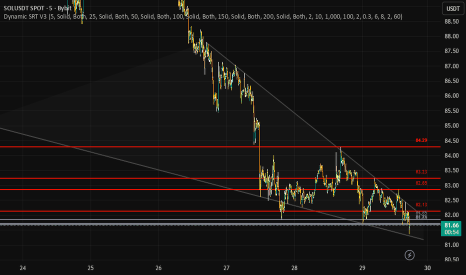
指標

Fractal Support and Resistance Zones EngineFractal Support and Resistance Zones Engine is a market structure tool built to convert confirmed fractal pivots into filtered support, resistance, and S/R flip zones.
The main reason this script was created is practical rather than theoretical. Fractal highs and lows are already a familiar market structure concept, but many fractal-based tools become difficult to use once they start filling the chart with too many overlapping levels. When every pivot is treated as equally important, the result is often visual clutter, weak prioritization, and little help in deciding which areas still matter around current price.
This script was written to make that process more usable. Instead of simply marking fractal pivots, it manages them as zones with a lifecycle. It filters oversized zones, ignores zones that are too far from current price, merges overlapping structure, tracks repeated interaction, handles role reversal behavior, removes weak or aging zones, and then selects only the strongest visible candidates for display.
Why this indicator exists
This script does not claim to introduce a new theory of support and resistance. Its purpose is to provide a more structured implementation of a familiar concept.
The problem it tries to solve is straightforward:
raw fractal levels can accumulate too quickly,
overlapping levels can make the chart harder to read,
old or weak zones can remain on screen longer than they are useful,
and many simple fractal tools do not do much after the initial pivot is detected.
This indicator was built to address those issues by treating zones as dynamic objects instead of static drawings. Once a zone is created, it is managed over time based on interaction, break behavior, age, visibility ranking, and proximity to price.
That is the main reason the script was written. It is not meant to replace all support and resistance methods. It is meant to make fractal-based structure more organized and more practical to work with.
What the indicator does
The script detects confirmed fractal highs and lows using left and right pivot bars.
A confirmed pivot high can create a resistance zone.
A confirmed pivot low can create a support zone.
There is also an optional developing zone mode. When enabled, the script can show provisional zones before full pivot confirmation. These are intentionally temporary and may disappear if price invalidates them before confirmation.
After a zone is created, the script does not simply leave it untouched. It keeps evaluating that zone and updates its status over time.
The script can display three structural categories:
Resistance zones
Support zones
S/R flip zones, when a previously broken zone changes role
How the script works
The engine begins with fractal pivot detection.
For resistance, the zone is built from the pivot high area.
For support, the zone is built from the pivot low area.
From there, several control layers are applied:
1) ATR-based size control
Zone height is capped by an ATR multiple so unusually large candle ranges do not create oversized zones that dominate the chart. This helps keep zones more comparable and visually usable.
2) Minimum significance and maximum distance filtering
A new zone must still meet a minimum size requirement relative to ATR, and it must remain within the configured distance from current price. This prevents the script from storing zones that are either too small to matter or too far away to be useful in the current context.
3) Overlap and merge logic
If a newly detected zone overlaps with an existing one, the script does not always draw another separate zone. When the roles match, it can reinforce and blend the existing zone rather than duplicating structure. This is one of the main anti-clutter mechanisms in the script.
4) Touch tracking
Zones gain interaction history when price returns to them from outside and touches them again. This interaction history later contributes to ranking and lifecycle decisions. A zone that has been respected multiple times is treated differently from a fresh zone that has never been retested.
5) Break and S/R flip handling
When price breaks beyond a zone by a configurable ATR-based threshold, the script can treat that as a structural break. If retest confirmation is enabled, the zone does not immediately change role. Instead, it enters a waiting state and only flips after the retest condition is satisfied. If retest confirmation is disabled, the role change happens immediately on the break condition. This gives the user a choice between faster reaction and stricter confirmation.
6) Flip count and removal behavior
Zones are not allowed to survive forever in the same way. The script tracks flip count and interaction history. If a zone has already flipped multiple times, it can eventually be removed instead of continuing to recycle indefinitely. This prevents heavily reused or degraded structure from staying on the chart forever.
7) Age-based pruning
Zones are also removed as they get older. Stronger zones can survive longer because the lifespan is adjusted by interaction and flip history, but aging still matters. This helps the chart focus more on structure that is still relevant.
8) Spatially aware pool management
The script keeps a limited zone pool depending on the selected performance mode. When the internal pool gets too large, weaker zones are evicted using a score that considers relevance and local crowding. In practice, this means the engine is not only adding zones, but also actively managing what deserves to stay in memory.
9) Visibility ranking
The script scores zones using interaction history, flip history, distance from current price, and age. It then selects only the top visible resistance, support, and flip zones rather than showing everything at once. This is a key part of the workflow because the script is designed to prioritize readability, not maximum historical coverage.
What makes it different from simpler fractal indicators
The main difference is not the use of fractals themselves. Fractals are well known. The difference is what happens after the fractal is detected.
Many simpler scripts stop at the first step: they identify the pivot and draw a level or box.
This script continues beyond that step by adding:
zone size control,
distance filtering,
overlap management,
touch-based reinforcement,
optional retest-confirmed flips,
flip counting,
age-aware removal,
spatial eviction when the zone pool becomes crowded,
and visibility ranking so only the strongest nearby zones are shown.
That combination is the real distinguishing feature of the script.
It is not just a fractal marker. It is a fractal-based zone management engine.
Was this script really necessary?
In the strictest sense, the underlying market idea is not new. Fractal pivots, support, resistance, and role reversal are all established concepts.
So if the question is whether this script introduces a brand-new trading theory, the honest answer is no.
But that is not the reason it exists.
The reason it exists is that there is practical value in taking a familiar concept and implementing it in a cleaner, more selective, and more manageable way. A trader who already uses fractal structure may not need another script that simply draws more levels. What may still be useful is a script that helps reduce clutter, maintain zone quality, and keep attention on the strongest nearby structure.
That is the point of this indicator.
So the honest answer is:
it was not necessary as a new theory,
but it can be useful as a more organized implementation of fractal-based support and resistance.
That is the real justification for the script.
Inputs and behavior
The script includes a small set of controls that shape how selective or lightweight the engine becomes.
Strategy changes how strict the filtering logic is. Conservative settings keep fewer zones and require stricter behavior. Aggressive settings allow more zones and looser filtering.
Performance controls how many zones can be tracked internally. Lighter modes reduce tracking load, while fuller modes allow broader detection.
Top Resistance Zones, Top Support Zones, and Top S/R Flip Zones limit how many ranked zones are actually shown.
Pivot Left Bars and Pivot Right Bars control fractal confirmation.
Max Zone Height (ATR) caps zone height.
Merge Sensitivity changes how aggressively nearby zones are combined.
Max Age controls the base lifespan of zones before age pruning removes them.
Require Retest for Flip changes whether role reversal happens immediately after a qualified break or waits for a retest.
Show Developing Zones enables early provisional zones before full confirmation. Because these are not fully confirmed yet, they may disappear.
Left Extension, Box Length, labels, colors, and the optional info panel control the visual presentation.
Alerts and chart workflow
The script provides alerts for:
new resistance zones,
new support zones,
S/R flips,
and zone breaks.
A practical workflow is to use the indicator to monitor the strongest nearby structural zones, then combine those zones with your own trend analysis, execution criteria, risk plan, or broader market context.
Important notes
This is a structural analysis tool. It does not predict price, guarantee reversals, or guarantee trade outcomes.
Confirmed fractal pivots appear only after the required right-side confirmation bars exist, so confirmed zones naturally appear with that built-in confirmation delay. If developing zones are enabled, the script may show temporary structure earlier, but those developing zones can disappear if price invalidates them before full confirmation.
Because of that, this indicator is best used as a framework for organizing price structure rather than as a standalone trade system. 指標

指標

指標