指標

Motion Reversal System [BullByte]Motion Reversal System (MRS) - Trend-Failure Bar Detector with Adaptive Pressure Meter, Multi-Mode Signal Engine, and Complete Trade-Level Framework
---
Why This Indicator Exists
Most reversal indicators fall into one of two failure modes. Either they fire constantly in ranging markets because they have no directional filter, or they only confirm reversals long after price has already turned because they rely on lagging momentum oscillators. Motion Reversal System (MRS) was built to solve both problems in a single coherent engine.
MRS is one engine with one purpose: identify the precise bar at which a confirmed trend structurally fails - the moment commitment fades, the bar itself rejects further advance, and the move's energy reverses. From that bar, MRS automatically frames the trade with entry, two targets, and a stop loss, then manages the full trade lifecycle to closure.
---
What Makes This Not a Mashup
A mashup combines independent indicators that each output their own signal, then layers them visually. MRS is the opposite. Every component of MRS feeds into a single decision: "Is the current bar a trend-failure bar?" Remove any one component and the engine stops working correctly.
- The Directional Gate decides IF a trend is present (no trend = no exhaustion to detect)
- The Four Failure Conditions decide IF the current bar is structurally failing that trend
- The Signal Mode decides HOW STRICT the failure must be
- The Pressure Meter provides a live visual reading of building reversal pressure
- The Trade Level Engine decides WHERE to enter, stop, and target
- The HTF Filter decides WHETHER higher-timeframe context confirms the call
These are not independent indicators. They are stages of one detection pipeline. Each stage exists because the next stage cannot function without it.
---
The Engine - How It Actually Works
Stage 1 - Directional Gate (Kaufman Efficiency Ratio, Self-Adapting)
The script computes Kaufman's Efficiency Ratio (ER) over a rolling window. ER measures net price displacement divided by the total path price traveled. Values near 1.0 indicate pure trending motion; values near 0.0 indicate pure noise.
A fixed ER threshold would work well on one instrument and fail on another, so MRS adapts the gate dynamically. The threshold becomes the rolling mean of the ER series plus half a standard deviation, with a user-defined floor. This means the gate raises itself during volatile sessions and lowers during quiet sessions automatically. No re-tuning per instrument.
Only bars that occur inside a confirmed directional move (gate passed + minimum ATR displacement satisfied) are evaluated for failure. This single design choice eliminates the largest source of false signals: exhaustion calls in choppy ranges where there is no trend to exhaust.
Stage 2 - Four Failure Conditions (Evaluated at Bar Close)
For every bar inside a confirmed trend, MRS evaluates four orthogonal failure conditions:
C1 - Velocity Reversal: The bar closed against the direction of the confirmed trend. This is the most basic failure signal. A bull trend bar that closes red, or a bear trend bar that closes green.
C2 - Wick Rejection: The trend-side wick (upper wick in a bull trend, lower wick in a bear trend) is at least N times the size of the bar's body. This measures intra-bar rejection - buyers or sellers pushed price further in the trend direction and were defeated within the same bar.
C3 - Commitment Anomaly: The bar's commitment value (measured via volume-weighted body strength when volume is reliable, or wick-rejection ratio when it is not) is at least N standard deviations below the recent trend's commitment baseline. The current bar is statistically anomalous compared to what the trend has been producing.
C4 - Range Expansion: The bar's true range is at least N times ATR. Filters out small doji bars where wick rejection and velocity reversal become meaningless from microstructure noise.
These four conditions are orthogonal - they measure different physical properties of the bar. C1 measures direction. C2 measures intra-bar struggle. C3 measures volume/commitment. C4 measures magnitude. When multiple conditions align on the same bar, the signal reflects a greater degree of structural confluence - though no combination of conditions guarantees a reversal.
Stage 3 - Signal Mode (Strictness Selector - THE ACTUAL SIGNAL GATE)
This is the decisive gate that determines whether a signal fires. The user chooses how many of the four conditions must align:
Conservative - All 4 conditions required. Rarest signals, highest structural confluence. Best for swing traders, low-noise sessions, or those who prefer fewer signals with stronger multi-condition alignment.
Balanced (default) - Any 3 of 4 conditions required. Middle ground for most users and most timeframes. Allows one condition to be absent if the other three are strong.
Aggressive - Velocity Reversal (C1) is mandatory plus at least one other condition (minimum 2 of 4 total). Most signals, fewer conditions required per signal. Best for scalpers, active intraday traders, or those who prefer earlier detection at the cost of more false positives.
When the chosen condition count is satisfied at bar close, a signal fires. The Pressure Meter (Stage 5) is a separate visual reading and does not gate signals.
Stage 4 - Commitment Measurement (Volume-Aware with Auto Fallback)
Commitment measures how decisively the market voted on each bar. MRS supports three measurement modes:
Auto (recommended) - Uses volume-weighted commitment on instruments with real volume data (crypto, futures, stocks with traded volume). Automatically falls back to wick-rejection ratio on indices and synthetic feeds where reported volume is meaningless. The dashboard surfaces whichever method is actually active.
Volume - Forces volume-weighted measurement. Useful when you want to lock the method explicitly. Silently falls back to wick if data is missing, with a dashboard warning.
Wick - Forces wick-rejection ratio regardless of volume availability. Best for spot Gold (XAUUSD), forex, or any instrument where you don't trust the broker's volume feed.
Stage 5 - Adaptive Pressure Meter (Live Visual Reading)
The pressure meter is the dashboard's live reading of building reversal pressure. It is always populated whenever a trend is confirmed, regardless of whether the four-condition gate has been met. This gives the trader a continuous sense of how strong the reversal pressure has been building.
The meter is normalized against an adaptive baseline calculated from its own rolling history (mean + multiplier x stdev). The dashboard percentage shows where the current meter sits relative to that baseline.
Important: the baseline is a visual reference only. It does not gate signals. The signal authority is the Signal Mode condition count described in Stage 3. The meter and baseline simply help the trader monitor when conditions are increasingly aligned before they actually trigger.
Stage 6 - Higher Timeframe Confirmation (Optional Filter)
When enabled, the engine cross-checks every signal against the directional state of a higher timeframe. A reversal signal on the chart timeframe is marked "Strong" when the higher timeframe direction agrees with the chart trend being reversed against. For example: chart is in a confirmed bull move, HTF is also bullish, and a bear reversal signal fires - this is HTF-Strong, because the HTF confirms the bull trend that is being exhausted.
If the HTF direction disagrees with the chart trend (e.g., chart is in a bull move but HTF is already bearish), the signal is marked "Weak" - visually dimmed but not suppressed. The trader still sees the call but is warned that the HTF backdrop does not align with the underlying chart trend being detected.
The HTF uses request.security with lookahead = barmerge.lookahead_off, eliminating future-data leak across timeframes. The HTF series itself naturally evolves as each HTF candle forms (this is standard Pine behavior), so the script treats HTF as a confirmation filter rather than a guarantee of HTF-bar finalization. The signal trigger itself remains chart-bar-close only.
Stage 7 - Trade Level Engine (Complete Lifecycle)
When a signal fires, the engine automatically computes and draws:
- Entry: signal-bar close
- Stop Loss: fixed ATR distance from entry (not score-scaled - strong signals deserve tighter stops, not wider ones)
- Target 1: intermediate reference level, ATR distance scaled by signal strength (visual only, does not close trade)
- Target 2: decisive level, ATR distance scaled by signal strength (closes the trade on hit)
While the trade is active, four colored horizontal lines extend from the signal bar to the current bar, with monospace pill labels showing the price and R:R for each level. Two zone fills (green Entry to TP2 reward zone, red Entry to SL risk zone) make the risk/reward geometry visible at a glance.
The trade closes when either TP2 or SL is touched at bar close (intra-bar wicks that retreat before close do NOT close the trade). Same-bar TP2/SL tie is resolved as SL hit (conservative backtest assumption).
After closure, the trade-level lines freeze in place as historical record. Labels and fills vanish to keep the chart clean. The cooldown counter starts. By default, all four lines (Entry, SL, TP1, TP2) persist as historical traces for richest backtest visibility. The "Keep TP1/TP2 Historical Lines" input can be turned off to delete TP1/TP2 lines on closure and roughly double the number of historical trades the chart can hold before Pine's 500-line cap is reached.
---
Signal Timing - No Repaint
All signal generation and trade closure is gated to confirmed (closed) bars via barstate.isconfirmed.
- A reversal signal triangle and label appear only at the close of the signal bar
- Entry, SL, TP1, TP2 levels are computed from the signal bar's close
- Trade closure (TP2 / SL hit) is evaluated only after the candle finalizes - intra-bar wicks that retreat before close do not trigger closure
The trade-off is up to one bar of timing on closure for cases where price spikes through a level intra-bar and retraces. The gain is realistic backtest visuals and zero repaint at every stage of the trade lifecycle. This is an intentional architectural choice for honest behavior over flashy intra-bar firing.
---
How to Read the Chart
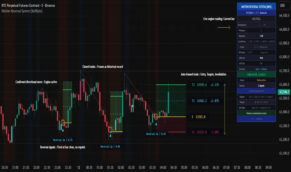
Signal Markers
Bull Reversal (detected inside a confirmed bear move, reversal up signaled): small cyan triangle below the bar.
Bear Reversal (detected inside a confirmed bull move, reversal down signaled): small red triangle above the bar.
Important: a bearish reversal signal fires inside a confirmed bull move. The signal detects exhaustion of the prevailing trend - not confirmation of a new one. The dashboard will show BULL MOVE while a short is active. This is correct behavior - you are trading the exhaustion of that bull move.
A monospace pill label sits beside each triangle showing the failure score (e.g., "Reversal Up | 2.45"). Higher numbers indicate stronger structural confluence across the four conditions.
When HTF Confirmation is enabled and HTF disagrees with the signal, the triangle and label appear in a dimmed color with "(HTF)" appended to the label text. The signal is still visible but is visually de-emphasized.
Trade Level Lines
Once a signal fires, four horizontal lines appear extending from the signal bar:
- Entry (yellow, solid): the price at which the signal was generated (signal-bar close)
- Target 1 (cyan, dashed): intermediate reference level, visual only
- Target 2 (green, solid): decisive level - trade closes when this is hit at bar close
- Stop Loss (red, solid): risk level - trade closes when this is hit at bar close
Pill labels at the right end of each line show the exact price and R:R distance.
Zone Fills
- Green soft fill between Entry and TP2: the reward zone
- Red soft fill between Entry and SL: the risk zone
At a glance, the green:red ratio visualizes the trade's risk-to-reward geometry.
Directional Background
- Subtle blue tint: a bull trend is confirmed
- Subtle red/orange tint: a bear trend is confirmed
- No tint: no confirmed direction (chop)
Bar Coloring (Exhaustion Gradient)
When the exhaustion meter rises above the trigger threshold (default 50% of baseline), bars are tinted on a gradient:
- Cool color (cyan/red): exhaustion is building but moderate
- Bright color (red on bull trend, cyan on bear trend): exhaustion has reached or exceeded the baseline - conditions for a signal are increasingly met, though no signal fires until the condition count gate is satisfied at bar close
Historical Trade Traces
After a trade closes, by default all four trade-level lines (Entry, SL, TP1, TP2) remain on the chart as a permanent historical record. This builds a visual log of every prior MRS detection directly on the chart. The "Keep TP1/TP2 Historical Lines" input can be turned off if you want to conserve Pine's line-object cap.
---
How to Read the Dashboard (Full Mode)
The dashboard is the live diagnostic panel. Every row tells you something specific about the current state of the engine. From top to bottom:
Row 0 - Title: "MOTION REVERSAL SYSTEM (MRS)" - confirms the indicator name.
Row 1 - Context: ticker symbol, chart timeframe, and active Signal Mode.
Row 2 - Directional State: BULL MOVE / BEAR MOVE / NEUTRAL - large text, colored. Tells you whether a confirmed trend is currently in effect. When a trade is active against the current trend (e.g., short open during a bull move), this row appends "SHORTING EXHAUSTION" or "LONGING EXHAUSTION" so the dashboard reads as a coherent statement rather than an apparent contradiction.
Row 3 - Exhaustion bar: a 10-segment text-based pressure bar with percentage. Shows how close the live meter is to the adaptive baseline. Color escalates from gray to teal to purple to bright red/cyan as pressure builds.
Row 4 - Pressure: numerical value of the live exhaustion meter.
Row 5 - Baseline: the adaptive baseline value (mean + k x stdev) the meter is compared against. Visual reference only - does not gate signals.
Row 6 - Conditions: which of the four failure conditions are currently satisfied. " VEL WICK ANOM RANGE" means C1, C2, C4 are firing; C3 is not.
Row 7 - Count: how many of 4 conditions are firing, with current Signal Mode in parentheses. This is the actual signal authority - when the count satisfies the Signal Mode rule, a signal fires.
Row 8 - Eff Ratio: the current Kaufman Efficiency Ratio value, with the adaptive gate level next to it. Shows whether the directional gate is passing.
Row 9 - ATR: current ATR value at the configured length. Reference for understanding trade-level distances.
Row 10 - HTF Dir: current higher-timeframe directional state, OR "INVALID HTF (set higher than chart)" warning if user has misconfigured the HTF input.
Row 11 - Commit: which commitment measurement method is currently active (Auto -> Volume, Auto -> Wick fallback, etc.), with warning indicator if forced mode silently fell back.
Row 12 - Active Trade Status: "NO ACTIVE TRADE" or "LONG ACTIVE E " / "SHORT ACTIVE E " - color-coded.
Row 13 - Status: "Ready for signal" / "Cooldown: N bars" / "Trade active" - tells you whether the engine can fire a new signal right now.
Row 14 - Session: count of signals fired in the current session (resets daily).
Rows 15 to 19 - Engine Parameters reference: live readouts of the directional window, lookback periods, threshold parameters, ER gate values, and current commitment status. Useful for verifying your settings are applied as expected.
Row 20 - Version and Author footer.
Mobile / Minimal Dashboard Mode
For phone and tablet users, switching "Dashboard Mode" to "Minimal (Mobile)" collapses the dashboard to a single-column 5-row compact layout with larger fonts: Title, State, Exhaustion, Conditions, and Trade Status. Diagnostics are hidden for screen-space efficiency.
---
Default Settings Explained
- Directional Window: 12 bars - measures Efficiency Ratio over a 12-bar lookback
- Directional Threshold (Base): 0.40 - minimum ER for trend confirmation, adapted upward dynamically
- Min Move Size: 1.5 ATR - net displacement must be at least 1.5 ATR for a trend to qualify
- Trend Statistics Lookback: 20 bars - sample size for computing commitment baseline statistics
- Wick Rejection Ratio: 1.5 - trend-side wick must be at least 1.5x the body to count as rejection
- Commitment Anomaly Sigma: 1.0 - current commitment must be at least 1.0 standard deviation below trend mean
- Min Range Expansion: 1.2 ATR - current bar range must be at least 1.2x ATR
- Signal Mode: Balanced - any 3 of 4 conditions required
- Baseline Lookback: 100 bars - rolling history for pressure meter statistics
- Baseline Multiplier: 2.0 - baseline = mean + 2.0 x stdev
- ATR Length: 14 - standard ATR period
- Commitment Mode: Auto - volume on real-volume instruments, wick on indices
- Post-Closure Cooldown: 10 bars - wait 10 bars after trade closure before new signal
- Stop Loss Distance: 1.5 ATR - base SL distance from entry
- Target 1 Distance: 1.5 ATR - T1 at 1:1 with SL
- Target 2 Distance: 3.0 ATR - T2 at 1:2 with SL
- Score-Weight Nudge: 0.3 - stronger signals widen targets by up to 30%
- Min Label Spacing: 0.35 ATR - minimum vertical gap between pill labels for readability
---
Recommended Usage by Trader Profile
Scalper (1m to 5m): Aggressive mode, Cooldown 5 to 8 bars, HTF Confirmation on 15m. Signal frequency will be higher in Aggressive mode; use the dashboard pressure meter to monitor building exhaustion between signals.
Intraday Trader (5m to 30m): Balanced mode (default), Cooldown 10 bars, HTF Confirmation on 1h to 4h. The default settings were designed with this profile in mind as a starting reference point.
Swing Trader (1h to 4h): Conservative mode, Cooldown 15 to 20 bars, HTF Confirmation on Daily. Few signals, maximum condition confluence required.
Position Trader (Daily and above): Conservative mode, HTF Confirmation on Weekly. Signals are rare; when they fire, all four structural failure conditions have aligned on a higher timeframe bar.
---
Recommended Markets
- Crypto (Spot and Perpetuals): well-suited - high volume data availability, clean microstructure, MRS auto-selects volume-weighted commitment
- Index Futures (NQ, ES, NIFTY futures): well-suited - real traded volume available, strong directional character
- FX Majors: usable with Wick commitment mode forced (broker volume is unreliable)
- Spot Gold (XAUUSD): use Wick mode explicitly - most brokers report tick count as volume which is meaningless
- Cash Indices (NIFTY, SPX index): MRS auto-detects index type and routes to Wick mode; verify Commit row on dashboard
---
A Real-World Example Walkthrough
This walkthrough is a constructed illustration of how the engine behaves. It does not represent a historical trade or a performance result.
Scenario: BTCUSDT 15m chart, Balanced mode, Auto commitment.
Bars 1 to 20: Price climbs in a steady bull move. Dashboard shows BULL MOVE, Efficiency Ratio 0.55, Pressure Meter 0.20 (low). No signals fire because exhaustion is not building.
Bar 21: A large green candle prints - Range Expansion (C4) fires but the bar closes strong (no Velocity Reversal C1), and commitment is normal (no C3). Only 1 of 4 conditions. No signal.
Bars 22 to 24: Three smaller green bars with shrinking bodies. The Pressure Meter ticks up to 0.55 (moderate). Bar coloring activates softly. Dashboard "Conditions" row shows - only Wick Rejection is firing intermittently. No signal yet.
Bar 25: A red bar prints with a long upper wick and large range. All four conditions fire:
- C1 Velocity Reversal: bar closed red (against bull trend)
- C2 Wick Rejection: upper wick is 1.8x the body
- C3 Commitment Anomaly: bar's commitment is 1.4 standard deviations below the trend baseline
- C4 Range Expansion: bar range is 1.6x ATR
Dashboard shows "Conditions: VEL WICK ANOM RANGE | Count: 4/4". Pressure Meter reads 1.15.
A red bear reversal triangle prints above the bar with the label "Reversal Down | 3.42". Trade-level lines automatically draw:
- Entry (yellow): 64,210.50 (signal-bar close)
- SL (red): 64,422.00 (1.5 ATR above entry, since this is a short)
- T1 (cyan dashed): 63,999.00 (1.5 ATR x score-scale below entry)
- T2 (green): 63,576.00 (3.0 ATR x score-scale below entry)
Green reward fill appears Entry to T2, red risk fill Entry to SL. Dashboard "Active Trade" row turns red: "SHORT ACTIVE E 64,210.50". Dashboard "Directional State" row reads: "BULL MOVE | SHORTING EXHAUSTION".
Over the next several bars, price drops. The trade-level lines extend bar-by-bar. Dashboard " Status " reads "Trade active". No new signals fire because one trade is already open.
Bar 32: In this example, price reaches T2 at 63,576.00 on this bar's close. The trade closes at the target level. Labels and zone fills vanish. The trade-level lines freeze at bar 32 as historical record. Dashboard "Status" switches to "Cooldown: 10 bars".
Bars 33 to 42: Cooldown period. No new signals possible.
Bar 43: Cooldown complete. Dashboard "Status" reads "Ready for signal". The engine will evaluate the next qualifying bar for failure conditions.
---
Chart Examples
These screenshots show the indicator in use at specific moments in time. They are provided for visual reference only and do not represent performance results or forward-looking outcomes.
1. MRS detected a trend-failure bar inside a confirmed bull move on BTCUSDT 5m. Range expansion (C4) fired as exhaustion pressure reached the adaptive baseline (1.28 vs 1.03). Balanced mode gated the short at bar close - entry 62,553.3, SL 62,681.9, T2 62,273.6 (T2 distance: 2.17R).
2. MRS detected a trend-failure bar at the low of a confirmed bear move on NQ1! 5m. As the engine tracked displacement against path length (ER), exhaustion pressure crossed the adaptive baseline - failure score 0.48. Balanced mode gated the long at bar close - entry 30,553.75, SL 30,489.00, T2 30,706.50 (T2 distance: 2.36R).
---
Parameter Adjustment Guide
If you get too few signals:
- Switch Signal Mode to Aggressive
- Lower Wick Rejection Ratio (1.0 to 1.2)
- Lower Commitment Anomaly Sigma (0.7 to 0.9)
- Lower Min Range Expansion (1.0 to 1.1)
- Reduce Cooldown to 5
If you get too many false signals:
- Switch Signal Mode to Conservative
- Raise Wick Rejection Ratio (2.0 to 2.5)
- Raise Commitment Anomaly Sigma (1.3 to 2.0)
- Raise Min Range Expansion (1.5 to 2.0)
- Enable HTF Confirmation
- Raise Cooldown to 15 to 20
If the T2 zone is reached but price reverses sharply before bar close triggers closure:
- Reduce T2 Distance to 2.0 to 2.5 ATR
- Reduce Score-Weight Nudge to 0.1 (less target widening on strong signals)
If SL is hit too often:
- Increase Stop Loss Distance to 2.0 ATR
- Increase T1 and T2 proportionally to maintain R:R geometry
---
What This Indicator Does Not Do
- It does not execute trades. It is an indicator (overlay), not a strategy. Order placement and trade management decisions remain with the user.
- It does not predict the future. It identifies bars where a confirmed trend has structurally failed based on objective criteria.
- It does not eliminate losses. False signals will occur, especially in news-driven price spikes. Always size positions according to your own risk management rules.
- It does not work on every instrument equally well. Choppy low-liquidity assets produce noisier signals. Test on your specific market before relying on it.
- It does not replace discretionary judgment. Use MRS as one input in your decision process, not the only input.
---
Alerts Available
MRS Bull Reversal (Strong) - bullish reversal signal; HTF confirms the preceding bear trend
MRS Bull Reversal (HTF Weak) - bullish reversal signal; HTF does not confirm the preceding bear trend
MRS Bear Reversal (Strong) - bearish reversal signal; HTF confirms the preceding bull trend
MRS Bear Reversal (HTF Weak) - bearish reversal signal; HTF does not confirm the preceding bull trend
MRS Target 2 Hit - trade closure at T2 level
MRS Stop Loss Hit - trade closure at SL level
---
Disclaimer
This script is provided for educational and analytical purposes only. It is not financial advice, an investment recommendation, or a solicitation to trade. Past performance of any indicator or strategy does not guarantee future results. Trading involves substantial risk of loss. The author and TradingView are not liable for any losses or damages arising from use of this script. Always validate signals against your own analysis, conduct your own due diligence, and apply prudent risk management. Use at your own risk.
---
Open source under Mozilla Public License 2.0. Code is fully readable in the Pine Editor for those who want to study the math. Thank you.
- BullByte 指標

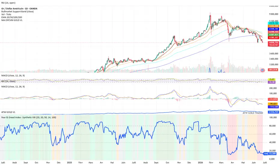
Fear & Greed IndexThe Fear & Greed Index is a synthetic market sentiment indicator designed to convert multiple technical signals into a single 0–100 score.
Its purpose is to quickly identify market phases of fear, neutrality, or greed across any asset or index.
This indicator does not rely on an official VIX.
Instead, it uses synthetic realized volatility, combined with trend and momentum metrics, to provide a visual reading of market sentiment and regime conditions.
Methodology
The score is built from several components:
Realized volatility
used as a market stress proxy: higher volatility pushes the index toward fear.
Momentum
captures recent price acceleration or deterioration.
RSI
evaluates market strength and overbought / oversold conditions.
Trend vs moving average
compares current price to its moving average to assess directional bias.
Drawdown
measures the distance from recent highs to identify stress, correction, or recovery phases.
Score interpretation
The final score is normalized between 0 and 100:
0 – 20 → Extreme Fear
20 – 40 → Fear
40 – 60 → Neutral
60 – 80 → Greed
80 – 100 → Extreme Greed
How to use it
Low readings usually reflect stressed, volatile, or corrective market conditions.
High readings usually reflect confident, bullish, or potentially overheated market conditions.
The indicator is best used as a market regime / sentiment filter, not as a standalone buy or sell signal.
Disclaimer
This script is a synthetic sentiment indicator based on price and volume data.
It is not an official volatility index and should not be considered investment advice. 指標

Volatility, Flow & Liquidity EngineVolatility, Flow & Liquidity Engine (VFL)
Why these parts are ONE tool, not a mashup of separate indicators
The three layers aren't independent studies stacked for show — they are sequential stages of a single trade decision (is a move coming, which way, and can I execute it) and they share one computational core. The same path-dependent volatility forecast is computed once and used by all three: it anchors Layer 1's expected move and implied-vs-realized dislocation, and it de-biases Layer 3's high-low spread estimators and prices its slippage and sizing. A signal is only actionable when Layer 1 says "loaded," Layer 2's order flow confirms the side, and Layer 3 says the spread and impact let you execute at size. Remove any layer and the decision is incomplete — timing without direction is a coin flip; direction without an execution read ignores slippage that can exceed the edge. That dependency, and the shared vol core, is why this lives in one script rather than three.
The three layers
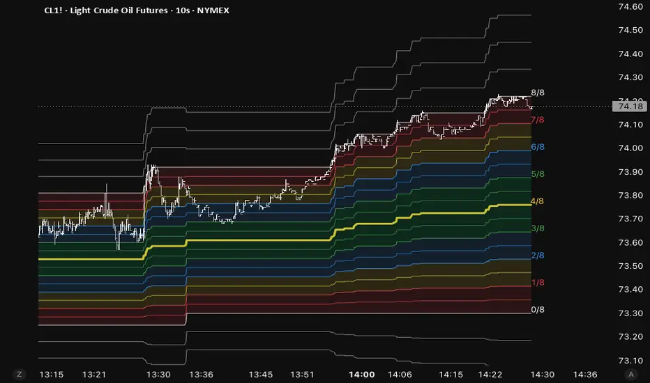
Pressure & regime — when a move is coming. Compression, implied-vs-expected-vol dislocation, basis tension, convexity and trend inefficiency combine into a "pressure" reading. A high-percentile load plus a real range release fires a signal, typed GAMMA BLAST / SQUEEZE / EXPANSION, alongside a variance-ratio regime read and a path-dependent realized-vol forecast with a rolling fit/trust gauge.
Order flow — which way. Reconstructed intrabar buy/sell pressure (bulk-volume by default, with candle-geometry and intrabar tick-rule options) standardized to a z-score plus session CVD. Used only to confirm or veto a release's direction — the one orthogonal read price geometry alone can't give.
Liquidity & execution — can I trade it, and at what cost. Low-frequency effective-spread estimators (EDGE primary, with high-low covariance and high-low range cross-checks), an illiquidity ratio and impact-slope, and a volume-at-price liquidity map (POC, value area, walls, voids, anchored VWAP with σ bands, nearest dense liquidity). These become a liquidity score, slippage estimate, and order-type and size guidance. A structure sub-layer (prior-day value area + untested "naked" POCs) builds a per-bar support/resistance ladder that location-gates the final signal: a long is withheld if it would fire into a resistance shelf, a short if into support.
How to use it
Wait for the consolidated decision table to line up — pressure loaded, order flow confirming the side, liquidity executable, and the trade well-located against the S/R ladder. Read the size and order-type guidance before entering, and treat STRESSED liquidity or Extreme vol as stand-aside flags. The on-chart glow lines map the structure (prior-day value, naked-POC magnets, liquidity support/resistance, nearest shelves, fair-value VWAP); the legend-key panel decodes every line and marker.
Universal — works on any asset, any market
Price source, volume source (with a borrow-volume option for cash indices/FX), companion symbol and volatility index are all configurable inputs. Defaults are tuned for NSE NIFTY index futures (intraday, weekly Tuesday expiry, 09:15–15:30) — change the companion/vol-index symbols, expiry day and session for other instruments. The volatility index and companion symbol are optional; without them the engine runs price-only and re-weights automatically.
Non-repaint
Higher-timeframe confluence reads the last closed HTF bar by default, and every higher-timeframe request uses no-lookahead — confirmed signals don't move after the bar closes. The current bar forms live and settles on close, like any indicator.
Honesty / limitations
Every block is a low-frequency estimator of a quantity normally measured from quote/tick/book data — it approximates, it does not measure. Order flow is reconstructed (≈tick-rule accuracy), not true bid/ask; dealer-flow effects are inferred from price/vol/basis, not read from an option chain. Volume modules need a real volume feed and auto-disable without one. Follow-through statistics are computed on loaded chart history (in-sample), not a forward backtest.
This is a study/education tool, not financial advice. Estimates only; past behaviour does not guarantee future results. 指標

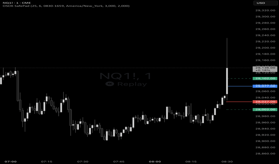
OSOK SafePadOSOK SafePad is a lightweight price-level tool for marking a configurable safety buffer above and below the current reference price. It is designed for traders who want a clean visual guide for breakout, stop-entry, or event-driven execution plans without cluttering the historical chart.
Key features
Plots an Upper Pad and Lower Pad around the reference price.
Configurable pad size in points.
Optional freeze mode to lock levels at the start of a chosen session window, defaulting to 8:30 New York time.
Optional take-profit and stop-loss guide levels for both long and short stop-entry scenarios.
TP and SL levels are calculated from account-currency targets using the symbol point value and order size.
Lines extend to the right for easier monitoring without leaving historical marks as new bars print.
Clean, low-saturation colour palette designed to work on both dark and light charts.
How it works
Before the freeze time, SafePad tracks the latest chart price and displays the pad levels from the current candle. When freeze mode is enabled and the chart enters the configured freeze window, the indicator captures that candle’s open as the reference price and locks the pad levels from that point onward.
For example, with a 25-point pad, the Upper Pad is drawn 25 points above the reference price and the Lower Pad is drawn 25 points below it.
Take-profit and stop-loss guides
The optional TP and SL lines are derived from the configured dollar target, order size, and the symbol’s point value. These levels are visual planning aids for a hypothetical buy-stop at the Upper Pad and sell-stop at the Lower Pad.
Notes and limitations
This is a visual planning indicator, not an automated trading system.
TP/SL calculations depend on TradingView’s syminfo.pointvalue; verify values for the instrument and broker feed you trade.
No trading signals, alerts, or order execution are included.
指標
IV Rank & Percentile XVI (S&P/ASX200 VIX)Most IV Rank and IV Percentile indicators on TradingView are built for the US VIX. This one is built specifically for XVI — the S&P/ASX 200 VIX (A-VIX) — so Australian index traders, and anyone trading XJO options, finally get the same volatility context without borrowing a US proxy. It reads straight off the published XVI value, so there's no option-chain reconstruction or estimation involved.
The core idea:
XVI is the ASX's "fear number" — the implied volatility of the XJO, the market's estimate of how much it's about to move over the next 30 days. The problem is that a raw XVI value is meaningless on its own. Is 16 high? Low? You can't know without context. This indicator's whole job is to give that context by answering one question: compared to its own recent history, is volatility currently rich, normal, or cheap?
The two ways it measures that:
IV Rank is the simple one. It looks at the highest and lowest XVI over your lookback window (a year by default) and asks where today sits on that line. XVI at its yearly low reads 0. At its yearly high, 100. Halfway between, 50. That's it — it's just "where in the range are we."
IV Percentile asks a slightly different question: of all the days in the window, what percentage had a lower XVI than today? If it reads 70, then vol is higher than it was on 70% of the past year's days. The reason this one's usually better is that IV Rank gets distorted by a single spike — one brief crash sets a sky-high "yearly high," and then every reading afterward looks artificially low against it for a whole year. Percentile doesn't have that problem because it counts days, so one freak day is just one day. That's why the regime label runs off Percentile by default.
The regime label:
This translates those 0–100 numbers into a single word so you don't have to interpret them each time. You set two thresholds — default 80 and 20. Above 80 it reads HIGH (vol is richer than most of the past year). Below 20, LOW (vol is cheap). Anything between, NORMAL. The thresholds are yours to move: if you think 80 is too strict and want it flagging "high" earlier, drop it to 70. The cutoffs define what you consider rich versus cheap. You can also switch whether the label reads off Percentile or Rank.
Live updating:
The ranking history is built from daily XVI closes (you want to rank against a year of daily data, not intraday noise), but the current reading floats live against that history. As XVI moves through the session, IV Rank, IV Percentile, and the regime word update with it rather than waiting for the daily close.
Settings:
Volatility index — defaults to ASX:XVI. Can be pointed at another volatility index if you want to reuse the tool elsewhere.
History timeframe — the bar size the ranking history is measured on. Daily is standard.
Lookback — how far back it ranks. 252 ≈ one year. Drop it to 90 or 60 for a tighter, more recent read; the long-window and short-window answers genuinely differ when the past year contains a stale spike, so comparing the two is useful.
Regime read from / High threshold / Low threshold — choose whether the label is driven by Percentile or Rank, and set the two cutoffs.
Display — plot the Percentile line on or off, and position the readout table in any corner.
Reading it:
The pane plots IV Rank (aqua) and IV Percentile (orange) on a 0–100 scale, with dashed guide lines at your high and low thresholds and a dotted midline at 50. The corner table shows the live XVI level alongside both readings and the current regime.
A note on the data: because XVI is a calculated index rather than a traded instrument, your reading is only as live as your XVI data feed. On delayed feeds it updates with that delay, which is still perfectly adequate for volatility-regime context.
This script is a volatility-context tool, not a trading system. It tells you where implied volatility sits relative to its own history; it does not generate buy or sell signals, and nothing here is financial advice. 指標

CME Price Limit MonitorCME Price Limit Monitor is a TradingView indicator for monitoring CME equity index futures price-limit risk directly on the chart.
It displays estimated CME limit-up and limit-down levels, custom prop-firm warning levels, current distance to each level, and a compact dashboard for quick risk awareness.
Key Features
Monitors both CME limit-up and limit-down levels
Supports Auto Mode and Manual Mode
Maps micro contracts to their mini counterparts for calculation
- CME_MINI:MES1! MES → CME_MINI:ES1! ES
- CME_MINI:MNQ1! MNQ → CME_MINI:NQ1! NQ
- CBOT_MINI:MYM1! MYM → CBOT_MINI:YM1! YM
- CME_MINI:M2K1! M2K → CME_MINI:RTY1! RTY
Displays prop-firm warning levels before official CME limits are reached
Provides a dashboard with current status, distances, reference price, and calculated levels
Supports TradingView manual alert creation through built-in alert conditions
Auto Mode
Auto Mode estimates the CME reference price from a continuous futures symbol, such as CME_MINI:NQ1! CME_MINI:NQ1!.
The indicator attempts to reconstruct the CME fixing window using TradingView data:
Accurate Mode: volume-weighted 1-second data
Fast Mode: 30-second estimate
You can also override the calculation symbol manually using TradingView’s symbol selector.
Manual Mode
Manual Mode lets you enter verified CME values yourself:
Reference Price
CME Official Limit-Up Price
CME Official Limit-Down Price
Manual Mode is recommended when exact official values are required.
Prop-Firm Warning Levels
The prop-firm buffer is measured in percentage points.
Example: if the CME limit is 7% and the prop-firm buffer is 2%, the warning level is calculated at 5% from the reference price.
Alerts
Alerts are created manually through TradingView’s official alert workflow.
Available alert conditions:
Entered Prop-Firm Warning Zone
Reached/Breached Official CME Limit
Official CME Price Limits
Always verify calculated or manually entered values against CME’s official price limit page:
www.cmegroup.com
Important Disclaimer
This indicator is for visual risk monitoring only. It does not guarantee official CME accuracy, broker accuracy, or prop-firm rule compliance. Auto Mode is an estimate based on TradingView-accessible data and may differ from CME-published official values. 指標

saadaziztrades_vix_regimesaadaziztrades_vix_regime
saadaziztrades_vix_regime is a VIX-based volatility regime dashboard built for active momentum traders.
This indicator is designed to run directly on the VIX chart and give traders a simple, visible read on whether the current volatility environment is supportive, fragile, defensive, elevated, or hostile for small-cap and mid-cap momentum trading.
It does not generate buy or sell signals. Instead, it helps answer the question that matters before every trade:
Is the volatility backdrop helping my momo trade, or is it warning me to reduce size, avoid chasing, and demand a cleaner setup?
────────────────────
WHY VIX MATTERS FOR MOMENTUM TRADERS
Most traders learn to watch price, volume, VWAP, float, catalyst, and relative volume.
That is important.
But there is another layer that often gets ignored:
Market volatility.
The VIX is commonly called the market’s fear gauge because it reflects expected volatility in the S&P 500. For intraday traders, the exact formula is less important than the message:
When VIX rises, the market is becoming more nervous.
When VIX falls, the market is becoming more comfortable.
For small-cap and mid-cap momentum traders, this matters because market conditions change how forgiving your setups are.
A clean VWAP reclaim in a calm tape can follow through.
That same reclaim in a nervous tape can pop, hesitate, stuff, and immediately turn into backside.
The trade setup may look similar, but the forgiveness level is different.
────────────────────
THE CORE RULE
For small-cap and mid-cap momo, a VIX spike usually does not mean “no trades.”
It means:
The quality bar goes way up because the market becomes more fragile.
The main effect is this:
When VIX spikes, traders become faster to sell weakness and slower to trust continuation.
So the same setup that works in a calm market can fail harder in a nervous market.
For the style this indicator was built around:
VWAP pullback → higher low → reclaim → previous high target
VIX changes how that pattern should be read.
────────────────────
WHAT GETS WORSE WHEN VIX SPIKES
Breakouts become less trustworthy.
A stock can reclaim, pop, and immediately stuff because buyers are less willing to chase.
Late entries over highs become more dangerous.
When volatility is elevated, a breakout candle is not enough. You need to see whether the next candle actually holds.
Failed reclaims matter more.
In calm markets, a failed reclaim might still reset and try again.
In VIX-spike conditions, a failed reclaim can quickly become backside.
This is especially important for traders buying reclaim-style setups. If price reclaims VWAP or a key level and then immediately loses it, the tape may be telling you that buyers are not strong enough.
Volume can become deceptive.
Big green volume does not always mean clean continuation.
In a nervous tape, some green volume can be emotional chasing, short covering, or trapped crowd behavior.
The key question becomes:
Did the next candle hold?
If not, assume the crowd may have gotten trapped.
Pullbacks need to be cleaner.
A normal pullback is fine.
But if the pullback volume is heavier than the breakout volume, or the stock loses VWAP quickly, elevated VIX makes that more dangerous.
In fragile conditions, sloppy pullbacks deserve less trust.
────────────────────
WHAT STILL WORKS
The best momo names can still run.
Small-cap catalysts often have their own universe:
* Float
* News
* Dilution risk
* Halt behavior
* Retail attention
* Relative volume
* Premarket structure
* Opening-drive participation
A strong catalyst name can still move even when VIX is elevated.
But in a VIX-spike environment, the setup needs to be obvious and immediate.
The A+ version becomes:
Top gainer + real catalyst + above VWAP + controlled pullback + higher low + reclaim with immediate hold + previous high nearby as target.
Not:
Random gainer + extended candle + reclaim-ish move + hope for continuation.
That difference matters.
────────────────────
THE CLEAN RULE
High or rising VIX does not kill small-cap momo.
It lowers forgiveness.
That is the entire reason this indicator exists.
When the dashboard says:
MOMO FRAGILE / DEFENSIVE
the read is not:
Never trade.
The read is:
Only take the cleanest higher-low reclaim. Reduce size. Do not chase breakout candles. Treat first target as business, not fantasy.
────────────────────
VIX TIER PLAYBOOK
This indicator is built around a simple structure:
VIX range first.
VIX direction second.
Trading behavior third.
The VIX level gives the regime.
The VIX direction tells whether risk is heating or cooling.
The dashboard turns that into a practical momo rule.
────────────────────
VIX BELOW 14 — CALM
Market read:
VIX below 14 usually reflects a calmer market environment.
That can be supportive because the broader tape is not in panic mode. But for small-cap momentum, very calm markets can sometimes mean less urgency, less fear, and less explosive sympathy.
Momo behavior:
In calm VIX conditions, do not force dead names.
Look for real catalysts, real volume, and clean structure.
Suggested behavior:
Clean catalyst only. Do not overtrade slow names.
────────────────────
VIX 14 TO 18 — NORMAL
Market read:
This is often one of the cleaner environments for momentum trading.
The broader market is not overly fearful, but there can still be enough participation and risk appetite for clean momo setups to work.
Momo behavior:
This is where normal A+ setups can be treated more normally.
Suggested behavior:
Normal A+ size allowed. Still respect stops.
Best fit:
* Top gainer
* Real catalyst
* Above VWAP
* Controlled pullback
* Higher low
* Reclaim
* Previous high target
────────────────────
VIX 18 TO 22 — CAUTION
Market read:
This is where the tape starts getting more sensitive.
Trades can still work, but fakeouts increase. Buyers may become less willing to chase continuation, and sellers may react faster when price hesitates.
Momo behavior:
This is not an automatic no-trade zone.
It is an A+ only zone.
Suggested behavior:
A+ only. Cleaner reclaim. No chasing.
In this range, the trader should demand:
* Better catalyst quality
* Cleaner VWAP structure
* Controlled pullback volume
* Immediate reclaim hold
* Previous high close enough to act as a realistic first target
────────────────────
VIX 22 TO 28 — ELEVATED
Market read:
This is a jumpier, more defensive environment.
The market may be reacting to uncertainty, macro headlines, large index movement, or broad risk-off behavior.
Small-cap momo can still work, but forgiveness is lower.
Momo behavior:
This is where discipline matters most.
Suggested behavior:
Small size. Fast risk control. Avoid marginal setups.
In this environment:
* Do not chase first vertical push
* Do not give failed reclaims too much room
* Do not assume high volume means clean continuation
* Do not average down into failed momentum
* Do not ignore VWAP loss
The trade needs to prove itself quickly.
────────────────────
VIX ABOVE 28 — DANGER
Market read:
This is a hostile or panic-style volatility environment.
The broader market may be unstable, and price movement can become sharper, faster, and less predictable.
Momo behavior:
Small-cap names may still spike, but the environment is not forgiving.
Suggested behavior:
Tiny test only or sit out.
In this zone, the goal is not to be a hero.
The goal is to protect capital and wait for a better tape.
────────────────────
VIX DIRECTION MATTERS
The VIX level is only half the story.
A VIX reading of 19 while falling is very different from a VIX reading of 19 while rising fast.
That is why this indicator tracks:
* VIX tier
* VIX direction
* Volatility expansion
* Volatility cooling
* Momentum permission
────────────────────
VIX FALLING
Market read:
Risk is easing.
Traders may become more willing to trust continuation.
Momo behavior:
Falling VIX can improve the backdrop, but it does not replace setup quality.
Suggested behavior:
Momo permission improves, but still require a clean chart.
A bad setup is still a bad setup.
────────────────────
VIX RISING
Market read:
Risk is heating up.
The market is becoming more defensive.
Momo behavior:
This is where traders should reduce size, avoid chase entries, and demand faster confirmation.
Suggested behavior:
Reduce size. No chase. Demand immediate follow-through.
For VWAP higher-low reclaim traders, this means the reclaim must hold quickly.
If it hesitates, that is information.
────────────────────
VIX EXPANDING FAST
Market read:
Risk is spiking.
This can happen during sudden index selling, macro headlines, overnight stress, or fear entering the tape.
Momo behavior:
Suggested behavior:
Protect open trades. Avoid hero entries. No marginal setups.
A fast VIX expansion does not mean every momo trade fails, but it means the trader should assume the tape is less forgiving.
────────────────────
VIX COOLING UNDER THE FAST EMA
Market read:
Risk may be easing.
This can be helpful if the market was previously heated and is beginning to calm down.
Momo behavior:
Suggested behavior:
Momo may improve, but do not blindly buy.
Risk easing is context, not a signal.
The actual trade still needs:
* Catalyst
* Attention
* Clean structure
* VWAP respect
* Higher low
* Reclaim
* Immediate hold
* Realistic target
────────────────────
BEST TIMEFRAME FOR THIS INDICATOR
The best default timeframe for saadaziztrades_vix_regime is the 5-minute VIX chart.
Recommended default:
VIX 5-minute chart.
The 5-minute timeframe is the best balance for active momentum traders because it is fast enough to show VIX heating and cooling during the trading session, but not so fast that every small candle flips the read.
For small-cap and mid-cap momo, the goal is not to react to every tiny VIX tick.
The goal is to understand whether the volatility backdrop is helping, hurting, or lowering the forgiveness level of your setup.
────────────────────
WHY 5-MINUTE VIX WORKS BEST
A 5-minute VIX chart gives a clean read on:
* Whether risk is heating into the open
* Whether VIX is cooling after a spike
* Whether the tape is becoming more forgiving
* Whether the market is becoming defensive
* Whether momo traders should use normal size, reduce size, avoid chase, or sit out
This matches the way many momentum traders actually trade:
Scanner → top gainer → catalyst → VWAP pullback → higher low → reclaim → previous high target.
The 5-minute VIX chart gives enough context to support that decision without becoming too noisy.
────────────────────
1-MINUTE VIX
The 1-minute VIX chart is useful for very fast open reads, but it can be noisy.
Best use:
* Is VIX spiking right now?
* Did VIX suddenly heat up after the open?
* Is the tape becoming hostile in real time?
* Did a sudden volatility shock just hit the market?
The 1-minute chart can be helpful during the first 10 to 20 minutes after the open, but it should not be the main wall-monitor timeframe for most traders.
If you use 1-minute VIX as your primary read, the dashboard may flip too often and create unnecessary hesitation.
Suggested use:
Use 1-minute VIX only for immediate risk awareness, not as the main decision layer.
────────────────────
5-MINUTE VIX
The 5-minute VIX chart is the recommended primary timeframe.
Best use:
* Should I be aggressive, selective, defensive, or sitting out?
* Is VIX cooling enough to make clean momo more trustworthy?
* Is VIX rising enough that I should avoid chase entries?
* Is the current market forgiving or fragile?
* Should I reduce size and demand faster confirmation?
For this indicator, 5-minute VIX is the best default for a wall monitor.
Suggested use:
Main wall monitor timeframe.
Recommended settings:
* Chart timeframe: 5 minutes
* Background mode: VIX Heat
* Background strength: Wall TV
* Background smoothing bars: 3 to 5
* Risk easing trigger: Strict
* Open risk window: 9:30 to 10:30 ET
────────────────────
15-MINUTE VIX
The 15-minute VIX chart is better for broader context.
Best use:
* Is the whole morning risk backdrop heating or cooling?
* Is the 5-minute move just noise or part of a larger regime shift?
* Is the broader tape becoming more defensive?
* Is VIX trending in a way that should affect the whole session?
The 15-minute chart is useful as a confirmation timeframe, but it is slower than ideal for live momo execution.
Suggested use:
Use 15-minute VIX as secondary context, not the main trigger.
────────────────────
DAILY VIX
The Daily VIX chart is best for premarket preparation and overall market bias.
Best use:
* Are we starting the day in a calm, normal, caution, elevated, or danger environment?
* Should today begin as a smaller-size day?
* Is the broader volatility regime changing?
* Are we trading inside a multi-day fear cycle or a calmer tape?
The Daily VIX chart is useful before the session begins, but it is too slow for intraday momo timing by itself.
Suggested use:
Use Daily VIX for morning prep and bigger-picture risk awareness.
────────────────────
MY RECOMMENDED TIMEFRAME STACK
For most active momo traders:
Primary live chart:
VIX 5-minute.
Secondary context:
VIX 15-minute or Daily.
Fast open awareness:
VIX 1-minute, optional.
Do not use the 1-minute VIX chart as the main decision tool unless you are specifically monitoring immediate volatility shocks.
────────────────────
PRACTICAL TIMEFRAME RULE
If the 5-minute VIX dashboard says:
MOMO FRAGILE / NO CHASE
then the trader should usually behave like this:
* Only take A+ VWAP higher-low reclaim setups
* Use smaller size
* Do not chase breakout candles
* Treat previous high as a real target
* Demand immediate hold after reclaim
* Respect the stop instantly
If the 5-minute VIX dashboard says:
MOMO WIND AT BACK / NORMAL SIZE OK
then the volatility backdrop is more supportive.
But that still does not mean buy random gappers.
It means normal A+ momo execution is allowed when the actual ticker has:
* Real catalyst
* Strong attention
* Clean VWAP structure
* Controlled pullback
* Higher low
* Reclaim
* Immediate hold
* Realistic target
The clean default is:
Use 5-minute VIX for live momo decisions.
Use 15-minute or Daily VIX for broader context.
Use 1-minute VIX only for immediate risk shock awareness.
────────────────────
HOW THIS INDICATOR CONVERTS VIX INTO MOMO BEHAVIOR
The dashboard combines:
* VIX tier
* VIX direction
* VIX momentum
* Volatility expansion
* Volatility cooling
* Key VIX 20 context
* Open-risk window context
Then it simplifies the read into a few practical states.
────────────────────
DASHBOARD STATES
GREEN LIGHT
VIX conditions are supportive.
Suggested behavior:
Normal A+ size only.
This does not mean buy anything. It means the volatility backdrop is not fighting you as hard.
SELECTIVE
The environment is acceptable, but not automatically clean.
Suggested behavior:
Clean catalyst + VWAP higher-low reclaim only.
This is a good reminder to avoid random gappers and only focus on quality.
DEFENSIVE
The market is getting fragile. VIX may be rising, volatility may be expanding, or the environment may be less forgiving.
Suggested behavior:
Reduce size. No chase.
This is one of the most important states for small-cap momo traders. It tells you that trades can still exist, but you need to behave differently.
NO TRADE / TINY SIZE
The VIX backdrop is hostile.
Suggested behavior:
Sit out or tiny test only.
This state exists to prevent emotional trades in the worst environments.
────────────────────
DASHBOARD ROWS
VIX
Shows the current VIX reading.
Regime
Classifies VIX into a practical volatility tier.
The intended playbook is:
* Calm
* Normal
* Caution
* Elevated
* Danger
Direction
Shows whether VIX is rising, falling, or mixed based on VIX momentum and the fast/slow EMA relationship.
Vol State
Shows whether volatility is stable, cooling, or expanding.
VIX 20
Tracks whether VIX is below, above, or testing the key 20 area.
VIX near 20 is useful because it often marks a psychological shift in the tape.
Below 20 does not automatically mean safe.
Above 20 does not automatically mean no trades.
But the area deserves attention.
Open Risk
Shows whether the selected open-risk window is favorable, watch, elevated, or outside the window.
The U.S. market open is especially important because momentum traders often see the most opportunity and the most traps during that period.
Permission
Shows the current momentum trading permission state.
Score
Displays the internal regime score for transparency.
Momo Rule
Gives a direct behavior rule:
* Normal size OK
* A+ only
* No chase
* Tiny test only
Action
A plain-English trading reminder.
Examples:
* Normal A+ size only
* Clean catalyst + VWAP HL reclaim only
* Reduce size. No chase.
* Sit out or tiny test only.
────────────────────
BACKGROUND MODES
VIX Heat Mode
Recommended for wall monitors.
This colors the background based on whether VIX pressure is heating up or cooling down.
* Teal / green = risk easing
* Orange / red = risk heating up
This is useful on a large monitor because it allows you to feel the market weather without reading every number.
Permission Mode
This colors the background based on the overall momentum permission score.
* Green = supportive
* Teal = selective
* Orange = defensive
* Red = hostile
────────────────────
EVENT LABELS
Risk Spike
Shows when VIX risk is spiking or volatility is expanding.
This is a warning to avoid chasing, protect open trades, and be more selective.
Risk Easing
Shows when VIX pressure is easing.
This does not mean buy.
It means the volatility backdrop may be improving, but the actual trade still needs to be clean.
────────────────────
PRACTICAL ADJUSTMENT FOR MOMO TRADERS
When the dashboard says:
MOMO FRAGILE / DEFENSIVE
treat it like this:
Size down.
Use smaller size until the stock proves itself.
For example, some traders may use half-size test entries in fragile conditions.
No chase.
Do not buy the first vertical push.
Wait for the pullback, higher low, and reclaim.
Take first target seriously.
Previous high becomes a real trim or exit area, not a place to get greedy.
In fragile markets, the first target is business.
Require faster confirmation.
After reclaim, you want immediate hold or follow-through.
If it hesitates, that is information.
Respect stops instantly.
In elevated VIX, failed momentum can flush faster because the whole tape is already defensive.
────────────────────
THE A+ SETUP THIS INDICATOR WAS BUILT AROUND
This indicator is designed to support traders focused on:
Top gainer + real catalyst + above VWAP + controlled pullback + higher low + reclaim + immediate hold + previous high target.
This is not designed to encourage random chasing.
It is designed to support better restraint.
────────────────────
RECOMMENDED SETTINGS
For a large monitor or wall TV:
* Chart timeframe: 5-minute VIX
* Background mode: VIX Heat
* Background strength: Wall TV
* Background smoothing bars: 3 to 5
* Label text mode: Risk Terms
* Risk easing trigger: Strict
* Dashboard location: Top Right
* Dashboard text size: Normal
* Wall label: On
For a cleaner desktop chart:
* Chart timeframe: 5-minute VIX
* Background strength: Normal
* Label text size: Tiny or Small
* Maximum event labels: 20 to 30
* Wall label bars to right: 8 to 12
* Wall label vertical offset: 1.5 to 2.0
For premarket preparation:
* Check Daily VIX for the broader volatility regime
* Check 15-minute VIX for the morning risk trend
* Use 5-minute VIX as the live trading dashboard
────────────────────
WHO THIS IS FOR
This indicator is built for traders focused on:
* Small-cap momentum
* Mid-cap momentum
* Float-sensitive runners
* Catalyst-driven gappers
* VWAP higher-low reclaim setups
* Opening-drive continuation
* SPY / SPX volatility awareness
* SPX / SPY 0DTE risk context
It is especially useful for traders who already have a technical setup but need help answering:
Should I be aggressive, selective, defensive, or sitting out?
────────────────────
HOW I USE IT
I use this as a market-condition filter while trading momentum.
The VIX chart stays visible while I watch my active trade chart and scanners.
Before taking a trade, I check the dashboard state and wall label.
If the dashboard says:
MOMO FRAGILE / NO CHASE
then I know I need a cleaner setup, smaller size, and immediate confirmation.
If it says:
MOMO WIND AT BACK / NORMAL SIZE OK
then the volatility backdrop is more supportive, but I still only want clean A+ setups.
────────────────────
SPX / SPY 0DTE CONTEXT
Although this indicator was built primarily for small-cap and mid-cap momo, it can also help SPX/SPY 0DTE traders.
For 0DTE traders, VIX matters because volatility affects:
* Speed of moves
* Premium behavior
* Reversal risk
* Stop sensitivity
* Breakout reliability
* How quickly a trade can go from working to failing
When VIX is rising or expanding, 0DTE traders should be especially careful with chase entries and late continuation attempts.
When VIX is cooling, the tape may become cleaner, but the trader still needs structure, level confirmation, and risk control.
────────────────────
SAAD AZIZ TRADES / LIVE MENTORSHIP
This indicator was built as part of the trading framework used at Saad Aziz Trades.
saadaziztrades.com
The focus is real-time mentorship for active traders, not random signals.
The live stream and mentorship are focused on:
* Small-cap and mid-cap momentum
* Float-sensitive runners
* Catalyst quality
* VWAP higher-low reclaim setups
* Risk management
* Opening-drive momo
* SPX / SPY 0DTE context
* Real-time market read
* Avoiding chase entries
* Building discipline through live reps
A scanner can show you what is moving.
A chart can show you where price is.
But mentorship helps you understand what matters while the candles are moving:
* Is this setup actually clean?
* Is the move already extended?
* Is the VIX backdrop helping or hurting?
* Should I size down?
* Should I skip?
* Is this A+ or just FOMO?
If you are learning momentum trading and want live context, live correction, and structured reps, follow Saad Aziz Trades for more education and live trading content.
Build value first.
The traders who need the framework will find it.
────────────────────
DISCLAIMER
This indicator is for educational and informational purposes only.
It does not provide financial advice, investment advice, or trading recommendations.
It does not guarantee profitability and should not be used as a standalone trading system.
Trading involves substantial risk. Always use your own judgment, manage risk carefully, and never trade with money you cannot afford to lose.
The indicator is designed to support decision-making, not replace it.
指標

Average True Range PercentATRP expresses Average True Range as a percentage of price instead of an absolute value. Raw ATR is denominated in price, so it can't be used to compare volatility across instruments trading at different price levels — a $10 stock and a $400 stock will have very different ATR values even if they move by the same relative amount. Dividing ATR by close (×100) normalizes it into a percentage, making volatility comparable across any symbol, timeframe, or asset class.
How It's Calculated
True range is smoothed with a selectable moving average rather than a fixed method, so you can match the indicator's responsiveness to your own style.
Settings
ATR Lookback Period — number of bars used in the smoothing calculation (default 14).
ATR Smoothing — RMA, SMA, EMA, or WMA (default RMA, the classic Wilder smoothing used by standard ATR).
ATR Timeframe — calculate ATR on the chart's own timeframe, or pin it to a fixed timeframe (ticks, seconds, minutes, hours, days, weeks, or months) regardless of what chart resolution you're viewing. Useful for gauging a higher-timeframe's volatility while trading a lower one.
Wait for Timeframe Closes — only relevant when ATR Timeframe differs from the chart. Off: the value updates live with the still-forming higher-timeframe bar (can repaint on historical reloads). On: the value only updates once the selected timeframe's bar has actually closed (no repainting, one-bar lag).
指標

The Acute Grief CurveACUTE GRIEF CURVE - a momentum oscillator for a market in mourning, for crypto
Price action is just is a grief chart. It's a running tally of how a few
million strangers feel about money they no longer have.
WHERE IT COMES FROM
In 1962 a technician named Edwin Coppock got hired by the Episcopal Church to
tell them when to buy after a crash. He decided a market clawing out of a bear
feels like a person clawing out of mourning - same shock, same numbness, same
long stupid crawl back - so he asked the clergy how long grief lasts.
They said 11 to 14 months. He typed those two numbers into a rate-of-change formula and
called it a day. That is the Coppock Curve.
WHY THE ORIGINAL DIES ON CRYPTO
Point standard Coppock at the total crypto market cap and it flatlines. Crypto went from three billion to four trillion. Early on it printed 16,000% moves; lately it prints 50% and calls it a bull run. On raw percentages the toddler years bury everything that came after, so the curve pins itself above zero for eight straight years and only dips under in 2022, once, like a smoke detector that exclusively activates during cremation.
An indicator that signals once a decade is just a commemorative plate.
So I rebuilt it.
HOW IT'S DIFFERENT
1. The Yale Bereavement Study (JAMA 2007) tracked grieving people month by month and found yearning peaks around month 4 and depression bottoms out around month 6. That's the wound. Coppock's 11–14 months is the part where the widow has already repainted the kitchen. This curve uses the 6- and 4-month rate-of-change - the actual bottom of the despair - smoothed over 5 periods, because a crowd of leveraged strangers speedruns the five stages of grief in about a long weekend, and you want the indicator watching the screaming, not the kitchen.
2. Log price, because crypto has no sense of scale. Comparing a 16,000% move to
a 50% move on a normal axis is like comparing a supernova to a birthday candle
and concluding they're both fire. Log pricing makes the math behave so the
curve oscillates around zero like a functioning adult across every cycle. You
can switch it off and watch it relapse into the classic version if you enjoy
that sort of thing.
3. A volatility filter that knows hope is a liar. This comes from the Dual
Process Model of grieving (Stroebe & Schut), which says recovery isn't a line,
it's a flailing back-and-forth nightmare, and the tell that you're really healing is
that the flailing gets quieter. Volatility is a market's flailing. So every
time the curve turns up, the indicator checks whether the shaking is calming
down or just catching its breath.
THE TWO SIGNALS
ACCEPTANCE ONSET (green): the curve turns up from below zero AND volatility is
contracting. The thrashing is subsiding. Acceptance is winning. In a market
this is the closest thing to good news, which is to say you've stopped
screaming and you're choosing to interpret that optimistically.
FALSE REPRIEVE (amber): same turn up, but volatility is still expanding. This
is the corpse twitching. You see the twitch, you call it a recovery, you re-
long with conviction, and the corpse remains, professionally, a corpse. Every
bear-market rally that ever ruined someone lives here.
Telling those two apart is the whole job. It's the difference between "the
worst is over" and "the worst would like a word."
HOW TO READ IT
Blue line is the curve. The shaded bit below zero is the acute grief zone, aka
where your timeline goes silent and the inspirational posters come out.
Background tint shows the volatility type - teal means contracting (healing),
red means expanding (don't). Signals print in the pane and on price. Optional
comparison curves let you plot the original 11–14 month clergy Coppock and the
useless-for-crypto 12–24 month integration version, so you can see, in public,
why the slow one would still be holding bags.
INPUTS
Periods are defined in MONTHS and auto-scale to your timeframe, so the grief
stays the same length whether you're on monthly, weekly, or daily. Everything's
adjustable - the peaks, the smoothing, the volatility window, the log toggle,
the filter, the shading. Alerts included, in case you want to be notified the
exact moment the market accepts its fate.
OMG USE YOUR HEAD, THIS IS A WORK IN PROGRESS
This is a context gauge, not a trade trigger. The filter is conservative - it distrusts sharp V-bottoms, because on those the volatility never calms down, which means it flagged the COVID low as suspicious. The COVID low was the buy of the decade. So yes, it's cautious the way a man on his third divorce is cautious about second dates: not always right, but you
understand where it's coming from. Volatility can also fake the green light
mid-bounce. Use it next to real market structure and your own judgment, both
of which are also flawed, but at least they're free.
It describes the emotional state of a market. It does not predict the future.
Neither do you. Neither do I (well, privately to myself I do). Now you have company.
This is an original reworking of the Coppock Curve - different periods, a log
construction, and a volatility-regime classifier bolted on from grief research,
not a stock indicator with the inputs nudged. Credit where due: Edwin Coppock
(1962), Maciejewski et al. (JAMA, 2007), and Stroebe & Schut.
Not financial advice. If you lose money using a grief indicator... I have nothing.
指標

Boshmann's Volatility HistBoshmann's Volatility Hist
The theory behind tracking normalized volatility is that market movement is highly cyclical, constantly alternating between periods of tight contraction and explosive expansion. Using raw volatility measures (like a flat Average True Range value) is flawed because the meaning of those points changes drastically as an asset's price scales up or down over time. By applying a statistical Z-Score to the ATR, we normalize the volatility relative to the asset's own historical baseline, allowing traders to objectively identify when price action is anomalously quiet (predicting a breakout) or unsustainably aggressive (predicting exhaustion or mean-reversion).
How the Script Works: The script calculates a standard 14-period Average True Range (ATR) to measure current price movement. It then runs a 250-period lookback to compute the rolling mean and standard deviation of that ATR, ultimately calculating a real-time Z-Score. This Z-Score is plotted as an oscillating histogram below the chart. The script uses fixed thresholds to color the histogram bars: Green for "Quiet" (Z-score < -0.5), Yellow for "Normal" (Z-score between -0.5 and 0.5), and Red for "Volatile" (Z-score > 0.5). It also plots dotted threshold lines so you can instantly see when volatility crosses into extreme territory.
Why You Should Use It: This script is the final pillar of the Boshmann's suite, engineered to be used in strict combination with the Regime Counters and the Market Direction Hist .
While the Regime Counter gives you the structural trend and the Direction Hist gives you the momentum conviction, this Volatility Hist reveals the energy state of the market. You should use this indicator because knowing the market's speed dictates your risk management and strategy timing. For example, if you spot a long string of "Quiet" (green) volatility bars while the Regime Counter just flipped to Bullish, you have found an optimal, low-risk entry before an explosive breakout. Conversely, if you are riding a trend and this histogram spikes deep into the "Volatile" (red) zone, it serves as a mathematical warning that the market is overextended, signaling that you should tighten stops or take profits before the inevitable pullback. 指標

Boshmann's Market Direction HistBoshmann's Market Direction Hist
The theory behind a directional histogram is to visually quantify not just the direction of a trend, but its underlying momentum and the distance between moving averages. While identifying a trend regime categorizes the market into a fixed state (bull, bear, or sideways), measuring the spread between a fast and slow moving average reveals whether that trend is accelerating, decelerating, or reaching exhaustion. By projecting this spread as an oscillator around a zero line, traders can easily spot momentum divergences and gauge the true strength of a directional move.
How the Script Works: The script calculates the raw distance between a short-term moving average (20-period SMA) and a long-term moving average (100-period SMA). To ensure the indicator works seamlessly across any asset class or timeframe—whether a stock is trading at $5 or $50,000—it normalizes this distance as a percentage of the current price. It then plots this normalized momentum as a histogram. Finally, the histogram bars are painted using the exact same logic as the Regime Counters script: Green for Strong Bull, Red for Strong Bear, and Yellow for Sideways.
Why You Should Use It: This script is explicitly designed to be used in combination with the Regime Counters and Volatility Histogram scripts to form a complete, three-dimensional view of the market.
A user should use this histogram because while the Regime Counter tells you what state the market is in, the Direction Histogram tells you how strong that state is. For example, if the Regime Counter classifies the market as "Bullish" but you see the green bars on this histogram steadily shrinking toward the zero line, it is a leading indicator that upward momentum is dying long before the official regime flips. Together, the three scripts allow you to trade systematically: the Regime Counter dictates your directional bias, the Volatility script warns you of price expansion, and the Direction Histogram measures the real-time conviction pushing the trend. 指標

Boshmann's Regime CountersSummary of Boshmann's Regime Counters
At its core, this indicator is designed to remove human subjectivity from chart reading by translating market behavior into purely objective, mathematically defined states. Rather than relying on discretionary trendlines or "gut feelings" about market speed, it uses robust statistical baselines to continuously classify the market into discrete Trend and Volatility regimes.
For TradingView users, this provides an immediate, systematic context of the market environment, which is crucial because trading strategies (like mean-reversion vs. trend-following) only perform well when aligned with the correct market state.
1. Trend Regime Classification (Directional Bias)
The indicator evaluates moving average alignments to determine the structural trend. It requires both price position and momentum to agree before declaring a strong trend:
Bull: The closing price is strictly above a long-term baseline (200 SMA) AND short-term momentum (20 SMA) is leading the medium-term momentum (100 SMA).
Bear: The closing price is below the 200 SMA AND the 20 SMA has crossed below the 100 SMA.
Sideways: Any state where the price and moving averages are in conflict or tangled.
Visuals: The chart bars are painted dynamically (Green for Bull, Red for Bear, Golden for Sideways) so the current regime is instantly visible.
2. Volatility Regime Classification (Market Speed)
Instead of using fixed point values to measure volatility (which break down across different timeframes and assets), the indicator uses an Adaptive Z-Score of the Average True Range (ATR). By looking back over a large sample size (250 periods), it calculates a rolling mean and standard deviation of the ATR. This normalizes volatility into a universal metric:
Quiet (Z-Score < -0.5): The market is contracting and experiencing significantly below-average movement.
Normal (Z-Score -0.5 to 0.5): The market is operating within its standard, expected historical variance.
Volatile (Z-Score > 0.5): The market is expanding, experiencing statistically significant, out-sized movement.
3. The Statistics Dashboard
The script anchors a real-time statistical dashboard to the chart. It tallies the exact number of bars—and calculates the overall historical percentage—spent in each specific trend and volatility regime.
What this does for TradingView users:
Strategy Alignment: By quantifying exactly how much time an asset spends trending versus chopping sideways, traders can objectively decide whether to deploy a trend-following system or a range-bound strategy on that specific asset.
Contextual Awareness: The adaptive Z-score prevents users from being caught off guard by volatility expansion, giving them a mathematical warning when the market shifts from "Quiet" accumulation into "Volatile" distribution.
Backtesting Validation: The on-chart percentages give quantitative traders immediate insight into the asset's structural personality over the loaded history (e.g., realizing an asset is only in a "Strong Bull" state 25% of the time helps set realistic win-rate expectations). 指標

指標

Absorption BubblesAbsorption Bubbles
Chart example (how to read it)
Green and red bubbles highlight candles with unusually high relative volume where price action suggests rejection (potential absorption) rather than clean continuation. Horizontal lines mark strong reaction levels and remain visible to track future retests/mitigation. The top-right table summarizes the current volume environment: Session RVOL (today vs average), Bar RVOL (current bar vs normal), Efficiency (volume-to-movement proxy), and an ATR-based stop distance (volatility reference).
This indicator helps you interpret relative volume participation and price reaction to highlight potential absorption / rejection areas without requiring Level 2 (order book) data.
What it does
1. Absorption Bubbles: Marks candles where volume is meaningfully higher than normal (relative volume) and where price action suggests a rejection rather than clean acceptance.
2. Persistent Zones (optional): When a strong event is detected, the script can draw a horizontal level/zone that remains on the chart to track retests and mitigation.
3. Volume Regime Table: Displays session and bar relative volume to quickly gauge whether the market is operating in a low-, normal-, or high-liquidity environment.
4. ATR Stop (RMA): Provides an ATR-based stop distance to standardize risk under changing volatility.
Why it’s useful
1. Helps identify moments when participation increases and price either rejects (often associated with absorption/defense) or moves efficiently (often associated with continuation).
2. Adds context to decide whether conditions are more likely choppy/rotational or trending/displacing, using volume and volatility proxies.
3. Keeps key reaction levels visible via zones, making retests easier to track.
How to use it
1. Start with the table:
: Higher Session RVOL generally means more liquidity and potentially better follow-through.
: Higher Bar RVOL highlights unusually active candles.
2. Focus bubbles around key locations:
Use bubbles as confirmation near important levels (session highs/lows, prior day levels, HTF
zones, obvious liquidity pools). Avoid treating mid-range bubbles as standalone signals.
3. Use zones as decision levels (if enabled):
Watch for clean rejection from the zone, or a decisive body break and retest for
continuation.
4.Use ATR Stop as a volatility reference:
Multiply the ATR value to match your risk model and instrument volatility.
Settings guidance
1. Increase RVOL thresholds to reduce noise (fewer, higher-quality signals).
2. Decrease thresholds to catch more frequent micro-events (more signals, more false positives).
3. Adjust lookbacks based on timeframe and instrument.
Limitations
1. This script does not use bid/ask delta or full order book information.
2. “Absorption” is inferred from volume + candle behavior, so signals should be used as confluence, not as a standalone trading system. 指標

VWAP SAR Magnitude Filter [Gabremoku]VWAP SAR Magnitude Filter
Short description
A state-based long-only trend filter that combines VWAP context with Parabolic SAR structure. It uses VWAP as the main trend and invalidation line, while SAR confirms directional pressure and helps visualize momentum expansion or compression.
Descrizione completa
VWAP SAR Magnitude Filter is a long-only overlay designed to turn two familiar tools, VWAP and Parabolic SAR, into a cleaner operational framework rather than a simple indicator mashup.
The script uses VWAP as the primary market context and invalidation line. When price is above VWAP, the market is treated as having bullish intraday or swing context. When price falls back below VWAP, that context weakens and the script can trigger an exit.
Parabolic SAR is not used here as the primary exit engine. Instead, it acts as a structural confirmation tool. A valid long setup requires price to be above VWAP while SAR remains below the candle, which helps align directional bias and price structure. This reduces the number of signals that would appear if VWAP or SAR were used independently.
The script also includes an Auto mode engine. In Auto mode, lower intraday timeframes are handled with faster behavior, while higher timeframes are treated as swing conditions with additional filters. This makes the indicator adapt its sensitivity without requiring constant manual switching.
In Swing mode, the script becomes more selective by requiring:
persistence of the long condition for a minimum number of bars,
a minimum distance between price and SAR,
confirmed exit behavior below VWAP,
a longer cooldown after exits.
This approach is intended to reduce noise and avoid frequent re-entries during unstable or sideways phases. The indicator is therefore more focused on readable continuation structure than on generating many raw signals.
How it works
Long context: Price above VWAP.
Long confirmation: Parabolic SAR below the candle.
Long entry: The bullish context and structural confirmation align.
Exit logic: Main exit occurs on VWAP fallback; in Swing mode the fallback can require confirmation across multiple bars.
Mode engine: Auto selects Intraday or Swing behavior depending on the chart timeframe.
Visual features
VWAP line as the main reference level.
SAR line and glow for directional structure.
Magnitude fill between price and SAR to visualize pressure expansion and compression.
Optional bar coloring.
Dashboard with State, Mode, Regime, Flow, Distance %, SAR Side, and Exit Logic.
How to use it
This indicator works best when price is developing directional structure away from VWAP. In strong trends, it can help frame cleaner long continuation behavior. In choppy or sideways markets around VWAP, noise is naturally higher because the market lacks clear directional context.
A practical way to use it is:
monitor whether price is holding above VWAP,
wait until SAR is also positioned below price,
use the dashboard to confirm the current regime and state,
treat VWAP fallback as the main warning that the active long structure may be weakening.
Limitations
This indicator is not meant to eliminate all noise, especially in lateral environments where price oscillates around VWAP. In those conditions, repeated context shifts are part of market behavior, so no VWAP-based trend tool can remove all false transitions. The script is designed to reduce that noise, not to make it disappear completely.
It is also a context and structure tool, not a complete trading system. Users should still evaluate market conditions, liquidity, session behavior, and personal risk management before making decisions. 指標
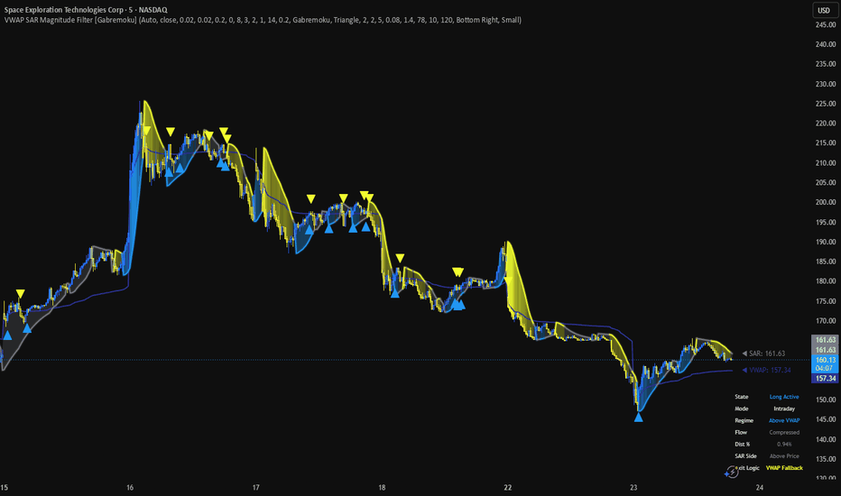
Volatility Regime OscillatorVolatility Regime Oscillator
OVERVIEW
A 0-100 oscillator confined to the one thing volatility truly does: measure and manage risk. It forecasts how large moves are likely to be, places that forecast on a self-normalising 0-100 percentile scale (calm → extreme), and reports the position-size multiplier a volatility-targeting approach would call for. You read it next to your own method and size accordingly. It places no orders, gives no entry/exit signals, and takes no view on direction. Volatility's only job here is how big, never which way — that restraint is the whole design.
WHY THESE METHODS BELONG IN ONE SCRIPT (mashup rationale)
This is not a folder of separate volatility studies — it is one pipeline, and each stage feeds the next:
Estimate. Range-based estimators (Yang-Zhang, Garman-Klass, Rogers-Satchell, Parkinson) measure realised volatility far more efficiently than close-to-close; combining them is more robust out-of-sample than trusting any single one.
Forecast. A HAR multi-horizon blend (with an optional measurement-error correction that shifts weight off the noisy fast term), EWMA, or window mean turns that estimate forward.
Character. Good/bad semivariance and vol-of-vol report whether the move is downside-driven and whether the volatility itself is stable — context a single number can't carry.
Regime. A percentile rank converts the forecast into a self-normalising 0-100 read, so the same calm/normal/high/extreme bands work on any symbol or timeframe.
Size. Volatility targeting turns the forecast into an exposure multiplier — blended toward constant exposure and gated down in extremes, the robust drawdown-reducing form.
A forecaster without a regime frame is just a number; a regime read without sizing is just a gauge; sizing without the de-risk gates is the naive targeting the research shows underwhelms. Chained, they answer one question end to end: how big is risk now, and what does that imply for size? Remove a stage and the chain breaks.
HOW IT IS DIFFERENT FROM A PLAIN VOLATILITY FORECASTER
Most volatility tools answer "what will volatility be?" This one answers "where does volatility sit, and how much should I size?" The forecast is only the input; the output is a regime percentile plus a position-sizing multiplier — vol targeting, conditional targeting, a managed/constant blend, downside scaling, and an optional stress gate — wrapped in a risk-management frame. It is a sizing and regime gauge, not a forecasting study.
HOW TO USE
Oscillator 0-100 = where current forecast vol sits in its own history (percentile). Bands: <25 calm, 25-65 normal, 65-90 high, ≥90 extreme.
Dotted marker = where your target vol sits in that distribution. Line above the marker = vol above target → size down; below = room to size up.
Suggested exposure (dashboard) = the vol-target multiplier of equity a long would use now (1.0× = 100%). Apply it to your own side.
Optional expected-move envelope on the price chart shows the size of the likely move (for stop placement) — symmetric, regime-coloured, never a direction or target.
UNIVERSAL ACROSS MARKETS
The estimators read OHLC, so it runs on any instrument and timeframe out of the box. An optional Analyse symbol input reroutes the calculation to a different instrument than the one charted. Annualisation is derived from the chart timeframe by default (so the forecast-vol % and the target marker read sensibly on any timeframe), with a manual bars-per-year override available. The India VIX stress gate is OFF by default because it reads an India-specific implied-vol symbol that would mislead on other markets — turn it on only for NIFTY / BANKNIFTY.
ACCURACY — AN HONEST NOTE
This contains the most advanced volatility methods genuinely computable from price bars. It does not and cannot contain the options-data frontier — rough-volatility calibration (rough Heston / fractional Brownian), deep-learning forecasters, or implied-vol-surface models — none of which run on chart OHLC. Even at its best, realised-vol forecasting explains only a minority of realised-vol variance. Treat this as a sharper estimate and a disciplined risk gauge, not a precise or certain forecast. The "suggested exposure" is context for your own risk process, not an instruction; the research is explicit that full vol-targeting often fails to beat constant exposure out of sample — the keepable part is tail/drawdown reduction, which is why sizing is blended toward constant exposure by default.
ORIGINALITY
The individual methods are public and credited below. The original work is the assembly: a single self-normalising oscillator that chains efficient range estimators → a measurement-error-corrected HAR forecast → a semivariance/vol-of-vol character read → a percentile regime → a blended, gated volatility-targeting exposure, with a regime-coloured expected-move envelope — a risk-and-sizing gauge rather than a forecast or a directional signal. No third-party Pine code is reused.
CONCEPT CREDIT
Volatility estimators — M. Parkinson (1980); Garman & Klass (1980); Rogers & Satchell (1991); Yang & Zhang (2000). HAR forecaster — Fulvio Corsi (2009); measurement-error (HARQ) correction — Bollerslev, Patton & Quaedvlieg (2016). EWMA / RiskMetrics — J.P. Morgan (1996). Good/bad realised semivariance — Barndorff-Nielsen, Kinnebrock & Shephard; Patton & Sheppard (2015). Path-dependent leverage effect — Julien Guyon & Jordan Lekeufack (2023). Volatility targeting / conditional targeting — Moreira & Muir (2017); Harvey et al. (2018); robustness caveats — Cederburg et al. (2020); Wang & Yan (2021). Assembly, oscillator framing, regime bands and the target marker are the author's own work. Not affiliated with, nor endorsed by, any third party.
DISCLAIMER
Educational risk-management gauge. NOT financial advice, NOT a signal, and NO guarantee of any outcome. Estimates from price can be wrong, especially through structural breaks and on low-history symbols. Trading carries risk of loss. Do your own research and manage your own risk. The author accepts no liability for any use of this script. 指標

Sweep Reclaim Entry Engine [trade_w_samet]🎯 Sweep Reclaim Entry Engine
Sweep Reclaim Entry Engine is a structured liquidity-sweep and reclaim analysis indicator designed to help traders study confirmed swing levels, controlled liquidity penetrations, reclaim strength, setup quality, directional alignment, and visual risk/reward models directly on the price chart.
This script focuses on one main concept:
Confirmed swing sweep and reclaim-based entry visualization.
It is not designed to mark every wick beyond every nearby high or low.
It is not designed to treat every penetration as a valid liquidity sweep.
It is not designed to create constant buy/sell labels.
Instead, the goal of Sweep Reclaim Entry Engine is to confirm structural swing levels, monitor their lifecycle, detect controlled penetrations beyond those levels, validate directional reclaims, apply configurable quality and market filters, and visualize accepted setups using one Entry level, one protective Stop Loss level, and one configurable risk/reward target.
The indicator includes:
• Confirmed swing-high and swing-low detection
• Reactive, Balanced, Structural, and Custom swing modes
• ATR-normalized level merging and proximity logic
• Fresh, Armed, Swept, Reclaimed, and Consumed level states
• Wick Only, Wick or Body, and Body Required sweep modes
• Minimum and maximum ATR-normalized sweep-depth filters
• First-penetration-only logic
• Multi-level sweep selection
• Dual-side sweep protection
• Same Candle, Fast, Flexible, and Custom reclaim windows
• Loose, Balanced, Strict, and Custom reclaim-strength modes
• Reclaim close-buffer, close-location, body-strength, and wick-rejection checks
• A transparent 0–100 setup-quality score
• A+, A, and B setup grades
• Loose, Balanced, Strict, and Custom quality-filter modes
• Relative-volume quality context
• Highest Quality and Nearest Level candidate-selection modes
• Direction, cooldown, cluster, duplicate-bar, and opposite-conflict controls
• Chart EMA, confirmed higher-timeframe EMA, and Combined EMA bias
• Optional volatility and market-efficiency filtering
• Entry ATR and Sweep Extreme stop-loss models
• A configurable 0.25R to 15R target
• One-active-trade-at-a-time logic
• Stop First and Target First same-bar assumptions
• Active TP / SL boxes and Entry / TP / SL lines
• SL-specific visual cleanup
• Important-only sweep-label filtering
• Full, Clean, Minimal, and Mobile chart profiles
• Full, Compact, Trade Only, and Off dashboard modes
• Adjustable marker, label, result, and dashboard sizes
• Crimson, Ice Blue, Monochrome, and fully custom colors
• Static TradingView alert conditions
• Optional dynamic alert() messages
• Compact bottom-right dashboard
• Confirmed-close permanent signals
• Confirmed higher-timeframe data handling
The purpose of this script is to help users visually study where a confirmed swing-level sweep is followed by a qualified directional reclaim.
It should be treated as a chart-analysis and educational decision-support tool.
It is not financial advice.
It is not an automated trading system.
It does not guarantee profitable trades.
It does not execute broker orders.
It does not replace personal analysis, risk management, or trade validation.
━━━━━━━━━━━━━━━━━━━━━━
📌 OVERVIEW
━━━━━━━━━━━━━━━━━━━━━━
At a high level, Sweep Reclaim Entry Engine does the following:
• Detects confirmed bullish and bearish swing pivots.
• Stores accepted swing highs and swing lows in separate internal level memories.
• Prevents near-duplicate levels using ATR-based merge tolerance.
• Tracks whether each level is Fresh, Armed, Swept, Reclaimed, or Consumed.
• Arms a level when price moves within the selected ATR distance.
• Detects a new penetration beyond an eligible swing level.
• Measures penetration depth relative to ATR.
• Classifies the sweep as wick-based or body-based.
• Applies minimum depth, maximum depth, first-interaction, multi-level, and dual-side rules.
• Moves the accepted level into the Swept state.
• Waits for price to reclaim the level within the selected reclaim window.
• Checks reclaim close buffer, close location, candle body strength, candle direction, and wick rejection.
• Calculates a 0–100 setup-quality score.
• Assigns an internal A+, A, or B grade.
• Applies the selected minimum-quality requirement.
• Compares multiple eligible reclaim candidates.
• Applies direction, trend-bias, market, cooldown, clustering, duplicate, and conflict rules.
• Confirms final BUY and SELL reclaim signals only after candle close.
• Projects Entry, Stop Loss, and one configurable take-profit target.
• Maintains one active visual trade model at a time.
• Tracks TP and SL events after the entry candle.
• Applies the selected same-candle TP / SL assumption.
• Preserves successful models when historical display is enabled.
• Deletes failed-model boxes, lines, and original signal labels after SL.
• Leaves only a small CLOSED SL HIT label for failed models.
• Displays engine, bias, quality, signal, and trade information in the bottom-right dashboard.
• Provides sweep, signal, grade, trade-open, TP, and SL alerts.
The script is intentionally built as a structured sequence.
It does not include machine-learning prediction.
It does not claim that every sweep will reverse.
It does not treat the quality score as a probability.
It provides a transparent way to study confirmed swing sweeps, directional reclaims, and their visual trade lifecycle.
━━━━━━━━━━━━━━━━━━━━━━
🧠 CORE IDEA
━━━━━━━━━━━━━━━━━━━━━━
The core idea behind Sweep Reclaim Entry Engine is based on the difference between a liquidity penetration and a confirmed reclaim.
A sweep occurs when price trades beyond a previously confirmed swing high or swing low.
A reclaim occurs when price returns through that level and closes with enough directional strength to satisfy the active rules.
The engine does not treat the sweep itself as an entry.
Instead, it separates the process into distinct stages:
Confirmed swing
→ managed level
→ level approach
→ valid penetration
→ sweep classification
→ reclaim window
→ reclaim confirmation
→ quality scoring
→ final filtering
→ confirmed entry model
For a bullish setup, the engine studies a penetration below a confirmed swing low and a later close back above that level.
For a bearish setup, the engine studies a penetration above a confirmed swing high and a later close back below that level.
The reclaim can occur on the same candle or within a configurable number of bars.
The final setup can then be evaluated using:
• sweep depth
• reclaim close quality
• wick rejection
• candle-body strength
• level freshness
• relative volume
• displacement
• market condition
• level cleanliness
• chart EMA alignment
• confirmed higher-timeframe EMA alignment
• cooldown and cluster rules
• opposite-signal conflict handling
The goal is not to maximize signal quantity.
The goal is to create an understandable process that explains how a stored swing level becomes a sweep candidate, how that sweep becomes a reclaim candidate, and how the final entry model is accepted or rejected.
━━━━━━━━━━━━━━━━━━━━━━
🧩 WHY THIS SCRIPT IS NOT A SIMPLE BUY/SELL INDICATOR
━━━━━━━━━━━━━━━━━━━━━━
Sweep Reclaim Entry Engine is not intended to be used as a blind buy/sell system.
The script is structured as a visual review workflow:
A pivot becomes confirmed
→ the swing level is stored
→ duplicate levels are filtered
→ price approaches the level
→ the level becomes Armed
→ price creates a new penetration
→ penetration type and depth are validated
→ the level becomes Swept
→ the reclaim window opens
→ reclaim strength is evaluated
→ a quality score is calculated
→ the setup receives a grade
→ eligible candidates are compared
→ execution filters are checked
→ the signal must remain valid at candle close
→ Entry, SL, and TP are projected
→ the active model is monitored
→ the model closes at TP or SL
→ the visual result is archived or cleaned
Each stage serves a specific purpose.
The confirmed-pivot engine defines the structural reference.
The level-memory engine prevents the script from treating all historical highs and lows as permanently active.
The Armed state separates a distant level from a level that price is actively approaching.
The sweep engine distinguishes a controlled penetration from a deep breakout.
The reclaim engine defines what qualifies as a directional return through the level.
The quality engine combines several independent setup characteristics.
The execution engine prevents clustered, duplicate, conflicting, or bias-opposed entries.
The trade model standardizes the visual Entry, risk, and reward references.
The dashboard explains the engine state and active model.
This makes the script a structured sweep-reclaim analysis tool, not a guaranteed signal generator.
━━━━━━━━━━━━━━━━━━━━━━
⚙️ HOW THE SCRIPT WORKS
━━━━━━━━━━━━━━━━━━━━━━
The script operates through several connected systems.
First, it confirms swing highs and swing lows using the selected pivot sensitivity.
Reactive mode uses shorter pivot lengths.
Balanced mode uses medium pivot lengths.
Structural mode uses wider pivot lengths and is the default.
Custom mode allows manual left-side and right-side pivot lengths.
float confirmedSwingHigh = ta.pivothigh(high, swingLeft, swingRight)
float confirmedSwingLow = ta.pivotlow(low, swingLeft, swingRight)
int confirmedHighBar = bar_index - swingRight
int confirmedLowBar = bar_index - swingRight
After confirmation, accepted swing levels are stored in separate high-side and low-side arrays.
Each level stores contextual information including:
• level price
• original pivot bar
• lifecycle state
• interaction count
• sweep bar
• sweep depth
• sweep extreme
• sweep type
• reclaim bar
• visual line reference
When price approaches a stored level, the level can move from Fresh to Armed.
When price creates a new penetration beyond the level, the engine checks:
• penetration mode
• minimum ATR depth
• maximum ATR depth
• first-attempt permission
• multi-level selection
• dual-side sweep protection
f_isValidHighSweep(float levelPrice, int attempts) =>
float depthATR = (high - levelPrice) / safeATR
int kind = f_highSweepKind(levelPrice)
bool depthValid = depthATR >= minSweepDepthATR and depthATR <= effectiveMaxSweepDepthATR
bool attemptValid = not firstInteractionOnly or attempts == 0
bool valid = f_isNewHighPenetration(levelPrice) and depthValid and attemptValid and f_modeAcceptsKind(kind)
valid
f_isValidLowSweep(float levelPrice, int attempts) =>
float depthATR = (levelPrice - low) / safeATR
int kind = f_lowSweepKind(levelPrice)
bool depthValid = depthATR >= minSweepDepthATR and depthATR <= effectiveMaxSweepDepthATR
bool attemptValid = not firstInteractionOnly or attempts == 0
bool valid = f_isNewLowPenetration(levelPrice) and depthValid and attemptValid and f_modeAcceptsKind(kind)
valid
A valid sweep moves the level into the Swept state.
The reclaim engine then waits for price to close back through the level within the selected window.
The reclaim must pass every enabled strength requirement.
The accepted candidate receives a quality score and grade.
If more than one candidate qualifies, the active Candidate Selection mode chooses the final candidate.
The final signal must also pass direction, bias, market, cooldown, cluster, duplicate-bar, and conflict rules.
Only after the bar closes with all conditions still valid can the permanent BUY or SELL reclaim signal and visual trade model appear.
━━━━━━━━━━━━━━━━━━━━━━
🟢 BULLISH SWEEP RECLAIM LOGIC
━━━━━━━━━━━━━━━━━━━━━━
A bullish sweep-reclaim setup begins with a confirmed swing low.
The swing low must be stored and remain eligible.
Price can then move close enough to place the level in the Armed state.
A bullish sweep is created when price penetrates below the swing-low level and the penetration satisfies the active sweep rules.
The engine may require:
• a wick-only penetration
• a wick or body penetration
• body participation beyond the level
• a minimum ATR-normalized depth
• a maximum ATR-normalized depth
• the first valid penetration attempt
• selection as the nearest valid level
• no simultaneous high-side sweep
After the low-side sweep, the bullish reclaim must occur inside the selected reclaim window.
The reclaim can require:
• a close above the swept level
• an ATR-based close buffer above the level
• a high close location inside the candle
• minimum body strength relative to ATR
• a bullish candle body when enabled
• minimum lower-wick rejection for same-candle reclaims
• a final score above the active quality threshold
• permission from the selected signal direction
• bullish chart and/or HTF EMA alignment
• permission from the active market-condition filter
• cooldown and cluster permission
• no stronger bearish conflict
f_isValidLowReclaim(int index) =>
bool valid = false
if index >= 0 and index < array.size(lowPrices) and barstate.isconfirmed
int state = array.get(lowStates, index)
int sweepBar = array.get(lowSweepBars, index)
if state == STATE_SWEPT and sweepBar >= 0
float levelPrice = array.get(lowPrices, index)
int barsAfterSweep = bar_index - sweepBar
bool windowPass = barsAfterSweep >= 0 and barsAfterSweep <= reclaimWindowBars
bool closePass = close >= levelPrice + safeATR * reclaimCloseBufferATR
bool locationPass = f_bullCloseLocation() >= reclaimCloseLocationThreshold
bool bodyPass = f_bodyATR() >= reclaimBodyStrengthATR
bool directionPass = not requireDirectionalCandle or close > open
bool sameBar = barsAfterSweep == 0
bool wickPass = not requireSameCandleWick or not sameBar or f_lowerWickRatio() >= reclaimWickThreshold
valid := windowPass and closePass and locationPass and bodyPass and directionPass and wickPass
valid
When every enabled rule passes at candle close, the script displays a BUY RECLAIM label.
If the visual trade model is enabled and no trade is active, the setup creates:
• Entry at the confirmed signal-bar close
• Stop Loss below entry or below the sweep extreme
• TP above entry
• blue/cyan reward box
• red risk box
• thick white Entry line
• blue TP line
• red SL line
This does not mean price must continue upward.
It means the configured bullish sweep-reclaim conditions were confirmed at the close of that candle.
━━━━━━━━━━━━━━━━━━━━━━
🔴 BEARISH SWEEP RECLAIM LOGIC
━━━━━━━━━━━━━━━━━━━━━━
A bearish sweep-reclaim setup begins with a confirmed swing high.
The swing high must be stored and remain eligible.
Price can then move close enough to place the level in the Armed state.
A bearish sweep is created when price penetrates above the swing-high level and the penetration satisfies the active sweep rules.
The engine may require:
• a wick-only penetration
• a wick or body penetration
• body participation beyond the level
• a minimum ATR-normalized depth
• a maximum ATR-normalized depth
• the first valid penetration attempt
• selection as the nearest valid level
• no simultaneous low-side sweep
After the high-side sweep, the bearish reclaim must occur inside the selected reclaim window.
The reclaim can require:
• a close below the swept level
• an ATR-based close buffer below the level
• a low close location inside the candle
• minimum body strength relative to ATR
• a bearish candle body when enabled
• minimum upper-wick rejection for same-candle reclaims
• a final score above the active quality threshold
• permission from the selected signal direction
• bearish chart and/or HTF EMA alignment
• permission from the active market-condition filter
• cooldown and cluster permission
• no stronger bullish conflict
When every enabled rule passes at candle close, the script displays a SELL RECLAIM label.
If the visual trade model is enabled and no trade is active, the setup creates:
• Entry at the confirmed signal-bar close
• Stop Loss above entry or above the sweep extreme
• TP below entry
• blue/cyan reward box
• red risk box
• thick white Entry line
• blue TP line
• red SL line
This does not mean price must continue downward.
It means the configured bearish sweep-reclaim conditions were confirmed at the close of that candle.
━━━━━━━━━━━━━━━━━━━━━━
💎 SWEEP RECLAIM QUALITY FILTER SYSTEM
━━━━━━━━━━━━━━━━━━━━━━
The script includes a multi-component quality system to reduce low-context reclaim signals.
This is important because not every sweep has the same structural meaning and not every reclaim candle has the same directional strength.
The quality engine evaluates eight components:
Sweep Depth — maximum 15 points
Measures where the penetration sits inside the active minimum-to-maximum sweep range.
The score favors a controlled sweep depth rather than automatically rewarding the deepest penetration.
Reclaim Close — maximum 20 points
Measures the directional location of the candle close.
A bullish setup receives more points when the reclaim closes near the top of the candle.
A bearish setup receives more points when the reclaim closes near the bottom.
Wick Rejection — maximum 15 points
Measures the directional rejection wick.
For multi-bar reclaims, the engine can also consider the stored sweep type and current reclaim structure.
Level Freshness — maximum 10 points
Newer levels generally receive more freshness points than levels that have remained active for a long time.
Relative Volume — maximum 10 points
Compares current volume with the selected baseline length.
When useful volume is not available, the engine avoids treating the setup as automatically invalid.
Displacement — maximum 15 points
Combines candle-body strength and the distance reclaimed through the level.
Market Condition — maximum 10 points
Uses candle range and ATR-regime information.
Level Cleanliness — maximum 5 points
Rewards levels with fewer prior interaction attempts.
The total is rounded and limited to 0–100.
float qualityScore = math.min(100.0, math.max(0.0, math.round(
sweepScore + closeScore + wickScore + freshnessScore +
volumeScore + displacementScore + marketScore + cleanlinessScore
)))
The quality score is not a win probability.
It is not a verified accuracy percentage.
It is an internal measurement of how closely the completed setup matches the selected structural rules.
━━━━━━━━━━━━━━━━━━━━━━
📏 SWEEP / ATR FILTER
━━━━━━━━━━━━━━━━━━━━━━
The sweep-depth filter measures the penetration beyond a swing level relative to ATR.
For a high-side sweep:
Sweep Depth = (High − Swing High) / ATR.
For a low-side sweep:
Sweep Depth = (Swing Low − Low) / ATR.
Minimum Sweep Depth rejects penetrations that may be too small to represent a meaningful liquidity event.
Maximum Sweep Depth rejects penetrations that may be too deep to represent a controlled sweep and may instead behave more like a breakout.
The default values are:
Minimum Sweep Depth = 0.05 ATR.
Maximum Sweep Depth = 0.80 ATR.
ATR normalization allows the threshold to adapt to changing volatility.
A 0.20 ATR sweep represents a relative move rather than a fixed number of points.
This helps the engine operate across different price scales.
However, ATR normalization does not make one configuration universally suitable.
A symbol with session gaps, irregular volume, or unusual volatility can still behave differently from another market.
A deeper sweep is not automatically a better setup.
Sweep depth is only one component of the complete reclaim process.
━━━━━━━━━━━━━━━━━━━━━━
🕯️ DISPLACEMENT QUALITY FILTER
━━━━━━━━━━━━━━━━━━━━━━
The displacement component evaluates whether the reclaim candle moves with enough directional force.
The engine considers:
• candle-body size relative to ATR
• distance closed beyond the reclaimed level
• bullish or bearish directional recovery
For bullish setups, stronger displacement generally means:
• a larger bullish body
• a close further above the reclaimed swing low
For bearish setups, stronger displacement generally means:
• a larger bearish body
• a close further below the reclaimed swing high
Reclaim Strength Mode can also impose a minimum body-size requirement before the setup reaches the quality-scoring stage.
Loose mode allows smaller directional bodies.
Balanced mode uses moderate requirements.
Strict mode requires stronger completed-candle behavior.
Custom mode exposes the manual threshold.
Displacement is not used as a prediction.
It is used to measure whether the completed reclaim candle demonstrates the selected degree of directional response.
━━━━━━━━━━━━━━━━━━━━━━
📊 REACTION STRENGTH FILTER
━━━━━━━━━━━━━━━━━━━━━━
The reaction-strength layer evaluates the candle that confirms the reclaim.
The active rules can include:
• close through the swept level
• ATR-based close buffer
• directional close location
• body strength relative to ATR
• bullish or bearish candle direction
• same-candle rejection wick
Reclaim Strength Mode provides:
Loose
Uses lower close-buffer, close-location, body-strength, and wick-rejection requirements.
Balanced
Uses moderate thresholds.
Strict
Uses the strongest built-in thresholds and is the default.
Custom
Uses the manual values selected by the user.
Strict mode applies:
• 0.05 ATR reclaim close buffer
• 0.70 directional close-location threshold
• 0.15 ATR minimum body strength
• 0.28 same-candle wick-rejection ratio
Require Directional Candle Body can additionally require:
• close above open for bullish reclaims
• close below open for bearish reclaims
Require Same-Candle Wick Rejection applies the wick requirement when the sweep and reclaim occur on the same candle.
The reaction-strength system is designed to distinguish a simple touch from a stronger completed directional response.
━━━━━━━━━━━━━━━━━━━━━━
🧼 CONFIRMED RECLAIM FILTER
━━━━━━━━━━━━━━━━━━━━━━
The reclaim layer requires the setup to remain valid at candle close.
Available reclaim windows include:
Same Candle
The penetration and reclaim must complete on the same candle.
Fast
The reclaim can occur on the sweep candle or the next candle.
Flexible
The reclaim can occur within three bars and is the default.
Custom
The user selects the maximum number of bars.
The engine stores the sweep bar and compares the current bar with the allowed reclaim window.
The sweep state timeout is automatically prevented from becoming shorter than the active reclaim window.
A reclaimed setup can also be blocked by:
• insufficient close buffer
• weak close location
• weak candle body
• missing directional body
• missing same-candle wick rejection
• low quality score
• direction restriction
• chart EMA misalignment
• higher-timeframe EMA misalignment
• market-condition failure
• active-trade restriction
• cooldown
• same-direction clustering
• duplicate-bar protection
• opposite-direction conflict
Final permanent BUY and SELL signals require confirmed-bar logic.
This means an unfinished realtime candle can temporarily trade beyond a level, but it does not become a permanent reclaim signal unless the conditions remain valid when the bar closes.
━━━━━━━━━━━━━━━━━━━━━━
🎯 ENTRY MODEL
━━━━━━━━━━━━━━━━━━━━━━
When a final BUY or SELL reclaim signal passes every enabled condition, the script can create a visual entry model.
The Entry reference is the close of the confirmed signal candle.
The engine stores:
• trade direction
• entry bar
• entry price
• stop price
• risk distance
• selected RR
• target price
• setup quality
• setup grade
The trade model opens only when:
• Enable Trade Model is active
• no visual trade is already active
• the final reclaim signal is confirmed
• the calculated risk distance is larger than the symbol’s minimum tick
• same-bar reopening is permitted when the previous model closed on the same candle
if enableTradeModel and not tradeActive and (allowSignalOnExitBar or not tradeClosedThisBar)
if buyReclaimSignal
float sweepExtreme = array.get(lowSweepExtremes, selectedLowReclaimIndex)
float candidateStop = stopLossMode == "Entry ATR Multiplier" ?
close - safeATR * stopATRMultiplier :
sweepExtreme - safeATR * stopBufferATR
float candidateRisk = close - candidateStop
The entry model is a visual analysis reference.
It is not a broker market order.
It does not include spread, slippage, commission, latency, or partial fills.
━━━━━━━━━━━━━━━━━━━━━━
🛑 ATR STOP-LOSS MODEL
━━━━━━━━━━━━━━━━━━━━━━
The script includes two stop-placement models.
Entry ATR Multiplier
For BUY setups:
Stop = Entry − ATR × multiplier.
For SELL setups:
Stop = Entry + ATR × multiplier.
This is the default mode.
The default Entry ATR Stop Multiplier is 2.00 ATR.
The multiplier can be adjusted from 0.10 to 15.00.
Sweep Extreme + ATR Buffer
For BUY setups:
Stop = stored low-side sweep extreme − ATR buffer.
For SELL setups:
Stop = stored high-side sweep extreme + ATR buffer.
The default Sweep-Extreme Buffer is 0.10 ATR.
float candidateStop = stopLossMode == "Entry ATR Multiplier" ?
close - safeATR * stopATRMultiplier :
sweepExtreme - safeATR * stopBufferATR
The selected stop determines the visual risk distance.
That risk distance also determines the take-profit distance.
The displayed stop is a planning reference only.
It does not place or manage a broker stop order.
━━━━━━━━━━━━━━━━━━━━━━
🎯 TAKE-PROFIT RR MODEL
━━━━━━━━━━━━━━━━━━━━━━
The script uses one configurable take-profit target.
The target is calculated from the distance between Entry and Stop Loss.
For BUY models:
TP = Entry + Risk × RR.
For SELL models:
TP = Entry − Risk × RR.
The Risk / Reward Target can be adjusted from:
0.25R to 15.00R.
The default is 2.00R.
activeTradeRisk := candidateRisk
activeTradeRR := tradeRiskReward
activeTradeTarget := close + candidateRisk * tradeRiskReward
The displayed RR controls the geometric distance of the projected target.
It does not represent a performance claim.
It does not guarantee that price will reach the target.
Changing the stop model or stop multiplier changes the target distance because both levels are based on the same initial risk.
━━━━━━━━━━━━━━━━━━━━━━
📦 ACTIVE TP / SL BOX SYSTEM
━━━━━━━━━━━━━━━━━━━━━━
When a confirmed reclaim model opens, the script can draw:
• blue/cyan TP box
• red SL box
• thick white Entry line
• blue TP line
• red SL line
• BUY RECLAIM or SELL RECLAIM label
The active boxes and lines extend to the right as new candles appear.
The Entry line is intentionally pure white and visually thicker than the TP and SL references.
When TP is reached:
• the trade model closes
• active boxes and lines stop at the closing bar
• the TP result label appears
• completed visuals can remain when Show Historical Trades is enabled
• completed visuals can be faded using Completed Trade Transparency
When SL is reached:
• the TP box is deleted
• the SL box is deleted
• the Entry line is deleted
• the TP line is deleted
• the SL line is deleted
• the original BUY or SELL signal label associated with that trade is deleted
• only a small CLOSED SL HIT label remains
This SL-specific cleanup keeps failed models visually concise.
The active trade model is educational and bar-based.
It does not simulate real broker execution.
━━━━━━━━━━━━━━━━━━━━━━
🚦 ONE ACTIVE TRADE AT A TIME
━━━━━━━━━━━━━━━━━━━━━━
The script includes one-active-trade-at-a-time logic.
If a visual trade model is active, the engine does not open another trade model until the current model closes.
Block Signals During Active Trade can also prevent new final signal labels from being accepted while the active model is open.
Allow New Signal on Exit Bar controls whether a new model can open on the same candle that closes the current model.
The default is disabled.
This design separates:
• market-level calculation
• sweep and reclaim detection
• permission to create a new trade model
The engine can continue updating structural levels and market context while a model is active.
However, the one-active-model rule prevents overlapping TP / SL boxes and conflicting lifecycle states.
This is a visual-management rule.
It is not a restriction on the user’s personal trading activity.
━━━━━━━━━━━━━━━━━━━━━━
⚠️ SAME-CANDLE TP / SL HANDLING
━━━━━━━━━━━━━━━━━━━━━━
The script begins checking TP and SL after the entry candle.
If both TP and SL are touched on the same later candle, standard OHLC data does not reveal the actual intrabar sequence.
The script therefore provides two selectable assumptions:
Stop First
The stop is processed before the target.
This is the default and more conservative assumption.
Target First
The target is processed before the stop.
This is the more optimistic assumption.
Neither option reproduces exact tick-level broker execution.
The model does not include:
• bid/ask spread
• slippage
• order latency
• partial fills
• queue priority
• execution venue rules
• intrabar tick order
Same-candle handling is a modeling choice required by the limits of standard bar data.
━━━━━━━━━━━━━━━━━━━━━━
🏷️ SWEEP RECLAIM LABELS
━━━━━━━━━━━━━━━━━━━━━━
The script uses separate labels for sweep events, reclaim signals, and trade results.
Sweep labels can display:
SWEEP HIGH
or:
SWEEP LOW
The Sweep Label Filter can show:
Important Only
Only sweeps that meet the active importance threshold receive visible labels.
All Valid
Every accepted sweep can receive a visible label.
The default Minimum Sweep Importance is 65.
BUY and SELL reclaim labels can use three display styles:
Full
Example:
▲ A+ BUY RECLAIM ▲
QUALITY • 87/100
or:
▼ A+ SELL RECLAIM ▼
QUALITY • 84/100
Compact
Displays a shorter direction, grade, and score format.
Icon
Displays a minimal directional icon and optional score.
Show Grade on Signal Labels controls A+, A, or B display.
Show Score on Signal Labels controls the 0–100 score display.
All dynamic label text uses bold and italic formatting.
Independent size controls are available for:
• sweep labels
• BUY / SELL signal labels
• TP / SL result labels
• confirmed pivot triangle markers
━━━━━━━━━━━━━━━━━━━━━━
📍 SWING LEVEL DISPLAY MODES
━━━━━━━━━━━━━━━━━━━━━━
The indicator includes several level-display modes.
All Active
Displays eligible Fresh, Armed, Swept, and Reclaimed swing levels according to the active color and line-style rules.
Armed + Events
Focuses on Armed, Swept, and Reclaimed levels.
Events Only
Shows levels primarily when a sweep or reclaim event has occurred.
Hidden
Keeps the level engine active while removing swing-level lines from the chart.
Level Line Style provides:
Adaptive
Changes the line appearance according to level state.
Solid
Uses solid lines.
Dashed
Uses dashed lines.
Dotted
Uses dotted lines.
Show Swing-High Levels and Show Swing-Low Levels can independently control each side.
Fade Older Levels can reduce the opacity of older stored levels.
Level Width controls line thickness.
The display mode affects chart presentation only.
It does not change the underlying sweep and reclaim calculations.
━━━━━━━━━━━━━━━━━━━━━━
🧹 LEVEL INVALIDATION
━━━━━━━━━━━━━━━━━━━━━━
Stored levels do not remain eligible forever.
A level can be removed or retired because:
• it exceeds Maximum Level Age
• a confirmed breakout exceeds the allowed invalidation distance
• its sweep state exceeds the active timeout
• it completes its reclaimed hold period
• its first penetration is rejected while First Penetration Only is active
• it is consumed after failing a final execution filter
• the maximum active-level capacity removes an older level
Breakout Invalidation uses ATR-normalized distance.
This helps distinguish a controlled sweep from a confirmed close that travels too far beyond an unswept level.
Sweep State Timeout limits how long a Swept level can wait for reclaim.
Reclaimed Level Hold Bars controls how long the line remains highlighted after a successful reclaim.
Consume Filtered Reclaims determines whether a reclaim candidate rejected by direction, bias, market, cooldown, cluster, or conflict rules is permanently retired.
Removing stale or invalid levels helps reduce repeated signals from outdated price references.
━━━━━━━━━━━━━━━━━━━━━━
📟 DASHBOARD
━━━━━━━━━━━━━━━━━━━━━━
The script includes a dashboard positioned in the bottom-right corner.
Dashboard modes include:
Full
Displays the broadest engine diagnostics.
Compact
Shows a reduced selection of important engine and trade information.
Trade Only
Focuses on the active trade lifecycle.
Off
Hides the dashboard.
The Full dashboard can display:
• active swing and reclaim configuration
• quality-filter mode
• Fresh, Armed, Swept, and Reclaimed level counts
• last sweep side
• last sweep type
• sweep depth
• last reclaim signal
• reclaim delay
• close location
• candle-body strength
• setup grade
• setup-quality score
• quality-component information
• selected candidate mode
• signal direction
• cooldown state
• trend-bias state
• market state
• active level
• latest block reason
• trade state
• Entry
• Stop
• Target
• risk distance
• selected RR
• total visual models
• wins and losses
• internal net R
• last model result
• current and best internal streaks
The dashboard is not TradingView Strategy Tester.
Its trade counters are based on the indicator’s own educational bar-based model.
They do not include spread, commission, slippage, latency, or real broker execution.
━━━━━━━━━━━━━━━━━━━━━━
🚨 ALERT SYSTEM
━━━━━━━━━━━━━━━━━━━━━━
Sweep Reclaim Entry Engine includes static TradingView alert conditions for:
• Swing High Swept
• Swing Low Swept
• Any Swing Sweep
• BUY Reclaim Confirmed
• SELL Reclaim Confirmed
• Any Reclaim Signal
• A+ Sweep Reclaim
• A Sweep Reclaim
• B Sweep Reclaim
• Sweep Reclaim Trade Opened
• Sweep Reclaim TP Hit
• Sweep Reclaim SL Hit
The script also includes optional dynamic alert() messages.
Dynamic messages can include:
• direction
• symbol
• timeframe
• grade
• quality score
• reclaimed level
• signal close
• Entry
• Stop Loss
• TP
• RR
• stop mode
• final model result
Dynamic Signal Alerts: A+ Only can restrict dynamic final-signal alerts to A+ setups.
Alert filtering affects alert delivery only.
It does not change chart calculations.
Alerts are monitoring tools.
They do not execute trades or place broker orders.
━━━━━━━━━━━━━━━━━━━━━━
🔔 HOW TO USE ALERTS
━━━━━━━━━━━━━━━━━━━━━━
A practical alert workflow:
1. Add Sweep Reclaim Entry Engine to the chart.
2. Select the desired swing, sweep, reclaim, quality, bias, and trade-model settings.
3. Open TradingView’s Create Alert window.
4. Select the indicator as the alert condition.
5. Choose the required static condition.
6. Use BUY Reclaim Confirmed or SELL Reclaim Confirmed for direction-specific signals.
7. Use Any Reclaim Signal for either direction.
8. Use A+, A, or B conditions when grade-specific monitoring is needed.
9. Enable Dynamic alert() Messages when detailed runtime messages are preferred.
10. Select Any alert() function call for dynamic messages.
11. Choose an alert frequency suitable for confirmed-candle monitoring.
12. Test the alert before depending on it.
13. Confirm every event with personal analysis and risk management.
Alert delivery can depend on:
• TradingView servers
• the user’s alert settings
• symbol data availability
• chart timeframe
• realtime feed status
• webhook destination availability
The indicator cannot guarantee alert delivery or external execution.
━━━━━━━━━━━━━━━━━━━━━━
🧪 HOW TO USE THE INDICATOR
━━━━━━━━━━━━━━━━━━━━━━
A practical workflow:
1. Add Sweep Reclaim Entry Engine to a standard candlestick chart.
2. Begin with the default Structural swing mode.
3. Keep Reclaim Strength Mode on Strict while learning the engine.
4. Keep Quality Filter Mode on Strict when a selective default is preferred.
5. Confirm that the selected higher timeframe is above the chart timeframe.
6. Observe the stored swing-high and swing-low levels.
7. Watch for a level to move from Fresh to Armed.
8. Review whether the penetration appears controlled rather than excessively deep.
9. Wait for the reclaim candle to close.
10. Review the BUY or SELL label, grade, and quality score.
11. Check the bottom-right dashboard for bias, market state, block reason, and active trade.
12. Treat Entry, SL, and TP as visual references only.
13. Compare the setup with personal structure, liquidity, session, volatility, and risk rules.
14. Use alerts for monitoring rather than blind execution.
15. Test the exact symbol, timeframe, session, and settings personally used.
16. Review historical TP models and concise CLOSED SL HIT labels to understand the visual lifecycle.
The indicator is best used as a structured sweep-reclaim review tool.
It should not be used as an automatic decision-maker.
━━━━━━━━━━━━━━━━━━━━━━
⚙️ SETTINGS REFERENCE
━━━━━━━━━━━━━━━━━━━━━━
⚙️ Core Swing Engine
Swing Mode
Selects Reactive, Balanced, Structural, or Custom.
Custom Left Bars
Controls left-side pivot sensitivity in Custom mode.
Custom Right Bars
Controls right-side pivot confirmation in Custom mode.
ATR Length
Controls ATR normalization throughout the engine.
━━━━━━━━━━━━━━━━━━━━━━
📍 Level Management
Maximum Active Levels Per Side
Limits stored swing highs and lows separately.
Maximum Level Age
Removes old inactive levels.
Level Merge Tolerance — ATR
Prevents near-duplicate swing levels.
Armed Distance — ATR
Controls how close price must move before a Fresh level becomes Armed.
Breakout Invalidation — ATR
Controls the confirmed-close distance that invalidates an unswept level.
━━━━━━━━━━━━━━━━━━━━━━
🌊 Sweep Detection
Sweep Penetration Mode
Selects Wick Only, Wick or Body, or Body Required.
Minimum Sweep Depth — ATR
Rejects insignificant penetrations.
Maximum Sweep Depth — ATR
Rejects excessively deep penetrations.
First Penetration Only
Allows only the first interaction attempt.
Multi-Level Sweep Handling
Selects Nearest Valid Level or All Valid Levels.
Block Dual-Side Sweep Bars
Prevents one candle from registering both a high-side and low-side sweep.
Sweep State Timeout
Controls how long a Swept level can wait for reclaim.
━━━━━━━━━━━━━━━━━━━━━━
✅ Reclaim Confirmation
Reclaim Window
Selects Same Candle, Fast, Flexible, or Custom.
Custom Reclaim Bars
Controls the reclaim window in Custom mode.
Reclaim Strength Mode
Selects Loose, Balanced, Strict, or Custom.
Custom Close Buffer — ATR
Controls reclaim distance beyond the level.
Custom Close Location
Controls directional close quality.
Custom Body Strength — ATR
Controls minimum reclaim-candle body size.
Custom Wick Rejection Ratio
Controls same-candle rejection-wick quality.
Require Directional Candle Body
Requires bullish or bearish candle direction.
Require Same-Candle Wick Rejection
Requires the active wick threshold for immediate reclaims.
Block Dual-Side Reclaim Bars
Prevents both directions from confirming on one candle.
Reclaimed Level Hold Bars
Controls how long a reclaimed level remains highlighted.
━━━━━━━━━━━━━━━━━━━━━━
💎 Quality Engine
Quality Filter Mode
Selects Loose, Balanced, Strict, or Custom.
Custom Minimum Quality
Controls the manual minimum from 50 to 100.
Include Relative Volume
Adds the relative-volume component.
Relative Volume Length
Controls the volume baseline.
Volatility Regime Length
Controls the ATR-regime baseline.
Show Grade on Signal Labels
Displays A+, A, or B.
Show Score on Signal Labels
Displays the 0–100 quality score.
━━━━━━━━━━━━━━━━━━━━━━
🎯 Signal Execution
Signal Direction
Selects Both, Long Only, or Short Only.
Candidate Selection
Selects Highest Quality or Nearest Level.
Cooldown Mode
Selects Off, Any Signal, or Same Direction.
Signal Cooldown Bars
Controls the time-based delay.
Use Same-Direction Cluster Filter
Blocks nearby repeated signals.
Minimum Signal Distance — ATR
Controls the required distance from the previous same-direction signal.
Block Duplicate Signal Bar
Prevents repeated final signals on one candle.
Opposite-Signal Conflict
Selects Block Both, Higher Quality, BUY Priority, or SELL Priority.
Consume Filtered Reclaims
Retires reclaim candidates rejected by final execution filters.
━━━━━━━━━━━━━━━━━━━━━━
🧭 Bias & Market Filters
Trend Bias Mode
Selects Off, Chart EMA, Higher Timeframe EMA, or Combined EMA.
Chart EMA Length
Controls current-timeframe trend bias.
Higher Timeframe
Selects the HTF context.
Higher-Timeframe EMA Length
Controls the confirmed HTF EMA.
Require EMA Slope Agreement
Adds directional EMA slope.
Market Condition Filter
Selects Off, Volatility, Efficiency, or Combined.
Efficiency Length
Controls directional-efficiency calculation.
Minimum Efficiency
Controls the required efficiency ratio.
Minimum ATR Regime Ratio
Sets the lower volatility boundary.
Maximum ATR Regime Ratio
Sets the upper volatility boundary.
The default HTF layer uses previous completed higher-timeframe values.
float confirmedHTFClose = request.security(
syminfo.tickerid,
higherTimeframe,
close ,
gaps = barmerge.gaps_off,
lookahead = barmerge.lookahead_on
)
float confirmedHTFEMA = request.security(
syminfo.tickerid,
higherTimeframe,
ta.ema(close, higherTimeframeBiasLength) ,
gaps = barmerge.gaps_off,
lookahead = barmerge.lookahead_on
)
━━━━━━━━━━━━━━━━━━━━━━
📈 Trade Model
Enable Trade Model
Enables Entry, SL, TP, and lifecycle visualization.
Stop-Loss Mode
Selects Entry ATR Multiplier or Sweep Extreme + ATR Buffer.
Sweep-Extreme Buffer — ATR
Controls protective distance beyond the sweep extreme.
Entry ATR Stop Multiplier
Controls ATR stop distance from Entry.
Risk / Reward Target
Controls target distance from 0.25R to 15R.
TP / SL Same-Bar Priority
Selects Stop First or Target First.
Block Signals During Active Trade
Maintains the one-active-model structure.
Allow New Signal on Exit Bar
Controls same-bar reopening.
Show TP / SL Boxes
Shows or hides risk/reward areas.
Show Entry / TP / SL Lines
Shows or hides price-reference lines.
Show Historical Trades
Keeps completed TP models.
Maximum Historical Trades
Limits stored completed visuals.
Show TP / SL Result Labels
Controls TP HIT and CLOSED SL HIT labels.
━━━━━━━━━━━━━━━━━━━━━━
🔔 Alert System
Enable Dynamic alert() Messages
Activates detailed runtime alerts.
Alert Final BUY / SELL Signals
Enables final-signal messages.
Dynamic Signal Alerts: A+ Only
Restricts dynamic signal messages to A+ setups.
Alert Trade Model Open
Sends Entry, SL, TP, RR, grade, and quality.
Alert TP / SL Result
Sends model-result messages.
━━━━━━━━━━━━━━━━━━━━━━
🎨 Visual Settings
Visual Profile
Selects Full, Clean, Minimal, or Mobile.
Level Display
Selects All Active, Armed + Events, Events Only, or Hidden.
Level Line Style
Selects Adaptive, Solid, Dashed, or Dotted.
Signal Label Style
Selects Full, Compact, or Icon.
Dashboard Mode
Selects Full, Compact, Trade Only, or Off.
Active Trade Zone Transparency
Controls TP / SL fill transparency.
Active Trade Border Transparency
Controls TP / SL borders.
Active Trade Line Width
Controls trade-line thickness.
Fade Completed Trades
Fades completed TP models.
Completed Trade Transparency
Controls historical fading.
Theme
Selects Crimson, Ice Blue, or Monochrome.
Show Swing-High Levels
Controls high-side levels.
Show Swing-Low Levels
Controls low-side levels.
Show Important Sweep Labels
Controls sweep-event labels.
Sweep Label Filter
Selects Important Only or All Valid.
Minimum Sweep Importance
Controls visible sweep quality.
Maximum Important Sweep Labels
Limits sweep-label history.
Show BUY / SELL Reclaim Signals
Controls final reclaim labels.
Maximum Reclaim Labels
Limits final signal-label history.
Fade Older Levels
Reduces old-level opacity.
Level Width
Controls swing-level line thickness.
Show Confirmed Pivot Markers
Controls pivot triangles.
Show Dashboard
Enables the dashboard.
━━━━━━━━━━━━━━━━━━━━━━
🛠️ Customization
Sweep Label Size
Controls SWEEP HIGH / SWEEP LOW labels.
Triangle Marker Size
Controls confirmed pivot triangles.
BUY / SELL Signal Label Size
Controls reclaim labels.
TP / SL Result Label Size
Controls result labels.
Dashboard Header Size
Controls dashboard titles.
Dashboard Text Size
Controls dashboard body text.
Color Mode
Selects Theme or Custom.
Custom color inputs control:
• swing-level states
• BUY / SELL backgrounds and text
• sweep-label backgrounds and text
• Entry, TP, and SL lines
• TP / SL fills and borders
• TP / SL result labels
• dashboard background, header, border, main text, and muted text
Input values and plotted marker values are hidden from the status line.
━━━━━━━━━━━━━━━━━━━━━━
🧠 WHAT MAKES THIS SCRIPT ORIGINAL
━━━━━━━━━━━━━━━━━━━━━━
Sweep Reclaim Entry Engine uses familiar analytical concepts such as:
• pivot highs and lows
• liquidity sweeps
• price reclaims
• ATR
• relative volume
• EMA bias
• market efficiency
• risk/reward projection
These concepts are not unique by themselves.
The originality of this script lies in how they are organized into one transparent sweep-reclaim workflow:
Confirmed pivot
→ separate high-side and low-side memories
→ ATR-normalized duplicate control
→ Fresh state
→ Armed state
→ penetration classification
→ minimum and maximum depth validation
→ Swept state
→ configurable reclaim window
→ close, location, body, and wick validation
→ eight-component quality score
→ A+ / A / B grade
→ multi-candidate comparison
→ cooldown, cluster, and conflict handling
→ chart and confirmed HTF EMA alignment
→ optional market-regime filtering
→ one-active-trade model
→ TP-specific historical preservation
→ SL-specific visual cleanup
→ static and dynamic alert delivery
→ bottom-right diagnostic dashboard
Distinctive implementation features include:
• separate lifecycle arrays for swing highs and swing lows
• a defined Armed state before sweep detection
• controlled minimum and maximum penetration depth
• wick/body sweep classification
• first-attempt retirement logic
• sweep-importance scoring separate from setup-quality scoring
• same-candle and multi-bar reclaim support
• transparent quality-component weighting
• Highest Quality and Nearest Level candidate selection
• multiple opposite-conflict resolution modes
• confirmed higher-timeframe EMA data
• ATR-normalized signal clustering
• full chart cleanup after SL
• independent sizing for every label and marker class
• status-line value suppression without hiding chart markers
• configurable targets up to 15R
The script is not a basic collection of unrelated filters.
Each module supports the same swing-sweep-reclaim process.
━━━━━━━━━━━━━━━━━━━━━━
⚠️ IMPORTANT PRACTICAL NOTES
━━━━━━━━━━━━━━━━━━━━━━
The indicator’s behavior depends heavily on settings and market conditions.
Signal frequency can change based on:
• Swing Mode
• pivot lengths
• maximum level age
• merge tolerance
• armed distance
• sweep penetration mode
• minimum and maximum sweep depth
• first-penetration logic
• multi-level selection
• reclaim window
• reclaim strength
• directional candle requirement
• same-candle wick requirement
• quality filter mode
• volume context
• direction restriction
• cooldown
• signal-cluster distance
• opposite-conflict mode
• chart EMA length
• HTF selection
• HTF EMA length
• market-condition filter
• volatility regime
• efficiency threshold
• active-trade restrictions
• symbol
• timeframe
• session
• data provider
• available chart history
A setting that appears selective on one market may behave differently on another.
Volume behavior can differ across forex, futures, equities, indices, and cryptocurrencies.
The higher-timeframe filter should use a timeframe meaningfully above the chart timeframe.
Structural mode confirms fewer and broader pivots than Reactive mode.
Strict reclaim and quality modes reduce signal frequency but do not guarantee better results.
Reactive or Balanced modes can increase frequency but can also increase chart noise.
Users should test the exact market, timeframe, session, and configuration they personally study.
━━━━━━━━━━━━━━━━━━━━━━
⚠️ LIMITATIONS AND SHORTCOMINGS
━━━━━━━━━━━━━━━━━━━━━━
This script has important limitations:
It does not guarantee profitable trades.
It does not predict future price movement.
It does not replace risk management.
It does not execute trades.
It does not place broker orders.
It does not include spread.
It does not include commissions.
It does not include slippage.
It does not include execution delay.
It does not include partial fills.
It uses bar-based OHLC data.
Same-candle TP / SL order cannot be known from standard OHLC bars.
Stop First and Target First are modeling assumptions.
Confirmed pivots require right-side bars before becoming available.
The quality score is not a win probability.
A+ is not a guaranteed outcome.
The dashboard is not TradingView Strategy Tester.
Internal model counters are not audited brokerage performance.
Historical boxes and labels do not guarantee future behavior.
Relative-volume quality depends on available volume data.
Higher-timeframe bias depends on the selected timeframe.
Market-efficiency filtering cannot identify every ranging condition.
ATR normalization does not make one configuration universal.
One-active-trade logic is a visual-management rule.
Data-feed differences can change historical pivots and signals.
Alert delivery depends on TradingView and user configuration.
Changing settings changes historical calculations.
Changing symbol, session, exchange, or timeframe changes the engine context.
For these reasons, Sweep Reclaim Entry Engine should be used as an educational decision-support and chart-analysis tool, not as a standalone automated strategy.
━━━━━━━━━━━━━━━━━━━━━━
👤 WHO THIS SCRIPT MAY BE USEFUL FOR
━━━━━━━━━━━━━━━━━━━━━━
This script may be useful for traders who:
• study liquidity sweeps
• monitor confirmed swing highs and lows
• distinguish a sweep from a reclaim
• prefer filtered signals instead of every wick event
• want a visible level lifecycle
• want ATR-normalized penetration thresholds
• want same-candle and multi-bar reclaim support
• want a transparent 0–100 quality framework
• want A+, A, and B setup grades
• want chart and confirmed HTF EMA context
• want optional market-regime filtering
• want Entry, SL, and TP visualization
• want one active model at a time
• want clean SL result handling
• want adjustable mobile and desktop presentation
• want alert-based monitoring
• want a structured educational analysis process
It may be less suitable for users who:
• want guaranteed buy/sell signals
• want a fully automated trading bot
• want every wick beyond every high or low
• expect the quality score to represent probability
• expect one configuration to work on every market
• require exact tick-level execution simulation
• expect displayed levels to match broker fills
• want an indicator to replace independent judgment
• expect alerts to execute orders automatically
━━━━━━━━━━━━━━━━━━━━━━
🧭 BEST PRACTICE SUGGESTIONS
━━━━━━━━━━━━━━━━━━━━━━
For a cleaner and more selective review:
• begin with Structural swing mode
• keep First Penetration Only enabled
• use Nearest Valid Level or Highest Quality according to preference
• keep Strict reclaim strength
• keep Strict quality filtering
• use Combined EMA bias
• select a valid higher timeframe
• use Same Direction cooldown
• keep the same-direction cluster filter enabled
• use Stop First for conservative same-candle modeling
• use Important Only sweep labels
• use Clean visual profile
• keep the dashboard in Compact or Full mode while learning
• use alerts for monitoring, not blind execution
For more active signal frequency:
• use Balanced or Reactive swing mode
• use Balanced reclaim strength
• use Balanced quality filtering
• reduce cooldown
• reduce minimum signal distance
• use Chart EMA or disable trend bias
• keep the hard market filter Off
• use All Valid sweep labels only when additional chart detail is useful
Always:
• review the structural level before the sweep
• confirm the reclaim candle has closed
• verify the setup fits personal market context
• compare the stop with nearby structure and volatility
• treat TP as a planning reference
• test the exact symbol and timeframe
• apply independent risk management and position sizing
━━━━━━━━━━━━━━━━━━━━━━
🔓 PUBLICATION NOTE
━━━━━━━━━━━━━━━━━━━━━━
Sweep Reclaim Entry Engine is published as an educational and visual market-analysis tool.
The purpose of this description is to explain:
• what the script does
• how swing points are confirmed
• how levels are stored and managed
• how Fresh, Armed, Swept, Reclaimed, and Consumed states work
• how penetration type is classified
• how minimum and maximum sweep depth work
• how reclaim timing works
• how reclaim strength is evaluated
• how the 0–100 quality score is calculated
• how A+, A, and B grades are assigned
• how candidates are selected
• how cooldown and clustering operate
• how opposite-direction conflicts are handled
• how chart and confirmed HTF bias work
• how market-condition filters operate
• how Entry and Stop Loss are calculated
• how the RR target is projected
• how one-active-trade logic works
• how same-candle ambiguity is handled
• how active and completed visuals behave
• how SL-specific cleanup works
• what the dashboard displays
• what static and dynamic alerts do
• what the timing limitations are
• what the script’s limitations are
• why the implementation is original
The script is designed to support structured analysis.
It does not promise profitable results.
It does not remove market risk.
It does not execute trades.
It should not be used as a blind buy/sell system.
MAIN CHART SCREENSHOT PLAN
Use one clean standard candlestick chart.
Show the indicator with its default settings.
The screenshot should contain:
• one clearly visible confirmed swing level
• one visible SWEEP HIGH or SWEEP LOW event
• one BUY RECLAIM or SELL RECLAIM label
• one active Entry / TP / SL model
• the thick white Entry line
• the blue/cyan TP area
• the red SL area
• the bottom-right dashboard
• the symbol and timeframe
• the indicator title in the status line
Do not include:
• other indicators
• manual drawings
• unrelated labels
• social links
• promotional text
• performance claims
• account-profit screenshots
• non-standard candles
• excessive zoom
• hidden price candles
The screenshot should demonstrate the script’s normal default behavior and make the swing, sweep, reclaim, risk model, and dashboard easy to understand.
━━━━━━━━━━━━━━━━━━━━━━
🛡️ DISCLAIMER
━━━━━━━━━━━━━━━━━━━━━━
Sweep Reclaim Entry Engine is provided for educational and informational purposes only.
It does not constitute financial, investment, trading, legal, or tax advice.
No indicator can guarantee future results.
Markets are uncertain, liquidity conditions change, volatility changes, and historical chart behavior does not ensure future performance.
Every user is responsible for their own:
• analysis
• validation
• risk management
• position sizing
• alert configuration
• trading decisions
• broker execution
• legal and tax obligations
The confirmed swing levels, lifecycle states, sweep labels, reclaim labels, quality scores, setup grades, bias states, market-condition states, Entry references, stop-loss levels, take-profit targets, TP / SL boxes, result labels, dashboard values, internal model counters, and alerts are visual analysis tools only.
The displayed Entry is not a guaranteed fill.
The displayed Stop Loss is not a broker order.
The displayed target is not a guaranteed objective.
The 0–100 quality score is not a win probability.
The A+, A, and B grades are not promises of performance.
The internal trade model does not include spread, commissions, slippage, latency, order-book conditions, or partial fills.
Use this script as a structured sweep-reclaim review and decision-support framework, not as a promise of profitability or a substitute for independent judgment.
指標
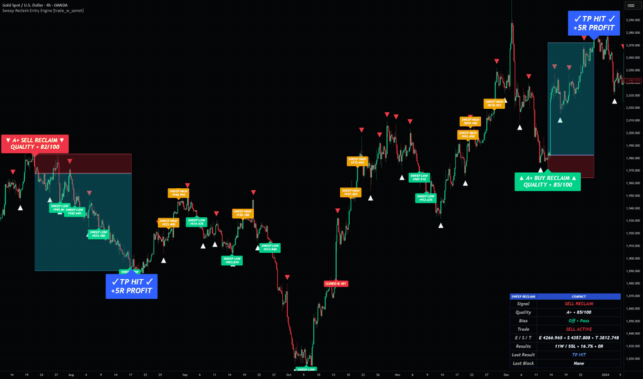
Variance Risk Premium OscillatorVariance Risk Premium Oscillator
What it does
The Variance Risk Premium Oscillator measures the gap between implied volatility (a volatility index such as India VIX) and realized volatility, scaled in standard-deviation (σ) units. That gap — the variance risk premium (VRP) — tells you whether option protection is currently rich (expensive, complacent) or cheap (underpriced, stressed). A vol-of-vol read is shown alongside as an instability gauge.
Why this is different (and original)
Most volatility tools on charts forecast or display realized volatility (ATR, standard-deviation bands, historical-vol plots). This one reads something different: the price of volatility insurance. Decades of research show implied volatility systematically exceeds the volatility that is subsequently realized, so the premium is, on average, positive — investors pay up for protection. When that premium stretches unusually high, protection is expensive and the crowd is complacent; when it collapses or turns negative, fear is being paid for and volatility is cheap. Presenting this premium as a clean, self-normalizing mean-reversion oscillator with a built-in edge test is what makes it original — it is not a realized-vol band and not a VIX plot.
How it works
Realized volatility = annualized standard deviation of log-returns over the chosen window.
Implied volatility = the volatility index you point it at.
VRP = Implied − Realized.
The VRP series is z-scored over the normalization window into the σ oscillator. Vol-of-vol (the standard deviation of the implied index) is tracked separately as an instability read in the dashboard.
How to use it
Above the upper (red) band = vol RICH / complacency — protection expensive.
Below the lower (green) band = vol CHEAP / stress — protection underpriced.
Turns out of an extreme (triangles) are the mean-reversion events: a turn up from the cheap zone often coincides with stress easing; a turn down from the rich zone with complacency ending.
Read the EDGE row. The harness checks whether, after a cheap-zone turn, price actually rallied (and after a rich-zone turn, faded) by ≥ k×ATR within the horizon, versus the unconditional Base %. EDGE = Hit − Base. If it is near zero on your market, the mean-reversion read is not paying there.
Settings guide
01 · Data & Volatility — implied-vol symbol, realized-vol length, annualization (252 for daily; bars-per-year for intraday), vol-of-vol length, universal price source.
02 · Normalization — z-score window, output smoothing.
03 · Calibration — horizon, favourable-move threshold (×ATR), base-rate window.
04 · Bands — stretch and extreme σ bands; divergence pivot.
05 · Display & Theme — visual style, regime tint, dashboard, colors.
Non-repaint
The implied-vol index is requested with lookahead_off and settles on its bar's close — no future leak.
Concept credit
Variance risk premium and its return predictability — Bakshi & Kapadia (2003); Carr & Wu (2009); Bollerslev, Tauchen & Zhou (2009); Coval & Shumway (2001).
Disclaimer
For research and education only. Not financial advice, not a recommendation, and not a guarantee of future results. A stretched premium does not guarantee reversion — regimes can stay rich or cheap for long stretches. All statistics are in-sample, close-to-close, and exclude costs. Do your own research and manage your own risk. 指標

Options Positioning OscillatorOptions Positioning Oscillator
What it does
The Options Positioning Oscillator is a single bounded line, scaled in standard-deviation (σ) units, that reads where derivatives positioning is leaning — risk-on (bullish) versus risk-off / hedged (bearish).
Most oscillators read price (RSI, Stochastic, MACD, etc.). This one deliberately does not. It reads the implied-volatility and futures-basis structure that sits underneath price, because hedging and positioning leave their footprint in the volatility surface and the cash-and-carry basis before they fully show up in price momentum. The output is one easy-to-read line with σ-banded extremes, so you can see at a glance whether positioning is neutral, leaning, or stretched.
Why these components are combined (mashup rationale)
This is not a bundle of unrelated indicators stacked for the sake of it. The three core legs are complementary, research-documented measurements of the same underlying quantity — the price of variance risk and the market's appetite for risk:
Implied-Volatility Rank — the level of implied vol within its own range (where fear sits historically).
Volatility Term-Structure — implied vol versus its own trend (the slope: calm/contango vs stressed/backwardation).
Futures Basis — the cash-and-carry premium or discount (demand and carry vs hedging pressure).
Each leg, on its own, is a noisy proxy for risk appetite. The academic literature shows each carries genuine information: implied volatility systematically exceeds subsequent realized volatility, producing a variance risk premium (Bakshi & Kapadia 2003; Carr & Wu 2009), and the shape/slope of the volatility term structure carries information about the price of variance risk that predicts volatility-asset returns incrementally to other proxies (Johnson 2017). Combining several noisy-but-informative proxies of one latent variable, on a common standardized scale, denoises any single proxy — a textbook signal-combination, which is exactly why the mashup is justified rather than arbitrary.
Two optional legs — Put-Call Ratio and Option Skew — extend the read for users who can supply that data as an external series. They are off by default because TradingView cannot natively pull live option-chain data; turning them on without a real source would feed price in their place, which would be wrong. The composite automatically re-balances around whatever legs are active.
How the components work together
Every leg is converted to a z-score on its native timeframe so they share one scale (the volatility legs are measured on a stable Daily timeframe by default, so "IV-rank" means the same thing whether you run a 5-minute or daily chart). The legs are sign-aligned so that up = bullish lean in every case:
high implied-vol level → bearish (subtracted)
steep/stressed term slope → bearish (subtracted)
premium futures basis → bullish (added)
They are then combined as a weighted average and lightly smoothed. The result is one line where positive = crowd leaning bullish/risk-on, negative = leaning bearish/hedged, and the dotted Extreme bands flag stretched positioning prone to mean-reversion.
How to use it
Read the level, not only the crosses. Above the +Lean band = bullish lean; below the −Lean band = bearish/hedged lean; beyond the dotted Extreme bands = stretched.
Turns out of an extreme (the triangles) are the actionable events — positioning unwinding from a stretched state.
Divergences (circles) warn when price and positioning disagree — e.g. price makes a higher high while positioning makes a lower high.
Read the EDGE row. The dashboard runs a live forward-return harness: for each turn it checks whether a favourable move (≥ k×ATR within the horizon) actually occurred, and compares that Hit % against the unconditional Base %. EDGE = Hit − Base is the only honest measure of whether the signal is doing anything on your instrument. If EDGE is near zero, the signal is not adding information on that market/timeframe — and the script tells you so.
Why it is original
It is not a re-skinned price oscillator. It is an options/volatility-native positioning gauge that (a) fuses the implied-vol level, term-structure slope, and futures basis into one standardized composite, (b) measures the volatility legs on a stable higher timeframe so the read is timeframe-consistent, and (c) ships with a built-in forward-return calibration harness that reports its own live edge instead of asking you to trust it. I am not aware of a published TradingView oscillator that combines these specific volatility-structure components with self-calibration.
Settings guide
01 · Data Sources — Cash, Futures and Implied-Vol-Index symbols (default NIFTY / NSE; change for any market), the timeframe for the volatility legs (default Daily), and a universal price source.
02 · Engine — IV-rank lookback, term mean length, normalization window, output smoothing.
03 · Component Weights — weight each leg; set a leg to 0 to drop it. Optional PCR / Skew legs (off by default; require external data).
04 · Calibration — horizon, favourable-move threshold (×ATR), base-rate window.
05 · Bands — Lean and Extreme σ bands; divergence pivot.
06 · Display & Theme — visual style (gradient area + glow / histogram / line), background regime tint, dashboard, colors.
Non-repaint
The volatility legs are requested with lookahead_off and settle on their bar's close — there is no future leak. Higher-timeframe values develop through the forming bar and confirm at its close, which is standard, intended behaviour.
Concept credit
Variance risk premium and its predictive content — Bakshi & Kapadia (2003); Carr & Wu (2009); Bollerslev, Tauchen & Zhou (2009).
Volatility term-structure slope and return predictability — Johnson, Risk Premia and the VIX Term Structure (2017).
Cash-and-carry futures basis — standard cost-of-carry theory.
Implied-volatility rank / percentile — established options-desk practice.
Disclaimer
For research and education only. This script is not financial advice, not a recommendation, and not a guarantee of future results. All statistics shown are in-sample, close-to-close, and exclude costs and slippage — a study aid, not a backtest. Do your own research and manage your own risk. 指標

Liquidity Void Zone Map [ZOM]Liquidity Void Zone Map is a clean imbalance and fair-value-gap style zone mapper built to highlight where displacement left thin liquidity behind.
What it shows:
- Bull and bear liquidity void bands built from three-candle imbalance geometry
- Capped zone height so the bands stay readable instead of becoming huge slabs
- Active, tapped, and broken-state tracking
- Reclaim/rejection retest marks when price revisits a void with directional confirmation
- A compact dashboard showing active bull/bear zones, tapped count, broken count, state, and best quality score
How I use it:
The bands are context, not standalone entries. I look for price to return into a void, then watch the reclaim/rejection behavior around the band while considering trend, volatility, and broader market structure. It is designed for ES/NQ/crypto/forex intraday structure reads, but it can be adapted to other liquid markets.
Open-source script. Educational tool only; not financial advice. 指標

Choppiness Keltner Pulse [ZOM]Choppiness Keltner Pulse is an open-source regime and continuation tool built around Choppiness Index contraction, Keltner reclaim/flush behavior, OBV pressure, and ATR thrust confirmation.
The idea is to identify moments when price is leaving a compressed or choppy state and beginning to move with cleaner directional participation. The glass channel visual shows Keltner pulse context, while price-anchored watch and confirmed markers keep signals attached to the chart when panning, zooming, scaling, or changing timeframes.
Core components:
- Choppiness Index regime / compression state
- Keltner reclaim and flush trigger logic
- OBV pressure confirmation
- ATR thrust / range expansion filter
- Cooldown-aware watch and confirmed signals
- Compact mini dashboard with mode, chop state, OBV pressure, trigger state, bias, and quality score
- Alerts for bullish and bearish watch/confirmed conditions
The Quality Score is a confluence read, not a prediction. It summarizes whether the current bar has enough regime, trigger, participation, thrust, and cooldown alignment to support the signal context.
This is not financial advice or a standalone trading system. Use it with structure, risk controls, and your own confirmation process. 指標

Auto8 3.0Auto8 3.0 is an automatic Fibonacci 1/8th Levels indicator (also known as Murrey Math Lines style). It dynamically calculates the highest high and lowest low over a user-defined lookback period (Fib Length, default 4096 bars), then divides that range into 8 equal parts. The script plots:
The 9 main levels (8/8 down to 0/8)
Several 1/16th intermediate lines
Upper and lower extensions (beyond the range)
Beautiful colored fills between each 1/8th zone
Clean right-side labels for every major level
It is fully automatic — it constantly updates as new highs/lows are made within the lookback window.
Main Use Cases:
High-Probability Support & Resistance
The 1/8th levels (especially 0/8, 2/8, 4/8, 6/8, 8/8) act as major psychological and institutional zones where price frequently reacts.
Market Structure & Bias Determination Price trading above 4/8 → Bullish structure
Price trading below 4/8 → Bearish structure
4/8 level often acts as a strong magnet (mean reversion point).
Zone Trading
Traders use the colored zones for:Buying in lower zones (1/8 – 3/8)
Selling in upper zones (5/8 – 7/8)
Breakout confirmation when price decisively breaks and holds a level
Very popular among Forex, Index, and Commodity traders on Daily, Weekly, and Monthly timeframes.
Key Strengths: Clean, visually appealing zone fills
Automatic — no manual drawing needed
Works on all instruments and timeframes
Good for identifying overextended moves (price at 8/8 or 0/8)
Typical Trading Style:
Swing trading, positional trading, and ICT/SMC traders who love Fair Value Gaps + Order Blocks + Fibonacci/Murrey levels.
指標