Delta Divergence [LliterH]█ WHAT IT DOES
Delta Divergence detects real-time divergences between price movement and intrabar delta across six simultaneous time windows. When price moves in one direction but the net aggressive volume points the other way, the dashboard flags it as a BULL or BEAR divergence — giving you a multi-timeframe view of hidden order flow in a single overlay.
• BULL — Price falling while delta is positive: absorption or hidden buying pressure
• BEAR — Price rising while delta is negative: distribution or hidden selling pressure
• OK — Price and delta are synchronized, no anomaly detected
█ HOW IT WORKS
Delta is approximated from intrabar candles using request.security_lower_tf(). Each sub-candle within your chart bar is classified as buy or sell volume based on its direction (close vs. open or close vs. previous close). The net difference — buy volume minus sell volume — is the delta.
This delta is then accumulated over six configurable rolling time windows (default: 1m, 3m, 5m, 15m, 30m, 1h). The indicator compares the price direction across each window against its cumulative delta. When they disagree, you have a divergence.
The dashboard updates every bar and shows four columns per window:
• TF — Time window label
• Vol — Total volume with a directional arrow (↗ rising, ▼ falling vs. prior window)
• Delta — Net buy minus sell volume (Δ) with sign
• Signal — BULL / BEAR / OK with duration counter in seconds
Confluence across three or more windows simultaneously is the highest-confidence signal this tool produces.
█ HOW TO USE IT
Step 1 — Identify confluence
A single window diverging is noise. Look for 3 or more windows showing the same signal at the same time. If the duration counter is growing on all of them, you are looking at sustained pressure — not a random fluctuation.
Step 2 — Read the duration
The number next to BULL or BEAR shows how many seconds the divergence has been active. A BULL signal held for 90+ seconds across the 1m, 3m, and 5m windows carries more weight than one that appeared two seconds ago.
Step 3 — Confirm with price context
This indicator does not generate entries by itself. Use it alongside your structure, support/resistance, or session bias. The ideal scenario: price approaches a key level, the dashboard shows confluence with growing duration, and volume is expanding (↗ arrow).
Step 4 — Use the alerts
Set the "Multi-Window Bull/Bear Confluence (3+)" alert to get notified without watching the dashboard. When the alert fires, check duration and volume, then apply your entry logic.
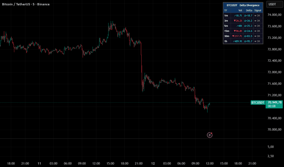
█ EXAMPLE SETUP — BTC/USDT 5m
• Chart: BTCUSDT 5-minute
• Lower TF input: 1m
• Price drops into a demand zone and stalls
• Dashboard shows BULL on 1m, 3m, and 5m windows
• Duration on all three is above 60 seconds and growing
• Vol column shows ↗ on the 1m and 3m windows
• This is the confluence picture worth acting on
█ SETTINGS
Delta Engine
• Lower TF — Must be below chart timeframe (e.g. 1m on a 5m chart)
• Classification method — Close vs Open or Close vs Prev Close
• Volume Assumption — Optional 40/60 split when only one side is recorded
• Min Delta / Min Price Change — Noise filters to suppress weak divergences
Time Windows
• Six independent windows, all configurable in seconds (default: 60, 180, 300, 900, 1800, 3600)
Dashboard
• Table position, text size, volume column toggle, duration toggle, symbol display
Colors
• Full control over bull, bear, neutral, background, and header colors
█ IMPORTANT NOTE
Delta in this indicator is approximated from candle direction — not from tick-by-tick order flow data. True delta requires exchange-level trade data that Pine Script does not provide without a Premium+ data feed using seconds-based timeframes. This tool is designed as a confluence and screening layer, not as a replacement for dedicated order flow platforms.
█ ALERTS
• Bull Divergence Detected — any window enters BULL state
• Bear Divergence Detected — any window enters BEAR state
• Multi-Window Bull Confluence (3+) — three or more windows in BULL simultaneously
• Multi-Window Bear Confluence (3+) — three or more windows in BEAR simultaneously
█ DISCLAIMER
This indicator is provided for educational and informational purposes only. It does not constitute financial, investment, or trading advice. Past performance is not indicative of future results. Trading involves substantial risk of loss and is not suitable for every investor. Always conduct your own research and consult a qualified financial professional before making any trading decisions. The author is not responsible for any losses incurred from the use of this tool 指標
指標

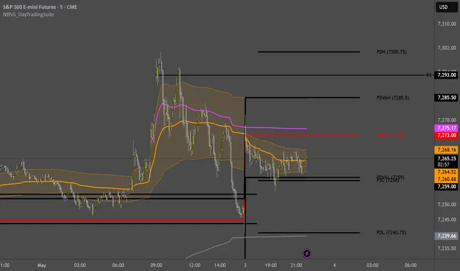
NBSG_DayTradingSuiteAn all-in-one day trading overlay designed by a futures trader for futures traders. It consolidates the key levels, anchored VWAPs, session volume profiles, and structural references that intraday traders typically spread across 3-5 separate indicators into a single, configurable script.
Built and defaulted for CME futures (ES, MES, NQ, MNQ, and similar instruments), but the session times are fully adjustable in settings. Traders on equities, crypto, or forex can adapt the indicator to their instrument by configuring the session windows to match their market's electronic trading hours.
The default session times are set for a trader operating in US Central Time (Chicago time). If you trade in a different timezone, adjust the session inputs accordingly.
This indicator is not a signal generator. It plots structure so you can make your own decisions.
FEATURES
Multiple Anchored VWAPs
The indicator plots two independent session-anchored VWAPs, each with optional standard deviation bands:
Overnight VWAP (VWAP 1) anchors at 17:00 CT (CME session open) and accumulates across the entire futures trading day through 16:00 CT. It resets cleanly each session. Optional 1SD and 2SD bands with fill show the statistical envelope around the developing VWAP.
NY Session VWAP (VWAP 2) anchors at 08:30 CT (Regular Trading Hours open) and accumulates through 16:00 CT. It includes a leapfrog mechanic: when the new RTH session begins, the prior session's VWAP is preserved and continues to plot as "Prev NY VWAP," giving you a reference for how price relates to yesterday's value during overnight trading.
Prev NY VWAP: This is the previous day's NY Session VWAP, which continues accumulating through the overnight session after the NY VWAP resets at 08:30. It provides a critical structural reference, particularly during the premarket and early RTH, showing where the prior session's volume-weighted equilibrium sits relative to current price. Many traders use the relationship between current price, the active NY VWAP, and the Prev NY VWAP to gauge directional bias.
All VWAPs use separate source, color, and line size settings.
Higher Timeframe VWAPs
Optional Weekly and Monthly VWAP overlays provide broader context without cluttering the chart. Disabled by default.
Session Volume Profiles (SVP)
Volume is distributed across the bar's high-low range using a configurable tick-based bin size (default: 2 ticks). The script calculates and plots:
Current Session SVP: POC and Value Area (VAH/VAL) for the active session, updating in real time.
Prior Day SVP: POC and Value Area from the previous completed session. These levels carry forward as horizontal references.
Last Week SVP: POC and Value Area from the prior completed week.
Each profile can be displayed as POC Only or POC + VA. The Value Area percentage is configurable (default: 70%).
Static Reference Levels
Prior Day High/Low (PDH/PDL): Previous day's range boundaries.
Last Week High/Low (LWH/LWL): Previous week's range boundaries.
Previous Session Close (PSC): The prior day's closing price.
Premarket High/Low (PMH/PML): Dynamically tracked during the 18:00-08:30 premarket session.
Opening Range (ORH/ORL): The first 15 minutes of RTH (08:30-08:45), with optional fill.
All static levels are individually togglable with independent color and size controls.
Deadzone
A configurable time window (default: 11:00-13:00 CT) highlighted with a background fill and border lines. This marks the midday period where volume and follow-through typically thin out on equity index futures. The time window is adjustable in settings.
Bar Coloring
Optional bar coloring based on the close's relationship to the three primary VWAPs (Overnight, NY, Prev NY). Bars are colored bullish when above 2 of 3, bearish when below 2 of 3, and neutral otherwise. Disabled by default.
Display Modes
A master display mode toggle lets you switch between:
Advanced All-Level: Shows everything you have enabled, the full suite.
Simplified VWAP: Strips the chart down to just the Overnight VWAP, NY VWAP, Prev NY VWAP, and Opening Range. All volume profiles, static levels, and the deadzone are automatically hidden. Useful for cleaner charts or when you want to focus purely on VWAP structure.
Labels
Every plotted level gets a text label with optional price display, offset to the right of the current bar for readability. Labels can be globally toggled on/off.
HOW TO USE
1. Add the indicator to your chart on an intraday timeframe (1m-30m recommended). It is defaulted for CME futures but can be adapted to any instrument by adjusting the session time inputs.
2. The default session times are built for US Central Time (Chicago). If your chart uses a different timezone, adjust the session inputs in the settings to match your market's session boundaries.
3. The default configuration shows most levels. Start by reviewing what each level represents, then toggle off anything that creates noise for your specific approach.
4. For cleaner charts, switch to "Simplified VWAP" mode, which isolates the core VWAP structure and Opening Range only.
CONFIGURATION
All session times, colors, line sizes, and visibility toggles are individually configurable. The settings are organized into numbered groups for clarity:
1. Master Display Mode
2. Session Times
3. NY VWAP Settings
4. Overnight VWAP Settings
5. Opening Range
6. Volume Profiles (SVP)
7. Static Levels
8. Higher Timeframe VWAPs
9. Deadzone
10. Bar Coloring
11. Labels
LIMITATIONS
The default session times are configured for CME futures with the standard 17:00-16:00 CT (close enough) session structure. If you are using this on equities, crypto, forex, or other instruments, you will need to adjust the session time inputs to match your market's electronic trading hours. The indicator will work on any instrument, but the session boundaries must be set correctly for accurate VWAP anchoring and level calculation.
This is a feature-rich script with multiple VWAPs, volume profiles, and level calculations running simultaneously. Tradingview handles it well the vast majority of the time, but on occasion the script may load slowly or display incompletely. If levels appear missing or the indicator looks off, a simple page refresh will typically resolve it.
The session volume profile uses a simplified volume distribution method (volume is evenly distributed across the bar's high-low range in tick-based bins). This is an approximation, not a tick-level volume profile. Accuracy improves on lower timeframes where bars have smaller ranges.
The Overnight VWAP session detection uses an hour-based reset (detecting when the bar's hour enters 17:00 in exchange time) rather than PineScript's built-in session boundary detection. This is intentional: on CME futures, the VWAP session (1700-1600) matches the instrument's native session, which prevents the standard session boundary method from firing correctly.
The deadzone time window relies on your chart's timezone setting. The default of 1100-1300 assumes US Central. Adjust if your chart uses a different timezone.
NOTES
This script is original work, but it stands on the shoulders of giants. The concepts and ideas behind it draw from numerous traders, educators, and open-source contributors who have freely shared their knowledge with the trading community. VWAP, volume profile, session levels, and opening range are not new ideas. What this script attempts to do is bring them together in a thoughtful, configurable way that reflects how an active futures day trader actually uses these tools in practice.
I built this for my own trading first. I am sharing it as open source because the open-source community on Tradingview gave me the foundation to learn, and this is my way of giving back what I have been given.
This is a structural tool, not a trading system. It does not generate buy/sell signals, alerts, or backtest results. Use it as a framework for building your own context around price action.
It's all risky, so you may as well make the bet.
指標

指標

AG Pro Anchored VWAP Event Map [AGPro Series]AG Pro Anchored VWAP Event Map
Overview / What it does
AG Pro Anchored VWAP Event Map is an overlay built to organize price action around Anchored VWAP after a meaningful starting point has been defined. Instead of treating VWAP as a single static reference, this script focuses on the relationship between price and a chosen anchor, then maps how the market behaves after that anchor is established. The goal is not to forecast price, but to make post-anchor structure easier to read in a consistent visual framework.
The script supports three anchor paths: Open, Swing, and Event. Open mode can reset the anchor from a daily, weekly, or monthly opening context. Swing mode rebuilds the anchor from a confirmed pivot high or pivot low. Event mode is designed for expansion-type situations and can anchor from a range expansion, a volume spike, or a breakout impulse. This creates a flexible workflow for traders who want to study how price responds to AVWAP under different structural conditions without switching tools.
Once the anchor is set, the script plots the Anchored VWAP, builds a distance band around it, tracks reclaim and reject behavior, and summarizes the current post-anchor bias in a compact panel. The result is a clean event map that can be used to study acceptance, rejection, recovery, or continuation around an anchored reference level. It is meant to simplify interpretation, not replace market context.
A key design goal of this script is clarity. The visual package is intentionally structured so the anchor, AVWAP path, distance zone, signal labels, and bias panel can be read together without turning the chart into a dense signal board. In practice, that means the indicator is most useful when it is treated as a contextual decision-support tool rather than a standalone trigger engine.
Unique Edge
The main distinction of this script is that it is not built as a generic VWAP overlay. Its emphasis is on post-anchor behavior. That means the visual logic starts from the selected anchor event and then evaluates how price interacts with the anchored VWAP afterward. In other words, the anchor is not only a starting point for the line itself; it is the center of the script's interpretation model.
Another differentiator is the combination of multiple anchor sources within one workflow. Traders can use opening-session logic, confirmed swing logic, or event-driven logic depending on the type of market behavior they are studying. This makes the indicator suitable for different styles of chart review while keeping the interface straightforward.
The distance band adds a second layer of structure. Rather than reading only the AVWAP line, users can also see whether price is operating close to the reference, stretched around it, or reacting from the upper or lower band zone. This helps frame whether a move appears to be re-accepting the anchored average, rejecting away from it, or trading in a more extended state.
The script also tries to keep the signal layer readable through selective label logic. Reclaim and reject markers are not intended to flood the chart. They are there to mark notable interactions with the anchored framework, while the panel provides a compact summary of the active anchor, current bias, distance, and latest signal state.
Methodology
The script begins by defining an anchor source. In Open mode, the anchor can be tied to a daily, weekly, or monthly opening transition. In Swing mode, the script waits for a confirmed pivot high or pivot low based on the selected swing length. In Event mode, the anchor is created only when a qualifying market event appears according to the selected event model.
For event-based anchoring, the script can use one of three internal conditions. Range Expansion looks for directional range behavior relative to ATR and recent structure. Volume Spike looks for directional participation with higher-than-average volume and a meaningful candle body fraction. Breakout Impulse looks for directional movement through recent extremes with supportive range and volume characteristics. These are practical anchor candidates for traders who want the AVWAP to begin from a meaningful change in behavior rather than from a calendar reset.
After the anchor is created, the script calculates Anchored VWAP using cumulative price-volume data relative to that anchor point. From there, it builds a distance band around the AVWAP. The band can be defined by ATR or percentage mode, depending on whether the user prefers a volatility-based or proportional framework.
Post-anchor bias is then derived from a simple internal score. The script evaluates whether price is above or below AVWAP, whether the AVWAP slope is improving or weakening, and whether price is trading beyond the distance band. This produces a practical Bullish, Bearish, or Neutral state. The intention is not to compress market structure into a perfect score, but to provide a compact directional read that can be used alongside the chart.
Reclaim and reject logic is based on how price interacts with the AVWAP and the surrounding band after the anchor is active. A reclaim highlights price moving back through the anchored reference with confirmation, while a reject highlights failure or pushback behavior around the band area. These events are intended as structural observations rather than guaranteed trade setups.
Signals & Alerts
The script includes reclaim and reject signal logic for both directions. These labels are designed to call attention to notable interactions with the anchored framework after the selected anchor becomes active. In practical use, reclaim behavior can be interpreted as a sign that price is attempting to re-establish acceptance relative to AVWAP, while reject behavior can suggest rejection away from the mapped zone.
Because market structure can become noisy, the script also includes signal spacing and density controls to reduce repetitive label clutter. This is especially relevant when anchored conditions remain active for long periods and price repeatedly tests the same area. The goal is to preserve readability while still marking relevant interactions.
Alert conditions are included for bullish reclaim, bearish reclaim, bullish reject, bearish reject, and a broader any-signal state. These alerts are deterministic within the script's ruleset, but they should still be used as workflow tools rather than interpreted as self-sufficient trading instructions.
Key Inputs
Anchor Source:
Choose whether the indicator should anchor from Open, Swing, or Event logic.
Open Anchor Type:
In Open mode, select daily, weekly, or monthly opening context.
Swing Length:
Controls how confirmed pivot highs and lows are detected in Swing mode.
Event Type:
In Event mode, choose between Range Expansion, Volume Spike, or Breakout Impulse as the anchor trigger model.
Event Lookback / Multipliers / Cooldown:
These inputs control how strict the event selection becomes and how frequently new event anchors can appear.
Band Mode:
Switch between ATR-based and percentage-based distance bands.
ATR Band Multiplier / Percent Band:
Define the width of the distance zone around Anchored VWAP.
Signal Density:
Helps regulate how aggressively reclaim and reject labels are displayed.
Panel and Label Size:
Allows the visual layout to remain readable across different chart styles and screen sizes.
Show Anchor Label / Show Anchor Level / Show Bias Ribbon:
These toggles control the visibility of anchor-focused visual elements and optional bias coloring.
Limitations & Transparency
This script is an interpretation aid. It does not identify the single correct anchor for all market environments. Different anchor choices can lead to different AVWAP paths, different reclaim or reject readings, and different conclusions. That is normal, and it is one of the reasons the script provides multiple anchor modes.
Event-based anchors depend on internal threshold logic such as ATR expansion, volume conditions, and breakout behavior. On some symbols or timeframes, those filters may trigger more frequently or less frequently than expected. Users may need to adjust event sensitivity and band settings to fit the market they are analyzing.
Reclaim and reject states are rule-based. They are not a guarantee of continuation, reversal, or follow-through. In sideways conditions, repeated AVWAP interactions can occur without producing a sustained directional move. The script can help organize those interactions visually, but it cannot remove market uncertainty.
The post-anchor bias is intentionally simplified. It is designed for readability, not for complete market classification. It should be read together with broader price structure, higher-timeframe context, liquidity conditions, and user-defined execution rules.
Risk Disclosure
This indicator is for chart analysis and workflow support. It does not provide financial advice, investment advice, or guaranteed outcomes. Markets involve risk, and any trading or investing decision remains the sole responsibility of the user.
No indicator can remove uncertainty from live markets. Anchored VWAP, reclaim behavior, reject behavior, and bias states are analytical references only. They should be validated with independent judgment, risk management, and broader market context before being used in any decision-making process.
Use this script as a structured visualization tool, not as a promise of performance or a substitute for disciplined trade planning.
指標

[SSS] ATR x Trend x Volume Signals# ATR x Trend x Volume Signals
---
## ENGLISH
ATR x Trend x Volume Signals is a multi-factor, non-repainting indicator that combines volatility structure, trend direction, and volume expansion into a single decision-support framework. It is primarily designed for futures trading on the Moscow Exchange (MOEX), but can be adapted to any instrument with sufficient volume data. It is built for traders who rely on technical confluence and prefer clear, rule-based setups with built-in position sizing.
🎯 **Purpose**
This tool identifies high-probability moments when three independent analytical layers — ATR-based volatility, CCI-driven higher-timeframe trend, and statistical volume analysis — all align. It helps filter out market noise and focus attention on clean, actionable conditions.
⚙️ **Structure**
The indicator consists of three core analytical layers plus supporting modules:
1️⃣ **ATR Trailing Stop (Dual Layer)** — Two adaptive ATR trailing lines (fast and slow) define the volatility envelope. The fast trail (optional display) responds quickly to price changes, while the slow trail acts as the primary trend filter and dynamic stop-loss reference. When the fast trail is above the slow trail, the structure is bullish (green); otherwise bearish (red).
2️⃣ **Trend Indicator (CCI + ATR, Higher Timeframe)** — A CCI-based directional filter combined with ATR smoothing, calculated on a user-defined higher timeframe. It determines the dominant trend and reduces false signal flips. The indicator uses a confirmed-bar anti-repaint pattern (` ` + `lookahead_on`) to ensure values are locked to the last closed HTF bar and never change retroactively.
3️⃣ **Volume Analysis (Statistical Deviation)** — Volume is evaluated against its historical moving average using standard deviation bands. Bars are classified into three tiers:
- 🟡 Medium volume (> 1.0 σ)
- 🟠 High volume (> 2.5 σ)
- 🔴 Extra-high volume (> 4.0 σ)
All thresholds are fully configurable.
💡 **Signal Logic**
A **Buy Signal** 🟢 appears when ALL of the following conditions are met simultaneously:
- The ATR structure is bullish (fast trail > slow trail).
- The Trend Indicator is blue (CCI ≥ 0 on the higher timeframe).
- A bullish candle closes above both the slow ATR trail and the Trend Indicator line.
- The bar shows at least medium volume (≥ 1.0 σ above average).
- The current bar is within the user-defined trading session.
A **Sell Signal** 🔴 appears when:
- The ATR structure is bearish (fast trail < slow trail).
- The Trend Indicator is red (CCI < 0 on the higher timeframe).
- A bearish candle closes below both the slow ATR trail and the Trend Indicator line.
- The bar shows at least medium volume (≥ 1.0 σ above average).
- The current bar is within the user-defined trading session.
**One signal per ATR phase:** Only one Buy or Sell signal can fire per ATR trend cycle. A new signal is generated only after the ATR direction changes and all conditions re-align.
❌ **Exit Logic**
Exit markers (cross symbols) appear when price crosses the slow ATR trailing line after an entry. This simulates a trailing-stop exit. The exit is suppressed on the entry bar itself to prevent same-bar false exits. A small percentage offset (0.07%) is applied to reduce noise-triggered exits.
⏰ **Session Filter**
Signals are generated only between user-defined start and end times (default: 14:00–18:00 chart time). This allows traders to restrict signal generation to their preferred active trading hours. Additionally, the chart background can be colored to visually separate session zones:
- 🟦 Cold session (default 00:00–14:00)
- 🟩 Work session (default 14:00–18:00)
- 🟥 Hot session (default 18:00–23:59)
📐 **Position Sizing Module**
A built-in position sizing table (bottom-right corner) calculates in real time:
- Risk amount in account currency based on account capital and risk percentage.
- Effective stop distance = ATR stop % + user-defined buffer %.
- Number of contracts (rounded down to whole number).
- Actual risk in currency and as percentage of account.
- Separate row for the last signal's position size at the moment of signal occurrence.
All parameters (account capital, point value, risk %, ATR buffer %) are configurable via inputs.
📊 **ATR TP Table**
A second table (bottom-left corner) displays the current ATR percentage distance from the close to the slow trail, along with calculated take-profit levels at 0.5×, 1×, 1.5×, 2×, and 3× the ATR distance. Each TP level can be individually shown or hidden.
🔔 **Alerts**
The indicator supports TradingView alerts for Buy and Sell signals. Each alert message includes: entry price, stop-loss price, ATR stop %, effective stop (ATR + buffer) %, position size in contracts, and all five TP levels.
🛡️ **Non-Repainting Design**
- The Trend Indicator uses the standard Pine Script anti-repaint pattern: `request.security()` with `lookahead = barmerge.lookahead_on` combined with ` ` offset, ensuring only confirmed (closed) HTF bar data is used.
- All signals are evaluated at bar close (`alert.freq_once_per_bar_close`).
- No future data is referenced at any point.
🧠 **Key Features**
- Dual ATR trailing stop (fast + slow) for volatility structure
- CCI-based higher-timeframe trend filtering (non-repainting)
- Statistical volume deviation heatmap (3 tiers)
- Session-restricted signal generation with visual background zones
- Dynamic trailing-stop exit system
- Built-in position sizing calculator with ATR buffer
- Multi-level take-profit reference table
- Alert-ready with full trade context
- Fully configurable inputs
- Pine Script v6
📈 **Usage Tips**
- For best results, set the Trend Indicator timeframe higher than the chart timeframe (e.g., chart on 1 min → Trend Indicator on 15 min; chart on 5 min → Trend Indicator on 1 hour).
- Combine with support/resistance levels, market structure, or higher-timeframe confirmation for additional context.
- Adjust volume thresholds based on the instrument's typical volume profile.
- Use the position sizing table to maintain consistent risk management across trades.
🔧 **Configurable Parameters**
Almost every aspect of the indicator can be customized through the Settings/Inputs panel:
*ATR Trailing Stop:* Fast ATR Period and Multiplier, Slow ATR Period and Multiplier, option to show/hide the fast trail line.
*Trend Indicator:* Higher timeframe selection, CCI Period, ATR Multiplier and Period for the trend calculation, option to show/hide.
*Volume Analysis:* MA Length, StdDev Length, and three threshold levels (Medium, High, Extra-High) — adjust these to match the volume profile of your instrument. Option to show/hide bar coloring.
*Session Filter:* Signal Start/End time, three session zones (Cold/Work/Hot) with independent start/end times and background colors — all customizable to your exchange schedule.
*Position Sizing:* Account Capital (RUB), Point Value (RUB), Risk per Trade (%), ATR Buffer (%) — these drive the real-time position sizing table.
*TP Table:* Each take-profit level (TP0.5, TP1, TP1.5, TP2, TP3) can be individually shown or hidden. Text size for both tables is selectable.
This flexibility allows the indicator to be tuned for different instruments, timeframes, and trading styles without modifying the code.
💰 **Recommended Risk and Money Management**
It is strongly recommended to use a structured risk and money management system with multi-step exits:
*Risk per trade:* 1% of account capital. The built-in position sizing module calculates the exact number of contracts for this risk level automatically.
*Multi-step exit system:*
- **0.5R reached** — move the stop-loss to breakeven (entry price). This eliminates the risk on the trade.
- **1R reached** — close half of the position to lock in profit. For the remaining half, choose one of two approaches depending on the results of your own backtesting: either trail the stop using the slow ATR line, or hold for a fixed R-multiple target (e.g., 1.5R, 2R, or 3R).
The TP table on the chart displays all these R-levels in real time, making it easy to plan exits visually. Past performance does not guarantee future results — always validate any exit strategy with your own backtesting before trading live.
📈 **Credits**
Inspired by:
- ATR Trailing Stop by Ceyhun
- Trend Magic by Kivanc Ozbilgic
- Heatmap Volume by xdecow
---
## РУССКИЙ
ATR x Trend x Volume Signals — это мультифакторный индикатор без перерисовки, объединяющий анализ волатильности, направления тренда и объёма в единую систему принятия решений. Индикатор предназначен в первую очередь для торговли фьючерсами на Московской бирже (MOEX), но может быть адаптирован для любого инструмента с достаточными данными по объёму. Создан для трейдеров, использующих техническую конфлюэнцию и предпочитающих чёткие, основанные на правилах торговые сетапы со встроенным расчётом позиции.
🎯 **Назначение**
Инструмент определяет моменты высокой вероятности, когда три независимых аналитических слоя — волатильность на основе ATR, тренд на старшем таймфрейме через CCI и статистический анализ объёма — совпадают одновременно. Это помогает отфильтровать рыночный шум и сосредоточиться на чистых, пригодных для торговли условиях.
⚙️ **Структура**
Индикатор состоит из трёх основных аналитических слоёв и вспомогательных модулей:
1️⃣ **ATR Trailing Stop (двойной)** — Две адаптивные линии ATR (быстрая и медленная) формируют контур волатильности. Быстрая линия (отображение опционально) реагирует на цену оперативно, медленная служит основным трендовым фильтром и динамическим уровнем стоп-лосса. Когда быстрая линия выше медленной — структура бычья (зелёная), иначе — медвежья (красная).
2️⃣ **Trend Indicator (CCI + ATR, старший таймфрейм)** — Направленный фильтр на основе CCI в сочетании со сглаживанием ATR, рассчитываемый на заданном пользователем старшем таймфрейме. Определяет доминирующий тренд и снижает ложные переключения. Используется стандартный анти-репейнт паттерн Pine Script (` ` + `lookahead_on`), что гарантирует использование только данных последнего закрытого бара старшего ТФ без ретроспективных изменений.
3️⃣ **Анализ объёма (статистическое отклонение)** — Объём оценивается относительно исторического среднего с помощью стандартного отклонения. Бары классифицируются на три уровня:
- 🟡 Средний объём (> 1.0 σ)
- 🟠 Высокий объём (> 2.5 σ)
- 🔴 Сверхвысокий объём (> 4.0 σ)
Все пороги полностью настраиваемы.
💡 **Логика сигналов**
**Сигнал на покупку** 🟢 появляется при одновременном выполнении ВСЕХ условий:
- Структура ATR бычья (быстрая линия > медленной).
- Trend Indicator синий (CCI ≥ 0 на старшем таймфрейме).
- Бычья свеча закрывается выше медленной линии ATR и линии Trend Indicator.
- Бар показывает как минимум средний объём (≥ 1.0 σ выше среднего).
- Текущий бар находится в пределах заданной торговой сессии.
**Сигнал на продажу** 🔴 появляется при:
- Структура ATR медвежья (быстрая линия < медленной).
- Trend Indicator красный (CCI < 0 на старшем таймфрейме).
- Медвежья свеча закрывается ниже медленной линии ATR и линии Trend Indicator.
- Бар показывает как минимум средний объём (≥ 1.0 σ выше среднего).
- Текущий бар находится в пределах заданной торговой сессии.
**Один сигнал за фазу ATR:** Только один Buy или Sell сигнал может сработать за один цикл тренда ATR. Новый сигнал генерируется только после смены направления ATR и повторного совпадения всех условий.
❌ **Логика выхода**
Маркеры выхода (крестики) появляются при пересечении ценой медленной линии ATR после входа. Это имитирует выход по трейлинг-стопу. Выход подавляется на баре входа для предотвращения ложных закрытий. Применяется небольшой процентный отступ (0.07%) для снижения шумовых срабатываний.
⏰ **Фильтр по сессиям**
Сигналы генерируются только в пределах заданного временного окна (по умолчанию: 14:00–18:00 по времени графика). Это позволяет ограничить генерацию сигналов активными торговыми часами. Дополнительно фон графика может окрашиваться для визуального разделения сессий:
- 🟦 Холодная сессия (по умолчанию 00:00–14:00)
- 🟩 Рабочая сессия (по умолчанию 14:00–18:00)
- 🟥 Горячая сессия (по умолчанию 18:00–23:59)
📐 **Модуль расчёта позиции**
Встроенная таблица расчёта позиции (правый нижний угол) рассчитывает в реальном времени:
- Сумму риска в валюте счёта на основе капитала и процента риска.
- Эффективное расстояние до стопа = ATR стоп % + пользовательский буфер %.
- Количество контрактов (округление вниз до целого числа).
- Фактический риск в валюте и в процентах от счёта.
- Отдельная строка с размером позиции последнего сигнала на момент его возникновения.
Все параметры (капитал, стоимость пункта, % риска, буфер ATR) настраиваются через входные данные.
📊 **Таблица ATR TP**
Вторая таблица (левый нижний угол) отображает текущее процентное расстояние ATR от цены закрытия до медленной линии, а также рассчитанные уровни тейк-профита: 0.5×, 1×, 1.5×, 2× и 3× от ATR-расстояния. Каждый уровень TP можно включить или скрыть индивидуально.
🔔 **Алерты**
Индикатор поддерживает алерты TradingView для сигналов Buy и Sell. Каждое сообщение алерта содержит: цену входа, цену стоп-лосса, ATR стоп %, эффективный стоп (ATR + буфер) %, размер позиции в контрактах и все пять уровней TP.
🛡️ **Защита от перерисовки**
- Trend Indicator использует стандартный анти-репейнт паттерн Pine Script: `request.security()` с `lookahead = barmerge.lookahead_on` в сочетании со сдвигом ` `, что гарантирует использование только подтверждённых (закрытых) данных старшего ТФ.
- Все сигналы оцениваются на закрытии бара (`alert.freq_once_per_bar_close`).
- Будущие данные не используются ни в одном месте кода.
🧠 **Основные возможности**
- Двойной ATR trailing stop (быстрый + медленный) для структуры волатильности
- Трендовый фильтр на CCI со старшего таймфрейма (без перерисовки)
- Тепловая карта объёма по статистическому отклонению (3 уровня)
- Генерация сигналов с ограничением по сессии и визуальным фоном
- Динамическая система выхода по трейлинг-стопу
- Встроенный калькулятор размера позиции с ATR-буфером
- Многоуровневая справочная таблица тейк-профитов
- Готовые алерты с полным торговым контекстом
- Полностью настраиваемые параметры
- Pine Script v6
📈 **Рекомендации по использованию**
- Для лучших результатов устанавливайте таймфрейм Trend Indicator выше таймфрейма графика (например: график на 1 мин → Trend Indicator на 15 мин; график на 5 мин → Trend Indicator на 1 час).
- Комбинируйте с уровнями поддержки/сопротивления, рыночной структурой или подтверждением со старшего таймфрейма.
- Настраивайте пороги объёма в зависимости от типичного профиля объёма инструмента.
- Используйте таблицу расчёта позиции для поддержания последовательного управления рисками.
🔧 **Настраиваемые параметры**
Практически каждый аспект индикатора можно настроить через панель Настройки/Аргументы:
*ATR Trailing Stop:* Период и множитель быстрого ATR, период и множитель медленного ATR, возможность показать/скрыть быструю линию.
*Trend Indicator:* Выбор старшего таймфрейма, период CCI, множитель и период ATR для расчёта тренда, возможность показать/скрыть.
*Анализ объёма:* Длина MA, длина StdDev и три порога (средний, высокий, сверхвысокий) — настраивайте их под профиль объёма вашего инструмента. Возможность показать/скрыть окраску баров.
*Фильтр сессий:* Время начала/окончания сигналов, три зоны сессий (холодная/рабочая/горячая) с независимыми временами начала/окончания и цветами фона — всё настраивается под расписание вашей биржи.
*Расчёт позиции:* Капитал счёта (RUB), стоимость пункта (RUB), риск на сделку (%), буфер ATR (%) — эти параметры управляют таблицей расчёта позиции в реальном времени.
*Таблица TP:* Каждый уровень тейк-профита (TP0.5, TP1, TP1.5, TP2, TP3) можно индивидуально показать или скрыть. Размер текста обеих таблиц выбирается отдельно.
Эта гибкость позволяет адаптировать индикатор под различные инструменты, таймфреймы и торговые стили без изменения кода.
💰 **Рекомендуемый риск- и мани-менеджмент**
Настоятельно рекомендуется использовать структурированную систему управления рисками и капиталом с многоступенчатыми выходами:
*Риск на сделку:* 1% от капитала счёта. Встроенный модуль расчёта позиции автоматически вычисляет точное количество контрактов для этого уровня риска.
*Многоступенчатая система выходов:*
- **Достигнут 0.5R** — перевод стоп-лосса в безубыток (цена входа). Это полностью устраняет риск по сделке.
- **Достигнут 1R** — фиксация половины позиции для закрепления прибыли. Для оставшейся части выберите один из двух подходов в зависимости от результатов вашего собственного бэктеста: либо трейлинг стопа по медленной линии ATR, либо удержание до фиксированного R-мультипла (например, 1.5R, 2R или 3R).
Таблица TP на графике отображает все эти R-уровни в реальном времени, что позволяет визуально планировать выходы. Прошлые результаты не гарантируют будущих — всегда проверяйте любую стратегию выхода собственным бэктестом перед реальной торговлей.
📈 **Благодарности**
Создано на основе идей:
- ATR Trailing Stop — Ceyhun
- Trend Magic — Kivanc Ozbilgic
- Heatmap Volume — xdecow 指標

Focus Bars [Kioseff Trading]Hello Traders!
🔹 Focus Bars
Focus Bars is a lower-timeframe reconstruction tool designed to break each candle into a price-based internal structure .
Instead of viewing a bar as a single OHLC print, this tool redistributes intrabar participation across price levels, showing where activity, delta, and directional pressure concentrated inside the bar itself .
Think of it as a way to look inside the candle .
intrabar participation distributed by price level
buy vs sell pressure mapped inside each bar
delta-driven visualization of internal structure
volume-based or delta-based profile sizing
stacked recent bars for direct comparison
lower timeframe reconstruction of candle internals (up to 1 tick)
🔹 What the tool shows
🔸 Focus Bar Structure
Each visible bar is reconstructed using lower timeframe data and divided into configurable price rows.
This allows the script to build an internal map of activity inside the candle, showing how participation distributed throughout its range.
This helps reveal:
where activity concentrated inside the bar
which price regions attracted the most interaction
how the bar built from low to high
🔸 Directional participation
The script estimates directional pressure using lower timeframe price movement and distributes that pressure across the bar’s traded range.
This allows you to observe:
where buying pressure was strongest
where selling pressure dominated
how directional activity distributed through the candle
Instead of treating the candle as one net result, Focus Bars breaks it into a layered participation structure .
🔸 Volume mode
In its default form, the profile width reflects total intrabar participation at each price level.
This helps identify:
high activity zones inside the bar
areas where the market spent more effort
internal high-interest regions
This mode focuses on where the bar traded most actively , regardless of which side was dominant.
🔸 Delta Bars mode
When Delta Bars mode is enabled, the visualization shifts from general activity to directional imbalance .
Positive delta levels extend one way, while negative delta levels extend the other, helping expose where directional pressure accumulated inside the bar.
This makes it easier to see:
which prices were dominated by buyers
which prices were dominated by sellers
where internal imbalance became most extreme
This mode is about pressure and imbalance , not just participation.
🔸 Recent bar stacking
The script displays multiple recent reconstructed bars side by side, allowing you to compare internal structure across the most recent candles.
This helps reveal:
whether participation is shifting higher or lower
whether recent bars are building similarly or differently
how internal pressure changes from one bar to the next
Rather than looking at candles in isolation, you get a stacked structural view of recent bar development.
🔸 Price-row resolution
Each bar is divided into a configurable number of rows.
Higher row counts provide finer structural detail, while lower row counts simplify the visualization.
This lets you control the balance between:
detail
clarity
performance
🔸 Lower timeframe reconstruction
The script uses lower timeframe data to estimate how participation distributed through each candle.
Granularity can be selected between:
1-minute
1-second
1-tick
This allows the internal structure to become more detailed as lower granularity data becomes available.
🔸 Buy / sell volume labels
Each price row includes separate displayed values for:
sell-side participation
buy-side participation
This gives a direct read on how activity distributed at each level, rather than relying only on color or profile width.
🔸 Gradient-based intensity
Color gradients help represent the magnitude of participation and directional pressure at each price level.
This makes it easier to spot:
high-intensity zones
low-interest areas
strong directional concentrations
Stronger color intensity reflects stronger internal participation or imbalance.
🔹 How to read it
Each component gives a different layer of information:
Candle body / wick → the outer structure of the bar
Profile width → where participation concentrated
Delta mode → where directional imbalance built
Buy / sell labels → how each side contributed at a level
Stacking → how internal structure changes bar to bar
🔹 Why this tool is useful
It gives you:
a way to look inside candles instead of only at candle outcomes
price-based intrabar participation mapping
clear visualization of internal volume and delta structure
context for where buying or selling pressure concentrated
a deeper structural view of recent bar development
🔹 Best use cases
analyzing internal candle structure
comparing recent bars side by side
spotting hidden participation concentrations
finding where directional pressure built inside a move
adding lower-timeframe context to bar-by-bar analysis
🔹 Important note
This tool uses lower timeframe data to reconstruct intrabar structure.
This means:
it is an approximation of internal order flow
accuracy depends on available lower timeframe data
selected granularity impacts precision
different symbols and data feeds may produce different levels of detail
🔹 Inputs you can customize
The script includes flexible controls such as:
granularity selection
bar count to display
row resolution
volume mode vs Delta Bars mode
color customization
display offset
Closing Notes
Focus Bars is built to shift the focus from how a candle finished to how it developed internally .
It helps reveal not just what the bar looked like from the outside, but where participation and pressure were concentrated inside it .
Thank you for checking it out!
指標

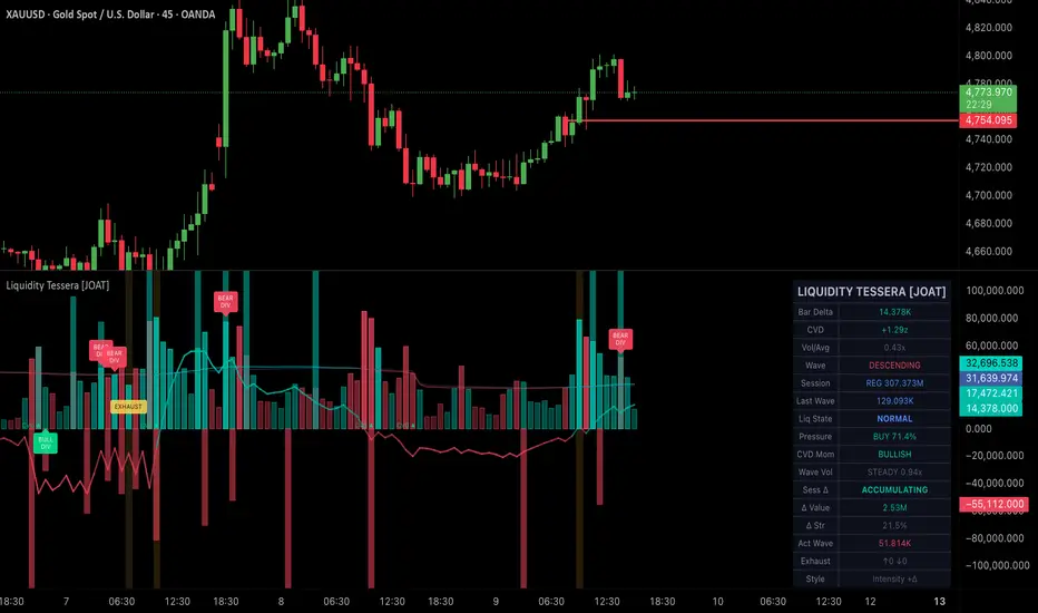
Liquidity Tessera [JOAT]Liquidity Tessera
Introduction
Liquidity Tessera is an advanced open-source volume intelligence pane that fuses Cumulative Volume Delta (CVD), Weis Wave volume clustering, multi-design intensity bars, volume absorption and climax detection, CVD momentum ribbon, liquidity exhaustion tracking, session-partitioned delta accumulation, and a comprehensive 16-row dashboard into a unified volume analysis system. This indicator transforms raw volume data into actionable intelligence about who controls the market — buyers or sellers — and whether that control is strengthening or weakening.
Standard volume indicators show you how much trading occurred. Liquidity Tessera shows you the character of that trading: whether volume is flowing in or out (CVD), whether volume waves are expanding or contracting (Weis Wave), whether institutions are absorbing supply or distributing into demand (absorption detection), and whether a move is reaching climactic exhaustion (climax and exhaustion signals). The indicator operates in its own pane below the price chart, providing a complete volume intelligence layer without cluttering price action.
Core Concepts
1. Cumulative Volume Delta (CVD)
CVD approximates the net buying and selling pressure by assigning each bar's volume as positive (buying) when the close is above the open, and negative (selling) when the close is below the open:
float barDelta = close > open ? volume : close < open ? -volume : 0.0
var float cvdRaw = 0.0
cvdRaw := nz(cvdRaw ) + barDelta
The cumulative sum of these deltas creates a running total of net order flow. Rising CVD indicates net buying pressure is accumulating; falling CVD indicates net selling pressure. The indicator offers optional normalization using a z-score approach (CVD relative to its rolling mean and standard deviation), which makes CVD comparable across different instruments and timeframes.
CVD divergences from price are particularly significant: when price makes a new high but CVD does not confirm (it stays below its recent high), it suggests the rally lacks genuine buying conviction and may be vulnerable to reversal.
2. Weis Wave Volume Clustering
The Weis Wave method groups volume into directional waves. Rather than looking at volume bar-by-bar, it accumulates volume during each directional swing. A wave reversal is triggered when price moves against the current wave direction by more than a configurable ATR-based threshold:
float waveThreshold = ta.atr(waveAtrLen) * waveAtrMul
// When price reverses by more than the threshold, the wave completes
// and accumulated volume is plotted as a single wave column
This reveals the Wyckoff-style volume pattern: are up-waves attracting more volume than down-waves (accumulation), or are down-waves attracting more volume (distribution)? The indicator tracks wave history and detects divergences between price swings and their corresponding wave volumes.
3. Volume Absorption Detection
Institutional absorption occurs when large players absorb selling pressure (or buying pressure) without allowing price to move significantly. The indicator detects this by identifying bars where volume is extremely high relative to average (above the configurable threshold, default 2x) but the price range is unusually small (below 50% of average range):
High volume + small range = someone is absorbing the opposite side's orders
This often occurs at the end of trends when institutions are building positions against the prevailing direction
Absorption bars are highlighted with a distinct amethyst color and labeled "ABS" on the chart.
4. Volume Climax Detection
A volume climax occurs when extreme volume (above the configurable threshold, default 3x average) coincides with a reversal candle pattern — specifically, a bar with a large wick-to-body ratio (wick > 2x body). This combination suggests that a massive influx of orders met strong opposition, creating a potential turning point. Climax bars are highlighted in fuchsia and labeled "CLIMAX."
5. Liquidity Exhaustion Tracking
The indicator tracks consecutive Weis Waves where volume declines from wave to wave. When two or more consecutive waves in the same direction show declining volume, it signals exhaustion — the trend is running out of fuel. This is a classic Wyckoff concept: a trend sustained by decreasing volume is unsustainable.
6. Delta Intensity Bar Coloring
Rather than simple up/down coloring, the indicator offers gradient-based bar coloring where the intensity of the color reflects the strength of the bar's delta relative to average volume:
float deltaStr = math.min(math.abs(barDelta) / volMA, 2.0) / 2.0
// Weak delta = faint color, strong delta = vivid color
baseCol := color.from_gradient(deltaStr, 0, 1,
color.new(TESS_INFLOW, 65), color.new(TESS_INFLOW, 0))
This means a green bar with faint color had weak buying conviction, while a vivid green bar had strong buying conviction — information not available from standard volume bars.
7. CVD Momentum Ribbon
A fast and slow EMA of the raw CVD create a momentum ribbon. When the fast CVD EMA is above the slow, delta momentum is bullish (buying pressure is accelerating). Crossovers between the two indicate shifts in delta momentum direction.
Features
Four Bar Design Modes: Solid (standard filled bars), Hollow (outline only), Intensity (transparency scales with volume relative to average), and Glass (semi-transparent with a stepline cap) — each providing a different visual emphasis
Weis Wave Histogram: Background columns showing completed wave volumes, colored by wave direction. Up-wave volumes plot above zero, down-wave volumes below
CVD Overlay: The cumulative delta line scaled to fit the volume pane, with gradient coloring from bearish (red) to bullish (teal) based on CVD value
Session Volume Accumulation: Separate tracking of pre-market, regular, and post-market session volumes and deltas, with session background coloring
Delta Pressure Score: A 0-100 percentage measuring net buying pressure over the last 20 bars. Above 60 = buy pressure dominant, below 40 = sell pressure dominant
Wave Volume Comparison: Real-time comparison of the current wave's volume against the previous wave, classified as Expanding, Steady, or Contracting
Liquidity State Classification: Categorizes the current bar as Absorption, Climax, Exhaustion, Spike, Dry-Up, or Normal based on the composite of all detection systems
Volume Spike Detection: Identifies bars where volume exceeds 2.5x average with a background highlight
Session Delta Bias: Tracks whether the current session's cumulative delta is net accumulating or distributing
16-Row Dashboard: Displays bar delta, CVD state, volume ratio, wave direction, session volumes, last wave volume, liquidity state, delta pressure, CVD momentum, wave volume comparison, session delta bias, delta strength, active wave volume, exhaustion counts, and bar style
Input Parameters
Cumulative Delta:
CVD Smoothing: EMA period for CVD smoothing (default: 14)
Normalize CVD: Toggle z-score normalization for cross-asset comparability (default: on)
CVD Ribbon Fast/Slow: EMA periods for the momentum ribbon (default: 8/21)
Wave Volume:
Wave ATR Multiplier: Threshold for wave reversal detection (default: 1.5)
Wave ATR Length: ATR period for wave threshold (default: 14)
Signals:
Absorption Vol Threshold: Volume multiple for absorption detection (default: 2.0)
Climax Vol Threshold: Volume multiple for climax detection (default: 3.0)
Toggles for wave divergence, absorption, climax, and exhaustion signals
Visuals:
Bar Style: Solid, Hollow, Intensity, or Glass (default: Intensity)
Toggles for delta intensity coloring, wave histogram, CVD overlay, CVD ribbon, session background, and dashboard
How to Use This Indicator
Step 1: Read the Liquidity State
Check the dashboard's Liquidity State. "Absorption" at support suggests institutions are buying. "Climax" after an extended move suggests a potential turning point. "Exhaustion" means the trend is losing volume fuel. "Normal" means standard conditions apply.
Step 2: Monitor CVD Direction
Rising CVD confirms uptrends; falling CVD confirms downtrends. CVD diverging from price is a warning sign. If price is making new highs but CVD is flat or declining, the rally may lack genuine buying support.
Step 3: Compare Wave Volumes
In a healthy uptrend, up-wave volumes should be larger than down-wave volumes. If down-wave volumes start exceeding up-wave volumes while price is still rising, distribution may be occurring. The Wave Volume Comparison metric in the dashboard tracks this automatically.
Step 4: Use Delta Pressure for Bias
The Delta Pressure score (0-100) provides a quick read on who controls the last 20 bars. Above 60 = buyers dominate. Below 40 = sellers dominate. Between 40-60 = balanced/contested.
Step 5: Watch for Signal Clusters
The most significant moments occur when multiple signals cluster: an absorption bar followed by a wave divergence during an exhaustion phase, for example, creates a high-conviction reversal setup. Single signals in isolation are less reliable.
Indicator Limitations
The CVD approximation (close > open = buying, close < open = selling) is a simplification. True order flow data requires Level 2/DOM data not available in Pine Script. This approximation works reasonably well on liquid instruments but is inherently imprecise
Volume data quality varies significantly across instruments and data providers. Forex "volume" is typically tick count, not actual traded volume. Crypto volume may include wash trading. The indicator's effectiveness depends on the quality of the underlying volume data
Weis Wave reversal detection depends on the ATR threshold parameter. Too small a threshold produces too many waves (noise); too large produces too few (missing genuine reversals). The optimal setting varies by instrument and timeframe
Absorption and climax detection use fixed ratio thresholds. What constitutes "extreme" volume varies across instruments and market conditions. The thresholds may need adjustment
Session volume tracking uses TradingView's built-in session detection, which may not align perfectly with all exchanges or instruments
The indicator operates in a separate pane and cannot overlay directly on price. Cross-referencing signals with price action requires visual comparison between panes
Originality Statement
This indicator is original in its comprehensive fusion of multiple volume analysis methodologies into a unified intelligence pane. While individual components (CVD, Weis Wave, volume absorption) exist separately, this indicator is justified because:
The integration of CVD, Weis Wave clustering, absorption detection, climax detection, and exhaustion tracking into a single system provides layered volume intelligence not available in any single existing indicator
The delta intensity bar coloring system uses gradient transparency based on delta strength, providing conviction information within the volume bars themselves
The liquidity state classification system synthesizes all detection subsystems into a single categorical assessment of current market conditions
Session-partitioned delta tracking reveals whether accumulation or distribution is occurring within specific market sessions
The CVD momentum ribbon provides a trend-following overlay on the delta data, identifying shifts in buying/selling momentum
Four distinct bar design modes (Solid, Hollow, Intensity, Glass) offer visual flexibility for different analysis preferences
Wave volume comparison with expanding/contracting classification automates Wyckoff-style wave analysis
Disclaimer
This indicator is provided for educational and informational purposes only. It is not financial advice or a recommendation to buy or sell any financial instrument. Trading involves substantial risk of loss. Volume analysis provides context about market participation but does not predict future price direction. Absorption, climax, and exhaustion signals are probabilistic patterns that can and do fail. CVD approximations are not equivalent to true order flow data. Always use proper risk management and conduct your own analysis. The author is not responsible for any losses incurred from using this indicator.
-Made with passion by officialjackofalltrades
指標

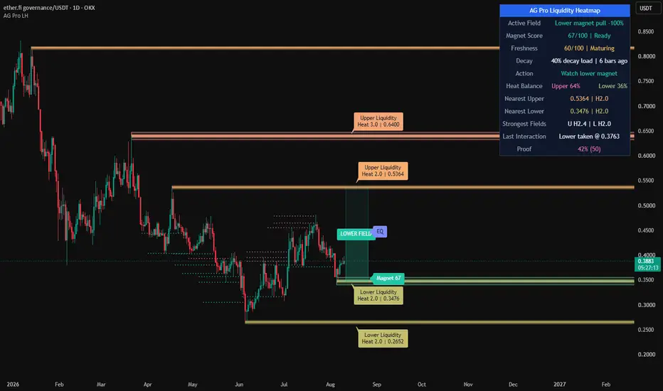
AG Pro Liquidity Heatmap [AGPro Series]AG Pro Liquidity Heatmap
Overview / What it does
AG Pro Liquidity Heatmap is a visual liquidity-mapping tool designed to project areas where resting stop interest is more likely to be concentrated. Instead of focusing on a single pattern or a one-bar signal, this script builds a forward-looking heatmap from clustered pivot behavior and displays that information as persistent horizontal liquidity bands on the chart.
The core idea is simple: repeated reactions around similar price levels often create zones where traders place stops, breakout orders, or defensive exits. When those levels begin to cluster, they can become structurally important. This script converts that clustering behavior into a heat score and renders it as layered Fire / Ice bands so traders can quickly identify where liquidity concentration may be building above or below current price.
The script is not built as a prediction engine, and it does not attempt to claim where price must go next. Its purpose is to help traders organize the chart, monitor the nearest active liquidity bands, and understand which nearby levels appear more saturated, more persistent, or already mitigated. In that sense, it is best used as a market-structure context tool rather than as a standalone entry model.
This script is also intentionally different from traditional support/resistance overlays, breakout detectors, and liquidity sweep labels. It does not merely mark recent highs and lows. It clusters pivot-derived levels, weights them into a dynamic heat score, extends them cleanly to the right side of the chart, and then updates or extinguishes them as price interacts with those zones.
Unique Edge
The unique edge of this script is that it treats liquidity as a developing field rather than a static line. A normal horizontal level script may show one prior high or one prior low. AG Pro Liquidity Heatmap instead tracks repeated pivot concentration, merges nearby levels into composite zones, scores those zones, and then visualizes the result as a layered heat structure.
A second differentiator is the lifecycle logic. Once a band has been interacted with, the script does not leave every level unchanged forever. Depending on the selected behavior, a zone can fade or be removed after liquidity is taken. This helps reduce visual clutter and keeps the chart focused on currently relevant liquidity structures rather than a permanently accumulating archive of old levels.
A third differentiator is presentation. The script is designed to produce a clean forward projection area with right-extending heat bands, readable labels, Fire / Ice theme control, a functional heatmap panel, and an optional EQ Magnet line that tracks the balance area between the nearest active upper and lower liquidity bands. The goal is not only analytical clarity, but also a chart layout that remains readable during live use.
Methodology
1) Pivot detection
The script first identifies pivot highs and pivot lows using user-defined left and right pivot lengths. These pivots are treated as candidate liquidity reference points.
2) Cluster merging
If a new pivot forms close enough to an existing level, based on an ATR-driven merge distance, the script merges that information into the existing zone rather than creating unnecessary duplication. This allows nearby pivots to accumulate into a stronger composite band.
3) Heat scoring
Each zone receives a heat score. Repeated clustering increases that score. When volume weighting is enabled, pivots formed with relatively stronger volume can contribute more heavily to the final score. This does not reveal actual order book liquidity, but it can provide a useful proxy for where market attention and stop concentration may be stronger.
4) Layered rendering
Each active zone is rendered as a multi-layer horizontal band. The band thickness and saturation scale with heat score, which makes stronger zones visually heavier than weaker ones. This helps the chart communicate intensity without requiring the user to read every value manually.
5) Liquidity lifecycle
When price reaches a zone, the script can either fade it or remove it depending on the selected extinguish mode. Optional mitigation tracking can leave a visual reminder of where liquidity was taken. This behavior is important because it keeps the heatmap adaptive rather than static.
6) Balance tracking
When both upper and lower active liquidity bands are available, the script can display an EQ Magnet line between the nearest bands. This is not a target call. It is a contextual balance reference that can help visualize the midpoint of the currently nearest active liquidity field.
States & Visual Elements
- Fire bands represent upper liquidity concentration derived from pivot highs.
- Ice bands represent lower liquidity concentration derived from pivot lows.
- Stronger zones become visually denser and more prominent as heat score rises.
- Zone labels display side, heat score, and price information in either compact or detailed mode.
- The Heatmap Panel summarizes active band count, nearest zones, strongest zones, heat balance, last sweep information, and the current extinguish behavior.
- The EQ Magnet line highlights the midpoint between the nearest active upper and lower bands when enabled.
- Optional mitigation tracks can remain on the chart after liquidity is taken.
How to use it
This script is generally most useful as a context layer.
Many traders may choose to use it in one of three ways:
- to map where price may interact with nearby liquidity concentration,
- to judge whether the closest active field is above or below current price,
- to avoid taking impulsive decisions directly into dense opposing liquidity.
The script can also be useful for chart organization. Traders who already use trend tools, structure tools, or trigger models may use the heatmap as a location filter. For example, a setup forming directly into a strong opposing liquidity band may deserve more caution than a setup developing in cleaner space.
Key Inputs
Pivot Left / Right Bars
Controls how pivots are detected. Smaller values can produce more frequent zones; larger values can make the structure more selective.
Cluster Merge Distance (ATR)
Defines how close pivots must be to merge into the same liquidity band. Lower values keep zones more separated; higher values create broader clustering.
Volume-Weighted Mode
Allows higher-volume pivots to contribute more strongly to heat score. This is a proxy weighting mechanism, not direct order-flow confirmation.
Minimum Heat Score To Show
Filters out weaker zones from the visual display.
Visual Saturation Score
Controls how quickly the visual intensity reaches its maximum appearance.
Base Band Height and Horizontal Band Density
Shape the visual footprint of each zone and determine how rich or minimal the rendered band structure appears.
Label controls
Allow the user to choose label mode, font size, theme, label offsets, and label density.
Panel controls
Allow the user to change panel visibility, location, theme, and font size.
Liquidity Taken Behavior
Determines whether mitigated zones fade or are removed.
Limitations & Transparency
This script does not access order book data, exchange liquidation feeds, or hidden liquidity information. The displayed heatmap is derived from chart-based pivot clustering and optional volume weighting. For that reason, the bands should be understood as technical liquidity proxies rather than direct measurements of real resting orders.
The heat score is also relative to the script's own internal logic. It is a ranking mechanism inside this model, not an absolute market-wide score. A higher score means a zone has accumulated more structural weight within the selected settings; it does not guarantee a reaction.
Like any chart tool based on pivots, the behavior of the script depends on the chosen timeframe, the selected sensitivity inputs, and the structure of the instrument being analyzed. Lower timeframes can create more noise, while higher timeframes can produce fewer but broader zones.
The EQ Magnet line is a contextual midpoint reference only. It should not be interpreted as a fixed target, a required destination, or a directional forecast.
Risk Disclosure
This script is a visual analysis tool for chart study and trade planning. It is not financial advice, not an execution system, and not a promise of future price behavior. Liquidity zones can fail, be overrun, or be ignored by price entirely.
No indicator should be used in isolation. Traders should consider market structure, volatility, risk management, execution quality, and their own process before making trading decisions. Always test settings carefully and use position sizing appropriate to your own risk tolerance.
指標

指標

指標

AG Pro Trend Continuation Quality [AGPro Series]AG Pro Trend Continuation Quality
Overview / What it does
AG Pro Trend Continuation Quality is an overlay built to evaluate whether a pullback is behaving like a healthy retracement inside an active trend, or whether the move is losing structural quality before continuation can develop.
Instead of treating every dip in an uptrend or every pop in a downtrend as equally important, the script isolates pullback sequences and scores them through a continuation-quality framework. The goal is not to predict every next candle. The goal is to help traders judge whether the market is showing disciplined retracement behavior that often precedes trend continuation.
The model combines trend alignment, pullback depth, pullback duration, relative volume behavior during the retracement, and the strength of the bounce candle that attempts to resume the trend. These conditions are translated into a compact quality score so the user can quickly separate cleaner continuation structures from weaker ones.
On the chart, the script highlights pullback zones, tracks the retracement box, displays a continuation-quality label, and maintains an information panel that summarizes trend state, recent quality readings, best quality, average quality, and internal distribution data. The result is a workflow-oriented continuation map rather than a simple trend-following overlay.
Unique Edge
The distinctive part of this script is that it does not label trend continuation from trend direction alone. A bullish EMA stack or bearish EMA stack is not enough by itself. The script specifically evaluates the quality of the retracement before the continuation attempt is scored.
That makes it meaningfully different from basic EMA trend tools, pullback highlighters, or single-condition continuation signals. Many tools can say that price is above or below an average. Fewer tools attempt to measure whether the internal anatomy of the pullback remains constructive for continuation.
The scoring engine focuses on five practical questions:
1. Is the broader trend aligned?
2. Is the pullback still structurally controlled rather than excessively deep?
3. Did the retracement last a reasonable number of bars?
4. Did volume contract during the pullback instead of expanding aggressively against trend?
5. Did the bounce show enough intent to suggest renewed directional participation?
This creates a cleaner framework for evaluating continuation setups in a way that is visual, systematic, and easier to compare across multiple pullbacks on the same chart.
Methodology
The script first determines directional context using EMA alignment and, when needed, swing-structure logic. This creates a working trend state that frames whether the script should be looking for bullish or bearish pullback behavior.
Once a directional leg is active, the script begins tracking a pullback when price retraces against that trend. During the retracement, it measures:
- how far the pullback travels relative to the prior trend leg,
- how many bars the pullback lasts,
- how pullback volume compares with the prior expansion leg,
- and whether the bounce candle shows convincing re-engagement.
These components are translated into a 0 to 10 quality score. Higher scores represent more orderly and structurally coherent pullbacks. Lower scores represent weaker or more suspect retracements.
The visual output is designed to make those evaluations easier to read in real time:
- pullback boxes frame the retracement zone,
- optional fib-depth line shows the deepest retracement point tracked inside the pullback,
- labels display score, quality grade, depth, duration, and relative volume,
- panel metrics summarize the current continuation environment.
Signals & Alerts
The script is designed as a quality-mapping tool, not as an automatic trade system.
Its event logic revolves around the completion of a pullback and the appearance of a bounce candle that attempts to resume the trend. When that bounce qualifies, the script calculates the final continuation-quality score and can display the setup if it meets the user-defined minimum score threshold.
Available workflow signals include:
- active bullish or bearish trend state,
- pullback in progress,
- completed pullback with scored continuation attempt,
- high-quality continuation events when the score reaches stronger thresholds.
Optional alerts can be used for:
- high-quality continuation conditions,
- or any scored pullback event, depending on user preference.
Because alerts are tied to the script’s scoring and confirmation logic, they are intended to support chart review and decision-making rather than act as guaranteed execution instructions.
Key Inputs
EMA Fast Length / EMA Mid Length / EMA Slow Length
These define the trend stack used to frame directional bias.
Swing Pivot Length
Controls the swing-structure sensitivity used in secondary trend detection.
Max Pullback Depth (%)
Defines how strict the script is when assessing whether a retracement remains healthy relative to the prior trend leg.
Min Pullback Bars / Max Pullback Bars
Controls the acceptable pullback duration window.
Volume Decline Ratio
Helps determine whether the retracement is occurring on lighter activity relative to the prior directional leg.
Minimum Score to Display
Filters weaker continuation events from the chart.
Label Size / Label Offset / Reduce Label Overlap
Lets the user adapt chart readability to their own zoom level and instrument volatility.
Panel Position / Panel Font Size / Panel Theme
Allows the continuation dashboard to be integrated into different chart layouts without dominating screen space.
Limitations & Transparency
This script does not know future market intent. It evaluates observable price and volume behavior after conditions form on the chart.
A high score does not guarantee continuation. It only indicates that the completed pullback meets the script’s internal definition of stronger continuation quality relative to other pullbacks.
The model is also sensitive to market regime. Trend continuation behavior tends to be clearer in directional markets and less reliable in highly compressed, erratic, or news-driven conditions.
Volume behavior can vary across instruments and data feeds. On some assets, especially where volume data is synthetic, limited, or structurally uneven, the volume component should be interpreted with caution.
Like other structure-based tools, this script can produce different practical usefulness depending on timeframe, instrument, volatility regime, and chart cleanliness. Users should calibrate inputs based on the market they are studying rather than treating defaults as universal settings.
This script should not be viewed as:
- a prediction engine,
- a standalone trade system,
- a replacement for risk management,
- or a guarantee that a bounce will develop into a full continuation leg.
Risk Disclosure
This script is for chart analysis and educational use. It is designed to help users study pullback quality inside established trends, not to provide financial, investment, or trading advice.
All trading and investing involve risk. Market conditions can change quickly, and even high-quality continuation structures can fail. Users should apply their own confirmation process, position sizing rules, and risk controls before acting on any market observation.
Use the script as a structured continuation framework, not as certainty.
指標

AG Pro Reversal Pattern Quality Scanner [AGPro Series]AG Pro Reversal Pattern Quality Scanner
Overview / What it does
AG Pro Reversal Pattern Quality Scanner is an overlay tool designed to detect and visualize selected classical reversal structures directly on the chart while adding a structured quality layer to each valid setup. The script focuses on four widely recognized reversal formations: Double Top, Double Bottom, Head & Shoulders, and Inverse Head & Shoulders.
Instead of marking every possible structural resemblance, the script applies a filtered detection workflow based on pivot structure, pattern width, peak or trough equality, pullback depth, neckline logic, and an internal quality model. The goal is not simply to identify a shape, but to highlight formations that display more balanced structure and more usable context.
Each detected pattern can be displayed with a pattern box, a projected neckline, and a quality label that summarizes the pattern type, directional bias, quality score, and grade. This makes the script suitable for traders who want a structured visual map of potential reversal zones rather than a raw pattern-highlighting tool with no ranking logic.
The indicator is built for chart reading and workflow support. It does not attempt to forecast future price movement with certainty, and it should not be interpreted as a standalone trade system. Its role is to help users organize reversal structures, compare them visually, and focus on higher-quality formations when reviewing price action.
Unique Edge
The main distinction of this script is that it does not treat all reversal patterns as equivalent. A detected pattern is further evaluated through a composite quality framework that considers structural symmetry, pullback depth, and volume behavior during formation and break conditions.
For Double Top and Double Bottom structures, the script checks whether the two peaks or troughs remain sufficiently close to each other within a defined tolerance and whether the intermediate pullback is large enough to make the structure meaningful. For Head & Shoulders and Inverse Head & Shoulders structures, the script evaluates shoulder symmetry, time symmetry, and relative positioning of the head against the shoulders.
The volume component is not used as a promise of confirmation. It is used as an additional contextual factor inside the quality score. In general terms, contracting volume during formation and stronger participation during the break candidate can improve the overall score when those conditions are present.
Another important part of the design is visual prioritization. The script does not only draw the structure. It also attempts to keep the chart readable by organizing labels, neckline extensions, and pattern boxes in a way that preserves interpretation. The result is a cleaner reversal-pattern map that aims to be more practical than a simple shape detector.
Methodology
The script begins with swing pivot detection. These pivots act as the structural foundation for all pattern candidates. Once enough pivot highs and lows are available, the script evaluates whether recent pivot sequences fit the requirements of one of the supported reversal structures.
For Double Top detection, the script checks whether two recent highs are similar enough, whether the interim low forms a valid neckline reference, whether the pattern width stays within defined limits, and whether price has broken below the neckline. For Double Bottom detection, the logic is mirrored on the bullish side through two similar lows, an interim high as the neckline reference, and a bullish break condition above that neckline.
For Head & Shoulders detection, the script evaluates a sequence of three pivot highs where the middle high must exceed the two shoulders. It then estimates neckline structure from the lows between those highs and applies symmetry and pullback checks before accepting the setup. Inverse Head & Shoulders applies the same structural concept in reverse using pivot lows.
After a valid break condition is detected, the script calculates a composite quality score. This score is based on user-controlled weights for volume behavior, symmetry, and pullback depth. The final output is normalized into a 1 to 10 quality scale, then translated into a grade label for easier scanning.
Signals & Alerts
The script can generate pattern-based alert conditions for:
- Double Top
- Double Bottom
- Head & Shoulders
- Inverse Head & Shoulders
These alerts are tied to the script’s internal structural conditions and neckline break logic. As with any chart-based alert workflow, users should confirm that the selected settings match their market, timeframe, and execution style.
Visual output can include:
- Pattern boxes
- Neckline lines
- Neckline labels
- Pattern quality labels
- Break candle highlighting
- Information panel with detection statistics
The quality label is intended to summarize the detected structure, not to guarantee outcome quality. A higher score means the pattern aligned more closely with the script’s internal criteria. It does not mean the setup must succeed.
Key Inputs
The script includes adjustable inputs for both detection behavior and presentation. Key controls include:
- Swing Pivot Length
- Peak / Trough Equality tolerance
- Minimum Pullback Between Peaks or Troughs
- Minimum and Maximum Pattern Width
- Minimum Quality to Display
- Weighting of volume, symmetry, and pullback depth inside the quality score
- Box, neckline, and pattern-label visibility
- Global label size
- Panel font size
- Panel position
- Neckline extension length
- Pattern-specific alert toggles
These controls make it possible to adapt the scanner to different chart densities, volatility profiles, and personal visual preferences.
Limitations & Transparency
This indicator is a rule-based pattern scanner. It is not a predictive engine, and it does not claim that all detected formations will lead to continuation or reversal. Classical chart structures can fail, invalidate, or behave differently depending on volatility, trend strength, liquidity conditions, timeframe, and broader market context.
Pattern recognition on live charts is inherently sensitive to pivot settings and bar structure. Small changes in pivot length, equality tolerance, or minimum pullback can materially change how many formations appear. Because of that, users should treat the script as a configurable analytical framework rather than a universal template.
The quality score is an internal ranking model built from the script’s own criteria. It is meant to help compare setups inside the same framework. It should not be interpreted as an objective probability model, a performance promise, or a substitute for independent trade management.
Volume analysis also depends on the reliability and characteristics of the symbol’s reported data. On some instruments, volume may be less informative or behave differently than expected. Users should evaluate this in the context of their own market.
Risk Disclosure
This script is provided for chart analysis, workflow organization, and educational use. It does not provide financial advice, investment advice, or guaranteed trade signals. All trading and investment decisions remain the sole responsibility of the user.
Reversal patterns can fail even when they appear clean and well-structured. Breaks can reverse, neckline moves can trap participants, and high-scoring formations can still underperform. Risk management, confirmation process, position sizing, and overall strategy design remain essential.
Use this tool as a structured visual aid inside a broader decision-making process, not as a standalone reason to enter or exit a position. 指標

AG Pro Inside Bar Breakout Quality [AGPro Series]AG Pro Inside Bar Breakout Quality
Overview / What it does
AG Pro Inside Bar Breakout Quality is an overlay tool built to study one of the market’s most familiar compression structures: the inside bar. Instead of stopping at simple detection, the script evaluates what happens after the pattern forms and grades the breakout attempt with a structured quality model. The result is a workflow-oriented view of inside bar compression, breakout strength, and failed continuation behavior.
The script first identifies a strict inside bar condition, where the current bar remains fully contained within the previous bar’s range. That parent range becomes the active reference zone. From there, the script monitors whether price resolves above or below the structure, whether the move is confirmed by close, whether volume supports the breakout, and whether the breakout later fails and re-enters the range within a user-defined window.
This is not designed as a generic “any breakout” marker. Its purpose is narrower and more specific: it focuses on a compact volatility contraction event, then measures how decisively price leaves that compression. In practical chart work, this helps separate a low-commitment range poke from a more convincing expansion move.
The visual presentation is intentionally structured. Inside bar zones are boxed, breakout direction is marked, quality is scored, and fakeouts are labeled when the breakout reverses back into the monitored range. This makes the script suitable for traders who want a cleaner way to inspect inside bar behavior without manually drawing every structure.
Unique Edge
The main difference here is that the script does not treat every inside bar break as equally meaningful. Many tools stop at “pattern detected” or “level broken.” This script adds a second layer: breakout quality. That layer is derived from close position, volume context, candle body participation, and alignment with the parent candle’s directional bias.
A second differentiator is the built-in fakeout logic. After a breakout is detected, the script continues to watch price for a limited number of bars. If the move quickly returns back through the breakout boundary, the event is tagged as a fakeout. This adds post-event context instead of only marking the first directional move.
Another distinction is that the methodology is deterministic and chart-native. The logic is rule-based, visible, and reproducible from bar to bar. Users can decide whether to require close confirmation beyond the inside bar range, whether to require volume confirmation, and how strict they want the displayed threshold to be through the minimum score filter.
In short, this script is not only about finding compression. It is about ranking the quality of the expansion attempt that follows the compression, while also acknowledging that some breakouts fail quickly and should be read differently.
Methodology
1) Inside Bar Detection
An inside bar is identified when the current bar’s high is lower than the previous bar’s high and the current bar’s low is higher than the previous bar’s low. This creates a strict containment definition based on the previous candle’s full range.
2) Reference Zone
Once an inside bar is detected, the prior candle becomes the parent reference bar. Its high and low define the active breakout boundaries. That range can be visualized as a box, with an optional midpoint line to make the compression zone easier to read on chart.
3) Breakout Confirmation
A bullish breakout occurs when price moves above the parent high. A bearish breakout occurs when price moves below the parent low. Users can choose whether breakout confirmation should be based on close beyond the range or on a less restrictive intrabar break condition.
4) Quality Score
Each breakout can be scored on a 0–10 scale. The score is built from multiple components:
- close position relative to the inside bar boundary
- volume ratio versus the selected moving average
- body participation within the breakout candle’s total range
- directional alignment between the breakout and the parent candle bias
This scoring model is designed to estimate how committed the breakout candle appears, rather than assuming all breaks have equal informational value.
5) Fakeout Detection
If enabled, the script monitors a user-defined number of bars after breakout. A bullish breakout that returns back below the upper boundary within that window is labeled as a bull trap / fakeout. A bearish breakout that returns back above the lower boundary within that window is labeled as a bear trap / fakeout.
6) Visual Layer
The script can display the inside bar zone, midpoint, breakout arrows, score labels, and fakeout markers. A summary panel tracks aggregate statistics such as total inside bars, total breakouts, breakout direction counts, fakeouts, and the latest breakout score.
Signals & Alerts
The script can provide alert conditions for:
- bullish inside bar breakout
- bearish inside bar breakout
- fakeout detection
- high-quality breakout events
- any breakout event
These alerts are intended to help users monitor the pattern and its resolution more efficiently. They do not replace trade planning, confirmation from broader market context, or independent risk management.
Key Inputs
Min Score to Show Breakout
Filters displayed breakout labels by quality threshold. This can be useful for reducing low-quality visual noise.
Volume Confirmation Required
When enabled, breakout evaluation requires volume to be above its moving average threshold. This can help remove low-participation breaks.
Volume MA Period
Defines the lookback length for average volume comparison.
Require Close Beyond IB
When enabled, breakout confirmation depends on bar close beyond the parent range. This creates a more conservative and more stable breakout definition.
Max IBs to Display
Controls how many recent structures and related objects remain visible on chart.
Show IB Box / Midline / Breakout Arrow / Score Label
Lets users decide how much visual detail they want to keep on screen.
Glow Effect on High Score
Adds emphasis to stronger breakout events without changing the underlying logic.
Fakeout Window
Defines how many bars after breakout the script should continue monitoring for a return back through the breakout boundary.
Limitations & Transparency
This script studies inside bar compression and subsequent breakout behavior. It does not claim to identify all meaningful consolidations, and it does not attempt to classify every market regime. The methodology is intentionally focused on one structure.
The score is a rule-based quality model, not an objective measure of future outcome. A high score does not guarantee continuation, and a lower score does not guarantee failure. It simply reflects how the breakout candle and its context behave according to the script’s internal criteria.
Volume-based interpretation may vary across symbols and markets. On some instruments, especially those with inconsistent or synthetic volume data, volume confirmation may be less informative than on others. Users should evaluate whether volume filtering is appropriate for the asset they are studying.
Fakeout detection is also definition-dependent. The script labels a fakeout when price returns through the breakout boundary within the selected lookback window. Different traders may prefer a different timing window or a different failure definition.
As with any overlay, chart readability depends on market volatility, timeframe, and user settings. On lower timeframes or during highly active periods, more visual events may appear. The built-in filters and display controls are there to help manage that density.
Risk Disclosure
This script is an analytical tool for chart study. It is not financial advice, not a trade recommendation, and not a promise of future results.
Inside bar breakouts can behave differently across timeframes, instruments, and market regimes. Users should not rely on a single pattern, score, or alert in isolation. Context still matters, including trend condition, liquidity environment, nearby structure, volatility regime, and execution discipline.
Before using this script in any live decision process, it should be reviewed in the specific market and timeframe relevant to the user’s own approach. Testing, observation, and risk controls remain essential.
指標

AG Pro Pin Bar Quality Filter [AGPro Series]AG Pro Pin Bar Quality Filter
Overview / What it does
AG Pro Pin Bar Quality Filter is a price-action overlay built to detect pin bar candles and then separate higher-quality rejection candles from weaker or noisier ones.
The script does not treat every long-wick candle as equally meaningful. Instead, it evaluates the internal candle structure first, then applies a compact quality framework around volume, recent momentum, and local support/resistance context. The result is a filtered pin bar workflow designed for traders who want cleaner chart annotation rather than a raw pattern dump.
This tool focuses on one specific job: identifying rejection candles with a measurable structure and presenting them with a readable quality label directly on the chart. It is intended to help users inspect potential reaction points, not to replace broader market context or execution rules.
The visual design is intentionally simple at the core: pin bar body highlighting, wick emphasis, directional markers, and compact quality labels. This makes the script suitable for traders who want candle-based context without converting the chart into a full market-structure dashboard.
Unique Edge
The distinctive feature of this script is that it does not stop at pattern detection.
A standard pin bar script often marks candles only because they have a long wick. This script goes further by checking whether the wick is large enough relative to the body, whether the body itself is small enough relative to the full candle range, and whether one wick clearly dominates the other. That combination helps reduce ambiguous candles that visually resemble pin bars but do not express clean rejection.
After the structural test, the script applies a three-part quality model:
- volume confirmation
- momentum context
- support/resistance proximity
This creates a practical quality hierarchy rather than a binary pattern label. In other words, the script is not only asking “Is this a pin bar?” but also “How much contextual support does this pin bar have?”
An optional piercing check is also available for users who want stricter validation. This adds another layer of selectivity by requiring the candle body to show stronger positional behavior relative to the prior bar.
Methodology
The script starts by measuring the current candle:
- candle body size
- full candle range
- upper wick length
- lower wick length
- dominant wick versus body ratio
A raw pin bar candidate requires:
- a minimum wick/body ratio
- a maximum body percentage of full range
- directional wick dominance
This helps define whether the candle is a legitimate bullish or bearish rejection structure.
Bullish pin logic is based on lower-wick dominance.
Bearish pin logic is based on upper-wick dominance.
Once a raw pin bar is detected, the script evaluates three contextual filters.
1) Volume filter
The current volume can be compared against a moving average of volume. This helps identify candles that form with relatively stronger participation.
2) Momentum confirmation
The script can check whether recent candles were moving in the opposite direction of the current pin bar. For example, a bullish pin bar becomes more meaningful when it forms after short-term downward pressure, while a bearish pin bar becomes more meaningful after short-term upward pressure.
3) Support / resistance proximity
The script tracks pivot-based reference levels and checks whether the pin bar forms close to a recent local support or resistance area, using an ATR-based distance threshold.
Each passed filter contributes to the final quality score. This produces a compact tiered output instead of a single undifferentiated signal stream.
Signals & Alerts
The script can identify:
- bullish pin bars
- bearish pin bars
- higher-quality pin bars based on the selected minimum score
Visual elements may include:
- body highlighting on detected pin bars
- wick emphasis
- directional arrow markers
- quality labels with contextual details
- an information panel summarizing the active state
The quality label can display the signal tier and relevant confirmations such as:
- wick/body ratio
- volume confirmation
- momentum confirmation
- support/resistance proximity
Alert conditions are available for:
- bullish pin bars
- bearish pin bars
- prime-quality pin bars
- any valid pin bar that meets the selected score threshold
This allows users to align alerts with their own strictness settings rather than monitoring every possible candle manually.
Key Inputs
Important user controls include:
- minimum wick/body ratio
- maximum body percentage of full range
- wick dominance threshold
- optional piercing requirement
- volume filter enable/disable
- momentum filter enable/disable
- support/resistance filter enable/disable
- minimum quality score
- label size
- panel display
- maximum number of displayed signals
These settings make the script adaptable across different instruments and chart styles. Users who prefer a broader scan can lower the strictness, while users who want fewer but cleaner signals can raise the thresholds.
Limitations & Transparency
This script is a rule-based candle-quality filter. It is not a market prediction engine, and it does not attempt to classify broader trend structure, liquidity behavior, or macro regime by itself.
A pin bar can still fail even when all filters pass. A visually strong rejection candle is not automatically a durable reversal. Context such as higher-timeframe structure, trend state, volatility regime, session behavior, and instrument-specific character still matters.
Support and resistance detection in this script is pivot-based and proximity-based. It is designed as a practical contextual filter, not as a complete structural mapping model.
Volume behavior also varies by asset and market type. On some instruments, especially where centralized volume data is limited or interpreted differently, the volume filter should be treated as a supplementary input rather than a universal truth test.
The momentum check is intentionally compact and local. It is meant to improve candle context, not to replace broader directional analysis.
For these reasons, the script is best used as a chart-reading assistant within a larger process, not as a standalone decision framework.
Risk Disclosure
This script is provided for technical analysis and chart annotation purposes only.
It highlights selected pin bar conditions based on user-defined structural and contextual rules. It does not provide financial advice, investment advice, or guaranteed trade outcomes. Markets can remain irrational, trend continuation can invalidate rejection candles, and false positives can occur in all timeframes and asset classes.
Users should validate the script on their own instruments, timeframes, and risk models before relying on it in live conditions. Position sizing, stop placement, execution discipline, and overall trade management remain the responsibility of the user.
In summary, AG Pro Pin Bar Quality Filter is designed to help traders study rejection candles with more structure, more selectivity, and cleaner on-chart presentation than a basic pin bar marker, while remaining transparent about what the script does and does not do.
指標

Live HTF Volume POC - ChartDNAThis indicator displays a real-time volume profile with a dynamic Point of Control (PoC) line on any higher timeframe, from 15-minute sessions up to 3-month periods.
HOW IT WORKS
The script divides the selected timeframe's price range into configurable bins and accumulates normalized volume at each level. The bin with the highest volume is highlighted as the PoC. A stepping PoC line tracks how the highest-volume level shifts as the session develops in real time.
When a new HTF session begins, the previous session's profile is frozen on the chart, building a visual history of volume distribution across sessions.
FEATURES
- Flexible timeframe selector supporting intraday (15m, 30m, 1h, 2h, 4h, 8h, 12h) through higher timeframes (Daily, Weekly, Monthly)
- Dynamic PoC plotted as a stepline showing real-time PoC migration
- 8 profile color styles: Default, Monochrome, Blue, Cyan, Green, Red, Orange, Purple (all gradient-based)
- Adjustable bin count and PoC line width
- Clean overlay with minimal chart clutter
HOW TO USE
- Use on lower timeframes (e.g., 5m or 15m chart) with a higher session timeframe (e.g., 1D or 1W) to see where volume is concentrating
- The PoC level often acts as a magnet for price, useful for identifying support/resistance and mean-reversion zones
- Combine with your existing price action or order flow analysis
LIMITATIONS
- Volume data quality depends on your broker/exchange feed
- On very low-liquidity instruments, the profile may appear sparse
- The indicator uses request.security() with a offset and lookahead to detect HTF boundaries; this does not introduce future data
CREDITS
Based on "Real-Time HTF Volume Footprint" by BigBeluga (open-source, CC BY-NC-SA 4.0). Modified with added timeframe flexibility, multiple gradient color styles, PoC line customization, and UI cleanup.
指標

AG Pro Engulfing Candle Quality [AGPro Series]AG Pro Engulfing Candle Quality
Overview / What it does
AG Pro Engulfing Candle Quality is a price action overlay designed to detect bullish and bearish engulfing candles and then grade them through a structured quality framework instead of treating every engulfing event as equally important.
Rather than marking all engulfing candles with the same visual weight, this script evaluates whether the candle shows characteristics that may make the event more meaningful in context. The goal is to reduce low-value pattern noise and help the user focus on engulfing candles that display stronger internal structure and better surrounding conditions.
The script can color qualifying candles, display score labels directly on the chart, add optional background emphasis, and summarize recent signal state through an information panel. This makes it suitable for traders who want a cleaner way to review engulfing behavior without turning the chart into a generic pattern map.
In practical use, the script is not intended to predict direction on its own. It is designed as a filtering and chart-reading aid for users who already work with structure, liquidity, support/resistance, trend context, or discretionary execution rules.
Unique Edge
Many engulfing tools stop at pattern detection. This script takes a different approach by treating engulfing candles as a quality event rather than a binary event.
Its core difference is the scoring model. Each qualifying candle is evaluated through a multi-factor framework that can include relative volume behavior, body-to-range efficiency, prior directional context, engulf strength, and optional support/resistance proximity. This creates a 1-10 quality score that helps separate weaker engulfing events from stronger ones.
The result is a more selective workflow:
- detect the pattern,
- evaluate the candle quality,
- display only the events that meet the user’s threshold,
- and keep the chart focused on higher-interest formations.
This makes the script different from simple engulfing markers, basic candlestick libraries, or broad pattern collections. Its purpose is not to label everything. Its purpose is to rank and filter.
Methodology
The script identifies bullish and bearish engulfing conditions using configurable detection logic. Users can choose a stricter close-based interpretation or a broader wick-based interpretation depending on how selective they want the pattern engine to be.
Once an engulfing candle is detected, the script evaluates the event with a weighted quality framework. The conceptual components include:
1. Relative volume
The candle is compared against a moving average of volume. A candle that forms with stronger-than-normal participation can receive a higher quality contribution than one forming on ordinary or weak activity.
2. Body efficiency
The candle body is evaluated relative to the full range. A larger, more decisive body may indicate stronger commitment than a candle with excessive wick noise and a relatively small real body.
3. Prior directional context
The script reviews recent directional pressure over a user-defined lookback window. This helps distinguish engulfing candles that appear after a more meaningful opposing move from those that form in flatter or less informative conditions.
4. Engulf strength
The script can incorporate how convincingly the current candle overtakes the prior candle structure, adding another layer beyond simple pattern recognition.
5. Optional support/resistance proximity
Users can enable an additional contextual bonus when the engulfing event forms near pivot-derived support or resistance areas.
These components are normalized into a score from 1 to 10. The score is then used for chart display, filtering, and alerts. This means the script is not simply asking whether an engulfing candle exists. It is asking whether the engulfing candle appears to have enough internal and contextual quality to deserve attention.
Signals & Alerts
The script can display:
- bullish engulfing events,
- bearish engulfing events,
- candle coloring for qualified signals,
- optional score labels,
- optional background highlights,
- and a chart panel summarizing recent signal state.
Alerts are deterministic and based on confirmed rule conditions inside the script. Users can create alerts for:
- bullish engulfing events,
- bearish engulfing events,
- high-quality bullish engulfing events,
- high-quality bearish engulfing events,
- or any engulfing event that meets the selected minimum score threshold.
As with any chart tool, users should understand that alerts reflect the script’s rules, not an outcome guarantee. An alert means the selected condition has been satisfied according to the methodology. It does not imply that the next market move will be favorable.
Key Inputs
The script includes several controls so users can adapt the tool to different symbols and timeframes.
Important inputs include:
- minimum score required for display,
- label cooldown to reduce visual clustering,
- trend-strength lookback,
- strict close-based or broader wick-based engulf logic,
- bullish and bearish visibility toggles,
- optional support/resistance bonus,
- support/resistance pivot length,
- ATR-based proximity setting,
- scoring weights for volume, body efficiency, trend context, and engulf strength,
- volume average threshold,
- body/range threshold,
- color controls for bullish, bearish, and score states,
- label size,
- background highlight toggle,
- candle-coloring toggle,
- score label visibility,
- panel visibility, position, font size, and theme,
- and minimum score required for alerts.
These inputs allow the user to keep the script conservative and selective, or make it more permissive when reviewing more active charts.
Limitations & Transparency
This script is a rule-based visual analysis tool. It does not know future price action, and it does not confirm trade quality on its own.
Several points are important:
- An engulfing candle is still a local pattern. It can fail, especially in noisy or low-liquidity environments.
- Strong scores do not guarantee continuation or reversal.
- The support/resistance context is approximate and derived from pivot logic, not from a universal market map.
- Volume behavior can vary across markets and data feeds.
- Different timeframes can produce very different signal density and quality distribution.
- The script is designed for confirmation and filtering, not for fully automated decision-making.
Users should treat the score as a structured quality estimate, not as a promise. In many workflows, the script is most useful when combined with broader context such as market structure, trend bias, higher-timeframe levels, session behavior, or risk management rules.
Risk Disclosure
This script is provided for chart analysis and educational use. It is not financial advice, not an execution system, and not a guarantee of performance.
All trading and investing involve risk. Market conditions can change quickly, and any pattern, score, or alert can fail. Users are responsible for their own analysis, entries, exits, and risk controls.
Use the script as a decision-support tool, not as a substitute for judgment.
指標

指標

指標

OutsiderEdge - Intrabar X-Ray⚠ This script uses request.footprint() and request.security_lower_tf(), which require a TradingView Premium plan or higher. The script will not load on Free or Plus plans.
Overview — What is X-Ray?
X-Ray is an open-source overlay indicator that dissects every candle into its sub-candle components, footprint data, effort-vs-result dynamics, and trap detection — all in one tool. Instead of guessing what happened inside a bar, X-Ray shows you.
It combines lower-timeframe candle decomposition with native footprint volume profiling, then layers on analytical modules that classify each bar's auction quality and warn for potential traps. Think of it as a bar-by-bar microscope that turns a single candle into a full story.
🔹 FEATURES
Tooltip Sub-Candle Viewer
Hover over any bar to see its internal structure: all lower-timeframe candles rendered as text-based charts inside the tooltip, with OHLC values, volume, bull/bear ratio, and summary statistics. Choose between a Colored or Black/White theme.
X-Ray Candle Coloring
Recolors your chart candles based on the bull/bear ratio of the sub-candles inside each bar. A bar that closed green but was internally 80% bearish sub-candles will show up differently than a uniformly bullish bar — exposing hidden weakness or strength at a glance.
Mini-Chart
Draws a real candlestick mini-chart to the right of the current bar, showing all lower-timeframe candles as actual visual candles with wicks and bodies. Gives you an instant intra-bar picture without switching timeframes.
Native Footprint Dashboard
A full volume footprint table rendered in the top-right corner using TradingView's native request.footprint() data. Displays buy and sell volume per price row, POC highlight, Value Area boundaries (VAH/VAL), delta, total volume, imbalance markers, and heatmap-style cell coloring — all without leaving your chart.
Effort vs Result Analysis
Classifies each bar by comparing volume effort against price result:
High Effort / Low Result — big volume, small body. Possible absorption or exhaustion.
Low Effort / High Result — small volume, large body. Vacuum/low-liquidity move.
Efficient Auction — delta-aligned, strong body, healthy volume. Clean price discovery.
Inefficient Move — delta opposed to direction with notable volume. Divergence warning.
Trap Detector
Scans each bar for structural trap patterns using delta, wick ratios, and body proportions:
Long Trap Risk — positive delta but bearish close with dominant upper wick.
Short Trap Risk — negative delta but bullish close with dominant lower wick.
Breakout Failed — wide range, tiny body, wicks dominate. Likely a fake move.
Continuation Likely — aligned delta, strong body, minimal wicks. Trend integrity intact.
Tutor Mode
An educational panel (bottom-right) that walks through each bar step by step: aggression direction, price reaction, imbalance stacking, POC location, volume context, and a final conclusion. Designed to help traders learn how to read order flow by seeing the reasoning broken down in real time.
🔹 HOW TO USE
Add X-Ray to your chart. Make sure your TradingView plan supports request.footprint() (Premium or higher).
Hover over any bar — the tooltip reveals the full sub-candle breakdown.
Check the candle coloring for quick internal sentiment at a glance.
Open the footprint dashboard (top-right) for row-by-row buy/sell volume, POC, and imbalance markers.
Look at the chart markers for Effort vs Result classifications and Trap signals.
Enable Tutor Mode to see a step-by-step explanation of the current bar's auction dynamics.
🔹 SETTINGS SUMMARY
① Tooltip: Bar width, number of candles, theme (Colored / B&W), marker style, OHLC/volume/summary toggles.
② X-Ray: Enable candle coloring, bull/bear/neutral colors.
③ Mini-Chart: Enable, offset, candle width, colors.
④ Footprint Dashboard: Enable, ticks per row, Value Area %, imbalance threshold, max rows, colors, totals, imbalance markers.
⑤ Data: Lower timeframe selection (Auto or manual), LTF calculation bars.
⑥ Effort vs Result: Enable, volume/body MA lengths, classification colors.
⑦ Trap Detector: Enable, trap type colors.
⑧ Tutor Mode: Enable, panel colors.
🔹 LOWER TIMEFRAME AUTO-DETECTION
When set to "Auto", X-Ray selects an appropriate sub-timeframe based on your chart:
Daily chart → 1h sub-candles
4h chart → 30m sub-candles
1h chart → 15m sub-candles
30m chart → 5m sub-candles
15m chart → 3m sub-candles
5m and below → 1m sub-candles
You can override this with a fixed timeframe in the Data settings.
🔹 GOOD PRACTICES
Use the tooltip and mini-chart to understand what happened inside a bar before making decisions based on its outer shape.
Effort vs Result works best when combined with context — a "High Effort / Low Result" bar at a key support level tells a very different story than one in the middle of a range.
Trap signals are most useful near structure (S/R, swing highs/lows, session opens). A trap in the middle of nowhere carries less weight.
Tutor Mode is great for learning but adds visual clutter — consider disabling it once you're comfortable reading the other modules independently.
The footprint dashboard shows the last bar only . Scroll through bars to compare footprints over time.
🔹 LIMITATIONS / DISCLAIMER
Requires TradingView Premium, Expert, or Ultimate plan for full functionality ( request.footprint() and request.security_lower_tf() ).
Footprint data availability depends on the exchange and instrument — not all symbols provide tick-level volume.
Sub-candle data is limited by the calc_bars_count parameter (default 300). Very high values may slow chart loading.
The Trap Detector and Effort vs Result modules use heuristic thresholds — they are probability tools, not certainties.
Trading involves substantial risk. This tool is for educational purposes only and is not financial advice. Past performance does not guarantee future results. You are solely responsible for your trading decisions and risk management.
Release Notes
v1.0 — Open-source release with: sub-candle tooltip viewer, X-Ray candle coloring, mini-chart, native footprint dashboard, Effort vs Result classification, Trap Detector, and Tutor Mode.
指標

指標
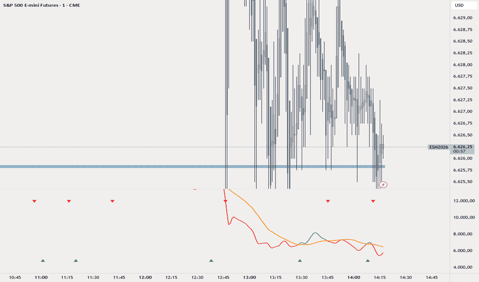
Pulse Heatmap [LB]
Pulse Reaction Heatmap
Overview
The Pulse Reaction Heatmap is a high-precision contextual price-reading indicator. It fuses an adaptive liquidity pulse with a dynamic volume density heatmap . Its core goal: reveal the "Market Footprint" —visually pinpointing price levels of institutional activity, liquidity absorption, and trend re-accumulation.
It delivers no mechanical signals; it spotlights zones primed for market reactions, defenses, or transitions .
Core Mechanism: The Pulse Line
Anchored by the Pulse , a hybrid trend-tracking line:
Adaptive Logic: Blends a Fast EMA ( 18 ) and Anchor EMA ( 34 ) to capture market equilibrium.
"Stickiness" Factor: ATR-based filter keeps it "glued" to price in consolidation, fluidly adapting during breakouts—eliminating the "lagging float" of standard MAs.
Dynamic Window: Pulse-centered workspace via multi-ATR , keeping the heatmap volatility-relevant.
Heatmap Construction & Scoring
Weighted scoring algorithm per bar in the lookback:
Conviction Weighting: Volume filtered by Body-to-Range ratio —large-body candles (low wicks) add max "conviction" density.
Positional Distribution: Weights across Full Range , Close (Acceptance) , and Wick Extremes (Test Levels) .
Temporal Decay: Older data fades mathematically (factor 0.978 ), prioritizing recent "hot" interest.
Visual Interpretation (Color Logic)
Gradient shows Market Interest Intensity :
Cold Zones (Blues/Greys): "Thin" liquidity; price slices through fast.
Intermediate Zones (Yellows/Oranges): Market Rotation —active order book equilibrium.
Hot Zones (Bright Red/Orange): Peak density; highly probable "accepted" prices for reactions/defenses.
Practical Trading Application
Confluence for AMT: Dynamic high-volume nodes and value areas as trends evolve.
Filtering Pullbacks: Target retraces into "Hot" zones for institutional defense confirmation.
Breakout Validation: Break + heatmap "re-densification" above = New Price Acceptance .
Important: The Pulse Reaction Heatmap is a Contextual Analysis Tool , not automated signals. Pair with Market Structure and Price Action to target true zones. 指標

AG Pro Relative Volume Pressure Map [AGPro Series]AG Pro Relative Volume Pressure Map
Overview / What it does
AG Pro Relative Volume Pressure Map is designed to evaluate whether relative volume is translating into efficient bullish pressure, efficient bearish pressure, inefficient two-way absorption, or possible climax behavior.
Instead of treating relative volume as a standalone “high volume” condition, this script maps how that volume is interacting with candle structure, close location, wick behavior, and short-term pressure efficiency. The result is a rules-based pressure framework built to help organize active price-volume interaction directly on the chart.
This script is not built as a basic RVOL meter, a generic volume spike detector, or a standalone entry engine. Its purpose is to classify whether elevated relative volume is being accepted as directional pressure, being absorbed into unstable churn, or appearing late enough to justify caution.
The visual design is intentionally chart-facing. Pressure events, backdrop zones, memory trails, and the summary panel are meant to help traders read whether volume is supporting directional intent or fading into friction. It is a decision-support map, not a prediction model.
Unique Edge
The main difference of this script is simple:
It does not ask only whether volume is above average.
It asks whether above-average volume is producing usable directional pressure.
That distinction matters.
Many relative volume tools stop at “volume is elevated.” This script goes further and evaluates whether that elevated participation is accompanied by efficient body structure, strong close positioning, limited opposing wick pressure, and acceptable short-horizon follow-through context. In other words, it attempts to separate meaningful pressure from noisy activity.
This also makes the script materially different from several other AG Pro tools:
- It is not a Volume Profile framework. It does not map acceptance, rejection, POC interaction, or value-area structure.
- It is not a VWMA extension tool. It does not measure dislocation from a volume-weighted moving anchor.
- It is not a money-flow proxy. It does not attempt to infer broader accumulation or distribution from flow-style formulas.
- It is not a breakout-quality map. It does not judge level breaks, retests, or structural invalidation around support/resistance rails.
- It is not a trend regime meter. It focuses on active pressure quality around current bars rather than broad market-state classification.
Its niche inside the AG Pro lineup is more specific:
AG Pro Relative Volume Pressure Map focuses on whether current relative volume is being converted into directional pressure efficiently, inefficiently, or excessively.
Methodology
The script starts with relative volume. Current volume is compared against its recent average so the tool can determine whether participation is dry, normal, elevated, or extreme.
From there, the script evaluates how price is behaving inside the same bar:
- Body efficiency: how much of the total range is being expressed through the real body.
- Close location: whether the bar is closing with directional conviction or fading into the middle of its range.
- Opposing wick pressure: whether the active side is being challenged by rejection.
- Stretch versus ATR: whether the move is becoming extended relative to recent volatility.
- Optional one-bar follow-through filter: whether short-horizon continuation is present when pressure is classified.
These components are combined into a pressure logic model that classifies price-volume behavior into five chart states:
1. Bull Pressure
Elevated relative volume is aligned with an efficient bullish body, strong close placement, limited upper-wick resistance, and acceptable follow-through context.
2. Bear Pressure
Elevated relative volume is aligned with an efficient bearish body, strong close placement, limited lower-wick resistance, and acceptable follow-through context.
3. Absorption
Relative volume is elevated, but directional efficiency is weak, conflicted, or unstable. This often reflects churn, friction, or two-way participation where raw activity does not cleanly convert into directional pressure.
4. Climax Risk
Relative volume is extreme and the bar is stretched enough to justify caution. The script uses this state to identify situations where pressure may be arriving in a late or inefficient form rather than in a fresh, clean expansion phase.
5. Passive
No major pressure condition is active. Participation is comparatively dry, mixed, or below the threshold required for the more expressive states above.
States / Alerts
This script is organized around states rather than trade commands.
Available state logic includes:
- Bull Pressure
- Bear Pressure
- Absorption
- Climax Risk
- Pressure State Change
These alerts are intended to reflect changes in price-volume character, not guaranteed opportunity. They can be used as workflow events, review prompts, or contextual filters inside a broader chart process.
The panel summarizes the active environment through fields such as:
- RVOL state
- Current pressure state
- Pressure side
- Quality
- Strength
- Efficiency
- Absorption risk and short-horizon bias
The chart layer complements this with event labels, backdrop zones, and pressure memory trails so the user can see not only what state is active now, but how recent pressure has evolved across the visible structure.
Why this is different from the other AG Pro scripts
AG Pro Relative Volume Pressure Map was intentionally designed to avoid overlap with the existing AG Pro publication line.
Where some AG Pro tools are built around breakout structure, moving-average displacement, equilibrium logic, profile interaction, or directional survival around a specific technical framework, this script stays centered on one narrower question:
Is current relative volume producing efficient pressure, inefficient absorption, or late-stage risk?
That makes it different in both concept and use case.
For example:
- A breakout-quality tool is asking whether a level event is structurally convincing.
- A profile-based tool is asking whether price is accepting or rejecting volume-defined areas.
- A reclaim/dislocation tool is asking whether price is stretching away from or reclaiming a known reference.
- This script is asking whether participation itself is translating into directional pressure cleanly enough to matter.
So even when the chart user applies multiple AG Pro tools together, this one is not meant to duplicate them. It fills a different layer of analysis: active pressure efficiency around relative volume.
Key Inputs
Relative Volume Length
Controls the lookback used to normalize current volume versus its recent baseline.
ATR Length
Used for stretch evaluation and several visual placement rules.
Pressure Smoothing
Smooths the relative volume component to reduce one-bar noise.
Use 1-Bar Follow-Through Filter
Adds a simple continuation requirement so pressure states can be made more selective.
Elevated RVOL Threshold
Defines the point at which participation becomes meaningfully above normal.
Extreme RVOL Threshold
Defines the threshold used for more exceptional activity and climax-style conditions.
Minimum Body Efficiency
Controls how much real-body participation is required before a pressure bar is considered efficient.
Strong Close Location
Controls how strongly price must close toward the active side of the range.
Opposing Wick Ceiling
Limits how much opposing rejection can be present before directional pressure quality degrades.
Climax Stretch vs ATR
Controls how extended a bar must be, relative to ATR, before the script considers late-stage risk more seriously.
Visual controls are also included for panel visibility, panel theme, panel font size, label density, candle coloring, backdrop display, and pressure-trail presentation.
Limitations & Transparency
This script does not predict future direction.
It does not identify hidden order flow.
It does not classify fundamental volume intent.
It does not replace execution rules, risk management, or higher-timeframe context.
Relative volume can expand for many reasons, and elevated participation does not guarantee continuation. In the same way, absorption or climax-style behavior can persist longer than expected before price resolves clearly.
All state classifications in this tool are rules-based interpretations of chart behavior. They are useful as structured context, but they are still abstractions built from price and volume features. Users should expect false positives, missed events, and market-specific variation depending on volatility regime, instrument behavior, and timeframe selection.
This script should be treated as an analytical overlay. It is designed to improve chart organization and pressure reading, not to promise outcomes.
Risk Disclosure
This script is provided for educational and informational purposes only.
It is not financial advice, not investment advice, and not a solicitation to buy or sell any instrument.
Trading and investing involve risk. Losses can exceed expectations, especially in volatile markets. Any decision made using this script should be confirmed with independent analysis, sound risk controls, and a workflow appropriate to the user’s own objectives and experience.
This tool is best used as one layer inside a broader decision process, not as a standalone reason to enter, exit, or size a position.
指標