
Apoorv Dubey | SEBI Registered Research Analyst | INH000030287
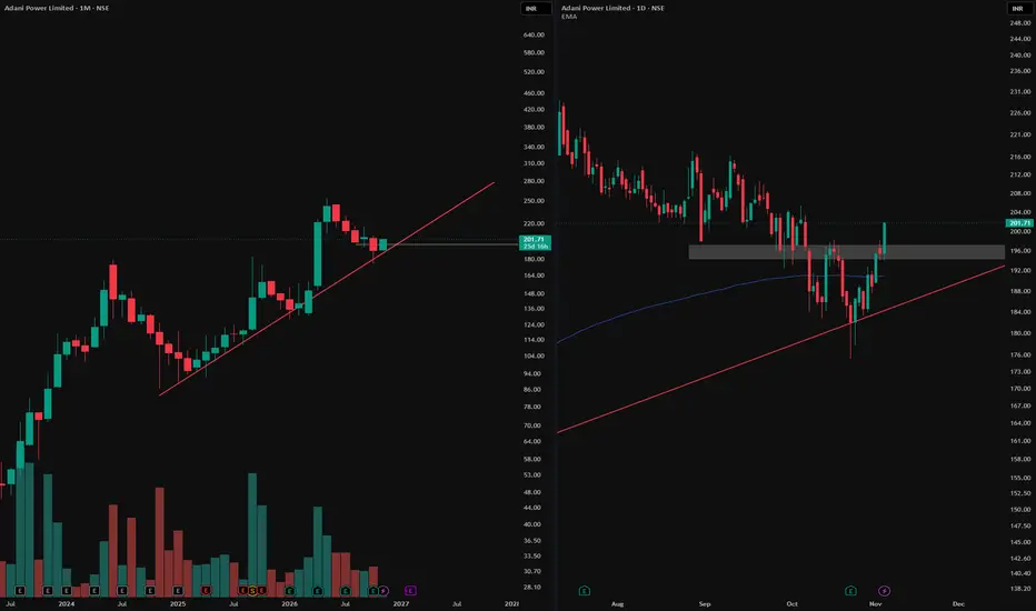
Monthly chart (left): The red line marks rising support. Price has reacted around this trendline several times, making it a useful reference for the broader trend.
Daily chart (right): Zoom in on the latest reaction and you’ll see a W-shaped bottom. The grey zone first acted as support, then became resistance after price broke below it. It also marked the area of the rebound between the two lows. The latest daily candle closed above that zone, reclaiming it.
The takeaway: The monthly chart shows where price reacted. The daily chart shows how the reversal developed. A close above the grey zone marks the breakout on this chart; whether price holds above it is a separate question.
For educational purposes only. This is not a recommendation to buy, sell or hold Adani Power or any other security.
Monthly chart (left): The red line marks rising support. Price has reacted around this trendline several times, making it a useful reference for the broader trend.
Daily chart (right): Zoom in on the latest reaction and you’ll see a W-shaped bottom. The grey zone first acted as support, then became resistance after price broke below it. It also marked the area of the rebound between the two lows. The latest daily candle closed above that zone, reclaiming it.
The takeaway: The monthly chart shows where price reacted. The daily chart shows how the reversal developed. A close above the grey zone marks the breakout on this chart; whether price holds above it is a separate question.
For educational purposes only. This is not a recommendation to buy, sell or hold Adani Power or any other security.

📊Swing & positional research with Buy, Sell & Hold recommendations
Contact for NOVEMBER SLOTS
📞WhatsApp ( Pro ): wa.me/919455664601
📢Free Picks on Telegram ( Join ) : t.me/hashtaghammer
Apoorv Dubey|SEBI RA INH000030287
Contact for NOVEMBER SLOTS
📞WhatsApp ( Pro ): wa.me/919455664601
📢Free Picks on Telegram ( Join ) : t.me/hashtaghammer
Apoorv Dubey|SEBI RA INH000030287
Bài đăng liên quan
Thông báo miễn trừ trách nhiệm
Thông tin và các ấn phẩm này không nhằm mục đích, và không cấu thành, lời khuyên hoặc khuyến nghị về tài chính, đầu tư, giao dịch hay các loại khác do TradingView cung cấp hoặc xác nhận. Đọc thêm tại Điều khoản Sử dụng.
📊Swing & positional research with Buy, Sell & Hold recommendations
Contact for NOVEMBER SLOTS
📞WhatsApp ( Pro ): wa.me/919455664601
📢Free Picks on Telegram ( Join ) : t.me/hashtaghammer
Apoorv Dubey|SEBI RA INH000030287
Contact for NOVEMBER SLOTS
📞WhatsApp ( Pro ): wa.me/919455664601
📢Free Picks on Telegram ( Join ) : t.me/hashtaghammer
Apoorv Dubey|SEBI RA INH000030287
Bài đăng liên quan
Thông báo miễn trừ trách nhiệm
Thông tin và các ấn phẩm này không nhằm mục đích, và không cấu thành, lời khuyên hoặc khuyến nghị về tài chính, đầu tư, giao dịch hay các loại khác do TradingView cung cấp hoặc xác nhận. Đọc thêm tại Điều khoản Sử dụng.