
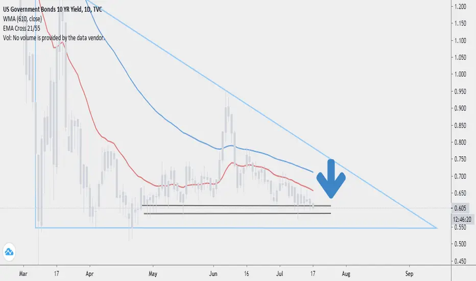
The US 10 Year Bond is probably the most watched metric used to determine the health of the markets. A drop in yields denotes fear and all risk assets are being sold off. The current chart for the 10 Year Bond looks pretty ugly, but it might make the bears quite happy. We are in a giant descending triangle. The formation within the triangle is a very ugly topping pattern.
The chart below is the price action of the 10 Year Bond and it is even more defined and clear. We are approaching the end of the formation.

Currently we stand at the edge and a single big red day may mean a continuation of the down trend. Oil and stocks seem to be topping or at meaningful resistance. Does this mean an imminent drop? No. I am no bear and I frankly don't care which way the markets go, but caution is very much advised. A daily close past the respective resistance/support lines will be a giant red flag for risk assets. Precious metals will likely also drop in such a situation as they have been trading similarly to stocks. However, the drop will likely be far less severe than the last one.
This is not trading advice, but purely my personal opinion.
The chart below is the price action of the 10 Year Bond and it is even more defined and clear. We are approaching the end of the formation.
Currently we stand at the edge and a single big red day may mean a continuation of the down trend. Oil and stocks seem to be topping or at meaningful resistance. Does this mean an imminent drop? No. I am no bear and I frankly don't care which way the markets go, but caution is very much advised. A daily close past the respective resistance/support lines will be a giant red flag for risk assets. Precious metals will likely also drop in such a situation as they have been trading similarly to stocks. However, the drop will likely be far less severe than the last one.
This is not trading advice, but purely my personal opinion.
Ghi chú
Bonds continue to move and will likely end the day past the respective resistance/support lines depending on which chart you are watching. Yet the SPX 500 is moving higher. Bag holders rejoice.
Thông báo miễn trừ trách nhiệm
Thông tin và các ấn phẩm này không nhằm mục đích, và không cấu thành, lời khuyên hoặc khuyến nghị về tài chính, đầu tư, giao dịch hay các loại khác do TradingView cung cấp hoặc xác nhận. Đọc thêm tại Điều khoản Sử dụng.
Thông báo miễn trừ trách nhiệm
Thông tin và các ấn phẩm này không nhằm mục đích, và không cấu thành, lời khuyên hoặc khuyến nghị về tài chính, đầu tư, giao dịch hay các loại khác do TradingView cung cấp hoặc xác nhận. Đọc thêm tại Điều khoản Sử dụng.