TSLA 4H: Extended Leading Diagonal or a Deeper Correction?
"Price is the consequence. Structure is the cause."
This four-hour structural analysis of Tesla (TSLA) examines the market through the principles of Elliott Wave Theory. Rather than forecasting price alone, the objective is to determine the market's current position within the larger wave structure and identify the most probable path forward.
Primary Thesis — Extended Leading Diagonal
The preferred interpretation views the current structure as a Leading Diagonal exhibiting structural extension, provided that the first structural invalidation level at $338.25714 remains intact.
Although "Extended Leading Diagonal" is not a formal Elliott Wave pattern, the current price development displays characteristics consistent with a diagonal extending beyond the proportions typically observed.
So far, the present advance has traveled only 61.8% of the preceding third wave, leaving room for additional structural expansion.
If this interpretation is correct, a confirmed breakout above $498.70642 could initiate a strong multi-swing advance, displaying momentum similar to an impulsive sequence while completing the terminal portion of the diagonal. A proportional correction would then be expected before the broader uptrend resumes.
Structural Targets
• First Target: $465.44267
• Primary Target: $570.22809
• Extended Targets: $750.10509 and $956.62950
Secondary Thesis — Conservative Development
The conservative interpretation assumes that the current Leading Diagonal has already completed, but the market still requires a more mature corrective phase before the next impulsive advance begins.
That correction could develop as:
Zigzag
Double or Triple Zigzag
Flat
or a more complex corrective combination.
According to Elliott Wave guidelines, corrections following a Leading Diagonal are often deeper and more time-consuming than the decline currently observed.
Only a clearly developing series of nested 1-2 sequences would significantly strengthen the case that the next higher-degree third wave has already begun.
Both scenarios remain structurally bullish over the long term. Their only difference lies in the depth, duration, and internal development of the current correction.
Structural Cycle
Under the preferred wave count, Tesla continues progressing toward the completion of a higher-degree eight-wave cycle, with the current roadmap projecting structural completion around March 2027, assuming Elliott Wave relationships remain valid.
Key Technical Levels
Bull Market Confirmation: $498.28083
Critical Structural Validation: $101.88
First Structural Invalidation: $338.25714
Structural Observation
An alternative interpretation remains under observation.
The current structure could eventually prove to be an Ending Diagonal completing Primary Wave (III), which would imply that a larger Primary Wave (IV) correction is still ahead.
At present, however, the available structural evidence continues to favor the Leading Diagonal interpretation. The alternative count remains part of ongoing Elliott Wave research, recognizing that structural interpretation evolves with price rather than personal conviction.
Markets rarely move in a straight line.
Structure provides the context. Price delivers the evidence.
Patterns whisper. I listen.
– Mr. Nobody 🎧📊
Elliott Wave Researcher
Gold Spot / U.S. Dollar
Feb 13, 2024
My view after two years (Sharp correction pattern)
TSLA: A Structural Blueprint of the Grand Cycle
"Price is the consequence. Structure is the cause."
This analysis is not a simple price forecast. Rather, it is a structural study of Tesla's position within its Grand Cycle through the principles and guidelines of Elliott Wave Theory.
Since its 2010 low, Tesla has developed a sequence of impulsive and corrective waves, each forming part of a much larger market geometry. The objective of this study is to identify the market's current position within that hierarchy and explore the most probable paths ahead based on wave structure, Fibonacci relationships, and Elliott Wave principles.
Aggressive Scenario (Turquoise Path): A Developing Leading Diagonal
The primary interpretation assumes that Primary Wave (IV) has already completed and the market has begun constructing a Leading Diagonal, marking the first phase of a new higher-degree impulsive cycle.
Within Elliott Wave Theory, a Leading Diagonal typically emerges at the beginning of a new trend, when market sentiment remains uncertain and confidence has yet to fully return. Rather than signaling weakness, this structure often reflects the gradual transition from accumulation toward expansion.
The key question is therefore:
Has the current correction already fulfilled the structural requirements of a Leading Diagonal?
If the answer proves to be yes, Tesla may already have established the structural foundation for the next higher-degree advance, potentially leading into a powerful Primary Wave (III), which is often the strongest and most dynamic phase of an impulsive sequence.
Conservative Scenario (Blue Path): The Correction May Require Further Development
The conservative interpretation remains equally bullish over the long term but suggests that the current correction may not yet be structurally complete.
Under this scenario, the market could still require a more mature corrective formation, such as:
Zigzag
Flat
or a more complex corrective combination
Once that correction is completed—while respecting Elliott Wave rules and structural guidelines—the market would still be expected to follow the same long-term bullish path illustrated by the aggressive scenario.
In other words, the destination remains the same. The only difference lies in the maturity, depth, and internal structure of the current correction.
Key Structural Levels
Structural Invalidation Level: 101.40
First Wave Territory: 19.73
The long-term objectives presented in this study are not arbitrary price projections. They are derived from Fibonacci expansion relationships and the mathematical structure of Elliott Wave development.
Research Note
Alongside the two primary scenarios, an alternative wave count remains under continuous evaluation.
Under this alternative interpretation, the current diagonal could ultimately prove to be an Ending Diagonal, completing Primary Wave (III) rather than initiating a new impulsive cycle. Should that interpretation prevail, the market would still require a larger-degree Primary Wave (IV) correction before the next long-term advance begins.
At present, however, the available structural evidence continues to favor the Leading Diagonal interpretation. The Ending Diagonal remains a secondary research hypothesis, maintained not because it is currently preferred, but because Elliott Wave analysis requires every credible structural alternative to remain open until the market itself resolves the pattern.
My objective is not to defend a preferred wave count, but to continuously refine structural understanding through the observation of real market behavior.
Markets are often dominated by noise.
Structure reveals the logic behind price.
Patterns whisper. I listen.
– Mr. Nobody 🎧📊
Elliott Wave Researcher
Long
Long
Long
US Oil (WTI) – 4H Elliott Wave Update US Oil (WTI) – 4H Elliott Wave Update | Structure First, Direction Second
The overall outlook remains unchanged, and both scenarios continue to respect Elliott Wave rules and guidelines.
The recent decline is still being monitored as the completion of a corrective structure. The key question is whether this decline is finishing an Expanded Flat within a developing bullish sequence or whether it is only another corrective phase before the larger bearish trend resumes.
Aggressive Scenario
The aggressive count continues to suggest that the advance from 54.877 marked the beginning of a new impulsive sequence.
If this interpretation is correct, the current decline is completing Wave (2) as an Expanded Flat, with Wave C now approaching its final subdivisions.
Once this corrective pattern is complete, I expect an impulsive advance to develop. Any corrective pullback after that impulse would simply confirm the trend before the next bullish leg begins.
Conservative Scenario
The conservative scenario remains consistent with the larger bearish outlook presented in the Daily analysis.
In this case, the current recovery may only become another corrective structure before sellers attempt one more decline.
A decisive break below 54.877 would invalidate the aggressive count and significantly increase the probability of a larger bearish continuation.
What Matters Most
At this stage, I am not trying to predict the market.
I am waiting for the market to reveal its structure.
A clear five-wave impulsive advance would strongly favor the aggressive scenario.
However, if the recovery remains corrective and fails to develop impulsive characteristics, the conservative count will continue to carry more weight.
As always, structure comes before prediction.
This analysis is shared strictly for Elliott Wave research and educational purposes, not as financial advice.
Facts always win.
Patterns whisper. I listen.
— Mr. Nobody 🎧📊
CFDs on Crude Oil (WTI)
Jun 25
US Oil – 4H Elliott Wave Update
CFDs on Crude Oil (WTI)
Jun 24
US Oil – Daily Elliott Wave Perspective
Long
Ethereum 4H: Final Leg of a Larger Correction ?Ethereum 4H: Final Leg of a Larger Correction or the Beginning of the Next Bull Cycle? | Elliott Wave Analysis
Following the primary scenarios discussed on the daily chart, the 4-hour timeframe provides additional insight into the internal structure of Ethereum's ongoing correction.
From the conservative perspective, the decline labeled as wave C continues to display the characteristics of an impulsive structure. Most notably, the initial phase of this decline appears to have developed as a large Leading Diagonal, a pattern frequently observed at the beginning of major impulsive sequences.
A closer examination of the internal subdivisions reveals that the extensions of waves (3) and (5) have remained within the 61.8% to 78.6% Fibonacci extension range, a behavior commonly associated with the personality of leading waves within larger impulsive structures.
There is also the possibility that the highlighted turquoise structure represents an extended third wave sequence. If the current interpretation is correct and the present decline is identified as wave (1) of a larger bearish impulse, then the market may still require one additional downward leg before the larger corrective structure is completed.
Under this interpretation, the Running Flat structure identified on the daily chart could eventually evolve into a Regular Flat, implying that Ethereum may still need to revisit lower price levels, potentially toward the $1,000-$900 region, before the larger bullish cycle begins.
However, an alternative outcome must also be considered.
If the current low marks the completion of the larger correction and the market develops a clear five-wave impulsive advance, the next expectation would be a corrective retracement against that advance. In this case, a decisive break above the wave (4) territory of the previous wave C decline would provide the first meaningful confirmation that the larger bullish cycle has begun.
Until such confirmation occurs, every corrective formation that develops following an initial advance—whether simple or complex, shallow or deep—must be evaluated carefully, as it may reinforce the possibility that one final bearish expansion remains ahead.
At present, the structure continues to respect Elliott Wave rules and guidelines. Therefore, the question is not whether Ethereum will eventually enter a major bull market, but whether the market has already completed its correction—or whether one final decline is still required before that expansion begins.
Sometimes the market's final test appears just before its greatest opportunity.
– Patterns whisper. I listen. – Mr. Nobody 🎧📊
Ethereum
2 days ago
Running Flat Correction Before a Historic Expansion? Ethereum!
Long
Long
Long
Long
NQ Weekly Outlook: Time-Cycle Expectations | July 6-10, 2026NQ Weekly Outlook: July 6-10, 2026
This idea documents my forward-looking model expectations for Nasdaq futures / NQ for the week of July 6 to July 10, 2026.
The focus is on documenting the model’s weekly expectations in advance, including possible directional tendencies and price-action behavior. These are research notes, not trade signals, recommendations, or guaranteed predictions.
The model work is based on my own time-cycle driven market research framework.
Since this idea is being published before the week unfolds, this is not a completed weekly price-action review.
Disclaimer:
This idea is for educational and research purposes only. It is not financial advice, trading advice, a trade signal, or a recommendation to buy, sell, enter, exit, or hold any financial instrument. Futures trading involves substantial risk, and past performance does not guarantee future results. Running Flat Correction Before a Historic Expansion? Ethereum! # Ethereum Daily Chart: Running Flat Correction Before a Historic Expansion? | Elliott Wave Analysis
The current Ethereum structure continues to support the view that the market remains within a larger degree **wave (II)** correction. According to the present Elliott Wave count, this corrective phase may ultimately serve as the foundation for one of the most significant bullish expansions in Ethereum's history.
The primary scenario suggests that Ethereum is developing a **Running Flat correction**, a relatively uncommon but highly important Elliott Wave pattern. Running Flats often appear in exceptionally strong markets, where corrective pressure fails to fully retrace the previous trend, effectively storing momentum for the next impulsive advance.
If the current wave count remains valid, the completion of this larger degree **wave (II)** could initiate a new impulsive cycle capable of driving Ethereum toward substantially higher valuations. The first major objective within this bullish scenario would be the region around **$4,370**, representing only the initial stage of a potentially much larger long-term expansion.
However, an alternative and more aggressive corrective scenario must also be considered.
Under this interpretation, the current market structure may continue developing through additional corrective formations, potentially advancing toward the territory of the previous fourth wave before initiating another decline. Such a development could ultimately complete a larger **Regular Flat correction**, with downside targets extending toward the **$1,305** or even **$907** regions.
At the present time, the evidence continues to support the conclusion that Ethereum remains within a broad sideways corrective environment. Whether this correction ultimately resolves as a **Running Flat**, a **Regular Flat**, or evolves into a more complex corrective combination remains the central question.
What is particularly important is that the current structure continues to respect Elliott Wave rules and guidelines. Until proven otherwise, the existing wave count remains technically valid.
Sometimes the strongest bull markets are born from the longest corrections.
The market is not revealing weakness.
It may simply be preparing for its next expansion.
– Patterns whisper. I listen. – Mr. Nobody 🎧📊
Long
Another US Recession Brewing?US Recession Study: Rates, Inflation, Treasury Yields, and Commercial Bank Balance Sheets
This chart compares several macroeconomic indicators that have historically aligned in a very specific way prior to, or around, major US recessions.
The purpose of this analysis is not to claim that a US recession is guaranteed, nor to predict an exact timing window. Rather, the purpose is to highlight a recurring macro-structural pattern that has appeared before several historic recessionary periods, namely:
declining policy rates, elevated or rising US 10Y yields, rising inflation pressure, and an expanding commercial banking balance sheet.
When these four variables begin to align, it may indicate that the economy is moving into a late-cycle or stress-transition phase, where monetary policy, inflation, bond yields, and banking-sector liquidity are no longer moving in a clean expansionary sequence.
________________________________________
Indicator Legend
The chart includes the following indicators:
USINTR — Green Step Line
USINTR represents the US interest rate / Federal Reserve policy rate.
On the chart, this is shown as the green step line. Because policy rates are adjusted in steps by the Federal Reserve, the indicator naturally appears as a stair-step structure rather than a smooth line. Historically, a falling USINTR has often appeared before or during recessionary periods because the Federal Reserve usually begins cutting rates when it sees economic weakness, financial stress, or disinflationary pressure building in the system. However, an important point is that rate cuts themselves are not automatically bullish. In early-cycle environments, rate cuts can support recovery. But in late-cycle environments, rate cuts may instead confirm that the Fed is responding to underlying economic deterioration.
In other words, the meaning of declining USINTR depends heavily on the wider macro context.
________________________________________
US10Y — Blue Line
US10Y represents the US 10-Year Treasury yield.
On the chart, this is shown as the blue line.
The US 10Y yield reflects longer-term expectations around inflation, growth, term premium, fiscal pressure, and bond-market risk. Prior to several recessionary periods, the US 10Y yield either increased, remained elevated, or failed to decline as quickly as the Federal Reserve policy rate. This is important because if the Fed is cutting rates while the 10Y yield remains elevated, financial conditions may not loosen as much as the policy rate alone would suggest.
In other words, declining short-term rates do not necessarily mean the broader economy is receiving relief if long-term yields remain high.
This creates a potentially stressful macro configuration: the Fed is trying to ease, but the long end of the bond market is not fully cooperating. That type of divergence can signal persistent inflation concerns, fiscal stress, bond-market resistance, or a loss of confidence in the ability of rate cuts alone to stabilize the system.
________________________________________
USIRYY — Red Line
USIRYY represents the US inflation rate year-over-year.
On the chart, this is shown as the red line.
Inflation is critical in this comparison because it determines how much flexibility the Federal Reserve actually has. If inflation is low and falling, the Fed can cut rates aggressively without much conflict. But if inflation is rising or remains sticky while growth begins to weaken, the Fed faces a much more difficult policy environment. Historically, several recessionary environments were preceded by or accompanied by periods where inflation pressures remained problematic even as the economy was weakening. That creates a difficult “policy trap”: cutting rates may be necessary because growth is weakening, but cutting too much may risk reigniting inflation or weakening confidence in the currency and bond market. In this chart, the red USIRYY line is therefore important because rising inflation pressure can reduce the effectiveness of falling policy rates.
________________________________________
USCBBS — Purple Line
USCBBS represents the US Commercial Bank Balance Sheet.
On the chart, this is shown as the purple line.
This indicator helps show the size of commercial banking-sector balance sheets.
An increase in USCBBS can reflect expanding banking-sector assets, liquidity support, credit-system changes, or balance-sheet growth within the financial system.
The key point is not that a rising commercial bank balance sheet is automatically bearish. In many environments, balance-sheet expansion can be supportive.
However, in the context of recession analysis, a rising USCBBS becomes more interesting when it occurs alongside: falling policy rates, elevated long-term yields, and rising inflation pressure.
That combination can suggest that liquidity or balance-sheet expansion is occurring not because the economy is entering a clean growth phase, but because the system may be requiring more support, more credit accommodation, or more balance-sheet absorption. This is especially important after 2019 and 2020, where the purple USCBBS line increased significantly and has remained structurally elevated compared to previous cycles.
________________________________________
Historic Recession Pattern
Across several historic recession windows, the same general structure can be observed:
Prior to the 1990 recession
US10Y and USIRYY increased while USINTR also moved higher into the late-cycle period. This reflected a classic tightening/inflation-pressure environment, where elevated rates and inflation eventually contributed to macro stress.
Prior to the 2001 recession
US10Y and USIRYY increased while USINTR moved lower. This was a different type of setup.
The Fed began easing, but the broader macro backdrop still contained inflation/yield pressure. This suggested that cutting short-term rates did not immediately remove stress from the system.
Prior to the 2008 recession
A similar pattern appeared again. US10Y and USIRYY increased while USINTR moved lower.
This was particularly important because the Fed had already begun responding to economic and financial stress, yet the system continued moving toward recession.
Again, the decline in policy rates was not a clean bullish signal. Instead, it reflected the Fed reacting to deteriorating conditions.
Prior to the 2020 recession
US10Y and USIRYY increased while USINTR remained lower compared to the preceding tightening phase.The 2020 recession was unique because of the external shock, but the macro system was already showing signs of vulnerability before the recession formally began.
The USCBBS line also became highly relevant from 2019 onward, as the commercial banking balance sheet began rising significantly.
________________________________________
Current Setup
Currently, the chart shows another potentially important alignment:
USIRYY, US10Y, USINTR, and USCBBS are aligning in a manner that resembles prior pre-recessionary or recession-adjacent macro structures. The current configuration is notable because: USINTR has declined, suggesting the Federal Reserve is no longer in a pure tightening phase. US10Y remains elevated, meaning long-term yields are still applying pressure to the economy, borrowers, valuations, housing, credit, and fiscal sustainability. USIRYY has increased, showing that inflation pressure has not fully disappeared. USCBBS has been rising again since December 2025, suggesting renewed expansion or support within the commercial banking balance-sheet structure. The important point is the interaction between these indicators.
If policy rates are falling but long-term yields remain elevated, then monetary easing may not translate into broad relief. If inflation is rising at the same time, then the Fed may have less room to cut aggressively. And if commercial bank balance sheets are expanding during this same window, it may suggest that the financial system is already moving into a more defensive or support-dependent phase. This does not mean a recession must happen immediately.
But historically, this type of alignment has not been a clean “risk-on” macro signal. It has often appeared when the economy was transitioning from late-cycle expansion into stress, slowdown, or recession.
________________________________________
Why This Pattern Matters
A common mistake in recession analysis is to focus on one indicator in isolation.
For example: Falling rates can look bullish. Rising bank balance sheets can look supportive.
Elevated yields can look like confidence in growth. Inflation can look like nominal strength.
But when all of these appear together, the interpretation changes. The structure becomes more complex. The Fed may be easing, but the bond market may still be tight. Inflation may be rising, limiting policy flexibility. Commercial bank balance sheets may be expanding, but not necessarily because the economy is healthy. This is why the combined alignment matters more than any single line on the chart. The recessionary signal is not one isolated indicator.
The signal is the macro contradiction between them.
________________________________________
Relationship to My FCBI Indicators
I originally intended to publish this chart with my custom FCBI indicators included.
However, because the analysis contained my custom FCBI scripts, TradingView would not allow the chart idea to be published in that form. For that reason, I removed the custom FCBI indicators from this version so that the recession comparison study could be published.
Users can still apply my FCBI indicators separately to perform a deeper version of this analysis.
The FCBI indicators are designed to measure the relationship between financial conditions and inflation pressure. In simple terms, they help assess whether financial conditions are acting as a brake or whether they are becoming too loose relative to inflation.
This matters because recessions often emerge not simply from high rates or low rates, but from the interaction between: inflation pressure, bond yields, policy rates, liquidity conditions, and the broader financial system. The FCBI framework is therefore useful as a separate overlay because it can help identify when financial conditions are tightening, loosening, or diverging from the inflation backdrop.
In this chart, even without the FCBI indicators attached, the same macro logic can still be observed through the relationship between USINTR, US10Y, USIRYY, and USCBBS.
________________________________________
Conclusion
The current macro setup does not confirm a recession by itself. However, the alignment between: declining USINTR, elevated US10Y yields, rising USIRYY, and rising USCBBS
is worth monitoring closely because similar configurations have appeared before or around previous US recessions. The key takeaway is that falling policy rates are not automatically bullish when long-term yields remain elevated, inflation begins rising again, and commercial bank balance sheets expand. Instead, that combination may suggest that the economy is entering a more fragile phase, where the Federal Reserve is attempting to ease while the broader financial system remains under pressure. For now, this chart should be viewed as a macro warning structure rather than a recession call.
The signal is not certainty.
The signal is alignment.
And historically, this type of alignment has often deserved attention.
Bitcoin 4H | Is the First Bearish Leg Complete.Bitcoin 4H | Is the First Bearish Leg Complete, or Is Wave C Just Getting Started?
Financial markets reward discipline, not certainty.
This analysis focuses on the internal structure of Bitcoin's recent decline using the Elliott Wave Principle. As in my Daily analysis, both the Conservative and Aggressive scenarios remain valid, and neither has been invalidated according to Elliott Wave rules and guidelines.
The recent decline is currently counted as a Double Zigzag (W-X-Y) in both scenarios. The difference lies in what follows next.
Conservative Scenario
In the Conservative view, the Double Zigzag may have completed a larger corrective structure.
If buyers continue to build momentum from this area and the market develops a clear five-wave impulsive advance, the current move could become Wave (1), followed by a Wave (2) correction before the larger uptrend resumes.
Under this scenario, any pullback following the initial advance would be considered a normal correction within a developing bullish trend, provided the impulsive structure remains intact.
Aggressive Scenario
The Aggressive scenario interprets the recent Double Zigzag as only the first leg of a much larger bearish correction.
If this count is correct, the current recovery should remain corrective rather than impulsive. It may develop into a simple Zigzag or another corrective pattern, potentially retracing 38.2%, 50%, or even 61.8% of the recent decline before sellers regain control.
Once that corrective rally is complete, another bearish leg could begin, with the larger correction extending toward the $40,000–$30,000 region.
An Important Alternative Count
There is another possibility that deserves attention.
The market may already be developing Waves 1 and 2 of Wave C, a lower-probability count that is illustrated on the chart with lighter labeling.
If this interpretation proves correct, the current rebound would represent only a small Wave 2 correction before a strong Wave 3 decline unfolds.
For that reason, I am paying much more attention to the structure of the current rally than to its size.
A clear five-wave advance would strengthen the Conservative scenario.
A corrective three-wave recovery, however, would continue to favor the Aggressive scenario and increase the probability of another decline.
Final Thoughts
At this stage, the market has not yet revealed its final direction.
Price structure, wave relationships, channel behavior, Fibonacci proportions, and respect for invalidation levels will determine which scenario gains confirmation.
Until the market confirms one path, both counts remain valid under Elliott Wave rules and guidelines.
As always, I prefer to follow the evidence rather than predict the future.
Facts always win.
Patterns whisper. I listen.
— Mr. Nobody 🎧📊
Long
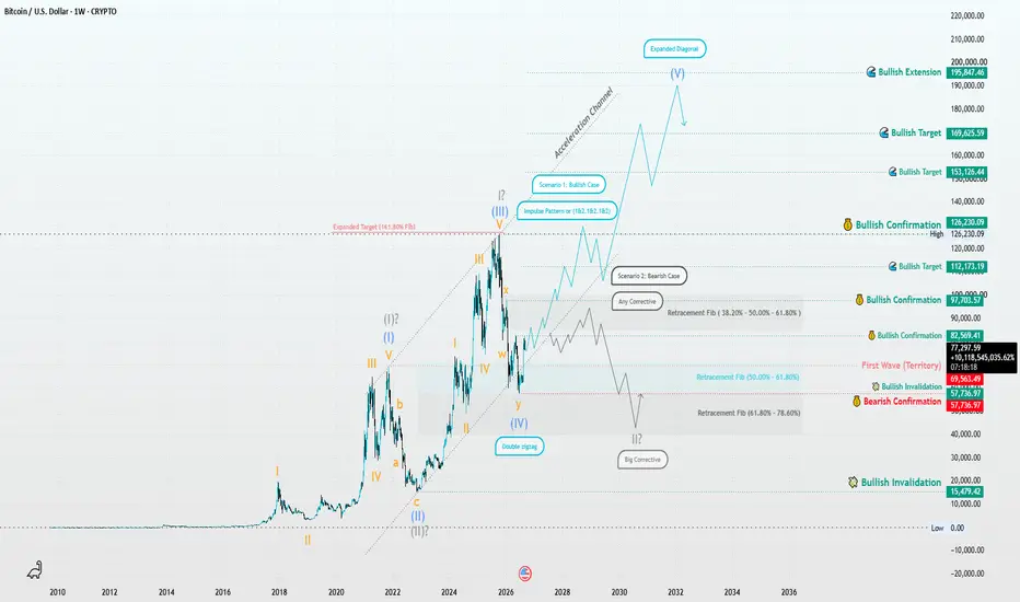
Has Wave II Completed, or Is Another Leg Down Coming?Bitcoin Elliott Wave Analysis | Has Wave II Ended, or Is This Only the First Leg Down?
Financial markets reward discipline—not certainty.
Every price movement reflects collective market psychology, and the Elliott Wave Principle provides a structured framework for understanding that behavior through objective market structure.
This analysis is based on Elliott Wave rules, guidelines, Fibonacci relationships, channel analysis, and price action—not prediction.
Ultimately, the market will decide which scenario becomes reality.
Primary (Conservative) Scenario
My primary scenario suggests that Wave II may already be complete as a Double Zigzag (W-X-Y) consisting of seven swings.
The key confirmation for this scenario would be a decisive break above Wave X, signaling that the corrective structure has likely ended.
If that occurs, I would expect the market to begin a new impulsive advance. However, even after breaking Wave X, pullbacks should still be expected, as markets rarely move in a straight line. Any corrective retracement should simply be viewed as part of a developing bullish trend rather than a change in the larger direction.
Alternative (Aggressive) Scenario
The second scenario assumes that the current Double Zigzag represents only the first bearish leg within a much larger corrective structure.
Under this interpretation, the market should first develop a corrective rally of any valid Elliott Wave corrective pattern, ideally retracing 38.2%, 50%, or at most 61.8% of the recent decline.
If that recovery remains corrective, another impulsive decline would become the higher-probability outcome.
In that case, Bitcoin could continue lower toward the $40,000–$30,000 region, where the larger corrective structure may finally be completed before the next long-term bullish cycle begins.
What Matters Most
At this stage, price structure is more important than price itself.
Rather than anticipating the market, I prefer to let the wave structure reveal which scenario is unfolding.
A confirmed impulsive advance would strengthen the conservative outlook.
A corrective recovery followed by renewed selling pressure would favor the aggressive scenario.
Until one of these structures is confirmed, both scenarios remain technically valid under Elliott Wave rules.
Risk Management Comes First
Successful trading is not about predicting every move.
It is about adapting to confirmed market structure while protecting capital.
Patience, discipline, and proper risk management remain far more valuable than confidence without confirmation.
The market always provides another opportunity—but only for traders who preserve their capital.
Final Thoughts
This publication represents an independent Elliott Wave study based entirely on objective market structure.
It is not financial advice, nor a prediction of the future.
If market structure changes, my wave count will change with it.
Because in Elliott Wave analysis, flexibility is not weakness—it is respect for the market.
Facts always win.
"Patterns whisper. I listen."
— Mr. Nobody 🎧📊
Long
Education
$CRCL: The moat questioned Open USD vs. USDC, and what it mean
A new stablecoin just walked onto the field with the biggest backer list crypto has seen in a while and it's aimed straight at Circle's business model.
The core conflict: USDC's entire economic engine is simple Circle keeps the yield earned on reserves backing every dollar in circulation. That's the business. OUSD flips that model: free minting and redemption, no volume caps, and reserve yield shared back with the 140+ partner companies distributing it instead of captured by a single issuer. Governance sits with a partner board, not one company calling the shots.
What makes this different from past consortium coins that fizzled (Paxos's USDG sits at ~$3B vs. USDC's ~$73-74B) is the backer list itself: Visa, Mastercard, Stripe, BlackRock, BNY, and Coinbase all signed on — and three of those names are Circle's own reserve, custody, and distribution partners. That's not a competitor showing up from outside; that's the ecosystem Circle built potentially voting with its feet.
The reaction:CRCL dropped ~16-18% in a single session its worst day since IPO compounded by a same-day Russell index removal forcing mechanical selling. Shares have clawed back a few points since but remain well off the highs.
Where it gets genuinely interesting: Wall Street is split in a way that rarely happens this cleanly. William Blair and Clear Street call the selloff overdone, pointing to USDC's scale and the historical failure rate of consortium coins. Others see this as a real structural threat Circle paid Coinbase ~$908M in 2024 for distribution, and that deal renews in August. If Coinbase's presence in OUSD is leverage for a better deal — or a sign of where flows eventually go — that's a different story than "logo spray and pray."
→ Bull case: first-mover liquidity, regulatory depth, and network effects are hard to replicate — consortiums are notoriously slow and prone to misaligned incentives.
→ Bear case: the distribution layer (exchanges, processors, wallets) now has a coin that pays them to prefer it over USDC — that's the exact lever that could erode Circle's moat over time.
→ Watch point: August's Coinbase contract renewal and Q2 earnings (circulation trend + reserve margin) will likely tell us more than any headline has so far.
We are not taking a side here the range of outcomes is genuinely wide, and this is one where the next few data points matter more than the reaction so far. Watching it closely rather than acting on it yet.
*Not financial advice for educational/discussion purposes.*
Be safe out there! $FIG (Figma): The 80% IPO Reset | Catching the Liquidity Flush
If you have been watching the brutal post-IPO repricing of NYSE:FIG (Figma), you know this chart has been a falling knife since last summer. After debuting and skyrocketing past $140, the stock suffered a massive 80% haircut driven by lock-up expirations and a broader SaaS multiple reset.
But the narrative is officially shifting. Recent 13F filings just revealed massive institutional accumulation (with major players dropping over $1B into the stock at these levels), and Q4 earnings just blew past estimates with 40% revenue growth. The smart money is buying the blood, and the technical structure on the 4-hour chart is finally confirming the bottom.
The Technical Execution
The markdown phase is exhausting, and we just saw a textbook reversal setup play out:
• The Liquidity Flush: Looking at the recent lows, price aggressively swept down into the $24 zone. This wasn't a standard sell-off; it was a pure imbalance liquidity flush. It grabbed the final stop-losses from the panicked retail holders and instantly reversed. If you caught this $24 sweep, you are sitting in a prime structural entry.
• The First Higher Low: After bouncing off $24 and pushing up toward $31, we are currently seeing a healthy, low-volume retracement back to the $25.50 - $26.00 area. The aggressive, panic-selling pressure has dried up.
• Institutional Absorption: The massive sell volume that characterized late 2025 has transitioned into quiet absorption. Institutions are building their positions in this accumulation block without spiking the price.
The Game Plan: Pyramiding the Reversal
We have the fundamental catalyst, and we have the liquidity sweep. Now we trade the structure.
The Strategy: For those already positioned from the $24 flush, this current retracement is where the reversal is validated. If you are looking for a new entry, do not buy blindly into the 4-hour chop.
1. Wait for the MSB: We want to see this current $25.50 area hold as a confirmed "Higher Low." We need a localized Market Structure Break (MSB) to the upside to confirm the pivot.
2. LTF Confirmation: Drop down to the 5-minute chart to hunt for the entry. Wait for a volume surge that signals the bottom of this retracement, followed by a brief stabilization period. Once you get a clean 2-bar streak confirming the buyers have taken control, that is your trigger.
3. Scale In: Initiate your first tranche with a fixed Stop Loss strictly below the $24 liquidity wick, and begin pyramiding into the trade as the 4-hour trend officially reverses.
The IPO hangover is clearing up, and the risk-to-reward down here is deeply asymmetrical. Let the structure confirm the entry, and manage your risk.
Did you catch that $24 liquidity sweep, or are you waiting for the next MSB to jump in? Hear you below! 👇
Disclaimer: This analysis is for educational purposes for the finance trading community. It is not financial advice. Always trade your own plan.
Long