Hourly FVG Range & 5m Inversionan idea for hourly entries using the range theory this isnt going to be perfect as it shows every possibility or oppotunity in the market so take this with bias and your own discretionChỉ báocủa Carsonlowder131
Market Sniper ELITE-20work as a sniper & accurate entry. This works with 1 min, 3min & 5min.Chỉ báocủa sujitarya201011
Volumetric Order Blocks - BensonDeveloped a script that identifies Order Blocks (OBs) and analyzes the volume profile within them. It calculates the Buy and Sell volume percentages for the candle that forms the block, displaying these metrics directly on the chart using boxes and labels. Key Features: Order Block Detection: Identifies Bullish OBs (the last bearish candle before a strong bullish break) and Bearish OBs (the last bullish candle before a strong bearish break). Volumetric Analysis: Calculates Buy and Sell volume percentages based on price action within the OB candle. Visual Representation: Displays the zones as green (bullish) and red (bearish) boxes, with the volume data (e.g., "B 100% | S 0%") and total volume (e.g., "5.0K") shown clearly. Strength Filtering: You can adjust the "Expansion Multiplier" to only highlight OBs that resulted in a significant move.Chỉ báocủa bensontataprofile148
Prasi - ZigZagplots - higher high and lower low This helps in understanding the recent high and lowChỉ báocủa Team2ForTrade1133
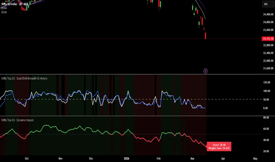
nifty vwap 3.1Monitors the "Big Players" It tracks the 10 most important stocks (like HDFC Bank, Reliance, and ICICI Bank) because these stocks carry the most "weight" and usually decide where the Nifty index goes. 2. The VWAP Test (The Filter) For each stock, the code checks: Is the current price Above its average price (VWAP)? Or is it Below its average price? Why? If a stock is above VWAP, it is considered Strong (buyers are in control). If it is below, it is Weak (sellers are in control). 3. Calculates "Power" (Weightage) Instead of just counting stocks, it calculates their combined percentage in the Nifty. Example: If only 3 stocks are "Above VWAP" but they are the biggest ones (like HDFC and Reliance), the "Total Weight" might still be very high (e.g., 30%), suggesting the market has underlying strength despite fewer stocks being green. 4. Visual Table It puts all this info into a neat Table on the top-right of your chart. Teal Section: Shows stocks that are Strong/Bullish. Red Section: Shows stocks that are Weak/Bearish. Summary: It tells you exactly how many stocks are on each side and their total percentage impact.Chỉ báocủa sudhakar_kb7
nifty vwap 3 Monitors the "Big Players" It tracks the 10 most important stocks (like HDFC Bank, Reliance, and ICICI Bank) because these stocks carry the most "weight" and usually decide where the Nifty index goes. 2. The VWAP Test (The Filter) For each stock, the code checks: Is the current price Above its average price (VWAP)? Or is it Below its average price? Why? If a stock is above VWAP, it is considered Strong (buyers are in control). If it is below, it is Weak (sellers are in control). 3. Calculates "Power" (Weightage) Instead of just counting stocks, it calculates their combined percentage in the Nifty. Example: If only 3 stocks are "Above VWAP" but they are the biggest ones (like HDFC and Reliance), the "Total Weight" might still be very high (e.g., 30%), suggesting the market has underlying strength despite fewer stocks being green. 4. Visual Table It puts all this info into a neat Table on the top-right of your chart. Teal Section: Shows stocks that are Strong/Bullish. Red Section: Shows stocks that are Weak/Bearish. Summary: It tells you exactly how many stocks are on each side and their total percentage impact.Chỉ báocủa sudhakar_kb13
BB Zones + HTF Confluence SignalsBB is a double bollinger band with higher time frames biasChỉ báocủa danielgo_aus19
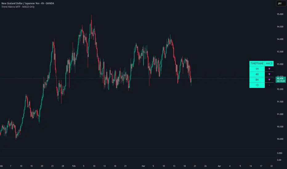
TPrecision MARKET PULSE Read the Energy, Not the DirectionHere's the full TradingView description text, ready to paste: MARKET PULSE — Read the Energy, Not the Direction Every indicator you've ever used tells you the same thing: which way price might go. RSI, MACD, stochastics — they're all measuring direction in different ways. Market Pulse does something fundamentally different. It measures the energy state of the market — the rhythm underneath price that exists before any move happens. The concept is simple: markets breathe. Before every significant move, price compresses — ranges tighten, candles shrink, volatility collapses inward. The market is inhaling. Then it exhales. Price erupts, ranges expand, energy releases. Market Pulse makes that cycle visible in real time across four components stacked in a single clean pane. BREATH (top section — blue/amber line) This is the core reading. True range normalized against its own long-term average, so 1.0 always means "normal." When the line drops below the blue band (0.7), the market is compressing — inhaling, coiling, building potential energy. When it rises above the amber band (1.3), the market is expanding — exhaling, releasing, moving with conviction. A breath line that stays flat and low for many consecutive bars is the most important signal this indicator produces. That is a spring being loaded. RHYTHM (middle section — green/red histogram) Rhythm measures the rate of change of breath. Are we expanding faster than we were, or compressing faster? Green bars above the midline mean expansion is accelerating — the exhale is gaining momentum. Red bars below mean compression is deepening — the coil is getting tighter. The most powerful moment is when rhythm crosses from red to green after a prolonged compression period. That is the first sign the exhale has begun. TENSION (bottom section — gradient fill) Every bar that breath spends below 1.0 (below-normal range) accumulates tension. The fill builds from blue to amber as pressure increases. High tension means the spring has been coiled for a long time and release is statistically overdue. Tension does not decay instantly — it bleeds out slowly on expansion bars, reflecting how energy releases gradually after a long coil. When tension is at its peak and breath is still compressed, you are looking at maximum potential energy in the market. PULSE RATE (dotted circles — overlay on breath section) This tracks the average interval between breath peaks — how fast energy cycles are completing. When the dots are high, cycles are churning quickly (active, volatile market). When dots drop, cycles are slowing down. A decelerating pulse rate often precedes market exhaustion, regime change, or a significant transition in character. It is the one component that operates on a longer timescale than the others. BACKGROUND ALERTS 🔵Blue background tint — Tension above 75% AND breath compressed below 0.7. The coil is tight. Maximum potential energy. The market is wound up. 🟠Amber background tint — Breath above 1.3 AND rhythm positive. Active release in progress. Energy is being deployed. HOW TO USE IT This indicator does not tell you to buy or sell. It tells you what state the market is in so you can make better decisions with whatever strategy you already use. Use it to avoid trading in the wrong state — entering a trend trade during deep compression usually means getting chopped. Entering a range trade during active expansion means getting run over. Use it to time entries on your existing signals — a buy signal that fires while tension is at extreme highs and breath is turning up is a very different trade than the same signal firing in a neutral state. Use it to identify when something is about to happen — not what, but when the energy conditions are right for a significant move. Use it across timeframes — compression on the daily while expansion fires on the 4H often means a powerful intraday move within a larger coiling structure. SETTINGS Base Period (default 20) — The lookback for ATR and breath calculation. Higher values = smoother, slower readings. Lower = more reactive. Smoothing (default 5) — Applied to all components. Increase to reduce noise on lower timeframes. Tension Lookback (default 50) — How far back tension and rhythm normalize themselves. Higher = tension builds more slowly, more selective extremes. Pulse Rate Period (default 10) — How many breath cycles to average for the pulse rate calculation. WORKS ON All markets (Forex, Crypto, Equities, Futures, Indices) — All timeframes — Pine Script v6 This is not a signal generator. It is a market state reader. Learn the rhythm before you trade the move. 👉 Join the community, ask questions, share setups: discord.gg/8H4qdBDaEuChỉ báocủa dtprecisionCập nhật 12
Macro DashboardOverview A three-panel macro surveillance dashboard built for top-down discretionary and systematic traders. Aggregates real-time data from 35 cross-asset feeds — rates, credit, liquidity, volatility, and positioning — into a single overlay table that updates on Daily, Weekly, and Monthly charts with automatic lookback calibration for each cadence. What It Does Left Panel — Macro Regime & Rates - Classifies the current macro environment into one of ten named regimes (Goldilocks, Boom, Stagflation, Easing, etc.) by synthesizing growth, inflation, and liquidity conditions in real time. - Decomposes rate moves into their underlying drivers — breakeven inflation vs. real rate — so you can see why yields are moving, not just that they moved. - Monitors yield curve dynamics (bull/bear steepening/flattening), high-yield credit spreads, forward inflation expectations, and the stock-bond correlation regime. - Tracks Fed balance sheet components, net liquidity, M2, bank reserves, and initial claims with directional momentum readings. Middle Panel — Volatility & Positioning - Surfaces the full vol complex: equity vol, rates vol (MOVE), the implied-vs-realized premium, term structure shape, skew, vol-of-vol, and put/call sentiment — condensed into a composite tail-risk gauge. - Estimates CTA/trend-follower positioning across equities, bonds, gold, and the dollar using a multi-horizon momentum proxy, and shows whether systematic flows are adding, holding, or cutting. - Models a vol-target leverage signal that tracks how risk-parity and vol-controlled strategies would be adjusting exposure based on recent realized volatility. - Rolls all of the above into a Signal Alignment section that scores conviction across four independent domains (macro, vol, credit, flows), flags which signal diverges when conviction is high, and generates a one-line narrative summary. Right Panel — Cross-Asset Pulse - Provides a full technical scorecard for 20+ instruments spanning equities, Treasuries, credit, precious metals, industrial commodities, energy, FX, crypto, and global equity markets. - Each row displays price, bar change, momentum, comparative relative strength vs. SPY, volatility-normalized mean-reversion distance, 52-week range positioning, and short-term / long-term trend states, culminating in a single actionable quadrant signal (LEAD / WATCH / REDUCE / AVOID). Decision Output - A composite risk-mode score derived from the four signal domains, expressed as a z-score with a directional label (Risk-On, Neutral, Defensive, Risk-Off) and a trend reading (Improving / Stable / Deteriorating). - Translates the score into allocation-level guidance: equity weight bias, duration posture, and hedge urgency — all internally consistent so the output never contradicts itself. - Breaks the view into three time horizons (Short-Term, Medium-Term, Long-Term) to separate tactical positioning from structural backdrop. Who It's For Macro-oriented traders and portfolio managers who want a single-screen answer to "What regime are we in, what's the vol surface saying, where is systematic flow headed, and do those signals agree?" Settings - Adjustable lookback lengths for momentum, relative strength, correlation, and historical volatility. - Configurable CTA target volatility and max leverage. - Table position and text size controls. Optional sleeve z-score display for the risk mode composite.Chỉ báocủa johnbaekkCập nhật 7
20 EMA - 12 Points Distance Alert + LineNotifies you when the price gets at least 12 points away from the 20 emaChỉ báocủa russell3wvzj113
river 10 min **This strategy was specially developed for the RIVERUSDT pair, combining advanced moving average techniques with continuous optimization to capture high-quality trading opportunities. It is designed to enhance trend detection, improve entry timing, and adapt more effectively to changing market conditions. The result is a more refined and dynamic trading approach aimed at maximizing potential performance while maintaining a structured and disciplined methodology.** אם אתה רוצה, אכתוב לך עכשיו גם גרסה **יותר חדה ומקצועית ברמה של פרופיל סיגנלים או משקיעים**. Chiến lượccủa lazyk4212
3A Setup + Order Flow3A Setup + Order Flow Indicator Combines Fabio's 3A Strategy (Absorption + Accumulation + Aggression) with Order Flow volume analysis. ━━━━━━━━━━━━━━━━━━━━ 📊 ORDER FLOW BUBBLES ━━━━━━━━━━━━━━━━━━━━ Volume bubbles sized by relative volume vs moving average: • 🟢 Green = Buy Dominant (strong bullish body or long lower wick) • ⚫ Black = Sell Dominant (strong bearish body or long upper wick) • 🟡 Yellow = Neutral (high volume but no clear direction) Bubble size: Small → Normal → Large → Huge Based on volume / SMA ratio thresholds. ━━━━━━━━━━━━━━━━━━━━ 🎯 3A SETUP SIGNALS ━━━━━━━━━━━━━━━━━━━━ AAA signal triggers ONLY when all 3 conditions align: 1️⃣ Absorption 🔶 High volume bars with small bodies. Institutions absorbing opposing orders. Requires minimum 2 absorption bars in lookback. 2️⃣ Accumulation 📦 Tight consolidation range after absorption. Volume decreases = calm before the storm. Range must be less than 1x ATR. 3️⃣ Aggression 💥 Breakout bar with high volume + large body. Must close beyond accumulation range + margin. Confirms institutional direction. ━━━━━━━━━━━━━━━━━━━━ 📌 CHART MARKINGS ━━━━━━━━━━━━━━━━━━━━ • 🔶 Orange Diamond = Absorption bar detected • 🟩 Green Box = Bullish accumulation zone • 🟥 Red Box = Bearish accumulation zone • ▲ AAA▲ = Buy signal (all 3 confirmed) • ▼ AAA▼ = Sell signal (all 3 confirmed) ━━━━━━━━━━━━━━━━━━━━ ⚙️ SETTINGS ━━━━━━━━━━━━━━━━━━━━ All parameters are adjustable: • Volume MA length • Bubble size thresholds • Absorption: volume multiplier, max body ratio, min bars • Accumulation: length, ATR multiplier • Aggression: volume multiplier, min body ratio, break margin ━━━━━━━━━━━━━━━━━━━━ 📖 HOW TO USE ━━━━━━━━━━━━━━━━━━━━ 1. Watch for orange diamonds (absorption) 2. Wait for tight consolidation (accumulation) 3. Enter on AAA▲ or AAA▼ signal (aggression) 4. Use bubbles for additional confirmation 5. Stop loss below/above the accumulation box Based on Fabio's ICT Order Flow concepts. Works on all timeframes and instruments. Chỉ báocủa smalldonCập nhật 62
premium on harukionly set up indicator It’s a useful tool for recording trades. Please use it for ICT setups. Chỉ báocủa mejirobear_crck52114
Blanco V3 (PRO MTF System)**Blanco V3 – Advanced Precision Trading System** Blanco V3 is the next evolution of the Blanco series, designed to deliver **precision entries, stronger confirmations, and cleaner decision-making**. It builds on the foundation of Blanco V1 and V2 by enhancing timing, filtering noise, and introducing smarter multi-timeframe alignment. At its core, Blanco V3 uses a **Zero Lag EMA (ZLEMA)** to reduce delay and detect trend direction faster than traditional indicators. Combined with advanced filters, it helps traders enter earlier while avoiding weak or late setups. --- ### ⚙️ Intelligent Trading Modes Blanco V3 features three adaptive modes that dynamically adjust strictness: * **Aggressive Mode** Faster signals with more entries. Ideal for scalping and lower timeframes. * **Balanced Mode (Recommended)** Optimized for consistency. Balances signal quality and frequency. * **Conservative Mode** Focuses only on the strongest setups. Best for swing trading and higher timeframes. Each mode automatically adjusts: * Trend strength thresholds (ADX) * Momentum requirements (RSI) * Entry precision (pullback sensitivity) --- ### 📊 Signal System Blanco V3 delivers a refined 3-layer signal structure: #### 🔺 Entry Signals (Precision Arrows) Small arrows mark optimized entry points using: * Pullbacks toward the ZLEMA * Momentum confirmation (RSI alignment) * Strong trend validation (ADX filter) * Candle strength (price action confirmation) These signals are designed to **improve timing and avoid chasing price**. --- #### 🟢 BUY / 🔴 SELL Labels (Trend Confirmation) Larger labels appear when the overall trend shifts direction, helping traders identify: * Swing entries * Trend reversals * Continuation opportunities --- #### ❗ Elite Signals (Full Alignment) Blanco V3 introduces enhanced **Elite Signals**, which appear only when: * A valid entry signal is triggered * AND all monitored timeframes are aligned These signals represent the **highest-probability setups**, combining trend, momentum, and full market agreement. --- ### 🧠 Multi-Timeframe Intelligence Blanco V3 includes a bright, easy-to-read dashboard showing trend direction across: * 5-minute * 15-minute * 30-minute * 1-hour * 2-hour * 4-hour Each timeframe is color-coded: * 🟢 Green = Bullish * 🔴 Red = Bearish --- ### 🔍 Smart Confirmation Logic (NEW) Blanco V3 improves flexibility and accuracy with: * **Partial Alignment (4/6 or more)** Allows earlier entries while maintaining quality * **Full Alignment (6/6)** Triggers ❗ Elite Signals for maximum confidence * **Noise Reduction Filters** Avoids sideways markets and weak momentum conditions --- ### 🎯 Strategy Philosophy Blanco V3 is designed around one key principle: > **Trade with the trend, enter on pullbacks, and confirm with alignment.** It focuses on: * Entering **after retracements**, not breakouts * Trading only in **strong market conditions** * Aligning with **higher timeframe direction** --- ### ⚠️ Best Use * Best on **1H and 4H charts** * Works best in **trending markets** * Combine with: * Risk management * Support & resistance * Market structure --- ### 📌 Quick Guide * 🔺 Arrows = precise entries * 🟢 BUY / 🔴 SELL = trend shifts * ❗ = elite high-probability trades * 📊 Dashboard = multi-timeframe confirmation --- **Blanco V3 is built for traders who want cleaner charts, smarter entries, and higher-quality signals — all in one system.** Chỉ báocủa blancoaby0140
Blanco V1-(Custom TF + Super Signals)**Blanco V1 Trading System (Multi-Timeframe Confirmation)** Blanco V1 is a high-probability trading indicator designed to identify strong market opportunities using a combination of Zero Lag EMA, trend strength, momentum, and multi-timeframe confirmation. At its core, Blanco V1 uses a Zero Lag Exponential Moving Average (ZLEMA) to reduce delay and provide faster, more accurate trend signals compared to traditional moving averages. The system includes three trading modes: * **Aggressive Mode**: More signals with faster entries, ideal for lower timeframes and active trading. * **Balanced Mode**: A mix of accuracy and frequency, recommended for most traders. * **Conservative Mode**: Fewer but higher-quality signals, focused on strong trends and confirmation. Blanco V1 provides two types of trade signals: * **Entry Signals (Arrows)**: Small green and red arrows show potential entries based on pullbacks, momentum (RSI), and strong trend conditions (ADX). * **Trend Signals (BUY/SELL Labels)**: Larger labels appear when the overall trend shifts, signaling potential swing trades. A key feature of Blanco V1 is the **Multi-Timeframe Dashboard**, which displays trend direction across: * 5-minute * 15-minute * 30-minute * 1-hour * 2-hour * 4-hour Each timeframe is color-coded: * 🟢 Green = Bullish * 🔴 Red = Bearish The most powerful feature is the **Super Signal (❗)**: * A green ❗ appears when all timeframes are bullish and a valid buy setup is present. * A red ❗ appears when all timeframes are bearish and a valid sell setup is present. These signals represent the highest-probability trades, combining trend alignment, momentum, and full multi-timeframe confirmation. Blanco V1 performs best on higher timeframes such as 1H and 4H and in trending markets. For best results, combine with proper risk management and price action confirmation. --- **Quick Guide:** * 🔺 Arrows = entry timing * 🟢 BUY / 🔴 SELL = trend shifts * ❗ = strongest trades (full alignment) Chỉ báocủa blancoaby0134
Auto Parallel Channel - Trend & Reversal TrackerThis indicator automates a highly specific and effective manual charting technique for tracking trends and identifying potential reversal zones. It is designed to help traders visualize dynamic parallel channels without the hassle of constantly redrawing lines, making it especially useful for timing short entries or spotting bottom reversals in volatile markets like crypto and forex. How It Works: Unlike standard channel indicators that simply connect the highest highs and lowest lows, this script uses a refined pivot-based logic. During a downtrend, it identifies the last three Pivot Lows (PL) and the last Pivot High (PH). It constructs the foundational trendline by connecting the intermediate lows and projects a perfectly parallel upper boundary starting from the last confirmed PH. Key Features: Custom Key Levels: Includes specific internal and external parallel levels (-0.12, 0, 0.12, 0.5, 0.88, 1.0, 1.12) to identify precise support, resistance, and breakout zones. Dynamic Peak Tracking (Prediction Line): Features a unique "memory" line. Before a new pivot is fully confirmed, a dashed tracking line anchors to the absolute highest price seen since the last Pivot High. This acts as an early-warning prediction channel that adjusts dynamically as price pushes higher, but stays firmly anchored if price drops. Clean Chart Management: Prevents chart clutter by automatically limiting the number of historical channels shown at once (customizable). Smart History Extension: Old channels don't just disappear or stretch to infinity. They are systematically frozen and extended backward/forward by a user-defined number of bars, allowing you to backtest how price reacted to past channel structures. Customizable Settings: Pivot Length: Adjust the sensitivity of pivot detection (Default: 25). History Extension Bars: Control how far historical channel lines project into the past/future (Default: -65). Max Historical Channels: Keep your chart clean by limiting visible past channels (Default: 3). Toggles: Easily turn dynamic tracking, historical lines, and pivot labels on or off. Whether you are riding a trend or looking for the exact moment a downtrend loses momentum, this automated channel system keeps your charts clean, precise, and highly actionable.Chỉ báocủa sohaibnori136
S&P 500 Breadth BullstackCore Idea of the Indicator: The indicator is not a classic buy/sell trigger, but rather a breadth regime scanner for the S&P 500. In other words, it measures how many stocks in each sector are trading above their 20-day, 50-day, and 200-day moving averages (Simple Moving Average - SMA), compresses that information into a color-coded view, and visualizes whether there is a true “bullstack” in the market. In practical terms, this means it is especially useful for filtering long positions during strong market phases, scaling into them, and turning defensive earlier when market breadth starts to weaken. Structure: The code loads three breadth series for each of the 11 S&P 500 sectors, plus the Nasdaq-100: 20D, 50D, and 200D. The data is retrieved using request.security() from other symbols or contexts; in Pine, this function is used to access values from other symbols or timeframes within the script. The script also calculates three averages from the 11 sectors (tot20, tot50, tot200) to create an overall view of S&P 500 market breadth. Color Logic: The core idea is: 20D represents short-term momentum, 50D represents medium-term confirmation, and 200D represents the long-term trend. The bullstackColor() function does not create a simple traffic-light system, but rather a graduated state model: green/turquoise means broad strength, white marks the transition zone, yellow/orange signals early weakness, red to near-black indicates clear breadth weakness, and pink represents a special case of negative divergence. This divergence occurs when many stocks are still above their 200D line in the long term (b200 > 65), while short-term momentum is already breaking down significantly (b20 < 45) — a typical late-cycle/distribution signal. Long Strategy: For longs, the indicator is most powerful when used as a market filter: The best entries occur when overall breadth rotates up out of capitulation through neutral (white) and then into light green, with 20D breadth picking up first as short-term momentum, 50D breadth then confirming as the medium-term trend, and 200D remaining stable as the long-term trend. The highest-quality longs occur when not only “Total SPY” turns green, but especially cyclical sectors such as XLY, XLF, XLI, XLK, and ideally the Nasdaq block as well are participating. That usually means the rally is broad, risk-on, and more durable. Specifically, I would derive three long setups from this: Early long (first tranche) on the turn from capitulation into the neutral zone, when 20D breadth is clearly rising and 50D breadth is no longer declining. Confirmation long (second tranche), when 20D > 50D > 50 and several leading sectors turn green at the same time. Trend add-on (final tranche), when the overall market and cyclical sectors such as XLY, XLF, XLI, and XLK are already green and rotating into turquoise, while pullbacks on the price chart remain shallow (only down to the SMA20 or slightly below). Position Management: For position management, the color is almost more important than the entry itself: as long as the picture remains green and 20D only fluctuates slightly, that argues for holding rather than nervous re-trading. Partial profit-taking or tighter risk management makes sense once strong green fades into pale green or white, because that often marks the transition from expansion to exhaustion. A clear warning signal against new longs is pink: in that case, the long-term trend is still intact, but short-term momentum is already rolling over — exactly the kind of environment where late longs are often rewarded the least. Caution is warranted here, and the first partial profits should be secured. Short Strategy: I would trade shorts much more selectively than longs with this indicator, because breadth indicators in uptrends can often stay “too strong” longer than short setups can tolerate. The better short opportunities do not occur on the first yellow bar, but when the overall picture shifts from white/yellow into orange/red, while 20D breadth and 50D breadth are weak at the same time and defensive sectors look better than cyclical ones. That points more to genuine market distribution rather than just a simple pullback in individual sectors. The cleanest short entries come after a failed rebound out of a pink divergence, or when multiple sectors flip synchronously into red/dark red after a warning phase, especially if Nasdaq, Tech, and other cyclical sectors confirm the weakness. A simple practical rule would therefore be: Prefer longs when breadth is expanding, 20D leads first, and 50D/200D then confirm. No fresh longs during pink divergences. Only take shorts when the weakness is broad, synchronized, and visible across sectors. One more important point: The script measures market breadth, not price structure. Therefore, it is best used as a top-down filter together with price triggers in SPY/ES/QQQ or in individual stocks — for example, breadth turning green plus a breakout or trend pullback on the chart, rather than trading breadth in isolation.Chỉ báocủa Nsrs051144
SMA DynamicSince you're publishing this on TradingView, you'll want a description that looks professional and clearly explains the logic so other traders (or your future self) understand the value. Here is a clean, effective English description for your script: SMA Dynamic Matrix: Adaptive Multi-Timeframe Strategy Overview The SMA Dynamic Matrix is an intelligent, context-aware indicator designed to streamline technical analysis across multiple timeframes. Instead of cluttering your chart with dozens of moving averages, this script automatically detects your current chart interval and applies a specific "Matrix" of three Simple Moving Averages (SMAs) tailored for that timeframe. How it Works The indicator synchronizes perfectly with your analysis flow. When you switch timeframes, the SMA periods update instantly based on a pre-defined optimized matrix: 5 Min: 12, 24, 78 SMAs 30 Min: 13, 26, 65 SMAs Daily: 10, 21, 63 SMAs Weekly: 12, 27, 55 SMAs Monthly: 12, 24, 36 SMAs Note: To keep your charts clean, the indicator will automatically hide itself if you switch to a timeframe not included in the matrix (e.g., 1-hour or 15-min). Visual Hierarchy The script uses a "Heatmap" color logic for instant recognition: Yellow Line: Short-term momentum (Fastest) Orange Line: Medium-term trend (Intermediate) Red Line: Major trend/Structure (Slowest/Most Significant) Key Features Zero Clutter: Only shows the 3 relevant averages for your current view. High Visibility: Optimized colors (Yellow, Orange, Red) with 100% opacity for clarity on both dark and light themes. Clean UI: Thin line weights (1px) to ensure price action remains the primary focus. Automated Logic: No manual input changes required when switching from intraday scalping to long-term investing.Chỉ báocủa Hindi17072
Adaptive Trend ChannelAdaptive Trend Channel is a trend-following overlay indicator designed to visualize directional bias through a dynamic centerline and a volatility-based channel. The script does not try to predict exact tops or bottoms. Its purpose is to help the trader structure price movement into bullish and bearish phases and track where the active side of the market is currently being defended. How it worksThe indicator is built from three core elements: 1. Linear regression smoothing The script first applies linear regression to high, low, and close. This reduces local noise and creates a smoother representation of recent price movement. 2. Reaction envelope on the smoothed series After regression smoothing, the script builds a short reaction structure using: an SMA of the regressed highs and lowsa highest/lowest window over the same smoothed dataThis envelope is used to detect whether recent price behavior continues to support the current directional regime or starts to weaken. 3. ATR-based channel width The channel width is not fixed. It is scaled using ATR, so the distance from the centerline expands and contracts with market volatility. This allows the channel to remain relatively narrow in calmer conditions and wider during more volatile phases. Regime logicThe script maintains a stateful market regime: Bullish regime: the centerline trails upward using the strongest recent trough structureBearish regime: the centerline trails downward using the weakest recent peak structureA regime change happens only when the smoothed reaction structure breaks against the current direction and the regressed close confirms that shift. This means the channel is not simply redrawn on every minor fluctuation. Instead, it attempts to preserve directional continuity until there is enough evidence to flip. What is displayedThe indicator plots: a central adaptive trend linea lower active channel boundary during bullish conditionsan upper active channel boundary during bearish conditionsa colored fill showing the currently dominant sidecircular markers at regime flipsGreen indicates bullish control. Red indicates bearish control. How to use itThis script can be used as a market structure and trend context tool. Typical ways to read it: When the channel is bullish, the centerline and lower boundary can be used as a reference zone for continuation behaviorWhen the channel is bearish, the centerline and upper boundary can be used as a reference zone for rejection behaviorRegime flips can help identify transitions from one directional phase to anotherThe slope of the centerline can help assess whether the current trend is strengthening, flattening, or reversingThe tool is generally more useful for trend context than for isolated entry signals. It can also be combined with price structure, liquidity zones, support/resistance, or volume-based confirmation. InputsLinear regression span: controls how much smoothing is applied to the source seriesEnvelope reaction length: controls the short-term reaction window on the smoothed structureHalf-channel ATR factor: controls how wide the adaptive channel is relative to volatilitySmaller settings will make the channel react faster. Larger settings will generally make it smoother and slower. NotesThis indicator is intended for chart analysis and trend interpretation. It should not be treated as a standalone trading system or as a guarantee of future market direction. Like any trend-following tool, it may react later during sharp reversals and may produce more frequent regime changes in choppy conditions. Chỉ báocủa MarketStructureLab22968
optionsThese Red and Green Bars are actually showing the status of the India VIX (Market Fear Index). Their movement up and down tells you whether "Fear" is increasing or decreasing in the market. In simple terms, here is what they mean: 1. Red Bars (VIX is Up 📈) * What is happening: This means the India VIX has moved higher compared to the previous candle. * Psychology: Uncertainty or fear is rising in the market. * Impact: When these bars are large and Red, the premiums of both Calls and Puts start to rise. * For Sellers: This is dangerous because the options you sold are becoming more expensive (Inflating). 2. Green Bars (VIX is Down 📉) * What is happening: This means the India VIX is falling. * Psychology: The market is cooling down; traders are no longer feeling as much fear. * Impact: This causes a "Vega Crush." Premiums shrink (decay) rapidly. * For Sellers: This is "Jackpot" time. You make money from both theta decay and the drop in volatility. Relationship Between Bars and Lines (Blue/Orange): You simply need to look for these combinations: * Large Red Bars + Blue/Orange Lines Up: This is a "Volatility Spike." Regardless of the direction, premiums are inflating. The chance of hitting a stop-loss is higher. * Large Green Bars + Blue/Orange Lines Down: This is a "Vega Crush." This is the best setup for 0.3 delta selling. Even if the market stays sideways, premiums will crash toward zero quickly. Summary Table: | Bar Color | VIX Status | Market Mood | Option Seller (You) | |---|---|---|---| | RED (High) | Up | Panic/Fear | Risk: Premiums will spike. | | GREEN (High) | Down | Relaxed | Profit: Premiums will drop fast. | | Small Bars | Flat | Stable | Normal: You get standard Theta decay. |Chỉ báocủa sudhakar_kb29
BSL / SSL Liquidity**BSL / SSL Liquidity** --- **Overview** A clean and simple liquidity level detector that automatically marks Buy Side Liquidity (BSL) and Sell Side Liquidity (SSL) levels on the chart based on swing highs and lows. --- **What is BSL and SSL?** - **Buy Side Liquidity (BSL)** — rests above swing highs where buy stop orders accumulate. Smart money targets these levels to fill sell orders before reversing. - **Sell Side Liquidity (SSL)** — rests below swing lows where sell stop orders accumulate. Smart money targets these levels to fill buy orders before reversing. --- **Key Features** - **Candle Close Based** — levels are only swept and removed when price **closes** above a BSL or below an SSL. Wicks that breach a level but close back inside are ignored, keeping valid levels intact. - **User Defined Level Count** — control how many recent swing points are displayed on the chart at any time via the Max Levels input. - **Auto Cleanup** — swept levels are automatically removed from the chart the moment price closes through them, keeping the chart clean and relevant. --- **How to Use** - **BSL** — potential upside target or short entry zone when swept - **SSL** — potential downside target or long entry zone when swept - Combine with higher timeframe bias and confluence factors for best results --- **Best Timeframes** Works on all timeframes. Most effective on 1H and above for swing level identification.Chỉ báocủa tarora19880222136
volatilty 3691. Multi-Asset & Custom Timeframe Selection The script allows you to select a specific asset (NIFTY, BANKNIFTY, etc.) and a fixed timeframe (e.g., 15m, 1H, Daily) from the settings. It fetches data for that specific selection regardless of what chart you currently have open. 2. Volatility-Adaptive Bands Instead of using fixed standard deviations, the script creates dynamic bands around a 25-period EMA. It calculates an ATR (Average True Range). It adjusts the width of the bands based on the India VIX. If VIX is high relative to its 25-EMA, the bands widen to account for market noise. If VIX is low, the bands tighten. 3. Trend Filtering with VWAP & VIX The code uses two primary filters to ensure high-quality entries: VWAP Filter: For a Long signal, the price must be above the VWAP. For a Short signal, it must be below. VIX Spike Protection: It prevents "Long" entries if the VIX is spiking (rising more than 0.8% above its EMA), as a rising VIX usually indicates a falling market or high risk. 4. Entry & Exit Logic BUY Signal: Triggered when the price closes above the Upper Adaptive Band AND VWAP, provided the VIX is stable. SELL Signal: Triggered when the price closes below the Lower Adaptive Band AND VWAP, provided the VIX is trending up. Exit/Neutral: The trend turns "Sideways" if the price crosses back over the 25-EMA, acting as a trailing stop or trend-weakness indicator.Chỉ báocủa sudhakar_kb23
Enhanced High-Scan RSI ProOverview This indicator is designed for professional traders who require clean, high-precision Support and Resistance levels without the "staircase" clutter found in standard pivot indicators. It focuses on the "Tide and Waves" philosophy, distinguishing between major institutional levels and minor intraday hurdles. Built for high-speed scanning, it features an Ingenious Polarity Flip engine that automatically detects when a "broken" level has overturned its role (Support becoming Resistance and vice versa), highlighting potential retest zones in real-time. Key Features Dynamic Polarity (Overture) Detection: Unlike static lines, this script monitors price interaction. When a major level is breached, the line color transforms (e.g., to Yellow) to signal an S/R Flip, identifying high-probability zones for "break and retest" strategies. Institutional vs. Retail Hierarchy: * Major Levels (Solid Bold): Represent long-term historical significance (The Tide). Minor Levels (Thin Dashed): Highlight recent intraday swings (The Waves). Clean Geometry Engine: Uses advanced array management to delete old, irrelevant lines. The result is a clean chart where lines float forward into the future space, providing clear targets for Stop Loss and Take Profit. Fully Refined Settings: Every aspect is customizable, including lookback periods, line limits, colors, and styles, allowing you to tailor the "strength" of the levels to any asset (Forex, Crypto, or Stocks). How to Use Identify the Trend: Watch the Major Levels to determine the primary market boundaries. Spot the Reversal: Look for price exhaustion near the Major Support (Green). The Retest Play: When a level turns Yellow, it indicates an S/R Flip. This is your cue to look for a retest of that level to confirm a breakout or a trend continuation. Risk Management: Use Minor Levels (Dashed) for precise Stop Loss placement or as immediate intraday targets. Technical Specifications Version: Pine Script v6 (Latest) Compatibility: Optimized for all timeframes (Best results on 1H, 4H, and Daily). Performance: Uses lightweight array logic to ensure zero lag, even on lower-end machines.Chỉ báocủa Taj_Ali_Khan4