Reversal Candle Patterns by SKVARMABearish: Bearish Engulfing, Shooting Star, Evening Star, Hanging Man Bullish: Bullish Engulfing, Inverted Hammer, Morning Star, Hammer Chỉ báocủa SKVARMA99032
Silver Bullet Sessions + Session FVGsIf you are trading the Silver Bullet Hours this indicator is right for you. You can fully customize every Session which are London Session and New York Am and PM Session. it displays the FVG inside and it even gives alerts when one is created. I created this indicator within one day with ChatGPT to help me visualize the Silver Bullet Hours. Mistakes can be included I am open for your opinions.Chỉ báocủa kevin_basner119
HTF Candle Architecture [MQLSoftware]HTF Candle Architecture overlays up to three higher-timeframe candles simultaneously on any chart, rendering each at full structural fidelity — body, wicks, and open mid-line — and extending the live candle in real time as bars print. A right-side panel shows the bias, range position, and cross-timeframe alignment for all active levels. Level-touch signals mark when price closes near a key HTF boundary. This is a visual analytical tool intended for chart reading and structural context. It does not execute trades and does not provide financial advice. Key Features Three simultaneous HTF levels, auto-selected from the standard timeframe ladder above the chart, with an override for manual pinning Three display modes per level: Candles (body box + wicks), Bars (H-L spine with open/close ticks), and HL (high and low range lines only) Live candle extends in real time — the body, wicks, and projection lines follow price as the current HTF period develops OHLC Projection lines project the current HTF candle's High, Low, Open, and Close as dotted levels to the right, labeled with the timeframe and price Range Position gauge — a filled-block bar (`████░░░ 71%`) showing where price sits inside each HTF candle's range; extremes (above 80% or below 20%) highlight in amber Alignment row — cross-timeframe bias summary: ↑↑ ALIGNED when all enabled levels agree bullish, ↓↓ ALIGNED when all agree bearish, ⇅ MIXED when they conflict Level-touch signals — fires when price first closes within a configurable ATR threshold of a HTF High, Low, or Open; one signal per HTF candle, per level HTF Bias Background — subtle background tint matching the primary level's direction (blue for bull, red for bear) Four alert conditions, all confirmed-bar only Core Concept Most HTF candle overlay scripts show a single timeframe. The useful information in a multi-timeframe view is not just that a candle exists at a higher timeframe — it is the structural relationship between that candle and the current position of price, repeated across multiple timeframes at once. This indicator builds that view directly. Three independent HTF levels render simultaneously with separate depth cues: the closest timeframe uses a lighter body and thinner border; deeper timeframes use heavier borders and darker fills, so the layered structure reads without confusion at a glance. The range position gauge is the specific addition that single-timeframe tools miss. Whether price is at 91% or 47% of the current Weekly candle's range changes the structural read. The gauge answers that for all three active levels without requiring the user to manually measure. The alignment row adds the cross-timeframe read in a single line. When all enabled timeframes agree on direction, a single colored label replaces the need to read each row and compare manually. When they conflict, ⇅ MIXED in amber flags it explicitly so a false conviction read is not made. The level-touch signal system layers actionable entries on top of the structural view. It applies a zone-entry filter — the signal fires only when price moves into the zone on this bar, not while it is already inside — and a per-period gate that allows at most one signal per active HTF candle per level. Combined, these two filters remove the signal spam that plagues basic proximity alerts. Anatomy of the Display HTF candle bodies are box objects spanning the HTF period's bar range. The live body updates right-edge and color on every bar. Closed candles are committed once the HTF period ends and stay anchored. Wicks are line objects centered within the body's bar range, connecting the body edge to the High or Low. In Bars mode, the same lines form the H-L spine, open tick, and close tick of a standard bar representation. The open mid-line is a dashed horizontal line at the Open price inside the body, visible when the body height exceeds 5% of ATR14, so it is suppressed on doji-like candles where it would overlap the border. OHLC Projection lines are dotted horizontals extending from the HTF period start to `bar_index + N bars` (configurable). Each carries a tiny label on the right showing the timeframe abbreviation, level name, and price. They update every bar, so they track the live candle's developing values until the period closes. The panel occupies the top-right corner. Rows 1-3 show the active timeframe, its bias (↑ BULL / ↓ BEAR), and the range position gauge. Row 4 shows the alignment verdict with a colored background. Rows 5-6 show the last signal fired. The header row shows the ticker. Level-touch signal arrows appear below or above the bar that closes near a HTF level: ▲ for a Low touch (potential support), ▼ for a High touch (potential resistance). Signal size scales with HTF depth: L1 uses the smallest arrow, L3 the largest. Notes on Repainting HTF candle visual rendering uses `request.security` with `lookahead=barmerge.lookahead_on`. The live body and wicks update intrabar as the current HTF candle develops. This is display-only and is the standard practice for visualizing a forming HTF candle. The `lookahead_on` value is never used in any signal condition. All signals are gated by `barstate.isconfirmed` and fire only on closed bars, never intrabar. Zone-entry filter : a signal fires only if `math.abs(close - level) <= threshold` on this bar AND `math.abs(close - level) > threshold` on the prior bar. Price must move into the zone on this bar; already being inside the zone does not retrigger. Per-period gate : a boolean flag resets at the start of each new HTF candle and is set on the first signal. At most one signal fires per HTF period per level. Alerts are gated by `barstate.isconfirmed` and fire once per confirmed bar. Typical Analysis Workflow A common analytical workflow may include: Checking the alignment row to establish a directional context — ↑↑ or ↓↓ ALIGNED suggests all active timeframes agree; ⇅ MIXED means caution Reading the range position gauge to see whether price is extended (above 80% or below 20% of the HTF range, highlighted in amber) or mid-range Watching the OHLC projection lines for the current session's active levels — these are the structurally meaningful prices for the live HTF candle Noting level-touch signals as markers where price has closed near a key HTF boundary; combine with other analysis to assess significance Configuration Auto Timeframes — when enabled, selects the three most relevant standard TFs above the chart automatically. Disable to pin timeframes manually per level. Candles to Show — how many closed HTF candles to keep on chart per level. Older candles are removed as new ones close. Display Type — Candles, Bars, or HL. Applied to all levels simultaneously. Per level (HTF 1 / 2 / 3) — enable/disable, custom timeframe, body opacity (0=opaque to 95=near-transparent), and separate bull/bear color pickers. Visual group — show/hide wicks, mid-line, timeframe labels, live-candle highlight, bias background, anchor dots at period starts, and new-period shade. Projections — show/hide H, L, O, C levels independently; extend-right bars; price labels on/off. Panel — show/hide. Signals — show/hide; touch threshold as ATR multiplier (0.05–1.0); H/L and Open toggles per level independently. Markets and Timeframes Works on any instrument and timeframe where at least one higher timeframe exists above the chart: Forex Stocks and Indices Commodities Cryptocurrencies Auto timeframe selection scales from 1m charts (1H / 4H / D auto) through Daily (W / M auto). At the top of the timeframe ladder, fewer than three higher timeframes exist and the unused levels can be disabled. Alerts HTF 1 H/L Touch — price closed near HTF 1 High or Low HTF 2 H/L Touch — price closed near HTF 2 High or Low HTF 3 H/L Touch — price closed near HTF 3 High or Low Any HTF H/L Touch — price closed near any active HTF High or Low All alerts fire on confirmed bars only.Chỉ báocủa MQLSoftware44472
Body vs Wick Filter**Body vs Wick Filter** The Body vs Wick Filter is a candle analysis tool that identifies candles with a significant body relative to their total range. The core idea behind this indicator is that candles with a large body and small wicks represent strong, decisive price movement, while candles with small bodies and large wicks indicate indecision, rejection or failed attempts to move in a direction. By filtering for candles that meet a minimum body percentage, traders can visually separate high-conviction moves from noise. **How it works** For every candle on the chart, the indicator calculates three values: the total candle range from high to low, the body size from open to close, and the remaining wick size. It then expresses the body as a percentage of the total range. A candle where the body takes up 80% of the total range is a strong, directional candle. A candle where the body is only 20% of the range is mostly wick and represents uncertainty in the market. **Coloring and visual output** Candles that meet or exceed your minimum body percentage threshold are highlighted directly on the chart. Bullish candles that qualify receive one color and bearish candles that qualify receive a separate color, both fully customizable in the settings. Candles that do not meet the threshold are left in their original chart color, so your attention is naturally drawn to the qualifying candles only. An optional percentage label is displayed above each candle within the lookback window, showing the exact body percentage so you can quickly assess the strength of any candle at a glance. **How to use it** 1. Set your minimum body percentage in the settings, for example 60%, to only highlight candles where the body makes up at least 60% of the total range 2. Choose your preferred colors for bullish and bearish qualifying candles 3. Adjust the lookback window to control how many recent candles display the percentage label 4. Use the Data Window by hovering over any candle to see the exact body percentage, wick percentage, total candle size in pips and body size in pips **Practical applications** This indicator is particularly useful for traders who base entries on candlestick structure, such as identifying strong momentum candles, confirming breakouts, or filtering out indecisive price action around key levels. It works on any timeframe and any instrument.Chỉ báocủa Trade4green18
Early Reversal Candlestick Pattern Early Reversal Candlestick Pattern Indicator (TradingView Pine Script v6) Identify high-probability market reversals with this advanced candlestick pattern indicator. The script automatically detects and confirms multiple bullish and bearish reversal setups, helping traders spot potential trend changes with greater confidence. ✅ Included Patterns 🔹 Inside Bar Breakout (Bullish) 🔹 Inside Bar Breakdown (Bearish) 🔹 Hammer Confirmation (Bullish) 🔹 Shooting Star Confirmation (Bearish) 🔹 Bullish Engulfing Reversal 🔹 Bearish Engulfing Reversal ⚡ Key Features Adjustable confirmation candle count Individual pattern enable/disable controls Separate color customization for each setup Automatic visual highlighting of confirmed reversal zones Works on all markets and timeframes 📈 How It Works The indicator doesn't just identify candlestick patterns—it waits for additional confirmation candles before marking a setup, reducing false signals and improving trade quality. Perfect for: ✔️ Price Action Traders ✔️ Swing Traders ✔️ Intraday Traders ✔️ Trend Reversal Strategies 💡 Combine with support/resistance, volume, and market structure for even better results.Chỉ báocủa ChartTrader-X32
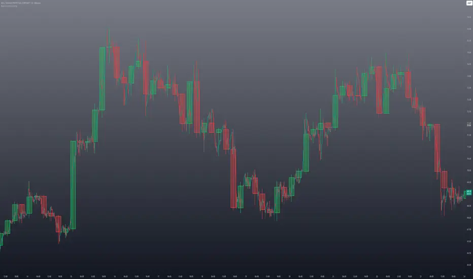
Macro Candle OverlayMacro Candle Overlay is a higher-timeframe candle visualization tool designed to display selected macro candles directly on the active chart. The script draws candles from a selected higher timeframe, such as 15m, 30m, 1H, 2H, 4H, Daily, Weekly, or Monthly. Each higher-timeframe candle is represented with its own body and wick, allowing traders to view larger candle structure without switching away from the current chart timeframe. This can help with visual analysis of broader market context, including higher-timeframe candle direction, wick behavior, candle body size, and developing macro candle structure. Main features: * Higher-timeframe candle overlay on the current chart; * Selectable candle timeframe; * Bullish and bearish body color settings; * Wick and border color settings; * Adjustable body transparency; * Automatic candle updating while the current higher-timeframe candle is still developing; * Clean chart-based visualization with no signal logic. How it works: The indicator uses the selected higher timeframe to define candle open, high, low, close, start time, and end time. It then draws each candle as a chart object, including a candle body and a wick. The active candle updates as new price data appears. This script does not generate buy or sell signals. It does not include strategy logic, alerts, backtesting, win-rate calculations, or performance projections. It is intended only as a visual charting tool for reading higher-timeframe candle structure. Traders can use it as an additional visual reference together with their own analysis, market structure, risk management, and trading plan. Chỉ báocủa Crypto_Imperija26
ATSS Pip HeightSimple minimalist "indicator" to show the movement of last candle as Open-Close and High-Low in brackets. Saves estimation from price scale or manual drawing on screen to measure.Chỉ báocủa tcjc_mail9
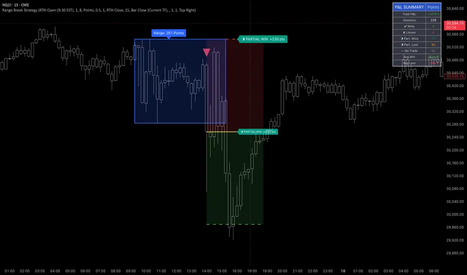
Range Breakout Strategy (Candle Close/ Any Break) + P<his script defines your chosen range (in candles) based on a candle close or any range break. This can be changed in the settings. The default is candle close - please change it to any range break if you want. As of now, candle close setting on NQ seems more profitable, but this of course will depend on the underlying and also the range of your choosing. The yellow line shows your entry point. You can of course edit line colors etc. in the settings. The dashed lines show your stop loss (red) and profit target (green). Then, the script calculates the P&L for your strategy. You can play with the settings and dates to calculate the P&L and see it change in real time in the stats table as you do so. I took care to calculate partial wins and losses as well, which is all indicated on the chart. I hope you find this useful. Happy trading, ~ Ava ~ Chỉ báocủa Stokrotka41
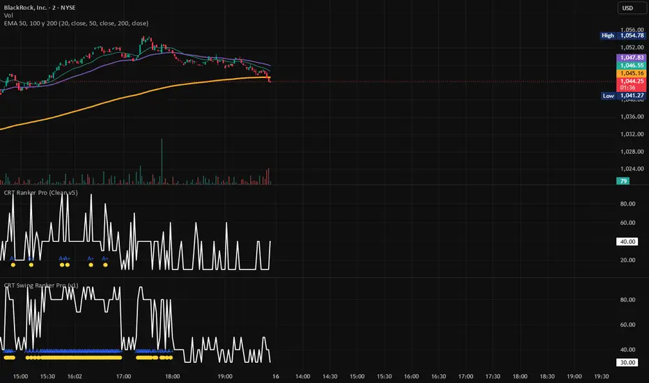
CRT Swing Ranker 2Wk+ by WildStitchScore swing setups that show elite A+ signals using my clean output design. This is a multi-factory swing trading indicator that scores stocks based on trend structure, relative strength, swing compression, volume consistency, and overall market regime. It is designed to identify swing setups with a typical holding pattern of 2 weeks or more. Use higher scores to identify the strongest setups, 70+ indicates A+ conditions, above 80 highlights elite continuation, this indicator is designed for scanning and ranking and not as a standalone buy/sell decision maker. Chỉ báocủa WildStitch9
Engulfing Zone Finder (Box) by vinafxEngulfing Zone (EG) Finder is an overlay indicator that automatically detects and draws boxes for two types of momentum-based price action patterns: Engulfing Zones and Outside Bar Zones . 🔷 Engulfing Zone (EG) An Engulfing Zone forms when a sequence of candles results in a breakout candle (BO) that closes beyond the high or low of an origin candle. Unlike the traditional 2-candle engulfing pattern, this indicator allows intermediate candles between the origin and the breakout candle, capturing a broader range of momentum shifts. Bullish Engulfing Zone The origin candle is a bearish candle. A subsequent bullish candle closes above the high of the origin candle — this is the breakout (BO) candle. A box is drawn from the origin candle to the BO candle, with the top and bottom set to the high and low of the origin candle . The box is drawn with a green border by default. Bearish Engulfing Zone The origin candle is a bullish candle. A subsequent bearish candle closes below the low of the origin candle — this is the breakout (BO) candle. A box is drawn from the origin candle to the BO candle, with the top and bottom set to the high and low of the origin candle . The box is drawn with a red border by default. Smart filtering logic built in: Origin Shift : If a new candle of the same type sweeps the wick of the current origin candle, it automatically replaces the origin. For example, if a new bearish candle has a higher high than the existing bearish origin, the new candle becomes the origin. Opposite Break Invalidation : If price closes beyond the opposite side of the origin candle before a valid breakout occurs, the origin is discarded. Nested Zone Filtering : If a smaller EG zone exists inside a larger one (same type), the indicator keeps the smaller zone and removes the larger one, reducing visual clutter. Max Candle Duration : A configurable limit (default: 5) controls the maximum total number of candles from origin to BO (inclusive). This prevents excessively long zones. 🔶 Outside Bar Zone (OB) An Outside Bar Zone is a 2-candle pattern where the second candle completely engulfs the first candle's range (higher high AND lower low), and both candles share the same direction. Bullish Outside Bar Zone Two consecutive bullish candles. The second candle has a higher high and a lower low than the first. The second candle's close is above the high of the first candle. A box is drawn covering the first candle, with a green border by default. Bearish Outside Bar Zone Two consecutive bearish candles. The second candle has a higher high and a lower low than the first. The second candle's close is below the low of the first candle. A box is drawn covering the first candle, with a red border by default. ⚙️ Settings Engulfing Zone Settings (Bullish / Bearish) Show/Hide: Toggle visibility for each zone type independently. Border Color: Customize the box border color. Background Color: Customize the box fill color and transparency. Outside Bar Zone Settings Show/Hide: Toggle visibility for Bullish and Bearish OB Zones independently. Border Color / Background Color: Fully customizable for each type. Performance & Limits Max Total Candles (Origin to BO) : Controls how many candles (including origin and BO) are allowed to form an EG zone. Default is 5. Set to 0 for no limit. Max Pending Origin Candles : Limits the number of origin candles tracked simultaneously. Default is 100. Max Total Boxes Displayed : Limits the total number of boxes drawn on the chart across all zone types. The quota is shared flexibly — if one type produces fewer boxes, the remaining capacity is available for other types. Default is 200. TradingView maximum is 500. 📝 Notes This indicator is an overlay and draws directly on the price chart. It works on all timeframes and all instruments (stocks, forex, crypto, futures, etc.). Doji candles (where close equals open) are included in the detection logic. A Doji is treated as both bearish and bullish, so it can serve as an origin candle, a breakout candle, or part of an Outside Bar pattern. The indicator uses open-source Pine Script v5. No external data requests or repainting techniques are used. Chỉ báocủa vinafx1172
Fake Pin Bar & Engulfing Pattern DetectorFake Pin Bar & Engulfing Pattern Detector This indicator is designed to detect Fake Pin Bar structures and standard Engulfing candle patterns directly on the chart. A Fake Pin Bar is a price action pattern that appears after price forms a Mother Bar, then one or more Inside Bars, and finally produces a false breakout candle. The signal candle briefly breaks outside the Mother Bar range, but then returns back inside the structure. If that breakout candle also has a strong rejection wick and a relatively small body, the indicator marks it as a Fake Pin Bar. The idea behind this pattern is simple: price attempts to break above or below a consolidation area, fails to continue, and closes back inside the previous range. This can show rejection, trapped breakout traders, or a possible reversal area. How The Indicator Works The script looks for three main components: 1. Mother Bar A candle that defines the main high and low range. 2. Inside Bar Sequence One or more candles after the Mother Bar that remain inside the Mother Bar range. 3. False Breakout Pin Bar The signal candle must break only one side of the Mother Bar range and then return back inside it. For a bearish signal, price breaks above the Mother Bar high and rejects downward. For a bullish signal, price breaks below the Mother Bar low and rejects upward. The indicator also detects standard bullish and bearish Engulfing patterns. An engulfing pattern is detected when the current candle body fully engulfs the previous candle body in the opposite direction. Best Use Cases This indicator is best used as a price action confirmation tool, not as a standalone trading system. It can be useful around: - Support and resistance areas - Supply and demand zones - Previous session highs and lows - Liquidity sweep areas - Consolidation breakouts - Higher timeframe key levels - Trend pullbacks - Range boundaries Fake Pin Bars are generally more meaningful when they appear at important market levels instead of random areas in the middle of a chart. Settings Minimum Wick Ratio Controls how large the rejection wick must be compared to the full candle range. A higher value requires a stronger wick and produces fewer signals. Maximum Body Ratio Controls the maximum allowed candle body size compared to the full candle range. A lower value requires a smaller body and makes the pin bar condition stricter. Maximum Inside Bar Count Defines how many Inside Bars the script can look for after the Mother Bar. A higher value allows the indicator to detect longer consolidation structures. Confirm Signals After Bar Close When enabled, signals are confirmed only after the candle closes. This helps avoid signals changing during the live candle. Require Body Inside Mother Bar When enabled, the signal candle body must return fully inside the Mother Bar range. This makes Fake Pin Bar detection stricter. Show Engulfing Candles Turns standard bullish and bearish Engulfing candle detection on or off. Show Pattern Details Shows or hides the Mother Bar pattern box and high/low guide lines. Label Text Size Changes the size of the Fake Pin Bar signal labels. Inside Bar Area Opacity Controls the opacity of the pattern area shown on the chart. Bullish Candle Color Sets the color used for bullish Engulfing candles. Bearish Candle Color Sets the color used for bearish Engulfing candles. Important Notes This indicator does not place trades, does not calculate stop loss or take profit levels, and does not provide financial advice. Signals should be combined with market structure, trend direction, volume, support/resistance, and proper risk management. No price action pattern is perfect. Fake breakouts and engulfing candles can fail, especially in low-volume or choppy market conditions.Chỉ báocủa malibuuu33831
Alpha Terminal Studio (G-ALPHA)🚀 Alpha Terminal Studio (G-ALPHA) The Alpha Terminal Studio (G-ALPHA) is an institutional-grade, multi-modular trading terminal environment designed to unify advanced market geography, institutional liquidity mapping, structural trend vectors, and algorithmic order-flow confirmation into a single, high-performance cohesive layout. Rather than cluttering the workspace with fragmented overlays, G-ALPHA operates as a multi-timeframe quantitative command center, offering 100% control through a highly optimized, compact user interface grid. The core objective of G-ALPHA is to eliminate retrospective retail bias by providing traders with real-time mathematical confluence zones, precise institutional stop-hunting layers, and probabilistic execution triggers natively scaled to asset volatility. Unlike traditional indicators that operate on fixed, lagging metrics, G-ALPHA incorporates dynamic Multi-Timeframe (MTF) request engines, adaptive Average True Range (ATR) risk parameters, and algorithmic volume profiling to deliver structural clarity across all asset classes and market regimes. 💡 Key Features 🎯 Multi-Timeframe Fibonacci Pivot Engine: Reconstructs static market geography by calculating mathematically precise Floor and Fibonacci pivot matrices from daily, weekly, or monthly boundaries. It projects dynamic expansion levels (Res 1–3) and liquidation exhaustion floors (Sup 1–3) directly onto the current asset margin. 🧠 Fractional Fibonacci MA Ribbon Wave: Features a fully decoupled, split moving average ribbon matrix based on pure Fibonacci sequences (lengths stretching individually from micro 3 to macro 4827). Arranged in an ultra-compact inline settings grid, it allows traders to selectively plot independent momentum waves without cluttering interface panels. 🕵️♂️ Smart Confluence Alert Detector: An algorithmic scanning layer that continuously measures the spatial proximity between active structural lines (MAs, Kijun-sen, and Fibo levels). When multiple independent variables overlap within a 0.15% tight mathematical threshold, the corresponding data panel dynamically flashes in high-contrast Gold—instantly identifying a high-probability institutional inflection point. 📊 Institutional Volume Profile POC Tracker: An embedded micro-volume engine that scans the active lookback horizon to locate the exact price level featuring the highest dense transaction concentration (Point of Control - POC). It anchors a structural step-line across the canvas, verifying where large institutional block orders are heavily capitalized. 🏹 Automated Price Action Trigger Signals: Monitors real-time micro-structure interactions exactly as price contacts major G-ALPHA levels. The moment structural Pinbars (Hammers/Shooting Stars) or Engulfing vectors develop inside institutional zones, the system executes instant green/red directional execution arrows (▲/▼). 🧬 Algorithmic Multi-Mode Candle Coloring Studio: Provides advanced hedge-fund grade visual overlays on price action. Traders can cycle between 4 unique quantitative candle filters: Ichimoku Sentiment Trend, ATR Volatility Intensity, Extreme Fibo Threat Zones, and Signal Pattern Confirmations. 📋 Multi-Timeframe Trend Matrix Dashboard: Deploys a sleek, semi-transparent monitoring table in the upper-right canvas corner. It keeps you synchronized with the broader market trend by scanning multi-timeframe order flow (5M, 15M, 1H, and Daily) against major balance vectors simultaneously. 🏦 Liquidity Pools & Stop Hunting Zones: Scans major market swings over a 50-bar rolling index to automatically highlight overhead and underlying liquidity pools. It projects transparent Order Block frames where retail stop-losses are concentrated, allowing traders to anticipate institutional "Stop Hunts." 🌍 Global Session Profile Overlays: Tracks macroeconomic volume handovers by casting precise dikey cross-sections at the exact opening brackets of major global trading seans (Asia, London, and New York). 🔬 Mathematical Logic and Structure G-ALPHA is built on a multi-layer quant framework designed to strip out microstructure noise and isolate definitive institutional block orders. The process initiates by capturing prior-period high-low-close matrices over user-selected horizons via strict lookahead-safe request modules. These raw data sets are converted into standard floor distribution scales and multiplied by custom Fibonacci extension variables ($0.382$, $0.618$, and $1.000$). Simultaneously, the indicator deploys individual mathematical arrays to calculate specific moving average paths. For trend-direction parsing, the algorithm computes Ichimoku Kijun-sen vectors, determining the absolute midpoint of high and low ranges over a 26-period lookback window across multiple dimensions: Kijun-sen = (Highest High(26) + Lowest Low(26)) / 2 To handle risk management algorithmically, the studio tracks market volatility via an integrated Average True Range (ATR) function. The resulting values are mathematically compiled and printed straight inside the right margin data boxes, giving traders instantaneous, dynamic Trailing Stop Loss and Multi-Stage Take Profit price marks mapped precisely to current asset volatility. All structural calculations are evaluated globally to guarantee script stability and prevents runtime execution lag, ensuring that the canvas rendering engine delivers clean, non-repainting coordinates in real-time. 🛠️ How to Use 1. Confluence Mapping: Look for the right-side data boxes to turn into a Gold alert color. This tells you a Fibonacci level is perfectly lining up with an active MA or Kijun-sen line, creating an institutional "Hot Zone." 2. Structural Execution: When price tests a key G-ALPHA channel, wait for a green/red Trigger Arrow to confirm the presence of institutional absorption. Ensure the upper-right MTF Matrix aligns with your directional execution. 3. Volatility Risk Control: Utilize the automated brackets printed right next to the active levels. Take entry positions near the Fibo floors, set your risk strictly at the printed mark, and target the corresponding and coordinates. 4. Liquidity & Seans Filter: Avoid shorting a resistance level if a major "Buy Liquidity Pool" sits right above it, especially during New York session openings, as market makers are highly probable to hunt those levels first. 🎛️ Settings Dashboard Control * Core Engine Settings: Toggles labels and configures multi-timeframe request horizons. * Trend & Ribbon Dashboard: Features an inline compact grid layout to selectively toggle independent MA lengths and Kijun vectors. * Quant Studio & Plugins: Configures smart confluences, Volume POC tracks, ATR lengths, Liquidity modules, and Session trackers. * Candle Overlay Profile: Dropdown menu selector to switch between various mathematical bar-coloring systems. * Theme & Styling Controls: Complete visual customization over colors, line weights, and line styles (Solid, Dashed, Dotted). 📌 Credits and Origins G-ALPHA is engineered by gunebak4n as an advanced, multi-modular terminal workspace designed to bridge the gap between complex multi-timeframe analytics and seamless execution. The architecture is intentionally optimized for professional traders, systematic strategy developers, and technical purists who require strict mathematical objectivity and a clean, clutter-free workspace. The model prioritizes script execution speed, visual grid alignment, and complete parameters flexibility without compromising deep institutional analytical data. ⚠️ Disclaimer All analytical outputs, signals, and values generated by Alpha Terminal Studio (G-ALPHA) are purely probabilistic and non-deterministic. This indicator does not guarantee future price direction, market outcomes, or trading profitability. It is a mathematical structure tool intended to assist disciplined decision-making under market uncertainty. Proper position sizing and independent risk management are mandatory requirements at all times.Chỉ báocủa gunebak4n6
9:30 AM Open09:30 AM New York Open time. Can easily identify the open price and use the line for reference in the current session.Chỉ báocủa tyson-6861111
Candle EfficiencyCandle Efficiency Candle Efficiency reveals the true strength behind each candle by looking inside it. Two candles can have the exact same size and color yet tell completely different stories: one may have moved in a clean, decisive push, while the other crawled there through constant back-and-forth. The standard chart hides this, because a candle is only a summary of what happened inside it. This indicator breaks each candle down into its lower-timeframe components and measures how efficient the move really was, then highlights only the candles that moved with genuine conviction. HOW IT WORKS For every candle on your chart, the indicator pulls all the candles from a lower timeframe that make up that candle (it "dissects" the candle). It then compares two things: - Net movement: the absolute distance from open to close of the candle (how far price actually advanced, in clean terms). - Total internal movement: the sum of the open-to-close moves of every lower-timeframe candle inside it (how much price moved in total, including all the back-and-forth). Efficiency = Net movement / Total internal movement A value close to 1 means the move was direct and strong: price went almost in a straight line, with little wasted motion. A value close to 0 means the move was choppy and weak: lots of internal movement that cancelled itself out and barely advanced. A large green candle built from one clean push is efficient; a same-sized green candle built from hesitation, pauses and reversals is inefficient, even though both look identical on the chart. AUTO-CALIBRATION Two things adjust automatically so the indicator works on any market and any timeframe without manual tuning: - Inner timeframe: chosen automatically to keep a constant ratio (around 16 lower-timeframe candles inside each chart candle). On a 4h chart it uses 15m, on 1h it uses 5m, on 15m it uses 1m, and so on. You can change the target ratio or set the inner timeframe manually if you prefer. - Strength threshold: the indicator measures the recent average efficiency of the current asset and only highlights candles whose efficiency clearly exceeds that average (by default, 1.3 times the average). This means "strong" always adapts to what is normal for that specific asset and timeframe, instead of relying on a fixed value that would only fit one market. WHAT YOU SEE Only strong candles are colored: bright green for strong bullish candles, bright red for strong bearish ones. Every other candle (weak or average) stays neutral gray. At a glance you only see where there was real conviction behind the move, with no noise from the ordinary candles. HOW TO USE IT Basic reading: the bright candles mark moves made with genuine strength. A breakout, a trend leg or an impulse confirmed by a bright candle carries real conviction behind it; the same move shown as a gray candle is weak and far more suspect. It helps separate moves that have fuel from moves that are just drifting. Reading the shift of control (advanced): because the indicator shows which side is moving with strength, it makes changes of control visible before price fully confirms them. Watch for this sequence at the end of a trend: - In a downtrend: while sellers are in control, the strong candles are red. When the decline starts turning gray (red candles stop being strong), the trend is losing conviction even though price is still falling. If strong green candles then begin to appear on the bounces, control is shifting to buyers, and a reversal to the upside becomes likely. - In an uptrend: the mirror image. Strong green candles dominate the rise, then the top turns gray (green candles lose their strength), and the appearance of strong red candles signals control passing to sellers and a likely reversal down. The gray phase is the key early warning: it shows the trend running out of strength before the actual turn, which is information you cannot get from price alone. The arrival of a strong candle of the opposite color then confirms the change of control. NOTES The indicator relies on lower-timeframe data, so it needs the inner timeframe to be smaller than the chart timeframe. On assets without volume data it still works, since the efficiency calculation is based on price movement, not volume. Like any tool, it describes what has already happened (it is reactive, not predictive) and works best as a reading aid alongside your own structure and levels, not as a standalone signal.Chỉ báocủa BullBearSR35
Trend Structure Scale-In👋 What's up traders, Decided to finally share this one after a lot of testing, tweaking, and more chart staring than I'd like to admit. Trend Mitigation Scale-In Pro is built around a simple idea: trade with the trend, wait for quality pullbacks, and let probabilities do the heavy lifting. The strategy combines: • EMA200 trend filtering • Pivot structure detection • Engulfing candle confirmation • Mitigation-based entries • Controlled scale-ins on pullbacks • Fixed basket take-profit management The goal isn't to catch every move. It's to stay aligned with the bigger trend and focus on higher-quality setups while keeping execution simple. Like every strategy, it's not perfect and should always be tested thoroughly before being used on a live account. I'm constantly building, testing, and improving new ideas, so feedback is always appreciated. If you find it useful, a ⭐ Favorite, 👍 Like, or 🚀 Boost helps more than you think and motivates me to keep sharing. Wishing everyone green charts and disciplined trading. 🏆 Good luck out there. — Tomukasss Chiến lượccủa Tomukasss33219
Real Relative StrengthReal Relative Strength (RRS) Real Relative Strength (RRS) measures a stock's performance relative to a benchmark (default: SPY) while adjusting for volatility using ATR. Unlike traditional Relative Strength, which compares price performance directly, RRS compares ATR-normalized moves, showing whether a stock is outperforming or underperforming the market on a risk-adjusted basis. Interpretation RRS > 0 → Stock is outperforming the benchmark. RRS < 0 → Stock is underperforming the benchmark. RRS = 0 → Stock is performing in line with the benchmark. Features Uses a rolling lookback period (default: 12 bars). Normalizes price movement by ATR to account for volatility differences. Includes a correlation indicator to show how closely the stock tracks the benchmark. Green fill indicates positive relative strength; red fill indicates negative relative strength. Trading Applications Bullish Candidates RRS above zero and rising. Price above key moving averages. Volume expanding. Indicates institutional leadership and market outperformance. Bearish Candidates RRS below zero and falling. Price below key moving averages. Weak participation during market rallies. Indicates relative weakness versus the broader market. Key Insight: RRS answers the question: "How many ATRs stronger or weaker is this stock compared to the benchmark over the selected lookback period?" This volatility-adjusted approach helps identify true market leaders and laggards more effectively than traditional relative strength measures. Chỉ báocủa pavankjadda11
ICT 15m FVG Retest AlertSends a notification to app when price retests a 15min FVGChỉ báocủa The_McJon37
ICT Ghost Chart by camikazeeICT Ghost Chart by camikazee Professional ICT / SMC Trading Toolkit ICT Ghost Chart is an advanced Smart Money Concepts (SMC) and ICT-based trading framework designed for discretionary traders, scalpers, day traders and swing traders. The indicator combines market structure, liquidity, sessions, Fibonacci dealing ranges, SMT divergence, liquidity sweeps and institutional execution concepts into a single integrated workflow. The goal is simple: Identify liquidity → confirm structure shift → locate optimal entry → define target liquidity. ━━━━━━━━━━━━━━━━━━━━ Core Features Liquidity Purge Detection Automatically detects: Sell-side liquidity sweeps Buy-side liquidity sweeps Weak sweeps Strong sweeps Institutional sweeps Provides visual confirmation when liquidity has been engineered and potentially taken. ━━━━━━━━━━━━━━━━━━━━ Market Structure Engine Tracks: MSS (Market Structure Shift) CHOCH (Change of Character) BOS (Break of Structure) External BOS External CHOCH Includes: Internal structure External structure Trend continuation Trend reversal detection ━━━━━━━━━━━━━━━━━━━━ Smart Fibonacci Engine Dynamic ICT dealing range model. Automatically plots: Internal Retracement Levels 0.50 0.618 Used for: Retracement entries Discount / Premium analysis Optimal Trade Entry concepts Expansion Targets 1.27 1.618 Used for: Liquidity targets Profit targets Continuation projections ━━━━━━━━━━━━━━━━━━━━ Session Engine Displays: Asia Session Europe Session USA Session Includes: Session Highs / Lows Session Ranges Session Boxes Current Session Mode ━━━━━━━━━━━━━━━━━━━━ ICT Killzones Includes: London Killzone New York Killzone Silver Bullet AM Silver Bullet NY Silver Bullet PM Macro AM Macro MID Features: Current Killzone Mode Historical Killzone Filtering HTF Auto-Hide Scalp Mode Swing Mode Clean Mode ━━━━━━━━━━━━━━━━━━━━ Best Markets Nasdaq (NQ) S&P 500 (ES) Gold (XAUUSD) Bitcoin (BTC) Ethereum (ETH) Major Forex Pairs ━━━━━━━━━━━━━━━━━━━━ Developed By ICT Ghost Chart by camikazee Professional ICT / Smart Money Concepts Trading Framework.Chỉ báocủa camikazee38
Strat SniperStrat Sniper is a multi-timeframe continuity indicator designed to help traders identify high-probability Strat opportunities while eliminating lower-quality setups. Instead of signaling every Strat pattern, this indicator filters setups using higher-timeframe continuity to focus on the trades that align with broader market direction. The result is a cleaner chart, fewer false signals, and greater confidence in execution. Features Dynamic Timeframe Selection Analyze Strat setups on any timeframe. * Leave Execution TF blank to use the current chart timeframe. * Select a specific timeframe to scan setups independently from the chart. Examples: * Trade 5-minute entries using 1-hour setups * Trade 15-minute entries using 4-hour setups * Scan Daily setups while viewing intraday charts Supported Strat Patterns Bullish: * 2-1-2 Reversal * 3-1-2 Continuation * 2-2 Reversal Bearish: * 2-1-2 Reversal * 3-1-2 Continuation * 2-2 Reversal ## Disclaimer This indicator is for educational purposes only and does not provide financial advice. All trading involves risk. Always use proper risk management and perform your own analysis before entering any trade. Chỉ báocủa StickTalkDunnyCập nhật 587
Umkehrstaebe nach MarkttechnikEin Umkehrstab (Reversal Bar oder Umkehrkerze) ist ein wichtiges Candlestick-Muster in der Markttechnik, das eine mögliche Wende im Kursverlauf eines Marktes signalisiert. Definition und Entstehung Ein Umkehrstab liegt vor, wenn der Preis über das Hoch oder Tief der vorhergehenden Kerze hinausgeht, sich dann aber innerhalb derselben Kerze stark in die entgegengesetzte Richtung umkehrt. Aufwärts-Umkehr (Bärisch): Der Kurs steigt zunächst über das Hoch der vorherigen Kerze, fällt dann aber deutlich ab und schließt unter seinem Eröffnungskurs. Abwärts-Umkehr (Bullisch): Der Kurs fällt zunächst unter das Tief der vorherigen Kerze, erholt sich dann stark und schließt über seinem Eröffnungskurs. Sie sollten nach Markttechnik niemals als isoliertes Signal gehandelt, sondern in Kombination mit anderen Chart-Ereignissen (z.B. Widerstände) oder übergeordneten Trends betrachtet werden.Chỉ báocủa Tradamy22
Two LinesA simple two vertical lines. I use them to highlight London and NY open times on the chart. EnjoyChỉ báocủa MagicMX3
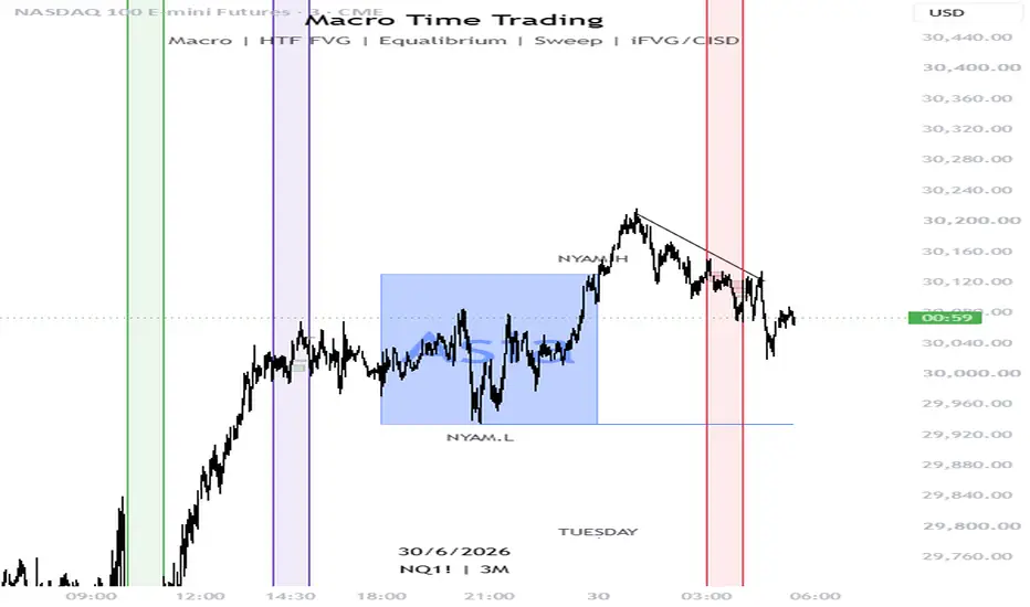
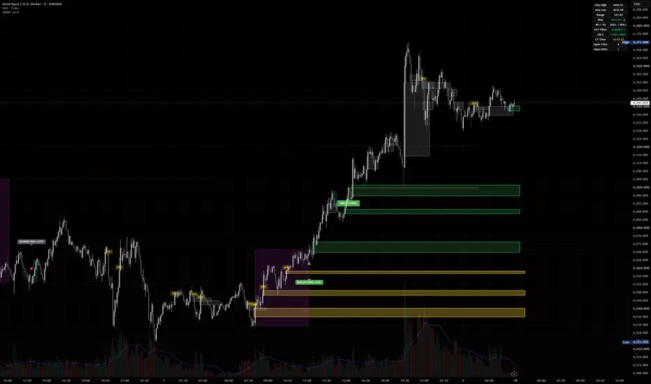
ARBF v1.4ARBF (Asia Range, Bias, Fair Value Gaps) is an intraday tool built around a single daily decision: which way price commits after the Asian session, and where it is likely to react on the way there. It combines three ideas that normally live in separate indicators into one workflow. ASIA RANGE AND DAILY BIAS The script marks the high and low of the Asian session (default 19:00 to 02:59 New York time, fully configurable) and draws the range as a box with optional extended levels into London and New York. During a configurable signal window (default London open onward) it watches for the first candle that closes beyond the Asia high or low. A close above the high sets a bullish bias for the day, a close below the low sets a bearish bias. Only the first break is taken, so the bias is fixed once and not repainted afterward. FAIR VALUE GAPS WITH BODY VS WICK CLASSIFICATION Three-candle imbalances are detected and drawn as zones. Each gap is classified: if a candle body closes fully beyond the gap it is treated as strong (solid border), if only a wick pierces it the gap is treated as weak and more likely to be retested (dashed border). Gaps are removed once price mitigates them, and there is an age limit so the chart stays clean. An alert can fire when price re-enters an unmitigated gap that aligns with the active daily bias. BALANCED PRICE RANGE (BPR) When a bullish and a bearish gap overlap in the same price area, that overlap is a Balanced Price Range, often a strong reaction zone. This version keeps a short-term memory of recently swept gaps, so a BPR is still recognised when one gap is filled and an opposite gap forms in the same area shortly after. The memory window and size are adjustable. HOW TO USE IT 1. Let the Asian range complete. 2. Wait for the bias signal during your chosen window. 3. Trade only in the direction of that bias, using unmitigated FVGs and BPR zones in that direction as your areas of interest for entries and reactions. 4. Use the alerts to be notified when price reaches a relevant gap or BPR. NOTES Credits: Farouk Seascalper All session logic is forced to New York time and is daylight-saving aware. Times in the inputs are New York hours. The included alert text references XAUUSD as an example only; the indicator works on any symbol and timeframe, though it is designed for intraday charts. This is an analysis tool, not financial advice, and signals should be confirmed with your own process.Chỉ báocủa d_jaegerCập nhật 25
LTF Imbalance V2LTF Imbalances A multi-timeframe Fair Value Gap (FVG) indicator that lets you view lower timeframe imbalances from any higher timeframe chart. Designed for SMC and ICT traders who need precision entry confluences without switching charts. What it does Scans five lower timeframes simultaneously — 1s, 5s, 15s, 30s, and 1m — and plots unmitigated imbalance zones directly on your chart. Each timeframe has its own colour and can be toggled independently, so you can layer up exactly the confluences you want without visual noise. Key Features Multi-TF FVG Detection — Identifies bullish and bearish imbalances across all five timeframes in real time using request.security_lower_tf() Three Mitigation Modes — Choose how a zone is considered filled: close inside the gap, wick into the gap, or wick fully through. Mitigated boxes are automatically deleted to keep the chart clean Minimum Gap Size Filter — Set a pip/point threshold to eliminate micro noise. Works across forex, indices, and commodities (recommended: 1.0 for forex, 5–20 for indices) Pivot Proximity Filter — Optionally restrict displayed zones to only those forming near structural pivot highs and lows, helping focus attention on the highest-probability imbalances Legend Table — An on-chart table showing each timeframe's status (ON/OFF) with a live colour swatch, fully configurable in position and size Clean Labelling — Each zone is labelled with its timeframe and direction (▲ bullish / ▼ bearish) for instant identification at a glance How to use it Load the indicator on any timeframe higher than 1s. Toggle the timeframes you want to monitor, set your minimum gap size for the instrument you're trading, and optionally enable the pivot proximity filter for confluence-only zones. Use alongside your preferred market structure or order block indicator for high-probability SMC entries. Notes Requires a TradingView plan that supports request.security_lower_tf() (Essential or higher) 1s data is only available on supported symbols and brokers Best used on the 1m–15m chart during active sessions such as London Open or New York OpenChỉ báocủa kevTheTrader4261821