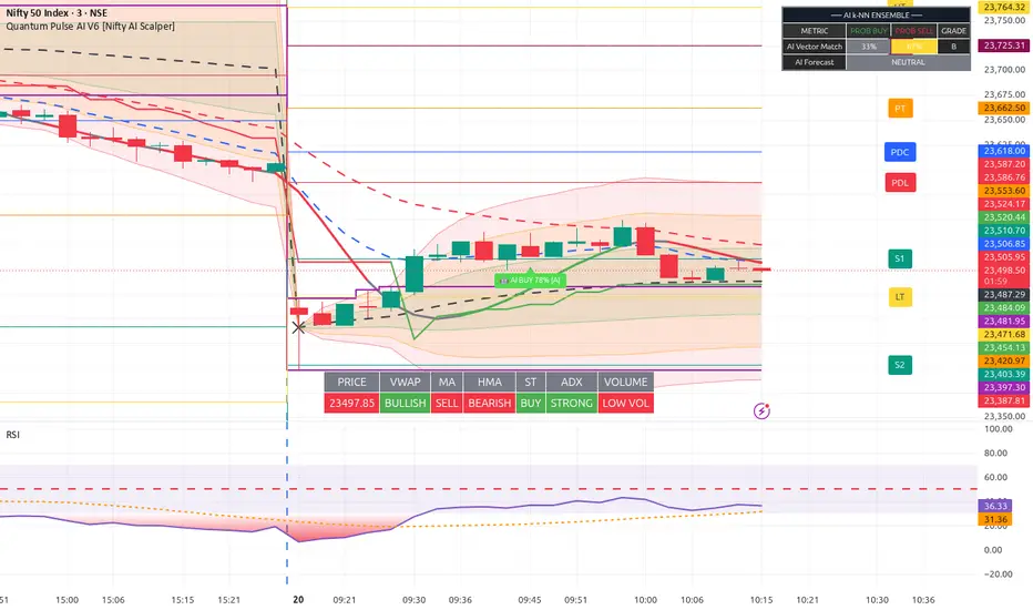
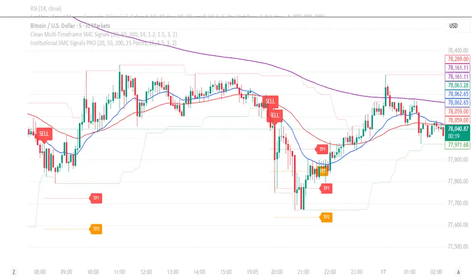
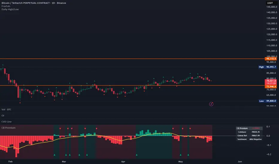
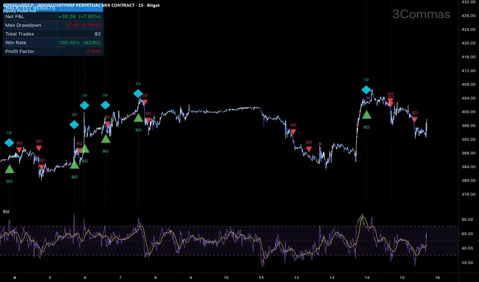
Backtesting de Failure Swing Pro - Manuel Leiva 3050Esta herramienta fue diseñada para todos los estudiantes de ICT y SMC, espero que lo disfruten.. Saludos desde Argentina Muchas Bendiciones..!!!! Atte: Manuel de Jesus LeivaChỉ báocủa anuelmanueldejesusleiva5
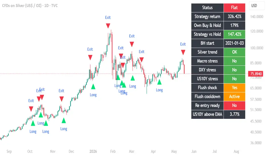
Silver Driver Strength IndexSilver Driver Strength Index This indicator compares Silver with the macro forces that often influence its move It helps separate price strength from driver strength Silver can rise because the backdrop is supportive But that is not the same as Silver showing strength beyond its usual drivers The index uses Gold, dollar strength, yields, real yields, inflation expectations, and volatility Above 0 means Silver is showing strength beyond its drivers Below 0 means the drivers are doing more of the work Around 0 means Silver is moving broadly with the macro backdrop This is not a buy or sell signal It is a market context toolChỉ báocủa CuriousMacroX9
Gold Driver Strength IndexDriver Strength Index This indicator compares Gold or Silver with the macro forces that often influence their move It helps separate price strength from driver strength Price can rise because the backdrop is supportive But that is not the same as showing strength beyond the usual drivers The index uses dollar strength, yields, real yields, inflation expectations, and volatility Above 0 means the asset is showing strength beyond its drivers Below 0 means the drivers are doing more of the work Around 0 means price is moving broadly with the macro backdrop This is not a buy or sell signal It is a market context toolChỉ báocủa CuriousMacroXCập nhật 11
Bullmarket Support Band + ADXAdición del ADX para H1 al indicador Bull Market Support Band, además de más opciones para mayor personalización.Chỉ báocủa elenocaballeroCập nhật 6
Silver Volatility Pulse vs GoldSilver Volatility Pulse vs Gold When is silver acting normal and when is it moving out of character? This indicator compares silver’s volatility with gold’s normal volatility relationship Blue bars mean silver is moving with extra force versus gold Grey bars mean silver is moving quieter than usual versus gold It is not a direction signal It is a behavior signal It helps show whether silver is calming down or starting to move out of character againChỉ báocủa CuriousMacroX5
IPO Lockup Markers (Conditional Age)IPO Lockup Markers (Conditional Age). IPO Lockup Markers (Conditional Age) IPO Lockup Markers (Conditional Age) IPO Lockup Markers (Conditional Age) IPO Lockup Markers (Conditional Age)IPO Lockup Markers (Conditional Age)Chỉ báocủa FundamentalChartist3
Table of information stockA table of contents for stocks is presented, which provides important data information about them.Chỉ báocủa digitalstoun3
EMA Channel + MTF Bias TableWhat This System Is Trying To Do This system separates trading into 2 jobs: 1. The Table Answers: “Should I even be looking for longs or shorts?” 2. The EMA Signals Answers: “Okay, WHEN exactly should I enter?” That’s the whole idea. Most beginners mix those together and take random signals. This system tries to stop that. Step 1 — Understand The Table You’ll see rows like: TFTrendVWAPQuality4HBULLSTRONG BULLA1HBULLBULLA15MBULLBULLA+5MBULLBULLB What Each Column Means TF = Timeframe 4H = big trend 1H = main intraday direction 15M = current market condition 5M = entry timeframe Think of it like: 4H = weather forecast 1H = today's trend 15M = current momentum 5M = your trigger TREND Column This tells you market direction. BULL Market trending upward. Prefer: buy setups long continuations BEAR Market trending downward. Prefer: shorts bearish continuation RANGE Market moving sideways. Usually: weaker entries slower moves more fakeouts Be cautious. CHOP Bad conditions. This means: random movement fake breakouts whipsaws Usually avoid trading completely. This is one of the most important things the table gives you. VWAP Column This shows whether price is favorably positioned relative to VWAP. The orange line on chart = VWAP. STRONG BULL Price strongly above VWAP. This is ideal for longs. BULL Above VWAP. Still favorable for longs. BEAR Below VWAP. Favorable for shorts. STRONG BEAR Strong downside pressure below VWAP. Best short conditions. QUALITY Column This grades how clean the market currently is. A+ / A Best conditions. Usually: strong trend clean movement continuation likely These are your best trades. B Okay conditions. Tradable. But less clean. C Messy conditions. Usually: chop starting weaker momentum overlapping candles Need caution. D Avoid trading. Market quality is poor. OVERALL Bias At bottom you'll see: FAVOR LONGS Means: higher timeframes aligned bullish Focus mainly on BUY setups. FAVOR SHORTS Focus mainly on SELL setups. MIXED / CHOP Timeframes disagree. This is where beginners lose money forcing trades. Usually: wait reduce trading be patient Step 2 — Wait For EMA Entry Signal After the table gives direction: NOW wait for actual entry. BUY Signal You’ll see: white BUY label This means: crossover(close, emaHigh) Basically: price regained momentum upward SELL Signal You’ll see: white SELL label Means: momentum turning downward The BIG Mistake Beginners Make They take: every BUY every SELL Don’t do that. The table decides IF signals are worth taking. How To Actually Trade It LONG Example GOOD Setup Table says: 4H = BULL 1H = BULL 15M = BULL VWAP = BULL Quality = A Then: wait for 5M BUY signal THAT is a high-quality setup. BAD Setup Table says: 4H = BEAR 1H = BEAR But 5M prints BUY. Ignore it. That’s usually just a temporary bounce against the trend. Easiest Beginner Rule ONLY TRADE: when 4H + 1H agree. That alone removes tons of bad trades. What You're Looking For You want: aligned timeframes clean quality VWAP agreement THEN EMA trigger That creates: cleaner continuation entries less emotional trading less random guessing Best Times To Trade This system works best during: NY open post-ORB expansion trend days sessions It works worst during: lunch sideways compression low volatility Simplest Possible Workflow Step 1 Check overall bias. FAVOR LONGS? Only hunt buys. FAVOR SHORTS? Only hunt sells. MIXED? Trade less or wait. Step 2 Check quality. A or A+? Good conditions. C or D? Be careful. Step 3 Wait for EMA signal. Then enter. Beginner Mistake To Avoid Do NOT chase giant candles. Best entries usually happen: - after pullbacks - after small pauses - After reclaim candles NOT after huge expansion candles. The Goal Of This System This system is trying to help you: - stop trading against trend - stop forcing chop trades - stop taking random signals only trade when market conditions support it That’s the real edge.Chỉ báocủa cdeck102751
Sessions + YH/YL + PWH/PWL - UTC+2I've made a pine editor script from The Netherlands. A instant indicator which includes: - Asia High + low 00-08u - London High + low 09-17.30u - NY high + low 15.30-22.00u - Previous day high + low - Previous week high + low I use this to scatch my basic key levels. Chỉ báocủa Janinezuijdwegt116
Relative Strength vs GoldThis indicator compares the active chart against Gold over a selected lookback period It calculates the percentage return of the active asset and subtracts the percentage return of Gold over the same period Above zero means the active asset is outperforming Gold Below zero means the active asset is underperforming Gold The neutral zone helps filter very small differences around the zero line The table automatically shows the active chart ticker versus Gold and displays the relative performance percentage in green, red, or gray By default, the benchmark is TVC:GOLD If you use another Gold feed, such as OANDA:XAUUSD, you may see small differences due to exchange and price feed variations For the cleanest comparison, set the Gold benchmark input to match the Gold symbol you use on your chart This is not a buy or sell signal, only a relative strength toolChỉ báocủa CuriousMacroX2
IPO Lockup MarkersThis indicator Marks the 30 day and 180 day lockout for IPOs.Chỉ báocủa FundamentalChartist2
Earnings Metrics TableUsefull table for a quick review of past earnings excluding EPS which I find pointless in my system. All I care about is generated revenue and profits (Net Profit Margin). Additionally I show FCF / Free Cash Flow. Number of past quarters rows is customizable, I keep it small and tight, 3 to four past quarters to support my buy/sell thesis. Thanks Claude as always for the help since I am not a coder. :) Other indicator in this example is "Performance" , usefull for quick past performance review. Be safe. MartyChỉ báocủa Marty_Bird92Cập nhật 21
Sessions & Point of interests + Buy/Sell signalsDevtrader Killzone Sweep & Reversal Pro A professional session-based liquidity sweep and reversal indicator designed for intraday traders who focus on market timing, killzones, liquidity raids, and reversal confirmation. This indicator combines session mapping, daily/session high-low tracking, liquidity sweep detection, engulfing confirmation, and an optional Moving Average Cross module into one clean visual tool. ━━━━━━━━━━━━━━━━━━━━━━ 🔹 CORE PURPOSE ━━━━━━━━━━━━━━━━━━━━━━ Devtrader Killzone Sweep & Reversal Pro is built to help traders identify potential reversal zones after price sweeps liquidity above recent highs or below recent lows. The logic focuses on a simple but powerful market behavior: 1. Price runs liquidity above a previous high or below a previous low. 2. The sweep candle shows a meaningful rejection wick. 3. The next candle confirms reversal intent with a full body engulfing close. 4. The chart highlights the confirmed bullish or bearish reversal setup. This makes the indicator useful for traders who monitor stop hunts, liquidity grabs, false breakouts, and session-based reversals. ━━━━━━━━━━━━━━━━━━━━━━ 🔹 LIQUIDITY SWEEP REVERSAL LOGIC ━━━━━━━━━━━━━━━━━━━━━━ The indicator detects two main setup types: 🟢 Bullish Sweep Reversal A bullish setup appears when: • The previous candle sweeps below the lowest low of the selected lookback range. • The previous candle has a large lower wick. • The current candle closes bullish. • The current candle body fully engulfs the previous candle body. This suggests that sell-side liquidity may have been taken and buyers are stepping back in. 🔴 Bearish Sweep Reversal A bearish setup appears when: • The previous candle sweeps above the highest high of the selected lookback range. • The previous candle has a large upper wick. • The current candle closes bearish. • The current candle body fully engulfs the previous candle body. This suggests that buy-side liquidity may have been taken and sellers are stepping back in. ━━━━━━━━━━━━━━━━━━━━━━ 🔹 CUSTOMIZABLE SWEEP FILTERS ━━━━━━━━━━━━━━━━━━━━━━ The sweep engine includes two important filters: Liquidity Lookback Controls how many bars are used to define the high or low that price must sweep. Minimum Wick Percentage Controls how strong the rejection wick must be as a percentage of the full candle range. A higher wick percentage creates stricter signals. A lower wick percentage creates more frequent signals. ━━━━━━━━━━━━━━━━━━━━━━ 🔹 SESSION / KILLZONE MAPPING ━━━━━━━━━━━━━━━━━━━━━━ The indicator includes three customizable trading sessions: • Tokyo • London • New York Each session can be individually enabled or disabled. For every session, the trader can customize: • Session name • Session time • Session timezone • Session separator color Vertical dotted separators are drawn at session start and session end, helping the trader visually separate important trading windows. The timezone input supports IANA timezone names such as: • Asia/Tokyo • Europe/London • America/New_York This makes the indicator suitable for traders working with global market sessions and daylight-saving changes. ━━━━━━━━━━━━━━━━━━━━━━ 🔹 DAILY HIGH / LOW LEVELS ━━━━━━━━━━━━━━━━━━━━━━ The indicator can optionally display the current or historical daily high and low. Daily level options include: • Show Daily High • Show Daily Low • Display Current Active Day Only • Display All Days • Custom colors • Custom line width This helps traders monitor where price is forming the current daily range and where liquidity may be building. ━━━━━━━━━━━━━━━━━━━━━━ 🔹 SESSION HIGH / LOW LEVELS ━━━━━━━━━━━━━━━━━━━━━━ The indicator can also track and display session highs and session lows. Session level options include: • Show Session High • Show Session Low • Display Current Active Session Only • Display All Sessions • Custom high/low colors • Custom line width Session highs and lows are useful for identifying intraday liquidity pools, especially around London and New York reversals. The indicator also handles overlapping sessions with priority logic, so when multiple sessions overlap, the later session takes ownership of the active bars. ━━━━━━━━━━━━━━━━━━━━━━ 🔹 OPTIONAL MOVING AVERAGE CROSS MODULE ━━━━━━━━━━━━━━━━━━━━━━ The indicator includes an optional Moving Average Cross module, disabled by default. When enabled, it displays: • Short moving average • Long moving average • MA cloud • Trend-colored candles • Cross markers • Bullish trend-change background highlight • Bearish trend-change background highlight • Buy and sell arrows Available moving average types: • SMA • EMA • WMA • Linear Regression The module can use either: • The current chart timeframe • A custom selected timeframe This gives traders an additional trend filter when reading liquidity sweep setups. ━━━━━━━━━━━━━━━━━━━━━━ 🔹 ALERTS ━━━━━━━━━━━━━━━━━━━━━━ The indicator includes alert conditions for the Moving Average Cross module: • Uptrend Alert • Downtrend Alert These alerts trigger when the short moving average crosses into a bullish or bearish trend state. ━━━━━━━━━━━━━━━━━━━━━━ 🔹 VISUAL DESIGN ━━━━━━━━━━━━━━━━━━━━━━ The indicator uses a clean visual structure: 🟢 Bullish sweep reversals are shown with triangle-up markers below the candle. 🔴 Bearish sweep reversals are shown with triangle-down markers above the candle. The confirmation candle receives a subtle background highlight, making reversal signals easier to notice without overcrowding the chart. Session separators, daily levels, session levels, and moving averages are all customizable from the indicator settings. ━━━━━━━━━━━━━━━━━━━━━━ 🔹 BEST USED FOR ━━━━━━━━━━━━━━━━━━━━━━ This indicator is especially useful for: • Intraday trading • Killzone trading • Liquidity sweep analysis • ICT / SMC-style market reading • Session high/low trading • False breakout detection • Reversal confirmation • London and New York session analysis • Trend-filtered reversal setups It can be used on indices, forex, commodities, crypto, and stocks, depending on the trader’s preferred market and timeframe. ━━━━━━━━━━━━━━━━━━━━━━ 🔹 IMPORTANT NOTE ━━━━━━━━━━━━━━━━━━━━━━ This indicator is not a complete trading system and should not be used as a standalone buy or sell signal. The sweep markers are designed to highlight potential reversal conditions after liquidity has been taken. Traders should still confirm setups using market structure, higher-timeframe bias, support/resistance, session context, risk management, and their own trading plan. ━━━━━━━━━━━━━━━━━━━━━━ 🔹 SUMMARY ━━━━━━━━━━━━━━━━━━━━━━ Devtrader Killzone Sweep & Reversal Pro helps traders combine three important intraday concepts: • When the market is trading • Where liquidity is building • When price confirms a potential reversal after a sweep It is designed to keep the chart clean while giving the trader structured information about sessions, highs/lows, liquidity sweeps, engulfing reversals, and optional moving average trend context.Chỉ báocủa DevtailorCập nhật 96
ICT A+ Setup MNQ ScalperThis script is an ICT-inspired scalping indicator designed mainly for Micro NASDAQ Futures (MNQ) on the 1-minute and 5-minute charts. It tries to identify high-probability (“A+”) setups using three main ICT concepts together: Market Structure Shift (MSS) Liquidity Sweeps Fair Value Gaps (FVG) When all conditions align, it gives: Buy/Sell signal Stop Loss (SL) Take Profit 1 (TP1) Take Profit 2 (TP2) ⸻ How the Indicator Works 1. Market Structure Shift (MSS) The script first detects swing highs and swing lows. It checks whether price breaks: Above previous swing high → bullish MSS Below previous swing low → bearish MSS This is the trend confirmation part. Bullish MSS Price closes above previous structure high. Bearish MSS Price closes below previous structure low. This helps avoid random entries against momentum. ⸻ 2. Liquidity Sweep Detection The script looks for stop hunts. Buy-side sweep Price sweeps below recent lows and then closes bullish. Sell-side sweep Price sweeps above recent highs and then closes bearish. This is a classic ICT liquidity grab concept. The indicator assumes smart money takes liquidity before reversing. ⸻ 3. Fair Value Gap (FVG) The script detects imbalance zones. Bullish FVG Current candle low is above the high from 2 candles ago. Bearish FVG Current candle high is below the low from 2 candles ago. These gaps show displacement/momentum. The script draws them automatically as colored boxes: Green = bullish FVG Red = bearish FVG ⸻ A+ Setup Logic The script only gives a signal when ALL 3 conditions align. BUY Signal Requires: Bullish MSS Buy-side liquidity sweep Bullish FVG SELL Signal Requires: Bearish MSS Sell-side liquidity sweep Bearish FVG This filtering removes many weak setups. ⸻ Stop Loss (SL) The script uses ATR (Average True Range). ATR measures volatility. Long SL Placed below the candle low. Short SL Placed above the candle high. This creates dynamic stop losses based on market volatility. ⸻ Take Profits The script uses Risk:Reward ratios. Default: TP1 = 1.5R TP2 = 3R Example: If your stop is 20 points: TP1 = 30 points TP2 = 60 points ⸻ Visual Elements Green “A+ BUY” Shows bullish entry. Red “A+ SELL” Shows bearish entry. Small circles Show Market Structure Shifts. Small triangles Show liquidity sweeps. Colored boxes Show Fair Value Gaps. ⸻ Alerts The script includes TradingView alerts. You can create: Buy alerts Sell alerts Webhook alerts for Telegram Mobile notifications ⸻ Best Use Cases Works best during: NY Open High volatility sessions Trend continuation days Especially good for: MNQ NQ XAUUSD NASDAQ CFDs ⸻ Strengths Good Confluence Combines multiple ICT concepts together. Cleaner Entries Avoids many random signals. Dynamic Risk Management Uses ATR-based SL. Beginner Friendly Easy visual signals. Mobile Friendly Works well on TradingView mobile. ⸻ Weaknesses Not Holy Grail No indicator is 100% accurate. Can Lag MSS confirmation requires candle closes. False Signals During Chop Sideways markets can still trigger setups. Needs Session Filtering Best results come during killzones. ⸻ Expected Accuracy With: Proper session filtering HTF bias Risk management News avoidance You may realistically achieve: 55%–75% win rate The high RR can still make it profitable even with losses.Chỉ báocủa shary89011
Forum Initium + LTA Session Breaks (Merged)🟡 LTA ALL-IN-ONE INDICATOR Pine Script v6 | TradingView | Free to Use ━━━━━━━━━━━━━━━━━━━━━━━━━━━━━━━━━━━━━ Built around the Lorenzo Trading Academy methodology. Combines 5 core concepts into a single clean indicator so you never need to juggle multiple tools. ━━━━━━━━━━━━━━━━━━━━━━━━━━━━━━━━━━━━━ WHAT IT PLOTS: ━━━━━━━━━━━━━━━━━━━━━━━━━━━━━━━━━━━━━ 📍 FORUM INITIUM (FI) → Auto-detects the Sunday weekly open every single week — no manual input → Draws a gold line as your weekly bias anchor → Live table shows if price is ABOVE (bullish) or BELOW (bearish) FI → Background highlights when price is within 5 pts of FI level → Updates automatically every Sunday 📊 PREVIOUS WEEK HIGH / LOW → PWH and PWL plotted automatically → Key structural reference levels → Labelled on the right of your chart 🕒 SESSION BREAK MARKERS → Vertical dotted lines at every daily session open → Separate dashed line at NY 18:00 (weekly session reference point) → All fully toggle-able 📈 CURRENT WEEK VOLUME PROFILE → Auto-calculates POC, VAH and VAL for the current live week → 128 row resolution (LTA standard) → 70% Value Area (LTA standard) → Value area shaded automatically 📉 PREVIOUS WEEK VOLUME PROFILE → Same levels for last week → POC, VAH, VAL all plotted → Dashed style to separate from current week visually ━━━━━━━━━━━━━━━━━━━━━━━━━━━━━━━━━━━━━ BUILT-IN ALERTS (12 total): ━━━━━━━━━━━━━━━━━━━━━━━━━━━━━━━━━━━━━ ⬆️ Price crosses ABOVE Forum Initium ⬇️ Price crosses BELOW Forum Initium ⚠️ Price approaching FI (within 5 pts) 🎯 Price touching FI level 🗓️ New week opened — FI set ⬆️ Above / ⬇️ Below CW POC ⬆️ Above / ⬇️ Below PW POC ⬆️ Above CW VAH (breakout mode) ⬇️ Below CW VAL (breakdown mode) 🕕 NY 18:00 session marker ━━━━━━━━━━━━━━━━━━━━━━━━━━━━━━━━━━━━━ EVERYTHING IS TOGGLE-ABLE: ━━━━━━━━━━━━━━━━━━━━━━━━━━━━━━━━━━━━━ → Turn any layer on or off → Change all colours to your preference → Adjust line widths → Change value area % and row count → Works on any timeframe → Best used on 5M and 1M charts ━━━━━━━━━━━━━━━━━━━━━━━━━━━━━━━━━━━━━ COMPATIBLE WITH: ━━━━━━━━━━━━━━━━━━━━━━━━━━━━━━━━━━━━━ ✅ XAUUSD (Gold) — primary use case ✅ Forex pairs ✅ Indices (US30, NAS100, GER30) ✅ Crypto (BTCUSD etc) ✅ TradingView Essential plan or above ✅ Pine Script v6 ━━━━━━━━━━━━━━━━━━━━━━━━━━━━━━━━━━━━━ HOW TO INSTALL: ━━━━━━━━━━━━━━━━━━━━━━━━━━━━━━━━━━━━━ 1. Open TradingView → Pine Editor 2. Select All (Ctrl+A) → Delete 3. Paste the full script 4. Save (Ctrl+S) 5. Click Add to Chart 6. Set your alerts via Right Click → Add Alert on indicator ━━━━━━━━━━━━━━━━━━━━━━━━━━━━━━━━━━━━━ Not a signal tool — a confluence tool. Use it to identify your key levels, then apply your own entry process. ━━━━━━━━━━━━━━━━━━━━━━━━━━━━━━━━━━━━━Chỉ báocủa InkJunkieuv19
Custom RSI (25/40/60/75 Levels)RSI with Alters-75 = Overbought, 60= Bullish momentum, 40 = Bearish momentum, 25 = OversoldChỉ báocủa eagonzalez4462
Fibonacci Institutional ImpulseFII (Fibonacci Institutional Impulse) is a modified version of the original indicator created by blublub and distributed under the Mozilla Public License 2.0 (MPL 2.0). This version was expanded and refined by kedwar13 to improve trend visualization and emphasize price interaction with the Fibonacci 0.5 deviation bands. MODIFICATIONS Changes made in this version include: • Added 60 EMA and 200 EMA trend overlays • Added Fibonacci 0.5 band crossing visualization • Added configurable Fibonacci Band settings • Added visual labels and alert conditions • Improved chart readability and script organization • Updated and standardized naming/labels INDICATOR PURPOSE This indicator is designed to highlight price interaction with the Fibonacci 0.5 deviation bands derived from a VWMA-based volatility structure. The 0.5 bands may act as dynamic areas of: • momentum continuation, • trend confirmation, • pullback reactions, • or possible exhaustion. The included EMA overlays help provide broader trend context and directional bias. IMPORTANT DISCLAIMER This indicator is NOT a standalone buy or sell signal system. The plotted labels and alerts only indicate that price has crossed a Fibonacci 0.5 band. Crossings alone should not be treated as guaranteed entries or exits. Signals should always be confirmed using additional analysis such as: • market structure, • price action, • support/resistance, • volume, • or higher timeframe trend confirmation. This tool is intended to be used as a confluence and market context indicator rather than an automated trading strategy. CREDITS Original script: © blublub Modified and extended by: kedwar13 Licensed under MPL 2.0: mozilla.orgChỉ báocủa kedwar1312
Killzones + TP1 & TP233 Killzone Direction Gann Zones A custom TradingView indicator built around session direction, untapped liquidity, and automatic Gann target projections. This indicator automatically maps: • Asia Killzone • London Killzone • NY AM Killzone • NY Lunch Killzone • NY APM Killzone How it works: If a session closes bullish, bullish targets are projected automatically. If a session closes bearish, bearish targets are projected automatically. Features: • Automatic session direction detection • TP1 and TP2 projections • 0.75 Gann expansion targets • Untapped liquidity tracking • Levels extend until tapped • Clean minimal chart design • Fully customizable colors • Adjustable line thickness • Session visibility toggles • Asia / London / NY AM session support • No manual Gann box plotting needed TP Logic: TP1 = Session High or Low TP2 = 0.75 Gann projection based on session range Designed for traders who focus on: • Session liquidity • Killzone trading • Continuation moves • Untapped targets • Directional expansion setups Built from real session behavior and manual chart mapping concepts to create a cleaner and faster workflow directly on TradingView. As always happy trading everyone. Chỉ báocủa MillionaireMind717Cập nhật 25
Regime Filter V4CRegime Filter V4 — Macro regime detection with rule-based LONG/SHORT filter OVERVIEW Regime Filter V4 is a macro regime detection indicator designed to filter trading signals on daily timeframe. It classifies the market into 3 regimes (UP / DN / RG), splits each regime into Early / Late phases, considers BTC macro context (Bull / Bear), and applies 4 explicit rules to decide whether LONG or SHORT trades are authorized. This is the public version of the filter I use to systematically gate signals on my own multi-method trading bot. It has been validated across 8 years of BTC daily data (2018–2026) with documented performance (cumsum +3,051R, Sharpe 0.455, Max DD reduced 42% vs no-filter baseline). HOW IT WORKS — THE 4 LAYERS Layer 1 — Regime detection Classify each daily bar into UP / DN / RG using EMA20 slope over a 7-day lookback: - UP : EMA20 > EMA20 × (1 + 0.1%) - DN : EMA20 < EMA20 × (1 - 0.1%) - RG : in between (range / consolidation) Layer 2 — Phase Early / Late Count consecutive days in the same regime (streak): - Early : streak ≤ 7 days (fresh trend) - Late : streak > 7 days (mature trend) Layer 3 — Macro context Compare EMA50 vs EMA200 on the asset itself: - Bull macro : EMA50 > EMA200 - Bear macro : EMA50 < EMA200 Layer 4 — The 4 rules (R1–R4) - R1 : Regime UP → SHORT always blocked - R2 : Regime UP → LONG: Early always OK; Late OK only if Bull macro - R3 : Regime DN → SHORT: OK only if ADX(14) > 30 - R4 : Regime RG → LONG: OK only if Bear macro AND RSI(14) < 30 (contrarian) VISUAL ELEMENTS Background colors: - Green = UP regime (lighter = Early, darker = Late) - Red = DN regime (lighter = Early, darker = Late) - Yellow / grey = RG regime (range) Plotted lines: - Blue (EMA20) — Regime EMA - Orange (EMA50) — Macro fast - Red (EMA200) — Macro slow Transition markers: - Red triangle down = UP → DN transition - Green triangle up = DN → UP transition - Grey diamond = transition into RG Dashboard (top-right): Live display of current regime, phase, streak, macro context, ADX, RSI, active rule, LONG / SHORT status, and approximate activity rate. HOW TO USE 1. Apply on daily timeframe of any liquid asset (works best on BTC, but tested cross-asset on ETH and SOL). 2. Read the dashboard to know the current regime and which trades are authorized. 3. Use the LONG / SHORT YES/NO status as a filter for your own trading signals or systems — only take trades aligned with the regime decision. 4. Set up alerts on regime transitions (UP/DN/RG) and on LONG/SHORT signals to be notified. VALIDATION CONTEXT - Tested on 8 years of BTC daily data (2018–2026) with custom backtest engine - Cross-asset validation on ETH and SOL - Walk-forward in-sample / out-of-sample stable - Reduces drawdown by ~42% vs unfiltered baseline - Sharpe ratio improvement from ~0.22 (baseline) to ~0.455 (with filter) - All numbers expressed in R-multiples (1R = sized risk per trade) INPUTS YOU CAN ADJUST - EMA Regime length (default 20) - Regime lookback days (default 7) - Regime threshold (default 0.1%) - Macro EMAs Fast / Slow (default 50 / 200) - ADX period & threshold for R3 (default 14 / 30) - RSI period & threshold for R4 (default 14 / 30) - Early/Late boundary in days (default 7) ALERTS AVAILABLE - Transition → UP - Transition → DN - Transition → RG - LONG signal (R2 or R4) - SHORT signal (R3) DISCLAIMER This indicator is a filter / decision-support tool , not a complete trading strategy. It tells you when the macro regime allows LONG or SHORT — it does not generate entry / exit prices. You must combine it with your own setup detection (Fibonacci retracement, trend continuation, structure breaks, etc.). Past performance does not guarantee future results. Always backtest with your own assumptions and position sizing. Use at your own risk. AUTHOR NOTE This filter is part of a broader systematic trading framework I've developed over 10+ years of crypto trading. The published version is the macro regime layer only — you bring your own entry / exit logic on top. If you find it useful, leave a like and feel free to comment with the asset / timeframe combinations that work best for you.Chỉ báocủa coyotcrypto6
Man on the Street (MonS) K-Economy ChartThis index, which I’m calling the Man on the Street (MonS) Index, is designed to track the "K-Shaped" divergence between the high-flying stock market and the lived reality of the American consumer. While the major indices are driven by a handful of tech giants, the MonS Index monitors ten "canaries in the coal mine" across two critical pillars of the real economy: Section 1: Discretionary Habits (The Wallet Test) DPZ / SBUX / CMG: The ultimate proxies for "stomach share." If consumers cut their $7 latte or $15 bowl, the discretionary squeeze is real. STZ (Modelo/Corona): Tracks "vice" spending—usually the last habit to go. ULTA: Monitors the "Lipstick Effect"—where shoppers buy small luxuries when they can't afford big ones. Section 1: Mid-Market Reality (The Structural Test) WHR (Whirlpool): A high-conviction "big-ticket" signal. If people stop replacing appliances, the consumer is tapped out. CTAS (Cintas): Tracks workforce health. If fewer uniforms and mats are being delivered, people aren't at work. FL / KSS: Traditional mid-tier retail. These track the hollowing out of the middle-class shopper. BBY (Best Buy): The "wait until next year" gauge for high-end tech and home theater. The Thesis: We are looking for a "Snap Back." When the MonS Index sags while the SPY/QQQ stays vertical, it signals a mechanical disconnect that eventually must resolve. We stay in cash and wait for the "Pixels" to meet the "Pavement."Chỉ báocủa NeverSawAlpha1
Man on the Street (MonS) Index - K Shaped Economy ChartThis index, which I’m calling the Man on the Street (MonS) Index, is designed to track the "K-Shaped" divergence between the high-flying stock market and the lived reality of the American consumer. While the major indices are driven by a handful of tech giants, the MonS Index monitors ten "canaries in the coal mine" across two critical pillars of the real economy: Section 1: Discretionary Habits (The Wallet Test) DPZ / SBUX / CMG: The ultimate proxies for "stomach share." If consumers cut their $7 latte or $15 bowl, the discretionary squeeze is real. STZ (Modelo/Corona): Tracks "vice" spending—usually the last habit to go. ULTA: Monitors the "Lipstick Effect"—where shoppers buy small luxuries when they can't afford big ones. Section 1: Mid-Market Reality (The Structural Test) WHR (Whirlpool): A high-conviction "big-ticket" signal. If people stop replacing appliances, the consumer is tapped out. CTAS (Cintas): Tracks workforce health. If fewer uniforms and mats are being delivered, people aren't at work. FL / KSS: Traditional mid-tier retail. These track the hollowing out of the middle-class shopper. BBY (Best Buy): The "wait until next year" gauge for high-end tech and home theater. The Thesis: We are looking for a "Snap Back." When the MonS Index sags while the SPY/QQQ stays vertical, it signals a mechanical disconnect that eventually must resolve. We stay in cash and wait for the "Pixels" to meet the "Pavement." Chỉ báocủa NeverSawAlpha3
Liquidity Intensity EGXWhy This Indicator Matters: Traditional volume indicators fail on EGX because: A 50M EGP day is massive for a 500M market cap stock (10% ratio) A 50M EGP day is tiny for a 50B market cap stock (0.1% ratio) Liquidity Intensity EGX solves this by normalizing for market cap, giving you an apples-to-apples comparison across the entire exchange. Created for the Egyptian Exchange (EGX). Works best with EGX-listed stocks, but applicable to any exchange with market cap data. Overview Liquidity Intensity EGX is a custom indicator designed specifically for the Egyptian Exchange (EGX) to measure and visualize stock liquidity intensity. Unlike generic volume indicators, this tool calculates the Liquidity Ratio (%) — the daily trading value relative to the company's market capitalization — giving you a normalized view of liquidity that works across all market cap sizes. How It Works The indicator combines three key metrics: Metric Formula Purpose Liquidity Ratio (%) (Volume MA × Close) / Market Cap × 100 Normalized liquidity measure Trading Value (EGP) 21-day SMA Volume × Close Average daily turnover in EGP Volume Spike Today's Volume > 2× Volume MA Identifies unusual activity 📋 Quick Reference Card 🟢 > 0.50% = High Intensity → Trade freely 🔵 0.10-0.30% = Healthy/Good → Optimal conditions 🟠 0.03-0.09% = Moderate → Size carefully 🔴 < 0.01% = Low/Stagnant → Avoid or limit orders 🟡 Yellow BG = Volume Spike → Momentum alert Practical Example: Trading AMOC Scenario You're analysing AMOC (Alexandria Mineral Oils Company) on the daily timeframe: Current Readings: Liquidity Ratio: 1.80% Line Colour: 🟢 Green (High Intensity) Background: Transparent (no volume spike today) Avg Trading Value: 95M EGP Market Cap: ~5.2B EGP Interpretation 🟢 Green Line (1.80%) — AMOC is experiencing exceptional liquidity (more than 3× the "High Intensity" threshold). This indicates strong institutional or retail interest. Transparent Background: While the liquidity ratio is excellent, today's volume is actually below average (95M vs 191M EGP average). This suggests the high ratio is sustained by the stock's smaller market cap, not an explosive volume day. Trading Decision The green signal confirms AMOC has sufficient liquidity for confident position sizing. However, the lack of a volume spike suggests waiting for a yellow background confirmation before entering a momentum trade. 🎯 Best Practices For Day Traders Focus on Green + Yellow combinations for the highest probability momentum trades Avoid Red stocks entirely, you'll face slippage and exit difficulties For Swing Traders Blue stocks offer the best risk/reward for multi-day holds Use Orange stocks only for high-conviction setups with smaller position sizes For Large Positions Minimum Blue tier recommended for positions > 100K EGP Orange and Red require breaking orders into smaller chunks Market Cap Considerations Small-Caps (< 1B EGP): Often show Green/Blue easily, verify with absolute EGP volume Mid-Caps (1B–10B EGP): Blue/Orange range, best balance of liquidity and growth Large-Caps (> 10B EGP): Often Orange, acceptable for stability, not momentum 🔔 Alert Conditions The indicator includes two built-in alerts: Alert Name Trigger Use Case Volume Spike Detected Volume > 2× 21-day average Catch momentum early Low Liquidity Warning Trading value drops below 5M EGP Exit illiquid positions before getting stuckChỉ báocủa mnmabroukw36ix1110
EGX Macro Relative MomentumThis is a macro momentum indicator that measures how the Egyptian stock market (EGX30) is performing relative to the USD/EGP exchange rate, essentially tracking whether local equities are outpacing currency devaluation or not. Here's the breakdown by section: Core Concept: The indicator answers: "Is the stock market rising faster than the Egyptian Pound is falling against the Dollar?" This matters because in country with currency volatility (like Egypt), nominal stock gains can be wiped out by currency devaluation. This tool separates real market strength from currency-driven illusory gains. Section-by-Section Explanation Inputs: EGX:EGX30 : The Egyptian stock market index FX_IDC:USDEGP : USD to Egyptian Pound exchange rate lookback : Rolling window for momentum accumulation (default: 20 bars) one month. Calculations: Rate of Change (ROC) Daily % change for both EGX30 and USD/EGP Relative ROC: Subtracts currency movement from equity movement: If EGX rises 2% and USD/EGP rises 1% → Relative ROC = +1% (market beating devaluation) If EGX rises 2% and USD/EGP rises 3% → Relative ROC = -1% (market lagging devaluation) Accumulation: Rolling sum of this relative momentum over your lookback period (smoothed via SMA × length) Visualization: Green histogram = Positive accumulated momentum (market strength exceeding currency pressure) Red histogram = Negative accumulated momentum (market weakness or heavy devaluation pressure) Background shading = Light green/red tint for quick visual context Divergence Signals Bullish divergence (▲): EGX rises while USD/EGP falls → Local market strength, currency recovery Bearish divergence (▼): EGX falls while USD/EGP rises → Capital flight, devaluation stress How to Read It: Green bars rising: EGX is gaining real momentum beyond just currency effects, genuine bullish. Red bars deepening: Market is selling off OR devaluation is outpacing any nominal gains, bearish. Bullish divergence: Market rallying despite currency stability/strength, strong risk-on signal. Bearish divergence: Market dropping while currency weakens, classic capital flight pattern. Practical Use Cases: Filtering trades: Only take long EGX positions when the indicator is green (positive relative momentum) Macro regime detection: Sustained red bars suggest it's a "currency trade" not an "equity trade" Your stock gains may not translate to real USD returns Timing entries: Bullish divergences at support can signal capitulation; bearish divergences at resistance warn of exodus risk. in options: you can change EGX30 to EGX100: The indicator becomes more sensitive to the broad market health rather than just the banking/real state giants that dominate EGX30. If you're trading smaller EGX names, EGX100 gives you better correlation to your actual universe. Increasing Lookback from 20 → 60: Timeframe shift: On a daily chart, you're moving from ~1 month of accumulation to ~3 months. Signal smoothing: The histogram becomes much slower and smoother, noisy daily wiggles get averaged out. Lag increases: You'll detect macro trends later, but with higher conviction. new update: ✅ Switching between stocks won't change the indicator values ✅ Values update once daily at market close (or on your chosen timeframe) ✅ You can manually change the timeframe in the indicator settings (gear icon) if you want weekly or hourly momentum ✅ Consistent readings across your entire EGX watchlist To Change Timeframe Manually Click the gear icon on the EGX Macro Relative Momentum indicator Change Timeframe to "W" (weekly), "60" (hourly), etc. All stocks will use the same timeframe settingChỉ báocủa mnmabroukw36ix9