Equity Stub MonitorMarketCap as % of Enterprise Value, giving you an idea how the equity is valued in relation to its cash or debt position.Chỉ báocủa Frowning3
Auto Crypto Market CapAuto Crypto Market Cap is a simple utility indicator that automatically displays the current market capitalization of the cryptocurrency shown on your chart. The script detects the base asset from the current symbol, for example: AAVEUSDT → AAVE SOLUSDT → SOL ETHUSDT → ETH It then requests the matching TradingView CRYPTOCAP symbol, such as CRYPTOCAP:AAVE or CRYPTOCAP:SOL, and displays the result in a clean table on the chart. Features: • Automatically detects the crypto ticker from the current chart • Displays market cap in a readable format: K, M, B, or T • Optional manual ticker override for special symbols • Useful for quickly checking whether a coin is small-cap, mid-cap, or large-cap • Works directly on price charts without needing to open a separate CRYPTOCAP chart Examples: AAVEUSDT → shows AAVE market cap BTCUSDT → shows BTC market cap ETHUSDT → shows ETH market cap LINKUSDT → shows LINK market cap For symbols like 1000PEPEUSDT, WETHUSDT, or WBTCUSDT, you can use the manual override input to set the correct ticker, for example PEPE, ETH, or BTC. Important: This indicator depends on TradingView’s CRYPTOCAP data. If TradingView does not provide a CRYPTOCAP symbol for a specific asset, the market cap may show as unavailable.Chỉ báocủa muchenZ1
Liquidez M15 Completa (Altos + Bajos)El script hará esto: Detecta el máximo previo (swing high) en M15 Espera que el precio: Rompa ese nivel (tome liquidez) Cierre por debajo (rechazo) Marca una señal de venta (liquidity grab) Puedes comprar o vender a cortos pips 50 TP1 y dejar correr Lotes grandes porque tiene muy poco draw down Utilizar en M15Chỉ báocủa cryptocaribbeancaptain8
Analyst Targets + PE & Forward PEAnalyst Targets + PE & Forward PE This indicator displays key fundamental and analyst data directly on your chart in a clean table, along with visual target price lines. Features: Trailing P/E (TTM) and Forward P/E Full Analyst Consensus Breakdown: Strong Buy Buy Hold Sell Strong Sell Overall Analyst Rating (Strong Buy to Strong Sell) Analyst Price Targets: Average Target High Target Low Target Visual Target Lines (all in light green with different styles for easy distinction) Dynamic labels showing exact target values The table updates in real-time and only appears on the last bar for a clean look. Target lines automatically adjust and extend as new bars form. Perfect For: Swing traders and investors who want quick insight into valuation and Wall Street consensus Checking how the current price compares to analyst targets Monitoring changes in analyst sentiment Settings: Table position can be changed in the script (currently Top Right) Line length and styles are customizableChỉ báocủa amirnik29
Market Structure MTF [Joy]Test TEST TEST TEST Test indicator TEST TESt for indicator TEST TESTChỉ báocủa Juicetrades2532
Smart Trader, Episode 07, ICS Geometric Buyers/Sellers Pressure🔶 Overview ICS Geometric Buyer/Seller Pressure measures the real-time balance between buying and selling forces through a geometric framework built on triangle areas. Rather than relying on volume, oscillators, or moving-average crossovers, this indicator constructs two right triangles on every bar — one representing seller pressure above the current price, one representing buyer pressure below it — and computes their areas inside a normalized coordinate system called the Isotropic Coordinate System (ICS). The ICS transforms raw price and time into a dimensionless plane using Yang-Zhang composite volatility as the scaling factor. Because both axes are divided by the same volatility estimate, the resulting triangle areas carry no unit — they are pure geometric ratios. This makes the pressure reading comparable across any instrument, any timeframe, and any price scale, without the trader needing to adjust parameters when switching charts. From these two normalized areas, the indicator derives a single metric called B, which condenses the entire buyer-versus-seller balance into a value between −1 and +1. B is then converted into intuitive percentage readings (Red % for seller dominance, Blue % for buyer dominance) and visualized through a gradient barometer column, a triangle fan overlay, and data-window plots ready for alerts. 🔶 Conceptual framework To measure the real-time balance between buying and selling forces, this indicator takes a geometric approach rather than relying on volume analysis, oscillator divergences, or moving-average crossovers. Two right triangles are constructed on every bar — one above the current price toward the range ceiling, one below toward the range floor — and their areas are compared to determine which side of the market currently dominates. Computing triangle areas in raw price-versus-time coordinates, however, introduces a structural problem: the same price movement produces a different geometric shape depending on the chart's zoom level, time compression, or display resolution. A 30-point rally on a compressed weekly chart creates a steep, narrow triangle; the identical rally on a stretched intraday chart creates a flat, wide one. The areas differ even though the underlying market event is the same. To eliminate this distortion, the indicator applies a normalization layer referred to here as the Isotropic Coordinate System (ICS). The principle behind it is dimensional analysis — a well-established technique in physics and engineering for removing unit-dependent artifacts from measurements. The horizontal axis (time) is rescaled by dividing bar offsets by sigma, and the vertical axis (price) is rescaled by dividing the natural logarithm of price by the same sigma. Because both axes share the same divisor, the resulting coordinate plane is isotropic: triangle areas reflect only the structural relationship between price and range boundaries, not how the chart happens to be displayed. The sigma used for this normalization is the Yang-Zhang (2000) composite volatility estimator, a published academic method (Journal of Business, Vol. 73, No. 3). It combines three independent variance components — overnight (close-to-open), intraday (open-to-close), and the Rogers-Satchell high-low-close estimator — into a single unbiased measure with minimum-variance weighting. This makes sigma robust across instruments with overnight gaps (equities, futures) and those that trade continuously (forex, crypto). The practical result: the normalization layer adapts to the volatility regime of each instrument, making triangle areas structurally comparable across different charts and timeframes and reducing the need for manual recalibration when switching instruments. 🔶 The B metric: from triangle geometry to a single number The core output of this indicator is a single value called B, which captures the instantaneous buyer-versus-seller balance in one dimensionless number. Picture any bar on your chart. The indicator draws two right triangles around it. The upper triangle sits between the bar's high and the range ceiling: its three vertices are (1) the current bar's high, (2) the range ceiling at the current bar, and (3) the range ceiling at the prime-offset bar, 101 bars back. This triangle represents seller territory — the geometric "room" that sellers occupy above the current price. The lower triangle mirrors this below: its vertices are the current bar's low, the range floor at the current bar, and the range floor at that same prime-offset bar. This is buyer territory — the room below the current price. The larger the seller triangle relative to the buyer triangle, the more the market is tilted toward selling pressure, and vice versa. Why prime-numbered offsets? The indicator uses the first 25 prime numbers (3, 5, 7, 11, ... 97, 101) as its sampling offsets. Prime numbers share no common factors with each other or with any periodic cycle in the data. When a signal is sampled at evenly spaced intervals (e.g. every 10, 20, 30 bars), there is a risk that the sampling grid locks onto a periodic pattern in the price — a weekly cycle, an options expiration rhythm, or any recurring structure — and either amplifies or masks it. This is a form of harmonic aliasing. Prime offsets avoid this: because no prime is a multiple of any other, the sampling set {3, 5, 7, ... 101} is maximally non-periodic, ensuring that each offset captures a structurally independent slice of the price range. Two roles: measurement and visualization For the B calculation itself, only the widest triangle is used — the one anchored at prime offset 101. This single pair of triangles (upper and lower) captures the broadest structural pressure across the entire lookback window. The remaining 24 primes serve a visual role: they generate the triangle fan overlay you see on the chart. But this visual layer is not merely decorative. Each triangle in the fan maps a pressure boundary at a different time horizon. As the screenshot above illustrates, candles that approach the red triangle edges tend to encounter resistance and reverse — the fan effectively draws a multi-scale map of where selling pressure intensifies. The blue fan does the same for buyer pressure below. Taken together, the fan gives the trader a spatial reading of how pressure distributes across shorter and longer horizons. A notable property observed during testing across multiple instruments and timeframes: regardless of triangle size or lookback period, B consistently produces values within the bounded range of -1 to +1. This is not a coincidence — it is a mathematical consequence of the symmetric ratio formula that derives B from the two triangle areas. The formula Both triangle areas are first computed using the Shoelace formula — a standard computational geometry method that yields the exact area of any polygon from its vertex coordinates. Then B is derived through a symmetric ratio: r1 = A_hi / A_lo r2 = A_lo / A_hi B = (r1 - r2) / (r1 + r2) When the seller triangle is much larger than the buyer triangle (A_hi >> A_lo), r1 grows large while r2 shrinks, and B approaches +1. When buyer pressure dominates, B approaches -1. When both areas are equal, B = 0 — balanced pressure. The formula is symmetric by construction, meaning it treats buyer and seller sides with identical mathematical weight. Percentage conversion To make B immediately readable on the chart, the indicator converts it into two percentage values: Red % = (B + 1) x 50 seller dominance, scale 0 to 100 Blue % = (1 - B) x 50 buyer dominance, scale 0 to 100 Red % and Blue % always sum to 100. They are available in the Data Window for any bar and are exposed as alert-ready plots, allowing traders to set threshold-based alerts (e.g. "Red % crosses above 80") directly from TradingView's alert builder, without writing any code. 🔶 Features at a glance 🔸 Gradient barometer — A vertical column rendered to the right of the last bar. It splits the effective range into a red (seller) zone and a blue (buyer) zone, with the dividing line set by B. The gradient fades from full opacity at the split point to near-transparent at each range boundary, giving an immediate visual sense of which side is dominant and by how much. 🔸 Prime triangle fan — 25 filled triangles (one per prime offset from 3 to 101) overlaid on the chart. Upper triangles are colored red (seller pressure), lower triangles blue (buyer pressure). Together they form a fan that maps pressure intensity across multiple time horizons simultaneously. Optional dashed outlines can be enabled for each side independently. 🔸 Range lines with price labels — Horizontal lines marking the effective high and low of the lookback window. Each line carries a price label placed to the left of the range start. When the channel is frozen (see Freeze/Revival below), a snowflake icon (❄) appears on the labels. 🔸 Diamond markers and prime labels — At each prime-offset bar, a diamond marker is placed at both the range ceiling and the range floor. The corresponding prime number is displayed above the ceiling diamond, providing a visual ruler of the sampling structure. 🔸 Freeze / Revival system — When a confirmed close breaches the range boundary, the mother channel freezes and a child channel is born on the breach side. The child computes its own pressure metric (B'), and when the opposing force inside the child reaches a user-defined threshold, the mother channel revives. This mechanism tracks regime transitions without discarding the prior range context. A dedicated label at the breach candle shows the child's B' value in real time. 🔸 Live and Closed display modes — "Live" updates tick by tick using the current bar's data. "Closed" anchors all calculations on the last confirmed bar, eliminating intra-bar noise for traders who prefer signal stability. 🔸 Data Window and alert-ready plots — Three invisible plots (Red %, Blue %, raw B) are exposed in the Data Window and available for TradingView's alert condition builder. Traders can create threshold, crossover, or crossing alerts on any of these values without writing Pine Script. 🔸 Full visual customisation — Every visual element (triangle fill colors, line colors, diamond size, text size, barometer width, barometer offset, gradient steps) is independently configurable through the indicator's settings panel. 🔶 Deep dive: the barometer The barometer is a vertical gradient column displayed to the right of the last bar on the chart. Its purpose is to translate the abstract B value into a shape that the eye can read instantly: a column split into a red zone (seller pressure) on top and a blue zone (buyer pressure) on the bottom. The column spans the full effective range — from rangeLow at the bottom to rangeHigh at the top. The split point between red and blue is not placed at the midpoint of the range. Instead, it is calculated directly from B: yMid = rangeHigh − (B + 1) × range / 2 When B = 0 (balanced), yMid sits at the exact center of the range. When B approaches +1 (full seller dominance), yMid drops toward the range floor, making the red zone fill nearly the entire column. When B approaches −1 (full buyer dominance), yMid rises toward the range ceiling, and the blue zone dominates. The gradient is rendered using a configurable number of boxes (default: 50). In the red zone, opacity is strongest near yMid and fades to near-transparent at rangeHigh. In the blue zone, opacity is strongest near yMid and fades toward rangeLow. This creates a natural "heat" effect: the most intense color always concentrates at the boundary where the two forces meet. At the top and bottom of the column, percentage labels display the Red % and Blue % values. These are the same percentages available in the Data Window, presented here as a quick visual reference. The barometer responds to the selected display mode. In "Live" mode, it updates on every tick using the current bar's B value. In "Closed" mode, it uses the B computed from the last confirmed bar, providing a stable reading that does not flicker with intra-bar price movement. Barometer settings 🔸 Show barometer — Toggle the entire barometer on or off. Default: on. 🔸 Offset (bars right) — How far to the right of the last bar the column is placed. Default: 11. Increase this if the barometer overlaps with other right-margin elements. 🔸 Width (bars) — The horizontal thickness of the column, measured in bars. Default: 5. 🔸 Gradient steps — The number of boxes used to render the gradient. Higher values produce a smoother fade. Default: 50. 🔶 Deep dive: the prime triangle fan The triangle fan is the indicator's signature visual element. It renders 25 filled triangles on the chart — one for each prime offset from 3 to 101 — fanning out from the current bar toward the left side of the lookback window. Upper triangles are shaded red (seller pressure) and lower triangles are shaded blue (buyer pressure), each with high transparency so the underlying candlesticks remain clearly visible. Every triangle in the fan shares two of its three vertices with the current bar: the bar's high (for upper triangles) or the bar's low (for lower triangles), and the corresponding range boundary at that bar. The third vertex sits at the range boundary at the prime-offset bar. Because each prime offset is a different distance back in time, the triangles vary in width — the smallest is narrow and captures very short-term pressure, while the largest stretches across the full lookback and captures the broadest structural picture. Reading the fan as a pressure map The fan functions as a multi-scale pressure map. Each triangle edge represents a boundary where one side's territory begins. When price approaches a cluster of red triangle edges from below, it is entering a zone where seller pressure intensifies across multiple time horizons simultaneously. The denser the overlap of red edges at a given price level, the stronger the structural resistance at that level. The same logic applies in reverse for blue edges and buyer support. This is visible in practice: candles that push into the red fan often stall or reverse at the triangle boundaries, while candles that drop into the blue fan tend to find support. The fan gives the trader a spatial sense of how much room each side has — a wide blue zone with thin red edges suggests buyers have structural space to move, and vice versa. Color flipping during freeze When the Freeze/Revival system is active and price moves beyond the frozen range boundary, the triangle colors on the breached side flip to reflect the new structural reality. Consider a downward breach: price closes below the frozen rangeLow and continues falling. The lower triangles — which normally appear blue to represent buyer territory — switch to red. This signals that what was once the buyer's domain has been structurally penetrated; the geometry now measures selling pressure extending below the old floor. At the same time, the upper triangles remain red as they always are, and because the distance between the current price and the frozen rangeHigh has grown dramatically, the seller area expands. The visual result: the entire fan turns uniformly red, reflecting overwhelming seller dominance across every time horizon in the fan. The mirror case works identically. During an upward breach, price closes above the frozen rangeHigh and continues rising. The upper triangles flip from red to blue, signaling that seller space has been penetrated from below. The lower triangles remain blue, and because the gap between the current price and the frozen rangeLow is now vast, buyer area dominates. The entire fan turns uniformly blue, reflecting overwhelming buyer dominance. The color flip is automatic and requires no user intervention. It is driven entirely by the relationship between the current price and the frozen boundaries — when price returns inside the frozen range, colors revert to their normal assignment. Diamond markers and prime labels At each prime-offset bar, the indicator places diamond-shaped markers at both the range ceiling and the range floor. Above the ceiling diamond, the prime number itself is displayed as a label. These markers serve as a visual ruler: they show the trader exactly where each sampling point falls in time and make the non-periodic spacing of the primes immediately visible on the chart. Fan settings 🔸 Show lower triangle lines / Show upper triangle lines — Toggle dashed outlines for each side. Default: off. When enabled, the outlines make individual triangle edges more distinct, which can be helpful when reading overlapping edges at specific price levels. 🔸 Lower / Upper line color — Stroke color for the dashed outlines. 🔸 Lower / Upper fill color — Fill color and transparency for the triangle bodies. Default: high transparency so candles remain readable. 🔸 Show vertical lines — Draws a vertical line at each prime-offset bar. Default: off. 🔸 Show prime labels — Displays the prime number and diamond at each offset. Default: on. 🔸 Diamond color / Diamond size — Visual styling for the diamond markers. 🔸 Label text size — Font size for the prime number labels. 🔸 Deep dive: Freeze / Revival Markets do not stay inside ranges forever. When price breaks out, most range-based indicators simply reset and start a new range from scratch, discarding whatever structural context existed before the breakout. The Freeze/Revival system takes a different approach: it preserves the prior range as a frozen reference while simultaneously tracking the new regime that emerges beyond it. How a freeze is triggered A freeze occurs when a confirmed close — not a wick, not an intra-bar spike — breaches the effective range boundary. The indicator compares the previous bar's close against the range that existed one bar before it, so the breach signal is fully confirmed and cannot repaint. Once a breach is detected: 🔸 The mother channel freezes — its high and low are locked at the values they held just before the breach. 🔸 A child channel is born on the breach side. For an upward breach, the child's floor is the frozen rangeHigh and its ceiling expands with each new high. For a downward breach, the child's ceiling is the frozen rangeLow and its floor drops with each new low. 🔸 A snowflake icon (❄) appears on the range price labels, and the triangle colors flip as described in the section above. The child channel and B' While the mother channel is frozen, the child channel computes its own independent pressure metric called B'. B' uses the same ICS triangle formula as the mother's B, but measured against the child's own boundaries. This means B' tracks the buyer/seller balance exclusively inside the new regime — the territory beyond the old range. A dedicated label appears at the breach candle showing the current B' value, converted to the percentage of the opposing force. For a downward breach, the label displays the buyer percentage inside the child; for an upward breach, it displays the seller percentage. This tells the trader how much counter-pressure is building inside the breakout zone. B' as a structural overbought / oversold reading When B' shows a very low opposing-force percentage shortly after a breach, the breakout side is structurally dominant — price has moved aggressively beyond the old range with minimal resistance. This condition is analogous to what traders call an overbought or oversold state, but derived from geometry rather than from momentum oscillators. The reading reflects the spatial imbalance between the two forces inside the child channel: one side occupies nearly all the geometric territory. As time passes, if the opposing force gradually builds — the B' percentage climbs — it signals that the breakout is losing its structural one-sidedness. The market is beginning to rebalance inside the new territory. Watching B' evolve over successive bars gives the trader a real-time gauge of whether the breakout retains its structural conviction or is approaching exhaustion. Revival: when does the freeze end? The freeze lifts when the opposing force inside the child channel reaches a user-defined threshold (default: 50%). At that point, the indicator interprets this as the exhaustion of the breakout: the force that drove the breach is being met by equal or greater counter-pressure. The freeze is lifted, all freeze state is reset, and the mother channel resumes normal range tracking. The snowflake icons, B' label, and color flips are removed. The revival threshold is configurable. A lower value makes the system more sensitive — it revives sooner, treating even moderate counter-pressure as a regime reset. A higher value makes it more patient — it waits for stronger opposition before releasing the freeze. The default represents balanced equilibrium: the freeze ends when the opposing side has matched the breach side. Why this matters The Freeze/Revival cycle gives the trader a structured way to observe regime transitions. Rather than watching a range silently reset after a breakout, the trader sees the old range preserved as context (frozen lines with ❄), the new regime measured in real time (B' at the breach candle with its overbought/oversold implication), and a clear signal when the transition is complete (revival). This makes it possible to distinguish between a genuine regime change and a brief spike that reverts — without relying on arbitrary time delays or fixed-bar re-entry rules. 🔸 Reading the indicator This indicator does not generate buy or sell signals. It is a measurement tool that quantifies the geometric balance between buyer and seller pressure. How that measurement is incorporated into a trading decision is entirely up to the trader. The following observations describe what the indicator shows, not what the trader should do. The barometer as a quick-glance gauge The barometer provides the fastest reading. A column dominated by red indicates that seller pressure is structurally larger than buyer pressure across the lookback window. A column dominated by blue indicates the reverse. When the split point sits near the center, pressure is approximately balanced. Watching how the split point migrates over successive bars reveals whether the pressure balance is shifting gradually or remaining stable. The fan as a spatial context layer The triangle fan adds spatial depth to the barometer's single-number reading. While the barometer tells you the current balance, the fan shows you where that balance is concentrated in price space. Areas where multiple triangle edges converge represent zones of intensified pressure — structural resistance above (red edges) or structural support below (blue edges). When price trades inside a region with sparse triangle coverage, it has more structural room to move before encountering the next pressure boundary. Freeze events as regime markers When a freeze occurs, it marks a structural event: price has left the established range. The frozen lines (marked with ❄) preserve the old context, and B' at the breach candle provides a real-time measure of how one-sided the new regime is. A very low opposing-force reading in B' indicates a structurally extended condition — the breakout side has occupied nearly all geometric territory. As B' climbs toward the revival threshold, it indicates increasing counter-pressure. The moment of revival itself marks the point where the new regime's one-sidedness has been structurally neutralized. Combining readings The three visual layers — barometer, fan, and freeze state — work together. For example, a barometer showing strong seller dominance combined with a fan whose red edges are densely clustered near the current price suggests concentrated structural resistance. If a freeze is also active with a low B', the structural picture is one of strong directional conviction on the breach side. Conversely, a barometer near balance with widely spaced fan edges and no active freeze suggests a structurally neutral environment. Data Window and alerts The Red %, Blue %, and raw B values are available in TradingView's Data Window for any bar by hovering over it. These same values are exposed as alert-ready plots, meaning traders can set alerts directly from TradingView's alert builder — for example, triggering when Red % crosses above or below a chosen level, or when B crosses zero. No Pine Script knowledge is required to create these alerts. 🔸 Open-source structure and reusability This script is published open-source under the Mozilla Public License 2.0. The full computation pipeline — the Yang-Zhang volatility estimator, the ICS coordinate transformation, the Shoelace area calculation, and the symmetric ratio that produces B — is readable, auditable, and reusable. B is a bounded output: it always falls between −1 and +1, carries no unit, and is computed from normalized geometry. These properties make it suitable as an input for other scripts. Examples of how B can serve as input to further analysis include: 🔸 Plotting B as a standalone oscillator with its own zero line and structural extremes. 🔸 Applying moving averages of different periods to B and studying their crossovers as indicators of shifting pressure regimes. 🔸 Using B as a weighting coefficient to scale other measurements by the current geometric pressure balance. 🔸 Comparing B across timeframes, since the ICS normalization makes the metric structurally comparable regardless of the chart resolution. 🔸 Testing for divergences between B and price action. 🔸 Using B as a filter condition for entry or exit logic in other strategies. The code is available for study and extension under MPL 2.0. Traders and developers who wish to build on this metric have full access to its derivation. 🔸 Settings reference Range Lines 🔸 Lookback length — Number of historical bars used to compute the high/low range. Default: 101. 🔸 Line width — Pixel width of the horizontal range lines. Default: 1. 🔸 Display mode — "Live" updates tick by tick using the current bar. "Closed" anchors on the last confirmed bar, eliminating intra-bar noise. Default: Live. ICS 🔸 ICS Window — Number of bars fed into the Yang-Zhang volatility estimator. Controls how much historical data shapes the normalization sigma. Default: 101. Prime Verticals and Labels 🔸 Show vertical lines — Draws a vertical line at each prime-offset bar. Default: off. 🔸 Show prime labels — Displays the prime number and diamond marker at each offset. Default: on. 🔸 Vertical line color — Color for vertical lines at prime offsets. 🔸 Diamond color — Color of diamond markers and their labels. 🔸 Label text size — Font size for prime number labels, in points. 🔸 Diamond size — Size of the diamond-shaped markers, in points. Prime Triangles 🔸 Show lower triangle lines — Toggle dashed outlines for lower (buyer) triangles. Default: off. 🔸 Show upper triangle lines — Toggle dashed outlines for upper (seller) triangles. Default: off. 🔸 Lower line color — Stroke color for lower triangle dashed outlines. 🔸 Upper line color — Stroke color for upper triangle dashed outlines. 🔸 Lower fill color — Fill color and transparency for lower (buyer) triangle bodies. 🔸 Upper fill color — Fill color and transparency for upper (seller) triangle bodies. Barometer 🔸 Show barometer — Toggle the barometer column on or off. Default: on. 🔸 Offset (bars right) — Horizontal distance from the last bar to the barometer column. Default: 11. 🔸 Width (bars) — Horizontal thickness of the barometer column. Default: 5. 🔸 Gradient steps — Number of boxes used to render the gradient. Higher values produce a smoother fade. Default: 50. Freeze and Revival 🔸 Revival threshold (B') — When the opposing force inside the child channel reaches this percentage, the freeze ends and the mother channel resumes. A lower value revives sooner; a higher value waits for stronger counter-pressure. Default: 50. 🔸 Disclaimer This indicator is a technical analysis tool designed for educational and informational purposes. It measures the geometric balance between buyer and seller pressure using the methodology described above. It does not predict future price movements, does not guarantee any outcome, and does not constitute financial, investment, or trading advice. The B metric, the barometer, the triangle fan, and the Freeze/Revival system are structural measurements derived from historical price data. Like all technical indicators, they reflect past and present conditions and carry inherent limitations. Market conditions can change rapidly, and no single measurement tool can account for all factors that influence price. Traders should use this indicator as one component within a broader analytical framework, always in combination with their own research, risk management practices, and judgment. Past performance of any reading or pattern observed through this indicator is not indicative of future results. Use this tool at your own risk. The author assumes no liability for any trading decisions made based on the information provided by this indicator.Chỉ báocủa ata_sabanci1010773
Global Macro Bias IndicatorGlobal Macro Bias — Know the Environment Before You Trade Most traders lose not because their setup was wrong — but because they traded against the macro environment without knowing it. This indicator reads the macro backdrop for you. Every bar. Automatically. It watches three things the big money watches: — Whether the bond market is signaling growth or fear — Whether the dollar is expanding or draining global liquidity — Whether the market is in appetite or protection mode Then it gives you one clear read: 🟢 RISK-ON — the environment favors longs and risk assets 🔴 RISK-OFF — the environment favors caution and safety ⚪ NEUTRAL — signals are mixed, better to wait No numbers to crunch. No settings to change. You open the chart and you know. How to use it: — Before you take any trade, glance at the bias — If you're looking to buy and it says RISK-OFF , that's your warning — If it says RISK-ON STRONG and your setup aligns — that's confluence — NEUTRAL means the macro isn't giving a clear edge, reduce size or wait Works on any chart, any asset. Stocks, forex, crypto, commodities — macro affects everything. If this helped you see the bigger picture, like and follow. More macro tools coming.Chỉ báocủa TJT_Pro12
ATH Drawdown LevelsOverview This script provides a clean, automated way to track key psychological and technical retracement levels from an asset's All-Time High (ATH). Instead of manually drawing Fibonacci levels or horizontal rays every time a new high is reached, this indicator dynamically updates and projects critical drawdown thresholds across your chart. Key Features Dynamic ATH Tracking: Automatically identifies the highest price point in the symbol's history and adjusts levels instantly if a new ATH is set. Key Retracement Levels: Specifically plots the -5%, -10%, and -15% drawdown marks—common "buy the dip" zones and correction milestones used by long-term investors. Clean Visuals: Uses dashed lines and price labels positioned to the right of the current bar to ensure your main chart area remains uncluttered. Ghosting Prevention: Optimized logic ensures that labels and lines move with the price action, preventing the "label stacking" common in many drawdown scripts. How to Use Simply add the script to your chart. The levels will automatically appear based on the symbol's historical peak. This is particularly useful for: Risk Management: Visualizing how far the current price is from its peak. Entry Strategies: Identifying entry points during healthy market pullbacks. Portfolio Rebalancing: Monitoring correction depths for long-term holds. Customization You can easily adjust the colors for each drawdown level in the Settings > Inputs menu to match your specific chart theme.Chỉ báocủa searsmatt5
ORB 15min NY SessionIndicator gives a very clean layout of the 15 min ORB. Can also be used to view all previous sessions.Chỉ báocủa thecleaner2211
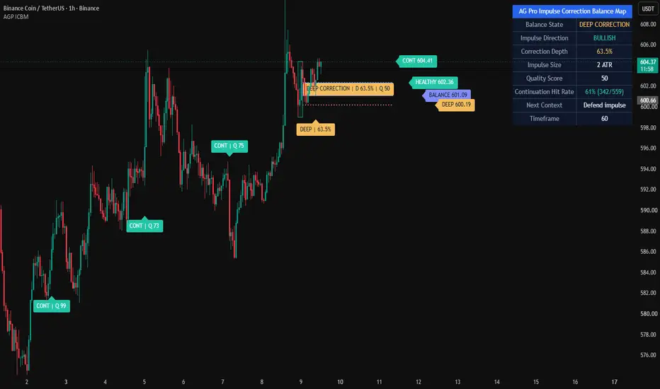
Fair Value Gap Reclaim Planner [AGPro Series]Fair Value Gap Reclaim Planner 🧠 Core Idea Has price returned into a fair value gap and reclaimed the imbalance midpoint with enough quality? 📌 Overview / What it does Fair Value Gap Reclaim Planner is an imbalance-focused price action tool built around three-candle fair value gap structure. The script detects bullish and bearish FVG zones, tracks fill progress, maps the midpoint, evaluates reclaim quality, and displays a structured 0-100 readiness score. It also projects an active reclaim corridor, invalidation shelf, target rails, labels, and a clean AG Pro dashboard. It does not predict future price movement, automate entries, or provide guaranteed signals. It is a visual framework for reading fair value gap reclaim behavior. 🎯 Purpose & Design Philosophy This script was built for traders who study imbalance zones but want a cleaner way to separate meaningful reclaim behavior from ordinary gap interaction. Fair value gaps can attract attention, but not every touch matters. The planner focuses on whether price fills, reacts, and reclaims a meaningful reference level inside the imbalance. The design supports patient analysis: identify the zone, measure the fill, wait for reclaim, then evaluate context. ⚡ Why This Script Is Different Most FVG tools highlight many imbalance zones and leave the user to interpret the rest manually. This script does NOT flood the chart with every historical imbalance. Instead, it focuses on the active FVG context, tracks fill progress, evaluates midpoint or full-edge reclaim, and converts the reaction into a clear score and action state. ⚙️ Methodology 1. Context Detection The script detects bullish and bearish three-candle fair value gaps using a minimum ATR-based size filter. 2. Reference Mapping It maps the FVG top, bottom, midpoint, fill area, and invalidation boundary. 3. Reaction Evaluation When price interacts with the active FVG, the script evaluates fill progress, reclaim distance, wick response, body quality, relative volume, gap quality, and freshness. 4. Visual Output Qualified reclaim events are shown with labels, projected zones, target rails, right-side level tags, and a compact panel. 🗺️ How to Read the Chart FVG Zone shows the active imbalance area. Midline marks the primary reclaim reference when Midline mode is selected. Fill Progress shows how deeply price has returned into the imbalance. READY FVG RECLAIM labels mark reclaim events that meet the selected score threshold. Invalidation Shelf marks the area where the reclaim context weakens or fails. The AG Pro panel summarizes Gap State, Reclaim Score, Fill Progress, Risk, and Action. 🚦 Signals & States • BULL FVG → bullish fair value gap detected and locked. • BEAR FVG → bearish fair value gap detected and locked. • READY FVG RECLAIM → price reclaimed the selected FVG reference with enough quality. • FVG TOUCH → price interacted with the active FVG zone. • INVALIDATED → the active reclaim context lost the opposite FVG edge. • READY → a qualified reclaim event is active. • MONITOR → the active FVG is being tested or a reclaim context remains open. • WAIT → no qualified reclaim event is active. 🔔 Alerts Logic Bullish FVG Reclaim Ready triggers when price reclaims the selected FVG reference upward with enough score quality. Bearish FVG Reclaim Ready triggers when price reclaims the selected FVG reference downward with enough score quality. FVG Touch triggers when price interacts with the active imbalance zone. FVG Reclaim Invalidated triggers when the active reclaim context loses the opposite FVG edge. Alerts are attention markers, not trade instructions. 🧩 Confluence Logic The strongest reclaim contexts appear when fill progress, wick response, close quality, relative volume, gap size, and freshness align. When price returns into the imbalance, respects the zone, and reclaims the midpoint or edge with clean reaction quality, the score improves. 📊 When to Use • Markets with visible imbalance behavior • Breakout pullbacks into fair value gaps • Trend continuation reviews • Reclaim attempts after partial FVG fills • Intraday or swing contexts where FVG zones remain meaningful ⚠️ When NOT to Use • Very low liquidity markets • Extremely noisy or illiquid symbols • Markets with unreliable candles or volume • Wide-spread conditions where small gaps are misleading • News spikes where imbalance zones can be invalidated quickly 🎛️ Key Inputs • Minimum FVG Size ATR → filters out tiny imbalance zones. • Maximum FVG Age Bars → controls how long an FVG can remain active. • Reclaim Reference → chooses midpoint reclaim or full-edge reclaim. • Touch Lookback Bars → controls how recent the FVG interaction must be. • Invalidation Buffer ATR → controls the risk shelf beyond the FVG edge. • Minimum Ready Score → sets how strict READY events should be. • Target Rails → control projected T1 and T2 levels. • Label Settings → control label density, size, and spacing. • Panel Settings → control panel visibility, location, theme, and font size. 🖥️ Interface & Visual Design The interface is designed to show the active imbalance context without filling the chart with excessive historical zones. The FVG zone, midline, fill meter, invalidation shelf, target rails, and panel are visually separated so the chart remains readable. The goal is a premium first-glance layout: zone first, reclaim second, action state third. 🧪 Practical Usage Workflow 1. Check the panel for active Gap State. 2. Locate the FVG zone and midpoint. 3. Watch how deeply price fills the imbalance. 4. Evaluate READY FVG RECLAIM labels and score quality. 5. Compare price with the invalidation shelf and target rails. 6. Confirm broader structure before making decisions. 🔍 Interpretation Guidelines A high reclaim score means the reaction is cleaner according to the script's rules. A lower score means the reclaim may be weaker, late, noisy, or incomplete. Fill progress is not a signal by itself. It becomes more meaningful when combined with reclaim quality and broader market context. 🚫 What This Script Is NOT This script is not a prediction engine. It is not financial advice. It is not an automated trading system. It does not guarantee entries, exits, profits, or outcomes. ⚠️ Limitations & Transparency Fair value gap interpretation can vary across markets, sessions, and timeframes. Some markets create many small gaps that may not carry meaningful context. Volatility changes can make an active FVG less relevant over time. No rule-based script can fully account for news, liquidity shocks, or sudden market structure shifts. 🧠 Market Context Notes Fair value gaps often represent fast price displacement and temporary imbalance. The reclaim of a midpoint or edge can help traders study whether the market is accepting or rejecting the imbalance area. The script works best when combined with structure, liquidity, volatility, and trend context. 🧾 Use Case Examples When a bullish FVG forms after displacement, price returns into the zone, partially fills it, and then reclaims the midpoint, the script may mark a bullish reclaim context. When a bearish FVG forms after downside displacement, price retraces into the imbalance and then rejects back below the midpoint, the script may mark a bearish reclaim context. 🧱 System Philosophy Fair Value Gap Reclaim Planner follows the AG Pro Series approach: turn a popular market concept into a structured decision map with context, score, risk reference, and clean visuals. It is designed to support judgment, not replace it. 🔐 Non-Promise Statement No script can provide certainty. No signal should be treated as guaranteed. Outputs should always be interpreted with independent analysis and responsible risk control. 📉 Risk Disclosure Trading involves risk. Market conditions can change quickly. Users are responsible for their own decisions, risk management, and trade execution. This script is for educational and analytical purposes only and does not provide financial advice. 📚 Educational Note This script is designed to help traders study how fair value gap fills, midpoint reclaims, and imbalance reactions behave across different market conditions. Chỉ báocủa AGProLabsCập nhật 33
BTC Trump China Visit This script visualizes a concrete BTC price scenario built around the Trump–Xi Beijing meeting on May 15. What's plotted: • $79,000–$80,000 liquidity zone (Phase 1 target — sweep before May 9) • $84,000 level (Phase 2 — speculative weekend pump on Trump media) • May 15 vertical line — the meeting date, expected local top • Post-May 15 slow bleed zone (Phase 3) • Probability table: 80% slow bleed / 10% real deal rally / 10% sharp dump The thesis: markets overpriced ceasefire signals. China won't concede before the visit — they need Trump coming to them, not the other way around. Euphoria peaks into the meeting. Reality hits after. Same mechanics as the October 2025 APEC setup, where BTC dropped from $111K to $108.5K on no joint press conference. This is not "if we go up we go up" analysis. Concrete levels, concrete timing, full accountability. Chỉ báocủa pnl_cult8
(EV/EBITDA) / GrowthBuilding blocks Component What it means EV (Enterprise Value) Market Cap + Debt + Minority Interest − Cash — the true cost to buy the whole company EBITDA Earnings Before Interest, Tax, Depreciation & Amortisation — a proxy for operating cash flow EV/EBITDA How many years of operating earnings you're paying — a valuation multiple Growth YoY % change in EBITDA (or Revenue) — how fast the company is expanding The problem it solves EV/EBITDA alone is incomplete. A company at EV/EBITDA = 20x growing at 40%/yr → cheap A company at EV/EBITDA = 10x growing at 2%/yr → expensive EVEG captures this by dividing the multiple by the growth rate. How to read it EVEG Interpretation < 1 🟢 Undervalued relative to growth = 1 🟡 Fairly valued > 2 🔴 Expensive relative to growth Negative ⚠️ Negative growth — ratio loses meaning Simple example EV/EBITDA = 15x EBITDA Growth = 30% EVEG = 15 ÷ 30 = 0.5 → 🟢 Cheap for its growth rate These are three different ways to calculate (EV/EBITDA) ÷ Growth, each using a different time period for the EBITDA denominator: EVEG @ FY — Fiscal Year Uses annual EBITDA (last full fiscal year) Most stable, least noisy Best for long-term valuation comparison Growth = YoY change in annual EBITDA EVEG @ TTM — Trailing Twelve Months Uses last 12 months of EBITDA (rolling) Most current/real-time view Reacts faster to recent earnings changes Growth = YoY change in TTM EBITDA EVEG @ FQ — Fiscal Quarter Uses a blended formula: ebitda_fq + (ebitda_ttm × 3/4) This was Lorenzo's original formula — it mixes the latest quarter with TTM to smooth out single-quarter spikes Most granular but also most volatile Growth still uses FY growth rate as the divisor Which to trust? Signal Best Use FY Long-term investors, annual screening TTM Most balanced — current but smoothed FQ Short-term traders, catching turning points early When all three are aligned and low (< 1), that's the strongest signal of undervaluation relative to growth.Chỉ báocủa syazdianCập nhật 13
Devtrader Dynamic Trading WindowsDevtrader Dynamic Trading Windows Devtrader Dynamic Trading Windows is an intraday session-mapping tool designed to help traders visually mark their preferred trading windows directly on the chart. The indicator allows traders to configure multiple ticker-specific profiles and define custom time intervals for each symbol. When the chart symbol matches one of the configured profiles, the indicator automatically applies that ticker’s specific trading windows and draws vertical start/end markers on the chart. This is useful for traders who focus on specific instruments at specific times of day, such as index killzones, equity opening windows, futures session windows, or personal backtested execution periods. Main Features • Multiple ticker profiles Configure separate profiles for symbols such as GER40, NQ, UK100, INTC, or any custom ticker. • Ticker-aware behavior The indicator checks the active chart symbol and only displays the windows configured for the matching ticker profile. • Multiple intervals per ticker Each ticker profile can contain multiple editable time intervals, allowing traders to map different trading windows throughout the day. • Custom vertical lines Each interval draws vertical markers at the start and end of the configured window. • Fully editable line style Customize the color, width, and style of the vertical markers. • Editable labels Each interval can display custom labels such as “NQ Open”, “GER40 Main”, “London Window”, or any other preferred text. • Timezone support Each ticker profile has its own timezone setting, so the configured sessions can be interpreted correctly for the selected market. • Intraday-focused design The script is designed for intraday charts such as 1m, 5m, 15m, and similar timeframes. • Status label A small status label shows which ticker profile is currently active and which timezone is being used. How It Works 1. Add the indicator to an intraday chart. 2. Open the indicator settings. 3. Enable the ticker profile you want to use. 4. Set the ticker match text, for example: - GER40 - NQ - UK100 - INTC 5. Define one or more session intervals. 6. Customize the marker text, color, line width, and line style. 7. When the chart symbol matches the profile, the indicator automatically draws the configured window markers. Example Use Cases • GER40 / DAX trading window: Mark the main execution window between 11:20 and 14:00. • NQ / Nasdaq futures trading window: Mark the New York open window and afternoon execution window. • UK100 trading window: Map the preferred London-session trading period. • Individual stocks: Mark opening range, momentum window, or preferred intraday execution periods for stocks such as INTC. Important Notes This indicator does not generate buy or sell signals. It does not predict price direction. It is not a strategy and does not place trades. Its purpose is to help traders stay disciplined by visually marking the exact periods when they prefer to focus, observe, or execute trades. Recommended Usage Use this indicator as part of a structured trading plan: • Define your best-performing execution windows. • Mark only the periods you have backtested or personally validated. • Avoid overtrading outside your planned windows. • Combine the window markers with your own market structure, liquidity, volume, price action, or strategy rules. • Review your trades later to see whether your best results come from specific time intervals. Why This Indicator Exists Many intraday traders perform better during specific market periods. For example, some traders prefer the London session, New York open, futures opening range, index killzones, or specific volatility windows. This tool was created to make those windows visible, consistent, and symbol-specific. Instead of manually remembering different time windows for each market, traders can configure them once and let the indicator automatically display the correct windows based on the active chart symbol. Best For • Intraday traders • Futures traders • Index traders • Stock traders • Killzone-based traders • Session-based traders • Traders who use backtested time windows • Traders who want more discipline around when they trade Chỉ báocủa DevtailorCập nhật 23
R2D2 Market Intelligence BarR2D2 Market Intelligence Bar: The Ultimate All-In-One Dashboard Overview The R2D2 Market Intelligence Bar is a comprehensive, customizable dashboard designed to give traders and investors an immediate, high-level read of an asset’s technical and fundamental health. Positioned neatly at the top right of your chart, this indicator eliminates the need to constantly switch tabs or clutter your screen with a dozen different sub-charts. Whether you are scanning a watchlist for momentum setups or doing due diligence on a long-term investment, the R2D2 bar consolidates the most critical quantitative metrics into a single, color-coded heads-up display. Key Features & Metrics The dashboard bridges the gap between technical price action and fundamental valuation. It includes: 1. The Performance Matrix (1W, 1M, 2M, 3M, 6M, 1Y, 2Y) Instantly view the asset's rolling percentage returns across seven distinct timeframes. The background color of these cells acts as a visual heat map: Light Green: Exceptional gains (+100% or more) Lime Green: Standard positive returns Bright Red: Standard negative returns Dark Red: Severe drawdowns (-10% or worse) 2. Risk & Volatility Management ATR %: The Average True Range expressed as a percentage of the current price, showing how much the asset swings daily. Volatility Status: Automatically categorizes current volatility as Low, Normal, or Elevated based on the ATR percentage. TS (Trail Stop): A dynamically calculated trailing stop-loss level, derived directly from your custom ATR multiplier settings. Volume (V %): Shows current volume momentum by comparing today's volume against the 20-day Simple Moving Average (SMA). 3. Quantitative & Fundamental Health SPX Beta: Measures the asset's 1-year volatility and correlation relative to a benchmark (default is the S&P 500 / SPY). A Beta over 1.0 means it is more volatile than the broader market. Sharpe Ratio: Evaluates the 1-year annualized risk-adjusted return. The dashboard automatically grades the Sharpe ratio as Good, OK, or Poor. PE Ratio: Trailing Twelve Months (TTM) Price-to-Earnings ratio. Net Income Margin (NIM): Shows the fundamental profitability of the company. Dividend Yield: The current TTM yield for income investors. Complete Customization Every trader's strategy is different. The R2D2 Intelligence Bar features a robust Dashboard Visibility menu that allows you to toggle every single metric on or off. Only care about technicals? Turn off the PE, Yield, and NIM. Want a cleaner screen on a smaller monitor? Drop the text size down to "Tiny" or hide the longer timeframes. The dashboard dynamically resizes itself so there are no empty, dead spaces. You can also adjust the core technical settings, including the ATR Length, the Trail Stop Multiplier, and the benchmark ticker used for the Beta calculation. Important Notes for Users Asset Limitations: Fundamental metrics (PE Ratio, Net Income Margin, and Dividend Yield) utilize TradingView's request.financial() functions. These metrics will only populate when viewing Equities (Stocks). If you apply this indicator to Crypto, Forex, or Futures, those specific cells will gracefully display as "N/A" or "0%" while the technical and performance metrics continue to calculate perfectly. Sharpe Ratio: The Sharpe ratio calculated in this script is a simplified 1-year annualized metric assuming a 0% risk-free rate, designed specifically for quick relative comparison between equities. How to Use Add the indicator to your chart. Double-click the R2D2 bar (or open the indicator settings gear icon). Under Technical Settings, define your risk tolerance by adjusting the ATR length and Trail Stop multiplier. Under Dashboard Visibility, toggle the metrics to fit your exact trading style. Trade smarter, not harder. Let R2D2 do the scanning.Chỉ báocủa R2D2_4LifeCập nhật 4
Big Boy ATRBig Boy ATR displays your Average True Range front and center — no squinting at a tiny subplot. A large, bold digital readout sits in the corner of your chart and updates in real time as each bar prints. Features: Oversized ATR value displayed in the chart corner — always visible at a glance Choose your ATR timeframe independently of the chart timeframe (e.g. view a Daily ATR while trading on an 8-minute chart) Selectable smoothing method: RMA, EMA, SMA, or WMA Fully configurable: length, decimal places, text color, background, border, and corner position Header label shows active length and timeframe so you always know what you're reading Designed for traders who use ATR for stop sizing and want the number immediately accessible without hunting for it in a subplot.Chỉ báocủa TheFuturesMonk24
ICT Turtle Soup + Liquidity Grabs + Equal Highs/Lows [Pro]1. Overview This indicator combines three powerful ICT tools in one: FeaturePurposeWhen to UseTurtle SoupDetects strong reversals after false breakoutsMain entry signalLiquidity Grabs + %Shows when liquidity is swept and how much remainsHigh-probability zonesEqual Highs/Lows (EQH/EQL)Identifies strong liquidity pools (multiple touches)Key levels for reversals You can now turn the Equal Highs/Lows feature completely on or off using the new toggle. 2. How to Use It (Step-by-Step) Recommended Daily Workflow: Turn on Equal Highs/Lows (or keep it off if you want a cleaner chart) Identify Key Levels Look for EQH (blue lines) → Potential resistance Look for EQL (purple lines) → Potential support Wait for Liquidity Grab Watch for LG-H (red) or LG-L (green) near these levels Pay attention to the % Left label Confirm with Turtle Soup The strongest setups are when Turtle Soup forms at or near an EQH/EQL Enter the Trade Enter on the Turtle Soup signal Use the SL line (if shown) Target previous swing high/low or 1:2–1:3 RR 3. How to Customize (Full Breakdown) A. Equal Highs & Lows (Most Important Section) SettingRecommended ValueEffectEnable Equal Highs/Lows FeatureON (default)Turn OFF to completely remove EQH/EQLEqual High/Low Lookback12 – 18Higher = stronger, fewer levelsMinimum Touches for Equal Level22 = good balance, 3 = very strong onlyEqual Tolerance %0.12 – 0.15How close levels need to beMax Active Equal Lines3 – 5Keeps chart cleanLine Extension Bars50 – 70How far lines extend to the rightShow Extending LinesONShows the horizontal linesShow Equal Highs / LowsONShows EQH / EQL labels Pro Tip: Start with Lookback = 15 and Minimum Touches = 2. Increase Lookback if you want fewer but stronger levels. B. Turtle Soup (Main Entry Signals) SettingRecommended ValueEffectSwing Lookback5Higher = stronger reversalsMin Body % of Range0.30Filters weak candlesShow Turtle Soup LabelsONShows "Turtle Soup (Bearish/Bullish)" C. Liquidity Grabs SettingRecommended ValueEffectLiquidity Lookback20Standard for most timeframesShow Liquidity GrabsONShows LG-H and LG-LShow % Remaining LabelONVery useful for decision makingLiquidity Box Transparency88 – 92Lower = more visible D. Visual Mode (Overall Look) ModeWhat You SeeBest ForMinimalOnly triangles + minimal labelsVery clean chartCleanMost useful elements (Recommended)Daily tradingFullEverything (boxes, SL lines, etc.)Learning / analysis 4. Recommended Settings for NQ / ES (15m & 30m) Equal Highs & Lows Enable Feature: ON Lookback: 15 Minimum Touches: 2 Max Active Lines: 4 Line Extension: 60 Turtle Soup Swing Lookback: 5 Min Body %: 0.30 Liquidity Lookback: 20 Show % Label: ON Visual Visual Mode: Clean Show Labels: ON 5. Pro Tips Strongest Setups: Turtle Soup + Equal High/Low + Liquidity Grab at the same level Best Time to Trade: First 2–3 hours after NY Open When to Skip Trades: No EQH/EQL levels nearby Strong trending market with no respect for equal levels Use with Higher Timeframe: Always check 1H or 4H bias first Quick Switch: Turn "Enable Equal Highs/Lows Feature" OFF when you want a simpler chart 6. Quick Reference You See ThisMeaningActionEQH + Blue LineStrong resistanceWatch for shortsEQL + Purple LineStrong supportWatch for longsLG-H + Red Box + %Liquidity swept abovePotential shortLG-L + Green Box + %Liquidity swept belowPotential longTurtle Soup (Bearish)Reversal after false high breakoutShort entryTurtle Soup (Bullish)Reversal after false low breakoutLong entryChỉ báocủa MrWoof88896
EMA 9/21/50 Bullish/Bearish Tracker SEDAT XI [5min Optimized]EMA 9/21/50 Bullish/Bearish Tracker SEDAT XI A clean, powerful, and visual trend strength indicator optimized for 5-minute charts. This indicator combines the classic EMA 9 – 21 – 50 stack with Higher Timeframe confirmation (15min EMA 50) and Volume Momentum to help traders quickly identify high-probability bullish and bearish setups. ✨ Key Features Triple EMA System: EMA 9 (Fast), EMA 21 (Medium), and EMA 50 (Trend) Dynamic Coloring: EMAs change color based on price position for instant visual feedback Higher Timeframe Filter: 15-minute EMA 50 confirmation to avoid counter-trend trades on 5min charts Volume Momentum Tracker: Detects significant volume spikes with bullish/bearish candle direction Strong Signal Logic: Combines EMA stack + Price position + HTF alignment + Volume spike Smart Background Coloring: Clear green/red background for strong momentum phases Professional Table Dashboard: Real-time status of Price, Stack, Volume, and HTF alignment Built-in Alerts: Multiple high-quality alert conditions Movable Table: Fully adjustable position with pixel offsets. 🎯 How to Read the Indicator Strong Bullish (Bright Green Background) EMA 9 > 21 > 50 (Bull Stack) Price above all three EMAs Price above 15min EMA 50 Bullish volume spike Strong Bearish (Bright Red Background) EMA 9 < 21 < 50 (Bear Stack) Price below all three EMAs Price below 15min EMA 50 Bearish volume spike The table gives you a complete snapshot at a glance: STATE: Overall market condition PRICE: Position relative to EMAs STACK: EMA alignment VOLUME: Spike detection HTF 15m: Higher timeframe confirmation 🚨 Alerts Included Price crosses EMA 50 Strong Bullish / Bearish Alignment Bullish/Bearish Volume Spikes during trend EMA 9/21 crossover in strong trend Best Used On Primary: 5-minute charts Also works well on 3min, 8min, and 15min timeframes Ideal for Day Trading, Scalping, and Swing Entries Settings Overview EMA Settings Adjustable lengths for EMA 9, 21, 50 Custom source (Close, HL2, etc.) Volume Settings Volume MA Length Spike Multiplier (default 1.5×) Table Position Choose base position + fine-tune with X/Y pixel offsets Created by Sedat XI Optimized for clean, stress-free trading on 5-minute charts. Would you like me to also write: A shorter version (for mobile view)? Detailed "How to Trade" section with examples? Tags and categories for publishing? Just say the word and I’ll refine it further!377msChỉ báocủa usamotorcars5
Sriram FINAL BOSS - Institutional Engine (Stable)perfect indicator for trading and taking postonal calls.Chỉ báocủa koushikvarshaa11
FagoriTools 1.0**FagoriTools — Multi-TF Trend + Reverse RSI Levels** All-in-one indicator that combines three utilities into a single script to reduce visual clutter on the chart: **1) Configurable EMAs** Five independent exponential moving averages, each with its own period, color, and on/off toggle. Default values follow common combinations: 9, 12, 26, 50, and 200. Useful for those who rely on classic crossovers (12/26, 50/200) and want all references consolidated within one indicator. **2) Reverse RSI Levels** Instead of displaying the RSI in a separate panel, this module plots two lines directly over price, indicating the exact value at which the asset would need to close for the RSI to reach the oversold (default 30) and overbought (default 70) thresholds. The calculation inverts the RSI formula: starting from the current gain and loss averages (RMA), it solves the equation for the `close` value that would produce the target RSI, accounting for Wilder's smoothing. This allows you to see at a glance, "if it drops to X, it becomes oversold" or "to turn overbought, it needs to rise to Y," without switching between panels. Both the RSI levels and the period (default 14) are fully customizable. **3) Multi-Timeframe Table** A consolidated panel displaying the asset's reading across seven timeframes: 5m, 15m, 1h, 4h, 1D, 1W, and 1M (each can be toggled on or off individually). For each timeframe, the table shows: * Trend — trend direction (Up/Down) based on the close relative to the slow EMA. Green = Up, Red = Down. * RSI — numeric RSI value for that timeframe, with the background color reflecting the trend. * Fixed (optional) — the same trend reading applied to a fixed pair chosen by the user (e.g., SPX500, DXY, BTCUSDT). Useful for tracking correlation with a benchmark without switching charts. The table position is configurable across two dimensions (vertical: Top/Middle/Bottom; horizontal: Left/Right). **How to Use** 1. Enable the EMAs that align with your strategy. 2. Adjust the RSI levels according to your style (some prefer 20/80 in crypto, 30/70 in stocks). 3. Use the multi-TF table to align your trades with the higher timeframe trend. Entries against the trend of larger timeframes typically have a lower win rate. **Notes** * The Reverse RSI is a deterministic calculation, not a projection. The value displayed is the current price required for the RSI to reach the target, and it updates with every candle. * The "Fixed" column depends on the chosen symbol being available on the broker. Otherwise, it remains blank. * Indicator is overlaid on price, working with any asset and timeframe.Chỉ báocủa hacademy14
Auto FIBB by Vamshi VarsaThis Indicator will automatically mark the FIBB with Displacements, once Price retraces to 0.71 levels of FIBB there is a high chance of reversal. SL should be at FIBB level 1 and TP should be at FIBB level 0Chỉ báocủa vamshi2varsaCập nhật 67
2-Click Pip CalculatorTitle Idea: 2-Click Interactive Pip Ruler (Clean & Fast) Description: This script acts as a fast, interactive vertical caliper. It strips out the time-axis requirements completely, dropping the tool down to just two clicks (Y-Axis only). How to Use It: Add the indicator to your chart. The prompt will ask you to select two points. Click 1: Click anywhere on the horizontal plane of your start price (e.g., a swing high). Click 2: Click anywhere on the horizontal plane of your target price (e.g., a swing low). The script instantly drops a clean, vertical measurement line at the hard right edge of your chart, displaying the exact pip distance between those two levels. Key Features: Zero Chart Clutter: No diagonal anchor lines or historical time markers dragging across your screen. Forex Auto-Scaling: Automatically detects if you are on a Forex pair and multiplies the tick size by 10 to give you standard Pips. If you are on an index or crypto, it defaults to standard ticks/points. Instant HUD: The pip label is locked cleanly to the right side of the measurement line with a semi-transparent background so it never gets lost in your candles.Chỉ báocủa cyrptopuneeta25
lewisyang_V2营业收入 (Total Revenue): $Q0 > Q1 > Q2 > Q3$净利润 (Net Income): $Q0 > Q1 > Q2 > Q3$净利润率 (Net Margin): $Q0 > Q1 > Q2 > Q3$Chỉ báocủa gcpyuf0
ocean tranChỉ báo tín hiệu gồm các tín hiệu sau MA200 Pivot point RSI TRENDLINE SELL KHI : GIÁ DƯỚI MA200 SO SÁNH VỚI PIVOT POINT VÀ RSI TỚI TRENDLINE QUAN SÁT Chỉ báocủa duongneuhp11