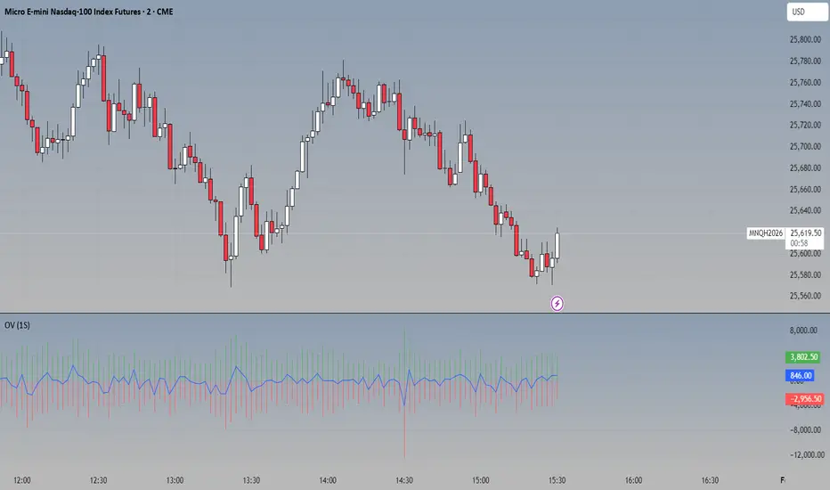
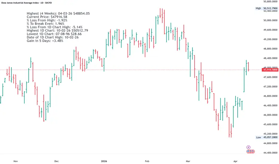
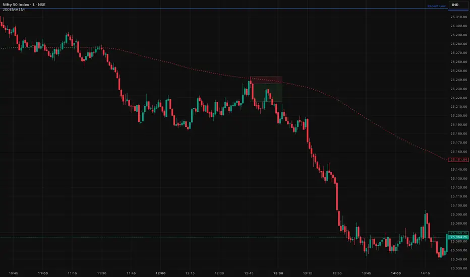
200 EMA Scalping 1 MinuteOnly Scalping in 1 Minute Super accurate, low faults, Strict rule based management, in Nifty 50Chỉ báocủa jamiddeka11139
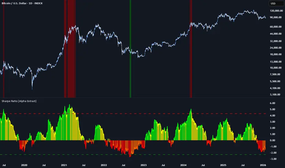
Sharpe Ratio [Alpha Extract]A sophisticated risk-adjusted return measurement system that calculates annualized Sharpe Ratio with dynamic color-coded visualization distinguishing return quality across positive and negative performance regimes. Utilizing rolling period calculations with smoothed moving average comparison, this indicator delivers institutional-grade performance assessment with overbought/oversold threshold detection for extreme risk-adjusted return conditions. The system's four-tier color classification combined with histogram fills and background highlighting provides comprehensive visual feedback on whether current returns justify their volatility risk across varying market cycles. 🔶 Advanced Sharpe Ratio Calculation Engine Implements classic Sharpe Ratio methodology measuring mean daily return divided by return standard deviation with annualization factor for consistent interpretation. The system calculates daily percentage returns, computes rolling mean and standard deviation over configurable periods, applies square root of 365 scaling for annualized comparison, and generates unbounded ratio values where higher positive readings indicate superior risk-adjusted performance. // Core Sharpe Ratio Framework Daily_Return = close / close - 1 Mean_Return = ta.sma(Daily_Return, Period) StdDev_Return = ta.stdev(Daily_Return, Period) Sharpe_Ratio = (Mean_Return / StdDev_Return) * sqrt(365) 🔶 Dynamic Four-Tier Color Classification Features sophisticated color logic distinguishing between strong positive returns (green), weakening positive returns (yellow), weakening negative returns (orange), and strong negative returns (red) based on relationship to smoothed average. The system compares current Sharpe against SMA-smoothed baseline, applying green when positive and accelerating, yellow when positive but decelerating, orange when negative but improving, and red when negative and deteriorating for nuanced regime assessment. 🔶 Smoothed Baseline Comparison Framework Implements SMA smoothing of Sharpe Ratio with configurable period to establish momentum reference line for trend determination within risk-adjusted returns. The system calculates simple moving average of raw Sharpe values, uses this smoothed line as directional benchmark, and determines whether current risk-adjusted performance is strengthening or weakening relative to recent average for color classification logic. 🔶 Extreme Threshold Detection System Provides overbought and oversold level identification with configurable upper and lower bounds marking exceptional risk-adjusted return extremes. The system defaults to +4.3 for overbought threshold (extremely favorable risk-return profile) and -2.3 for oversold threshold (severely unfavorable risk-return profile), applying dashed horizontal reference lines and background highlighting when Sharpe breaches these statistical extremes requiring attention. 🔶 Histogram Fill Visualization Architecture Creates gradient-filled histogram between Sharpe Ratio line and zero baseline using dynamic color matching with 30% transparency for intuitive positive/negative return distinction. The system fills area above zero with bullish colors (green/yellow) and below zero with bearish colors (orange/red), providing immediate visual confirmation of whether returns are compensating for volatility risk or destroying risk-adjusted value. 🔶 Background Zone Highlighting Framework Implements subtle background coloring when Sharpe enters extreme overbought or oversold zones, alerting traders to statistically significant risk-adjusted return conditions. The system applies semi-transparent red background when ratio exceeds +4.3 (exceptionally strong risk-adjusted returns potentially unsustainable) and green background when below -2.3 (severely poor risk-adjusted returns potentially reversionary), creating visual alerts without obscuring price action. 🔶 Annualization Methodology Integration Utilizes standard square root of time scaling (sqrt(365)) to convert rolling period Sharpe calculations into annualized format for cross-temporal comparison. The system applies this mathematical transformation ensuring Sharpe values represent expected annual risk-adjusted returns regardless of calculation period length, enabling consistent interpretation whether using 100-day or 200-day rolling windows. 🔶 Zero-Line Reference System Provides critical zero-line plot serving as boundary between positive risk-adjusted returns (capital allocation justified by return/risk profile) and negative risk-adjusted returns (strategy destroying value on risk-adjusted basis). The system emphasizes this threshold as decision point where values above zero suggest continuation while values below zero indicate reconsideration of exposure. 🔶 Momentum-Based Color Transitions Implements intelligent color switching logic that considers both absolute Sharpe value and its momentum relative to smoothed average, creating four distinct regimes for granular performance assessment. The system enables identification of bullish acceleration (green), bullish deceleration (yellow), bearish improvement (orange), and bearish acceleration (red) for nuanced position management beyond simple positive/negative classification. 🔶 Configurable Period Optimization Features adjustable calculation period and smoothing length enabling optimization across different trading timeframes and volatility regimes. The system defaults to 150-period calculation (approximately 6-7 months of daily data) with 30-period smoothing, but allows customization from short-term tactical assessment to long-term strategic evaluation based on investment horizon and strategy requirements. 🔶 Performance Optimization Framework Employs efficient rolling calculations with streamlined daily return processing and optimized standard deviation computation for smooth real-time updates. The system includes minimal computational overhead through single-pass mean and variance calculations, enabling consistent performance across extended historical periods while maintaining accuracy of risk-adjusted return measurements. This indicator delivers sophisticated risk-adjusted return analysis through classic Sharpe Ratio methodology with enhanced visual classification distinguishing return quality and momentum. Unlike simple return-focused indicators, Sharpe Ratio penalizes volatility ensuring traders evaluate whether returns justify the risk undertaken. The system's four-tier color coding, smoothed baseline comparison, and extreme threshold detection make it essential for portfolio managers and systematic traders seeking objective performance assessment beyond raw price gains. High positive Sharpe values indicate efficient return generation relative to volatility risk, while negative values signal value destruction on risk-adjusted basis requiring strategy reassessment. The indicator excels at identifying periods when risk-taking is rewarded (green zones) versus periods when volatility exceeds returns (red zones) across cryptocurrency, forex, and equity markets for optimal capital allocation decisions.Chỉ báocủa AlphaExtract160
PEGY RatioThe basic metrics that all indicators descend from are for each bar the Open, High, Low, Close and Volume where the Close is often noted as Price. Then the Price/Earnings ratio entered trading. Price/Earnings is often noted as P/E ratio or PE. The first major formalisation and widespread use of the P/E ratio came in 1934, when Benjamin Graham and David Dodd introduced it in their landmark book "Security Analysis". Their work established the P/E ratio as a core tool in fundamental analysis and value investing. Graham’s influence was profound: he used the P/E ratio to help investors judge whether a stock was overpriced or underpriced, and his teachings shaped generations of value investors, including Warren Buffett. The P/E ratio evolved into modern variants like forward P/E and Shiller CAPE. There’s no single P/E cutoff that definitively marks a “growth” or “income” stock, but investors commonly treat P/E below about 10–15 as value/income oriented and P/E above about 20–25 as growth oriented. It is important to watch the P/E trend. If the P/E is a low value and reducing in value, then the company may be failing, and it is not good to invest in. P/E is a relative signal, not an absolute rule. A high P/E usually means the market expects above average future earnings growth; a low P/E often signals lower growth expectations, higher current yield, or elevated risk. Benchmarks vary by sector and cycle: what’s “high” for utilities is low for software. Historical market averages (e.g., S&P 500) help frame whether a multiple is elevated or depressed. The next step was the PEG ratio which was first introduced in 1969 by Mario Farina, who described it in his book "A Beginner’s Guide to Successful Investing in the Stock Market". The concept later gained widespread popularity thanks to Peter Lynch, who championed it in his 1989 bestseller "One Up on Wall Street", arguing that a “fairly priced” company tends to have a PEG of about 1. Over 1 is overpriced and below is a bargain. Later the PEGY ratio, a variation of the PEG ratio that added dividend yield into the valuation came into prominence so that mature, dividend paying companies are treated “fairly” . The PEGY ratio emerged in the 1990s as analysts and portfolio managers began adapting the PEG ratio for dividend paying companies. The concept is a natural extension of Peter Lynch’s PEG logic: If growth matters, and dividends matter, combine them into one valuation metric. PEGY (Price/Earnings Growth% and Dividend Yield) is a straightforward modification of the PEG ratio that adds dividend yield to the growth term so that mature, dividend paying companies aren’t penalized by low growth rates alone. The formula is typically written as: PEGY=(Price/Earnings)/(Earnings growth %+Dividend yield%) Peter Lynch (One Up on Wall Street, 1989) is the most cited printed source that describes a dividend adjusted PEG concept and applies it as a practical screening rule for investors. PEGY is in Chapter “Some Fabulous Numbers”. If earnings are negative, then the PEGY ratio will be negative, and it is best to invest in companies that make money. That is, positive PEGY ratio. The PEGY ratio can have different ratios depending upon whether historical data is used (Mario Farina preference) or whether forward looking earnings (Peter Lynch preference) is used in the calculations. Enough for the history lesson. You can quickly go through your watchlist and determine which stocks have a PEGY Ratio from 0 to 1 and eliminate the others. Then whittle down that list to find stocks travelling from bottom left to upper right on the page. Use any other indicators on that reduced list that your tradng plan uses and there you have your list of stocks in which to invest. Chỉ báocủa Katandra3345
FCF Yield - cristianhkrThis indicator is a fundamental valuation tool that calculates Free Cash Flow Yield in real-time. Unlike standard indicators, this script solves the data gap for European companies reporting semi-annually and allows for short-term projections. What is FCF Yield? It is the real "interest rate" a company generates relative to its current market price. Formula: FCF Yield = (Free Cash Flow / Market Cap) * 100 Key Features: Timeframe Flexibility: Switch between TTM (Trailing Twelve Months), FY (Fiscal Year), and FQ (Fiscal Quarter). Smart Fallback System: Essential for European stocks. If you select "Quarter" for a company that only reports semi-annually (like many European ones: Adidas, LVMH, Pluxee), the script automatically detects and uses the Semi-Annual (FH) data instead of showing an error. Projection/Annualization: Option to annualize short-term data (multiplies Quarters x4 or Semi-Annuals x2) to estimate annual yield based on the last report. Intuitive Visualization: Green area for positive cash generation and red for cash burn. Interpretation Guide (Fundamental): 5%: Generally indicates an attractive valuation (the company generates significant cash relative to its price). < 2%: The company might be overvalued or is a high-growth company reinvesting everything. Negative: The company is burning cash (liquidity risk or early expansion phase). Chỉ báocủa cristianhkr15
Asian Liquidity Sweep + NY Reversal [NY Only]Asian Liquidity Sweep + NY Reversal Concept Asia builds a tight range → liquidity pool London / early NY raids that liquidity (stop hunt) New York delivers the real move in the opposite direction Sessions utc+3 Asia range: 04:00 – 10:00 Liquidity sweep: London open → pre-NY (≈10:00–14:00) Execution window: NY Kill Zone 15:00 – 18:00 Step-by-Step Model Define Asia Range Mark: Asia High Asia Low Liquidity Sweep (Stop Hunt) Price must do ONE of the following: Sweep above Asia High → bullish liquidity taken Sweep below Asia Low → bearish liquidity taken NY Reversal Confirmation (Key Part) Wait for NY Kill Zone and look for: Strong rejection candle Displacement / impulsive move back inside range Optional: small internal structure break on lower TF Entry Rules (High Probability) 🔻 If Asia High is swept: Bias: SELL Entry: After NY rejection On pullback to: Discount zone / FVG OR Asia High retest SL: Above sweep high TP: Asia Low (TP1) NY session low / next HTF liquidity (TP2) If Asia Low is swept: Bias: BUY Entry: NY rejection + displacement Pullback to imbalance / Asia Low SL: Below sweep low TP: Asia High Daily high / premium liquidity arrows/labels-will show when to buy or sell signal-once per day Use volume profile (max) for confirmation of entry point Lets win together Chỉ báocủa harry_adera 1.9 K
BTC Fundamental Value Hypothesis [OmegaTools]BTC Fundamental Value Hypothesis is a macro-valuation and regime-detection model designed to contextualize Bitcoin’s price through relative market-cap comparisons against major capital reservoirs: Gold, Silver, the Altcoin market, and large-cap equities. Instead of relying on traditional on-chain metrics or purely technical signals, this tool frames BTC as an asset competing for global liquidity and “store-of-value mindshare”, then estimates an implied fair value based on how BTC historically coexists (or diverges) from these benchmark universes. Core concept: relative market-cap anchoring The indicator builds a reference-based fair price by translating external market capitalizations into implied BTC valuation using a dominance framework. In practice, you choose one or more reference universes (Gold, Silver, Altcoins, Stocks). For each selected universe, the script computes how large BTC “should be” relative to that universe (dominance ratio), and converts that into an implied BTC price. The final fair price is the average of the implied prices from the enabled universes. Two dominance modes: automatic vs manual 1. Automatic Dominance % (default) When enabled, the model estimates dominance ratios dynamically using a 252-period simple moving average of BTC market cap divided by each reference market cap. This produces an adaptive baseline that follows structural changes over time and reduces sensitivity to short-term spikes. 2. Manual Dominance % If you prefer a discretionary macro thesis, you can directly input dominance parameters for each reference universe. This is useful when you want to stress-test scenarios (e.g., “BTC should converge toward X% of Gold’s market cap”) or align the model with a specific long-term adoption narrative. Reference universes and data construction - BTC market cap: pulled from CRYPTOCAP:BTC. - Gold and Silver market caps: derived from the corresponding futures symbols (GC1!, SI1!) multiplied by an assumed total above-ground quantity (constant tonnage converted to troy ounces). This provides a practical and tradable proxy for spot valuation context. - Altcoin market cap: pulled from CRYPTOCAP:TOTAL2 (total crypto market excluding BTC). - Stocks market cap proxy (Σ3): a deliberately conservative equity benchmark built from three mega-cap stocks (AAPL, MSFT, AMZN) using total shares outstanding (request.financial) multiplied by price. This avoids index licensing complexity while still tracking a meaningful slice of global equity beta/liquidity. Valuation output: overvalued vs undervalued (log-based) The valuation readout is expressed as a percentage derived from the logarithmic distance between BTC price and the model’s fair price. This choice makes valuation comparable across long time horizons and reduces distortion during exponential growth phases. A positive valuation indicates BTC trading below the model’s implied value (undervalued), while a negative valuation indicates trading above it (overvalued). Oscillator: relative momentum and regime confirmation In addition to fair value, the indicator includes a momentum differential oscillator built from RSI(50): - BTC RSI is compared to the average RSI of the selected reference universes. - The oscillator highlights when BTC strength is leading or lagging the broader macro benchmarks. - Color is rendered through a gradient to provide immediate regime readability (risk-on vs risk-off behavior, expansion vs contraction phases). Visualization and UI components - Fair Price overlay: the computed fair price is plotted directly on the BTC chart for immediate comparison with spot price action. - Valuation shading: the area between price and fair price is filled to visually emphasize dislocation and potential mean-reversion zones. - Oscillator panel: a zero-centered oscillator with filled bands helps you identify persistent trend regimes versus transitional conditions. - Summary table: a right-side table displays the current valuation (over/under) and, when Automatic mode is enabled, the live dominance ratios used in the model (BTC/GOLD, BTC/SILVER, BTC/ALTC, BTC/STOCKS). How to use it (practical workflows) - Macro valuation context: use fair price as a structural anchor to assess whether BTC is trading at a premium or discount relative to external liquidity baselines. - Regime filtering: combine valuation with the oscillator to distinguish “cheap but weak” from “cheap and strengthening” (and the inverse for tops). - Mean-reversion mapping: large, persistent deviations from fair value often highlight speculative extremes or capitulation zones; this can support systematic entries/exits, position sizing, or hedging decisions. - Scenario analysis: switch to Manual Dominance % to model adoption outcomes, policy-driven shifts, or multi-year re-rating assumptions. Important notes and limitations (read before use) - This is a hypothesis-driven macro model, not a literal intrinsic value calculation. Results depend on dominance assumptions, proxies, and data availability. - Gold/Silver market caps are approximations based on futures pricing and fixed supply constants; real-world supply dynamics, above-ground estimates, and spot/futures basis can differ. - The Stocks (Σ3) benchmark is a proxy and intentionally not “the whole market”. It is designed to represent a large-cap liquidity reference, not total equity capitalization. - Always validate signals with additional context (market structure, volatility regime, risk management rules). This indicator is best used as a macro layer in a broader decision framework. Designed for clarity, macro discipline, and repeatability BTC Fundamental Value Hypothesis by OmegaTools is built for traders and investors who want a clean, data-driven way to interpret BTC through the lens of competing asset classes and capital flows. It is particularly effective on higher timeframes (Daily/Weekly) where macro relationships are more stable and valuation signals are less noisy. © OmegaTools, ErosChỉ báocủa OmegaToolsCập nhật 29
Maor Beniash | Pro DashboardMB-PRO | Smart Info & Risk Dashboard Description The MB-PRO indicator is a minimalist dashboard designed to provide traders with rapid situational awareness and critical risk management data, without cluttering the chart. This tool consolidates fundamental and technical data into one organized corner, helping avoid common errors such as entering a trade right before an earnings report or incorrect stop-loss calculations. Key Features: Full Company Name: Displays the complete name of the entity. Market Cap: Shows the current market capitalization. Sector & Industry: Quickly identifies the sector and industry classification. Risk Management (ATR): Displays the Average True Range (14) in both absolute value and percentage (crucial for stop-loss sizing). Earnings Alert: A smart warning mechanism where the text automatically turns orange when the report date is approaching (default: 21 days, adjustable). This helps prevent holding positions during high-risk periods.Chỉ báocủa maorbeniashCập nhật 137
Trade TrackerThis indicator is a lightweight trade P/L monitor that takes a manual entry price, direction (long/short), position size, and a configurable dollar value per point/tick. It computes real-time profit/loss by comparing the current close to the entry price, converting the move into points and then dollars based on your size and tick value. On the last bar, it draws an entry line at the specified price and renders a stacked label at that level showing Buy/Sell, size, dollar P/L (green/red), and the point P/L. It continuously deletes and redraws the line/labels to keep the chart clean, and it also plots the entry price so the value is visible in the data window and price scale. Chỉ báocủa gggoaaat13
P/E Ratio (TTM)This indicator plots the trailing P/E ratio (TTM) using GAAP EPS (TTM) sourced directly from TradingView’s fundamental data. It includes valuation‑zone color coding, yearly labels, and a clean, compressed visual layout suitable for most equities. The goal is to provide a fast, intuitive view of how expensive or cheap a stock is relative to its historical earnings power. Note: The indicator caps P/E values around 120 for visual clarity. Negative P/E ratios are intentionally excluded, since P/E is undefined when EPS is negative. You can adjust the cap or remove it entirely if you prefer a full‑range view. This tool is especially useful for identifying periods when a company is trading at historically elevated or discounted valuation levels.Chỉ báocủa followmytradingjournal106
Time Zones PROGeopbytech – Time Zones PRO (v6) Geopbytech – Time Zones PRO is a professional market session indicator designed for intraday, scalping, and Smart Money Concepts (SMC) traders who want precise market timing and clean chart context. This indicator allows you to visualize up to 5 configurable market sessions in a single script, fully adaptable to any timezone and trading style. 5 independent sessions (ON / OFF per session) Custom session time ranges Editable timezone (IANA format: America/New_York, Europe/London, UTC, etc.) Soft and clean background shading Session start flag (🚩) printed at the exact opening candle Works on Forex, Indices, Gold, and Crypto Built with Pine Script v6 (latest version) Common Use Cases London Session – Early liquidity grabs and manipulation New York Killzone – High-probability SMC entries Asia Range – Range building and target mapping Custom sessions based on your local timezone Easy Configuration All settings are accessible from the indicator panel: Enable or disable each session Edit session names and time ranges Adjust background colors Select your real local timezone Toggle session start flags on or off No need to load multiple indicators — everything is centralized into one professional tool. Indicator Philosophy This indicator does NOT provide buy or sell signals. Its purpose is to provide market context, timing, and structure , helping traders focus only on periods where institutional liquidity is active. Perfectly compatible with: Smart Money Concepts (SMC) Order Blocks Fair Value Gaps (FVG) Market Structure Liquidity Sweeps Author Geopbytech – Juan Delgado Disclaimer This indicator is for educational purposes only. It does not constitute financial advice. Always trade with proper risk management.Chỉ báocủa GeopbytechCập nhật 33
FED Net Liquidity (WALCL - TGA - RRP)a measure of FED net liquidity with color codes. What is FED Net Liquidity? FED Net Liquidity is a proxy for how much usable US-dollar liquidity is actually available to financial markets. It combines three balance-sheet items from the Federal Reserve and the US Treasury into one number: FED Net Liquidity = FED Balance Sheet (WALCL) − Treasury General Account (TGA) − Reverse Repo (RRP) The goal is simple: to estimate how much money is “in play” for risk assets, rather than parked or withdrawn.Chỉ báocủa vbarink122
Indian Equities Theme Tracker [EWT] - Sector Rotation HeatmapIdentify where the "Smart Money" is flowing in the Indian Markets. The Indian Equities Theme Tracker is a powerful visual dashboard designed for NSE traders and investors to monitor sector rotation and relative strength in real-time. By tracking the most liquid Exchange Traded Funds (ETFs), this tool provides a birds-eye view of the Indian economy—from core benchmarks like Nifty 50 and Nifty 500 to high-growth themes like Defence, EV, Tourism, and Energy. In modern markets, capital doesn't move into all stocks at once; it rotates between sectors. This script helps you spot the leaders and laggards across five different timeframes, ensuring you are always positioned in the strongest themes. 🚀 Key Features : 23+ Essential Themes: Tracks Broad Market, Market Caps (Mid/Small), Sectors (IT, Bank, Auto, Metal), and Narratives (Defence, Tourism, EV, Energy). Dynamic Performance Sorting: Automatically reorders the table based on your selected lookback (1 Day, 1 Week, 1 Month, 3 Months, or YTD). Heatmap Logic: Intuitive color coding helps you instantly identify extreme bullishness or bearishness across the board. Liquidity Focused: Uses the most liquid NSE ETFs (BeES and equivalent) to ensure the data is accurate and reflects tradeable prices. Pro UI Design: A clean, professional dashboard that can be positioned anywhere on your chart without cluttering your price action analysis. 📊 Themes Included : Benchmarks: Nifty 500, Nifty 50, Nifty Next 50. Market Caps: Midcap 150, Smallcap 250. Sectors: Private & PSU Banks, IT, Pharma, Healthcare, FMCG, Auto, Metals, Infra, Realty. Thematic/Narratives: Defence, Tourism, Energy, EV & New Age Automotive, Consumption. Safe Havens: Gold & Silver. 🛠️ How to use : Timeframe: Switch to the Daily (D) timeframe for the best results. Settings: Use the inputs to change the table position (Top/Middle/Bottom) and the sorting criteria. Strategy: Look for themes that are consistently at the top of the "1 Month" and "3 Month" lists—these are your structural leaders. Use "1 Day" to spot quick tactical bounces. Disclaimer: This indicator is for educational and informational purposes only and does not constitute financial advice. Always perform your own due diligence.Chỉ báocủa YetAnotherTA189
Macro 6-PackMacro 6-Pack dashboard: SPX momentum, VIX, HY credit spread, 10Y yield shifts, DXY trend, and 2s10s curve.Chỉ báocủa boromeywang6
XRP Athey Mitchnick Implied Price (Ramp + Analytical 2030 Label)This indicator implements a fundamental valuation framework for XRP based on the Athey–Mitchnick cryptoasset valuation model. Unlike traditional technical indicators (RSI, MACD, etc.), this tool is not designed to predict short-term price movements. Instead, it models what XRP should be worth over time under explicit adoption and demand assumptions. It answers the question: If XRP becomes a real settlement rail and a long-term store of value, what price would be required for the system to function? What This Indicator Adds This implementation extends the static Athey–Mitchnick model by introducing a time-based ramp: 1. Adoption grows over time You specify: TV CAGR (%) SoV CAGR (%) These values compound annually from a start date to an end date (e.g., 2030), producing a dynamic implied valuation curve. 2. Terminal 2030 price is computed analytically The indicator explicitly computes the implied price at the target year (e.g., 2030) and displays it as: “2030 Implied Price = $X” This is done analytically, so the chart does not need to extend to 2030 for you to see the terminal valuation. 3. This is not a trading indicator This model is not designed for: Scalping Breakouts Entry timing Momentum trading It is designed for: Long-term valuation anchoring Scenario modeling Macro thesis testing Adoption-based forecasting Narrative vs fundamentals comparison How to Read the Chart Market Price (Close) This is the actual XRP market price. It reflects: Speculation Liquidity Leverage Narrative Emotion Implied Price (Ramp) This is the fundamental valuation curve. It shows what XRP’s price would need to be at each point in time for your adoption and store-of-value assumptions to be true. Bands (Optional) The ±% bands are valuation tolerance zones. They are not volatility bands. They help visualize: Overvaluation Undervaluation Reversion zones 2030 Label The label: 2030 Implied Price = $X represents the terminal valuation implied by your assumptions. This is the most important output of the model. What Makes the Price Go Higher To increase the implied 2030 price, one or more of these must change: 1. Higher Transaction Adoption (TV) Inputs: TV0 TV CAGR % This reflects real-world economic usage. Higher TV means XRP is settling more real value per day. Examples: Cross-border payments Tokenized assets Treasury settlement Interbank liquidity rails 2. Higher Store-of-Value Demand (SoV) Inputs: SoV0 SoV CAGR % This reflects long-term holding demand. This is the most powerful driver of long-term price. It models: Institutional holdings Strategic reserves Collateral usage Long-term investor behavior 3. Lower Velocity Input: Velocity V Lower velocity means XRP must be held longer to support the same transaction volume. This implies: Reserve-like behavior Collateralization Treasury holding Structural stickiness Price is inversely proportional to velocity. 4. Lower Effective Supply Inputs: Supply0 Supply CAGR Supply cap If XRP becomes locked, escrowed, staked, or structurally held, the effective circulating supply shrinks, increasing price. Why This Matters Most crypto price models are: Technical Reflexive Narrative-driven Non-falsifiable This one is: Structural Adoption-based Testable Falsifiable If XRP never achieves the adoption implied by your inputs, the model will not justify high prices. This indicator is a forward-looking valuation engine, not a trading tool. It shows: What XRP’s price must be for your beliefs about its future to be true. It forces clarity. It forces discipline. And it converts stories into structure. Chỉ báocủa avohra779
Smart Floors & Ceilings [RSI + Volume] - MarcDuckMarks floors and ceilings based off of RSI and VolumeChỉ báocủa marcduck85
SPY Options Targets -IV Expected MoveWhat this indicator is? This tool turns option implied volatility into two things: 1) Expected move levels on the SPY chart for a chosen time horizon 2) Estimated option premium targets if SPY reaches those levels It is built to answer three trading questions: 1) How far can SPY reasonably move in my holding window 2) What SPY levels should I use for profit targets or invalidation 3) If SPY hits those levels, what option price is a realistic target What the bands mean on the SPY chart The bands are expected move levels on the underlying, recalculated each bar from the selected option’s implied volatility. One sigma band The teal band is the expected one standard deviation move over the next Horizon minutes. In practice, this is a normal move zone for that holding window. Two sigma band The orange band is the expected two standard deviation move over the next Horizon minutes. In practice, this is a large move zone for that holding window. How to interpret value If price is near the middle of the bands, the market is behaving normally for that window. If price approaches the one sigma band, the move is extended for that window. If price approaches the two sigma band, the move is unusually large for that window and you should expect either strong continuation or sharp mean reversion depending on market context. What the table means and how to use it IV Implied volatility solved from the selected option price. Higher IV widens the bands and increases option targets. DTE Days to expiry of the selected option. Near expiry options can change faster and IV can shift quickly. H move 1 sigma The projected one sigma SPY move in dollars for the selected Horizon minutes. This is the key number for planning. Opt at plus 1 sigma and minus 1 sigma If SPY reaches the one sigma upper band or the one sigma lower band, the indicator estimates what your selected option should be worth at that moment, assuming implied volatility does not change. Opt at plus 2 sigma and minus 2 sigma Same idea for the two sigma bands. Now opt px Current option price for reference. ................................................................................................................. How to trade using it? Step 1 Pick the right option input Choose the same expiry you plan to trade and pick a liquid contract, ideally at the money or near the money. This makes the IV reading more representative of the current tape. Step 2 Set the horizon to your holding time If you typically hold 15 to 30 minutes, set Horizon minutes to 15 or 30. If you typically hold 60 to 120 minutes, set it accordingly. This matters because the bands represent expected move for that exact window. Step 3 Use the bands to define trade planning For a long bias Entry is your setup. The bands are used for targets and risk. Target 1 is the one sigma upper band. Target 2 is the two sigma upper band if momentum supports continuation. Invalidation can be defined as losing the mid zone and failing to reclaim, or a clear level based stop. The indicator does not choose your stop. It gives your realistic upside distance. For a short bias Target 1 is the one sigma lower band. Target 2 is the two sigma lower band if momentum supports continuation. Invalidation can be defined similarly using your structure. Step 4 Use the option targets as profit taking levels Once you enter an option trade, ignore random premium swings and anchor to the table. Common approach Take partial profit when the option approaches the plus or minus one sigma target value. Hold a smaller runner for the plus or minus two sigma target value. If SPY hits the one sigma band but the option is far below the table target, it usually means implied volatility is dropping. Reduce expectations or exit earlier. If SPY hits the one sigma band and the option is above the table target, it usually means implied volatility expanded. Consider taking profits sooner because this extra premium can mean revert. Step 5 Use it to choose strikes Before entering, check whether your desired option profit requires SPY to travel to the two sigma band within your horizon. If yes, that is a lower probability trade for that window. If your plan is achievable around the one sigma band, it is typically more realistic. .................................................................................................................. Practical examples Scalp example Horizon 30 minutes. If H move 1 sigma is about 1 dollar, then expecting a 3 dollar SPY move in 30 minutes is a two to three sigma expectation and should be treated as a low probability scalp unless a news event is active. Intraday example Horizon 120 minutes. If H move 1 sigma is about 2 dollars, a 2 dollar move is a reasonable target and a 4 dollar move is the stretch target. Important limitations Implied volatility changes The option target prices assume IV stays constant. In real markets IV can change during the move, especially on 0DTE, around news, or during sharp selloffs. Treat option targets as a baseline estimate. Not a standalone signal This indicator does not generate buy or sell signals. Combine it with your entry model, structure, or momentum confirmation. Liquidity matters Very wide bid ask spreads can distort the inferred IV. Use liquid contracts. Suggested defaults for SPY Use a liquid near the money option for the current expiry. Horizon 30 for scalps, 60 for intraday, 120 for swings. Keep expiry time at 16:00 New York. Disclaimer This script is for educational and informational purposes only and is not financial advice. Options involve risk and may not be suitable for all traders.Chỉ báocủa NeuralMarkets31
AuditLens - Profit Quality Analyzer📊 AuditLens - Profit Quality Analyzer Ever wonder if a company's profits are real or just accounting tricks? This indicator helps you spot potential earnings manipulation by analyzing the gap between reported profits and actual cash generation. ━━━━━━━━━━━━━━━━━━━━━━━━ 🔍 WHAT IT DOES ━━━━━━━━━━━━━━━━━━━━━━━━ Calculates the "Divergence Ratio": (Net Income - Operating Cash Flow) / Total Assets • Positive divergence = Profits NOT backed by cash (risky) • Negative divergence = Cash exceeds profits (healthy "cash cow") ━━━━━━━━━━━━━━━━━━━━━━━━ 🚦 SIGNAL GUIDE ━━━━━━━━━━━━━━━━━━━━━━━━ 🔴 RED FLAG (>10%): High risk - possible aggressive revenue recognition 🟠 ORANGE: Divergence trending up for 3+ quarters 🟡 YELLOW: Divergence trending up for 2+ quarters 🟢 GREEN (<-5%): "Cash Cow" - strong cash generation ✅ HEALTHY (0 to -5%): Normal profit quality ━━━━━━━━━━━━━━━━━━━━━━━━ 📈 HOW TO USE ━━━━━━━━━━━━━━━━━━━━━━━━ 1. Add to any stock chart 2. Check the summary table (top right) 3. Look for RED FLAGS before buying 4. Prefer stocks with negative divergence (cash cows) ━━━━━━━━━━━━━━━━━━━━━━━━ ⚠️ FAMOUS EXAMPLES ━━━━━━━━━━━━━━━━━━━━━━━━ • Enron (2001): Showed profits but burned cash → Bankruptcy • Wirecard (2020): €1.9B "cash" that didn't exist → Fraud • Luckin Coffee (2020): Fake revenue, no cash backing → Delisted This indicator would have flagged all of them. ━━━━━━━━━━━━━━━━━━━━━━━━ 🔗 FULL VERSION ━━━━━━━━━━━━━━━━━━━━━━━━ Want more detailed analysis with: • 6 advanced audit rules • Historical trend analysis • Receivables & Inventory checks • Detailed reports for any stock 👉 Try the full version FREE: auditlens-check.netlify.app ━━━━━━━━━━━━━━━━━━━━━━━━ 📚 THE LOGIC ━━━━━━━━━━━━━━━━━━━━━━━━ Based on forensic accounting principles: - Companies can manipulate earnings (accruals) - But cash flow is harder to fake - Big gap between the two = potential red flag This is NOT financial advice. Always do your own research. ━━━━━━━━━━━━━━━━━━━━━━━━ Built by AuditLens team 🔍 Questions? DM or comment below.Chỉ báocủa crg9001188
BTC Spot Premium Index (Coinbase - Binance )Overview This indicator measures the price difference between Bitcoin (BTC) on Coinbase and Binance, providing insights into the buying pressure from US-based investors versus the global market. A positive premium suggests stronger buying activity on Coinbase, which is often interpreted as a bullish signal for BTC. Key Features • Premium Calculation: The core of the indicator is the formula: Coinbase BTC Price - Binance BTC Price. • Visual Representation: The premium is plotted as an oscillator with a zero line. Positive values are colored green, and negative values are red, making it easy to identify the prevailing market sentiment. • Moving Average: A customizable moving average (default is a 20-period SMA) is included to help identify the trend of the premium. The MA line is displayed in white. • Adjustable Parameters: You can adjust the moving average length and type (SMA, EMA, WMA, RMA) to fit your trading style. How to Use 1. Identify US Market Sentiment: A sustained positive (green) premium suggests strong buying interest from the US market, which can be a precursor to price appreciation. 2. Spot Trend Reversals: A crossover of the premium line above the zero line can signal a shift from bearish to bullish sentiment. Conversely, a cross below the zero line may indicate weakening US demand. 3. Confirm with Moving Average: When the premium line crosses above its moving average, it can signal strengthening momentum. A cross below the MA may suggest a potential slowdown. Interpretation • Green Area (Positive Premium): Indicates that BTC is trading at a higher price on Coinbase than on Binance. This is generally considered a bullish sign, as it reflects strong demand from US investors. • Red Area (Negative Premium): Indicates that BTC is trading at a lower price on Coinbase. This may suggest weaker demand in the US market or stronger selling pressure. • White Line (Moving Average): Helps to smooth out the premium data and identify the underlying trend. Use it as a dynamic support or resistance level for the premium itself. This indicator is a powerful tool for gauging market sentiment and can be a valuable addition to any BTC trader's toolkit. However, it should be used in conjunction with other technical analysis tools and not as a standalone signal for making trading decisions.Chỉ báocủa dylancui919
FDAX MarrellFDAX ONR + Range/Trend Confirm + 15m FVG (CET) — Indicator Description This indicator is designed for FDAX traders who trade 15m Fair Value Gaps (FVG) using 1m confirmation (CISD/SMC execution) and want to avoid getting chopped in range days. What it does Overnight Range (ONR) module (00:00–08:55 CET) Draws the Overnight box. Calculates and displays key ON metrics: ONR – overnight range size Score – overnight directional efficiency (how “one-way” the move was) Loc – where price closed inside the overnight range (close location) Flags a Pre-Range bias when overnight behavior suggests a higher probability of a choppy/session-range environment. Range vs Trend confirmation (European open logic) Builds the Opening Range (OR30) box (09:00–09:30 CET). Tracks TR60 (09:00–10:00 CET) for early volatility expansion. Confirms the session state: WAIT – no confirmation yet CONFIRMED RANGE – conditions point to a balanced/choppy day CONFIRMED TREND – volatility expansion and acceptance outside OR indicates a trending day 15m FVG overlays Plots 15m FVG zones (bullish/bearish) as clean extending boxes. Optional filters: Show FVGs only when CONFIRMED TREND (to avoid taking FVGs in chop). Hide FVGs inside the EQ zone (mid-range) to reduce low-quality setups. Why it’s useful Range days are where most stop streaks happen when trading FVG + 1m confirmation. This indicator helps you: Identify when the market is likely to be balanced/choppy Wait for trend confirmation before taking aggressive FVG plays Focus only on high-probability FVG locations aligned with session conditions Best use Use the indicator on FDAX (EUREX) with 15m / 5m context and execute on 1m. Prioritize FVGs during CONFIRMED TREND and be selective (or reduce size) during WAIT / CONFIRMED RANGE. If you want, I can also write a shorter “TradingView public script style” description (2–3 lines + bullet features), or a more marketing/premium description for your community. Chỉ báocủa Marrell26
StO Price Action - Panel US Economy DataShort Summary - Displays selected us economic data as a time series graph - Economic indicator name shown in the upper-right corner - Designed as a lightweight fundamental context overlay Full Description Overview - Plots economic macro data as a continuous graph - Combines visual trend context with clear textual identification Supported Economic Data - CPI – Consumer Price Index - CIR – Core Inflation Rate (YoY) - IRYY – Inflation Rate (YoY) - IJC – Initial Jobless Claims - JC4W – Jobless Claims (4-Week Average) - NFP – Nonfarm Payrolls - UR – Unemployment Rate Graph Behavior - Selected economic series is rendered as a line graph - Graph color is user-configurable Label Display - Full descriptive name of the selected indicator - Fixed position in the upper-right corner Usage - Helps identify macro trends alongside price action - Useful for bias alignment on higher timeframes - Works well with Trend-following Systems or higher-timeframe structure analysis Notes - Economic data is informational and non-predictive - Not a signal or timing tool - Best used as contextual background not standalone inputChỉ báocủa sto_svcCập nhật 18
Value Area PRO (TPO/Volume Session VAH/VAL/POC) 📌 AP Capital Value Area PRO (TPO / Volume) AP Capital Value Area PRO is a session-based value area indicator designed for Gold (XAUUSD), NASDAQ (NAS100), and other CFD instruments. It focuses on where the market has accepted price during the current session and highlights high-probability interaction zones used by professional traders. Unlike rolling lookback volume profiles, this indicator builds a true session value area and provides actionable signals around VAH, VAL, and POC. 🔹 Core Features Session-Anchored Value Area Value Area is built only during the selected session Resets cleanly at session start Levels develop during the session and can be extended forward No repainting or shifting due to lookback changes TPO or Volume Mode TPO (Time-at-Price) mode – ideal for CFDs and tick-volume data Volume mode – uses broker volume if preferred Same logic, different weighting method Fixed Price Bin Size Uses a fixed bin size (e.g. 0.10 for Gold, 0.25–0.50 for NAS100) Produces cleaner, more realistic VAH/VAL levels Avoids distorted profiles caused by dynamic bin scaling VAH / VAL / POC Levels VAH (Value Area High) VAL (Value Area Low) POC (Point of Control) (optional) Lines can be extended to act as forward reference levels 🔹 Trading Signals & Alerts Value Re-Entry Identifies false breakouts where price: Trades outside value Then closes back inside Often seen before strong mean-reversion or continuation moves. Acceptance Detects initiative activity using: Multiple consecutive closes outside value Filters out weak single-candle breaks Rejection Flags strong rejection candles: Large candle body Wick outside value Close back inside the value area These conditions are especially effective on Gold intraday. 🔹 Optional Profile Histogram Right-side volume/TPO histogram Buy/sell imbalance visualization Fully optional to reduce chart clutter and improve performance 🔹 Best Use Cases Recommended markets XAUUSD (Gold) NAS100 / US100 Other index or metal CFDs Recommended timeframes 5m, 15m, 30m Suggested settings Mode: TPO Value Area: 70% Bin size: Gold: 0.10 NAS100: 0.25 or 0.50 🔹 How Traders Use It Trade rejections at VAH / VAL Look for acceptance to confirm trend days Use re-entries to fade failed breakouts Combine with trend filters, EMA structure, or session context ⚠️ Disclaimer This indicator is provided for educational and analytical purposes only and does not constitute financial advice. Always manage risk appropriately.Chỉ báocủa APCapitalTrading79
HazMeed Session Highs/Lows)Marks out Asia Session Highs and Lows Marks out London Session Highs and Lows Marks out NYAM Session Highs and LowsChỉ báocủa hasanmev23
Performance Table: Standard DCA | Last 6-12-24-48MThis indicator visualizes Standard Dollar-Cost Averaging (DCA) performance across multiple time horizons (6M, 12M, 24M, 48M). It summarizes invested capital, current portfolio value, net profit, and return percentage in a compact table, allowing quick comparison of short- and long-term DCA outcomes. Designed for long-term investors, it helps evaluate how consistent periodic investments perform over time without relying on market timing. The indicator is asset-agnostic and works on any symbol supported by TradingView. Key use cases: Long-term portfolio tracking DCA strategy validation Performance comparison across periods Educational and analytical purposes This tool focuses on clarity and realism, avoiding over-optimization and short-term noise. -- I hope this table helps investors better understand long-term DCA performance. Feedback and suggestions for improvement are always welcome.Chỉ báocủa sedatonat14