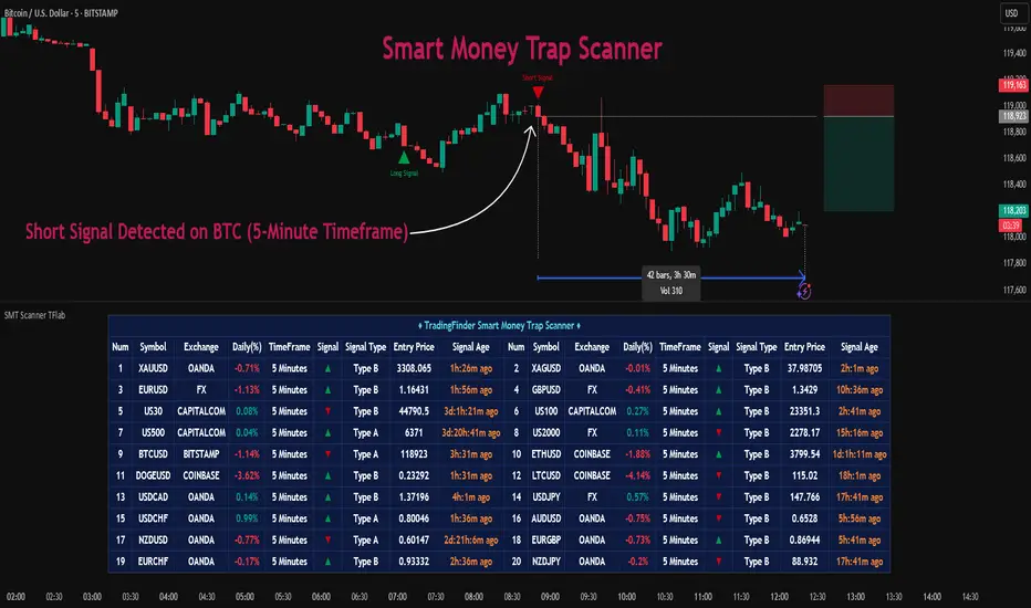
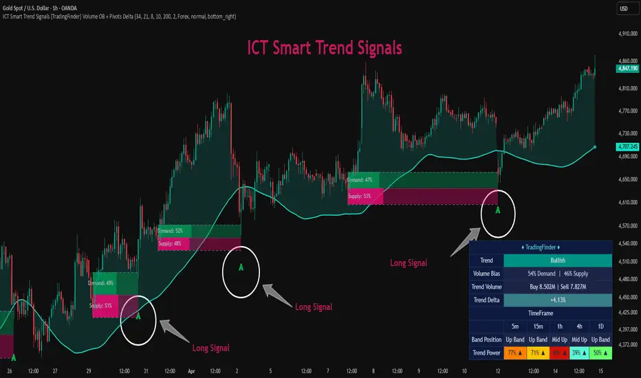
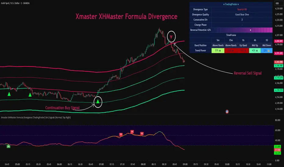
Smart Money Trap Scanner [TradingFinder] 🔵 Introduction
In many market conditions, what initially seems to be a decisive breakout often turns out to be nothing more than a false breakout or fake move. Price breaks through a significant structural level, such as a swing high or low or a key support and resistance zone, only to quickly return to its previous range. These moves, often driven by liquidity traps or market manipulation, typically signal structural weakness rather than the start of a new trend.
This screener is specifically designed to detect such situations. It focuses on identifying false breakouts and price returns to broken levels within a defined time window, and then looks for retracements into the Fibonacci zone. If price reenters the 0.618 to 1.0 retracement area and aligns with the time-based filters, the system flags a low-risk, high-probability entry opportunity.
To enhance the precision of signal detection, the screener categorizes setups into two distinct types based on the speed of the price reaction after a breakout. Type A signals occur when the price breaks a level and immediately returns to break-even within the very next candle indicating a sharp rejection and rapid invalidation of the breakout. In contrast, Type B signals involve a more gradual return to the broken level, typically taking between two to five candles. This differentiation allows traders to better assess the context and urgency of each trap, providing a clearer understanding of momentum and liquidity behavior behind the move.
Additionally, the screener includes a Signal Age feature, which displays how much time has passed since the last valid signal was generated. This allows traders to quickly assess signal freshness and avoid acting on outdated setups, especially in fast-moving market environments.
One of the key advantages of this tool is its ability to simultaneously scan multiple symbols and timeframes. It only triggers an alert when all conditions false breakout, structural return, and Fibonacci alignment are met. This allows traders to bypass the need for manually reviewing dozens of charts and instead concentrate on clean, valid, and structure-based setups with greater precision.
🔵 How to Use
This tool operates as a structure-based screener that continuously scans various symbols and timeframes. By combining price behavior analysis, structural breakout detection, and Fibonacci retracement zones, it only signals entries when the probability of reversal is significantly supported by liquidity logic and price correction depth.
The system doesn’t just monitor price movements beyond key levels like swing highs or lows. It also evaluates whether the move quickly reverses and absorbs liquidity. If so, Fibonacci is applied to measure the depth of the pullback and identify the most favorable entry zones.
🟣 Long Signal
A long setup is triggered when price temporarily breaks below a valid structural support or swing low. This initial move is typically designed to trigger stop losses and collect sell-side liquidity. If price returns to the broken level within five candles, it is considered a false breakout.
At this point, Fibonacci is drawn from the recent swing high to the new low. If price enters the 0.618 to 1.0 retracement zone within the next ten candles, a potential long entry aligned with Smart Money logic is activated. This deep retracement zone often offers the best low-risk entry, as it typically marks the area where liquidity has been absorbed and the breakout structure has failed.
The stop loss is placed slightly below the 1.0 level to account for minor fluctuations, while the target is set based on trend structure or risk-reward preferences.
🟣 Short Signal
A short setup begins with price temporarily breaking above a valid resistance or swing high. This breakout is often driven by buy-side liquidity collection or stop hunting. If price returns to the broken level within five candles, the move is marked as a breakout failure.
Fibonacci is then drawn from the recent swing low to the new high. If price enters the 0.618 to 1.0 zone within ten candles after the return, a short opportunity is confirmed. This area usually represents the maximum acceptable retracement before a continuation move to the downside and often triggers strong reactions.
The stop loss is placed just above the 1.0 level, and the target is defined based on the expected structure of the move or a predetermined reward ratio.
🟡 Advantages of the Screener
Unlike manual approaches that require constant monitoring of multiple charts, this tool functions as a fully automated screener across multiple symbols and timeframes. It continuously evaluates key levels, liquidity reactions, structural returns, and Fibonacci zones. An alert is only generated when all necessary conditions are met with high accuracy.
This ensures that traders avoid risky or misleading entries and stay focused on precise, verified, and logic-based setups — saving time, reducing noise, and improving consistency in decision-making.
🔵 Settings
🟣 Logical settings
Swing period : You can set the swing detection period.
Valid After Trigger Bars : Limits how many candles after a fake breakout the entry zone remains valid.
Max Swing Back Method : It is in two modes "All" and "Custom". If it is in "All" mode, it will check all swings, and if it is in "Custom" mode, it will check the swings to the extent you determine.
Max Swing Back : You can set the number of swings that will go back for checking.
🟣 Display Settings
Table on Chart : Allows users to choose the position of the signal dashboard either directly on the chart or below it, depending on their layout preference.
Number of Symbols : Enables users to control how many symbols are displayed in the screener table, from 10 to 20, adjustable in increments of 2 symbols for flexible screening depth.
Table Mode : This setting offers two layout styles for the signal table :
Basic : Mode displays symbols in a single column, using more vertical space.
Extended : Mode arranges symbols in pairs side-by-side, optimizing screen space with a more compact view.
Table Size : Lets you adjust the table’s visual size with options such as: auto, tiny, small, normal, large, huge.
Table Position : Sets the screen location of the table. Choose from 9 possible positions, combining vertical (top, middle, bottom) and horizontal (left, center, right) alignments.
🟣 Symbol Settings
Each of the 10 symbol slots comes with a full set of customizable parameters :
Symbol : Define or select the asset (e.g., XAUUSD, BTCUSD, EURUSD, etc.).
Timeframe : Set your desired timeframe for each symbol (e.g., 15, 60, 240, 1D).
🟣 Alert Settings
Alert : Enables alerts for SMT Screener.
Message Frequency : Determines the frequency of alerts. Options include 'All' (every function call), 'Once Per Bar' (first call within the bar), and 'Once Per Bar Close' (final script execution of the real-time bar). Default is 'Once per Bar'.
Show Alert Time by Time Zone : Configures the time zone for alert messages. Default is 'UTC'.
🔵 Conclusion
Many trading mistakes stem from misinterpreting price breaks and entering too early into deceptive moves. In a market environment where false breakouts, liquidity traps, and engineered movements are increasingly common, having a tool that accurately filters these events and frames them within a Fibonacci-based and time-filtered structure provides a real strategic edge.
This indicator merges market structure logic, false breakout detection, and precise retracement analysis to ensure trades are only taken when multiple technical factors are aligned. It not only enhances trade success rates but also helps avoid emotional or impulsive entries.
Moreover, with the ability to scan across several symbols and timeframes simultaneously, the tool goes beyond being just an indicator it becomes a semi-automated structural analysis system. For traders who base their decisions on price behavior, Smart Money logic, and structural retracements, this screener can become a key component of a disciplined and effective trading approach.
Liquidity Sweep Scanner [TradingFinder] 🔵 Introduction
Recognizing how liquidity develops and how price reacts at key structural levels is critical for spotting precise, low-risk trade entries. The Liquidity Sweep Scanner is an advanced tool built to track market activity in real time, pinpoint liquidity sweeps, define reaction zones, and identify confirmation candles across multiple instruments and timeframes.
Key Advantages :
Detects high-probability reversal points with precision.
Combines liquidity analysis, market structure, and candle confirmation.
Works seamlessly across multiple symbols and timeframes.
This screener can scan a broad watchlist or analyze every timeframe of a single asset to find optimal reversal zones. It starts by identifying a clear swing point either a swing high or swing low and marking a reaction zone between that point and the candle’s highest or lowest open/close value.
If price revisits the zone, performs a liquidity grab, and forms an indecision candle such as a doji or narrow-bodied bar that closes inside the zone, this may indicate rejection of the level and a failed breakout attempt. Based on the surrounding market context, the screener then flags a potential bullish or bearish reversal and generates the appropriate Long or Short signal.
By focusing on precise entry timing, institutional order flow alignment, and filtering out false breakouts, the Liquidity Sweep Scanner zeroes in on the market areas where liquidity engineering, reversal potential, and inefficiency overlap. This makes it an indispensable tool for price action traders who rely on clear, high-quality setups without the distraction of market noise.
🔵 How to Use
The Liquidity Sweep Scanner continuously evaluates market structure, issuing alerts when a potential reversal setup emerges. It merges liquidity behavior, swing point analysis, and candle confirmation within predefined reaction zones.
To illustrate, imagine price forms a swing high or low, then later returns to that level. If it sweeps the prior extreme and produces a qualifying candle inside the reaction zone, the tool signals a possible reversal.
🟣 Long Setup
For a bullish scenario, the screener first spots a valid swing low a level often packed with sell-side liquidity. From there, it defines a reaction zone stretching from the swing low to the candle’s lowest open/close point.
If price retests this area with a wick dipping below the swing low but then closes back inside the zone, it signals absorption of selling pressure and rejection of further downside. The screener then awaits a confirmation candle commonly a doji or small-bodied bar closing inside the zone. Once these conditions align, a Long signal is logged and, if alerts are active, the trader receives a notification.
🟣 Short Setup
For bearish opportunities, the process begins by locating a valid swing high typically an area dense with buy-side liquidity. The reaction zone is drawn from the swing high to the candle’s highest open/close value.
When price retests this zone, sweeps above the swing high, and fails to close higher, it suggests a bull trap and waning upward momentum. The screener then requires a confirmation candle often a doji or rejection bar that closes back within the zone before confirming a Short signal.
These bearish setups help traders pinpoint likely institutional sell zones, offering a clear view of where price may reverse following a liquidity event.
🔵 Settings
🟣 Logical settings
Liquidity Swing period : You can set the swing detection period.
Market Structure Period :You can set the Pivot Period to determine the detection direction.
Max Swing Back Method : It is in two modes "All" and "Custom". If it is in "All" mode, it will check all swings, and if it is in "Custom" mode, it will check the swings to the extent you determine.
Max Swing Back : You can set the number of swings that will go back for checking.
Maximum Distance Between Swing and Signal : The maximum number of candles allowed between the swing point and the potential signal. The default value is 50, ensuring that only recent and relevant price reactions are considered valid.
🟣 Display Settings
Table on Chart : Allows users to choose the position of the signal dashboard either directly on the chart or below it, depending on their layout preference.
Number of Symbols : Enables users to control how many symbols are displayed in the screener table, from 10 to 20, adjustable in increments of 2 symbols for flexible screening depth.
Table Mode : This setting offers two layout styles for the signal table :
Basic : Mode displays symbols in a single column, using more vertical space.
Extended : Mode arranges symbols in pairs side-by-side, optimizing screen space with a more compact view.
Table Size : Lets you adjust the table’s visual size with options such as: auto, tiny, small, normal, large, huge.
Table Position : Sets the screen location of the table. Choose from 9 possible positions, combining vertical (top, middle, bottom) and horizontal (left, center, right) alignments.
🟣 Symbol Settings
Each of the 10 symbol slots comes with a full set of customizable parameters :
Symbol : Define or select the asset (e.g., XAUUSD, BTCUSD, EURUSD, etc.).
Timeframe : Set your desired timeframe for each symbol (e.g., 15, 60, 240, 1D).
🟣 Alert Settings
Alert : Enables alerts for LSS.
Message Frequency : Determines the frequency of alerts. Options include 'All' (every function call), 'Once Per Bar' (first call within the bar), and 'Once Per Bar Close' (final script execution of the real-time bar). Default is 'Once per Bar'.
Show Alert Time by Time Zone : Configures the time zone for alert messages. Default is 'UTC'.
🔵 Conclusion
The Liquidity Sweep Scanner equips traders with a precise, structured method for spotting high-probability reversals by merging liquidity sweeps, reaction zone mapping, and candle confirmation.
It not only filters out market noise but also highlights price areas where inefficiency and reversal potential align. Beyond identifying clean entry points, the tool includes a market direction detection feature allowing traders to quickly determine the prevailing trend and align their trades accordingly.
With adjustable settings such as the Pivot Period for fine-tuning detection direction, it adapts to various trading styles and timeframes, making it a powerful and versatile addition to any trader’s strategy.
ICT AI ATR Signals [TradingFinder] 🔵 Introduction
In financial markets, two main factors always have the greatest impact on traders’ decisions: the direction of the trend and the level of price volatility. Although there are various tools to analyze each of these factors, very few indicators can combine them in a coordinated and simultaneous way.
The ICT AI ATR indicator has been designed with this purpose in mind, to provide a unified and comprehensive view of the market instead of relying on multiple scattered indicators.
This indicator is built upon two widely used tools: the Moving Average (MA) and the Average True Range (ATR). The combination of these two indicators allows traders to simultaneously track the trend direction and account for market volatility two elements that always play a decisive role in trading decisions.
In the structure of the indicator, the Moving Average acts as the central line and serves as the backbone of the tool. By calculating the average price over a defined period, the Moving Average filters out excess market noise and provides a clearer picture of the overall price movement.
This helps traders focus on the main trend instead of being distracted by minor and temporary fluctuations. The central line is thus the main reference point for identifying the trend direction.
Alongside this, the ATR is responsible for measuring the real volatility of the market. Unlike many tools that only look at closing price changes, the ATR considers the true range of candlestick movements, giving a more accurate view of market dynamics.
In the ICT AI ATR indicator, this feature is used to draw dynamic bands above and below the Moving Average line. These bands shift with changing market conditions and act like dynamic support and resistance levels, areas where strong price reactions often occur.
This combination allows traders not only to see the dominant market trend through the Moving Average but also to understand volatility and the natural price range via the ATR. For this reason, the ICT AI ATR identifies points that are likely to act as reaction or reversal zones, whether during bounces off the bands or breakouts through them.
With this structure, the trader can at a glance :
Identify the overall market direction using the Moving Average.
Observe volatility and the natural range of price movement through ATR.
Recognize key levels where strong reactions or potential reversals are more likely.
As a result, the ICT AI ATR functions as a combined tool that replaces the need to use several separate indicators, enabling traders to analyze trend, volatility, price bands, and even Fibonacci targets within a single unified framework.
🔵 How to Use
The ICT AI ATR indicator is designed to simplify market analysis through two main components: visual display of bands and signals on the chart itself, and a multi-symbol analytical dashboard capable of monitoring over 20 different assets simultaneously across multiple timeframes.
This dashboard feature allows traders to gain a quick overview of overall market conditions without opening multiple charts or constantly switching timeframes. It updates in real-time, showing active Buy (Long) and Sell signals for each symbol.
As such, the combination of direct chart display and dashboard analytics makes the indicator useful both for detailed analysis of a single symbol and for monitoring multiple markets at once.
🟣 How do ICT AI ATR trading signals work?
Sell Signal (Short) : Triggered when the price pushes below the lower band (Low goes outside the lower band) and then closes back above it. This indicates potential weakness in bullish momentum and suggests possible selling pressure or the start of a downward correction. Traders can use this to spot sell setups or manage long positions.
Buy Signal (Long) : Triggered when the price extends above the upper band (High goes outside the upper band) and then closes back below it. This often signals exhaustion in bearish pressure and the return of buying strength, potentially marking the start of a new upward move.
This signaling logic is based on the actual behavior of price relative to the ATR dynamic bands. Unlike static formulas, signals adapt to changing market conditions, making them more accurate and reliable.
The main advantage of the ICT AI ATR indicator is that traders can benefit from real-time analysis directly on the chart by observing price interactions with the bands and signals while also receiving a multi-market overview through the dashboard. This combination is especially valuable for traders who operate across multiple instruments or markets simultaneously.
🔵 Settings
🟣 Logical settings
Moving Average Type : Select the type of moving average for the central line. Options include EMA, SMA, RMA, WMA, or HMA depending on the trading strategy.
Moving Average Period : Defines the length of the moving average. Shorter periods make the central line more responsive to price changes, while longer periods smooth out the line to show the broader trend.
ATR Period : Determines the number of candles considered for volatility calculation. Shorter periods increase sensitivity, while longer periods provide a more stable view of volatility.
ATR Multiplier : Sets the distance between the upper/lower bands and the central moving average line. Higher values widen the bands, while lower values bring them closer to price.
Smooth Period: Used to smooth data and reduce chart noise. Higher values produce smoother, more consistent indicator lines.
Signal Gap : Defines the minimum number of candles required between two consecutive signals. This prevents back-to-back signals from appearing too frequently and ensures only the more reliable ones are shown.
🟣 Display Settings
Table on Chart : Allows users to choose the position of the signal dashboard either directly on the chart or below it, depending on their layout preference.
Number of Symbols : Enables users to control how many symbols are displayed in the screener table, from 10 to 20, adjustable in increments of 2 symbols for flexible screening depth.
Table Mode : This setting offers two layout styles for the signal table :
Basic : Mode displays symbols in a single column, using more vertical space.
Extended : Mode arranges symbols in pairs side-by-side, optimizing screen space with a more compact view.
Table Size : Lets you adjust the table’s visual size with options such as: auto, tiny, small, normal, large, huge.
Table Position : Sets the screen location of the table. Choose from 9 possible positions, combining vertical (top, middle, bottom) and horizontal (left, center, right) alignments.
🟣 Symbol Settings
Each of the 10 symbol slots comes with a full set of customizable parameters :
Symbol : Define or select the asset (e.g., XAUUSD, BTCUSD, EURUSD, etc.).
Timeframe : Set your desired timeframe for each symbol (e.g., 15, 60, 240, 1D).
🟣 Alert Settings
Alert : Enables alerts for AAS.
Message Frequency : Determines the frequency of alerts. Options include 'All' (every function call), 'Once Per Bar' (first call within the bar), and 'Once Per Bar Close' (final script execution of the real-time bar). Default is 'Once per Bar'.
Show Alert Time by Time Zone : Configures the time zone for alert messages. Default is 'UTC'.
🔵 Conclusion
The ICT AI ATR indicator, by combining three core elements Moving Average for trend detection, ATR for volatility measurement and dynamic bands, and Fibonacci levels for price targets—provides a multi-layered and intelligent tool for market analysis. In addition to showing accurate bands directly on the chart, it also offers a multi-symbol dashboard that allows traders to monitor signals across different assets and timeframes in real time.
The key advantage of this indicator is that it eliminates the need to use several separate tools by integrating trend, volatility, key levels, and trade signals into one unified framework. For this reason, ICT AI ATR is a reliable and effective choice for both short-term traders seeking quick market moves and long-term traders focused on dynamic support and resistance levels.
Supply and Demand Scanner Toolkit [TradingFinder] 🔵 Introduction
The analytical system presented here is built upon a deep quantitative foundation designed to capture the dynamic behavior of supply and demand in live markets. At its core, it calculates continuously adaptive zones where institutional liquidity, volatility shifts, and momentum transitions converge. These zones are derived from a combination of a regression-based moving average, a long-period ATR, and Fibonacci expansion ratios, all working together to model real-time volatility, price momentum, and the underlying market imbalance.
In practice, this means that at any given moment, five primary bands and seven variable analytical zones are generated around price, representing different market states ranging from extreme overbought to extreme oversold.
Each band reacts dynamically to price volatility, recalibrating with every new candle, which allows the system to mirror the true, constantly changing structure of supply and demand. Every movement between these zones reflects a transition in the strength and dominance of buyers and sellers, a process referred to as volatility-driven price state transitions.
Traditional analytical models often rely on fixed or static indicators that cannot keep up with the rapid microstructural changes in modern markets. This system instead uses regression and smoothing logic to adapt on the fly. By combining a regression moving average with a smoothed moving average, the model calculates real-time trend direction, momentum flow, and trend strength.
When the regression average rises above the smoothed one, the system classifies the trend as bullish; when it falls below, bearish. This dual-layer structure not only helps confirm direction but also enables the automatic detection of critical structural shifts such as Break of Structure (BoS), Change of Character (CHoCH), and directional reversals.
Both the current trend (Live Trend) and projected future trend (Vision Trend) are calculated simultaneously across all available timeframes. This dual analysis allows traders to identify structural changes earlier and to recognize whether a trend is gaining or losing momentum.
In most conventional moving-average-based frameworks, trading signals are delayed because these models react to price rather than anticipate it. As a result, many buy or sell signals appear after the real move has already begun, leading to entries that contradict the current trend. This system eliminates that lag by employing a mean reversion trading model. Instead of waiting for crossovers, it observes how far price deviates from its statistical mean and reacts when that deviation begins to shrink, the moment when equilibrium forces reemerge.
This approach produces non-lagging, data-driven signals that appear at the exact moment price begins to revert toward balance. At the same time, traders can visually assess the market’s condition by observing the spacing, compression, or expansion of the dynamic bands, which represent volatility shifts and trend energy. Through this interaction, the trader can quickly gauge whether a trend is strengthening, losing power, or preparing for a reversal. In other words, the model provides both quantitative precision and intuitive visualization.
A unique visual element in this system is how candles are displayed during transitional states. When Live Trend and Vision Trend contradict each other, for instance, when the current trend is bullish but the projected trend turns bearish, candle bodies automatically appear as hollow.
These hollow candles act as visual alerts for zones of uncertainty or equilibrium between buyers and sellers, often preceding trend reversals, liquidity sweeps, or volatility compression phases. Traders quickly learn to interpret hollow candles as signals to pause, observe, or prepare for potential shifts rather than to act impulsively.
Signal generation in this model occurs when price reverts from extreme zones back toward neutrality. When price exits the strong overbought or strong oversold zones and reenters a milder area, the system produces a reversal signal that aligns with real-time market dynamics. To refine accuracy, these signals are confirmed through several filters, including momentum verification, volatility behavior, and smart money validation. This multi-layered signal logic significantly reduces false entries, helping traders avoid overreactions to temporary liquidity spikes and enhancing performance in volatility-driven markets.
On a broader level, the model supports full multi-timeframe analysis. It can analyze up to twenty symbols simultaneously, across multiple timeframes, to detect directional bias, correlation, and confluence. The result is a holistic map of market structure in real time, showing how each asset aligns or diverges from others and how lower timeframes fit into the macro trend. Variables such as Live Trend, Vision Trend, Directional Strength, and Zone Positioning combine to give a complete structural snapshot at any given moment.
Risk management is handled by an adaptive Trailing Stop Engine that continuously aligns with current volatility and price flow. It integrates pivot mapping with ATR-based calculations to dynamically adjust stop-loss levels as price evolves. The engine offers four adaptive modes, Grip, Flow, Drift, and Glide, each tailored to different levels of market volatility and trader risk tolerance. In visualization, the profit area between entry and stop-loss is shaded light green for long positions and light red for short positions. This design allows immediate recognition of active risk exposure and profit lock-in zones, all in real time.
Altogether, the combination of ATR Volatility Mapping, Fibonacci Band Calibration, Regression-Based Trend Engine, Dynamic Supply and Demand Equilibrium, Conflict Detection through Hollow Candles, Mean Reversion Signal Model, and Adaptive Trailing Stop forms a unified analytical system. It maps the market’s structure, identifies current and future trends, measures the real-time balance of buyers and sellers, and highlights optimal entry and exit points. The final result is higher analytical precision, improved risk control, and a clearer view of the true, data-defined market structure.
🔵 How to Use
Analyzing supply and demand in live financial markets is one of the most complex challenges traders face. Price rarely moves in a straight line; instead, it evolves through phases of expansion, compression, and redistribution. Many traders misinterpret these movements because the zones that appear strong or reactive at first glance often represent nothing more than temporary liquidity redistributions.
These areas, while visually convincing, may lose relevance quickly when volatility increases or when viewed from another timeframe. In high-volatility environments, traditional zone analysis becomes even more unreliable. Price may seem to respect a support or resistance level only to break through it a few candles later. This behavior creates false zones and misleading reversal points.
The key to filtering such movements lies in understanding the context, how volatility, momentum, and structural flow interact across different timeframes. A single timeframe can only tell part of the story. The market’s true structure emerges only when data is synchronized from macro to micro levels.
This is where multi-timeframe correlation becomes essential. Every timeframe offers a different lens through which supply and demand balance can be observed. For example, a trader might see a bullish setup on a 15-minute chart while the 4-hour chart is still showing a strong distribution phase. Without alignment between these layers, trades are easily positioned against the dominant liquidity flow. The model presented here solves this by processing all relevant timeframes simultaneously, allowing traders to see how short-term movements fit within higher-level structures.
Each market phase, whether accumulation, expansion, or reversion, carries a unique volatility fingerprint. The system tracks transitions in volatility regimes, momentum divergence, and structural breakouts to anticipate when a phase change is approaching. For instance, when volatility compresses and ATR readings narrow, it often signals an upcoming breakout or reversal. By monitoring these shifts in real time, the model helps the trader differentiate between liquidity grabs (temporary volatility spikes) and genuine structural changes.
Every supply-demand interaction within this system is adaptive rather than static. The zones continuously recalibrate based on live parameters such as price velocity, momentum distribution, and liquidity displacement. This adaptive structure ensures that the balance between buyers and sellers is represented accurately as market conditions evolve.
In practice, this allows the user to identify early signs of trend exhaustion, potential reversals, and continuation patterns long before traditional indicators would react.
In essence, successful supply and demand analysis requires moving beyond subjective interpretation toward data-driven decision-making.
Manual drawing of zones or relying solely on visual intuition can lead to inconsistent results, especially in fast-changing markets. By combining ATR-driven volatility mapping, mean reversion dynamics, and multi-timeframe alignment, this framework offers a clear, objective, and responsive model of how market forces actually operate. Each decision becomes grounded in measurable context, not assumptions.
The analytical interface is divided into two main sections : the visual chart framework and the scanner data table.
On the chart, five dynamic bands and seven analytical zones appear around price. These are calculated from ATR, regression moving average, and Fibonacci expansion ratios to define whether the market is overbought, oversold, or neutral. Each zone has distinct color coding, allowing traders to recognize the market state instantly without switching tools or indicators.
Price movement within these bands reveals more than just direction, it tells a story of volatility, liquidity flow, and market equilibrium. The upper zones typically indicate exhaustion of buying pressure, while lower zones highlight areas of overselling or potential recovery. The way price reacts near these boundaries can help determine whether a continuation or reversal is likely.
At the heart of the visualization are two layered trend components : Live Trend and Vision Trend.
The Live Trend shows the present market direction based on regression and smoothing logic, while the Vision Trend projects the probable future trajectory by analyzing slope deviation and momentum displacement. When these two align, the trader sees confirmation of market strength. When they diverge, candle bodies turn hollow, a simple yet powerful visual alert signaling hesitation, consolidation, or a possible turning point.
At the bottom of the interface, the Scanner Table organizes all analytical data into a structured display. Each row corresponds to a symbol and timeframe, showing the current Live Trend, Vision Trend, Directional Strength, Zone Position, and Signal Age. This table provides a real-time overview of all assets being tracked, showing which ones are trending, which are in reversal, and which are entering transition zones. By analyzing this table, traders can instantly identify correlation clusters, where multiple assets share the same trend direction, often a sign of broader market sentiment shifts.
The Scanner can simultaneously process multiple timeframes and up to twenty different assets, producing a panoramic market overview. This makes it easy to apply a top-down analytical workflow, starting with higher timeframe alignment, then drilling down into lower levels for execution. Instead of reacting to isolated signals, traders can see where confluence exists across structures and focus only on setups that align with overall market context.
The bands and their color coding make interpretation intuitive even for less experienced users. Darker shades correspond to extreme zones, typically where institutional orders are being absorbed or distributed, while lighter zones mark mild overbought or oversold conditions. When price transitions from an outer extreme zone into a milder region, a signal condition becomes active. At this point, traders can cross-check the event using momentum and volatility filters before acting.
The trailing stop section of the display adds another critical dimension to decision-making. It visualizes stop levels as continuously updating colored lines that follow price movement. These levels are calculated dynamically through pivot mapping and ATR-based sensitivity. The shaded area between the entry point and active stop loss (light green for buys, light red for sells) gives traders immediate insight into how much of the move is currently secured as profit and how much remains exposed. This simple visual cue transforms risk management from a static calculation into a living, responsive process.
All components of this analytical system are fully customizable. Users can adjust signal type, calculation periods, smoothing intensity, and band sensitivity to match their trading style. For example, a scalper might shorten ATR and MA periods to capture rapid fluctuations, while a swing trader might increase them for smoother and more stable readings. Because every element responds to live data, even small adjustments lead to meaningful changes in how the system behaves.
When combined with the scanner’s data table, these features enable a top-down analytical workflow, one where decisions are not made from isolated indicators but from a complete, multi-dimensional understanding of market structure. The result is a system that supports both reactive precision and proactive market awareness.
🟣 Long Signal
A long signal is generated when price begins to rebound from deeply oversold conditions. More precisely, when price enters the strong or extreme oversold zones and then returns into the mild oversold region, the system identifies the start of a mean reversion phase. This transition is not based on subjective interpretation but on mathematical deviation from equilibrium, meaning that selling pressure has been exhausted and liquidity begins to shift toward buyers.
Unlike delayed signals that depend on moving average crossovers or oscillators, this signal appears the moment price starts moving back toward balance. The model’s mean reversion logic detects when volatility contraction and momentum realignment coincide, producing a non-lagging entry condition.
In this situation, traders can visually confirm the setup by observing the spacing and curvature of the lower bands. When the lower volatility bands begin to flatten or curve upward while ATR readings stabilize, it indicates that the market is transitioning from distribution to accumulation.
The strength and quality of each long signal depend on the configuration of trend variables. When both Live Trend and Vision Trend are bullish, the probability of continuation is significantly higher. This alignment suggests that the market’s short-term momentum is supported by long-term structure. On the other hand, when the two trends contradict each other, which the chart highlights with hollow candles, it represents a temporary phase of indecision or conflicting forces.
In these moments, traders are encouraged to monitor volatility compression and observe whether the next few candles confirm a real breakout or revert back to range conditions.
Additional confirmation can be derived from observing the slope of the regression moving average and the magnitude of ATR fluctuations. A steeper upward slope combined with decreasing volatility indicates stronger bullish intent. In contrast, if ATR expands while price remains flat, it signals potential traps or fakeouts driven by short-term liquidity grabs.
Valid long signals often emerge near the end of volatility compression periods or immediately after liquidity sweeps around major lows. These are points where large players typically absorb remaining sell orders before initiating upward movement. Once the long condition triggers, the system automatically calculates the initial stop loss using a combination of recent pivots and ATR range. From that point, the Trailing Stop Engine dynamically adjusts as price rises, maintaining optimal distance from the entry point and locking in profits without restricting trade potential.
For educational context, consider a situation where the market has been trending downward for several sessions, and the ATR value begins to decline, showing that volatility is compressing. As price touches the lower extreme zone and reverses into the mild oversold region while Live Trend starts turning positive, this creates an ideal long condition. A new cycle of expansion often begins right after such compression, and the system captures that early shift automatically.
🟣 Short Signal
A short signal represents the opposite scenario, a point where buying momentum weakens after a strong rally, and price begins to revert downward toward equilibrium. When price exits the strong or extreme overbought zones and moves into the mild overbought region, the model detects the start of a bearish mean reversion phase.
Here too, the signal appears without delay, as it is based on the real-time relationship between price and its volatility boundaries rather than on indicator crossovers.
The system identifies these short conditions when upward momentum shows visible fatigue in the volatility bands. The upper bands start to flatten or turn downward while the regression slope begins to lose angle. This is often accompanied by rising ATR readings, showing an expansion in volatility that reflects distribution rather than continuation.
The quality of the short signal is strongly influenced by the interaction between the two trend layers. When both Live Trend and Vision Trend point downward, the likelihood of sustained bearish continuation increases dramatically. However, if they diverge, candle bodies turn hollow, clearly marking zones of conflict or hesitation. These phases often coincide with the end of a bullish impulse wave and the start of an early correction.
A practical example can illustrate this clearly. Imagine a market that has been trending upward for several days with expanding volatility. When price pushes into the extreme overbought zone and starts pulling back into the mild region, the system interprets it as the first sign of distribution. If at the same time the regression moving average flattens and ATR begins to rise, it strongly suggests that institutional participants are taking profit. The generated short signal allows the trader to position early in anticipation of the downward reversion that follows.
The initial stop loss for short trades is calculated above the most recent pivot high, ensuring logical protection based on the structural context. From there, the Trailing Stop Engine automatically tracks the price movement downward, tightening stops as volatility decreases or expanding them during sharp swings to avoid premature exits.
The engine’s dynamic nature makes it suitable for both aggressive scalpers and patient swing traders. Scalpers can set the trailing sensitivity to “Grip” mode for tighter control, while swing traders can use “Glide” mode to capture larger portions of the trend.
Most short signals form right after volatility expansion or liquidity grabs around major highs, classic exhaustion areas where momentum divergence becomes evident. The combination of visual cues (upper band curvature, hollow candles, ATR spikes) provides traders with multiple layers of confirmation before taking action.
In both long and short scenarios, this analytical system replaces emotional decision-making with structured interpretation. By translating volatility, momentum, and price positioning into clear contextual patterns, it empowers the trader to see where reversals are forming in real time rather than guessing after the move has started.
🔵 Setting
🟣 Logical Setting
Channel Period : The main channel period that defines the base moving average used to calculate the central line of the bands. Higher values create a smoother and longer-term structure, while lower values increase short-term sensitivity and faster reactions.
Channel Coefficient Period : The ATR period used to measure volatility for determining the channel width. Higher values provide greater channel stability and reduce reactions to short-term market noise.
Channel Coefficient : The ATR sensitivity factor that defines the distance of the bands from the central average. A higher coefficient widens the bands and increases the probability of detecting overbought or oversold conditions earlier.
Band Smooth Period : The smoothing period applied to the bands to filter minor price noise. Lower values produce quicker reactions to price changes, while higher values create smoother and more stable lines.
Trend Period : The period used in the regression moving average calculation to identify overall trend direction. Shorter values highlight faster trend shifts, while longer values emphasize broader market trends.
Trend Smooth Period : The smoothing period for the regression trend to reduce volatility and confirm the dominant market direction. This setting helps to better distinguish between corrective and continuation phases.
Signals Gap : The time interval between generated signals to prevent consecutive signal clustering. A higher value strengthens the temporal filter and produces more selective and refined signals.
Bars to Calculate : Defines the number of historical candles used in calculations. Limiting this value optimizes script performance and reduces processing load, especially when multiple symbols or timeframes are analyzed simultaneously. Higher values increase analytical depth by including more historical data, while lower values improve responsiveness and reduce potential lag during live chart updates.
Trailing Stop : Enables or disables the dynamic trailing stop engine. When active, the system automatically adjusts stop loss levels based on live volatility and price structure, maintaining alignment with market flow and trend direction.
Trailing Stop Level : Defines the operational mode of the trailing stop engine with four adaptive styles: Grip, Flow, Drift, and Glide. Grip offers tight stop management for scalping and high precision setups, while Glide allows wider flexibility for swing or long-term trades.
Trailing Stop Noise Filter : Applies an additional filtering layer that smooths minor fluctuations and prevents unnecessary stop adjustments caused by short-term market noise or micro volatility.
🟣 Display Settings
Show Trend on Candles : Displays the current trend direction directly on price candles by applying dynamic color coding. When Live Trend and Vision Trend align bullish, candles appear in green tones, while bearish alignment displays in red. If the two trends conflict, candle bodies turn hollow, marking a Trend Conflict Zone that signals potential indecision or upcoming reversal. This feature provides instant visual confirmation of market direction without the need for external indicators
Table on Chart : Allows users to choose whether the analytical table appears directly over the chart or positioned below it. This gives full control over screen layout based on personal workspace preference and chart design.
Number of Symbols : Controls how many symbols are displayed in the screener table, adjustable from 10 up to 20 in steps of 2. This flexibility helps balance between detailed screening and visual clarity on different screen sizes.
Table Mode : Defines how the screener table is visually arranged.
Basic Mode : Displays all symbols in a single column for vertical readability.
Extended Mode : Arranges symbols side by side in pairs to create a more compact and space-efficient layout.
Table Size : Adjusts the visual scaling of the table. Available options include auto, tiny, small, normal, large, and huge, allowing traders to optimize table visibility based on their screen resolution and preferred chart density.
Table Position : Determines the exact placement of the screener table within the chart interface. Users can select from nine available alignments combining top, middle, and bottom vertically with left, center, and right horizontally.
🟣 Symbol Settings
Each of the 10 available symbol slots includes a full range of adjustable parameters for personalized analysis.
Symbol : Defines or selects the asset to be tracked in the screener, such as XAUUSD, BTCUSD, or EURUSD. This enables multi-asset scanning across different markets including forex, commodities, indices, and crypto.
Timeframe : Sets the specific timeframe for analysis for each selected symbol. Examples include 15 minutes, 1 hour (60), 4 hours (240), or 1 day (1D). This flexibility ensures precise control over how each asset is monitored within the multi-timeframe structure.
🟣 Alert Settings
Alert : Enables alerts for AAS.
Message Frequency : Determines the frequency of alerts. Options include 'All' (every function call), 'Once Per Bar' (first call within the bar), and 'Once Per Bar Close' (final script execution of the real-time bar). Default is 'Once per Bar'.
Show Alert Time by Time Zone : Configures the time zone for alert messages. Default is 'UTC'.
🔵 Conclusion
Understanding financial markets requires more than indicators, it demands a framework that captures the interaction of price, volatility, and structure in real time. This analytical system achieves that by combining mean reversion logic, volatility mapping, and dynamic supply and demand modeling into an adaptive, data-driven environment. Its computational bands and trend layers visualize market intent, showing when momentum is strengthening, fading, or preparing to shift.
Each signal, derived from statistical equilibrium rather than delayed indicators, reflects the exact moment when the balance between buyers and sellers changes. Variables like Live Trend, Vision Trend, Directional Strength, and ATR-based Volatility Context help traders assess signal quality and alignment across multiple timeframes. The system blends automation with human interpretation, preserving macro-to-micro consistency and enabling confident entries, exits, and stop management through its adaptive Trailing Stop Engine.
Every component, from color-coded zones to hollow candles, forms part of a broader narrative that teaches traders to read the market’s language instead of reacting to it. Built on self-correcting analysis, the framework continuously recalibrates with live data. By transforming volatility, liquidity, and price behavior into structured insight, it empowers traders to move from reaction to prediction, a living ecosystem that evolves with both the market and the trader.
ICT Liquidity Pool AI Signals [TradingFinder] 🔵 Introduction
Price action in trading is often influenced by the market's natural tendency to focus on critical zones where liquidity tends to accumulate. These key areas, including gaps in fair value and order blocks, represent places where institutional traders place substantial orders, driving price movement.
As the market approaches these zones, a phase known as a liquidity sweep typically occurs. This process absorbs available liquidity, leading to a sharp market reaction. The price might reverse direction or continue its trend with renewed momentum, a characteristic seen in many short-term trading strategies based on market dynamics.
Such market reactions, often recognized by distinctive candlestick formations, are typically associated with false breakouts. Price action momentarily breaches significant levels, triggering stop orders, before quickly returning within the established range. These occurrences offer valuable insights for identifying potential reversals, making them an essential tool for short-term traders.
Once the liquidity sweep takes place, the price often retraces to specific zones where institutional activity is concentrated. These areas play a crucial role in restoring market balance, and the reactions that follow tend to produce high-probability setups. The swift recovery after the liquidity sweep and the retracement to these key levels creates an ideal opportunity for entering trades.
This tool features two distinct modes for traders to choose from :
Binary Signal Mode: This mode focuses on short-term market movements, identifying precise entry points based on quick price reactions in the market.
Trading Setup Mode: Designed for traders seeking comprehensive setups, this mode highlights the critical levels for entry and exit, considering broader market behavior and technical analysis.
By understanding the interplay of liquidity sweeps, fair value gaps, and order blocks, traders can devise strategies tailored for both binary options and traditional trading. This versatile approach enables traders to identify market reversals with confidence and execute trades at the most opportune moments.
Bullish :
Bearish :
🔵 How to Use
This indicator leverages the ICT Concept framework, providing powerful signals for both binary options and trading setups. It identifies key market patterns such as Liquidity Sweeps, Order Blocks, and Fair Value Gaps, while also offering precise entry prices, take profit, and stop loss levels, ensuring well-structured trade setups.
The logic behind this indicator is simple but effective : when price approaches high-interest liquidity zones and shows signs of reversal, it triggers entry signals and calculates key levels for both risk management and profit-taking.
🟣 Binary Signal
A binary signal is generated when the market reaches significant liquidity zones, showing clear signs of a potential reversal. Both long and short signals are triggered only after a valid candle confirmation occurs, ensuring a high-probability entry point.
Bullish (Long) Signal : This signal appears when the price, after moving downward, reaches a sell-side liquidity zone where liquidity has accumulated below previous lows. A bullish Order Block or Fair Value Gap in the same region indicates a potential reversal.
The entry price is set when the candle confirmation closes, signaling the start of the bullish move. The take profit is placed at the most recent support level or a predetermined target, and the stop loss is placed just below the recent low to limit risk.
Bearish (Short) Signal : This signal is triggered when price, after an upward movement, reaches a buy-side liquidity zone and absorbs liquidity above recent highs. If a bearish Order Block or Fair Value Gap forms in the same region and a candle confirmation pattern closes, the indicator triggers a red Put signal.
The entry price is set at the candle close, and the take profit is placed at the nearest resistance level. The stop loss is positioned just above the recent high to minimize risk.
🟣 Trading Setup
The indicator also provides a comprehensive trading setup by defining entry price, take profit, and stop loss levels for both binary and regular trades.
Bullish (Buy) Setup : The entry price is placed after the bullish candle confirmation closes. The take profit is set at the most recent support level or a target price zone where the market is likely to reverse. The stop loss is positioned just below the recent low or the liquidity zone, ensuring protection against unexpected market moves.
Bearish (Sell) Setup : The entry price is defined at the close of the bearish candle confirmation, and the take profit is set at the most recent resistance level. The stop loss is placed just above the recent high to prevent large losses if the market does not behave as expected.
🔵 Setting
Trading Mode :
Choose how the indicator operates.
Binary : Designed for binary options trading. Generates Call (Bullish) and Put (Bearish) signals based on Liquidity Sweep, OB/FVG alignment, and candle confirmation. The Binary Win or Loss result is determined by the direction of the next candle after the signal.
Setup : Designed for swing trading. Displays full trade structure including Entry Price, Take Profit, and Stop Loss based on market structure and liquidity levels.
Swing Period : Defines how many candles are used to detect structural pivots (swing highs and lows). A higher value increases accuracy but reduces the number of signals.
Candle Pattern : Enables candle-based confirmation logic. When turned on, the indicator issues signals only if a valid reversal pattern is detected. You can also choose the confirmation filter strength, tighter filters show fewer but more precise signals.
Reward to Risk Display on Chart : Enables the Reward/Risk value to be added to the setup drawing when the chart symbol is not one of the symbols included in the screener. This ensures that when the indicator plots a setup directly on the chart, the Reward/Risk ratio is displayed alongside the Entry, Take Profit, and Stop Loss levels.
Table on Chart : This setting enables or disables the on chart screener table. When enabled, the table displays signal status, correlation information, and symbol data directly on the chart. When disabled, the chart remains clean with no table overlay.
Number of Symbols : This option controls how many symbol pairs are displayed in the screener table. Users can choose between four or six pairs depending on screen size and personal preference.
Table Size : This setting adjusts the visual scale of the screener table. Smaller sizes are suitable for minimal layouts, while larger sizes improve readability when monitoring multiple pairs simultaneously.
Table Mode : This setting offers two layout styles for the signal table.
Basic mode displays symbols in a single vertical column, using more vertical space and providing straightforward readability.
Extended mode arranges symbols in pairs side by side, optimizing screen space with a more compact and efficient layout.
Table Position : This option defines where the screener table is placed on the chart. The table can be positioned in any corner or central area to avoid overlapping with price action or other indicators.
🔵 Conclusion
This indicator combines Liquidity Sweeps, Fair Value Gaps, and Order Blocks within a structured smart money framework to deliver precise and adaptable trading signals. By requiring structural alignment and candle confirmation, it filters out random price movements and focuses only on high-probability reaction zones. Whether identifying quick post-sweep reversals or structured continuation setups, the logic remains consistent and rooted in institutional market behavior.
With the flexibility of Binary and Setup modes, traders can apply the same core concept across different trading styles. From short-term binary precision entries to fully defined swing trades with clear risk management, this tool provides both timing accuracy and structural clarity, helping traders approach the market with confidence and discipline. Price Action Strategy Screener 1&5 Min [TradingFinder] 🔵 Introduction
Price action is the study of how price moves, reacts, and leaves information behind through structure, swings, and liquidity behavior. Instead of relying on indicator signals or mathematical outputs, price action focuses on reading market intent directly from price movement, especially around key swing highs and lows where liquidity is often targeted. Understanding repeated reactions, failed continuations, and stop hunts is essential for identifying high quality trading opportunities.
In this price action strategy, signals are not generated from a single breakout or liquidity grab. Price must sweep a swing level multiple times, form a new structural reference, and return again to hunt liquidity. This repeated sweep and reaction process filters out random volatility and highlights deliberate market behavior. When this sequence occurs near the upper band or lower band of a price band, the signal gains additional context by aligning with premium and discount zones.
Correlation plays a critical role in validating price action signals. Symbol pairs are first selected based on historically high correlation on the daily timeframe so that divergence becomes meaningful. When correlation weakens on the execution timeframe, situations emerge where one asset continues to make higher highs or lower lows while the correlated asset fails to confirm and remains near a key swing level. This correlation breakdown exposes inter market divergence and relative strength or weakness, reinforcing the price action narrative.
An RSI component is provided only as an optional confirmation tool. It does not participate in signal generation and does not influence the strategy logic. Traders may use RSI to evaluate momentum exhaustion divergence or overbought and oversold conditions, or ignore it entirely. The foundation of this approach remains price action driven, built on liquidity sweeps, structural interaction, correlation dynamics, and contextual price band positioning rather than indicator dependency.
⚠️ Note: This product works only on the 1m and 5m timeframes. Please switch your chart to one of these timeframes to use the indicator properly.
🔵 How to Use
A central pillar of this methodology is the emphasis on historically high correlation as a prerequisite for meaningful analysis. Correlation is not treated as a signal by itself, but as a contextual foundation that gives weight to divergence and disagreement. When two markets have demonstrated strong alignment over time, especially on higher timeframes such as the daily chart, any deviation from that relationship becomes informative. The strategy assumes that without prior correlation, divergence has little analytical value and may simply reflect unrelated market behavior.
By filtering symbol pairs based on strong long term correlation, the tool focuses only on situations where market alignment is expected. When that alignment weakens on the execution timeframe, price behavior gains additional significance. One symbol may continue to expand, break structure, or print new extremes, while the correlated symbol stalls, compresses, or fails to confirm. This breakdown highlights emerging relative strength or weakness and often precedes rotation, rebalancing, or corrective price action rather than clean continuation.
The practical application of this concept relies on selecting logically related markets. Examples include precious metals such as OANDA:XAUUSD and OANDA:XAGUSD , closely linked equity indices like CAPITALCOM:US100 and CAPITALCOM:US500 , highly correlated currency pairs within the same economic group such as OANDA:EURUSD and OANDA:GBPUSD , or crypto assets like COINBASE:BTCUSD and COINBASE:ETHUSD that often move in tandem. By anchoring analysis to these correlated pairs, the strategy avoids random comparisons and instead isolates moments where market disagreement reflects a genuine shift in participation, intent, or liquidity distribution.
🟣 Buy Setup
Buy scenarios are evaluated when price is positioned near the lower band and begins to show signs of downside fatigue. The market should demonstrate repeated probing below a reference low without sustained follow through, indicating sell side absorption. After several failed attempts to push lower, price often compresses, forms a reaction base, and starts to defend that area.
Confirmation comes from relative performance between correlated markets. While the primary symbol holds its ground, the secondary symbol may begin to stabilize or recover, showing that downside pressure is no longer synchronized. This decoupling suggests that bearish participation is weakening. Buy setups gain higher quality when price starts to rotate upward from the lower band while downside extensions continue to fail.
🟣 Sell Setup
Sell scenarios develop when price trades near the upper band and shows signs of upside exhaustion. Multiple extensions above a reference high followed by weak continuation often signal buy side consumption. Price may repeatedly spike higher but struggle to maintain acceptance, leaving behind rejection and compression near the same zone.
Cross market behavior plays a key role in validation. When one correlated asset continues to advance while the primary symbol fails to sustain new highs, the imbalance becomes visible. This lack of confirmation reflects diminishing demand and distribution rather than healthy expansion. Sell setups become higher probability when price stalls near the upper band, fails to hold premium levels, and correlated markets no longer move in alignment.
🔵 Setting
Signal Source Pair : This option defines which pair’s signals are displayed on the chart. The script calculates signals for six different symbol pairs simultaneously, but only one pair can be visualized on the chart at a time. By selecting Pair 1 through Pair 6, the user chooses which pair’s signal output is shown on the active symbol. For example, if Pair 4 is selected, only signals generated by Pair 4 will appear on the chart.
Table on Chart : This setting enables or disables the on chart screener table. When enabled, the table displays signal status, correlation information, and symbol data directly on the chart. When disabled, the chart remains clean with no table overlay.
Number of Symbols : This option controls how many symbol pairs are displayed in the screener table. Users can choose between four or six pairs depending on screen size and personal preference.
Table Size: This setting adjusts the visual scale of the screener table. Smaller sizes are suitable for minimal layouts, while larger sizes improve readability when monitoring multiple pairs simultaneously.
Table Mode : This setting offers two layout styles for the signal table.
Basic mode displays symbols in a single vertical column, using more vertical space and providing straightforward readability.
Extended mode arranges symbols in pairs side by side, optimizing screen space with a more compact and efficient layout.
Table Position : This option defines where the screener table is placed on the chart. The table can be positioned in any corner or central area to avoid overlapping with price action or other indicators.
Symbol 1 and Symbol 2 : These options define the two symbols that are evaluated together as a pair. Users should select symbols that have historically shown high correlation so that divergence and correlation breakdowns carry meaningful analytical value.
Signals are generated based on relative strength and weakness, behavioral divergence, and confirmation failure between the two symbols. For each pair, signals are displayed only for the symbol defined as the active output in the screener.
Confirmation Period : This setting controls the initial swing confirmation window. It defines how many bars are required for a swing structure to be considered valid before liquidity sweeps and reactions are evaluated. Higher values tend to produce stronger and more reliable swing structures while reducing signal frequency. Lower values respond faster but may include shorter term or less significant movements. This logic is applied identically across all six pairs, with each pair calculated independently.
RSI Setting : The RSI section is completely optional and is provided only for visual confirmation. It has no influence on signal generation or strategy logic.
Short RSI, Mid RSI, Long RSI : These options allow different RSI lengths to be displayed simultaneously. Short RSI reacts quickly to momentum changes, while Mid and Long RSI provide smoother and broader context. Each RSI length can be enabled or disabled independently.
Show RSI Levels : This option toggles the visibility of RSI reference levels.
Low Potential Zone : Highlights areas where momentum potential is relatively low.
Mid Potential Zone : Marks neutral or transitional momentum environments.
High Potential Zone : Highlights areas with higher momentum potential, often associated with expansion or exhaustion phases.
All RSI zones are purely visual and do not affect signal logic or calculations.
🔵 Conclusion
This price action strategy is built to highlight moments where market behavior shifts from participation to hesitation. By observing repeated tests of key areas, failed continuation, and loss of alignment between related markets, the approach helps traders focus on areas where risk becomes more defined and directional follow through becomes more selective. The combination of band location, multi stage interaction, and cross market confirmation allows users to filter noise and concentrate on scenarios where price is more likely reacting than accelerating.
Rather than offering fixed entries or automated decisions, this framework encourages discretion, contextual reading, and structured execution. It is most effective when used by traders who understand market phases, rotation, and imbalance, and who are willing to wait for price to reveal intent through behavior rather than speed. When applied with patience and proper risk management, the strategy provides a consistent way to evaluate quality over quantity in evolving market conditions.
Boom and Crash Spike SP2L Indicator [TradingFinder] 🔵 Introduction
The SP2L (Spike–2Leg) strategy is a price action trading model designed to identify high-probability market entries based on sharp impulsive movements followed by structured pullbacks. This methodology is built on the observation that strong directional moves in the market are often followed by corrective retracements into the original impulse zone, creating precise opportunities for continuation entries with clearly defined risk.
At its core, SP2L focuses on the concept of a market spike, which represents a sudden and aggressive price displacement driven by a significant imbalance between buyers and sellers. These spikes are typically caused by strong order flow and are characterized by large directional candles, increased volatility, and rapid liquidity consumption. From a structural perspective, a spike reflects a phase where the market moves too quickly to trade efficiently, resulting in temporary dislocations in price delivery.
A direct consequence of this impulsive behavior is the formation of market inefficiencies, often visible as Fair Value Gaps (FVGs). During a spike, the lack of balanced trading activity creates unfilled areas on the chart where price has not been properly distributed. In SP2L, these inefficiencies are not treated as noise, but as structured zones that define the internal anatomy of the move and provide reference points for potential retracement.
The core logic of SP2L is to wait for price to return into the spike structure through a controlled pullback. Instead of entering during the initial impulsive move, the strategy focuses on re-engagement at key structural levels formed during the spike. This approach allows traders to participate in strong momentum trends while maintaining precise entry timing, controlled risk placement, and improved risk-to-reward efficiency.
Bullish :
Bearish :
🔵 How to Use
The SP2L strategy is applied by first identifying a strong impulsive market movement (Spike) and then waiting for a controlled pullback into the internal structure of that spike. Instead of entering during the initial expansion phase, the strategy focuses on retracement-based entries where price revisits previously formed structural levels such as candle highs/lows created during the spike.
This approach allows traders to enter in the direction of the dominant momentum with improved precision, while maintaining clearly defined risk parameters and structured trade management.
🟣 Bullish Setup
In a bullish scenario, a spike is identified as a strong upward movement characterized by consecutive bullish candles and aggressive displacement to the upside. After this move, the market typically forms a sequence of Higher Lows (HLs) during minor corrections. Each HL becomes a potential buy zone, but the actual entry is only triggered when price pulls back and retests that level.
Once the entry is activated, the Stop Loss (SL) is placed below the origin of the spike or beneath the structural low that initiated the impulsive move. Take Profit (TP) levels are then structured using a tiered approach, typically starting from TP1 (1R), TP2 (2R), and extending toward higher risk-to-reward targets if momentum continues. This allows partial profit-taking while keeping a portion of the position open for trend continuation.
🟣 Bearish Setup
In a bearish scenario, a spike is identified as a strong downward movement driven by aggressive selling pressure and rapid price displacement. During this move, the market forms Lower Highs (LHs) as part of corrective pullbacks. Each LH acts as a potential sell zone, and the entry is activated when price retraces back to retest that structural level.
The Stop Loss (SL) is placed above the origin of the spike or above the highest point that initiated the bearish displacement. Take Profit levels follow the same structured model, with TP1, TP2, and extended targets based on continuation strength, allowing for systematic scaling out of positions as price moves in favor of the trade.
🟣 Dashboard | Trade Management (TP, SL & Outcome Tracking)
In the dashboard, each trade is tracked in real time from entry to final outcome. The system displays Entry Price, Stop Loss, and multiple Take Profit levels (TP1, TP2, TP3), along with the current state of each level (Waiting, Touched, or Completed). This allows traders to visually monitor how price interacts with the trade structure.
Additionally, the dashboard records the final trade outcome based on price action behavior. If Stop Loss is hit before any meaningful profit target, the trade is marked as a Loss. If TP1 or TP2 is reached, the trade is considered partially profitable, and if TP3 is fully achieved, it is recorded as a Strong Win. This outcome-based tracking system provides a clear performance overview and helps evaluate the effectiveness of the strategy over time.
🔵 Settings
Entry Model : defines how the trade is executed after a SP2L signal is generated. In Aggressive mode, the entry is triggered immediately at the market level without waiting for a pullback confirmation. In Moderate mode, the signal is placed as a standard pending limit order closer to the entry zone, while in Defensive mode the pending entry is placed deeper in a safer price area, prioritizing lower risk and more conservative execution.
🟣 Spike Filter | Movement
Minimum Spike Bars : Defines the minimum number of consecutive candles required for a valid spike.
Movement Power : Enables or disables the momentum-based spike filter.
Movement Power Level : Sets the strength threshold; higher values filter out weaker moves and only detect strong spikes.
🟣 Spike Filter | Gap
Gap Filter : Enables or disables the gap filter.
Gap Type : Selects which type of gap should be detected (All Gaps, Significant, Structural, Major).
🟣 Position Management
Stop-Loss Threshold : Enables or disables the stop-loss threshold feature.
Stop-Loss Threshold Value : Defines the value of the stop-loss threshold for risk management.
Risk-Reward Ratio : Sets the desired risk-to-reward ratio (e.g., 1:1 or 1:2).
Include SL Threshold in R:R : Determines whether the stop-loss threshold is included in risk-to-reward calculations.
Signal Validity Bars : defines how many candles a pending signal remains valid after it is generated. If price does not reach the entry level within this period, the signal expires and becomes invalid.
🔵 Conclusion
The SP2L (Spike–2Leg) strategy provides a structured and systematic approach to trading impulsive market movements by focusing on spike formation and controlled pullback entries. Instead of reacting to price breakouts, the strategy emphasizes understanding the internal structure of strong directional moves and using those inefficiencies as precise entry opportunities. This makes SP2L a rule-based model that aligns with real market behavior rather than predictive assumptions.
By combining spike detection, imbalance recognition, and retracement-based execution, SP2L allows traders to participate in high-momentum phases of the market with clearly defined risk and reward parameters. The use of tiered take-profit levels and structurally placed stop-losses ensures that each trade follows a disciplined framework, supporting both capital protection and profit maximization in trending conditions.
Overall, SP2L is not just an entry technique, but a complete trading framework that integrates market structure, liquidity behavior, and execution logic into a single model. This makes it suitable for traders who want to move beyond discretionary decision-making and adopt a more systematic, data-driven approach to price action trading.
Binary Options Strategy 1-5-15-30-90 Sec & Min [TradingFinder] 🔵 Introduction
Market behavior is not defined by randomness, but by order positioning, structural pressure, and directional imbalance. Every expansion or rejection in price is the result of how the market distributes orders around critical structural areas. These reactions become visible only when price reaches zones where participation and exposure are at their highest.
Price naturally migrates toward areas of unfinished business, levels where previous moves left behind unfilled orders or weak structure. When these areas are reached, the market often produces a temporary structural violation, creating the appearance of continuation while internally transitioning to the opposite side.
These brief violations are not failures of structure; they are transitional events. Their purpose is to exhaust one side of the market, absorb remaining orders, and prepare price for a directional response. Once this process is complete, price tends to react sharply as balance is restored and a new directional phase begins.
Reactions frequently originate from price inefficiencies and institutional positioning zones, where rapid movement previously occurred without sufficient interaction. When price revisits these areas after a structural trap, it often delivers decisive and controlled responses.
This screener is designed to detect these transition moments, when structural pressure, order absorption, and directional intent align. By isolating these conditions across multiple symbols, it converts complex market mechanics into clear, actionable structural signals, allowing traders to focus on moments where price behavior reflects intention rather than noise.
Bullish Signal :
Bearish Signal :
🔵 How to Use
This screener is built to identify structural reaction points where the market completes a directional phase and begins a new one. Instead of tracking price continuously, it scans for moments when pressure, exhaustion, and response converge at key structural locations.
The output of the screener should be treated as a filter, not a final decision. Each flagged symbol highlights a scenario where price behavior suggests a potential directional response. Traders are expected to confirm context, execution timing, and risk parameters on the chart before entering a position.
🟣 Long Setup
A bullish scenario is detected when price transitions from a downward phase into an area where sell pressure weakens and absorption occurs. This typically happens after price extends below recent structural lows, reaching a zone where downside continuation becomes inefficient.
In this region, price often shows signs of failed continuation. The market temporarily pushes lower but lacks follow-through, indicating that selling interest is being absorbed. Shortly after, price stabilizes and begins to react upward from a structurally sensitive area.
When the screener identifies this sequence, downward expansion, structural failure, and upward reaction, it flags the symbol as a potential long opportunity.
This condition reflects a shift from distribution to accumulation, where downside momentum is exhausted and buying pressure starts to dominate. For execution-based strategies, the optimal entry usually occurs shortly after the market confirms the reaction and begins to move away from the structural zone.
🟣 Short Setup
A bearish scenario is detected when price advances into an area where buy pressure becomes overstretched and upward continuation loses efficiency. This often occurs after price trades above recent structural highs, entering a zone where aggressive buying is met with strong opposing interest.
In these areas, price frequently produces a temporary expansion higher followed by hesitation or rejection. The inability to sustain movement above the level signals that buying momentum is being absorbed and that the market is preparing for a directional shift.
When the screener detects upward extension followed by structural weakness and downside response, it flags the symbol as a potential short opportunity.
This setup represents a transition from accumulation to distribution, where control shifts from buyers to sellers. The most effective execution window typically appears immediately after price confirms rejection and starts moving away from the upper structural zone, as reactions tend to be fast and decisive once the transition completes.
🔵 Settings
Swing Period : Determines how many candles are used to identify structural turning points such as swing highs and swing lows. Higher values increase accuracy but reduce the number of signals.
Signal Type : Specifies the type of signal generated by the indicator. The option All shows every signal, Main Signal displays only the primary one, and Alternative Signal produces a secondary signal that appears one candle after the main signal for additional confirmation.
Candle Pattern : Enables candle pattern logic for reversal confirmation. When active, the indicator issues a signal only when a valid candle formation confirms the market reaction.
Candle LookBack Check : Verifies that the last few candles move in the opposite direction of the signal to be generated. This condition acts as a confirmation filter, ensuring that the signal appears only after a clear counter-move in price.
Last Candle Direction : Considers the direction of the most recent candle in the analysis. It helps determine whether the final candle moves with or against the current trend.
Last Candle Shadow Ratio : Sets the ratio between the last candle’s wick and body to refine confirmation accuracy. Higher values require longer wicks, indicating stronger rejection and a more reliable reversal pattern.
Table on Chart : This setting enables or disables the on chart screener table. When enabled, the table displays signal status, correlation information, and symbol data directly on the chart. When disabled, the chart remains clean with no table overlay.
Number of Symbols : This option controls how many symbol pairs are displayed in the screener table. Users can choose between four or six pairs depending on screen size and personal preference.
Table Size : This setting adjusts the visual scale of the screener table. Smaller sizes are suitable for minimal layouts, while larger sizes improve readability when monitoring multiple pairs simultaneously.
Table Mode : This setting offers two layout styles for the signal table.
Basic mode displays symbols in a single vertical column, using more vertical space and providing straightforward readability.
Extended mode arranges symbols in pairs side by side, optimizing screen space with a more compact and efficient layout.
Table Position : This option defines where the screener table is placed on the chart. The table can be positioned in any corner or central area to avoid overlapping with price action or other indicators.
🔵 Conclusion
Markets move through a continuous cycle of expansion, exhaustion, and response. Understanding this cycle requires more than observing price direction; it demands recognizing where pressure builds, where it fails, and where control shifts from one side of the market to the other.
This screener is designed to isolate those moments of transition. By filtering symbols based on structural interaction, absorption, and reaction, it highlights situations where price behavior reflects intentional movement rather than random fluctuation. Instead of reacting to every candle or chasing momentum, traders can use this tool to focus on selective, high-quality scenarios where directional probability improves due to completed structural processes.
The true value of this screener lies in its ability to reduce noise, compress complex market mechanics into actionable signals, and support disciplined decision-making. When used with proper context and risk control, it becomes a powerful framework for identifying moments when the market reveals its next directional phase.
Consistency with this approach comes not from frequency, but from patience, confirmation, and a clear understanding of how price transitions between phases. Those who learn to wait for these transitions gain a significant advantage in reading and responding to market behavior.
Binary Options Signals Provider M1-H4 [TradingFinder] 🔵 Introduction
Binary Options trading is highly sensitive to timing, precision, and short-term price reactions. Unlike other trading styles, entries in binary markets must be executed at exact moments when price behavior, momentum, and liquidity conditions align within a very limited time window.
This Screener is designed to generate Binary Options trading signals based on pure price action analysis, market structure, and liquidity behavior rather than lagging indicators. The signals are not random alerts; they are produced only when price reacts at critical decision points defined by supply and demand zones.
The core logic focuses on how price behaves when it reaches areas of concentrated orders, where liquidity absorption or injection typically leads to fast directional moves. These reactions are evaluated through candlestick structure, momentum shifts, and false breakout behavior, which are essential for short-duration binary setups.
By combining order blocks, Fair Value Gaps, imbalances, and breaker structures with strict candlestick confirmation, this indicator identifies high-probability Long and Short Binary Options signals suitable for short-term expirations across multiple timeframes.
Rather than predicting the market, the indicator reacts to real-time order flow and liquidity interaction, making it a structured and disciplined tool for traders who rely on precise execution in Binary Options environments.
Long Signal :
Short Signal :
🔵 How to Use
The first step is to identify valid structural zones such as order blocks, Fair Value Gaps, imbalances, or breaker structures. These zones represent areas where order flow has previously shown a strong directional response and where future reactions are likely to occur.
Once a zone is identified, the indicator continuously monitors price behavior as it approaches and interacts with that area. A signal is generated only when price reaches a valid zone, liquidity behavior becomes evident, and a confirming candlestick structure forms in alignment with the expected direction.
This approach ensures that Binary Options signals are issued only during moments of active market participation, where short-term directional moves have the highest probability of success.
🟣 Long Signal
A Long Binary Options signal is generated when price reaches a validated demand zone, such as a bullish order block, an unfilled bullish Fair Value Gap, a lower-structure imbalance, or a bullish breaker.
As price enters the demand area, the indicator evaluates whether sell-side liquidity is being absorbed. This is reflected through changes in candlestick structure and momentum behavior.
Confirmation occurs when bullish price action patterns form, including structures such as :
Pin Bars with long lower wicks
Bullish Engulfing patterns
Rejection candles
False breakouts of local lows
Short-term momentum continuation after liquidity sweep
When these conditions align within or near the demand zone, the indicator issues a Long signal, indicating a high-probability bullish reaction suitable for Binary Options execution with short expirations.
🟣 Short Signal
A Short Binary Options signal is generated when price reaches a validated supply zone, such as a bearish order block, a bearish Fair Value Gap, an upper-structure imbalance, or a bearish breaker.
In these areas, price often collects buy-side liquidity above nearby highs before reversing. The indicator monitors this behavior and waits for clear bearish confirmation through candlestick structure and momentum shift.
Bearish confirmation patterns include :
Pin Bars with long upper wicks
Bearish Engulfing patterns
Rejection candles
Indecision followed by strong bearish displacement
False breakouts of local highs
Once price confirms rejection or liquidity exhaustion within or near the supply zone, the indicator generates a Short signal, highlighting a short-term bearish opportunity optimized for Binary Options trading.
🔵 Settings
Last Candle in Signal Direction: When On, a signal is issued only if the last candle moves in the direction required by the signal.
Signal in Nearly Zone : When enabled, the signal becomes valid even if the candle is near the zone rather than strictly inside it. When disabled, only signals formed inside the zone are allowed.
Table on Chart : This setting enables or disables the on chart screener table. When enabled, the table displays signal status, correlation information, and symbol data directly on the chart. When disabled, the chart remains clean with no table overlay.
Number of Symbols : This option controls how many symbol pairs are displayed in the screener table. Users can choose between four or six pairs depending on screen size and personal preference.
Table Size : This setting adjusts the visual scale of the screener table. Smaller sizes are suitable for minimal layouts, while larger sizes improve readability when monitoring multiple pairs simultaneously.
Table Mode : This setting offers two layout styles for the signal table.
Basic mode displays symbols in a single vertical column, using more vertical space and providing straightforward readability.
Extended mode arranges symbols in pairs side by side, optimizing screen space with a more compact and efficient layout.
Table Position : This option defines where the screener table is placed on the chart. The table can be positioned in any corner or central area to avoid overlapping with price action or other indicators.
🔵 Conclusion
Binary Options trading requires precise timing, disciplined execution, and a clear understanding of short-term market behavior. This indicator is built on the principle that high-quality binary signals emerge not from prediction, but from real-time price reactions at key liquidity zones. By combining supply and demand analysis with structural elements such as order blocks, Fair Value Gaps, imbalances, and breaker structures, the indicator filters out random price movements and focuses only on moments when the market is actively responding to order flow.
Signals are generated exclusively when price reaches a validated zone, liquidity behavior becomes evident, and a confirming candlestick forms at the correct location. This structured process helps reduce emotional or impulsive entries and maintains consistency in execution. Rather than acting as a standalone decision-maker, the indicator functions as a confirmation and timing tool, assisting traders in identifying high-probability Long and Short Binary Options setups across multiple timeframes while remaining aligned with the underlying mechanics of price and liquidity. ICT Liquidity Grab Alerts Scanner [TradingFinder] 🔵 Introduction
Consistent profitability in trading doesn’t come from guessing direction, it comes from timing, structure, and understanding how price actually moves around liquidity. In today’s fast-paced markets, whether you're trading crypto, forex, or indices, the ability to read price action, identify market structure, and react to liquidity shifts in real time is what separates low-quality entries from high-probability trading setups.
This Trading Setup Screener is built with that exact idea in mind. Instead of relying on lagging indicators or generic signals, it focuses on pure price action, smart money concepts, and institutional trading behavior. The core logic revolves around how price interacts with supply and demand zones, where large orders, liquidity pools, and market imbalance often drive strong directional moves.
The indicator actively scans the chart for key technical structures such as Order Blocks, Fair Value Gaps (FVG), liquidity sweeps, imbalances, breaker blocks, and critical support and resistance levels. These are the zones where the market typically makes decisions, either continuation or reversal. When price approaches these areas, the system evaluates momentum, trend behavior, candlestick patterns, and fake breakouts (false breakouts) to determine whether a valid trading setup is forming.
What makes this tool different is its focus on confluence. A setup is not based on a single signal, it requires alignment between market structure shift, liquidity interaction, price rejection, and momentum confirmation. This approach naturally filters out noise, reduces overtrading, and highlights only those setups where institutional order flow is likely involved.
Whether you're a scalper looking for precise entries, an intraday trader tracking short-term trends, or a swing trader focusing on structure, this indicator adapts across multiple timeframes and market conditions. Instead of predicting where the market might go, it reacts to what price is actually doing, in real time, helping you stay aligned with trend direction, volatility shifts, and high-probability trading opportunities.
Bullish Signal :
Bearish Signal :
🔵 How to Use
This indicator is designed to simplify one of the most important parts of trading: identifying high-quality trading setups at the right location and the right time. It does this by combining price action analysis, market structure, and liquidity behavior around key technical zones.
At its core, the process is straightforward. The system continuously scans for institutional zones such as Order Blocks, Fair Value Gaps, liquidity pools, imbalances, and major support/resistance levels. These zones act as decision points where price is most likely to react, either through a reversal, continuation, or a fake breakout.
However, reaching a zone is not enough.
A valid trading setup forms only when multiple elements come together :
Price reaches a high-interest liquidity zone
A clear reaction or rejection is visible
Market structure begins to shift (break of structure / shift in trend)
Momentum supports the move
A confirming candlestick pattern appears
This multi-layered confirmation ensures that you’re not trading random movements, but rather entering based on real market intent, where buyers or sellers are actively stepping in.
The indicator works seamlessly across scalping, intraday, and swing trading strategies. You can also combine it with your own trend bias, higher timeframe analysis, or risk management rules to further refine your entries and exits.
🟣 Bullish Setup
A Bullish trading setup forms when price moves into a demand zone, an area where buying interest, liquidity absorption, and potential reversal or continuation to the upside are expected.
These zones typically include :
Bullish Order Blocks
Bullish Fair Value Gaps (FVG)
Discount zones within market structure
Liquidity sweeps below previous lows
Bullish breaker structures
Strong support zones
As price enters these areas, the indicator closely tracks sell-side liquidity and watches for signs that sellers are losing control. What matters here is not just the level, but how price behaves at that level.
A valid Bullish setup requires clear confirmation through price action and momentum, such as :
Bullish Engulfing patterns showing strong buyer presence
Pin Bars with long lower wicks (liquidity rejection)
Liquidity sweep followed by impulsive bullish move
False breakout below support (fakeout)
Strong rejection candles from demand
Break of structure to the upside
Momentum shift aligning with bullish direction
When these signals align within a demand zone, it indicates that liquidity has been taken and absorbed, and buyers are stepping in with strength. At this point, the indicator highlights a Bullish setup, signaling a potential upward move with strong technical backing.
🟣 Bearish Setup
A Bearish trading setup occurs when price reaches a supply zone, where selling pressure, liquidity distribution, and potential downside movement are expected.
Typical supply areas include :
Bearish Order Blocks
Bearish Fair Value Gaps (FVG)
Premium zones in market structure
Liquidity grabs above previous highs
Bearish breaker blocks
Strong resistance zones
In these regions, the market often collects buy-side liquidity before reversing. The indicator monitors this behavior and waits for confirmation that buyers are weakening and sellers are gaining control.
A valid Bearish setup is confirmed through price action signals and momentum shift, including :
Bearish Engulfing patterns
Pin Bars with long upper wicks (rejection of higher prices)
Liquidity sweep above highs followed by bearish displacement
False breakout above resistance
Strong bearish impulsive candles
Break of structure to the downside
Momentum continuation after rejection
When these elements come together, it suggests that the market has completed a liquidity grab and is ready to move lower. The indicator then marks a Bearish setup, highlighting a potential short opportunity based on market structure and liquidity logic.
🔵 Settings
Last Candle in Signal Direction : When On, a signal is issued only if the last candle moves in the direction required by the signal.
Signal in Nearly Zone : When enabled, the signal becomes valid even if the candle is near the zone rather than strictly inside it. When disabled, only signals formed inside the zone are allowed.
Reward to Risk Display on Chart : Enables the Reward/Risk value to be added to the setup drawing when the chart symbol is not one of the symbols included in the screener. This ensures that when the indicator plots a setup directly on the chart, the Reward/Risk ratio is displayed alongside the Entry, Take Profit, and Stop Loss levels.
Table on Chart : This setting enables or disables the on chart screener table. When enabled, the table displays signal status, correlation information, and symbol data directly on the chart. When disabled, the chart remains clean with no table overlay.
Number of Symbols : This option controls how many symbol pairs are displayed in the screener table. Users can choose between four or six pairs depending on screen size and personal preference.
Table Size : This setting adjusts the visual scale of the screener table. Smaller sizes are suitable for minimal layouts, while larger sizes improve readability when monitoring multiple pairs simultaneously.
Table Mode : This setting offers two layout styles for the signal table.
Basic mode displays symbols in a single vertical column, using more vertical space and providing straightforward readability.
Extended mode arranges symbols in pairs side by side, optimizing screen space with a more compact and efficient layout.
Table Position : This option defines where the screener table is placed on the chart. The table can be positioned in any corner or central area to avoid overlapping with price action or other indicators.
🔵 Conclusion
At its core, trading is about understanding where the market is likely to react — and more importantly, why. This indicator is built around that principle, focusing on price action, market structure, and liquidity dynamics rather than relying on lagging signals or simplified indicators.
By integrating key concepts like Order Blocks, Fair Value Gaps, liquidity sweeps, imbalances, and support/resistance behavior, the system isolates only those moments where real market activity is taking place. It doesn’t flood the chart with signals, instead, it waits for confluence, where structure, momentum, and liquidity all align.
This approach helps reduce noise, avoid low-quality trades, and improve overall trade execution and timing. It encourages a more disciplined trading style, where decisions are based on confirmation and structure, not emotion or impulse.
Whether you’re trading trends, reversals, breakouts, or pullbacks, this tool provides a clear framework to stay aligned with institutional flow, market direction, and high-probability setups. Instead of predicting price, it reacts to it, giving you a more realistic, structured, and professional edge in reading the market.
In the end, it’s not about finding more trades, it’s about finding better trades, in the right zones, with the right confirmations, and in sync with how the market truly moves.
ICT Smart Trend Signals [TradingFinder] Volume OB + Pivots Delta 🔵 Introduction
Understanding the forces behind price movement is one of the most important aspects of market analysis. ICT Smart Trend Signals combines ICT market concepts, Smart Money analysis, Volume Imbalance, Order Blocks, Demand & Supply zones, and Price Action confirmation into a complete volume-driven trading framework. Instead of analyzing price movement alone, this indicator focuses on the relationship between price action and market participation to identify trend direction, momentum strength, and potential trading opportunities.
The foundation of this system is its Volume Intelligence Engine, which analyzes market activity by separating volume into Buying Volume and Selling Volume to measure the balance between buyers and sellers. By calculating Demand Strength and Supply Strength, the indicator helps traders understand which side of the market has more control.
Strong Demand Strength indicates dominant buying pressure, while stronger Supply Strength highlights increased selling pressure. This allows traders to evaluate whether a market move is supported by real participation or if the current trend may be weakening.
Another important component is the analysis of Volume Data, Volume Pressure, and Trend Delta. Volume Pressure measures the imbalance between buying and selling activity to identify the dominant market force, while Trend Delta shows the difference between accumulated buying and selling volume during a trend.
Positive Trend Delta indicates stronger buyer participation, while negative Trend Delta reflects stronger seller control. These volume-based measurements provide additional context for understanding trend quality, momentum, and possible shifts in market direction.
The indicator also identifies Volume Imbalance Order Blocks, which are created from significant differences between buying and selling pressure. These zones represent areas where strong market participation has occurred and can act as important reaction areas when price returns to them. By combining Volume Imbalance with ICT concepts, Demand & Supply analysis, and market structure, the indicator helps traders focus on meaningful zones instead of relying only on traditional support and resistance levels.
Three different signal models are available to adapt to different market conditions. Order Block Reaction Signals identify potential opportunities when price interacts with Volume Imbalance Order Blocks and Demand/Supply zones. Trend Line Pin Bar Signals combine a dynamic volume-based trend line with Price Action confirmation to detect possible continuation setups during established trends. Trend Change Signals highlight potential shifts in market direction by monitoring changes in volume pressure, buyer and seller dominance, and overall trend conditions.
Beyond signal generation, the indicator provides a complete market analysis dashboard with Multi-Timeframe Trend Analysis, Dynamic ATR Trend Bands, Band Position, and Trend Power measurement. Traders can monitor trend direction, volume bias, trend delta, and trend strength across multiple timeframes to better understand the overall market context. This indicator can be used for scalping, intraday trading, and swing trading, depending on the timeframe where signals are generated. Lower timeframes can provide faster setups, while higher timeframes can help identify stronger trends and larger market structures.
🔵 How to Use
Before using the signals, traders should first analyze the market condition from the indicator dashboard and trend system. The goal is not to take every signal, but to understand the current balance between buyers and sellers and use signals when market conditions support the setup.
The Trend Line and Volume Analysis provide the first layer of market understanding. Traders can observe whether the market is under bullish or bearish control by checking the trend direction together with Demand Strength, Supply Strength, and Trend Delta.
When the trend direction, volume pressure, and Delta are aligned, the market usually shows stronger participation from one side. For example, a bullish trend supported by higher Demand Strength and positive Trend Delta indicates stronger buyer activity, while a bearish trend with dominant Supply Strength and negative Trend Delta shows stronger seller participation.
The Volume Imbalance Order Blocks are used as key reaction areas. Instead of searching for entries in random locations, traders can wait for price to return to these zones and evaluate the reaction. A bullish Order Block can act as a potential demand area where buyers may defend the price, while a bearish Order Block can act as a potential supply area where sellers may appear. Combining the reaction from these zones with trend direction and volume conditions can help traders filter weaker setups.
The indicator provides three different signal models that can be used depending on the market situation. Each signal focuses on a different type of opportunity:
🟣 Buy Signals
Bullish Volume Imbalance Order Block Signal
This signal is generated when price interacts with a bullish Volume Imbalance Order Block. Traders can use this setup when price returns to a demand-based zone and shows signs of buyer reaction.
A stronger bullish setup is usually supported by bullish trend conditions, higher Demand Strength, and positive Trend Delta, showing that buying pressure remains active around the zone.
Bullish Trend Line Pin Bar Signal
This signal is designed for trend continuation scenarios. When the market is already moving upward, a pullback toward the dynamic trend line followed by a bullish Pin Bar can indicate that buyers are defending the trend area.
Traders can use this signal together with volume confirmation to evaluate whether the pullback is a temporary correction or a possible trend weakness.
Bullish Trend Change Signal
This signal focuses on possible transitions from bearish conditions into bullish market phases. It appears when the indicator detects an improvement in buying pressure and a change in the overall volume-based trend state.
Traders can use this signal to monitor early stages of potential upward movements, especially when volume conditions begin shifting in favor of buyers.
🟣 Sell Signals
Bearish Volume Imbalance Order Block Signal
This signal appears when price returns to a bearish Volume Imbalance Order Block and reacts from a supply-based area. Traders can use this setup to identify locations where sellers previously showed strong participation.
A stronger bearish setup is supported by higher Supply Strength, negative Trend Delta, and bearish trend conditions, indicating stronger selling pressure.
Bearish Trend Line Pin Bar Signal
This signal is used for continuation opportunities during bearish trends. When price retraces toward the dynamic trend line and forms a bearish Pin Bar, it can indicate that sellers are defending the trend area.
Combining this signal with supply dominance and negative volume conditions can help traders identify higher-quality bearish setups.
Bearish Trend Change Signal
This signal highlights possible transitions from bullish conditions into bearish market phases. It appears when selling pressure increases and the volume-based trend state begins shifting toward sellers.
Traders can use this signal to monitor potential downside movements and changing market conditions.
🔵 Settings
Volume MA Length : Defines the calculation period used for the volume-weighted demand and supply analysis. Higher values provide a smoother view of market pressure, while lower values react faster to volume changes.
Volume Pressure Length : Controls the smoothing period of buying and selling pressure calculations. Increasing this value reduces noise and creates a more stable volume pressure analysis.
Trend Smoothing : Adjusts the smoothing of the Volume Center line. Higher values create a smoother trend line, while lower values make the indicator respond faster to market changes.
Pressure Threshold % : Defines the minimum volume pressure required to confirm bullish or bearish trend conditions. Higher values filter weaker movements and focus on stronger volume imbalances.
Slope Confirmation : When enabled, the indicator uses the slope direction of the Volume Center to confirm trend direction and reduce false trend changes.
ATR Length : Defines the ATR calculation period used for dynamic trend bands. Higher values create wider and smoother bands, while lower values make the bands more sensitive to volatility changes.
Band Distance : Controls the distance of the trend bands from the Volume Center. Increasing this value creates wider trend zones, while lower values generate tighter bands.
Ultra Volume Data : Enables additional volume data sources to combine volume information from multiple providers and create a broader volume analysis.
Market : Selects the market type for volume data sources. Available options include Forex, Crypto, and Stock.
Info Table : Displays the multi-timeframe dashboard containing trend direction, volume bias, trend volume, trend delta, band position, and trend power information.
Table Text Size : Controls the text size of the dashboard.
Table Position : Changes the location of the dashboard on the chart.
Alert : Enables alerts for generated signals. After enabling this option, traders can create TradingView alerts to receive notifications when new signals appear.
🔵 Conclusion
ICT Smart Trend Signals combines volume analysis, market structure, and price action concepts to provide a complete framework for understanding market behavior. By analyzing Buying Volume, Selling Volume, Demand & Supply Strength, Volume Pressure, and Trend Delta, the indicator helps traders identify the dominant force behind price movements and evaluate the quality of existing trends. The integration of Volume Imbalance Order Blocks, Trend Line Pin Bar Signals, and Trend Change Signals provides different approaches for analyzing continuation setups, reaction zones, and possible market transitions.
This indicator is designed to be a flexible market analysis tool that can be used across different trading styles, including scalping, intraday trading, and swing trading. By combining multi-timeframe trend analysis, dynamic trend bands, and volume-based confirmations, traders can gain a clearer view of market conditions and make decisions based on the relationship between price movement and market participation rather than relying on price action alone.
Xmaster XHMaster Formula Divergence [TradingFinder] 3in1 Signals 🔵 Introduction
The Xmaster Formula brings trend, momentum, volatility, divergence, and reversal analysis into one view. Its purpose is to help traders see whether price is still moving with strength or beginning to lose momentum. Divergence can warn that a trend is weakening, but it rarely tells the whole story on its own. Price position, market extension, trend strength, and higher-timeframe direction also matter when deciding whether a move is more likely to reverse or continue.
The system detects regular bullish and bearish divergences, reversal buy and sell signals, and trend continuation setups. It also tracks consecutive divergences and reports whether a momentum phase change was detected between the relevant price swings. This gives traders more information than a simple divergence marker and makes it easier to separate an early warning from a more developed reversal structure.
Dynamic price bands show where price is trading within the current market range. Price may be close to the center, moving toward an upper or lower band, or trading beyond the outer boundaries. Trend Power adds another layer by showing the strength and direction of the current move. Together, these readings help explain whether the market is trending, pulling back, losing momentum, or becoming overextended.
The multi-timeframe dashboard shows Band Position, Trend Power, and trend direction for the 5-minute, 15-minute, 1-hour, 4-hour, and daily timeframes. It also displays the latest divergence type, divergence quality, number of consecutive divergences, Change Phase, and Reversal Potential. This makes it easier to compare a short-term signal with the wider market direction before making a trading decision. The system can be used for scalping, intraday trading, and swing trading in forex, cryptocurrencies, stocks, indices, commodities, gold, and other financial markets.
🔵 Understanding Divergence
Divergence appears when price and momentum stop moving in the same direction. Price may continue rising while momentum begins to weaken, or price may form a new low even though selling pressure is no longer increasing. This disagreement can be an early sign that the current trend is losing strength.
The system focuses on Regular Divergence, which is mainly used to find possible reversal points. Regular divergence does not mean that price must reverse immediately. Strong trends can continue even after divergence appears. It is more useful when read together with price rejection, Band Position, Trend Power, Change Phase, and the direction of higher timeframes.
🟣 Bullish Regular Divergence
A Bullish Regular Divergence, shown as Bullish RD, forms when price creates a lower low while momentum forms a higher low. Sellers manage to push price to a new low, but momentum does not confirm the same level of bearish pressure.
This often shows that selling strength is fading. Buyers may be starting to return, even though price has not yet changed direction. Bullish divergence is usually more useful after a clear downtrend, near the lower bands, or when price has moved into an overextended bearish area.
🟣 Bearish Regular Divergence
A Bearish Regular Divergence, shown as Bearish RD, forms when price creates a higher high while momentum forms a lower high. Price continues to rise, but the new high is not supported by stronger momentum.
This can be a sign that buying pressure is weakening and sellers are beginning to respond. Bearish divergence becomes more relevant after a sustained rally, near the upper bands, or when price is trading in an overextended bullish area.
🟣 Divergence Lines and Labels
Regular divergences are also drawn directly on the momentum panel. Green lines and +RD labels mark bullish divergence, while red lines and -RD labels mark bearish divergence. This makes it possible to review earlier divergence structures on the chart while the dashboard continues to show information about the latest one.
🟣 Consecutive Divergence and Divergence Quality
The dashboard counts qualifying divergences that appear consecutively. The quality reading is based on that count :
Normal : One divergence
Good : Two consecutive divergences
Strong : Three or more consecutive divergences
A Strong reading does not guarantee a reversal. It only shows that the divergence structure has developed further. Traders should still check how price reacts around the bands and whether the wider market direction supports the same idea.
🟣 Change Phase
Change Phase reports whether the system detected a shift in momentum behavior during the divergence structure. A positive reading means that momentum moved through a different phase between the relevant price swings.
This can add useful context when price is already reacting near an outer band. It should not be treated as an entry signal by itself. The reading works best alongside divergence direction, price reaction, Trend Power, and the higher-timeframe bias.
🟣 Momentum Panel
The momentum panel gives a quick visual reading of current market pressure. A green line shows bullish momentum, a red line shows bearish momentum, and orange marks a more balanced or transitional condition.
Reference levels at 30, 50, and 70 help traders read where momentum is positioned. The middle zone can be useful for spotting changes in market behavior, while movement toward the upper or lower areas shows stronger directional pressure. These levels should be used as context rather than automatic buy or sell triggers.
🔵 Dashboard Information
🟣 Reversal Potential
Reversal Potential estimates the possibility of a change in the current trend. The higher the percentage, the greater the chance that the market may change direction.
The value should always be read together with the current trend direction. During an uptrend, a rising Reversal Potential means that the chance of a bearish reversal is increasing. During a downtrend, a higher reading means that a bullish reversal is becoming more likely.
A low value suggests that the current trend still has a better chance of continuing. A high value does not guarantee an immediate reversal, since price may remain extended for some time. Divergence, Change Phase, Band Position, price reaction, and higher-timeframe direction can provide further confirmation.
🟣 Trend Power
Trend Power is displayed as a percentage together with a directional symbol. An upward arrow shows bullish direction, a downward arrow shows bearish direction, and the neutral symbol marks a less decisive condition.
🟣 Band Position
Band Position shows where price is located within the dynamic band structure. The dashboard uses six states:
Mid Up : Price is above the central band but below the first upper band.
Up Band : Price is between the first and second upper bands.
Above Bands : Price is above the outer upper band.
Mid Down : Price is below the central band but above the first lower band.
Down Band : Price is between the first and second lower bands.
Below Bands : Price is below the outer lower band.
These states help traders see whether price is close to its central area or already extended. Above Bands and Below Bands can draw attention to extreme movement, but they do not guarantee that a reversal is about to begin.
The colored background works as a heatmap, making it easier to compare trend strength across all five timeframes. A high percentage shows stronger directional pressure, while a lower reading points to weaker or less organized movement. Direction and strength should always be read together.
🔵 How to Use
Start with the multi-timeframe dashboard before looking at the latest arrow on the chart. The dashboard works as a quick market map. It shows where price is located inside the bands, how strong the trend is, and whether bullish or bearish pressure is dominant on each timeframe. When several timeframes point in the same direction, the market has better directional alignment. When lower and higher timeframes disagree, price may be in a pullback, consolidation, or transition phase.
Next, look at the divergence section. Divergence Type shows the latest Bullish RD or Bearish RD. Divergence Quality tells you whether the structure is Normal, Good, or Strong. Consecutive Div shows how many qualifying divergences have formed, while Change Phase shows whether a momentum shift was detected during the structure.
The dashboard also shows Reversal Potential as a percentage. This value should be treated as an additional multi-timeframe market reading, not as a guaranteed reversal probability or an automatic entry signal. It is most useful when compared with Band Position, Trend Power, divergence, and the current price reaction.
Then move to the price bands. The central band is the main reference area, while the upper and lower bands show how far price has moved from the center. Price outside an outer band is extended, but that alone is not enough to expect a reversal. Some strong trends remain outside the bands for a long time.
This is why Reversal and Continuation signals must be read differently. Reversal signals look for price to return from an extreme area. Continuation signals look for a pullback followed by a renewed move in the direction of the trend.
Signals are confirmed after the candle closes. Nearby repeated signals are also filtered, which helps reduce intrabar noise and keeps the chart cleaner.
🟣 Bullish Signals
Bullish Reversal Signal
The Bullish Reversal signal appears as a green upward symbol ⩓ below the chart. It forms after price moves below the lower outer band and then closes back above that boundary.
This return shows that sellers may be losing control and buyers are starting to react from an extended bearish area. The signal is usually more useful after a clear decline than during a narrow sideways market.
A Bullish RD with Good or Strong quality, a positive Change Phase, or supportive higher-timeframe readings can add confirmation. A bullish reversal on a lower timeframe may have more room to develop when the 1-hour, 4-hour, or daily direction is neutral or bullish.
The signal can be used to find a possible market bottom, the end of a bearish pullback, or the first stage of a bullish reversal. Still, the first reaction from an outer band may only become a temporary bounce. Price confirmation and risk management remain necessary.
Bullish Continuation Signal
The Bullish Continuation signal appears as a green triangle ▲ below the chart. It is used when the market is already in an uptrend.
The sequence usually starts with a strong move above the upper outer band. Price then pulls back toward the central area. If buyers regain control and price closes back above the central band, the chart marks a possible continuation of the bullish trend.
This signal can be used for pullback entries, trend-following trades, breakout continuation, and re-entry during an existing uptrend. It is stronger when Trend Power remains high and several timeframes still show a bullish direction.
When the dashboard is mostly bearish or neutral, the move may only be a short-term recovery. In that case, the continuation signal needs more confirmation.
🟣 Bearish Signals
Bearish Reversal Signal
The Bearish Reversal signal appears as a red downward symbol ⩔ above the chart. It forms after price moves above the upper outer band and then closes back below that boundary.
This rejection shows that buyers may be losing strength and sellers are beginning to react from an extended bullish area. The signal is generally more useful after a sustained rise than during sideways price action.
A Bearish RD with Good or Strong quality, a positive Change Phase, weakening bullish readings, or a shift toward bearish higher-timeframe direction can support the setup. Traders may also compare the signal with resistance areas they have already marked on the chart.
A bearish reversal may lead to a market top, a corrective decline, or the beginning of a new downtrend. During a strong uptrend, however, it may only create a temporary pullback. The higher-timeframe direction helps show which scenario is more likely.
Bearish Continuation Signal
The Bearish Continuation signal appears as a red triangle ▼ above the chart. It is used when the market is already moving in a downtrend.
The sequence begins with a strong move below the lower outer band. Price then retraces toward the central area. If sellers return and price closes back below the central band, the chart marks a possible continuation of the bearish trend.
This signal can be used for bearish pullback entries, breakdown continuation, and re-entry after a short-term recovery. It is stronger when Trend Power remains high and several timeframes still point downward.
When higher timeframes are bullish or the dashboard readings are mixed, the bearish continuation signal should be treated more carefully. The retracement may develop into a larger reversal instead of another move lower.
🔵 Settings
Show Table : Shows or hides the dashboard.
Table Size : Changes the dashboard size using Tiny, Small, Normal, Large, Huge, or Auto.
Table Position : Selects where the dashboard appears on the chart.
🔵 Conclusion
Divergence shows when price and momentum are no longer moving together. The momentum panel shows whether bullish or bearish pressure is dominant, while the bands show whether price is close to its usual range or trading at an extreme. Trend Power and the multi-timeframe dashboard then show whether the wider market still supports the current move.
Reversal trades need more attention to divergence, Change Phase, outer-band rejection, and higher-timeframe direction. Continuation trades depend more on trend strength, the pullback toward the central band, and the return of buyers or sellers. No single arrow should be treated as a complete trading plan. The better setups are usually the ones where price action, trend direction, momentum, and dashboard readings tell the same story.
Trend Hunter Pro Oscillator [TradingFinder] Introduction
A clean trend signal is not only about finding direction; it is about understanding when the market bias is actually shifting and when price is simply moving inside noise. In fast markets, traders often need a clearer way to read the recent trend behavior, spot bullish or bearish pressure, and separate temporary fluctuations from meaningful directional moves.
Trend Hunter Pro Oscillator is designed for traders who want a more structured view of trend momentum and multi-timeframe confirmation. The oscillator highlights the aggregated trend direction over recent candles, helping users quickly recognize when the recent market bias turns bullish or bearish. Blue circles mark bullish trend shifts, while orange circles mark bearish trend shifts, making the chart easier to read without overcomplicating the analysis.
The indicator supports both reversal and continuation trading approaches. Reversal Mode is useful when traders want to detect potential changes in direction after the market shows signs of exhaustion or a shift in pressure. Continuation Mode is built for traders who prefer to follow the broader trend and look for entries aligned with higher-timeframe market direction. This makes the tool flexible for different trading styles, including scalping, intraday trading, swing trading, and multi-timeframe analysis.
With its visual oscillator, trend bias markers, overbought and oversold zones, chart-based bullish and bearish signals, and alert functionality, Trend Hunter Pro Oscillator gives traders a practical way to monitor market direction across Forex, Crypto, Stocks, Indices, Commodities, and CFDs. It does not try to overload the chart; instead, it focuses on showing where trend pressure is building, where direction may be changing, and where a setup may deserve closer attention.
How to Use
After adding the indicator to the chart, the first step is to select the Higher Timeframe from the settings. The Current Timeframe is the timeframe currently open on your TradingView chart, while the Higher Timeframe is the larger timeframe selected manually in the indicator settings. For example, if the chart is set to 15 minutes, the Higher Timeframe can be set to 1 hour, 4 hours, or daily. This setup allows the indicator to compare the current market movement with a broader trend view.
The oscillator panel is used to read the internal trend condition. Blue and orange circles show the aggregated trend direction over recent candles. A blue circle means the recent trend bias has turned bullish, while an orange circle means the recent trend bias has turned bearish. These markers help traders quickly understand whether buying pressure or selling pressure is becoming dominant in the latest market movement.
The diamond markers on the oscillator show bullish and bearish oscillator signals. A green diamond indicates a bullish signal on the oscillator, while a red diamond indicates a bearish signal. These signals can be used as supporting confirmation when the trader is checking the current trend bias, momentum behavior, or possible shift in direction. They are not meant to be used alone, but they can help make the reading of the oscillator clearer.
The main chart displays the final bullish and bearish setup markers. A green upward triangle represents a potential buy setup, and a red downward triangle represents a potential sell setup. These markers are designed to highlight areas where the indicator detects a possible trading opportunity based on the selected mode and timeframe conditions. However, they should not be considered guaranteed buy or sell signals. Traders should still review price action, market structure, key levels, volatility, risk management, and their own trading plan before entering a position.
The indicator has two signal modes: Reversal and Continuation. Reversal Mode is useful when the trader wants to look for possible direction changes. In this mode, the indicator focuses on situations where the market may be shifting from bearish to bullish or from bullish to bearish. Continuation Mode is more suitable for traders who want to follow the broader trend and look for setups that align with the higher-timeframe direction.
If the Higher Timeframe is not selected, or if it is the same as the Current Timeframe, the indicator will display a warning message. This means that the multi-timeframe analysis is not active because both timeframes are effectively the same. If the selected Higher Timeframe is lower than the Current Timeframe, the indicator will display an error message. In this case, the timeframe selection is invalid because the Higher Timeframe must be greater than the chart timeframe for reliable multi-timeframe analysis.
The indicator also supports bullish and bearish alerts. When alert sending is enabled, users can receive notifications when a potential buy or sell setup appears on the chart. This is useful for traders who monitor multiple symbols or timeframes and want to be notified when a new setup is detected.
Bullish Setup
A bullish setup appears when the indicator detects conditions that support a potential upward move. On the oscillator, a blue circle shows that the aggregated trend direction over recent candles has turned bullish, meaning the recent market bias is shifting toward buying pressure. Green diamond markers can also be used as supporting bullish oscillator signals, showing that the oscillator is giving a positive reaction.
On the main chart, the green upward triangle represents a potential buy setup. This marker helps traders quickly spot areas where bullish conditions are forming across the selected timeframe structure. However, the triangle should not be treated as a guaranteed buy signal. Before entering a trade, traders should still check price action, market structure, support and resistance levels, liquidity areas, volatility, and their own risk management rules.
Bearish Setup
A bearish setup appears when the indicator detects conditions that support a potential downward move. On the oscillator, an orange circle shows that the aggregated trend direction over recent candles has turned bearish, meaning the recent market bias is shifting toward selling pressure. Red diamond markers can also be used as supporting bearish oscillator signals, showing that the oscillator is giving a negative reaction.
On the main chart, the red downward triangle represents a potential sell setup. This marker is designed to highlight areas where bearish conditions may be developing across the selected timeframe structure. Like the bullish signal, it should not be used as a standalone confirmation. Traders should review the broader trend, key price levels, market structure, and risk conditions before making a trading decision.
Circle markers are used to show shifts in the recent trend bias. A blue circle marks a bullish bias shift, while an orange circle marks a bearish bias shift. Diamond markers represent oscillator momentum signals; a green diamond shows bullish momentum, and a red diamond shows bearish momentum.
Settings
Higher Timeframe : Select the higher timeframe used for multi-timeframe confirmation. This timeframe must be greater than the current chart timeframe.
Signal Mode : Choose how the indicator generates trading setups. Reversal Mode focuses on potential trend shifts, while Continuation Mode looks for setups aligned with the broader trend direction.
Show Error & Warning : Enable or disable timeframe warning messages on the chart. These messages appear when the higher timeframe is missing, equal to the chart timeframe, or lower than the chart timeframe.
Send Alert : Enable or disable bullish and bearish setup alerts. When enabled, the indicator can send notifications when a potential buy or sell setup appears.
Conclusion
Trend Hunter Pro Oscillator brings trend direction, oscillator signals, chart-based setups, and multi-timeframe confirmation into one clear trading tool. Instead of focusing only on price movement, it helps traders understand whether the recent market bias is turning bullish or bearish and whether a potential setup is aligned with the selected timeframe structure.
The indicator can be used by traders who look for early reversal signs as well as those who prefer continuation setups in the direction of the broader trend. Circle markers, diamond signals, buy and sell setup triangles, warning messages, and alert functionality all work together to make the analysis process more organized and easier to follow.
Like any technical indicator, Trend Hunter Pro Oscillator should not be used as a standalone decision-making system. The best results come when traders combine its signals with market structure, key price levels, volatility, liquidity zones, and proper risk management. Used this way, the indicator can become a practical support tool for reading trend behavior and spotting potential trading opportunities with more confidence.
Dynamic Correlation Arbitrage Screener [TradingFinder] 🔵 Introduction
The financial markets contain many assets that exhibit a strong positive correlation due to shared economic drivers, market sentiment, or institutional capital flows. Examples include US30 and NAS100, Gold and Silver, EURUSD and GBPUSD, or different crude oil benchmarks.
Although these assets generally move in the same direction over time, temporary price divergences, spread expansions, and correlation breakdowns frequently occur as a result of liquidity imbalances, news events, session-specific volatility, or short-term market inefficiencies. Identifying these divergences can provide valuable insights for traders seeking Relative Strength opportunities, Pair Trading setups, and Statistical Arbitrage scenarios.
The Dynamic Multi-Session Correlation (DSC) indicator is designed to measure and compare the percentage performance of correlated assets across multiple time horizons, including Daily, Weekly, Bi-Weekly, and Monthly periods. By monitoring performance differentials between related markets, the indicator highlights situations where one asset significantly outperforms or underperforms its correlated counterpart.
When these deviations exceed predefined thresholds, the weaker asset becomes a potential Buy candidate while the stronger asset becomes a potential Sell candidate, allowing traders to construct market-neutral Pair Trading positions based on the expectation of future convergence between the two correlated instruments.
The indicator can also be viewed as a Correlation Trading, Spread Trading, and Relative Performance Analysis tool. By monitoring the expansion and compression of performance spreads between correlated assets, traders can identify potential market inefficiencies and statistical arbitrage opportunities.
Significant spread expansion may indicate temporary dislocations between correlated markets, while spread compression often signals the convergence process targeted by Pair Trading and Mean Reversion Trading strategies.
Rather than predicting market direction, this indicator focuses on detecting Intermarket Divergence and Relative Value imbalances. The generated signals can be used as an early warning system for further confirmation through SMT Divergence, Liquidity Sweeps, Session-Based Divergences, Retracement Imbalances, and other Smart Money Concept (SMC) methodologies.
For example, traders may look for situations where one correlated asset is trading at a New York Session High while the other is simultaneously forming a Session Low, or when one market sweeps a significant liquidity level that its correlated counterpart has not yet reached. These conditions can reveal temporary inefficiencies between highly correlated markets and provide additional confirmation for potential mean reversion opportunities.
🔵 How to Use
The Dynamic Multi-Session Correlation (DSC) indicator is designed to identify trading opportunities between highly correlated assets by measuring their relative performance across multiple time horizons. Unlike traditional indicators that attempt to predict the future direction of a single market, this tool focuses on identifying temporary inefficiencies, performance imbalances, and abnormal divergences between correlated instruments. These opportunities are commonly utilized in Pair Trading, Statistical Arbitrage, Relative Value Trading, and Market Neutral Trading strategies.
The core assumption behind the indicator is that highly correlated assets tend to maintain a relatively stable relationship over time. Markets such as Gold and Silver, US30 and NAS100, EURUSD and GBPUSD, or different crude oil benchmarks often react to similar macroeconomic factors, institutional order flow, market sentiment, and liquidity conditions. Although these markets generally move together over the long term, temporary divergences frequently emerge due to news events, liquidity grabs, session-specific volatility, or short-term imbalances in buying and selling pressure.
The purpose of the indicator is to detect these divergences and highlight situations where the relationship between two correlated assets becomes abnormally stretched. When this occurs, traders can search for opportunities to buy the relatively weaker asset while simultaneously selling the relatively stronger asset, with the expectation that the performance gap between the two markets will eventually contract.
Unlike directional trading, profitability does not depend on whether the overall market rises or falls. Instead, profit is generated from the convergence of two correlated assets and the reduction of the performance differential between them.
🔵 Identify Performance Divergence
The first stage of the process is identifying a significant difference in performance between two correlated assets.
The indicator continuously calculates and compares percentage changes across four different time horizons :
Daily Performance
Weekly Performance
Bi-Weekly Performance
Monthly Performance
Analyzing multiple time horizons provides a broader understanding of market behavior. Some divergences are short-term and only visible on a daily basis, while others develop over weeks and may reveal deeper institutional imbalances. By monitoring multiple periods simultaneously, traders can distinguish between temporary noise and more meaningful dislocations.
For each period, the indicator calculates the percentage return of both assets and measures the difference between their performances.
For example :
XAUUSD : +1.7%
XAGUSD : +3.1%
Performance Differential : 1.4%
In this scenario, Silver has outperformed Gold by 1.4%.
If the difference exceeds the predefined threshold, the indicator generates a Pair Trading signal.
Because Silver is relatively stronger, the suggested position becomes :
Long XAUUSD
Short XAGUSD
The opposite would occur if Gold outperformed Silver.
This logic forms the foundation of Relative Strength Analysis, Relative Value Trading, Correlation Trading, Spread Trading, and Mean Reversion Trading. The market that has advanced less or declined more is considered relatively weak, while the market that has advanced more or declined less is considered relatively strong. The market that has advanced less or declined more is considered relatively weak, while the market that has advanced more or declined less is considered relatively strong.
The indicator assumes that excessive relative strength and excessive relative weakness are often temporary. As a result, these imbalances may eventually normalize through future price movement.
The threshold values are fully customizable and should be optimized using historical analysis and backtesting. Since every market possesses different volatility characteristics, the ideal divergence threshold for Gold and Silver may differ significantly from that of stock indices, currencies, or energy markets.
A signal generated by the indicator represents the necessary condition for a potential trade opportunity. However, experienced traders often seek additional evidence that the divergence reflects a genuine market inefficiency rather than a temporary fluctuation.
🔵 Detecting Market Inefficiencies
After a performance divergence has been identified, traders can analyze the relationship between both markets in greater depth.
The most powerful opportunities typically emerge when a performance differential is accompanied by a visible anomaly in market structure, liquidity behavior, session performance, or price action.
These anomalies suggest that the normal relationship between the two correlated assets has temporarily broken down.
The larger the discrepancy, the greater the probability that institutional participants may eventually restore equilibrium between the two markets.
🔵 SMT & Price Divergence
One of the most effective methods for evaluating a divergence opportunity is through SMT Divergence and broader forms of Intermarket Divergence.
SMT (Smart Money Technique) Divergence occurs when two highly correlated assets fail to confirm each other's highs or lows.
For example :
Asset A creates a new high.
Asset B fails to create a new high.
Or :
Asset A creates a new low.
Asset B fails to create a new low.
Because correlated markets normally move together, this discrepancy can indicate a temporary imbalance in institutional participation, liquidity distribution, or order flow.
The same concept applies to any structural divergence between correlated assets.
Examples include :
Different swing structures
Different market structure shifts
Different breakout behavior
Different momentum characteristics
Different reactions to key support and resistance levels
When a significant performance differential and a strong SMT Divergence occur simultaneously, traders gain additional evidence that the relationship between the two markets may be temporarily distorted.
This concept is widely used in Smart Money Concepts (SMC), Intermarket Analysis, Institutional Trading Models, and Relative Strength Trading.
🔵 Retracement Imbalance
Another powerful method of evaluating divergence is through Retracement Analysis.
When two highly correlated assets experience the same directional movement, they often display similar retracement characteristics.
However, temporary market inefficiencies can cause one asset to recover significantly faster than the other.
For example :
A bearish impulse leg develops in both markets.
Following the decline :
Asset A retraces only 30% of the move.
Asset B retraces 80% of the move.
Or even :
Asset B completely recovers 100% of the original decline.
This creates a substantial imbalance in relative strength.
One market demonstrates aggressive buying pressure while the other remains weak.
Such differences frequently indicate that the normal correlation structure between the assets has become temporarily distorted.
Retracement Imbalances are particularly useful because they reveal changes in market participation before a complete reversal or convergence occurs.
The greater the difference in retracement depth, the more significant the imbalance becomes.
🔵 Session Divergence
Financial markets behave differently throughout the Asian Session, London Session, and New York Session. Institutional order flow, liquidity conditions, volatility, and participation levels often change dramatically as one session transitions into another.
Because correlated assets are frequently influenced by the same institutional flows, their session behavior should generally remain aligned.
A Session Divergence occurs when this alignment breaks down.
Examples include :
One market trades at the New York Session High while its correlated counterpart trades near the Session Low.
One asset creates a new London Session High while the correlated asset fails to extend upward.
One market expands its session range while the other remains compressed.
One market continuously prints higher highs while the correlated market forms lower lows.
A practical example is observing the Dow Jones Index making fresh New York Session lows while the NASDAQ simultaneously reaches new New York Session highs.
Such behavior reflects a significant divergence in institutional activity and can reveal temporary pricing inefficiencies between highly correlated markets.
Session-Based Divergence is particularly valuable for intraday traders who focus on liquidity, session ranges, market structure, and institutional trading behavior.
🔵 Liquidity Sweep Divergence
Liquidity events frequently provide some of the strongest evidence of temporary market inefficiency.
This method compares how correlated assets interact with important liquidity pools.
Examples include :
Swing High Liquidity
Swing Low Liquidity
Buy-Side Liquidity
Sell-Side Liquidity
Equal Highs
Equal Lows
Session Highs
Session Lows
A Liquidity Sweep Divergence occurs when one market successfully captures liquidity while the correlated market fails to reach the equivalent liquidity level.
For example :
Gold sweeps a major swing high.
Silver remains below the corresponding swing high.
Or :
NAS100 sweeps session liquidity.
US30 fails to reach the same liquidity target.
This discrepancy often reveals a temporary imbalance in institutional execution and market positioning.
Liquidity Sweep Divergence is commonly used alongside Smart Money Concepts, Liquidity Grabs, Stop Hunts, Market Structure Shifts, and SMT Analysis.
When combined with a large performance differential, it can significantly improve the quality of a Pair Trading opportunity.
🔵 Managing Pair Trading Positions
Once an opportunity has been identified, both positions should be executed simultaneously.
The strategy consists of :
Buying the weaker asset
Selling the stronger asset
This creates a hedged position that focuses on the relationship between two markets rather than the absolute direction of either market.
The objective is not to predict whether prices will rise or fall.
The objective is to profit from the convergence of relative performance and the compression of the performance spread between two correlated assets. As the spread contracts and the correlation relationship begins to normalize, the combined Long/Short position may generate profits regardless of the overall market direction.
In many situations, one position may experience a loss while the other generates a larger profit.
As long as the combined result remains positive, the strategy remains successful.
This characteristic makes Pair Trading one of the most widely used approaches in Statistical Arbitrage, Hedge Fund Trading, Relative Value Trading, Quantitative Trading, and Market Neutral Investment Strategies.
By focusing on Correlation Analysis, Relative Strength, Market Inefficiencies, Intermarket Divergences, Liquidity Behavior, and Institutional Order Flow, traders can identify opportunities that may remain invisible when analyzing a single chart in isolation.
🔵 Settings
Symbol 1–10 : These settings allow traders to define up to ten different symbols for correlation analysis. The default symbols include major correlated markets such as US30, NAS100, XAUUSD, XAGUSD, EURUSD, GBPUSD, UKOIL, USOIL, BTCUSD, and ETHUSD. Users can replace these symbols with any preferred instruments based on their own correlation study, market focus, and trading strategy.
Pair On/Off : This option enables or disables each pair. When enabled, the selected pair will be included in the Pair Different table and Pair Signals table. The same setting is available for all five pairs.
Symbol Pair : This setting defines which two symbols are compared as a correlated pair. Users can select any two symbols from the Symbol 1–10 list. The same logic applies to the First Pair, Second Pair, Third Pair, Fourth Pair, and Fifth Pair sections.
Daily Pair Min Diff % : This value defines the minimum required daily performance difference between the two selected symbols. If the daily percentage difference exceeds this threshold, the indicator generates a daily Pair Trading signal.
Last Week Pair Min Different % : This value defines the minimum required performance difference over the last week. It is used to detect weekly divergence, relative strength imbalance, and short-term statistical arbitrage opportunities between the selected correlated assets.
Last 2 Week Pair Min Different % : This value defines the minimum required performance difference over the last two weeks. It helps identify medium-term divergence and stronger relative value imbalances between two correlated symbols.
Last Month Pair Min Different % : This value defines the minimum required performance difference over the last month. It is useful for detecting larger and more persistent performance deviations between correlated assets.
Show Table : This option enables or disables the main information table on the chart.
Number of Symbols : This setting controls how many symbols are displayed in the symbol performance section of the table. Users can display 2, 4, 6, 8, or 10 symbols.
Number of Pairs : This setting controls how many correlated pairs are displayed in the Pair Different section. Users can display from 1 to 5 pairs.
Number of Signals : This setting controls how many pair signals are displayed in the Pair Signals section. Users can display from 1 to 5 signal rows.
Table Size : This setting adjusts the overall size of the table. Available options include Auto, Tiny, Small, Normal, Large, and Huge.
Table Position : This setting determines where the table appears on the chart. Users can place it in any major chart location, including top, middle, or bottom areas.
🔵 Conclusion
Financial markets are highly interconnected, and many assets maintain strong correlations due to shared economic drivers, institutional capital flows, and market sentiment. However, these relationships are rarely perfect. Temporary imbalances, liquidity events, news-driven volatility, and shifts in institutional positioning can create significant divergences between correlated markets. Identifying these inefficiencies is where the Dynamic Multi-Session Correlation indicator provides its greatest value.
Rather than focusing on the future direction of a single market, this indicator is designed to identify performance differentials, relative strength imbalances, and statistical arbitrage opportunities between correlated assets. By comparing percentage performance across multiple time horizons, traders can quickly locate markets that have become abnormally stretched relative to one another and construct Long/Short positions that seek to profit from future convergence.
The indicator can be used as a standalone Pair Trading scanner or combined with advanced concepts such as SMT Divergence, Smart Money Concepts (SMC), Liquidity Sweeps, Session Analysis, Market Structure, Relative Strength Analysis, and Intermarket Correlation Trading. This flexibility allows traders to adapt the tool to a wide range of trading styles, including intraday trading, swing trading, statistical arbitrage, market-neutral strategies, and relative value trading.
Because correlation structures vary across different markets and market conditions, users are encouraged to optimize threshold values through historical analysis and backtesting. When combined with proper risk management and a solid understanding of correlated asset behavior, the Dynamic Multi-Session Correlation indicator can become a powerful tool for detecting market inefficiencies, monitoring spread expansion and spread compression, identifying correlation breakdowns, and uncovering high-probability Pair Trading and Statistical Arbitrage opportunities that may remain hidden when analyzing a single chart in isolation.
The indicator is particularly valuable for traders focused on Pair Trading, Statistical Arbitrage, Correlation Trading, Spread Trading, Mean Reversion Trading, Relative Value Trading, Quantitative Trading, and Market Neutral Long/Short strategies across Forex, Indices, Commodities, Metals, and Cryptocurrency markets.