Learn to use column charts
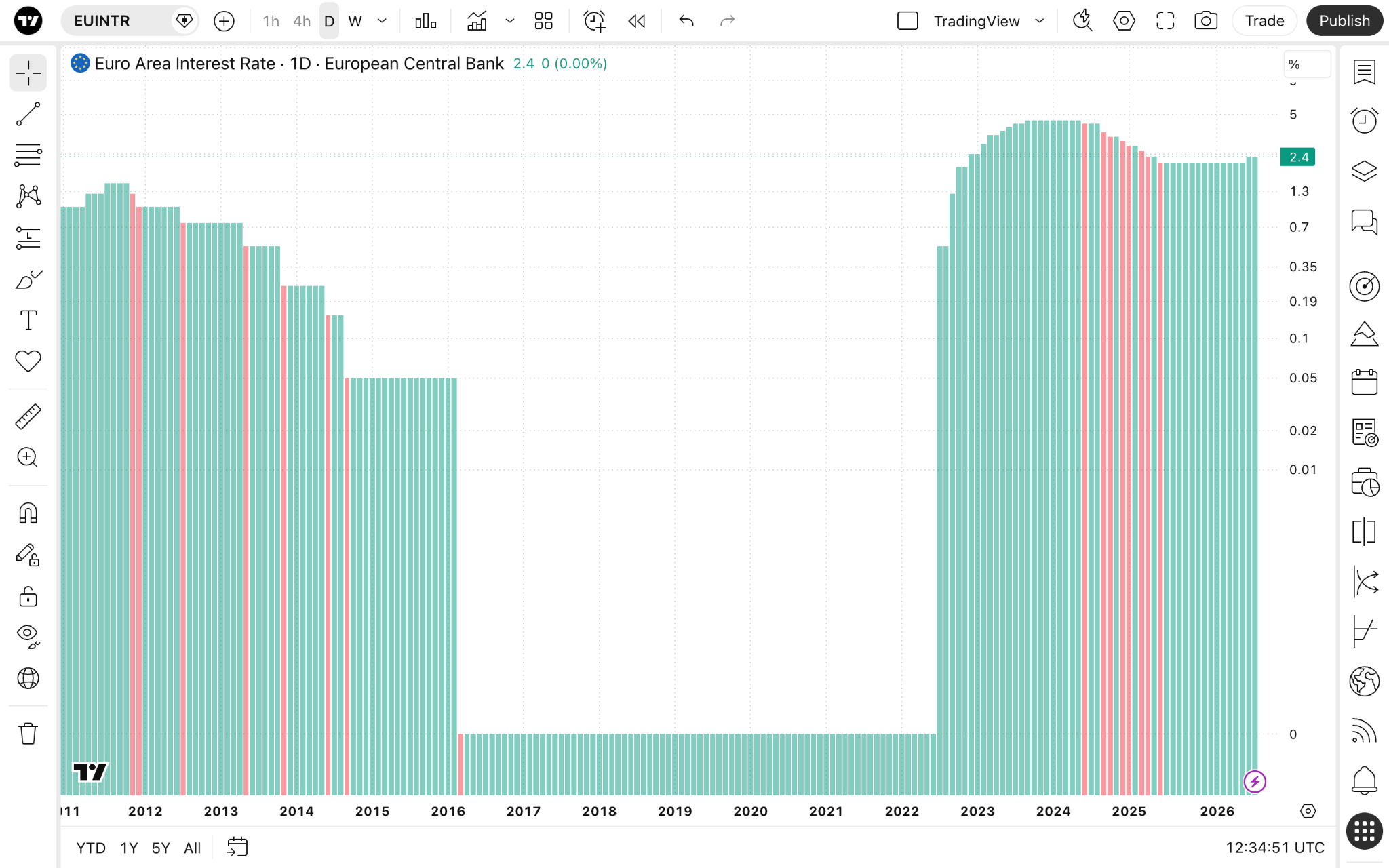
Column charts are unique and differ from other chart types as these use a completely different approach to displaying values. They can be used for both technical and fundamental analysis, and are especially good for economic data.
CONTENTS:
What is a column chart?
This chart type uses vertical columns stemming from the bottom scale. It is mostly used for financial data to see how values have changed over a significant period of time.
Column charts vs area charts
The reason we compare these two is because both appear somewhat similar. By default, columns are colored depending on the previous column price which makes them especially helpful when comparing consecutive points in time.
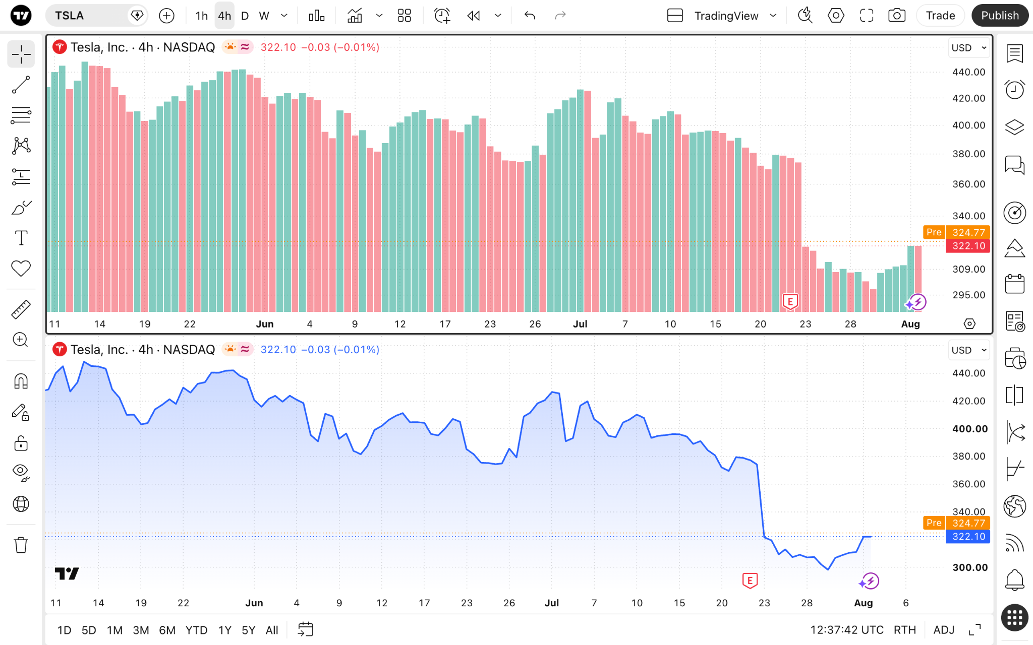
Column charts
- Provide a clear picture of precise chart values.
- Easy to see changes in relationship to previous values.
- Well suited for economic data.
Area charts
- Better for trend analysis.
- More intuitive visual interpretation.
- Better suited for technical data.
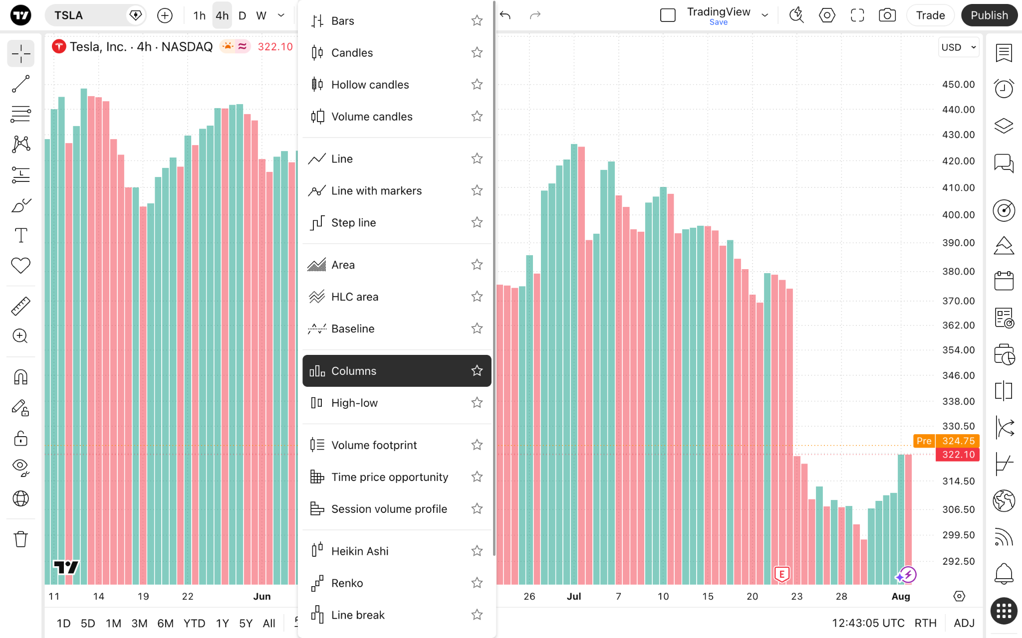
Enabling the chart type
From Supercharts, open the chart type menu on the top toolbar, and select "Columns."
Settings
To configure this chart type, click the gear "Settings" button on the upper toolbar, and open the "Symbol" tab.
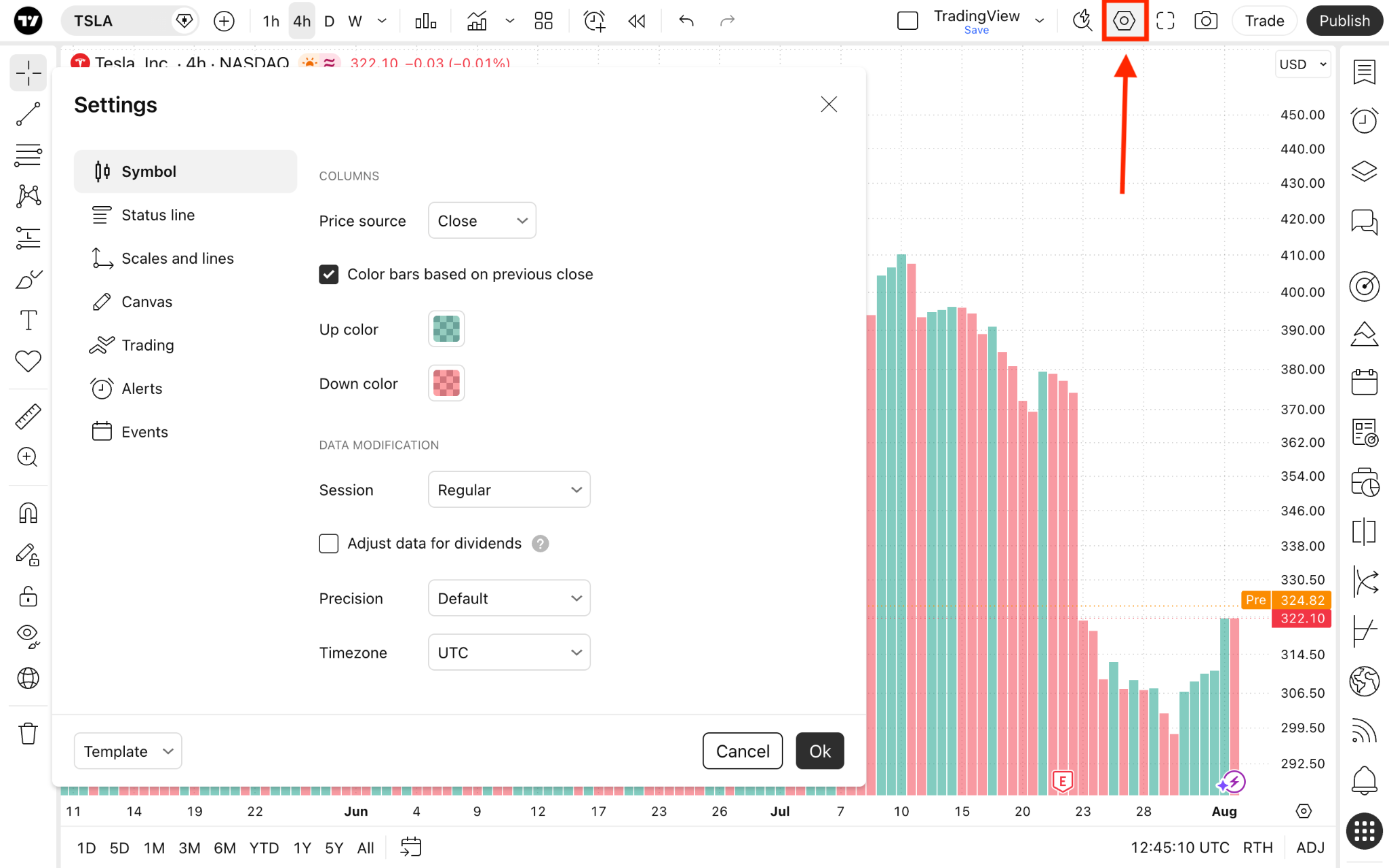
- Price source: Choose the price you want the chart to show. By default, it is set to close price, meaning the line will be plotted by connecting the asset's closing price during the selected timeframe in a sequence. But you can change it to one of the following:
- Open: Shows the opening prices.
- High: Shows the highest prices.
- Low: Shows the lowest prices.
- Close: Shows the closing prices.
- (H + L)/2: Shows the average of the highest and lowest prices.
- (H + L + C)/3: Shows the average of the highest, lowest, and closing prices.
- (O + H + L + C)/4: Shows the average of the opening, highest, lowest, and closing prices.
- Color bars based on previous close: With this setting on, the color of each bar will be determined by whether its close price is higher (green) or lower (red) than the close price of the previous bar, rather than by the bar's own open and close prices.
- Up color: Change the color, thickness, and opacity of the bullish columns.
- Down color: Change the color, thickness, and opacity of the bearish columns.
Column charts in a nutshell
You can use column charts to display economic indicators such as GDP, interest rates, or inflation rates. They will appear as a consecutive array of green and red columns, helping you easily spot macroeconomic trends and shifts.
Also read: