Trend Pulse MSL Trend Pulse is a comprehensive indicator designed to analyze the current market regime, buying and selling pressure, and the strength of completed bullish and bearish waves.
The indicator is built around three interconnected calculation components:
Predictive Balance — a predictive market-equilibrium level.
Pressure Pulse — an oscillator measuring current directional pressure.
Wave Memory — a system for evaluating completed bullish and bearish pressure waves.
Each component has a distinct purpose, but none of them operates independently. The output of one calculation block becomes an input for the next, creating a single integrated market-state model.
━━━━━━━━━━━━━━━━━━━━━━━━━━━━━━━━━━━━━━━━
🎯 What the indicator is designed to answer
MSL Trend Pulse helps traders evaluate five questions in sequence:
What directional market regime is currently active?
Which side is applying more pressure: buyers or sellers?
Is current pressure aligned with the broader Bias or moving against it?
How strong is the current pressure?
Is that pressure strengthening, fading, expanding, cooling, or becoming overheated?
This is not a mechanical entry-and-exit system and not a simple collection of several standard indicators placed in one script.
MSL Trend Pulse was designed as a unified analytical model in which:
Predictive Balance identifies the price regime;
Pressure Pulse measures current directional pressure;
Wave Memory evaluates the strength of completed waves;
Dashboard combines the results into a readable market-state interpretation.
━━━━━━━━━━━━━━━━━━━━━━━━━━━━━━━━━━━━━━━━
🧠 Why these components are combined
Predictive Balance estimates a dynamic market-equilibrium level and the direction in which that equilibrium is moving.
The movement of Predictive Balance and the distance between price and the balance level are then used as inputs in the calculation of Pressure Pulse.
Pressure Pulse determines:
the direction of current pressure;
the intensity of that pressure;
the beginning of a new pressure wave;
the completion of the previous pressure wave.
Completed pressure sequences are passed to Wave Memory.
Wave Memory separately maintains reference strength for:
bullish waves;
bearish waves.
These reference values are used to calculate the slower-moving market Bias.
Each component therefore adds a different layer of information:
Predictive Balance describes the price regime;
Pressure Pulse describes current pressure;
Wave Memory describes the historical wave context;
Dashboard provides the final interpretation.
Standard Pine Script functions, including ATR and EMA, are used only for volatility normalization and smoothing.
They are not used as standalone trade signals and do not form a conventional moving-average crossover system.
━━━━━━━━━━━━━━━━━━━━━━━━━━━━━━━━━━━━━━━━
⚖️ Predictive Balance
Predictive Balance is a recursive level-and-drift model.
The calculation uses a weighted price source:
Price Source = (High + Low + 2 × Close) / 4
The closing price receives additional weight because Close represents the final price accepted during the current period.
The indicator then measures directional path efficiency over the selected Direction Window.
Path efficiency compares:
the net distance between the beginning and end of the calculation window;
the total absolute path traveled by price during the same period.
High path efficiency
Price moved consistently and predominantly in one direction.
Low path efficiency
Price traveled through a large number of alternating movements but made relatively little net progress.
The resulting efficiency value controls how quickly Predictive Balance reacts.
The model first projects the next balance level by:
taking the previous balance value;
adding the previously estimated directional drift.
It then calculates the prediction error: the difference between the projected level and the current weighted price.
This prediction error updates two elements simultaneously:
the current Predictive Balance level;
the direction and speed of the drift.
As a result, the line can:
react faster during efficient directional movement;
become more stable during noisy or sideways conditions;
account not only for the position of price, but also for the direction of its own estimated movement.
━━━━━━━━━━━━━━━━━━━━━━━━━━━━━━━━━━━━━━━━
🔺 Market regime changes
The market regime does not change simply because price touches or briefly crosses Predictive Balance.
An adaptive confirmation zone is calculated around the balance line using:
current ATR;
directional path efficiency;
the base band width;
the selected level of noise protection.
During irregular or inefficient price movement, the zone becomes wider.
During consistent directional movement, the zone can become narrower.
Bullish regime confirmation
A bullish regime change requires both conditions:
price closes above the upper boundary of the adaptive zone;
Predictive Balance drift is positive.
Bearish regime confirmation
A bearish regime change requires both conditions:
price closes below the lower boundary of the adaptive zone;
Predictive Balance drift is negative.
This state-retention logic reduces frequent bullish and bearish switches around the balance line.
A green upward-pointing triangle marks a confirmed transition into a bullish regime.
A red downward-pointing triangle marks a confirmed transition into a bearish regime.
The triangles represent changes in the calculated regime. They are not standalone recommendations to buy or sell an asset.
━━━━━━━━━━━━━━━━━━━━━━━━━━━━━━━━━━━━━━━━
📊 Pressure Pulse
Pressure Pulse measures current directional pressure using four interconnected price characteristics.
1. Candle body pressure — 35%
The distance between Open and Close is normalized by ATR.
This component measures the directional displacement of the candle relative to current market volatility.
2. Closing-location pressure — 25%
Close is evaluated relative to the candle’s full High–Low range.
A close near the High increases positive pressure.
A close near the Low increases negative pressure.
A close near the middle of the range produces a more neutral reading.
3. Predictive Balance movement — 25%
The change in Predictive Balance is normalized by ATR.
This component reflects the direction and speed of the estimated equilibrium level.
4. Price stretch — 15%
The distance between Close and Predictive Balance is normalized by ATR.
This component measures how far price has extended from the estimated market equilibrium.
After the four components are combined, the result passes through an adaptive pressure-memory process.
In noisy market conditions
Pressure memory becomes shorter, allowing weak and irregular pressure to decay more quickly.
In directional market conditions
Pressure memory becomes longer, allowing persistent pressure to remain visible for a longer period.
The accumulated result is then:
normalized against its own recent average amplitude;
smoothed;
softly compressed to maintain a comparable visual scale across different instruments and timeframes.
Reading the histogram
Above zero — bullish pressure is dominant.
Below zero — bearish pressure is dominant.
Rising bars — directional pressure is increasing.
Shrinking bars — directional pressure is fading.
High amplitude — strong normalized pressure.
Low amplitude — weak pressure.
Pressure Pulse does not reset when price crosses Predictive Balance.
This makes it possible to follow the development of pressure independently of a single price-to-line crossover.
━━━━━━━━━━━━━━━━━━━━━━━━━━━━━━━━━━━━━━━━
🌊 Wave Memory
Wave Memory analyzes completed sequences of bullish and bearish pressure.
Beginning of a bullish wave
A bullish wave begins when Pressure Pulse moves above the positive Wave Deadband boundary.
Beginning of a bearish wave
A bearish wave begins when Pressure Pulse moves below the negative Wave Deadband boundary.
The neutral area around zero prevents every small histogram fluctuation from creating a new wave.
For each completed wave, the script calculates:
average absolute pressure;
peak absolute pressure;
duration in bars;
price-path efficiency.
Price-path efficiency compares:
the net price movement from the beginning to the end of the wave;
the total absolute price path traveled during that wave.
If price moved predominantly in one direction, efficiency will be high.
If the wave contained substantial movement but produced little net price change, efficiency will be low.
The final wave-strength calculation incorporates:
70% average pressure;
30% peak pressure;
the square root of wave duration;
an adjustment for price-path efficiency.
Bullish and bearish waves update separate historical reference values.
A newly completed wave does not immediately replace the previous reference. Instead, it gradually updates the corresponding reference according to the Reference Update setting.
This process creates a more stable wave-based Bias.
━━━━━━━━━━━━━━━━━━━━━━━━━━━━━━━━━━━━━━━━
🧭 Dashboard
The Dashboard displays four characteristics of the current market state:
Phase — the relationship between current pressure and Bias.
Magnitude — the current strength of Pressure Pulse.
Bias — the relative strength of completed bullish and bearish waves.
State — the current development stage of directional pressure.
━━━━━━━━━━━━━━━━━━━━━━━━━━━━━━━━━━━━━━━━
Phase — market phase
Bullish Impulse
Bullish pressure is aligned with bullish Bias.
Current movement supports the broader bullish wave context.
Bearish Impulse
Bearish pressure is aligned with bearish Bias.
Current movement supports the broader bearish wave context.
Bullish Pullback
Bullish pressure is developing against bearish Bias.
This may represent a corrective movement within a broader bearish context.
Bearish Pullback
Bearish pressure is developing against bullish Bias.
This may represent a corrective decline within a broader bullish context.
Bullish Pressure
Bullish pressure is active, but completed waves have not yet established a clear directional Bias.
Bearish Pressure
Bearish pressure is active, but completed waves have not yet established a clear directional Bias.
Balanced
Pressure Pulse remains inside the neutral deadband, so meaningful directional pressure is not currently present.
━━━━━━━━━━━━━━━━━━━━━━━━━━━━━━━━━━━━━━━━
Magnitude — pressure strength
Magnitude is based on the absolute value of the current normalized Pressure Pulse:
Weak — below 0.40.
Normal — from 0.40 to 0.85.
Strong — from 0.85 to 1.30.
Extreme — 1.30 and above.
Magnitude measures the current intensity of pressure. It does not represent the probability of a future move and does not predict how far price may travel.
━━━━━━━━━━━━━━━━━━━━━━━━━━━━━━━━━━━━━━━━
Bias — wave direction
Bullish
Completed bullish waves are stronger on average than completed bearish waves.
Bearish
Completed bearish waves are stronger on average than completed bullish waves.
Neutral
Neither side has established sufficient relative dominance.
Bias is calculated from completed pressure waves and therefore intentionally changes more slowly than Pressure Pulse.
━━━━━━━━━━━━━━━━━━━━━━━━━━━━━━━━━━━━━━━━
State — pressure development
Building
Pressure is increasing while Bias remains neutral.
Fading
Pressure is decreasing while Bias remains neutral.
Expansion
Pressure is aligned with a directional Bias and continues to increase.
Cooling
Pressure is moving against Bias or is beginning to lose strength.
Overheated
Pressure has reached an extreme level but has already started to weaken.
Balanced
No meaningful directional-pressure state is currently present.
━━━━━━━━━━━━━━━━━━━━━━━━━━━━━━━━━━━━━━━━
📌 How to use the indicator
A practical analysis sequence is:
Identify the active regime using the color of Predictive Balance and the most recent triangle.
Review Bias to determine which side has produced stronger completed waves.
Use Phase to determine whether current pressure supports Bias or represents a counter-move.
Use Magnitude to evaluate the current intensity of pressure.
Use State to determine whether pressure is strengthening or losing momentum.
Example 1
Bullish Bias + Bullish Impulse + Expansion
Bullish pressure supports the broader bullish wave context and continues to strengthen.
Example 2
Bullish Bias + Bearish Pullback + Cooling
Bearish pressure is developing against bullish Bias, but the counter-move is losing strength.
Example 3
Bearish Bias + Bullish Pullback + Cooling
Bullish pressure is present against the broader bearish context but has begun to weaken.
Example 4
Neutral Bias + Bullish Pressure + Building
Bullish pressure is increasing, but completed waves have not yet established a sustained advantage for buyers.
Possible applications
MSL Trend Pulse can be used for:
market-regime confirmation;
pullback analysis;
current momentum assessment;
evaluating alignment between current pressure and Bias;
filtering trading scenarios;
monitoring the strengthening and weakening of directional movement.
━━━━━━━━━━━━━━━━━━━━━━━━━━━━━━━━━━━━━━━━
🔔 Alerts
The indicator includes four alert conditions:
MSL Bull Flip — a transition into a bullish regime has been confirmed.
MSL Bear Flip — a transition into a bearish regime has been confirmed.
MSL Pressure Up — Pressure Pulse crossed above zero.
MSL Pressure Down — Pressure Pulse crossed below zero.
When Confirm Flips On Bar Close is enabled, regime changes and corresponding alerts are confirmed only after the candle closes.
━━━━━━━━━━━━━━━━━━━━━━━━━━━━━━━━━━━━━━━━
⚙️ Main settings
Direction Window
Controls the period used to measure directional path efficiency.
Minimum Reaction / Maximum Reaction
Define the lower and upper limits of Predictive Balance reaction speed.
Drift Learning
Controls how quickly the model learns changes in market direction and movement speed.
Drift Damping
Controls how quickly previously estimated drift loses its influence.
Volatility Length
Defines the ATR period used for volatility normalization.
Flip Band Base
Sets the minimum width of the adaptive regime-confirmation zone.
Noise Protection
Widens the regime-change zone during noisy or inefficient market movement.
Normalisation Length
Defines the period used to normalize Pressure Pulse against its own recent amplitude.
Pulse Smoothing
Controls the final smoothing applied to the Pressure Pulse histogram.
Minimum Memory / Maximum Memory
Define the lower and upper limits of pressure persistence.
Wave Deadband
Defines the neutral zone used to separate bullish and bearish pressure waves.
Reference Update
Controls how strongly each completed wave updates its corresponding historical reference.
Minimum Wave Bars
Defines the minimum wave duration required before a completed wave can update Wave Memory.
Window
Allows wave statistics to use all available chart history or begin from a selected date.
Reactive Candles
Colors candles according to the direction and intensity of Pressure Pulse.
Glow Effect / Glow Intensity
Control the visual glow applied to Predictive Balance and the Pressure Pulse histogram.
These settings affect presentation only. They do not change calculations, regime logic, or alerts.
Dashboard Position
Allows the Dashboard to be placed in the upper-right, middle-right, or lower-right area of the chart.
━━━━━━━━━━━━━━━━━━━━━━━━━━━━━━━━━━━━━━━━
⚠️ Calculation behavior and limitations
The indicator does not use future bars.
Values on closed historical candles remain fixed after those candles are completed.
Values on the active candle may change before it closes because High, Low, and Close are not yet final.
Bias is based on completed waves and therefore reacts more slowly than Pressure Pulse.
During the early stage of a reversal, Bias may temporarily retain its previous direction.
Sudden gaps and news-driven candles can cause rapid changes in Predictive Balance and Pressure Pulse.
Results may be less stable on low-liquidity instruments.
Indicator behavior depends on the instrument, volatility environment, and selected timeframe.
MSL Trend Pulse does not calculate:
position size;
stop-loss placement;
profit targets;
acceptable trade risk;
mechanical entry or exit points.
The indicator is designed to analyze market context. No individual Dashboard state, line color, triangle, or histogram reading should be interpreted as a guaranteed forecast of future price movement. Indicador

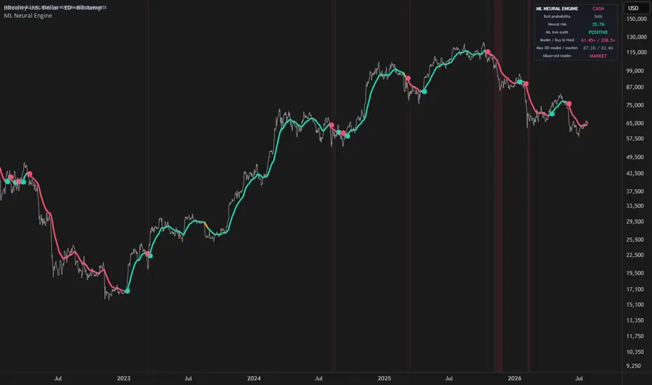
Machine Learning Neural Network EngineMachine Learning Neural Network Engine turns complex Daily market behavior into three clear states: LONG, WATCH and CASH.
Instead of relying on one fixed trend signal, the indicator combines an adaptive neural network, continuous model validation and an independent crisis detector. The result is a simple visual interface backed by a fully causal machine-learning process.
HOW IT WORKS
At its core is a compact 6-5-1 neural network trained directly on the chart.
It analyzes six normalized features:
Short- and medium-term trend structure
RSI momentum
Deviation from linear regression
Directional price efficiency
Relative volatility
Candle pressure adjusted by relative volume
The network learns sequentially from completed market outcomes. On each confirmed Daily bar, it can only train on information from an earlier bar whose result has become known. Current predictions never use future data.
Training uses nonlinear neurons, RMS-scaled gradient updates, error clipping and regularization. This is an adaptive online model, not a set of fixed coefficients labelled as machine learning.
SELF-AUDITING MACHINE LEARNING
The neural network is continuously compared with an independent structural trend model.
When the network’s matured predictions provide useful additional information, its influence increases. When its recent error becomes worse than the structural baseline, its influence is automatically reduced.
This live validation mechanism prevents the indicator from trusting its machine-learning component unconditionally.
CRISIS DETECTION
A separate stress engine monitors:
Rapid 10-day declines
Drawdown from the 63-day high
Abnormal ATR expansion
Long-term price structure
This layer can trigger a defensive state independently of the neural model, helping the indicator respond to sudden market deterioration.
HOW TO READ IT
LONG — Green
The model, trend structure and confirmation rules support a constructive market environment.
WATCH — Amber
The market remains structurally LONG, but risk or exit evidence is increasing.
CASH — Red
The environment is defensive because of persistent weakness or confirmed crisis stress. The indicator never takes short positions.
The colored neural axis and surrounding halo display the active state without covering the chart with labels. Transition pulses identify confirmed changes, while the dashboard shows bull probability, neural risk and the current machine-learning audit.
WHAT MAKES IT DIFFERENT
The script integrates four distinct functions:
1. Online neural-network learning
2. Live error-based model validation
3. Independent downside-stress detection
4. A confirmed state machine designed to limit excessive switching
These components are not combined as a simple indicator vote. Each has a separate role in learning, validation, protection or state stabilization.
SETTINGS
ML response controls adaptation speed and signal stability:
Fast reacts sooner.
Balanced is the recommended starting point.
Smooth prioritizes stability.
ML selectivity controls how much evidence is required before LONG or CASH is confirmed.
The indicator is designed exclusively for standard Daily charts.
BUILT-IN COMPARISON
The dashboard includes a lagged long/cash comparison with buy-and-hold. It applies the selected transition cost and openly displays periods when the model underperforms.
This comparison is a diagnostic tool, not a complete strategy backtest. It does not include every possible spread, slippage, tax, financing or execution constraint.
IMPORTANT LIMITATIONS
The bull probability is an internal normalized score, not a statistically calibrated probability of profit. The model can react late, generate false transitions in sideways markets and cannot eliminate gap risk.
The developing Daily bar may change before closing. Confirmed historical states use no future data, no lookahead and no higher-timeframe security calls.
This indicator provides market context, not financial advice or guaranteed performance. Online learning does not imply future outperformance.
Indicador
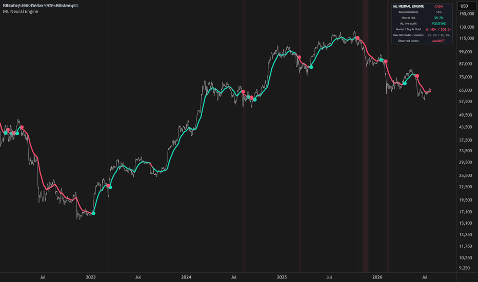
Chart Patterns [FEELS]Classical chart patterns, drawn only after price confirms them, each one carrying a running count of how often that pattern has reached its measured target on this chart.
No pattern appears until its neckline breaks. Once drawn, it never moves.
FEATURES
- Four classical reversal patterns: Double Top, Double Bottom, Head & Shoulders, Inverse Head & Shoulders
- Confirmed-only: a pattern is drawn after its neckline breaks, not while it is still forming
- Non-repaint: once drawn, the geometry never changes
- Measured target and neckline plotted for every pattern
- Live per-pattern hit-rate table: how often each type reached its target on the current chart
- Target-reached and invalidated outcomes marked on the chart
- ATR-based tolerances that adapt to each symbol
- Close or wick neckline confirmation, optional weaker-second-peak filter
- Four alerts, fully adjustable colors, labels and text
WHAT IT DETECTS
Four of the most widely taught reversal patterns: Double Top, Double Bottom, Head & Shoulders, and Inverse Head & Shoulders. Each is built from confirmed swing pivots, so the shape on the chart is the same shape a trader would draw by hand.
HOW IT WORKS
The engine keeps a zigzag of confirmed swing highs and lows and checks the most recent pivots against each pattern template: two equal tops over a shared low for a Double Top, a higher head between two level shoulders for Head & Shoulders, and so on. A candidate is not shown yet. It is only drawn once price breaks through the neckline, which is the point at which the pattern is considered complete. From that bar the geometry is locked.
- Neckline: the line the pattern breaks. Horizontal for double tops and bottoms, sloped through the two inner pivots between the shoulders and the head for Head & Shoulders and its inverse.
- Measured target: the pattern height projected from the break, drawn as a dotted line. This is the standard textbook objective, not a forecast.
- Outcome tracking: after a pattern confirms, the script follows it for a set number of bars to see whether price reached the measured target, closed back past the pattern, or did neither in time. All three outcomes feed the table.
- Hit-rate table: for every pattern type it shows how many confirmed patterns reached their target, out of every pattern that has finished tracking, as a running count on the current symbol and timeframe. Head & Shoulders reaching target less often than a Double Bottom is information, not a defect.
HOW TO READ IT
1. Wait for the break. A shape only appears after the neckline gives way, so what you see is a completed pattern, not a guess about one still forming.
2. Use the table as context. A pattern type that has historically reached its target often on this chart carries more weight than one that rarely has. The sample size is shown next to the percentage so you can judge how much to trust it.
3. The measured target is the reference objective. A pattern is only marked invalidated when price closes back past its own extreme, the high of a double top or the right shoulder of a head and shoulders, so the invalidation mark sits at that level rather than at the neckline. How you act on either is your decision.
ORIGINALITY
This script waits for the neckline break before drawing anything, locks the geometry once a pattern is drawn, and keeps a live per-pattern tally of how each one resolved on the chart you are looking at. The idea is to combine the shape a trader would draw by hand with a running record of what happened after that shape completed, on this exact symbol and timeframe. The zigzag, the pattern templates, the neckline construction and the outcome tracking are written from scratch for this script.
HONESTY
- A swing pivot confirms only after the Swing size number of bars, so a pattern appears on the chart once its break is confirmed, and its earlier points are drawn back to where they occurred. On a bar replay this looks like a shape appearing into the past. That is the cost of the no-repaint rule, not a glitch. After a pattern is drawn its position never changes, and the break is evaluated on bar close.
- The hit-rate table is a historical count on the current symbol and timeframe. Reaching target means price hit the measured objective within the tracking window; a pattern that neither reached target nor closed back past its extreme within that window counts against the rate, not as a skipped sample. Only patterns that reached target or invalidated print a mark on the chart, so a timed-out pattern is counted in the table but not tagged, and the visible marks are fewer than the table total. It describes what happened after past patterns, it does not predict future ones, and a small sample can move a lot. It is not a performance claim.
- Tolerances are ATR-based, so the definition of equal tops or a clean break adapts to each symbol's volatility instead of a fixed percentage.
- The tool is most useful on liquid symbols and on intraday-to-daily timeframes, where enough clean swings form. On very long histories only the most recent patterns stay drawn to keep the chart readable.
ALERTS
Bearish pattern confirmed · Bullish pattern confirmed · Target reached · Pattern invalidated.
SETTINGS
Every input has a tooltip. The main ones: "Swing size" sets how many bars on each side define a swing, "Neckline break" chooses close or wick confirmation, "Second peak / bottom" can require the classic weaker-second-peak form, "Patterns kept" caps how many stay on the chart, and the table, colors, outcome text and both text sizes are all adjustable.
This is a descriptive tool for reading classical chart patterns. It is not financial advice and does not predict price. Indicador

FVG Sweep Magnet Engine [PhenLabs]📊 FVG Sweep Magnet Engine
Version: PineScript™ v6
📌 Description
The FVG Sweep Magnet Engine turns displacement-born Fair Value Gaps into scored magnetic targets that only arm after a real liquidity sweep. Instead of treating every imbalance as tradeable, FSME waits for buy-side or sell-side liquidity to be raided, then confirms when price is pulled back into a high-quality FVG.
This solves the two biggest failure modes retail ICT tools create: trading empty gaps with no context, and chasing sweeps that never reclaim structure. Neon multi-layer magnet beams, graded gap boxes, and a live regime dashboard make the confluence readable in one glance — built for dark-chart screenshots and fast decision-making on futures, indices, FX, and crypto.
🚀 Points of Innovation
Displacement-validated FVG detection filters out micro-noise gaps that never attract price
Liquidity sweep gate (BSL/SSL raid + rejection) must print before any magnet signal arms
0–10 quality score blends gap size, displacement strength, freshness, and volume impulse
Clean visual hierarchy: soft FVG zones + single CE midline by default; neon only on MAG
Partial-fill fade and full mitigation cleanup keep the chart honest as gaps get consumed
Live FSME dashboard tracks bias, live gaps, best score, sweep state, and last signal
🔧 Core Components
Displacement FVG Engine: Detects classic 3-candle bullish/bearish imbalances only when the middle candle body clears an ATR displacement threshold and the gap clears a minimum ATR size filter
Liquidity Rail Tracker: Maintains confirmed swing BSL/SSL pools as dotted rails and classifies wick-rejection raids that reclaim the level
Magnet Confluence Gate: Arms a signal only when a fresh sweep window overlaps a live scored FVG that price re-enters with directional close confirmation
Target Projector: Extends dotted neon target rays from the FVG midline by ATR multiple after a magnet print
Regime Dashboard: Compact top-right table summarizing bull/bear FVG count, best score, sweep state, last signal, nearest magnet mid, and ATR
🔥 Key Features
Non-repaint pivot liquidity and confirmed-bar FVG logic suitable for alerts and live trading
Configurable displacement, gap size, magnet window, min score, and target extension
Bull cyan / bear magenta neon palette with independent fill, border, rail, and beam colors
Optional faded mitigated FVGs for study mode, or hard-delete cleanup for clean charts
Alertconditions for bull/bear magnets, BSL/SSL sweeps, and new displacement FVGs
Works as a standalone SMC overlay or confluence layer on top of session/order-block tools
🎨 Visualization
FVG zones: Soft teal/red translucent boxes (high transparency so candles stay readable) with score on the right edge
CE midline: Single thin dashed line at the gap center — no permanent multi-layer beam cage
Neon on MAG only: Triple glow beam + TP ray appear only when a magnet signal arms
MAG labels: Clear ▲ MAG / ▼ MAG tags offset above/below the bar (not stacked on wicks)
Optional extras (off by default): liquidity rails and sweep diamonds for power users
Signal highlight: Soft bar tint only on confirmed MAG bars
Dashboard: Compact 6-row panel — Bias, Live Gaps, Best Score, Sweep, Last Signal
📖 Usage Guidelines
Max Active FVGs — Default: 10 — Range: 2-40 — Keep low for a clean chart
Displacement ATR Mult — Default: 1.25 — Range: 0.3-5.0 — Raise on noisy lower TFs
Min Gap Size (ATR) — Default: 0.25 — Range: 0.05-3.0 — Higher = fewer, cleaner zones
Require Displacement Candle — Default: true — Keep on for quality
Max FVG Age (bars) — Default: 60 — Range: 10-300 — Expires stale magnets
Magnet Window — Default: 18 — Range: 3-80 — Bars after a sweep for FVG entry confirm
Min Score for Signal — Default: 5 — Range: 0-10 — Raise to 7+ for selective setups
Show FVG Midline (CE) — Default: true — Single dashed CE line per zone
Neon Beam Only on MAG — Default: true — Neon appears only on confirmed signals
Show Liquidity Rails — Default: false — Optional; off keeps chart readable
Show Sweep Diamonds — Default: false — Optional; off by default to reduce noise
✅ Best Use Cases
ICT/SMC traders waiting for liquidity raids into unfilled FVGs instead of blind gap fades
Intraday index and futures traders (ES, NQ, YM) on 1m–15m seeking clean reversal confluence
FX and crypto traders mapping displacement legs during London/NY expansion
Prop-style discretionary traders who want scored setups with explicit invalidation (full gap fill)
Content creators capturing high-contrast neon dark-chart screenshots for TradingView publish art
⚠️ Limitations
FVG detection is geometric (3-candle imbalance) and does not use true order-book data
Sweep logic uses confirmed swing pivots, so very fresh local highs/lows need pivot length bars to register
High-volatility news spikes can create large displacement gaps that score well but fail if context is one-way trend
Neon beams and boxes are object-limited; extreme settings (max FVGs + long age) can hit TradingView object caps
This is a confluence overlay, not a complete strategy — always pair with risk rules and higher-timeframe bias
💡 What Makes This Unique
Sweep-gated magnets: FVGs stay passive until liquidity is actually raided — reverse of “every gap is a signal” tools
Scored gaps: Traders see why a zone matters (size, displacement, age, volume) instead of binary boxes
Signal-first visuals: zones stay quiet until confluence arms — neon and TP only on MAG
PhenLabs DNA: Liquidity + engine naming + dashboard, fused with this week’s dominant FVG/ICT community demand
🔬 How It Works
Displacement scan: On each bar the engine checks for a 3-candle bullish or bearish FVG, requires the middle candle body to clear ATR × displacement mult, and rejects gaps smaller than ATR × min gap size
Score + draw: Qualifying gaps receive a 0–10 score and are rendered as translucent boxes with a three-layer neon midline beam and optional score label
Liquidity map: Confirmed pivot highs/lows become BSL/SSL rails; a sweep prints when price raids the level with sufficient wick and closes back through it
Magnet arming: For a limited bar window after the sweep, if price re-enters a live same-direction FVG that clears the min score and closes in the reclaim direction, a MAG signal fires
Projection + lifecycle: Dotted ATR targets extend from the magnet mid; partial fills fade the box, full fills or max age invalidate the gap and clean objects unless faded mode is enabled
💡 Note:
Use FSME as a visual decision-support layer for liquidity-to-imbalance workflows. Confirm higher-timeframe bias, define risk beyond the opposite side of the FVG or swept pool, and never treat magnet markers as guaranteed entries. This script is an analytical aid only and does not constitute financial advice.
Indicador

Swing Trade Scanner Setup Grade and VerdictGrades the stock on your chart as a long swing setup — a 0–100 score, an A+ to D grade, and a plain-English verdict.
You've found a stock. Is it actually a setup? Swing Trade Scanner grades the chart in front of you the way a swing trader reads it — trend, momentum, relative strength, volume — and gives you one honest answer: a score, a grade, and a verdict in plain English.
It works on its own — nothing else required.
Why one score instead of five separate indicators?
Every check in this script exists on its own — but alone, each one whipsaws. What makes a swing setup is confluence: trend, momentum, proximity to highs, relative strength, and volume confirming each other at the same time.
The Scanner's contribution is the weighting and the interaction between the checks: MA alignment counts most because trend is what pays swing traders, and the extension penalty can override an otherwise perfect score — because the same chart that grades well near the fast MA is a bad entry 8% above it. That interaction is what a stack of separate indicators won't show you.
What goes into the score (0–100)
Five checks, each weighted by how much it matters:
MA alignment (up to 35 pts) — is price stacked cleanly above the 4-MA ribbon? A full bull stack (price > fast MA > each slower MA) earns full points.
Momentum (up to 20) — how far price has moved over the lookback (60 bars by default).
Distance from the recent high (up to 20) — leaders sit near their highs; a stock 10% below its high has repair work to do first.
Relative strength vs SPY (up to 15) — is the stock beating the market (SPY = S&P 500 ETF), not just rising with it?
Volume (up to 10) — is it trading above its 20-day average?
Then one guardrail: the extension penalty . More than 6% above the fast MA and the score gets docked (−12 points, −20 past 10%). Chasing a stretched chart is how good setups become bad entries — the Scanner won't grade one highly.
The verdict reads in plain English
HIGH QUALITY (score 75+) — everything lined up.
MODERATE (55–74) — decent, not complete.
WEAK (40–54) — most of the checklist is missing.
AVOID (under 40) — not a long setup right now.
EXTENDED / WAIT — the setup grades well BUT price is stretched more than 6% above the fast MA. Good stock, bad moment. Let it pull in.
What you see on the chart
The 4-MA ribbon — four moving averages (EMA 20 / 50 / 100 / 200 by default; EMA, SMA or WMA), with the zone between the two fastest shaded green in an uptrend, red in a downtrend.
Candle coloring (optional) — green in a full bull stack, teal in a partial one, red in a full bear stack, so the trend state reads at a glance.
The dashboard — grade + score up top, then the four core metrics (MA Alignment, 60-bar Momentum, RS vs SPY, Volume Ratio) and the Verdict row.
Long setups only
This tool grades the long (buy) side. On a downtrending chart it won't invent an opportunity — it shows Full Bear and AVOID and tells you to look elsewhere.
Settings — defaults work out of the box
MA ribbon — four lengths, MA type, and colors.
Lookback (60 bars) — the window for momentum, relative strength, and the recent high.
Volume MA length (20).
Table position, text size, dark/light theme, and status colors.
⚠ Educational tool for reading and grading charts. The grade measures how complete a setup is by these rules — it does not generate buy/sell signals or predict price. Not financial advice. Indicador

ICT Kill Zone Sniper [JOAT]═══ ICT KILL ZONE SNIPER ⚡ ═══
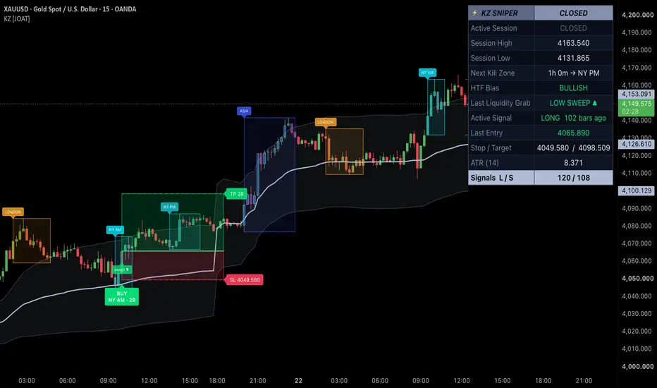
A session-aware sniper tool that paints every candle by its active kill zone, tracks the liquidity pool each session leaves behind, and fires a single clean BUY or SELL only after price sweeps the prior pool and reverses back inside the current kill zone. Built for traders who wait for the liquidity grab, not the breakout.
▎ WHAT IT DOES
It splits the trading day into four classic kill zones — Asia , London , NY-AM and NY-PM — colors the candles inside each one, and records the high and low that every finished session builds. Those prior highs/lows become the liquidity pools hunted in the next window. When the current kill zone reaches into one of those pools and then closes back through it, the tool marks the sweep and projects a full trade: entry, ATR stop, and an R-based target zone.
▎ HOW IT WORKS
• Kill-zone clock — each session window is evaluated in a chosen wall-clock timezone (New York by default). Membership is na-guarded, so it behaves correctly on any intraday timeframe and simply idles on higher timeframes.
• Session state machine — while a kill zone is live, the tool expands that session's running high and low. When the session ends, that high/low is frozen as the prior liquidity pool and drawn as dashed projection lines carried into the next window.
• Sweep + reversal detection — a high sweep needs price to trade above the prior pool high yet close back below it; a low sweep needs a dip below the prior pool low with a close back above. A Min Sweep Depth (× ATR) filter rejects micro-penetrations caused by spread and tick noise.
• Confirmation — sweeps can be evaluated on confirmed bar close only, so signals do not repaint intrabar. At most one long and one short can print per kill-zone occurrence when the one-per-side lock is on.
• Optional HTF bias — a higher-timeframe EMA (requested with lookahead off) can gate direction: longs only above it, shorts only below it.
• Trade projection — on a valid signal the stop is placed beyond the swept extreme plus an ATR buffer, risk is measured from entry to stop, and the target is set at your chosen R multiple. Reward and risk are drawn as tinted zone boxes with entry/SL/TP lines and level labels.
• Optional VWAP — a session-anchored VWAP with a ±σ band is available as extra context.
▎ HOW TO USE IT
• Wait for a BUY or SELL pill to print inside a colored kill zone — it means the prior pool was swept and price reversed back through it.
• The green zone box is the reward leg toward the R-target; the red zone box is the risk leg to the stop. The label pill shows the session and the R multiple.
• Use the dashed prior high/low lines as the liquidity being hunted this session — signals cluster around them.
• Treat the HTF bias as a directional filter and the sweep tags as confirmation that liquidity was actually taken before you commit.
• Combine with your own structure read; the tool marks the setup, you manage the trade.
▎ KEY SETTINGS
• Kill Zones — timezone plus editable session windows for Asia, London, NY-AM and NY-PM.
• Signal Engine — ATR length, confirm-on-close, one-signal-per-side lock, and minimum sweep depth.
• HTF Bias — toggle, higher timeframe, and EMA length.
• Trade Model — stop buffer beyond the sweep, risk/reward target in R, projection length, and how many past signals to keep.
• Visuals — candle tinting and transparency, session boxes, pools, sweep tags, signal labels, SL/TP lines and zone boxes, VWAP bands, and label size.
• Dashboard — show/hide, position, and text size.
▎ DASHBOARD
A cyberpunk chrome-gradient panel reporting the active session , current session high/low , a countdown to the next kill zone , the HTF bias state, the last liquidity grab side, the active signal with bars-since, the last entry , its stop / target , the current ATR , and a running long / short signal tally .
▎ ALERTS
• KZ Sniper Long — prior-pool low sweep plus bullish reversal inside a kill zone.
• KZ Sniper Short — prior-pool high sweep plus bearish reversal inside a kill zone.
▎ NOTES
• Works across assets; the session logic is intended for intraday timeframes and idles on higher ones.
• Confirm-on-close keeps signals non-repainting; the HTF EMA is requested with lookahead off.
• Nearly every visual has a toggle, so you can strip it down to just the candles and signals for a clean chart.
• Any on-chart tallies reflect historical signals only.
For research and education only. This is not financial advice. No indicator can predict the future, and past behavior does not guarantee future results. Always manage your own risk.
Made with passion by JackOfAllTrades ⚡ Indicador

SuperTrend Engine [Quantum Algo]SuperTrend Engine
====================================================
🔶 OVERVIEW
SuperTrend Engine is a volatility-adaptive SuperTrend indicator built on one idea: every SuperTrend gives you signals — this one shows you the whipsaws it saved you from, tells you its real win rate on your chart, and admits when it is wrong.
The engine self-tunes its factor with a fully transparent formula, confirms flips through a Whipsaw Shield that absorbs fake-outs and marks every one it absorbed, stamps every buy and sell flip with its live, honestly-computed win rate on the current symbol, settles every marker into its real outcome ten bars later, and draws the trade geometry — entry, trailing stop, one-R and two-R references — the moment a flip confirms.
🔶 WHAT IS A SUPERTREND?
A SuperTrend is a trailing stop built from the Average True Range: a band placed a volatility-scaled distance from price that ratchets in the trend's favor and never retreats. While price holds above the band, the trend is up and the band trails below as a stop; a close through the band flips the state. It is one of the most followed trend-following tools in retail trading — and its famous weakness is the whipsaw: sideways markets flip it back and forth, and a fixed factor that survives chop is too slow in trends. This engine is built specifically against that weakness.
🔶 WHY THIS SCRIPT IS ORIGINAL
1. The Whipsaw Shield — visible absorbed fake-outs. A flip only confirms when the close clears the opposite band by a volatility margin. When the raw trail flips and reverses before clearing it, the engine holds its direction and prints a small ghost marker where the whipsaw died, with a running Whipsaws Shielded counter in the dashboard. Other tools try to reduce whipsaws quietly; to our knowledge, none renders the failures it absorbed. Here the evidence is on the chart.
2. Honest per-symbol flip statistics. Every flip is stamped with its live win rate on this exact symbol and timeframe — shrinkage-adjusted so thin history cannot show fake confidence, with a Wilson confidence bound and sample count in the hover tooltip. The indicator audits itself in public instead of asserting signals.
3. Markers that settle into their outcome. Each buy and sell marker resolves ten bars later: the trend color if the flip delivered, faded gray if it failed. Scroll any chart and read the engine's true track record directly off the markers — including the losses.
4. Transparent adaptation, not a black box. The factor self-tunes between your two bounds using Perry Kaufman's Efficiency Ratio — tight when price moves cleanly, wide in chop — and the dashboard shows the live factor and efficiency reading every bar. The adaptation can be verified with a calculator; nothing asks for trust.
5. A trade plan, not just a line. On every confirmed flip the engine draws the entry, the trailing stop, and one-R and two-R reference levels, and the dashboard tracks the open signal's running R-multiple live.
6. A breathing chart. The glow between price and trail intensifies with trend distance and fades as price returns to the stop, grade-A flips (volume, efficiency, and a decisive break together) print in the accent color, and the whole layer stays capped and clean.
🔶 HOW IT WORKS
Adaptive trail: Classic ratcheting SuperTrend bands are computed from the Average True Range, with the factor interpolated between the trend bound and the chop bound by the Efficiency Ratio — the ratio of net price movement to total path length over the lookback.
Whipsaw Shield: The raw band flip is treated as a candidate, not a signal. Only a close beyond the opposite band plus the margin confirms the flip; a raw flip that reverses first is counted, marked as a ghost, and absorbed.
Statistics: Each confirmed flip records what price did ten and thirty bars later, in the flip's direction, into capped first-in-first-out databases. Win rates are pulled toward fifty percent by pseudo-samples and carry Wilson lower bounds. Until the minimum sample is met, markers read "collecting history" instead of inventing a number.
Outcome settlement: Every marker stores its flip price and recolors by the realized ten-bar outcome, then joins the capped history.
Grading: Volume z-score, efficiency level, and break decisiveness combine into an A, B, C grade on every flip.
Non-repainting: Flips, shields, grades, statistics, and settlement are all evaluated on closed bars. Once printed, nothing moves.
🔶 HOW TO USE IT
1. Works on any market — cryptocurrency, forex, gold, indices, stocks, futures — and any timeframe. Trending instruments suit tighter trend bounds; choppy ones benefit from a wider chop bound and a larger shield margin.
2. Treat the flip as regime information and the trail as the stop: the line is the invalidation, and the one-R and two-R references scale targets to the risk the stop defines.
3. Read the ghost markers as the tool working: a cluster of × marks in a range is the chop a fixed-factor SuperTrend would have traded.
4. Judge fresh flips against the settled history and the statistics rows — a symbol whose markers keep settling gray is telling you trend-following struggles there, and that is information worth having before the next flip.
5. Use the grade for position confidence: an A-grade flip with volume, high efficiency, and a decisive break is a different event from a drift-through.
6. Watch the live factor and efficiency in the dashboard to see the adaptation reasoning in real time.
🔶 SETTINGS
- Adaptive trail: Average True Range length, factor in strong trend, factor in chop, Efficiency Ratio length.
- Whipsaw Shield: flip margin and ghost marker toggle.
- Statistics: sample cap, minimum samples to grade, shrinkage strength, Wilson z-score, markers to keep.
- Trade plan toggle and plans to keep.
- Visuals: all colors, glow fill, candle tinting.
- Themeable dashboard: position, four text sizes, title band, background, frame, grid, and three text colors.
🔶 ALERTS
- Buy Flip / Sell Flip — the adaptive trail flipped with the confirmation margin cleared.
- Whipsaw Shielded — a raw flip reversed before confirming; the engine held its direction.
- Grade A Flip — full quality confluence: volume, efficiency, and a decisive break.
🔶 FREQUENTLY ASKED QUESTIONS
Does the indicator repaint? No. Every flip, shield event, grade, statistic, and marker settlement is evaluated at bar close. Once printed, nothing moves.
How is this different from other adaptive or machine-learning SuperTrends? Adaptation itself is not the claim — several tools adapt the factor. The differences are transparency and honesty: the adaptation here is one verifiable formula shown live on the dashboard, the whipsaws it absorbs are rendered instead of hidden, every signal carries its real statistics with confidence bounds, and every marker settles into its true outcome.
What does a ghost × marker mean? The raw SuperTrend flipped there and reversed before clearing the confirmation margin. The engine held its direction and counted the whipsaw it absorbed.
Why does a marker turn gray? The flip failed: ten bars later, price had not moved in its direction. Gray markers are the audit trail working — an honest tool must be able to show its losses.
Why do the win rates hover near fifty percent on some symbols? Because that is the truth of trend-flip performance there. The shrinkage and confidence bounds are designed to display small honest numbers rather than large misleading ones.
🔶 CREDITS
The SuperTrend trailing stop was created by Olivier Seban; the Average True Range is by J. Welles Wilder Jr. (1978); the Efficiency Ratio is by Perry J. Kaufman; the Wilson score interval is by Edwin B. Wilson (1927). This script gratefully acknowledges all four. The Whipsaw Shield, the transparent adaptive-factor design, the per-symbol statistical engine, the outcome-settling markers, the trade plan layer, and all code in this script are original work — no third-party or open-source script code was reused.
🔶 LIMITATIONS
Trend-following flips underperform by nature in prolonged ranges; the shield reduces but cannot eliminate that cost, and shielded entries confirm slightly later than raw ones — the margin trades earliness for reliability. Statistics need history to mature and are honest about being thin early. Volume grading is less meaningful on symbols with unreliable volume reporting. No indicator replaces independent analysis.
🔶 DISCLAIMER
This script is provided strictly for educational and informational purposes. It is not financial advice, an investment recommendation, or a solicitation to buy or sell any financial instrument. Past behavior of any flip, statistic, or grade does not guarantee future results. Trading involves substantial risk. Always do your own research and manage risk independently. Indicador

ATK/DEF Support Resistance SR Force MatrixS/R Force Matrix is a custom support and resistance analysis framework designed to stud the strength, behavior, and historic significance of pric reactio areas through a combination of volatility adjustment, swing struc analysis, liquidity measurement, and candle pressure evaluati.
Traditional support and resistance methods usually treat pric lev as fixed horizontal areas created from previous hig and lo. However, market conditions are constantly changing, and the importance of a pric lev can vary depending on volatility, histor interaction, participation intensity, and current market behavior.
S/R Force Matrix introduces a dynamic calculat approach by combining multiple independent market measurements to evalu the relative strength characteristics of support and resistance zo.
The core concept of this indicator is that a pric lev should not only be observed by its location, but also by the market inform surroud its formation and histor behavior.
ATR-Based Dynamic Power Calculation
The foundation of S/R Force Matrix is an ATR-based normalization system.
Instead of using fixed distance measurements, the indicator adapts its calcula according to current volatility conditions. ATR is used as a volatility reference to evalua the relative size and significance of historical pric movements across different market environments.
This allows the indicator to analyze pric lev with a dynamic perspective rather than treating every historical swing point equally.
Historical Swing Structure Analysis
The indicator identifies histo swing highs and swing lows as potential resistance and support areas.
Each detected pric area is evalua through historical data characteristics, including:
previous pric formation
historical interaction frequency
distance from current price
volatility-adjusted movement size
The purpose is to create a structured representation of how important pric areas develop over time.
Price Reaction Strength Matrix
S/R Force Matrix combines several measurements into a unified strength evaluati model.
The Power calcula integrates:
histori volatility conditions
volume participation
swing importance
timeframe adjustment
historical interaction behavior
This creates a matrix-based view of pricarea strength instead of displaying simple support and resistance lines.
Market Pressure Analysis
The indicator includes candle pressure analysis to observe the internal balan between upward and downward pric movement.
By analyzing candle position within the tra range, the system measures the relationship between:
closing location
candle range distribution
current pressure balance
This provides additional context about current pric behavior around important lev.
Liquidity Flow Observation
Volume activity is incorporated to analyze changes in market participation.
The Liquidity Flow component observes:
relative volume expansion
volume contraction
prie position compared with VWAP
participation intensity
The purpose is to visualize how market activity changes around pri areas rather than relying only on price levs.
Timeframe Adaptive Framework
S/R Force Matrix automa adjusts calcula based on different timeframe environments.
Different chart intervals contain different volatility characteristics and market structures. The timeframe multiplier helps maintain a more consistent analytical framework when observing various market conditions.
Difference From Traditional Support & Resistance Tools
Unlike traditional support and resistance indicators that mainly mark previous highs and lows, S/R Force Matrix focuses on the strength characteristics behind each pric area.
Traditional approaches generally answer:
"Where did price previously react?"
S/R Force Matrix focuses on:
"How significant was the histori reaction area based on multiple calculated market factors?"
By combining ATR volatility analysis, historical swing behavior, liquidity information, and candle pressure measurements, the indicator creates a broader market structure visualization.
Design Philosophy
S/R Force Matrix is created as a quantitative market behavior analysis.
The objective is to provide a structured way to observe:
dynamic support and resistance characteristics
historical pric area importance
volatility-adjusted strength
liquidity participation changes
current market pressure conditions
The indicator does not provide tra instructions, or financial advice.
It is designed to help users analyze and price behavior through a multi-factor calculat framework. Indicador

Log Regression Regime Channel Log Regression Regime Channel
A market regime, trend quality, price deviation, and directional momentum indicator built around a unified log-linear regression model.
The indicator is designed to evaluate five connected aspects of market behavior:
1. Is the current market statistically directional or neutral?
2. How well does the regression model describe recent price movement?
3. Where is the current price relative to its fitted trend?
4. Does short-term momentum support or oppose the current market regime?
5. Is the underlying regression trend strengthening, cooling, or remaining stable?
The indicator’s primary purpose is to organize several related measurements into one coherent analytical framework.
━━━━━━━━━━━━━━━━━━━━━━━━━━━━━━━━━━
📐 Core Calculation: Log-Linear Regression
The script applies ordinary least-squares linear regression to the logarithm of closing prices over the selected Regression Length.
The model has the following form:
log(price) = intercept + slope × time
Using logarithmic prices allows the model to analyze proportional price movement rather than absolute movement in price units.
For example, a move from 10 to 11 is treated consistently with a move from 100 to 110 because both represent a 10% change.
After the regression is calculated in logarithmic space, the fitted values are converted back into regular price values using the exponential function.
The model calculates:
• Regression Slope — determines the direction of the fitted trend.
• Regression Intercept — defines the position of the fitted path.
• Residual Standard Deviation — measures the typical distance between observed log prices and the regression model.
• R² — measures how much of the variation in log prices is explained by the fitted trend.
• Fitted Price Values — represent the model values at the beginning and end of the regression window.
Only positive price observations can be used because the logarithm of zero or a negative value is undefined.
The indicator begins displaying the complete model after enough valid historical bars have accumulated.
━━━━━━━━━━━━━━━━━━━━━━━━━━━━━━━━━━
📊 Residual-Based Regression Channel
The channel width is not calculated from ATR, a fixed percentage, or the standard deviation of raw prices.
It is based on the standard deviation of regression residuals in logarithmic space.
A residual is the difference between:
the observed logarithmic price
and
the logarithmic price fitted by the regression model.
The channel includes:
• Regression Midline — the centerline of the current fitted model.
• Inner Residual Bands — the inner residual-deviation boundaries.
• Outer Residual Bands — the outer residual-deviation boundaries.
• Channel Ribbons — optional shaded areas between the inner and outer boundaries.
Because the boundaries are symmetrical in logarithmic space, they represent proportional deviations from the fitted model.
After conversion back into regular price values, the upper and lower parts of the channel may not appear perfectly symmetrical on a linear price scale.
Difference Between the Two Length Settings
Regression Length determines how many bars are used to calculate the statistical model.
Visible Channel Length determines only how many recent bars are used to draw the current channel.
Changing Visible Channel Length does not change the underlying regression calculation. It changes only the displayed length of the channel.
This separation makes it possible to use a longer model window without drawing the channel across the entire calculation period.
━━━━━━━━━━━━━━━━━━━━━━━━━━━━━━━━━━
🎯 Price Deviation From the Model
Current price deviation is calculated as:
current logarithmic residual ÷ residual standard deviation
The result shows the current price’s distance from the regression model in residual standard deviations.
Price Location
Center — price is close to the fitted regression midline.
Upper — price is above the regression model.
Lower — price is below the regression model.
Deviation Zones
Normal — the absolute deviation remains inside the inner boundary.
Extended — the absolute deviation has reached the inner boundary.
Extreme — the absolute deviation has reached the outer boundary.
The Extended and Extreme states describe price location relative to the current model.
They do not automatically imply that price must reverse. During a strong trend, price may remain elevated or depressed relative to the regression path for an extended period.
━━━━━━━━━━━━━━━━━━━━━━━━━━━━━━━━━━
📈 Trend Quality and Trend Strength
The market is not classified as Bullish or Bearish from the direction of the regression slope alone.
The regime engine evaluates three characteristics together:
• the direction of the log-regression slope;
• Trend Quality;
• standardized Trend Strength.
Trend Quality
Trend Quality is measured using R² and displayed as a percentage.
R² indicates how consistently the movement of log prices is described by the regression model.
A higher value means that the fitted trend explains a larger proportion of the observed log-price variation.
Trend Strength
Trend Strength is calculated as the total fitted logarithmic movement across the regression window divided by the residual standard deviation.
It measures how large the directional move is relative to the normal dispersion of price around the model.
The value is expressed in residual standard deviations.
Why Both Measurements Are Used
A small but orderly slope and a large but irregular price movement do not represent the same market condition.
Using R² and Trend Strength together allows the indicator to evaluate:
• the consistency of the trend;
• the magnitude of the directional move;
• the amount of residual noise around the model.
━━━━━━━━━━━━━━━━━━━━━━━━━━━━━━━━━━
🔄 Market Regime Hysteresis
The script maintains one of three persistent market states:
🟢 Bullish
The regression slope is positive, while trend quality and strength satisfy the required thresholds.
⚪ Neutral
The conditions for a directional regime are not satisfied or are no longer sufficiently stable.
🔴 Bearish
The regression slope is negative, while trend quality and strength satisfy the required thresholds.
Different thresholds are used to enter a new directional regime and to preserve an existing regime.
Entering a New Regime
A new Bullish or Bearish regime must satisfy the stricter:
• Trend Entry Quality threshold;
• Trend Entry Strength threshold.
Preserving an Existing Regime
Once a directional regime has been established, it may remain active using the lower:
• Trend Exit Quality threshold;
• Trend Exit Strength threshold.
This mechanism is known as hysteresis.
It reduces frequent switching between directional and neutral states when the model measurements fluctuate around a single threshold.
Market Regime changes are committed only after the chart bar is confirmed. The persistent regime state therefore does not change while the current bar is still forming.
━━━━━━━━━━━━━━━━━━━━━━━━━━━━━━━━━━
⚡ Directional Momentum
Current Momentum is not based on a standard RSI, MACD, or moving-average crossover.
It combines two normalized components:
1. Logarithmic Price Velocity
Measures the direction and speed of proportional price changes.
2. Residual-Deviation Velocity
Measures whether price is gaining or losing ground relative to the fitted regression path.
This makes it possible to distinguish between:
• absolute price movement;
• movement relative to the current statistical trend.
Each component is normalized by its own typical absolute movement.
Momentum Score Composition
75% — normalized logarithmic price velocity.
25% — normalized residual-deviation velocity.
━━━━━━━━━━━━━━━━━━━━━━━━━━━━━━━━━━
🧭 Adaptive Momentum Threshold
Momentum is classified using a dynamic threshold.
The script selects the larger of:
• the user-defined Minimum Momentum Threshold;
• the recent standard deviation of Momentum Score multiplied by the Adaptive Noise Multiplier.
When the Momentum Score becomes more unstable, the classification threshold automatically increases.
This helps reduce directional classifications during periods of elevated momentum noise.
Momentum Classification
🟢 Bullish Momentum — Momentum Score is above the positive adaptive threshold.
🔴 Bearish Momentum — Momentum Score is below the negative adaptive threshold.
⚪ Neutral Momentum — Momentum Score remains between the positive and negative thresholds.
Regression Line Color
A green line represents Bullish Momentum.
A red line represents Bearish Momentum.
A neutral-colored line indicates that momentum has not exceeded the adaptive threshold.
The optional Momentum Fill is drawn between the current fitted regression value and its smoothed reference line. Its color follows the current momentum classification.
━━━━━━━━━━━━━━━━━━━━━━━━━━━━━━━━━━
🚀 Trend Acceleration
Trend Acceleration measures changes in the standardized regression slope.
The regression slope is first divided by the residual standard deviation.
The change in this standardized slope is then:
• smoothed;
• compared with its typical absolute change;
• converted into a normalized acceleration score.
Interpretation During a Bullish Regime
Strengthening — positive acceleration exceeds the selected threshold.
Cooling — negative acceleration exceeds the threshold in absolute terms.
Stable — the change remains within the threshold.
Interpretation During a Bearish Regime
Strengthening — negative acceleration exceeds the selected threshold.
Cooling — positive acceleration exceeds the selected threshold.
Stable — the change remains within the threshold.
Interpretation During a Neutral Regime
Changing — the absolute change in the standardized slope exceeds the threshold.
Stable — the change remains within the threshold.
Trend Acceleration describes changes in the regression trend and is calculated separately from short-term directional momentum.
━━━━━━━━━━━━━━━━━━━━━━━━━━━━━━━━━━
🧩 Market Phase Engine
Market Phase is an interpretation layer that combines three measurements:
• confirmed Market Regime;
• current Current Momentum;
• current Price Deviation.
Market Phase is not a separate independent indicator and does not use an additional hidden calculation.
It describes the current combination of conditions already calculated by the model.
🟢 Bullish Regime Phases
Bullish Overextension — price has reached an extreme upper deviation during a Bullish regime.
Pullback Recovery — price is in the lower part of the channel, while directional momentum has turned Bullish again.
Bullish Pullback — price has moved into the lower part of the channel while short-term momentum remains Bearish.
Trend Continuation — the Bullish regime is supported by Bullish momentum.
Momentum Cooling — the Bullish regime remains active, but current momentum is Bearish.
Bullish Consolidation — the Bullish regime remains active without a clear directional momentum classification.
🔴 Bearish Regime Phases
Bearish Overextension — price has reached an extreme lower deviation during a Bearish regime.
Bounce Rejection — price is in the upper part of the channel, while directional momentum has turned Bearish again.
Bearish Bounce — price has moved into the upper part of the channel while short-term momentum remains Bullish.
Trend Continuation — the Bearish regime is supported by Bearish momentum.
Countertrend Bounce — the Bearish regime remains active, but current momentum is Bullish.
Bearish Consolidation — the Bearish regime remains active without a clear directional momentum classification.
⚪ Neutral Regime Phases
Upper Price Shock — price has reached an extreme upper deviation without an established directional regime.
Lower Price Shock — price has reached an extreme lower deviation without an established directional regime.
Neutral Upward Impulse — Bullish momentum has developed while the market regime remains Neutral.
Neutral Downward Impulse — Bearish momentum has developed while the market regime remains Neutral.
No Clear Trend — neither a directional regime nor a significant momentum impulse is present.
Market Phase labels describe the current combination of model conditions. They should be interpreted together with the underlying regime, momentum, and deviation measurements.
━━━━━━━━━━━━━━━━━━━━━━━━━━━━━━━━━━
💎 Why These Components Are Combined
Log Regression Regime Channel is not a collection of unrelated indicators placed inside one script.
All major components are derived from, or directly connected to, the same log-regression model.
How the Components Are Connected
• The regression slope provides the directional foundation.
• R² evaluates the quality of the same regression model.
• Residual dispersion defines the width of the channel.
• Residual volatility standardizes Trend Strength.
• The current residual produces the Price Deviation measurement.
• Changes in residual deviation contribute to Directional Momentum.
• Changes in the standardized slope produce Trend Acceleration.
• Regime, momentum, and deviation are combined by the Market Phase engine.
The purpose of this architecture is to express direction, model quality, price location, momentum, and acceleration in compatible terms.
This differs from mechanically combining several independent oscillators that use unrelated formulas and scales.
Core Architectural Features
• a unified log-linear regression model;
• a residual-based channel instead of an ATR or fixed-percentage channel;
• combined evaluation of trend quality and trend strength;
• confirmed-bar regime hysteresis;
• normalized price and residual momentum;
• an adaptive momentum threshold;
• a separate trend-acceleration measurement;
• deterministic Market Phase classification.
━━━━━━━━━━━━━━━━━━━━━━━━━━━━━━━━━━
🖥️ Dashboard
The dashboard contains six primary measurements.
Market Regime
Displays the confirmed market state:
Bullish, Neutral, or Bearish.
Trend Quality
Displays:
• R² as a percentage;
• standardized Trend Strength.
Price Deviation
Displays:
• whether price is above or below the model;
• the current deviation in residual standard deviations;
• the Normal, Extended, or Extreme deviation zone.
Current Momentum
Displays the current short-term directional momentum:
Bullish, Neutral, or Bearish.
Trend Acceleration
Displays the current regression-trend state:
Strengthening, Cooling, Stable, or Changing.
Market Phase
Displays the current interpretation of the combination of:
• market regime;
• directional momentum;
• price deviation.
The channel boundaries and regime label use the color of the confirmed Market Regime.
The rolling regression line uses the color of Current Momentum.
These colors represent different calculations and should not be interpreted as duplicate classifications.
━━━━━━━━━━━━━━━━━━━━━━━━━━━━━━━━━━
⚙️ Default Settings
Regression Model
Regression Length — 120 bars
The number of bars used to calculate the log-linear regression model.
Visible Channel Length — 100 bars
The number of recent bars used to display the current regression channel.
Residual Channel
Inner Residual Band — 1.0σ
The inner channel boundary, measured in residual standard deviations.
Outer Residual Band — 2.0σ
The outer channel boundary, measured in residual standard deviations.
Regime Detection
Trend Entry Quality — 45% R²
The minimum model quality required to enter a Bullish or Bearish regime.
Trend Exit Quality — 35% R²
The minimum model quality required to preserve an existing directional regime.
Trend Entry Strength — 1.25σ
The minimum standardized trend strength required to enter a directional regime.
Trend Exit Strength — 0.90σ
The minimum trend strength required to preserve the current regime.
Directional Momentum
Momentum Length — 5 bars
The smoothing period used for short-term directional momentum.
Momentum Baseline — 18 bars
The period used to estimate typical price and residual movement.
Momentum Noise Window — 40 bars
The period used to estimate variation in the combined Momentum Score.
Minimum Momentum Threshold — 0.35
The minimum normalized threshold required for a directional momentum classification.
Adaptive Noise Multiplier — 0.30
The multiplier used to increase the momentum threshold when Momentum Score becomes more unstable.
Acceleration Threshold — 0.35
The minimum normalized change in slope required for an acceleration classification.
Built-In Parameter Safeguards
The script automatically controls relationships between dependent settings:
• the outer residual band remains wider than the inner band;
• exit thresholds cannot be stricter than their corresponding entry thresholds;
• Momentum Baseline remains longer than Momentum Length.
━━━━━━━━━━━━━━━━━━━━━━━━━━━━━━━━━━
🔍 How to Use the Indicator
The following sequence provides a structured way to interpret the model.
Step 1. Identify Market Regime
Determine whether the model currently recognizes:
• a Bullish regime;
• a Bearish regime;
• a Neutral environment.
Step 2. Evaluate Trend Quality
Use R² and Trend Strength to assess:
• how consistently price is moving;
• how large the fitted trend is relative to residual noise.
Step 3. Determine Price Location
Price Deviation shows:
• whether price is above or below the regression model;
• whether the deviation is Normal, Extended, or Extreme.
Step 4. Compare Momentum With Market Regime
When regime and momentum point in the same direction, the short-term movement is aligned with the broader statistical regime.
When they point in opposite directions, short-term movement is not supporting the current regime.
Step 5. Evaluate Trend Acceleration
Determine whether the current regression trend is:
• Strengthening;
• Cooling;
• Stable;
• Changing.
Step 6. Use Market Phase as the Combined Context
Market Phase combines regime, momentum, and price location into one descriptive classification.
It is best interpreted as a summary of the current market structure rather than separately from its underlying components.
━━━━━━━━━━━━━━━━━━━━━━━━━━━━━━━━━━
🛠️ How Settings Affect the Model
Regression Length
A longer period generally produces a slower and more stable model.
A shorter period reacts more quickly to price changes but may change market regime more frequently.
Entry Quality and Entry Strength
Higher values require a cleaner and stronger trend before a Bullish or Bearish regime can begin.
Residual Bands
Wider bands require a larger deviation from the regression model before price is classified as Extended or Extreme.
Momentum Thresholds
Higher thresholds reduce the number of Bullish and Bearish momentum classifications.
Acceleration Threshold
A higher threshold reduces the number of Strengthening, Cooling, and Changing classifications.
Settings should be evaluated in relation to the selected instrument, timeframe, and market behavior.
The default values provide a general starting point and are not optimized for every market or timeframe.
━━━━━━━━━━━━━━━━━━━━━━━━━━━━━━━━━━
⚠️ Real-Time Behavior and Limitations
The visible channel represents the latest calculated regression model.
Its boundaries, slope, and shaded areas update as new market data becomes available. The current channel should therefore not be interpreted as a fixed historical object that existed in exactly the same position in the past.
The rolling regression line stores, on each historical bar, the value calculated from the information available at that time.
The Following Values Can Change on an Open Bar:
• regression-model values;
• residual-channel position;
• Price Deviation;
• Current Momentum;
• Trend Acceleration;
• Market Phase.
Market Regime changes only after the bar has been confirmed.
The script does not use future data or lookahead calculations.
However, log regression is sensitive to the selected calculation window.
The model can be materially affected by:
• large price gaps;
• sudden price movements;
• structural market changes;
• low liquidity;
• changes in volatility;
• the selected instrument and timeframe.
The indicator is an analytical tool. Its measurements should be considered together with independent market analysis, risk management, and the characteristics of the selected trading instrument. Indicador

Day Trade Setup - CRT Session Range ModelDay Trade Setup - CRT Session Range Model
Day Trade Setup - CRT Session Range Model is a session-based market framework designed to identify important intraday reference ranges and combine them with liquidity sweeps, M15 imbalance gaps, market structure levels, and supply or demand zones.
The script is designed to help traders organize intraday price action around selected H1 session ranges. Instead of displaying isolated signals, it creates a structured map of the current setup, including the range high, range low, 50% midpoint, nearby liquidity events, and relevant M15 reference areas.
Core Concept
The indicator analyses predefined H1 trading periods and selects the most significant candle within each session window using a weighted candle score.
The score considers:
Candle body size
Upper and lower wick size
User-defined body weighting
User-defined wick weighting
The selected candle becomes the active session range. Its high, low, and 50% midpoint are then projected across the chart as reference levels.
The most recent valid session setup automatically becomes the active model.
Session Range Models
The indicator supports three session groups:
Dawn Range
The Dawn Range evaluates the H1 candles formed between 1:00 AM and 5:00 AM.
The script compares the five candles and selects the candle with the highest weighted body-and-wick score as the active range.
Morning Range
The Morning Range compares the 8:00 AM and 9:00 AM H1 candles.
The candle with the stronger weighted score becomes the active range.
Evening Range
The Evening Range compares the 8:00 PM and 9:00 PM H1 candles.
The stronger candle is selected as the active range.
Users can display one session model individually or enable all available sessions.
Active Range Display
When a new setup is selected, the indicator displays:
Session Range High
Session Range Low
50% midpoint
Session and hour label
Continuously extending reference lines
The 50% level helps divide the selected range into upper and lower halves, providing a visual reference for premium and discount areas within the setup.
The script replaces the previous active range when a newer valid session setup is confirmed.
Liquidity Sweep Detection
The indicator includes an optional liquidity sweep module that monitors price interaction with the active range high and low.
A potential bearish liquidity sweep may be identified when price:
Trades above the active range high
Returns and closes below the range high
Meets the selected volatility, body, and upper-wick requirements
A potential bullish liquidity sweep may be identified when price:
Trades below the active range low
Returns and closes above the range low
Meets the selected volatility, body, and lower-wick requirements
The liquidity sweep filter also includes a cooldown period to reduce repeated labels appearing within a short number of bars.
These markers represent potential liquidity-rejection events and are not automatic entry signals.
M15 Imbalance Gap
The script can locate a recent bullish or bearish M15 imbalance gap that formed before the active session setup.
The imbalance module:
Searches the latest M15 gaps
Considers only gaps formed before the active setup
Supports bullish, bearish, or both gap types
Filters gaps using ATR-based minimum size
Can restrict results to gaps near the session range
Locks the selected gap when a new setup appears
Displays the gap boundaries and midpoint
Only a qualifying gap whose midpoint is outside the active session range is displayed.
This helps traders identify nearby price imbalances that may act as reaction areas or potential liquidity objectives.
M15 Structure Levels
The indicator identifies previously confirmed M15 swing highs and swing lows using pivot-based market structure.
For each new session setup, the script searches for:
A confirmed structure high above the session range
A confirmed structure low below the session range
Only structure points that formed before the active setup are considered.
The selected levels are extended across the chart and labelled as:
STRUCT-HIGH
STRUCT-LOW
These levels may be used as external liquidity references, breakout levels, or potential price objectives.
M15 Supply and Demand Zones
The indicator also includes a simplified M15 supply and demand zone module.
A potential demand zone is identified from a bearish candle followed by a bullish displacement above that candle’s high.
A potential supply zone is identified from a bullish candle followed by a bearish displacement below that candle’s low.
The script applies body-strength and optional ATR range filters before accepting a zone.
For a bullish session setup, the script searches for a qualifying demand zone positioned above the session range.
For a bearish session setup, the script searches for a qualifying supply zone positioned below the session range.
Only zones formed before the active setup are considered.
The selected zone is displayed with:
Zone boundaries
50% midpoint
M15 zone label
Automatic right-side extension
Multi-Timeframe Structure
The model combines information from multiple timeframes:
H1 for session-range selection
M15 for imbalance gaps
M15 for structure highs and lows
M15 for supply and demand zones
Current chart timeframe for liquidity-sweep confirmation and display
The M15 modules are intended for charts between 1 minute and 15 minutes. Their drawings are hidden automatically on timeframes above 15 minutes.
Alerts
The indicator includes alerts for:
A newly selected session setup
A qualifying M15 structure high
A qualifying M15 structure low
A selected demand zone
A selected supply zone
The new setup alert identifies the symbol, selected model, and setup hour.
Suggested Workflow
A possible workflow is:
Identify the active H1 session range.
Observe whether price is trading above or below the 50% midpoint.
Wait for price to interact with the session high or low.
Look for a qualifying liquidity sweep.
Review nearby M15 imbalance gaps.
Check external M15 structure levels.
Use the selected supply or demand zone as additional context.
Apply independent entry confirmation and risk management.
The script is intended to organize market context. It does not automatically calculate an entry price, Stop Loss, Take Profit, position size, or trade outcome.
Customization
Users can adjust:
Light or dark visual theme
Active session model
Candle body and wick weighting
Line width and label size
Range projection length
Liquidity-sweep quality filters
Sweep cooldown period
Gap direction and ATR filter
Gap proximity to the setup
Structure pivot length
Supply and demand zone strength
Zone distance from the setup
These settings allow the model to be adapted to different symbols, volatility conditions, and trading styles.
Limitations
The session model uses fixed H1 time windows based on the symbol’s exchange or chart time context. Users should verify that the displayed hours match their intended trading session.
Pivot-based structure levels require candles on both sides of the pivot before confirmation. As a result, structure levels appear after the turning point has already formed.
Liquidity sweeps, imbalance gaps, and supply or demand zones do not guarantee a price reversal or continuation.
The script displays selected technical reference areas only. It does not account for spread, commission, slippage, economic news, liquidity conditions, or broker execution.
Because the script uses multiple timeframe calculations, some elements may update only after the relevant H1 or M15 candle has completed.
Disclaimer
Day Trade Setup - CRT Session Range Model is provided for technical analysis and educational purposes only.
It does not constitute financial advice, investment advice, trade recommendations, or guaranteed trading results. The displayed ranges, sweeps, gaps, structure levels, and zones are technical reference areas and should not be used as standalone entry signals.
Users are responsible for independently evaluating market conditions and applying appropriate risk management before trading with real funds. Indicador

Day Trade Setup - FVG FinderDay Trade Setup - FVG Finder
Day Trade Setup - FVG Finder is a Fair Value Gap detection tool designed to identify bullish and bearish price imbalances directly on the chart.
The indicator scans both the current chart timeframe and a user-selected higher timeframe, then displays active FVG zones as colored boxes with optional price labels. Zones remain visible until they are mitigated or, for chart-timeframe zones, expire after the selected lookback period.
How It Works
A bullish Fair Value Gap is detected when the low of the current candle is above the high from two candles earlier, creating an untraded price area between them.
A bearish Fair Value Gap is detected when the high of the current candle is below the low from two candles earlier.
The script measures the size of each gap in points and displays only the zones that meet the minimum gap-distance setting selected by the user.
All chart-timeframe FVG calculations are confirmed after the candle closes.
Main Features
Detects bullish and bearish Fair Value Gaps
Displays FVG zones directly on the chart
Adjustable minimum FVG gap size
Customizable bullish and bearish zone colors
Adjustable zone transparency
Automatic extension of active zones
Automatic removal when a zone is mitigated
Optional expiration of older chart-timeframe zones
Higher-timeframe FVG detection
Adjustable higher-timeframe gap threshold
Optional price labels for the upper and lower edges of each zone
Light and dark chart-theme support
Alerts for new and mitigated FVG zones
Current Timeframe FVG Zones
The indicator scans the active chart timeframe for three-candle price imbalances.
When a valid bullish or bearish FVG is detected, the zone is drawn from the originating candle area and extended to the right.
Chart-timeframe zones remain active until:
Price closes beyond the opposite boundary of the zone, or
The zone exceeds the selected historical bar limit
For a bullish FVG, the zone is considered mitigated when price closes below its lower boundary.
For a bearish FVG, the zone is considered mitigated when price closes above its upper boundary.
Higher-Timeframe FVG Zones
Users can enable Multi-Timeframe FVG detection and select a separate higher timeframe.
Higher-timeframe zones are calculated using completed higher-timeframe candles to reduce changes caused by an unfinished candle.
HTF zones are displayed on the current chart and continue extending until price closes beyond their mitigation boundary.
This allows traders to monitor broader price imbalances without switching between multiple charts.
FVG Gap Filter
The FVG GAP (Point) setting controls the minimum size required for a chart-timeframe imbalance to be displayed.
The HTF FVG GAP (Point) setting applies the same type of filter to higher-timeframe zones.
Increasing these values reduces the number of smaller gaps shown on the chart, while lowering them allows the indicator to display more zones.
The correct point value may vary depending on the symbol, broker, and minimum tick size.
Price Tags
Optional price tags can be displayed at the upper and lower boundaries of every FVG zone.
Users can choose to:
Match the tag color with the bullish or bearish zone
Automatically adjust the tag color for light or dark charts
Select custom background and text colors
Change the tag-text size
These labels help users read the exact zone boundaries without manually checking the price scale.
Alerts
The indicator provides alert conditions for:
New Bullish FVG
New Bearish FVG
Bullish FVG Mitigated
Bearish FVG Mitigated
New Bullish Higher-Timeframe FVG
New Bearish Higher-Timeframe FVG
Bullish Higher-Timeframe FVG Mitigated
Bearish Higher-Timeframe FVG Mitigated
After adding the indicator to the chart, users can create TradingView alerts for any of these conditions.
Suggested Use
FVG zones may be used as areas of interest for:
Pullbacks
Rebalancing of price imbalances
Support and resistance context
Trend-continuation setups
Liquidity and market-structure analysis
Multi-timeframe confluence
The indicator does not generate direct Buy or Sell entries. Traders should evaluate each zone together with market structure, trend direction, liquidity, volatility, trading session, and personal risk-management rules.
Limitations
Fair Value Gaps do not guarantee that price will return to a zone or react from it.
During volatile market conditions, multiple zones may form within a short period. Some zones may be mitigated immediately, while others may remain active for an extended time.
Mitigation is determined using candle closes beyond the selected zone boundary. Intrabar price movement alone does not remove a zone.
Higher-timeframe zones are based on completed higher-timeframe candles, so they appear only after the relevant candle has closed.
Historical zones may also be limited by TradingView drawing-object limits and the selected lookback settings.
Disclaimer
Day Trade Setup - FVG Finder is provided for technical analysis and educational purposes only.
It does not provide financial advice, investment advice, trade recommendations, or guaranteed trading results. Fair Value Gap zones are reference areas only and should not be used as standalone entry signals.
Users are responsible for independently evaluating market conditions and applying appropriate risk management before trading with real funds. Indicador

ATK/DEF Support Resistance SR Power Range Overview
ATK/DEF S/R Power Range is a custom market structure analysis indicator designed to stud historical pric reaction areas through adaptive volatility measurement, swing structure analysis, volume participation, and candle pressure behavior.
Unlike traditional static support and resistance tools that rely only on horizontal price levels or manually selected zones, this indicator introduces an ATR-based adaptive calculat framework to evalua the historical significance and strength of previous market reaction points.
The purpose of this indicator is to provide a structured visualization of how histor price areas develop, how much market activity occurred around those areas, and how current price behavior interacts with previously established zones.
Core Concept
Market reaction areas are not only determined by pric location. Different historical poin may contain different levels of participation, volatility impact, and market activity.
ATK/DEF S/R Power Range combines multiple independent measurements to create a more dynamic observation model:
Swing structure identification
ATR-based volatility normalization
Historical reaction strength calculation
Volume participation analysis
Candle pressure balance measurement
These components work together to evaluate the relative strength characteristics of historical price regions.
Adaptive S/R Power Calculation
The indicator uses ATR-based normalization to adapt the calculation according to current market volatility conditions.
Instead of treating every pric movement equally, the system measures historical swing points with consideration of:
Volatility environment through ATR
Relative volume activity
Distanc from current market area
Historic importance weighting
This creates a dynamic power calculation that reflects how significant each detected swi area has been under previous market conditions.
Historical Swing Structure Analysis
The indicator identifies historical swing highs and swing lows to build a database of previous market reaction points.
Each detected area is analyzed according to:
Location of the swing point
Historical occurrence
Strength calculation
Relative importance compared with other detected zones
This allows the chart to display a structured map of historically important reaction areas rather than simple fixed horizontal levels.
Candle Pressure Analysis
In addition to price location, the indicator analyzes candle internal behavior.
The pressure module evaluates:
Closing position within the candle range
Upper and lower wick distribution
Relative dominance between upward and downward pressure
This provides additional information about the balance of market forces around current pric movement.
Power Range Visualization
Each detected region is assigned a calcula strength value.
The strength classification helps visualize different levels of historical significance:
Weak reaction areas
Moderate reaction areas
Strong historical zones
Extreme activity regions
The purpose is to display the intensity characteristics of previous pric interactions through a measurable framework.
Difference From Traditional Support & Resistance Tools
Traditional support and resistance indicators generally focus on:
Fixed horizontal levels
Simple pivot calculations
Manual zone marking
Basic swing identification
ATK/DEF S/R Power Range expands this concept by combining:
Adaptive ATR-based measurement
Historical strength weighting
Volume participation analysis
Candle pressure evaluation
Instead of viewing support and resistance only as static pric levels, this indicator trea them as dynamic market behavior areas influenced by volatility and participation.
Design Philosophy
ATK/DEF S/R Power Range was created to provide a quantitative approach to stu market structur and historical price behavior.
The indicator does not attempt to predict future movement or provide tra instructions.
Its purpose is to help users analyze:
Where significant histori reactions occurred
How strong those areas were relative to market conditions
How price behavior develops around important zones
By combining volatility, structure, volume, and pressure analysis, ATK/DEF S/R Power Range creates a broader framework for observing market interaction with histor pric areas. Indicador

Opening Range Formation Trace - ORB & Initial BalanceOpening Range Formation Trace is an intraday research indicator that records a configurable opening range, preserves the chronology of its formation, and tracks neutral post-range evidence after the range is complete.
It is intended for users who want to study more than the final opening-range high and low. The script focuses on how the range was built, when its extremes formed, how efficiently price traveled during the opening window, and what occurred after the range locked.
The default opening-range duration is 15 minutes. Setting Range duration to 60 minutes provides an Initial Balance-style workflow.
Session configuration
The script includes reference presets for:
- US equities open
- Tokyo cash open
- London cash open
- CME equity regular trading hours
- Exchange-time opening
- Custom IANA timezone and opening time
The opening time, duration, active weekdays, projection period, and sampling resolution are configurable.
Session presets are editable reference anchors. They are not an exchange holiday or early-close calendar. Users should confirm that the selected opening time and chart session match the instrument being studied.
What makes this implementation distinct
Cumulative formation trace
A conventional opening-range display normally shows only the completed high and low. This script also preserves cumulative high-low envelopes at configurable elapsed-time checkpoints during the opening window.
Each trace slice shows the range that had been reached by that point in time. The slices are cumulative and are not treated as independent mini-ranges.
The trace colors distinguish whether a checkpoint added:
- Upper-side expansion
- Lower-side expansion
- Expansion on both sides
- No new final extreme
This makes it possible to inspect whether the opening range developed through an early directional move, alternating expansion, late acceleration, or rotation.
Independent research checkpoints
The visual trace can use between two and eight time slices. Formation classification does not depend on the selected number of visual slices.
Classification uses separate fixed research checkpoints:
- The halfway point of the opening-range duration
- A user-configurable early checkpoint
This separation allows users to change visual detail without unintentionally changing the definition of the formation classification.
Opening-range measurements
The script calculates the following transparent measurements:
Opening-range width
The completed high-low distance. It is available in native price units and as a percentage of the sampled opening price.
Width percentile
The current width is compared with prior complete opening ranges calculated from the same current configuration.
At least five prior complete observations are required before a percentile is displayed. Equal values receive a midpoint rank. The current observation is ranked before it is added to the comparison history.
The percentile is a relative description of recent opening-range width. It is not a probability of a breakout, target, or profitable result.
Sampled path efficiency
Path efficiency compares the absolute distance from the opening sample to the final sampled close with the cumulative sampled closing-price path traveled during the opening window.
A higher value indicates a more direct sampled path. A lower value indicates more back-and-forth movement.
Path efficiency is descriptive. It is not a confidence score or prediction.
Close location
Close location expresses where the final sampled close sits inside the completed range.
A value near zero is close to the range low. A value near one is close to the range high.
Expansion skew
Expansion skew compares the distance expanded above the opening price with the distance expanded below it.
Positive values indicate more upper-side expansion. Negative values indicate more lower-side expansion. Values near zero indicate more balanced expansion.
Late expansion share
Late expansion share measures how much of the final opening-range width was added after the halfway checkpoint.
This value describes when the range expanded. It does not forecast the next move.
Early checkpoint width share
This measures how much of the final width had already formed at the independent early checkpoint.
Final extreme order
The script records whether the final high or final low was first established earlier in the sampled sequence. When both final extremes are first observed in the same sampled interval, the order is reported as simultaneous rather than inventing a more precise sequence.
Formation classifications
Completed and non-partial opening ranges are assigned to one of eight descriptive formation states:
- Upper-led drive
- Lower-led drive
- Late upper expansion
- Late lower expansion
- Late two-sided expansion
- Rotational formation
- Two-sided formation
- Mixed formation
The classifications are derived from path efficiency, close location, expansion skew, late expansion share, and early checkpoint width share.
All classification thresholds are exposed as user inputs. The classifications are descriptive research labels and are not buy or sell signals.
Research equilibrium
The script can display one of four opening-range equilibrium references:
- Volume-weighted sampled HLC3
- Arithmetic mean of sampled HLC3
- Opening-range midpoint
- Sampled opening price
When usable volume is unavailable, the volume-weighted method falls back to the arithmetic mean of sampled HLC3.
Post-range evidence
After a complete opening range locks, the script can track a neutral sequence of observable events.
Accepted departure
The first accepted departure can occur above or below the completed range.
Users can define acceptance using:
- Sample close
- Sample wick
- A buffer measured as a fraction of the completed range
- A required number of consecutive samples
The word accepted refers only to this configurable operational definition. It does not claim institutional participation or predict continuation.
Re-entry
After the first accepted departure, the script records whether price returns through the departed range boundary.
Opposite-edge traverse
After re-entry, the script records whether a later sample reaches the opposite opening-range edge.
Re-entry and opposite-edge traversal are not credited from the same sampled interval. The opposite edge is evaluated only from a later sample so the script does not invent an intrabar order that the available data cannot prove.
Additional post-range observations include:
- Upper-edge test count
- Lower-edge test count
- Closing-sample dwell inside, above, and below the range
- Maximum upper reach measured in completed-range units
- Maximum lower reach measured in completed-range units
Visual research panel
The fixed research panel summarizes the rightmost relevant opening range in the current chart view.
It can display:
- Formation classification
- Width percentile
- Path efficiency
- Late expansion share
- Current post-range state
- Accepted-departure, re-entry, and traverse progression
- Upper and lower edge-test counts
- Maximum reach above and below the range
- Sampling or fallback resolution
The panel is a research summary. Its colors and state labels do not constitute trade instructions.
Realtime and historical behavior
The script is designed for standard intraday candlestick charts.
It intentionally disables processing on synthetic chart types and daily-or-higher charts because their price construction or session assumptions can make opening-range chronology ambiguous.
Lower-timeframe sampling can be selected from 1, 3, 5, or 15 minutes. When the selected sampling timeframe is higher than the chart timeframe, the chart timeframe is used instead.
During a live opening window, the developing high, low, trace, equilibrium, and panel can update as new completed samples become available. Developing values should therefore be treated as provisional until the configured range has ended.
The script does not request future data and does not use lookahead.
Historical lower-timeframe bars contain finalized OHLC values. They do not reproduce every update that occurred while those bars were live.
Visible chart adaptive mode
In Visible chart adaptive mode, the script uses the current chart viewport to prioritize opening-range sessions that intersect the displayed period. Scrolling or zooming causes the visual layer to be recalculated for the newly visible history.
Most recent sessions mode is also available for users who prefer a rolling, live-first display.
Confirmed chart-bar fallback
The amount of available lower-timeframe history depends on the symbol, chart history, and TradingView plan.
When lower-timeframe arrays are unavailable on older confirmed bars, the optional fallback can continue the study with confirmed chart-timeframe bars if the chart timeframe can fit inside the configured opening-range duration.
Fallback sessions are identified as coarse-resolution observations in the research panel. They should not be interpreted as having the same chronological precision as lower-timeframe sessions.
If the first available sample begins after the configured session open, the session is marked as partial. Formation classification, width-history inclusion, and post-range evidence are intentionally disabled for that incomplete session.
Alerts and Data Window outputs
Neutral alert conditions are available for:
- Opening range locked
- Accepted departure above
- Accepted departure below
- Range re-entry
- Opposite-edge traverse
The alert conditions describe observable events and are exposed on confirmed chart bars.
Research measurements are also available in the Data Window without adding values to the chart status line.
Suggested workflow
1. Use a standard intraday candlestick chart.
2. Select the session preset or custom timezone and opening time that match the intended research window.
3. Set the opening-range duration. Use 60 minutes for an Initial Balance-style study.
4. Select the finest practical sampling resolution available for the chart and instrument.
5. Review the formation trace before interpreting the completed classification.
6. Use the panel to compare width, path efficiency, late expansion, and the post-range event sequence.
7. Treat all readings as market-context observations and combine them with independent analysis and risk controls.
Limitations
The script does not maintain an official exchange calendar and does not automatically adjust for holidays or early closes.
Results depend on the selected session, duration, sampling timeframe, chart session, and classification thresholds.
Historical lower-timeframe availability varies by symbol and TradingView plan.
Coarse chart-bar fallback has lower chronological resolution than lower-timeframe sampling.
Volume-weighted equilibrium depends on the quality and meaning of the volume data supplied for the instrument.
Width percentile describes the script's available comparison sample and is not a probability of future behavior.
Formation classifications and post-range evidence describe observed price behavior. They do not guarantee continuation, reversal, support, resistance, or profitability.
The script does not place orders, calculate position size, generate targets or stops, produce a strategy backtest, or provide financial advice.
日本語説明
Opening Range Formation Traceは、設定した寄り付きレンジを記録し、そのレンジがどのような順序と速度で形成されたか、完成後に価格がどのように推移したかを研究するための日中足インジケーターです。
完成した高値と安値だけでなく、形成途中の累積高安、最終極値の記録順序、経路効率、上下拡張の偏り、後半拡張比率などを表示します。
既定の形成時間は15分です。形成時間を60分に設定すると、Initial Balance型の研究に使用できます。
セッション設定
以下の基準時刻プリセットを備えています。
- 米国株式市場
- 東京現物市場
- ロンドン現物市場
- CME株価指数RTH
- 取引所時間
- IANA時間帯と開始時刻を指定するカスタム設定
これらは編集可能な基準時刻です。取引所の祝日や短縮取引日を自動判定する公式カレンダーではありません。
累積形成トレース
形成時間を2から8個の経過時間区間に分け、各時点までに到達していた累積高値と累積安値を保存します。
各区間は独立した小レンジではありません。
色によって、上側拡張、下側拡張、両側拡張、新しい最終極値なしを区別します。
形成分類で使用する50%地点と初動チェックポイントは、表示トレースの分割数から独立しています。そのため、表示の細かさを変更しても分類定義が意図せず変化しません。
主な研究値
レンジ幅
完成した高値と安値の差です。価格単位と始値比率で確認できます。
幅パーセンタイル
現在の設定で計算された過去の完全なレンジ幅と比較します。
表示には最低5件の過去観測が必要です。同値は中間順位として扱い、現在値を履歴へ追加する前に順位を計算します。
この順位は過去レンジ幅に対する相対位置であり、ブレイクや利益の確率ではありません。
経路効率
寄り付きサンプルからレンジ内最終終値までの純移動距離を、形成中に終値が移動した累積経路で割った値です。
高い値は比較的直接的な経路、低い値は往復の多い経路を示します。予測の信頼度ではありません。
終値位置
完成レンジ内での最終終値位置を0から1で表します。
拡張偏り
始値より上へ拡張した距離と、始値より下へ拡張した距離を比較します。
後半拡張比率
形成時間の50%地点以降に追加された最終レンジ幅の比率です。
初動幅比率
ユーザー指定の初動チェックポイント時点で、最終レンジ幅の何割が既に形成されていたかを示します。
形成分類
完全なレンジを以下の8状態へ分類します。
- 上側主導ドライブ
- 下側主導ドライブ
- 後半上側拡張
- 後半下側拡張
- 後半両側拡張
- 回転型形成
- 両側形成
- 混合形成
分類は経路効率、終値位置、拡張偏り、後半拡張比率、初動幅比率から判定します。
すべての基準値をユーザーが変更できます。分類は研究用の記述であり、売買シグナルではありません。
レンジ後の検証
レンジ完成後は、以下の順序を中立的に記録します。
受容離脱
完成レンジの上側または下側への最初の受容離脱です。
終値またはヒゲ、レンジ幅に対する余白、必要な連続サンプル数を設定できます。
受容という言葉は、この設定による操作的な判定だけを意味します。機関投資家の参加や継続を保証するものではありません。
再侵入
最初の受容離脱後に、価格が離脱したレンジ境界を通って戻ったかを記録します。
反対端到達
再侵入後の、より後のサンプルで反対側のレンジ端へ到達したかを記録します。
再侵入と反対端到達を同一サンプルから同時に認定せず、利用可能なデータから証明できない時系列を作らない設計です。
上端と下端のテスト回数、レンジ内外の終値滞在比率、レンジ幅を1Rとした上下最大到達量も記録します。
リアルタイムと過去表示
標準の日中足ローソク足チャートを対象としています。
合成足および日足以上では、セッション時系列が曖昧になるため処理を停止します。
サンプリング足は1分、3分、5分、15分から選択できます。
リアルタイムのレンジ形成中は、新しい確定サンプルに応じて高値、安値、トレース、均衡値、研究パネルが更新されます。形成終了までは発展中の値として扱ってください。
将来データやlookaheadは使用しません。
表示中チャート適応モードでは、スクロールまたはズームした期間と交差する過去セッションを優先して再描画します。
古い履歴で下位足を取得できない場合、条件を満たす確定チャート足を使うフォールバックを選択できます。フォールバックを使用したセッションは、研究パネルで粗い解像度として明示します。
開始前半のデータがないセッションは不完全レンジとして表示し、形成分類、幅履歴への追加、レンジ後検証を停止します。
制限事項
取引所の祝日や短縮取引日を自動判定しません。
結果はセッション、形成時間、サンプリング足、チャートセッション、分類しきい値によって変わります。
利用できる下位足履歴は、銘柄、履歴量、TradingViewプランによって異なります。
チャート足フォールバックは、下位足処理よりも時系列解像度が低くなります。
出来高加重均衡値は、銘柄から提供される出来高データの品質に依存します。
幅パーセンタイルは利用可能な過去標本内の順位であり、将来の確率ではありません。
形成分類とレンジ後イベントは観測された値動きを記述するものであり、継続、反転、支持、抵抗、利益を保証しません。
このインジケーターは注文、ポジションサイズ、利益目標、損切り、ストラテジーバックテストを提供せず、金融助言を行うものではありません。 Indicador

XAUUSD Scalper Pro by QUANTRADZGold Scalping Direction & Pullback Signals is a trend-following indicator designed to identify potential BUY and SELL opportunities on XAU/USD. It is intended primarily for 1-minute, 3-minute and 5-minute charts.
The indicator combines trend direction, momentum, volatility and candle confirmation into a configurable scoring system. Signals are designed to appear only after a candle has closed, helping traders avoid acting on incomplete candles.
HOW IT WORKS
The indicator analyzes:
• EMA 20 and EMA 50 for short-term trend direction• Optional EMA 200 for the broader market trend• RSI for momentum confirmation• ADX and DMI for trend strength and directional pressure• ATR for volatility filtering and risk-level calculations• Pullbacks toward the moving averages• Candle-body strength for entry confirmation• Optional higher-timeframe trend alignment
BUY SIGNAL
A BUY signal may appear when the short-term trend is bullish, price completes a valid pullback, momentum supports further upside and a strong bullish candle closes.
SELL SIGNAL
A SELL signal may appear when the short-term trend is bearish, price completes a valid pullback, momentum supports further downside and a strong bearish candle closes.
SIGNAL SCORING
Each bullish or bearish condition contributes to a directional score. A signal appears only when the score reaches the selected minimum threshold.
A higher threshold generally produces fewer but more selective signals. A lower threshold produces more signals but may also increase false entries.
CHART FEATURES
• Confirmed BUY and SELL markers• EMA 20, EMA 50 and optional EMA 200• Bullish and bearish condition scores• Trend and momentum dashboard• Optional higher-timeframe confirmation• ATR-based stop-loss and target guides• Configurable signal cooldown• Optional session and volatility filters• Confirmed BUY and SELL alerts
SUGGESTED USE
This indicator is designed for trend-pullback trading. It should not be used to enter every signal automatically.
Before considering an entry:
Confirm that the market is trending.
Avoid flat or frequently crossing moving averages.
Wait for the signal candle to close.
Check nearby support and resistance.
Avoid major economic announcements and abnormal volatility.
Use appropriate risk management.
For normal spot, CFD or futures trading, ATR levels can help estimate possible stop-loss and profit-target locations.
For fixed-payout trades, the ATR stop and target lines do not represent expiry rules. Each expiry duration should be tested separately using historical and demo results.
NON-REPAINTING BEHAVIOR
Signals are designed to use confirmed candle data and appear after the signal candle closes. Higher-timeframe calculations are designed to avoid lookahead.
Users should independently verify this behavior with TradingView’s Bar Replay feature before using the indicator.
IMPORTANT LIMITATIONS
This indicator does not predict the market and does not guarantee profitable trades. Signals can fail during ranging conditions, sudden news events, low liquidity or rapid reversals.
TradingView prices may differ from prices displayed by a broker or fixed-payout platform. Small differences can significantly affect short-duration trades.
Always test the indicator on historical data and a demo account before considering real-money trading. Past performance does not guarantee future results. Never risk money you cannot afford to lose. Indicador

IQ Trend Beams [TradingIQ]🔹 OVERVIEW
IQ Trend Beams is a trend assistant that draws your trendlines the way a disciplined chartist would - and then holds them accountable. It maintains two channels, support and resistance , each always showing one working line. A line is born forming : it moves and re-shapes freely, polished every bar by a perceptual score toward the line a skilled trader would actually draw. When its geometry settles and it has earned enough tangency credit, it locks - and from that moment the ink is frozen forever; it never moves again. Locked ink extends until break evidence fires, then it is broken : restyled but never relocated, holding the screen as history until its successor locks.
Riding each live beam is its own forecast ; a calibration band, a reach profile, and ghost levels, all built from the volume that has actually traded around that line.
This is an honest visualization and modeling tool , not a signal service. It draws structure clearly and states its own confidence out loud; it is not a validated edge or a promise of profit. Read the limitations section - it is not window dressing.
🔹 THE TWO CHANNELS - AN AUDITED PROMISE
Most trendline tools quietly redraw the past so the line always looks right in hindsight. Trend Beams refuses to. A line lives through three visible states:
• Forming (dotted) - the assistant sketching. It is free to move and re-fit while it hunts for the right geometry. This is the only state in which a support/resistance line moves, and it is dotted precisely so you can tell a guess from a commitment.
• Locked (solid) - the geometry has stilled and earned its tangency credit, so the line is frozen . It will never move again. A locked beam is a promise the tool has to keep in public.
• Broken (restyled) - break evidence fired. The ink is re-styled to show it failed, but it is never relocated ; it holds its original slope as an honest record and, if you keep history on, dims into the background once its successor locks.
Because a locked line cannot move, what you saw at lock time is what you keep. This is the core design commitment of the tool.
Two rails, either direction by design. Support is the lower rail, fit to the swing lows on the underside of price; resistance is the upper rail, fit to the swing highs above it. Neither is locked to a single slope: in a falling market the support rail angles down with the lows (the floor of the down-channel), and in a rally the resistance rail angles up with the highs (the ceiling of the up-channel). That is deliberate. A tool that forces support to only ever point up would go blind to the lower boundary of a downtrend - and miss exactly the moves that matter. Trend Beams instead always draws both boundaries of the channel price is actually in , so a strong move is framed on both sides rather than half-missed. If you prefer to read it the classical way, follow the rail that agrees with the trend and treat the other as the opposite wall of the same channel.
🔸 HOW A LINE EARNS ITS LOCK
While forming, each line is scored every bar by a perceptual fit , a running measure of how well its geometry matches what a careful trader would draw against the recent swing structure, blended with a one-pole toward its fitted slope so it settles rather than twitches. A lock is granted only when the geometry has gone still for long enough, the line has accumulated real tangency credit (genuine touches, not a single graze), and it spans a minimum bar count - and it is refused outright if it would invert the channel. The Mode dial sets how much evidence this takes.
🔹 THE AUDIT BADGE
Locked ink can carry a small measurement badge that reports, in plain terms, how the line is actually holding up:
• Wick-through - recent piercing of the line, exponentially weighted, measured against the tool's 10% design target . A well-behaved line lets price kiss it, not knife through it.
• Survival probability - the current modeled odds that the line is still valid.
• Maturity - how far through its estimated total run the move is, so a young trend reads differently from an exhausted one.
The badge is the tool grading its own work on the chart, not a trade instruction.
🔸 THE FORECAST - EACH BEAM READS ITS OWN VOLUME
Every live beam carries its own forecast, built entirely from the volume that has traded around that line. Trend Beams bins the intrabar volume by its distance from the beam, smooths it into a continuous density (a kernel-density estimate), and renders three things that ride the line:
• Calibration band - translucent ribbons hugging the beam, one per density bin, showing where the trend has held its volume. Strength is encoded as colour vibrancy at a constant perceptual lightness (the Oklab principle - a dense core reads vivid, the thin tails fade), so nothing is made brighter or darker than its weight warrants.
• Reach profile - a smooth filled contour fanning into the future margin, where each level's forward extent is its density times the trend's estimated remaining length . It answers, at a glance: if this trend keeps going, how far - and around which prices - does its own volume say it reaches?
• Ghost levels - dashed lines at the distribution's densest peaks, riding parallel to the beam, marking the prices this trend keeps returning to.
The forecast attaches only to a beam's currently-visible live element - its forming sketch, or its locked ink - and keeps no history . It is a read of the present trend, refreshed at the live edge, not a replay of the past.
🔸 THE ENGINE DIALS
• Mode - the tempo. Fast locks, breaks and re-forms sooner (short swings); Slow demands more evidence and holds through more noise (long moves); Medium is the balanced reference.
• Precision - how much data the engine reads: the perceptual fit window and the intrabar sample rate. Higher tiers resolve finer structure at more load. Sampling is timeframe-aware and never drops below one minute.
🔹 LAYERS, COLOUR & LEGIBILITY
Every layer is a toggle - forming lines, broken history, audit badges, and the forecast - so you can run it as a bare two-line channel or a fully dressed read. Colours come from three clean anchors: Support , Resistance , and Chrome (badges and neutral furniture). The whole translucent forecast - band, profile, and ghost levels - is coloured in the Oklab perceptual space, so strength shows up as vibrancy at a constant lightness rather than as glare, and a single Contrast dial scales the entire forecast from a whisper to bold.
🔸 HOW TO READ IT
• Treat a forming (dotted) line as a hypothesis and a locked (solid) line as a committed level - the tool is telling you which is which on purpose.
• Watch the audit badge : rising wick-through and falling survival probability say a locked line is wearing out.
• Read a broken line as a failed level that still marks where the structure gave way.
• Use each beam's band to see where its trend has held its volume, its reach profile for how far the trend's own volume says it can run, and its ghost levels for the prices it keeps returning to.
🔹 INPUTS
• Trend Engine - Mode (tempo) and Precision (data depth).
• Layers - show forming lines, broken history, audit badges, and the forecast.
• Colors - Support, Resistance, and Chrome anchors, plus a Contrast control for the translucent forecast.
• Channels - enable the support and/or resistance side independently.
🔸 LIMITATIONS AND HONEST NOTES
• This is a drawing and modeling assistant , not a validated strategy. It makes no performance claim and no edge claim . Nothing here is financial, investment or trading advice.
• Locked and broken lines do not repaint - once a line locks, its geometry is frozen. Forming lines move by design (they are the live sketch, and are dotted to say so), and each beam's forecast (band, profile, ghost levels) refreshes at the live edge as new volume arrives and attaches only to the current live element. These are live reads, on purpose; none of them rewrites confirmed history.
• Survival probability, maturity, remaining length and the reach profile are model estimates from the trend's own statistics - projections, not guarantees, and not forecasts of price.
• Intrabar sampling is subject to your plan's intrabar data limits ; higher Precision tiers read more intrabar data.
• Drawing budgets are finite. The tool caps its lines, labels and polylines internally, but very long histories with everything enabled push against TradingView's per-script drawing limits - trim the layers you don't need.
Indicador
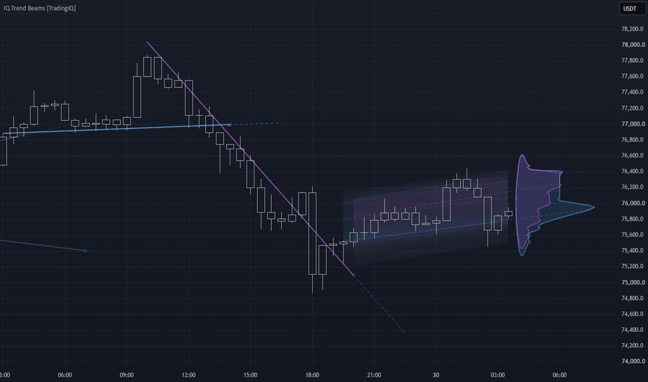
Indicador

FVG Sniper [JOAT]═══ FVG SNIPER ═══
A complete Fair Value Gap engine that finds price imbalances, grades their quality, tracks how they fill, mitigate and invert, and then paints a full trade blueprint the moment a clean setup fires. One gap is spotlighted as the strongest, and every signal arrives with entry, three targets, a stop, and colored risk/reward zones — no arrows, no clutter.
▎ WHAT IT DOES
FVG Sniper detects three-candle fair value gaps (imbalances), scores each one from 0–10, and monitors its life cycle: how much of the gap has been filled, whether it has been mitigated (wick-tapped through), and whether price has closed fully through it to flip its role into an Inverted FVG (IFVG) . When a graded gap produces a rejection or an IFVG flip that agrees with the higher-timeframe bias, it draws a structured trade plan and reports the whole picture in a dashboard.
▎ HOW IT WORKS
• Gap detection — a bullish gap forms when the current low sits above the high from two bars back; a bearish gap forms when the current high sits below the low from two bars back.
• Quality filters — each candidate must clear a minimum gap size (as a multiple of ATR ) and a minimum displacement body ratio on the impulse candle, so tiny or weak imbalances are ignored.
• Grade (0–10) — blends gap size, the displacement range of the middle candle, and relative volume into a single score. Only gaps at or above your minimum grade may fire a signal.
• Fill & mitigation — the engine tracks the running extreme inside each gap to compute a live fill percentage, and marks a gap mitigated once a wick fully traverses it.
• Inversion (IFVG) — when price closes fully through a gap, its role flips; the box restyles to a dashed amber accent and the flip is logged.
• Signals — two sources you can mix or isolate: Rejection (price retraces into a live gap and reacts back out with a directional close) and IFVG Flip (a mitigated gap is closed through, confirming continuation).
• HTF bias filter — an optional higher-timeframe EMA bias must agree with the signal direction before it is allowed.
• Trade model — on a fresh signal it sets entry at close, a stop either gap-protected (just beyond the triggering gap boundary) or ATR-based, with risk clamped between a floor and a cap. Targets TP1/TP2/TP3 are placed at your chosen R multiples.
• Non-repainting — all detection, scoring and signals evaluate on confirmed (closed) bars only, and the HTF request uses no lookahead.
▎ HOW TO USE IT
• Trade in the direction of the BUY / SELL pill. The stars and score on the pill show the grade of the gap that triggered it.
• The entry line (chrome), dashed stop , and TP1/TP2/TP3 lines map the plan directly on the chart; level labels on the right print exact prices and R values.
• The green zone is the target/reward area from entry to TP3; the red zone is the risk area between entry and stop — a fast visual read of the trade's R:R.
• A single ★ spotlight tags only the strongest active gap, so you always know the best imbalance in view.
• Use live gaps as decision zones: watch the fill % of the nearest gap, and treat an IFVG flip as a shift in short-term control.
• When a trade closes, a result label prints the outcome (TP hit, stop, or exit at R) so completed setups stay readable.
• Combine with your own structure, session and news context — the gap engine locates the where , you confirm the when .
▎ KEY SETTINGS
• Engine — enable bullish/bearish detection, choose the signal source (Rejection, IFVG Flip, or both), and cap how many gaps stay visible plus their lifetime and box extension.
• Filters — ATR length, minimum gap size, minimum displacement body ratio, minimum grade, the HTF bias filter (timeframe + EMA length), and whether a directional rejection close is required.
• Trade Model — stop basis (Gap-Protected vs ATR), stop buffer/distance, risk floor and cap, TP1–TP3 in R, max trade duration, zone projection, and how many completed trades to keep.
• Visuals — toggle gap boxes, midline, hide-mitigated declutter, grade spotlight, IFVG styling, signal pills, zone boxes, lines, level and result labels, zone-reader candle coloring, optional VWAP + σ bands, and all colors/transparency/sizes.
• Dashboard — show/hide, position, text size, and dark or light panel.
▎ DASHBOARD
The on-chart panel reports: HTF bias, count of active bullish and bearish gaps, the nearest gap price and its fill %, the strongest gap's star grade, the last IFVG flip (with bar age), the active signal, any live trade with its entry, and running totals of bullish / bearish / inverted gaps detected.
▎ ALERTS
• BUY signal
• SELL signal
• Bullish IFVG Flip (inversion up)
• Bearish IFVG Flip (inversion down)
▎ NOTES
• Works on all timeframes and all assets — indices, forex, crypto, stocks, futures.
• Signals and drawings are computed on closed bars, so they do not repaint after the bar confirms.
• Object caps and hide-mitigated / declutter toggles keep the chart clean even on long histories.
• Any on-chart result labels reflect historical signals only and are illustrative, not a performance guarantee.
For research and education only. This is not financial advice. No indicator can predict the future, and past behavior does not guarantee future results — always manage your own risk.
Made with passion by JackOfAllTrades ⚡
Indicador

Indicador

Friendly Trend Friendly Trend is an adaptive trend-state indicator designed to answer two practical questions:
Is the current market structure in a confirmed bullish or bearish state?
Do the selected timeframes support the same directional bias?
The indicator simplifies trend reading without reducing the analysis to a basic moving-average crossover.
It combines directional efficiency, normalized price impulse, adaptive smoothing, volatility-sensitive boundaries, confirmation rules, and multi-timeframe context into one coordinated trend model.
━━━━━━━━━━━━━━━━━━━━━━━━━━━━━━━━━━━━
🧩 WHAT MAKES FRIENDLY TREND DIFFERENT
Friendly Trend is not a collection of unrelated indicators placed on the same chart.
Every component is part of one connected trend-state engine and has a specific role:
• Directional efficiency determines whether price is moving cleanly in one direction or following a noisy path.
• Normalized impulse measures the direction and strength of recent price movement.
• Adaptive smoothing changes the response speed of the trend basis according to current market conditions.
• The volatility model determines how far price must move before a change can qualify as meaningful.
• Slope, momentum, reversal-buffer, and consecutive-bar conditions confirm a new trend state.
• The multi-timeframe dashboard applies the same complete trend engine independently to each selected timeframe.
• The Overall result converts the individual timeframe states into a weighted directional score.
The script uses established mathematical building blocks such as exponential smoothing, True Range, and absolute price change.
Its original contribution is the way these measurements are connected into one adaptive trend-state architecture rather than used as separate signals or combined into a simple indicator mashup.
━━━━━━━━━━━━━━━━━━━━━━━━━━━━━━━━━━━━
🧭 DIRECTIONAL EFFICIENCY
The model compares:
• the net distance price has moved over the selected Length;
• the total path travelled by price during the same period.
A relatively direct move produces a higher efficiency value.
A market that repeatedly moves up and down while making little net progress produces a lower efficiency value.
This measurement helps the trend basis behave differently during:
• clean directional movement;
• noisy consolidation;
• uncertain or transitional conditions.
━━━━━━━━━━━━━━━━━━━━━━━━━━━━━━━━━━━━
⚡ NORMALIZED IMPULSE
The script separately calculates directional impulse by comparing:
• smoothed signed price changes;
• smoothed absolute price changes.
The result is normalized around zero:
• positive values indicate upward directional pressure;
• negative values indicate downward directional pressure;
• values close to zero indicate weak or balanced movement.
Impulse performs two functions inside the model:
It helps determine how quickly the adaptive basis should react.
It filters trend changes that are not supported by sufficient directional strength.
━━━━━━━━━━━━━━━━━━━━━━━━━━━━━━━━━━━━
📈 ADAPTIVE TREND BASIS
Friendly Trend calculates a faster and a slower smoothed price estimate.
It then blends them according to the current combination of:
• directional efficiency;
• absolute normalized impulse.
During clean directional movement, the faster estimate receives more influence, allowing the basis to follow price more closely.
During noisy or indecisive conditions, the slower estimate receives more influence, reducing unnecessary reactions to minor price fluctuations.
The result is a basis that adapts its response speed instead of using one fixed smoothing behavior in every market condition.
━━━━━━━━━━━━━━━━━━━━━━━━━━━━━━━━━━━━
🌊 ADAPTIVE TREND ZONE
The trend zone is not based on a fixed percentage or a single ATR value.
Its width combines:
• smoothed True Range;
• the mean absolute distance between price and the adaptive basis;
• the relationship between short-term and long-term volatility;
• the user-defined Band Multiplier.
The short-term versus long-term volatility ratio allows the zone to:
• expand when current market activity increases;
• contract when conditions become calmer;
• adjust to changing volatility regimes.
The volatility ratio is limited to prevent a single extreme movement from distorting the zone for an unnecessarily long period.
━━━━━━━━━━━━━━━━━━━━━━━━━━━━━━━━━━━━
✅ TREND CONFIRMATION
A new bullish state requires all of the following conditions:
• price closes above the upper adaptive boundary;
• the adaptive basis has a positive slope;
• normalized impulse is above the Momentum Filter;
• price clears the additional Reversal Buffer;
• the complete condition remains valid for the selected number of Confirmation Bars.
A bearish state uses the opposite conditions:
• price closes below the lower adaptive boundary;
• the adaptive basis has a negative slope;
• normalized impulse is below the negative Momentum Filter;
• price clears the Reversal Buffer;
• the condition remains valid for the required number of closed bars.
Once a trend is confirmed, the state remains active until the opposite trend passes the same confirmation process.
This persistence is intentional. The trend does not change merely because price returns inside the adaptive zone.
━━━━━━━━━━━━━━━━━━━━━━━━━━━━━━━━━━━━
🎨 HOW TO READ THE CHART
🟢 Green basis and green zone
A bullish trend state has been confirmed.
🔴 Red basis and red zone
A bearish trend state has been confirmed.
⚪ Gray basis
The script does not yet have enough confirmed information to assign a bullish or bearish state.
🏷️ Bullish and Bearish labels
A label marks the bar where a new trend state was confirmed.
Labels are not printed on every bar.
The colored zone visualizes the active trend structure. It is not a profit target, stop-loss level, support level, or resistance level.
━━━━━━━━━━━━━━━━━━━━━━━━━━━━━━━━━━━━
🕒 MULTI-TIMEFRAME DASHBOARD
The dashboard calculates the complete Friendly Trend engine independently on four configurable timeframes.
The default timeframes are:
• 15 minutes;
• 1 hour;
• 4 hours;
• 1 day.
Each row can display one of three states:
• Bullish
• Bearish
• Neutral
The dashboard does not copy the state of the chart timeframe into the other rows.
Each selected timeframe performs its own calculation using the same adaptive trend model.
Higher-timeframe rows use the state of the most recently completed higher-timeframe bar.
When a selected timeframe is lower than the chart timeframe, the script uses a previously completed lower-timeframe state. This conservative approach introduces a small delay but avoids presenting an unfinished lower-timeframe candle as a confirmed trend.
━━━━━━━━━━━━━━━━━━━━━━━━━━━━━━━━━━━━
⚖️ OVERALL TREND
The Overall result is not calculated through a simple majority vote.
Each timeframe state is converted into a numerical value:
• Bullish = +1
• Bearish = −1
• Neutral = 0
The values are then weighted according to timeframe duration.
Larger timeframes receive more influence through logarithmic weighting, while smaller timeframes continue to contribute to the result.
The normalized score is classified as:
• Bullish when it is above the Overall Threshold;
• Bearish when it is below the negative Overall Threshold;
• Mixed when it remains between the two thresholds.
This means that two short-term bullish readings do not automatically override bearish conditions on both the 4-hour and daily timeframes.
A Mixed result indicates disagreement or insufficient directional alignment. It is not a separate market direction.
━━━━━━━━━━━━━━━━━━━━━━━━━━━━━━━━━━━━
🛠️ HOW TO USE FRIENDLY TREND
Friendly Trend is designed primarily as a directional filter, not as a complete entry system.
One possible workflow is:
1. Identify the broader bias
Use Overall to understand the weighted multi-timeframe direction.
2. Review timeframe alignment
Check the individual dashboard rows to see where agreement or disagreement occurs.
3. Confirm the local trend
Use the trend state on the chart timeframe as the immediate directional context.
4. Apply an independent entry method
Combine the indicator with your own:
• market-structure setup;
• entry conditions;
• stop placement;
• position-sizing rules;
• exit plan.
5. Treat Mixed conditions cautiously
A Mixed result suggests that directional alignment is weak or divided.
Instead of forcing a bullish or bearish interpretation, traders may choose to reduce directional conviction until the timeframes become more aligned.
For example, a trader may prioritize long setups when both the chart state and Overall are Bullish, while avoiding countertrend setups when the higher timeframes remain strongly Bearish.
This is an example of interpretation, not a trading recommendation.
━━━━━━━━━━━━━━━━━━━━━━━━━━━━━━━━━━━━
⚙️ MAIN SETTINGS
Length
Controls the main observation window used by:
• the directional-efficiency calculation;
• the slower trend basis;
• the long-term volatility model.
Higher values generally produce:
• smoother behavior;
• fewer reactions to short-term changes;
• greater signal delay.
Lower values generally produce:
• faster reactions;
• greater sensitivity to local movement;
• more potential noise.
Band Multiplier
Controls the visible width of the adaptive trend zone.
Higher values:
• require a larger move before the trend can change;
• reduce sensitivity;
• may produce fewer signals.
Lower values:
• make the model more responsive;
• reduce the distance required for a trend change;
• may increase switching during sideways markets.
Confirmation Bars
Defines how many consecutive closed bars must satisfy all trend-change conditions.
A higher value provides stricter confirmation but also delays the signal.
Reversal Buffer
Adds extra distance beyond the displayed adaptive zone before a new trend can be confirmed.
Its purpose is to reduce rapid Bullish and Bearish changes when price repeatedly tests the zone during consolidation.
Momentum Filter
Defines the minimum normalized impulse required for a new trend.
Increasing this value rejects weaker directional moves.
Setting it too high may cause the indicator to miss gradual trends that develop without strong short-term momentum.
Overall Threshold
Controls how much weighted multi-timeframe agreement is required before Overall becomes Bullish or Bearish.
Higher values:
• require stronger agreement;
• produce more Mixed readings.
Lower values:
• classify directional alignment more easily;
• produce Bullish or Bearish results more frequently.
Time Frame 1–4
Define the four periods calculated in the dashboard.
The timeframes can be adjusted to match the user’s trading horizon.
A logical progression from lower to higher periods generally provides the clearest context.
━━━━━━━━━━━━━━━━━━━━━━━━━━━━━━━━━━━━
🔔 ALERTS
The script includes alert conditions for:
• confirmed bullish trend changes on the chart timeframe;
• confirmed bearish trend changes on the chart timeframe;
• any confirmed chart-timeframe trend change;
• bullish and bearish changes for each dashboard timeframe;
• changes of Overall to Bullish;
• changes of Overall to Bearish.
Chart-timeframe trend alerts are based on confirmed bar-close changes.
━━━━━━━━━━━━━━━━━━━━━━━━━━━━━━━━━━━━
⏱️ REAL-TIME AND CONFIRMED-BAR BEHAVIOR
The adaptive basis and visible zone can move while the current price bar is still open because they reflect live market data.
However:
• the chart trend state changes only after the bar is confirmed;
• Bullish and Bearish labels are generated only on confirmed chart bars;
• chart-timeframe trend alerts are based on confirmed state changes;
• higher-timeframe dashboard states use completed higher-timeframe bars;
• lower-timeframe dashboard states are intentionally delayed to avoid using an unfinished lower-timeframe candle as a confirmed signal.
Users should distinguish between:
• the live movement of the adaptive basis and zone;
• a confirmed change of trend state.
━━━━━━━━━━━━━━━━━━━━━━━━━━━━━━━━━━━━
⚠️ LIMITATIONS
Friendly Trend does not predict future prices.
Like any trend-following model, it may react with delay after a sudden reversal.
Confirmation Bars, the Reversal Buffer, and the Momentum Filter intentionally exchange some response speed for greater trend stability.
Sideways markets can still produce alternating trend states, especially when using:
• a short Length;
• a narrow trend zone;
• low confirmation requirements.
The indicator does not guarantee exact entries, exits, profits, or a specific win rate.
It should be used together with independent analysis and appropriate risk-management rules. Indicador

VSA TrailEffort-Displacement VSA Trail
Effort-Displacement VSA Trail is a scalping-oriented VSA-style indicator built around a custom effort-result signal gate.
The script uses common technical-analysis building blocks such as ATR, SMA, volume, candle body, and trailing-stop direction, but the signal logic and the way these parts are combined are original to this script.
The core idea is simple: a directional signal should not appear only because price crossed a trailing stop, and it should not appear only because volume increased.
A Buy or Sell label is printed only when three things align on the same bar:
1. ATR trailing-stop direction confirms the active side.
2. Volume expands above its own baseline.
3. Price displacement expands above its own baseline.
The displacement layer is calculated as:
body = abs(close - open)
gap = abs(open - previous close)
displacement = body + gap
This is the main design difference of the script.
Instead of measuring only candle body size, the script also includes the opening gap from the previous close.
This creates a stricter effort-result model: volume must be accompanied by real directional displacement before a signal is allowed.
The ATR trailing stop acts as the directional regime layer.
The volume condition acts as the effort layer.
The displacement condition acts as the result layer.
Only when direction, effort, and result confirm each other does the script print a Buy or Sell signal.
This is not a generic volume spike tool and it is not a plain ATR trailing-stop indicator.
It is a combined VSA-style confirmation model designed to reduce weak signals where volume increases but price movement does not meaningfully follow.
Public / common components used:
- ATR calculation with ta.atr()
- SMA baselines with ta.sma()
- ATR-style trailing-stop direction logic
Original elements:
- Body-plus-gap displacement confirmation
- Same-bar effort-result validation
- Signal gating that requires ATR direction, volume expansion, and displacement expansion together
- Stateful Buy/Sell logic that avoids repeating the same-side signal until direction changes
This script does not include copied third-party script code.
It was built as an original combination of standard Pine Script functions and custom signal logic.
Use case:
This indicator is intended for short-term chart analysis where the trader wants to see only those directional moments where trailing-stop bias, volume expansion, and displacement expansion confirm each other.
Limitations:
The script is not a complete trading system.
It does not include position sizing, take-profit rules, slippage modeling, spread handling, or full risk management.
Signals can still fail in choppy, illiquid, or news-driven market conditions.
Disclaimer:
This script is for educational and informational purposes only.
It is not financial advice, investment advice, or a recommendation to buy or sell any asset.
Trading involves risk.
Past signals do not guarantee future results.
Always use your own analysis and risk management. Indicador

Golden Cross Engine [Quantum Algo]Golden Cross Engine
====================================================
🔶 OVERVIEW
Golden Cross Engine is a complete golden cross and death cross indicator that goes far beyond marking the moving average crossover: it counts down to the next cross before it happens, grades every cross by quality, measures what golden and death crosses have actually done on the current symbol with honest statistics, and lets every cross marker settle into its real outcome so the chart itself shows which crosses worked and which failed.
The golden cross — the fast moving average crossing above the slow, classically the 50 over the 200 — is one of the most watched events in all of trading, and the death cross is its bearish mirror. Every major cross makes financial headlines. This engine turns that famous event from a headline into a measurable, projectable, and auditable object on your chart.
🔶 WHAT ARE THE GOLDEN CROSS AND DEATH CROSS?
A golden cross occurs when a faster moving average (traditionally the 50 period) closes above a slower one (traditionally the 200 period), signaling that intermediate momentum has overtaken the long-term trend — historically read as the start of a bullish regime. A death cross is the opposite: the fast average crossing below the slow, read as the start of a bearish regime. Because both averages move slowly, the cross itself is a lagging event — which is exactly why this engine adds a convergence countdown that shows the cross forming before it prints.
🔶 WHY THIS SCRIPT IS ORIGINAL
1. The convergence countdown. The engine measures the current slope of both averages and projects their geometry forward, drawing the two converging paths and marking where and when they would meet: "Golden Cross ≈ 9 bars" with the projected price level. It is a projection at current slopes — clearly labeled as such, never a forecast — and it makes the most-watched lagging signal in trading visible in advance. An approach alert fires when the countdown first enters your chosen lead window.
2. Markers that settle into their outcome. Every cross prints in neutral gold, then resolves twenty bars later: the bullish or bearish color if the cross delivered, faded gray if it failed. The chart becomes its own audit trail — scroll back and see the honest history of every cross on the symbol.
3. Per-symbol cross statistics. Using shrinkage-adjusted win rates and Wilson confidence bounds, the engine reports how often golden and death crosses were favorable on this exact symbol and timeframe at five, twenty, and sixty bars, with sample counts and average moves — on every marker's tooltip and in the dashboard. It answers "does the golden cross actually work here" with data instead of folklore.
4. Cross quality grading. Every cross is graded A, B, or C from three observable conditions: elevated volume at the cross, slope steepness of the fast average, and momentum confirmation of price relative to it. Grade A crosses are the full-confluence events.
5. A living regime fill. The zone between the averages breathes: the bullish or bearish tint intensifies as the gap widens and pales as a cross approaches, so regime strength and regime fatigue are visible at a glance. Cross bars flash once.
6. Multi-timeframe cross state. The dashboard shows whether the fast average is above or below the slow on the fifteen-minute, one-hour, four-hour, daily, and weekly timeframes simultaneously — full-stack regime alignment in two compact rows.
🔶 HOW IT WORKS
Averages: Selectable simple or exponential averages at configurable lengths, defaulting to the classic 50 and 200.
Countdown: The engine computes each average's recent slope and solves the convergence geometry. When the averages are approaching within the horizon, it draws both projected paths, the meeting diamond with the bar count, and the projected level. When they are separating, the dashboard reads Diverging.
Statistics: Each confirmed cross records what price actually did five, twenty, and sixty bars later, in the cross's direction, into capped first-in-first-out databases. Win rates are pulled toward fifty percent by pseudo-samples so a thin history cannot display fake confidence, and each rate carries a Wilson lower bound. Crosses are rare events by nature, so sample counts are honest and often small — markers read "collecting history" until the minimum is met.
Outcome settlement: Each marker stores its cross price; twenty bars later it recolors by the realized directional outcome and joins the capped history.
Grading: Volume z-score, normalized slope steepness, and price-side confirmation combine into the A, B, C grade shown on the marker tooltip and dashboard.
Non-repainting: Crosses, grades, and statistics are evaluated on closed bars. The countdown updates on the live bar by design — it is a live projection, and it is labeled as one.
🔶 HOW TO USE IT
1. The natural home is the daily chart of major symbols — indices, large-capitalization stocks, cryptocurrency — where the 50 and 200 cross is the famous event. Intraday charts work identically with proportionally more crosses and deeper samples.
2. Watch the countdown as regime alarm: a shrinking bar count with a steepening fast average means the regime change is forming in front of you.
3. Read the settled history before trusting a fresh cross: a chart full of gray markers is telling you crossovers chop on this symbol; a chart of colored ones is telling you they trend.
4. Use the grade as confluence: an A-grade cross with volume, steep slope, and price confirmation is a different event from a flat, quiet drift-through.
5. Check the timeframe rows: a golden cross on your chart while the daily and weekly already sit bullish is alignment; against them, it is a counter-trend event.
6. The statistics rows are context, not commands — favorable rates describe this chart's history, never the next cross.
🔶 SETTINGS
- Average type and both lengths.
- Countdown: projection toggle, horizon, and approach alert lead.
- Statistics: sample cap, minimum samples to grade, shrinkage strength, Wilson z-score, markers to keep.
- Visuals: all colors, gradient fill toggle, cross-bar flash toggle.
- Themeable dashboard: position, four text sizes, title band, background, frame, grid, and three text colors.
🔶 ALERTS
- Golden Cross / Death Cross — the crossover confirmed at bar close.
- Golden Cross Approaching / Death Cross Approaching — the countdown first entered the alert lead window at current slopes.
- Grade A Cross — a cross fired with full quality confluence.
🔶 FREQUENTLY ASKED QUESTIONS
Does the indicator repaint? No. Crosses, grades, statistics, and marker settlement are evaluated on closed bars. The countdown is a live-bar projection and is explicitly presented as one.
Is the countdown a prediction? No. It is where the averages meet if both keep their current slopes. Slopes change; the countdown updates with them. Its value is showing the event forming, not promising the date.
Why are the sample counts small? Because genuine crosses are rare — a daily chart may produce only a handful in years of data. The engine shows honest small numbers with confidence bounds instead of inventing large ones, and lower timeframes build deeper samples.
Why did an old cross marker turn gray? It failed: twenty bars after that cross, price had not moved in the cross's direction. Gray markers are the audit trail working.
Which lengths should I use? The classic 50 and 200 define the famous event. Faster pairs produce more crosses and richer statistics at the cost of more noise.
🔶 CREDITS
The golden cross and death cross are classical moving-average crossover concepts in the public domain of technical analysis, watched across generations of market participants. The Wilson score interval is by Edwin B. Wilson (1927), and shrinkage estimation is standard public statistics. This script gratefully acknowledges that shared lineage. The convergence countdown and projection geometry, the outcome-settling markers, the per-symbol statistical grading, the living regime fill, and all code in this script are original work — no third-party or open-source script code was reused.
🔶 LIMITATIONS
Moving average crossovers are lagging by construction, and the countdown inherits the assumption of stable slopes. Cross samples are naturally small on higher timeframes; statistics mature with history and faster settings. Volume grading is less meaningful on symbols with unreliable volume reporting. Multi-timeframe rows describe state, not signals. No indicator replaces independent analysis.
🔶 DISCLAIMER
This script is provided strictly for educational and informational purposes. It is not financial advice, an investment recommendation, or a solicitation to buy or sell any financial instrument. Past behavior of any cross, projection, or statistic does not guarantee future results. Trading involves substantial risk. Always do your own research and manage risk independently. Indicador

Dynamic Market Metrics [MarkitTick]💡 All-in-one market analysis suite designed to unify trend evaluation, momentum measurement, and dynamic risk management into a single, cohesive interface. Rather than relying on a scattered array of disparate indicators, this unified system synthesizes multiple dimensions of market data—including volatility, money flow, and higher-timeframe confluence—to provide a comprehensive structural overview of the current asset. It visually maps trend direction, plots actionable trade risk levels, and features a real-time heads-up display (HUD) dashboard to track critical market internals without cluttering the charting workspace.
● Overview
✨ Originality and Utility
Traditional technical analysis often forces traders to compromise between lagging trend followers and noisy momentum oscillators. This script solves that divergence by integrating an adaptive trend baseline with volume-weighted momentum constraints. It is unique in its ability to automatically map forward-looking risk-to-reward brackets the moment a structural shift is confirmed. Instead of guessing where to place stops and targets, the system calculates these thresholds dynamically based on real-time volatility, offering a strictly objective framework for trade management. This eliminates the need for messy chart mashups, replacing them with a highly organized, singular logic engine.
🔬 Methodology and Concepts
The core engine of this tool operates on an abstracted synthesis of price volatility and money flow dynamics.
The primary trend anchor is established by evaluating average true price ranges against the flow of capital entering or exiting the asset.
Rather than relying on simple price crosses, the baseline only shifts when confirmed by underlying volume and momentum pressures.
A specialized breakout override mechanism constantly monitors for abnormal momentum spikes. If a sudden surge in directional velocity exceeds the baseline volatility threshold, the system immediately recalculates the trend state to adapt to the new market structure.
Trade levels are generated using a dynamic risk parity model. The system measures the precise distance between the confirmed entry trigger and the structural invalidation point, projecting synchronized target tiers that maintain strict mathematical risk-to-reward ratios.
All higher-timeframe data integration is strictly coded using offset historical referencing, ensuring absolute data integrity and preventing any future leakage or repainting artifacts.
🎨 Visual Guide
The script utilizes a clean, professional aesthetic, heavily reliant on dynamic colors and structured dashboard elements.
• The Trend Anchor and Cloud
Trend Line: A distinct, segmented line that tracks the primary market direction. It colors dynamically based on the active state (Bullish, Bearish, or Neutral).
Dynamic Cloud: A semi-transparent filled area bridging the primary trend line and a smoothed reference baseline. The thickness of this cloud visually represents the immediate strength and momentum of the trend.
Candle Coloring: Chart candles are painted to match the active trend state, providing instant visual alignment with the underlying engine.
• Trade Levels and Signals
Signal Markers: Minimalist labels appear above or below the price action to indicate confirmed structural shifts.
Stop Loss (SL) Line: A solid line representing the exact invalidation point of the active trend.
Entry Line: A dashed line marking the exact price where the signal was confirmed.
Take Profit (TP) Lines: A series of three dashed lines representing incremental target zones.
Risk/Reward Fills: Shaded background zones visually map the risk area (Entry to SL) against the reward area (Entry to TP3), allowing for immediate visual risk assessment.
• The HUD Dashboard
Located in the top right corner, this data table provides a real-time read of market internals:
Trend State & HTF Context: Displays the current directional bias on both the local and higher timeframes.
Entry, Target, and SL: Prints the exact numerical values for the active trade parameters.
Momentum & Money Flow: Visual progress bars indicating the current intensity of price movement and capital flow.
Volatility: Indicates whether the market is currently in a state of expansion or contraction.
Trend Age: A counter showing exactly how many bars have elapsed since the current trend began.
📖 How to Use
The system is designed to be highly objective. Monitor the chart for a confirmed signal marker, which indicates a shift in the underlying structural trend. Once a signal fires, the script will automatically render the Entry, Stop Loss, and Take Profit levels.
Validation: Before considering the signal, check the HUD Dashboard. A high Momentum score and an aligned Higher Timeframe (HTF) Context significantly increase the probability of continuation.
Execution: Use the exact printed Entry line for placement. The Stop Loss line dictates the hard invalidation point where the premise of the trend is broken.
Management: As price moves in the anticipated direction, manage the position by scaling out or moving protective stops as the asset crosses the TP1, TP2, and TP3 thresholds.
Breakouts: If a sudden momentum burst triggers an override, the trend state will flip immediately. Treat these as aggressive volatility expansions that require tighter risk management.
⚙️ Inputs and Settings
The settings panel is modularized for precise user control:
• Core & Breakout
ATR Mult & Length: Adjusts the core sensitivity of the volatility engine. Lower values create a tighter, more reactive baseline.
BO Override & Sens: Toggles the momentum breakout detection and dictates how much abnormal velocity is required to override the primary trend.
• Higher Timeframe (HTF)
Show HTF & TF: Enables the integration of a secondary, longer-term timeframe to act as a directional filter.
• Trade Tools & Cloud
Show Trade Levels: Toggles the rendering of the dynamic Entry, SL, and TP lines.
Cloud Settings: Controls the length, transparency, and rendering of the visual trend cloud and candle coloring.
• Alerts & Colors
JSON Action Strings: Allows users to input custom formatted strings for Long, Short, and Close actions, perfectly integrating with automated third-party execution platforms.
Colors: Fully customizable palettes for all lines, fills, dashboards, and signal markers.
🔍 Deconstruction of the Underlying Scientific and Academic Framework
The architectural foundation of this system rests on auction market theory and the statistical properties of volatility clustering. Financial markets operate through continuous auctions where price discovery is driven by the aggressive absorption of resting liquidity. This engine abstracts that process by measuring the standard deviation of price excursions—quantifying the asset's true range—and mapping it against the directional flow of capital.
By analyzing the divergence between pure price action and volume-weighted accumulation, the system identifies the true mean of value. When price deviates beyond these statistical bounds accompanied by extreme momentum, it signals a structural paradigm shift rather than a standard mean-reversion event. Furthermore, the embedded risk parity model abandons static numerical thresholds in favor of dynamic proportional scaling. The reward brackets are continuously mathematically linked to the localized volatility of the anchor point, ensuring that the risk-to-reward distribution remains statistically constant regardless of the asset's current expansion or contraction phase.
⚠️ Disclaimer
All provided scripts and indicators are strictly for educational exploration and must not be interpreted as financial advice or a recommendation to execute trades. We expressly disclaim all liability for any financial losses or damages that may result, directly or indirectly, from the reliance on or application of these tools. Market participation carries inherent risk where past performance never guarantees future returns, leaving all investment decisions and due diligence solely at your own discretion. Indicador

PSAR Trend Filter PSAR Trend Filter is an event-based trend filtering indicator built around Parabolic SAR reversals.
It helps separate ordinary PSAR direction changes from events that also meet the selected trend direction, movement strength, and confirmation requirements.
━━━━━━━━━━━━━━━━━━━━━━━━━━━━━━━━━━
🎯 CORE CONCEPT
PSAR Trend Filter is not designed as a simple combination of several independent indicators.
The script uses a structured validation sequence for one specific event:
Parabolic SAR identifies a possible direction change.
EMA checks whether the event agrees with the broader price direction.
ADX evaluates the strength of the current directional movement.
Optional candle confirmation checks the direction of the signal candle.
Cooldown limits signals that occur too close to one another.
Bar-close confirmation controls signal stability in real time.
Parabolic SAR is the only source of the initial event.
EMA, ADX, and the additional filters do not generate independent signals. Their role is to approve or reject a new crossover between price and PSAR.
━━━━━━━━━━━━━━━━━━━━━━━━━━━━━━━━━━
🧩 WHY THESE COMPONENTS ARE COMBINED
Each component has a separate function within one unified validation process.
🔹 PARABOLIC SAR — EVENT TIMING
An UP candidate appears when the closing price crosses above the PSAR value.
A DOWN candidate appears when the closing price crosses below the PSAR value.
An UP or DOWN label cannot appear without a new crossover between price and PSAR.
PSAR determines the timing of the event, but on its own it may change direction frequently during sideways or irregular market conditions.
🔹 EMA — DIRECTIONAL CONTEXT
EMA is used as a broader directional filter.
An UP event is allowed only when the closing price is above the EMA.
A DOWN event is allowed only when the closing price is below the EMA.
EMA does not generate a signal independently. It checks whether the new PSAR reversal agrees with the current directional context.
🔹 ADX — MOVEMENT STRENGTH
ADX evaluates the strength of directional movement without identifying whether that movement is bullish or bearish.
A PSAR event is accepted only when the ADX value is equal to or greater than the minimum level selected by the user.
The same length is used for the Directional Index calculation and ADX smoothing.
The purpose of this filter is to reject PSAR events that occur when measured directional strength is below the selected threshold.
🔹 CANDLE CONFIRMATION
When candle confirmation is enabled:
• UP requires a bullish candle, where the closing price is above the opening price.
• DOWN requires a bearish candle, where the closing price is below the opening price.
This is an additional check performed directly on the bar where the event occurs.
Candle confirmation is disabled by default.
🔹 COOLDOWN — SIGNAL FREQUENCY CONTROL
Cooldown prevents new accepted signals from appearing for a selected number of complete bars after the previous accepted signal.
A signal rejected by the cooldown condition is not postponed or restored later.
The next signal opportunity requires a new crossover between price and PSAR.
🔹 BAR-CLOSE CONFIRMATION
By default, UP and DOWN signals are confirmed only after the current bar closes.
This reduces the possibility of a label appearing while the bar is forming and disappearing before the bar closes.
When bar-close confirmation is disabled, UP or DOWN conditions may change during the formation of the current bar.
━━━━━━━━━━━━━━━━━━━━━━━━━━━━━━━━━━
📈 UP SIGNAL LOGIC
An UP label appears only when all enabled conditions are satisfied on the same bar:
• The closing price crosses above Parabolic SAR.
• The closing price is above the EMA when the EMA filter is enabled.
• ADX is equal to or greater than the selected minimum when the ADX filter is enabled.
• The candle is bullish when candle confirmation is enabled.
• The cooldown requirement is satisfied.
• The bar is closed when bar-close confirmation is enabled.
━━━━━━━━━━━━━━━━━━━━━━━━━━━━━━━━━━
📉 DOWN SIGNAL LOGIC
A DOWN label appears only when all enabled conditions are satisfied on the same bar:
• The closing price crosses below Parabolic SAR.
• The closing price is below the EMA when the EMA filter is enabled.
• ADX is equal to or greater than the selected minimum when the ADX filter is enabled.
• The candle is bearish when candle confirmation is enabled.
• The cooldown requirement is satisfied.
• The bar is closed when bar-close confirmation is enabled.
━━━━━━━━━━━━━━━━━━━━━━━━━━━━━━━━━━
⚙️ EVENT-BASED ARCHITECTURE
All enabled filters must approve the event directly on the bar where price crosses PSAR.
For example, when an UP crossover occurs while ADX is below the selected minimum, the signal is rejected.
If ADX rises above the threshold on a later bar, the script does not generate a delayed UP signal. A new crossover between price and PSAR is required before another signal can be evaluated.
The indicator does not maintain a pending signal after a rejected reversal.
Each PSAR event is evaluated only at the moment it occurs.
━━━━━━━━━━━━━━━━━━━━━━━━━━━━━━━━━━
💎 ORIGINALITY AND PRACTICAL PURPOSE
Parabolic SAR, EMA, and ADX are established technical analysis concepts.
The originality of PSAR Trend Filter is not based on claiming that the standard formulas behind these indicators are new.
The distinction lies in how the components are organized and how they work together within one event-based validation architecture.
The components are not treated as several equal or independent signals:
• PSAR is the only event trigger.
• EMA checks directional alignment.
• ADX checks movement strength.
• Candle confirmation checks agreement on the signal bar.
• Cooldown controls the spacing between accepted events.
• Bar-close confirmation determines whether the signal must wait for the bar to finish.
This structure creates a clear distinction between:
• the underlying Parabolic SAR state;
• a new PSAR reversal;
• a filtered UP or DOWN event.
The chart continuously displays the current PSAR state, while UP and DOWN labels and their corresponding alerts appear only after the complete enabled validation sequence is satisfied.
The signal architecture and implementation were developed specifically for this script.
No code from other published TradingView Community scripts was reused.
━━━━━━━━━━━━━━━━━━━━━━━━━━━━━━━━━━
👁 HOW TO READ THE CHART
🟢 Green PSAR dots
The closing price is above the current Parabolic SAR value.
🔴 Red PSAR dots
The closing price is below the current Parabolic SAR value.
🟢 Green fill
Represents the current underlying upward PSAR state.
🔴 Red fill
Represents the current underlying downward PSAR state.
〰 Gray line
The EMA used by the directional filter.
⬆ UP label
An upward PSAR crossover approved by all enabled filters.
⬇ DOWN label
A downward PSAR crossover approved by all enabled filters.
Important:
The PSAR dots and colored fill represent the underlying PSAR state.
They do not mean that the EMA, ADX, candle confirmation, cooldown, and bar-close conditions have all been satisfied.
Only the UP and DOWN labels represent filtered events.
UP and DOWN describe the direction of an approved event. They are not automatic instructions to open or close a position.
━━━━━━━━━━━━━━━━━━━━━━━━━━━━━━━━━━
🛠 DEFAULT SETTINGS
Parabolic SAR
• PSAR Start: 0.02
• PSAR Increment: 0.02
• PSAR Maximum: 0.20
Signal filters
• Confirm Signals On Bar Close: enabled
• EMA Trend Filter: enabled
• EMA Length: 50
• ADX Strength Filter: enabled
• ADX Length: 14
• Minimum ADX: 15
• Candle Confirmation: disabled
• Cooldown Between Signals: enabled
• Cooldown Bars: 1
Visual settings
• UP/DOWN labels: enabled
• PSAR trend fill: enabled
• EMA display: enabled
If the selected PSAR Maximum value is lower than PSAR Start, the script uses PSAR Start as the effective maximum value.
━━━━━━━━━━━━━━━━━━━━━━━━━━━━━━━━━━
🧭 HOW TO USE THE INDICATOR
Start with the default settings and compare the UP and DOWN labels with ordinary changes in the color and position of the PSAR dots.
This makes it possible to observe which PSAR reversals were rejected by the additional filters.
EMA Length
• A higher EMA length creates a slower directional filter.
• A lower EMA length makes the filter more responsive to recent price changes.
Minimum ADX
• A higher threshold requires stronger measured directional movement.
• A lower threshold allows more PSAR reversal events to pass the strength filter.
Candle Confirmation
Enable this setting when the direction of the signal candle should agree with the direction of the event.
Cooldown Bars
Increase this value to create more distance between accepted signals.
Disabling individual filters
Each filter can be disabled separately to evaluate its influence on the number and location of signals.
Settings should be evaluated for the selected symbol, timeframe, and market conditions.
A single parameter combination should not be considered universal for every market.
━━━━━━━━━━━━━━━━━━━━━━━━━━━━━━━━━━
🔔 ALERTS
The script provides two separate alert conditions:
• PSAR Filtered UP
• PSAR Filtered DOWN
To keep alert behavior consistent with confirmed labels on the chart:
• keep Confirm Signals On Bar Close enabled;
• select Once Per Bar Close when creating the alert.
The alert message includes:
• event direction;
• exchange;
• symbol;
• timeframe;
• closing price.
━━━━━━━━━━━━━━━━━━━━━━━━━━━━━━━━━━
⏳ REALTIME BEHAVIOR
When bar-close confirmation is enabled, UP and DOWN labels are accepted only after the current bar has closed.
While the realtime bar is still forming, the following values may continue to update:
• the current PSAR value;
• the EMA value;
• the color of the PSAR dots;
• the colored PSAR fill.
These elements use current-bar market data.
When Confirm Signals On Bar Close is disabled, an UP or DOWN condition may appear and disappear before the current bar closes.
━━━━━━━━━━━━━━━━━━━━━━━━━━━━━━━━━━
🛡 FUTURE DATA AND REPAINTING CONSIDERATIONS
The script does not use:
• future data;
• higher-timeframe lookahead;
• negative plot offsets;
• backward placement of signals on earlier bars;
• retrospective relocation of UP or DOWN labels.
When bar-close confirmation is enabled, filtered UP and DOWN events are accepted only on confirmed bars.
For more stable realtime behavior, keep Confirm Signals On Bar Close enabled and use Once Per Bar Close alerts.
━━━━━━━━━━━━━━━━━━━━━━━━━━━━━━━━━━
⚠️ LIMITATIONS
• Parabolic SAR is sensitive to changes in direction and may reverse frequently during sideways or irregular price movement.
• EMA and ADX are calculated from historical and current price data and therefore introduce lag.
• ADX measures strength but does not determine bullish or bearish direction.
• A signal rejected by one of the filters is not postponed to a later bar.
• Every new signal requires a new crossover between price and PSAR.
• The indicator does not calculate position size.
• The indicator does not determine acceptable risk.
• The indicator does not set stop-loss or take-profit levels.
• The indicator does not estimate expected returns.
• This script is an indicator, not an automated backtesting strategy.
• Results may vary depending on the symbol, timeframe, volatility, and market regime.
━━━━━━━━━━━━━━━━━━━━━━━━━━━━━━━━━━
⚖️ IMPORTANT
PSAR Trend Filter is an analytical tool.
It does not guarantee:
• the accuracy of every signal;
• profitability;
• the absence of losing trades;
• any specific future market result.
The user remains responsible for signal interpretation, risk management, and all trading decisions. Indicador