Delta Flow Ribbon [AlgoNorth]Delta Flow Ribbon
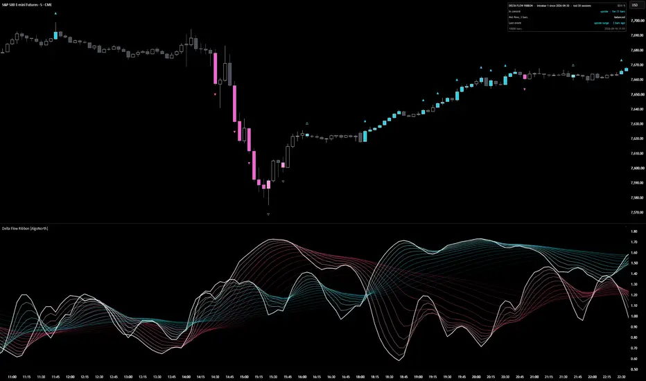
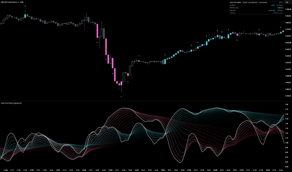
Picture two bars with the same heavy volume. In one, price travels the way that volume was leaning. In the other, it barely moves. A volume histogram draws them the same height. Delta Flow Ribbon is built to tell them apart.
It starts with which way the volume was leaning. Two 14‑strand ribbons, blue for upside flow and pink for downside, each measured against what is normal for that exact time of day. Whichever ribbon sits on top is in control, and the fan opening or closing shows whether that control is building or fading.
The flow behind the ribbons is estimated volume delta: volume with a direction. The script looks at the 1‑minute bars inside every chart bar. Each one's volume counts as upside if it closed up, and downside if it closed down.
Then it checks whether the push worked. Candles light up where flow surges (net flow at least 2.0× normal over three bars, with price travelling with it) and where a hard push stalls (at least 1.5× normal with price travelling 0.35× or less of what that flow would usually move it). Blue for upside, pink for downside, and a lighter shade where the flow was absorbed.
It is a context tool for your own setups. It shows who is in control and when that control is being tested. It does not say what price does next.
🔶 USAGE
🔸 Start with the ribbons. Blue on top means upside flow is running ahead of downside; pink on top means downside is ahead. The bright line on top of each ribbon is its core, the quickest strand. Where the two cores cross, control has changed hands. A ribbon spread wide is flow on the move; a ribbon pulled tight is flow that has settled.
🔸 Then look up at the candles. A solid ▲ above a blue candle marks the start of an upside surge, a solid ▼ below a pink candle, the start of a downside one. A hollow △ or ▽ on a lighter candle marks absorbed flow: a heavy push went in and price barely moved. One arrow per run keeps the chart clean, and the run continues for as long as the candles stay coloured.
🔸 The candles come first and the ribbon confirms. The ribbon is smoothed over 5 to 30 bars, so its peak lands a few bars after the last coloured candle. Read the candle as the event and the ribbon as how much flow has built up behind it (the smoothing can be lowered in the settings for a quicker reaction).
🔸 The sequence worth learning: pink surge candles into a low, a light‑pink absorbed candle at the bottom, then the blue core rising up through the pink. Heavy downside flow met size, then upside flow took over. Weigh it against your own levels. It is context, not a trigger.
🔸 Price climbing while the blue ribbon slides back towards 1.0 is a move running on less flow than it started with. Price flat while a ribbon stays high is flow being soaked up. Both ribbons near 1.0 means nobody is pushing.
🔸 The panel reads the most recent bar, not the part of the chart you have scrolled to: who is in control and for how long, net flow over the last three bars, and the last event. On a live bar it says "forming now" until the bar closes. Full mode adds the raw readings, the delta source and running counts.
🔸 One thing that surprises people: the 09:30 open often shows no coloured candles at all. That is deliberate. Every bar is compared with the average for that same time of day over the last 20 sessions, so heavy flow at the open is just average for the open. A candle only colours when its flow is well above the average for its time of day.
🔶 DETAILS
🔸 Estimated delta. Each chart bar is split into its 1‑minute bars (5‑minute on charts above an hour, hourly on daily). A 1‑minute bar that closed above the previous close puts its volume into upside flow, one that closed below puts it into downside, and an unchanged close keeps the previous direction. Add them up and that is the bar's estimated delta. Where that smaller data is not available, the script places volume by where the close sits in the bar's range instead, and the panel says so.
🔸 Normal for the time of day. Volume, upside flow, downside flow and close‑to‑close travel are each averaged per time slot over the previous 20 sessions. A 5‑minute chart has 288 slots a day, and each one only ever compares itself with its own history. On charts above four hours, or until a slot has enough history, a rolling 300‑bar average takes over and the panel header shows which is in use.
🔸 The ribbons. Upside flow divided by its normal feeds the blue ribbon, downside flow divided by its normal feeds the pink. 1.0 is normal, and each side is measured up to 5×. Every ribbon is the same reading drawn at 14 smoothing lengths spaced from 5 to 30 bars, each passed through three rounds of exponential smoothing, which is what makes the fan open and close. Bars trading under 0.6× normal volume are eased back towards 1.0 so thin trade cannot throw the ribbons around.
🔸 Surge. Net flow = the 3‑bar average of delta ÷ the average one‑way flow for that time of day. A surge is net flow of at least 2.0×, with price travelling in the flow's direction.
🔸 Absorbed flow. Net flow of at least 1.5×, but the 3‑bar price change ÷ the average price change for that time of day comes to 0.35× or less of what that much flow should produce. Expected travel grows with roughly the square root of flow (exponent 0.5): four times the flow is expected to move price about twice as far, not four times. The script measures only the mismatch. Resting size on the other side is one common reason for it, not something the script can see.
🔸 Colours adapt to the chart. Put it on a white or light‑grey background and the ribbons, candles, arrows and panel darken instead of fading out.
🔶 SETTINGS
🔸 Delta: intrabar (default) or bar shape, with the intrabar timeframe on Auto or fixed at 1, 5 or 15 minutes.
🔸 Calibration: time of day (20 sessions per slot) or recent bars (300), plus the quiet threshold (0.6× normal volume).
🔸 Look: fastest strand 5, strand span 25, three smoothing passes, 14 strands, and the two ribbon colours. The defaults are smoothed on purpose. Drop the fastest strand or the passes for a twitchier ribbon.
🔸 Candles: surge at 2.0×, absorbed at 1.5× with price response 0.35×, exponent 0.5, the two candle colours, absorbed shade, arrows once per run or on every candle, arrow size, optional glow.
🔸 Alerts: control change, flow surge and absorbed flow. Pick them as named conditions, or choose "Any alert() function call" to get all three in one alert with the symbol, timeframe and readings in the message.
🔸 Scale: soft (default), log or none, with a knee for how hard extremes are squeezed. Panel: compact or full, on the price chart or in the pane, any corner.
🔶 LIMITATIONS
🔸 The delta is an estimate. It comes from 1‑minute price direction and volume, not exchange‑reported bid and ask trades, and it will differ from a true trade‑by‑trade delta.
🔸 Intrabar history runs out. Older bars beyond it use the bar‑shape fallback, and the panel shows the date the intrabar data begins.
🔸 On a 1‑minute chart there is no smaller timeframe and too few sessions inside the 10,000‑bar window, so it runs on bar shape and the recent‑bars baseline. The panel says so.
🔸 On symbols whose feed reports tick counts rather than traded size (most spot forex and CFDs), the reading is a net tick count, not a volume delta, and the panel flags it.
🔸 The script calculates the most recent 10,000 bars. Readings above 5× normal are shown as 5×.
🔸 The forming bar updates until it closes. Everything on closed bars is fixed.
🔸 Time‑of‑day calibration needs an intraday chart of four hours or less. Daily and weekly charts use the recent‑bars window.
🔶 SUMMARY
Delta Flow Ribbon turns estimated volume delta into two things you can read at a glance. The ribbons show which side is pushing and how hard for that time of day. The candles show where that push surged or was absorbed. Blue for upside, pink for downside, lighter where the flow stalled. It marks conditions, not outcomes.
Indicador
Estratégia

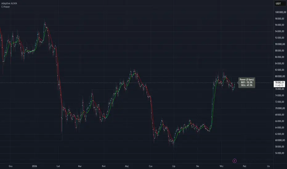
C-Power OscillatorThis script is an advanced momentum and volume-flow oscillator named the "C-Power Oscillator".
It is specifically designed to work collaboratively with the primary C-Power indicator by operating as a lower-panel confirmation tool. While the main indicator tracks price structures on the chart, this oscillator uses mathematical statistics and volume to measure the exact strength of buyers (demand) against sellers (supply) on a scale from 0 to 100%.
How the script functions:
1. Volume Spike FilterThe oscillator factors in trading volume but protects itself against anomalous volume anomalies (such as sudden news spikes) that could distort the reading. If the volume of the current candle exceeds the average volume of the analysis period by more than 3.5 times, it is artificially capped at that maximum allowed threshold.
2. Advanced Volatility Modeling (Garman-Klass)Instead of using a standard ATR (Average True Range), this script uses the sophisticated Garman-Klass volatility estimator. This model:
- Evaluates Open, High, Low, and Close prices simultaneously.
- Integrates a gap-adjustment feature to account for overnight or sharp price gaps.
- Provides a highly precise calculation of true market variance within the specified period.
3. Statistical Probability (Z-Score & Gaussian CDF)This is the core engine of the oscillator. The script measures the distance between the current close and the midpoint of the price action (calculated from the open and the previous close).
- It computes a Z-score by dividing this price imbalance by the Garman-Klass volatility.
- Using a built-in mathematical approximation of the Gaussian CDF (Cumulative Distribution Function), it translates the Z-score into a directional probability percentage. This determines whether a price move is statistically significant or just random market noise.
4. Volume/Power Split (Buy Percent Calculation)
- The calculated directional probability is multiplied by the filtered volume, creating distinct series for buyers (buyPowerSeries) and sellers (sellPowerSeries).
- The script sums these forces over the chosen analysis period (default: 10 bars) to calculate what percentage of total market power belongs to the buyers.
- A value of 50% represents perfect equilibrium. Values closer to 100% indicate absolute buyer dominance, while values near 0% indicate absolute seller dominance.
5. ALMA SmoothingTo prevent the indicator line from becoming too jagged and generating false whipsaws, the final percentage is smoothed using an ALMA (Arnaud Legoux Moving Average). ALMA uses a Gaussian distribution filter to eliminate noise and provide a clean line while maintaining minimal lag compared to traditional moving averages.
6. Noise Reduction (Deadzone) & VisualsThe script implements a Deadzone (neutral zone) around the 50% balance line (defaulting to a width of 5%, or 47.5% to 52.5%). If the market power fluctuates within this narrow band, the oscillator flattens the line to exactly 50.0, signaling a clear "no-trend / consolidation" state.
Visual Indicators On Your Panel:
- Line above 50%: The market is controlled by buyers (colored green), accompanied by a green background fill.
- Line below 50%: The market is controlled by sellers (colored red), accompanied by a red background fill.
- Overbought (default: 60) & Oversold (default: 40) Levels: When the line breaches these thresholds, it changes to a bright neon color (bright green or bright red), warning that the current market move is overextended.
Summary - acting as the perfect companion to the C-Power indicator, this oscillator removes the guesswork from volume analysis. By combining price location, statistical probability, and volume filtering, it provides a clean, lag-reduced confirmation of which side actually controls the order flow.
What exactly is the C-Power Oscillator? It’s essentially a "Money Flow Index on steroids"—one that relies not on the visual geometry of candlesticks, but on statistics and probability distribution. Indicador

Smart AVWAPs## Smart AVWAPs
Smart AVWAPs is a multi-anchored VWAP indicator designed for swing traders who want to identify areas where several important volume-weighted price levels converge.
Instead of anchoring VWAPs to every minor swing, the indicator automatically creates AVWAPs from selected high-importance events:
* High relative volume swing highs and lows
* Earnings gaps
* 52-week highs and lows
* Major reversal candles with elevated volume
The indicator keeps the most recent active AVWAPs on the chart, making it easier to visually identify price zones where multiple anchored VWAPs overlap or compress.
### How to Use
AVWAP convergence can highlight areas where participants anchored to different market events have similar volume-weighted cost bases.
For swing trading, these areas can be monitored as potential support, resistance, consolidation, or breakout zones.
A typical workflow is:
1. Look for several AVWAPs converging within a narrow price range.
2. Observe how price behaves around the convergence area.
3. Wait for confirmation such as a strong breakout, reclaim, increased relative volume, or successful retest.
4. Use broader trend, market structure, and risk management before taking a position.
AVWAP convergence itself is not intended to be an automatic buy or sell signal.
### Inputs
**Active AVWAPs**
Controls the maximum number of recent AVWAP anchors displayed.
**Pivot Left / Right**
Controls the sensitivity of swing-high and swing-low detection.
**Minimum RVOL**
Requires a swing or reversal candle to have elevated volume relative to its recent average.
**Earnings Gap %**
Defines the minimum price gap required for an earnings event to create an anchor.
**Reversal ATR**
Controls how large a reversal candle must be relative to ATR before it qualifies as a significant anchor.
### Intended Use
The indicator is primarily designed for daily-chart swing trading, but the settings can be adjusted for other timeframes and trading styles.
It is best used as a visual confluence tool rather than as a standalone trading system.
For research and educational purposes only. This indicator does not provide financial advice or guarantee future mar
Indicador

TrendLock | Multi-Timeframe Supertrend Donchian BreakoutStrategy Explanation
TrendLock combines three independent confirmations before it will ever open a trade: a primary Supertrend for local trend direction, a higher-timeframe Supertrend that must agree before entries are allowed, and a Donchian channel breakout that times the actual entry once both trend layers align. A volume-spike filter adds a final check that real participation is behind the move, not just drift.
The idea is simple: most Supertrend scripts fire on every local flip and get chopped up in ranges. TrendLock only engages when the bigger picture and the immediate price action are both pointing the same way, and only pulls the trigger on a genuine breakout — not just a trend-line touch.
Exits are ATR-based (stop and target sized off current volatility, not fixed percentages), with an optional early exit if the primary Supertrend flips against the position.
Features
Dual-timeframe Supertrend agreement filter (toggle on/off)
Donchian channel breakout entry trigger, plotted with a shaded channel
Volume-spike confirmation filter
ATR-based stop loss and take profit
Optional trend-flip exit independent of the stop/target
Long-only, short-only, or both-direction modes
Background tint shows HTF/LTF agreement at a glance
Built-in alert conditions for long and short signals
Tips
Pick an HTF meaningfully above your trading timeframe (e.g. 15m chart → 4H filter, 1H chart → 1D filter). Too close and the filter does nothing; too far and setups become rare.
Test the HTF filter on and off separately — it should reduce trade count and whipsaws, not just trade count.
Donchian lookback and ATR lengths interact: a longer Donchian window means fewer, larger breakouts, so widen your ATR stop/target multipliers accordingly.
Try disabling the volume filter on lower-liquidity assets, where volume data can be noisy or unreliable.
Backtest across several unrelated symbols and timeframes using the same input values — if it only works on one chart, the settings are likely overfit rather than a real edge.
Warnings
This is a backtesting and research tool, not financial advice — past performance in the Strategy Tester does not predict future results.
request.security calls for the HTF Supertrend can behave differently between the visible chart and actual live execution; always forward-test on a paper account before risking real capital.
Breakout strategies are prone to false starts in choppy markets even with trend filters — expect a real losing-streak tail in the backtest, not just the equity curve's best stretch.
Commission, slippage, and order-fill assumptions in the Strategy Tester are approximations; verify against your actual broker/exchange fee schedule before sizing a live position.
The HTF filter and volume filter are optional and default to specific settings — review every input before deploying, don't assume the defaults suit your instrument or timeframe.
Estratégia

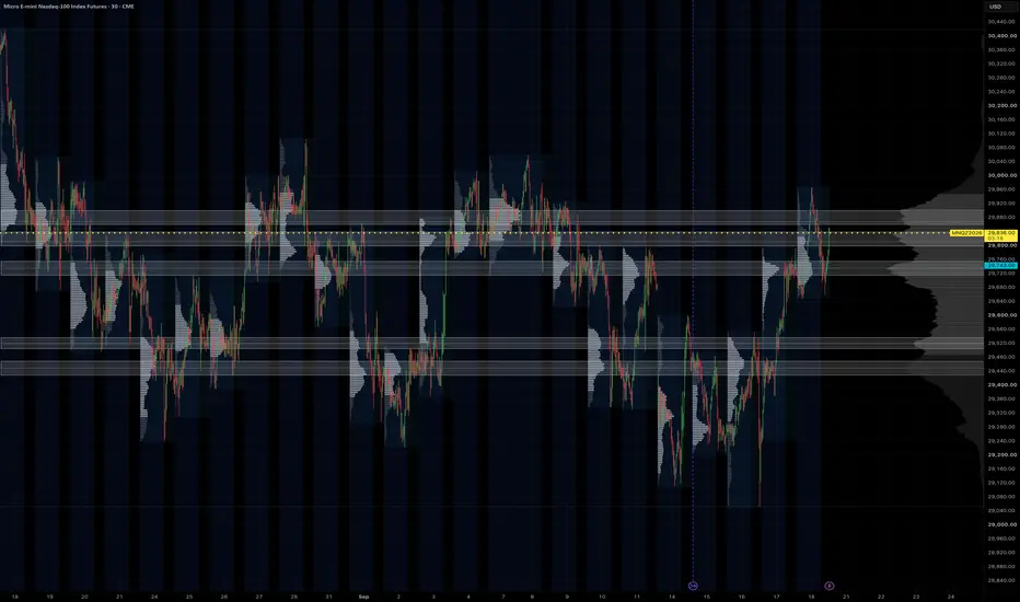
HVN ZonesHVN Zones boxes the high-volume nodes of a multi-session volume profile, the way many traders do by hand from a zoomed-out chart with a fine visible-range profile: each prominent node above and below price becomes a zone you can trade against. It draws the zones, a dotted line at each node's point of control, and a small label.
HOW IT WORKS
1. A volume profile is built over the last N Globex sessions (default 63, about three months) or over the visible range, from 1-minute intrabars where your plan allows it, otherwise from chart bars. Row size is fixed in points or automatic (range divided by 1000).
2. The histogram is smoothed with a short centred moving average.
3. A node is a row that is the tallest within a window of rows on either side and at least a set share of the tallest row in the profile.
4. Each node's zone is grown from the peak while volume stays above a floor. The default floor is prominence-based: prominence is the peak minus the higher of the troughs on either side, and the zone ends where volume has fallen 60% of the way from the peak toward that trough. This keeps a node on top of a broad dome local instead of turning the whole value area into one zone. Nodes with little prominence are dropped and zones are capped in height. The older "% of peak" rule is still available as an option.
5. Overlapping or near zones merge, a price band keeps only nodes within 2 x daily ATR(14) of the current price (or a fixed number of points, or off), and the strongest N zones by peak volume are drawn.
SETTINGS THAT MATTER
Window > Sessions: how far back the profile looks. 63 matches a three-month composite; 20 gives a tighter, more recent read.
Node detection > Zone width (%), Min prominence, Max zone height: how tall a zone gets and which nodes qualify. Lower the width for thinner boxes.
Price band: widen or narrow the multiplier to show more or fewer zones.
Node detection > Recompute every (minutes): the profile changes little intra-day, so the default is hourly. Bar Replay recomputes on every step.
Drawing > Label indent: a fixed pixel push to the right so labels sit in the chart margin at any zoom.
LIMITS
1-minute intrabars need a plan with intrabar access, and TradingView serves at most 100k of them per request, which is about 60 sessions. Longer lookbacks use chart bars for the older part. Switch "Profile source" to Chart bars on any plan.
Volume is spread evenly across the rows each bar overlaps, the same approximation TradingView's own visible-range profile makes at the bar level. It is not a tick profile.
Zones are rebuilt on each recompute from the current window, so they show the current profile, not a history of past zones.
The profile method follows the open-source volume-profile family by PtGambler (MPL-2.0). This script is an original implementation. Indicador
D.vis Swing Engine - RP + RVOL + Trend## English
**D.vis Swing Engine – Relative Performance + Relative Volume + Trend**
D.vis Swing Engine is a swing trading indicator designed to identify stocks that combine positive trend structure, relative strength versus the S&P 500, and above-average trading volume.
The indicator combines several technical components into a single visual framework:
**Relative Performance (RP)** compares the stock's performance with the S&P 500, using SPY as the default benchmark. A positive RP value means the stock has outperformed the benchmark during the selected lookback period. The indicator also measures whether Relative Performance is improving or deteriorating.
**Relative Volume (RVOL)** compares the current trading volume with the stock's average volume over a selected period. An RVOL above 1.0 indicates above-average volume, while values such as 1.5x or 2.0x indicate significantly increased market participation.
The indicator classifies high relative volume on bullish candles as **Money In** and high relative volume on bearish candles as **Money Out**. These readings should be interpreted as proxies for buying and selling pressure rather than literal capital inflows or outflows.
The trend component uses:
- EMA 9
- EMA 21
- SMA 50
- SMA 200
The primary bullish trend condition requires price to trade above EMA 9 while EMA 9 is above EMA 21. SMA 50, SMA 200, and EMA 21 slope filters can optionally be enabled for more restrictive setups.
The indicator also calculates a **Setup Score from 0 to 5** based on five conditions:
1. Price is above EMA 21.
2. EMA 9 is above EMA 21.
3. Relative Performance is positive.
4. Relative Performance is rising.
5. Relative Volume exceeds the selected threshold on a bullish candle.
The dashboard classifies the setup as:
**WAIT** – insufficient conditions are aligned.
**WATCH** – most conditions are aligned and the stock may be approaching a valid setup.
**BUY 5/5** – trend, Relative Performance, and Relative Volume conditions are fully aligned.
A BUY label is displayed only when the complete bullish setup becomes valid for the first time, helping reduce repeated signals during an already established trend.
The indicator also includes a **RISK** condition designed to highlight potential distribution. This occurs when price falls below EMA 21, Relative Performance becomes negative, and strong relative volume appears on a bearish candle.
### Suggested settings for swing trading
- Benchmark: SPY
- Relative Performance Timeframe: Daily
- RP Lookback: 63 trading days
- RP Momentum Period: 5 trading days
- RVOL Average Length: 20
- RVOL Threshold: 1.5x
- SMA 50 Filter: Optional
- SMA 200 Filter: Optional
This indicator is intended as a decision-support tool and should not be used as a standalone trading system. Market structure, support and resistance, earnings, fundamental factors, risk management, and broader market conditions should also be considered.
---
## Română
**D.vis Swing Engine – Performanță Relativă + Volum Relativ + Trend**
D.vis Swing Engine este un indicator pentru swing trading conceput pentru a identifica acțiunile care combină o structură tehnică pozitivă, performanță relativă superioară față de S&P 500 și volum de tranzacționare peste medie.
Indicatorul combină mai multe componente tehnice într-un singur sistem vizual:
**Relative Performance (RP)** compară performanța acțiunii cu S&P 500, folosind implicit SPY drept benchmark. O valoare RP pozitivă înseamnă că acțiunea a performat mai bine decât benchmark-ul în perioada selectată. Indicatorul măsoară și dacă performanța relativă se îmbunătățește sau se deteriorează.
**Relative Volume (RVOL)** compară volumul curent de tranzacționare cu volumul mediu al acțiunii din perioada selectată. Un RVOL peste 1,0 indică un volum peste medie, iar valori precum 1,5x sau 2,0x indică o creștere semnificativă a participării în piață.
Indicatorul clasifică volumul relativ ridicat pe lumânări bullish drept **Money In**, iar volumul relativ ridicat pe lumânări bearish drept **Money Out**. Aceste valori trebuie interpretate ca aproximări ale presiunii de cumpărare sau vânzare, nu ca intrări sau ieșiri literale de capital.
Componenta de trend utilizează:
- EMA 9
- EMA 21
- SMA 50
- SMA 200
Condiția bullish principală cere ca prețul să fie peste EMA 9, iar EMA 9 să fie peste EMA 21. Filtrele SMA 50, SMA 200 și panta EMA 21 pot fi activate opțional pentru setup-uri mai restrictive.
Indicatorul calculează și un **Setup Score de la 0 la 5**, bazat pe cinci condiții:
1. Prețul este peste EMA 21.
2. EMA 9 este peste EMA 21.
3. Relative Performance este pozitiv.
4. Relative Performance este în creștere.
5. Relative Volume depășește pragul selectat pe o lumânare bullish.
Dashboard-ul clasifică setup-ul astfel:
**WAIT** – nu sunt îndeplinite suficiente condiții.
**WATCH** – majoritatea condițiilor sunt îndeplinite, iar acțiunea se poate apropia de un setup valid.
**BUY 5/5** – condițiile de trend, Relative Performance și Relative Volume sunt complet aliniate.
Eticheta BUY este afișată doar în momentul în care setup-ul bullish complet devine valid pentru prima dată, reducând astfel semnalele repetate în timpul unui trend deja confirmat.
Indicatorul include și o condiție **RISK**, concepută pentru a evidenția posibile perioade de distribuție. Aceasta apare atunci când prețul scade sub EMA 21, Relative Performance devine negativ, iar pe o lumânare bearish apare un volum relativ ridicat.
### Setări recomandate pentru swing trading
- Benchmark: SPY
- Timeframe Relative Performance: Daily
- RP Lookback: 63 zile de tranzacționare
- RP Momentum Period: 5 zile
- Media pentru RVOL: 20 perioade
- Prag RVOL: 1,5x
- Filtru SMA 50: Opțional
- Filtru SMA 200: Opțional
Indicatorul este conceput ca instrument de suport pentru luarea deciziilor și nu trebuie utilizat ca sistem de tranzacționare independent. Structura pieței, suporturile și rezistențele, raportările financiare, factorii fundamentali, managementul riscului și condițiile generale ale pieței trebuie analizate separat. Indicador

Kinetic Trend & Momentum Oscillator: Driver Cluster [MantisAlgo]KINETIC TREND & MOMENTUM OSCILLATOR: 🚗DRIVER CLUSTER
Read market momentum like a driver reads the road.
Driver Cluster brings together trend speed, changes in momentum, trading activity, and directional strength in a car-style dashboard. A steering wheel and illuminated pedals show the latest signal, while the instrument cluster helps you follow how the move develops.
The indicator uses an Ehlers SuperSmoother filter to reduce small price fluctuations before measuring movement. Think of it as smoothing out bumps in the road so the overall direction is easier to read.
🟢 THE DRIVER COCKPIT
The cockpit sits at the top right of the main price chart by default. Its name, color, and pedal position work together to show the latest accepted signal.
• DRIVE — Cyan
An upward regime has started. The steering wheel and accelerator light up, and the accelerator appears pressed.
• REVERSE — Coral
A downward regime has started. The steering wheel and accelerator turn coral, with the accelerator pressed.
• BREAK — Violet
A brake event has occurred. The accelerator is released, and the brake pedal lights up in its pressed position.
• NEUTRAL — Gray
The cockpit is waiting for its first accepted signal in the loaded chart history.
DRIVE and REVERSE remain displayed until another qualifying event changes the state. BREAK stays lit until the next DRIVE or REVERSE.
The cockpit remembers the latest signal. The lower dashboard shows current conditions, so the two displays can tell different parts of the same story.
📊 FOUR GAUGES, FOUR QUESTIONS
SPEED — How fast is the trend moving?
SPEED measures the pace and direction of the smoothed price movement.
• Above zero: upward movement.
• Below zero: downward movement.
• Near zero: little directional movement.
It is adjusted for recent volatility, making the reading more useful than a raw change in dollars or points.
TORQUE — Is the trend gaining or losing momentum?
Calculated from changes in trend speed, TORQUE helps you see whether a move is strengthening or easing.
For an upward move, positive torque means upward speed is increasing; negative torque means it is decreasing. For a downward move, negative torque can mean the decline is getting faster, while positive torque can mean it is slowing.
A useful distinction: SPEED can remain high while TORQUE weakens, just as a car can still be moving quickly after it begins to slow down.
BOOST — How active is the market?
BOOST compares reported trading volume with its recent average.
• Around 1.0x: roughly average activity.
• Above 1.0x: higher activity.
• Below 1.0x: lower activity.
POWER — How strong is the overall momentum reading?
POWER combines movement speed with TRACTION, a measure of how consistently price travels in one direction rather than zigzagging. Relative trading activity contributes to the calculation where available.
The gauge shows a percentage of the selected reference level. At 95% or higher, it displays MAX.
POWER measures intensity, not direction. Both a strong rise and a strong decline can produce a high reading.
🟢 SIGNALS & DRIVING STATES
DRIVE and REVERSE combine directional speed, torque, and traction to identify the start of a qualifying move. Trading activity provides additional confirmation where available, and a cooldown helps separate directional launches.
• DRIVE appears as a cyan triangle below the signal bar.
• REVERSE appears as a coral triangle above the signal bar.
• A brake event appears as a violet square labeled BRAKE; the cockpit displays BREAK.
A brake event occurs when an active move meets the deceleration or weakening-speed conditions. A qualifying opposite-direction signal can also switch the regime directly.
The lower dashboard follows the move through states such as LAUNCH DRIVE, STEADY CRUISE, POWER ACCEL, DECELERATING, and REVERSE DRIVE.
OVERHEAT highlights unusually high torque or POWER readings. It draws attention to momentum intensity rather than predicting a reversal.
🛣️ CHART & DASHBOARD VIEW
On the main chart:
• The steering wheel and pedals show the latest accepted signal.
• Optional candle colors reflect the current momentum phase.
• A smoothed price line helps reveal the underlying path.
• Signal markers identify directional launches and brake events.
In the lower pane:
• The main curve shows SPEED.
• The shaded ribbon emphasizes its distance from zero.
• The thin torque curve shows changes in speed on its own scale.
• Dotted boundaries at +0.20 and -0.20 mark the neutral speed band.
• The instrument cluster combines the four gauges, PRND gear selector, and driving status.
⚙️ CUSTOMIZATION
Adjust price smoothing, torque smoothing, volatility measurement, traction, and the volume lookback to suit your analysis.
Launch threshold, brake sensitivity, and cooldown settings control how the indicator responds to changing conditions.
The cockpit and lower dashboard have independent position controls. You can also adjust the cockpit proportions and show or hide chart colors, lines, signals, and the neutral band.
🔔 ALERTS & SIGNAL TIMING
Alert conditions are available for:
• Forward ignition — DRIVE.
• Reverse ignition — REVERSE.
• Brake events.
• Momentum overheat.
Chart signals can change while a candle is still open. Select Once Per Bar Close when creating an alert if you want notifications based on the closing update.
The cockpit's Change pedal state on closed bars only option is enabled by default. It makes the steering wheel and pedals wait for the candle close before accepting a new signal. This option controls the cockpit display, not the timing of all chart signals.
⚠️ DISCLAIMER
Driver Cluster is a technical-analysis and educational tool. It does not execute trades or guarantee future results. Signals describe calculated market conditions and should be evaluated alongside your own analysis and risk management.
Indicador

MOMENTUM MATRIXMOMENTUM MATRIX is a single-pane momentum dashboard that combines a zero-lag oscillator, a volume-weighted money flow histogram, automatic divergence detection, a four-factor confluence strip, and a live table that tracks the historical hit rate of every signal the script prints. The goal is to show momentum, participation, and trend agreement in one place, and to let you measure how the signals have actually performed on the chart you are looking at instead of trusting a marketing claim.
█ WHAT IT SHOWS
1. Wave (upper band, 0 to 100)
A stochastic oscillator applied to a zero-lag EMA of price instead of raw price, smoothed once and paired with a short signal line. The zero-lag input reduces turning-point delay by roughly one bar compared with a standard stochastic or RSI while keeping the familiar 0 to 100 scale. Dotted levels mark overbought (default 80), midpoint (50), and oversold (default 20). The wave colours green when rising above its signal line and red when falling below it.
2. Money Flow (lower band, -100 to 0)
A histogram of net buying or selling pressure. Each bar's volume is signed by where the close sits inside the bar's range, then smoothed with an EMA and normalised by average volume so the reading stays between -100 and +100 across any symbol. Columns are drawn from the band midpoint: above it means net inflow, below it means net outflow. Columns become solid when the reading exceeds the overflow level (default 40), which flags unusually one-sided pressure.
3. Divergences
Regular bullish and bearish divergences between price and the Wave are found from pivot highs and lows (default 3-bar pivots, maximum 40 bars apart) and labelled on the pane.
4. Confluence strip (bottom row)
A thin colour strip scoring -4 to +4 from four independent checks: Wave above or below 50, Wave above or below its signal line, Money Flow positive or negative, and price above or below a 21-period zero-lag EMA. Bright green or red means all four agree; grey means they conflict.
5. Signals
Reversal buy: Wave crosses up through the oversold level while Money Flow is positive and the wave is rising.
Reversal sell: mirror of the above at the overbought level.
Momentum buy: Wave crosses up through 50 while Money Flow is positive and volume is at least 1.2 times its average.
Momentum sell: mirror of the above.
Each signal type has its own alert condition, plus alerts for both divergence types.
6. Accuracy table (top right)
Shows the current state and confluence score, live Wave, Money Flow, and trend readings, and the running hit rate of each of the four signal types on this chart. A hit is counted when price moves at least X percent (default 0.5) in the signal direction within N bars (default 6). Both thresholds are inputs, so you can set them to match your own targets. The counters are computed from the loaded history, so they reflect the symbol and timeframe you are viewing.
█ HOW TO USE IT
Treat the pane as context, not as a stand-alone entry system. The most useful reads are:
- Trend continuation: confluence strip at +3 or +4 (or -3 / -4), Money Flow on the same side, and a Momentum signal in that direction.
- Exhaustion: Wave in the overbought or oversold zone while Money Flow overflow fades, or a divergence label appears.
- Filtering: check the hit-rate table before acting on a signal type. If a signal has printed twenty times on your chart with a 40 percent hit rate, that tells you more than any indicator marketing.
On my own tests across BTC, HYPE, and ZEC on the 4-hour chart, simple oversold and overbought reversal signals from any oscillator, including this one, land close to a coin flip. Confluence-gated momentum signals did better on strongly trending symbols and worse on ranging ones. The table exists so you can see this for yourself on every chart.
█ INPUTS
Wave: zero-lag EMA length, stochastic length, smoothing, signal length, overbought and oversold levels.
Money Flow: length and overflow level.
Confluence: trend ZLEMA length.
Divergence: pivot length, maximum bars between pivots, show or hide.
Signals: volume multiplier for momentum signals, show or hide.
Accuracy: evaluation bars and hit threshold percent.
Display: show or hide the table.
█ NOTES
Works on any symbol and timeframe. Signals and divergence labels are confirmed on bar close and do not repaint. Hit-rate counters use only bars available in the chart history, so they will differ between timeframes and between accounts with different history limits. Indicador

Volatility# Volatility — Body vs. Wick Decomposition
**Every standard volatility tool collapses a candle into one number. That number throws away the
only thing you actually needed to know: whether the range was earned or rejected.**
ATR tells you a bar was 12 points. It cannot tell you whether that was a 12-point body driving t
hrough offers, or a 1-point body with 11 points of wick where price went there and got slammed b
ack. Those two bars have identical ATR. They are opposite trades.
This indicator refuses to average them together.
---
## What it does
**Two independent histograms, volume-style.**
- **Bodies** plot up from zero — the portion of the range that *held*. Committed movement. What
actually printed a close somewhere new.
- **Wicks** plot down from zero — the portion that was *rejected*. Price went, and price came ba
ck. Failed exploration.
Each histogram has its own rolling average and its own spike threshold. A wick spike and a body
spike are different events, and the indicator scores them separately instead of blending them in
to one meaningless mean.
That separation is the whole idea. Range is not a single quantity — it is two opposing forces th
at happen to share a bar.
---
## How to read it
**Tall bodies, short wicks** — trend. The range is being converted into progress. Continuation s
etups work, mean-reversion gets ru
**Short bodies, long wicks** — a fut nobody keeps it. Fades work, brea
kouts fail. This is the state that looks identical to a trend on ATR and costs people money.
**Both compressing** — a coil. Genuine low volatility, not just quiet direction. Expansion pendi
ng.
**Wick spike with no body spike** e tried, got rejected, and the tape
told you so in real time.
**Body share of range** (in the readout) is the single cleanest number here. High share = convic
tion. Low share = indecision. Watc
Split the wick histogram into **upich side* is doing the rejecting. A
run of long upper wicks under a flat high is supply, plainly drawn.
---
## The average candle
On the price pane, the indicator draws a single synthetic candle built from the lookback: averag
e body, average upper wick, averagd separately and drawn to scale.
Crucially, the body is the **net s− open`, not the absolute average. T
his matters more than it sounds:
- In a **trend**, the moves don't cancel — you get a tall body pointing the way the market is ac
tually going.
- In **consolidation**, up and down bars cancel each other out and the body **collapses to a stu
b**, with the wicks left standing
An absolute average can't do that. body in pure chop, because it has d
iscarded the sign. Here, the shape of the average candle *is* the market regime — you read it th
e same way you read any candle, be
Switch to `Body represents: Absolulassic reading where body + wicks eq
uals the average range.
---
## Settings
**Average over** — `Candles` for a fixed bar count (default 50), or `Time` for a clock window co
nverted to bars on your timeframe.urrent leg; long windows describe th
e session's character. A very long window on a fast chart will read flat by design, because that
is the truth about a long window.
**Layout** — `Mirrored` for two ind a zero line, or `Stacked` for one
range column with the body solid inside it, preserving body + wick = range.
**Color mode** — `Above/below average` (default), `Up/down candle` for classic direction tinting
, or `Flat`.
**Spike threshold** — multiple of drawn as a step line on both.
**Avg candle** — position, width, r the body reads net or absolute.
Every color is exposed.
---
## Honest limitations
- Mirrored mode auto-scales to whiwicks routinely dwarf bodies on your
instrument, the body histogram will look compressed — use Stacked.
- The average candle is anchored iight of price, so it drifts closer a
s you zoom out. Adjust the offset.
- Wicks are measured to the extrem will distort a short lookback. That
is a feature when you want to see it and a nuisance when you don't.
---
## Why bother
Volatility is not one number. It is a *composition*. A market can be loud and going nowhere, or
quiet and going somewhere, and thet distinguish those cases because th
e information is destroyed before it reaches you.
This puts the composition back on the chart. Indicador

Relative Volume TiersVolume bars that change colour when volume is unusual: grey is normal, orange is high, magenta is extreme. Each bar is compared with the normal volume for that time of day over the last 20 sessions, so the open and close don't get coloured every day just for being busy. I use it to see whether a move has real volume behind it. It works from 5 second charts up, and the thresholds adjust to the timeframe automatically.
This is a volume indicator that looks like the regular volume bars, but each bar is coloured by how unusual its volume is. I made it to check whether a move on the chart has real participation behind it or is happening on thin volume.
How it works
Every bar is compared to a baseline, which is the volume you would normally expect for that bar. The bar then gets one of three colours (all adjustable):
- Gray: normal volume
- Orange: high volume, above the High multiplier times the baseline
- Magenta: extreme volume, above the Extreme multiplier times the baseline
The baseline
On intraday charts the baseline is based on time of day. A bar at 9:35 is compared with the 9:35 bars of the previous 20 sessions, not with the bars right before it. Without this the open, the close and news times would get coloured every day just because they are always busy, and the quiet midday hours would never get coloured at all. This way a bar is only coloured when its volume is unusual for that time of day.
A 5 second chart only covers a day or so of history, which is not enough for this. So on 5s, 10s, 15s, 30s and 1m charts the time of day profile is built from 5 minute data, which goes back much further, and scaled down to the chart's bar size.
If a time slot does not have enough history yet (5 sessions by default), or on daily and higher charts, the indicator uses the average of the previous 20 bars instead. The current bar is never part of its own baseline.
You can choose Median or SMA for the average. Median is the default, because one news day will not keep the baseline high for weeks afterwards.
Multipliers by timeframe
Volume on small bars jumps around much more than on large ones, so one pair of multipliers does not fit every timeframe. With Auto multipliers on, the indicator picks them based on the chart timeframe (High / Extreme):
- 10s and below: 2.5 / 5.0
- 15s to 30s: 2.0 / 4.0
- 45s to 4m: 1.8 / 3.0
- 5m to 20m: 1.5 / 2.5
- 30m and above: 1.4 / 2.0
All of these can be changed in the settings. Turn Auto off to use one fixed pair on every timeframe.
Other options
- Down bars (close below open) can be drawn fainter, so you still see direction.
- Price candles can be painted in the high and extreme colours.
- The live bar can be coloured by its projected volume, which is the volume so far divided by the part of the bar that has passed. It starts after 35% of the bar by default and can change until the bar closes. The bar height always shows the real volume.
- A baseline line, plus optional High and Extreme threshold lines.
- An info label showing the current relative volume, the multipliers in use and which baseline is active.
- Alerts for high, extreme, and high or extreme volume. They only trigger on closed bars.
Setup tip
The indicator is drawn on the price chart like the built-in volume. TradingView keeps a bottom margin under custom indicators, so the bars will float a little above the bottom edge. To make them sit on the bottom, right-click the chart, go to Settings > Canvas > Margins and set Bottom to 0. The Volume height setting controls how tall the bars are. If you would rather have it in its own pane, move it there and set Volume height to 100.
Notes
- Volume shows how many traders took part in a move, not which way price will go next. A big spike after a long run can mean the move is ending rather than starting.
- On futures, volume moves to the next contract around rollover, so make sure you are looking at the contract that has the volume.
- Time of day is only used on regular time based charts. On Renko, range and tick charts the indicator uses the average of the previous bars. Indicador

SMC Order Block Scorer [Volume Confluence]SMC Order Block Scorer
Finds smart money order blocks and ranks them by volume-profile confluence, so you can see which zones are more likely to hold.
What it does
*Draws market structure (BOS and CHoCH) from major swing pivots
*Creates an order block on every swing break
*Builds a volume profile and marks the POC, Value Area (VAH/VAL) and HVNs
*Scores every order block from 0 to 100 and grades it A+, A, B or C
*Removes order blocks once price revisits them (mitigation)
How it works
*Structure : A close beyond the last swing high or low is a break. A break in the trend direction is a BOS. A break against it is a CHoCH. A CHoCH on a volume spike is tagged "CHoCH Vol".
*Order block: The last opposite candle before the break becomes the zone. It is the last down candle before a bullish break, or the last up candle before a bearish one.
*Volume profile : Volume is spread across price rows over a lookback window.
POC: the row with the most volume.
Value Area: the range holding about 70% of volume.
HVN: a local volume peak well above the average row.
Score : An order block earns more points when it has:
*the POC inside it (biggest credit)
*Value Area overlap
*an HVN inside it (extra credit)
*a large share of the profile's volume
*a strong impulse move and high volume on the break
*a BOS in the trend direction (worth more than a CHoCH)
How to read the chart
*Green boxes: bullish (demand) order blocks
*Red boxes: bearish (supply) order blocks
*Label: direction, grade and score, for example ▲ A+ 84%, with the volume features it touches (POC · VA · HVN) underneath
★ and thicker border: the highest-scoring active order block
*Stronger fill: a higher grade
*Dotted line: the 50% level of the zone
*Histogram on the right: the volume profile, with the POC in red, Value Area in blue and HVNs in gold
*Table: the current swing trend, the top 3 order blocks and the count of active ones
How to use it
*Look for order blocks graded A or A+ that also have POC or HVN in the label.
*Trade in the direction of the swing trend. A bullish block in a bullish trend is a stronger setup than a counter-trend one.
*Wait for price to come back to the zone and confirm on a lower timeframe before entering.
*Use the 50% line as a reference for entries.
*Use the far side of the block as a stop reference.
*If the chart looks busy, raise "Hide OBs below score" to 50 or higher.
Key settings
*Swing Lookback: the default of 50 gives fewer, larger zones. Use 10–20 for more zones on lower timeframes.
*Mitigation trigger:
*Touch: removed when price revisits the zone.
*50%: removed when price reaches the middle of the zone.
*Wick: removed when a wick trades through the far side.
*Close: removed when a candle closes beyond the far side.
*Keep mitigated OBs: shows used zones as faded boxes instead of deleting them.
*Scoring weights: change how much the POC, Value Area and HVN count.
*Market structure toggle: turns BOS and CHoCH drawing on or off. Order blocks still work with it off.
Alerts
*Bullish and bearish BOS
*Bullish and bearish CHoCH, with or without a volume spike
*New bullish or bearish order block
*Order block mitigated Indicador

Taught to Trade - Session Range & Value Area Map🔵 OVERVIEW
This marks three things on your chart, all of them facts about what already happened: where the previous session's volume actually traded, where that session's high and low were, and where the current session's first N minutes set their boundaries.
Nothing here is a forecast. Drawing where price traded yesterday is a statement about yesterday. What you do with it is yours.
🔵 WHAT IT DRAWS
Prior session value area — the price band that contained a chosen share of the previous session's volume, built from a real volume-at-price profile rather than an approximation. You get the value area high, the value area low, and the point of control, which is simply the single price level that traded the most volume.
Prior session high and low — the outer boundary of where the session went.
Opening range — the high and low of the first N minutes of the current session, forming as the session develops.
The value area is shaded so the band is readable at a glance, and a small table reports every level numerically along with the number of bars that went into the profile.
🔵 HOW THE PROFILE IS BUILT
The session's price range is divided into bins. Each bar's volume is distributed across every bin its high-low range touches, rather than dumped into a single bin at the close — so a wide bar contributes to the whole span it covered.
The point of control is the heaviest bin. The value area then expands outward from it, taking whichever neighbouring bin holds more volume, until the chosen percentage of session volume is enclosed. That is the standard construction, implemented in the open where you can read it.
🔵 HOW TO READ THE TABLE
Prior VAH, POC and VAL are the previous session's value area. Prior high and low are its extremes. Open range is the current session's first N minutes.
Bars in profile is the one people skip and shouldn't. It is the sample the profile was built from. On a 5-minute chart of a 09:30-16:00 session it should read 78. If it reads far less, you are looking at a partial session — a holiday, a half day, or the first session in your loaded history — and the levels are built on less than you think.
🔵 WHAT THIS DOES NOT MEAN
A level being drawn is not a prediction that price will react there. The value area describes where volume traded yesterday and nothing else. It carries no claim about tomorrow, and this script will never make one.
The point of control is not support. It is the busiest price of a finished session. Whether that matters on the next touch is exactly the question the chart cannot answer for you.
🔵 SETTINGS
Session specification in exchange time, defaulting to 0930-1600. Use 0000-0000 for a 24-hour instrument, where the boundary becomes the exchange day roll. Opening range length in minutes. Value area percentage and profile resolution in bins. Individual toggles and colours for each element.
Five alert conditions cover price crossing the prior value area high, the prior value area low, the prior point of control, and the opening range high and low. None fires on its own — you arm the ones you want in the alerts dialog. This script does not send buy or sell signals and never will.
🔵 WHERE IT FAILS
Intraday only. On a daily chart or above there is no session to profile, and the table says so rather than drawing something meaningless.
The profile is volume-weighted, so it inherits whatever your data feed reports as volume. On instruments where volume is a proxy — most spot forex, some CFDs — the profile is built on a number that does not mean what it means elsewhere.
A partial session produces a partial profile, silently, except for the bars count. Holidays, half days, and the oldest session in your loaded history all do this. Check the count.
Bin resolution is a real choice, not a detail. More bins give a finer profile and a noisier point of control; fewer bins give a stable POC that may sit some distance from where volume actually concentrated. There is no correct number and this script does not pretend to know yours.
The value area percentage is a convention. Seventy percent is common; it is not derived from anything. Change it and the band changes.
A 24-hour instrument has no natural session boundary. Setting 0000-0000 gives you the exchange day roll, which is a real boundary for bookkeeping and an arbitrary one for price.
The opening range is incomplete until N minutes have elapsed. Before that the lines are still moving.
Session levels reset every session. This is deliberate — it is a session tool — but it means levels you were watching disappear at the boundary rather than persisting.
Open source, so you can read every calculation rather than taking any of it on trust.
Educational tool only, not investment advice. It does not predict anything and does not generate signals. Trading involves substantial risk of loss. Indicador

Volume Effort vs Result ScannerVolume Effort vs. Result Scanner (Equilibrium Tracker)
This indicator is designed for price action and Volume Spread Analysis (VSA) traders seeking to identify key inflection points in the market. It specifically scans for the "Effort vs. Result" anomaly, looking for instances where massive trading volume (High Effort) fails to move the price significantly, resulting in a tightly contained candlestick range (Small Result).
When these two parameters align, it indicates a strong point of market equilibrium or hidden absorption, often signaling institutional accumulation, distribution, or an imminent volatility breakout.
How It Works
The script evaluates the market using two entirely customizable lookback periods, defaulting to standard institutional baselines:High Relative Volume (Effort): Compares the volume of the current bar against a 50-period Simple Moving Average (SMA). By default, it looks for bars with at least 2.0x (200%) the average volume.
Small Candlestick Range (Result): Compares the total high-to-low range of the candle against a 50-period Average True Range (ATR). By default, it limits the signal to candles that are 1.0x (100%) or less of the average historical volatility.
Tuning the Scanner to Your Strategy
This indicator is fully customizable so you can dial in your exact personal favorite setup depending on the market environment or asset class:
To Find Massive Institutional Absorption (Rare, High-Quality): Keep the Min Relative Volume Ratio high (e.g., 2.0x to 2.5x) and tighten the Max Candle Size Ratio downward (e.g., 0.6x to 0.8x). This isolates rare, ultra-tight "Doji" or pin bars that have massive volume injected into them.
Indicador

Indicador

YURI VWAP Excursion EngineSession VWAP has a deadline that most levels do not. When the session ends the average resets, and whether price got back to it stops being an open question. This script keeps the record of how that question has been answered on the chart in front of you: every time price left VWAP by more than a set distance, how long it took to touch VWAP again, and how often the session simply ran out first.
HOW TO USE IT
Put it on an intraday chart of a symbol that reports volume. One minute bars and coarser are accepted. Leave Regular hours only switched on unless you want pre and post market bars counted into the average.
Read the status line first. The ledger builds as the chart is walked, so it needs loaded history: at the defaults each half of the session wants 15 finished excursions before it reads, and the status counts up until then. If the ledger stays thin on your symbol, the distance is large for it. Lower Distance that starts an excursion and the ledger fills faster, with the trade off set out under THE SENSITIVITY THAT MOVES THE HEADLINE.
Most of the time the pane is empty and the status reads ok, no excursion open. That is the normal state. When price closes further from session VWAP than the distance, the background shades and a line starts. The line is the share of comparable past excursions that were already back at VWAP by the age this one has now reached. Time out gives that age, and Still watched at this age gives how many past excursions the share is built from at that point, which is the cell that says how much weight the line will bear.
The two group rows lower down are the standing record: the same share at a fixed reference age, 60 minutes by default, for excursions that began early in the session and for those that began later. They are there on every bar, whether or not an excursion is open.
WHAT AN EXCURSION IS
An excursion opens on the first bar whose close sits more than the chosen distance from session VWAP, measured in basis points of VWAP. It closes on the first later bar whose range contains VWAP, which is a touch rather than a close through it.
One push that retreats partway and goes out again without reaching VWAP stays a single excursion. That is what makes the number a duration rather than a count of pokes. A bar that trades through VWAP and still closes past the threshold ends one excursion and starts another on the same bar, because the close is tested before the open.
If the session ends with an excursion still open, it is not discarded. It goes into the ledger with the elapsed time kept as a lower bound and a mark saying the deadline arrived first. The pushes that did not come back are the ones a record of return times is most tempted to lose, and a record that loses them is an advertisement.
THE OBVIOUS NUMBER IS THE WRONG ONE
The tempting headline is the share of excursions that got back to VWAP before the close. That number is mostly a clock readout.
Grouped by the hour of the session they started in, that raw share ranked against the minutes remaining in the session at a Spearman of 0.96 across the tested window. A push that leaves at 09:40 has most of the day to come back and a push that leaves at 15:10 has fifty minutes, so comparing the two tells you which one left earlier and little else.
WHAT IS READ INSTEAD
A Kaplan-Meier estimate of the share already back at the current age. Each entry in the ledger contributes to the number still under observation for as long as it was actually watched, contributes an event only where a return was seen, and leaves the pool at the point its session ended if it was still out then. It is neither counted as a failure to return nor thrown away.
Both simpler repairs break, in opposite directions, and the difference is not small at long ages. Admitting an entry only when it was watched at least as long as the age being asked about throws away returns that were already seen, and every one of those is a late departure, because in a fixed length session a short horizon is a late start: on the tested window that reads the later group at 25.5 percent at two hours against 29.5 for Kaplan-Meier. Admitting every entry whose outcome is determined swings it the other way, because a short horizon entry gets in only when it came back fast: 37.5 percent at the same age. At one hour, which is where most of the reading happens, the three land at 17.4, 18.6 and 16.1, so the choice matters much less.
THE CLOCK, AND EXACTLY WHAT SURVIVES
The ledger is kept in two groups split at a settable minute of the session, because departure time separates them. At an age of one hour the early group reads 41.0 percent against 16.1 for the later group, a gap of 24.9 points against a standard error of 5.9, on 122 and 89 entries.
Two things have to be said about that rather than left for you to find.
In a session of fixed length the departure minute and the minutes remaining are one variable with the sign flipped, and the two groups have no overlap on it at all. So this is not a time of day effect sitting on top of a remaining time effect, and no matching inside this design could separate the two. What survives is narrower: after the observation window is equalised at each age, departure time still separates the groups.
And the most likely mechanism is measured in this same script. VWAP is still mobile early in the session and nearly frozen late, so the distance can close from either end. Splitting the same measurement by the same two groups, the VWAP itself supplied a median 38.8 percent of the closing distance for early departures against 16.9 for later ones. That is a ratio of 2.3 against the ratio of 2.5 in the return shares. A reader will take the 41 against 16 as a statement about price behaviour at different times of day, and much of it is a statement about how mobile the session average still is.
Below about half an hour of age the two groups are not distinguishable on this sample at all. At fifteen minutes the gap is 1.0 points against a standard error of 3.1, so the split matters to the reading only once an excursion has been out a while, which is not when a reader is most likely to be looking at it.
WHAT A RETURN ACTUALLY IS
A return does not mean price moved. VWAP walks toward price as the session accumulates volume, and either side closing the distance ends the excursion the same way. The numbers in the section above are what that is worth. The ledger does not separate the two and does not try to. Reading a return as price coming back is a reading you are adding, not one the script supports.
THE TWO SIDES ARE POOLED, AND THAT WAS CHECKED
At an age of one hour the estimate reads 30.7 percent for the 100 pushes above VWAP and 32.0 percent for the 111 below. That is the same number written twice, so the sides are pooled. A split that buys nothing costs half the sample, and this ledger is thin enough that halving it matters.
MEASURED
All of the following is five minute bars on SPY, QQQ and IWM, sixty sessions each from 2026-06-25 to 2026-09-18, at the default 35 basis point distance and the default split at 120 minutes. They are measurements of this script's own record, not results of a strategy.
Two hundred and eleven excursions in total: 125 came back before the close and 86 were still out when it arrived. Per symbol that is 0.65 excursions a session on SPY, 1.57 on QQQ and 1.30 on IWM, which is the spread you should expect from one distance setting applied to three instruments.
The estimate by age, early group against later group: at 15 minutes 5.7 percent against 4.7, at 30 minutes 16.4 against 7.0, at 60 minutes 41.0 against 16.1, at 120 minutes 62.3 against 29.5. Pooling the two groups at one hour would print 31.4 percent, a number that describes neither.
THE SENSITIVITY THAT MOVES THE HEADLINE
The distance threshold is the setting the gap between the groups depends on, and it does not hold up evenly. At 25 basis points the gap at an hour is 29.1 points against a standard error of 5.2, on 313 excursions. At the default 35 it is 24.9 against 5.9, on 211. At 50 basis points it falls to 8.4 against 9.0, on 96 excursions, which is no gap at all. At 70 it comes back to 24.2 against 13.2, on 44.
Two things to keep in mind reading that. The four rows are not four replications: the 70 basis point excursions are a subset of the 50, which are a subset of the 35, so they are four views of one sixty session sample and the agreement between them counts for much less than four independent tests would. And the default is not the flattering cell. Twenty five basis points has both the larger gap and the larger sample; 35 was set for ledger size, not for the gap.
The 50 basis point row sits about 1.8 standard errors below the 35 row, which on its own is unremarkable, and both groups moved toward each other there rather than one collapsing. But sixty sessions on three US equity ETFs is not enough to settle it, and it is the weakest number in this file.
The split point is steadier. Moving it to 60, 90, 120 and 180 minutes gives early group estimates at an hour of 47.1, 42.6, 41.0 and 37.4 percent against later group estimates of 22.9, 21.6, 16.1 and 14.4. The separation survives every one of those and degrades smoothly, so the default is a choice about where to cut rather than the thing producing the result.
READING IT
The pane draws one line: the share of comparable past excursions already back at the age the open excursion has now reached. It appears while an excursion is open and is absent otherwise. Dotted guides sit at 25, 50 and 75.
That line is a distribution function of the age, so it is non-decreasing while an excursion stays open, and it ranked against that age between 0.88 and 0.93 across the three tested symbols. That is the same kind of clock relation the raw return share was rejected for two sections above, and it is not hidden here: the line rises because the excursion is getting older, not because anything has happened. What it adds over the age printed one row above it in the table is the conversion of that age into a historical frequency. It is not a second piece of information.
The background is shaded while an excursion is open. It is the same shade whichever side of VWAP price left from, on purpose. Which side price is on is on the price chart already, and colouring it here would dress a state as a lean.
The table carries nine rows. The first five describe the bar in front of you: the state, the distance from VWAP in basis points, how long the current excursion has been open, the share already back, and how many entries in this group are still under observation at that age against how many the group holds. That fifth row belongs with the first four rather than with the ledger, because it is read at the current age and the current age is a clock that only runs inside the session. The next three are the ledger behind it: the same estimate at a fixed reference age for each of the two groups, and the size of the whole ledger with how many of its entries were still out at the close. The ninth is a status line.
The data window carries four series: the age, the number still under observation, the size of the group and the size of the ledger. The distance from VWAP is in the table only. It is the same quantity a session VWAP band script already publishes, so it is here to make the excursion definition legible on screen and not as a reading of its own.
The status line names every reason there is no reading rather than printing something plausible in its place. There are nine messages besides the two that begin with ok, in the order they are tested. That the chart is built from synthetic prices. That it is not intraday. That it is a seconds or tick chart. That the symbol reports no volume. That no session has opened yet. That the bar is outside the counting window. That it is the first bar of a session, which has no distance to measure against a one bar average. How far along the ledger is, in excursions. And that this half of the session holds too few excursions to read, which is a different shortage from an empty ledger. Two notes can be appended to either ok message rather than replacing it, so the count of nine stands: how many entries are still under observation at this age when that number is below the floor, and, if it ever happened, that a session held more excursions than the buffer could carry.
On a refused chart the line and all four data window series are empty, all eight value cells in the table are empty, and only the status line speaks. The three dotted guides stay, being fixed levels rather than series, and the row labels stay so the table keeps its shape.
Outside the counting window is not a refusal but it blanks the same way for everything it affects. A bar before the open or after the close has fed nothing into the average and moved no clock, so the line, the shading, the first five table rows and three of the four data window series go empty rather than holding the last in-session value. The three ledger rows and the ledger size series stay, because they are history rather than a reading about that bar.
SETTINGS THAT MATTER
The distance that starts an excursion is the setting to move first and the one to set by the resulting ledger size rather than by taste. Too wide and the ledger holds nothing. Too narrow and it fills with round trips through a VWAP that price was sitting on anyway. It is in basis points of VWAP so that the same setting means the same proportional distance at any price level, and it is instrument specific: the same number gave 0.65 excursions a session on one ETF and 1.57 on another.
The split point decides which past excursions count as a similar time of day. The section above shows what moving it does. Its upper limit is twelve hours, so on an instrument whose counting window runs longer than that the split cannot reach the middle of the session and the two groups stop meaning early and late.
The reference age changes the two group rows in the table and nothing else. It does not touch the line, the live reading or the ledger.
The minimum group size is a floor, and it is worth knowing what it is a floor on. It counts the excursions in that half of the session, not the ones still under observation at the age being read. Those are different numbers and the second is usually much smaller, because an entry leaves the pool once its own session ended. Below the floor the line stays empty and the status line says how many excursions that half of the session holds. Above it the line draws, and whenever the number still under observation falls below the same figure the status line appends that count, so a thin reading says so. On the tested window that appended note was earned on between half and four fifths of the bars that drew a line, which is worth seeing rather than hiding. The same count is the fifth row of the table on every bar. The line itself is drawn dimmed wherever that count is below the floor, so the thin stretch is visible when scrolling back rather than only in the table on the last bar. Where the count reaches zero the estimate is carried forward from the last return the ledger saw, which is past everything it has observed, and the table says so beside the number.
Regular hours only decides both what feeds the average and what the session clock counts. Turning it off counts pre and post market bars into both.
WHAT IT WILL NOT DO
It generates no entries or exits, no alerts and no signals. Nothing in it is one.
It does not say that a push which has been out a long time is coming back. The estimate is a historical frequency and its complement is not a forecast. The excursions that stayed out are in the pool for as long as they were observable, and a push that has been out longer than most is equally consistent with a day that has simply gone somewhere. Nothing here separates those two cases, and treating the reading as a reason to take the other side is a use the record does not support.
It does not distinguish price returning to VWAP from VWAP arriving at price, and the section above says how large that second effect measured.
The estimator assumes that how long an excursion runs and how much session was left when it started are unrelated, and in this design they are related by construction, since the deadline is the session close and the whole file is about departure time mattering. Kaplan-Meier removes the part of that which comes from discarding observations. It does not remove the dependence itself, and no estimator computed from this ledger could.
Which way that pushes the numbers is worth being plain about, because the obvious answer is not the one the data gives. The mechanism is certain: inside the later group the 19 entries that leave the pool before an hour have a mean departure minute of 352, against 222 for the 57 still under observation at that age. Kaplan-Meier credits those departed entries with the return rate of the ones still being watched. If the latest departures were the slower returners, the later group's estimate would be pushed up and the gap this file reports would be conservative. On the tested window they are the faster ones: splitting the later group of 89 at its own median departure, the latest half reads 10.2 percent against 4.3 at thirty minutes, 20.3 against 13.0 at an hour, and 40.3 against 21.7 at ninety. That points the bias the other way, and would make the reported gap too wide rather than too narrow. Those percentages are thinner than they look. The 40.3 rests on 10 events with 6 of 43 entries still under observation, and the 20.3 on 17 of 43. And the deeper problem is not the sample. The test uses the very estimator whose assumption is in question, on the subgroup where that assumption bites hardest, so it is circular by construction rather than merely underpowered. The honest statement is that the sign is not determined here.
The ledger is built as the script runs across the loaded history, so two charts of the same symbol with different amounts of history loaded hold different ledgers and print different numbers. The ledger holds the most recent 300 excursions and then begins overwriting the oldest, so on a long chart the reference is recent history rather than all of it.
Excursions are disjoint in time, so unlike a rolling window count they are separate observations rather than overlapping ones. They are still not independent draws. The 211 excursions behind the numbers above come from 180 symbol sessions across three US equity funds that move together, on the same sixty calendar days, so a standard error computed as though they were independent is too small. At 122 entries a 41 percent share carries such a standard error of 4.5 points, and the honest one would be wider.
An excursion that opens on the last bar of a session is committed with a horizon of zero. It counts toward the ledger size and toward the entries marked still out at the close, and it enters no comparison at any age above zero, because there is nothing it could have shown. Three of the 211 excursions in the tested window were of this kind.
The current session's excursions are held back until that session ends, since the horizon each one needs is not known until then. So today's pushes inform tomorrow's reading and not today's.
The tested window contained no half day, so every session in it ran the same length. A shortened session produces shorter horizons and the ledger handles it by construction, but that path was not exercised by the measurements above.
It needs real volume. On a feed reporting tick counts instead of shares, VWAP and everything built on it are approximations, and spot FX has no consolidated volume to build one from.
It needs a standard chart. On Heikin Ashi, Renko, Kagi, Line Break, Point and Figure or Range bars the close is a synthetic price that no share traded at, and a ledger built from those would be a record of something that did not happen. Those charts are refused by name, as are seconds and tick charts.
Every reading is computed on closed bars. The forming bar carries the last closed bar's reading until it closes and takes its own then, and nothing already printed is rewritten afterwards.
This is context for a decision, not the decision.
Indicador

C-PowerIndicator "C-Power" (candle buy/sell power) and is designed to dynamically measure and display the buying power (Buyers) and selling power (Sellers) over a specific period.
Simply put: the script analyzes recent candles and displays a small label on your chart showing who currently holds the upper hand in the market, along with their respective percentages.
How the Script Works (Step-by-Step)
1. Volume Filtering:
- The script retrieves market volume and smooths it using an ALMA (Arnaud Legoux Moving Average) over a selected period (5 candles by default).
- It protects the chart from anomalies – if an abrupt, massive volume spike occurs (over 3.5 times the average), the script "caps" it so that a single outlier does not distort the overall result.
2. Gap Protection:
- Instead of using just the raw highs and lows of the current candle, the script compares them with the closing price of the previous candle (prev_close). This ensures that price gaps are factored into the market's true momentum.
3. Garman-Klass Volatility Calculation (GK Volatility):
- This is the mathematical core of the script. It utilizes the advanced Garman-Klass formula, which measures market volatility based on the relationship between the open, high, low, and close prices.
- The result is further smoothed by the ALMA filter, delivering a highly stable representation of market volatility that is resilient against market noise.
4. Z-Score and Probability Estimation (Statistics):
- The script measures where the current price sits relative to the candle's midpoint and divides this by the calculated volatility. This creates a statistical value known as a Z-score.
- Using a built-in Cumulative Distribution Function for a normal distribution (normCDF via the error function erf), the script converts this score into a directional weight between 0 and 1. This weight represents the statistical probability of whether the move is inherently bullish or bearish.
5. Determining Final Power (Buy/Sell Power):
- If trading volume data is available for the asset, the script multiplies the volume by this calculated statistical weight.
- If volume data is unavailable (e.g., on certain indices or Forex pairs), the script relies entirely on the mathematical structure of the price action itself (hence the dynamic text update to GK Price).
- These accumulated values over the specified period (e.g., 5 candles) are then converted into percentages (e.g., BUY: 65.0% / SELL: 35.0%).
6. Chart Visualization:
- A text label is generated on the right side of the chart, shifted forward by a user-defined offset (3 candles by default).
- This label smoothly changes color (gradient) depending on who is dominating the market. If buyers have the upper hand, the label turns green (or your custom bullish color). If sellers take control, it turns red. It remains gray when the market is in balance.
Key Advantages of This Script:
- Versatility: It functions seamlessly both on markets with volume data (crypto, stocks) and markets without it (forex).
- Statistical Framework: Rather than guessing a trend based on simple logic like "the price is going up, so buy," it evaluates mathematical probability and volatility.
Conclusion – Overall, this is a dynamic indicator that utilizes mathematical estimations (Garman-Klass volatility, statistical Z-score, and probability distribution) to estimate the power of buyers and sellers over a selected candle lookback period.Typically, similar indicators fetch data from lower timeframes and rely on a simple logic: a red candle means a drop where sellers won, while a green candle means a rise where buyers won. They then simply aggregate the data and determine the buy/sell power based on the ratio of bullish to bearish candles.This indicator, however, attempts to reconstruct those same relationships mathematically on a single timeframe.Soon, I will release an oscillator that will serve as a historical complement to this indicator. Indicador
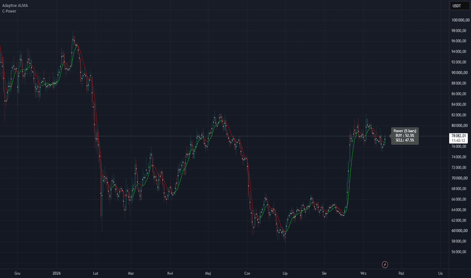
Indicador

Pressure Release Confirmation Engine [PhenLabs]📊 Pressure Release Confirmation Engine
Version: PineScript™ v6
📌 Description
Pressure Release Confirmation Engine waits for trend-pressure to print a real extreme, then it does nothing until that pressure releases back through a hysteresis band on a closed bar. That release is the trade decision: fade a divergent extreme, or (optionally) take an aligned capitulation/extension release.
It is built for the exhaustion / trend-pressure workflow traders are actually using right now — without another locked-in oscillator recipe and without a Premium data gate. Use the built-in Range Position Pressure, or point Source at any plot you already trust (RSI, MACD, WaveTrend, a paid oscillator). Same arm → release → divergence gate either way. Markers print on price from this pane script, alerts fire both directions, and two numeric plots are Pine Screener columns.
🚀 Points of Innovation
Discrete release trigger, not a paint-the-trend oscillator. Nothing fires at the extreme. The signal is the closed-bar hysteresis cross that ends the extreme.
Any-source engine via input.source — run the same gate on built-in pressure or on an oscillator you already have on the chart.
Divergence quality at the trigger, not as a second indicator. DIVERGENT = price refused to confirm the pressure extreme (higher-low / lower-high). ALIGNED = price confirmed it.
One live arm at a time, timeout expiry, no same-bar arm-and-release, no dual-direction fire.
Pane oscillator plus force_overlay price markers from a single script — no second indicator to add.
Full value on every TradingView plan. No footprint, no tick chart, no lower-timeframe request as a requirement.
Pine Screener columns (PRCE Signal, PRCE State) plus four alertconditions.
🔧 Core Components
Range Position Pressure: close located inside the N-bar high/low, EMA-smoothed to 0–100. External mode replaces this with your selected plot (optionally min-max normalized so 80/20 still mean something).
Extreme arm: pressure must be the lookback highest/lowest and through Overbought/Oversold. The engine stores the arm-bar high or low as the price-confirmation reference.
Hysteresis release: bullish cross of Oversold+Hysteresis, bearish cross of Overbought−Hysteresis, evaluated only on barstate.isconfirmed.
Quality gate: while armed, a new price low (bull) or new price high (bear) marks ALIGNED. No new extreme marks DIVERGENT. Default markers show divergent releases only.
Dashboard: source mode, pressure, phase, quality, bars armed, last signal, screener codes.
🔥 Key Features
Built-in and External source modes with progressive disclosure (dependent inputs stay inactive until External is selected).
Readable defaults: divergent triangles only, arm dots off, short dashboard, no extra labels on price.
Timeout so stale arms die instead of lingering into the next swing.
Named alerts for divergent-only and any-release, both directions, plus alert() on the close.
Screener-ready numeric plots hidden from the pane (data window / screener only).
Armed-state background and dashed/dotted level plots so the hysteresis band is visible.
🎨 Visualization
Pressure line (pane): colored by live arm. Green = bull arm, red = bear arm, gray = idle.
Dashed Overbought/Oversold, dotted mid-line and release levels.
Green triangle below the bar = bullish divergent release (force_overlay on price).
Red triangle above the bar = bearish divergent release.
Optional tiny circles = aligned releases (off unless Price Markers = All releases).
Top-right dashboard: Source, Phase, Quality, Bars Armed, Last Signal, Screener codes. Hover any value cell for the definition.
📖 Usage Guidelines
Pressure Source — Default: Built-in Pressure — Built-in uses this chart. External applies the identical gate to another indicator’s plot.
External Plot — Default: close — Active only in External mode. Add your oscillator first, then pick its plot here.
Normalize External to 0–100 — Default: true — Leave on for MACD, delta, unbounded sources. Off if the source is already 0–100 (RSI, Stochastic, %R flipped).
Pressure Length — Default: 14 — Range: 3–100 — Lookback of built-in range-position pressure.
Pressure Smooth — Default: 3 — Range: 1–30 — EMA on the raw pressure series (both modes).
Extreme Lookback — Default: 10 — Range: 3–50 — Highest/lowest test that qualifies an arm.
Overbought / Oversold — Default: 80 / 20 — Arm thresholds.
Hysteresis — Default: 10 — Range: 1–25 — Release band. Bull fires on a close-bar cross of 30 with defaults; bear on a cross of 70.
Arm Timeout — Default: 25 bars — Armed extremes that never release expire with no signal.
Price Markers — Default: Divergent only — Divergent only / All releases / Hide shapes.
Show Arm Markers — Default: false — Tiny pane dots at the arm bar.
Table Size — Default: Small — Tiny / Small / Normal / Large.
✅ Best Use Cases
Intraday and swing fade of exhausted pressure on indices, FX, gold, and crypto — the engine is asset-agnostic.
Traders who already have a favorite oscillator and want a closed-bar trigger instead of reading slope by eye.
Screening a watchlist for PRCE Signal = 2 (divergent bull) or −2 (divergent bear) on the Pine Screener.
Pairing Built-in Pressure with a higher-timeframe chart for swing, then dropping External Source onto an RSI/MACD on the execution timeframe.
⚠️ Limitations
This is a confirmation engine, not a full system. It does not size positions or place stops. Use your own invalidation (arm-bar extreme is the natural reference).
External mode is only as honest as the plot you feed it. If that plot repaints, PRCE will inherit it. Built-in pressure does not.
Hysteresis will miss V-reversals that never cross the release level before timeout. That is intentional.
One live arm. A new opposite extreme cancels the previous arm.
Not financial advice. Past pressure releases do not guarantee future results.
💡 What Makes This Unique
The product is the release gate , not a new oscillator brand. Removing the arm → hysteresis → divergence sequence removes every signal.
Works as a standalone pane tool and as a meta-tool on any other plot, without a Premium data dependency.
Default chart shows only the higher-quality divergent events, so the picture stays readable.
⚙️ Under the Hood
input.source() : the same extreme/release/divergence state machine can run on close-derived Range Position Pressure or on any other script’s plot. That is the core method — not a decorative source picker. Built-in mode is the default so the script is complete on a blank chart.
input.enum + active : External Plot and Normalize stay inactive until Source = External. Progressive disclosure, not a 40-input wall.
force_overlay on plotshape : a pane oscillator that still marks the price candle from one script. Solves the “add two indicators” friction.
plot() linestyle : dashed thresholds and dotted release/mid levels with zero drawing-object budget.
Closed-bar gate : ta.crossover / ta.crossunder and all arm/release mutations sit behind barstate.isconfirmed. Historical and realtime agree. No lookahead.
Data mode / plan note : no plan-gated APIs. Dashboard row Source = BUILT-IN or EXTERNAL is the only mode flag, and both modes are available on every plan.
Screener & alerts : PRCE Signal (2 divergent bull, 1 aligned bull, −1 aligned bear, −2 divergent bear) and PRCE State (1 armed bull, −1 armed bear, 0 idle) are data-window plots. alertcondition exists for divergent and any-release, both directions.
🔬 How It Works
Pressure is computed (or ingested) onto a 0–100 scale and smoothed. Overbought/Oversold are the arm lines; hysteresis sits inside them as the release line.
On a confirmed bar, if pressure is the lookback extreme and through the arm line, the engine stores that bar’s low (bull) or high (bear) and waits. Opposite arms cancel each other.
While armed, any new price low/high versus the arm reference flips quality from DIVERGENT to ALIGNED. If the hysteresis line is not crossed before timeout, the arm expires silent.
A closed-bar crossover of Oversold+Hysteresis (bull) or crossunder of Overbought−Hysteresis (bear) consumes the arm and emits the signal, quality tag, price marker (if enabled), screener value, and alerts.
Read the dashboard: Phase tells you whether to wait or act; Quality tells you whether price confirmed the extreme; Source tells you which series the gate is running on.
💡 Note:
Add the script, leave defaults, and wait for a triangle. Hover the dashboard cells the first time — they are the legend. For External mode, add your oscillator first, switch Pressure Source, pick its plot, and keep Normalize on unless that plot is already 0–100. Alerts: use “PRCE Bull/Bear Divergent Release” unless you explicitly want aligned events. Screener: filter PRCE Signal = 2 or −2.
This is an analytical aid, not financial advice. You are responsible for risk, execution, and whether a release is worth taking in the current market. Indicador

Indicador

GM VWAP Reversal - Candle ConfirmationGM VWAP Reversal - Candle Confirmation
A mean reversion indicator that combines VWAP deviation bands with a candle-close confirmation sequence. It looks for potential reversals following price extensions away from VWAP, using VWAP as the reference for a possible return toward the mean.
HOW SIGNALS WORK
SELL sequence:
1. A candle closes above the upper outer VWAP band, starting the leading move.
2. A later bearish candle becomes C1.
3. A later bearish candle closes below C1's close and becomes C2.
4. A subsequent candle closes below C2's close, confirming SELL if the entry-zone and optional ADX conditions are satisfied.
BUY follows the opposite sequence below the lower outer band, using bullish C1 and C2 candles and a subsequent close above C2's close.
The leading move may span multiple candles. Intervening candles are allowed, and the final confirmation candle does not require a specific body direction. Wick breaks alone do not trigger signals.
VWAP AND ENTRY ZONES
Default outer bands are set at 2 standard deviations from VWAP. At confirmation, SELL must remain at least 1 standard deviation above VWAP, and BUY at least 1 standard deviation below it. This prevents signals from appearing too close to the mean.
Available VWAP anchors:
- Session
- Week
- Month
Session is the default and follows the symbol's daily session boundary. The anchor should be longer than the chart timeframe. The default calculation source is Close; HLC3 is also available.
SIGNAL FILTERS
- All setup and signal decisions use confirmed candle closes.
- One signal is allowed per excursion. A close at or beyond VWAP rearms that side.
- A new VWAP anchor resets pending setups.
- Pending setups can expire or be cancelled when price reaches VWAP or closes beyond the locked setup extreme.
- The optional ADX filter blocks confirmation when ADX is above the selected threshold and rising. It is disabled by default.
- If the first qualifying entry close fails the entry-zone or ADX check, the setup is consumed rather than producing a delayed signal.
DISPLAY AND ALERTS
- Upper and lower VWAP zones
- BUY and SELL markers
- Optional Leading, C1 and C2 markers
- C2 closing-price reference line
- Optional setup invalidation reference
- Optional dashboard
- BUY, SELL and combined alerts
The dashed target line records VWAP at the moment of the signal. The live VWAP continues to update.
USAGE AND LIMITATIONS
The indicator requires a data feed with volume and waits for a configurable number of candles after each VWAP reset. VWAP and its bands update during an open candle; signal decisions wait for the candle to close.
Price can remain outside the bands during strong trends. A signal identifies a confirmed reversal setup under these rules, not a guaranteed return to VWAP.
This is an indicator, not an automated trading or backtesting strategy. Default settings are starting points for testing, not optimized performance claims. Indicador

Liquidity Heatmap & Sweep RadarLiquidity Heatmap & Sweep Radar — see where the stops are, and when they get hunted
Price is drawn to liquidity — the pools of stop orders resting above old highs and below old lows. This tool maps those pools as a colour-graded heatmap and, when price wicks through one and closes back, marks the stop-hunt in real time.
── WHAT IT DRAWS ──
• Liquidity pools — clusters of swing highs (buy-side liquidity, above price) and swing lows (sell-side liquidity, below price). Swings that sit close together merge into one pool — that's exactly how equal highs / equal lows stack stops into a bigger, more attractive target.
• Heatmap intensity — the more times a level has been touched, and the higher the volume when it formed, the hotter and more opaque its band. Faint band = minor pool; solid band = a magnet.
• Sweep Radar — when price wicks past a pool and closes back inside (a stop-hunt), an × marks it and the drained pool is cleared. Pools that price simply closes through are removed as consumed (toggle).
── READING THE DASHBOARD ──
• Buy-side above — the price of the nearest liquidity pool above current price (the next upside target/magnet).
• Sell-side below — the price of the nearest pool below current price.
• Strongest pool — the price of the single strongest pool on the chart, with its strength score in parentheses (touches + a volume bonus).
• Active pools — how many buy-side (▲) and sell-side (▼) pools are currently live.
• Distance up — how far the nearest pool above sits, in percent.
• Distance down — how far the nearest pool below sits, in percent.
── HOW TO USE IT ──
• Targets: in a move, the nearest hot band above/below is the natural draw — a logical objective, or a place price reaches before deciding.
• Sweeps: a sweep (×) marks the moment liquidity was taken — price wicked through a pool and closed back. Treat it as CONTEXT, not a standalone trade trigger: on its own a sweep is not a reliable reversal signal (see the note below). It earns its weight only in confluence with structure — e.g. a sweep that coincides with a Change of Character, or one into a higher-timeframe supply/demand zone.
• Context: stack it under a market-structure tool — the heatmap tells you where the fuel sits and when it gets taken; your structure read tells you whether that leads to a reversal or a continuation.
── ON THE SWEEP SIGNAL (tested honestly) ──
Across the top coins on 1H–1D (out-of-sample), a raw sweep — by itself, with no other filter — showed NO reliable reversal edge: after a sweep, forward returns were a coin-flip with a slight tendency to CONTINUE, not reverse. That held at every horizon tested (1–20 bars) and even for exhaustion sweeps at trend extremes and strong multi-touch pools. So this tool deliberately does not sell the sweep as a reversal signal. Its job is to map where liquidity rests and flag when it is taken — powerful CONTEXT for a discretionary or structure-based method, not an automated buy/sell trigger.
── HONEST DISCLOSURE ──
TradingView does not expose an aggregated exchange-liquidation or order-book feed to scripts, so this is a STRUCTURE + VOLUME proxy for resting liquidity — built from swing clusters and formation volume, not real liquidation data. It shows where stops most plausibly sit, not a live order book. Treated that way, it is a powerful map; treated as literal liquidation data, it is not.
── NON-REPAINTING ──
Sweeps are confirmed on bar close (barstate.isconfirmed) — an × does not appear and then vanish. Pools are anchored to confirmed swing pivots; the bands extend to the right and update their intensity on the live edge.
── SETTINGS ──
Swing length, cluster tolerance (how close swings must be to merge), max pools per side, band thickness, sweep marking, remove-on-close-through, dashboard position/size, and the buy-side / sell-side colours — all adjustable.
Free and open-source (Mozilla Public License 2.0) — the full logic is on the Pine tab.
This tool is for research and education. It is not financial advice and does not guarantee profit. Test on your own markets and manage your own risk.
Indicador

Volume Spike Radar [AxeAlgo]Volume Spike Radar
--
What it does
This indicator flags statistically abnormal volume the moment a bar closes, and instead of just saying volume was big it classifies what kind of event likely happened based on the relationship between that volume and the price range the bar actually produced. It separates four distinct situations. Absorption is heavy volume with a compressed range, often a sign that large resting orders are soaking up buying or selling pressure without letting price travel, and is a classic early reversal tell. Breakout is heavy volume paired with a wide, expanded range, suggesting aggressive orders are actually pushing price through a level rather than just defending it. Climax is extreme volume that caps an already extended run of same direction closes without any fresh range expansion, which is the classic exhaustion or blow off signature seen at the end of a move rather than the start of one. Anything left over is treated as a plain elevated spike with no distinct character.
On top of classification, the indicator flags effort versus result divergence, which happens when an extreme volume bar pushes hard in one direction but still fails to make a new high or low compared to recent price action, suggesting participants on that side got trapped rather than rewarded. A running estimate of cumulative volume delta, built from where each candle closed within its own range, shows whether recent volume has been net accumulating or net distributing over the last several bars. Every volume reading can also be normalized against that specific hour's own historical average, so a session open that is naturally busy every single day stops being repeatedly flagged as unusual just because of the time it happens, and only a bar that is unusual even for its own hour gets the extra marker.
How it works
Volume is measured against its own rolling average using either a straightforward relative volume multiple such as three times the average, or a statistical z score measured in standard deviations, with separate moderate and extreme thresholds for whichever method you choose. Every qualifying bar's total range is compared against its own ATR to decide whether it lands in the absorption, breakout, or climax bucket, and a consecutive same direction run counter is used specifically to detect climax conditions, since a climax by definition needs an extended move behind it rather than an isolated spike. Rapid fire spikes that occur within a small, configurable number of bars of each other are merged into a single growing event badge that shows the bar count and the peak multiple reached during that cluster, instead of stacking a separate tag on every single bar, which keeps fast moving or highly volatile charts readable instead of turning into a wall of overlapping text.
An optional smart candle coloring tints each qualifying bar according to its classification so the character of a move is visible without needing to hover over every tag, and a dashboard summarizes the current volume regime as quiet, normal, elevated, or extreme, the direction of the cumulative delta trend over the last several bars, the time of day adjusted reading, how many spikes have occurred so far in the current session, and the details of the most recent qualifying event.
How to use it
Choose between relative volume and z score depending on whether you prefer an intuitive multiple of average volume or a stricter statistical outlier test that adapts automatically to how noisy a symbol's volume normally is. The badge display mode lets you choose how much detail shows up on the chart itself, from showing every qualifying spike, to only the key institutional style events such as absorption, breakout, climax, and divergence, to only the very largest outliers, to hiding badges completely and relying on candle coloring alone for a cleaner look. Session windows for the major market opens can be highlighted so a spike can be read in the context of whether it happened during a typically active window or outside of it.
The advanced tuning section exposes the exact thresholds behind every classification, including how compressed a range needs to be to count as absorption, how wide it needs to be to count as breakout, and how long a directional run needs to last before a spike there can be called a climax, so the definitions can be tightened or loosened to match how a specific symbol or timeframe normally behaves. This tool describes historical volume behavior that has already happened on a confirmed bar. It is meant to add context to your own analysis of price action, not to function as a standalone buy or sell signal on its own.
Alerts
Alerts are provided for bullish volume spikes, bearish volume spikes, extreme tier outliers regardless of direction, absorption events, breakout volume, climax and exhaustion events, and effort versus result divergence.
Non repainting
Tags, badges, classification, cumulative volume delta, and every alert are evaluated on confirmed bar closes only and never move or change once they have been printed. The background glow and the smart candle coloring are the two live elements on the chart, and both are designed to track the forming bar in real time the same way a standard volume histogram does, settling into their final state the instant the bar actually closes.
Disclaimer
This script is provided for educational and informational purposes only. It visualizes historical volume statistics based on past price and volume data, and it does not predict future price movement in any way. Nothing in this indicator constitutes financial advice or a recommendation to buy or sell any instrument. Always use proper risk management and combine this tool with your own independent analysis before making any trading decision.
Indicador