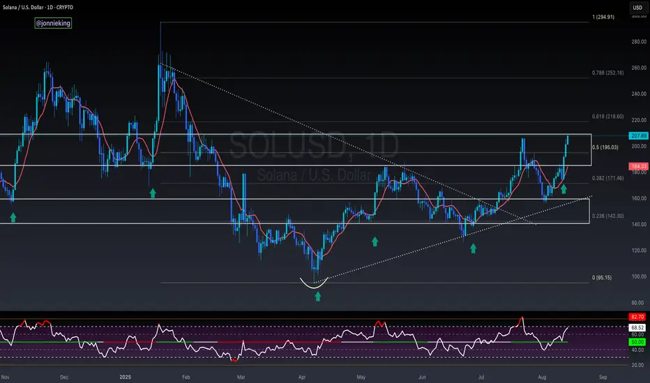
Long
Long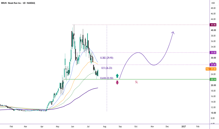
Canadian Dollar Stuck Between Tariffs and OilUSD/CAD traded with a firmer tone on Tuesday as the Canadian Dollar remained under pressure from the latest U.S. tariff escalation. The U.S. imposed a 50% tariff on a range of Canadian goods tied to disputes over cars, alcohol, and dairy, which immediately complicates Canada’s trade outlook. Normally, elevated oil prices would give the Canadian Dollar a cleaner tailwind, but tariff risk and weaker domestic momentum are making that support less powerful.
For the BOC, the rate path remains a hold story. The central bank kept rates at 2.25% last week and continues to balance elevated inflation against soft growth and trade uncertainty. Canadian inflation already surprised to the downside this week and is expected to ease if oil and gasoline pressures fade, but that forecast now sits against a more complicated trade backdrop. The Canadian Dollar is stuck between two forces: oil supporting Canada’s terms of trade and tariff risk undermining confidence in the growth outlook.
In the above chart, USD/CAD has found follow through in recent weeks after finally breaking out of a multiyear triangle that originated in 2023. In June it was noted that “the first hurdle to validate the bullish breakout is the band of resistance formed by the highs in January, March, and April of this year around 1.3929/66. Through these levels, USD/CAD may have offered the strongest confirmation yet that the near three-year triangle has ceded way to a new bullish trading regime.” Along these lines, USD/CAD’s recent turn higher through its 50-day EMA (exponential moving average) ahead of 1.3929/66 suggests that a series of higher highs and higher lows is emerging. The low carved out by the bullish engulfing bar on July 20 just above 1.4000 may be respected as a turning point in the near-term. That said, a resolution of the fundamental disputes, particularly on tariffs, could override this technical turning point and shift the near-term focus back to the downside. M&M Bullish Engulfing Candlestick PatternMahindra & Mahindra Swing Setup: Bullish Reversal Pattern Challenges Negative Production Narrative
________________________________________
Mahindra & Mahindra Ltd. (NSE: M&M)
Technical Research Report | Daily Timeframe
Current Price: ₹3,001.00 (+1.64%)
Volume: 3.18 Million Shares
Pattern: Bullish Engulfing
Pattern Reliability: 79.0%
Trend Status: Weakening Downtrend
Setup Classification: Multi-Day Swing Setup
________________________________________
1. Fundamental Disconnect vs. Structural Shift
Mahindra & Mahindra currently presents an interesting divergence between short-term fundamental sentiment and emerging technical behaviour.
Recent reports indicating a 15% decline in June SUV production due to supply-chain labour shortages have naturally introduced near-term concerns regarding operational efficiency and production throughput. From a fundamental perspective, such developments often create uncertainty regarding delivery schedules, inventory planning, and near-term earnings expectations.
However, markets frequently discount information before it becomes visible in reported numbers. As a result, the more important question becomes whether market participants are using the news as a reason to distribute holdings or as an opportunity to accumulate positions at attractive structural levels.
The current chart suggests the latter possibility.
Despite the negative news flow, M&M generated a Bullish Engulfing pattern with a reliability score of 79.0%, while simultaneously attracting 3.18 million shares of volume, reflecting above-average participation and visible buying dominance.
From an institutional market structure perspective, this behaviour is noteworthy because the reversal signal is occurring near the lower boundary of a multi-month trading range.
The market is effectively communicating three important observations:
Negative news has not produced a structural breakdown.
Buyers continue to defend the lower range region.
Price is attempting stabilization despite weakening sentiment.
This creates what technicians often refer to as a fundamental disconnect, where headline news remains negative while price behaviour begins showing signs of stabilization.
The significance of the Bullish Engulfing pattern increases because it appears within a Lower Range Consolidation environment, where downside momentum is already showing signs of exhaustion.
While the broader trend remains technically weak, the current setup suggests that institutional participants may be selectively accumulating exposure while market sentiment remains cautious.
________________________________________
2. Multi-Day Swing Architecture
The current swing framework revolves around the Reference Entry Zone at ₹3,128.15.
This level represents the primary technical decision area for the ongoing recovery attempt.
At present, the stock remains below the reference zone, indicating that the reversal signal has emerged but has not yet transitioned into full confirmation. The objective for bulls is not merely to sustain the Bullish Engulfing pattern but to establish acceptance above the reference area.
Reference Entry Zone
₹3,128.15
A sustained move toward and above this level would signal improving market acceptance and strengthen the probability that the current recovery extends beyond a short-term reaction.
________________________________________
First Objective
Resistance 1 (R1): ₹3,041.93
This represents the nearest supply zone and the first technical hurdle within the recovery process.
________________________________________
Secondary Objective
Resistance 2 (R2): ₹3,082.97
A move through this region would indicate increasing buyer commitment and continued structural repair.
________________________________________
Primary Swing Objective
Resistance 3 (R3): ₹3,153.73
This level carries elevated significance because it sits slightly above the reference framework and would demonstrate that the market is successfully overcoming recent supply pressure.
________________________________________
Macro Structural Objective
Higher Range: ₹3,399.00
The broader technical ceiling remains located near ₹3,399.00.
A successful progression toward this zone would represent a substantial improvement in structure and would effectively signal a transition from recovery into trend restoration.
From a technical perspective, the journey from the current lower-range environment toward ₹3,399 would require multiple layers of confirmation, including improving momentum indicators and sustained participation.
________________________________________
3. Risk Mitigation & Support Grids
Although the Bullish Engulfing pattern provides a constructive signal, risk management remains essential because several momentum indicators continue to show caution.
Current indicator conditions include:
RSI: 43.92 (below neutral equilibrium)
MACD: -46.98 (bearish momentum remains present)
Bollinger Bands: Compression phase (BB Squeeze)
Trend Structure: Weakening Downtrend
Market State: Lower Range Consolidation
These conditions suggest that the market is attempting stabilization but has not yet completed a full trend reversal.
________________________________________
Support Infrastructure
Support 1
₹2,930.13
The nearest support level and the first area expected to attract buyers during any pullback.
Support 2
₹2,859.37
A more significant support zone that would become relevant if the recovery loses momentum.
Support 3
₹2,818.33
The final major structural support visible within the current framework.
Lower Range
₹2,900.40
This level represents the broader accumulation zone currently supporting price.
________________________________________
Technical Invalidation
Stop Loss
₹2,919.25
This level serves as the primary technical invalidation point for the current swing setup.
A decisive breakdown below this level would indicate that the lower-range accumulation thesis is failing and that sellers have regained control of the market structure.
________________________________________
Position Sizing & Risk Profile
The current setup carries a defined risk of:
₹115.10 per share
This is a relatively wide risk parameter and therefore requires disciplined capital allocation.
Professional traders typically adjust position size according to predefined risk exposure rather than increasing exposure based solely on conviction. The wider the stop distance, the smaller the position size required to maintain consistent portfolio risk.
The presence of a Bollinger Band Squeeze adds another layer of importance to risk management.
Compression environments often precede volatility expansion. While the eventual expansion may occur in favour of the reversal pattern, technicians must acknowledge that compressed markets can produce sharp directional moves in either direction.
As a result, maintaining strict adherence to predefined invalidation levels remains critical.
________________________________________
Technical Conclusion
Mahindra & Mahindra currently represents a compelling example of technical behaviour diverging from short-term fundamental sentiment.
While recent production disruptions and labour-related supply constraints have introduced negative headlines, price action has thus far resisted a broader breakdown. Instead, the stock has formed a Bullish Engulfing pattern with 79.0% reliability, supported by 3.18 million shares of volume and visible buying dominance.
The market remains within a weakening downtrend and several momentum indicators continue to require improvement. However, the combination of lower-range stabilization, expanding participation, and Bollinger Band compression suggests that the stock may be entering an important structural inflection phase.
The immediate focus remains on the progression toward the ₹3,128.15 reference zone, while the broader technical framework continues to monitor the pathway through ₹3,041.93, ₹3,082.97, and ₹3,153.73, ultimately extending toward the higher-range ceiling at ₹3,399.00.
Until additional confirmation emerges, the setup should be viewed as a developing recovery attempt supported by improving participation rather than a fully established trend reversal.
________________________________________
Educational Disclaimer
This analysis is provided solely for educational and informational purposes and reflects a technical interpretation of price action, market structure, volume behaviour, and publicly known developments. It does not constitute investment advice, a recommendation, or a solicitation to buy or sell any financial instrument. Market conditions can change rapidly, and technical patterns do not guarantee future outcomes. Investors and traders should conduct their own independent research and consult a SEBI-registered investment advisor before making any investment or trading decisions.
 Long
Long
RELIANCE – Technical & Educational Snapshot📊 RELIANCE – Technical & Educational Snapshot
Ticker: NSE: RELIANCE
Sector: ⛽ Energy / Conglomerate
CMP: 1,359.70 ▲ (+2.80% | 20 May 2026)
Learning Rating: ⭐⭐⭐⭐☆ (Recovery Attempt Inside Broader Range Structure)
Chart Pattern Observed: 📊 Corrective Pullback → Stabilisation → Recovery Bounce
Candlestick Pattern Observed: Bullish Engulfing
📊 Technical Snapshot
RELIANCE is showing an early-stage recovery attempt after facing sustained corrective pressure near higher supply zones. Recent price action reflects stabilisation near lower demand regions, with the latest bullish engulfing candle indicating renewed buying interest after a period of weakness. RSI is currently placed near 46.6, suggesting that momentum is recovering from weaker territory rather than entering overheated conditions, leaving room for continuation if follow-through buying emerges. MACD remains slightly negative but is showing signs of stabilisation, indicating that bearish pressure may be slowing after the recent decline. Bollinger Bands are beginning to contract after elevated volatility, reflecting possible range formation before the next directional move. Price is now attempting to reclaim nearby resistance levels, and sustained acceptance above these zones may support broader recovery continuation.
📊 Volume Analysis
🔹 Current Volume: ~13.25M
🔹 Average Volume (20-period): ~19.69M ⚠️
📉 Volume remains below average despite the bullish recovery candle.
💡 Interpretation: Recovery moves supported by lower participation often indicate cautious buying activity rather than aggressive institutional accumulation. Stronger participation near resistance zones would improve continuation confirmation.
🔑 Key Levels – Daily Timeframe
Support Areas: 1327 | 1294 | 1276
Resistance Areas: 1377 | 1395 | 1427
These are zones where price has paused or reacted earlier.
📉 Pullback Zones (Chart-Based Observation)
Healthy Pullback Zone 1: 1345 – 1337
Healthy Pullback Zone 2: 1327 – 1294
Deep Pullback Support Zone: 1276 Area
💡 Pullbacks holding above recovery zones may support continuation momentum, while deeper retracement below support can weaken the recovery structure temporarily.
What’s Catching Our Eye: Bullish engulfing candle emerging near lower support zones.
What to Watch For: Sustained acceptance above the 1377 resistance zone.
Failure Zone: Sustained weakness below 1327 weakens recovery structure.
Risks to Watch: Weak participation and rejection near overhead supply zones.
What to Expect Next: Recovery continuation with range-bound behaviour possible.
Bullish Case: Strength above resistance may support fresh upside expansion.
Bearish Case: Failure near resistance may trigger renewed consolidation pressure.
Momentum Case: Momentum recovering gradually but requires stronger confirmation.
STWP Equity Snapshot – RELIANCE
Reference Setup:
Reference: 1,362.9
Invalidation Level: 1,310.9
Upside Reference 1: 1,414.8
Upside Reference 2: 1,466.7
STWP View:
• Sentiment: Recovery Neutral | Trend: Broad Range Structure
• RSI: 46.62 (Neutral Recovery Zone)
• Volume: Below Average Participation
• Structure: Bullish Recovery Attempt
Final Outlook
Momentum: Moderate
Trend: Range to Recovery
Risk: Moderate
Volume: Low to Moderate
Learning Note: Recovery structures become stronger when bullish reversal candles are supported by improving participation near resistance zones.
Disclaimer:
This analysis is generated strictly for educational and analytical purposes only.
This does NOT constitute investment advice, trading advice, or a recommendation to buy or sell any security or derivative instrument.
Options trading involves substantial risk and may not be suitable for all participants.
Readers are advised to exercise independent judgment and consult a SEBI-registered financial advisor before taking any trading or investment decisions.
STWP assumes no responsibility for any financial loss arising from the use of this analysis.
💬 Recovery continuation or temporary bounce — what does the structure suggest to you?
🔼 Boost | ✍️ Comment | 🔁 Share with a learner
👉 Follow STWP for clean chart-reading insights
🚀 Stay Calm. Stay Clean. Trade With Patience.  Long
Long
ABB – Technical & Educational Snapshot📊 ABB – Technical & Educational Snapshot
Ticker: NSE: ABB
Sector: ⚙️ Industrial Automation / Engineering
CMP: 6,605.00 ▲ (+4.36% | 20 May 2026)
Learning Rating: ⭐⭐⭐⭐☆ (Recovery Momentum Near Resistance Zone)
Chart Pattern Observed: 📊 Pullback → Stabilisation → Recovery Attempt
Candlestick Pattern Observed: Bullish Engulfing
📊 Technical Snapshot
ABB is showing a recovery attempt after witnessing corrective pressure from higher supply zones, with recent price action indicating renewed buying interest near important support levels. The latest bullish engulfing candle reflects strong short-term recovery momentum as buyers attempt to reclaim lost ground near resistance clusters. RSI is currently placed near 46.8, indicating that momentum is recovering from neutral territory rather than entering overheated conditions, leaving room for continuation if supported by follow-through buying activity. MACD remains weak but is gradually stabilising, suggesting that bearish pressure may be slowing after the recent decline. Bollinger Bands are beginning to contract after elevated volatility, reflecting possible consolidation before the next directional move. Price is now approaching an important resistance zone near prior reaction highs, and sustained acceptance above these levels may strengthen the recovery structure further.
📊 Volume Analysis
🔹 Current Volume: ~546K
🔹 Average Volume (20-period): ~554K ⚠️
📉 Volume remains near average despite the recovery candle.
💡 Interpretation: Recovery moves supported by average participation may indicate cautious buying activity rather than aggressive institutional accumulation. Stronger participation near resistance zones would improve confirmation strength.
🔑 Key Levels – Daily Timeframe
Support Areas: 6368 | 6131 | 6003
Resistance Areas: 6732 | 6860 | 7097
These are zones where price has paused or reacted earlier.
📉 Pullback Zones (Chart-Based Observation)
Healthy Pullback Zone 1: 6496 – 6441
Healthy Pullback Zone 2: 6368 – 6212
Deep Pullback Support Zone: 6003 Area
💡 Pullbacks holding above recovery zones may support continuation momentum, while deeper retracement below support can weaken the recovery structure temporarily.
What’s Catching Our Eye: Strong bullish engulfing candle after corrective pressure.
What to Watch For: Sustained acceptance above the 6732 resistance zone.
Failure Zone: Sustained weakness below 6368 weakens recovery structure.
Risks to Watch: Weak participation and rejection near overhead supply zones.
What to Expect Next: Recovery continuation with range-based movement possible.
Bullish Case: Strength above resistance may support fresh upside expansion.
Bearish Case: Failure near resistance may trigger renewed consolidation pressure.
Momentum Case: Momentum recovering but requires stronger participation confirmation.
STWP Equity Snapshot – ABB
Reference Setup:
Reference: 6,624
Invalidation Level: 6,212
Upside Reference 1: 7,035
Upside Reference 2: 7,446
STWP View:
• Sentiment: Recovery Positive | Trend: Uptrend Weakening
• RSI: 46.8 (Neutral Recovery Zone)
• Volume: Average Participation
• Structure: Bullish Recovery Attempt
Final Outlook
Momentum: Moderate
Trend: Developing Recovery
Risk: Moderate to High
Volume: Average
Learning Note: Recovery structures become stronger when bullish reversals are supported by improving participation near resistance zones.
Disclaimer:
This analysis is generated strictly for educational and analytical purposes only.
This does NOT constitute investment advice, trading advice, or a recommendation to buy or sell any security or derivative instrument.
Options trading involves substantial risk and may not be suitable for all participants.
Readers are advised to exercise independent judgment and consult a SEBI-registered financial advisor before taking any trading or investment decisions.
STWP assumes no responsibility for any financial loss arising from the use of this analysis.
💬 Recovery continuation or temporary bounce — what does the structure suggest to you?
🔼 Boost | ✍️ Comment | 🔁 Share with a learner
👉 Follow STWP for clean chart-reading insights
🚀 Stay Calm. Stay Clean. Trade With Patience.  Long
Long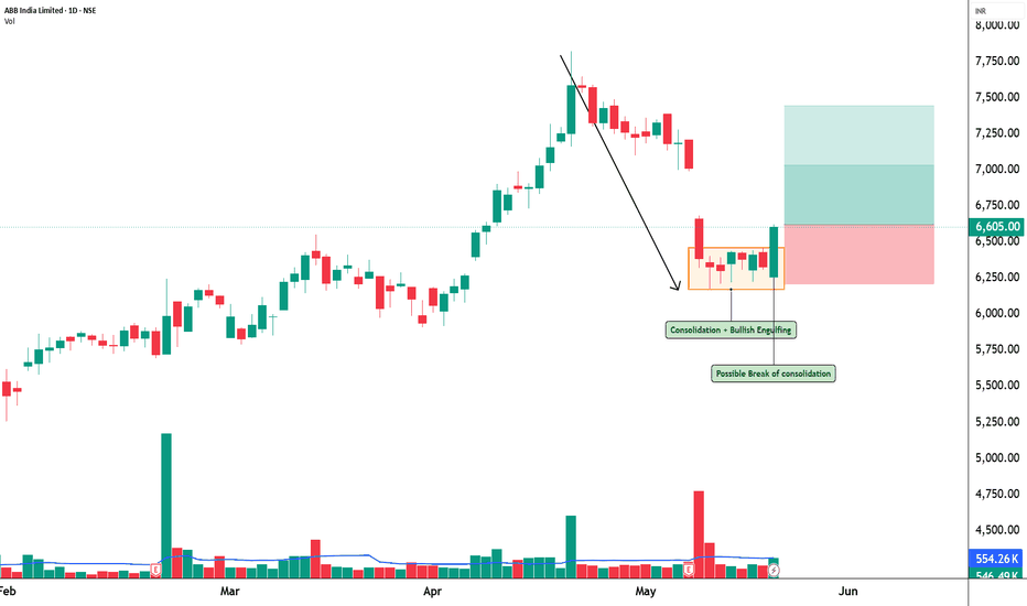
KRN – Momentum Expansion Near Resistance with Bullish Engulfing📊 KRN Heat Exchanger Ltd – STWP Equity Snapshot
Ticker: NSE: KRN
Sector: Industrial / Engineering
CMP: 1,284 ▲ (+6.82%)
Learning Rating: ⭐⭐⭐⭐☆ (Momentum Expansion Near Resistance)
Chart Pattern Observed: Strong Impulse Move → Short-Term Consolidation
Candlestick Context: Bullish Engulfing with Follow-through Strength
🔑 Key Levels – Daily Timeframe
Support Areas: 1,217 | 1,151 | 1,112
Resistance Areas: 1,322 | 1,361 | 1,427
These are zones where price has paused or reacted earlier.
📊 Volume Analysis
Above-average volume during the impulsive move signals active participation, but slight cooling near resistance suggests temporary exhaustion.
📍 Price Reference Framework
Intraday:
Reference: 1,295
Invalidation: 1,180
Upside Zones: 1,409 → 1,524
Swing:
Reference: 1,295
Invalidation: 1,107
Upside Zones: 1,670 → 1,951
🔄 Pullback / Opportunity Zones
1,220 – 1,200 → Immediate demand zone
1,150 – 1,120 → Strong structural support
Below 1,110 → Trend weakens
🎯 STWP View
Momentum remains positive with a strong bullish candle structure, but price is facing resistance overhead. A controlled pullback or consolidation here would strengthen continuation potential.
📌 Final Outlook
Momentum: Moderate | Trend: Up | Risk: High | Volume: Moderate
💡 Learning Note
Strong bullish engulfing near resistance often leads to either breakout or short consolidation — patience helps avoid chasing extended moves.
⚠️ Disclaimer
This analysis is generated strictly for educational and analytical purposes only.
This does NOT constitute investment advice, trading advice, or a recommendation to buy or sell any security or derivative instrument. Readers are advised to exercise independent judgment and consult a SEBI-registered financial advisor before taking any trading or investment decisions. STWP assumes no responsibility for any financial loss arising from the use of this analysis.  Long
Long
BALKRISIND – STWP Equity Snapshot📊 BALKRISIND – STWP Equity Snapshot
Ticker: NSE: BALKRISIND
Sector: Specialty Tyres / Industrial Manufacturing
CMP: 2,280.20 ▲ (+4.81%)
Learning Rating: ⭐⭐⭐☆☆ (Reaction From Weak Structure)
Chart Pattern Observed: Reaction Candle After Sustained Downtrend
Candlestick Context: Bullish Engulfing Near Short-Term Support
Balkrishna Industries has recently witnessed a sustained corrective phase after earlier attempts to hold higher levels. The broader structure still reflects a sequence of lower highs, indicating that sellers have maintained control through most of the recent sessions. However, the latest price action shows the emergence of a strong bullish engulfing candle near the lower boundary of the current structure, suggesting that buyers have begun reacting at relatively depressed levels.
From a momentum perspective, RSI is positioned around 39.7. This indicates that the stock is approaching the lower band of momentum equilibrium. While this does not automatically signal a reversal, it does indicate that downside momentum may be moderating and the market could enter a phase of stabilization or temporary recovery.
The recent bullish candle has also appeared alongside elevated participation, with relative volume close to 1.88 times the normal activity band. This suggests that the reaction is supported by participation rather than purely mechanical price movement. Even so, the broader trend has not yet shifted to bullish conditions. Price still trades below multiple supply layers that were formed during the earlier decline.
From a structural perspective, immediate resistance is positioned around the 2,342 zone, followed by broader supply areas near 2,403 and 2,498. These levels represent prior reaction points where sellers previously regained control. Sustained acceptance above these levels would be required before the market can transition from corrective behaviour to constructive recovery.
Volume Analysis
Current participation reflects higher-than-normal trading activity, with relative volume near 1.88 times the average band. This suggests active engagement from market participants during the reaction move. However, continuation strength will depend on whether this participation expands further near resistance zones. Without additional expansion, the current move may transition into a consolidation phase rather than a sustained directional trend.
Key Levels – Daily Timeframe
Primary support areas are located near 2,185, followed by deeper structural levels near 2,090 and 2,028. These zones have previously attracted buying interest and may continue to influence price behaviour if tested again.
On the upside, resistance zones are positioned around 2,342, followed by 2,403 and the broader supply cluster near 2,498. These levels remain important barriers for any recovery attempt.
Structure Read – What Matters Now
The most important observation is the emergence of a bullish engulfing candle after a prolonged decline. This indicates the possibility of a relief rally or stabilization phase, but not yet a confirmed trend reversal. The broader structure still reflects downward pressure through lower highs.
If price manages to sustain above the 2,342–2,403 resistance band, the probability of structural recovery increases. On the other hand, failure to hold above the 2,185 support zone could lead to renewed downside exploration toward deeper support levels.
Price Reference Framework – Educational View
From an intraday perspective, the observation zone lies around 2,308, with risk invalidation below 2,147. Upside reaction zones are positioned near 2,470 and 2,631, where price may slow or react due to supply activity.
From a swing perspective over the next two to five sessions, the observation zone remains near 2,308, while structural invalidation lies below 1,944. If recovery momentum strengthens, higher reference zones extend toward 3,037 and 3,583, though these levels become relevant only if price successfully reclaims the intermediate resistance band.
STWP View
Momentum is currently moderate while the broader trend structure remains neutral to weak. Risk remains elevated due to the prior downtrend context, although the recent reaction candle indicates early stabilization. Volume participation is relatively high, suggesting that market participants are beginning to engage again. The session registered a gain of approximately 4.81 percent.
Final Outlook
Momentum: Moderate
Trend: Range
Risk: High
Volume: High
📘 Learning Note
Strong reaction candles can often trigger short-term recoveries after prolonged declines. However, disciplined traders focus not on the candle itself but on whether price can sustain above nearby supply zones. Structure and acceptance ultimately determine whether a bounce becomes a trend.
⚠️ Disclaimer
This post is intended solely for educational and informational purposes. It does not constitute investment advice, a recommendation, or a solicitation to buy or sell any security. Market investments are subject to risk. Please consult a SEBI-registered financial advisor before making any investment decisions. STWP is not responsible for actions taken based on this analysis.
💬 Did this help you read the chart better?
🔼 Boost | ✍️ Comment | 🔁 Share with a learner
👉 Follow STWP for clean chart-reading insights
Stay Calm. Stay Clean. Trade With Patience.  Long
Long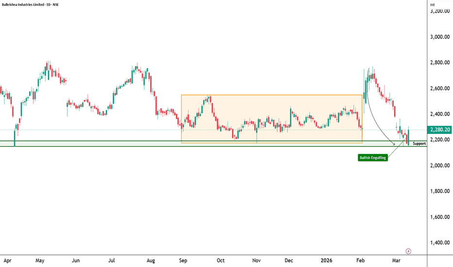
SRF – STWP Equity Snapshot📊 SRF – STWP Equity Snapshot
Ticker: NSE: SRF
Sector: Specialty Chemicals / Industrial Materials
CMP: 2,626.30 ▲ (+5.53% | 12 Mar 2026)
Learning Rating: ⭐⭐⭐⭐⭐ (High-Conviction Recovery Attempt)
Chart Pattern Observed: Bullish Engulfing After Downtrend
Candlestick Context: Strong Bullish Expansion Candle with Exceptional Participation
SRF has been trading under corrective pressure for several weeks, forming a sequence of lower highs and lower lows that defined the broader downtrend structure. The latest price action, however, indicates a strong reversal attempt supported by a bullish engulfing formation emerging after the decline. Such formations often signal a shift in short-term market control as buyers step in aggressively after extended weakness.
RSI is currently positioned near 46.02, reflecting recovery from weaker momentum zones but still below strong bullish territory. This suggests that the market is transitioning from corrective conditions toward stabilisation rather than entering an overextended rally. MACD is beginning to stabilise after a prolonged negative phase, indicating that downside momentum may be fading while buyers attempt to rebuild directional strength.
From a structural perspective, price is now approaching a resistance band between 2,693 and 2,760, which represents the nearest supply cluster created during the earlier decline. Acceptance above this band would strengthen the probability of a broader recovery phase. Until that acceptance occurs, the current move should be interpreted as a recovery rally within a developing structure rather than a confirmed trend reversal.
Volume Analysis
Current volume is significantly elevated with relative volume around 3.28 times the recent average. The bullish expansion candle is supported by exceptional participation, suggesting that institutional activity may be present in the move. Such high participation strengthens the credibility of the reversal attempt, although continuation strength will depend on whether this volume expansion sustains near resistance levels.
Key Levels – Daily Timeframe
Primary support areas are positioned near 2,503, followed by 2,379 and 2,312. On the upside, resistance zones are located around 2,693, 2,760 and 2,883. These levels represent prior reaction points where price has historically paused or reversed and therefore serve as structural decision zones.
Structure Read – What Matters Now
The most notable development is the strong bullish engulfing candle emerging after a prolonged corrective phase. The immediate focus now shifts to whether price can achieve sustained acceptance above the 2,693–2,760 resistance cluster. Sustained trade below 2,168 would weaken the broader recovery structure and increase the probability of renewed downward pressure. The key risk lies in resistance rejection after the sharp expansion. The most probable near-term outcome is either controlled consolidation below resistance or continuation if participation remains strong.
Price Reference Framework – Educational View
From an intraday observation perspective, the key reference zone lies around 2,636, with risk invalidation below 2,441. Upside reference zones are positioned near 2,831 and 3,026. These levels are intended purely for studying short-term price behaviour and participation dynamics.
From a swing perspective over the next two to five sessions, the observation zone remains around 2,636, with structural invalidation below 2,168. Upside reference zones extend toward 3,572 and 4,274, becoming relevant only if price sustains above reclaimed resistance areas.
STWP View
Momentum is strengthening while the broader structure transitions from a downtrend into a potential recovery phase. Risk remains elevated due to proximity to resistance and the need for structural confirmation. Volume is high and strongly supportive of the move. Sentiment is bullish with RSI improving and the session recording a 5.53 percent advance.
Final Outlook
Momentum: Strong
Trend: Up
Risk: High
Volume: High
📘 Learning Note
A bullish engulfing candle after a decline signals the beginning of a structural test. Confirmation occurs only when price sustains above resistance zones where earlier selling emerged.
⚠️ Disclaimer
This analysis is generated strictly for educational and analytical purposes only. All option structures, metrics, scores, interpretations, PCR, Max Pain levels, and volatility commentary are model-based observations derived from uploaded data. This does not constitute investment advice, trading advice, or a recommendation to buy or sell any security or derivative instrument. Options trading involves substantial risk and may not be suitable for all participants. Readers are advised to exercise independent judgment and consult a SEBI-registered financial advisor before making any trading or investment decisions. STWP assumes no responsibility for any financial loss arising from the use of this analysis.
STWP Option Chain Analysis – SRF
Here is a quick options-based observation for SRF.
From the current options activity, an important support area appears near 2580, while resistance is visible around 2700. Liquidity concentration is strongest near 2620, which often becomes a zone where price spends time as traders adjust positions.
Call-side positioning is gradually building near the 2700 strike, suggesting that this level may act as a near-term ceiling unless stronger momentum emerges. On the put side, liquidity is visible around 2580, indicating that this level may provide defensive support.
Based on the current option structure, the visible positioning band appears to be between 2580 and 2700, creating an approximate range width of about 120 points. Using this structure as a reference, the estimated intraday movement expectation is roughly around ±48 points from the ATM level.
This places the approximate upper activity zone near 2668, while the lower activity zone appears near 2572. Current gamma positioning suggests range-bound behaviour as dealer hedging activity may keep price rotating around key strikes.
Options pressure currently shows call pressure near 45 percent and put pressure near 55 percent, indicating relatively stronger put-side positioning and supportive market structure.
Build-Up Signal: Long Build-up
Key Liquidity Strikes:
Best CE Liquidity Strike: 2640
Best PE Liquidity Strike: 2620
Liquidity Vacuum Zones: 2600, where price may move faster through the level.
Current positioning does not show a strong dealer trap structure.
If price manages to move above 2800, it may indicate strengthening bullish momentum. On the other hand, if price moves below 2480, downside pressure may begin to increase.
Overall, the present options structure suggests that price may continue rotating between 2580 and 2700, with 2620 acting as a short-term liquidity magnet while market participants adjust positions.
Important Note
This information is shared strictly for educational and analytical purposes based on publicly available options chain data. It is not investment advice, not a trading recommendation, and not a buy or sell signal. Please consult a SEBI-registered financial advisor before making any trading or investment decisions.
– STWP  Long
Long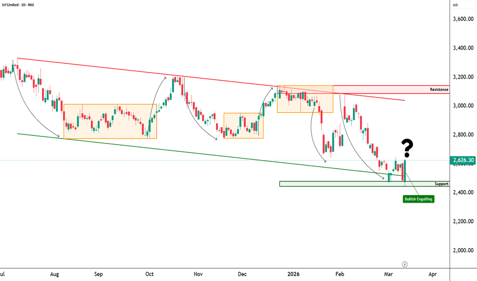
Bullish Engulfing Pattern — The Psychology of ReversalBullish Engulfing Pattern
Hello everyone! Today, we're diving into one of the most powerful reversal patterns in technical analysis — the Bullish Engulfing pattern. It's not just a combination of two candles; it reflects the psychological state of the market and the moment when the balance of power shifts from sellers to buyers.
➡️ What Does It Look Like?
This is a two-candlestick pattern:
First Candle — Bearish (Red/Black): Reflects the temporary dominance of sellers, continuing the downward move.
Second Candle — Bullish (Green/White): Its body completely engulfs the body of the previous red candle.
Important: It's the body that gets engulfed. The shadows (wicks) can extend beyond the body. The larger the second candle's body relative to the first, the stronger the signal.
➡️ Where Does It Appear?
The pattern forms at the end of a downtrend or at a significant support level. It's an early warning that a trend reversal might be coming.
➡️ Market Psychology: What's Happening Inside?
The market is moving down. The first (red) candle closes lower than it opened — sellers seem in control, bears are confident.
Then, on the next candle, something unexpected happens. Price opens even lower than the previous close (perhaps with a gap). It looks like the bears are about to crush the market again. But instead, price sharply reverses upwards and closes above the first candle's open.
This tells us:
The bears exhausted their momentum and couldn't hold prices at the lows.
Bulls aggressively stepped in and completely seized control, buying up all the sellers' positions.
➡️ Key Rules for Identification:
Trend: A clear downtrend must precede the pattern. The signal is weaker in a sideways market.
Colors: First candle is bearish; second is bullish.
Engulfing: The body of the second candle must completely cover the body of the first.
Size: The second candle is noticeably larger than the first. The bigger the contrast, the stronger the signal.
Shadows: They are allowed, but shorter shadows indicate more decisive engulfing.
⚠️ CRITICAL: Context and Confirmation are Key
The Bullish Engulfing pattern is NOT a standalone buy signal. It requires additional confirmation on the chart. This filter protects you from false entries.
The pattern gains maximum strength when it appears:
✅ At a Support Level: This is mandatory. The pattern should form at a significant support level (historical level, demand zone, mirror level).
✅ Near an Order Block (OB): The signal is especially strong if the bullish engulfing candle originates from a zone of institutional interest.
✅ With a Fair Value Gap (FVG): An unfilled FVG near the pattern increases the probability of a reversal.
✅ With a Structure Break: It's even better if the pattern simultaneously breaks a trendline or a significant level.
✅ With Volume: Higher-than-average volume on the second candle confirms buyer aggression.
✅ On Higher Timeframes: The higher the timeframe, the stronger the reversal signal. On daily (D1) or weekly (W1) charts, it's a major alert. On a 5-minute chart, it's just short-term noise.
❌ If a Bullish Engulfing pattern appears in the middle of random, chaotic movement with no connection to key levels — its value is minimal. Do not trade it.
➡️ Trading Plan: How to Use It
Do NOT enter immediately when the second candle closes. Always wait for confirmation.
Entry Point:
On a retest of the level broken by the bullish candle (its close or high level now acting as support).
Or after price firmly closes above a nearby resistance level.
Stop-Loss: Place it below the low of the second candle (or below its lower wick).
Take Profit (Target): The nearest resistance level above, or a target based on your risk/reward ratio (aim for at least 1:2).
➡️ Key Takeaways:
Essence: A bullish reversal signal showing a shift in market balance.
Main Condition: Second candle's body fully engulfs the first's body + mandatory location at a support level.
Golden Rule: Higher timeframe = stronger signal.
Discipline: This pattern requires confirmation. It doesn't work in a vacuum.  Education
SOLARINDS – STWP Equity Snapshot📊 SOLARINDS – STWP Equity Snapshot
Ticker: NSE: SOLARINDS
Sector: Industrial Explosives / Defence Manufacturing
CMP: 13,989.00 ▲ (+3.59% | 03 Mar 2026)
Learning Rating: ⭐⭐⭐⭐☆ (Range Compression Near Upper Band)
Chart Pattern Observed: Bullish Engulfing Within Broad Consolidation
Candlestick Context: Strong Bullish Expansion Candle with Rising Participation
SOLARINDS continues to trade within a broad consolidation structure after reacting from the strong demand zone near 11,600–11,800. The recent price action shows a bullish engulfing candle forming near the upper half of the range, indicating renewed buying interest as price attempts to push toward the swing high zone near 14,900–15,000. While the broader trend remains constructive, the structure is still range-based until a decisive breakout above prior swing highs is achieved.
RSI is positioned near 61.8, reflecting strengthening momentum without entering extreme overbought conditions. This suggests healthy bullish participation rather than euphoric extension. MACD remains positively aligned, supporting continuation bias in the short term. From a CPR perspective, price is holding within a bullish zone with projected levels shifting upward, indicating developing structure rather than breakdown risk. However, the immediate supply cluster between 14,351 and 14,713 remains critical. Acceptance above this band would increase the probability of a structural breakout, while rejection may result in continued consolidation inside the broader range.
Volume Analysis
Current volume is running above recent average participation, supporting the bullish expansion candle. The move is backed by credible activity rather than passive drift. Continuation strength will depend on whether volume expands further as price approaches the upper resistance cluster. Sustained participation near resistance improves breakout probability; contraction may lead to another pullback within range.
Key Levels – Daily Timeframe
Primary support areas are positioned near 13,363, followed by 12,737 and 12,375. On the upside, resistance zones are located around 14,351, 14,713, and 15,339. These levels represent prior reaction zones and define the structural boundaries of the current consolidation.
Structure Read – What Matters Now
The key observation is the bullish engulfing formation emerging within a tightening range structure. The focus now shifts to whether price can achieve sustained acceptance above the 14,351–14,713 resistance cluster. Failure to hold above 13,363 would weaken the immediate bullish structure and increase the probability of range continuation. The primary risk lies in resistance rejection near prior swing highs. The most probable near-term path is a breakout attempt toward the swing high zone, followed by either expansion on volume or controlled consolidation.
Price Reference Framework – Educational View
From an intraday perspective, the observation zone lies around 13,990, with risk invalidation below 13,594. Upside reference zones are positioned near 14,351 and 14,713. These levels are intended solely for studying short-term price behaviour and participation.
From a swing perspective over the next two to five sessions, the observation zone remains around 13,990, with structural invalidation below 12,737. Upside reference zones extend toward 15,339 and higher structure-dependent projections, becoming relevant only if price sustains above reclaimed resistance.
STWP View
Momentum is strong within a developing structure, while the broader trend remains classified as range movement transitioning toward potential breakout. Risk remains elevated due to proximity to upper resistance. Volume is supportive and constructive. Sentiment is bullish, with RSI strengthening and price advancing 3.59 percent in the session.
Final Outlook
Momentum: Strong
Trend: Range to Breakout Attempt
Risk: High
Volume: Moderate to High
📘 Learning Note
Breakouts are validated by acceptance and sustained participation above resistance. A strong candle inside a range is preparation; confirmation comes only after structure shifts.
⚠️ Disclaimer
This post is intended solely for educational and informational purposes. It does not constitute investment advice, a recommendation, or a solicitation to buy or sell any security. Market investments are subject to risk. Please consult a SEBI-registered financial advisor before making any investment decisions. STWP is not responsible for actions taken based on this analysis.
Did this help you read the chart better?
Boost | Comment | Share with a learner
Follow STWP for clean chart-reading insights
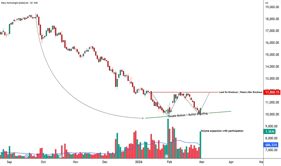
Stay Calm. Stay Clean. Trade With Patience. DIXON – STWP Equity Snapshot📊 DIXON – STWP Equity Snapshot
Ticker: NSE: DIXON
Sector: Electronics Manufacturing Services
CMP: 10,528.00 ▲ (+4.07% | 27 Feb 2026)
Learning Rating: ⭐⭐⭐⭐☆ (Reversal Attempt Within Broader Downtrend)
Chart Pattern Observed: Double Bottom with Bullish Engulfing Near Support
Candlestick Context: Strong Bullish Expansion Candle with High Participation
DIXON has been in a sustained corrective decline, forming a clear sequence of lower highs and lower lows over the past several months. The recent price action, however, signals a potential structural shift as the stock attempts to form a double bottom near the 9,800–10,000 demand region. The emergence of a bullish engulfing candle at this zone, supported by strong participation, indicates that buyers are attempting to absorb supply after an extended downtrend.
RSI is positioned near 40.54, reflecting recovery from oversold conditions without entering overbought territory. This suggests improving momentum rather than confirmed bullish dominance. MACD is showing early stabilisation, indicating that downside momentum is cooling, though a confirmed trend reversal will require sustained follow-through. Structurally, price remains below the broader resistance band near 11,175–11,868, and until that supply zone is reclaimed with acceptance, the overall structure remains range-to-recovery rather than confirmed trend reversal.
From a CPR perspective, price is attempting to stabilise around the pivot region after prolonged weakness. The projected CPR remains relatively wide, which typically aligns with volatility expansion. Acceptance above immediate resistance levels would strengthen the reversal case, while rejection could result in continued range-bound behaviour within the broader corrective structure.
Volume Analysis
Current volume is significantly elevated, with relative volume at 2.62 times average participation. The bullish expansion is supported by strong activity, indicating genuine participation rather than passive bounce behaviour. High volume near structural support enhances the credibility of the reversal attempt. Continuation strength, however, will depend on whether participation remains strong as price approaches higher resistance zones.
Key Levels – Daily Timeframe
Primary support areas are positioned near 10,020, followed by 9,876 and 9,667. On the upside, resistance zones are located around 10,737, 10,946, and 11,172. These levels represent prior reaction points and serve as structural reference areas for continuation or rejection.
Structure Read – What Matters Now
The key structural development is the formation of a potential double bottom accompanied by a bullish engulfing candle on high volume. The immediate focus is on whether price can achieve acceptance above the 10,737–10,946 resistance cluster. Sustained trade below 9,287 would weaken the recovery structure and increase the probability of trend continuation to the downside. The primary risk lies in failure near resistance, which could convert the current move into a temporary relief rally within a broader downtrend. The most probable near-term path is range expansion attempt toward overhead supply, followed by either acceptance or consolidation.
Price Reference Framework – Educational View
From an intraday perspective, the observation zone lies around 10,620, with risk invalidation below 10,064. Upside reference zones are positioned near 11,175 and 11,730. These levels are intended solely for studying short-term price behaviour and structural interaction.
From a swing perspective over the next two to five sessions, the observation zone remains around 10,620, with structural invalidation below 9,287. Upside reference zones extend toward 13,285 and 15,285, and become relevant only if price sustains above reclaimed resistance levels.
STWP View
Momentum is strong in the short term, but the broader trend remains range-bound within a developing recovery phase. Risk is elevated due to proximity to overhead resistance and prior downtrend context. Volume is high and supportive of the current reversal attempt. Sentiment is neutral, RSI stands at 40.54 reflecting improving momentum, and the session registered a 4.07 percent advance.
Final Outlook
Momentum: Strong
Trend: Range
Risk: High
Volume: High
📘 Learning Note
Reversal structures gain strength when high participation aligns with demand zones. Confirmation comes from acceptance above supply, not from the first bullish candle.
⚠️ Disclaimer
This post is intended solely for educational and informational purposes. It does not constitute investment advice, a recommendation, or a solicitation to buy or sell any security. Market investments are subject to risk. Please consult a SEBI-registered financial advisor before making any investment decisions. STWP is not responsible for actions taken based on this analysis.
💬Did this help you read the chart better?
🔼 Boost | ✍️ Comment | 🔁 Share with a learner
👉 Follow STWP for clean chart-reading insights
Stay Calm. Stay Clean. Trade With Patience.
 Long
Long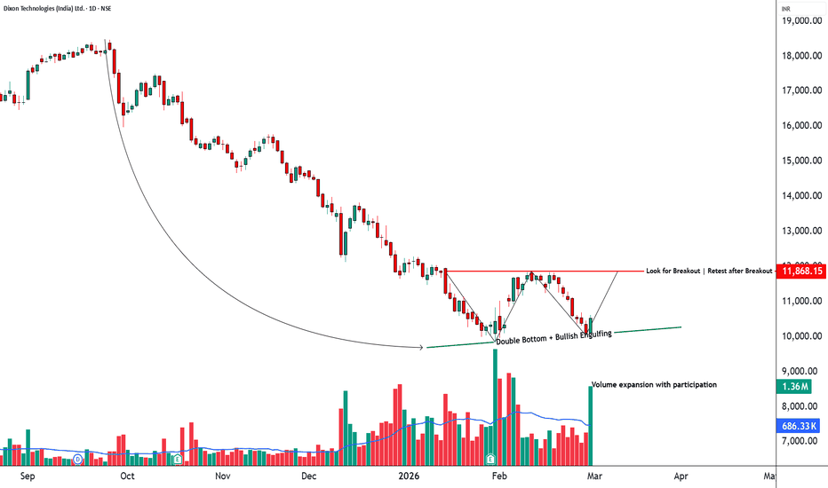
 Long
Long
Salik Stock Reversal Alert-A Hidden Gem in Dubai’s Stock Market!Hello Traders!
Today’s analysis is on Salik Company PJSC (DFM), one of Dubai’s most watched stocks. UAE markets are full of hidden opportunities, and this chart highlights one of them. After forming a strong Rectangle Pattern for months, the stock finally gave a clean Breakout , followed by a Bullish Engulfing retest candle , a classic sign of buyers returning with strength.
Why this setup is special?
Rectangle pattern breakout after long consolidation shows trend resumption potential.
Bullish engulfing pattern adds confirmation of renewed momentum.
Multiple timeframe structure supports higher targets with low downside risk.
Levels to Track:
The best entry zone remains around 5.80–5.90 AED , where strong support and bullish engulfing confirmation align. The first short-term target is placed at 6.25 AED , followed by a medium-term target near 6.60 AED , and a positional level of 6.99 AED . Long-term investors can aim for the major holding target around 8.00 AED . A stop loss below 5.37 AED should be maintained to protect positions.
If you want to catch these kinds of early setups before they explode, make sure you follow closely, (Analysis By @TraderRahulPal ). More analysis & educational content is shared regularly on my profile. Sometimes one strong setup can shift your entire month’s momentum. If this helped you, don’t forget to like and follow for regular updates.
Disclaimer:
This analysis is for educational purposes only and should not be taken as financial advice. Please do your own research or consult your financial advisor before investing.  Long
Long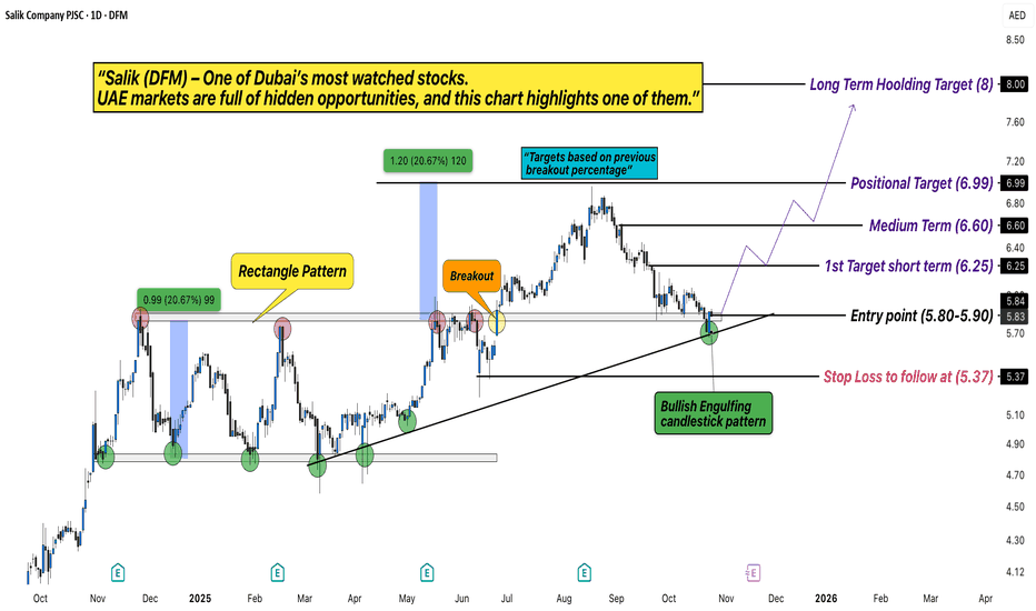
 Long
Long
Long 
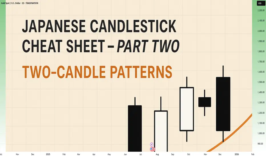
Japanese Candlestick Cheat Sheet – Part Two- 2 candle patternsTwo-Candle Patterns That Signal Shifts in Sentiment
Single candles whisper…
But two candles talk to each other — and when they do, they often reveal the first signs of a reversal or continuation.
In this second part of the series, we go deeper.
From engulfings to haramis, tweezer tops to piercing lines — these patterns don’t just look good on charts… they capture the psychological tug-of-war between buyers and sellers.
Price doesn’t lie.
And two candles in a row can say: “Something just changed.”
Learn to spot them early. Learn to listen when the chart speaks.
This is Part Two of your practical guide to mastering candlestick formations.
BULLISH KICKER
Bias: Bullish
What is the Bullish Kicker pattern?
The Bullish Kicker forms when a strong bullish candle follows a bearish one with no overlap between the two, indicating a sudden shift in sentiment. This pattern is a powerful indicator of a reversal as buyers take control. The sharp contrast between the bearish and bullish candles reflects a dramatic shift in market psychology, where bears are caught off-guard and forced to cover their positions.
Bullish Kickers are rare but extremely telling, providing a clear signal that sentiment is favoring buyers. Recognizing such decisive patterns can be a game-changer.
Meaning:
Found after downtrends or sell-offs; suggests a sudden shift in sentiment, indicating strong buying interest and potential trend reversal.
BULLISH ENGULFING
Bias: Bullish
What is the Bullish Engulfing pattern?
The Bullish Engulfing pattern occurs when a large bullish candle fully engulfs the previous smaller bearish candle, signaling a potential trend reversal. This pattern highlights a moment when buyers overpower sellers, often marking the beginning of upward momentum. Psychologically, it suggests that buyer confidence is returning, and sellers are losing their grip.
For traders, understanding Bullish Engulfing patterns can provide crucial entry points into emerging trends. Learning to identify and trade such patterns is essential for capturing momentum and new trends.
Meaning:
Typically found in downtrends, this pattern signals a potential bullish reversal as buyers overpower sellers, often indicating a shift toward upward momentum.
BULLISH HARAMI
Bias: Bullish
What is the Bullish Harami pattern?
The Bullish Harami consists of a small bullish candle within a preceding larger bearish one, indicating a pause in downward momentum and hinting at a potential reversal. This pattern shows that sellers are beginning to weaken as buyers cautiously test the waters. The Harami reflects a shift in sentiment from bearish to neutral, often marking a transitional phase in the market.
Interpreting the Bullish Harami helps traders spot moments when sentiment is shifting, potentially signaling the start of a trend change.
Meaning:
Seen in downtrends, it suggests indecision, with possible bullish reversal if the following candles confirm buying strength, indicating a weakening bearish trend.
PIERCING LINE
Bias: Bullish
What is the Piercing Line pattern?
The Piercing Line forms when a bullish candle opens below the previous bearish candle’s low but closes over halfway into it. Found in downtrends, this pattern reflects strong buying pressure as buyers step in at lower prices, creating a potential bullish reversal. The Piercing Line pattern suggests that sentiment may be shifting as buyers gain confidence.
This pattern’s strength lies in its psychological impact, revealing moments when buyers are willing to take risks. Recognizing these signs early can provide valuable insights for traders looking to time entries.
Meaning :
Found in downtrends, this pattern suggests a possible bullish reversal if buying continues, as sellers lose control to buyers.
TWEEZER BOTTOM
Bias: Bullish
What is the Tweezer Bottom pattern?
The Tweezer Bottom pattern is characterized by two consecutive candles with nearly identical lows, one bearish and one bullish. This pattern often signals the end of a downtrend, as the matching lows suggest a strong support level where buyers are stepping in. The Tweezer Bottom highlights market psychology at work, with sellers unable to push prices lower, reflecting renewed buying interest.
Tweezer Bottoms are ideal for traders looking to identify support zones and potential reversal points. By understanding this pattern’s significance, traders can make informed decisions.
Meaning:
Found in downtrends, it signals potential reversal, showing strong support at the matching low, suggesting buyers are stepping in.
BEARISH KICKER
Bias: Bearish
What is the Bearish Kicker pattern?
The Bearish Kicker is the inverse of the Bullish Kicker, forming when a strong bearish candle follows a bullish one without overlap, indicating a sharp sentiment shift. This pattern often marks a sudden reversal, with sellers taking control after an initial bullish period. Psychologically, Bearish Kickers are powerful, signaling that buyers are caught off-guard and losing momentum.
Recognizing Bearish Kickers provides traders with insights into sudden shifts in market dynamics, helping them avoid buying into weakening trends.
Meaning:
Found after uptrends; indicates a sudden sentiment shift, signaling potential trend reversal and intensified selling pressure.
BEARISH ENGULFING
Bias: Bearish
What is the Bearish Engulfing pattern?
The Bearish Engulfing pattern forms when a large bearish candle engulfs the previous smaller bullish candle, suggesting a potential reversal in an uptrend. This pattern signals that sellers have regained control, often marking the start of downward momentum. The Bearish Engulfing reveals a psychological shift, as selling pressure overtakes buying interest.
This pattern is a powerful tool for traders who aim to catch trend reversals, allowing them to align with emerging downward momentum.
Meaning:
Typically found in uptrends, this pattern signals a potential bearish reversal as sellers overpower buyers, often indicating a downward momentum shift.
BEARISH HARAMI
Bias: Bearish
What is the Bearish Harami pattern?
The Bearish Harami consists of a small bearish candle contained within a larger preceding bullish one, reflecting indecision and a potential trend reversal. Found in uptrends, it hints that buyers are losing strength, while sellers are cautiously testing the market. This pattern highlights moments when buyer momentum begins to wane, suggesting caution.
Interpreting the Bearish Harami allows traders to spot potential shifts in sentiment, helping them manage risk and time their exits.
Meaning:
Seen in uptrends, it suggests indecision with a potential bearish reversal if following candles confirm, indicating a weakening bullish trend.
DARK CLOUD COVER
Bias: Bearish
What is the Dark Cloud Cover pattern?
The Dark Cloud Cover appears when a bearish candle opens above the previous bullish candle but closes over halfway into it, reflecting a shift in control from buyers to sellers. This pattern suggests that bullish momentum may be fading, hinting at a potential reversal. Dark Cloud Cover patterns reveal moments when sentiment shifts from optimism to caution.
For traders, understanding this pattern helps them anticipate reversals at the top of uptrends.
Meaning:
Found in uptrends; signals potential bearish reversal if selling continues, as buyers lose control to sellers.
TWEEZER TOP
Bias: Bearish
W hat is the Tweezer Top pattern?
The Tweezer Top is formed by two candles with matching or nearly matching highs, typically one bullish and one bearish. This pattern signals potential resistance, as sellers are consistently pushing back against the same level. The Tweezer Top reflects a moment of seller strength, often marking the end of an uptrend.
Recognizing Tweezer Tops helps traders spot resistance zones and potential reversal points, allowing them to avoid buying into weakening trends or even shorting the asset.
Meaning:
Found in uptrends, it signals potential reversal, showing strong resistance at the matching high, suggesting selling pressure.
🧭 Final Thought
Two-candle formations often appear at key turning points — right where most traders hesitate or get trapped.
Learn to read them not just as patterns, but as conversations between candles — one pushing, the other reacting.
And if this is your first time reading the series, don’t miss Part One – where we covered single-candle signals like dojis, hammers, and marubozus — the very foundations of candlestick reading.
 Education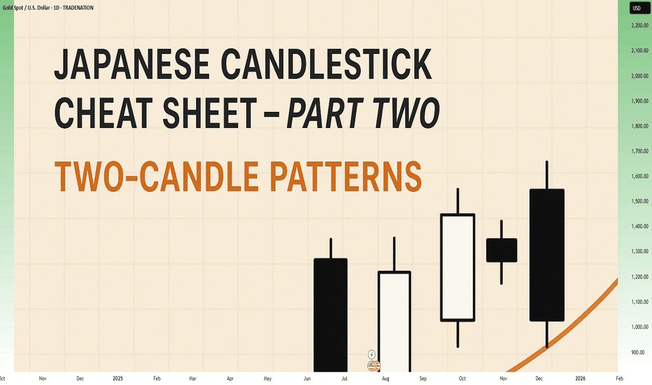
Long 
Long 
Bullish Engulfing Pattern: A Strong Reversal SignalBullish Engulfing Pattern: A Strong Reversal Signal
The bullish engulfing pattern is a two-candlestick formation that suggests a possible reversal from a downtrend to an uptrend in the financial market. This particular pattern holds immense value for traders and technical analysts as it equips them with the means to discern potential buying opportunities. In this article, we will explain how traders implement this pattern in their trading strategies.
What Is a Bullish Engulfing Pattern?
The bullish engulfing is a technical analysis pattern consisting of two candles. This formation emerges when a large bearish candlestick is succeeded by a larger green one that entirely engulfs it.
What does the bullish engulfing mean? The bullish engulfing indicates a potential shift in market sentiment, suggesting that buying pressure might surpass selling pressure in the near future and highlighting a possible reversal from a downtrend to an uptrend.
Traders can find the bullish engulfing candlestick pattern across various financial instruments, including currencies, stocks, cryptocurrencies*, ETFs, and indices.
Bearish Engulfing vs Bullish Engulfing
The bullish engulfing pattern has a counterparty - bearish engulfing. The bearish engulfing pattern occurs during an uptrend, indicating a change in market sentiment and potential price reversal to the downside. It consists of two candles, where the second is larger and bearish and completely engulfs the body of the preceding candlestick.
How Can You Trade the Bullish Engulfing Pattern?
Here are some steps traders consider when trading with the bullish engulfing:
- Identification: Look for a clear bullish engulfing setup on a price chart at the end of a downtrend.
- Entry Point: Although candlestick patterns don't provide precise entry and exit points as chart patterns do, there are general rules you could use.
The entry point could be set slightly above the high of the bullish engulfing formation. In the conservative approach, traders enter the market after several candles close higher. In a risky approach, traders open a buy position after the pattern is formed.
- Exit Point: A stop-loss level could be below the low of the engulfing candle or below a nearby support level. A take-profit level could be based on a trader’s risk/reward ratio or key resistance levels.
- Risk Management: You can consider a risk management strategy to potentially limit losses. Traders focus on appropriate position sizing and risk-to-reward ratios to maintain a balanced approach to trading.
- Trade Monitoring: Once you have entered the trade, monitor price action and market conditions. Pay attention to any sign of reversal confirmation or potential obstacles that may invalidate the signal.
- Stop-Loss and Take-Profit Adjustment: As the trade progresses, you may consider adjusting your stop-loss level to protect potential returns. Similarly, you may consider adjusting your take-profit level if the price signals a strong uptrend.
Live Market Example
Let's consider an example of a bullish engulfing on the forex chart. The bullish engulfing candle in the example below is marked with 1 and 2. The trader sets the entry point above the green candle and a stop-loss level below it. The take profit is at the closest resistance level.
How Do Traders Confirm a Bullish Engulfing Candlestick Pattern?
Confirming this pattern enhances the reliability of its signals and helps traders make informed decisions. Here are key steps to confirm it:
- Volume Analysis: Traders typically look for increased buying trading volume accompanying the candle. Higher volume suggests stronger buyers’ interest and validates the reversal signal.
- Follow-Up Candlesticks: Waiting for subsequent closes can confirm the upward momentum. A series of higher closes strengthens its credibility.
- Support Levels: If it forms near a significant support level, this adds context to the reversal, as buyers are stepping in at a critical price point.
- Technical Indicators: Complementary indicators like the Relative Strength Index (RSI), Stochastic Oscillator, or a pair of moving averages can confirm the shift in sentiment.
- Market Context: Traders assess the overall market trend and news to ensure the formation aligns with broader market conditions.
Bullish Engulfing and Other Patterns
Let’s take a closer look at how this pattern compares to other chart formations, like the piercing and harami.
What Is the Difference Between a Bullish Engulfing and a Piercing Pattern?
A bullish engulfing pattern occurs when a large bearish bar is followed by a larger candlestick that completely overtakes the former's body. This indicates a strong potential reversal from a downtrend to an uptrend.
In contrast, a piercing formation also signals a potential reversal but is slightly weaker. It forms when a bearish candle is followed by a bullish candle that closes above its midpoint but doesn’t envelop it entirely.
What Is the Difference Between a Bullish Engulfing Pattern and a Bullish Harami Pattern?
The bullish harami pattern consists of a large red candle followed by a smaller green candle that is completely contained within the body of the red candle. This formation suggests a potential reversal but is generally considered less strong than the bullish engulfing candle pattern, as the latter completely envelops the previous bearish bar, showing more decisive buying pressure.
Final Thoughts
While this pattern offers valuable insights into potential trend reversals, it's essential to complement it with technical indicators and robust risk management for effective use. Also, be sure to explore other patterns as they may look very similar but provide different signals.
FAQ
What Is a Bullish Engulfing Pattern?
A bullish engulfing pattern is a two-candlestick formation in technical analysis that suggests a potential reversal from a downtrend to an uptrend. It occurs when a large bearish candlestick is followed by a larger bullish candlestick that completely engulfs the body of the preceding bearish candle.
How Reliable Is the Bullish Engulfing Pattern?
The reliability of the bullish engulfing pattern as a reversal signal depends on various factors, including the overall market context, confirmation from other technical indicators, and the timeframe being analysed. While it can be a strong indication of a potential trend reversal, it is not foolproof and should be used in conjunction with other tools and fundamental analysis.
What Is a Bullish Engulfing Candle Trading Strategy?
The bullish engulfing candle strategy involves identifying this pattern at the end of a downtrend as a signal for a potential sentiment shift. Traders typically enter a buy position slightly above the high of the closing bar, with stop-loss levels set below the low or beneath nearby support levels. Take-profit levels are determined based on risk/reward ratios or key resistance levels.
Do Wicks Matter in Engulfing Candlesticks?
Yes, wicks matter in the formation. The wicks provide insights into price rejection and volatility. For a strong confirmation, the absence of long upper wicks suggests sustained buying pressure, reinforcing its validity as a reversal signal.
*Important: At FXOpen UK, Cryptocurrency trading via CFDs is only available to our Professional clients. They are not available for trading by Retail clients. To find out more information about how this may affect you, please get in touch with our team.
This article represents the opinion of the Companies operating under the FXOpen brand only. It is not to be construed as an offer, solicitation, or recommendation with respect to products and services provided by the Companies operating under the FXOpen brand, nor is it to be considered financial advice. Bitcoin Forecast: May 2025 OutlookMay 2025 has marked a strong upward trend for Bitcoin, with the leading cryptocurrency steadily trading in the $100,000–$105,000 range and hitting multi-month highs. This growth has been largely fueled by active accumulation from institutional investors, including exchange-traded funds (ETFs), reinforcing Bitcoin’s growing integration into the traditional financial system.
Institutional Demand as a Key Driver
A major factor behind Bitcoin’s recent surge is the increasing flow of capital from institutional investors. Large ETFs, such as those managed by BlackRock and Fidelity, have expanded their positions in BTC, sending a strong signal of confidence from established financial institutions. This has further boosted interest from retail investors and strengthened the overall bullish momentum.
Macroeconomic Context
Another significant influence is the market's anticipation of a potential interest rate cut by the U.S. Federal Reserve. A more dovish monetary policy stance would make riskier assets, including cryptocurrencies, more attractive, encouraging further investment in Bitcoin.
While the Fed is expected to make a rate decision in June, markets tend to price in such moves early, which is already being reflected in Bitcoin’s price trajectory.
Forecast: How Much Could Bitcoin Be Worth by End of May?
Given the current momentum and positive market sentiment, analysts suggest that Bitcoin could continue its ascent. Optimistic forecasts predict that BTC might reach $120,000–$130,000 by the end of the month, provided macroeconomic conditions remain favorable. Still, the inherent volatility of the crypto market means potential pullbacks should not be ruled out.
Conclusion
May 2025 could prove to be a pivotal month for Bitcoin. Increased institutional participation, supportive macroeconomic signals, and favorable technical indicators are all contributing to its ongoing rally. If the current trend continues, Bitcoin could set new all-time highs in the coming weeks. Long