指标
基本面分析

指标

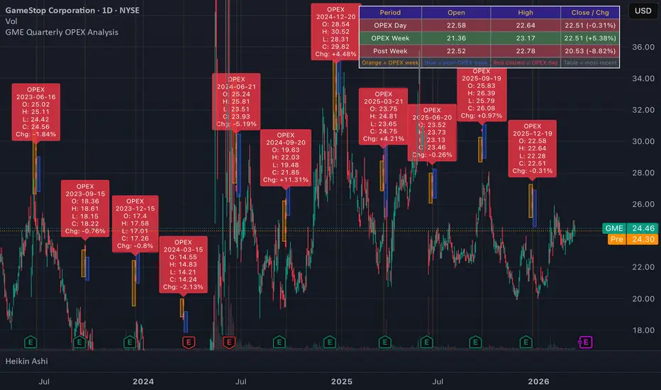
GME Quarterly OPEX Analysis**GME Quarterly OPEX Analyzer** — marks every quarterly expiration date (3rd Friday of March, June, September, December) on a GME daily chart going back as far as chart data allows. For each OPEX it draws a red dashed vertical line, labels the day's OHLC and % change, shades the full OPEX week in orange, and shades the following week in blue. A table in the top-right shows the most recent OPEX day, OPEX week, and post-OPEX week OHLC with color-coded green/red results. Useful for visually identifying whether quarterly OPEX dates correlate with local price bottoms, tops, or reversals over time.
指标
SOFR-EFFR Spread Analysis- Secured Overnight Financing Rate (SOFR), Effective Federal Funds Rate, (EFFR), SOFR-EFFR spread (ζ(t) = SOFR - EFFR).
- If the spread is positive and big enough, it indicates significantly pressure to stock and macro market.
- 3 alerts from the spread:
1. **Small alerts**: Spread > 5bps for more than 2 day
2. **Warning alerts**: Spread crosses above 15bps
3. **Critical alerts**: Spread exceeds 25bps
指标

Crisis Signal DetectorIf BTC, S&P 500, gold, and DXY all rise simultaneously, it’s a crisis signal of possible breakdown.
指标

ORCB Opening Range Candle BreakORCB — Opening Range Candle Break
The ORCB indicator is built around a simple but powerful concept: identify the high and low of a defined opening range, then trade the first clean break of that range in the direction of the trend.
How it works
The indicator defines an Opening Range between two user-set times (default 7:00–8:00 AM London time). It tracks the highest high and lowest low within that window, drawing a live shaded box as the range forms in real time. Once the range closes, it watches for the first candle to close cleanly above or below the range — confirmed only on closed candles, no repainting.
Signals are filtered by a dual EMA (default 8 & 20). Long signals only fire when the fast EMA is above the slow EMA. Short signals only fire when it is below. This keeps you trading with the trend and avoids counter-trend fades.
When a valid break occurs, the indicator plots an entry arrow, and automatically calculates and draws your Take Profit and Stop Loss levels based on your chosen Risk:Reward ratio (default 1:2). The SL is placed on the opposite side of the range plus a configurable buffer.
Features
Live OR box that forms in real time from the first candle of the range
OR High/Low lines shown for the current session only — historical days show the box only, keeping the chart clean
TP/SL lines for the current session only, automatically removed at midnight
Entry arrows kept permanently for trade review
Dual EMA trend filter with fully editable lengths and colours
Overnight High/Low (default 00:00–07:00) — mirrors Previous Day High/Low behaviour, visible all day and updated each morning
Previous Day High/Low — one set only, updated daily
All time windows, colours, buffer size, R:R ratio and EMA settings fully editable in Settings
Maximum OR box history configurable (default 10 days)
Built-in alerts for long and short breaks
Upgraded to Pine Script v6
Designed for
Index futures (DAX, ES, NQ) and forex on 5-minute and 15-minute charts. All session times use the Europe/London timezone, making it plug-and-play for London open strategies. All inputs are fully adjustable so it can be adapted to any session, instrument or opening range window.
指标

All-In-One Stock Dashboard: Ratios to Moving AveragesTired of switching between tabs to check a stock's fundamentals, short interest, and technical extensions? This indicator bridges the gap between fundamental analysis and technical execution by putting all the critical data into one clean, fully customizable dashboard right on your chart.
Whether you are a swing trader looking for mean reversion setups based on Average Daily Range (ADR) extensions, or an investor verifying free cash flow and revenue growth, this dashboard gives you the complete picture at a glance.
Key Features:
📊 Core Fundamentals & Valuation
Key Stats: Instantly view Market Cap, Shares Float, and Short % of Float.
Ratios & Margins: Tracks P/E Ratio, P/S Ratio, Debt-to-Equity, Return on Equity (ROE), and Pretax Margins.
Growth & Yield: Displays Revenue 1Y Growth, FCF Yield, EBITDA Yield, and Dividend Yield.
Bonus: Shows the estimated IPO Date directly on the chart.
📏 Technical & MA Extensions (The "Rubber Band" Effect)
Distance to Highs/Lows: Tracks the exact percentage distance from the All-Time High, 52-Week High, and 52-Week Low.
Moving Average Extensions: Measures how far the current price is extended from key moving averages (10 EMA, 21 EMA, 50 SMA, 150 SMA, and 200 SMA).
Dual-Metric Measurement: The MA distance is displayed in both Percentage (%) and the number of Average Daily Ranges (ADRs). This is crucial for knowing when a stock is statistically overextended and due for a reversion to the mean.
Historical Extremes: The script actively monitors the 200 SMA extension over a 5-year lookback period. It plots visual crosses on the chart when the price reaches a new maximum or minimum percentage extension from the 200 SMA.
⚙️ Highly Customizable
Adjust the Average Dollar Volume and ADR lookback lengths.
Lock the Moving Averages to a specific higher timeframe (e.g., Daily) so your dashboard remains consistent even if you drop down to an intraday chart.
Fully adjustable table position, text sizes, and dynamic colors (values automatically turn green or red depending on positive/negative data).
How to use the MA / ADR feature:
When a stock is stretched several ADRs away from its short-term moving averages (like the 10 or 21 EMA), it becomes highly susceptible to a snap-back. Use the combined % Dist / # ADRs column to objectively measure momentum and avoid buying at the absolute top or shorting at the absolute bottom.
指标

Leverage Vortex @greenyyp## 📊 Leverage Vortex – Script Overview
**Leverage Vortex** is a TradingView indicator for futures traders using leverage. It visualizes long and short positions with all important levels directly on the chart and automatically calculates margin, PnL, break-even and liquidation.
---
### 📈📉 Positions & Levels
- Long & short manageable simultaneously
- Entry, take profit, stop loss, break-even and liquidation as lines on the chart
- Up to **2 DCA entries** per side with automatically calculated average entry
- Up to **3 freely configurable ROI levels** per side (e.g. +5%, +15%, +30%)
### 🧪 Leverage, LIQ & Fee
- Individual leverage for long and short
- Automatic **liquidation calculation** (isolated mode) with adjustable buffer
- **LIQ early alert** – notification before price reaches liquidation
- Maker & taker fee included in break-even calculation
### 📦 Info-Box
- Compact overview with margin, entry, PnL, TP, SL, BE and LIQ
- Unrealized **PnL in % and USD** – updated live
- **Total PnL** combined across both positions
- Position, size and theme freely configurable
### 🔔 Alerts
- **One single master alert** for all levels – no multiple alerts needed
- Alerts for: LIQ, LIQ proximity, TP, SL, BE, all ROI levels and DCA entries
- Dynamic alert messages with current price
### 〽️ VWAP
- Session VWAP for **day, week, month and year**
- **ATH-VWAP** and **ATL-VWAP**
- **Swing markers** (◆) at significant highs and lows as AVWAP anchor points
### 〰️ Bollinger Bands
- Classic Bollinger Bands with configurable length, multiplier and fill
### 📐 Pivot Points
- Previous high & low for **day, week, month and year**
---
*All indicators are toggleable via master switches. More indicators coming in future updates.*
指标

Global Risk DashboardWith the current global situation becoming increasingly unstable, markets across energy, precious metals, volatility, and crypto have been moving rapidly. During periods like this, it’s important to monitor multiple asset classes at the same time.
I noticed that I was constantly switching between several watchlists and charts just to keep track of the instruments I care about. To make this easier, I built a simple Global Risk Dashboard that displays all key markets in one place.
The dashboard allows you to quickly see price levels and daily performance across different asset groups, helping you understand the broader market environment without constantly changing charts.
Key Features
Custom Sections – Create up to 8 sections to organize markets however you like (Energy, Metals, Crypto, FX, Equities, etc.)
Up to 5 Instruments per Section – Monitor multiple assets within each category.
Enable / Disable Sections – Show only the groups you care about.
Enable / Disable Individual Instruments – Fully customizable layout.
Color-Coded Performance – Cells automatically change color based on daily performance.
Daily Price + % Change – Quickly identify which markets are moving.
Flexible Layout – Sections automatically adjust depending on what you enable.
Example Use Cases
You might organize sections like:
Volatility (VIX, VVIX, MOVE)
Energy (WTI, Brent, NatGas)
Precious Metals (Gold, Silver, Copper)
Crypto (BTC, ETH, Total Market Cap)
Macro (DXY, US Yields, Equity Indexes)
But the layout is fully customizable, so you can build a dashboard tailored to your own workflow.
Why This Tool Exists
The goal of this script is simple:
reduce the need to constantly switch between watchlists and charts during fast-moving market conditions.
Instead, you get a single, compact overview of the markets that matter to you.
指标

Earnings History EvaluatorOverlays historical earnings trends aligned by earnings date.
Best used as an additional chart below your fav go to for single ticker viewing.
It includes an attempt at earnings stats and predictions based on past behavior.
指标

Institutional Quarter Levels (Precious Metal Commodities)Institutional Levels that price reacts off of. Use as liquidity, align with zones like QDV, SDV, and FIB. Yearly, Monthly are most probable with zone alignment. Weekly and daily work better with liquidity levels.
指标

Institutional Quarter Levels (Gold and Silver only)Institutional Quarter Levels that is aligned with my Quantum Strategy. Works with Quarterly Deviation, Fib Levels, and Standard Deviation alignment.
指标

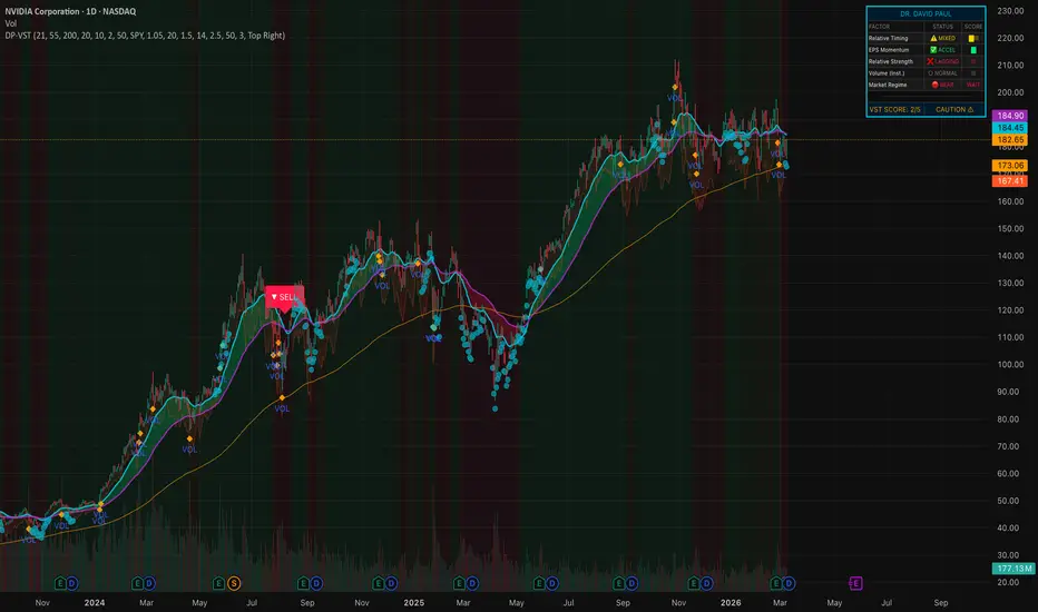
Dr. David Paul Earnings Swing System
A visually intuitive swing trading indicator built on Dr. David Paul's VectorVest
methodology — scoring earnings momentum, relative strength, trend timing & market
regime in one unified dashboard.
This indicator translates Dr. David Paul's world-renowned VectorVest stock selection
and market timing methodology into a fully visual, real-time scoring system directly
on your TradingView chart.
Dr. Paul's philosophy is simple but powerful: buy stocks with ACCELERATING EARNINGS,
trading ABOVE VALUE, in CONFIRMED BULL MARKETS — and exit when any of those conditions
breaks down.
VectorVest ranks every stock with a composite VST score built from three proprietary
metrics. This indicator approximates that framework with five measurable factors:
1. RELATIVE TIMING (Trend Ribbon)
— Dual EMA ribbon (Fast 21 / Slow 55) signals trend direction
— Price above 200 EMA confirms long-term bull structure
— Green ribbon = uptrend confirmed; Red ribbon = stand aside
2. EPS MOMENTUM PROXY (Earnings Acceleration)
— Rate-of-Change acceleration simulates EPS growth trajectory
— Dr. Paul's core principle: "You want earnings growing AND accelerating"
— Cyan dots below price indicate active earnings acceleration
3. RELATIVE STRENGTH vs. Market (RS Ratio)
— Stock performance benchmarked against SPY (configurable)
— Only trade stocks OUTPERFORMING the market
— Mirrors VectorVest's RS (Relative Safety/Strength) component
4. VOLUME SURGE (Institutional Interest)
— Detects above-average volume (default: 1.5× 20-period average)
— Orange diamonds mark institutional accumulation signals
— Dr. Paul: "Follow the smart money — big volume = big players"
5. MARKET REGIME (Color Guard System)
— Background shading: GREEN = Bull, RED = Bear, AMBER = Neutral
— Based on Dr. Paul's "Color Guard" concept from VectorVest
— ONLY take buy signals in GREEN (Bull) market regime
BUY Signal (Green Label)
Fires when ALL of the following align:
• Composite Score ≥ user-defined minimum (default: 3/5)
• Fast EMA crosses above Slow EMA (trend confirmation)
• Market in Bull Regime
• EPS acceleration active
• Stock outperforming benchmark
• RSI below 75 (not extended/overbought)
SELL Signal (Red Label)
Fires when:
• Fast EMA crosses below Slow EMA
• Market enters Bear Regime
• Composite Score collapses to ≤ 1
A real-time table (top-right by default) shows:
• Each factor's current status with icons
• Visual block meter for each score
• Final VST composite score out of 5
• Verdict: STRONG BUY / WATCH / CAUTION / AVOID
• Trend Ribbon — EMA cloud (green/red fill)
• Bar Colors — Score-graded from bright green (5) to red (0)
• Stop Zone — ATR-based trailing stop band (orange)
• Regime Background — Faint green/red/amber shading
• EPS Dots — Cyan circles during acceleration phases
• Volume Diamonds — Orange on institutional surge bars
• Buy/Sell Labels — Clear directional arrows with text
All key parameters are adjustable:
• EMA lengths (Fast, Slow, Trend Filter)
• EPS ROC lookback & acceleration threshold
• Benchmark symbol (default: SPY)
• Volume surge multiplier
• ATR stop multiplier
• Minimum score threshold for signals
• Dashboard position
• Toggle each visual component on/off
1. BUY Signal fired
2. SELL / Exit Signal fired
3. High-Score Setup (4+ score in bull market)
4. Volume + EPS Surge combo detecte
This indicator uses PRICE-BASED PROXIES to simulate VectorVest's proprietary
fundamental data (EPS, VST, GRT). For full fundamental scoring, access to
VectorVest platform data is required.
•The EPS Momentum Proxy uses Rate-of-Change acceleration as a substitute for
actual earnings-per-share data — it reflects price momentum consistent with
earnings-driven moves.
•PAST PERFORMANCE IS NOT INDICATIVE OF FUTURE RESULTS. This tool is for
educational and informational purposes only. Always use proper risk management.
Best used on Daily and Weekly timeframes for swing trading, consistent with
Dr. Paul's documented methodology.
This indicator is inspired by the publicly taught trading methodology of
Dr. David Paul, as presented in his VectorVest seminars and educational
content. All core concepts — earnings acceleration, relative value,
relative safety, market timing, and the Color Guard system — are
attributable to Dr. Paul's work.
special thanks to @Beck_Mullen for helping me learn , develop , and understand how to build my own scripts and refine them for my own personal trading!
指标
hungfnguyenSonic R + Ersoy Fibo FollowThis is a very Line in in scripts, you have to select this line
and this line is progressing with Fibonach Digits
want to just developed more this script to specify the buy and sell points
指标

Combined Quarterly & Annual Sales/EPS/Gross Margin/ROE%Overview
The Combined Quarterly & Annual Fundamentals Dashboard is a comprehensive fundamental analysis tool designed for growth investors (inspired by MarketSurge/Investors Business Daily). It centralizes mission-critical financial data into a single, clean dashboard, allowing you to track a stock's institutional-quality "report card" without leaving your chart.
The script tracks Quarterly Year-over-Year (YoY) growth for both Sales and EPS, as well as Annual Fiscal Year performance, including Gross Margins and Return on Equity (ROE).
Key Features
Quarterly YoY Table: Displays the last 4–20 quarters of Sales and EPS growth. It specifically calculates YoY by comparing the current quarter to the same quarter from the previous year, highlighting the "acceleration" or "deceleration" key to identifying high-growth leaders.
Annual Sales Section: Breaks down the last 4 fiscal years of total revenue, annual revenue growth, and Gross Margins.
Annual Earnings Section: Tracks the last 4 fiscal years of EPS, annual EPS growth, and Return on Equity (ROE%).
Dynamic Visual Coding: Growth percentages are automatically color-coded (Green for positive, Red for negative) to help you instantly spot fundamental turnarounds or breakdowns.
Customizable Layout: Use the settings menu to toggle between Standardized or Reported EPS, hide negative growth quarters, and reposition the table to any corner of your chart.
How to Use
Check for "C" and "A": In the CANSLIM methodology, "C" (Current Earnings) and "A" (Annual Earnings) are the most vital. Use the top section to look for 25%+ quarterly growth and the bottom sections to ensure the company has a strong annual track record.
Margin & ROE Health: Use the Annual sections to verify that the company isn't just growing sales, but is doing so efficiently (steady or expanding Gross Margins) and is generating high returns for shareholders (ROE).
Acceleration Hunting: Look for quarters where the "Sales YoY%" and "EPS YoY%" numbers are getting progressively larger.
Settings
Use Standardized EPS: Choose between adjusted "Pro-forma" earnings or GAAP reported earnings.
Number of Quarters: Adjust the lookback period for the quarterly section (default is 8).
Table Position: Move the dashboard to avoid overlapping with your price action or other indicators.
指标

ICT HTF Objective MapThis indicator automatically marks important levels from the 15-minute, 1-hour, and 4-hour timeframes directly on your chart. It saves you from having to manually go through higher timeframes and draw them yourself.
It shows:
Swing highs and swing lows as horizontal lines
Fair value gaps (FVGs) as shaded boxes
Each level is labeled with its timeframe so you always know where it came from.
The goal is to keep your chart simple while still showing the key areas price may react to or move toward during the day. It helps you stay aware of important higher-timeframe levels without cluttering your chart or spending extra time marking them manually.
指标

Price to Gross Profit (Market Cap / TTM Gross Profit)plots price to gross profit.
most useful for growth stocks that are light on earnings due to early stage growth or R&D heavy.
"The Price to Gross Profit ratio (often abbreviated as P/GP or Price/Gross Profit) is a valuation metric calculated as:
P/GP = Market Capitalization ÷ Gross Profit
(or, per-share version: Price per Share ÷ Gross Profit per Share)
It measures how many dollars of market value (or stock price) the market assigns to each dollar of a company's gross profit (revenue minus cost of goods sold / direct costs).
Why It's Useful (Key Advantages Over Common Alternatives)
Better than Price-to-Sales (P/S) for companies with very different gross margins
P/S treats every dollar of revenue the same, but gross margins vary dramatically across industries (software ~70–90%, retail ~20–40%, semiconductors ~50–60%).
→ P/GP normalizes for gross margin efficiency — a high P/S company with fat margins may look cheaper on P/GP than a low-margin business with similar P/S.
Classic example: During the dot-com era (and still relevant today), comparing internet companies like Amazon (lower gross margins) vs. Yahoo or pure ad businesses showed much narrower valuation gaps on P/GP than on P/S.
Especially powerful for early-stage, growth, loss-making, or SaaS/fintech/tech companies
Many high-growth firms have:
Negative net income → P/E useless or negative
Heavy operating expenses / R&D / marketing → EV/EBITDA or P/FCF distorted or negative
→ Gross profit is often positive and growing much earlier than operating profit or net income.
P/GP becomes one of the cleanest ways to compare "how expensive is this growth engine?" among peers burning cash but scaling gross profit strongly.
Less easily manipulated than bottom-line earnings
Gross profit is higher up the income statement and less affected by:
Accounting choices for depreciation, amortization, stock-based comp, one-time items
Operating leverage differences
→ It provides a "purer" view of the core business model's pricing power and cost-of-production efficiency.
Useful in cross-industry or peer benchmarking
When comparing companies in sectors with wildly different expense structures, P/GP helps level the playing field better than P/S and is often more predictive than raw P/E (especially when earnings are volatile or nonexistent).
Variant: EV / Gross Profit
Enterprise value version removes the effect of cash/net debt and is popular in some SaaS and fintech analyses for the same reasons.
Limitations (When It's Less Useful)
Ignores operating expenses, taxes, interest, capex → doesn't tell you if the company can turn gross profit into free cash flow or net earnings
Still revenue-dependent → can be inflated by aggressive revenue recognition
Less meaningful for very mature, high-margin stable companies (where P/E or EV/EBITDA usually dominate)
Not as standardized or widely quoted as P/E, P/S, or EV/EBITDA — you usually have to calculate it yourself
Quick Summary: When to Reach for P/GP
Use it especially when:
Analyzing growth/tech/SaaS/fintech companies
Comparing firms with very different gross margin profiles
P/E is unavailable or misleading
You want a margin-adjusted alternative to P/S
It's not the single best metric for every situation, but it's one of the most under-appreciated "middle ground" valuation tools — cleaner than P/S, more available than P/E or EV/EBITDA in early/high-growth stages. Many value-oriented and growth investors quietly rely on it (or variants like gross profit yield = 1 / P/GP) for exactly these reasons."
指标

Nifty 500 VCP AlertHow to Deploy This for the Nifty 500
Add to Chart: Add this script to your chart.
Create the Alert: Click the "Alert" icon (the clock) in TradingView.
Condition: Select "Nifty 500 VCP Alert".
Trigger: Select "Any alert() function call" (this ensures it uses the dynamic text we coded above).
The Catch: TradingView requires you to set this alert up per ticker. To scan the Nifty 500 quickly, simply open your Nifty 500 watchlist, use your down arrow key to flip through the charts daily, and the visual green triangle will instantly flag the setups.
指标

Techno-Fundamental VCP Screenersignals directly into a screener table on your chart, so I can monitor the status of multiple tickers simultaneously
指标
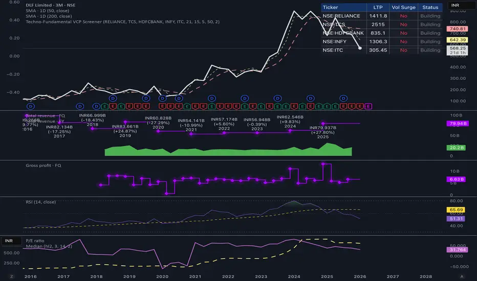
Techno-Fundamental VCP BreakoutThe Strategy Breakdown
This script mathematically codifies the visual patterns of a classic fundamental breakout:
The Base Setup: It looks for a stock that has formed a solid base over the last 21 trading days.
The Final Shakeout (Tightening): It demands that the most recent 5 days have contracted extremely tightly (less than 5% depth), signaling that selling pressure has dried up entirely.
The Institutional Footprint: It waits for a price breakout above that 5-day tight resistance, accompanied by a massive surge in volume (default is 2x the 50-day average).
When scanning a watchlist of Nifty 500 constituents, this indicator helps filter out the sideways noise and flags only the charts where institutions are actively stepping in on new fundamental data.
指标

Proxy Index [MTF] [Open]Description
The Proxy Index is an advanced Intermarket Data Analysis tool that allows traders to create synthetic assets or custom indices using mathematical formulas.
By releasing this script as Open-Source, developers can study how to effectively use request.security to pull OHLC (Open, High, Low, Close) data from multiple different tickers simultaneously and compile them into a single, cohesive custom candlestick chart.
Underlying Concepts & Methodology
The script acts as a mathematical compiler for price feeds.
Data Acquisition: It retrieves the exact price data from up to 4 user-defined assets (A, B, C, and D).
Algebraic Engine: It applies a selected mathematical formula (e.g., Asset A * Asset B / Asset C) to every individual Open, High, Low, and Close point.
Visualization: The resulting data is plotted either as a traditional synthetic Candlestick chart or a continuous Line chart, allowing traders to perform technical analysis on a non-existent, composite asset.
Key Features
Custom Synthetic Formulas: Choose between multiple algebraic structures (multiplication and division) mixing up to 4 different tickers.
Multi-Timeframe (MTF): Analyze the synthetic index on a higher timeframe without leaving your current chart.
Built-in Smoothing: Includes an integrated Moving Average (SMA or EMA) calculated directly over the synthetic proxy data to help identify macro trends.
How to Use
Macro Spreads: Create yield spreads (e.g., US10Y - US02Y equivalents) or commodity ratios (e.g., Gold/Silver ratio) to gauge market risk sentiment.
Custom Indices: Create your own weighted currency indices if the standard DXY or EXY doesn't fit your institutional view.
To comply with House Rules regarding non-English UI, here is the translation of the script's settings menu:
1. Construção do Proxy (Proxy Construction)
Fórmula do Proxy = Formula Structure (A*B, A/B, etc.)
Ativo A / B / C / D = Asset A / B / C / D Ticker Input
2. Tempo Gráfico (MTF Timeframe)
Usar Tempo Gráfico Personalizado = Use Custom Timeframe
Tempo Gráfico = Select Timeframe
3. Exibição (Display Options)
Modo de Exibição = Display Mode (Velas/Candles vs. Linha/Line)
Cor Alta / Baixa / Pavio = Bull / Bear / Wick Colors
Cor da Linha / Espessura = Line Color / Width
Mostrar Linha Zero = Show Zero Line
4. Média Móvel do Proxy (Proxy Moving Average)
Mostrar Média Móvel = Show Moving Average
Tipo de MA = MA Type (SMA / EMA)
Comprimento / Cor / Espessura = Length / Color / Width
Descrição
O Proxy Index agora é Open-Source! Esta é uma ferramenta de Análise Intermercado e de Dados que permite criar "Ativos Sintéticos". Com ele, você pode misturar até 4 ativos diferentes usando fórmulas matemáticas para gerar um gráfico de velas totalmente customizado.
Funcionalidades
Fórmulas Matemáticas: Crie índices multiplicando ou dividindo ativos (ex: Ouro dividido por Prata, ou um Índice Dólar customizado).
Velas Sintéticas: Transforma o resultado da equação matemática em um gráfico de velas real (OHLC) ou linha contínua.
Média Móvel Integrada: Analise a tendência do seu ativo sintético com uma SMA ou EMA embutida.
Código Aberto: Excelente base de estudo para manipulação de arrays e requisições de múltiplos ativos simultâneos.
指标

US Recessions - ShadingThis indicator shades the chart background during every U.S. recession as dated by the National Bureau of Economic Research (NBER). Recessions are defined using NBER’s business cycle peak-to-trough months, and the script shades from the peak month through the trough month (inclusive) using monthly boundaries.
What it does
* Applies a shaded overlay on your chart **only during recession periods**.
* Works on any symbol and any timeframe (crypto, equities, FX, commodities, bonds, indices).
* Includes options to:
- Toggle shading on/off
- Choose your preferred shading colour
- Adjust transparency for readability
Why this overlay is important for analysing any asset class
Even if you trade or invest in assets that aren’t directly tied to U.S. GDP (like crypto or commodities), U.S. recessions often coincide with major shifts in:
-Risk appetite (risk-on vs risk-off behaviour)
-Liquidity conditions (credit availability, financial stress)
-Interest-rate expectations and central bank response
-Earnings expectations and corporate defaults
-Volatility regimes (large, sustained changes in volatility)
Having recession shading directly on the price chart helps you quickly see whether price action is happening in a historically “normal” expansion environment, or in a macro regime where behaviour can change dramatically. This is particularly useful in a deeper analysis like comparing GOLD to SPX. This chart makes it clear how in recessions the S&P bleeds against Gold therefor making the concept more visual and better for understanding.
Of course this is just an example of how it can be used, there are plenty of other factors which can be overlayed like unemployment and interest rates for an even better understanding.
指标

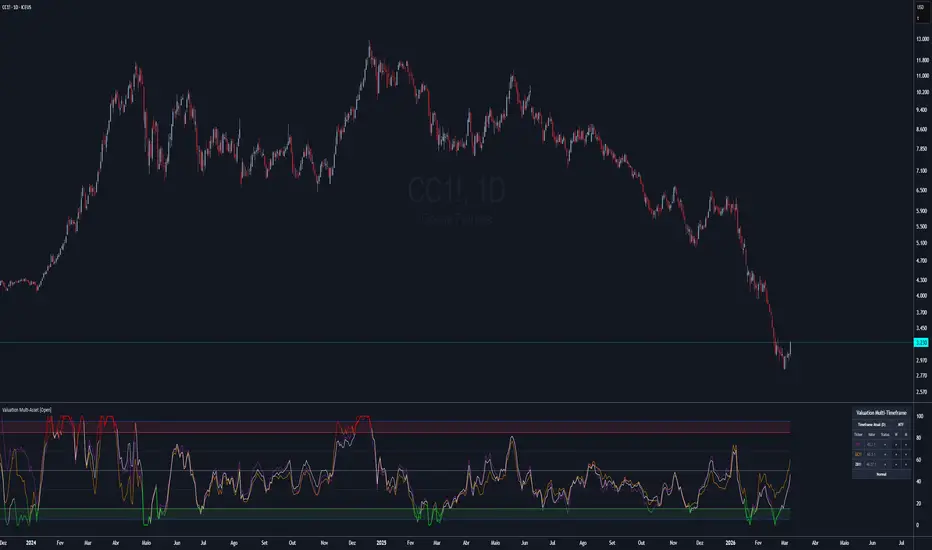
Valuation Multi-Asset [Open]Description
The Valuation Multi-Asset is a highly specialized Intermarket Analysis tool designed to determine the relative valuation of your chart's asset by comparing its performance against up to 6 global benchmarks simultaneously.
By releasing this V1.4 edition as an Open-Source tool, traders and Pine Script developers can study advanced concepts such as dynamic multi-timeframe (request.security) arrays, matrix-style data normalization, and complex real-time table drawing.
Underlying Concepts & Methodology
The script operates on the principle of asset correlation and historical mean reversion.
Ratio Calculation: It computes the pure price ratio between the Chart Asset and the selected Benchmark Assets (e.g., DXY, Gold, Bonds).
Smoothing & Normalization: It applies an Exponential Moving Average (EMA) to filter noise, and then normalizes the result over a long-term historical lookback period (default is 156 weeks/3 years).
Scoring (0-100): The normalized data is ranked into a Valuation Index.
< 15 (Green): Historically Undervalued (Cheap) relative to the benchmark.
> 85 (Red): Historically Overvalued (Expensive) relative to the benchmark.
Key Features
Expanded Capacity: Monitor up to 6 simultaneous assets on a single chart to build a complete macro correlation matrix.
MTF Dashboard: A built-in HUD summarizes the Valuation bias (Cheap/Neutral/Expensive) across Daily, Weekly, and Monthly timeframes.
ETF Reference Table: Includes a handy on-chart cheat sheet of major ETFs to use as benchmarks.
How to Use
Contextual Bias: Use the MTF dashboard to get a quick read. If 5 out of 6 comparisons say your asset is "Cheap" on the Weekly timeframe, the probability of a macro mean-reversion (Long trade) increases drastically.
To comply with House Rules regarding non-English UI, here is the translation of the script's settings menu:
1. Seleção de Ativos (Asset Selection)
Usar Timeframe Personalizado = Use Custom Timeframe
Mostrar Ativo (1-6) = Show Asset (Slots 1 to 6)
Símbolo = Symbol (Ticker)
2. Tabela de Referência de ETFs (ETF Reference Table)
Mostrar Tabela Ref. = Show Reference Table
Posição / Categoria = Table Position / Filter Category
3. Parâmetros do Índice (Index Parameters)
Comprimento EMA = Smoothing EMA Length
Comprimento R do VIndex = Valuation Index Lookback Period
4. Níveis de Valuation (Valuation Levels)
Sobrevaloração / Subvaloração = Overvaluation / Undervaluation (Thresholds)
Nível Neutro = Neutral Level
5. Configurações de Tabela (Table Settings)
Tamanho do Texto = Text Size
Tema = Theme (Dark/Light)
Usar Cores Personalizadas = Use Custom Colors
6. Análise Multi-Timeframe (MTF Analysis)
Mostrar D / W / M = Show Daily / Weekly / Monthly Columns
Descrição
O Valuation Multi-Asset agora é Open-Source! Esta ferramenta de Análise Intermercado calcula a correlação relativa do seu ativo contra até 6 benchmarks globais (como Dólar, Ouro, SP500).
Ele normaliza os dados históricos e cria um placar de 0 a 100 para te dizer estatisticamente se o seu ativo está "Caro" ou "Barato" em relação ao resto do mundo.
Funcionalidades
6 Slots de Ativos: Monitore uma cesta completa de correlações.
Painel MTF: Resumo de valuation para os tempos Diário, Semanal e Mensal em uma única tabela.
Código Aberto: Estude a manipulação avançada de tabelas e request.security.
指标