Adaptive Volumetric Reversion Channel Fade ValidatorAdaptive Volumetric Reversion Channel — Fade Validator (AVRC)
What it is
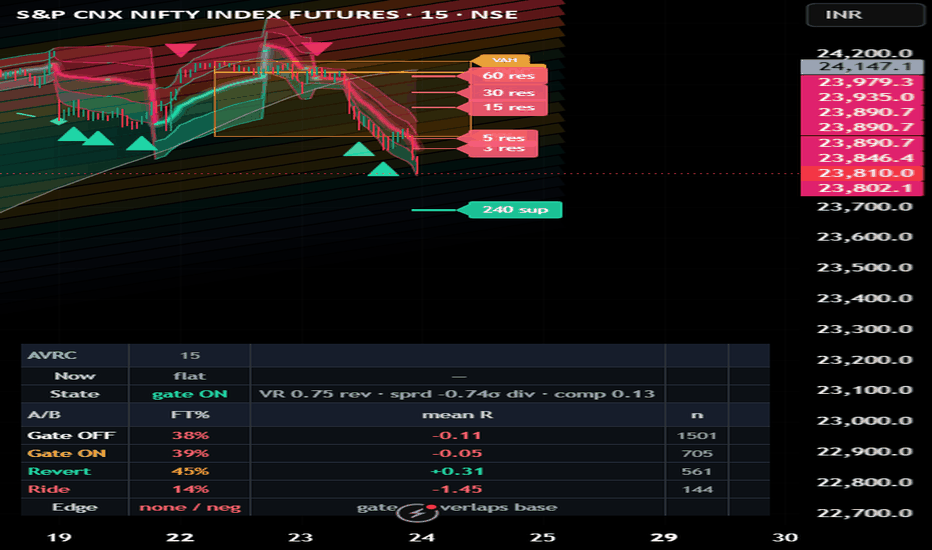
AVRC is an anchored, volume-weighted regression channel that frames mean-reversion ("fade") setups and then gates, scores and validates them — so you can see whether fading stretched price actually has an edge on your symbol and timeframe instead of taking it on faith. It is a study / analysis framework, not a strategy and not a signal service.
Why these components are combined (the mashup rationale)
Fading an extreme asks three different questions, and no single classic tool answers all three. AVRC coordinates several non-redundant lenses on one shared geometry (an anchored regression channel) and one shared volatility unit (residual σ), so each lens can check the others rather than echoing it:
WHERE is price stretched? A volume-weighted regression centerline with residual-σ bands is drawn against a slower macro trend-relative volume map — volume binned by σ-distance from a longer regression line. Whether the tactical band sits in a thin (fast-traversed) or thick (heavily-traded) macro node tells you if a fade is likely clean or absorbed. This cross-read is the connective tissue between the two layers.
Is a reversion ACTUALLY firing? Independent "tells" at the band — a close-back rejection, a band-confluent momentum divergence, an equal-high/low liquidity sweep, and the macro-density read. Because these tells are correlated, their agreement is shrunk by a design-effect correction so echoes can't masquerade as independent confirmation.
Is the market in a reverting STATE? A regime gate (variance-ratio test + a reversion-trust correlation) only passes fades when price increments offset rather than compound. An entry-time ride-risk score (macro-trend alignment, the two-centerline spread, an already-walking band, momentum, mean-reversion half-life, and multi-timeframe trend consensus) flags fades likely to be "walked" rather than reverted.
The components share one geometry and one volatility unit, and each can veto the others. The goal is to suppress low-quality fades more than to generate them.
How the validation layer works (what makes this more than a drawing)
Every fade is logged and, a fixed horizon later, resolved: its forward return is measured in ATR units and tabulated Gate ON vs Gate OFF — follow-through %, a Wilson 95% interval, whipsaw %, and mean R per fade. Outcomes are additionally split Reverted vs Rode, by macro node (thin/thick), and by ride-risk (low/high at the running median). The panel's Edge line synthesizes this into a single read: is Gate ON's follow-through interval clearing the ungated baseline with positive mean R and enough samples? Per-fade rows also export to the Data Window for your own analysis. Every filter has to earn its place against the ungated baseline.
How to use it
Set the Price source (top of settings). Defaults are tuned for an intraday index future; the source is user-selectable so the framework runs on any symbol or market. Volume-based parts (heatmap, profile, POC) need a real volume feed.
Read the panel top-down: Now (live setup) → State (regime + spread + compression) → the A/B scoreboard (Gate OFF, Gate ON, Revert, Ride) → Edge verdict.
A fade arms when price tags the outer band and at least one tell prints, then passes only if the regime (and optional ride-risk) gate agrees. Target is the centerline or the nearest untested POC.
If Gate ON does not beat Gate OFF on follow-through and mean R with non-overlapping intervals and enough samples, the edge isn't there on this symbol/timeframe — change them, don't force it. The signal is clearest on higher intraday timeframes; 1-minute is mostly noise.
What is original here
The original work is the coordination: a shared-σ, timeframe-adaptive regression channel used as a reversion frame; a trend-relative volume map cross-read against the band; decorrelated tells fused by a design-effect shrink; a statistical regime gate; an entry-time ride-risk score; and a built-in A/B + forward-return validation harness — combined so each lens can veto the others and the tool reports its own hit rate. It is not a re-skin of any single indicator.
Concept credits (techniques are standard; this implementation is original)
Volume-weighted least-squares & polynomial regression; residual-σ channels; anchored VWAP (all standard); Volume Profile / Value Area / Point of Control — Market Profile (Steidlmayer / CBOT); Variance-Ratio test — Lo & MacKinlay (1988); design effect / effective sample size — Kish (1965); proportion confidence interval — Wilson (1927); mean-reversion half-life — Ornstein–Uhlenbeck process; ATR, RSI, Parabolic SAR — Wilder; Stochastic — Lane; Supertrend (classic, MTF context). Builds on established open-source regression-channel and anchored-VWAP techniques.
Settings (all defaults are on; tuned for an intraday index future)
Data/Source · Volatility unit · Macro volume heatmap · Tactical channel & bands · Interrelation & band-walk · Ride-risk filter · Density cross-read · Reversion tells · Regime gate · POC targets · Fade signal · Validation & export · Dashboard & theme (auto light/dark) · MTF trend context. The two signal-suppression gates (walk-gate, ride-gate) ship off so the indicator shows its signals and lets the validation panel tell you whether enabling them helps.
Disclaimer
For research and education only. NOT financial advice, NOT a recommendation, and NOT a guarantee of future results. All statistics shown are in-sample on loaded history, close-to-close at the horizon, without costs or slippage — a study aid, not a backtest. Mean reversion fails in trends and during regime breaks. Do your own research and manage your own risk. 指标
指标

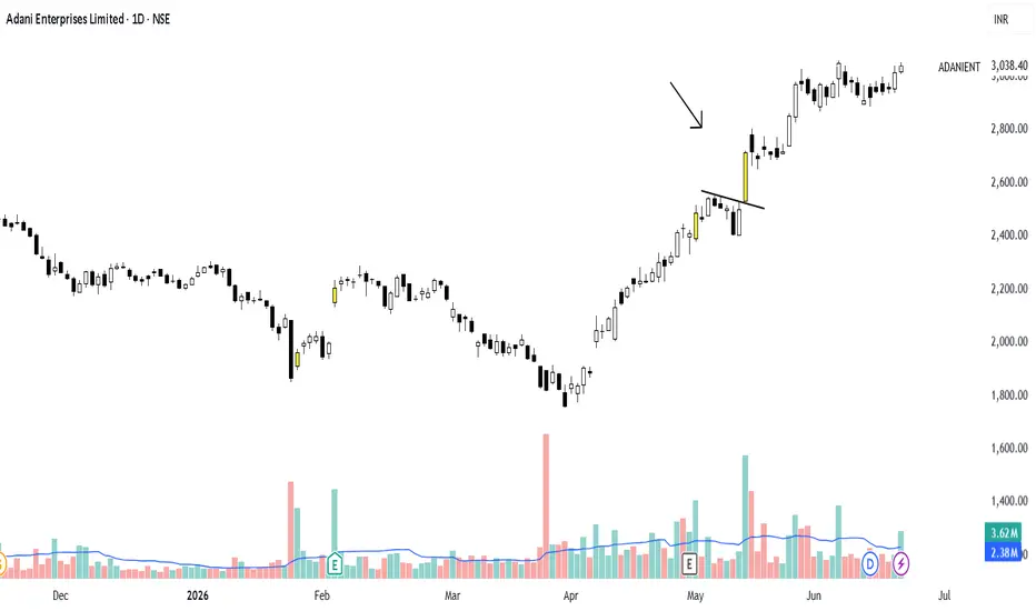
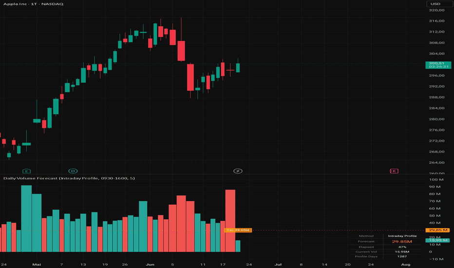
Daily Volume ForecastDaily Volume Forecast
What this indicator does
Daily Volume Forecast projects the full-day trading volume of the current, still-running day — its expected value at the closing bell. It is designed for the Daily chart , where the live bar already carries the volume accumulated so far; the indicator scales that partial volume up to an estimate for the whole session.
The goal is to answer a simple question intraday: is today on track for above- or below-average volume? — before the day is actually over.
How it works
Partial volume so far: On the Daily chart the current bar's volume is the cumulative volume traded since the session open. This is the basis that gets extrapolated.
Elapsed session time: On a daily bar the bar's own hour/minute is the open time, not the current time. The indicator therefore derives the elapsed time from the real wall-clock (timenow) in the instrument's exchange timezone, relative to the configured session, so it knows how far the day has progressed.
Two forecast methods are available:
Intraday Profile (recommended): Intraday volume (e.g. 5-minute) is pulled per day via request.security_lower_tf and averaged into a typical volume-by-time-of-day curve . Because real volume is U-shaped (heavy at the open and close, light at midday), this curve captures how much of a day's volume is normally done by the current time. The forecast is current_volume / expected_fraction_done_by_now, which adapts automatically to the instrument's own shape. Until enough intraday history exists, it falls back to the linear method.
Linear: Assumes volume is spread evenly across the session: forecast = current_volume × (session_length / elapsed_minutes). Simple, requires no extra data, but overestimates the remainder in the morning because it ignores the U-shape.
Live update: The estimate is computed on the current (last) bar and updates as the day develops. When the market is closed, elapsed time clamps to the full session, so the forecast converges to the actual day's volume.
Display
Volume columns of the actual daily volume (historical and current), coloured by up/down day — green when close ≥ open, red otherwise.
Forecast line for the projected full-day volume, extended to the right edge (trackprice) on the current bar.
Label on the last bar showing the estimate (e.g. "Est. 3.2M").
Info table (optional, bottom-right) with the selected method, the forecast, percent of the session elapsed, the current volume, and the number of days used to build the profile.
Settings
Forecast Method: Intraday Profile or Linear.
Trading Session: Session string (default 0930-1600 for US RTH); adjust to the instrument (e.g. 0900-1730 EU stocks, 0000-2400 for 24h / crypto / FX).
Profile Resolution (min): Intraday resolution used to build the volume curve (Intraday Profile only).
Show Historical Daily Volumes: Toggle the volume columns.
Show Info Table: Toggle the table.
Colours for up and down volume.
How to use it
Apply it to a Daily chart (a warning label appears on other timeframes). Use it to gauge participation in real time — to confirm breakouts on rising projected volume, to flag unusually quiet days, or as a context filter alongside a price strategy. The Intraday Profile method is recommended whenever the instrument has a pronounced intraday volume shape; Linear is a lightweight fallback that needs no intraday history.
Notes
request.security_lower_tf provides only a limited amount of recent intraday history (a TradingView/plan limit), so the profile is built from the most recent available days and rolls forward naturally.
The profile method needs a few completed days to warm up; until then it uses the linear fallback.
The session string must match the instrument, otherwise the elapsed-time scaling — and therefore the forecast — is distorted. Extended-hours volume is not considered.
This script is an analysis tool and does not constitute financial advice. A volume forecast is an extrapolation, not a guarantee of the day's outcome.
═══════════════════════════════════════
Daily Volume Forecast — Deutsch
Was macht dieser Indikator?
Daily Volume Forecast prognostiziert das gesamte Tagesvolumen des aktuellen, noch laufenden Tages — den zu erwartenden Wert zum Handelsschluss. Er ist für den Daily-Chart ausgelegt, wo die laufende Kerze bereits das bisher kumulierte Volumen trägt; der Indikator skaliert dieses Teilvolumen auf eine Schätzung für die ganze Session hoch.
Ziel ist es, schon während des Tages eine einfache Frage zu beantworten: Läuft der heutige Tag auf über- oder unterdurchschnittliches Volumen hinaus? — bevor der Tag tatsächlich vorbei ist.
Wie es funktioniert
Bisheriges Teilvolumen: Auf dem Daily-Chart ist das Volumen der aktuellen Kerze das seit Session-Eröffnung kumulierte Volumen. Das ist die Basis, die hochgerechnet wird.
Verstrichene Session-Zeit: Auf einer Tageskerze ist deren Stunde/Minute die Eröffnungszeit, nicht die aktuelle Uhrzeit. Der Indikator leitet die verstrichene Zeit deshalb aus der realen Uhrzeit (timenow) in der Börsen-Zeitzone des Instruments ab, relativ zur eingestellten Session — so weiss er, wie weit der Tag fortgeschritten ist.
Zwei Prognosemethoden stehen zur Wahl:
Intraday Profile (empfohlen): Über request.security_lower_tf wird das Intraday-Volumen (z. B. 5-Minuten) je Tag erhoben und zu einer typischen Volumenkurve nach Tageszeit gemittelt. Da reales Volumen U-förmig ist (viel bei Eröffnung und Schluss, wenig am Mittag), erfasst diese Kurve, welcher Anteil des Tagesvolumens zur aktuellen Uhrzeit normalerweise schon gehandelt ist. Die Prognose ist aktuelles_Volumen / erwarteter_Anteil_bis_jetzt und passt sich automatisch an die Form des Instruments an. Bis genug Intraday-Historie vorliegt, greift der lineare Fallback.
Linear: Nimmt an, dass das Volumen gleichmässig über die Session verteilt ist: Prognose = aktuelles_Volumen × (Session-Länge / verstrichene_Minuten). Einfach, ohne Zusatzdaten, überschätzt aber am Vormittag den Rest, weil die U-Form ignoriert wird.
Live-Update: Die Schätzung wird auf der aktuellen (letzten) Kerze berechnet und aktualisiert sich im Tagesverlauf. Bei geschlossenem Markt wird die verstrichene Zeit auf die volle Session begrenzt, sodass die Prognose gegen das tatsächliche Tagesvolumen konvergiert.
Anzeige
Volumen-Säulen des tatsächlichen Tagesvolumens (historisch und aktuell), eingefärbt nach Up/Down-Tag — grün wenn close ≥ open, sonst rot.
Prognose-Linie für das hochgerechnete Tagesvolumen, auf der aktuellen Kerze bis zum rechten Rand verlängert (trackprice).
Label am letzten Balken mit der Schätzung (z. B. "Est. 3.2M").
Info-Tabelle (optional, unten rechts) mit gewählter Methode, Prognose, Anteil der bereits verstrichenen Session, aktuellem Volumen und Anzahl der für das Profil genutzten Tage.
Einstellungen
Forecast Method: Intraday Profile oder Linear.
Trading Session: Session-String (Standard 0930-1600 für US-RTH); an das Instrument anpassen (z. B. 0900-1730 EU-Aktien, 0000-2400 für 24h / Krypto / FX).
Profile Resolution (min): Intraday-Auflösung zum Aufbau der Volumenkurve (nur Intraday Profile).
Show Historical Daily Volumes: Volumen-Säulen ein-/ausblenden.
Show Info Table: Tabelle ein-/ausblenden.
Farben für Up- und Down-Volumen.
Verwendung
Auf einen Daily-Chart anwenden (auf anderen Timeframes erscheint ein Hinweis-Label). Geeignet, um die Marktbeteiligung in Echtzeit einzuschätzen — etwa zur Bestätigung von Ausbrüchen bei steigender prognostizierter Beteiligung, zum Markieren ungewöhnlich ruhiger Tage oder als Kontext-Filter neben einer Kursstrategie. Die Methode Intraday Profile wird empfohlen, wenn das Instrument eine ausgeprägte Intraday-Volumenform hat; Linear ist ein leichtgewichtiger Fallback ohne Intraday-Historie.
Hinweise
request.security_lower_tf liefert nur eine begrenzte Menge jüngster Intraday-Historie (TradingView-/Abo-Limit), daher basiert das Profil auf den jüngsten verfügbaren Tagen und rollt natürlich mit.
Die Profil-Methode braucht einige abgeschlossene Tage zum "Aufwärmen"; bis dahin greift der lineare Fallback.
Der Session-String muss zum Instrument passen, sonst werden die Zeit-Skalierung — und damit die Prognose — verzerrt. Vor-/Nachbörsliches Volumen wird nicht berücksichtigt.
Dieses Skript ist ein Analyse-Werkzeug und stellt keine Anlageberatung dar. Eine Volumenprognose ist eine Hochrechnung, keine Garantie für den Tagesausgang.
指标
指标
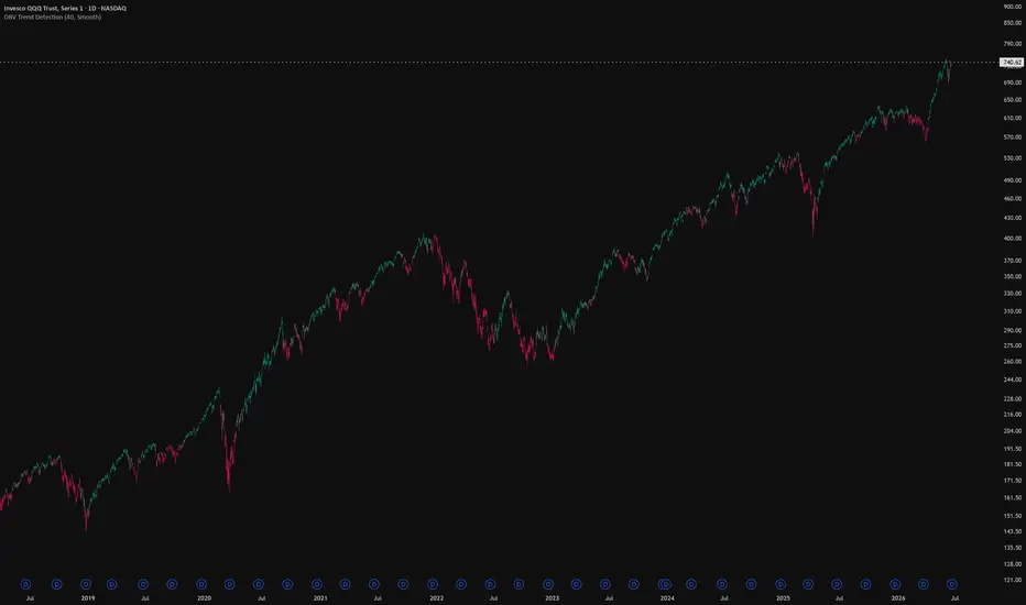
OBV Trend CandlesOBV Trend Candles
This indicator colors your candles based on the relationship between On-Balance Volume (OBV) and a moving average of OBV. It's a simple way to keep volume-based trend context visible directly on the price chart, without having to watch a separate OBV pane.
How it works
OBV accumulates volume on up-closes and subtracts it on down-closes, so a rising OBV means volume is flowing into the asset and a falling OBV means it's flowing out. This script takes that OBV line and compares it to a simple moving average of itself:
When OBV is above its SMA, volume momentum is building → candles are painted green.
When OBV is below its SMA, volume momentum is fading → candles are painted red.
The idea is that volume often shifts before or alongside price, so the color flips can give you a read on whether the current move is backed by participation.
The Sensitivity input
The single setting that matters is Sensitivity, which is the length of the SMA applied to OBV. Lower values make the indicator react faster to changes in volume flow (more color flips, more noise), while higher values smooth things out and only flip on more established shifts. Tune it to your timeframe and trading style — there's no universally "correct" value.
Notes
It works on any timeframe and any asset, as long as that asset reports volume data. On symbols without volume (some forex pairs and certain indices), OBV can't be calculated and the script will let you know. Colors are fully customizable in the settings.
This is a context/confirmation tool, not a standalone signal — it tells you about volume flow, not where to enter or exit. Use it alongside your own analysis. 指标

指标

指标

Channel Volume Profilwizard channel vp idm is a visual analysis tool built around a dynamic price channel, an anchored volume profile, value area levels, volume nodes, inducement zones, liquidity sweeps, and confluence labels.
the purpose of this indicator is to help traders read where price is positioned inside an active market structure. it combines channel direction, volume acceptance, value area behavior, and liquidity reactions into one clean visual layout.
this indicator does not predict the market. it is designed to organize technical analysis and highlight areas where price may react, slow down, reject, or continue.
main concept
the script builds a dynamic channel around price using a regression-based structure. inside this channel, it calculates an anchored volume profile that follows the slope of the market.
unlike a classic horizontal volume profile, this profile is projected inside the active channel. when the market is rising, the profile follows the upward slope. when the market is falling, the profile follows the downward slope.
this makes the profile easier to read in trending conditions, because the volume zones stay aligned with the current market path.
what the indicator displays
poc
poc stands for point of control. it marks the area with the highest volume inside the profile. this is often an area of acceptance where price may return, pause, or consolidate.
vah
vah stands for value area high. it is the upper boundary of the value area. if price rejects this level, a move back toward the poc may be watched. if price accepts above it, the market may be trying to expand higher.
val
val stands for value area low. it is the lower boundary of the value area. if price rejects this level, a move back toward the poc may be watched. if price accepts below it, the market may be trying to expand lower.
hvn
hvn stands for high volume node. it marks an area where volume concentration is high. these levels may act as areas of acceptance, reaction, or slowdown.
lvn
lvn stands for low volume node. it marks an area where volume concentration is low. these levels may act as fast movement zones, rejection zones, or imbalance areas.
idm
idm represents an internal inducement area. it helps identify internal liquidity zones that may be swept before a reaction or continuation.
drop marker
the drop marker highlights a possible liquidity sweep. it appears when price takes a level or zone and then moves back inside.
a label
the a label is a confluence marker. it combines several conditions such as sweep, rejection, value area interaction, volume behavior, poc reclaim, and structure context. it should not be used alone. it is a visual signal for deeper analysis.
how to use the indicator
start by looking at the channel direction.
if the channel is rising, the trader can focus more on reactions near the lower part of the channel, val, or bullish sweep zones.
if the channel is falling, the trader can focus more on reactions near the upper part of the channel, vah, or bearish sweep zones.
if price is near the middle of the channel, the market may be balanced. in that case, it is usually better to wait for a clear rejection, breakout, sweep, or acceptance shift.
how to use the poc
the poc is the main acceptance level of the current profile.
when price is above the poc, the market may be accepting higher prices.
when price is below the poc, the market may be accepting lower prices.
when price keeps returning to the poc, the market may be consolidating or building balance.
a clean break and hold above the poc can show stronger bullish acceptance.
a clean break and hold below the poc can show weaker structure or bearish acceptance.
how to use vah and val
vah and val define the value area.
a rejection from vah can show that price is failing to accept higher levels.
a rejection from val can show that price is failing to accept lower levels.
an acceptance above vah can suggest expansion to the upside.
an acceptance below val can suggest expansion to the downside.
beginners can use vah, poc, and val as a simple map:
vah = upper value zone
poc = balance zone
val = lower value zone
how to use hvn and lvn
hvn and lvn are displayed as small dotted levels with tiny labels.
hvn can act as a reaction or slowdown zone because price has previously accepted volume there.
lvn can act as a faster movement zone because there was less volume acceptance there.
these levels are not automatic buy or sell signals. they are reference points that should be combined with price action, structure, and risk management.
how to use idm
idm labels show internal inducement areas.
an idm can represent a zone where liquidity was built and later taken by the market. when price sweeps an idm and then reintegrates, it may help explain a reaction or shift in behavior.
an idm near val may support a bullish reaction if price sweeps and returns inside the channel.
an idm near vah may support a bearish reaction if price sweeps and returns inside the channel.
how to use the drop marker
the drop marker shows a potential liquidity sweep.
a drop below val or below the lower channel can suggest that price swept lower liquidity and then returned inside.
a drop above vah or above the upper channel can suggest that price swept upper liquidity and then returned inside.
it is usually better to wait for candle close before interpreting the marker.
how to use the a label
the a label represents a stronger confluence condition.
a bullish a near val or the lower channel can suggest possible absorption if price sweeps liquidity and closes back inside.
a bearish a near vah or the upper channel can suggest possible distribution if price sweeps liquidity and closes back inside.
the a label becomes more meaningful when it appears near poc, vah, val, hvn, lvn, or idm.
it should always be confirmed with market context, candle close, and risk management.
important settings
channel / vp lookback
controls how many bars are used for the channel and the volume profile. a higher value gives a broader view. a lower value gives a more reactive view.
regression length
controls the base of the channel. a higher value makes the channel smoother. a lower value makes it react faster to recent price movement.
vp rows
controls the number of rows in the volume profile. more rows create more detail, but too many rows can make the chart heavier.
value area %
controls the value area calculation. the common default is 70.
poc source
chooses how the poc is calculated. raw is stricter. smoothed is more stable visually.
vah / val source
chooses whether value area boundaries use raw volume or smoothed volume.
keep vp / levels inside rails
keeps the volume profile and main levels inside the channel so they do not overlap the outer rail visuals.
auto guard from neon rails
adds extra spacing from the visual rail bands to keep the profile and levels clean.
show inner lines
shows or hides decorative inner channel lines. when disabled, inner decorative lines are removed, while important levels such as poc, vah, val, hvn, and lvn remain visible.
show hvn / lvn small lines
shows small dotted high volume node and low volume node markers.
idm validation mode
controls how idm labels are displayed.
balanced sweep is more flexible.
strict bos is more selective.
early candidate displays potential idm areas earlier.
a minimum score
controls how selective the a label is. a higher value gives fewer signals. a lower value gives more signals.
beginner workflow
step 1
identify the channel direction.
if the channel is rising, focus on bullish reactions near the lower channel, val, or sweep zones.
if the channel is falling, focus on bearish reactions near the upper channel, vah, or sweep zones.
step 2
check where price is compared to the poc.
above poc can show stronger acceptance.
below poc can show weaker acceptance.
around poc can show balance or consolidation.
step 3
watch vah and val.
vah is the upper value boundary.
val is the lower value boundary.
look for rejection, acceptance, or sweep around these levels.
step 4
use hvn and lvn as reaction levels.
hvn may slow price down.
lvn may lead to faster movement or sharp rejection.
step 5
wait for confirmation.
a drop marker shows a sweep.
an a label shows confluence.
an idm label shows internal liquidity.
when several elements appear in the same area, that zone becomes more important for analysis.
example use case
price is rising inside the channel.
price pulls back toward val.
a drop marker appears below val.
price closes back inside the channel.
an a label appears near the lower channel.
in this case, the trader can study the area as a possible bullish reaction zone. this does not mean automatic entry. the trader should still check market structure, candle close, risk, and invalidation level.
another example
price reaches the upper channel and trades near vah.
a drop marker appears above vah.
price closes back below vah.
an a label appears near the top of the channel.
this can be studied as a possible rejection zone. the trader should still confirm with structure, risk management, and broader market direction.
usage tips
do not use the indicator alone.
always check the broader trend.
wait for candle close before making a decision.
avoid trading every label.
focus on zones where several elements align.
adjust settings depending on the asset and timeframe.
use proper risk management.
test the indicator before using it in live conditions.
risk notice
this indicator is an educational and technical analysis tool. it is not financial advice and does not guarantee any result. all signals and levels should be used as visual references inside a complete trading plan. every trader is responsible for their own decisions, risk management, and execution.
指标

Anchored VWAP Reversion ChannelAnchored VWAP Reversion Channel — Regime-Gated Fade Framework
## What this script does
This is an **analytical study** that frames mean-reversion ("fade") setups around an **anchored, volume-weighted regression channel**, then **gates** those setups by a statistical market-state test and **scores** them against their own forward outcomes. It does not place orders and it is not a signal service — its purpose is to let you see, on your own instrument and timeframe, whether fading a stretched move actually has an edge, instead of assuming it does.
It plots one channel (a centre line plus inner/outer residual-σ bands), marks fade setups at the outer band, draws supporting context (volume-profile POC / value area, untested prior-session POCs, momentum divergences, liquidity sweeps, and multi-timeframe trend lines), and reports a compact validation panel.
## Why these components are combined (mashup rationale)
Fading an extreme is really three separate questions, and no single classic indicator answers all three. Stacking look-alike indicators just echoes one input, so this tool deliberately combines **three non-redundant lenses and makes them check each other**:
1. **WHERE is price stretched?** — A **volume-weighted polynomial regression** anchored at the most recent swing pivot, with **residual-σ bands**. Because the curve tilts with the active leg, an outer-band tag stays meaningful even inside a trend, where a flat cumulative VWAP would not. A **volume profile** anchored to the *same* window supplies POC and value area, and prior-session POCs that have never since been traded through become **reversion targets**.
2. **Is a reversion actually firing here?** — Three orthogonal **tells** evaluated only at the band: a **close-back rejection**, a **band-confluent momentum divergence**, and an **equal-high/low liquidity sweep** (stop-run). Crucially, all three are derived from the same stretch, so their agreement is shrunk by a **design-effect correction** (effective-sample-size): three correlated echoes are not allowed to masquerade as three independent confirmations.
3. **Is the market in a reverting state at all?** — A **regime gate** combining a **variance-ratio test** and a **reversion-trust correlation** only lets a fade through when recent increments are offsetting (mean-reverting) rather than compounding (trending).
The pieces are not bolted together side by side: they share **one geometry** (the anchored channel) and **one volatility unit** (residual σ / ATR), and each can veto the others. A band tag with no tell does nothing; a tell with no reverting regime does nothing. The design goal is to **suppress** low-quality fades — into a trend, mid-range, or backed by a single echoed tell — more than to generate them.
## The honesty layer (what makes this more than a drawing)
Every fade that fires is logged and, a fixed horizon later, **resolved**: its forward return is measured in ATR units and tabulated **with the regime gate ON versus OFF**, reporting follow-through %, whipsaw %, a Wilson 95% confidence interval, and the **mean return per fade**. A per-fade series also exports to the Data Window so you can study the full return distribution offline. The gate has to **beat its own ungated baseline** to justify itself — the framework is built to be tested, not trusted blindly.
## How to use it
1. Set the **Price source** (group 01). It works on any symbol and any market; volume-based parts need a real volume feed.
2. A fade **arms** when price tags the outer band **and** at least one tell prints, then **passes** only if the regime gate reports a reverting state. Solid triangles are gated fades; the target is the centre line or the nearest untested POC.
3. Read the panel top-down: does **Gate ON** beat **Gate OFF** on both follow-through and mean R, with non-overlapping intervals and a reasonable sample size? If not, the edge is not present on this symbol/timeframe — change them rather than forcing the trade.
4. The signal lives on **higher intraday timeframes**; one-minute data is mostly noise.
## Defaults
Shipped tuned for **NSE:NIFTY** index futures on intraday timeframes (sources, pivot lengths, value-area %, and the Tuesday-style weekly session context reflect that instrument). Every value is exposed as an input — change the **Price source** and the relevant lengths to run the framework on any other instrument or market.
## What is original
The original work is the **coordination**, not any single formula: an anchored polynomial-regression channel used as a reversion frame, three decorrelated band tells fused by a design-effect shrink, a statistical regime gate, and a built-in A/B + forward-return validation harness — combined so each lens can veto the others and the whole thing reports its own hit rate. It is not a re-skin of one indicator.
## Concept credits (techniques are standard; this implementation is original)
Anchored VWAP (standard); volume-weighted least-squares / polynomial regression (standard); residual-σ channel (standard); Volume Profile, Value Area and POC — Market Profile, Steidlmayer / CBOT; Variance-Ratio test — Lo & MacKinlay (1988); design effect / effective sample size — Kish (1965); proportion confidence interval — Wilson (1927); ATR trailing stop / Supertrend (classic, used for the multi-timeframe context lines); RSI — Wilder; Stochastic — Lane.
## Disclaimer
For research and education only. This is an analytical study, **not** financial advice, **not** a recommendation, and **not** a guarantee of future results. All statistics shown are **in-sample** on loaded history, close-to-close, without costs or slippage — a study aid, not a backtest. Mean reversion fails in trends and through regime breaks. Do your own research and manage your own risk.
指标

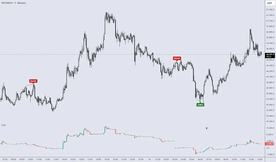
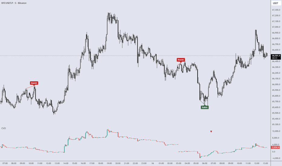
CVD [Order Flow]Price tells you what happened. Cumulative Volume Delta tries to tell you who was leaning on it. Delta is buying pressure minus selling pressure on each bar; CVD is that delta accumulated into a running line, so a market can grind sideways in price while the delta quietly stacks in one direction. CVD builds that line, draws it as informative candles instead of a flat curve, and watches it for two order-flow behaviors traders care about: divergence against price and absorption. One honest caveat sits underneath all of it, and the tool is built around it rather than hiding it: TradingView does not know real buy versus sell volume, so this CVD is a lower-timeframe estimate — and on data where that estimate is weak, the tool stays quiet instead of inventing pressure.
HOW IT WORKS
CVD is reconstructed from a lower timeframe, because the chart timeframe alone cannot tell you how a bar's volume split between buyers and sellers. The tool requests intrabar data from a faster timeframe and classifies each intrabar: an up intrabar adds its volume as positive delta, a down intrabar subtracts it, and a doji counts as zero — on an ambiguous intrabar the tool refuses to guess a side.
Delta and CVD — each bar's delta is the sum of its intrabar deltas. The cumulative line is committed only when the bar closes (the live bar is shown separately and is provisional until then). Two accumulation modes: Session resets the running total at each session start; Cumulative carries it across.
CVD candles — by default CVD is drawn as candles in its own pane: the open is the previous close, the high and low are the running intrabar extremes of the cumulative within the bar, and the close is the bar's net delta. This shows the path the delta took inside the bar, not just where it ended — more informative than a plain line. Line and Line+Histogram styles are available too.
Divergence — drawn on the price chart, between a price pivot and the matching CVD pivot, on confirmed pivots only. Regular divergence (price makes a higher high or lower low while CVD does the opposite — a potential exhaustion read) and Hidden divergence (a continuation read, default off). Several filters gate it: minimum swing size, minimum CVD move, minimum pivot volume, and bar-distance bounds, so trivial wiggles do not get marked.
Absorption — a strong delta meeting a weak price result: a lot of one-sided pressure that fails to move price its way, as if the move is being absorbed. It is confirmed on the next candle. This is an order-flow pattern, not a buy or sell instruction.
The unreliable-data part is deliberate and silent. Behind the scenes the tool weighs the symbol type against how complete the intrabar measurement is. On a symbol with no real volume it withholds signals; on tick-volume data it stays cautious. There is no confidence panel or badge — the honesty is in the behavior, not in a label on your chart.
Intrabar data is pulled from a lower timeframe and classified into per-bar delta (up = +volume, down = -volume, doji = 0)
Delta is accumulated into CVD and committed on bar close; the running line is drawn as candles, line, or line+histogram
Confirmed price and CVD pivots are compared for divergence; a strong-delta / weak-result bar is flagged as absorption, confirmed next candle
HOW TO READ
The CVD line rising means net buying pressure is accumulating; falling means net selling pressure. Sideways price with a steadily climbing or dropping CVD is the situation this tool is built to surface.
CVD candles show the intrabar path: a long candle that closed near its delta extreme is one-sided flow, while a candle that ran far in delta but closed back near its open is flow that met resistance.
A regular divergence is price and CVD disagreeing at a swing — price extends, delta does not. A hidden divergence (off by default) is the continuation-flavored version. Both describe an order-flow condition, not a trade.
An absorption mark is heavy delta that did not get its move. It says pressure was met, nothing more.
"Bullish" and "Bearish" describe the direction of the pattern, not a buy or sell instruction. Marking a divergence or an absorption says nothing about whether price will turn, continue, or do neither. The tool maps the order flow; the read is yours.
INPUTS
LTF Source / Manual LTF — Auto picks a lower timeframe targeting enough intrabars per chart bar; Manual lets you set it yourself.
Accumulation — Session (reset the running total each session) or Cumulative (carry it across).
Show Bullish / Show Bearish Divergence — enable each direction independently.
Show Hidden — add the continuation-style hidden divergence (default off).
Pivot Left / Right — how many bars define a confirmed pivot (larger = stricter and later, but still no repaint).
Pivot Source — Wick or Close: measure pivots from the extremes or from the closes.
Min Swing Size / Min CVD Move / Min Pivot Volume / Min & Max Bars Between — the divergence quality filters; raise them for fewer, cleaner marks.
CVD Smoothing — smooth the CVD used for pivot detection.
Absorption — toggle the absorption pattern; its delta, range, and period thresholds define how strong the delta and how weak the result must be.
CVD Style — Candles (default), Line, or Line+Histogram.
Zero Line / Dim Live Bar / Up & Down Color — display options; Dim Live Bar visually marks the not-yet-committed bar.
ALERTS
CVD Bullish Divergence and CVD Bearish Divergence fire when a confirmed, filter-passing divergence is marked.
Absorption fires when a confirmed absorption is marked.
All fire on confirmed, quality-gated events — set them up with "Once Per Bar Close."
NOTES & LIMITS
This is an observation tool, not a forecast. The single most important thing to understand: TradingView does not provide real buy versus sell volume, so this CVD is a lower-timeframe estimate built by splitting each bar into faster intrabars and classifying them. That estimate is only as good as the volume data underneath it. On instruments with genuine traded volume — futures and crypto — it is at its most reliable. On forex and CFDs the "volume" is tick volume (number of price updates, not contracts traded), so the delta there is looser, and the tool treats it cautiously through a silent data-quality gate; on a symbol with no usable volume it withholds signals rather than drawing noise. There is no panel telling you this per bar — the caution is built into the behavior. Divergence and absorption are order-flow patterns, not buy or sell instructions, and marking one says nothing about whether price will reverse or continue. No repaint, no lookahead: the cumulative line is committed on confirmed (closed) bars and the live bar is shown separately as provisional; divergences are drawn on confirmed pivots only — they appear a few bars late by nature, but they do not move once printed; absorption is confirmed on the next candle. The lower-timeframe request reads completed intrabars and does not leak the future. No profit, win-rate, or guarantee claim. Open-source under CC BY-NC-SA 4.0 — non-commercial use, attribution to ElisTools required for reuse or derivatives. TradingView (Pine v6) only. 指标
指标

Order Flow Microstructure Engine# Order Flow Microstructure Engine
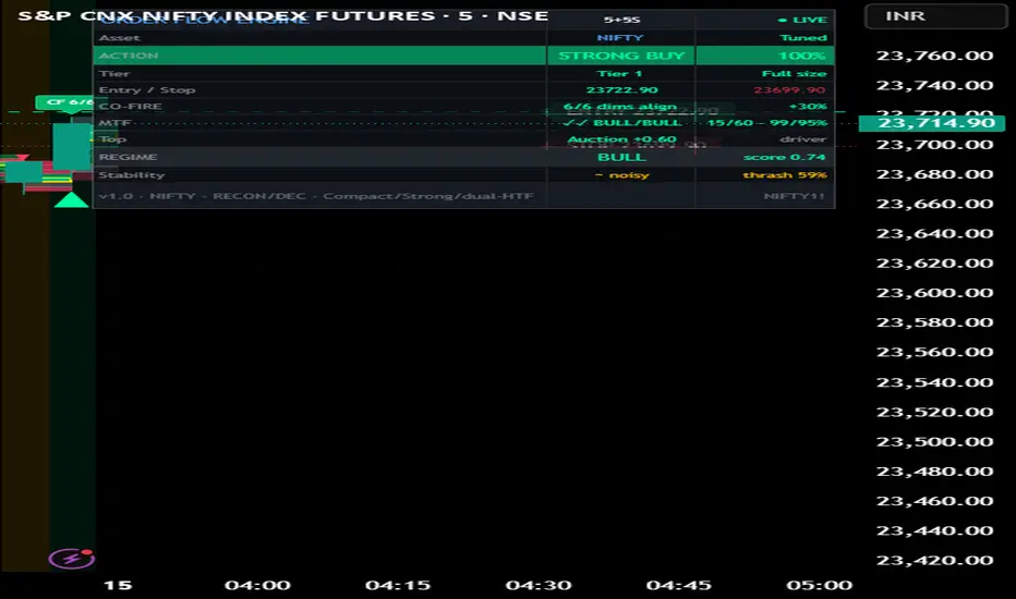
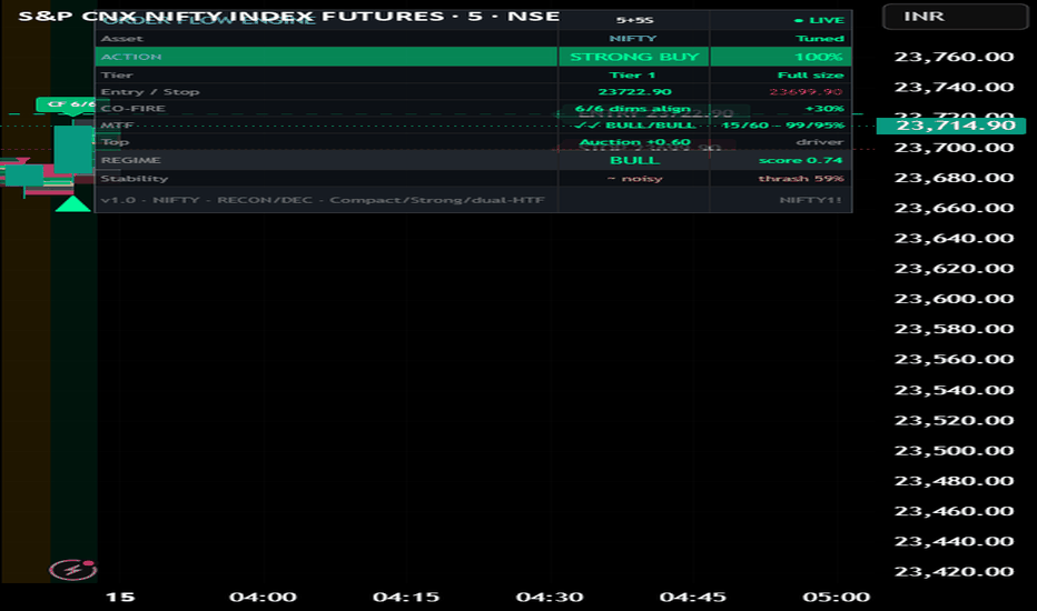
**Order Flow Microstructure Engine** condenses a full stack of order-flow and market-microstructure measures into a single decision: one confidence %, one tier, and one action with entry/stop levels — shown in an adaptive on-chart dashboard. It is built to answer one question on every bar: *are aggressive buyers or aggressive sellers in control, and how convinced should you be?*
This is not a bundle of unrelated indicators placed on one chart. Every component measures a **different facet of the same process** — the buy/sell auction happening inside each bar — and they are combined inside **one probabilistic model**. The reason for the mashup, and how the parts interact, is described below as the guidelines require.
**Why these components are combined (mashup justification)**
No single order-flow measure is reliable alone: raw delta misleads during absorption, CVD drifts, footprint imbalances appear in chop, and toxicity rises at both reversals and breakouts. Because these weaknesses are *partially independent*, fusing the measures correctly cancels noise that any one of them carries. The original element is **how** the fusion is done — not what is plotted.
**How it works (the pipeline)**
1. *Reconstruction.* Lower-timeframe sub-bars are pulled and each is classified buy/sell with a tick-rule cascade (after Lee & Ready). Where the data plan exposes native volume footprint, real bid/ask is used and aggregated into the same price bins. The dashboard always shows whether it is running on reconstructed (`RECON`) or native (`NATIVE`) data.
2. *Factors.* From that base it derives Aggressor Imbalance Ratio, Cumulative Volume Delta, footprint imbalances/POC, auction Value-Area efficiency (acceptance vs rejection), integrated multi-level Order-Flow Imbalance (depth-weighted), VPIN-style flow toxicity, Kyle's lambda price-impact/liquidity, a directional self-exciting (Hawkes) intensity, and a square-root-law absorption measure.
3. *Fusion (the original part).* Each factor is mapped to a probability and combined in Bayesian log-odds. Crucially, the flow-derived factors are **decorrelated before fusion** using an effective-sample-size (design-effect) shrinkage, so factors that are really the *same evidence* (AIR, delta, CVD, footprint, OFI) cannot inflate confidence just by agreeing. Structurally independent factors (auction efficiency, MOC, Hawkes, absorption, cross-instrument) enter at full weight. The posterior is then gated by multi-timeframe and multi-horizon consensus and damped by a regime-thrash (chop) penalty, producing one confidence → a 5-tier ladder → an action.
Without this combination you would get several conflicting opinions; the value is the **correlation-aware fusion** that turns them into one calibrated read.
**How to use it**
- Apply to a liquid instrument on an intraday timeframe (1m–1h). Defaults are tuned for index futures on 5-minute charts with 5-second sub-bars.
- Read the Compact dashboard top-down: ACTION + confidence %, Tier (position-size guidance), Entry/Stop, then CO-FIRE confluence, multi-timeframe and regime/stability. Switch "Table view mode" to Full for a complete factor-by-factor breakdown.
- On-chart triangles mark Tier-1/Tier-2 long/short signals across history; footprint boxes show the intrabar buy/sell distribution.
- For other markets: change the **Market preset** (group 01). Choose **CUSTOM** to set your own session, MOC window, footprint bin sizing and CVD reset — making it usable on any instrument in any market.
- The dashboard theme auto-adapts to a light or dark chart background.
**What makes it original**
Correlation-aware decorrelated Bayesian fusion of order-flow factors; a native-footprint seam that uses real bid/ask when available and transparently falls back to reconstruction; layered multi-horizon + multi-timeframe + cross-instrument confirmation on a microstructure base; and a regime-stability filter that penalizes only genuine directional reversals, not same-direction intensity changes.
**Honesty / limitations**
On most retail feeds, order flow here is reconstructed from lower-timeframe data via the tick rule (~75–80% trade-sign accuracy), not true exchange bid/ask, unless your plan provides native footprint data. The data source is shown in the dashboard. This is an analytic and educational tool, not financial advice and not a guarantee of results.
**Concept credits**
Lee & Ready (trade sign); Kyle (price impact / lambda); Easley, López de Prado & O'Hara (VPIN); Cont, Kukanov & Stoikov and Xu, Gould & Howison (OFI / multi-level OFI); Hawkes and Bacry–Muzy (self-exciting intensity); Almgren and Tóth–Bouchaud (square-root impact law); Kaufman (Efficiency-Ratio adaptation); Steidlmayer (Market Profile / Value Area); Kish (design effect). All Pine implementations are original re-derivations; no external script code is used.
**Disclaimer**
For research and educational purposes only. Nothing here is financial advice. Markets carry risk and past behaviour does not guarantee future results. Always do your own research and manage risk.
指标
Liquidity Map & Execution Cost# Liquidity Map & Execution Cost
## What this script does
LMX answers three execution questions most indicators ignore: **how expensive is it to get in and out right now, how hard would it be to move size, and where on the chart will price struggle versus travel freely.** It reads only the chart's own price and volume — no symbol is hardcoded, so it runs on any asset and any market (equities, futures, FX, crypto, indices) — and turns the answers into a plain-language trade check: liquidity state, suggested position size, order type, estimated slippage, and a colour-coded map of support, resistance, walls and open gaps.
## Why these components are combined (mashup justification)
This is not several indicators stacked together — it is one liquidity model whose parts each answer a question the others cannot, and they are designed to be read together. Removing any one leaves a specific blind spot:
1. **Cost to cross — effective spread.** Estimated with the EDGE estimator (Ardia, Guidotti & Kroencke 2024) from open/high/low/close, cross-checked against Abdi-Ranaldo (2017) and Corwin-Schultz (2012). This tells you the round-trip cost of entering, which spread-blind tools cannot show. Alone, it says nothing about moving size or about levels.
2. **Cost to move size — price impact.** The Amihud (2002) illiquidity ratio with a high-low refinement, plus a rolling Kyle (1985) lambda computed as a true regression slope. This tells you how far your own order would push price — the question that matters for sizing, and one a spread estimate cannot answer.
3. **Direction of pressure — order imbalance.** A close-location signed-volume imbalance and its persistence. This tells you which side is leaning now, adding direction that the cost measures lack.
4. **The spatial map — volume at price.** A time-decay-weighted, range-distributed volume profile that yields the Point of Control and Value Area (standard 70% method), rendered as directional zones: green support below price, red resistance above, solid = a wall price struggles at, faint = an open gap price slides through. This converts the abstract cost/impact numbers into *locations* on the chart.
5. **Anchored VWAP — fair value.** A volume-weighted average anchored to your chosen reference (last major swing by default; or session/week/month open, or the highest-volume bar), drawn as a trend-coloured line. It is the dynamic counterpart to the static profile: where the average participant is positioned, and whether price is rich or cheap versus that.
Together they form one decision: the spread and impact set the **cost and size**, the imbalance and VWAP set the **direction and fair value**, and the map sets the **location** — so the output is "trade full size with market orders, buyers in control, room to run up to the gap above," not five separate readings.
## How a reading is produced
Each estimator is normalised to a percentile of its own history so thresholds adapt to every symbol and timeframe. The inverted spread, inverted impact and depth combine into a 0–100 **Liquidity Score**, classified as Deep / Normal / Thin / Stressed (a sudden impact spike forces Stressed). The score drives the suggested size multiplier, the order-type advice and the slippage estimate. The map is rebuilt on the last bar from the volume-at-price profile.
## How to use it
- Apply to any symbol. Set the price source and, if you trade very low intraday timeframes, optionally fix the calc timeframe (e.g. Daily) so the spread estimators stay stable. On symbols without real volume the volume modules disable automatically and the score leans on the spread estimators (the panel shows "price-only").
- **Simple mode (default)** gives plain-language guidance: Liquidity, Trade cost, Pressure, Position size, Orders, Watch-out, Fair value, and a one-line verdict. **Pro mode** exposes the full readout (spread in bps, Amihud and Kyle percentiles, depth, imbalance, flow persistence, value-area levels).
- On the chart: trade toward green support, expect resistance at red, size down where the map is thin (price moves fast there), and read the trend-coloured fair-value line for rich/cheap context.
- Alerts: liquidity-state change and sudden liquidity withdrawal.
## Originality
The combination is the original contribution: a single overlay that fuses low-frequency **spread**, **impact** and **imbalance** estimators with a **time-decay, range-distributed volume profile** and an anchored fair-value line, then translates all of it into sizing/order/slippage decisions in plain language. The building blocks are public-domain methods (EDGE, Abdi-Ranaldo, Corwin-Schultz, Amihud, Kyle, volume-profile Value Area, anchored VWAP), each used for the specific job described above and cited in the script header.
## Limitations (please read)
- These are **low-frequency estimators** of quantities normally measured from quote/tick data. They approximate — they do not measure — the true spread, depth, or dealer book.
- Volume-based modules require a real volume feed; they disable on symbols without one.
- Spread estimators were validated on daily-type bars; on very fast intraday timeframes they are noisier — use the calc-timeframe option if needed.
- The on-panel statistics are computed on the loaded chart history.
- This is an analysis tool, **not financial advice.** Test before use and trade at your own risk.
指标

指标

指标

Volume Profile AnalysisVolume Profile Analysis 📊
Advanced horizontal volume profile with order size analysis, buy/sell split, POC, and Value Area — all calculated from real tick-level volume delta.
Core Features:
🔹 Bidirectional Volume Profile Horizontal histogram showing volume distribution across price levels. Buy volume extends RIGHT, sell volume extends LEFT from candles. Delta is proportionally distributed across each bar's price range — no inflation.
🔹 Order Size Analysis Automatically categorizes volume into Large (>1.5× SMA) and Small orders using real volume data. Color-coded so you can see institutional vs retail activity at each price level.
🔹 Point of Control (POC) Yellow line marking the price level with the highest volume — the "fair value" where most trading occurred.
🔹 Value Area (VA) Gray zone containing 68% of total volume around the POC. Price tends to revert to this zone. Trading above/below VA indicates imbalance.
🔹 Buy/Sell Split Each profile level shows separate bars for buying and selling pressure. Labels display exact volumes (e.g., "4.5K | 3.2K").
🔹 Large Order Detection Highlights price levels where >75% of volume comes from large orders — potential institutional accumulation/distribution zones.
🔹 Real-Time Dashboard POC, VA High/Low, distance from POC in ATR units, position (Above/Inside/Below VA), current delta, and profile range.
How to Use:
Signal Meaning
Price at POC Fair value — range-bound market
Price above VA Bullish imbalance — may mean-revert down
Price below VA Bearish imbalance — may mean-revert up
High large order % Institutional activity — watch for reversals
Buy >> Sell at level Buyers absorbed selling at that price
Sell >> Buy at level Sellers absorbed buying at that price
Recommended Settings:
Timeframe: 1S (most precise delta)
Price Levels: 30 (good balance of detail)
Lookback: 100 bars (captures recent session)
Order Size: Enabled (see institutional activity)
Best For: Order flow traders, volume profile traders, identifying support/resistance, detecting institutional activity, understanding where value is established. 指标

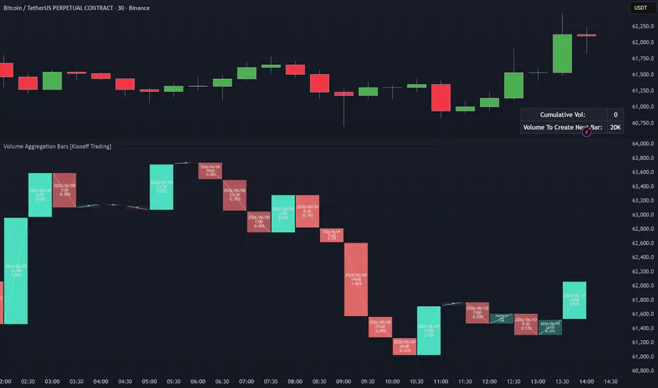
Volume Aggregation Bars [TradingIQ]Hello Traders!
🔹 Volume Aggregation Bars
Volume Aggregation Bars is a volume-based candle visualization tool designed to show how price moves after a fixed amount of trading activity has occurred.
Instead of building candles from fixed time intervals, this tool builds candles from fixed volume thresholds.
That means each displayed bar represents a comparable amount of participation, helping traders study price movement through the lens of activity, effort, efficiency, and participation-based structure .
builds candles from volume instead of time
supports automatic or custom volume thresholds
optional dollar-volume aggregation
uses lower-timeframe volume data for improved accuracy
shows developing volume-bar progress in real time
displays directional candles with optional wicks
includes a volume progress table
🔹 What the tool shows
🔸 Volume-based candles
Traditional candles are built from time.
For example, a 5-minute candle closes every 5 minutes whether the market was active or quiet.
Volume Aggregation Bars work differently.
A new candle is created only after the selected amount of volume has traded.
This helps normalize each candle around market participation rather than time.
In simple terms:
high activity creates new candles faster
low activity creates new candles slower
each candle reflects a more comparable amount of traded volume
price movement can be studied relative to actual participation
🔸 Auto or custom volume thresholds
The script can automatically estimate a useful volume threshold, or traders can manually define their own required volume amount.
You can choose between:
Auto
Required Volume
Auto mode uses recent volume behavior to create a dynamic aggregation threshold.
Required Volume mode lets you choose the exact volume needed to form each new candle.
This gives flexibility for traders who want either an adaptive setting or a fixed, repeatable volume model.
🔸 Dollar-volume mode
The tool can also treat the required volume setting as a dollar amount.
When enabled, the script converts traded volume into dollar-volume when appropriate.
This is useful because raw volume can vary heavily between assets.
Dollar-volume can help normalize activity across different markets by focusing on the value traded rather than only the number of units traded.
🔸 Lower-timeframe volume aggregation
Volume Aggregation Bars can use lower-timeframe data to build more accurate volume candles.
Instead of relying only on the chart timeframe, the script can request lower-timeframe volume and price data to better track when the volume threshold is reached.
This helps improve the accuracy of each volume-based candle, especially on higher chart timeframes.
🔸 Directional candle coloring
Each completed volume candle is colored based on whether price closed above or below the prior completed volume candle.
This makes it easy to see whether each block of market participation resulted in upward or downward price movement.
green candles show upward movement
red candles show downward movement
optional wicks can display the high and low within each volume block
🔸 Efficiency-based transparency
The script also adjusts candle transparency based on movement efficiency.
Efficiency compares how much price moved from the previous close relative to the total high-low range of that volume block.
A cleaner directional move will appear stronger.
A choppier or less efficient move will appear more faded.
This helps separate:
clean directional movement
choppy movement
weak movement inside a wider range
high-volume activity with limited directional progress
🔸 Developing current candle
The current unfinished volume candle is displayed separately while it is still forming.
The script shows the current progress toward the next completed volume bar.
This lets traders see how close the market is to completing the next volume aggregation candle.
The developing candle can help answer:
how much volume has already accumulated
how much volume remains before the next bar forms
whether the current volume block is moving price meaningfully
whether activity is speeding up or slowing down
🔸 Volume progress table
The built-in table shows real-time volume progress information.
Depending on your settings, it can display:
current cumulative volume
volume required to create the next bar
remaining volume before the next aggregation candle completes
This gives a quick reference for how close the current candle is to completion.
🔹 How to read it
Each component gives a different layer of market context:
Volume candle → price movement after a fixed amount of activity
Green candle → price moved higher after the volume block completed
Red candle → price moved lower after the volume block completed
Wick → high and low reached during the volume block
Transparency → directional efficiency of the move
Current candle → unfinished volume block in progress
Volume table → remaining activity needed before the next bar forms
🔹 Why this tool is useful
It gives you:
a cleaner way to study price movement by participation
an alternative to fixed-time candles
a way to see whether volume is producing meaningful movement
better context during high-volume and low-volume conditions
a visual map of activity-based price movement
a framework for comparing effort versus result
🔹 Best use cases
studying price movement after fixed volume thresholds
analyzing high-volume market activity
identifying efficient directional moves
comparing active and inactive market periods
observing how price reacts as participation builds
filtering out some of the distortion created by fixed-time candles
building context around effort versus result
🔹 Important note
This tool is based on historical volume and price movement.
That means:
volume bars do not predict future price direction
strong volume does not guarantee continuation
low efficiency does not automatically mean reversal
high efficiency does not automatically mean trend strength will continue
volume aggregation should be used as context, not certainty
🔹 Inputs you can customize
The script includes flexible controls such as:
lower-timeframe volume source
automatic volume aggregation mode
custom required volume threshold
optional dollar-volume setting
wick display
number of volume blocks shown
time label display options
time label size
candle border width
volume progress table
table position
Closing Notes
Volume Aggregation Bars is built to shift the focus from asking what did price do after a fixed amount of time to asking what did price do after a fixed amount of market activity .
It helps traders visualize price movement through participation, volume efficiency, and activity-based structure.
Thank you for checking it out! 指标

Velocity Breakout Strategy (VBS)Overview
The Velocity Breakout Strategy (VBS) is a comprehensive, institutional-grade swing trading system designed to identify high-probability momentum shifts. Rather than relying on a single lagging indicator, VBS synthesizes five distinct dimensions of market data: Macro Trend, Market Structure, Smart Money Concepts (SMC) valuation, Volatility (ATR/ADX), and Intrabar Volume Delta.
The goal of VBS is to filter out low-probability "chop" and only trigger entries when structural momentum aligns with aggressive buying volume.
Core Mechanics & Underlying Logic
1. Trend & Gradient Cloud Baseline The foundation of VBS is a multi-timeframe moving average system utilizing a Micro (9), Fast (20), and Slow (50) EMA. The relationship between the Fast and Slow EMAs paints a dynamic Gradient Cloud, instantly visualizing the macro trend.
2. Intrabar Volume Delta Estimation Standard volume tells you how much was traded, but not who was in control. VBS includes a custom Volume Delta Estimation engine. It approximates buying vs. selling pressure within a single candle by analyzing where the candle closes relative to its total high-to-low range.
The Filter: VBS can be configured to strictly block any buy signals if the current candle exhibits negative Delta (where estimated selling pressure outweighs buying pressure), preventing entries into hidden institutional distribution.
3. Smart Money Concepts (SMC) Valuation Zones VBS calculates a rolling 100-bar Dealing Range to map out institutional liquidity. It splits this range to identify "Premium" (overvalued) and "Discount" (undervalued) zones. The strategy actively looks for pullback entries (Reloads) when the asset drops into the Discount zone.
4. Volatility & Dynamic ATR Trailing Stops Risk management is handled by a responsive ATR Trailing Stop that adapts to the Average Directional Index (ADX).
During trending phases, the ATR multiplier is wide to let the trade breathe.
When the ADX detects a volatility "Squeeze" (ADX < 20), VBS dynamically tightens the ATR multiplier, protecting profits before a sudden volatile expansion occurs.
5. Master Candle Consolidation VBS scans for extreme volatility contraction using a "Master Candle" concept. If the price prints 4 consecutive bars entirely within the High/Low bounds of a previous Master Candle, the system arms a Breakout Trigger.
Entry Signals (When to Buy)
VBS generates specific, visual entry signals on the chart:
A+ Buy (Lime Triangle): A Golden Cross (20/50 EMA) occurs simultaneously with a verified Higher Low in market structure, backed by positive volume delta.
Risky Buy (Orange Triangle): A Golden Cross occurs, but the strict Higher Low market structure is not yet confirmed.
Bullish Reload (Blue Arrow): A zero-lag pullback entry. Price dips into the SMC Discount zone, touches the Fast EMA, and sweeps liquidity (long lower wick), closing with positive delta.
Consolidation Breakout (Purple Arrow): Price violently breaks the bounds of a 4-bar Master Candle consolidation in the direction of the macro trend.
Exit Strategy (When to Sell)
ATR Trail Exit (Red Down Triangle): The primary exit. Triggers when price closes below the dynamic ATR Trailing Stop.
Macro Break: A failsafe exit triggered if a Death Cross (20 EMA crossing under 50 EMA) occurs while holding a position.
The Strategy Manual: How to Use the Settings
We have built a professional-grade algorithm, which means it has "levers" designed to adapt to almost any market condition. Think of these settings as the steering wheel, gas pedal, and brakes for your strategy. Here is your complete manual on exactly what each setting does, when to change it, and how to use it.
1. Moving Averages & Trend These define the "macro environment." They tell the algorithm whether it is allowed to look for long setups or if it needs to stay out.
Micro EMA Length (Default: 9): The fast-moving trigger line. Decrease to 5 if you are scalping on a 1-minute chart. Increase to 12 if you want to ignore tiny 1-bar pullbacks.
Fast/Slow EMA Length (Default: 20/50): The core trend cloud. If you are swing trading daily charts and want to catch massive, long-term trends, change these to the traditional 50 and 200.
2. Smart Triggers & Structure This is the "Brain" of the algorithm that filters out bad setups.
Real-Time Lookback (Micro) (Default: 12): How many candles backward the script looks to verify a recent "Higher Low" was made before a crossover. If the script is missing valid entries because the pullback was long and drawn out, increase this to 20.
Pivot Lookback/Forward (Macro) (Default: 5): Purely visual. It dictates how many candles are needed to confirm the HH/LL text labels on the chart.
Require Higher Low for A+ Entry (Default: Checked): The strictest safety filter. Uncheck this if you are trading highly volatile assets (like Crypto) that often V-bottom and explode upward without stopping to form a higher low.
Max Run-up % (Chase Filter) (Default: 10.0): Stops the algorithm from buying if the price has already pumped 10% from the bottom. If you are trading Small Caps that regularly pump 30% in a single candle, you must increase this to 20 or 30.
Block Entries in Gray Chop Zone (Default: Checked): The anti-whipsaw filter. Uncheck only if you are actively trying to buy at the absolute bottom of a sideways consolidation box before the momentum officially kicks in.
3. Master Candle Consolidation Your custom logic for catching coiled breakouts.
Required Follow-up Bars (Default: 4): How many candles must get trapped inside the Master Candle. Reduce to 3 on high-timeframes (Daily/Weekly) where 4 days of resting is rare. Increase to 6 or 8 on 5-minute charts to ensure the consolidation is truly exhausted.
Use Master High/Low Bounds (Default: Checked): If unchecked, it only uses the candle body (Open to Close). Uncheck this on highly volatile, "wicky" charts where a single stray wick keeps ruining your consolidation count.
Require Bull Trend & Green ATR for Breakout (Default: Checked): Uncheck this if you want to trade "Reversal Breakouts" (buying an upward breakout before the macro trend has officially flipped bullish).
4. Smart Money Concepts (SMC) Ensures you are buying at a wholesale price.
Dealing Range Lookback (Default: 100): Decrease to 50 for faster, more aggressive zone shifting during rapid market regimes.
Require SMC Zone for Reloads (Default: Checked): Uncheck this during a raging, parabolic bull market where price never pulls back deep enough to hit the discount zone.
5. Dynamic ATR Exits (ADX Squeeze) Your trailing stop-loss manager.
Base ATR Multiplier (Trend) (Default: 3.0): Change to 2.0 for tighter risk management on large-cap stocks. Increase to 4.0 or 5.0 for highly erratic Crypto assets.
Tight ATR Multiplier (Chop) (Default: 1.5): The "choke" stop. Keep this very tight (1.0 to 1.5) to protect profits when momentum dies.
ADX Squeeze Threshold (Default: 20): Increase to 25 if you want the algorithm to aggressively lock in profits the second a trend shows minor weakness.
6. Volume Analysis & POC (Visuals)
Volume Lookback & StDev Multiplier: These dictate when the Fuchsia (Distribution) and Blue (Accumulation) diamonds appear. If you are getting too many diamond alerts, increase the Multiplier to 4.0 so it only flags true anomaly volume.
POC Profile Rows (Default: 40): Resolution of the Volume Profile calculation that draws the yellow Point of Control line. Increase to 100 for a more precise POC line. Decrease to 20 if your TradingView app is lagging.
The VBS Dashboard
The script features a built-in, non-intrusive HUD (Heads Up Display) utilizing a "Lazy-Draw" architecture to prevent memory buffer crashes. It provides a real-time readout of:
Current Macro Trend & Market Structure (HH/HL/LL/LH)
Intrabar Delta State (Positive/Negative)
Volatility State (Expanding vs. ADX Squeeze)
Current SMC Zone (Premium vs. Discount)
Real-time Stop Risk (%)
Usage & Backtesting Notes
By default, the strategy is optimized for comprehensive backtesting. It utilizes a fixed quantity size (qty=1) and allows pyramiding. This ensures the Strategy Tester captures and records the success rate of every single signal generated by the engine, providing a pure, unclouded view of the strategy's mathematical edge.
Disclaimer: VBS is an educational tool designed for analyzing market structure and volume dynamics. It does not guarantee profits. Always use proper risk management and test extensively on paper before deploying real capital.
策略

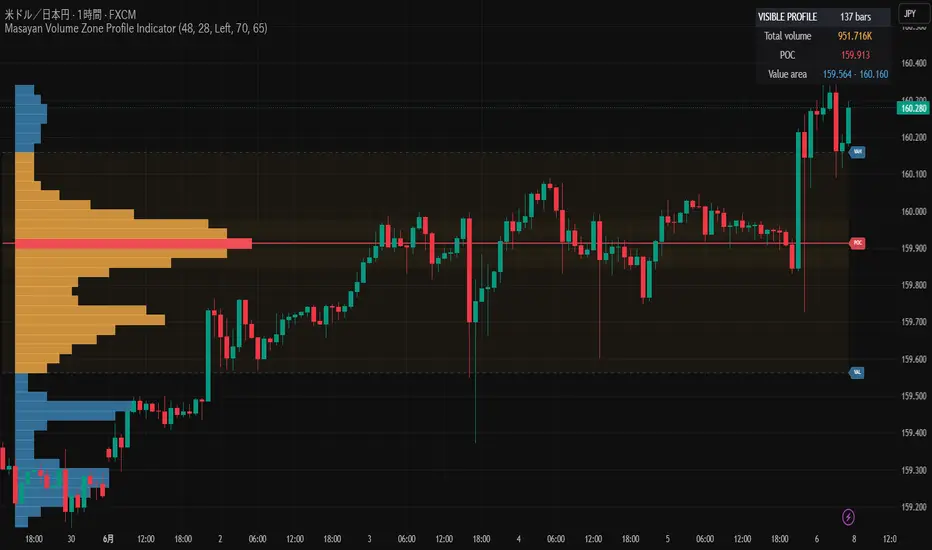
Volume Profile Composite, Naked POC & Value-AreaVolume Profile — Composite, Naked POC & Value-Area
==================================================
WHAT IT IS
A volume-at-price profile built for depth and decisions. It measures where trade
actually concentrated across the loaded history, distils that distribution into
the levels traders use — Point of Control (POC), Value Area (VAH/VAL), High and
Low Volume Nodes (HVN/LVN), and untested "naked" prior-session POCs — and then
converts those levels into a plain-language read of where price sits in the
auction (premium, discount, or inside value; balancing or migrating).
It is a study for chart analysis and education. It plots levels and context; it
does not place orders and does not output buy/sell signals.
HOW IT WORKS (ENGINE)
Volume is accumulated bar by bar into a price-keyed map on a fine grid (the
symbol's minimum tick multiplied by a user factor), then re-aggregated to the
chosen number of display rows. Because the engine uses a map rather than a fixed
lookback array, the profile can span every loaded bar instead of only a recent
window, and it is not limited by the historical bar-reference ceiling.
Each bar's volume is distributed across that bar's high-low range over a capped
number of samples, and tagged buy or sell by bar direction, producing a two-tone
histogram and a per-level delta. Where intrabar (lower-timeframe) data is
available, recent history can optionally be refined from it; older bars fall back
to the bar-range method. The Value Area is grown outward from the POC bin until
the chosen percentage of total volume is captured. Prior-day, prior-week and
full-history composite levels reuse the same value-area routine on their own maps.
The heavy redraw runs on bar open/close rather than on every realtime tick, to
keep live charts responsive.
WHY THESE COMPONENTS ARE COMBINED (MASHUP JUSTIFICATION)
This is one volume-profile engine, not a stack of independent indicators. Every
layer is computed FROM THE SAME accumulated volume map, and each one exists to
remove a specific blind spot of the raw histogram. A bare histogram only answers
"where did volume happen"; it cannot tell you whether price is rich or cheap,
which level matters next, or whether the market is balancing or trending. The
combined layers answer those questions, and they work together as follows:
- POC and Value Area transform the raw distribution into a fair-value frame, so
every other reading can be expressed as premium, discount, or inside value.
- HVN and LVN classify each price level produced by that same distribution as
acceptance (a volume shelf where reactions are more likely) or a thin gap
(where price tends to move quickly). This tells you how a level is likely to
behave, which the POC/Value Area alone do not.
- Naked prior-session POCs carry acceptance forward in time: they are POCs from
earlier sessions that price has not yet traded back through, derived from the
same per-session maps, and they act as revisit references.
- Value migration is simply the sequence of those session POCs read as a
direction, turning the profile history into a balancing-versus-trending read.
- The composite overlay keeps the full-history POC and Value Area in view while
you work a shorter, more legible recent window, so context is never lost.
- VWAP, Initial Balance, an expected-move band, and cumulative-volume-delta
divergence are confluence layers. They are optional and each degrades
gracefully if its data is absent. They are included because volume-profile
levels are used in context: VWAP gives the session's volume-weighted mean,
Initial Balance gives the opening reference, the expected-move band frames a
realistic day's range, and CVD-versus-price flags exhaustion. Each one answers
"does independent volume/price information agree with what the profile shows
here?", which is exactly how these levels are traded in practice.
- The Auto-Read is the synthesis step: it does not add new data, it ranks the
levels the engine already produced by distance to price and states the auction
context in words.
In short, the histogram is the raw material and every other element is a
transformation of that same data into a level, a classification, a confluence
check, or a written read. That shared derivation is the reason they belong in a
single script rather than as separate indicators.
WHAT IT PLOTS
- Buy/sell two-tone histogram, drawn in the clear space to the right of price so
candles stay visible.
- POC, Value Area (VAH/VAL, adjustable percentage), HVN/LVN nodes.
- Naked daily POCs, with a creation-time check that skips levels already traded
through and an optional age-out so the list stays meaningful.
- Polarity flip: a prior-day Value Area edge that price closes decisively beyond
and holds changes role (broken VAH becomes support; broken VAL becomes
resistance) and feeds the support/resistance read.
- Prior-day and prior-week POC/Value Area, full-history composite overlay,
developing POC.
- VWAP with standard-deviation bands, Initial Balance, expected-move band,
cumulative-volume-delta divergence, buy/sell imbalance shelves, poor highs/lows,
single-print gaps.
- Higher-timeframe POC bias (a light proxy — see Limitations).
- Auto-Read dashboard (full or compact), one-line headline, and an on-chart
identity strip showing the script name, symbol and timeframe.
HOW TO USE
1. Choose a scope: Rolling (default), Composite (all history), From date, or
Fixed range. The composite overlay keeps the big-picture levels visible.
2. Read location first from the headline or dashboard: inside value, premium, or
discount, and whether value is migrating up, down, or flat.
3. Treat the levels as a map, not a signal. POC acts as a mean-revert magnet;
Value Area edges are balance boundaries; HVN suggests stalls; LVN suggests
fast moves; a naked POC is a revisit reference.
4. Look for confluence with VWAP, Initial Balance, and prior-session levels, and
treat CVD divergence as a caution flag.
5. Detail presets (Simple / Standard / Pro) gate how much is shown. A compact
dashboard toggle trims the table to the key decision fields.
WHAT MAKES IT ORIGINAL
- Full-history depth via the price-keyed map, beyond a fixed lookback window.
- A built-in, past-only calibration of the profile's own claims: it logs
value-edge and POC-stretch reversion events against the prior-day Value Area
(which exists on every bar, so the measurement backfills over history), waits a
fixed horizon, and reports the realised hit-rate with a 95% confidence
interval. This is descriptive of past behaviour on the specific instrument; it
is explicitly not a backtest and not a forecast.
- A decision-ordered, plain-language Auto-Read derived entirely from the engine's
own levels.
DATA SOURCE AND ANY-MARKET USE
The volume source is user-selectable (Settings > Data source), so the profile can
be built from the symbol's own volume or from any other series your feed
provides. For symbols that report no native volume (some cash indices and FX
feeds), an optional "borrow volume" field lets you supply a volume-bearing proxy
for the same instrument; it only activates when the charted symbol genuinely has
no volume. The volatility-index symbol for the expected-move band is also
user-set and falls back to a daily-ATR band when left blank. An optional
asset-class auto-tune adapts the grid and node percentiles to the detected class.
All of these are blank or off by default, so nothing is tied to one market.
CALIBRATION NOTE
The calibration panel is descriptive only. It reports how often, in the past, on
the current symbol, price followed through after the logged events. Small samples
are flagged. It is not a probability of future results.
LIMITATIONS (HONEST)
- This uses a BAR-RANGE volume distribution (optionally refined by lower-timeframe
bars). It approximates where volume traded within each bar. It is NOT exchange
price-by-price volume, tick data, or order-flow/footprint, and it cannot see
bid/ask.
- It needs real volume. Cash indices often report none — use the matching future
or continuous contract, or the borrow-volume field.
- The higher-timeframe POC is a light single-bar proxy (the price of the
highest-volume higher-timeframe bar over a lookback), not a full higher-
timeframe profile.
- All readings are probabilistic context, not predictions.
DISCLAIMER
This script is a study/indicator for chart analysis and education only. It is NOT
a strategy, NOT a recommendation, and NOT financial advice. It places no orders
and guarantees no result. Trading involves substantial risk; a level's past
behaviour does not assure future behaviour. Do your own research and manage your
own risk.
指标

指标

指标

Secure BTC 5m Scalper Pro V6 Dynamic Institutional FlowOverview
Secure BTC 5m Scalper Pro V6 is an institutional-grade, high-probability scalping engine engineered specifically for low-timeframe environments (3m/5m). Built on top of a secured trend-following framework, this version introduces the "5-Star Combo Block"—a real-time data matrix that mathematical scans the last 20 candles to filter out low-volume weekend traps, false breakouts, and retail noise.
Equipped with a highly responsive, custom-built HUD (Heads-Up Display), this tool delivers complete market context at a single glance without cluttering your workspace.
Key Features
Secured Momentum Engine: Utilizes an optimized Supertrend filter combined with a major 200 EMA baseline to trade strictly in the direction of the institutional trend.
The 20-Candle Multi-Metric Scanner: Automatically runs 5 algorithmic checks in the background on every single tick:
Market Flux: Quantifies buyer vs. seller control by checking candle close distribution ratios.
Volatility Impulsion: Measures current body size expansions against a localized ATR baseline to detect explosive breakouts.
Structure Tracker: Implements Dow Theory principles to immediately flag whether the immediate price action is Bullish, Bearish, or stuck in a horizontal Range.
Volume Delta: Approximates localized buying/selling order book pressure by cross-referencing price spreads against volume nodes.
Zone Value (VWAP): Identifies premium vs. discount pricing relative to the institutional volume-weighted average price.
Anti-Wick Risk Management: Dynamically places custom Stop Loss targets by scanning the extreme structural pivots over the last 3 candles and adding localized volatility padding.
Fully Modulable Dashboard: Change positioning (Top, Bottom, Middle) and scale down font sizing dynamically directly from the UI settings menu—fully optimized for iPad, laptop, and multi-screen setups.
How to Use the 5-Star Combo HUD
The script features a live-updating section titled --- LIVE 20b ACTUEL ---. The dashboard fields will dynamically switch background colors based on market conditions:
🟢 Bright Green Cell: Immediate bullish confirmation.
🔴 Bright Red Cell: Immediate bearish confirmation.
⚪ Dark Gray Cell: Flat, neutral, or non-trending market context.
🎯 The Confirmation Rule
When a flashing "GO" signal prints on your chart:
For a LONG Signal: Verify that the live section shows a strong dominance of Green Cells (Bullish Structure, High Volume Delta, Over 55% Buyer Flux).
For a SHORT Signal: Verify that the live section shows a heavy confluence of Red Cells (Bearish Structure, Seller Volume Delta, Under 45% Buyer Flux).
The Filter: If you see a cluster of Gray Cells (Range / Neutral / Mou / Flat), the algorithm is identifying a low-liquidity environment or typical weekend chop. Stay out and preserve capital.
Settings & Configuration
Trend Sensitivity: Tweak the Supertrend factors and baseline EMA lengths to fit your personal execution style.
ADX Threshold Filter: Set your minimum directional index threshold (Recommended: 18) to ensure the engine only fires during real trend expansions.
Execution Modes: Toggle between a localized Fibonacci Extension target (1.618) for aggressive trending days or a strict Manual Risk-to-Reward ratio for mechanical, consistent scalp compounding.
UI Customization: Shift position and scale table parameters inside the "4. Design Tableau" section.
*** ### Disclaimer
Past performance does not guarantee future results. Scalping involves high execution speed and precise risk control. Always test strategy parameters on a demo account before risking live capital. 指标

指标