Squeeze Regime Map [BSL]Squeeze Regime Map classifies volatility contraction, confirmed release and
directional expansion as explicit states. It answers “what volatility regime
is the current chart in?”, not “what trade should I take?”
This is an original BarState Labs implementation built from an independent
written specification. It does not reproduce another publication's formula,
defaults, interface, chart grammar or source code.
HOW IT WORKS
Normalized volatility is Wilder ATR divided by close and expressed as a
percentage:
`nATR = RMA(True Range, ATR length) / close × 100`
The current nATR is ranked inside the latest complete rolling window using an
inclusive percentile:
`VOL PCTL = 100 × count(window values <= current nATR) / window size`
Inclusive ties are deliberate. The implementation uses this explicit bounded
definition rather than relying on an opaque rank function.
Directional impulse is displacement over the selected momentum length,
normalized by current ATR and then EMA-smoothed:
`impulse = EMA((close - close ) / ATR, smoothing)`
Impulse labels the direction of a confirmed release only when its magnitude is
at least the configured minimum. A weak release is recorded as unresolved
instead of being forced up or down.
STATE MACHINE
- Compression begins when VOL PCTL is at or below the compression-entry level.
- Compression persists until the separate release threshold is reached. This
hysteresis prevents repeated threshold chatter.
- The first qualified exit is a one-bar Release Up or Release Down state and a
one-bar +1 or -1 machine-readable pulse.
- A weak exit returns to Neutral and increments the unresolved ledger.
- On the next bar, a directional release becomes Expansion only when volatility
reaches the expansion threshold and impulse keeps the same qualified
direction.
- Expansion persists while volatility remains above the release threshold and
direction agrees. Otherwise the state returns to Neutral.
- A new compression always takes transition precedence.
The default thresholds are 20 / 40 / 70 percentile. They must satisfy
`compression < release <= expansion`; an invalid order renders `CONFIG ERROR`
and freezes committed output until corrected.
CONFIRMED-BAR BEHAVIOR
State, duration, release plots, diagnostics and alert pulses commit only on
confirmed bars. On an open realtime bar, the panel says `OPEN BAR — HELD` and
retains the previous confirmed values. Historical, elapsed realtime and Bar
Replay bars use the same transition order.
This does not prevent upstream exchange or broker feed corrections from
changing rebuilt history after reload. The script makes no external data
requests and uses only the current chart symbol and timeframe.
OUTPUTS
The pane contains:
- volatility percentile and declared threshold guides;
- a visually clipped impulse histogram;
- optional confirmed regime backgrounds;
- optional confirmed release markers;
- Compact and Full evidence panels with state, duration, normalized metrics,
release counts, unresolved events and readiness.
Hidden machine-readable plots expose:
- Regime code: -3, -2, 0, 1, 2 or 3;
- Compression score: 100 minus VOL PCTL;
- Confirmed release: +1, -1 or 0.
The Confirmed release plot can be selected directly as Signal Audit Lab's
Event source with the Signed pulse decoder. In the validation run, BSL-002's
18 up and 19 down releases matched BSL-001's 18 long and 19 short accepted
events exactly.
ALERTS
Four alert conditions are provided:
- Confirmed volatility release up;
- Confirmed volatility release down;
- Confirmed directional expansion up;
- Confirmed directional expansion down.
Release alerts use the same one-bar booleans as the exported pulse. Expansion
alerts fire only on entry into expansion.
LIMITATIONS
- This is a regime classifier, not a forecast, entry/exit system or strategy.
- A release direction is a normalized momentum label, not evidence of future
return.
- Percentile and state depend on the loaded symbol, timeframe, feed, history
and settings.
- Warm-up requires a complete percentile window and valid momentum history.
- The maximum 500-value percentile window is bounded but intentionally more
expensive than the default 126-value window.
- No optimization, multi-symbol scan, multi-timeframe request, order model,
position sizing or profitability claim is included.
VALIDATION
The release candidate passed 14 deterministic reference tests, a 14/14 live
Pine harness, BTCUSDT/AAPL × 1D/1H runtime checks, exact reload parity,
realtime and replay gates, valid/invalid threshold boundaries, four alert
conditions, 390 px rendering, BSL-001 signed-source integration and a 32,137
execution Profiler run at the maximum 500-bar window.
ORIGINALITY AND SOURCE
Category demand was selected from a dated metadata corpus. No protected,
invite-only or closed source was accessed, and no source from a compared open
publication was imported. The script uses standard true-range, Wilder RMA,
percentile-count and EMA calculations and is released under MPL 2.0.
CHANGELOG
v1.0.0
- Initial open-source release candidate.
- Explicit compression, release and expansion state machine with hysteresis.
- Inclusive rolling volatility percentile and normalized directional impulse.
- Confirmed +1 / -1 release export for Signal Audit Lab.
- Compact/Full evidence panels, four alerts and visible limitations.
Indikator

Failed Auction Detector Failed Auction Detector — footprint-confirmed rejection at swept reference levels
Every push through a level is the market asking a question: is there real business up here, or was that just noise wearing conviction's clothes? Most of the time nobody answers the question properly. A wick forms, the candle closes back inside the level, and every "stop hunt" or "liquidity sweep" indicator on the platform declares victory — because that's all they ever look at: the shape left behind, not what actually traded while it was being made.
That's the gap this script was built to close. A market is a two-sided auction. When price extends beyond a reference level — a swing extreme, a session high or low, the prior day's high or low — the auction is testing whether new business exists at the new price. It either finds acceptance and the range expands, or it finds nothing and snaps back. The candle can't tell you which one happened; the volume that traded during the extension can.
The problem with wicks
A wick past a level that closes back inside is a necessary condition for a failed auction. It is nowhere near sufficient. Thin resting liquidity, a single oversized print, plain noise — all of these can leave the exact same shadow on a chart with no real shift in who was willing to transact at the new price. Build a rule on candle shape alone and you're building a rule that mostly detects candle shapes, not auctions failing.
How a signal earns its place
I decomposed "failed auction" into three conditions, checked in order, not one threshold:
Sweep — price trades through a reference level you've enabled (a confirmed swing pivot, the developing session high/low, and/or the prior day's high/low; run any combination at once).
Rejection in the footprint — the part that actually does the work. "Rejection" isn't one observable event; it's a state that several distinct microstructure mechanisms can each produce on their own, so instead of one blanket volume-and-range test, the script checks four independent ways an auction can lose its nerve: an aggressive imbalance stepping in against the move, exhaustion of the side that pushed the extreme (its own volume thinning out relative to the session's point of control), absorption (heavy volume at the extreme that produced no further ground given), or an outright reversal in net delta at the extreme itself. A signal needs the sweep and reclaim plus any one of these four — alternative evidence for the same event, not four boxes that all have to tick, because real failures don't always announce themselves the same way twice.
Reclaim — the bar closes back inside the level. The extension didn't hold.
Conviction, not a coin flip
Two failed auctions can carry very different weight, and collapsing that to a plain yes/no throws away exactly the information that separates them. Every confirmed signal earns a 0–6 score from reclaim distance in ATR, rejection-wick size, whether the footprint imbalance fired, whether any rejection mechanism was present at all, volume significance against its recent average, and confluence with the prior day's level. That resolution is what lets a score bucket be tested against forward outcomes later, instead of trusted on faith because it's printed on the chart. Score ≥ 5 gets marked separately as high conviction.
You choose which levels are worth defending
Not every reference level deserves the same attention on every instrument. Rather than hardcoding one definition, the level itself is a checkbox input — swing pivot, session extreme, prior-day high/low, any combination. That turns "which level construction actually produces the more reliable signal" into something you get to test on your own market, not an assumption baked into the code before you ever loaded it. A freshness filter keeps the script from re-flagging a level the market is only drifting through, and each level fires once until it's freshly swept again, so the chart doesn't fill with the same tired flag on a level nobody's testing anymore.
Where the real work is: levels that hold, and levels that give way
The script reads buy and sell volume off each traded price row directly from TradingView's footprint engine — not the bar's high or low, the actual rows underneath it. That's the difference between a level that's genuinely protected (swept, then rejected by real opposing size) and one that was merely visited on the way through. The script signals only the protected case, on purpose: when a level is swept and the footprint shows the opposite picture — the aggressing side still winning at the extreme, no imbalance, no exhaustion, no absorption — that's the auction finding real business at the new price, and it isn't a separate detector, it's the same evidence read the other way. I use that same row-level data, sitting in the on-chart table and the data window, to make that read myself.
From evidence to a trade
The shaded zone on each signal and the dotted reclaim line aren't decoration — their edges are built from the same executed volume the detection ran on, so they sit exactly where the auction actually failed, not where a candle makes it look like it failed. That gives two of the three numbers a trade needs, for free:
Invalidation sits beyond the genuine sweep extreme — the specific high or low the market actually rejected — instead of a generic ATR multiple bolted on afterward with no connection to the real event.
Entry is typically the reclaim itself, or a retest of the reclaimed level, because that's the exact price where the failure got confirmed.
The same table reporting the signal also reports the trade data behind it — bar delta, delta at the extreme, top or bottom-zone volume against the point-of-control row, whether the imbalance flag fired — so a given entry's conviction is graded from real orderflow, not taken on the label's word alone. "Precise" here means anchored to where actual buying and selling happened. It isn't a claim about win rate, and the next section is exactly what would earn the right to make one.
No time travel
Swing levels use a confirmed pivot lag, never the current unconfirmed bar. Session levels reference only bars before the current one. Prior-day levels come through with lookahead explicitly switched off. Every plotted value and every signal only ever sees what was actually knowable at the time it fired.
What's proven, and what isn't yet
This is a rule-based detector, not a validated statistical signal — an honest hypothesis about how orderflow behaves at rejected levels, not a claim that it has forward-return content. That claim gets earned with a conditional event study: forward returns at several horizons for every fired signal, split by score bucket, testing whether score actually rank-orders the outcome instead of just looking like it should — plus a placebo run of the same logic against price levels that were never real reference points, to make sure the signature isn't just "high volume happened here" dressed up in more specific language. Until that's done, treat this as what it is: a discretionary confirmation tool that flags a failed auction with a graded conviction score, not a system that manages your entries, stops, targets, or size. A level's past reaction is not a promise about its next one.
Limitations
Requires a TradingView Premium or Ultimate plan — the footprint API is gated to those plans.
Built for standard candlestick charts. Sweep and reclaim logic will misread the market on Heikin Ashi, Renko, or other synthetic chart types.
Default thresholds for imbalance, exhaustion, absorption, and volume significance are tuned for a liquid futures instrument; thinner symbols or very low timeframes may need the detection inputs adjusted.
Indikator

Signal Audit Lab [BSL]Signal Audit Lab measures what happens after numeric events emitted by another
indicator. Connect one external plot, define how its values become long and
short events, and inspect the resulting sample on the current symbol and
timeframe.
This is a measurement tool. It does not generate signals, simulate orders, or
claim that an observed event has a trading edge.
HOW IT WORKS
The script reads one numeric `input.source()` series. Four decoders are
available:
- Signed pulse: positive and negative event pulses such as +1 / 0 / -1.
- Threshold cross: crossings above the long level or below the short level.
- Long-only edge: the first qualifying long value after a non-qualifying value.
- Short-only edge: the equivalent short-only rule.
Events are committed only on confirmed bars. Held values are deduplicated into
one edge. Optional cooldown and conflict rules make rejected events explicit.
An `na` transition cannot create an accidental first event without a prior
valid observation.
MEASUREMENT
The event-bar close is the anchor. Direction-adjusted forward returns are
measured after 1, 3, 5, 10 and 20 bars by default. Each horizon has its own
completed and pending sample count, so unfinished observations never enter the
denominator.
The round-trip cost input subtracts a user-defined basis-point amount from each
completed return. It is a sensitivity adjustment, not a fill, spread, slippage,
or execution model.
The panel reports:
- completed and pending observations;
- mean raw and cost-adjusted directional return;
- hit rate, return dispersion, and a Wilson 95% interval;
- separate aggregate, long, and short results;
- mean favorable and adverse excursion at the longest horizon;
- a payoff proxy based on mean positive versus mean negative net outcomes;
- longest-horizon session and normalized-ATR volatility splits;
- accepted long/short counts, cooldown rejects, conflicts, `na` skips, and
configuration status.
Samples below 30 observations are highlighted. Compact mode keeps aggregate
horizons, excursion/payoff, and diagnostics readable on narrow charts. Full
mode adds directional detail, raw-to-net values, Wilson intervals, dispersion,
and the split tables.
SESSION AND VOLATILITY SPLITS
The session split classifies the event bar using the selected session and
timezone. The defaults are 09:30–16:00, Monday–Friday, America/New_York.
Volatility is normalized ATR (`ATR / close`) compared with its moving-average
baseline. Defaults are ATR 14 and baseline 100. LOW is below 0.8 times the
baseline, HIGH is above 1.2 times the baseline, and values between those
boundaries are MID. Events before the baseline is available are UNCLASSIFIED.
The exact settings remain visible in Full mode.
SETUP
1. Add an indicator that exposes a numeric plot. TradingView strategies cannot
provide an external source plot.
2. Add Signal Audit Lab and select that plot under Event source.
3. Choose the decoder and levels that match the producer's numeric contract.
4. Enter a clear source label, then set horizons, cost sensitivity, session,
and volatility boundaries.
5. Read the sample count and diagnostics before interpreting percentages.
For a continuous oscillator such as RSI, Threshold cross is the natural
decoder. For a producer that exposes +1 / 0 / -1 pulses, use Signed pulse.
OUTPUTS AND ALERTS
Optional chart markers show accepted confirmed events. A hidden +1 / 0 / -1
plot is available for inspection or data export. Alert conditions are provided
for “Accepted long event” and “Accepted short event”; they use the same
confirmed booleans as the statistics.
REPAINT AND DATA BOUNDARY
Signal Audit Lab does not commit its own events before bar close. Historical
and realtime tests confirm that an unconfirmed source flicker is excluded from
the statistics until confirmation.
This boundary cannot certify the upstream source. A connected indicator may
still repaint, use future-looking data, revise history, or change behavior after
an update. Reload and Bar Replay should be repeated for the specific producer
before relying on a result. The panel therefore labels source stability as
unverified.
LIMITATIONS
- Results describe the loaded chart history, symbol, timeframe, settings, and
upstream plot. They are not universal and can change when any of these change.
- Close-to-close forward measurement is not an order-fill simulation or a
strategy backtest.
- The cost input does not model spread, slippage, liquidity, partial fills,
position sizing, pyramiding, or portfolio interaction.
- MFE and MAE use chart OHLC values inside the forward window; they do not prove
an executable path through intrabar prices.
- Session and volatility splits are descriptive. Small or imbalanced buckets
should not be treated as stable regimes.
- The script does not optimize settings, predict prices, or validate the logic
of the connected producer.
Use the Lab to form a better question, then verify that question with a proper
execution model and out-of-sample process.
ORIGINALITY AND SOURCE
This is an original BarState Labs implementation built from an independent
written specification and deterministic acceptance fixtures. No protected,
invite-only, or closed-source implementation was used. The script uses standard
forward-return, variance, Wilson interval, excursion, and ATR calculations and
is published under the Mozilla Public License 2.0.
CHANGELOG
v1.0.0
- Initial open-source release.
- Four explicit event decoders with confirmed-bar commitment.
- Five configurable forward horizons and cost sensitivity.
- Aggregate, directional, excursion, session, and volatility evidence.
- Compact and Full panels, accepted-event markers, and two alert conditions. Indikator

Indikator

Kamote v1.0Kamote v1.0 gives traders a clear, color-coded decision system that tells them the current market regime and the single highest-probability strategy to use—or when to stay out—across Intraday, Day, and Swing horizons.
It does this by combining five independent, hysteresis-protected filters into one coherent recommendation engine, displayed in a clean status matrix with fully configurable alerts. The result is fewer forced trades in dead or chaotic conditions and higher-confidence entries when the conditions actually align.
### Core Value: One Dashboard That Replaces Guesswork ###
Most indicators show isolated signals. Kamote synthesizes volatility regime, higher-timeframe trend direction, trend efficiency, volume behavior, and horizon-specific strategy scoring into a single, actionable output. Traders see at a glance:
Whether volatility is Dead, Healthy, or Extreme
Whether the higher-timeframe linear-regression slope is Bullish, Bearish, or Flat
Whether multi-timeframe Kaufman Efficiency Ratio confirms real trend strength
Whether volume is Expanding, Contracting, or Flat
The optimal strategy (Trend Long/Short, Pullback Long/Short, Momentum Long/Short, Breakout, Mean Reversion) or “Stay Out / None”
Color coding makes the matrix instantly readable. Green supports action, red signals caution or exit, yellow flags transitional states.
### How the Engine Works ###
Kamote runs a single higher-timeframe data request (automatically set by the chosen trading mode) and blends it with chart-timeframe calculations. All regime classifications use percentile ranks plus hysteresis bands so the status does not flicker on every minor bar.
Volatility Regime (ATR Percentile + Hysteresis)
ATR is ranked over a lookback window. Dead (< low percentile), Extreme (> high percentile), or Healthy. Hysteresis prevents rapid oscillation between states. Extreme + contracting volume + weak efficiency is treated as structural noise and forces a “Stay Out” recommendation.
Higher-Timeframe Trend Filter (ATR-Scaled Linear Regression Slope)
Slope is calculated on the higher timeframe, normalized by ATR, and classified Bullish / Bearish / Flat. The threshold itself scales with volatility so the filter stays relevant in both quiet and explosive markets.
Multi-Timeframe Efficiency Ratio
Kaufman’s Efficiency Ratio is computed on both chart and higher timeframes, then blended with user-adjustable weights. A minimum threshold gates whether the move is efficient enough to support trend or momentum strategies.
Volume Regime (Percentile + Hysteresis)
Volume is ranked and classified Expanding / Contracting / Flat. Expanding volume supports breakouts and trend continuation; contracting volume favors mean-reversion or short-side setups depending on direction.
Horizon-Aware Strategy Scoring
The script first checks for hard invalid states (extreme volatility + contracting volume + weak efficiency, flat slope + weak efficiency + flat volume, or swing-mode + flat slope + extreme ATR). If any invalid condition is true, the recommendation is “Stay Out.”
Otherwise it scores eight strategy candidates using eligibility gates and horizon-specific weights:
Trend and Pullback strategies are favored on Day and especially Swing horizons.
Momentum strategies are favored on Intraday.
Breakout receives a boost on Intraday and a discount on Swing.
Mean Reversion is favored on Swing and discounted on Intraday.
The highest-scoring eligible strategy is displayed. Confidence modifiers (healthy ATR, volume alignment, weak prior efficiency, etc.) further refine the score so the recommendation is not binary.
### Designed for Real Trading Workflows ###
Three preset modes (Intra / Day / Swing) automatically adjust higher-timeframe, efficiency length, volume lookback, slope threshold, ATR window, and hysteresis. Users can still fine-tune every parameter. Layout can be horizontal or vertical and placed in any corner. Alerts fire only on confirmed state changes for ATR regime, slope direction, efficiency cross, volume regime, and strategy recommendation—keeping notification noise low.
### Why Traders Adopt It ###
Kamote does not claim to predict the future. It enforces discipline by making regime and edge explicit. When the matrix is green and a strategy is named, the conditions that historically support that style of trade are present. When it says “Stay Out,” the market is offering no edge. That single piece of information—knowing when not to trade—is often more valuable than any entry signal.
The script is pure Pine Script v6, overlay=false, and designed to sit alongside price action or other tools without cluttering the chart. It is built for discretionary traders who want a systematic regime filter and for systematic traders who need a clean, multi-factor permission layer.
Install Kamote v1.0, select your trading horizon, and let the status matrix tell you what the market is actually offering right now. Indikator

STOC - EMA + RSI Pullback TraderThe STOC – EMA RSI Pullback Trader is a long-only trend-following indicator designed to identify potential entries during bullish trends and controlled pullbacks.
Instead of chasing price after a large upward move, the indicator looks for opportunities when price returns toward the faster trend average while the broader trend remains positive.
How it works
The indicator combines:
* 20 EMA for identifying short-term momentum and pullback areas.
* 50 EMA for determining the broader trend.
* RSI for confirming that momentum remains bullish.
An initial Buy signal can appear when the 20 EMA crosses above the 50 EMA and RSI confirms positive momentum.
After the bullish trend is established, a Pullback Buy signal can appear when price revisits the 20 EMA and subsequently confirms strength above it while RSI remains above the selected bullish threshold.
Exit methods
The indicator provides three selectable exit methods:
* 20 EMA crossing below the 50 EMA.
* Price closing below the 50 EMA.
* Either condition, whichever occurs first.
The “Either Condition” setting offers more defensive trade management, while the EMA crossover exit generally gives the trend more room to develop.
Key features
* Initial EMA crossover entries.
* Trend-continuation pullback entries.
* RSI momentum confirmation.
* Adjustable EMA and RSI settings.
* Optional requirement for rising RSI.
* Multiple pullback-confirmation methods.
* Selectable exit logic.
* Buy, Pullback Buy and Exit labels.
* Active-trade background highlighting.
* Trend and trade-status dashboard.
* TradingView alert conditions.
* Dynamic JSON messages for webhook integration.
* Works across equities, indices, futures, forex and cryptocurrencies.
How to use
The indicator is best used on instruments displaying a clear directional trend.
A valid bullish environment generally exists when:
* The 20 EMA is above the 50 EMA.
* Price is trading above the 50 EMA.
* RSI is above 50.
The initial Buy signal identifies a possible new bullish trend. Pullback Buy signals identify potential re-entry opportunities after price returns toward the 20 EMA without invalidating the broader trend.
Avoid treating every signal as an automatic trade. Consider confirming the setup using:
* Higher-timeframe trend direction.
* Support and resistance.
* Breakout structure.
* Volume expansion.
* Relative strength.
* Overall market and sector conditions.
Suggested timeframes
* Daily and weekly charts: positional and swing trading.
* 1-hour and 4-hour charts: shorter-term swing trading.
* 5-minute and 15-minute charts: intraday trading with additional market and volume confirmation.
Alerts
Create a TradingView alert using “Any alert() function call” to receive the indicator’s dynamic Buy and Exit messages. Standard Buy and Exit alert conditions are also available.
Disclaimer
This indicator is provided solely for educational and informational purposes. It does not constitute investment advice, financial advice, trading advice or a recommendation to buy or sell any security or financial instrument.
Trading and investing involve substantial risk, including the possible loss of capital. Historical signals and past performance do not guarantee future results. Always perform your own analysis, apply appropriate position sizing and risk management, and consult a qualified financial professional when necessary. Indikator

Momentum Candle By SkyroothMomentum Candle By Skyrooth highlights expansion candles — the bars where one
side takes control decisively — and filters out the ordinary bars that only look
big because volatility happened to be high at the time.
WHAT PROBLEM THIS SOLVES
Most price action methods depend on a single instruction: "wait for
displacement". A break of structure only counts if the candle that caused it was
decisive. An order block only counts if the move leaving it was strong.
The problem is that "strong" is usually judged by eye, and the eye is unreliable.
A 40 point candle is large on a quiet morning and unremarkable during a news
release. Traders end up calling the same candle valid or invalid depending on
what they want to see.
This indicator applies one fixed measurement instead.
HOW IT WORKS
A candle is marked when all of the following are true:
1. BODY DOMINANCE — the body is large relative to the total range of the bar, so
the close finishes near the extreme rather than in the middle. This is what
separates a decisive bar from a bar that spent the session being rejected.
2. RANGE VS RECENT VOLATILITY — the range is compared against a rolling average
of recent ranges, not against a fixed point value. This is what makes the
measurement adapt: the same threshold works on a quiet session and a volatile
one, and on gold as well as an index.
3. VOLUME CONFIRMATION — the bar is compared against its own recent volume
average. Expansion on thin volume is usually a liquidity gap rather than
participation.
4. DIRECTIONAL AGREEMENT — the bar's direction is checked against the prevailing
trend, so continuation bars are separated from isolated spikes.
Bars meeting the conditions are coloured and marked on the chart. Everything
else is left alone.
HOW TO USE IT
This is a filter, not an entry signal. It answers one question — "was that move
decisive?" — and nothing else. There is no entry, stop or target here.
Typical use:
- CONFIRMING A STRUCTURE BREAK. When price breaks a swing high or low, check
whether the breaking candle is marked. An unmarked break is more likely to be
a liquidity sweep that reverses.
- VALIDATING AN ORDER BLOCK OR IMBALANCE. The candle that leaves the zone should
be marked. If the departure was weak, the zone is weak.
- AVOIDING CHASING. A marked candle means the move already happened. Wait for a
retracement into the area the candle originated from rather than entering at
the extreme.
SETTINGS
- Body ratio threshold — minimum share of the range the body must occupy.
Raise it for fewer, cleaner signals.
- Volatility lookback — number of bars in the rolling range average.
- Volume multiplier — how far above its own average the bar's volume must be.
Set to zero to disable the volume condition on instruments with unreliable
volume data, such as spot forex.
- Trend filter — enable to keep only bars aligned with the prevailing direction.
NOTES AND LIMITATIONS
- Signals are confirmed on bar close. An intrabar candle can meet the conditions
and then lose them before closing.
- Volume conditions depend on the feed. Centralised futures volume is reliable;
spot forex volume is broker specific and often is not.
- A marked candle describes what already happened. It carries no claim about
what happens next, and no win rate is implied.
- Works on any symbol and timeframe, though the volume condition is most
meaningful on instruments with genuine exchange volume. Indikator

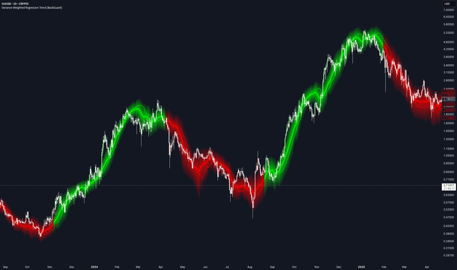
Variance-Weighted Regression Trend [BackQuant]Variance-Weighted Regression Trend
Overview
Variance-Weighted Regression Trend is a rolling linear-regression trend indicator that adjusts the influence of observations according to the estimated variance of their regression residuals.
The script first calculates a standard ordinary least-squares regression across the selected window. It then measures the squared residuals around that fit and uses those residuals to estimate how variable the regression error has been through the sample.
Those variance estimates are converted into relative weights. Lower estimated residual variance can receive more influence, while higher estimated residual variance can receive less. A second weighted regression is then calculated using those weights.
The indicator also includes:
EMA, RMA or rolling-average residual variance.
Configurable inverse-variance weighting strength.
Weight regularization and upper/lower weight limits.
Weighted R² and slope-quality diagnostics.
Two regression-channel methods.
Optional trend-flip quality confirmation.
OLS comparison.
Linear regression projection.
Trend colouring and alerts.
Calculation
The basic process is:
Fit an ordinary least-squares regression over the Regression Length.
Calculate the squared residual of every observation around that fit.
Smooth those squared residuals to estimate local residual variance.
Add a regularization floor to reduce unstable extreme weights.
Convert variance into relative observation weights.
Clamp weights between the selected minimum and maximum.
Calculate a second weighted regression.
The weighted line is therefore influenced more by observations receiving larger relative weights and less by those receiving smaller ones.
Variance Weighting
The weighting is based on regression residual variance , not ATR, trading volume or raw price volatility.
For each point:
Residual = Source - OLS fitted value
Squared Residual = Residual²
The squared residuals are then processed using the selected Variance Model.
EMA
Uses exponential smoothing and responds more quickly to recent residual changes.
RMA
Uses a slower recursive smoothing process.
Rolling Mean
Uses a finite moving average of squared residuals.
Weight Power
Weight Power controls how strongly estimated variance affects the regression.
The raw weighting relationship is:
Weight ∝ 1 / Variance^Weight Power
0 gives equal weighting, making the final fit behave like the OLS regression.
1 applies standard inverse-variance-style weighting.
Values above 1 increase the difference between low- and high-variance observations.
Higher settings can make the regression more selective, but can also concentrate too much influence in a small part of the sample.
Variance Regularization
Very small variance estimates can otherwise create extremely large inverse weights.
The script therefore adds a fraction of the window's mean squared residual to each local variance estimate.
Higher regularization makes the weights more uniform.
Lower regularization allows stronger differences between observations.
Minimum and Maximum Relative Weight
Raw weights are normalized relative to their average before being clamped.
A relative weight above 1 means the observation has greater-than-average influence.
A value below 1 means it has less.
The Minimum Relative Weight prevents high-variance observations from effectively disappearing from the regression.
The Maximum Relative Weight prevents very low-variance observations from dominating the entire fit.
Weighted Regression
Once the final weights are calculated, the script solves a weighted linear regression:
Y = Intercept + Slope × X
The displayed line is the current endpoint of that rolling weighted regression.
Each new bar shifts the regression window and recalculates:
OLS.
Residuals.
Variance estimates.
Weights.
Weighted slope and intercept.
OLS Comparison
The optional OLS line shows the endpoint of the initial equal-weight regression.
This makes it easy to see how much the variance weighting is actually changing the result.
If Weight Power is set to 0, the weighted regression and OLS should be effectively aligned.
As the weighting becomes more aggressive, the lines may separate depending on the residual structure inside the window.
Trend State
Trend direction comes from the sign of the weighted regression slope.
Positive slope = bullish.
Negative slope = bearish.
A bullish flip occurs when the stored trend changes from bearish to bullish.
A bearish flip occurs when it changes from bullish to bearish.
Quality Confirmation
Quality Confirmation can be enabled to prevent weak slope changes from immediately flipping the trend state.
When enabled, an opposite slope must also satisfy:
Minimum Weighted R².
Minimum Slope / Standard Error.
If those conditions are not met, the existing trend state remains active even if the current slope temporarily changes sign.
Weighted R²
Weighted R² measures how well the weighted straight-line regression describes the current sample.
Higher values indicate that the weighted observations are more closely aligned with a linear fit.
Lower values indicate a less orderly linear relationship.
R² does not determine trend direction and should not be interpreted as a forecast of future performance.
Slope / Standard Error
The script calculates the absolute weighted slope relative to its estimated standard error:
|Slope| / Slope Standard Error
This is used as a practical slope-quality measure.
Higher values indicate that the fitted slope is larger relative to the estimated regression error.
It is used by the optional Quality Confirmation setting and is not presented as a formal significance test.
Regression Channels
Two channel-width methods are available.
Weighted Residual RMS
Uses the weighted root-mean-square distance of observations from the fitted regression.
This reflects the general amount of scatter around the line.
Regression Standard Error
Uses the calculated standard error of the fitted current regression value.
This normally represents a different and often narrower measure than residual RMS.
The Channel Multiplier scales whichever method is selected.
Expand During Poor Fit
When enabled, the channel becomes wider as Weighted R² decreases.
This is intended to visually reflect greater uncertainty when the current window is poorly described by a straight line.
The expansion affects only the channel width.
It does not alter the regression or trend calculation.
Projection
The Projection extends the current regression slope forward by the selected number of bars.
It is simply:
Current fitted line extended using the current slope.
It is not a separate forecasting model.
As the regression changes on new bars, the projection also changes.
Current Relative Weight
The Data Window shows the final relative weight assigned to the newest observation.
A value:
Above 1 = greater-than-average influence.
Below 1 = less-than-average influence.
This can help show how the current observation is being treated by the variance-weighting model.
Effective Sample Size
The indicator also reports:
Effective N = (Sum of Weights)² / Sum of Squared Weights
This provides a simple measure of weight concentration.
If weights are similar, Effective N remains close to the full Regression Length.
If a smaller group of observations receives most of the weight, Effective N falls.
This is useful when experimenting with aggressive Weight Power or wide weight limits.
Trend Strength
Trend Strength is used only for the regression glow.
It combines:
60% Weighted R².
40% normalized Slope / Standard Error.
It does not affect the regression or signals.
ATR(14) is used only to scale the visual width of the glow and flip bloom to the instrument.
Input Guide
Regression Length
Controls the size of the rolling regression sample.
Projection Bars
Controls how far the current fitted slope is extended visually.
Variance Length
Controls how quickly the residual-variance estimate changes.
Variance Model
Selects EMA, RMA or Rolling Mean smoothing of squared residuals.
Weight Power
Controls the strength of inverse-variance weighting.
Variance Regularization
Reduces extreme differences between weights.
Minimum / Maximum Relative Weight
Limits how little or how much influence any one observation can receive.
Channel Width
Selects Weighted Residual RMS or Regression Standard Error.
Channel Multiplier
Scales the regression channel.
Poor Fit Expansion
Optionally widens the channel as R² deteriorates.
Quality Confirmation
Requires minimum regression fit and slope quality before allowing trend flips.
How to use it
The indicator can be used as:
A regression-based trend filter.
A comparison between ordinary and variance-weighted regression.
A way to study how residual-based weighting changes a rolling trend estimate.
A trend-quality filter using R² and slope strength.
A regression channel for visualizing fit dispersion.
The OLS Comparison and Data Window values are particularly useful when testing the weighting settings, because they show whether the extra weighting is materially changing the regression or simply producing a result close to ordinary least squares.
Limitations
The variance estimates are derived from OLS residuals inside the same rolling window.
The model is a custom two-stage weighted regression rather than a full generalized least-squares procedure.
Higher Weight Power can concentrate the fit in a relatively small part of the sample.
Linear regression cannot represent every type of market structure.
High R² does not imply future trend continuation.
The forward projection is only a linear extrapolation of the current fit.
Quality Confirmation can reduce weak flips but can also delay genuine changes in direction.
Data Window
The script exposes:
Weighted Slope.
Weighted R².
Slope / Standard Error.
Weighted Residual RMS.
Regression Standard Error.
Current Relative Weight.
Effective Sample Size.
Trend Strength.
Alerts
The indicator includes:
Variance-Weighted Regression Bullish: trend changes from bearish to bullish.
Variance-Weighted Regression Bearish: trend changes from bullish to bearish.
Variance-Weighted Regression Flip: either transition occurs.
Summary
Variance-Weighted Regression Trend starts with a normal rolling OLS regression, measures the residual variance around that fit, and uses those estimates to assign relative weights to the observations in a second regression.
The weighting strength, variance smoothing, regularization and weight limits are all configurable, making it possible to move from essentially equal-weight OLS to a much more selective fit.
The final weighted slope controls the trend state, while Weighted R² and the Slope / Standard Error score can optionally be used to filter weak reversals.
Regression channels, OLS comparison, forward projection and the visual strength system provide additional context around the core weighted regression without changing the underlying trend logic.
Indikator
Cross-Asset Session Impulse Engine [PhenLabs]📊 Cross-Asset Session Impulse Engine
Version: PineScript™ v6
⚠️HEADS UP⚠️
Click the three dots on the right of the indicator after adding it to your chart and click pin to scale to make sure it is displaying properly
📌 Description
Cross-Asset Session Impulse Engine waits for the session opening range to lock, then asks a simple question before you take the break: did correlated markets print the same impulse, or is this chart running alone? A k-of-n basket (crypto, dollar, indices — you pick) must confirm in the same direction, with invert flags for assets like DXY that move against risk.
The engine is built for every TradingView plan. There is no footprint feed, no lower-timeframe history wall, and no silent crash when a basket symbol or volume field is missing. If the basket cannot load, the dashboard switches to chart-only and you still see the opening range. Confirmed signals, named alerts, and Pine Screener columns are included.
🚀 Points of Innovation
Opening-range break is gated by live cross-asset breadth instead of a single-chart close
Per-symbol invert flags so DXY-up can confirm a risk-off short without extra scripts
All-plan design: same-timeframe request.security only — no Premium-only data path
Dead basket symbols return na and drop out of the vote instead of aborting the script
Missing volume skips the optional gate and labels Vol N/A instead of refusing to load
Named bullish/bearish confirmed alerts plus Screener plots for breadth, signal, and armed state
🔧 Core Components
Session clock: New York, London, Tokyo, or a custom session/timezone pair
Opening range: first N session bars freeze ORH/ORL; later confirmed closes beyond those rails are impulses
Basket voter: up to four input.symbol contexts, each with its own opening range on the same clock
Confirmation gate: min k live same-direction votes, or chart-only when every basket feed fails
Projection: ATR targets from the broken rail and invalidation at the opposite side of the range
Dashboard: OR state, chart break, breadth, per-symbol arrows, data mode, signal
🔥 Key Features
Preset sessions so you are not locked to US cash hours
Enable/disable and invert each basket symbol; unused inputs stay hidden
Optional relative-volume filter that degrades to off when the symbol has no volume
Unconfirmed chart-break markers are hidden by default to keep price readable
One confirmed signal per session, both directions, with alertconditions
Screener-ready numeric plots (breadth net, signal +1/−1, armed)
🎨 Visualization
Dashed ORH/ORL rails and a translucent opening-range box on the session
Dotted ATR targets and a dashed invalidation line after a confirmed signal
Triangle markers for confirmed impulses; optional faint circles for unconfirmed chart breaks
Top-right dashboard: session, OR lock, chart state, breadth, basket tape, data mode, signal
📖 Usage Guidelines
Session Preset — Default: New York — NY 09:30–16:00, London 08:00–16:30, Tokyo 09:00–15:00. Custom unlocks session and timezone.
Opening Range Bars — Default: 6 — Range: 1-48 — On 5m this is ~30 minutes (classic ORB). Raise it on 1m, lower it on 15m.
Min Basket Confirms — Default: 2 — Range: 0-4 — 0 fires on the chart break alone. Keep this ≤ the number of enabled live symbols.
Enable Symbol 1–4 — Defaults: BTCUSDT on, ETHUSDT on, DXY on (invert on), ES1! off — Use distinct tickers. Invert for inverse assets.
Require Relative Volume — Default: false — When on, confirmed bars need volume ≥ Min Rel Volume × SMA. No volume → gate skipped, dashboard shows N/A.
Show Unconfirmed Chart Breaks — Default: false — Turn on only when you want to see the raw OR break before breadth arrives.
Table Size — Default: Small — Tiny / Small / Normal. Visible only while the dashboard is on.
✅ Best Use Cases
Intraday ORB on indices, FX, and crypto during NY, London, or Tokyo
Filtering fake session breaks that do not show up in BTC, ETH, DXY, or ES
Risk-off reads: DXY invert on so a dollar spike confirms shorts on the chart
Watchlist screening via the XSIE Signal and XSIE Breadth Net columns
⚠️ Limitations
Designed for intraday session charts. Daily bars often sit outside a cash-session window and will show OR as OUT.
Basket symbols that match the chart ticker are skipped so the chart cannot vote twice.
Confirmation can arrive after the chart break (late breadth). That is intended; the armed state stays until session end or confirmation.
One signal per session. Opposite-range invalidation flags the trade; it does not flip and re-fire.
Pine Screener itself is a paid TradingView product. The script only exposes plots — it does not unlock Screener on a free account.
💡 What Makes This Unique
Cross-asset k-of-n is the confirmation, not a decorative correlation table
All-plan data path with an explicit chart-only fallback when the basket is dead
Invert-aware votes treat DXY as a risk switch instead of a same-direction clone
⚙️ Under the Hood
Same-timeframe request.security basket : four unrolled tuple calls fetch OHLC on timeframe.period with lookahead_off and ignore_invalid_symbol=true. Invalid tickers return na and drop out of breadth instead of throwing. This is not lower-timeframe volume and not footprint — every plan sees the same engine.
Opening-range state machine : each context (chart + basket) freezes ORH/ORL after N session bars. A break is the first confirmed close beyond the frozen rail. The lock bar cannot break because its high/low still define the range.
Invert mapping : when Invert is on, an upside OR break on that symbol votes for a downside chart impulse (and vice versa).
Data mode : no plan-gated feed is used. The Data row reports All-plan, live/enabled count, Vol x.xx or N/A, vol gate skipped, or basket failed · chart-only.
Screener and alerts : plot XSIE Breadth Net, XSIE Signal (+1/−1 on the confirmed bar), and XSIE Armed. alertcondition titles are “XSIE Bullish Impulse Confirmed” and “XSIE Bearish Impulse Confirmed” — not a generic “extreme event”.
🔬 How It Works
The session clock marks bars inside the chosen window. A new session resets range, votes, drawings, and the fired flag.
The first N bars build ORH/ORL. After lock, a confirmed close beyond a rail arms bull or bear on the chart.
Each live basket symbol builds its own range on the same clock and casts an up or down vote (optionally inverted).
When armed direction reaches min confirms — or the basket is entirely dead and chart-only mode is on — the engine fires once, projects ATR targets, and sets invalidation at the opposite rail.
A confirmed close through invalidation flags INVALIDATED. The next session starts clean.
💡 Note:
Best on 1–15m charts with the session that actually trades your market. Seed the basket with assets you can actually resolve on your TradingView plan and region; failed symbols simply show ✗ and the rest keep voting. This is an analytical aid, not financial advice.
Indikator

Streak statisticsAfter four red bars, what actually happens? Your chart already knows.
Description
Counts every run of consecutive up closes and consecutive down closes on the loaded chart and reports, for each exact streak length, how often that streak extended by one more bar. The instrument's own base rate of up and down closes is shown alongside, so every continuation frequency can be read against what an ordinary bar does rather than against an imagined 50%.
How it calculates
Direction is close against prior close. Each time a streak reaches a length, that length's denominator increments; each time it extends by one more bar, the numerator increments. The figure at length three therefore answers exactly: of the streaks that reached three, what share became four. The final row pools every resolved opportunity at or beyond the configured cap.
Right-censoring is handled correctly. A streak enters a denominator only when its next bar is known, so the unfinished streak sitting at the chart edge is never silently counted as a failed continuation. Reset boundaries censor the preceding streak rather than treating the boundary or the overnight gap as a failure. A flat close terminates a streak without extending either side.
The sample is a precise rolling number of observed comparisons rather than an unknown quantity determined only by your chart plan's history allowance, and the date range actually in the window is reported in the header tooltip. The window is rebuilt when the sample changes, once per bar close, not on every price tick.
Each continuation rate carries its sample size and an optional 95% Wilson interval. A separate base-rate-centered stabilized estimate is available and is never substituted for the empirical frequency; both are shown.
How to read it
The first row shows the current streak and, when a resolved sample exists for that state, its historical continuation, opposite, and flat shares plus the lift against base. The base row shows the share of all observed moves that were up, down, and flat. Each length row shows the continuation share, the sample size, the interval, and the stabilized estimate, per direction, with the lift in percentage points beside it.
Emphasis marks a cell that is both materially different from its base rate and interval-separated from it. It marks a departure in either direction; the sign is carried by the lift column, never by colour alone.
Repainting
Closed bars do not repaint. The live bar never enters the sample.
Timeframe requirements
Any intraday timeframe when a reset mode is active. Calendar-day reset and custom-session reset both require an intraday chart, because on daily or higher a calendar-day reset would exclude every bar. Set reset mode to Never to run on daily and above.
Originality and attribution
Run counting is elementary probability. What is original here is the treatment: continuation frequency by exact streak length and direction, conditioned so each length's denominator is the number of streaks that actually reached it, correct right-censoring at the chart edge and at reset boundaries, a bounded rolling sample in observed moves rather than in chart history, and base rate, interval, and sample size shown rather than implied. This is not derived from and does not reuse code from any existing published script.
Honest limitations
Descriptive frequencies are not forecasts, signals, or proof of an edge.
Serial dependence means the Wilson intervals are descriptive uncertainty bands, not a complete market-microstructure hypothesis test.
Looking across many rows creates multiple-comparison risk. Emphasis requires both interval separation and a minimum effect you set, but that does not eliminate data-mining risk.
Rare long streaks stay rare. Stabilization reduces visual overreaction; it cannot manufacture information that is not in the sample.
Close-to-close direction counts overnight gaps unless a reset mode is on.
The rolling window is measured in observed comparisons, not clock time. Indikator

Level survival trackerEveryone trades PDH. Almost nobody knows their own numbers on it.
Description
Tracks six session reference levels every day: prior day high, prior day low, overnight high, overnight low, opening range high, opening range low. For each, over a rolling window of sessions, it reports the probability the level gets tested, the probability it breaks given a test, how failure probability changes with repeated tests, and the median rejection distance and time from first touch to break.
How it calculates
Prior day levels come from the last completed exchange daily bar via the documented non-repainting request idiom, or optionally from the previous custom chart session. Overnight high and low accumulate outside the session and freeze at the open; the opening range freezes when its window completes, and the bars that built it cannot also test it. A touch is a bar overlapping the level within a tolerance frozen at the session open, counted in episodes. A break is a confirmed close beyond the level plus tolerance, after a touch. A session whose open is already beyond a level, or where price closed through it without any bar ever overlapping it, is recorded as opened-beyond and excluded from every rate, because that level was never fairly testable. Completed sessions are written once, after the session ends.
The tolerance can be defined in ticks, points, a fraction of prior daily ATR, or a fraction of chart ATR. Statistics can be conditioned on the session's opening gap against the prior daily range, or on prior daily volatility versus its own 20-day mean. The break rate can display a 95% Wilson interval so the uncertainty is visible next to the point estimate. Break rates and touch-failure rates require their own minimum number of actual tests before anything is shown.
How to read it
Today's column shows each level's live state: untested, testing with its touch count, broke with the touch it broke on and the time, or opened beyond. P(test) is tests over eligible sessions. P(break | test) is breaks over actual tests, with the interval underneath if enabled. Touch failure answers: of past sessions that reached this many touches on this level, how often did the level eventually break. Reaction and time are the median rejection distance in points and the median minutes from first touch to confirmed break. Every figure carries its sample size, and figures below the minimums show the count instead of a percentage.
Repainting
Closed bars do not repaint. Touches and breaks are decided on confirmed bars only, and a session's outcomes enter history only after the session completes.
Originality and attribution
The levels are common knowledge. What is original is the survival accounting: episode-counted touches, conditional failure by touch number, opened-beyond exclusion, frozen per-session tolerance, regime conditioning, and interval-honest break rates with sample sizes shown. This is not derived from and does not reuse code from any existing published script.
Honest limitations
These are empirical frequencies, not forecasts or trade signals.
Intrabar path is unknowable from OHLC bars. A same-bar touch and break records as a first-touch break with zero measured rejection.
Overnight rows need extended-hours bars on the chart.
The session must not cross midnight in the chosen time zone.
Previous-RTH prior levels need one completed chart session to warm.
The chart timeframe must divide the session start and length exactly, so bars align to the session boundaries. For a 09:30 to 16:00 session that is 1, 2, 3, 5, 6, 10, 15, or 30 minutes. This is not a fixed ceiling: it follows your session. A session starting on the hour, such as 09:00 to 16:00 or 08:00 to 17:00, also accepts 20 and 60 minutes. Misaligned timeframes are refused rather than measured against fuzzy session boundaries, because a bar straddling the open would corrupt the opened-beyond classification, which reads the session-open price.
The opening range is rounded up to a whole number of chart bars, so no bar can straddle its boundary. On a 2-minute chart a 15-minute range becomes 16. The effective value is in the table header tooltip.
Results depend on instrument, session, tolerance, timeframe, and sample. Change any one and the numbers change. Indikator

SMI Ergodic Oscillator PROSMI Ergodic Oscillator PRO
The SMI Ergodic Oscillator PRO is a momentum indicator designed to help traders identify changes in the strength and direction of price movement.
The indicator displays a histogram, making momentum behavior easy to visualize:
🟢 Green/Lime: momentum is gaining strength or positive slope.
🔴 Red: momentum is weakening or showing negative slope.
Larger bars: indicate stronger momentum.
Smaller bars: may indicate declining momentum and a possible loss of strength.
The main purpose of the indicator is not to generate trades by itself, but to help confirm market direction and identify potential changes in momentum.
How to Use
1. Trend Confirmation
During an uptrend, look for a sequence of consistent positive bars. Sustained momentum can provide additional confirmation that the current move remains strong.
During a downtrend, look for persistent negative bars.
2. Momentum Changes
A change in histogram color can highlight a potential shift in market momentum.
Red → Green
May indicate improving bullish momentum.
Green → Red
May indicate weakening bullish momentum or increasing bearish momentum.
Color changes should be evaluated together with price action, market structure, and the overall trend.
3. Loss of Momentum
When histogram bars begin to decrease in size, even while remaining on the same side, this may indicate that the current movement is losing strength.
This can be used as an alert to:
Reduce exposure
Protect an existing position
Wait for additional confirmation
Monitor for a potential reversal
Parameter Settings
The indicator provides three main parameters:
Parameter Practical Function Effect
Long Length Controls the longer-term sensitivity Higher values = smoother response
Short Length Controls responsiveness to recent price movements Lower values = faster response
Signal Length Controls signal smoothing Higher values = less noise
Suggested Settings
Balanced — 20 / 5 / 5
A good starting configuration for general market analysis and most timeframes.
Fast — 10 / 3 / 3
More responsive to recent momentum changes. Suitable for traders looking for earlier signals, but it may produce more noise.
Conservative — 30 / 7 / 7
Produces a smoother reading and reduces sensitivity to smaller market fluctuations.
Very Conservative — 50 / 10 / 10
Designed for traders who prefer to focus on larger and more sustained market movements.
Choosing the Right Settings
There is no universal "best" configuration. Parameters should be adapted to:
Asset: Crypto, Forex, stocks, indices, etc.
Timeframe: Scalping, day trading, or swing trading.
Volatility: Highly volatile markets may require more conservative settings.
Trading style: Faster settings can be useful for earlier momentum detection, while slower settings can provide stronger confirmation.
Simple Trading Approach
A practical approach is to use the indicator in combination with price structure and market context.
Potential Long Setup:
Favorable market structure + positive momentum + confirmation from the histogram.
Potential Short Setup:
Favorable bearish structure + negative momentum + confirmation from the histogram.
Avoid: entering a trade solely because the histogram changes color. A color change is better treated as a confirmation or warning signal, rather than an independent trading signal.
Important Notice
The SMI Ergodic Oscillator PRO is a technical analysis tool designed to assist with market analysis. It does not guarantee trading results and should not be considered financial advice. Always combine the indicator with proper risk management and independent market analysis. Indikator

Money Flow Index GlauMoney Flow Index Glau (MFI)
Description
The Money Flow Index (MFI) is a technical analysis oscillator that combines price and volume to evaluate buying and selling pressure in an asset.
This indicator uses the typical price (HLC3 = (High + Low + Close) / 3) and calculates the MFI on a scale from 0 to 100.
In this version, in addition to the traditional MFI line, the line color changes according to its direction:
Green: MFI is rising compared with the previous period, indicating increasing buying pressure.
Red: MFI is falling compared with the previous period, indicating increasing selling pressure.
Yellow: MFI remains unchanged compared with the previous period.
The indicator displays three main levels:
80: Overbought
50: Middle Band
20: Oversold
How to Adjust the Length Parameter
The Length parameter determines the number of periods used to calculate the MFI.
The default value is 14, which is the traditional MFI setting.
Shorter Length
Examples: 5, 7, or 9
A shorter Length makes the MFI more responsive to recent price and volume changes.
It can be useful for:
Short-term trading
Scalping
Identifying faster changes in buying and selling pressure
However, shorter settings can also produce more fluctuations and potentially more false signals, especially in highly volatile markets.
Default Length
14 periods
This is the traditional MFI setting and provides a balanced starting point for different markets and timeframes.
Longer Length
Examples: 21, 30, or 50
A longer Length makes the indicator smoother and less sensitive to short-term price and volume fluctuations.
It can be useful for:
Swing trading
Broader trend analysis
Reducing short-term market noise
Keep in mind that a longer Length can also make the indicator react more slowly to changes.
How to Interpret the Levels
MFI Above 80
When the MFI moves above 80, the asset is traditionally considered to be in an overbought condition.
This does not automatically mean that the price will decline.
The MFI can remain above 80 during a strong uptrend. Therefore, price action and other technical factors should be considered before making a trading decision.
MFI Below 20
When the MFI moves below 20, the asset is traditionally considered to be in an oversold condition.
This does not automatically mean that the price will rise.
During a strong downtrend, the MFI can remain below 20 for an extended period.
MFI Between 20 and 80
When the MFI remains between 20 and 80, it is outside the traditional overbought and oversold zones.
The 50 level can be used as an additional reference to evaluate the relative balance between buying and selling pressure.
How to Use the Color Direction
One of the main visual features of this version is the color change of the MFI line according to its direction.
Green Line
When the MFI line is green, the current MFI value is higher than the previous value.
This indicates that money flow is increasing compared with the previous period.
It can be used as confirmation of increasing bullish momentum.
Red Line
When the MFI line is red, the current MFI value is lower than the previous value.
This indicates that money flow is decreasing compared with the previous period.
It can be used as confirmation of increasing bearish momentum.
Yellow Line
When the MFI line is yellow, the current MFI value is equal to the previous value.
In this situation, there has been no change in the MFI value between the two periods.
Example of a Potential Bullish Scenario
A possible bullish setup can occur when:
The MFI moves near or below 20.
The MFI begins to rise.
The line changes to green.
The MFI recovers above 20.
Price action provides additional confirmation of a potential recovery.
This combination can be used as part of a broader analysis of a potential reversal or recovery.
Example of a Potential Bearish Scenario
A possible bearish setup can occur when:
The MFI moves near or above 80.
The MFI begins to decline.
The line changes to red.
The MFI moves back below 80.
Price action provides additional confirmation of potential weakness.
This combination can be used as part of a broader analysis of a potential correction or reversal.
Failure Swings
The MFI can also be analyzed using patterns commonly known as Failure Swings.
Bullish Failure Swing
A traditional interpretation can occur when:
The MFI falls below 20.
The MFI moves back above 20.
The MFI pulls back again but remains above 20.
The MFI breaks above the previous high.
This behavior may indicate increasing buying pressure.
Bearish Failure Swing
A traditional interpretation can occur when:
The MFI rises above 80.
The MFI moves back below 80.
The MFI rebounds but remains below 80.
The MFI breaks below the previous low.
This behavior may indicate increasing selling pressure.
Suggested Settings
These settings are only general references and should be tested according to the asset and timeframe being used.
Short-Term / Scalping
Length: 5–9
Levels: 20 / 50 / 80
Day Trading
Length: 9–14
Levels: 20 / 50 / 80
Swing Trading
Length: 14–21
Levels: 20 / 50 / 80
Trend Analysis
Length: 21–50
Levels: 20 / 50 / 80
There is no universally optimal setting. MFI behavior depends on the asset, volume, volatility, and timeframe.
Recommended Use
The MFI should be used as a confirmation tool, rather than as a standalone source of buy or sell signals.
It can be combined with:
Market structure
Support and resistance
Trend analysis
Price action
Volume analysis
Moving averages
Divergences
Chart patterns
A touch or cross of the 20 or 80 levels should not automatically be interpreted as a buy or sell signal.
The MFI is generally more useful when combined with other technical analysis methods and price structure.
Limitations
The MFI is calculated from historical price and volume data. Therefore, it does not predict the future and can remain in overbought or oversold conditions during strong trends.
The line color only represents the direction of the MFI compared with the previous period. It does not, by itself, represent a confirmed buy or sell signal.
Parameters should be adapted and tested according to the asset and timeframe being analyzed.
TradingView Publishing Guidelines
This indicator was developed using Pine Script® v6.
For public publication on TradingView, the description should clearly explain the script's purpose, functionality, usage, and limitations.
The script should be presented accurately without misleading performance claims or guarantees of profitability.
Avoid claims such as:
Guaranteed profits
Guaranteed winning signals
Guaranteed accuracy
Unrealistic win rates
Promises of future performance
This indicator is intended as a technical analysis tool and should not be presented as financial advice.
Risk Disclaimer
This indicator is provided for educational and informational purposes only.
It is not financial, investment, or trading advice.
Past market behavior does not guarantee future results. Always conduct your own analysis and consider appropriate risk management before making any trading decision.
Trade responsibly. Indikator

Intraday Pullback Sniper (BB, Stoch RSI, Liquidity, HTF)An intraday entry-timing indicator.
It looks for pullbacks into a Bollinger band in the direction of the higher-timeframe bias — buying dips in an up regime, selling rallies in a down one — and marks the candle where the pullback has run far enough and the lower-timeframe structure has turned back.
It marks conditions. It does not place stops, targets or position sizes, and it does not tell you to buy. That decision stays with you.
TWO DOTS, AND THE DIFFERENCE BETWEEN THEM IS THE WHOLE IDEA
A small dot means a setup is armed. Four conditions on the same candle: the wick touched a band, the candle closed back inside and in the half that faces that band, the Stoch RSI was at its extreme within the last few candles, and the bias allows that direction. Read it as "price bounced off the band, I am watching."
A large dot means every enabled condition is met. On top of a setup still running from an earlier candle it needs the structure of the entry timeframe to have confirmed the turn, a second band touch with a rejection on this very candle, the bias, the liquidity sweep if you require one, an open session, and the cooldown after the last signal to have passed. Read it as "price did it a second time, and the structure turned in between."
The decisive part is the time gap. The band has to be touched twice, and the structure has to confirm between the two. A large dot can therefore never appear on the same candle as its own small dot — the following one at the earliest. A new small dot on a signal candle is normal: that candle meets the setup conditions as well, so it arms the next setup while the current one fires.
WHAT IT DRAWS
On the price chart: Bollinger Bands, the bias EMA, setup and signal dots with the price they occurred at, swing labels (HH / HL / LH / LL), market structure (BOS / CHOCH / MSB) for several timeframes, liquidity levels named by side and rank, and session boxes sized to the high and low each session made.
In its own pane: the Stoch RSI the logic actually runs on, its levels, dots at the extremes, the bias as a background tint, and a strip along the bottom that runs for as long as a setup is still waiting for its signal.
HOW SWINGS ARE FOUND
Everything structural — swing labels, market structure and liquidity — comes from one single engine using the classical definition of a turning point. A swing high is the highest candle of a window with the same number of candles on its left and on its right, so it is a local extreme in the literal sense. It is confirmed and never repainted, at the cost of a delay equal to that window.
Highs and lows strictly alternate. A second point of the same kind before the opposite one does not open a new leg; it replaces the current one if it is more extreme, otherwise it is discarded. Two degrees are calculated: a short one with a lookback of 2, the classic fractal, and a longer one for the larger move.
Structure breaks are judged on the close, never on wicks. A break with the prevailing direction is a BOS, one against it a CHOCH; both are MSB events.
Liquidity levels are swing points price has not closed beyond. Once a candle of that timeframe closes through a level, the orders resting there have been filled and the level is dropped. A wick through it with a close back on the old side is a sweep, not a break, so the level survives and is marked as swept.
HOW TO USE IT
Put the chart on the setup timeframe, 5 minutes by default. The entry timeframe must be lower than the chart; its candles are read from inside each chart candle. All higher-timeframe data comes from closed candles only, and signals are evaluated at the close of a chart candle, never intrabar.
The 5-minute default describes the preset, not a limit. Every timeframe is adjustable — a 15m chart with a 1H bias and 5m entry structure works the same way. The status table tells you if the chart and the setup timeframe do not match.
For alerts, pick "Any alert() function call" with the trigger "Once Per Bar Close". One alert then covers both directions, and the message carries symbol, direction, price, bias, setup direction, structure state, sweep and session. Separate SNIPER LONG and SNIPER SHORT conditions exist as well.
Every setting has a tooltip. Group 0 holds a glossary of the labels and a short guide to the alerts.
ON THE DEFAULTS
The defaults are deliberately on the safe side and the strict bias is on. If you get too few signals, switch conditions off one at a time and watch what changes — that is far more instructive than loosening several at once. The liquidity sweep is the one filter that is off by default; switch it on for the stricter variant.
LIMITATIONS, HONESTLY
Lower-timeframe data on TradingView is limited to a few months of intrabar history depending on your plan. Further back the entry structure and the signals that depend on it are missing, while everything else keeps drawing normally.
A swing is only confirmed after its window has passed, so the most recent candles cannot carry a label yet. That delay is the price of never repainting, and it is not a bug.
The indicator needs no volume, so it works on CFDs, forex and futures alike. It assumes continuous trading without large gaps — on instruments that gap overnight a band touch can come from the opening gap rather than from a rejection, and the logic is of little use there.
Suited to liquid, continuously traded instruments: index CFDs, major crypto, major forex pairs, liquid futures. On crypto the sessions carry no meaning; either switch all three off or trade the overlapping hours deliberately.
This is a tool for your own analysis, not financial advice. Past behaviour of any setup says nothing about future results. Indikator

Mann-Kendall Trend Significance [RC Tools]RC Tools — Mann-Kendall Trend Significance
────────────────────────────────────────────────────────────────────
█ OVERVIEW
Most trend tools answer "which way is price going." This one answers a different question: "how statistically unlikely is it that this trend is just noise." It applies the Mann-Kendall test — a nonparametric hypothesis test from statistics, most commonly used in hydrology and climate-science time-series analysis — to price, turning "trend" into a proper standardised test statistic rather than a slope or a moving-average read.
█ WHAT IT DOES
Computes a standardised Z-statistic for monotonic trend over a rolling window and classifies each confirmed bar as a Significant Uptrend or Significant Downtrend once that statistic crosses a configurable significance threshold. Colours the chart background accordingly, plots both the smoothed and raw Z line in a dedicated pane against static threshold lines, and shows a table with the current state, how long price has been in it, and historical base rates (average forward return and win rate) for each state.
█ THE THEORY BEHIND IT
The Mann-Kendall test was developed to detect a monotonic trend in a time series without assuming any particular distribution or that the trend is linear — it only asks whether values tend to rise (or fall) more often than chance would predict. It does this by comparing every pair of points in a window and tallying how often the later point is higher versus lower than the earlier one. Under the null hypothesis of no trend, that tally has a known variance, which lets the raw count be converted into a Z-score — the same logic behind any standard statistical significance test. A Z-score of 1.645, for example, corresponds to the classic 90% one-tailed critical value: at that level, the observed pattern would be expected by pure chance less than 10% of the time.
This is a meaningfully different question from "has price been going up." A choppy market can have more up-days than down-days without ever producing a statistically significant Z-score; a genuinely persistent trend will.
█ HOW IT IS CALCULATED
1. Over a rolling window, compute S — the sum, across every pair of points in the window, of the sign of (later value − earlier value). A persistent uptrend pushes S strongly positive; a persistent downtrend pushes it strongly negative; a directionless window keeps it near zero.
2. Under the null hypothesis of no trend, S has a known variance: Var(S) = n(n−1)(2n+5) / 18, where n is the window length (this assumes no tied values, a reasonable approximation for continuous price data).
3. Standardise S into a Z-score, with the standard continuity correction applied.
4. Optionally smooth the Z-statistic (it is naturally "steppy," since individual pairs enter and exit the window discretely as new bars form).
5. When smoothed Z rises above the long threshold, the state flips to Significant Uptrend. When it falls below the (negative) short threshold, it flips to Significant Downtrend. Otherwise the state holds — this is hysteresis, not noise.
Classification occurs ONLY on confirmed bar close — the plotted Z, the background colour and the table all update together, so nothing here can disagree mid-bar or flip back and forth as the current bar forms.
█ SETTINGS & CONFIGURATION
• Source (default close)
• Window Length (default 20, capped at 50 to keep the pairwise comparison fast)
• Long / Short Significance Thresholds (default 1.645 each, the classic 90% one-tailed critical value) — set independently so long and short conviction can be tuned separately rather than assuming symmetric behaviour
• Smoothing Length and Type (default 3-period EMA) — reduces the raw statistic's step-like behaviour
• Forward Return Window (default 20 bars) — the horizon used for the base-rate table
• Table visibility, position and colours are fully configurable; the main-chart background painting can be toggled off if you only want the statistics pane
█ HOW TO USE IT
Use it as a trend-confirmation filter, not a standalone entry trigger. Because it requires the statistic to clear a significance threshold rather than simply cross zero, it tends to flag fewer, more deliberate trend changes than a typical oscillator — useful for filtering out other tools' false starts in choppy conditions. Check the base-rate table's sample count before treating any single state as meaningfully predictive.
Works on any asset and timeframe with sufficient history for the Window Length.
█ LIMITATIONS
• Mann-Kendall tests for a MONOTONIC trend within the window. It says nothing about the trend's magnitude, and any use of it as a precision entry/exit signal is a misuse.
• The variance formula assumes no tied values, which is reasonable for continuous price data but can be mildly optimistic on assets with heavy price discretisation (e.g. very low-priced or thinly-traded instruments).
• The window length is capped at 50 to keep the pairwise comparison fast — larger structural trends spanning more bars are not captured directly.
• The raw Z statistic is discrete and "steppy" by construction; smoothing trades responsiveness for a cleaner state transition.
• Historical base-rate stats need a meaningful sample count (check N) before being trusted, especially in a low-frequency-flip regime or on a short history.
• This script does NOT repaint. All classification updates on confirmed bar close only.
█ DISCLAIMER
For educational and informational purposes only. Nothing here is financial advice. Past behaviour of any trend-significance state does not indicate future results. Trade at your own risk.
Indikator

HTF BPR (Balanced Price Range)Introduction
Within Inner Circle Trader (ICT) concepts, the Balanced Price Range (BPR) is especially important, as it helps to navigate institutional order flow. It pinpoints price zones where opposing market inefficiencies intersect, leaving pools of resting liquidity and unexecuted orders. This indicator automates the identification of these overlapping structures across any asset class while using data from higher (or current) timeframe.
How is this script different from other similar tools:
- Unique way of presenting BPR zones with focus on clarity and simplicity
- Highly configurable and customizable
- Automatic timeframe selection which always uses next higher timeframe (can be manually overridden)
- It marks BPRs on either higher or current timeframe providing more flexibility
- Uses side box markers which can help to navigate busy charts (can be turned off)
- Option to wait for higher timeframe close before removing BPR from the chart which should eliminate any repainting during mitigation
- Markers are highlighted when price touches BPRs, giving clear indication the price interacts with this BPR
What is BPR
A Balanced Price Range - frequently referred to as a double Fair Value Gap occurs when a bullish FVG and a bearish FVG directly overlap. Because both buyers and sellers created imbalances across the exact same price window, these overlapping zones become high-probability reaction areas. In algorithmic price delivery, BPRs serve as primary rebalancing targets where the market seeks liquidity before expanding or reversing.
What is FVG
FVG or Fair Value Gap is a three-candle formation where the middle candle moves so aggressively creating displacement that it leaves a gap between the wick of the prior candle and the wick of the following candle.
Trading BPR
BPR entries remain one of the most underrated setup models in ICT trading:
- The Setup: Locate overlapping bullish and bearish FVGs, ideally on the 1-hour to 4-hour timeframes.
- Execution: Wait for price to revisit this overlap following a confirmed Market Structure Shift (MSS). The reaction inside this confluence is usually immediate and sharp.
- The Edge: While average retail traders trade single FVGs in isolation, entering at the intersection captures the compound liquidity of both imbalances.
The Underlying Mechanics
- Single Inefficiencies: A standard Fair Value Gap represents one-sided delivery—a rapid displacement where either buyers or sellers were largely absent.
- Dual Inefficiencies: A BPR represents a corridor that price aggressively skipped twice — once going up without sellers, and second time going down without buyers.
- Algorithmic Repricing: When price returns to a BPR, the delivery algorithm is repricing an area of double inefficiency. Because both buy-side and sell-side resting orders line up inside this narrow range, retests typically trigger decisive expansion away from the zone.
SETTINGS:
- Show HTF BPRs - enable displaying of BPR zones on higher (or current) timeframe
- Looback - how many previous bars are used to find BPRs
- Auto Higher timeframe (one step up) - when enabled, the script works using data from the next higher timeframe above the chart's timeframe
- Manual HTF - when the previous option is not enabled, you can select manualy any higher timeframe (or chart TF)
- Wait for HTF Close (no repainting) - BPR is removed from the chart after higher timeframe close (this may take some time on higher timeframes)
- Max BPR Length - max distance between two opposing FVGs which are part of the same BPR
- Stop drawing BPR after X Candles - BPR is removed from the chart after this many bars
- Fill & Border - BPR decorations settings
- Side Marker & Border - apart from displaying factual BPRs as they are created, the script can also display box side markers
- Marker Position - define where the markers should be displayed (and their width)
- Mitigated BPR Boxes - select what happens when BPR is fully mitigated (the price closes through it). When "Remove" is selected, the corresponding Marker is removed as well. "Highlight" and "Display" options don't apply to the Markers.
-----------------
Disclaimer
The content provided in this script is for educational and informational purposes only. It does not constitute financial advice, investment recommendations, or a solicitation to buy or sell any financial instruments. I will not accept liability for any loss or damage, including without limitation any loss of profit, which may arise directly or indirectly from the use of or reliance on such information.
All investments involve risk, and the past performance of a security, industry, sector, market, financial product, trading strategy, backtest, or individual's trading does not guarantee future results or returns. Investors are fully responsible for any investment decisions they make. Such decisions should be based solely on an evaluation of their financial circumstances, investment objectives, risk tolerance, and liquidity needs. Indikator

Sweep Reversal Map+ [Herman]Sweep Reversal Map
Sweep Reversal Map is an open-source price-action indicator designed to identify potential reversal areas that develop after price sweeps previously confirmed swing liquidity.
The concept is inspired by liquidity-sweep and reversal principles taught within ICT methodology, including the idea that price can trade beyond a prior swing high or swing low, reclaim that liquidity level, and subsequently confirm a reversal through a break of nearby market structure.
This script provides an independent Pine Script implementation of that general concept with configurable swing detection, sweep penetration, structure confirmation, displacement filtering, developing zones, and historical reversal mapping.
HOW IT WORKS
The indicator follows a multi-stage process rather than marking every wick through a previous high or low.
1. Confirmed Swing Liquidity
The script first identifies confirmed swing highs and swing lows using the selected Swing Length.
These levels represent previously established areas of liquidity that price may later sweep.
2. Liquidity Sweep
A bearish reversal candidate begins when price trades above a confirmed swing high.
A bullish reversal candidate begins when price trades below a confirmed swing low.
The Minimum Sweep Penetration setting can optionally require price to move a specified ATR-based distance beyond the liquidity level before the event qualifies as a sweep.
3. Reclaim
After the sweep occurs, the script tracks whether price closes back through the swept liquidity level.
For a bearish setup, price must reclaim below the swept swing high.
For a bullish setup, price must reclaim above the swept swing low.
4. Local Structure Confirmation
A sweep alone does not create a confirmed reversal.
The script records nearby structure preceding the sweep and waits for price to break that structure in the opposite direction.
A bearish reversal requires a close below the relevant local structure level.
A bullish reversal requires a close above the relevant local structure level.
5. Displacement Filter
The confirmation candle can also be required to show a minimum body size relative to ATR.
This provides an optional displacement requirement and helps distinguish stronger confirmation candles from very small structure breaks.
Setting Minimum Displacement Body to 0 disables this filter.
REVERSAL ZONES
When Show Developing Reversals is enabled, a faint zone represents a sweep that has occurred but has not yet completed the full confirmation process.
The zone expands if price creates a more extreme price during the developing setup.
Once all confirmation conditions are satisfied, the zone becomes visually stronger and is retained as a historical confirmed sweep-reversal area.
If confirmation does not occur within the selected Maximum Confirmation Bars, the developing setup expires and is removed.
HOW TO INTERPRET THE MAP
A zone above price represents a confirmed bearish sweep-reversal event originating from liquidity above a previous swing high.
A zone below price represents a confirmed bullish sweep-reversal event originating from liquidity below a previous swing low.
The horizontal line identifies the liquidity level associated with the sweep.
The marker identifies the original confirmed swing from which that liquidity level was derived.
These areas are intended to provide additional price-action context. They are not automatic long or short entries and should not be interpreted as guaranteed reversal points.
SETTINGS
Swing Length
Controls how many bars on each side are required to confirm a swing. Higher values generally identify less frequent but more significant swing points.
ATR Length
Defines the ATR period used by the penetration and displacement filters.
Minimum Sweep Penetration
Determines how far beyond the swing level price must trade for the event to qualify as a sweep. A value of 0 accepts any breach.
Local Structure Length
Controls the number of preceding bars used to determine the local structure level required for reversal confirmation.
Maximum Confirmation Bars
Defines how long a developing sweep can remain active while waiting for confirmation.
Minimum Displacement Body
Requires the confirmation candle body to reach a selected fraction of ATR. A value of 0 disables the displacement requirement.
Show Developing Reversals
Displays or hides unconfirmed sweep zones while they are developing.
Confirmed Box Extension
Controls how far confirmed reversal zones extend to the right.
Historical Setups
Controls the maximum number of confirmed historical setups retained on the chart.
IMPORTANT BEHAVIOR OF SWING DETECTION
Swing highs and swing lows are confirmed only after the required number of bars has formed to the right of the potential pivot.
For example, with a Swing Length of 5, a potential swing requires five subsequent bars before it can become a confirmed liquidity level.
Once confirmed, the level is visually anchored to the bar where the swing originally occurred. This historical placement should not be interpreted as the indicator having known the swing in real time on that original bar.
A sweep can only be detected after the corresponding swing has already been confirmed.
Signals and confirmation logic are evaluated on confirmed bars.
LIMITATIONS
Liquidity sweeps and structure breaks are price-action events, not guarantees that price will continue reversing.
Different markets and timeframes can produce very different amounts of noise and therefore may require different Swing Length, structure, penetration, and displacement settings.
A developing reversal can disappear if the required confirmation does not occur before the confirmation window expires.
The indicator does not calculate expected returns, win rates, profit targets, stop-loss levels, or strategy performance.
It should therefore be used as a market-structure visualization and research tool rather than as a standalone trading system.
ORIGINAL IMPLEMENTATION
The underlying liquidity-sweep/reversal concept is an established price-action concept and is associated here with ICT educational methodology.
The original contribution of this script is its programmatic implementation and visualization workflow: confirmed swing-liquidity tracking, optional ATR-normalized sweep penetration, reclaim state tracking, local-structure confirmation, ATR-normalized displacement confirmation, developing setup management, expiration logic, configurable historical reversal zones, and confirmation alerts.
The source code is published openly so users can inspect how each condition is calculated and modify the implementation for their own research. Indikator

MA Ribbon Aurora_Channel_V1 (DRIZZLE_ALGO56) MA Ribbon with Aurora Channels UI
█ Overview
MA Ribbon with Aurora Channels UI is an experimental indicator designed to modernize the classic Moving Average Ribbon. Instead of relying on static trailing averages—which frequently lag during sharp structural shifts—the system fuses custom MA ribbons with Flipped (Inverse) Ribbon Dynamics, Volume Expansion Multipliers, and Asymmetrical Wick Ratios, wrapped inside a real-time HUD interface.
The indicator converts standard ribbon dispersion into a multi-layered, volatility-adaptive envelope (Core Channel, Expansion Envelope, and Trigger Buffer). The channel automatically expands during high-volume momentum breakouts and contracts during low-volatility consolidation phases.
⚠️ Author Note: This project is an experimental research prototype. Optimal performance requires manual tuning of parameter settings (smoothing lengths, volume sensitivity, and width multipliers) based on your target asset, timeframe, and prevailing market regime.
█ How It Works
⚪ Dynamic Midline Engine
The system averages all active moving averages (supporting SMA, EMA, SMMA, WMA, VWMA) to create a central equilibrium reference line.
⚪ Flipped Ribbon & Width Engine
Rather than relying purely on standard moving average distance, the indicator calculates inverse mirror projections for every active ribbon line to measure true structural price dispersion:
flip = 2 * source - ma
The maximum deviation across normal and flipped lines defines the raw channel width, which is then smoothed using an exponential moving average:
rawWidth = math.max(math.abs(diff1), math.abs(diff2), math.abs(diff3), math.abs(diff4))
⚪ Volume-Driven Expansion
Channel width dynamically scales upward when volume participation exceeds its baseline moving average, ensuring bands react instantly to institutional volume spikes:
volRatio = volume / volMa
volBoost = 1.0 + math.max(0.0, volRatio - 1.0) * volSens
⚪ Asymmetrical Wick Balancing
Upper and lower envelope boundaries expand independently based on the ratio of directional wicks relative to ATR. This prevents false boundary breaches caused by one-sided wick rejections:
upAsym = 1.0 + asymStr * (ur / math.max(atrVal, syminfo.mintick))
dnAsym = 1.0 + asymStr * (lr / math.max(atrVal, syminfo.mintick))
⚪ Aurora Multi-Layer Bounds
The engine calculates three distinct volatility zones:
Core Channel: The primary equilibrium zone surrounding the midline.
Expansion Envelope: Outermost normal volatility bounds where directional acceleration occurs.
Trigger Buffer: An extreme extension boundary for mean-reversion cues.
⚪ Signal Engine & HUD Dashboard
The script tracks zone transitions, logging whether a boundary breach represents a 1st Touch or a Retest. The real-time HUD table tracks current zone regime, duration, ribbon compression percentage, active volume boost, and touch history directly on the chart.
█ How to Use
⚪ Volatility Contraction & Compression
When the Ribbon Tightness value on the HUD falls below 30%, the MA ribbon is in deep compression. Price residing strictly inside the Core Channel signals neutral range consolidation prior to a breakout.
⚪ Trend Expansion & Momentum Setup
A candle close outside the Expansion Envelope indicates institutional volume acceleration. Look for 1st Touch (triangle) or Retest (circle) shapes for momentum entries aligned with expanding channel width.
⚪ Mean-Reversion / Profit-Taking Setup
When price reaches or breaches the outer Trigger Buffer, market expansion is overextended. Look for mean-reversion rejections back toward the Core Channel or Midline.
█ Settings
MA Ribbon Inputs
MA #1 – #4: Enable or disable up to four independent moving averages. Select the MA type (SMA, EMA, SMMA, WMA, VWMA), source, length, and plot color.
Display
Show Normal / Flipped Ribbon: Toggle visibility of standard ribbon lines or mirror projections.
Show Core / Envelope / Trigger: Toggle individual channel layer visibility.
Show Dashboard & Position: Enable the real-time HUD and select its chart overlay anchor.
Show Signal Shapes: Enable breakout and retest signal markers.
Channel Engine
Core Multiplier: Sets the width multiplier for the inner fair-value channel.
Envelope Multiplier: Controls the distance of the momentum envelope bounds.
Trigger Buffer Multiplier: Controls the outer overextension boundary.
Width & Edge Smoothing: Sets the EMA smoothing applied to raw dispersion and final channel edges.
Volume MA Length & Sensitivity: Adjusts how strongly volume spikes expand channel boundaries.
Asymmetry Strength: Controls how aggressively upper/lower bounds deform in response to long wicks.
Colors
Core Upper / Lower: Custom colors for the inner channel clouds.
Envelope / Trigger / Midline: Color selection for boundary lines and fill layers.
Cloud Transparency: Adjusts the opacity gradient of background fills.
Disclaimer
The content provided in my scripts, indicators, ideas, algorithms, and systems is for educational and informational purposes only. It does not constitute financial advice, investment recommendations, or a solicitation to buy or sell any financial instruments. I will not accept liability for any loss or damage, including without limitation any loss of profit, which may arise directly or indirectly from the use of or reliance on such information.
All investments involve risk, and the past performance of a security, industry, sector, market, financial product, trading strategy, backtest, or individual's trading does not guarantee future results or returns. Investors are fully responsible for any investment decisions they make. Such decisions should be based solely on an evaluation of their financial circumstances, investment objectives, risk tolerance, and liquidity needs. Indikator

Order Flow Bar Statistics [QuantAlgo]🟢 Overview
The Order Flow Bar Statistics is a per bar order flow table built for traders who want to see how a candle formed rather than just where it closed. It reads the order flow data TradingView makes available for the symbol you are charting and lays it out row by row: volume by aggressor side, delta, liquidations, open interest, positioning, funding, and closing price. Whether you are zoomed out reading months of activity as a heat map or studying the last few bars figure by figure, the table gives you a structured view of what took place inside each candle instead of a single volume number.
*Note: This indicator uses TradingView volume footprint data, which is available on Premium and Ultimate plans only.
🟢 What Are Bar Statistics?
A candle tells you where price opened, closed, and how far it traveled. However, it tells you nothing about who did the trading. Two bars can close identically while one was driven by aggressive buyers lifting the offer and the other by patient limit orders absorbing supply. Order flow statistics separate those cases.
The core distinction is the aggressor: the side that crossed the spread to get filled. Aggressive buy volume is the portion of a bar that traded into the offer. Aggressive sell volume traded into the bid. The difference between them is delta, and delta read against price movement is where most of the insight lives. Layered on top of that, liquidations show where leverage was forcibly closed, open interest shows whether positions were opened or unwound, and funding shows which side is paying to hold its exposure. Together these describe the mechanics underneath a price move rather than just its outcome.
🟢 How It Works
The indicator assembles each bar's statistics from the data TradingView provides for your symbol and lays them out as a grid. The aggressor split and delta come from volume footprint data. Total volume and closing price come from the charted contract itself. Liquidations, open interest, and funding come from the companion data feeds TradingView publishes for supported derivative contracts. Net Long and Net Short are derived from delta and open interest.
Every row reads from the symbol you are charting, and which rows populate depends on what TradingView publishes for it. Rows with no data available read as N/A.
Rendering happens in two layers. The color layer covers every bar the chart holds, giving you the long range view. The number layer prints figures on the most recent bars for close reading. Each cell is shaded relative to the largest reading its own row produced across a configurable lookback, so intensity reads against recent conditions rather than a fixed scale that would go flat on quiet symbols.
🟢 Key Features
▶ The Statistics
Volume and delta: Buy Volume, Sell Volume, Total Volume, Delta Volume, and Percent Delta. Buy and sell reconcile to total, and Percent Delta normalizes the imbalance so bars of very different size stay directly comparable.
Liquidations: Buy Liquidations, Sell Liquidations, Total Liquidations, and Delta Liquidations. These show forced position closures split by side, with a net figure isolating which side wore the damage when both are firing at once.
Positioning: Open Interest change, Net Long, and Net Short. Net Long plus Net Short reconciles back to delta, and Net Long minus Net Short reconciles back to the open interest change, so the pair ties to both inputs and can be checked against the rows above it.
Context: Funding Rate and Close Price. Funding shows the rate in force during the bar, and the closing price keeps the table self contained so you can read a full bar of order flow without moving your eye back to the candles.
▶ Two Rendering Layers
Turn numbers off and the table becomes a pure heat map spanning the full chart. At that zoom, shifts in funding, open interest, and liquidation activity become visible as blocks of color rather than individual readings, which may help identify when market character changed. Turn numbers back on and you have the figures on recent bars for close analysis of individual candles.
▶ Delta Engine
The aggressor split has four modes. Bid/ask engine reads TradingView volume footprint data. Bid/ask engine with estimate falls back to a range based approximation on bars that data does not cover, keeping the row continuous and flagging estimated cells with a tilde on the row tag. Estimate from bar range works purely from where each bar closed within its range, which can be useful on symbols or periods where footprint coverage is thin. Off leaves the delta rows out entirely, leaving a table of liquidations, open interest, funding, and volume.
▶ Liquidation Naming
Liquidation rows can be named by either convention, because the two are mirror images of each other. A long being closed out fires a market sell, and a short being closed out fires a market buy. Liquidated position side names a long being wiped out as a buy liquidation, since buyers were the side liquidated. Resulting order side names the same event as a sell. The underlying data is identical either way, only the labels swap.
▶ Zero and Unavailable Are Distinct
A cell prints 0 when the feed is live and the value for that bar is zero. When TradingView has no data for that row on your symbol, or none for a particular bar, the cell reads N/A and the row name tag dims. Reading the two apart matters, because a bar with no liquidations and a symbol with no liquidation data are different situations. Rows built from two inputs, such as Net Long and Net Short, read as N/A when either input is missing.
▶ Row Tooltips
Every row name tag carries a tooltip explaining what that statistic measures and how to interpret it. Dimmed tags state that the data is not available for the ticker you are charting.
▶ Number Format and Display
Figures keep their decimals rather than being rounded off. Abbreviation carries the decimals through the conversion, so a value reads as 73.95K rather than 74K, and can be switched off to print everything in full. Decimal precision adapts to magnitude by default or can be fixed to a set count. Display Mode reports volume, delta, liquidations, and open interest either in base units of the contract or converted to quote currency notional for comparison across assets and across time.
▶ Color Presets and Automatic Contrast
Six color schemes are included: Classic, Aqua, Cosmic, Cyber, Neon, and Custom with full control over bullish, bearish, and zero colors. Text color inside every cell is calculated from the cell shade using relative luminance, so figures stay legible on any scheme, any custom color, and at any intensity without manual adjustment.
▶ Alerts
Twenty eight built in alert conditions, two for every row. Magnitude rows offer Rising and Falling. Signed rows offer Turns Positive and Turns Negative, since a zero cross is the meaningful event for delta, liquidation delta, open interest, and net positioning.
🟢 Examples
A few patterns worth watching:
1. Price up, Delta positive, Open Interest up: aggressive buying alongside new contracts entering. This may suggest genuine participation behind the move rather than a squeeze, which some traders read as more sustainable than a rally driven purely by covering.
2. Price up, Delta negative or flat, Open Interest down: the move may be shorts covering rather than fresh buying. These sequences can produce fast price movement while having less durable positioning behind them.
3. Large Delta with little price movement: aggressive orders appear to be meeting resting liquidity. Absorption of this kind often shows up near the end of a directional push, and may indicate the aggressive side is running out of room.
4. Liquidation spike with Open Interest falling sharply: forced deleveraging rather than new positioning. Clusters here mark where leverage was flushed, and once that leverage is gone there may be fewer participants left to force out in the same direction.
5. Funding elevated and holding, with Open Interest high: one side is paying a persistent cost to maintain crowded exposure. This does not time a reversal on its own, but it may raise the odds that a move against that side accelerates once it starts.
6. Percent Delta clustering with the same sign across consecutive bars: sustained pressure rather than a single aggressive print. Isolated large readings are common, runs of them are less so and may carry more information.
Remember that every long is matched to a short. Rising open interest during a downtrend does not mean only shorts are entering, it means positions on both sides are being opened. Delta is what distinguishes which side was acting aggressively, which is why the two rows are more useful read together than apart.
🟢 Important Notes
1. This indicator uses TradingView volume footprint data. That data is available on Premium and Ultimate plans only, and the requirement applies to the whole script rather than to individual rows, so the table will not render on other plans regardless of which statistics are enabled.
2. The statistics included here are those TradingView currently exposes to Pine scripts for most supported symbols. Order flow coverage on TradingView continues to expand, and further statistics may be added in future updates as new per bar data becomes accessible to scripts. Where a metric you use elsewhere is absent, it is because a per bar feed for it is not yet available to Pine rather than a design choice.
3. TradingView reconstructs which side was the aggressor rather than reading an exchange taker flag directly. Buy and sell reconcile to total volume, while the split itself may differ from other data sources. The direction of delta is generally the more dependable part of the reading, and the exact split is best treated as indicative. Footprint coverage also thins on older bars, so those rows may go blank when scrolled far back.
4. Liquidation, open interest, and funding data is published by TradingView for crypto derivatives on a number of exchanges, such as Binance, Bybit, and OKX. Coverage is decided per feed and per venue, so a contract can be fully tradable and still have no companion data, in which case those rows read as unavailable.
5. Liquidation values may arrive in base or quote currency depending on the venue and derivative. Read magnitudes against the past behavior of the same symbol rather than comparing them directly across exchanges.
6. On spot pairs, equities, indices, and other symbols with no derivative data, the volume and delta rows still function while the liquidation, open interest, and funding rows report as unavailable. Those three are properties of derivative contracts and have no equivalent in a spot market, so the indicator reports them as unavailable. Funding applies only to perpetual contracts, since dated futures converge through basis instead.
7. Printed figures are drawn with label objects, which TradingView caps at 500 per script shared across every enabled row. With every row enabled, the ceiling is 34 numbered bars. Color is unaffected and spans the full chart. Switching rows off buys more numbered columns.
8. Bar Replay can report a memory limit error. Volume footprint data loads across the full chart and cannot be capped by bar count, so on charts carrying a lot of history it can exceed the memory a script is allotted while replay is running. Whether you encounter it depends on how much history the chart holds, and replaying on a higher timeframe or a symbol with shorter history reduces the load. Normal charting is unaffected.
9. Order flow is most useful as a context layer rather than a standalone signal. Reading these statistics alongside price structure, market context, and your own risk management may help you assess whether a move is backed by new positioning or driven by unwinding, which could have meaningful implications for how far it extends and how quickly it might reverse.
10. Every data request uses the chart's own timeframe with lookahead disabled, and each bar's figures and shading are calculated from that bar and the ones before it, so a bar that has closed does not change afterward. The bar currently forming updates as it forms, as it does in any indicator reading live price or volume, so treat the rightmost column as provisional until that bar closes. Set alerts to trigger Once Per Bar Close if you want them evaluated on completed bars only. Indikator

@RSI_MATRIX@RSI MATRIX
INDICATOR CONCEPT
RSI MATRIX was designed to use the RSI in a different way from its traditional representation.
Normally, RSI is displayed in a separate panel to identify momentum, weakness, overbought and oversold conditions.
RSI MATRIX transfers significant RSI events directly onto the price chart, transforming them into horizontal price levels that remain active over time.
The core concept is simple:
A significant RSI event identifies a potentially important price level. That level remains visible until the market confirms its breakout.
This allows the trader to simultaneously observe:
• RSI behavior
• Price levels generated by previous RSI events
• The relationship between current price and active levels
• Confirmed breakouts of those levels
RSI MATRIX is not designed to automatically predict future market direction. It is a market analysis and decision-support tool.
RSI SETTINGS
The indicator uses a fully configurable RSI.
Default configuration:
RSI Period: 14
High Threshold: 65
Low Threshold: 35
Mid Level: 50
These values can be customized in the indicator settings.
RSI SYMBOLS
🔴 ▼ RED DOWN TRIANGLE
The RSI was above the High threshold and crosses back below it.
With the default settings: RSI crosses back below 65.
This event creates a new horizontal ray at the LOW of the candle that generated the signal.
🟢 ▲ GREEN UP TRIANGLE
The RSI was below the Low threshold and crosses back above it.
With the default settings: RSI crosses back above 35.
This event creates a new horizontal ray at the HIGH of the candle that generated the signal.
🟣 ▲ PURPLE UP TRIANGLE
The RSI crosses above the High threshold.
With the default settings: RSI crosses above 65.
This indicates strong positive RSI momentum.
🟣 ▼ PURPLE DOWN TRIANGLE
The RSI crosses below the Low threshold.
With the default settings: RSI crosses below 35.
This indicates strong negative RSI momentum.
RSI 50 LEVEL
RSI MATRIX can optionally display RSI crossings of the central 50 level.
▲ RSI ABOVE 50
The RSI crosses from below to above 50, providing additional information about increasing positive momentum.
▼ RSI BELOW 50
The RSI crosses from above to below 50, providing additional information about increasing negative momentum.
These indications are optional and can be enabled or disabled in the indicator settings.
HORIZONTAL RSI RAYS
Horizontal rays are one of the main features of RSI MATRIX.
When RSI crosses back below the High threshold, the indicator creates a horizontal ray at the LOW of the candle that generated the event.
When RSI crosses back above the Low threshold, the indicator creates a horizontal ray at the HIGH of the candle that generated the event.
The rays extend to the right and remain visible on the chart.
This transforms a past RSI event into a price level that can be monitored in the future.
The trader can therefore observe how price behaves when it later approaches or interacts with these levels.
LINE HIERARCHY
RSI MATRIX includes an automatic visual hierarchy to make active levels easier to read.
Lines closer to the current price can be displayed more prominently, while older lines can gradually become less prominent.
The user can configure:
• Distance from price used to identify nearby lines
• Number of bars after which a line is considered old
• Width of nearby, normal and old lines
• Transparency of each category
This hierarchy only changes the visual appearance of the lines. It does not modify their underlying logic.
CONFIRMED BREAK
A simple intrabar movement beyond a horizontal ray is not sufficient to invalidate it.
RSI MATRIX uses candle closes to confirm a breakout.
When a level is broken according to the confirmation rules:
The BREAK is confirmed
The horizontal ray is deleted
A BREAK symbol can appear on the chart
An alert can be generated
This helps distinguish temporary intrabar penetration from a confirmed breakout.
AUTOMATIC BREAK CONFIRMATION
With Automatic Deletion enabled, RSI MATRIX automatically adapts its confirmation logic according to the timeframe.
M5 AND M15
A BREAK requires 2 closes beyond the line within a 3-bar window. The two closes do not necessarily need to be consecutive.
HIGHER TIMEFRAMES
A BREAK requires 2 consecutive closes beyond the line.
All confirmations are evaluated at candle close.
BREAK DIRECTION
▲ BREAK LONG
A horizontal ray has been broken and confirmed in the upward direction.
▼ BREAK SHORT
A horizontal ray has been broken and confirmed in the downward direction.
LONG and SHORT describe the direction of the confirmed breakout. They should not automatically be interpreted as buy or sell signals.
ALERTS
RSI MATRIX includes automatic alerts for confirmed BREAK events.
Example:
BREAK LONG | TF: M15 | Price: 1.16850
BREAK SHORT | TF: H1 | Price: 1.16520
Each alert contains the BREAK direction, timeframe and price at confirmation.
Alerts are generated at candle close, only after the BREAK confirmation conditions have been satisfied.
This prevents a temporary price movement during candle formation from being treated as a confirmed breakout.
RSI BOX
The current RSI value can be displayed in a box in the upper-right corner of the chart.
▲ RSI xx.x = RSI is greater than or equal to 50
▼ RSI xx.x = RSI is below 50
The box color changes accordingly, providing an immediate view of the current RSI condition without requiring a separate RSI panel.
PRACTICAL USE
RSI MATRIX can be used to create a dynamic map of price levels derived from previous RSI events.
RSI EVENT → LEVEL CREATION → LEVEL REMAINS ACTIVE → PRICE RETURNS → POSSIBLE CONFIRMED BREAK
The objective is not only to observe what RSI is doing now. RSI MATRIX preserves on the price chart the levels associated with previous significant RSI events.
Active horizontal rays represent levels that have not yet been invalidated according to the indicator's confirmation rules.
A confirmed BREAK indicates that price has satisfied the conditions required for that level to be considered broken.
QUICK SYMBOL GUIDE
🔴 ▼ Red Triangle → RSI crosses back below the High threshold → horizontal ray created at the candle LOW.
🟢 ▲ Green Triangle → RSI crosses back above the Low threshold → horizontal ray created at the candle HIGH.
🟣 ▲ Purple Triangle → RSI crosses above the High threshold.
🟣 ▼ Purple Triangle → RSI crosses below the Low threshold.
▲ RSI > 50 → RSI crosses above the central 50 level.
▼ RSI < 50 → RSI crosses below the central 50 level.
━━━━ Horizontal Ray → Price level generated by a previous RSI event and still active.
▲ BREAK LONG → Confirmed upward breakout of an active horizontal ray.
▼ BREAK SHORT → Confirmed downward breakout of an active horizontal ray.
IMPORTANT NOTICE
RSI MATRIX is a technical analysis tool and is not an automated trading system.
Symbols, horizontal rays and BREAK events should be interpreted within the context of market structure and the timeframe being analyzed.
BREAK LONG and BREAK SHORT indicate confirmed breakouts according to the indicator's rules and should not automatically be interpreted as buy or sell signals. Indikator

Market Path Forecast [BOSWaves]Market Path Forecast - Swing-Calibrated Directional Forecast with Confidence Cone, Structure-Snapped Levels, and Adaptive Horizon
Overview
Market Path Forecast is a swing-calibrated probabilistic directional forecast system that derives its target price, forecast duration, and cone width entirely from the statistical properties of the instrument's own historical swing behavior, where the path cone, level placement, and forecast horizon all adapt continuously to the accumulated record of completed swings rather than applying fixed ATR multiples or arbitrary projection distances.
Instead of projecting fixed percentage moves or static ATR extensions, the system accumulates the percentage size and bar duration of each completed directional swing into weighted sample arrays, computes the weighted average and standard deviation of those samples, and uses these statistics to estimate where the current swing is likely to travel and how long it is likely to take. The resulting forecast is not a generic technical projection but a statistically calibrated estimate derived from the instrument's actual measured movement history.
This creates a forecast framework that is self-calibrating to each instrument and timeframe. Instruments with large consistent swings produce wide confident cones pointing to distant targets. Instruments with small erratic swings produce narrower cones with closer targets. The confidence interval setting scales the cone width relative to the measured historical variance, allowing the trader to choose whether to view the tight central tendency or the broader probable range. Structure snap alignment pulls forecast levels toward nearby historical pivot prices, anchoring statistically derived targets to structurally significant levels. And the adaptive horizon dynamically adjusts the projection duration as the current swing develops, so the cone length reflects how much time is estimated to remain rather than a fixed number of bars.
Price is therefore evaluated against a forecast that reflects the instrument's own statistical swing personality rather than a generic overlay applied identically regardless of how the instrument actually moves.
Conceptual Framework
Market Path Forecast is founded on the principle that the most reliable basis for a directional price forecast is the statistical distribution of the instrument's own completed swing history, and that both the target level and the confidence around that target should derive from measured historical variance rather than from fixed indicator parameters.
Traditional forecast tools apply static extensions, fixed ATR projections, or Fibonacci ratios that carry no relationship to how the specific instrument actually moves. This framework replaces static projection with statistical estimation, accumulating a rolling weighted sample of historical swing sizes and durations and deriving forecast parameters from that sample on every bar. Recent swings receive greater weight than older ones, ensuring the forecast adapts dynamically to evolving market behavior while maintaining the stability that comes from a sufficient sample of historical evidence.
Three core principles guide the design:
Forecast targets, durations, and cone widths should derive from the statistical properties of the instrument's own swing history rather than from fixed parameters, ensuring every element of the projection reflects actual measured behavior rather than generic assumptions.
The confidence cone should scale with historical swing variance through a statistically meaningful confidence interval parameter, so traders understand they are viewing a fraction of the measured probability distribution rather than an arbitrary visual band.
Forecast levels should be snapped toward nearby historical structure prices where they exist within the configurable snap range, anchoring statistically derived targets to the structural price levels that may have influenced prior swing reversals.
This shifts directional forecasting from fixed-parameter projection into instrument-specific statistical estimation where all visual elements adapt to the instrument's own historical behavior.
Theoretical Foundation
The indicator combines swing detection through highest and lowest lookback comparison, recent-weighted average and standard deviation calculation across historical swing percentage moves and bar durations, directional forecast derivation from the appropriate bull or bear sample arrays, momentum-adjusted path curvature using EMA difference normalization, structure-snap level alignment using nearest historical pivot within the configurable ATR search radius, and historical support and resistance zone construction from separate pivot detection with age-based expiry and break detection.
Swing direction is tracked by monitoring whether the current highest or lowest lookback value is being set by the current high or low, with confirmed swing points registered when price rotates away from a prior extreme. Each completed directional leg contributes its percentage move and bar duration to separate bull and bear sample arrays using a weighted push that replaces oldest samples beyond the configured maximum. The weighted average applies linearly increasing weights from oldest to most recent, giving recent swings proportionally greater influence. Standard deviation is computed from the same weighted scheme, producing a variance measure that reflects recent behavior more than distant history. The forecast target is calculated as a percentage move from the swing origin, with the extension factor derived from the deviation ratio to scale the extension level beyond the primary target.
Four internal systems operate in tandem:
Swing History Engine : Detects confirmed swing direction changes, measures the percentage move and bar duration of each completed leg, and accumulates these into directional and combined weighted sample arrays that feed all downstream forecast calculations.
Statistical Forecast Engine : Derives weighted average target percentage and duration from the directional sample arrays, falls back to combined samples when directional sample count is insufficient, calculates the standard deviation for cone width scaling, and applies minimum spacing enforcement to prevent levels from overlapping.
Path and Level Rendering System : Constructs the three-layer confidence cone using eased smooth interpolation with momentum-derived curvature, and renders up to six forecast levels as three-layer box zones with structure-snapped prices, directional coloring, and configurable label display.
Historical Structure System : Independently detects pivot highs and lows at the configured structure pivot length, maintains active zone boxes with age-based fading and break detection, stores pivot prices in a rolling array that feeds the structure snap function for all forecast levels, and enforces maximum zone count and age limits.
This design ensures the forecast derives entirely from measured historical behavior while the structure snap layer connects statistically derived levels to structurally significant prices where they exist in proximity.
How It Works
Market Path Forecast evaluates price through a sequence of swing-calibrated and statistically derived processes:
Swing Direction Tracking : On each bar, the highest high and lowest low over the configured swing length are compared to the current bar. When the current high sets the lookback high, direction tracks bullish. When the current low sets the lookback low, direction tracks bearish. Confirmed swing points are registered when price rotates away from the prior extreme.
Swing Sample Accumulation : On each confirmed swing direction change, the completed leg's percentage move and bar duration are calculated and pushed into the appropriate directional and combined sample arrays with size capping at the configured maximum. Bull legs accumulate into the bull arrays and bear legs into the bear arrays.
Weighted Forecast Derivation : The weighted average of the directional sample array provides the forecast percentage move. The weighted average of the duration array provides the forecast bar count. The weighted standard deviation of the directional array provides the variance measure for cone scaling. When fewer than three directional samples exist, the combined arrays are used as fallback.
Adaptive Horizon Calculation : The estimated remaining bars for the current swing are calculated by subtracting elapsed bars from the estimated total duration and clamping to the configured minimum and maximum. When adaptive horizon is disabled, the fixed bar count is used instead.
Target Calculation : The primary target is derived from the swing origin price adjusted by the forecast percentage in the forecast direction, with a minimum distance floor enforced as an ATR multiple to prevent targets from forming too close to current price.
Level Derivation : Target 1, 2, and 3 are placed at 40, 70, and 100 percent of the base distance. The extension level is placed beyond Target 3 using a factor derived from the deviation-to-mean ratio. The opposite structure reference and invalidation level are placed on the opposing side of price.
Structure Snap Application : Each raw level price is tested against the rolling historical structure price array. If a matching structural high or low exists within the ATR snap range on the correct side of price, the level is blended toward that structural price by the configured snap strength.
Minimum Spacing Enforcement : After snapping, all levels are adjusted to maintain a minimum separation equal to twice the zone ATR width, preventing levels from overlapping regardless of snap results.
Cone Construction : The base band half-width is derived from the greater of the ATR floor and the price-converted standard deviation, clamped to a maximum fraction of the distance to Target 3, then multiplied by the confidence interval setting. Smooth eased interpolation builds the outer, inner, and center polyline paths between current price and the Target 3 level with momentum-derived curvature applied.
Historical Structure Zone Management : Pivot highs and lows detected at the structure pivot length receive dual-layer zone boxes that extend rightward each bar, fade with cubic age scaling, convert to dotted broken style when price closes through them, and expire after the configured maximum age or break age.
Together, these elements form a continuously updating forecast system where every visual element adapts to the instrument's measured swing history and structural price environment.
Interpretation
Market Path Forecast should be interpreted as a statistically calibrated swing forecast with a probabilistic confidence cone and structure-aligned target levels:
Forecast Path Cone : The three-layer cone extending from current price represents the probable range of price paths based on historical swing behavior. The outer layer covers the full confidence interval width. The inner layer covers approximately 55 percent of the cone width. The center line represents the weighted average expected path.
Cone Width : A wide cone indicates high historical swing variance where completed swings varied significantly in size. A narrow cone indicates consistent swing behavior with low variance. The confidence interval setting controls how many standard deviations of historical variance the cone spans.
Cone Curvature : The cone bends in the direction of current EMA momentum, reflecting whether the trend currently has upside or downside momentum bias that may influence the directional path of the developing swing.
Target 1, 2, 3 Levels : Three-layer zone boxes at progressively greater distances represent the expected first, intermediate, and primary swing completion levels derived from the weighted average of historical swings at 40, 70, and 100 percent of the base distance.
Extension Level : Beyond Target 3, the extension level marks where larger-than-average swings have historically reached, scaled by the ratio of standard deviation to mean swing size. A larger extension factor indicates that historical swings have been more variable and have occasionally traveled significantly beyond average.
Support / Resistance Level : The opposing-direction level on the near side of price identifies the closest structural reference in the opposing direction, representing the level where a counter-swing could develop before the forecast target is reached.
Invalidation Level : The furthest opposing level marks the price beyond which the current swing forecast would be statistically invalidated, representing the distance at which counter-directional movement exceeds what is consistent with the current swing remaining intact.
Historical Structure Zones : Green support zones and red resistance zones from historical pivot detection provide the structural price environment that both informs the forecast level snap function and serves as ongoing structural reference for price interaction monitoring.
Broken Structure Zones : Zones that have been closed through convert to dotted style with faded coloring, indicating the former level has been breached and may now function in the opposing structural role.
Cone width, target level placement, snap alignment to structure, and invalidation level distance collectively provide more forecast context than any element in isolation.
Signal Logic & Visual Cues
Market Path Forecast generates two directional signals tied to swing direction changes:
Bullish Forecast : Triggered when swing direction flips from bearish to bullish, resetting the forecast origin to the confirmed swing low and projecting the cone and levels upward toward the statistically estimated bull swing targets.
Bearish Forecast : Triggered when swing direction flips from bullish to bearish, resetting the forecast origin to the confirmed swing high and projecting the cone and levels downward toward the statistically estimated bear swing targets.
Each forecast reset incorporates the newly completed swing into the weighted sample arrays before generating the next projection, ensuring every forecast benefits from the most recent available behavioral evidence.
Alert generation covers bullish and bearish forecast direction changes for systematic swing-based monitoring workflows.
Strategy Integration
Market Path Forecast fits within swing-calibrated directional and statistical target-based trading approaches:
Target-Based Exit Planning : Use the three forecast target levels as a staged exit framework, planning partial position reductions at T1, T2, and T3 rather than targeting a single fixed level, allowing structured progression through the statistically estimated swing completion zone.
Cone Containment Monitoring : Monitor whether price is staying within the inner confidence cone or pressing against the outer boundaries as a real-time swing health indicator. Price persistently hugging the outer cone boundary in the forecast direction suggests above-average momentum. Price compressing toward the center early in the forecast suggests weakening follow-through.
Extension Level Context : Use the extension level as a target for high-momentum setups where the deviation-to-mean ratio is elevated, indicating that historical swings have occasionally extended significantly beyond the average. A larger gap between T3 and the extension level reflects greater historical variability.
Invalidation Level Risk Management : Use the invalidation level as the maximum tolerable counter-directional excursion, beyond which the current swing forecast is no longer statistically consistent with historical behavior and the position rationale is undermined.
Structure Snap Confluence : Prioritize levels that have been snapped to nearby structural pivot prices over purely statistically derived levels, as these represent locations where both the measured swing expectation and historical price structure align simultaneously.
Confidence Interval Calibration : Use a lower confidence interval such as 0.5 for tight conviction analysis where you want to see only the central tendency of the forecast. Use 1.5 or 2.0 to visualize the broader probability range that captures less typical swing outcomes.
Technical Implementation Details
Swing Detection : Highest and lowest lookback comparison with direction tracking and confirmed point registration on price rotation
Sample Arrays : Weighted push accumulation for bull, bear, and combined percentage and duration arrays with configurable maximum size
Forecast Statistics : Linearly increasing weight scheme for weighted average and standard deviation with directional to combined fallback below minimum sample threshold
Cone Construction : Eased smooth interpolation with momentum-normalized EMA curvature across configurable step count for outer, inner, and center polyline paths
Level System : Six forecast levels with percentage-of-base-distance placement, deviation-ratio extension scaling, structure snap blending, minimum spacing enforcement, and three-layer zone box rendering
Structure System : Pivot-based zone detection with dual-layer boxes, rolling structure price array for snap function, cubic age fading, break detection with style conversion, and configurable zone count and age limits
Performance Profile : Last-bar rendering with full polyline and object rebuild each update, configurable level count for object management
Optimal Application Parameters
Timeframe Guidance:
1 - 5 min : Intraday swing forecasting with shorter swing length and fewer historical swings for fast adaptation to intraday directional changes
15 - 60 min : Session-level swing projection with balanced swing length and moderate sample count for meaningful statistical accumulation across typical session swings
4H - Daily : Swing-level directional forecasting with longer swing detection and larger sample count for statistically robust estimates derived from significant structural moves
Suggested Baseline Configuration:
Swing Length : 16
Historical Swings : 20
Volatility Length : 200
Adaptive Forecast Horizon : Enabled
Confidence Interval (SD) : 1.0
Path Curvature : 0.45
Number of Levels : 6
Structure Snap Strength : 0.65
Show Historical Structure : Enabled
Show Forecast Path : Enabled
Show Forecast Levels : Enabled
These suggested parameters should be used as a baseline; their effectiveness depends on the instrument's swing frequency, historical swing consistency, and preferred forecast horizon, so fine-tuning is expected for optimal performance.
Parameter Calibration Notes
Use the following adjustments to refine behavior without altering the core logic:
Forecast targets too close to price : Decrease Minimum Target Distance toward 1.0 to allow targets to form closer to price, or increase Historical Swings to accumulate more samples that may include larger average moves.
Forecast targets too far from price : Increase Minimum Target Distance to enforce greater separation, or decrease Historical Swings to weight more recent and potentially smaller swing samples more heavily.
Cone too wide or too narrow : Adjust Confidence Interval to expand or contract the cone relative to the measured standard deviation of historical swings, using 0.5 for a tight central tendency view or 2.0 for a broad probability range.
Forecast flipping too frequently : Increase Swing Length to require more bars on each side of a confirmed swing extreme, filtering shorter-term oscillations from the swing detection.
Forecast too slow to update : Decrease Swing Length toward 6 for faster swing confirmation, or decrease Historical Swings to allow the weighted average to adapt more quickly to recent behavior changes.
Levels not snapping to structure : Increase Structure Snap Range to widen the ATR distance within which structural pivot prices attract forecast levels, or increase Structure Snap Strength toward 1.0 for stronger magnetic pull toward nearby structure.
Too many historical structure zones : Reduce Maximum Zones to limit visible structural zones, or decrease Maximum Zone Age to expire older zones sooner and keep the chart focused on more recent structural history.
Adjustments should be incremental and evaluated across multiple session types rather than isolated market conditions.
Performance Characteristics
High Effectiveness:
Instruments with consistent swing behavior where historical percentage moves and durations cluster tightly, producing low variance forecasts with narrow confident cones that accurately reflect the instrument's typical directional tendency
Trending markets where completed swings accumulate rapidly and the weighted sample arrays update frequently, keeping the forecast calibrated to current momentum characteristics
Swing-based trading approaches where statistically derived target levels replace arbitrary Fibonacci or ATR projections with instrument-specific measurements of where swings have historically terminated
Structure-rich instruments where the snap function can align statistically derived levels with meaningful historical pivot prices, creating confluence between statistical expectation and structural significance
Reduced Effectiveness:
Instruments with highly erratic swing behavior where percentage moves vary widely between legs, producing large standard deviations and wide uncertain cones that reduce the specificity of target level placement
Range-bound or choppy markets where swing detection fires frequently on minor oscillations, populating the sample arrays with small inconsistent measurements that undermine forecast reliability
Instruments with insufficient completed swings within the sample window where the fallback to combined arrays may produce forecasts that blend bull and bear statistical properties inappropriately
Very short timeframes where completed swings are so numerous and small that the weighted average converges on noise-level movements without statistical significance
Markets undergoing structural regime changes where historical swing statistics are no longer representative of current behavior, making the weighted average a poor estimate of future swing potential until sufficient new samples accumulate
Integration Guidelines
Confluence : Combine with BOSWaves structural tools, volume analysis, or momentum indicators to validate forecast direction and target level interactions with broader analytical context before committing to swing-based trade plans
Sample Count Awareness : Monitor whether the forecast is drawing on directional or combined samples by assessing how many completed swings in the current direction exist within the historical window. Fewer than three directional samples means the forecast is using combined statistics that blend both directions.
Cone Evolution Monitoring : Track cone width changes across successive forecast resets as a volatility regime indicator. Progressively widening cones across multiple swings suggest increasing swing size variability. Narrowing cones suggest the instrument is entering a more consistent swing rhythm.
Structure Snap Validation : When a level snaps significantly from its raw statistical position to a nearby structural pivot, treat the snapped level with elevated confidence as it represents simultaneous statistical expectation and structural significance.
Invalidation Discipline : Respect the invalidation level as a hard position management boundary. A close beyond the invalidation level indicates counter-directional movement that exceeds the statistical parameters of the current forecast, warranting position reassessment regardless of other analytical factors.
Disclaimer
Market Path Forecast is a professional-grade swing-calibrated statistical forecast and structural analysis tool. It uses weighted historical swing statistics with confidence interval scaling and structure snap alignment but does not predict future price movements with certainty. All forecasts represent statistical estimates based on historical behavior and carry inherent uncertainty that increases with forecast horizon. Results depend on market conditions, instrument swing consistency, parameter selection, and disciplined execution. BOSWaves recommends deploying this indicator within a broader analytical framework that incorporates order flow context, structural analysis, and comprehensive risk management. Indikator

kNNLorentzianMachineLearningA high-performance, quant-grade machine learning library written in Pine Script v6, implementing a k-Nearest Neighbors (kNN) classification engine optimized for algorithmic trading. This library features a zero-data-leakage architecture, dynamic memory pre-allocation, and a specialized distance metric designed to evaluate historical market state similarities efficiently.
🔷 Introduction
For quantitative and algorithmic traders using TradingView and Pine Script v6, this library provides an institutional-grade machine learning architecture that moves far beyond basic, traditional technical indicators.
When it comes to feature scalability, the engine is designed to handle a dynamic and unrestricted number of features. You simply pass an array of your chosen technical features, and the library automatically adapts its internal matrix structure to accommodate them. The matrix allocates columns for your features while reserving the final column specifically for the historical target direction. For optimal performance and to avoid the curse of dimensionality—where distance metrics lose precision in overly complex spaces—it is best to use a compact, orthogonal set of three to eight features, such as balanced combinations of momentum, volatility, and volume indicators.
A critical advantage for backtesting integrity is the zero-data-leakage design. In quantitative finance, accidentally including contemporaneous or future information in historical calculations invalidates your results. This library forces the historical scanning loop to start at index one instead of zero, completely excluding the active current bar from the distance calculation pool. This eliminates lookahead bias entirely and ensures your backtest results reflect true historical precedents.
To handle market noise, the library uses a Lorentzian distance metric with a logarithmic transformation. Standard Euclidean distance metrics often break down during flash crashes or extreme macroeconomic volatility spikes because outliers heavily distort the results. The logarithmic transformation dampens the impact of extreme values, stabilizing the kNN classification engine during turbulent market regimes.
From a performance and runtime perspective, the library implements advanced memory management. By using pre-allocated temporary matrices, it avoids the heavy heap thrashing caused by constant dynamic resizing. Furthermore, the step-size parameter allows the engine to sample historical bars by skipping intervals, meaning you can run deep historical lookbacks across thousands of bars without hitting Pine Script execution timeouts.
Finally, the engine delivers probabilistic confidence scoring rather than rigid binary signals. It evaluates the top-k nearest neighbors and computes a directional confidence ratio. Signals are only triggered when this confidence score breaches your configured threshold, giving algorithmic traders a reliable filter for risk management. Combined with recursive safety checks that catch missing values before they can crash your script, this library offers a robust foundation for live quantitative execution.
🔷 Key Technical Features
🔹 Robust Min-Max Feature Normalization
Dynamic Bounding: Computes local maximums and minimums over a configurable lookback window to normalize raw source values.
Edge-Case Safety: Implements strict safeguards against division by zero and na propagation, defaulting to a median scale baseline when ranges collapse or data is unavailable.
🔹 Historical Matrix State Management
Integrity Validation: Performs deep array inspection to ensure all feature vectors are free of na values before ingestion.
Bounded Rolling Buffer: Automatically maintains a sliding window of historical states, capping memory growth by removing oldest records once the threshold is exceeded.
🔹 Optimized kNN Classification Engine
Zero Data Leakage: Explicitly offsets historical iteration starting points (beginning at index 1) to prevent current-bar lookahead bias.
Memory Optimization & Pre-allocation: Reduces runtime overhead through dynamic step-size sampling and pre-allocated temporary matrix architecture.
Lorentzian Distance Adaptation: Utilizes a logarithmic transformation metric to compute feature distance matrices, mitigating the distorting effects of market outliers.
Confidence Scoring: Aggregates directional outcomes from the top-k nearest neighbors to output a bounded probability metric and a threshold-filtered trading score .
🔷 Function Signatures & API Reference
🔹 f_minmax(src, len)
Normalizes a data series between 0 and 100 using a rolling lookback window.
Return Type: float
🔹 f_update_history_matrix(hist_matrix, current_features, target_direction, max_lookback)
Appends validated feature vectors and target directions to the historical memory matrix.
Return Type: void
🔹 f_calc_knn_matrix(k_neighbors, threshold, current_features, hist_matrix, step_size)
Executes the kNN distance scan, sorting, and institutional confidence calculation.
Return Type:
Below find a script example to quickly test the library.
//@version=6
indicator("kNN Lorentzian Library API Example ", overlay = true)
import thequantscience/kNNLorentzianMachineLearning/5 as knnLib
// INPUTS & CONFIGURATION
k_neighbors = input.int(8, "k Neighbors", minval=1)
threshold = input.float(0.6, "Confidence Threshold", minval=0.5, maxval=1.0, step=0.05)
max_lookback = input.int(500, "Max Lookback Window", minval=100)
step_size = input.int(1, "Scan Step Size", minval=1)
norm_len = input.int(14, "Normalization Lookback", minval=5)
// FEATURE ENGINEERING & NORMALIZATION
// Extract raw technical indicators and normalize them using the library's f_minmax function
float f1 = knnLib.f_minmax(ta.rsi(close, 14), norm_len)
float f2 = knnLib.f_minmax(ta.cci(close, 14), norm_len)
float f3 = knnLib.f_minmax(ta.mom(close, 10), norm_len)
// Package features into an array
array current_features = array.new_float(0)
array.push(current_features, f1)
array.push(current_features, f2)
array.push(current_features, f3)
// Define the target direction (e.g., did price go up relative to the previous bar?)
float target_direction = close > close ? 1.0 : 0.0
// MATRIX MANAGEMENT & kNN EXECUTION
// Initialize the historical matrix (persisted across bars using 'var')
// Note: matrix columns = number of features + 1 (for the target direction)
var matrix hist_matrix = matrix.new(0, array.size(current_features) + 1, na)
// 1. Update history matrix with current bar's features and target
knnLib.f_update_history_matrix(hist_matrix, current_features, target_direction, max_lookback)
// 2. Execute the kNN classification engine
= knnLib.f_calc_knn_matrix(k_neighbors, threshold, current_features, hist_matrix, step_size)
// PLOTTING & VISUAL FEEDBACK
// Plot buy/sell signals on the chart
plotshape(raw_signal == 1, title="Long Signal", style=shape.triangleup, location=location.belowbar, color=color.green, size=size.small)
plotshape(raw_signal == -1, title="Short Signal", style=shape.triangledown, location=location.abovebar, color=color.red, size=size.small)
-----------------------------------------------------------------------------
f_minmax(src, len)
Parameters:
src (float) : (float) The raw data series to normalize (e.g., RSI, CCI, Momentum).
len (int) : (int) Lookback period for determining the rolling minimum and maximum.
Returns: (float) The normalized value scaled from 0 to 100, or a default midpoint (50.0) on structural failure.
-----------------------------------------------------------------------------
f_update_history_matrix(hist_matrix, current_features, target_direction, max_lookback)
Parameters:
hist_matrix (matrix) : (matrix) The reference matrix storing historical feature rows and targets.
current_features (array) : (array) The current bar's feature vector array to evaluate and ingest.
target_direction (float) : (float) The label/target outcome for the current state (e.g., 1.0 for up, 0.0 for down).
max_lookback (int) : (int) Maximum allowed row capacity for the history buffer to control memory footprint.
Returns: (void) Mutates the history matrix in place.
-----------------------------------------------------------------------------
f_calc_knn_matrix(k_neighbors, threshold, current_features, hist_matrix, step_size)
Parameters:
k_neighbors (int) : (int) Number of nearest neighbors to query for classification.
threshold (float) : (float) Confidence probability boundary required to trigger a directional signal (e.g., 0.6).
current_features (array) : (array) The live feature vector evaluated against historical instances.
hist_matrix (matrix) : (matrix) The historical memory matrix containing past states and targets.
step_size (int) : (int) Sampling step size interval to optimize heavy runtime loops.
Returns: (tuple) Returns where signal is 1, -1, or 0, and confidence is a float ratio.
----------------------------------------------------------------------------- Bibliothek

HTF FVG Tracker (M1D)HTF FVG Tracker
Keeps a running ledger of the hourly, four-hour and eight-hour fair value gaps on any intraday chart. Each gap is drawn the moment its candle set completes on its own timeframe, and each zone runs its own timeframe's length forward and then stops — so the day reads left to right as a clean staircase of imbalances, hour by hour, instead of a pile of boxes all stretching to the live candle at once.
It is a marking tool, not a signal tool. It draws where higher-timeframe imbalances printed and what has happened to them since, and leaves the read to you.
The zones
A bullish gap (BISI) is a candle whose low sits above the high two candles back; a bearish gap (SIBI) is a candle whose high sits under the low two candles back. Each is measured on the tracked timeframe's own candles — H1, H4 and H8, each with its own switch — and drawn from its displacement candle forward.
Every zone carries its name inside the box at the right edge, centred on the zone's midline: H1+ for a bullish hourly gap, H4- for a bearish four-hour one. A setting adds the displacement candle's New York hour, so a four-hour gap reads H4+ 2PM. The fill colour states direction; the border is a solid line on every zone so the edges stay readable where timeframes overlap.
The window
By default a zone extends exactly its own timeframe past its formation: an hourly gap gets one more hour, a four-hour gap four hours, an eight-hour gap eight — then its right edge is fixed. How many of its own candles it runs is a setting, and a second mode keeps the newest zone per timeframe extending until the next zone on that timeframe prints instead.
Either way, if a new gap prints while an earlier zone on the same timeframe is still open, the earlier zone is cut at the new zone's left edge. Nothing overlaps raggedly, and every box's width tells you how long it was the live imbalance.
Volume imbalance and suspension blocks
A fair value gap measured wick to wick understates a fast leg. Where the candle bodies also gap on either seam of the displacement candle while the wicks still bridge it, that volume imbalance is part of the same region, and the zone absorbs it — the edge extends from the wick to the body it should have reached. Each seam is tested on its own.
A suspension block is three same-direction candles whose bodies gap at both seams with no wick gap anywhere — a span price never traded back through. It is drawn as its own zone, from the first candle's close to the last candle's open, tagged SB.
A body gap across a session or weekend break is a calendar artefact, not an imbalance, so any seam spanning more than one candle's worth of time is excluded from both rules. Absorption and suspension blocks each have their own switch.
Fills
A fill is a candle body closing through the far edge of the zone. A wick into the zone is a touch, and a touch never counts. By default a fill inside the zone's window shortens the box to the fill bar but keeps it on the chart — the ledger is the point, and a filled gap is still part of the day's record. You can instead leave a fill unmarked, or delete the zone outright. Zones older than a set number of days are removed either way.
Consequent encroachment
Each zone can carry its midpoint — the consequent encroachment of that gap — as a dotted line through the box. One switch.
Method & repainting
Each timeframe is read with a single higher-timeframe request using confirmed candles only — offset by one bar with lookahead, the standard non-repainting form. Detection is gated to the chart bar's close, so a zone appears on the first closed chart bar after its higher-timeframe candle completes, and nothing appears mid-bar and then withdraws.
In the default mode a zone's full window is drawn as soon as the zone prints, so its right edge can sit a little ahead of the live candle until the window closes. In the until-the-next-FVG mode the newest zone per timeframe extends rightward as bars print — that is the box tracking the present, not its history changing.
The chart timeframe has to be at or below the timeframe being tracked. On a 4-hour chart you get the H4 and H8 ledgers only, and above H8 the script says so on the chart rather than drawing nothing.
Alerts
Three, one per timeframe, firing on bar close when a new zone prints on that timeframe — gap or suspension block.
What it will not do
It places no entries, exits, stops or targets, draws no bias and grades no gap. It does not decide which imbalance matters — that is a judgement about context this script does not have. A quiet day showing only a handful of zones is the tool working, not failing.
Settings
The three timeframe switches and days of history; the zone extension mode and its candle count; volume imbalance absorption, suspension blocks, and the fill behaviour; bullish, bearish and border colours with the zone fill transparency; the consequent encroachment line, the New York hour tag, and label text size.
Disclaimer
This is a decision-support tool for discretionary ICT trading. It is not financial advice, and no market's past behaviour is indicative of future results. Indikator


