One Minute Algo Run Enhanced v6 sunny1. OMAR Enhanced v6
Welcome to the beginner training for OMAR Enhanced version six. This indicator organizes opening-range information, directional context, market levels, volume profile, trade plans, and alerts. It is a decision-support tool, not a promise of profit. Use replay or simulation first, define your maximum daily loss, and never take a trade only because a label appears.
2. Learning goals
By the end of this lesson, you should be able to read the opening range, distinguish fixed levels from developing levels, understand long, short, and no-trade conditions, and interpret the complete entry, stop, and target plan. You will also learn what the journal records and what the adaptive filter can and cannot do.
3. Indicator map
The indicator has four layers. Context explains the market environment. Levels show prices that may attract, reject, or accelerate price. Signals appear only when the entry rules are satisfied. Management tracks target one, target two, stop, and breakeven. Read the layers in this order so that a single signal is never separated from its context.
4. Chart orientation
On the chart, trade labels stay close to the breakout candle, while key-level labels sit farther to the right. Horizontal lines remain anchored to their actual prices, so zooming or scrolling does not change the level. Developing labels can move while their calculation window is open. Use the display settings to reduce label size, distance, color intensity, and transparency.
5. Opening range
The default New York opening range measures from nine thirty to ten oh five Eastern time. On a one-minute chart, the first completed bar can lock the range at nine thirty-one when that option is enabled. The high, midpoint, and low become reference prices. The normal trade window runs from nine thirty-one to four p.m. Eastern.
6. Target ladder
The entry is the breakout candle close. The default stop is the opening-range midpoint. The distance from entry to stop is one unit of risk, called one R. Target one is one R from entry, and target two is two R. A wider stop creates wider targets, so position size must be chosen separately to keep account risk controlled.
7. Opening bias
Opening bias is a frozen context check. Completed fifteen-minute and sixty-minute bars compare the nine and twenty-one exponential moving averages. Price at range lock must also agree with the opening VWAP side. When all three agree, the result is long or short. If alignment is incomplete, the indicator says wait. Bias narrows the preferred direction but does not create an entry by itself.
8. Live outlook
The live outlook updates as conditions change. It counts six directional votes: fifteen-minute trend, sixty-minute trend, VWAP side, position relative to the range midpoint, directional movement, and whether price is expanding outside the range. Scores of plus three or more show long, minus three or less show short, and the middle is neutral. This is context, not an entry alert.
9. Range state
Range state describes what price has done relative to the opening range. Building means the range is still forming. Inside range means price remains between the high and low. Expanding up or down requires a close outside the range, not only a wick. Back inside identifies a failed expansion. Both sides means the session closed beyond both boundaries at different times.
10. Fixed and developing levels
A fixed level stops changing after its measurement is complete. Examples include the prior-day high, low, and close, completed session ranges, locked initial balance, and confirmed pivots. A developing level can still move, such as the current regular-hours high or weekly profile. The word D E V on the chart warns you that the calculation has not finished.
11. Asia and London ranges
The default Asia session runs from six p.m. to midnight Eastern, and London runs from two to five a.m. These overnight highs and lows give context before New York opens. A sweep can reject and reverse, or it can accept and continue. Treat each boundary as a reaction area, then look for alignment with bias, structure, and an actual entry signal.
12. Asia opening range
The first fifteen minutes after the six p.m. futures open create a compact Asia opening range. It begins at six and becomes fixed at six fifteen. The high, midpoint, and low can help judge overnight acceptance and later retests. Use it together with the broader Asia high and low; the line alone is not a reason to enter.
13. Initial balance
Initial balance measures the first regular-hours hour, from nine thirty to ten thirty. After it completes, the indicator can project half-range and full-range expansions above and below. These are continuation and stretch references. They may also become reaction zones. Always check whether another opposing level sits before the projected expansion target.
14. Confirmed pivots
One-hour and four-hour pivots add higher-timeframe structure. With the default strength of three, a pivot needs three completed bars on each side, so confirmation arrives after the turning bar. This delay prevents the script from using future information. A confirmed pivot is possible support or resistance, but it does not guarantee that price will reverse there.
15. POC, VAH, and VAL
Volume profile estimates where trading activity occurred during a measured period. P O C is the price row with the most calculated volume. V A H and V A L are the top and bottom of the seventy-percent value area. Current regular-hours and weekly profiles develop until their periods finish. Watch for acceptance, rejection, and confluence; never assume the level must hold.
16. Naked weekly levels
At each completed week, the indicator stores weekly P O C, V A H, and V A L. If price has not traded through one of those levels, it remains naked and extends to the right as a possible future magnet or reaction area. When price touches it, the level becomes inactive. The default history is eight prior weeks, and no naked level is guaranteed to be reached today.
17. Why profile values differ
Two volume-profile indicators can show different values without either being broken. Differences may come from session hours, number of price rows, volume allocation method, lower-timeframe precision, contract symbol, continuous-contract adjustment, or whether the profile is still developing. For a fair comparison, match symbol, session, row count, value-area percentage, and data precision first.
18. Choppy and no trade
The indicator blocks entries when market quality falls below its rules. Common reasons are an opening range below ten points, A D X below eighteen, price balancing close to the developing daily P O C, or a breakout candle whose body is less than thirty-five percent of its full range. No trade is a valid signal and should remain until the blocking condition clears.
19. Signal gate
A long or short alert requires every enabled condition to be true on the breakout bar. The opening range must be locked, the time must be inside the trade window, no choppy block can be active, the candle body must be strong enough, and optional bias must agree. Finally, the close must cross the proper range boundary and the daily signal-frequency rule must permit it.
20. Entry, stop, and targets
For either direction, the alert provides a complete plan: entry at the breakout close, stop at the opening-range midpoint, and target one and target two from the risk distance. After target one, the journal protects the remaining simulated position at the original entry and records breakeven if price returns. Actual order size, fills, slippage, and partial exits remain the trader's responsibility.
21. Alerts and display controls
To receive the full dynamic message in TradingView, create an alert using Any alert function call. That message includes direction, symbol, entry, stop, both targets, opening bias, and range state. Display settings let you hide level groups and adjust trade-label size, key-level distance, naked-level distance, font appearance, text color, transparency, and full-width horizontal lines.
22. Journal and adaptive filter
The journal records trade count, target-one and target-two results, stops, breakevens, monthly totals, and recent target-one success. With fewer than ten results, the filter is learning only. Below fifty-five percent, it tightens quality rules, and below forty-five percent it tightens them further. This is rule adjustment, not machine learning. Pine does not rewrite itself or preserve unlimited learning after reloads.
23. Beginner daily workflow
Before regular hours, mark overnight ranges, prior-day levels, pivots, and naked profile levels. At nine thirty, let the range form. After lock, read bias, live outlook, range state, and any no-trade condition. At a breakout, require the alert and check room to the next opposing level. Manage the planned stop and targets. After the session, review in replay and change only one setting at a time. Education only; futures can produce losses quickly.
Gurpreet Sappal Indicateur

quantedOptions Levels [qO]Official quantedOptions Levels Script.
quantedOptions Levels draws options-positioning levels on any chart from one pasted line of text: the call wall and put wall, the gamma flip, the builder's call-side and put-side gamma maxima (Gamma C / P), the largest positive and negative delta-exposure strikes (DEX C / P), the five largest net-gamma strikes, a shaded zone between the walls, and the strike profile itself as a ladder on the right edge of the chart, one bar per strike sized by net gamma.
HOW TO USE
1. Copy a levels line from a quantedOptions dashboard (quantedTrader for QQQ, SPY and other tickers; quantedGamma for SPX) with "Copy for TradingView".
2. Open this indicator's settings and paste the line into "Paste from quantedOptions".
3. The levels appear with a header showing the ticker, expiry cohort, time and the price at that time. Levels are a snapshot of that moment. Paste again to refresh.
CONVERSION
On the ticker's own chart the levels are drawn as they are. On a related instrument they are rescaled live: QQQ levels on NQ, MNQ or NDX; SPY on ES, MES or SPX; SPX on ES or MES; IWM on RTY or M2K; DIA on YM or MYM; GLD on GC or MGC; SLV on SI or SIL; USO on CL, MCL or QM. Ratios are sampled only on bars where the ETF traded, so an overnight futures move does not shift the lines. Cash-index levels on their futures use the basis instead of a ratio. "Fixed ratio" lets you set your own factor; "Off" draws everything 1:1. Each label shows the level in the chart's price and the original strike.
DISPLAY
Levels that share a strike are drawn once with the names joined, so nothing overlaps. Each group of levels can be switched off. Glow, line start, ladder length and label size are adjustable. Three alert conditions are included: price crossing the call wall, the put wall and the gamma flip.
TRY IT
Paste this line to see the indicator work on a QQQ chart, or on NQ to see the conversion. It is QQQ's front expiry at 11:00 Central on 2026-09-04:
qo1|QQQ|2026-09-04|11:00|717.62|0DTE|net=291.1|cw=720|pw=718|flip=724.53|gc=720|gp=718|dc=715|dp=720|top=720,718,717,722,716|p=682:-0.6,683:-0.7,684:-1.5,685:-2.3,686:-0.8,687:-1.3,688:-1.9,689:-1.7,690:-3.8,691:-2.7,692:-2.0,693:-1.5,694:-3.0,695:-6.4,696:-2.2,697:-3.6,698:-3.6,699:-2.8,700:-20.7,701:-2.8,702:-5.3,703:-9.8,704:-5.8,705:-32.5,706:-7.9,707:-16.1,708:-29.6,709:-19.8,710:-51.3,711:-36.0,712:-35.6,712.5:-26.0,713:-58.2,714:-7.7,715:49.9,716:-135.7,717:-232.0,717.5:5.9,718:-308.2,719:45.3,720:432.7,721:88.5,722:186.0,722.5:111.9,723:36.0,724:83.5,725:126.5,726:20.3,727:19.1,727.5:7.2,728:27.4,729:6.7,730:44.2,731:11.2,732:10.9,732.5:1.5,733:3.6,734:3.3,735:40.7,736:3.4,737:2.2,737.5:0.7,738:0.8,739:2.1,740:4.5,741:4.8,742:0.5,742.5:0.5,743:0.6,744:0.5,745:1.5,746:0.5,747:0.5,748:1.4,749:0.2,750:2.7,751:1.8,752:0.2,753:0.3
NOTES
Nothing is sent anywhere. The only input is the text you paste, and the only data requested are the reference prices of the related tickers for conversion. The levels are derived from listed options open interest and Greeks. They describe where positioning sits; they are not a signal. Indicateur

OB + SD MTF Overlap# OB + SD MTF Overlap
## Overview
Most order block and supply/demand tools draw zones for a single timeframe. That
forces you to flip between charts to know whether the level you are looking at also
matters on the higher timeframes — and by the time you flip back, the reaction is over.
This script merges **two different zone engines** — Volumized Order Blocks and
Supply & Demand — and renders both across **up to six timeframes at once** on a single
chart. Instead of a wall of boxes, it encodes the important part as **color intensity**:
the more confluence at a price level, and the higher the timeframe it comes from, the
more opaque the zone. One glance tells you which levels are worth your attention.
## How the zones are detected
The script runs two independent detection engines. They never mix with each other:
an order block is only ever merged with another order block of the same direction, and
a demand zone only with another demand zone.
**Order Blocks (structure based).** A swing high/low is confirmed with a configurable
swing length (default 10). When a close breaks that swing, the script walks back through
the impulse to find the origin candle — the lowest low before a bullish break, the
highest high before a bearish one — and marks that candle's range as the zone. Zones
larger than 3.5×ATR(10) are discarded as noise. Each block also stores the volume of the
three candles that produced the break, split into buy-side and sell-side, and displays
the total plus an imbalance percentage (for example `24.657M (32%)`). A low percentage
means the break was one-sided; a high percentage means it was contested.
**Supply & Demand (momentum based).** When four consecutive candles print bodies larger
than half the 20-period average body in the same direction, the script marks the base
candle that preceded the burst. These zones are clamped to 1.5×ATR(20) so a single wide
candle cannot produce an oversized area, and a minimum spacing of 5 bars prevents the
same move from generating a cluster of near-identical zones.
**Invalidation** is configurable per engine: by wick or by close. Broken zones can stay
on the chart as historical reference or be hidden.
## The overlap and intensity system
Every enabled timeframe is scanned independently, and zones of the same kind and
direction that overlap in price are fused into a single box. The merged zone keeps the
union of the price range, inherits the identity of the **highest** timeframe involved,
and carries a counter of how many original zones it absorbed — shown as `xN` in the label
along with the timeframes it came from, e.g. `1 Hour & 15 Min OB x2`.
Opacity is then computed from two terms:
```
transparency = base − (timeframe rank × tf step) − ((overlap count − 1) × overlap step)
```
clamped to a configurable floor. In practice: a lone 15-minute zone is barely tinted,
while a cluster where the 15m, 1h and 4h all agree is strongly saturated. All four
constants are exposed in the *Color Intensity* settings group, so you can make the effect
subtle or dramatic.
## Auto MTF
With **Auto MTF** enabled (default) the script ignores the manual slots and follows the
chart: it uses the current timeframe plus the next three standard ones above it. On a 5m
chart you get 5m, 15m, 1h and 4h; on a 4h chart you get 4h, D, W and M. Change the chart
timeframe and the zone set re-scales with it — no reconfiguration.
Turn Auto MTF off to drive the six slots manually. In both modes, timeframes lower than
the chart's and duplicate slots are disabled automatically.
## Retests, breaks and alerts
An **R** label marks each time price returns to a live zone (with a cooldown so a single
extended visit does not produce a stack of labels), and an optional **B** label marks the
bar where a zone is invalidated. Labels are cleaned up when their zone disappears.
Eight alert conditions are available: retest and break, for supply, demand, bullish OB
and bearish OB.
## Settings worth knowing
- **Max Distance To Last Bar** — how much history is processed. Lower it if the script
is slow on your machine, especially with six timeframes enabled.
- **OB / S&D Zone Count** — zones kept per type, per timeframe (One / Low / Medium / High).
This is the main control over chart clutter and object count.
- **Swing Length** — smaller values produce more, smaller order blocks.
- **Order Blocks / Supply & Demand** — either engine can be switched off entirely.
- **OB Volume Text** — hides the volume and imbalance line if you only want the boxes.
## How to use it
Treat it as a **map, not a trigger**. The zones tell you where imbalance was created and
where price may react; they say nothing on their own about direction or timing. A
practical reading order:
1. Prioritise the darkest boxes — high timeframe, high overlap.
2. Prefer zones with few or no `R` labels; each retest consumes whatever resting interest
the level held.
3. Use the volume imbalance to tell a decisive origin from a contested one.
4. Wait for your own confirmation *inside* the zone (rejection, absorption, a signal from
another tool) rather than trading the touch itself.
On lower timeframes price interacts with some zone almost constantly, so a zone touch
by itself is a very weak piece of evidence. The value of this script is in showing you
where several independent readings of the market point at the same price — and in letting
you ignore the rest.
## Credits and license
This is a derivative work that merges and extends two open-source scripts by
**@fluxchart**: *Volumized Order Blocks | Flux Charts* and *Supply & Demand (MTF) |
Flux Charts*. The detection logic of both engines is preserved from the originals.
Released under the same **Mozilla Public License 2.0**: mozilla.org
What this version adds over the originals: both engines running side by side in one
script; multi-timeframe support extended to the Order Block engine (the original was
chart-timeframe only); the overlap counter and the timeframe/confluence based opacity
model; Auto MTF; retest and break labels unified across both engines; and the removal
of the internal volume bars in favour of a cleaner multi-timeframe view.
## Disclaimer
This indicator is a visualisation and context tool. It does not generate buy or sell
signals, it makes no claim about future performance, and it should not be used as the
sole basis for a trading decision. Test any approach on your own data before risking
capital.
Indicateur

Indicateur

Indicateur

Gaussian Trend Filter | Lyro RS█ Overview
Gaussian Blur Trend Filter | Lyro RS is a trend-following overlay that runs price through a two-pass Gaussian blur to build a smoothed baseline, then classifies the market as bullish, bearish, or neutral from the slope of that baseline combined with price's position relative to it.
Where a single moving average reacts to every wiggle in price, this indicator convolves the same Gaussian kernel over price twice. The second pass smooths the already-smoothed series, producing a wider effective kernel with cleaner slope behaviour than a single-pass filter of the same length — fewer false slope changes, later noise-driven flips.
The result is a coloured baseline with a filled cloud back to price, flip labels marking the exact bar of a trend change, and recoloured candles so the whole chart reflects the current state at a glance.
█ How It Works
⚪ Gaussian Weighting
Each bar in the lookback window is weighted using a Gaussian curve rather than a flat or linear taper, so nearby bars dominate but older bars still contribute smoothly instead of dropping out abruptly.
w = math.exp(-(i * i) / (2.0 * sigma * sigma))
sigma is set as a percentage of Kernel Length via the Blur Width input, which shapes how quickly that weighting falls off.
⚪ Two-Pass Convolution
The first pass smooths raw close into an intermediate series. The second pass smooths that already-blurred series with the same kernel. Two convolved Gaussians combine into one wider, cleaner Gaussian — this is what removes the "noise of the noise" that a single pass leaves behind.
⚪ Trend Classification
The trend only flips to bullish when the baseline is rising and price closes above it, and only flips to bearish when the baseline is falling and price closes below it. Outside of those conditions the previous state is held, so the trend is sticky rather than flickering on ambiguous bars.
⚪ Visual Layer
The baseline is drawn as a stacked outer-glow / glow / core-line plot for a soft neon look, the raw first-pass line is kept visible but faint as a reference, the space between baseline and price is filled as a trend cloud, and candles are recoloured to match the active trend.
█ How to Use
⚪ Reading the Cloud
Cloud colour and fill direction show the current bias and how far price has stretched from the smoothed baseline.
⚪ Flip Labels
"Long" and "Short" labels mark the exact bar where trend state changed — useful as an entry trigger or as confirmation of a bias shift.
⚪ Tuning Kernel Length
Shorter length reacts faster and produces more flips; longer length is smoother but lags further behind price. Lower timeframes generally want shorter settings.
⚪ Tuning Blur Width
Controls how sharply the Gaussian weighting falls off relative to Kernel Length. Lower values keep more first-pass detail; higher values flatten the weighting curve for extra smoothness.
⚪ Alerts
Two built-in alert conditions — Bullish Flip and Bearish Flip — let you get notified the moment the trend state changes without watching the chart.
█ Settings
Kernel Length (5–100, default 30) — number of bars used in the Gaussian window for both blur passes.
Blur Width (0.1–1.0, step 0.05, default 0.35) — Gaussian sigma as a fraction of Kernel Length.
Custom Color Palette — Classic, Mystic (default), Accented, or Royal preset schemes.
Use Custom Palette — overrides the preset with your own Up/Down colours.
█ Important
The double Gaussian pass trades reactivity for a cleaner slope — the baseline will lag raw price more than a single-pass filter of the same length. Reduce Kernel Length on faster markets or lower timeframes if that lag feels excessive. Trend state is confirmed on bar close and does not repaint historically, though the state of the currently forming bar can still change until it closes.
This script is provided for educational and informational purposes only and does not constitute financial advice. Past performance of any strategy, indicator, or trading approach does not guarantee future results. Indicateur

McGinley Regime Ribbon [AxeAlgo]McGinley Regime Ribbon
----------------------------------------------------------------------
WHAT THIS SCRIPT DOES
----------------------------------------------------------------------
McGinley Regime Ribbon classifies the current market into one of four regimes, Trend Up, Trend Down, Ranging, or Volatile, on any chart, in real time, and colours a woven ribbon to match.
It is a context filter. It does not predict future price direction and it does not generate buy or sell signals. Its job is to tell you which kind of tool fits current conditions, so you can stop applying trend logic to a range or fade logic to a trend.
- Trend Up or Trend Down: trend and breakout tools are in context, and mean reversion tends to fight the move.
- Ranging: fades, support and resistance, and VWAP reversion tend to fit, while breakout tools tend to produce false starts.
- Volatile: wide, structureless movement with no dependable edge for either style. The label is a suggestion to stand aside.
----------------------------------------------------------------------
BACKGROUND, WHY A McGINLEY RIBBON AND NOT AN EMA RIBBON
----------------------------------------------------------------------
A standard EMA moves at one fixed speed set only by its length. That same speed applies in a dead calm range and in a fast trend. That fixed speed is the main reason an EMA ribbon whipsaws: in chop, price crosses back and forth through a band that cannot get out of the way, and the stacked or not stacked alignment reading that any ribbon based classifier depends on flickers along with it.
The McGinley Dynamic (John R. McGinley, CMT) handles this inside the formula rather than by adding more smoothing. Each line updates every bar with a term that measures how far price has pulled away from the line, raised to the fourth power. When price pulls away, the line speeds up to close the gap on its own. When price is riding the line, it settles back to roughly the pace of an EMA of the same length. The line is fast when it needs to be and calm when it needs to be, with no separate trend or chop switch attached on top.
The Ribbon Smoothness input is the published tuning constant that scales the baseline speed so it lines up with an EMA of the chosen length. Lower reacts faster, higher is steadier, and the adaptive behaviour happens on top of that either way.
----------------------------------------------------------------------
THE SHARED SPEED FACTOR
----------------------------------------------------------------------
The textbook McGinley formula lets each line compute its own deviation from price. In a five line ribbon that breaks the one property a ribbon needs, a stable relative order between the lines, because a slower line always lags price more than a faster one, so it sees a larger deviation and speeds up by a different amount on an ordinary bar.
In this script only the middle line computes its own deviation. The other four reuse that same speed factor. Relative responsiveness between any two lines is then a fixed ratio of their lengths, exactly like an EMA ribbon, while the ribbon as a whole still accelerates in trends and calms in chop as a group. The speed factor is bounded so one extreme bar cannot collapse every line at once. The five lengths keep Fibonacci spacing, 8, 13, 21, 34 and 55 by default, scaled from a single Ribbon Length input.
----------------------------------------------------------------------
HOW THE REGIME IS CLASSIFIED
----------------------------------------------------------------------
Three independent readings are combined on each bar.
1. Ribbon alignment. How many of the five lines are stacked in order, fast above slow for up or the reverse for down. A full stack is directional structure, a partial stack is not.
2. ADX, taken from the Directional Movement Index. Above the trending threshold points to a real directional push, below the chop threshold points to none. ADX on its own cannot separate trend from chop, which is why it is only one of three inputs.
3. Normalised ATR percentile. ATR divided by price, ranked against its own recent history on a 0 to 100 scale. A high percentile means volatility is unusually elevated for this symbol specifically. Ranking against its own history is what lets the thresholds work across different symbols and timeframes without re-tuning.
From those three:
- Volatile requires an elevated ATR percentile together with a ribbon that has come apart. A fully stacked ribbon is treated as a trend no matter how fast it is moving, so elevated volatility on its own never forces the Volatile state.
- Trending requires not Volatile, ADX at or above the trending threshold, a fully stacked ribbon, and a ribbon spread, meaning its width measured in ATR, at or above a minimum.
- Ranging is the calm, structureless default that applies when neither of the above holds.
----------------------------------------------------------------------
STABILITY AND CONFIRMATION
----------------------------------------------------------------------
Four layers keep the regime from flickering on a boundary.
- Hysteresis. The reading needed to leave a regime is looser than the one needed to enter it, so a value parked on a threshold does not flip every bar.
- Minimum hold. A changed raw regime becomes official only after it has held for a set number of bars. Entering Volatile is exempt by default, because standing aside should not wait.
- Flip rate chop filter. If the official regime has already changed several times inside a recent window, the market is whipsawing by definition, and a fresh trend call is held back until it settles. An already established trend is exempt, so this never fights a real trend through a pullback.
- Higher timeframe confirmation. The same classifier is run on a higher timeframe using confirmed bars only, then folded into an agreement flag and into the published gates. It can require the higher timeframe to merely not conflict, or to match the trend direction exactly.
----------------------------------------------------------------------
SCORES
----------------------------------------------------------------------
- Regime Confidence, 0 to 100. How far past its defining threshold the current regime sits. A reading right on the line scores near zero.
- Regime Maturity, 0 to 100. How long the current run has lasted compared with past runs of the same type on this symbol. A high value means the current phase is already longer than most earlier ones, which can flag a stretched range or an extended trend.
- Trend Quality, 0 to 100. A weighted blend of ADX, ribbon alignment, ribbon spread and mid line slope, reduced when volatility is elevated.
----------------------------------------------------------------------
WHAT YOU SEE ON THE CHART
----------------------------------------------------------------------
- A woven ribbon of 21 thin strands interpolated across the five McGinley lines, with no solid fill. Each strand is a shade of the current regime colour, darker on the slow edge and lighter on the fast edge, over a soft wide glow. Gold for Trend Up, ruby for Trend Down, royal blue for Ranging, indigo blue for Volatile.
- Shade is driven by Regime Confidence. A confident reading gets the full saturated colour. A borderline reading is pulled toward a greyed version of the same colour, never a different colour and never invisible, so the ribbon colour itself tells you how much to trust the call.
- On a regime change every strand cross fades from the old colour to the new one over a few bars, so the ribbon melts between colours instead of snapping.
- A diamond when the regime officially flips into a directional call. A gold diamond below the bar for Trend Up and a ruby diamond above the bar for Trend Down, following the usual arrow convention. Flips into Ranging or Volatile are reported on the dashboard rather than the chart.
----------------------------------------------------------------------
DASHBOARD
----------------------------------------------------------------------
A compact on chart panel showing the current regime, the tool family it favours, Trend Quality, Regime Confidence, ADX, ATR percentile, the recent flip count, how long the regime has run against its own median, any pending flip and its confirmation countdown, and the higher timeframe regime with its agreement state. If the optional signal section is enabled it also shows average result by regime.
Position is selectable. The whole panel can be turned off.
----------------------------------------------------------------------
OPTIONAL, GRADE A SIGNAL BY REGIME
----------------------------------------------------------------------
An optional section lets you wire in an external signal series from another indicator, positive for long, negative for short, zero for flat. The script measures each entry forward return over a chosen number of bars in ATR units and reports the average result grouped by the regime the signal fired in, so you can see which regimes your own signal actually performs in. It is off by default and stays blank until pointed at a real signal.
----------------------------------------------------------------------
INPUTS
----------------------------------------------------------------------
- Ribbon. Price source, overall length, smoothness, and drawn width. Drawn width changes appearance only, not detection.
- Trend Criteria. A single dial, Strict, Normal or Lenient, that moves the trend strength bar, the minimum ribbon width, the volatility cut off, the confirmation delay and the quality floor together.
- Higher Timeframe Check. On or off, and which timeframe to use.
- Display. Element toggles, panel position, and the four regime colours.
- Grade A Signal By Regime. The optional external signal section above.
- Advanced. Higher timeframe agreement rules, ADX and ATR lengths, volatility lookback, colour fade length, and whether markers and alerts wait for the bar close.
----------------------------------------------------------------------
CALCULATION AND REPAINT BEHAVIOR
----------------------------------------------------------------------
Chart timeframe logic uses only the current bar own data. Higher timeframe reads take the last closed higher timeframe bar with lookahead off, so they do not repaint. The regime change diamonds and the alert calls are gated to confirmed, closed bars by default.
The ribbon colour on the open, still forming bar can update until that bar closes, because the live bar regime is not final until then. This is expected for a context tool. The confirmed markers and alerts are the parts that wait for the close.
There is a warm up period. The ribbon, ADX and the percentile window all need history first, and until that fills the panel reads Calibrating and no regime is published.
----------------------------------------------------------------------
LIMITATIONS
----------------------------------------------------------------------
- This is a classifier, not a strategy. It describes current conditions, it does not tell you where to enter or exit.
- Regime calls lag by design. Hysteresis, the minimum hold and the chop filter all trade a few bars of delay for fewer false flips.
- On very short histories, or the first bars of a new symbol, there is not enough data to rank volatility or measure regime maturity, and those readings stay blank until enough runs have completed.
- Thresholds are preset driven. The three criteria presets cover most cases, but unusual instruments may still need the Advanced dials.
----------------------------------------------------------------------
DISCLAIMER
----------------------------------------------------------------------
Trading involves substantial risk of loss and is not suitable for every investor. Nothing in this script or its description constitutes financial, investment, or trading advice. The regimes detected by this script label current and past conditions only and are not indicative of future results. Test any tool on your own markets, timeframes and settings before relying on it.
Indicateur

Trendline Indicator with Dynamic Breakpoint TrackingTrendline Indicator with Dynamic Breakpoint Tracking
This indicator automates the process of manually drawing and redrawing trendlines as price structure evolves, rather than plotting a single static line.
How it works
The script tracks confirmed swing highs and lows (pivots). It starts in downtrend mode, watching the most recent swing low:
When that low is broken, the line resets. It anchors to the top of the prior move and snaps its second point to the next confirmed swing high that's lower than that top — drawing a fresh descending resistance line.
As price continues down, each new broken low re-anchors the line the same way, so the resistance line keeps stepping down along the sequence of lower highs.
If price closes at or above the current resistance level, the script flips to uptrend mode and begins drawing an ascending support line using the mirror-image logic: anchoring from the bottom of the move and snapping to the next confirmed higher low.
The two modes alternate automatically as market structure shifts between making lower highs and higher lows.
Dynamic breakpoint tracking
Unlike a fixed trendline, the breakpoints this script uses to define the line are re-evaluated continuously:
If a transition is only halfway confirmed (e.g. resistance broke but no higher low has formed yet) and price reverses back through the original anchor before that confirmation completes, the script recognizes the transition failed and reverts to the prior trend immediately, rather than waiting on a reversal that isn't materializing.
A stale-anchor safeguard prevents the line from getting permanently locked onto an old price level if the market structure it's tracking becomes irrelevant.
Inputs
Pivot Left/Right Bars — sensitivity of swing detection (smaller = faster but noisier, larger = smoother but more lag)
Max bars to search for anchor point — how far back the script looks when re-anchoring
Line colors/width, signal colors, and toggles for trend labels, pivot markers, and the debug status table
Notes
Pivot-based detection is inherently lagging by design (a swing can only be confirmed once bars exist on both sides of it), so the line reacts after structure is confirmed, not in real time.
Built for visualizing trend structure and potential trend-change points — not a standalone buy/sell signal generator. Combine with your own confirmation and risk management.
Indicateur

Volume Delta Footprint Zones HeatmapVolume Delta Footprint Zones Heatmap (ΔFP)
Order-flow context from CVD. It marks the price levels where aggressive buying or selling showed up without moving price, and keeps those levels on the chart as horizontal lines that fade as they age.
The idea
Delta at a price level tells you how much aggression traded there — but most delta is just the cost of moving price. A bar that rallies 20 points obviously prints positive delta, and that part says nothing you couldn't read off the candle. What's worth marking is delta that did not produce a move: aggression that got absorbed by passive size sitting at a level.
So rather than accumulating raw delta, this script accumulates the residual:
It keeps a rolling average of delta per point of price movement over the last N bars.
For the current bar it computes the delta you would expect from that bar's price change.
Actual minus expected is the unexplained delta.
That residual is spread across the bar's footprint rows in proportion to each row's share of the bar's net delta, and added to a running total for that price.
A level therefore builds up value when trade happens there that the price move doesn't account for. Positive = unexplained buying, drawn green above price. Negative = unexplained selling, drawn red below price.
On a bar with essentially no price change the expected delta is ~zero, so the whole of the bar's delta counts as unexplained — which is the intended behaviour, not a special case.
Decay, not accumulation
Every stored level fades by a fixed percentage each bar, so the map is an exponentially weighted average rather than a session-long total, and recent flow dominates. A contribution keeps (1 − rate)^N of its weight after N bars — at the 5% default that is roughly 60% after 10 bars, 36% after 20, 8% after 50. Levels that fade below the minimum threshold are dropped.
Levels are also removed the moment price trades through them, and are barred from re-forming until price moves a configurable distance away. The display therefore stays on levels that have not been tested yet.
Reading it
Green line above price — unexplained buying that was absorbed there. Supply sat on it.
Red line below price — unexplained selling that was absorbed there.
The label on each line is the level's current residual delta. Red labels show sell-side magnitude as a positive number.
Lines get shorter-lived and thinner on the ground when flow is being explained by the move itself; they persist and stack when price is grinding against size.
Thicker clusters are simply several adjacent rows that each cleared the threshold. Up to 30 levels are kept per side; when both sides are full the furthest level is dropped first.
Limitations — please read before drawing conclusions
Footprint delta is approximated, not tape-derived. Treat magnitudes as relative to each other, not as absolute traded size.
Requires footprint data for your plan and symbol.
Decay only advances on bars where the footprint request actually returns data. On the 1S default, where sub-minute history is shallow, older levels freeze rather than fading — scroll back far enough and the map stops ageing.
The expected-delta baseline is a single rolling mean. It is a crude model of the delta/price relationship and it is symmetric — it does not distinguish up-moves from down-moves.
A level that replaces another in the same drawing slot on the same bar starts one bar late, and a level that lives only a couple of bars in a reused slot may not draw a line at all, though its label still appears.
No signals, no alerts, no directional calls. This is context only, and it is published for people who want to experiment with the idea rather than as a finished system.
Notes
Delta is accumulated per price grid, decays exponentially, and is never reinforced — a level only ever fades once the flow that built it stops. Zones are drawn with plot.style_linebr and the plot layer forces a break whenever a drawing slot changes level, so every segment is horizontal. Indicateur

TRU NQ Macro DossierFor the Trader Round Up community. Built on the macro study by Petar and a
16-year NQ statistical extension (June 2010 - June 2026, 1-minute data).
Shared by LS (@ludv44). Statistics of the past, not financial advice.
THE IDEA (per the study): the hourly move tends to START inside the ICT macro
window xx:50-xx:10 (origin forms there in ~73-78% of hours for most macros),
and the distance it travels from the macro OPEN into the next hour's close is
remarkably stable across 16 years when measured in %ADR(20) or % of price.
This indicator plots, for 14 macros of the trading day (from LO into the PM session), the two
statistical target envelopes around the macro open:
ADR TP = median run %ADR(20) x live ADR(20) (both sides of open)
price%TP = median run %price x macro open (both sides of open)
DEFAULT VISUALS: vertical ADR-target outline at xx:50 + macro OPEN price line
+ the ADR & price% target envelope, drawn xx:50 -> xx+1:10. Everything else
(macro High/Low/EQ lines, stats block, large-macro zone, names) is built in
but OFF by default - all configurable.
NOTES: constants are NQ-derived; ADR(20) and price are read live, so it also
runs on MNQ (identical) and approximately on ES. Intraday charts (M1-M5 best).
ET-anchored (America/New_York), DST-safe. The 8:50 ET macro is the one
exception to the origin rule - the 9:30 ET cash open right after it takes
over; treat its stats as a warning, not an invitation. Indicateur

Volume Pressure ZonesThe Volume Pressure Zones indicator identifies areas of concentrated buying and selling pressure by analyzing intra-bar price action and volume.
Rather than relying purely on price structure, this script estimates the internal volume pressure behind price movements. It splits the volume of each candle into Buy and Sell components based on where the candle closes relative to its high-low range.
How it Works:
Pressure Calculation: The script tracks the cumulative Buy and Sell volumes over a specified lookback period (default 6) and compares them against the average volume.
Zone Projection: When the concentrated pressure exceeds a user-defined threshold (default 1.3), it projects a visual zone forward.
Buy Zones (White): Represent areas of concentrated buying pressure, potentially acting as support.
Sell Zones (Black): Represent areas of concentrated selling pressure, potentially acting as resistance.
Overlap Prevention: To maintain a clean and readable chart, the script prevents new boxes of the same type from overlapping. A new zone is drawn only after the previous zone's extension period has fully elapsed.
Settings:
Pressure Threshold: Adjusts the sensitivity of zone creation. A higher value requires a stronger concentration of volume to draw a box.
Zone Extension: Determines how many bars forward the support/resistance box is projected.
Moving Average (Optional): An optional EMA is included with slope-based color coding for trend context. This is hidden by default to keep the chart clean.
This indicator does not predict future price movements but provides a visual mapping of where significant volume pressure has recently occurred. It is best used alongside other contextual market analysis.
How to Use (Trading Strategies & Applications):
1. The Pullback & Retest Strategy
These zones represent areas where significant capital was committed. Rather than entering a trade immediately as the zone forms, wait for the initial move to play out and look for a pullback to the zone.
Bullish Setup: Wait for a White (Buy) zone to form and price to move higher. When the price retraces back into this white zone, look for bullish rejection (e.g., a pin bar or engulfing candle) to enter long.
Bearish Setup: Wait for a Black (Sell) zone to form and price to drop. Sell on the retracement back into the black zone, using it as a resistance ceiling.
2. Trend Alignment (Using the Optional MA)
To avoid trading against the dominant momentum, use the built-in Moving Average (or your own preferred trend filter) to select high-probability zones.
Enable the Moving Average in the settings.
If the price is trading above a rising MA, prioritize White (Buy) zones for long entries and ignore black zones.
If the price is trading below a falling MA, prioritize Black (Sell) zones for short entries and ignore white zones.
3. Dynamic Risk Management (Stop Loss & Take Profit)
The zones provide logical, volume-backed levels for managing your risk and targeting profits.
Stop Loss Placement: When taking a long position from a support area, place your stop loss just below the bottom edge of the current White (Buy) zone.
Take Profit Placement: If you are in a long position, use the nearest developing or existing Black (Sell) zone as a realistic take-profit target, as it represents historical selling pressure.
4. Breakout Validation
When the price approaches a previously established pressure zone, observe how volume and price behave. If the price easily breaks through a thick Black (Sell) zone with strong momentum, it indicates that the buyers have fully absorbed the historical selling pressure. This invalidated resistance zone often flips to become future support.
Disclaimer: Like all technical indicators, Volume Pressure Zones should not be used in isolation. It works best when combined with broader market structure analysis, price action, and proper risk management. Indicateur

Indicateur

Currency Strength Meter - Relative Strength📊 Currency Strength Meter (CSM) — Relative Currency Strength
Description
The Currency Strength Meter measures the relative strength of 8 major currencies (USD, EUR, GBP, CHF, CAD, AUD, JPY, NZD) in real time, calculated from 26 Forex pairs.
Instead of looking at pairs in isolation, the CSM aggregates each currency's behavior across every pair it appears in, generating a score from 0 to 9 that reflects how strong or weak that currency currently is on the selected timeframe.
How it works
For each of the 26 pairs, the indicator calculates where the closing price sits within the high/low range of the last N candles — a calculation similar to a stochastic oscillator.
That value is converted into a score from 0 to 9 (0 = extremely weak, 9 = extremely strong).
The base currency of the pair receives the calculated score, while the quote currency receives the complementary value (9 − score).
Each currency's final strength is the average of all scores it received across the pairs it's part of.
An optional smoothing filter (with triangular weighting) reduces noise by giving more weight to recent candles.
Key features
📈 8 strength lines plotted on the panel, one per currency
📋 Real-time ranking table, sorting currencies from strongest to weakest
🔲 Mini visual histogram (block bars) showing each currency's intensity
🟢🔴 Configurable reference zones (strong limit and weak limit)
▲▼ Buy/Sell signals when the chart's base currency is strong and the quote currency is weak (or vice versa)
🔶 "Market imbalance" alert, triggered when one currency crosses into the strong zone and another crosses into the weak zone — a hint of a strong trend forming
🔔 Ready-to-use alertconditions for setting up TradingView alerts
Settings
Timeframe used for calculation (independent of the chart's timeframe)
Number of candles analyzed
Smoothing and triangular weighting (on/off)
Upper and lower thresholds for signals
Panel position and display options
How to use
This indicator works best as a confirmation and market-context tool, not as a standalone entry system. Combine the strength/weakness signals with your own technical analysis (price action, support/resistance, other indicators) before making entry decisions.
⚠️ This indicator is an analysis tool and does not constitute investment advice. Always manage your own risk. Indicateur

Tech Leadership Map+ [Herman]Tech Leadership Map
Tech Leadership Map is a relative-market leadership indicator designed to show whether technology-focused market activity is currently leading, lagging, or moving without a clear advantage relative to the broader US equity market.
The indicator does not generate traditional buy or sell signals. Instead, it provides an additional market-context layer that can help traders evaluate whether current market participation supports or conflicts with the directional move they are analyzing.
It includes two selectable and independent leadership models:
* **Price**
* **Volume Pressure**
Both models convert several measurements into a standardized four-component composite score.
---
Why Tech Leadership Matters
Technology shares represent an important component of US equity index activity, particularly for Nasdaq-related instruments.
When technology is outperforming the broader market, Nasdaq-focused markets may be receiving stronger relative participation. When technology is underperforming, broader-market strength may not be confirmed by technology leadership.
This indicator attempts to make that relationship easier to observe directly on the chart.
It should be treated as a **relative-market context tool**, not as a standalone forecasting system.
---
Leadership States
The indicator evaluates four separate components.
Each component contributes:
**+1** = favors the selected technology leader
**0** = neutral / unavailable confirmation
**-1** = favors the benchmark
The resulting Composite Score can therefore range from:
**+4 to -4**
The default classification is:
** GREEN — Tech Leading**
Composite Score of +2 or higher.
Technology-oriented activity is showing stronger relative leadership than the selected benchmark.
** YELLOW — No Clear Edge**
Composite Score between -1 and +1.
The measurements are mixed and neither side has sufficient agreement to establish a clear leadership state.
** RED — Tech Lagging**
Composite Score of -2 or lower.
Technology-oriented activity is showing weaker relative leadership than the selected benchmark.
These colors describe the current relative-leadership condition. They do not represent predictions of future price direction.
---
# 1. PRICE MODE
The default Price model compares:
**QQQ — Price Leader**
with
**SPY — Price Benchmark**
Both symbols can be changed in the indicator settings.
The model evaluates four components.
### 1. Performance From RTH Open
The indicator measures the percentage performance of QQQ and SPY from the beginning of the configured US Regular Trading Hours session.
It then compares those performances.
If QQQ has performed better from the RTH open, the component favors the leader.
If SPY has performed better, it favors the benchmark.
---
### 2. Relative-Strength Ratio Slope
The indicator calculates the relative-strength relationship:
**QQQ / SPY**
The logarithm of this ratio is evaluated using a linear-regression slope.
A rising relative-strength relationship indicates improving technology leadership.
A falling relationship indicates weakening technology leadership relative to the benchmark.
---
### 3. Short-Term Momentum Difference
The model compares short-term rate-of-change momentum between the leader and benchmark.
By default, this component uses a 5-bar momentum comparison.
This allows the indicator to identify situations where both markets may be moving in the same direction while one is accelerating more strongly than the other.
---
### 4. Correlation-Break Confirmation
QQQ and SPY normally exhibit a relatively high degree of correlation.
The indicator measures correlation between their logarithmic returns.
When correlation falls below the model's internal threshold, the short-term momentum difference receives an additional confirmation vote.
The purpose of this component is to emphasize periods where relative movement becomes more meaningful because the two markets are no longer behaving as closely together.
---
# 2. VOLUME PRESSURE MODE
Volume Pressure provides an alternative model that does **not use QQQ/SPY price movement to determine leadership**.
The default market-internal sources are:
**NASDAQ: VOLDQ**
versus
**Broad Market / NYSE: VOLD**
These represent net up-volume minus down-volume market internals.
The symbols are editable because VOLDQ and VOLD represent different market universes and should not be interpreted as literal constituent-by-constituent equivalents of QQQ and SPY.
---
## Normalization
NASDAQ and broad-market internal series can operate on substantially different numerical scales.
For that reason, the indicator first normalizes each series independently before comparing them.
This prevents the raw numerical magnitude of one internal from automatically dominating the comparison.
---
## Volume Pressure Components
The model then evaluates four measurements.
### 1. Pressure Level
Compares the current normalized leader pressure with the normalized benchmark pressure.
---
### 2. Fast Pressure
Applies short-term smoothing to both normalized internal series and compares their relative position.
This helps reduce some bar-to-bar noise while preserving short-term changes in leadership.
---
### 3. Pressure Momentum
Measures the change in normalized internal pressure over the selected momentum lookback.
This identifies which market internal is currently improving or deteriorating faster.
---
### 4. Pressure Impulse
Each normalized internal is compared with its own slower baseline.
The difference between those impulses determines which market is showing the stronger deviation from its recent baseline.
---
# Chart Display
The default visualization uses colored dots placed along the chart.
The colors correspond directly to the current leadership state:
**Green = Tech Leading**
**Yellow = No Clear Edge**
**Red = Tech Lagging**
Optional chart-bar coloring can also be enabled.
By default, leadership dots are displayed only during the configured US Regular Trading Hours session:
**09:30–16:00 New York time**
This behavior can be changed in the settings.
---
# Statistics Table
The optional statistics table provides additional information about the active model.
Depending on the selected source, it displays:
* active leadership source
* current leadership state
* Composite Score
* individual component votes
* correlation in Price mode
* normalized internal gap in Volume Pressure mode
The table is intended to make the calculation transparent rather than displaying only the final color.
---
# How to Use It
The indicator is primarily intended as a **confirmation and market-context tool**.
For example, when analyzing a Nasdaq-related market, a trader may compare the current directional setup with the technology leadership state.
A bullish market setup occurring while technology is leading represents a different relative-market environment from the same setup occurring while technology is lagging.
Similarly, a bearish setup occurring while technology leadership is weakening may provide different contextual information from one occurring during strong technology leadership.
The indicator does not determine whether a trade should be entered. Entry, exit, risk management, market structure, liquidity, volatility, news conditions, and other factors remain separate trading decisions.
---
# Alerts
Three state-change alerts are available:
* Technology leadership becomes positive
* Technology leadership becomes negative
* Leadership becomes mixed
Alerts trigger when the composite state transitions into the corresponding condition.
---
# Repainting / Realtime Behavior
The indicator is designed without future-data references.
All external symbol requests use `lookahead_off`, and the script does not reference future bars or negative offsets.
However, values on the **currently forming realtime bar can change until that bar closes**, because the underlying markets and market internals are still updating.
Historical completed bars represent the final calculated state for those completed chart bars.
Users who require confirmed information should therefore evaluate the state after the relevant bar has closed.
---
# Data Availability
The indicator depends on external TradingView symbols.
Price mode requires valid data for the selected Price Leader and Price Benchmark.
Volume Pressure mode requires valid data for the selected market-internal symbols.
Availability of individual symbols can vary depending on TradingView data access, exchange coverage, account configuration, or symbol availability.
If the required data is unavailable, the indicator reports that state rather than attempting to substitute another source automatically.
---
# Originality
Tech Leadership Map combines two distinct approaches to relative-market analysis inside one standardized leadership framework.
Rather than displaying QQQ/SPY relative strength or market internals as isolated raw series, the indicator evaluates several independent characteristics of leadership and converts them into a transparent four-vote Composite Score.
The Price model evaluates:
* session-relative performance
* relative-strength trend
* relative momentum
* correlation-based confirmation
The Volume Pressure model independently evaluates:
* normalized internal pressure
* smoothed pressure leadership
* internal momentum
* pressure impulse
Both engines produce the same standardized leadership states, allowing users to compare price-based leadership with non-price market-internal participation using a consistent visual framework.
The complete Pine Script source code is published openly so users can inspect the calculations and understand exactly how each state is derived.
---
## Important Notes
This indicator is an analytical tool and is not intended to provide investment advice or guarantee future market performance.
Leadership describes a relative condition between the selected markets or market internals. It should not be interpreted as a prediction that the charted instrument must rise or fall.
Users should evaluate the indicator together with their own analysis, trading methodology, and risk-management process. Indicateur

LTF BPR (Balanced Price Range) [D4A]LTF BPR (Balanced Price Range)
Why working on my other BPR script: HTF BPR , I thought it would be interesting to have BPR script that shows BPR from lower timeframe and hence this script was created. The logic is simply the same as in higher timeframe BPR script, with a few differences:
- the main one is to simplify the drawings, this script only draws average line from lower timeframe BPR. The main reason for this is that otherwise you can have too many BPR drawings which overlap and make it look very busy on the chart. From my experience the average line from LTF BPR is a reasonable level which the price usually interacts with. Once candles close beyond this line, the BPR won't hold in most cases.
- the average line is only drawn where the BPR formed and is not extended to avoid having too many lines on the chart.
- another difference is that there are no side markers or labels like in the HTF script
Who is this script for
- students who follow ICT methodology
- scalper traders who want to see where price has already been balanced on lower timeframe
Since two scripts are very similar in what they do, the large part of script description is taken from the other script and only modified where appropriate.
Introduction to BPR Concept
Balanced Price Range (BPR) is especially important ICT methodology, as it helps to navigate institutional order flow. It pinpoints price zones where opposing market inefficiencies intersect, leaving pools of resting liquidity and unexecuted orders. This indicator automates the identification of these overlapping structures across any asset class while using data from lower timeframe (the script pulls data using pine function request.security_lower_tf)
What is BPR
A Balanced Price Range - frequently referred to as a double Fair Value Gap occurs when a bullish FVG and a bearish FVG directly overlap. Because both buyers and sellers created imbalances across the exact same price window, these overlapping zones become high-probability reaction areas. In algorithmic price delivery, BPRs serve as primary rebalancing targets where the market seeks liquidity before expanding or reversing.
What is FVG
FVG or Fair Value Gap is a three-candle formation where the middle candle moves so aggressively creating displacement that it leaves a gap between the wick of the prior candle and the wick of the following candle.
Trading Lower Timeframe BPRs
BPR entries remain one of the most underrated setup models in ICT trading. This script should help to pinpoint areas which may be important levels where the price is going to reverse from after seeking to re-balance and/or to give opportunity for Smart Money to re-enter the market. While using the script, one can easily observe that price very often reverses, which is seen as wicking out to/from these areas. With some experience you can learn how to use this information to make advantage of knowing which levels have been balanced and are not likely to be reversed to while the trend continues in the opposite direction.
The Underlying Mechanics
- Single Inefficiencies: A standard Fair Value Gap represents one-sided delivery—a rapid displacement where either buyers or sellers were largely absent.
- Dual Inefficiencies: A BPR represents a corridor that price aggressively skipped twice — once going up without sellers, and second time going down without buyers.
- Algorithmic Repricing: When price returns to a BPR, the delivery algorithm is repricing an area of double inefficiency. Because both buy-side and sell-side resting orders line up inside this narrow range, retests typically trigger decisive expansion away from the zone.
SETTINGS:
- Show LTF BPRs - enable displaying of BPR zones on lower timeframe
- Looback - how many previous bars are used to find BPRs
- Auto Lower timeframe (one step down) - when enabled, the script works using data from the previous lower timeframe below the chart's timeframe, eg. when on 1m chart, the script uses 15sec data, 5m chart -> 1m data and so on.
- Manual HTF - when the previous option is not enabled, you can select manualy any lower timeframe (it won't work with current timeframe or higher timeframe)
- Max BPR Length (LTF bars) - max distance between two opposing FVGs which are part of the same BPR
- Stop drawing BPR after X Candles - BPR is removed from the chart after this many bars
- Volume Imbalance Included - include volume imbalance as part of FVG which is part of BPR
- FVG Size Filter (x LTF ATR) - limit the size of LTF FVG that is used to create valid BPR. Use 0 to ignore this limit.
- Bull/Bear Average Line - BPR decoration settings
- Mitigated BPR - select what happens when BPR is fully mitigated (the price closes through it).
-----------------
Disclaimer
The content provided in this script is for educational and informational purposes only. It does not constitute financial advice, investment recommendations, or a solicitation to buy or sell any financial instruments. I will not accept liability for any loss or damage, including without limitation any loss of profit, which may arise directly or indirectly from the use of or reliance on such information.
All investments involve risk, and the past performance of a security, industry, sector, market, financial product, trading strategy, backtest, or individual's trading does not guarantee future results or returns. Investors are fully responsible for any investment decisions they make. Such decisions should be based solely on an evaluation of their financial circumstances, investment objectives, risk tolerance, and liquidity needs. Indicateur

The Distilled LRLRLow-resistance runs — where price has nothing to trade against.
WHAT IT MARKS
Liquidity is not spread evenly across a chart. In some places swings pile up at
one price and leave a shelf of orders behind them; in others they ladder away
from each other and leave almost nothing at any single level. This script marks
the second kind — a low-resistance run.
A run is two adjacent swings stepping the SAME way: highs stepping down, or lows
stepping up. Nothing is stacked at one price across that stretch, which is why
price tends to travel through it quickly rather than grinding.
HOW IT IS BUILT
1. SWINGS. A fine fractal, not a structural one. A staggered run is a
candle-level object — read off a slow swing chain it does not exist at all.
Pivot strength is yours to set; the default of 2 bars either side is the
scale the pattern actually lives on.
2. THE PAIR MUST BE ADJACENT. The run is the swing and the one immediately
before it. Pairing across a whole store of pivots will happily draw a
diagonal spanning days, which describes nothing local.
3. THE LEAN IS THE OBJECT — AND IT IS SIGNED. This is the part that decides
whether the tool is useful or actively misleading. A rise leans on its RISING
LOWS; a fall leans on its FALLING HIGHS. Those are the sides with nothing
stacked, and they are the sides price travels through. The test here is
therefore signed: for highs it asks whether the newer high is LOWER than the
one before it, for lows whether the newer low is HIGHER. An unsigned test —
comparing the absolute distance between the two swings — accepts both leans,
and roughly half of what it draws then ladders AGAINST the move it claims to
describe. That distinction is easy to miss and it is the difference between a
map and noise.
4. A SIZE BAND. The step between the two swings is measured in ATR, with a
floor and a ceiling. Below the floor the two swings are effectively one; above
the ceiling they are not a staggered run at all, they are two separate legs.
5. SPENT WHEN DELIVERED INTO. Price reaching the outer end of the ladder has
taken the thin ground the run described. At that point the run is history, not
information, and it is removed — or greyed and kept as a record, your choice.
6. A PER-SIDE CAP. Rising-low runs and falling-high runs are capped separately.
A single shared cap lets a busy stretch of ladders on one side push every one
of the other side's off the chart, which is a display fault that reads exactly
like the engine having stopped working.
HOW TO USE IT
Read it as a MAP, not a trigger. It answers one question — is the ground in
front of this move thin or is it stacked? — and nothing else.
Common uses:
· Targets. A run in front of a trade is ground price can cover quickly. A stack
of equal levels is not.
· Stop placement. Putting a stop inside a run puts it where price has the least
to slow it down.
· Context for a break. A break heading into a run and a break heading into a
shelf are different trades, whatever the break itself looks like.
WHAT IT DOES NOT DO
It does not score, rank, grade or signal. There is no entry, no target, no
direction call and no statistic attached to any drawing on the chart. It marks
a structural condition; what price does on arrival is a separate question and
this script does not claim to answer it.
It is also descriptive by construction: a run is drawn once both of its swings
have confirmed, which means the pattern is complete before it appears. That is
deliberate — a "forming" run is just a guess about the next pivot.
SETTINGS
Pivot strength · how many bars either side define a swing. Larger finds fewer
and bigger runs; it does not make them better.
Pivots remembered · how far back the store reaches.
Step at least / at most (× ATR) · the size band described above.
Remove a run once it is delivered into · on removes it, off greys it and keeps it.
Runs kept per side · the per-side cap.
Colours, width, label · presentation only.
An alert fires when a run is delivered into.
Indicateur

HTF Candle BoxHTF Candle Box
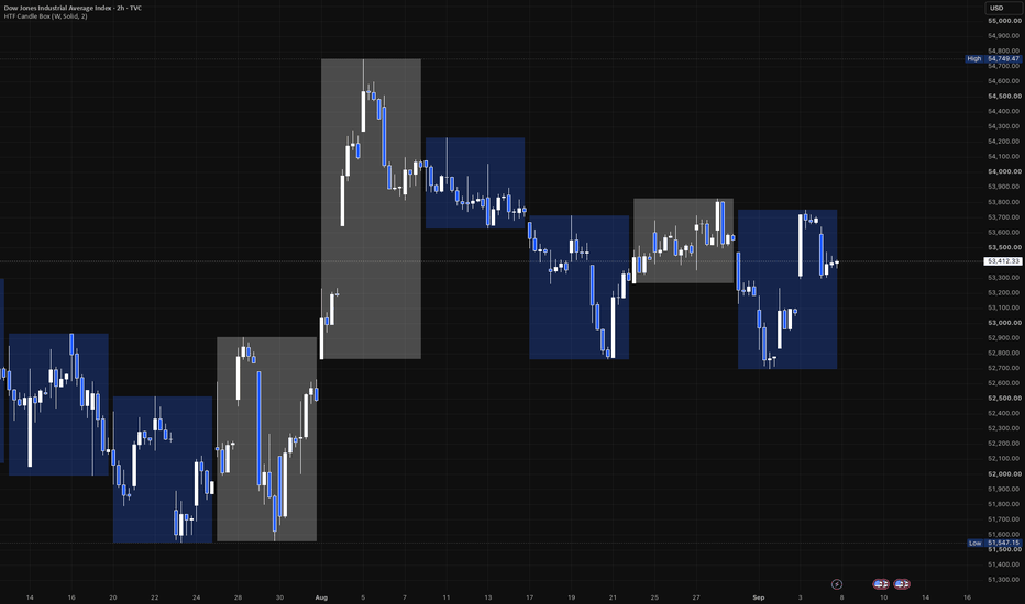
Wraps every higher-timeframe (HTF) period into a single box drawn directly on your current chart - a way to see the weekly (or monthly, or any coarser) range and direction without leaving your intraday or daily view.
What it draws
Each box spans one HTF period:
- Top / bottom track that period's running high and low, growing live bar by bar as the period develops.
- Fill color reflects direction, like a candle: bullish (close at/above the period's open) or bearish (close below it) - using your two chosen colors. The still-forming box updates its color live too, so it can flip as price crosses back over the period's open, settling once the period actually closes.
- Border is optional - off by default, toggle it on and set its own color, style (solid/dashed/dotted), and width.
Settings
- Higher Timeframe - any timeframe coarser than your chart's own (defaults to Weekly). The indicator automatically skips itself if your chart is already at or coarser than the chosen HTF, since there'd be nothing meaningful to group.
- Bull / Bear Color - one row, two swatches. Each color's own opacity slider (in the picker itself) controls fill strength - no separate transparency setting needed.
- Show Border / Border Color / Border Style / Border Width - fully optional outline layer.
Use it for
Keeping higher-timeframe structure (this week's range so far, last week's completed range, etc.) visible while trading a lower timeframe, without switching charts or adding a second pane. Indicateur
MarketMaulers CISDMarketMaulers CISD marks the level where delivery changed state: the open of the run that raided a level and then failed to hold it. It runs on the chart timeframe and on up to two higher timeframes at once, and it draws one line per setup rather than a lane of candles, because the level is the whole product.
Potential · Confirmed · Invalidated
FROM ZERO: WHAT A CISD IS
Read it as a three-candle story.
C1 is the candle whose high or low is worth taking. C2 is the candle that takes it and closes back inside. C3 is the candle that opens afterwards, where the reclaim either gets proven or does not.
The CISD LEVEL is not C1's extreme and it is not C2's close. It is the OPEN of the consecutive same-direction run that did the raiding. That run is a sequence of candles all closing the same way, and its open is where the move that swept began. When price closes back through that open, the run that swept is now the run that failed. Delivery has changed state. That is the entire concept, and everything below is about identifying that one price honestly.
THE TIMEFRAME NAMES A GRANULARITY, NOT A CANDLE
This is the part most implementations get wrong, and it is the difference between a tool that fires several times an hour and one that marks something.
A CISD timeframe names the resolution you are confirming on. Its C1 and C2 candles come from one fractal step ABOVE it:
1m from 15m · 3m from 30m · 5m from 1H · 15m from 4H · 1h from 1D · 4h from 1W · 1D from 1M
So a 5m CISD is a 1H C1 and C2, confirmed on 5m closes. Hunting "the current 5m candle sweeps the previous 5m candle" is a different and much noisier thing that happens several times an hour and means little.
Two consequences follow, and both are visible.
• A CISD only draws when your chart timeframe is at or BELOW its own granularity. From a 15m chart a 5m CISD stays hidden, because the chart cannot resolve the closes that confirm it.
• A slot confirms at ITS OWN granularity. On a 5m chart the 15m slot waits for a 15m close, not a 5m one. Set a slot to CHART and the chart timeframe becomes the granularity, with its C2 still pairing one step up.
THE TWO-SIDED SWEEP RULE
A candle that takes BOTH sides of the prior candle is indecisive. It swept the highs and the lows, so there is no side it committed to and no direction to deliver in. No C2, no setup, either way. This gates everything and it is on by default.
MAULER MODE is the single exception and it is off by default. If that two-sided candle CLOSED beyond one of C1's extremes then it was decisive after all, and the setup stands. It loosens the strictest gate in the model, so it is worth turning on deliberately rather than leaving on.
WHERE THE LEVEL COMES FROM, AND WHY IT MOVES
The anchor is the open of the first candle of the current same-direction run. Only an opposite-close candle resets it. Wicks, extremes and dojis are transparent to it, and a run can span a candle boundary, because delivery often starts inside the previous candle.
Two rules keep that anchor honest.
• A RATCHET. Any candle opening beyond the current anchor drags the anchor to its own open. A rally pulls a dead anchor up with it, so a shallow wick past the extreme can never capture a stale run from hours ago. The anchor always sits at the origin of the CURRENT move.
• RE-ANCHORING TO THE FINAL SWEEP. When price sweeps, pulls back, then sweeps again further, the level moves to that last leg. The anchor is structural, a run open, so a bare noise wick past the extreme re-captures the same value. Only a genuine pullback and resweep shifts the mark.
WHAT POTENTIAL MEANS, AND THE ONE CASE THAT SURPRISES PEOPLE
Potential means one thing only: price has not closed through the level yet. It is not a statement about which candle the close belonged to.
So when the C2's own sealing close is already through the level, the CISD is CONFIRMED at that seal and draws that way immediately. There is no waiting for a later candle to say what has already happened.
That test runs at the seal and never in the middle of C2, because the level re-anchors every time price sweeps a new extreme inside the candle. A bar confirming against the level as it stood an hour ago would be confirming against a level that no longer exists.
INVALIDATION
A hunt dies when price takes the C2's own extreme before the level is reclaimed. That is a raw trade through it, not a close, because a trade is a trade at any resolution and the setup does not survive the manipulation extreme being taken back.
Failed levels are removed by default, which keeps every line on the chart a setup that is still live or one that actually worked. Turn on Keep failed and they stay as dotted, faded history with an invalidation tag, which is the honest picture when you are reviewing rather than trading.
WHY IT DOES NOT REPAINT
There is no security call anywhere in this script. The engine accumulates its own higher-timeframe candles from the bars it runs on rather than requesting them, so there is no lookahead idiom to get wrong and no repaint surface at all.
Confirmation reads the previous, always-complete bar, and only on a bar where the slot's own timeframe has rolled, which is what makes a 15m slot confirm on 15m closes rather than on whatever the chart happens to be. Every state change is judged on closed data.
THE TABLE
Three rows, one per slot, bull state and bear state. It reports what happened LAST rather than what has ever happened, so a side that confirmed and was later invalidated reads as invalidated. A readout that cannot go backwards is not a readout.
Deliberately independent of what draws. Most people run one slot on the chart and want the state of the other two without adding lines to the price pane.
ALERTS
CISD armed (potential) · CISD confirmed · CISD invalidated
Messages carry the slot timeframe, the direction, the event and the level price, so what arrives is a level you can act on rather than a notification that something happened somewhere. Create one alert on this indicator with the condition set to Any alert() function call and it carries every enabled event for every slot at once.
An optional killzone filter quiets alerts outside three editable windows. It touches alerts only. Outside your windows the chart is identical: setups still arm, confirm, draw and invalidate on exactly the same rules, you do not get pinged for them.
MADE TO FIT YOUR CHART
Three slots each with their own bull and bear colour. Potential and confirmed lines have separate style and width. Labels on or off with three text sizes. Three right-extension modes, including freezing a confirmed level at the bar it confirmed, which is the honest history: the level did its job there. Keep failed on or off, with a budget for how many finished levels stay per side. Table position, text size, and a toggle per section.
The kept-level budget goes to 250 a side, and the tooltip is blunt about what that means. TradingView caps a script at 500 lines and 500 labels total. Past roughly 80 a side with more than one slot on, the platform ceiling decides what you see rather than this number does. It is a budget, not a promise.
HOW TRADERS ACTUALLY USE IT
Start with one slot and leave the other two off. The default pair, 5m and 15m, is two different fractals on one chart, and running both before you have read either one on its own is how a clean idea turns into noise.
Leave Draw potential off at first. With it off, every line on your chart is a CISD that actually confirmed. Turn it on when you want to see the setups the tool was watching that never paid, which is a different and slower kind of study.
The invalidation alert is the underrated one. Knowing a level died is a stand-down, and stand-downs are cheaper than entries.
WHAT THIS TOOL IS NOT
It marks a level and reports what happened to it. It does not project targets, it does not size a position, it does not stack or merge zones, and it does not tell you the setup was good. Those are layers on top of a CISD rather than part of one, and this file marks the CISD.
Works on any market and any timeframe.
Display only. This marks a level and reports what happened to it, it does not fire buy/sell signals and it does not forecast. Educational tool, not financial advice.
Published open-source. The fractal pair table, the two-sided sweep gate, the delivery-run anchor and its ratchet, the re-anchor-to-final-sweep capture, the seal confirm, the per-slot granularity gate and the alert transport are all readable in the source. Everything above explains what it marks and how it decides what to mark; the code is there so you can check that the description is accurate rather than take it on faith. Read it, fork it, argue with the constants.
Indicateur

Indicateur

Indicateur

EMA Speed Oscillator + RSI
Title: EMA Speed Oscillator + RSI
Description:
The Core Philosophy: Fixing RSI's Biggest Flaw
The Relative Strength Index (RSI) is arguably one of the most popular oscillators in technical analysis. However, it has a massive functional blind spot: During strong, aggressive trends, the RSI can remain in "overbought" or "oversold" territories for extended periods.
Many traders get trapped trying to catch a falling knife just because the RSI is below 30, or they prematurely short a massive bull rally because the RSI is above 70.
The Solution: You need a true momentum filter to confirm the RSI. That is exactly what this indicator does. By merging the standard RSI with the velocity (Speed) of an Exponential Moving Average (EMA) in a single pane, this tool filters out the "noise" and fakeouts of the RSI. You no longer have to guess if an oversold RSI is a true reversal or just a trap in a strong downtrend.
How It Works Under the Hood
This indicator calculates the percentage rate of change (velocity) of a chosen EMA over a specific lookback period.
Instead of plotting the RSI on a separate 0-100 scale (which would create a visual mess when mixed with momentum percentages), the RSI is custom-scaled to flawlessly match the EMA Speed's visual range. This allows you to monitor exactly how price momentum and relative strength are interacting at any given second.
How to Trade Using This Indicator
Instead of printing rigid, lagging "Buy/Sell" labels, this indicator provides pure, readable momentum context so you can make informed decisions.
🟢 Bullish Reversal Setup (Long)
The Setup: Wait for the Scaled RSI (Orange line) to drop into or below the Oversold zone (Green dotted line).
The Trap Avoidance: Do NOT buy immediately. The downtrend might still be strong.
The Trigger: Wait for the EMA Speed (Colored line) to turn Green and aggressively cross ABOVE the Zero Line. This confirms that the true momentum has shifted bullish, validating the RSI reversal.
🔴 Bearish Reversal Setup (Short)
The Setup: Wait for the Scaled RSI (Orange line) to push into or above the Overbought zone (Red dotted line).
The Trap Avoidance: Do NOT short immediately. The bull trend might just be resting.
The Trigger: Wait for the EMA Speed to turn Red and aggressively cross BELOW the Zero Line. This confirms the sellers have taken control of the momentum.
Key Features Breakdown
EMA Speed Oscillator: Measures the true acceleration of the trend. Green line indicates positive momentum, Red line indicates negative momentum.
Perfectly Scaled RSI: The orange RSI line dynamically adapts to the EMA speed scale, preventing visual clutter while allowing precise crossover comparisons.
The Squeeze Zone (Purple Background): When the EMA Speed falls extremely close to the zero line, momentum is dead. The indicator paints the background Purple to warn you of a flat, choppy, or consolidating market. Rule of thumb: Avoid taking reversal trades inside the Purple Zone. Wait for a volatility breakout.
Live Status Dashboard: A sleek table in the top-right corner displays real-time EMA Speed %, standard RSI values, and current trend status (Rising, Falling, or Flat) at a single glance.
Default & Recommended Settings
The script is optimized by default for high-sensitivity, short-to-medium term momentum tracking:
EMA Period: 6
Lookback Period: 13 (Measures how much the EMA has moved compared to 13 bars ago)
Note: You can freely adjust these in the settings to suit higher timeframes (like 1D or 1W) for swing trading.
Disclaimer: This script is for educational and analytical purposes only. No indicator guarantees 100% accuracy. Always use this tool in conjunction with overall market structure, price action, and proper risk management. Indicateur

VIKING + AXE & SHIELD## VIKING + AXE & SHIELD — What This Indicator Does
**VIKING + AXE & SHIELD was built so you only need one TradingView indicator on your chart.**
Instead of stacking separate indicators for moving averages, RSI, Accumulation/Distribution, OBV, CMF, ADX, relative volume, relative strength, support/resistance and other context, this script combines them into **one overlay indicator and one compact information panel**. The goal is to keep the chart clean while still showing trend, momentum, volume, money flow, relative strength and important price levels in one place.
The indicator automatically works from the **timeframe you are currently viewing**. For example, if the chart is on 1H, the RSI and A/D calculations are based on hourly bars. On Daily, they use daily bars. On Weekly, they use weekly bars.
### Moving averages
VIKING plots four commonly used trend averages directly on the price chart:
* **9 EMA**
* **21 EMA**
* **50 SMA**
* **200 SMA**
The 9 and 21 EMAs are intended to show shorter-term trend and momentum, while the 50 and 200 SMAs provide broader trend structure. Their current prices are also printed beside the averages so you can immediately see where they are without moving the cursor over them.
Internally, the script also examines the relationship between these moving averages and price. It can recognize conditions such as bullish or bearish MA stacking, price reclaiming or losing moving averages, golden/death-cross conditions, and developing trend structures. Those calculations are kept in the script even though they are not all printed in the VIKING panel.
### AXE & SHIELD support and resistance
AXE & SHIELD is the support/resistance part of the system.
Rather than simply drawing every recent high and low, it detects pivot-based price zones and tracks how those zones behave after they are created. Zone width is adjusted using ATR, and nearby pivots can be merged into the same area rather than creating a cluttered chart full of almost-identical levels.
The script evaluates support and resistance using several ideas, including:
* how well price closes relative to the zone,
* how deeply price penetrates it,
* how strongly price reacts away from it,
* how many times the zone has already been tested,
* and whether the zone has actually broken.
This creates an internal **zone survival score** rather than assuming every support or resistance level has equal strength. The score itself is intentionally kept internal so the chart remains simple.
Support levels are shown in the selected support color and resistance in the selected resistance color. Provisional/unconfirmed levels can be shown with a dotted appearance, and the script can mark zones that have been swept.
The nearest support and nearest resistance are also exported to TradingView's data window/status line if enabled.
---
# The VIKING information panel
The panel condenses several indicators into a small area instead of requiring separate lower chart panes. It includes:
**ADX / 52W High**
**P-RVOL / RS**
**OBV / ADR%**
**CMF / Average Volume**
**RSI full readout**
**A/D Pressure full readout**
The panel position and text size are adjustable. Strong, caution and weak/broken conditions are color coded so the information can be scanned quickly.
## ADX — trend strength
ADX answers a simple question:
**How strong is the current trend?**
The script uses a 14-period DMI/ADX calculation.
* Above **25** = Strong
* Below **20** = Choppy
* Between 20 and 25 = Building
It also compares ADX with three bars ago and adds arrows to show whether trend strength is increasing or decreasing.
Example:
`ADX 30.6 Strong ↑`
means a relatively strong trend whose strength is still increasing.
Important: **ADX does not tell you whether the trend is bullish or bearish.** It measures the strength of the trend.
## 52W Hi — distance from the 52-week high
The panel calculates the highest price over approximately 252 bars and shows how far the current price is from that high as a percentage.
Example:
`52W Hi -8.2%`
means price is currently about 8.2% below its 52-week high.
This provides quick context about whether a stock is trading near leadership territory or well below previous highs.
## P-RVOL — projected relative volume
P-RVOL is more sophisticated than simply comparing today's volume with yesterday's volume.
The script builds a historical intraday volume curve using previous sessions. By default, it uses:
* the previous **20 sessions**,
* a **15-minute calculation timeframe**,
* and regular NYSE hours of **9:30 AM–4:00 PM New York time**.
It looks at how much volume normally occurs by the current point in the trading session and projects what the full day's volume may look like.
Example:
`P-RVOL 1.50x`
roughly means the current trading pace is projecting toward about **1.5 times normal session volume**.
The arrows show whether projected relative volume itself is increasing or decreasing.
This makes P-RVOL especially useful early in the trading day because you do not have to wait until the closing bell to know whether participation appears unusually strong.
## RS — relative strength
The RS rating measures the stock's performance relative to the S&P 500.
The calculation gives more weight to recent performance while also considering longer periods, using approximately:
* 63 trading days,
* 126 days,
* 189 days,
* 252 days.
The stock's performance is compared against SPX over those same periods.
The result is converted into an RS-style rating, and an arrow indicates whether relative strength is improving or deteriorating.
Example:
`RS 83 ↑`
means the stock is showing relatively strong performance and its relative-strength trend is improving.
## OBV — buying and selling pressure
On-Balance Volume looks at volume together with whether price closed higher or lower.
VIKING does not clutter the panel with OBV's huge raw cumulative number. Instead it examines the **five-bar change** and converts it into an easy description:
* Strong Buying ↑
* Buying ↑
* Strong Selling ↓
* Selling ↓
* Neutral →
That gives the useful information from OBV without needing an OBV pane.
## ADR% — average daily range
ADR% shows the stock's average trading range as a percentage over the previous 20 bars.
Higher ADR stocks generally make larger percentage moves, while lower ADR stocks generally move less.
For example:
`ADR% 4.94%`
means the stock has recently been moving through an average daily range of roughly 4.94%.
This gives a fast way to judge how volatile or active a stock normally is.
## CMF — Chaikin Money Flow
CMF measures where price closes within each candle's range and weights that behavior by volume over 20 periods.
Positive CMF generally indicates buying pressure, while negative CMF indicates selling pressure.
VIKING calculates both the current CMF value and its recent direction.
A reading such as:
`CMF +0.20`
suggests positive money flow.
A negative reading suggests the opposite.
## Average Volume and liquidity label
VIKING calculates average volume over 50 bars and adds a simple liquidity classification:
* **Liquid** = average volume above 500,000
* **Thin** = above 100,000
* **Avoid** = below 100,000
This is meant as a quick screening aid, not a universal definition of liquidity.
---
# RSI without needing an RSI pane
One of the main purposes of VIKING is to provide enough numerical information about RSI that a separate RSI pane is unnecessary.
The readout looks like:
`RSI 37.2 | Δ5 +1.9 | Dist -1.9 | Acc3 +9.3`
It contains four pieces of information.
### RSI
The first number is standard **RSI(14)**.
The script also calculates a **14-period SMA of RSI** as its baseline.
A simplified way to think about the current reading:
* above 60 = stronger momentum
* 40–60 = middle/transition area
* below 40 = weaker momentum
These same thresholds control the panel's RSI color.
### Δ5
`Δ5` means:
**How much has RSI changed over the previous five bars?**
Example:
`Δ5 +7.0`
means RSI is seven points higher than five candles ago.
`Δ5 -7.0`
means RSI is seven points lower.
Because it is based on bars, the meaning automatically changes with your chart:
* 1H chart = five hours
* Daily chart = five trading days
* Weekly chart = five weeks
This makes the same indicator useful across multiple timeframes.
### Dist
`Dist` is the distance between current RSI and its 14-period RSI moving-average baseline.
Example:
`RSI 55 | Dist +7`
means RSI is seven points above its recent baseline.
`RSI 55 | Dist -4`
means RSI may still be above 50, but it is actually below its recent RSI trend.
That distinction helps identify whether momentum is strengthening or weakening instead of relying only on the absolute RSI number.
### Acc3
`Acc3` measures **three-bar acceleration**.
The script compares RSI's move over the latest three bars with its move over the previous three bars.
This is useful because a single bad candle does not automatically destroy an otherwise improving momentum trend.
For example:
`RSI 42 | Δ5 +5 | Dist +3 | Acc3 +7`
can be read as:
RSI is still relatively low, but it has improved over five bars, moved above its recent baseline, and the recent three-bar move is stronger than the three bars before it.
So rather than simply knowing **where RSI is**, VIKING also tells you:
**where it came from, where it sits relative to its trend, and whether that movement is gaining or losing strength.**
---
# A/D Pressure without needing an Accumulation/Distribution pane
Standard Accumulation/Distribution is cumulative. Raw values can become extremely large and are difficult to compare between different stocks.
VIKING therefore converts A/D into a normalized **A/D Pressure** reading instead of displaying the raw cumulative number.
It examines the change in A/D over 20 bars and divides that change by the total volume over the same period. The result is converted to a scale capped between approximately **-100 and +100**.
The readout looks like:
`A/D -11 | Δ5 -5 | Dist -9 | Acc3 +6`
### A/D
The first number is the current normalized pressure.
Broadly:
* positive = accumulation pressure
* negative = distribution pressure
* near zero = relatively balanced
The panel colors stronger positive readings at +20 or higher and stronger negative readings at -20 or lower.
### A/D Δ5
This tells you how much normalized A/D pressure has changed over five bars.
`Δ5 +10`
means accumulation/distribution behavior has improved by 10 points over five candles.
`Δ5 -10`
means it has deteriorated.
### A/D Dist
A/D Pressure has its own **20-period moving-average baseline**.
`Dist` tells you how far current pressure is above or below that normal path.
Positive Dist means current A/D pressure is stronger than its recent baseline.
Negative Dist means it is weaker.
### A/D Acc3
Acc3 uses the same concept as RSI.
It compares the change in A/D Pressure during the latest three bars with the previous three bars.
This creates some very useful combinations.
For example:
`A/D -11 | Δ5 -5 | Dist -9 | Acc3 +6`
means:
**A/D is still negative, it is still worse than five bars ago, and it remains below its baseline — but the most recent three-bar behavior is improving.**
In other words:
**The condition is still weak, but it may be starting to turn.**
That is much more informative than simply displaying a raw A/D value.
---
# Stage and long-term trend context
The script also contains daily calculations involving the **200-day and 220-day moving averages**.
It checks whether price is moving above the 200-day average while the long-term average is flat or improving, including cases where price gaps completely above the prior 200-day average.
These calculations are designed to provide longer-term stage/trend context directly on the chart rather than adding another separate study.
---
# How to read the indicator as a whole
VIKING is not intended to make a trading decision from one number.
Its purpose is to let several independent pieces of evidence confirm or disagree with each other.
For example, a strong setup might show something like:
```text
ADX 31 Strong ↑
P-RVOL 1.45x ↑
OBV Strong Buying ↑
CMF +0.18
RS 82 ↑
52W Hi -4.2%
RSI 58.4 | Δ5 +7.2 | Dist +5.1 | Acc3 +4.0
A/D +28 | Δ5 +12 | Dist +9 | Acc3 +7
```
That would tell you:
**Trend strength is increasing, volume participation is elevated, OBV and CMF show buying pressure, the stock is relatively strong, it is close to its 52-week high, momentum is improving, and accumulation pressure is strengthening.**
The opposite combination would warn that multiple parts of the market structure are deteriorating.
The important idea is that **no individual reading needs to be treated as a buy or sell signal. VIKING is a compact market-context system.**
## Why it was built
Most TradingView layouts become crowded when you add:
RSI + A/D + OBV + CMF + ADX + relative volume + moving averages + support/resistance + relative strength.
VIKING + AXE & SHIELD is designed to replace that stack with **one indicator**.
Price stays as the main focus.
The moving averages and important support/resistance levels stay directly on the chart, while indicators that would normally require separate panes are converted into compact numerical or descriptive readings in the VIKING panel.
That gives you more chart space while still preserving information about:
**trend, momentum, participation, accumulation/distribution, money flow, volatility, relative strength and market structure.**
That is the core purpose of the script.
Indicateur

Intraday Master ProIntraday Master Pro is a high-precision trading script engineered to identify high-probability intraday opportunities by filtering momentum, volume, and multi-timeframe alignment into automated trade setups.
Key Features
Multi-Timeframe Trend Dashboard: Real-time alignment checks across the 1m, 5m, and 15m timeframes.
Dynamic Trend Flow Band: Visual volatility channels indicating overall market bias.
Precision Entry Signals: Volume-filtered entries based on EMA crossovers and RSI constraints.
Automated Risk Management: Dynamic Stop Loss (SL) and 3 Take Profit targets (TP1, TP2, TP3) anchored directly to active signal bars.
Setup Rating Score (1–100): Real-time setup scoring algorithm based on multi-timeframe concordance and volume strength.
How It Works
1. High-Precision Signals & Entry Conditions
The indicator issues BUY or SELL labels only when multiple conditions align:
Trend & Momentum: Fast and Slow EMA crossovers filtered by RSI.
Volume Confirmation: Spikes exceeding 1.25x the 20-period volume average.
Cooldown Guard: Built-in bar cooldown filters to prevent whipsaws during choppy consolidated markets.
2. Multi-Timeframe Dashboard & Setup Rating
Located on the right side of your chart, the dashboard updates live:
1m / 5m / 15m Trend Status: Green (BULL) or Red (BEAR) depending on price position relative to core moving averages.
Setup Rating (1 to 100): A live score grading the quality of the current setup.
80–100 (Green): High-confluence setup across all timeframes and volume.
60–79 (Orange): Moderate setup; proceed with standard risk.
Below 60 (Gray): Low confluence or weak trend.
3. Dynamic Stop Loss & Take Profit Levels
When a valid signal triggers, the indicator projects extended level lines onto your chart:
SL (Orange Line): Calculated dynamically using ATR based on recent market volatility.
TP1 (1.5x R:R): Partial profits / initial target.
TP2 (2.8x R:R): Main target.
TP3 (4.5x R:R): Extended runner target for strong trending days.
How to Use Intraday Master Pro
Wait for a Signal: Look for a clear BUY or SELL label on the chart.
Check Confluence: Glance at the Dashboard. Look for Setup Ratings of 80/100 or higher and alignment across 1m, 5m, and 15m timeframes for maximum statistical edge.
Set Orders: Place your Stop Loss at the SL line and split your position across TP1, TP2, and TP3.
Manage Risk: Once price reaches TP1, consider moving your Stop Loss to entry (Breakeven) to lock in a risk-free trade while riding the position to TP2 and TP3.
Settings & Configuration
Risk Management Inputs: Adjust Core Sensitivity or Volatility Factor to widen or tighten stop-loss distances based on the asset’s volatility.
Visuals: Toggle the Dashboard or Flow Band visibility on/off and customize accent colors to fit dark or light charts.
Disclaimer
The Intraday Master Pro indicator is designed strictly for educational and informational purposes and does not constitute financial, investment, or trading advice. Past performance is not indicative of future results. Trading equities, options, forex, and cryptocurrencies involves significant financial risk and can result in the loss of your capital. Always practice proper risk management and consult a licensed financial advisor before executing trades. Indicateur


