Learn using seasonals
Seasonals are charts of price changes observed over the same period (season) in different years. They are built for each year and compared with similar charts for other years plotted on a shared coordinate space. This tool allows you to visualize seasonal price trends, evaluate the regularity of specific dynamics, and identify patterns expected at a particular time of the year.
CONTENTS:
What are seasonals
TradingView's seasonality charts are annual, meaning one chart shows an instrument's price dynamics for the entire year. Each year in a given range corresponds to its own line on the chart.
You can view seasonality charts for the last three years on the Overview tab of the symbol page and in the watchlist’s symbol info section, which you can find in the right panel.

These preview charts are for reference only and cannot be modified. To open the standalone "Seasonals" page with the ability to customize the chart, click the More seasonals button in the widget or go directly to the “Seasonals” tab of the symbol page.

View customization
The "Seasonals" page provides access to the instrument's full data history. You can select your desired historical period for analysis:
Adjusting the timeframe: To set the start and end years for plotting, pull the ends of the slider located above the chart. You can also move the entire slider forward or backward along the time axis by clicking its middle and dragging it. This keeps the number of covered years unchanged while shifting the range along the timeline.

Percentage vs absolute values: Click the Percentage button to change the price axis mode. When active, the price change is displayed as a percentage from the beginning of the year. When inactive, the mode is disabled, and price changes are presented in absolute values.

Average line: Click the Average line button in the upper-right corner of the chart to display a dashed average curve based on data from your selected years. This feature helps visually assess the overall trend and dynamics of seasonal fluctuations, making it easier to analyze data and make trading decisions.
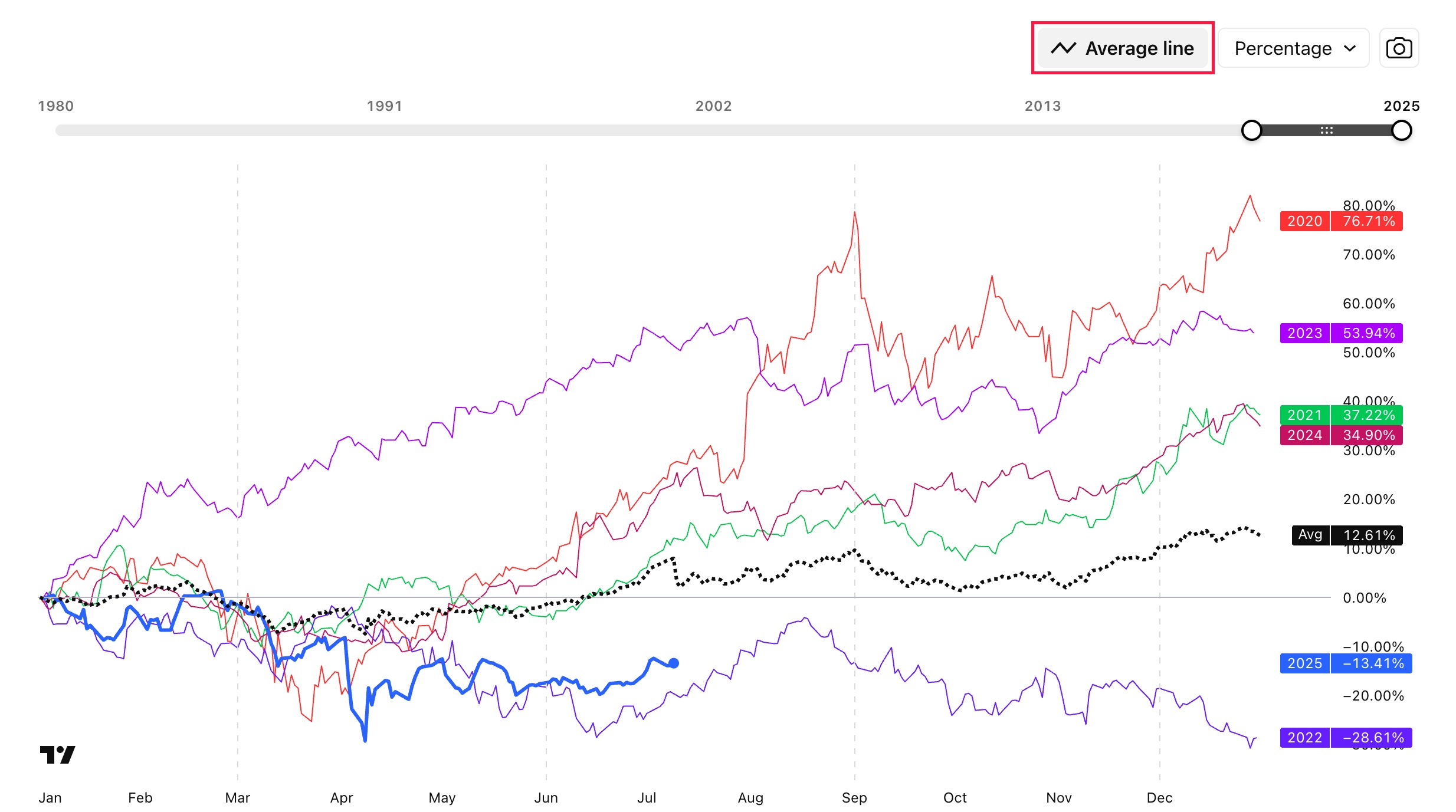
Once you have finished your analysis, you can save an image of the resulting chart or share a snapshot. Just click the camera icon and select the appropriate option.

Seasonals table
You can also display seasonals as a table. In this view, each row represents a calendar year, while each cell shows the price change for a given month.
Cell colors make it easy to spot trends at a glance: green highlights positive changes, while red marks negative ones. At the bottom of the table, you’ll find a summary row displaying the distribution of positive and negative closes for each month across the selected years.
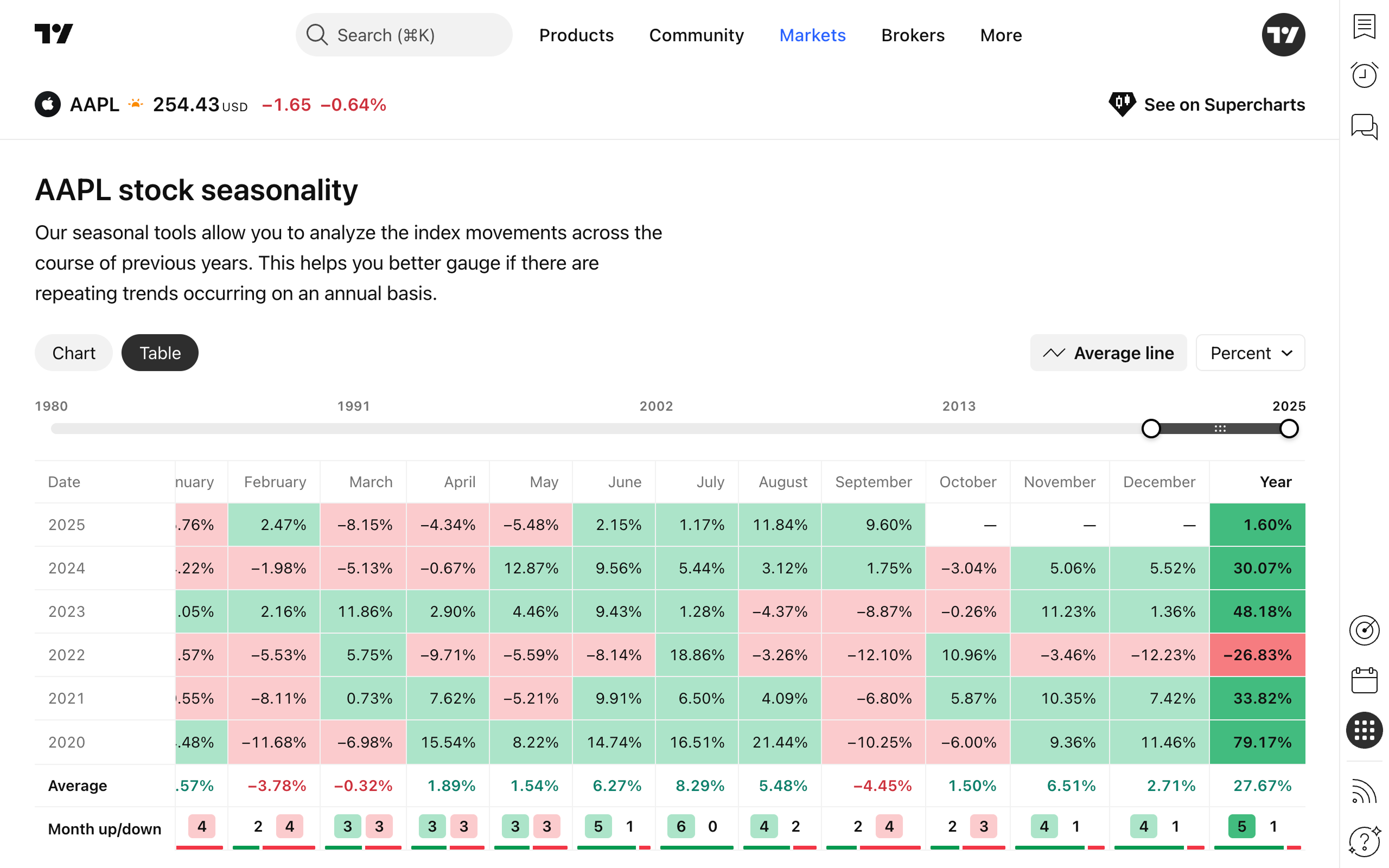
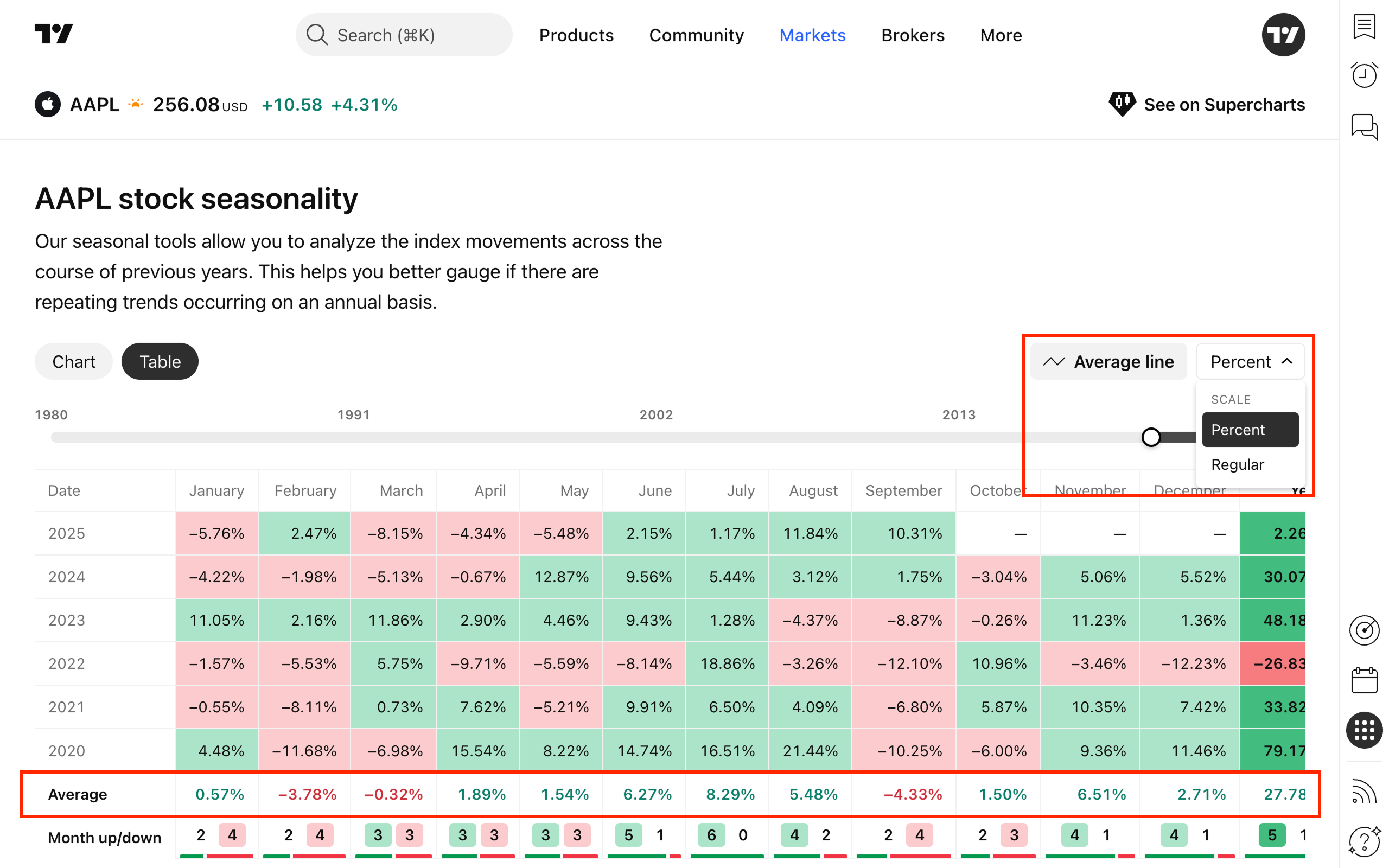
Just like the charts, the table is fully customizable. You can choose the display period (by years), switch between percentage or absolute values, and even add average values, which will appear in a separate row at the bottom of the table.
Also read: