EURUSD 4H — Bearish Channel Break into Key DemandEURUSD is showing a clear shift in short-term momentum after breaking below the descending channel. The chart also contains multiple market-structure confirmations, including previous BOS levels, a visible demand FVG, and a broader demand zone below current price.
Market structure
The earlier bullish move created a sequence of higher highs and higher lows, supported by multiple bullish breaks of structure. However, after reaching the upper area, price entered a descending corrective channel.
The important development is the strong bearish displacement below the channel, which suggests that short-term sellers have gained momentum. Price is now approaching a key reaction area around the 1.1548–1.1556 demand FVG.
Key levels to watch
🔴 Supply zone: approximately 1.1688–1.1708
This area aligns with the previous upper supply region and nearby buy-side liquidity. A sustained move above this zone would weaken the broader bearish scenario.
🟦 Demand FVG: approximately 1.1548–1.1556
Price is currently approaching this imbalance. A strong bullish reaction and reclaim of nearby structure could indicate that buyers are defending the area.
🟢 Main demand zone: approximately 1.1500–1.1518
If the FVG fails to hold, this lower demand area becomes the next important region to monitor for potential price reaction.
⚫ Sell-side liquidity: around 1.1455–1.1460
A deeper bearish continuation could eventually expose the liquidity resting below the previous swing lows.
Possible scenarios
Bearish continuation:
If price remains below the broken channel and fails to reclaim nearby resistance, the current bearish momentum may continue toward the demand FVG, followed by the broader demand zone.
Bullish reaction:
If price reaches the demand/FVG area and shows clear rejection with a bullish market-structure shift, a corrective move higher could develop. Confirmation would be more important than anticipating the reversal.
Trading perspective
The current 4H bias is short-term bearish, but price is approaching a significant demand area. For that reason, the key focus is whether sellers can continue the displacement or whether buyers create a confirmed reaction from demand.
This analysis is for educational and market-discussion purposes only. Price can move in either direction, so risk management and confirmation remain essential
Title: XAUUSD 1H | Rejection Block Holds as Price Eyes Upper LiqXAUUSD is currently trading within a broader descending structure, but price is now reacting from an important Rejection Block around 4,564–4,575. This area has previously attracted strong buying interest, making it an important demand zone to monitor.
After the recent sell-side move, price has shown a bullish reaction from the lower zone and is attempting to reclaim the nearby 4,580–4,594 Order Block. A sustained move above this area could indicate that buyers are gaining short-term control.
The main bullish objective on this chart is the upper liquidity/target area near 4,693. However, price still needs to deal with the descending trendline and intermediate resistance levels before any continuation toward that objective can be confirmed.
Key levels to watch:
Demand / Rejection Block: 4,564–4,575
Order Block / Decision Area: around 4,580–4,594
Current resistance: descending trendline
Upside objective: around 4,693
Invalidation: a sustained breakdown below the marked rejection zone would weaken the bullish scenario.
The overall idea remains conditional rather than directional certainty. Confirmation through market structure and price acceptance above the nearby decision zone would provide additional evidence for a potential move higher.
This analysis is shared for educational and market-discussion purposes only and represents a technical scenario, not a guarantee of future price movement.  Long
Long
 Long
Long
XAUUSD | 1H Market Structure & Key ZonesGold is currently trading around the **4,599–4,600 area** after rejecting from the upper supply region. The chart shows a shift in short-term structure, with the marked **CHoCH** highlighting that bullish momentum has weakened and price is now approaching an important decision area.
🔴 **Primary Supply Zone:** 4,640–4,655
🔴 **Higher Supply / BSL Area:** 4,682–4,695
🔵 **Demand Order Block:** 4,557–4,570
🟢 **Strong Demand Zone:** 4,505–4,525
Price is currently positioned between the supply and demand areas, making the reaction at these zones particularly important. A retracement into the upper supply regions may provide information about whether sellers remain active, while a move into the demand order block could reveal whether buyers are willing to defend the area.
If the nearby demand zone fails to hold, the lower strong demand area becomes the next key zone to monitor. Conversely, sustained acceptance above the nearby supply could shift attention toward the higher liquidity and supply region.
*Key Focus:** Patience and confirmation remain important. Watching price action, liquidity behavior, and market structure at the marked zones before assessing the next potential scenario.
This analysis is shared for educational purposes only and represents a personal market-structure perspective, not financial advice
Long 
Long 
XAUUSD 30M — Bearish Structure | SMC + FVG + Price ActionXAUUSD continues to show **bearish market structure** on the 30-minute timeframe after a strong rejection from the higher supply area. The recent sequence of lower highs and lower lows suggests that sellers currently remain in control.
### 🔴 Key Areas to Watch
* **Supply Zone:** 4,680–4,690
* **Bearish Order Block:** 4,620–4,632
* **Fair Value Gap (FVG):** Around 4,602–4,615
* **Main Demand Zone:** 4,573–4,588
* **Lower Demand Zone:** 4,530–4,540
### 📊 Current Price Action
Price has declined sharply into the **4,590 area**, where it is now approaching the upper boundary of the marked demand zone. The nearby **FVG and bearish order block** remain important reaction areas if price retraces.
### 📉 Bearish Scenario
If price pulls back into the **FVG / 4,620–4,632 order-block area** and forms a clear bearish rejection or lower-timeframe confirmation, the bearish structure could remain intact. In that case, the demand zone around **4,573–4,588** may continue to act as an important area of interest, with the lower **4,530–4,540 zone** becoming relevant if downside momentum extends.
### 📈 Alternative Scenario
If buyers defend the current demand area and price starts reclaiming nearby structure, the market could first revisit the FVG and higher order-block region. A sustained move above the marked bearish zone would weaken the immediate bearish outlook.
⚠️ **This idea is for educational and technical analysis purposes only. Market conditions can change quickly, so always use your own confirmation and risk management
Short 
Long 
What Happens When Price Revisits This Fresh Supply Zone on USOILSymbol: USOIL
Timeframe: Daily
Structure: Supply Zone — Rally-Base-Drop
Current Market Context
Price is currently near an identified supply zone . This area is being observed because it originated from a strong imbalance following a Rally-Base-Drop structure.
The formation consists of a rally, a relatively compact base, and a subsequent bearish leg-out. From a market-structure perspective, this sequence can provide useful context for studying how price behaves when it later revisits an area associated with previous selling pressure.
Why This Zone Is Technically Significant
Several characteristics make this area technically interesting:
• Fresh zone: Price has not meaningfully revisited the zone since its formation.
• Strong leg-out: The departure from the base was relatively decisive, creating a visible expansion in price.
• Quality basing structure: The consolidation before the bearish move provides a clearly defined structural reference.
• Market structure: The zone can be studied alongside surrounding swing highs, swing lows, and the broader sequence of price expansion and retracement.
What Can Happen During a Revisit?
A revisit to a supply zone does not guarantee rejection.
One possible scenario is that price reacts around the zone and begins developing bearish price action. Such a reaction could include rejection candles, a change in short-term swing structure, or renewed downside momentum.
Another possible scenario is that price continues through the zone and establishes acceptance above it. This could indicate that the historical supply is no longer influencing price in the same manner.
A third possibility is a period of consolidation around the area, where price provides limited directional information before a clearer structure develops.
Confirmation Matters
The zone itself represents a technical area of interest rather than a predetermined outcome.
Price action confirmation can provide additional context when studying the reaction. Observations may include rejection, changes in market structure, momentum shifts, or sustained acceptance beyond the zone.
These observations are part of technical analysis and should not be interpreted as trading signals.
Invalidation Is Possible
Supply zones can weaken or become invalidated.
If price moves decisively through the area and establishes sustained acceptance above it, the original Rally-Base-Drop interpretation may become less relevant.
This illustrates an important principle of supply-and-demand analysis: a historical imbalance does not guarantee that the same area will produce the same reaction in the future.
Risk Management — Educational Perspective
From a general trading-education perspective, risk management involves recognizing that any technical interpretation can be incorrect.
Concepts such as position sizing, predefined invalidation conditions, and controlled exposure are commonly used to manage uncertainty. These concepts are presented for educational purposes and are not recommendations for any particular trade or individual.
Key Observation
The interesting question is not whether this supply zone must hold.
The technical question is:
How does USOIL behave when price interacts with this fresh Daily Rally-Base-Drop structure?
The resulting price action may provide additional information about the evolving market structure, regardless of whether the reaction is bullish, bearish, or inconclusive.
This publication is intended solely for educational and informational purposes. It reflects a technical analysis of market structure and should not be interpreted as investment advice, a recommendation, or a solicitation to buy or sell any financial instrument. Always perform your own analysis and manage risk according to your individual circumstances.
 Short
Short
USDJPY 2H: What Happens at This Fresh Supply Zone?Symbol: USDJPY
Timeframe: 120 Minutes
Structure: Supply Zone — Rally-Base-Drop
Current Market Context
Price is currently near an identified supply zone . This area is being observed because it originated from a strong imbalance following a Rally-Base-Drop structure.
The zone represents an area where historical price action showed a relatively compact basing phase followed by a strong bearish leg-out. From a market-structure perspective, this type of formation can be useful for studying how price behaves when it revisits an area associated with previous supply.
Why This Zone Is Technically Interesting
Several characteristics make this area worth observing:
• Fresh zone: Price has not meaningfully revisited the area since its formation.
• Strong leg-out: The departure from the base was relatively decisive, indicating a notable imbalance in the observed price action.
• Quality basing structure: The base shows comparatively contained price movement before the expansion lower.
• Market structure: The formation can be examined in the context of curve analysis.
What Can Happen When Price Revisits Supply?
A revisit does not guarantee a particular outcome.
One possible scenario is that price encounters renewed selling pressure around the zone and begins forming bearish price-action structures.
Another possibility is that price moves through the zone, indicating that the historical supply may no longer be influencing price in the same way.
A move through the area could therefore provide useful information about how the market is interacting with this previously identified supply.
Conversely, rejection from the zone could become an interesting example of how price responds when returning to a fresh Rally-Base-Drop structure.
Confirmation Matters
The zone itself is only a technical area of interest. Price action confirmation can provide additional information about whether the market is actually reacting to the area.
Examples of observations could include rejection, changes in swing structure, momentum shifts, or sustained acceptance above the zone. These are analytical observations rather than predetermined signals.
Invalidation Is Also Possible
Supply zones are not permanent. A sustained move through the area could weaken or invalidate the original structural interpretation.
This is an important concept when studying supply and demand: historical imbalance does not guarantee that the same imbalance will influence future price action.
Risk Management — Educational Perspective
From a general trading-education perspective, risk management involves considering the possibility that a technical thesis may be incorrect.
Concepts such as predefined invalidation conditions, position sizing, and controlled exposure are commonly discussed as ways of managing uncertainty.
These are general educational concepts rather than recommendations for any particular market participant or trade.
Key Observation
The interesting question is not whether this supply zone must hold.
The more useful technical question is:
How does USDJPY behave when price interacts with this fresh Rally-Base-Drop structure?
That price-action response may provide additional information about the current market structure.
This publication is intended solely for educational and informational purposes. It reflects a technical analysis of market structure and should not be interpreted as investment advice, a recommendation, or a solicitation to buy or sell any financial instrument. Always perform your own analysis and manage risk according to your individual circumstances. ETH/USD (1H) – Bullish Structure Intact, Eyeing Major ResistanceEthereum continues to respect bullish market structure on the 1H, with price holding above the recent demand zone (DZ) near $1,900 after a clean BOS. Price is now testing the $1,919–1,922 zone just below Major Resistance at ~$1,938.
Key level: Major resistance ~$1,938 — a break and hold above opens room toward $1,948+
TP1: ~$1,868
TP2: ~$1,835 (invalidation zone if structure breaks down)
 Short
Short
XAUUSD 4H: What Could Happen When Price Revisits This Fresh DBD Symbol: XAUUSD
Timeframe: 240M (4H)
Zone Structure: Drop–Base–Drop (DBD)
Zone Type: Supply Zone
Market Context
Price is currently trading near an identified 4H supply zone . This area is being observed because it originated from a strong imbalance following a Drop–Base–Drop (DBD) structure.
The DBD formation represents a sequence where price declines, temporarily consolidates, and then continues lower with a relatively strong leg-out. From a technical-analysis perspective, this type of structure can highlight an area where a significant imbalance previously developed.
Why This Zone Is Technically Significant
Several characteristics make this area relevant for market-structure observation:
Fresh zone: The area has not been meaningfully revisited since its formation.
Strong leg-out: The departure from the base showed notable downside momentum.
Quality basing structure: Price spent a relatively limited amount of time consolidating before the bearish expansion.
Market structure: The move away from the zone created a visible displacement in price, making the area useful for studying subsequent reactions.
Fresh supply zones are often watched because the first revisit can provide useful information about how price interacts with a previously established imbalance.
What Traders Often Observe on a Revisit
When price returns to a supply zone, several different behaviors are possible.
One scenario is that price could show bearish rejection , with candles displaying reduced buying momentum, rejection wicks, or a shift toward lower-timeframe bearish structure.
Another possibility is that price could move through the zone without significant rejection. This may indicate that the previously observed supply is being absorbed or that the underlying market structure has changed.
A third scenario is that price could initially react from the zone but later return to test the area again. This can create a more complex interaction between liquidity, momentum, and market structure.
There is also a bullish scenario in which price breaks and sustains above the supply area. In that situation, the original bearish interpretation of the zone would become less relevant, and subsequent price action would need to be evaluated in the context of the new structure.
Confirmation Matters
The presence of a supply zone by itself does not establish what price will do next.
Price action confirmation can provide additional information about whether the observed area is actually producing a reaction. Lower-timeframe structure, candle behavior, momentum, and the way price enters and leaves the zone may all be relevant when studying the interaction.
Zone Invalidation
A supply zone can fail.
A sustained move through the zone may invalidate the original technical premise behind the area. This is an important part of studying supply-and-demand analysis: zones are areas of interest, not guarantees of future price behavior.
Risk Management — Educational Context
From a general trading-education perspective, risk management refers to controlling potential downside exposure and understanding what would invalidate a market hypothesis.
Concepts such as predefined invalidation conditions, position sizing, and limiting exposure are commonly discussed as part of disciplined trading. These concepts should be adapted to an individual's own circumstances rather than treated as universal recommendations.
Key Observation
The interesting part of this XAUUSD 4H structure is not simply whether the supply zone holds or fails.
It is how price behaves when it interacts with the zone .
The reaction, rejection, acceptance, or breakout can provide additional information about the evolving market structure.
Educational Disclaimer
This publication is intended solely for educational and informational purposes. It reflects a technical analysis of market structure and should not be interpreted as investment advice, a recommendation, or a solicitation to buy or sell any financial instrument. Always perform your own analysis and manage risk according to your individual circumstances. Short 
BTCUSD: Bearish Order Block Above Major Liquidity🔹 BTCUSD is showing a short-term bullish recovery from the 63,200 area, with price reclaiming local structure and moving toward the 64,000–64,400 resistance zone. This area appears to contain previous supply and an Order Block, making it an important region for price reaction. Above this zone, further upside could expose the 64,800–65,225 resistance area, while the broader structure still shows signs of selling pressure.
🔸 A possible scenario is that BTCUSD may continue higher into the highlighted resistance and then face rejection if sellers defend the Order Block. Traders may wait for clear price confirmation before considering any trade. If the resistance zone fails to hold, price could retrace toward the 63,200 support and potentially the lower liquidity area around 62,400–62,230. Conversely, sustained acceptance above resistance could suggest further bullish continuation.
This analysis is for educational purposes only and does not constitute financial or investment advice. Always conduct your own research before making trading decisions.  Short
Short
XAU/USD (Gold): Seeking Retracement After Strong Resistance RejThe 4-hour chart on XAU/USD (Gold) indicates price running directly into a major Daily & 4-Hour Resistance Zone ($4,340 – $4,375), producing clear, aggressive upper-wick rejections.
After an explosive bullish expansion, the market is overextended. A corrective wave toward lower discount levels is needed to rebalance price action before any potential continuation.
Technical Rationale & Reasons for the Downside Scenario
4H / 1D Major Supply & Rejection Zone ($4,340 – $4,375): Buyers failed to hold above $4,350, leaving multiple long upper wicks. This indicates strong selling pressure and institutional profit-taking at key daily resistance.
Overextended Momentum & Need for Healthy Retracement: The rapid upward move left liquidity imbalances and fair value gaps below. A pull-back will clean up sell-side liquidity and rebalance the chart.
Dynamic Support Alignment: Target 3 coincides with key historical breakout structure and the rising 100 EMA (~$4,141), providing strong confluence for a complete corrective cycle.
Downside Targets
First Target Zone ($4,230 – $4,250): Initial structural support and local swing low consolidation area.
Second Target Zone ($4,160 – $4,175): Mid-range reaction zone and intermediate demand block.
Third Target Zone ($4,100 – $4,110): Key high-timeframe structural support level, aligned near the 100 EMA.
Disclaimer: This trade analysis is for educational and idea-sharing purposes only and is not financial advice. Always manage your risk carefully using strict position sizing and stop losses. Short 
 Long
Long
What is Dynamic Liquidity Zones? Supply & Demand Trading Basics
Today, we will discuss the concept of dynamic liquidity zones in trading.
I will explain to you the difference between static and dynamic liquidity zones.
You will learn how to identify and use them properly.
Take notes, and let's get started.
Let's start by discussing static liquidity zones.
Static liquidity zones are liquidity clusters that do not shift with time.
Once they are identified on a price chart, they remain fixed no matter when the price returns to them.
That's an example of a static liquidity supply zone on GBPUSD.
It is a horizontal structure cluster that accumulates selling orders.
Whenever the price tests it, this zone will remain at the same levels.
Now, compare that to EURUSD pair.
As you can see, we have a significant static horizontal supply cluster.
But, it is just a part of a major dynamic liquidity zone that is based on a strong vertical structure - a trend line and horizontal demand zone.
The upper boundary of that area will be higher with time.
This zone will grow, and selling orders will be concentrated within it.
Dynamic liquidity supply zone is a combination, a confluence of a strong trend line and a static liquidity supply zone that constantly changes over time.
Above is the example of a static liquidity demand zone on EURJPY.
It is a horizontal structure cluster that accumulates buying orders.
Whenever the price tests it, this zone will remain at the same levels.
Examine the price action on CADCHF pair.
There is a significant horizontal liquidity demand zone below current prices.
But, this liquidity zone is part of a larger, dynamic demand zone.
This dynamic demand cluster is based on a vertical structure - a trend line and this horizontal demand zone.
With time, this zone will expand , becoming wider and wider.
We will expect that buying orders will be concentrated within that entire area.
Dynamic liquidity demand zone is a combination, a confluence of a strong trend line and a static liquidity demand zone that constantly changes over time.
Please note that, depending on the positioning and the direction of a trend line, a dynamic liquidity zone can expand or contract.
On EURGBP pair, we can see a contracting liquidity supply zone based on a falling trend line and a horizontal supply cluster.
And a contracting demand zone based on a rising trend line and a horizontal static demand cluster.
Both dynamic areas become smaller over time.
Your ability to identify dynamic liquidity zones provides a deeper understanding of a concentration of buying and selling orders on the market.
Integrate this knowledge into your analysis, and good luck to you in trading.
❤️Please, support my work with like, thank you!❤️
I am part of Trade Nation's Influencer program and receive a monthly fee for using their TradingView charts in my analysis.
Education 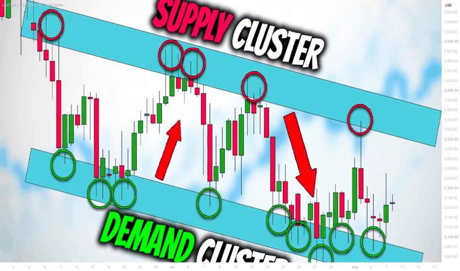
 Education

 Long
Long