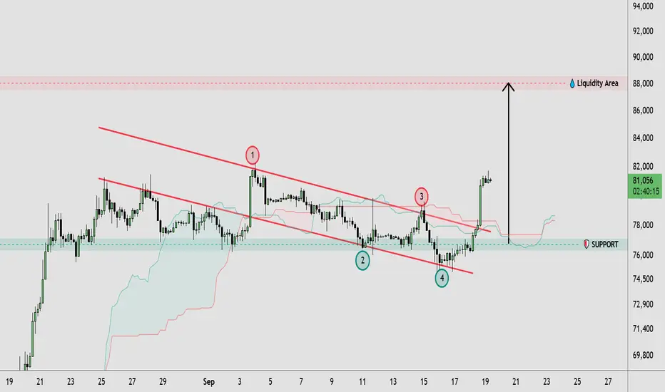
BTCUSD Breaks Descending Channel | 88K Liquidity in Focus🔹 BTCUSD has broken above the descending channel structure after multiple tests of its upper boundary, suggesting a shift in short-term price action. Price is currently holding around the 81,000 area after a strong bullish expansion from the 76,000–77,000 support zone. The breakout places attention on the recent swing highs around 82,000, while the larger highlighted liquidity area near 88,000 remains an important resistance region. The previous channel structure and support zone continue to provide key areas for market structure analysis.
🔸 If BTCUSD maintains the breakout and holds above the former channel resistance, price could continue building toward higher liquidity, with the 88,000 area becoming a potential zone of interest. Traders may wait for price confirmation and a successful retest before considering any trade. If the breakout fails and price moves back below the 76,000–77,000 support area, the bullish structure could weaken and a deeper retracement might develop.
This analysis is for educational purposes only and does not constitute financial or investment advice. Always conduct your own research before making trading decisions.  Long
Long
XAUUSD — Weekly Wave 5 Lower Toward 4,060
From Kelly’s view, gold enters next week inside a broader bearish corrective structure. Price is currently trading around 4,378, after recovering from the 4,240–4,250 area, but the rebound is still developing beneath a descending channel and an important sell zone around 4,390–4,410.
The key idea is simple: the current recovery may represent a corrective Wave (4), while the main weekly scenario remains a continuation lower into Wave (5) if sellers defend the upper resistance zone.
⟡ Market structure
Gold remains inside a descending structure after the major peak near 4,680. Recent rebounds have continued to form below important resistance, while the descending channel is still controlling the broader direction.
The current recovery from around 4,240 has pushed price back toward the 4,390–4,410 sell zone, where Fibonacci resistance and the projected Wave (4) completion area overlap.
For next week, 4,334 is the first important support. A clean break below this level could confirm renewed bearish momentum and expose the 4,240–4,255 area.
If that support also fails, the larger Wave (5) projection points toward the 4,045–4,075 zone.
➤ Key levels
◌ Current price area: 4,375–4,385
◌ Main sell zone: 4,390–4,410
◌ Strong resistance: 4,410–4,430
◌ Strong support: 4,334
◌ Secondary support: 4,240–4,255
◌ First target: 4,334
◌ Second target: 4,240–4,255
◌ Main target: 4,045–4,075
◌ Invalidation: Above 4,430
⌁ Elliott Wave view
Wave (1): The first bearish leg pushed price lower from the previous recovery high.
Wave (2): Gold produced a corrective rebound before sellers regained control.
Wave (3): The stronger bearish impulse extended toward the 4,240 area.
Wave (4): The current rebound may be completing near 4,390–4,410, where the descending channel and Fibonacci resistance overlap.
Wave (5): If sellers reject this zone, the final bearish leg could develop toward 4,240 first, followed by the larger 4,045–4,075 target area.
▸ Trading scenario
Preferred bearish scenario
Entry: 4,390–4,410 after bearish confirmation
Stop Loss: Above 4,430
Take Profit 1: 4,334
Take Profit 2: 4,240–4,255
Take Profit 3: 4,045–4,075
The cleaner plan is to wait for rejection from the sell zone rather than chase price lower around current levels. A bearish reaction near 4,390–4,410, followed by a break below 4,334, would strengthen the Wave (5) scenario.
Alternative scenario:
If gold breaks above 4,410–4,430 and holds above the descending structure, the bearish Wave (5) setup may be delayed and price could extend toward the next higher resistance before sellers regain control.
◌ Invalidation
The main bearish scenario would weaken if price gains sustained acceptance above 4,410, and a confirmed break above 4,430 would invalidate the preferred Wave (5) structure for next week.
⌁ Kelly’s view
Kelly’s main view remains bearish for next week while gold stays below 4,390–4,430.
The current rebound may still have room to test the sell zone, but the broader structure favors another bearish leg if sellers defend resistance. 4,334 is the first confirmation level, while 4,240–4,255 remains the next major support before the larger 4,045–4,075 Wave (5) target comes into focus.
Do you think gold will reject the 4,390–4,410 sell zone first, or break 4,334 directly next week?  Short
Short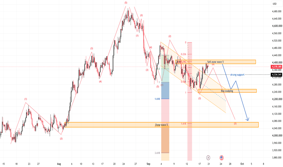
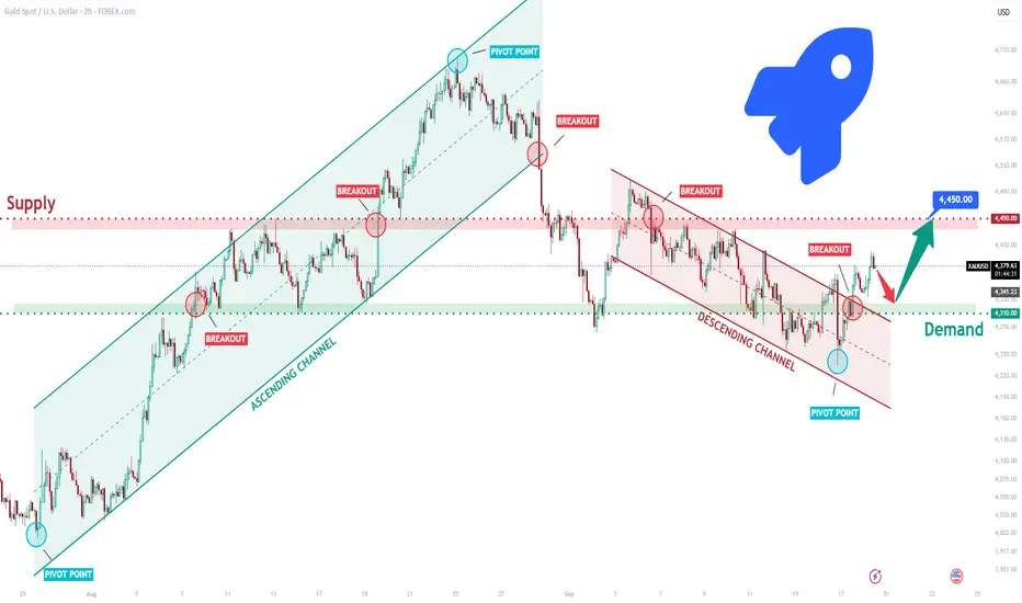
XAUUSD Long: Channel Breakout Could Drive Price Higher To 4,450$Hello traders! Here’s my technical outlook based on the current XAUUSD (2H) chart structure. XAUUSD previously traded inside an ascending channel before breaking higher and later forming a descending channel. Price then tested the Supply Zone near 4,450, where sellers rejected the upside before pulling back toward demand.
Currently, XAUUSD is trading below the 4,450 Supply Zone while holding above the 4,310 Demand Zone. The recent bounce from support suggests buyers are preparing for another move higher.
As long as XAUUSD remains above 4,310 and respects the current support structure, the bullish scenario remains valid. A continuation higher could target 4,450 (TP1). However, a break below 4,310 would weaken the bullish outlook. Manage your risk! Long 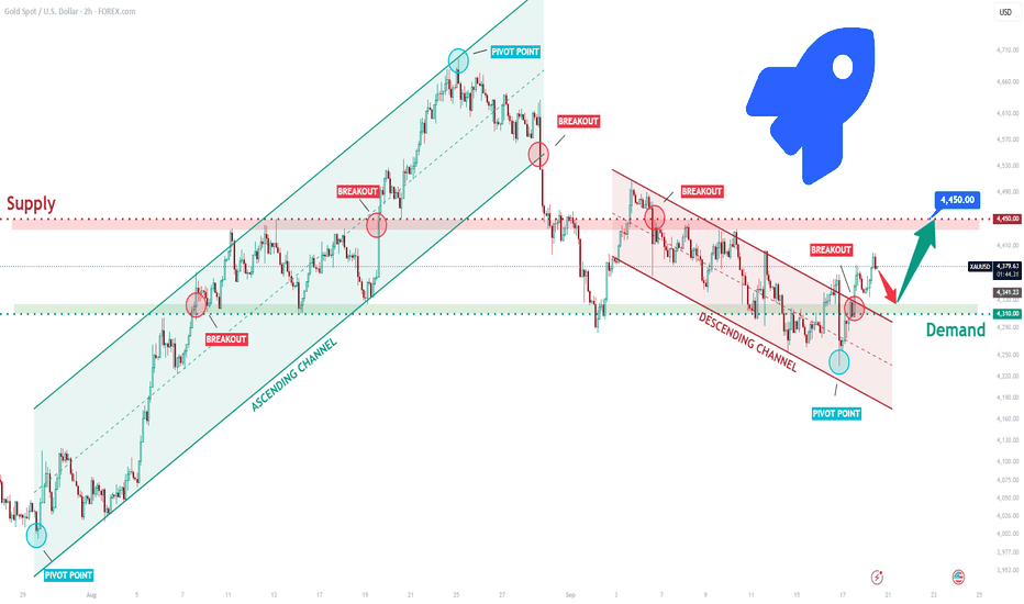
XAUUSD — Descending Channel Breakout Toward 4,500 Liquidity🔹 XAUUSD is showing a broader corrective structure within a descending channel, while recent price action suggests buyers are gaining some control after reacting from the 4,250–4,300 support area. Price has pushed back above the channel’s upper boundary, indicating a potential breakout attempt, with resistance developing around 4,400–4,450. The marked liquidity area near 4,500–4,520 remains an important upside zone, while the recent higher lows suggest improving short-term market structure.
🔸 If the breakout remains supported, XAUUSD could continue toward the 4,500 liquidity area as buyers test higher resistance. Traders may wait for price confirmation and sustained acceptance above the breakout area before considering any trade. If the breakout fails and price falls back below the 4,300 region, the market could revisit the 4,250–4,270 support zone and potentially resume the broader corrective structure.
This analysis is for educational purposes only and does not constitute financial or investment advice. Always conduct your own research before making trading decisions. Long 
 Short
Short
The Elephant Jungle 9/20/26 Page 1Are the Bulls about to make a big move and flip the market Bullish?
I only ask because if the Bulls can get over the ATH Anchor VWAP and get a solid candle body close above the 1M High, they could flip the ATH Anchor VWAP to Support and have a fresh new 1M Demand Range to fall back on as they continue their fight back up to ATH.
And after catching some nice Support off the 2022 Anchor VWAP, the Bulls have put together two solid Bullish months, so solid that it is starting to look like a Three White Soldiers Candle Pattern could form on the 1M.
But lets not get too far ahead of ourselves.
Because the Bears still have these Bulls chained up like some mean junkyard dogs.
And that ATH Anchor VWAP has not given out yet.
In fact, if the Bulls don’t shake loose from that chain this month, this candle just may actually form an Evening Star Candlestick Pattern, a bearish reversal pattern that just happens to be a signal that the Bears could be ready to take back over and send these Bulls back down to the Range Low.
So with 10 days left, will the Bears keep the Bulls in check and keep the market moving their way?
Or will the Bulls finally be OFF THE CHAIN like it’s the late 90s and somebody just pressed play on DMX’s “Party Up”?
Because if these Bulls can break that chain, flip that ATH Anchor VWAP to Support, and secure that 1M body close above the 1M High, we could be looking at a whole different market as the Bulls start climbing their way back toward All Time High.
The question is, are the Bulls finally ready to break free? The Elephant Jungle 9/20/26 Page 2The Bears are hanging in there and trying their hardest to keep the Bulls from taking out the Range High.
And they have been doing a pretty good job so far, as the Bulls just made their 3rd attempt to take out the Range High, but seem to have failed, or at least that is what it is looking like for now.
And since we are on the subject of what things look like right now, lets talk about how those 3 attempts the Bulls made to get back up to the Range High are looking awfully similar to a Wyckoff Model 2 Distribution.
And if that is what I think it looks like, this could be bad news for the Bulls.
Because if this is a Wyckoff Distribution, it could mean the Bears are getting ready to send these Bulls back down to 74.9K.
And if the Bears build enough momentum, they will more than likely start filling those gaps the Bulls left in the middle of the road, like some highway maintenance workers coming in to fix the damage.
But all hope is not gone just yet for the Bulls.
Because there is always a chance this Wyckoff Distribution fails, flip flops into a Wyckoff Accumulation, and sends the Bulls right back up toward the Current Range High.
And that is where things could get very interesting.
Is this really a Distribution?
Or are the Bears setting themselves up for a nasty surprise when the Bulls flip the script and turn this whole thing into Accumulation?
Lets go to a lower Time Frame and see how that just may happen. Long 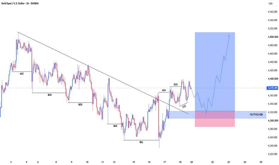
Long 
Ethereum Weekly | One Larger Structure, Two Scenarios⏱️ Reading time: About 3 minutes
On the Ethereum Weekly chart, it helps to step back from the short-term price movements and focus on the larger market structure.
From the beginning of the chart, we can follow a larger impulsive structure, where waves I, II, and III are marked at their respective degree.
After the formation of III, the market entered a more complex corrective period, with several swings developing along the way. The main question now is whether this larger correction is approaching completion or still needs more time and structure to develop.
At this point, we are following two scenarios.
Scenario 1: Bullish Case
In the bullish scenario, the larger corrective structure may be approaching completion, and after (IV) is complete, the market could begin a larger upward move.
The first thing we want to see is an Impulse Pattern — Five Waves Up.
In other words, the market needs to develop a valid five-wave structure from the current area.
In this scenario, the initial move could be only the beginning of a larger structure, followed by intermediate corrections before the upward movement continues.
The 2,597.17 area is important as our Bullish Confirmation level. Holding the structure above this area could provide additional evidence for the bullish scenario.
If this structure continues to develop, the potential targets shown on the chart are:
19,534 → 39,407 → 96,606
These are not guaranteed price predictions. They are potential structural targets based on the wave relationships within this scenario.
Scenario 2: Bearish Case
The bearish scenario remains on the table as well.
If the current move fails to develop into a valid impulsive structure and the market enters another Big Correction, the larger corrective structure may still need more time to develop.
In that case, the current count could still represent only part of the larger correction, meaning the market may need additional time and price movement before a larger bullish cycle begins.
For us, reaching a specific price level is not the only thing that matters.
How price reaches that level matters even more.
If the market develops five waves upward, followed by a proportional correction, and then forms another impulsive structure, that sequence could provide important evidence for the bullish scenario.
But if the structure remains corrective, we will reassess the count based on the new market evidence.
Another important point on this chart is wave degree.
For example, I, II, and III belong to one degree, while (III) and (IV) represent a higher degree within the larger structure.
Therefore, we should not compare waves simply by their visual appearance. Degree, proportion, time, and internal structure all matter.
Ultimately, this is what matters most in our analysis:
We don't try to predict the path. We follow the structure.
If the bullish structure is confirmed, the turquoise scenario shows one possible path.
If the corrective structure continues, the black scenario remains under consideration.
In the end, the market itself will tell us which structure is developing.
Patterns whisper. I listen.
— Mr. Nobody 🎧📊
Ethereum
7 days ago
ETH/USD | The Hidden Structure of Wave V
Ethereum
Jul 11
Ethereum | Is the Largest Corrective Cycle Nearing Completion?
Long 
Long 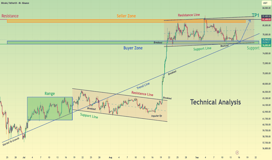
 Short
Short
🇪🇺🇺🇸 EUR/USD | When Structure Reveals the Next Path⏱️ Reading time: about 3 minutes
In this analysis, we are taking a closer look at the EUR/USD structure—especially the movement that developed after the recent historical low, and what price may currently be building at the lower degrees.
From an Elliott Wave perspective, it is not enough for us to simply ask whether price will ultimately move higher or lower. The more important question is:
What structure is the market building right now?
From the major market low, a significant upward move developed, followed by a corrective phase. In the bullish scenario, this correction may still be part of a larger corrective structure. Therefore, we do not want to make the decision before the market itself gives us enough structural evidence.
🟦 Scenario 1 — Bullish Case
In the bullish scenario, if the current correction can complete as a three-wave structure, we would expect price to break out of the marked area and develop a valid motive structure to the upside.
The first important area for this scenario is 1.20818, marked on the chart as Bullish Confirmation.
However, simply moving above this level is not enough for us.
If price breaks above this area and then develops a valid bullish structure, we can give greater weight to the possibility of further upside and the development of Five Waves Up.
Along this path, the 1.20, 1.24, and then approximately 1.26–1.27 areas can become important zones to monitor for price reaction.
The key point is that even if five waves develop to the upside, we still need to observe the correction that follows. The structure will help us determine the degree we are actually dealing with.
⬛ Scenario 2 — Bearish Case
The bearish scenario has not been removed from the chart yet.
If price fails to develop a valid bullish motive structure and instead turns lower again, the possibility of a deeper correction becomes more important.
In that case, a break of the Corrective Channel and the development of a valid bearish structure would become particularly important.
The 1.15833 area is also marked as an important level for monitoring the bearish scenario.
If this path continues, the structure could become more complex and deeper, potentially developing into a larger corrective pattern.
🌀 What Matters Most Right Now
At this stage, we do not want to force the market to follow either scenario.
Scenarios are the map; price structure must reveal the actual path.
If price breaks above the bullish area and develops a valid motive structure, the bullish scenario will gain more weight.
If the upward move fails to produce the required structure and the market returns to a bearish structure, the possibility of a deeper correction will become important again.
Finally, 1.01771 remains marked on the chart as an important Invalidation level.
For us, even a large bullish or bearish move by itself is not enough.
We are waiting for structure.
Structure First. Scenario Second.
Patterns whisper. I listen.
— Mr. Nobody
Euro / U.S. Dollar
2 days ago
EUR/USD — Larger Correction or the Continuation of the Bullish T
Euro / U.S. Dollar
Jun 20
EURUSD: Grand Supercycle Perspective & Structural Outlook
 Long
Long
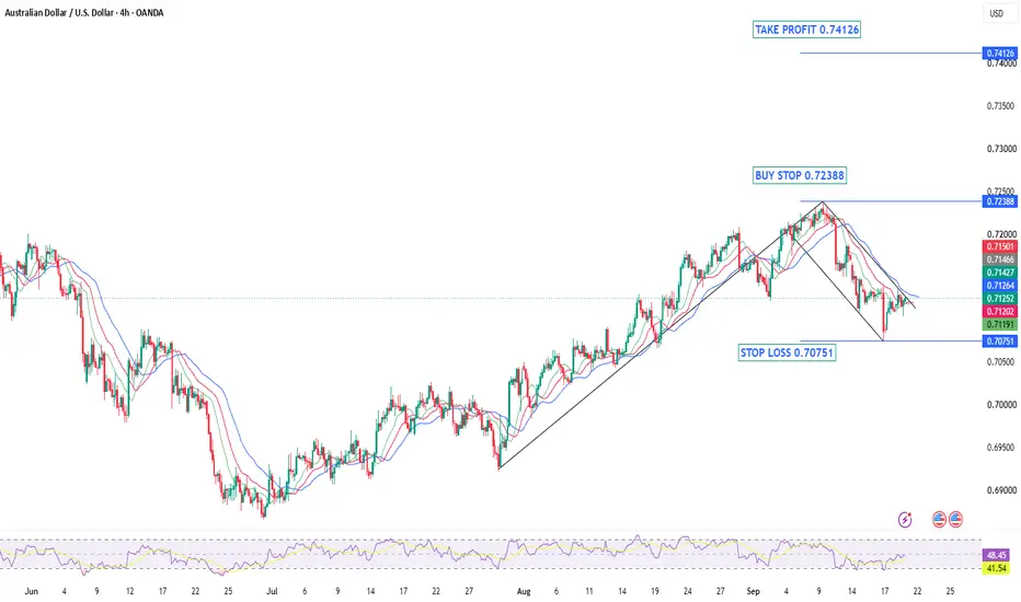
AUDUSD — Bullish Flag Breakout SetupAfter months of bearish pressure that dominated the first half of the year, AUDUSD has made a remarkable recovery. Since mid-July, the pair has been carving out a textbook bullish structure — printing a clean series of Higher Highs and Higher Lows — a classic sign that buyers are firmly in control and the market is in a healthy Advancing Phase.
The rally was strong and impulsive, with price gaining significant ground in a relatively short period of time. This kind of momentum tells us that there is genuine buying interest behind this move — not just a temporary bounce.
The Flag Formation
After such a strong impulse move pushing price all the way up to the 0.7238 resistance zone, it was only natural for the market to pause and consolidate. This is exactly what happened. Price pulled back in an orderly and controlled manner — not a sharp reversal, not panic selling — just a healthy cooldown. This consolidation formed a Bullish Flag pattern, which is one of the most reliable continuation patterns in technical analysis.
The flag has been respecting its boundaries cleanly. Price is compressing, momentum is being reset, and the market appears to be coiling up for the next move. This is exactly the kind of price action that precedes a strong breakout.
What We Are Looking For
A clean breakout and close above the upper boundary of the flag at 0.72388 would confirm that the consolidation phase is over and the trend is ready to resume. Once buyers take control above that level, the path toward 0.74126 opens up — a significant supply zone and our target for this setup.
The stop loss is placed at 0.70751, below the flag structure and recent swing low — giving the trade enough room to breathe while keeping risk defined.
Levels to Watch:
🔵 Buy Stop: 0.72388 (breakout confirmation)
🔴 Stop Loss: 0.70751 (below flag & swing low)
🟢 Take Profit: 0.74126 (supply zone)
As always, patience is key. We do not chase — we wait for the market to come to our level and confirm before entering.
Not financial advice. Trade your own plan. Bitcoin Daily | The Structure Is Still the Story⏱️ Reading time: About 3 minutes
On the Bitcoin Daily chart, the main question for us is not simply whether price is going up or down.
The more important question is:
What is the current structure telling us?
From the major low marked on the chart, Bitcoin has developed a significant upward move. Now, we are watching one of the most important structural decision points in the market.
Scenario 1: Bullish Case
In the bullish scenario, the current upward move could be part of a larger impulsive structure.
First, we want to see this current structure develop and eventually complete. After that, a correction would be normal.
A correction does not automatically mean that the bullish structure has failed.
If the correction is followed by another impulsive move, a Leading Diagonal, or even a smaller nested 1–2 structure, that could provide important evidence for further upside.
The area around $126,255–$126,272 is especially important.
A valid break above this area could provide the first meaningful confirmation of the bullish scenario.
If the structure continues to support this scenario, the next structural targets shown on the chart are:
$168,628 → $195,184 → $237,116
These are not predictions or guarantees.
They are simply potential structural targets based on the current Elliott Wave scenario.
Scenario 2: Bearish Case
The bearish scenario is still possible.
If the current upward move fails to develop into a valid impulsive structure, and price begins forming another corrective structure, this could mean that the current rally is only part of a larger correction.
In that case, the 50%–61.8% retracement area becomes important, followed by the 61.8%–78.6% zone.
And there is one important point to remember:
One five-wave move alone is not enough to confirm a bullish trend.
For us, the sequence is more important:
Impulse → Correction → New Impulse
If this sequence develops according to Elliott Wave rules and guidelines, the bullish scenario becomes stronger.
If it doesn't, we simply reassess the structure and allow the market to show us what comes next.
The $15,479 level remains our major bullish invalidation level on this chart.
So as long as the larger structure continues to respect this level, the broader bullish possibility remains structurally valid.
And perhaps the most important idea is this:
We don't try to force the market to fit our count.
We adjust our count to fit the market.
Patterns whisper. I listen.
— Mr. Nobody 🎧📊
Bitcoin
Jun 22, 2023
Strong bullish cryptocurrency market???YES
Pullback Before Another BSL TestFundamental Analysis
Gold is holding firm after posting its first weekly gain in four weeks, helped by easing oil prices and some reduction in inflation pressure. However, the U.S. dollar remains near a seven-week high, Treasury yields are around 5%, and markets still price roughly a 55% chance of another Fed hike in October.
Technical Analysis
On H1, Gold remains constructive after the recent bullish BOS, but price is now approaching the 4,395–4,410 BSL / major resistance.
The cleaner continuation setup is a controlled pullback into the 4,348–4,368 OB + Fibo zone. If buyers defend this area, the next bullish wave could retest upper liquidity.
Volume Profile also shows an important lower balance area around 4,300–4,318 POC.
Important Key Levels
4,395–4,410 — BSL / Major Resistance
4,348–4,368 — OB + Fibo
4,300–4,318 — POC
4,235–4,250 — SSL / Major Support
Trading Scenario
Buy priority remains on a pullback into 4,348–4,368 followed by bullish H1 confirmation.
Target: 4,395–4,410 BSL.
Invalidation: H1 acceptance below the OB + Fibo zone.
Overall View
The short-term structure remains constructive, but buying directly below BSL offers less attractive positioning. A pullback into support could provide the cleaner continuation setup.
Will Gold retest the OB + Fibo first before breaking 4,400? Long 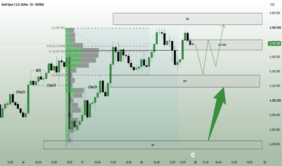
Head and Shoulders Pattern: The Retest Is the TradeMost traders who spot a head and shoulders pattern do the same thing. They mark the neckline, wait for price to break it, and enter on the candle that breaks. It is the textbook instruction, and it is usually the worst available price. Thomas Bulkowski's data on more than 2,800 head-and-shoulders tops found that price pulls back to the broken neckline in 68 percent of cases. Entering on the break means paying for the first impulsive move. Waiting for the pullback means entering near the same level with a much tighter stop.
Recognising the shape is the easy part and adds almost nothing on its own. The edge, such as it is, lives in how you handle the break. That the shape carries any information at all was settled at the Federal Reserve Bank of New York. Osler and Chang wrote an algorithm to find head-and-shoulders formations in daily dollar exchange rates from March 1973 to June 1994, then ran the same rule against 10,000 simulated random-walk series to see whether the profits were luck. They were not. For a chart pattern, that is rare.
What Is the Head and Shoulders Pattern?
The head and shoulders chart pattern is three consecutive peaks, with the middle one highest, appearing at the end of an uptrend. The left shoulder is an ordinary trend high. The head is a higher high, but made on thinner participation. The right shoulder is an attempt that fails to reach the head at all.
Read as order flow, it is demand exhausting in three tries. Buyers who drove the trend take profit into the head. The next rally attracts fewer of them, so it stalls lower. Sellers who watched the failed attempt now have a reference point, and they lean on it. The pattern is a picture of that handover, which is why its modern description in Edwards and Magee's 1948 book Technical Analysis of Stock Trends insisted on falling volume through the right shoulder. Rising volume there usually means the trend is not finished. Everything after that hangs on one line drawn underneath the pattern.
The anatomy: three peaks with the middle highest, a neckline across the two lows between them, and volume fading into the right shoulder.
The Neckline: How to Draw It Correctly
The neckline connects the two reaction lows between the shoulders. If the lows sit at roughly the same price, the line is horizontal. If the second low is lower, it slopes down, which is a stronger warning because demand was already failing before the right shoulder formed.
The neckline head and shoulders traders draw carelessly is where most false signals come from. Two rules keep it honest:
Anchor to closing prices, not to spike lows. A single wick under the level is one liquidity sweep, not an agreement about value. Closes show where the market actually settled.
Require a decisive close through the line, not a touch. A candle that pokes below the neckline and closes back above it has confirmed nothing. The pattern is complete only on a close beyond the line.
The Break and the Retest
Once the neckline breaks, stop-loss orders sitting under the pattern trigger and accelerate the move. Then it runs out of fuel, because the traders who sold the break have no one left to sell to, and price drifts back toward the neckline.
That drift is the opportunity. Broken support becomes resistance, because the buyers trapped inside the pattern now want out at breakeven and supply the selling. The retest offers the same directional trade with the stop placed just above the neckline instead of above the right shoulder, which can cut the risk by more than half.
Take a Bitcoin example with round numbers. A head and shoulders forms with the head at 82,500 and the neckline at 76,000. A trader who shorts the break at 76,000 and places a stop above the right shoulder at 78,000 is risking 2,000 points. A trader who waits for the pullback to 76,000 after the break, sees it rejected, and places a stop at 76,700 is risking 700 points for the same target. Same idea, same level, roughly a third of the risk.
The cost is the trades you miss: roughly a third of patterns never pull back, and those are often the strongest moves. A better average entry in exchange for fewer entries. Entry settled, the next question is where the trade ends.
The chart below is one of those third. Price closed through the neckline and kept falling without ever coming back to it, so there was no retest to wait for. What it still shows is the smaller decision inside the same trade: entering the moment price crosses the neckline against waiting for the candle to close beyond it. The stop sits in the same place either way, so the earlier entry carries the better risk-to-reward, 2.31 against 1.36 on this pattern. The trade-off is the one the neckline rules already named. A cross is not a close, and a candle that dips through the line and closes back above it has confirmed nothing.
No retest on this one. The same stop and the same target, so the entry that acts on the cross rather than the close keeps more of the move, at the price of giving up the confirmation.
How to Measure the Head and Shoulders Pattern Target
The standard head and shoulders pattern target is the height of the formation projected from the break. Measure vertically from the top of the head down to the neckline, then subtract that distance from the point where price closed through the neckline.
Run it on the same Bitcoin pattern. The head sits at 82,500 and the neckline at 76,000, so the formation is 6,500 points tall. Project that down from the break at 76,000 and the target is 69,500.
Treat it as a reference, not a promise. In Bulkowski's sample, 51 percent of head-and-shoulders tops reached the measured target, the average decline was 16 percent, and the break-even failure rate was 19 percent. A target hit half the time argues for partial profit at an intermediate level rather than holding for the full projection. The same arithmetic runs upside down.
Inverse Head and Shoulders
The inverse head and shoulders is the same structure upside down, forming after a downtrend: a low, a lower low, then a higher low that cannot reach the previous depth. Selling pressure exhausts in three attempts, the neckline sits across the two intervening highs, and the pattern completes on a close above it.
One asymmetry matters. Bottoms are built on the return of buyers, so an inverse pattern wants expanding volume on the breakout, while a top can complete on quiet trading because price falls under its own weight. A neckline break upward on weak volume is the most common way the inverse pattern fails.
The inverse pattern completes on a close above the neckline, and wants a volume expansion there to be credible.
What the Evidence Actually Says
The case for it. Savin, Weller and Zvingelis put an automated recogniser through US stocks from 1990 to 1999 and published the result in the Journal of Financial Econometrics . In the large caps they found nothing. In the small caps they did: Russell 2000 stocks produced risk-adjusted excess returns of 5 to 7 percent a year over a three-month holding period, and the returns survived transaction costs. Lo, Mamaysky and Wang, scanning US stocks from 1962 to 1996, reached the broader version of the same finding: several chart patterns, head and shoulders among them, carry incremental information.
The case against it. The same two researchers then went back to ask whether the pattern was worth using at all. Their 1999 follow-up in the Economic Journal concluded that the rule makes money but is not efficient, because simpler trading rules dominated it. Savin and colleagues traced 41 to 49 percent of their own small-cap result to the pattern merely picking out negative-momentum stocks. Add the subjectivity of drawing it by hand, and the honest summary is a modest edge in specific markets, not a reliable signal.
Regime decides. The pattern is a reversal formation, so it needs something to reverse. After an extended, mature trend it is worth taking seriously. Inside a sideways range it is noise, because three peaks and two lows are what a range looks like by definition. Check that a real trend preceded the formation before you trade it.
A head and shoulders pattern is not a prediction. It is a record of demand failing three times, and its practical value is that it hands you a clearly defined level to trade against. Treat the neckline as the decision line, let the market come back to it, and size the position off the tight stop that the retest allows. The shape gets you looking; the retest is what makes the trade worth taking.
Education 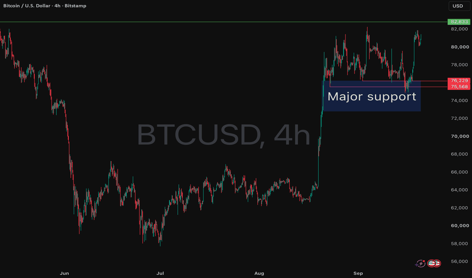
HBAR Macro Symmetrical Triangle — $0.56 Breakout Target & $3.09 HBAR/USD | 1M Chart | Macro Technical Setup
HBAR is compressing inside a large multi-year symmetrical triangle, with price continuing to respect both the descending macro resistance line and rising support from the cycle lows.
On the monthly timeframe, this is becoming a significant compression structure. Price is currently around $0.084, so the setup remains unconfirmed — the important event would be a decisive breakout and higher-timeframe acceptance above the descending trendline.
The Triangle Measured Move
The height of the structure gives an approximate $0.389 measured move.
Depending on exactly where HBAR breaks the descending resistance, projecting that move from the breakout area puts the primary technical objective around:
$0.50–$0.56
That is particularly interesting because the measured move converges closely with the previous macro high / 1.0 Fibonacci level near $0.569.
This creates a clear technical roadmap if the triangle resolves upward:
Triangle breakout → $0.20 → $0.316 → $0.416 → ~$0.56
Key Fibonacci Levels
The chart identifies the following levels:
$0.070 — 0.236
$0.105 — 0.382
$0.145 — 0.500
$0.200 — 0.618
$0.316 — 0.786
$0.416 — 0.886
$0.569 — 1.000
The $0.20 region stands out because it is both the 0.618 retracement and approximately where HBAR would begin challenging the upper boundary of the macro structure.
What Happens Above the Previous High?
If HBAR eventually reclaims the ~$0.57 macro high, the Fibonacci extensions on this chart provide longer-term areas to monitor:
1.272 → $1.20
1.414 → $1.77
1.618 → $3.09
The 1.618 extension near $3.09 would represent roughly a 1,000%+ move from the potential breakout region shown on the chart.
Importantly, $3.09 is not the triangle measured-move target. The triangle itself points toward approximately $0.50–$0.56. The $1.20, $1.77 and $3.09 levels are longer-term Fibonacci extensions that would only become relevant if HBAR first breaks the triangle and ultimately clears its previous macro high.
Confirmation
For the bullish scenario, I'm watching for:
1. Break above the multi-year descending resistance
2. Monthly acceptance above the trendline
3. Reclamation of ~$0.20 / 0.618
4. Continuation toward $0.316 and $0.416
5. Challenge of the ~$0.56–$0.57 macro target zone
Until the upper trendline is broken, HBAR remains inside the triangle and the direction is not confirmed.
A decisive loss of the ascending macro support would invalidate the bullish triangle thesis.
This is a monthly macro setup, not a short-term trade. The structure could take considerable time to resolve.
Educational analysis only. This is not financial advice or a recommendation to buy or sell HBAR. Cryptocurrency markets involve substantial risk. Always conduct your own research and manage risk appropriately.  Long
Long
Gold (XAUUSD): Same Resistance Shelf Across Three Timeframes◆ Read: XAUUSD is testing a resistance shelf in the 4385–4400 zone that shows up independently across the 1H, 4H, and 15m charts, not one signal repeating, three separate structural reads converging on the same price. The 4H version of this shelf has recorded 55 total touches; the 15m shows a nearby level at 52.
◈ What's building underneath: raw volume regime reads QUIET on both the 1H and 15m right now, but the cumulative volume delta trend is Accumulating on every timeframe shown. Net buying pressure has been building steadily without a dramatic spike, a grind rather than an explosion.
⚠ If this shelf holds and price rejects: there's a well-tested support stack beneath, a zone with 23 touches near 4325 on the 1H, and a cluster with 28-45 touches in the 4315–4370 range on the 15m.
🔒 No signals, no promises, a structural read across timeframes, not a trade recommendation. Always manage risk and do your own analysis.
The Elephant Jungle 9/20/26 Page 4So what’s the Play today, Red?
Right now, I am watching for a Short at these Order Blocks that Price is coming into right now, and like always, I am waiting to see my confirmations before taking a Short.
And as for Longs, I am not looking at anything until we reach the 12H Order Block.
Unless, of course, the Market presents an opportunity that makes sense for me to take a Long.
That’s the plan for today.
The Market has a few different paths it could take, and I am not here to force one of them.
I am here to wait for Price to come to my levels, watch for my confirmations, and then decide if the trade is actually worth taking.
I would love to hear your thoughts on the Market, so drop them in the comments.
And like always, trade safe, use good risk management, and wait for your levels and confirmations.
Until next time...