Gold Spot (XAU/USD) Technical Outlook
My current analysis highlights a potential upside move in Gold toward Box A, which represents a key liquidity zone. Price action is showing strength, and this area is likely to attract buy‑side liquidity before any significant reversal.
- Upside Bias:
The market structure suggests that Gold may continue its upward momentum, at least until Box A is reached. This aligns with the liquidity grab scenario, where price seeks to clear resting orders above recent highs.
- MACD Confirmation:
The MACD indicator is currently supporting bullish momentum, adding weight to the upside bias. This technical confirmation strengthens the case for potential buy setups in the near term.
- Buy Setups:
Any well‑structured buy entries in this zone could be favorable, provided risk management is applied. Traders should monitor intraday signals for confirmation before entering positions.
- Potential Reversal:
After the anticipated push to the upside, Gold may face resistance and begin a corrective move. The chart highlights a Daily Fair Value Gap (FVG) as the probable downside target. This zone could act as a magnet for price once liquidity is taken out at the highs.
---
Summary
In short, Gold is showing bullish momentum toward Box A, supported by MACD. However, traders should remain cautious, as the upside move may eventually lead to a reversal into the Daily FVG zone. Red line is my liquidity line
As always, market wins! trade with care. be a part of the market
FOREXCOM:XAUUSD
 Long
Long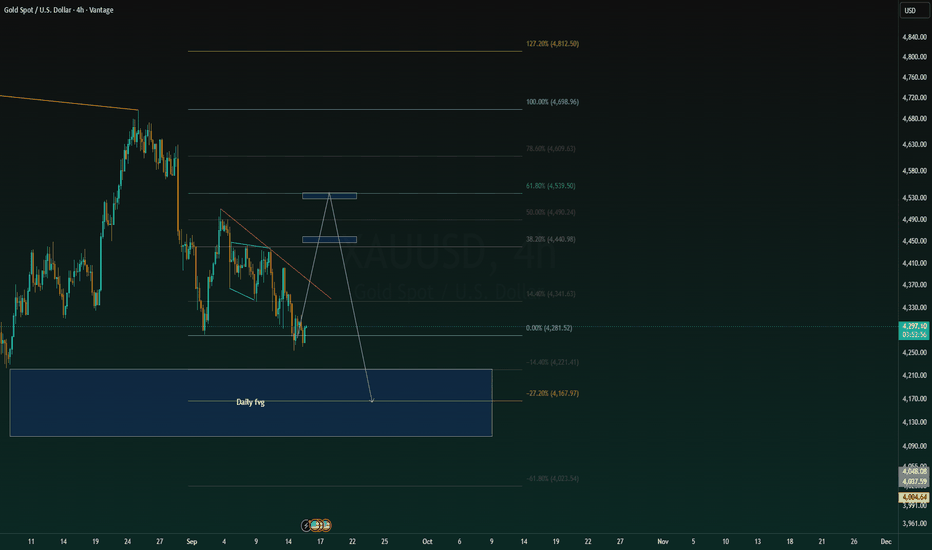
Three Failed Recovery Tops Into Major Support — Selloff Slowing?Good Morning,
Hope all is well. Here is my TA on ACM.
What I’m Seeing
Looking at AECOM on the weekly chart, this setup is a little different from the distressed bottoming names we've been looking at.
The company itself is not fundamentally broken. Instead, the stock has gone through a major valuation reset, falling from roughly $135–$140 to around $64–$65.
Technically, the trend remains bearish. But I'm starting to see a change in the quality of that bearish trend.
I've marked three successive recovery tops:
Top #1 ~$137 → Top #2 ~$88 → Top #3 ~$78
Each rally failed at a lower level, so sellers clearly remained in control.
But now price is approaching a major historical support area around $60–$63, while my volume and momentum readings across the 4H, daily and weekly time frames appear to be shifting.
To me, the structure is moving from:
distribution → markdown → lower highs → selling exhaustion → potential accumulation
I'm not calling the bottom yet, but this is exactly where I start watching for one.
The Three Tops Tell the Story
The first top around $135–$140 marked the end of the previous uptrend.
From there, AECOM experienced a major breakdown.
The first recovery couldn't restore the trend and topped around $85–$90.
Then another attempt topped around $76–$80.
So structurally, there's no argument yet:
the weekly chart remains bearish.
But there's another side to that story.
Each successive bearish leg is bringing price closer to a major long-term support zone while the underlying momentum structure appears to be losing some of its strength.
That's what interests me.
$60–$63 Is the Most Important Area on the Chart
The horizontal level you've drawn around $60–$62 is critical.
This isn't simply an arbitrary support line.
It's roughly where AECOM established an important floor before the large 2022–2025 advance.
Now, after losing more than half its value from the 2025 peak, price has returned to essentially the same region.
For me, this becomes the decision zone.
I don't automatically assume $60 is the bottom.
But if sellers push AECOM into this area and cannot produce meaningful continuation beneath it, my interest increases considerably.
Declining Volume Could Be Telling Us Something
Your note about volume is particularly important.
During a healthy bearish continuation, I generally want to see sellers remain aggressive as price approaches new lows.
Instead, you're seeing volume begin to decline across several time frames while momentum starts shifting more positively.
That can mean fewer participants are willing to sell at increasingly depressed prices.
The relationship I'm watching is:
price falling + bearish momentum weakening + participation declining.
That's potentially seller exhaustion.
But declining volume by itself isn't enough. It can also simply mean nobody is interested.
What I eventually need is the second half of the equation:
buyers stepping in with expanding volume as price begins reclaiming resistance.
That's what would convert exhaustion into evidence of accumulation.
The Current Structure Isn't Accumulation Yet
I'd make one small adjustment to the annotation on the chart.
I would label $60–$70 as a "potential accumulation zone" rather than confirmed accumulation.
We don't have enough evidence yet to say larger buyers are definitely accumulating shares.
What we do have is an area where that process could begin.
If AECOM starts spending several weeks around $60–$70, volatility compresses, selling volume continues declining, and downside attempts repeatedly fail, then the accumulation thesis gets much stronger.
Even better would be:
high-volume downside test → no meaningful new low → strong recovery → higher low.
That would get my attention.
The First Level I Want Reclaimed: $70
At approximately $64.70, I don't need to chase the stock.
The first thing I want to see is price establish itself back above approximately $68–$70.
That would tell me the current low is beginning to attract demand.
After that, the $76–$80 region becomes extremely important.
That's approximately where Top #3 formed and where your highlighted distribution/consolidation region begins.
Reclaiming that would break the immediate sequence of lower highs.
So my early reversal sequence is:
$60–$63 holds → $70 reclaimed → higher low → $78–$80 reclaimed.
That would materially change my technical view.
$85–$90 Is the Bigger Trend Test
If the recovery gets through $80, the next area I'd watch is approximately $85–$90.
That's where Top #2 developed.
Breaking through there would be much more significant because we'd no longer just be talking about a bounce from oversold conditions.
We'd potentially have:
major low → higher low → higher high → trend reversal.
Beyond that, I'd watch roughly $100–$110, before thinking seriously about a return toward the old highs.
I wouldn't project $140 from today's chart.
There are several major layers of trapped supply that price would need to repair first.
Fundamentals — This Is Where AECOM Gets Very Interesting
The fundamental picture is much stronger than the price action initially suggests.
AECOM's latest Q3 report looked terrible on the surface: reported revenue fell 14% to $3.59 billion, the company reported a $76 million operating loss, and diluted EPS was -$0.65.
But there's an extremely important reason.
AECOM took a $337 million pre-tax charge related to the delayed completion of a Construction Management project that had originally been awarded in 2019. Management says the contract was entered under terms that would not meet the company's current risk policies.
That distinction matters enormously to my interpretation of this chart.
The market is dealing with a genuine financial hit—but the latest quarter does not appear to show the core design business collapsing.
Underlying Earnings Were Much Better
If I remove that specific project charge, the underlying quarter looks completely different.
AECOM says adjusted EBITDA excluding the charge would have been approximately $329 million, up 5%, while adjusted EPS would have been $1.49, up 11% year over year. The design business's net service revenue increased 4%, or 5% adjusting for one fewer working day.
That's why I find the stock's decline interesting.
We're potentially looking at a situation where:
the share price is behaving like the business has structurally deteriorated, while much of the earnings shock came from a specific legacy project.
That doesn't make the charge irrelevant. A $337 million loss is real.
But I distinguish between:
one problematic legacy contract
and
the core business losing competitiveness.
Right now, the evidence points much more toward the former.
The Backlog Is Probably the Strongest Fundamental Signal
This is what really gets my attention.
Despite the stock collapsing, AECOM's total backlog increased 13% to a record $27.8 billion.
The company generated a 1.6x book-to-burn ratio, including approximately $4.2 billion of wins during Q3. Its design pipeline also reached another all-time high.
That's a major piece of evidence against the idea that the underlying franchise is deteriorating.
Customers are still awarding AECOM work.
In fact, they're awarding it at a record pace.
That's why the fundamental and technical pictures are starting to create an interesting disconnect:
stock price ↓ sharply
while
backlog ↑ to record levels.
That divergence is something I would pay close attention to.
The Balance Sheet Isn't Signaling Distress Either
AECOM finished the quarter with approximately $1.0 billion of cash and $2.75 billion of debt. Management reported net leverage of roughly 1.5x.
That's important because it means I'm not looking at a heavily distressed balance sheet while trying to predict a technical bottom.
The company still has financial flexibility.
The project charge has reduced expected free cash flow, though.
AECOM now expects approximately $300 million of FY2026 free cash flow, compared with higher expectations before the project problem became apparent.
So there's real damage here.
It's just different from the company entering a fundamental collapse.
Guidance Explains Why the Market Is Nervous
Management reduced FY2026 reported guidance because of the Construction Management charge.
Adjusted EPS is now expected at approximately $3.95–$4.15, with adjusted EBITDA around $935–$965 million.
But this is another case where I want to separate the project from the underlying operation.
Excluding that charge, management still expects adjusted EPS of $5.90–$6.10 and adjusted EBITDA of $1.275–$1.305 billion, essentially consistent with its previous guidance.
That's a very important distinction.
The market is correctly pricing additional execution risk into the stock.
But if the problematic project is genuinely isolated and approaches completion as expected, there's potentially a large gap between current market sentiment and normalized earnings power.
There's Still a Risk I Wouldn't Ignore
The legacy project isn't finished yet.
AECOM expects substantial completion during fiscal Q2 2027, and the company is pursuing claims related to the work that could take years to resolve.
So I wouldn't automatically assume $337 million is the final word.
Construction contracts can produce additional surprises.
That becomes one of the biggest fundamental invalidations for my thesis:
another major charge → additional cash-flow deterioration → further guidance reduction.
If that happens while $60 breaks technically, I wouldn't fight the market.
Infrastructure Demand Is Still Strong
The broader business backdrop also remains attractive.
AECOM works across transportation, water, environmental, energy and building infrastructure. Its recent wins include major rail, water and transportation projects across several geographies, and the company continues investing in AI and its higher-value Advisory capabilities.
Management also reaffirmed its longer-term target of a 20%+ margin exit rate by FY2028 and 15%+ adjusted EPS CAGR from FY2026 through FY2029, excluding the Construction Management charge.
Those are targets, not guarantees.
But they tell me the internal outlook for the core business remains very different from what the current share-price trend might imply.
Why This Setup Interests Me
This is probably the core of my thesis.
Technically I'm seeing:
$140 peak → violent markdown → Top #2 → lower low → Top #3 → another lower low → bearish momentum weakening near major historical support.
Fundamentally I'm seeing:
one major legacy-project problem → reduced reported earnings and cash flow
but underneath that:
record backlog → strong bookings → positive core design growth → underlying EPS growth → manageable leverage.
That creates the type of disconnect I like watching.
The chart hasn't confirmed the bottom.
But unlike some distressed turnaround stocks, I don't necessarily need the underlying business to recover—I mainly need the market to stop pricing the company as though the recent project problem represents permanent deterioration.
My Bullish Scenario
My preferred sequence would be:
$60–$63 support holds → downside volume continues contracting → momentum improves → $68–$70 reclaimed → higher low → $78–$80 breakout.
If that happens, I start looking toward $85–$90.
A successful reclaim of that area would be particularly important because it would eliminate Top #3 and begin challenging Top #2.
From there, I think $100–$110 becomes a reasonable larger recovery area.
But I want price to earn each step.
My Bearish Scenario
The bearish scenario is very clear.
If AECOM decisively breaks $60, particularly with expanding volume and renewed downside momentum, I would not interpret that as accumulation.
That would tell me the current support hasn't absorbed supply.
Fundamentally, I'd be especially concerned if that breakdown occurred alongside another Construction Management charge, weaker backlog, lower bookings, or another reduction in underlying guidance.
That combination would tell me the market knows something more serious is changing.
My Bias
I'm neutral-to-cautiously bullish around $60–$65, but I'm not calling the bottom yet.
What makes this one particularly interesting to me is that the technical deterioration looks substantially worse than the underlying operating picture.
I'm seeing:
Price approaching major multi-year support around $60–$63
Three progressively lower recovery tops
Bearish trend strength beginning to moderate
Volume declining across multiple time frames
Momentum beginning to improve
A core business that is still growing
Record $27.8B backlog
1.6x book-to-burn
Underlying adjusted EPS growth despite the project problem
A relatively manageable 1.5x net leverage position
So for me:
$60–$63 = potential accumulation / decision zone.
$68–$70 = first evidence buyers are gaining control.
$78–$80 = meaningful structural confirmation.
$85–$90 = major reversal test.
I wouldn't buy simply because AECOM has fallen 50% from its highs. I want to see sellers attack $60–$63 and fail to achieve meaningful downside progress.
If that happens while volume dries up, momentum continues improving, and price subsequently starts reclaiming $70 and $80, then I'll have much stronger evidence that what currently looks like a falling knife is actually transitioning into a long-term accumulation process.
Trade Safely!
Enjoy!  Long
Long
 Long
Long
 Short
Short
BTC | Structure Shifted, Five Pools Sit AboveBy analyzing the #BTC (Bitcoin) chart on the Daily timeframe, we can see a market that spent almost a year making lower lows, swept the liquidity beneath them, and has since shifted structure upward with enough force that the entire range above is now unclaimed liquidity.
━━━━━━━━━━━━━━━━━━━━
DAILY TIMEFRAME
━━━━━━━━━━━━━━━━━━━━
The downtrend. From the November high at $116,323.39 price moved in one direction. Each rally failed lower than the last, and in February the BMS confirmed it — the November swing low was broken and the bearish structure was formally set. Every bounce after that was sold into.
The sweep. The low did not come from strength. In early July price drove through the February low into the stops resting beneath it — a clean liquidity sweep — and printed the Protected Low at $57,664.45 . That is the origin of everything that followed.
The shift. From that low price built a base through July and August, then in late August broke the structure to the upside with the MSS . The way it broke matters more than the fact that it broke: the move left clear bullish fair value gaps behind it and expanded vertically rather than grinding. Displacement like that is how a real shift looks. Price is now at $77,037.28 .
━━━━━━━━━━━━━━━━━━━━
THE LIQUIDITY ABOVE
━━━━━━━━━━━━━━━━━━━━
Five untouched pools of buy-side liquidity sit overhead, each one an old high that was never revisited:
BSL 1 — $82,875.74
BSL 2 — $90,609.88
BSL 3 — $98,042.69
BSL 4 — $107,584.81
BSL 5 — $116,323.39
A high that has never been defended isn't resistance, it's a target. Five of them stacked in sequence is the road map for the rest of this move.
━━━━━━━━━━━━━━━━━━━━
THE BIAS
━━━━━━━━━━━━━━━━━━━━
Bullish. The structure shifted, the displacement was real, and the liquidity is all on one side.
━━━━━━━━━━━━━━━━━━━━
SCENARIO A — THE BASE CASE
━━━━━━━━━━━━━━━━━━━━
Chasing here is the worst version of this idea. The better entry sits below the 0.5 retracement of the impulse leg — the area just above $70,000 . Price is extended from its origin, and a pullback into discount is the normal behaviour after displacement of this size.
The first objective on a reaction from there is BSL 1 at $82,875.74 , and above it the ladder opens.
━━━━━━━━━━━━━━━━━━━━
SCENARIO B — THE DEEPER RETRACE
━━━━━━━━━━━━━━━━━━━━
The stronger area is lower. The RBS zone at $65,097.26 – $67,206.58 is where the resistance that capped price from April through August was broken and flipped. It also overlaps the 0.62 ($67,206.58) and 0.705 ($65,097.26) retracement levels of the same impulse.
Broken resistance, deep discount and a fib cluster in the same band is as much confluence as this chart offers. If price reaches it and the daily prints a buy signal there, that is the high-conviction entry — same targets, materially better price.
━━━━━━━━━━━━━━━━━━━━
INVALIDATION
━━━━━━━━━━━━━━━━━━━━
A daily close below the Protected Low at $57,664.45 . That level is the origin of the shift; beneath it the July sweep failed and the bullish structure is gone.
An earlier warning comes first: a daily close below $65,097.26 that does not reclaim means the RBS zone failed as demand, and the entry thesis is broken well before the structure is.
And the rule that governs all of it: a break is a candle close, not a wick. The RBS zone is exactly where a wick beneath will look like failure and close back inside — that band held price for four months, which means it is thick with stops on both sides, and thick stop clusters are what wicks are made from.
━━━━━━━━━━━━━━━━━━━━
FUNDAMENTAL BACKDROP
━━━━━━━━━━━━━━━━━━━━
The supportive side. US spot Bitcoin ETFs just closed their strongest three-week stretch of 2026 at $3.8 billion in combined inflows, including $986.9 million in the week ending September 5. Total net assets across the products reached $101.3 billion , and the 50-day and 200-day moving averages converged into a golden cross around September 11 . The previous three completed crosses were followed by moves of 50%, 45% and 60% .
The opposing side. This is not a clean macro picture. Markets are pricing a 58.4% probability of a 25bp rate HIKE at the September 15–16 FOMC — happening right now, not a cut. July PCE inflation ran at 3.7% year over year , August payrolls came in at 162,000 , and Brent near $97 is feeding the inflation problem. Year-to-date ETF net flows are still roughly $1 billion negative despite the recent surge, and a golden cross is a lagging signal that has reversed within weeks before.
The link. The FOMC outcome is the most likely cause of the retracement this idea is waiting for. A hawkish result does not break the structure — it hands the discount entry the chart is already asking for. Which is the entire point of having the levels marked before the event rather than reacting after it.
This analysis will be updated as the market evolves.
Best Regards, BigBeluga 🐳 Decoding True Market Path through Aurelix Royal ReviewsWhile a single candlestick offers a quick, readable summary of a market session, relying solely on its final color can lead to an incomplete or oversimplified interpretation of market dynamics. Green simply indicates that price closed higher than it opened, while red indicates a lower close. However, this outcome reveals only the destination, concealing the specific intraday journey price took to get there.
Decompressing the Session: From Summary to Internal Structure
Higher-timeframe candles are effective precisely because they compress vast amounts of price action into four key data points: the open, high, low, and close. While this compression filters out unnecessary noise, it inherently strips away critical structural context.
For instance, a daily candle records the absolute highs and lows of the day, but it cannot reveal sequence—such as whether the high or the low occurred first. Similarly, a strong close near the top of the session's range could reflect sustained, directional buying throughout the entire day, or it could represent a late, aggressive surge that only recovered after hours of severe weakness. When traders analyze platform features or market analytical tools, as seen in comprehensive AurelixRoyal Reviews, understanding this distinction between overall session trends and underlying volatility becomes essential for accurate structural assessment.
Comparing Identical Closes with Contrasting Paths
To appreciate why the path matters, consider two distinct trading sessions that both yield an identical green daily candle:
The Directional Advance: Price experiences a minimal initial drop, establishes a low early on, and steadily trends upward for the remainder of the session, retaining the vast majority of its gains by the close.
The Rotational Recovery: Price suffers a sharp, sudden selloff during the early hours, finds a bottom, reverses completely to erase the entire decline, and manages a modest late-day push to finish slightly above the open.
To a high-level chart viewer, both sessions end constructively in green. Underneath the surface, however, the underlying market behavior was radically different. One session displayed steady, uninterrupted acceptance, while the other was defined by heavy two-sided rotation, deep rejection, and high volatility.
Key Structural Questions Beyond Color
Focusing on the internal path allows traders to evaluate the efficiency and character of a move rather than treating every green or red candle as an absolute condition. Rather than judging a candle by its summary color alone, several structural questions provide far deeper insight:
Retention Rate: What percentage of the maximum intraday move was actually preserved into the final close?
Session Character: Was price action smooth and directional, or was it highly rotational and erratic?
Point of Rejection: Where did major counter-pressure appear, and did it leave behind significant upper or lower wicks?
Acceptance vs. Failure: Does the final close confirm genuine continuation, or does it merely represent a brief rebound after severe failure?
A green candle featuring a prominent upper wick shows that while the final result was technically positive, price failed to hold higher levels. Likewise, a tiny candle body might hide massive intraday swings where buyers and sellers fought intensely, only to settle near the starting point. Evaluating these internal dynamics helps clarify broader market context, a topic frequently highlighted across modern financial discussions and detailed AurelixRoyal Reviews that focus on strategic decision-making tools.
Targeted Lower-Timeframe Context
This perspective does not suggest that every single daily candle must be dissected on a one-minute chart. The higher timeframe remains invaluable for maintaining a clean, high-level view of the market. However, when a specific candle is being used to justify a core interpretation—such as confirmed strength, structural failure, or major level acceptance—inspecting the lower-timeframe path becomes necessary.
Ultimately, the final color of a candle tells you the result of a session. The internal path reveals how that result was achieved. Examining what actually occurred inside the candle turns a basic summary into actionable structural observation. Education 
BRIAN XAUUSD – GOLD WEAK BELOW 4,338 BRIAN XAUUSD – GOLD WEAK BELOW 4,338
Gold remains under pressure as the market moves into the FOMC decision window.
Price is now trading around 4,275 after another failed recovery attempt, while the broader short-term structure continues to show lower highs and weak buyer follow-through. Fundamentally, the market is still cautious. Gold is marking another down day as traders wait for the two-day FOMC policy meeting, and this keeps positioning defensive ahead of the rate decision.
When gold trades near a one-month low before a major Fed event, the market usually becomes very sensitive to any rejection or breakdown around key value zones. That is exactly what the current chart is showing.
Technical structure
On the H1 chart, gold is trading below the Current VAH / POC immediate volume zone around 4,290 - 4,306.
This zone is important because it was the latest short-term value area. Price tried to stabilize there, but the reaction was weak. As long as gold stays below this zone, buyers do not have real control.
The next important resistance is the Key Rotation Area around 4,338 - 4,365. This is the area where any recovery may face stronger selling pressure. If gold pulls back into this zone and rejects, the bearish continuation view remains valid.
Above that, the Upper Value Rejection zone around 4,500 remains the major seller interest area. This was where the larger bearish rotation started, and it continues to define the upper structure.
On the downside, gold is now approaching the 4,232 area. If sellers keep control below 4,306, the market can rotate lower into this level before any stronger buyer reaction appears.
Important zones
Current price area: 4,265 - 4,280
Gold is trading near the lower part of the structure after losing short-term value.
Current VAH / POC: 4,290 - 4,306
Immediate resistance. Buyers need to reclaim this area to slow the bearish pressure.
Key Rotation Area: 4,338 - 4,365
Main reaction zone if gold attempts a deeper pullback.
Strong Acceptance Zone: 4,290 - 4,310
Previous value support, now acting as a pressure area after the breakdown.
Upper Value Rejection: 4,490 - 4,510
Major seller interest zone and higher resistance.
Downside liquidity: 4,232 - 4,240
Next lower target if sellers continue pushing the auction lower.
Trading scenario
Priority view: sell on recovery below 4,306
Entry:
Look for sell positions only if gold rebounds into 4,290 - 4,306 or higher into 4,338 - 4,365 and shows clear bearish rejection.
Stop Loss:
Above the rejection high or above the reclaimed value zone.
Take Profit:
TP1: 4,250
TP2: 4,232 - 4,240
TP3: 4,200 if FOMC-driven momentum supports another downside expansion
This setup follows the current bearish structure. Gold has already lost short-term value, so chasing sell late near the low is not ideal. The cleaner plan is to wait for a retest and rejection from resistance.
Alternative buy scenario
A buy setup is only interesting if gold sweeps the 4,232 - 4,240 liquidity area and shows strong bullish rejection.
Entry:
Buy only after clear confirmation from the lower liquidity zone.
Stop Loss:
Below the local sweep low.
Take Profit:
TP1: 4,290 - 4,306
TP2: 4,338
TP3: 4,365 if buyers reclaim momentum
This would only be a reaction-buy setup, not a full bullish reversal yet. For a stronger recovery, gold needs to reclaim 4,306 first, then hold above 4,338.
Final view
Gold is still under seller control while trading below 4,306.
The market is heading into the FOMC meeting with weak momentum, and the current chart suggests that sellers are still defending every recovery attempt. The nearest downside area to watch is 4,232 - 4,240. If price reaches this zone, buyer reaction may appear, but confirmation is needed before considering any long setup.
For now, my map is simple:
Below 4,306 = sellers keep control.
Reject 4,306 = downside pressure continues.
Break 4,338 = recovery improves.
Reject 4,338 - 4,365 = bearish structure remains valid.
Lose 4,232 = downside can extend toward 4,200.
Gold is not in a clean bullish position yet. The best approach is patience: wait for either a confirmed rejection from resistance or a strong reaction from the lower liquidity zone.
Will gold defend 4,232 before the FOMC decision, or will sellers force one more deep flush first?
Long 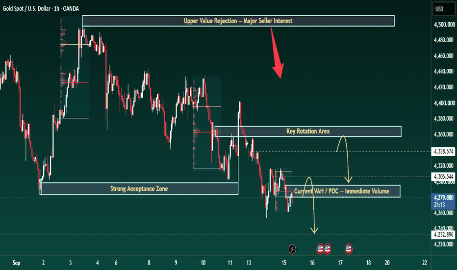
DXY | When Structure Reveals the Dollar’s Next Path⏱️ Estimated Reading Time: About 2 Minutes
In this update, our focus is on the current DXY structure on the daily chart, where the market is still revealing the pattern following the recent decline.
From the higher-degree perspective, we continue to monitor two scenarios.
🟢 Bullish Scenario
If the current structure completes as a corrective pattern and the market then develops a valid motive structure, the probability of further DXY strength will increase.
A break of the marked levels could provide additional confirmation for the bullish scenario and potentially open the path toward higher levels.
⚫ Bearish Scenario
On the other hand, if the current movement fails to maintain a corrective character and the market develops another valid bearish structure, the probability of a deeper correction will increase.
In that case, DXY could continue developing a more complex corrective structure, such as a Double Zigzag or another higher-degree combination.
🔎 What Matters Right Now?
We do not want to label the structure before the market reveals it.
For now, the key is price action around the marked levels and the internal structure of the next move.
If the next upside move develops as a motive structure, the bullish scenario gains strength. If price turns lower again and builds a valid bearish structure, the deeper corrective scenario remains on the table.
So for now, we have one main question:
What pattern is DXY actually building?
The market will provide the answer through structure.
Structure First. Scenario Second.
Patterns whisper. I listen.
— Mr. Nobody 🎧📊
Chart Note: The chart is set to “Lock Price to Bar.” For a closer look at the current structure, simply zoom in on the most recent price action and the marked levels.
Dollar Index
Jun 7
DXY Structural Analysis: Navigating the Diagonal
U.S. Dollar Currency Index
Jun 5
The DXY Time Paradox: Monday Engineering & Elliott Wave Dissecti
 Long
Long
BTCUSDTBitcoin (BTCUSD) 4H Analysis: Testing Key Range Support
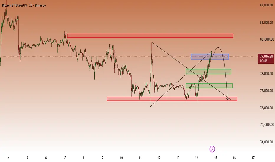
Bitcoin is currently trading around $76,950, sitting right on the lower boundary of a 24-day consolidation range between $76,000 and $79,000.
Bearish Breakout Scenario: A decisive candle close below the $76,000 support zone (specifically clearing $75,400) will confirm a breakout from this multi-week range, opening the door for a deeper correction toward the primary target at $72,300.
Trade Trigger: Patience is key. Wait for a full candle close below $76,000 to confirm the move and avoid getting caught in a liquidity sweep or fakeout.
Risk Management: Invalidations / Stop-Loss can be placed above the breakdown level (around $77,500) targeting $72,300 for an optimal Risk-to-Reward ratio.
AMIRHASSAN SALEK
امیرحسن سالک Short 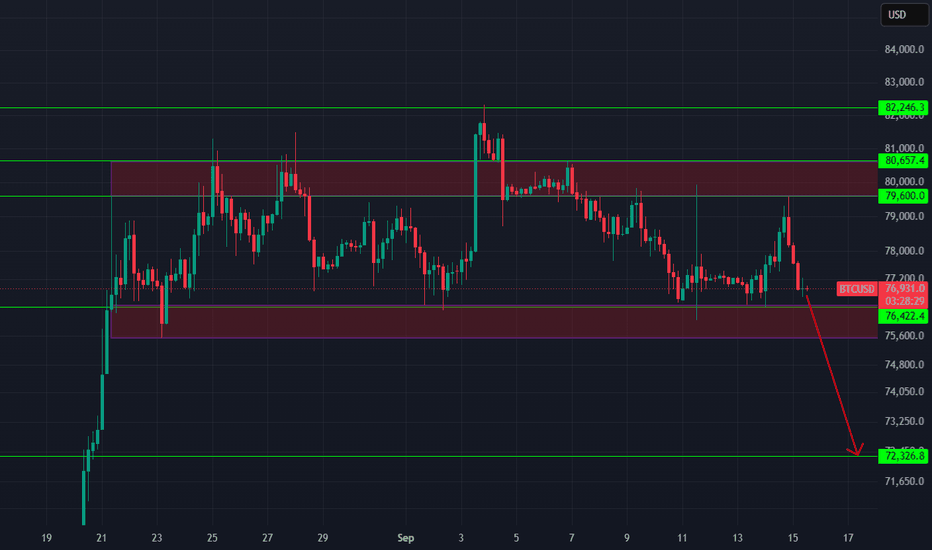
Short 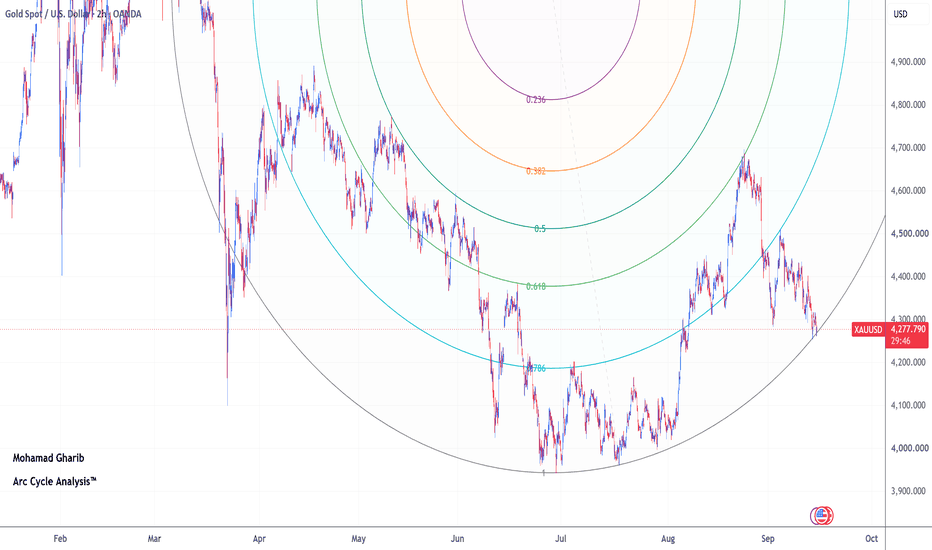
XMR ForecastKUCOIN:XMRUSDT The logic behind this trade is based on the higher-timeframe bearish trend. The bearish impulses remain strong, while the bullish corrective moves are relatively slow and weak.
On the lower timeframe, we can also see a strong bearish move followed by a slow bullish correction, which increases the probability of another bearish leg.
⚠️ Risk Disclaimer
All analyses, market views, and scenarios presented on this page are provided for informational and educational purposes only and should not be considered financial advice or a recommendation to buy or sell any financial instrument.
Financial markets involve substantial risk, and none of the scenarios presented here are guaranteed to occur. Each trader is solely responsible for their own trading decisions, risk management, and any profits or losses resulting from their trades.
Please consider your own financial situation, risk tolerance, and trading strategy before making any trading decision. Do not rely solely on the information provided on this page when making investment or trading decisions.ll risk. Controlled trade. 🎯  Short
Short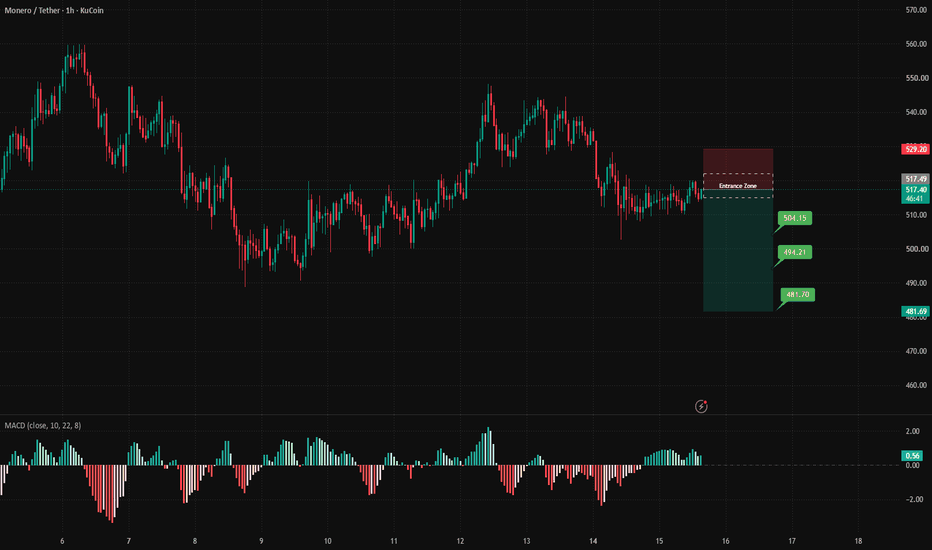
XAU Is Trapped in a Triangle — FOMC Could Trigger the Next BreakGold is compressing.
After the sharp correction from this year’s highs, XAU has been forming a triangle consolidation , with price repeatedly squeezed between lower highs and higher lows.
Now it is approaching the apex — and the FOMC could provide the catalyst for the breakout.
📊 Why This FOMC Matters
The market is already pricing roughly a 92% probability of a 25bp Fed hike , while the U.S. 10Y yield has moved above 5%.
So the rate decision itself may not be enough.
What matters is whether Powell is more hawkish or dovish than expected.
That could finally break XAU out of its current compression.
🎯 My Short-Term Setup
The key zone is $4,300–4,340 .
If XAU rebounds into this area but fails to break the triangle’s upper boundary, I prefer the short side:
Short: $4,315–4,335
SL: $4,355
TP1: $4,265
TP2: $4,220
TP3: $4,150
I would not chase a breakdown. I want to see a rejection first.
⚠️ The Bullish Trigger
If FOMC sends XAU through $4,350 and price holds above it, the triangle breaks upward.
Then I would switch direction:
Long: $4,350–4,370
SL: $4,315
TP1: $4,420
TP2: $4,480
🔥 My Take
This is not the time to predict the FOMC candle.
The triangle is already telling us volatility is being compressed.
FOMC may simply decide which side gets released.
Below $4,340 → bearish bias.
Above $4,350 → bullish breakout.
For the next few sessions, $4,300–4,350 is the battlefield I’m watching.  Short
Short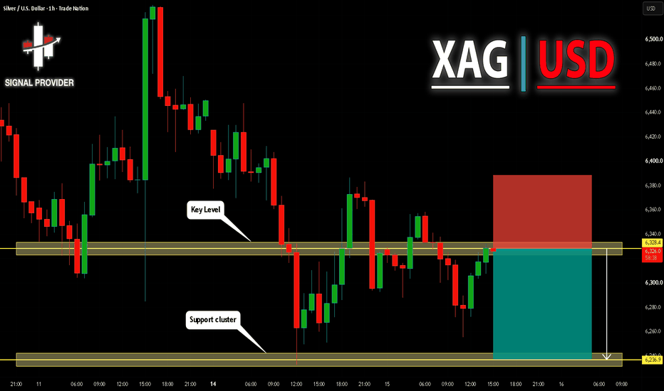
Where Volume Traded Can Matter More Than WhenMost traders read volume vertically. They see a large volume bar and know that significant activity occurred during that candle, but that still leaves an important question unanswered: where did that trading actually take place?
Volume at price gives a different view of market structure because it separates areas where participants repeatedly accepted price from areas the market moved through quickly.
Imagine CRYPTOCAP:BTC trades between $78,000 and $82,000 for several days, but most of the volume occurs between $79,500 and $80,500. Price occasionally reaches the edges of the range, yet relatively little business is completed there.
That tells you the entire $4,000 range should not necessarily be treated equally.
The area around $80,000 has become an accepted region. Buyers and sellers repeatedly found enough opposing interest to transact there, positions accumulated, and the market spent considerable time around that price. If CRYPTOCAP:BTC leaves the range and later returns, this area can become important because many previous participants have a reference point there.
Low-volume areas tell a different story.
Suppose CRYPTOCAP:BTC breaks above $80,500 and moves rapidly toward $82,000 while relatively little volume trades between the two prices. The market has travelled through that area, but it has not necessarily established much acceptance there.
If price later re-enters that low-volume region, there may be less historical participation to slow the move. Instead of expecting every previous candle or minor level to create support or resistance, traders can watch whether price moves quickly through the area again until reaching a region where substantial trading previously occurred.
This creates a useful distinction.
High-volume areas are locations where the market previously found balance. When price returns, watch whether it begins rotating and spending time there again. If it does, the market may be rebuilding acceptance around that price.
Low-volume areas are locations where the market previously found less agreement. When price enters them, watch whether it again moves efficiently toward the next area of heavier participation. If price instead begins spending time and building volume inside the area, something has changed: a previously rejected price region is now gaining acceptance.
This is also why volume at price should not be used as an automatic support-and-resistance tool. A high-volume area does not guarantee a reversal, and a low-volume area does not guarantee fast movement.
The useful information comes from comparing historical participation with current behavior.
Price tells you where the market has travelled. Volume at price helps show where participants previously wanted to stay — and whether they still want to stay there when price returns.  Short
Short

 Long
Long

 Short
Short