BANKNIFTY - Testing the Supply Zone After Strong Reversal📊 BANK NIFTY – Testing the Supply Zone After Strong Reversal ⚔️
Date: 28th Oct 2025
Spot Price: ₹58,271
🔹 Supports: 57,885 / 57,555 / 57,341
🔹 Resistances: 58,428 / 58,642 / 58,871
🔹 Intraday Demand Zones:
1️⃣ 57,629 – 57,576
2️⃣ 57,555 – 57,484
3️⃣ 57,341 – 57,300
🔹 Supply Zones:
1️⃣ 58,214 – 58,297 (Tested)
2️⃣ 58,354 – 58,529
🔑 Key Highlights
Bank Nifty rebounded strongly from multiple demand zones near 57,600 with a clear volume spike.
Price has now reached the tested supply zone around 58,214–58,297, where profit booking or short build-up could appear.
ATR Dashboard (STWP Edition) shows volatility expansion — suggesting the next move will likely be decisive.
The upper supply belt (58,350–58,530) remains a crucial resistance for trend confirmation.
🎯 STWP Trade View
Bank Nifty is currently trapped between strong demand below and supply overhead, indicating a range setup.
Keep a close watch on dips back into the 57,600–57,800 demand pocket — those zones remain key buyer territories.
If the index breaks and sustains above 58,530, expect a momentum push toward 58,870+.
Conversely, rejection from the current supply could bring a short-term pullback.
💡 Learning Note
When price revisits a tested supply zone after a strong recovery, volume behavior becomes the key —
Declining volume = exhaustion
Expanding volume = breakout potential
Observing this shift early helps traders position themselves smartly before the move unfolds.
Final Outlook:
Momentum: Recovering, but supply pressure visible | Trend: Range-bound between 57,600–8,500|Risk: Neutral within range; breakout may shift bias | Volume: High during reversal — watch behavior at supply
________________________________________
________________________________________
⚠️ Disclosure & Disclaimer – Please Read Carefully
The information shared here is meant purely for learning and awareness. It is not a buy or sell recommendation and should not be taken as investment advice. I am not a SEBI-registered investment adviser, and all views expressed are based on personal study, chart patterns, and publicly available market data.
Trading—whether in stocks or options—carries risk. Markets can move unexpectedly, and losses can sometimes exceed the money you have invested. Past performance or past setups do not guarantee future results.
If you are a beginner, treat this as a guide to understand how the market works and practice on paper trades before risking real money. If you are experienced, always assess your own risk, position sizing, and strategy suitability before entering trades.
Consult a SEBI-registered financial adviser before making any real trading decision. By engaging with this content, you acknowledge full responsibility for your trades and investments.
Position Status: No active position in BANKNIFTY at the time of analysis.
Data Source: TradingView & NSE India (Past Chart Reference) (Historical levels)
💬 Found this useful?
🔼 Give this post a Boost to help more traders discover clean, structured learning.
✍️ Drop your thoughts, questions, or setups in the comments — let’s grow together!
🔁 Share with fellow traders and beginners to spread awareness.
👉 “If you liked this breakdown, follow for more clean, structured setups with discipline at the core.”
🚀 Stay Calm. Stay Clean. Trade With Patience.
Trade Smart | Learn Zones | Be Self-Reliant 📊 NAUKRI - Demand & Supply🎯 INFO EDGE INDIA LTD (NSE: NAUKRI)
Sector: Internet & IT Services | CMP: ₹1,384.00 | View: Range-Bound Near Supply
________________________________________
🟥 Possible Supply Zone
Zone: ₹1,380.60 – ₹1,391.50
Price is consolidating within this resistance pocket.
Sellers may defend this area, making it a critical short-term barrier.
A decisive breakout above ₹1,391.50 can unlock momentum toward ₹1,406 – ₹1,433.
________________________________________
🟩 Possible Demand Zone
Zone: ₹1,334.80 – ₹1,322.40
Strong accumulation zone where buyers previously took control.
Likely to act as a defensive base in case of a pullback.
Re-entry by buyers expected near this zone if tested again.
________________________________________
🔹 Key Levels
Resistance: 1406.73 / 1433.67 / 1475.83
Support: 1337.63 / 1295.47 / 1268.53
💡 STWP View (Educational Insight)
NAUKRI is currently resting near supply after a sharp rally.
Sustaining above ₹1,391.50 → likely continuation toward ₹1,406 – ₹1,433.
Pullback toward ₹1,334–₹1,322 → potential re-entry zone for fresh accumulation.
Breakdown below ₹1,322 → may weaken short-term structure and invite deeper correction.
🔍 Final Outlook
Momentum: Strong |Trend: Bullish |Risk: High| Volume: High
───────────────────────────────────────────────
⚠️ **DISCLOSURE & DISCLAIMER (SEBI-Compliant)**
───────────────────────────────────────────────
📘 **Purpose:**
This content is created **solely for educational and informational purposes** to help readers understand market structure, price action, and technical analysis.
It does **not constitute investment advice**, research recommendation, or a solicitation to buy or sell any security.
👤 **Author Disclosure:**
The author is **not a SEBI-registered investment adviser or research analyst.**
All chart studies, price levels, and observations are based on publicly available data (e.g., **NSE India**, **TradingView**) and are presented purely for **learning illustration**.
📊 **Position Status:**
No active position in * * at the time of publication.
“The author may sometimes trade in the securities discussed, but such trades are independent and shared here only for educational understanding.”
⚠️ **Risk Disclosure:**
Trading and investing involve financial risk. Market movements can be unpredictable, and losses may exceed invested capital.
Readers are strongly advised to consult a **SEBI-registered investment adviser** before making any trading or investment decisions.
🧠 **Responsibility Clause:**
By engaging with this post, you acknowledge that you are **solely responsible for your own trading or investment decisions**, and that this content is intended only for **market education and awareness**.
───────────────────────────────────────────────
💬 **Did You Find This Useful?**
If this analysis helped you understand price structure or market psychology better:
🔼 **Boost** to support transparent & structured financial education.
✍️ **Comment** your insights, observations, or questions — let’s learn together.
🔁 **Share** this post with learners and aspiring traders who value discipline.
📚 **Follow stwp** for more structured, educational breakdowns on stocks & setups.
🚀 *Stay Calm. Stay Clean. Trade With Patience.*
💡 *Trade Smart | Learn Zones | Be Self-Reliant.*
───────────────────────────────────────────────
 Long
Long
 Long
Long
Nifty 50 Hits Major Supply Zone After Trendline & VCP Breakout!Today, we're diving deep into the Nifty 50 chart, which is painting a very interesting picture. After a significant downturn, the bulls have been patiently and persistently fighting back. We've seen the index respect several supply zones in the past, leading to temporary declines. However, the character of the market seems to be shifting, and a major breakout has just occurred that we need to talk about.
🚀 A Tale of Two Patterns: Triangles and VCPs
If you look closely at the price action, a story unfolds. For months, Nifty was constrained by a sloping trendline, getting rejected from it on two separate occasions. At the same time, the price was carving out a series of higher lows. This convergence of a flat top (the trendline resistance) and rising bottoms formed a classic ascending triangle pattern—a sign of building bullish pressure.
What makes this setup even more compelling is the subtle pattern within the pattern: a Volatility Contraction Pattern (VCP). Notice how after each minor decline, the pullbacks became shallower. This "drying up" of selling pressure is a textbook sign that sellers are losing control and the big players are accumulating positions. The formation of this VCP right before the breakout was a strong hint that the subsequent move could be powerful and decisive.
Yesterday, we witnessed the culmination of this battle. The price broke out of the triangle and shattered the downward-sloping trendline with significant momentum, slicing through previously tested supply zones. This is a clear victory for the bulls in the short to medium term.
What's Next? Navigating the Path Ahead 🎯
Now for the million-dollar question: where do we go from here? The breakout is strong, but the path ahead isn't without its obstacles.
The Immediate Hurdle: Price is currently pushing into a fresh supply zone . This is the first significant test for the bulls post-breakout. We should anticipate some friction here as sellers who were waiting at these levels might try to defend their territory. This could lead to a bit of consolidation or a minor pullback, which is perfectly healthy.
The Ultimate Test: If the momentum continues and buyers overwhelm the sellers at the current zone, the next major target comes into view. This upper supply zone is particularly critical because it coincides with the All-Time High (ATH). The ATH is not just a technical level; it's a major psychological barrier where many traders may look to book profits. A rejection from this all-important zone is a high probability, given its significance.
In the upcoming sessions, we'll be watching closely to see how the price behaves at these key levels. The strength of the current momentum suggests that the immediate supply zone could be overcome, but the real test awaits at the peak.
Lastly, Thank you for your support, your likes & comments. Feel free to ask if you have questions.
The goal of a successful trader is to make the best trades. Money is secondary.
Disclaimer: Please note that this analysis is purely for educational purposes and should not be considered as a trading or investment recommendation. I am not a SEBI registered Analyst. Always conduct your own research and consult with a financial advisor before making any investment decisions. GOKULAGRO – A Strong Demand Zone Meets Classic Breakout Retest 📈 Market Insights 📈
In the world of price action, every rally and pullback leaves behind clues — and supply and demand zones are among the most telling. These zones are the footprints of institutions — areas where large players once entered or exited positions, creating visible imbalances on the chart. When price revisits these zones, it often reacts sharply, as unfilled orders get triggered once again.
🧩 Supply & Demand View 🧩
In the case of GOKULAGRO , we’re witnessing this principle in action. After a powerful rally that pushed the stock to fresh all-time highs, the inevitable profit-booking wave stepped in — giving birth to a clean supply zone near the top. This is where sellers briefly took control, pausing the bullish momentum and cooling off the rally.
Now, what’s particularly interesting is where the price has landed. It’s currently hovering around a strong demand zone — not just any support level, but the very origin of the rally that broke previous resistance barriers and fueled the stock’s breakout run. These areas are historically loaded with pending buy orders, and a return to them often sparks a renewed upward reaction.
Demand Zone Strength: Located at the base of a prior impulse move, signaling prior institutional buying.
Price Reaction Potential: Sharp reversals often emerge from such zones as demand reactivates.
Buyer Interest Area: This zone marks where large players previously entered the market aggressively.
🚀 Classical Chart View 🚀
From a traditional technical standpoint, the broader structure also paints a bullish narrative. The stock recently broke through a significant resistance level — a level that had previously capped price for weeks. The breakout was accompanied by a notable volume surge , suggesting strong conviction behind the move.
What’s unfolding now is a textbook example of “resistance turning into support.” As price revisits this breakout zone, selling pressure has notably declined — reflected in a visible drop in volume during the pullback. This reduced activity indicates that sellers are losing steam, and the correction might simply be a healthy retest rather than a reversal.
Old Resistance → New Support: A classic structural shift confirming bullish continuation.
Volume Behavior: Declining sell volume during the pullback suggests waning bearish momentum.
Zone Confluence: The overlap of the demand zone with this retested level strengthens the bullish setup.
✨ Final Takeaway ✨
Both analytical lenses — supply and demand as well as classical technical — align seamlessly here. GOKULAGRO has already found footing at a high-quality demand zone , one that previously launched a major impulse move. If buyers step in again from this region, the stock could well be gearing up for its next leg higher .
For those observing this setup, keeping a protective stop-loss below ₹162.5 could provide a sensible cushion beneath structural support.
💡 Risk Management Reminder 💡
Even the cleanest patterns can fail — that’s the reality of trading. What separates consistent traders from the rest is discipline . Always size your positions wisely and respect your stop-loss.
“The art of trading is not about being right all the time, but about losing less when you are wrong.”
🔄 Patience, consistency, and emotional control often beat bold predictions in the long run.🔄
Lastly, thank you for your support, your likes & comments. Feel free to ask if you have questions.
⚡ Keep learning, keep analyzing — because every chart tells a story! ⚡
This analysis is purely for educational purposes and should not be considered as trading or investment advice. I am not a SEBI-registered analyst.  Long
Long
Nifty 50: Monthly Supply Zone Rejection Signals Bearish Momentum📊 Monthly Timeframe Analysis 📊
Nifty 50 and Nifty 500 have both respected their monthly supply zones, taking a clear rejection from these levels. Interestingly, despite the difference in the number of stocks (50 vs. 500), both indices are showing identical patterns, which the market is currently reflecting as a strong bearish bias.
📉 Weekly Timeframe Analysis
The weekly chart shows a proper rejection from a sloping downtrend line, confirming sellers’ dominance.
This week’s candle has formed a Bearish Marubozu – a long body with tiny wicks – indicating strong selling pressure.
Structurally, this candle aligns with an Evening Star type reversal, reinforcing the bearish bias.
Key takeaway: Weekly chart clearly favors the bears until price sustains above the supply zone.
📉 Daily Timeframe Analysis
On the daily chart, selling pressure has been continuing for the past few sessions.
Today’s candle is a Gap Down Bearish Candle, forming part of a Three Black Crows pattern on Nifty 500.
This confirms a short-term trend reversal and strong bearish momentum.
The next major support lies around the demand zone Nifty (~24475). If price tests this zone and reverses, we may see a bounce.
However, if the daily close is below this demand zone in upcoming sessions, expect further downside.
✅ Final Outlook ✅
Monthly supply zone has triggered a bearish reversal, coinciding with the Weekly Downtrend line.
Strong Bearish Marubozu on weekly close signals a shift in trend toward sellers.
Daily Three Black Crows + Gap Down candle confirms strong selling pressure in the short term.
Overall bias remains bearish until support near the demand zone shows a potential reversal.
“Patience and discipline are your best allies in trading; let the charts guide you, not emotions.”
Lastly, thank you for your support, your likes & comments. 📈 Keep analyzing, keep learning, and let the charts teach you every day!
This analysis is purely for educational purposes and is not a trading or investment recommendation. I am not a SEBI registered analyst.
 Short
Short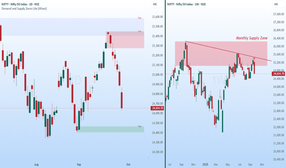
Accumulation and a Possible Breakout Towards Weekly Supply📈 Market Trend and Structure 📈
After forming an all-time high, price began its decline and developed a weekly supply zone . This supply zone now stands as the major target area for buyers.
Following the decline, price touched the weekly demand zone , which acted as a powerful reversal point . As supply-demand traders, this gave us a strong indication of the probable bottom.
From there, price recovered and moved into a phase of sideways consolidation , reflecting the tug of war between buyers and sellers.
⚡ Breakout Attempts and Trendline Support ⚡
During this consolidation, price attempted two breakouts with strong volumes . Both times, sellers stepped in aggressively at the horizontal resistance line.
Buyers, however, showed resilience by consistently defending an ascending trendline . This steady support is a sign of accumulation and growing demand.
Recently, price and volume contracted , forming an inside candle —a balance between buyers and sellers.
Today, this inside candle was broken to the upside, which could make this third breakout attempt successful.
🎯 Trading Plan 🎯
Bias: Bullish continuation.
Entry Trigger: Two previous breakout attempts + today’s breakout of the inside candle.
Target: Weekly supply zone.
Stop Loss: Below the previous swing low.
Risk-to-Reward: Approximately 1:3, a favorable setup.
✨ In Short : Sellers are still active near horizontal resistance, but buyers are showing greater strength at higher lows. The breakout of today’s inside candle tilts the balance towards buyers, making this the most promising pre-breakout setup so far.
🚀💡 “In trading, patience to wait and courage to act make all the difference.”
Lastly, Thank you for your support, your likes & comments. Feel free to ask if you have questions.
⚡ Stay disciplined, trade smart, and let the charts guide your story! 📊✨
This analysis is purely for educational purposes and is not intended as a trading or investment recommendation. I am not a SEBI registered Analyst.  Long
Long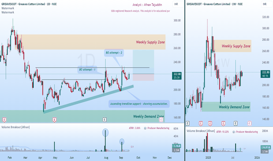
SHARDACROP: Smart Money Demand Zones Align with Classic BreakoutI've been tracking SHARDACROP, and what I'm seeing is honestly one of those setups that doesn't come around too often. There's something brewing here that caught my attention—and it's not just one signal, but two completely different analytical approaches pointing to the exact same conclusion.
Today, I'm breaking down this chart using the modern supply & demand approach that tracks institutional footprints, and the classic technical analysis. When these two methodologies start singing the same tune? That's when you know it's time to pay attention.
What makes this SHARDACROP setup special? Both methods are screaming the same message. And in my experience, that's usually when the big moves happen.
💡 Supply & Demand Analysis - Reading the Smart Money Trail 💡
Let's start with the supply and demand zones. Think of these as crime scenes—they're where the big players left their fingerprints. These aren't random levels; they're areas where massive institutional orders are sitting, waiting to be filled.
🎯 How the Big Players Play 🎯
Here's what most retail traders don't get: when institutions want to buy or sell millions of dollars worth of stock, they can't just hit the market buy button like we do. They'd move the price against themselves instantly. Instead, they layer in orders over time, creating these demand and supply zones.
So when price comes back to test a demand zone, we're betting that the same smart money players who were buying there before still have unfilled orders waiting. It's like they've set a trap—and price is walking right into it.
🔥 What Jumped Out at Me with SHARDACROP 🔥
Solid Weekly Foundation : There's a weekly demand zone that's been acting like a fortress
Stacked Daily Zones : Inside that weekly zone, we've got 1 daily demand zone and another demand zone is latest layered on top of each other.
Leg-out Candle Signature : That leg-out candle? Breaking to new highs, Pure smart money. The size of that imbalance tells me this wasn't retail traders getting excited
📈 The Setup That's Unfolding 📈
Now here's where it gets interesting. Price is drifting back toward our demand zone, and everything's lining up perfectly:
Entry Sweet Spot : Right within that established demand zone
Clean Risk Level : Stop goes below the zone—simple
Clear Target Path : Measured move up to the next supply zone
What I love about this risk-reward setup is the clean path to our 1:2.5 target. There's no major supply zone standing in our way, and the weekly trend is up.
⚡ Traditional Technical Analysis ⚡
Now let's flip the script and look at this through classic technical analysis. And you know what? The story gets even better.
🏗️ The Resistance That Finally Cracked 🏗️
This chart's telling a story I've seen a thousand times, but it never gets old:
The Struggle Phase : Price kept banging its head against the same resistance level, over and over
The Explosion : When it finally broke, it didn't just break—it demolished that level with a massive candle and huge volume
Volume Don't Lie : That breakout volume spike? That's confirmation the move was real
The Polarity Play : Now that old resistance is getting ready to flip into support—textbook price action
📊 Volume Tells the Real Story 📊
What really caught my eye is how volume's behaving on this pullback. As price drifts down toward our support zone, volume's drying up. That's not weakness—that's actually bullish. It means the selling pressure is fading, and when volume contracts like this during a retest, it often sets the stage for the next leg higher.
🎯 When Two Worlds Collide - The Confluence Magic 🎯
Here's where things get really exciting. I'm not just seeing one good setup—I'm seeing two completely different analytical methods pointing to the exact same opportunity:
Supply & Demand Says : Smart money demand zone with layered institutional support
Technical Analysis Says : Classic breakout retest with polarity support and volume confirmation
The Bottom Line : Both methods identify the same zone as the high-probability entry point
When this happens, I call it a "confluence setup." It's like having two different GPS systems both telling you to take the same route—you can be pretty confident you're heading in the right direction.
🌟 Putting It All Together 🌟
SHARDACROP's showing me: institutional footprints perfectly aligned with classic technical patterns. The Multiple Timeframe demand zones, the breakout retest setup, the volume behavior—it's all coming together in a way that makes me sit up and take notice.
But remember, even the best setups can fail. The market doesn't owe us anything, and it certainly doesn't care how confident we are. Trade smart, manage risk, and let the probabilities work in your favor over time.
💪 "The best traders aren't the ones who are right the most—they're the ones who make the most when they're right and lose the least when they're wrong." 📈
Disclaimer: This analysis is purely for educational purposes and isn't meant as trading or investment advice. I'm not a SEBI registered analyst. Always consult with qualified financial advisors before making investment decisions.  Long
Long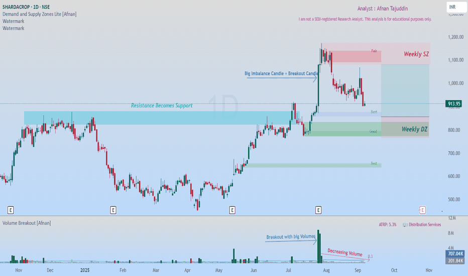
 Long
Long
 Long
Long
 Long
Long

 Long
Long
 Long
Long
CEAT Ltd: Is a Rebound on the Horizon? A Confluence of TechnicalTraders — let’s dig into CEAT Ltd NSE:CEATLTD . where both demand-supply dynamics and classic technical signals are flashing something worth watching. What’s setting up here isn’t just noise — there’s real structure underneath the surface.
Demand Zone & Institutional Footprints
Let’s start with the core of this setup: the Demand Zone. CEAT’s price is inching toward a daily timeframe Rally-Base-Rally zone — and not just any zone, but one that stands out in terms of quality.
Why does this matter? Because these aren’t retail-driven bounces. These are often the hidden footprints of institutions quietly building positions.
On June 23rd, price came close to this very demand zone — and without even touching it, we saw a sharp bounce. That’s a strong tell. There’s clear demand waiting just below.
Institutions don’t throw their entire order book at the market in one go. They scale in. So when price comes back to this area, it’s likely to trigger those leftover buy orders — potentially leading to another move higher.
Zooming out to the broader view : Both weekly and monthly charts are still in an uptrend. There are no obvious supply zones on the higher timeframes That clears the runway for bullish continuation.
💡 Traditional Technical Analysis Perspective 💡
Now let’s switch gears for a moment and take a look through the lens of classic technical analysis. What’s the chart telling us in plain sight?
CEAT spent months coiling within a consolidation range — nothing impulsive, just sideways chop.
But that changed on April 30th with a decisive breakout. And this wasn’t on light volume — it came with strong participation, a real sign of conviction.
Post-breakout, we’ve seen consistent volume buildup alongside price progression. This isn’t a one-day wonder — it’s been developing.
Act of Polarity at Work: The breakout level had previously acted as firm resistance multiple times. Now that price is retesting it from above, it’s doing exactly what we expect — flipping that resistance into potential support.
Interestingly, this retracement is happening on declining volume. That’s key. It often suggests a healthy retest rather than a breakdown — a potential “buy the dip” scenario, if you will.
🤝 The Confluence: Where Two Worlds Meet 🤝
Here’s where things get really compelling — that demand zone we highlighted? It aligns perfectly with the same level that’s being retested post-breakout. That overlap — this confluence — is no coincidence.
It dramatically increases the odds of a strong bounce, because we’re getting validation from two independent analytical frameworks. When price, psychology, and institutional footprints all point to the same zone — you pay attention.
We could consider a tactical Stop Loss just below the demand zone. And in terms of upside? The previous swing high near ₹4000 stands out as a logical first target.
"Success in trading is a marathon, not a sprint. Consistency, discipline, and effective risk management are your true North Stars."
Stay sharp. Even the cleanest setup can fail — and that’s why managing risk isn’t optional. If price violates the zone and closes below your SL, step out without hesitation.
Thanks for reading — your support, feedback, and questions always help drive this community forward. Let’s keep sharpening our edge together.
🚀 Trade smart, stay disciplined, and let your journey be one of continuous learning! 🚀
Disclaimer: This analysis is intended purely for educational purposes. It does not constitute investment advice or a trading recommendation. I am not a SEBI-registered advisor.  Long
Long
Demand & Supply Price Action Play – CMSINFO Price Structure & Market Context
CMSINFO’s recent price action has followed a textbook path, respecting clean structural levels driven by institutional order flow. It's one of those charts where the zones aren’t just technical—they're telling a story. And right now, that story is setting up a potentially meaningful long opportunity.
💡 Daily Timeframe – Big Picture Bias
The daily chart remains resolutely bullish . We're still seeing that healthy rhythm of higher highs and higher lows , signaling that the uptrend is very much intact.
📍 Daily Supply Zone: ₹540 – ₹546
That said, price did face some resistance recently—right where we’d expect it to. A fresh supply zone Rally Base Drop around ₹540–₹546 served up a rejection and sparked the current pullback. Nothing unusual there. In fact, in strong trends, these kinds of pullbacks often offer the best risk-adjusted entries —as long as we’re positioned at the right zones.
⏱️ 125-Minute Timeframe – Precision Entry Layer
Zooming into the 125-minute chart gives us a much clearer map for potential execution.
🟢 Demand Zone: Rally Base Rally ₹500 – ₹498
Here’s where things get interesting. This demand zone hasn’t been touched since it formed—making it a fresh zone , and by definition, high-probability for a first bounce. Price has just tapped into it, which could attract short-term buyers looking to ride the next leg up.
🔴 Supply Zone: Rally Base Drop ₹532 – ₹537
This zone sits just overhead and marks the first potential resistance . If price moves up from the current demand area, this is where traders may begin trimming positions or tightening stops.
🎯 Trade Blueprint 🎯
Entry: Between ₹500 – ₹498 (inside 125-minute demand zone)
Stop Loss: Below ₹498 (conservative buffer: ₹495)
Target 1: ₹532 – ₹537 (nearest 125min supply)
🧩 Why This Setup Deserves Attention 🧩
Daily Trend Structure Remains Bullish – higher timeframe bias supports a continuation upward.
Fresh LTF Demand Zone – first touch makes this zone statistically favorable.
Defined Risk-Reward Parameters – tight stop with layered targets for flexible management.
Pure Price Action Logic – just clean, institutional footprints.
🚀 “Opportunities don’t come from chasing— they come from waiting in the right places.” 💡 Stay patient, respect your zones, and let the market come to you.
This analysis is purely for educational purposes and does not constitute a trading or investment recommendation. I am not a SEBI registered analyst.
Lastly, thank you for your support, your likes & comments. Feel free to ask if you have questions.
 Long
Long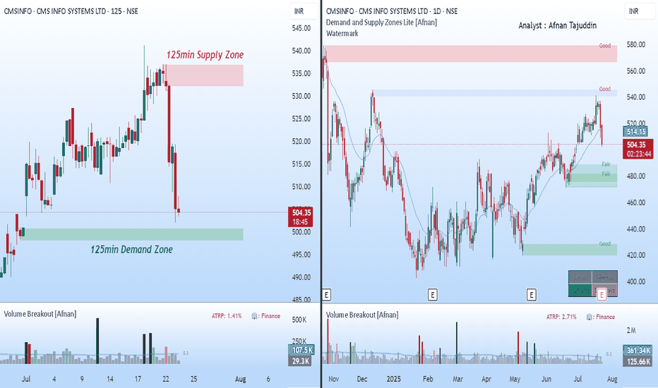
 Long
Long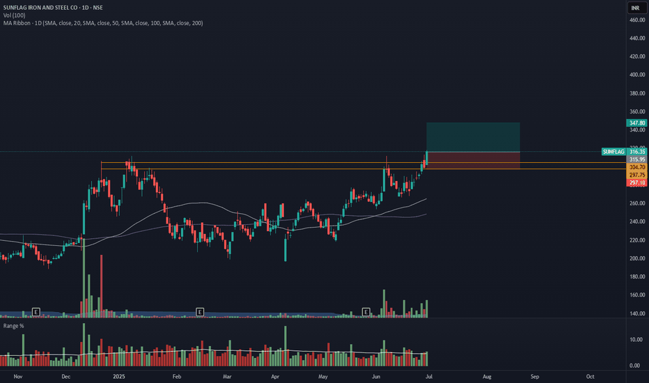
 Long
Long

BSE – Strong Call Writing | Tested Supply Zone in Play________________________________________________________________________________
📈 BSE – Strong Call Writing Below 2600 | Tested Supply Zone in Play
🕒 Chart: 15-Min
📆 July 8, 2025
________________________________________________________________________________
🔍 What’s Catching Our Eye:
Massive Call writing seen from ₹2400 to ₹2900, clearly indicating resistance at higher levels.
________________________________________________________________________________📌 What We’re Watching For:
Price is facing selling near the ₹2542–₹2589 supply zone; a rejection here can drag it toward ₹2395 or below.
________________________________________________________________________________📌 OI Inference:
CEs are heavily sold across all levels – especially 2600, 2500, 2700, and 2400 CE.
Strong Put buying from 2400 down to 2000 PE → Market participants are expecting downside.
________________________________________________________________________________🔁 Trend Bias:
🔴 Bearish to Range-Bound – unless price breaks above ₹2594.05 with volume and CE unwinding.
________________________________________________________________________________🧠 Trade Logic / Reasoning:
• 12+ Call Strikes under Short Build-Up = strong ceiling
• Long Build-Up in deep Puts (2500, 2400, 2300, even 2000)
• Tested supply zone between ₹2542–₹2589 = rejection likely
• PE IVs rising = fear building up, especially below 2500
________________________________________________________________________________📍 Important Levels to Mark:
🔺 Top Range (Resistance): ₹2731.6
🔻 Bottom Range (Support): ₹2395
🟢 Demand Zone: NA
🔴 Supply Zone: ₹2542.20 – ₹2589.10 | SL: ₹2594.05(Tested Zone)
________________________________________________________________________________🎯 Trade Plan (Educational Purpose Only):
✅ Sell (Equity): Near ₹2542–₹2589 if price rejects the supply zone
✅ Buy (Equity): Only above ₹2594.05 with strong volume
✅ Best Put to Buy: ₹2500 PE or ₹2400 PE on breakdown
❌ Avoid Call Buying: All Calls are under heavy selling
📌 Strategy Idea (Low Risk):
Bear Put Spread – Buy 2500 PE, Sell 2400 PE
→ Profitable if stock drops, risk stays limited
________________________________________________________________________________⚠️ Invalidation Levels:
🔺 Above ₹2594.05 = bearish setup may fail
🔻 Below ₹2395 = confirms breakdown and trend continuation
________________________________________________________________________________
⚠️ Disclaimer:
This post is for educational purposes only.
STWP is not a SEBI-registered advisor.
No buy/sell recommendations are made.
Please consult your financial advisor before trading.
STWP is not responsible for any trading decisions based on this content.
________________________________________________________________________________
💬 Will BSE break supply and fly, or get rejected again?
⬇️ Share your view in the comments!
🔁 Repost this if you're watching BSE
✅ Follow STWP for clean Options + Price Action insights
🚀 Let’s trade with clarity and confidence!
________________________________________________________________________________  Short
Short
HDFCBANK – Heavy Call Writing Near 2000 Zone________________________________________
📈 HDFCBANK – Heavy Call Writing Near 2000 Zone | OI + Price Action Analysis
🕒 Chart Type: 15-Minute
📆 Date: July 7, 2025
________________________________________
🔍 What’s Catching Our Eye:
HDFCBANK closed at ₹1987.4, and the entire Call side from ₹1980 to ₹2100 is showing strong Short Build-Up, clearly suggesting resistance building up ahead, especially around ₹2000–₹2040 levels.
Meanwhile, Put side shows Long Unwinding at ₹2000 PE, suggesting lack of bullish confidence at current levels.
________________________________________
📌 What We’re Watching For:
Watch the zone between ₹2004.70 – ₹2007.90 very closely – it’s a visible Supply Zone based on price rejection + heavy CE OI.
If HDFCBANK fails to break and sustain above ₹2009.30 (SL), bears may take control again and drive it back to ₹1980 or below.
________________________________________
📊 Volume Footprint:
Heavy CE volumes hint at active resistance:
• ₹2000 CE – 9.3k+ contracts
• ₹2060 CE – 7.8k+ contracts
• ₹2020 CE & ₹2040 CE – ~5.6k contracts each
→ Strong presence of Call writers near current levels, pressuring the upside.
________________________________________
📈 Option Chain Highlights:
Calls (Short Build-Up):
• ₹2000 CE: +1,93,600 OI | Price ↓ 8.87%
• ₹2060 CE: +10,04,300 OI | Price ↓ 16.67% ✅ Major resistance buildup
• ₹2020 CE: +6,90,800 OI | Price ↓ 11.42%
• ₹2040 CE: +5,83,550 OI | Price ↓ 15.13%
• ₹1980 CE: +2,17,800 OI | Price ↓ 6.44%
• ₹2100 CE: +2,00,200 OI | Price ↓ 17.76%
Puts:
• ₹2000 PE: -84,150 OI | Price ↓ 0.87% → Long Unwinding = Bullish weakness
• ₹1980 PE: +6,050 OI | Price ↓ 2.33% → Weak Short Build-Up
📌 Inference:
Call writers are dominating the entire upper side. There’s no strong Put writing, and PE writers are exiting positions at ATM — this confirms limited bullish conviction.
________________________________________
🔁 Trend Bias:
🔴 Bearish to Range-Bound – unless ₹2009.30 gets taken out on closing basis
________________________________________
🧠 Trade Logic / Reasoning:
• Heavy Short Build-Up in all major CE strikes
• Lack of Put writing near spot
• Supply Zone aligning perfectly with Option Chain resistance
→ Expect rejection or pause unless strong buyers break ₹2009.30 with volume.
________________________________________
📍 Important Levels to Mark:
🔺 Top Range (Resistance): ₹2008
🔻 Bottom Range (Support): ₹1980
________________________________________
🎯 Trade Plan (Educational Purpose Only):
✅ Best Buy (Equity): Above ₹2009.30 with a bullish candle and volume
✅ Best Sell (Equity): Below ₹2004.70 for quick move to ₹1980
✅ Best CE to Long: None – CE side is under Short Build-Up
✅ Best PE to Long: ₹1980 PE if price starts rejecting ₹2000 zone again
🟢 Demand Zone: ₹1965 – ₹1980 (Intraday Bounce Possible)
🔴 Supply Zone: ₹2004.70 – ₹2007.90 (SL: ₹2009.30)
⚠️ Invalidation Levels (With Logic):
🔻 Bullish View Invalid Below: ₹1980 – breaks structure and confirms weakness
🔺 Bearish View Invalid Above: ₹2009.30 – a breakout above this level with volume + PE Short Build-Up will invalidate bearish trades
________________________________________
⚠️ Disclaimer:
This analysis is for educational purposes only.
STWP is not a SEBI-registered advisor.
No buy/sell recommendations are made.
Please consult your financial advisor before trading.
STWP is not responsible for trading decisions based on this post.
________________________________________
💬 Rejection from ₹2000 or breakout above ₹2009?
What’s your view on HDFCBANK? Comment below ⬇️
🔁 Share this if you're tracking the zone
✅ Follow STWP for clean Price Action + OI Trades
🚀 Let’s trade with clarity and confidence!
________________________________________


