Trading AnalysisWhere is Nifty right now?
Nifty closed at 23,689 on Thursday May 14. After a brutal fall earlier this week (it touched ~23,300), it bounced back for 2 days in a row. So right now it's in a recovery mood — but it hasn't really "fixed" itself yet. Think of it like someone who had a fever, now feeling slightly better, but not fully healthy.
2 What's the wall above? (Resistance)
If Nifty tries to go up next week, it will hit a wall around 23,500–23,600 first. That's the first test. If it somehow crosses that, the BIGGER wall is at 23,900–24,000 — where all the major moving averages (50-day & 200-day) are sitting. Lots of sellers will be waiting there to book profits. So going above 24,000 next week? Unlikely unless something very positive happens.
3 What's the floor below? (Support)
If Nifty starts falling, the first safety net is around 23,300–23,150. This zone has held multiple times recently. If it breaks this level decisively (and stays below it), then the next stop could be 23,000 or even 22,900. That's the danger zone — but that's not the most likely scenario for next week.



 Education

XAUUSD : Trendline Support + Demand Zone Confluence | Target ?XAUUSD (Gold Spot) — Bullish Market Structure & Channel Breakout
Gold continues to exhibit strong bullish momentum on the 30-minute timeframe, adhering closely to a long-term ascending trendline and respecting key structural levels.
Key Technical Factors:
Structural Reversal (Inverse Head & Shoulders): The market initially created an Inverse Head & Shoulders pattern, followed by a Break of Structure (BOS) above the $4,280 resistance level, confirming the shift to a bullish bias.
Ascending Trendline Support: A strong upward trendline has been guiding price action from the $4,150 region. The trendline continues to hold firmly as dynamic support.
Downward Channel Breakout: Following the initial rally, price consolidated in a bullish flag / downward channel before breaking out to the upside, signaling trend continuation.
Demand Zone Confluence: Price has recently pulled back into a established Demand Zone ($4,330 – $4,360), which aligns directly with the ascending trendline support.
Trade Setup & Scenario:
Bias: Bullish
Entry Zone: Around the current retest of the Demand Zone ($4,340 - $4,360).
Target: $4,400.00 major psychological resistance level.
Invalidation / Stop Loss: A sustained break and candle close below the trendline support / Demand Zone ($4,320 level).  Long
Long
Long 
The Hidden Logic of Market Trends: Understanding Why Price KeepsLook at any strong trend on a chart and it can seem obvious in hindsight.
The stock keeps making higher highs. Pullbacks are shallow. Buyers step in again and again.
Then, somewhere along the way, the trend slows down.
The question is:
Why?
Markets don't move in trends simply because a chart pattern says they should. Trends develop because buyers or sellers repeatedly gain enough control to push price toward new levels.
Behind every trend is a continuous battle between demand and supply, confidence and fear, participation and hesitation.
Once you understand that, market trends become much easier to read.
A Trend Starts With Imbalance
Markets are usually moving between periods of balance and imbalance.
When buyers and sellers are relatively evenly matched, price tends to move sideways.
But when one side becomes more aggressive, the balance changes.
If buyers are willing to keep accepting higher prices, price begins moving upward.
If sellers become increasingly aggressive, price starts moving lower.
This imbalance is where a trend begins.
The interesting part is that trends don't need everyone to agree.
They only need one side to be consistently stronger.
Why Uptrends Create Higher Highs
An uptrend is more than a series of green candles.
It represents a repeated willingness from buyers to accept higher prices.
Imagine a stock moves from ₹100 to ₹110.
It then pulls back to ₹105.
Instead of collapsing, buyers return.
Price moves to ₹115.
It pulls back again, but buyers defend the previous area.
Price moves toward ₹120.
The pattern is telling us something:
Demand continues to appear at increasingly higher prices.
That's the hidden logic behind higher highs and higher lows.
Downtrends Work the Same Way
A downtrend is simply the opposite battle.
Sellers repeatedly become active at lower prices.
Price falls from ₹200 to ₹185.
A temporary recovery takes it to ₹192.
Sellers return.
Price falls toward ₹175.
Another bounce occurs, but buyers cannot regain the previous high.
Eventually, lower highs and lower lows begin forming.
The market is showing that supply is consistently stronger than demand.
Pullbacks Are Part of the Trend
Many new traders see a pullback and immediately assume the trend is over.
But healthy trends rarely move in a straight line.
Some traders take profits.
Others enter in the opposite direction.
New participants wait for better prices.
This creates temporary counter-moves.
In an uptrend, a pullback can simply be the market taking a pause before buyers regain control.
The important question isn't:
"Did price pull back?"
It's:
"How did price behave during the pullback?"
A shallow pullback followed by strong buying tells a very different story from a deep decline that breaks important market structure.
Momentum Doesn't Stay Constant
Trends have different phases.
Early in a move, very few traders may believe it.
As price continues moving in the same direction, more participants notice.
Momentum increases.
Eventually, the trend becomes obvious to almost everyone.
This is where emotions can become extreme.
FOMO attracts late buyers during strong rallies.
Fear can bring aggressive selling during sharp declines.
Ironically, the strongest emotional participation can sometimes appear close to major turning points.
That's why experienced traders pay attention not only to direction, but also to how the market is behaving.
Trends Need Participation
A trend cannot continue indefinitely without enough participation.
Think about a market moving higher.
Early buyers are profitable.
More traders notice the move.
New buyers enter.
But eventually, some early participants start taking profits.
If new demand continues to absorb that selling, the trend can continue.
If new demand begins disappearing, momentum may slow.
This is why volume can be useful when studying trends.
It doesn't tell you exactly what will happen next, but it can provide clues about the level of participation behind a move.
Support and Resistance Tell Part of the Story
Previous highs and lows often become important because traders remember them.
A previous high may attract sellers who are looking to exit.
It may also attract breakout traders waiting for price to move above it.
A previous low can attract buyers and stop-loss orders from traders holding long positions.
As price approaches these areas, the battle between buyers and sellers becomes more intense.
A trend becomes especially interesting when it breaks through an important level and then holds above or below it.
That can show that the market has accepted a new price range.
The Role of Liquidity
Liquidity is another important part of market trends.
Orders often accumulate around obvious highs, lows, support, resistance, and psychological price levels.
When price approaches these areas, activity can increase.
Sometimes price briefly moves beyond an obvious level before reversing.
Other times, the move continues because enough buying or selling pressure exists to push the market into a new range.
This is why a breakout should not be judged by the first candle alone.
The reaction afterward often tells you much more.
When a Trend Starts Losing Its Logic
Trends don't usually reverse because of one random candle.
Often, the behavior starts changing first.
An uptrend may begin showing:
Smaller bullish moves
Deeper pullbacks
More upper wicks
Failed breakouts
Lower highs
A break of important support
Individually, these signs don't guarantee a reversal.
But together, they can suggest that buyers are losing control.
The same logic applies to downtrends.
The key is to notice when the market stops behaving the way it did earlier.
Consolidation Is Not a Waste of Time
Some of the most important periods on a chart look boring.
Price moves sideways.
Volatility contracts.
Candles overlap.
Nothing seems to happen.
But consolidation is often the market searching for balance.
Buyers aren't strong enough to push significantly higher.
Sellers aren't strong enough to push significantly lower.
Eventually, something changes.
A new wave of buying or selling enters the market.
The balance breaks.
A new trend may begin.
The quiet period was simply preparation for the next decision.
Don't Confuse Direction With Strength
A market can still be moving higher while becoming weaker.
This is an important distinction.
Price direction tells you where the market is moving.
Price behavior can tell you how strongly it is moving.
For example, a stock may continue making new highs while each rally becomes smaller and pullbacks become deeper.
The trend is technically still bullish.
But its character is changing.
That's the kind of detail that can be missed when traders focus only on whether price is above or below a moving average.
The Market Is Constantly Repricing
At its core, every trend is a process of repricing.
Buyers and sellers constantly reassess what an asset is worth.
New information appears.
Expectations change.
Positions are opened and closed.
Risk appetite changes.
As these decisions change, the price changes with them.
That's why a market that was considered attractive at ₹100 may suddenly look expensive at ₹150.
And a stock that nobody wanted at ₹80 may become attractive at ₹60.
Price is constantly searching for a new level where enough participants are willing to trade.
Final Thoughts
Market trends may look simple on a chart, but the psychology behind them is anything but simple.
An uptrend reflects repeated demand.
A downtrend reflects persistent supply.
Pullbacks show temporary disagreement.
Breakouts show a shift in balance.
Consolidations show uncertainty.
And reversals begin when the old trend can no longer maintain control.
Instead of asking only:
"Is the market bullish or bearish?"
Try asking better questions:
Who is in control?
Are buyers becoming more aggressive or less aggressive?
Are pullbacks being absorbed?
Is price accepting a new level or rejecting it?
Is the trend getting stronger—or quietly losing momentum?
These questions help you move beyond simply identifying trends.
They help you understand why the trend exists in the first place.
Because a market trend is not just a line moving from left to right.
It is the visible result of millions of decisions being made by buyers and sellers. Education 
#NIFTY Intraday Support and Resistance Levels - 11/08/2026Nifty is expected to open flat, with the index continuing to trade within the existing consolidation range. There are no major changes in the key levels, with 24,550–24,450 acting as the immediate support zone and 24,700–24,750 as the important resistance zone.
If Nifty sustains above 24,750, buying can be considered with targets of 24,850, 24,900 and 24,950+. On the downside, a break below 24,450 can trigger selling towards 24,350, 24,300 and 24,250.
Overall, the market is likely to remain consolidated, so traders should avoid aggressive positions inside the range and wait for a decisive breakout above 24,750 or breakdown below 24,450 for the next directional move. BTCUSDT Rejects Resistance — Bearish Pullback Setup📊 ANALYSIS:
BTCUSDT maintains a short-term HH/HL structure after the recent bullish BOS, but price is now consolidating directly below the 65,177–65,568 supply zone.
The 65,568 area acts as key resistance, while 64,258 and 63,916 are the visible Fibonacci retracement levels.
The chart shows a bullish FVG around 62,800–63,200, which could act as a deeper demand/imbalance zone if the pullback accelerates.
Ichimoku cloud structure remains supportive below price, but rejection from supply could trigger a retracement toward the lower levels.
A decisive breakout above supply would shift momentum back toward continuation.
🎯 BULLISH SCENARIO:
A clean 2H close above 65,568 confirms resistance breakout → targets 65,750–66,000.
🔻 BEARISH SCENARIO:
Rejection below 65,177–65,568 followed by a break of 64,258 → targets 63,916, then the 62,800–63,200 FVG.
⚠️ INVALIDATION:
2H close above 65,568 invalidates the bearish pullback setup.
📌 BIAS:
Neutral → Bearish below 65,568; bullish on confirmed breakout.
#BTC #BTCUSDT #CryptoTrading #PriceAction #TechnicalAnalysis #SmartMoneyConcepts #TradingView XAUUSD Major Supply Rejection Could Trigger a Pullback
Gold has made a strong impulsive move higher and is now entering a major supply zone around 4,360–4,380. This area has previously attracted strong selling pressure, making it an important reaction point for the current structure.
The current move looks extended into resistance, so a rejection from the supply zone could lead to profit-taking and a corrective decline. Rather than chasing the short immediately, confirmation through a bearish candle, lower high, or CHOCH would provide a stronger setup.
If sellers gain control, the first downside targets sit around 4,275 and 4,240, followed by the major 4,196 support / previous-resistance zone. A clean break below 4,196 would strengthen the bearish structure and potentially open the way toward deeper support.
The key factor is how price behaves inside the supply zone. A sweep of the recent high followed by a sharp rejection would add strong confirmation to the bearish scenario.
On the other hand, a decisive 4H close above the supply zone followed by a successful retest would invalidate the short setup and favor bullish continuation.
Key Technical Structure
🔴 Supply: 4,360–4,380
📉 Bearish confirmation: Rejection + lower high / CHOCH
🎯 Downside: 4,275 → 4,240 → 4,196
🧱 Major support: 4,196
⚠️ Invalidation: Sustained breakout and hold above supply
📌 Best approach: Wait for confirmation rather than shorting directly into the zone. Short 
BSE Ltd — Bouncing from 0.786 Fib Support, Fresh Bullish SetupOverview
BSE closed today at 3,596.1, up 4.02%, a strong bounce after finding support near the 0.786 Fib level (3,334.6) that we flagged as the next zone to watch in our last update. This bounce has brought price back up toward the falling wedge's upper trendline, and it's worth tracking as a fresh setup.
Follow-up Context
In our earlier post, we noted the 0.618 Fib + wedge zone (3,570–3,610) had failed to hold, and price fell through to the 0.786 Fib level. That level has now given the bounce we were watching for, with today's strong green candle confirming buyer interest at this support.
Pattern Explanation
Price has been falling in a wedge shape since the May high of 4,446.8, with both trendlines sloping down but converging. A falling wedge, like this one, is generally a bullish reversal pattern once broken decisively to the upside. Price is now testing the wedge's upper boundary again after bouncing off deep Fib support, an important test to confirm whether this bounce has real strength behind it.
Today's bounce also came on strong volume, 6.34M shares traded versus the 20-day average of 2.94M, roughly double the usual activity. That kind of volume pickup on a reversal day suggests real buying interest stepped in at this support zone, rather than just a quiet drift higher.
Trade Setup
Entry: Buy on strength above 3,600, ideally with confirmation of a close above the wedge's upper trendline
Stop Loss / Invalidation: 3,334 (below the 0.786 Fib support, would negate this bullish setup)
Target 1: 3,739 (0.5 Fib)
Target 2: 3,906 (0.382 Fib)
Key Levels
Support (Invalidation): 3,334.6 (0.786 Fib)
Wedge Resistance: ~3,600–3,650
Target 1: 3,739
Target 2: 3,906
50 EMA: 3,684.8
200 EMA: 3,261.0
Beginner's Lesson
After a sharp fall, the first bounce off a deep support level doesn't automatically mean the downtrend is over. What matters is whether the bounce can clear the resistance zone above it (here, the wedge's upper trendline) with real strength. Volume helps here too, a bounce on strong volume, like today's, carries more weight than one on light, half-hearted buying. If the bounce fails and price falls back below the recent support, it was likely just a pause within the bigger downtrend, not a reversal.
Conclusion
BSE is showing a strong, volume-backed bounce off the 0.786 Fib support and is now testing the falling wedge's upper boundary. A clean close above this zone would support further upside toward 3,739 and 3,906. A slip back below 3,334 would invalidate this bullish setup.
This is for educational purposes only and not investment advice. Please do your own research or consult a financial advisor before making any trading decisions.  Long
Long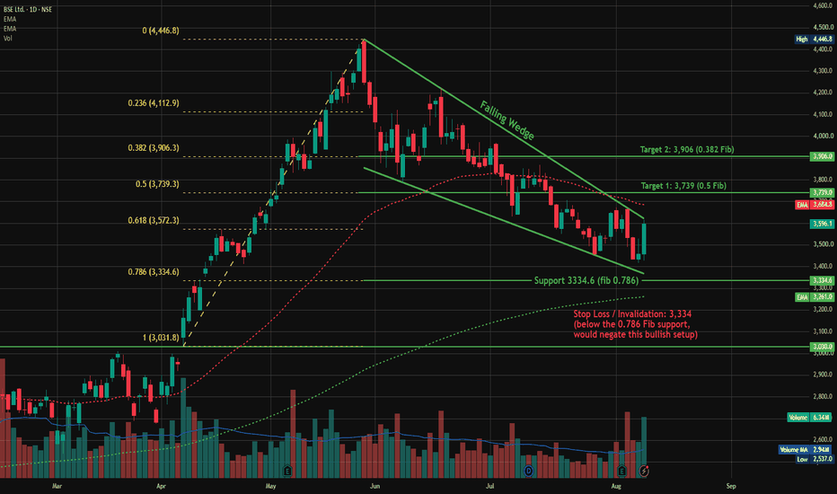
 Short
Short
Education

Trading Masterclass #1Institutional trading means trading like hedge funds, banks, prop firms, and professional desks. They do not trade based on emotions, random tips, or gambling. They use systems, probabilities, risk control, position sizing, discipline, and psychology.
Retail traders often lose because they focus only on “entry.” Institutions focus on:
Risk Management
Capital Protection
Position Sizing
Probability
Psychology
Consistency
Repeatable Edge
In options trading, if you think like institutions, your results can improve significantly  Education

Education

Education

 Education

 Education

Technical AnalysisCore of Technical Analysis
Technical Analysis is the study of past price movements, volume, and market trends to predict future price direction.
3 Main Principles:
Market Discounts Everything
All news, emotions, and fundamentals are already reflected in price.
Prices Move in Trends
Markets usually move in uptrend, downtrend, or sideways trends.
History Repeats Itself
Human psychology creates repeating chart patterns.
Key Tools:
Charts (Candlestick, Line, Bar)
Support & Resistance
Trendlines
Indicators (RSI, MACD, Moving Averages)
Volume Analysis Education

JUBLFOOD: Adam & Eve Pattern Near a Key Breakout ZoneJUBLFOOD has been showing an interesting change in structure on the daily chart.
After falling toward the ₹405–₹410 area, the stock started recovering. The first bottom was sharp, while the second bottom developed more gradually around ₹410–₹425.
This creates a potential Adam & Eve double-bottom pattern.
The most important part of the setup is now the neckline.
The ₹495–₹500 Zone Matters
Price has climbed strongly back toward the ₹495–₹500 area, where the previous recovery attempt failed.
This makes the current zone extremely important.
If buyers can push price above ₹500 and sustain it, the pattern could receive confirmation.
But simply touching or briefly crossing ₹500 isn't enough.
I'd want to see a strong daily close above the neckline, ideally supported by healthy volume.
Why the Pattern Is Interesting
There are several positive signs on the chart:
Price has moved sharply higher from the ₹410–₹420 zone.
The short-term moving averages have turned upward.
Price is trading above the moving averages.
Recent buying candles show improving momentum.
Volume has picked up during the latest advance.
The structure has started forming higher highs and higher lows
.
Together, these signs suggest that buyers have become much more active than they were during the earlier decline.
The Breakout Is Still the Key
This is where patience becomes important.
If JUBLFOOD breaks above ₹500, holds above it, and successfully retests the area, the breakout would look much stronger.
On the other hand, if price moves above ₹500 and quickly falls back below it, that could become a false breakout.
In that situation, traders should be careful about chasing the move.
What About the Pattern Target?
The traditional Adam & Eve measurement uses the depth of the pattern and projects it upward from the neckline.
With the neckline around ₹500 and the pattern low around ₹405–₹410, the theoretical projection comes roughly toward the ₹590–₹595 region.
But this should be treated as a measured pattern objective, not a guaranteed target.
Price can face resistance well before reaching that level.
What I'm Watching Next
For me, the chart comes down to one simple question:
Can JUBLFOOD turn ₹500 from resistance into support?
If yes, the bullish structure becomes much more convincing.
If the stock gets rejected and falls back into the previous range, the breakout thesis needs to be reconsidered.
The setup is interesting, but the market still has to confirm it.
Final View
JUBLFOOD is approaching a major decision zone around ₹495–₹500.
The Adam & Eve structure is visible, momentum has improved, and buyers have pushed price back to the neckline.
Now the important part is not predicting the breakout.
It's watching how price behaves when it gets there.
A pattern creates the opportunity. Price action provides the confirmation.