Strategy
Breadth Indicators

Vol Profile TotoMazterThis indicator displays a Volume Profile anchored to the right side of the chart, decomposing volume into bullish (blue) and bearish (green) components at each price level.
HOW IT WORKS
For each of the last N candles (configurable from 1 to 50), the total volume is split into bullish and bearish fractions using a body/range proportional model:
- Bullish weight = 0.5 + (body/range) x 0.5 for bullish candles
- Bearish weight = 0.5 + (body/range) x 0.5 for bearish candles
- A doji (body = 0) gets 50/50 split. A marubozu gets 100/0.
ILU AMP
Indicator

DIY Custom Strategy Builder [ZP] - v1 (Strategy)Strategy with different Indicators included. With short and Long signals on different time frames, TP and SL included. Win Rate: around 80%
Strategy

VWAP Bands Customizavel FMPVWAP Bands Customizável para quem esta buscando day trades e reverções rapidas em qualquer mercado.
Indicator

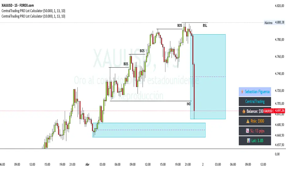
CentralTrading PRO Lot Calculator🚀 CentralTrading PRO Lot Calculator
Advanced Risk Management & Position Sizing Tool
🧠 Description
CentralTrading PRO Lot Calculator is a professional-grade trading tool designed for traders who understand that consistent profitability comes from risk management, not entries.
This indicator automatically calculates your optimal lot size based on your account balance, predefined risk percentage, and stop loss distance. It provides a structured and disciplined approach to position sizing, eliminating emotional decision-making and helping you execute trades with precision.
Built with the mindset of funded traders and institutional risk models, this tool allows you to operate with a clear, rule-based system directly on your chart.
⚙️ Key Features
✔ Automatic lot size calculation based on risk (%)
✔ Real-time risk display in monetary value
✔ Stop Loss integration for precise position sizing
✔ Clean and professional on-chart dashboard
✔ Fixed panel (non-moving) for better usability
✔ Compatible with Forex, Indices, and Metals
Indicator
Triple MACD PRO NASDAQ MTF CLEAN FLOW FINAL PROA minimalistic multi-timeframe MACD designed for high-speed markets like the NASDAQ.
This indicator focuses purely on momentum, flow, and structure – without visual clutter, signals, or distractions.
🔍 Concept
This tool combines three synchronized MACD layers:
M1 (Entry Engine) → fast momentum and execution timing
M5 (Flow) → short-term directional pressure
M15 (Structure) → higher timeframe bias
All components are normalized and enhanced with momentum acceleration to adapt to the speed of modern index markets.
🎯 Purpose
The indicator is built to:
Read real-time market flow
Identify high-probability continuation phases
Filter weak or low-quality moves
Provide a clean, distraction-free trading view
There are no signals, arrows, or background effects – only essential information.
🎨 Visualization
Histogram (M1) → momentum strength and acceleration
MACD/Signal Lines → structure and crossover context
MTF Fill (M5 & M15) → directional bias without clutter
Color logic:
Green → bullish pressure
Red → bearish pressure
Bright colors → increasing momentum
Darker tones → weakening momentum
Higher timeframe fills remain visible even when lines are hidden, providing continuous context.
📈 How to Use
Long Conditions:
M1 histogram turns and expands upward
M5 fill is bullish (green)
M15 supports or is neutral
Short Conditions:
M1 histogram turns and expands downward
M5 fill is bearish (red)
M15 confirms or aligns
⚠️ Important Notes
This is not a signal-based indicator
Designed for active decision-making and flow reading
Best used in trending or expanding markets
Avoid trading during flat or low-momentum conditions
🧠 Key Features
Multi-timeframe integration (M1 / M5 / M15)
Dynamic normalization (adapts to volatility)
Momentum acceleration (faster reaction than standard MACD)
Clean UI with optional HTF visibility
No repainting
💹 Best Markets
Highly optimized for:
NASDAQ (US100 / NQ) ⭐⭐⭐⭐⭐
Also suitable:
S&P 500 (ES / US500)
DAX (GER40)
Gold (XAUUSD)
Less effective for:
Low volatility Forex pairs
Sideways or illiquid markets
⏱️ Recommended Timeframes
M1 → Primary use (scalping / execution)
M5 → Flow confirmation
M15 → Structural bias
🚫 Not Designed For
Automated trading signals
Long-term investing
Range-bound strategies
Summary:
A high-performance, ultra-clean MACD framework built for traders who rely on structure, momentum, and flow – not signals.
Indicator

Diagonales Exactas Futuro + Ruptura (Manual Price)diagonales especificadas por tiempo de 1 hora, media hora, 15 minutos, 5 minutos, 1 dia, 1 semana. Soportes y resistencias.
Indicator

Author Strategy - HA signals on regular candlesСтратегия построена на оригинальной идее из видео автора, адаптирована для тестирования сигналов Heikin Ashi на обычных свечах.
Используются два индикатора:
Chandelier Exit от EverGet
ZL SMMA от VerFit
Правила:
Лонг:
* появляется Buy
* цена выше ZL SMMA
* стоп под сигнальной свечой
* выход при обратном пересечении средней
Шорт:
* появляется Sell
* цена ниже ZL SMMA
* стоп над сигнальной свечой
* выход при обратном пересечении средней
В данной версии сигналы рассчитываются по Heikin Ashi, а входы и стопы исполняются по обычным свечам для более реалистичного тестирования.
Источник идеи:
www.youtube.com
Автор адаптации и тестирования:
@AssekeTradeLab
Strategy

Milman's Crypto Breadth: % Above MASelect the interval (100DMA and 200DMA recommended) and enjoy the power of b r e a d t h !
Indicator

OBV Divergence Finder - Jeff 2026OBV Divergence Finder
This shit finds divergences better than Hitler could find Jews
Indicator

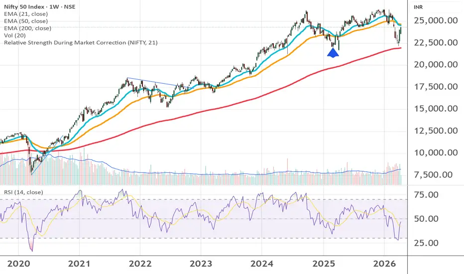
Relative Strength During Market CorrectionLooking for sectors that display RS during market correction
Indicator
Volatility-Adjusted Supply & Demand Zones [Footprint]Volatility-Adjusted Supply & Demand Zones
Overview
Most supply and demand indicators draw zones based on price structure alone — a strong candle appears, a box gets painted, and every zone looks equally valid. This indicator takes a different approach: it sizes and scores every zone using ATR-based volatility, then validates each zone using real order flow data pulled from the bar's volume footprint. The result is a layer of institutional context that price-only zone detectors cannot provide.
The indicator detects displacement candles whose bodies exceed a user-defined ATR multiple, assigns each zone a composite strength score derived from body size and relative volume, and then cross-references the zone's origin bar against footprint delta — the net difference between aggressive buying and aggressive selling — to classify each zone as confirmed, weak, or mitigated. Zones where order flow agreed with the directional move are rendered at full opacity. Zones where delta contradicted the move are faded, acting as a caution signal rather than a confident level. A built-in performance heatmap tracks historical win rates and delta confirmation rates across five strength bins so you can calibrate inputs to your instrument over time.
How it works
Zone detection
On each bar the indicator computes ATR and compares the candle body size against it. If the body exceeds the displacement threshold (ATR × Displacement Multiplier), the bar is flagged as a displacement move. A pending zone is created at the candle's proximal edge and held in a queue. The zone is only confirmed after price has moved away cleanly for a user-defined number of bars without re-entering the candidate range. If price re-enters during the waiting period, the candidate is discarded.
bodySize = math.abs(close - open)
dispRatio = bodySize / atr
isStrongMove = dispRatio > displacementMult
Zone height is fixed at the time of detection: ATR × Zone Width Multiplier, measured from the proximal edge of the displacement candle inward. Demand zones extend downward from the candle high; supply zones extend upward from the candle low.
Strength score
Each zone carries a strength score calculated from the body-to-ATR ratio and the bar's relative volume (volume divided by its moving average). Multiplying these two factors rewards moves that were both large in price terms and accompanied by elevated volume.
relVol = volume / ta.sma(volume, volLengthInput)
strengthScore = dispRatio * math.sqrt(relVol)
The score is displayed on the zone label and used to bin zones into the statistics table.
Footprint delta confirmation
The indicator calls request.footprint() once per bar to obtain the volume footprint for the displacement candle. It reads the bar-level delta (net aggressive buying minus selling), and also inspects the Point of Control (POC) row for directional imbalance. A demand zone is delta-confirmed when the origin bar shows net buying (delta > 0). A supply zone is confirmed when the origin bar shows net selling (delta < 0). When delta contradicts the zone direction, the zone is rendered at the Weak Zone Transparency level as a visual warning.
Zones whose POC row has a confirming buy or sell imbalance are marked with a ⚡ symbol on their label, indicating that the most-traded price level within the bar showed a pronounced one-sided order flow skew.
Visual encoding
Full-opacity zone — footprint delta confirmed the zone direction. Treat as a standard level.
Faded zone (Weak Zone Transparency) — delta contradicted the zone direction. Approach with caution; order flow did not support the move.
Heavily faded zone (Mitigated Transparency) — price has since closed through the far edge of the zone. The level has been invalidated.
⚡ label marker — the POC row of the origin bar showed a confirming imbalance, suggesting concentrated institutional activity at the most-traded price.
Inputs
Detection
ATR Length — lookback period for ATR, which controls zone width, displacement sensitivity, and reaction targets across the entire indicator. Lower values (e.g. 7) make ATR respond faster to recent volatility, producing narrower zones on quiet bars. Higher values (e.g. 21) smooth out spikes for more consistent sizing. Default: 14.
Displacement Multiplier — minimum candle body size as a multiple of ATR required to qualify as a displacement move. Lower values (e.g. 0.5) detect more zones including smaller impulses. Higher values (e.g. 1.5–2.0) filter down to only the most explosive candles. Default: 1.0.
Volume MA Length — lookback period for the volume simple moving average used to compute relative volume. Lower values (e.g. 10) make the baseline adapt quickly so only larger surges register. Higher values (e.g. 50) treat moderate volume increases as more significant. Affects the strength score only, not zone placement. Default: 20.
Zone Width ATR Multiplier — height of each zone expressed as a multiple of ATR at detection. Lower values (e.g. 0.3) produce tight zones that require a precise re-entry. Higher values (e.g. 1.0) tolerate wider wicks before a touch is registered. Default: 0.5.
Confirmation Bars — number of bars price must hold outside the zone after the displacement candle before the zone is drawn. Lower values (e.g. 1–2) capture zones faster but allow more false starts. Higher values (e.g. 5+) require a sustained move away and reduce noise. Default: 3.
Volume Footprint
Ticks Per Footprint Row — price range of each footprint row in ticks. Smaller values (e.g. 10–25) produce more granular rows and more detailed POC detection. Larger values (e.g. 200–500) aggregate into fewer rows and run faster. Match to your instrument: for ES futures (0.25 pts/tick), 100 ticks = 25 points per row; for BTC (0.10/tick), 1000 ticks ≈ $100 per row. Default: 100.
Value Area % — percentage of total bar volume that defines the Value Area, following standard market profile convention. Raising this widens the VA; lowering it tightens it. Default: 70.
Imbalance Threshold % — how much a row's buy volume must exceed the row below's sell volume (or vice versa) to be flagged as imbalanced. At 300%, buy volume must be 3× the adjacent row's sell volume. Lower values (e.g. 150%) flag more imbalances; higher values (e.g. 500%) flag only extreme skews. Default: 300.
Show Delta on Zone — when enabled, the zone label includes the footprint delta direction (▲/▼) and size in thousands at the origin bar. Disable to show only the strength score. Default: on.
Highlight Imbalanced Zones — when enabled, zones whose origin bar POC row has a confirming directional imbalance are marked with ⚡ in the label. Disable to suppress imbalance detection entirely. Default: on.
Statistics
Show Performance Heatmap — toggles the heatmap table in the top-right corner. The table groups zones into five strength bins and shows demand win rate, supply win rate, total zone count, and delta confirmation rate per bin, colour-coded from red (low) to green (high). Default: on.
Reaction Target (ATR) — how far price must move away from a zone after touching it to count as a successful reaction, in ATR multiples. Lower values (e.g. 0.5) count small bounces as wins; higher values (e.g. 2.5–3.0) require meaningful moves. Affects statistics only — does not resize zones. Default: 1.5.
Style
Demand Color — fill and border colour for demand zones. The opacity set in the colour picker controls baseline transparency; delta-confirmed zones render at this opacity while weak zones are additionally faded. Default: green at 60% transparency.
Supply Color — fill and border colour for supply zones. The same transparency layering applies as demand zones. Default: red at 60% transparency.
Weak Zone Transparency — transparency applied to zones where footprint delta contradicts the zone direction. Higher values (closer to 100) make weak zones nearly invisible. Lower values keep them visible as a caution marker. Default: 82.
Mitigated Transparency — transparency applied after a zone is invalidated by price closing through its far edge. Higher values clean up the chart; lower values retain mitigated zones as historical context. Default: 90.
Usage notes
Before trusting any zone, check the label: a ▼ delta on a demand zone or ▲ delta on a supply zone means aggressive order flow did not support the move. Wait for additional confirmation before entering against the zone.
The ⚡ marker identifies zones where the most-traded price level within the displacement bar showed a one-sided imbalance. These levels represent potential areas of concentrated institutional activity and may produce stronger reactions than unmarked zones.
Use the performance heatmap to calibrate your displacement and volume inputs. If the highest-scoring bins (6–8, 8+) are showing low win rates for your instrument, the displacement multiplier may be too low and is capturing impulsive but unsustained moves.
The Δ Conf% column in the heatmap shows what fraction of zones in each strength bin had confirming delta. If high-strength zones show low confirmation rates on your instrument, consider whether a different timeframe or session gives more reliable footprint data.
Footprint data requires a TradingView subscription tier that provides volume footprint access. On instruments or timeframes where footprint is unavailable, delta values display as "Δ n/a" and all zones default to confirmed status so zone detection still functions.
Ticks Per Footprint Row is the most instrument-sensitive input. Set it too small and computation overhead increases; set it too large and POC imbalance detection loses resolution. For equity index futures, 50–100 ticks per row is a reasonable starting range.
Mitigated zones (heavily faded) mark levels where price has already broken through. They are kept visible by default as historical reference but can be hidden completely by setting Mitigated Transparency to 100.
This indicator does not generate entry signals. It identifies structural levels with order flow context. Combine it with a trigger mechanism — a lower-timeframe confirmation candle, a momentum signal, or a volume surge — before committing to a trade.
Indicator

ORB Breakout Reset Alert (9:30-10:00 ET)Opening Range Breakout indicator for intraday charts. Triggers alerts when price closes above the 9:30–10:00 AM Eastern opening range high with strong volume and price above VWAP before 11:30 AM.
Indicator

Volume Footprint [Simplifyed]Volume Footprint
Overview
Most volume indicators tell you how much was traded. This indicator tells you who won . Volume Footprint displays the order flow breakdown inside every bar — how many contracts were bought aggressively versus sold aggressively at each price level — so you can see where institutional participation is concentrated and whether that participation is consistent with the direction price actually moved.
The core insight is simple: price only moves when effort fails to produce a result. A bar dominated by sell orders that still closes higher is not bearish — it is a sign that passive buyers absorbed every aggressive seller. The next move is likely up. This script surfaces those inefficiencies directly on your chart.
Requires a TradingView Premium or Ultimate plan for the request.footprint() API.
How it works
The script requests a full footprint for each bar via Pine Script v6's native request.footprint() call. Each bar is divided into rows based on a user-defined tick width. Every row shows its delta — the net difference between aggressive buy volume and aggressive sell volume at that price level.
footprint fp = request.footprint(i_ticks, i_va, i_imbal)
float barDelta = fp.delta()
array rows = fp.rows()
Six signal types are derived from that data:
Bear Trap (green label) — the majority of sell-delta rows are clustered in the bottom third of the bar. Sellers entered at the lows and were absorbed. Their break-even stop is the bar's POC.
Bull Trap (red label) — the majority of buy-delta rows are clustered in the top third of the bar. Buyers entered at the highs and were absorbed. Their break-even stop is the bar's POC.
Squeeze Up / Squeeze Down (diamond) — price crosses through a Vulnerability Line drawn at a prior trap bar's POC. Trapped participants hit their stops and accelerate the move.
Ineff Sell / Ineff Buy (circle) — bar delta is negative but the candle closed up (or vice versa). Effort did not produce the expected result. The aggressive side is exhausted.
Vulnerability Line (dashed) — a horizontal line extending from each trap bar's POC. This is the trapped trader's break-even level. It turns dotted when consumed by a Squeeze signal.
Iceberg Row (bright border) — a row where total volume exceeds a multiple of the bar's average row volume. Signature of a passive institutional limit order silently absorbing aggression.
Bar rows are coloured by delta direction: teal for net buying, red for net selling. Row opacity scales with volume when the gradient mode is enabled. The Value Area (the range of rows containing a user-defined percentage of total bar volume) receives a gold border. The POC row receives an orange border.
The bar delta label at the bottom of each bar shows the net delta, volume context (FRESH / EXIT up / EXIT down), and a summary of imbalance counts. A star prefix (★) on trap labels means the trap fired at the edge of the recent N-bar range — the highest-conviction location.
Inputs
Footprint
Ticks per Row — controls the price granularity of each footprint row. One tick equals syminfo.mintick. Lower values (e.g. 10) produce more rows and finer detail but consume more drawing objects; higher values (e.g. 500) produce fewer, coarser rows. Target approximately 25 rows per bar. Use the "ATR Ticks Hint" value in the Data Window as a starting point. Default: 100.
Value Area % — the percentage of total bar volume used to define the Value Area. The standard market profile convention is 70. Raising this to 90 widens the highlighted region; lowering it to 50 tightens it to only the highest-volume core. Default: 70.
Imbalance Threshold % — a row is flagged as having a buy imbalance when its buy volume exceeds this percentage of the row below's sell volume (and vice versa for sell imbalance). At 300%, a row needs 3× the adjacent row's opposing volume to qualify. Lower values (e.g. 150) produce more frequent imbalance markers; higher values (e.g. 500) flag only extreme stacking. Default: 300.
Signals
Fresh/Exit Range (bars) — the lookback window used to classify whether the current bar is in the middle of the recent range (FRESH — new institutional entry) or at its extremes (EXIT — take-profits or stops). A value of 20 uses the prior 20 bars. Shorter lookbacks (e.g. 5) react to recent swings; longer lookbacks (e.g. 50) classify against a broader structural range. Default: 20.
Iceberg Threshold (x avg row vol) — a row is highlighted as an iceberg when its volume exceeds this multiple of the bar's average row volume. At 3.0×, a row needs three times the average to qualify. Lower values (e.g. 2.0) highlight more rows; higher values (e.g. 6.0) flag only the most extreme absorption events. Default: 3.0.
Candle Shape Filter for Traps — when enabled, a Bear Trap additionally requires a hammer candle (lower wick at least 2× the body, upper wick at most 0.5× the body) and a Bull Trap additionally requires a shooting-star candle. This reduces signal frequency and increases precision. Disable it on instruments where wick structure is less reliable (e.g. crypto with frequent spikes). Default: off.
Display
Value Area Highlight — draws a gold border on rows within the Value Area. Default: on.
POC Highlight — draws an orange border on the Point of Control row (highest volume row in the bar). Default: on.
Imbalance Markers — plots a small triangle at the top or bottom of rows with a buy or sell imbalance. Default: on.
Bar Delta Label — displays a label below each bar showing total bar delta, volume context, and dominant imbalance count. Default: on.
Trap Signals — shows Bear Trap and Bull Trap labels on qualifying bars. A ★ prefix indicates the trap fired at a range edge. Default: on.
Vulnerability Lines — draws a dashed horizontal line at each trap bar's POC, extending to the right until consumed by a Squeeze signal. Default: on.
Squeeze Signals — plots a label when price crosses through a Vulnerability Line, triggering forced exits from trapped participants. Default: on.
Efficiency Signals (Effort vs Result) — plots Ineff Sell and Ineff Buy labels when delta direction and candle direction disagree. Default: on.
Volume Gradient — when enabled, each row's background opacity scales with its share of total bar volume, making high-volume rows visually heavier. When disabled, all rows use a flat background colour. Default: off.
Label Size — sets the text size of row delta labels. Options: tiny, small, normal. Default: tiny.
Usage notes
Read the "ATR Ticks Hint" value from the Data Window before setting Ticks per Row. Divide the hint by 25 to find a starting point that yields approximately 25 rows per bar. Too few rows (under 10) loses resolution; too many rows (over 40) consumes drawing objects rapidly and shows only the last few bars in full detail.
Full footprint detail (boxes and labels) is limited to approximately the last 13 bars due to drawing object limits (500 boxes, 500 labels). All signals — traps, squeezes, efficiency — are plotted on all historical bars via plotshape and barcolor, so you can scroll back to review signal history without losing them.
Treat the ★ trap label as higher conviction than an unmarked trap. A trap firing in the middle of a range has less context than one firing at a structural high or low where stops are naturally clustered.
A Vulnerability Line turning dotted is the Squeeze confirmation. The price crossing the line is the mechanical event; the line changing style is its visual acknowledgement. Monitor open Vulnerability Lines for potential squeeze setups forming over multiple bars.
Ineff Sell and Ineff Buy signals are strongest when they appear in the FRESH zone (bar label shows "FRESH"), meaning institutional participants entered mid-range and their effort failed. Efficiency signals in EXIT zones are more ambiguous — they may simply reflect profit-taking.
A row with a bright iceberg border is a price level to watch on subsequent bars. Institutions building positions via iceberg orders at a specific level tend to defend that level on retests.
This indicator requires one request.footprint() call per script. You cannot combine it with other scripts that also use request.footprint() on the same chart due to Pine Script's single-footprint-per-indicator constraint.
Recommended pairings
Volume Footprint is most effective when combined with a structural context tool — a supply and demand zone indicator or a swing high/low marker — so you can confirm whether trap and squeeze signals are firing at meaningful price levels. A session volume profile (VPVR) on the same chart helps identify whether the current bar's POC aligns with a broader high-volume node or is isolated.
Indicator

Market BreadthThis script is an Advanced Market Breadth Dashboard that tracks the true underlying strength of the stock market by analyzing Up Volume versus Down Volume.
Specifically, it monitors three major exchanges—NYSE, NASDAQ, and ARCA—and provides:
Smart Ratios: A visual oscillator that plots bullish volume (more Up Volume) as positive numbers and bearish volume (more Down Volume) as negative numbers around a clear zero line.
Momentum Histogram: A color-coded histogram showing whether market breadth is gaining or losing momentum.
Real-Time Data Table: An on-chart dashboard displaying live Up/Down volume ratios, volume percentages, raw volume numbers, and a dynamic "Market State" assessment (e.g., Bullish, Neutral, Bearish).
Indicator

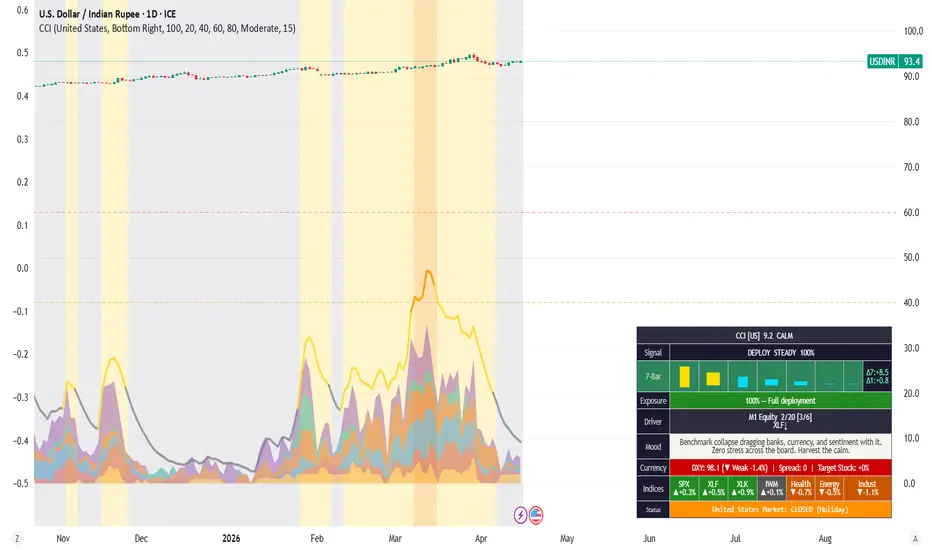
CCI - Country Crisis IndexCountry Crisis Index (CCI) — Real-Time Country-Level Risk Dashboard
The Country Crisis Index answers one question: how bad is it HERE, specifically?
While global indices tell you what the world is doing, CCI drills into a single country's stress across six dimensions — equity markets, currency flight, inflation, sovereign credit, external vulnerability, and political sentiment — and compresses it into a single 0-100 score with actionable trading guidance.
🔢 Six Scoring Modules
Module Weight What It Captures
M1 Domestic Equity Stress 0-20 Benchmark z-score, bank/benchmark ratio, smallcap rotation, VIX, sector breadth
M2 Currency & Capital Flow 0-20 FX rate-of-change (1/3/5-bar with decay), FX z-score, yield spikes, sovereign spread, DXY-adjusted move
M3 Inflation & Cost of Living 0-15 Oil-in-local-currency, gold-in-local breakout, wheat, copper, natural gas
M4 Sovereign & Credit Risk 0-20 Sovereign spread level + momentum, bank sector weakness, HYG credit, correlation break
M5 External Vulnerability 0-15 Oil import stress, trade partner z-score, US 10Y momentum, DXY strength
M6 Political & Sentiment 0-10 VIX event risk, PSU/private divergence, smallcap drawdown, sustained volatility
🚦 Five Threat Levels
L0 CALM (0-19) — Full deployment. Business as usual.
L1 ALERT (20-39) — Something twitching. Tighten stops.
L2 WARNING (40-59) — Hedge the book. Rotate to quality.
L3 DANGER (60-79) — Capital preservation mode. Cut weak names.
L4 CRISIS (80-100) — Maximum defensive. Survive first, profit later.
📊 9-Row Dashboard
The table packs everything a trader needs into a single glance:
Score & Level — CCI value with threat classification and country code
Signal & Direction — Action signal (DEPLOY → EXIT ALL) with crisis momentum (SURGING / RISING / FLAT / COOLING / RETREATING)
7-Bar Sparkline — Colour-coded trend: red = crisis rising, green = easing, gray = steady. Includes Δ7 and Δ1 deltas
Exposure — Recommended portfolio allocation percentage with guidance text
Driver — Which module is dominant plus active feed tags (Bank↓, Oil(52H), VIX↑, etc.)
Mood — 3-line editorial combining observation + reaction + insight, with 465+ sentence combinations adapting to timeframe, threat level, and trend direction
Currency — Local exchange rate (e.g., ₹84.35/$), FX direction, sovereign spread, target stock move
Indices — 7-index heatmap with last session % change and ▲/▼ arrows
Status — Market open/closed with distinct colours for after hours, holidays, and weekends (OHLC-verified, not just clock-based)
🌏 10 Country Profiles
Select from the dropdown: India (default, fully implemented), United States, United Kingdom, Japan, Germany, China, Australia, Brazil, South Korea, Turkey.
Each profile maps 11 country-specific symbols plus configuration flags for FX direction, emerging market volatility scaling, oil importer weighting, timezone, and market hours.
⚙️ Key Mechanics
Asymmetric Smoothing — Crisis rises fast (3-bar EMA), eases slowly (10-bar EMA). Designed to catch the elevator down but not the escalator up.
Convergence Multiplier — When 3+ modules fire simultaneously, the score amplifies (1.15x to 1.5x). Multi-front stress is worse than the sum of parts.
EM Volatility Scaling — Emerging market FX thresholds are scaled wider (India 1.2x, Turkey 1.8x) because a 1% move in the rupee is not the same as 1% in the dollar.
Timeframe Adaptive — Works on any chart timeframe. All data feeds use chart resolution. Mood text adapts language for intraday scalpers, daily swing traders, and weekly allocators.
Holiday Detection — Uses OHLC stale-data verification, not just clock hours. Correctly identifies exchange holidays even on 24/7 chart symbols.
📡 Webhook JSON Export
Full indicator state exported as JSON via TradingView alerts — score, all six module values, 22 price feeds, Δ7/Δ1 deltas, dominant driver, exposure, session status, mood text, sub-headline, and multi-sentence narrative. Ready for downstream apps, dashboards, or notification systems.
🔗 Companion to WCI
CCI is designed to work alongside the World Crisis Index (WCI). WCI answers "how bad is the world?" — CCI answers "how bad is it here?" Together they give you global macro context and country-specific risk in one view. Default table positions avoid overlap (WCI top-right, CCI bottom-right).
Data: 22 of 40 request.security() calls. No repainting. Pine Script v6.
Indicator
Indicator

Ninja Trader - Order Flow Smart Footprint 📘 User Manual: Order Flow Smart Footprint
The Order Flow Smart Footprint acts as an "X-ray" for your charts. It breaks down standard price candles into their volume components, identifying aggressive buyers/sellers and highlighting institutional-level activity (Smart Money).
1. Visual Elements & Their Meaning
🔴/🟢 Volume Clusters (Circles)
What it is: Circles plotted on the candle at the price level where the highest volume imbalance occurred.
Green Circle: Aggressive buyers have taken control. This is a strong Bullish signal.
Red Circle: Aggressive sellers are dominating. This is a strong Bearish signal.
How to use: Finding a cluster at a Support/Resistance level confirms that institutions have started entering positions.
📊 Point of Control (POC) Lines
What it is: Horizontal dashed lines inside every candle.
Significance: This represents the specific price level where the most trading activity occurred during that candle.
How to use: The POC acts as a "price magnet." If the price stays above the POC in subsequent candles, the trend is strong. If the price crosses the POC to the opposite side, a trend reversal is likely.
🔢 Bar Delta Labels (+500 / -300)
What it is: Numerical values displayed above or below the candles.
Significance: The net difference between market buy volume and market sell volume.
Positive Delta (+): More aggressive buying pressure.
Negative Delta (-): More aggressive selling pressure.
How to use: Use this to spot "Absorptions." For example, if a candle is green but the Delta is negative, it suggests sellers are secretly absorbing the buyers' orders, signaling a potential drop.
🎨 Background Heatmap (Color Shading)
What it is: Soft background coloring behind specific bars.
Significance: Indicates zones of "Panic Buying" or "Panic Selling" where the Order Flow imbalance is extreme.
2. Settings (Inputs)
Imbalance Ratio: Controls the sensitivity of the indicator. A higher number (e.g., 3.0) will only show the most significant Smart Money traces. A lower number (e.g., 1.5) will provide more frequent signals.
Show POC Lines: Toggle to enable or disable the high-volume concentration lines.
Show Bar Delta: Toggle the numerical display of the buy/sell volume difference.
3. Trading Strategies
A. Trend Continuation
Condition: Market is in a clear uptrend.
Signal: A green candle appears with a Green Cluster (Circle) and positive Delta.
Action: Enter Long, as this confirms aggressive institutional participation in the direction of the trend.
B. Reversal & Absorption
Condition: Price reaches a major resistance level.
Signal: A Red Cluster appears at the very top of a green candle, or a negative Delta is seen on a bullish candle.
Action: Prepare for a Short entry, as this indicates "Supply" is entering the market and buyers are being exhausted.
4. Important Notes
Timeframes: This indicator is most effective on "Intraday" timeframes (1m, 5m, 15m) where Order Flow activity is most granular.
Confirmation: Never use this indicator in isolation. Always combine it with Market Structure (HH/HL) or identified Support and Resistance zones.
This tool gives you the edge to see "under the hood" of the market, allowing you to follow the footprints of institutional traders rather than just reacting to price movement.
Happy Trading!
Indicator

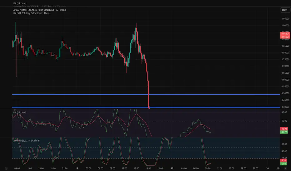
RSI EMA Dot (Long Below / Short Above)RSI EMA Cross Dot Indicator
This indicator identifies potential reversal points by combining RSI extremes with momentum shifts.
A signal is generated when the RSI (14) crosses its EMA (14) after being in an extreme zone:
Long signal (green dot below the candle):
RSI was below 20 (oversold) and then crosses above its EMA.
Short signal (red dot above the candle):
RSI was above 80 (overbought) and then crosses below its EMA.
Dots are plotted directly on the chart:
Long signals appear below the candle
Short signals appear above the candle
This helps highlight potential market reversals after extreme conditions, making it useful for identifying high-probability reaction zones.
Indicator
Chandelier Exit PRO (Fixed)This script is a trend-following trading indicator that:
Uses ATR (volatility) to create dynamic stop levels
Detects trend direction changes (uptrend / downtrend)
Generates BUY signals when trend turns bullish
Generates SELL signals when trend turns bearish
Uses ADX to avoid sideways markets and reduce false signals
Indicator

Vigilant Asset Allocation (VAA)1. Where VAA comes from
The basic observation behind VAA is not new. Jegadeesh and Titman showed in 1993 that stocks with strong recent returns keep outperforming for roughly three to twelve months. That finding was initially confined to equities, but Asness, Moskowitz and Pedersen (2013) later confirmed that the same pattern holds across bonds, currencies and commodities. Momentum, it turns out, is not just a stock-picking anomaly. It works at the asset-class level too.
Moskowitz, Ooi and Pedersen (2012) took this one step further. They looked at time-series momentum rather than cross-sectional momentum. The distinction matters: cross-sectional momentum asks "which asset is doing best?", while time-series momentum asks "is this asset going up at all?". VAA uses both questions, but the time-series version is what drives the breadth filter.
Faber (2007) probably deserves credit for bringing momentum into mainstream tactical allocation. His rule was simple: hold an asset when it trades above its ten-month average, sell when it drops below. Crude, but it cut drawdowns significantly. Antonacci (2014) refined this into dual momentum, combining trend direction with relative strength across two universes.
Keller and Keuning (2017) built on all of this but added something the earlier models lacked: a breadth dimension. Instead of looking at each asset independently, they count how many offensive assets carry positive momentum. If even one drops below zero (in the aggressive B=1 variant), the entire allocation goes defensive. The reasoning is straightforward. When breadth deteriorates, trouble is usually on the way. Waiting for every asset to turn negative is waiting too long.
In their original backtest (1970-2016, using Shiller extended data for the early period and ETF prices from inception), VAA-G4 produced roughly 17.7% annualised with a maximum drawdown of about 16.1% (Keller and Keuning, 2017, Table 2). These are in-sample numbers. They tell you what happened, not what will happen.
2. How the model works
2.1 Momentum scoring
Every asset gets a 13612W score, a weighted combination of four return lookbacks:
mom = 12 * r1 + 4 * r3 + 2 * r6 + r12
The r values are simple returns: r1 = close / close - 1, and so on for 63, 126 and 252 bars. The one-month return gets the heaviest weight (12), the twelve-month return the lightest (1). Recent momentum matters more, but the yearly anchor keeps the score from overreacting to short-term noise.
There is no normalisation. The raw score is used only for two things: ranking assets within each universe, and checking whether it is positive or negative for the breadth count.
2.2 The two universes
Keller and Keuning specified these defaults:
Offensive (growth):
- SPY (S&P 500)
- EFA (international developed)
- EEM (emerging markets)
- AGG (US aggregate bonds)
Defensive (preservation):
- LQD (investment-grade corporate bonds)
- IEF (7-10 year treasuries)
- SHY (1-3 year treasuries)
All seven are changeable in the settings. If you swap in other ETFs, make sure they have enough history.
2.3 The breadth rule
Each day the indicator counts how many offensive assets have positive momentum. Call the count of non-positive ones n_negative. The rule:
- n_negative >= B (default 1): go to the top defensive asset
- n_negative < B: go to the top offensive asset
With B=1, one single negative asset triggers the switch. That is aggressive in the sense of being quick to flee. Keller and Keuning argue this is the right trade-off. Breadth erosion tends to precede broader sell-offs, so early rotation is worth the occasional whipsaw.
2.4 Rebalancing
The paper prescribes monthly rebalancing. The indicator locks the allocation at the close of the last trading day of each month. Everything that happens between rebalances is monitoring only. The dashboard shows both the locked position ("held") and what the model would do today ("live").
Daily rebalancing is available as an option. It is not what the paper tested.
2.5 Ties
When two assets have the exact same momentum score, the one listed first wins. Sounds arbitrary because it is. But four overlapping return windows make exact ties rare in practice.
3. What you need
- TradingView, any plan (free works, Pro lifts the alert cap)
- A daily chart. The lookbacks assume daily bars. On weekly or intraday charts the periods are wrong and the dashboard flags it.
- 252 bars of history for every symbol. Until that is available, the model shows "warming up".
4. Setup and settings
4.1 Getting started
Add the indicator to any daily chart via the TradingView indicator search. It loads with the Keller/Keuning defaults. The status row at the bottom of the dashboard tells you when the model is ready.
4.2 Strategy
Breadth Threshold (B): 1 matches the paper. Raising it to 2 means two assets have to go negative before the model rotates. Fewer whipsaws, slower reaction.
Monthly Rebalancing: On by default. Off gives you daily updates, which is useful for experimentation but not what the literature tested.
4.3 Symbols
Offensive and defensive universes are fully configurable. If you replace an ETF, check that TradingView has daily data going back at least a year.
4.4 Visuals
Background Mode: "Position" tints the background green (offensive) or red (defensive). "Off" removes it.
Candle Colouring: Paints candles by breadth strength. Full green at 4/4 positive, full red at 0/4, faded tones in between. Transparency is adjustable.
Color Theme: Eight palettes. All of them work in both dark and light mode.
Glow Effect: Adds layered transparent lines behind the main plot. Useful if the signal gets lost in a busy chart. Off by default.
4.5 Dashboard
The table in the top right (moveable) shows:
- Regime: offensive or defensive, with the breadth count
- Allocate: which specific ETF to hold (100% always)
- Live: intra-month reading (only visible in monthly mode)
- Individual asset rows: 13612W scores and a trend arrow (up, down, or flat compared to 5 bars ago)
- Status: "active", "warming up", or "wrong timeframe"
4.6 Alerts
Five conditions, all behind a master switch:
- Regime switches to offensive at month-end
- Regime switches to defensive at month-end
- Held asset changed (same regime, different pick)
- Live breadth dropped between rebalances
- Live breadth recovered between rebalances
The live alerts are early warnings, not trade signals. They tell you the next rebalance might produce a change.
5. Reading the chart
The step line maps the breadth count to a 0-10 scale:
| Breadth | Value | What it means |
| 4/4 positive | 0.0 | Everything trending up |
| 3/4 positive | 2.5 | One weak link, still offensive with B=1 |
| 2/4 positive | 5.0 | Defensive if B is 2 or below |
| 1/4 positive | 7.5 | Broad weakness |
| 0/4 positive | 10.0 | Nothing working |
The threshold line sits at B * 2.5. Above it means defensive. The zone fill below the threshold marks the offensive region.
One thing to keep in mind: the distances between these steps do not mean anything quantitative. 5.0 is not "twice as bad" as 2.5. It is an ordinal display, not a risk score.
6. How to actually use it
The simplest workflow: check the dashboard on the last trading day of the month. Look at the "Allocate" row. Buy that ETF at the open of the next session. Done until next month.
If you want a heads-up, turn on the live alerts. A "breadth dropped" alert mid-month tells you the next rebalance might flip regimes. That gives you time to plan, not to act early. The month-end values are what count.
VAA does not know about your taxes, your broker fees, or your risk tolerance. Treat it as one input to your decision process, not the whole process.
7. What the model does not do
It does not model execution. There is no bid-ask spread, no slippage, no market impact.
It cannot protect you from whipsaws. Momentum systems by nature struggle in choppy, directionless markets. The breadth filter helps, but a month where sentiment flips back and forth will still produce unnecessary trades.
Monthly rebalancing is both a feature and a weakness. It keeps you from overtrading, but it also means a crash in the middle of a month does not trigger any action until month-end.
The backtests in the paper used extended data that goes back to 1970. The actual ETFs (EEM, AGG) only started trading in 2003. TradingView data will not replicate the full historical period.
The model is always invested. There is no cash option. You are either in the top offensive or the top defensive ETF.
Momentum can stop working. Correlations change. What the academic literature documents as a persistent anomaly can go through multi-year stretches of underperformance. The 2009 recovery, for instance, was fast enough to catch most trend-following systems off-guard.
8. Common questions
Why does it say "warming up"?
The model needs 252 daily bars per symbol. Loading the indicator on a chart without enough history means it cannot compute the twelve-month return component.
Can I run this on a 4-hour chart?
You can, but 21 bars on a 4-hour chart is not a month. The lookbacks will be wrong. The dashboard will flag this.
I changed the symbols and the readings look off.
Make sure the replacement ETFs actually have a year of daily data on TradingView. Some regional ETFs or newer funds do not.
The live reading disagrees with the held position.
That is expected in monthly mode. The held position only updates at month-end. The live reading shows what would happen if you rebalanced today. They diverge by design.
Should I trade every time the live reading changes?
No. Unless you deliberately turned off monthly rebalancing, the live reading is for awareness, not for execution.
References
Antonacci, G. (2014) Dual Momentum Investing: An Innovative Strategy for Higher Returns with Lower Risk. New York: McGraw-Hill.
Asness, C.S., Moskowitz, T.J. and Pedersen, L.H. (2013) 'Value and Momentum Everywhere', The Journal of Finance, 68(3), pp. 929-985. doi:10.1111/jofi.12021.
Faber, M.T. (2007) 'A Quantitative Approach to Tactical Asset Allocation', The Journal of Wealth Management, 9(4), pp. 69-79.
Jegadeesh, N. and Titman, S. (1993) 'Returns to Buying Winners and Selling Losers: Implications for Stock Market Efficiency', The Journal of Finance, 48(1), pp. 65-91. doi:10.1111/j.1540-6261.1993.tb04702.x.
Keller, W. and Keuning, J.W. (2017) 'Breadth Momentum and Vigilant Asset Allocation (VAA): Winning More by Losing Less', SSRN Electronic Journal. doi:10.2139/ssrn.3002624.
Moskowitz, T.J., Ooi, Y.H. and Pedersen, L.H. (2012) 'Time series momentum', Journal of Financial Economics, 104(2), pp. 228-250. doi:10.1016/j.jfineco.2011.11.003.
Indicator

GOLDM Regime Detector v2.0
## **GOLDM Regime Detector v2.0**
**Institutional-Grade Options Selling Framework for MCX Gold Mini**
---
### **Overview**
GOLDM Regime Detector v2.0 is a **rule-based decision engine** built for systematic option sellers operating in **MCX Gold Mini (GOLDM)**.
Unlike traditional indicators that generate isolated signals, this framework continuously evaluates market structure and outputs a **complete trading stance** — covering **regime, structure, strike placement, position sizing, and exits**.
The objective is simple:
> **Trade the right structure, in the right environment, with controlled risk.**
---
### **Regime Architecture**
The model classifies market conditions into four execution states:
* **Regime 1 — Premium Selling (Full Size)**
Range-bound market with stable volatility
→ Deploy **Iron Condors / Strangles**
* **Regime 2 — Directional Selling (Full Size)**
Orderly trend with controlled volatility
→ Deploy **Credit Spreads aligned with trend**
* **Regime 3 — Reduced Exposure (Half Size)**
Suboptimal or uncertain conditions
→ Trade **wider strikes with reduced capital**
* **Regime 4 — Defensive Mode**
Volatility expansion or structural break
→ **No new exposure — manage or exit existing positions**
---
### **Model Construction**
The system integrates multiple dimensions of market behavior:
* **Trend** → EMA slope + ADX (direction + strength)
* **Volatility** → ATR percentile + expansion dynamics
* **Positioning** → Bollinger %B (range vs extremes)
* **Time Risk** → Days to Expiry (DTE constraints)
* **Event Risk** → Manual override for macro events
Each regime is triggered only when conditions align across these factors, ensuring **context-aware execution rather than reactive trading**.
---
### **Strike Engineering**
All strike levels are **systematically derived from ATR**, ensuring consistency across volatility regimes:
* Dynamic distance from spot based on regime quality
* Wider strikes in adverse conditions
* Rounded to **MCX-standard 500 intervals**
This removes discretionary bias from strike selection and aligns risk with market conditions.
---
### **Embedded Risk Framework**
The script includes a predefined exit structure:
* **Profit Capture** → 40–50% premium decay
* **Stop Loss** → Premium expansion threshold (2× entry)
* **Time Exit** → Forced closure near expiry
* **Regime Transition** → Automatic shift to defensive posture
* **Partial Management** → Profit lock-in with trailing logic
---
### **Execution Interface**
* Real-time **regime classification**
* **Suggested structure** (IC / spreads)
* **Strike levels plotted on chart**
* **Confidence score**
* **DTE and event warnings**
* Fully integrated **decision dashboard**
---
### **Usage Guidelines**
* Apply on **MCX:GOLDM1! or front-month futures**
* Optimized for **Daily timeframe**
* Execute systematically — **regime → structure → strikes → risk management**
* Designed for traders prioritizing **process over prediction**
---
### **Positioning**
This framework is built for traders who:
* Prefer **structured decision-making over discretionary trading**
* Want **consistency across market regimes**
* Understand that **edge comes from execution discipline, not prediction**
---
### **Disclaimer**
This tool provides a structured framework for decision-making.
Execution, risk management, and capital allocation remain the responsibility of the user.
---
Indicator

Supertrend ScalpingThis Pine Script indicator called “Supertrend Scalping” is designed for scalping strategies and is built around the Supertrend indicator, enhanced with a complete trade management system including multiple Take Profit (TP) levels and a dynamic Stop Loss (SL).
The script begins by calculating the ATR (Average True Range), which measures market volatility. The user can choose between the standard ATR (RMA) or a simple moving average version (SMA). This ATR is then used to construct the Supertrend bands by adding and subtracting a multiple of the ATR from a price source (by default, hl2). These bands adjust dynamically and define the trend: when price breaks above the upper band, the trend turns bullish; when it breaks below the lower band, the trend becomes bearish.
Trading signals are generated when the trend changes direction. A BUY (LONG) signal appears when the trend shifts from bearish to bullish, while a SELL (SHORT) signal appears when it shifts from bullish to bearish. At each new signal, the script initializes a virtual trade using the current closing price as the entry point.
The core strength of this script lies in its trade management system. It automatically calculates three Take Profit levels (TP1, TP2, TP3) and an initial Stop Loss, all based on configurable ATR multiples. These levels are displayed on the chart using colored lines and labels. The script then continuously monitors price action to detect when these levels are reached.
When a Take Profit level is hit, it is visually removed. If TP1 is reached, the Stop Loss can be moved to the entry price (break-even). If TP2 is reached, the Stop Loss is moved up to the TP1 level. This creates a smart trailing stop mechanism that progressively locks in profits. If either TP3 or the Stop Loss is hit, the trade is fully closed and all visual elements are cleared.
Additionally, the script updates label positions in real time so they follow the current bar, and it highlights the active trend with a colored background (green for bullish, red for bearish). It also includes alert conditions for entry signals as well as TP and SL hits.
In summary, this indicator goes beyond simple signal generation by offering a complete scalping framework, combining entry signals, structured profit targets, risk management, and volatility-based adaptability.
Indicator
