Auto Fibonacci ZonesAuto Fibonacci Zones is a visual Fibonacci retracement tool built around confirmed swing pivots.
The script automatically detects the most recent significant swing leg using confirmed pivot highs and pivot lows, then draws Fibonacci retracement levels from that leg. It is designed to reduce the need for manually redrawing Fibonacci levels each time a new swing structure forms.
What the script shows
- Fibonacci retracement levels from the latest confirmed swing leg
- Optional Fibonacci extension levels
- A highlighted 0.5 - 0.618 retracement zone
- A dashed anchor leg showing the selected swing
- A compact state label describing the current retracement condition
- Optional alerts for key retracement events
How it works
The script uses confirmed pivot highs and confirmed pivot lows to define the current swing leg. A new Fibonacci sheet is accepted only when the detected high-low leg is large enough relative to ATR. This helps avoid redrawing levels on very small price movements.
The main retracement levels include:
- 0
- 0.382
- 0.5
- 0.618
- 0.786
- 1
The script can also show optional extension levels:
- 1.272
- 1.618
Extensions are disabled by default because they are reference geometry only and should not be interpreted as price forecasts.
Level sets
The user can choose between three level display modes:
- Core: shows 0, 0.5, 0.618, and 1
- Major: shows the main Fibonacci levels with a cleaner chart layout
- Standard: shows the common retracement levels
Golden zone
The script highlights the area between 0.5 and 0.618. This zone is commonly watched by traders as a retracement area, but it should not be treated as a guaranteed reversal zone or standalone trading signal.
State label
The state label gives a quick reading of the current retracement condition, such as:
- Shallow retracement
- Deep retracement
- Inside 0.5 - 0.618 zone
- Near full retrace
- Full retrace exceeded
- Beyond 0 level
The state label is only a descriptive reading of where price is relative to the current Fibonacci sheet.
Old or inactive sheets
The script includes options to fade older or fully retraced Fibonacci sheets. This helps keep the chart clean when the selected swing leg is no longer fresh or has already been fully retraced.
Main settings
Swing Detection:
- Pivot strength
- Minimum leg height x ATR
Levels:
- Level set
- Show extensions
- Shade 0.5 - 0.618 zone
Display:
- Show anchor leg
- Show level labels
- Show level prices
- Show state label
- State label offset
- Fade old / invalid sheet
- Expire sheet after bars
Lines and colors:
- Level line width
- Key level line width
- Anchor leg width
- Level colors
- Golden zone color
- Extension color
- Label colors
- Transparency controls
Alerts
The script includes alert conditions for:
- Price entering the 0.5 - 0.618 zone
- Price exiting the 0.5 - 0.618 zone
- Price crossing the 0.618 level
- Price touching or exceeding the 1.0 retracement level
- Price retesting the 0 level
These alerts are descriptive chart events. They are not buy or sell signals.
Repainting and confirmation note
This script uses confirmed pivot highs and confirmed pivot lows. A pivot can only be confirmed after the selected pivot-strength bars have passed.
Because of this, Fibonacci anchors appear only after confirmation. When a newer valid swing leg is confirmed, the current Fibonacci sheet can be replaced by the new one.
This is normal confirmation delay for pivot-based tools. The script does not use lookahead, and the levels are based on confirmed swing structure.
Limitations
Fibonacci levels are visual reference levels, not predictive levels.
A price reaction near any Fibonacci level does not guarantee continuation, reversal, support, or resistance.
The selected swing leg is determined automatically by the script. In some cases, a trader may manually choose a different swing leg based on broader market context.
This indicator is intended for chart analysis, education, and visual review of retracement structure. It is not a trading system, financial advice, or a standalone buy/sell tool. Indicator

Key Levels - By DukleKEY LEVELS — current day dH / dO / dL and previous day pdH / pdL
WHAT IT DOES
Draws the five reference levels most day traders check first, as clean horizontal lines with small tags to the right of each line: the current day's Open (dO), High (dH) and Low (dL), plus the previous day's High and Low (pdH, pdL) in a second color.
HOW IT WORKS
The levels are computed directly from the chart's own intraday bars — no higher-timeframe security calls. The day boundary follows the symbol's exchange trading day, the same boundary the built-in daily candles use. dO is fixed at the session open. dH and dL update in real time: the moment price prints a new high or low of the day, the line moves with it — that is by design, since "today's high so far" is a moving value until the session closes. At the daily rollover, the finished day's high and low become the new pdH and pdL, and the current-day lines reset to the new open.
HOW TO USE IT
Works on any intraday timeframe (it deliberately draws nothing on Daily and above, where the current candle already is the day). Typical uses: pdH/pdL as breakout or rejection zones for the session, dO as the intraday bull/bear line, dH/dL as the developing range. All five lines can be toggled individually; colors, line width and how far the lines extend to the right of price are configurable in the settings.
NOTES
The current-day lines updating with new highs/lows is intended behavior, not lookahead — the previous-day levels never change during the session. Nothing here is financial advice.
Indicator

MRB Cycle Oscillator Alpha**Overview**
The "MRB Cycle Oscillator Alpha" is a highly advanced, multi-dimensional momentum and trend-analysis tool. It is not just another MACD; it upgrades traditional momentum concepts by combining Triple Exponential Smoothing (TES), mathematically derived momentum "Cycle Candles," RSI-confluent Bollinger Bands, and an ADX/DMI-driven background. This provides traders with a unified dashboard for trend direction, momentum strength, and mean-reversion zones without cluttering the main chart.
**What makes it original? (Core Concepts)**
This script brings originality to the Community Scripts by fusing several independent mathematical concepts into a single cohesive oscillator:
1. **TES-MACD (Triple Exponential Smoothing):** Instead of standard EMAs, this indicator calculates the MACD utilizing a custom Triple Exponential Smoothing (TES) algorithm. This significantly reduces market noise and lag compared to a traditional MACD.
2. **Momentum Cycle Candles:** Instead of displaying a raw oscillator line, the script extracts the open, high, low, and close values directly from the TES-MACD's historical delta. It then applies a custom smoothing algorithm to generate "Cycle Candles." This unique transformation visualizes momentum shifts and trend persistence much more clearly than a standard line or histogram.
3. **RSI-Dynamic Bollinger Bands:** Bollinger Bands are applied directly to the oscillator (users can choose to base it on the MACD Line EMA or the Signal Line TES). Furthermore, the outer bands dynamically change color based on the traditional chart's RSI values (e.g., turning green when RSI is overbought, red when oversold). This provides a dual-confirmation for extreme conditions.
4. **ADX/DMI Background Matrix:** The indicator calculates ADX and ±DI in the background. If the ADX crosses a user-defined threshold, the chart background changes color based on the dominant DI (green for uptrends, red for downtrends). This acts as a macro-trend filter.
**How to use it**
* **Trend Confirmation:** Use the background color (driven by ADX/DMI) to filter your trades. Only look for long setups when the background is green, and short setups when red.
* **Momentum Shifts:** Watch the color and body of the Cycle Candles in the oscillator pane. A transition from red to green indicates a shift to bullish momentum.
* **Overextended Zones (Mean Reversion):** When the Cycle Candles pierce the outer Bollinger Bands, AND the bands themselves change color (triggered by RSI extremes), it signals a highly overextended market, warning of a potential reversal or pullback.
**Customization**
Every element is modular. Traders can disable the Cycle Candles view in favor of a standard line, toggle the Bollinger Bands, adjust the RSI thresholds for band coloring, and fine-tune the ADX/DMI periods for background filtering. Indicator

Liquidity Sweep Detector ProLiquidity Sweep Detector Pro with Smart Trade Setups
Overview
Liquidity Sweep Detector Pro with Smart Trade Setups is an advanced Pine Script® v6 indicator designed to identify one of the most important institutional price action concepts in modern financial markets: Liquidity Sweeps.
Instead of relying on traditional indicators that simply react to price movement, this indicator focuses on how liquidity is collected around swing highs and swing lows, how false breakouts occur, and where institutions may trigger stop-loss orders before reversing price.
The indicator automatically detects Buy-Side Liquidity, Sell-Side Liquidity, confirmed liquidity sweeps, and then generates a structured trade setup complete with Entry, Stop Loss, and Take Profit zones. Every sweep is evaluated using a proprietary scoring system that combines multiple market factors into a single confidence score.
The purpose of this indicator is not to predict the future, but to organize liquidity-based market behavior into a clear visual framework that helps traders identify high-quality reversal opportunities and potential institutional activity.
---
Why This Indicator Was Created
Most liquidity indicators only highlight swing highs and swing lows or draw simple liquidity lines. They often leave traders with the difficult task of manually deciding whether a sweep is genuine, whether the rejection is strong enough, and where a logical trade setup should be placed.
Liquidity Sweep Detector Pro was created to automate this entire workflow.
Instead of requiring multiple indicators, it combines liquidity detection, sweep confirmation, scoring, trend filtering, session filtering, dynamic trade setup generation, and live market statistics into a single comprehensive tool.
The objective is to simplify institutional liquidity analysis while keeping the chart clean, organized, and easy to interpret.
---
How the Indicator Works
The indicator continuously scans the chart for confirmed swing highs and swing lows.
These swing points become potential liquidity pools where market participants commonly place stop-loss orders.
Once a sufficient number of highs or lows cluster together, the indicator identifies them as:
• Buy-Side Liquidity
• Sell-Side Liquidity
These liquidity areas remain active until price interacts with them.
When price temporarily moves beyond one of these liquidity pools but quickly closes back inside the previous range, the indicator identifies this behavior as a Liquidity Sweep rather than a genuine breakout.
After confirmation, the sweep is analyzed using multiple filters before being displayed on the chart.
---
Buy-Side & Sell-Side Liquidity Detection
The indicator automatically marks important liquidity locations throughout the market.
Buy-Side Liquidity
Buy-Side Liquidity represents areas above previous highs where stop-loss orders from short positions and breakout buy orders commonly accumulate.
When price briefly trades above these highs but immediately returns back below them, the indicator identifies a Bearish Liquidity Sweep.
The chart labels these levels as:
Buy Side Liq
---
Sell-Side Liquidity
Sell-Side Liquidity represents areas below previous lows where stop-loss orders from long positions are typically concentrated.
When price temporarily trades below these lows before rapidly reversing back upward, the indicator identifies a Bullish Liquidity Sweep.
The chart labels these levels as:
Sell Side Liq
---
Liquidity Sweep Confirmation
A sweep is not confirmed simply because price trades beyond a previous high or low.
Several confirmation filters are applied before the signal becomes valid.
These include:
• ATR displacement confirmation
• Relative volume confirmation
• Market structure validation
• Candle rejection strength
• Liquidity cluster quality
• Session filtering
• Trend filtering (optional)
Only when these conditions align does the indicator generate a confirmed liquidity sweep.
This helps reduce false signals while focusing on stronger market reactions.
---
Smart Strength Score
Every detected sweep receives a proprietary Strength Score ranging from 0 to 100.
The score is calculated using multiple components including:
• Liquidity quality
• Number of liquidity touches
• ATR displacement
• Relative volume
• Rejection candle strength
• Market structure
• Age of the liquidity level
Higher scores indicate stronger technical confirmation.
The indicator also displays a star rating to provide an instant visual assessment of signal quality.
Example:
★★★★★ Elite
★★★★ Strong
★★★ Good
★★ Moderate
★ Weak
This allows traders to prioritize higher-confidence setups.
---
Automatic LONG & SHORT Trade Setups
One of the most unique features of this indicator is its ability to automatically generate a complete trade setup immediately after a confirmed liquidity sweep.
After a Bullish Liquidity Sweep
When the indicator detects that Sell-Side Liquidity has been swept, it automatically builds a LONG setup.
The setup includes:
• Entry Zone
• Stop Loss Zone
• Target Zone
• Risk-to-Reward calculation
---
After a Bearish Liquidity Sweep
When the indicator detects that Buy-Side Liquidity has been swept, it automatically builds a SHORT setup.
The setup includes:
• Entry Zone
• Stop Loss Zone
• Target Zone
• Risk-to-Reward calculation
This provides traders with a structured trade framework instead of only highlighting the sweep itself.
---
Automatic Risk Management Visualization
Each generated setup includes clearly displayed trading zones.
The indicator automatically draws:
• Green Target Zone
• Red Stop Loss Zone
• Entry Price
• Stop Loss Price
• Target Price
These zones remain visible on the chart, allowing traders to easily evaluate the trade structure and monitor price progression after the sweep.
---
Liquidity Zones
Following each confirmed sweep, the indicator creates a liquidity reaction zone.
These zones represent the area where institutional rejection occurred.
Users can configure how these zones behave after price revisits them.
Available options include:
• Extend
• Fade
• Delete
This provides flexibility depending on individual trading preferences.
---
Trend Filter
An optional trend filter helps align liquidity sweeps with the broader market direction.
Supported filters include:
• EMA 50
• EMA 200
• EMA 50 + EMA 200
When enabled, the indicator prioritizes sweeps that occur in alignment with the selected trend.
---
Session Filter
The indicator can restrict sweep detection to specific Forex trading sessions.
Supported sessions include:
• Sydney
• Tokyo
• London
• New York
Users can analyze liquidity behavior only during preferred institutional trading hours.
---
Dashboard
A real-time dashboard summarizes important market statistics, including:
• Bullish Sweeps Today
• Bearish Sweeps Today
• Strong Sweeps
• Weak Sweeps
• Average Strength Score
• Highest Score
• Current Market Trend
• Active Trading Session
This allows traders to quickly evaluate current market conditions without manually reviewing the entire chart.
---
Alerts
The indicator includes alert conditions for:
• Bullish Liquidity Sweep
• Bearish Liquidity Sweep
• Strong Sweep
• Elite Sweep
• Liquidity Zone Filled
• LONG Setup Created
• SHORT Setup Created
• Target Hit
• Stop Loss Hit
These alerts allow traders to monitor liquidity events without continuously watching the chart.
---
Works on Any Market
Although designed primarily for institutional Forex trading, the indicator also performs effectively on:
• Forex
• Gold
• Silver
• Indices
• Futures
• Commodities
• Cryptocurrency
• CFDs
• Stocks
Because liquidity exists in every actively traded market, the underlying methodology remains applicable across multiple asset classes.
---
Works on Any Timeframe
The indicator automatically adapts to every TradingView timeframe, including:
• 1 Minute
• 3 Minute
• 5 Minute
• 15 Minute
• 30 Minute
• 1 Hour
• 4 Hour
• Daily
• Weekly
Lower timeframes are generally more suitable for scalping and intraday liquidity analysis, while higher timeframes provide broader institutional market context.
---
Typical Trading Workflow
A common workflow using this indicator is:
1. Allow the indicator to identify Buy-Side and Sell-Side Liquidity.
2. Wait for a confirmed liquidity sweep.
3. Review the Strength Score and star rating.
4. Confirm the setup using your preferred market analysis.
5. Use the automatically generated LONG or SHORT setup as a structured trading framework.
6. Monitor the trade using the predefined Entry, Stop Loss, and Target zones.
7. Manage risk according to your personal trading plan.
---
Key Features
✔ Automatic Buy-Side Liquidity Detection
✔ Automatic Sell-Side Liquidity Detection
✔ Liquidity Sweep Confirmation
✔ Proprietary Strength Score (0–100)
✔ ATR Confirmation
✔ Relative Volume Confirmation
✔ Market Structure Confirmation
✔ Session Filter
✔ Trend Filter
✔ Automatic LONG Setup Generation
✔ Automatic SHORT Setup Generation
✔ Entry, Stop Loss & Target Visualization
✔ Dynamic Liquidity Zones
✔ Real-Time Dashboard
✔ Custom Alerts
✔ Fully Customizable Inputs
✔ Supports All Markets
✔ Compatible with All Timeframes
✔ Clean Institutional Chart Visualization
---
Important Note
This indicator is designed as a liquidity and market structure analysis tool. It does not guarantee profitable trades, predict future market direction, or provide financial advice. All automatically generated trade setups are based on predefined liquidity sweep conditions and should be used alongside your own technical analysis, market context, and disciplined risk management.
---
Originality & Author Verification
Liquidity Sweep Detector Pro with Smart Trade Setups is an original Pine Script® v6 implementation independently researched, designed, and developed by Forex_Market_Insights.
The complete concept, indicator architecture, liquidity workflow, visualization, scoring methodology, trade setup generation, dashboard design, user interface, confirmation logic, and overall implementation were created specifically for this project from first principles.
This script is not a clone, copy, conversion, or modification of any existing TradingView publication. While concepts such as liquidity, swing highs/lows, ATR, volume, market structure, and price action are widely known within technical analysis, the way they are combined, processed, scored, and presented in this indicator represents an original implementation developed by the author.
Author: Forex_Market_Insights
Pine Script® Version: v6
Implementation: Original
Concept & Design: Original
Algorithm: Original
Visualization: Original
Trading Workflow: Original
Developed by: Forex_Market_Insights Indicator

Indicator

Points from open price marker**Points From Open Price Marker**
The Points From Open Price Marker is a customizable tool designed to help traders visualize how far price moves above and below a selected candle's opening price.
The indicator identifies a user-selected reference candle and marks:
• The exact opening price
• The highest price reached above the open
• The lowest price reached below the open
• The total point expansion in both directions from the opening price
Each marker displays the actual price level and the number of points gained or lost from the candle's open, allowing traders to quickly measure volatility, expansion, and range development.
Features include:
✅ Select any candle timeframe
✅ Select any reference candle start time
✅ Measure upward and downward price expansion from the open
✅ Display price values, point distance, or both
✅ Customizable marker colors and sizes
✅ Optional open price bubble for quick reference
This tool can be used for studying opening ranges, session behavior, volatility expansion, market structure, and price movement patterns. Traders can apply it to futures, stocks, forex, or crypto to analyze how far price typically travels from important opening levels.
The indicator does not predict direction or provide trade signals. It is designed as a visual measurement tool to help traders understand price movement relative to a key candle open.
Indicator

Trendlines [FEELS]Auto trendline tools tend to draw every line they can find, then quietly redraw them when price disagrees. This indicator does the opposite: a line is drawn only after price has respected it three times, and once drawn it never moves. Every line carries its own proof, a plain-text counter of how many times price has touched it.
HOW IT WORKS
The engine pairs confirmed swing pivots and validates the segment between them: if price closed through it anywhere along the way, the pair is rejected. Survivors become invisible candidates. A candidate is promoted to a real chart line only when a third touch confirms that the market actually respects it, and from that moment the geometry is locked.
- Touch counter: every line is labeled in plain text, "Support · 3 touches". More touches also make the line thicker, so the most respected line on the chart is the most visible one.
- Two scales: the base set tracks the swings you trade, the Major set (thicker, built from roughly 3x bigger swings) tracks the macro structure.
- Breaks: a break is a close beyond the line plus an ATR buffer, marked on the chart when it happens. Wicks through the line do not count.
- Flip watch: a broken line is not deleted. It stays on the chart as a dotted grey ghost, and when price returns to it from the other side, a Retest marker prints: broken support acting as resistance, tracked automatically. Ghosts expire on their own.
- Housekeeping: near-duplicate lines merge into the stronger one, and lines nobody has touched for a long time, or that drifted more than 10 ATR away from price, retire quietly. The chart stays at a few lines that matter instead of a fan of guesses.
HOW TO READ IT
1. The touch counter is a strength ranking. A line with 5 touches has proven itself more than a line with 3, and the strongest lines are where reactions have historically been most consistent.
2. Touches and breaks read differently. Price returning to a rising support with a high touch count is the classic trend pullback structure. A close through the line (Break marker) means the structure that carried the trend is gone.
3. Retest markers show the flip. After a break, the old line often gets tested from the other side; the Retest marker prints when that happens, with the line itself as the natural invalidation level of the pattern.
HONESTY
- Confirmation has a cost. A swing pivot confirms only after the "Swing size" number of bars, so a line appears on the chart only once its third touch is confirmed, and at that moment it is drawn back to its origin. On a bar replay this looks like a line appearing into the past out of nowhere. That is the price of the no-repaint rule, not a glitch.
- After a line is drawn its position never changes. Breaks are evaluated on closed bars only, and Break/Retest markers stay where they printed.
- The touch badges at the right edge follow the last bar for readability; that movement is cosmetic, not a signal.
- Touch and break tolerances are ATR-based, so they adapt to each symbol's volatility instead of using fixed percentages.
- Works on any symbol and timeframe with enough history to form swings.
ALERTS
New support line · New resistance line · Support touched · Resistance touched · Support broken · Resistance broken · Flip retest.
SETTINGS
Every input has a tooltip. The ones that change the picture most: "Swing size" sets how big a swing must be to anchor a line, "Touches to confirm" is the promotion rule (3 by default), "Max lines per side" caps the chart at the lines that matter, "Macro lines" adds the thicker second scale, "Line width" and "Text size" scale the visuals for presentations.
ORIGINALITY
Most auto-trendline scripts connect the latest two pivots and update the line as new pivots print, so the line you see today is not the line you saw yesterday. This engine is built the other way around: lines must earn their place through touch-count validation before they exist, their geometry is locked after, near-duplicates are merged, and broken lines move to a ghost stage that keeps tracking them for the support/resistance flip. The pivot pairing, segment validation, touch accounting and the line lifecycle are written from scratch for this script.
This is a descriptive tool for reading trendline structure. It is not financial advice and does not predict price. Indicator

ICT IRL ERL Liquidity Rotation Indicator v1This indicator automates a full ICT-style liquidity rotation model: it builds dealing ranges for the Daily, London, and NY AM sessions, plots OTE (Optimal Trade Entry) fib zones on each, locates a confirming Fair Value Gap inside that OTE zone across multiple timeframes (1H → 15m → 5m), and then tracks a full setup lifecycle — tap, manipulation leg, inversed-1m-FVG or CISD confirmation, and entry — from IDLE through HUNTING to TRIGGERED. A second, independent engine does the reverse: it watches key session highs/lows (London and Asia) for a liquidity sweep and runs the same manipulation-leg / iFVG / CISD confirmation logic in the opposite direction (ERL → IRL).
What it plots
Session highs/lows (Asia, London, NY AM, NY PM) with live and locked untaken-liquidity levels
NDOG/NWOG opening gaps
Daily, London, and NY Killzone dealing ranges with OTE fib levels (0, 0.5, 0.62, 0.705, 0.79, 1)
The specific FVG (labelled by timeframe and range) sitting inside each range's OTE zone
LONG/SHORT labels the moment a setup's entry trigger fires
How to use it
Run the indicator on a 1-minute chart — the entry-trigger logic is designed specifically for 1m confirmation.
Watch the two status tables (top-right: IRL→ERL per session; bottom-right: ERL→IRL per level) to see each setup's current state: IDLE (nothing happening), HUNTING (tapped and watching for confirmation), TRIGGERED (entry signal fired), or COMPLETED.
A LONG/SHORT forecast appears on the chart when a setup triggers — that's your entry signal.
All key parameters — session times, swing sensitivity, FVG timeframe priority, minimum displacement for a valid trigger — are adjustable in the settings.
Note: This is a decision-support tool, not signal-and-forget automation — always apply your own judgment and risk management before acting on any label. Indicator

Candlestick Edge Auto-Preset MTF Self-CalibratingCandlestick Edge only fires a candlestick pattern when it is "rightly placed" — confirmed by a higher-timeframe trend AND by where price sits in the developing volume profile. Then it does what most pattern tools don't: it forward-tests every signal and reports the MEASURED edge per pattern, so you read realized performance instead of a marketing claim.
WHY THIS IS ONE TOOL (not a bundle)
The parts answer one question about one candle: "is this pattern in a place that has historically paid, and does it beat a coin-flip here?"
PATTERN detection says WHAT printed (24 classic candlestick patterns).
HTF ALIGNMENT says whether the bigger trend agrees.
VOLUME-PROFILE POSITIONING says WHERE it printed — reversals only at value-area edges, naked POC, HVN support/resistance, or liquidity sweeps; continuations only through low-volume voids or on a value breakout.
The CALIBRATION SPINE forward-resolves each signal with a triple barrier and reports Hit% vs a matched Base% (Edge) with a Wilson confidence interval, so a placed-and-confirmed pattern can be told apart from a small-sample fluke.
One pattern substrate, one location read, one calibration spine.
MEASUREMENT (the differentiator)
Each signal opens at close with target = ±TP·ATR, stop = ∓SL·ATR, over a fixed horizon. The first barrier touched decides win/loss (same-bar tie counts as the stop — conservative). Base% is the unconditional same-barrier win-rate for that direction. Edge = Hit% − Base%; a "*" marks rows whose Wilson 95% lower bound clears the base rate. A leave-one-out row prices each filter's marginal contribution, and a footer lists only the patterns that are green AND have enough samples to trust in the current configuration.
AUTO PRESET (default on)
Candlestick edges are timeframe-specific. Auto Preset reads the chart's timeframe and switches on the pattern subset plus higher-timeframe distance that performed best for that timeframe in the author's study of NSE index futures, and forces the two filters on. Turn it OFF for full manual research mode: all 24 patterns selectable, filters and HTF distance (3x / 5x / 15x / custom) under your control. Nothing is ever removed — the preset only curates which patterns are active by default per timeframe.
HOW TO USE
Leave Auto Preset on and read the labelled signals (teal = bullish, red = bearish, each tagged with the pattern name). Open "Show scoreboard" to see measured Edge per pattern — trust the EDGE column and the "*", never a raw hit-rate. Best behaviour is on intraday timeframes (1H and below).
ORIGINALITY
Standard techniques are credited below. What is original is the combination: a location-gated pattern engine whose every signal is forward-calibrated, a timeframe-adaptive auto-preset, a leave-one-out filter attribution, and an auto-surfaced tradeable set — measured edge, not asserted.
NON-REPAINT
Signals open on confirmed bars; triple-barrier outcomes resolve on bars AFTER the trigger; all higher-timeframe / lower-timeframe / prior-day-POC requests use lookahead_off and confirmed intrabars. Pivots used by sweeps confirm first.
DATA & MARKETS
Runs on any symbol that reports volume; the developing profile needs volume to be meaningful. Defaults are tuned for intraday index futures. On the Enhanced data tier the delta read uses intrabar aggregation (richer on paid plans) and auto-falls-back to an OHLCV proxy when intrabars aren't served — safe to leave on for any plan.
CONCEPT CREDITS (methods operationalized — original Pine re-derivations)
Candlestick patterns — Nison; pattern-performance framing per Bulkowski
Market / auction profile, POC / Value Area — Steidlmayer; Dalton
Bulk Volume Classification — Easley, Lopez de Prado & O'Hara (2012)
Triple-barrier labelling — Lopez de Prado
Wilson score interval — Wilson (1927)
HONESTY / LIMITS
The profile is an ATR-binned developing session profile (not tick POC). Delta is an estimate (proxy or intrabar reconstruction), not true bid/ask. Reported edge is context measured on loaded history — not a prediction or a promise. The preset defaults were tuned on one instrument over a recent window, so treat them as a well-measured hypothesis, not proven alpha.
Educational tool. Not financial advice — you alone are responsible for your trading decisions. Indicator
[Core Convexity] SMT Divergences
## Description
The SMT Divergences indicator is a comprehensive tool designed to detect and manage Smart Money Tool (SMT) divergences across multiple assets directly on your primary chart. SMT divergence is a classic concept used to identify institutional accumulation or distribution by revealing a lack of correlation between highly correlated assets (such as NQ, ES, and YM, or Gold and Silver) at key structural swing points.
This script automates the detection process, filters out duplicate signals, and tracks mitigation (when an SMT structure is broken or invalidated by price action) to keep your charts clean and actionable.
### Key Features
* **Automatic Asset Pairing:** Detects the root symbol of your current chart and automatically pulls data for the most relevant correlated instruments. For example, if you are viewing NQ, it will automatically check ES and YM. It also features a dedicated "No YM" mode to simplify index correlation down to NQ and ES exclusively.
* **Custom Asset Input:** Switch the selection mode to "Custom" to manually input any two symbols you wish to compare against your primary chart.
* **Dual-Layer Detection:** The script scans both immediate pivot points and structural swings (Highs/Lows) to provide both near-term and macro SMT identification.
* **Dynamic Mitigation Stack:** When price invalidates an SMT level, the indicator can immediately remove the visual lines or keep them on the chart for a specified expiration window with a configurable tag to track historical structural breaches.
* **Advanced Merging Logic:** To eliminate chart clutter, the script includes options to merge duplicate rays triggering on the same candle, as well as merging same-origin SMTs into a single combined projection point.
---
## How It Works
An SMT Divergence occurs when one asset fails to confirm a new swing high or low made by a correlated asset:
* **Bearish SMT:** The primary asset fails to make a higher high while the correlated asset successfully drives to a higher high, indicating underlying weakness.
* **Bullish SMT:** The primary asset fails to make a lower low while the correlated asset successfully drives to a lower low, indicating underlying strength.
The script runs a safe lookback sequence up to 450 bars to find matching historical pivot structures, compares the relationship between the primary chart and your secondary/tertiary assets, and plots precision lines directly between the corresponding structural points.
---
## Settings and Inputs
### System
* **Real-Time Detection:** When enabled, calculations update dynamically on the live, open bar. When disabled, signals confirm strictly on the close of the candle.
* **Merge Duplicate Rays:** If both tracked assets trigger an SMT divergence on the exact same bar, this option condenses them into a single line with a combined text label.
* **Merge Same-Origin SMTs:** Combines multiple SMT lines originating from the exact same candle, extending the line to the furthest matching historical point and appending an (M) tag.
* **Enable Structure SMT:** Expands the algorithm to look for structural pivot failures in addition to immediate, strict candle-to-candle alignment.
* **Lookback:** Determines how many historical bars the script will scan to find a matching structural pivot point (capped safely up to 500 bars).
* **Min Bars for Line/Label:** Configures the strict visual threshold required before rendering a line or a text label to screen, filtering out negligible, noise-level divergences.
### Broken SMT Mitigation
* **Remove Broken SMTs:** Activates the garbage collection system to handle lines when price violates the divergence level.
* **Bars to Keep After Invalidation:** Determines how long a broken SMT line remains visible on your chart before deletion. Set this to 0 for immediate visual removal.
* **Show (X) Tag on Invalidated:** Appends an (X) character to the text labels of broken levels during their expiration window.
* **Mitigation Logic:** Choose between "Pair Only (Strict)" which invalidates the line if the primary chart and the specific asset break structure, or "All Connected (Global)" which requires all three assets to breach the level before declaring an invalidation.
### Asset Selection and Styling
* **Asset Selection Mode:** Toggle between Automatic, Automatic (No YM), or Custom routing.
* **Check Mode:** Options include "Strict" (where bullish lines check highs and bearish lines check lows) or "Both High & Low" for unrestricted pivot mapping.
* **Styling Groups:** Fully customize visibility, font sizes, colors, line widths, and line styles (Solid, Dashed, Dotted) independently for both Asset 1 and Asset 2 configurations. Indicator

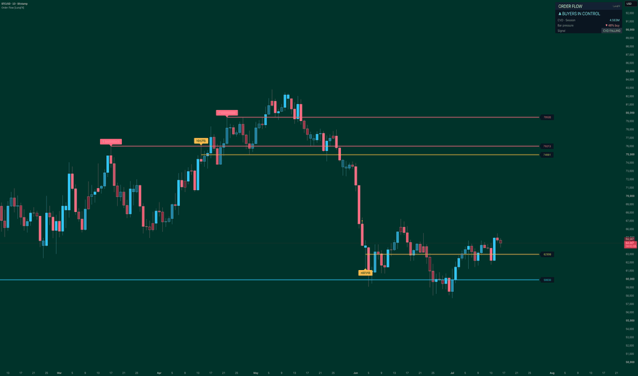
Order Flow Volume Delta, CVD, Absorption & Divergence [LunqFX]Price shows you WHERE the market went. Order flow shows you WHO pushed it there — buyers or sellers — and whether they had real volume behind the move. This Order Flow indicator reads the volume delta on every candle (the balance of buying volume vs selling volume), builds it into a cumulative volume delta (CVD) trend, and automatically marks the two order-flow events that lead price: absorption and delta divergence. Everything is drawn on your chart as clean delta candles, order-flow support/resistance levels and a live buying-pressure dashboard.
❶ THE CONCEPTS (so it's clear)
▸ VOLUME DELTA — the difference between buying volume and selling volume inside a bar. Positive delta = buyers were more aggressive, negative = sellers. It is the core of all order-flow analysis.
▸ CVD (CUMULATIVE VOLUME DELTA) — delta added up over time. A rising CVD means buyers are steadily accumulating; a falling CVD means distribution by sellers. CVD is how you see the real trend of order flow, not just price.
▸ ABSORPTION — a bar with heavy volume but almost no price movement. It means a large player (smart money / institutional) is absorbing every market order at that level. Absorption very often appears right before a reversal.
▸ DELTA DIVERGENCE — price makes a new high but CVD does not (or a new low but CVD does not). The move has no real volume behind it — a trap / exhaustion signal that warns a reversal is likely.
❷ WHAT YOU SEE ON THE CHART
▸ Delta candles — sky-blue when buyers won the bar, coral when sellers won; the brighter the candle, the more one-sided the flow. You read buying and selling pressure at a glance.
▸ Order-flow levels — every absorption (gold) and divergence (blue / coral) is projected to the right as a support/resistance level with its exact price. These are the levels where big volume actually traded, so price reacts to them again.
▸ Live dashboard — who is in control (buyers vs sellers) from the CVD, the CVD value, the current bar's buy/sell pressure split, and the latest signal.
❸ HOW TO TRADE IT — STEP BY STEP
1 — Read the BIAS. The panel shows ▲ BUYERS or ▼ SELLERS IN CONTROL from the CVD. Trade with the side that controls order flow, not against it.
2 — Watch for DELTA DIVERGENCE against the move. Price higher high while CVD makes a lower high = buyers are exhausted → look for shorts. Price lower low while CVD makes a higher low = sellers are exhausted → look for longs. This is the highest-value order-flow reversal signal.
3 — Use ABSORPTION as a reversal cue. When heavy volume fails to move price, the move is being absorbed; watch for the turn and use that gold level as your invalidation line.
4 — Trade the reaction at order-flow levels. Old absorption and divergence levels act as support and resistance — enter when the delta flips back in your favour as price returns to a level.
5 — Confirm with Bar pressure. The panel's ▲/▼ % buy shows the live buy/sell split — take the trade when it agrees with your setup and the bias.
❹ HOW IT WORKS (fully transparent)
Each bar's volume is split by where price closed in its range: buy-volume = volume × (close − low) ÷ range, sell-volume = volume × (high − close) ÷ range, and delta = buy − sell. This is a transparent, range-based volume-delta estimate — it needs no tick or bid/ask feed, so it runs on any symbol. CVD is the running sum of that delta (session-anchored on intraday charts, fully cumulative on daily and higher, handled automatically). Absorption is flagged when volume rises above its average by your chosen multiple while the candle body stays smaller than a fraction of ATR. Divergence compares each confirmed swing pivot in price with the CVD value at that pivot. Every reading comes from closed bars and confirmed pivots — no repainting, no lookahead.
Order flow is strongest on markets with true exchange volume — crypto, stocks, futures and indices — and on intraday timeframes (1m–4h), where buying and selling pressure is most meaningful. On forex, volume is broker tick-volume, so treat the delta as an approximation of order flow rather than exact.
SETTINGS — CVD reset (Session / Week / None), absorption sensitivity, divergence swing length, number of order-flow levels + glow, delta candles on/off, dashboard position.
ALERTS — bullish delta divergence, bearish delta divergence, absorption, and CVD crossing zero (buyers / sellers taking control).
This indicator is an educational market-analysis tool, not financial advice. The volume delta shown here is a transparent estimate from price and volume, not exchange-audited bid/ask order flow, and past behaviour does not guarantee future results. Always confirm with your own analysis and manage your risk.
Indicator
Market Regime Engine [NQ Labs] WHAT THIS ANSWERS
Almost every indicator tells you WHAT the market is doing. Very few tell you
whether the current market has enough exploitable structure to be worth
risking money on at all. The Market Regime Engine is built for that second
question: should I be trading this right now, and if so, what style of
approach do current conditions actually favour?
It is not a signal generator. It produces no entries. It is a filter you run
underneath whatever you already trade.
WHY IT IS BUILT THIS WAY
Two design decisions separate this from a conventional regime or trend filter.
1. EVERY AXIS IS PERCENTILE-RANKED AGAINST ITS OWN HISTORY.
Most regime tools use fixed thresholds - an ADX of 25, an ATR multiplier of 3.
Those numbers are calibrated to whatever the author tested on. They are the
reason a tool behaves sensibly on one instrument and nonsensically on the
next. Here, each axis is ranked against its own recent distribution on the
current symbol and timeframe, so a 65th-percentile reading carries the same
meaning on a crypto pair as it does on an FX major. Nothing needs retuning
per market.
2. THE THREE AXES ARE ORTHOGONAL BY DESIGN.
Many "confluence" tools stack three views of momentum and present the
agreement as confirmation. Correlated inputs agreeing is not evidence. These
three measure genuinely different properties:
DIRECTIONAL EFFICIENCY - net distance travelled divided by the total path
walked to get there. A value near 1 is a straight line. A value near 0 means
price ended where it started after a great deal of work. This is the most
direct available answer to "is there a trend here", and it is independent of
direction.
VOLATILITY STATE - ATR ranked against its own history. Not "is volatility
high" in absolute terms, but "is volatility high for this instrument".
RETURN PERSISTENCE - lag-1 autocorrelation of log returns. Positive means an
up bar tends to be followed by an up bar, so momentum approaches have
something to work with. Negative means the market reverts. Near zero means
returns carry no usable memory.
THE SCORING LOGIC
The Tradeability Score (0-100) rests on one idea:
Efficiency is the signal. Volatility is the cost of being wrong.
Volatility only hurts you when there is no direction to exploit.
So the noise penalty is the product of how little direction exists and how
violent the market is. It approaches zero inside a strong trend no matter how
wild conditions get - because volatility inside a trend is opportunity, not
noise - and it peaks precisely where traders are most reliably ground down:
low efficiency combined with high volatility. That specific combination is
what the engine exists to flag.
THE FIVE REGIMES
TREND Efficiency high. Directional. Follow it.
VOLATILE CHOP Efficiency low, volatility high. No direction, maximum cost
of being wrong. The state that does the damage.
COIL Efficiency low, volatility low. Compression. Wait.
RANGE Efficiency low, volatility middling. Edges are tradeable.
TRANSITION Efficiency mid-range. No clean read. Reduce size.
A raw regime read must hold for a configurable number of consecutive bars
before it is confirmed. Without that filter, readings that straddle a
threshold flip back and forth for single bars.
REGIME MATURITY - THE PART I HAVE NOT SEEN ELSEWHERE
The engine records the length of every completed regime run on the current
chart and reports the current run against that learned baseline, together with
the sample size behind it.
A trend at 0.3x its typical duration and a trend at 2.4x are not the same
trade, even though every conventional indicator prints the identical reading
for both. A compression that has lasted three times longer than compressions
normally last on this instrument is a different proposition to one that
started six bars ago.
The sample size (n=) is shown deliberately. Below the configured threshold the
cell dims, because a baseline built from two observations is not evidence and
should not be dressed up as though it were.
HOW TO USE IT
The engine is a gate, not a trigger. The intended workflow:
1. Read the Verdict first. STAND DOWN means your edge, whatever it is, is
probably not present. The most valuable output of this tool is the trades
it talks you out of.
2. Read the Regime and Favoured Style. Trend-following systems belong in
TREND. Mean-reversion belongs in RANGE, and only when Persistence confirms
the market is actually reverting rather than merely quiet. COIL means the
setup has not arrived yet. VOLATILE CHOP means nothing you own works here.
3. Read Persistence before choosing an approach. If it reads Random, the
market has no memory to exploit in either direction, and both momentum and
mean-reversion are coin flips.
4. Use vs Typical for position management, not entry. An extended regime is
not a reversal signal. It is a reason to stop adding and to tighten what
you already hold.
5. Let the ribbon and score do the work on the price chart. The dashboard can
be forced onto the main pane so the engine occupies a pane without costing
you chart real estate.
SETTINGS THAT ACTUALLY MATTER
RANKING LOOKBACK is the important one. It must span several complete regime
cycles on your timeframe or every axis will rank near the middle and
everything will read TRANSITION. 250 bars on a daily chart is roughly a year -
a real baseline. 250 bars on a 5-minute chart is under a day, and is not.
On intraday timeframes, raise it substantially.
MINIMUM REGIME RUN trades responsiveness for stability. Higher values give a
calmer read and a cleaner duration baseline at the cost of confirming changes
later. Set it to 1 to see the unfiltered classification.
CHOP PENALTY controls how hard low-efficiency volatility is punished. Set it
to 0 and the score becomes pure efficiency rank.
EFFICIENCY and VOLATILITY thresholds are percentiles, not raw values. They do
not need adjusting per instrument. That is the point.
LIMITATIONS - STATED PLAINLY
- This is a lagging, descriptive tool. It classifies conditions that have
already formed. It does not forecast, and it cannot tell you a regime is
about to end.
- Confirmation costs lag. A genuine regime change registers a few bars late by
design. That is the price of not flickering.
- The maturity baseline is learned from visible chart history and rebuilds
whenever settings, symbol, or timeframe change. It is not persistent memory.
Early in a chart, or for a rarely-occurring regime, the sample is thin. The
n= value tells you when to discount it.
- On intraday equity charts, overnight gaps inflate ATR and distort the
persistence reading. Daily and above, or extended hours, handle this better.
- Autocorrelation is a weak statistic on short samples. Persistence readings
close to zero should be read as "no information", not as a subtle signal.
- Efficiency is directionless. TREND tells you a trend exists, not which way
it points. Pair it with something that reads direction.
- No regime classification is correct at the moment it matters most, which is
the turn. Nothing here changes that.
This script is open-source. Read the code, disagree with it, improve it.
This is an analytical tool for studying market conditions. It is not financial
advice, and it does not generate trade recommendations. Trading involves risk
of loss. Indicator

ICT SMC H4 FVG Retest M15 Scalping KillzonesICT SMC H4 FVG Retest — M15 Scalping Killzones
Overview
ICT SMC H4 FVG Retest — M15 Scalping Killzones is a multi-timeframe trading indicator designed to identify structured intraday setups based on:
* Confirmed higher-timeframe Fair Value Gaps
* M15 execution Fair Value Gaps
* ICT-style killzones
* Session highs and lows
* H4 buy-side and sell-side liquidity
* Market or limit-entry models
* Liquidity-based profit targets
The indicator is intended to be used on a 15-minute chart.
Its purpose is not to generate a large number of signals. It is designed to wait for a higher-timeframe imbalance, a valid departure from that zone, and a later retest during an active trading session.
⸻
Core strategy
The standard short setup follows this sequence:
1. A bearish H4 Fair Value Gap is confirmed.
2. Price moves below the H4 FVG.
3. Price later returns to the H4 FVG during an enabled killzone.
4. A bearish M15 FVG forms and overlaps the H4 zone.
5. The M15 candle closes and confirms the setup.
6. The indicator displays the proposed entry, stop-loss and target.
The bullish setup uses the opposite sequence:
1. A bullish H4 FVG is confirmed.
2. Price moves above the H4 FVG.
3. Price later returns to the H4 FVG during an enabled killzone.
4. A bullish M15 FVG forms inside or overlapping the H4 zone.
5. The M15 candle closes and confirms the setup.
6. The indicator displays the proposed entry, stop-loss and target.
The H4 FVG that is created during the initial market displacement is treated as a future retest zone. The indicator does not use the M15 FVGs that formed before the H4 candle was confirmed.
⸻
Non-repainting higher-timeframe logic
The indicator only uses confirmed higher-timeframe candles.
A new H4 FVG is therefore displayed only after the third H4 candle in the three-candle FVG sequence has closed.
This avoids using an H4 imbalance that may appear intrabar and disappear before the H4 candle closes.
The trade-off is intentional:
* the FVG is not shown as confirmed while the H4 candle is still forming;
* once the H4 candle closes, the confirmed zone appears on the M15 chart;
* the indicator then waits for a future retest.
The confirmed HTF FVG is used for signals and alerts. No unconfirmed HTF data is used for trade validation.
⸻
Fair Value Gap definition
Bullish FVG
A bullish FVG exists when the low of the third candle is above the high of the first candle.
The imbalance is the price range between:
* the high of the first candle;
* the low of the third candle.
Bearish FVG
A bearish FVG exists when the high of the third candle is below the low of the first candle.
The imbalance is the price range between:
* the high of the third candle;
* the low of the first candle.
The large middle candle is usually the displacement candle, but its full body is not the FVG. The FVG is only the untraded space between the first and third candles.
⸻
Entry modes
The indicator includes three HTF retest models.
A — Strict retest
Price must first close outside the HTF FVG, then return to the zone.
For a bearish FVG:
* price must close below the FVG;
* price must later return into it.
For a bullish FVG:
* price must close above the FVG;
* price must later return into it.
This is the most selective mode and is the default setting.
A′ — Tolerant retest
A wick outside the HTF FVG is sufficient to validate the departure.
This mode produces more opportunities than the strict model but may accept less decisive departures.
B — Direct tap in killzone
No prior departure from the HTF FVG is required.
A direct touch of the HTF zone during an enabled killzone can become eligible if the remaining entry conditions are satisfied.
This is the least selective mode.
⸻
M15 confirmation
By default, the indicator requires an M15 Fair Value Gap in the same direction as the HTF FVG.
For a short:
* the HTF FVG must be bearish;
* the M15 FVG must also be bearish;
* the M15 FVG must overlap the HTF FVG.
For a long:
* the HTF FVG must be bullish;
* the M15 FVG must also be bullish;
* the M15 FVG must overlap the HTF FVG.
The M15 FVG size filter can be used to ignore very small imbalances.
When Require an M15 FVG is disabled, the indicator can generate a setup from a simple HTF FVG retest during a killzone.
⸻
Candle-close confirmation
The setting:
Validate signals only at M15 close
should normally remain enabled.
When enabled:
* an intrabar M15 FVG is not enough;
* the setup must still be valid when the M15 candle closes;
* triangles and alerts are produced only from confirmed M15 conditions.
This prevents signals from appearing during a candle and disappearing before its close.
⸻
Killzones
Killzones are anchored to the native timezone of each market. They automatically follow daylight-saving changes where applicable.
Asia killzone
Default timezone:
Asia/Tokyo
Default window:
09:00–13:00 Tokyo time
London killzone
Default timezone:
Europe/London
Default window:
07:00–10:00 London time
New York AM killzone
Default timezone:
America/New_York
Default window:
09:30–11:00 New York time
New York PM killzone
Default timezone:
America/New_York
Default window:
13:30–16:00 New York time
Each killzone can be enabled, disabled or adjusted independently.
The background colors only indicate an active trading window. They do not indicate bullish or bearish direction.
⸻
Entry types
Market at close
The proposed entry is the closing price of the confirmed signal candle.
The setup becomes visually active immediately after confirmation.
Limit at FVG edge
The indicator places a theoretical limit entry at the relevant edge of the M15 FVG.
For a bearish setup, the entry is placed at the lower boundary of the bearish M15 FVG.
For a bullish setup, the entry is placed at the upper boundary of the bullish M15 FVG.
If M15 confirmation is disabled, the relevant HTF FVG boundary is used instead.
The limit order remains pending for the selected number of M15 candles. If it is not filled before expiration, the order is cancelled and the HTF zone may become available for a later setup.
⸻
Stop-loss placement
For a bearish setup, the stop-loss is placed:
* above the opposite side of the M15 FVG;
* plus the selected tick buffer.
For a bullish setup, the stop-loss is placed:
* below the opposite side of the M15 FVG;
* minus the selected tick buffer.
When M15 FVG confirmation is disabled, the stop is placed beyond the opposite side of the HTF FVG.
The Stop buffer in ticks setting adds a small safety margin beyond the imbalance boundary.
⸻
Profit targets
The indicator supports two target models.
Liquidity target
When enabled, the indicator searches for the nearest eligible liquidity level in the direction of the trade.
Possible targets include:
* previous Asia session high or low;
* previous London session high or low;
* previous New York session high or low;
* H4 buy-side liquidity;
* H4 sell-side liquidity;
* the current session high or low.
A target must offer at least the selected minimum reward-to-risk ratio.
Fixed R:R fallback
If no eligible liquidity target is available, the indicator uses the selected fixed reward-to-risk ratio.
The default fallback is:
2.0R
⸻
Swept liquidity handling
Two modes are available.
Legacy v3.3
Previously swept session levels and H4 liquidity levels may still be used as targets.
This mode preserves the original behavior of the earlier indicator.
Untouched liquidity only
Once a liquidity occurrence has been swept, it is no longer eligible as a target.
A new pivot or a new completed session may later create a new active liquidity occurrence at the same or a similar price.
This mode is generally more selective because it targets liquidity that has not yet been consumed.
⸻
Session levels
The indicator tracks the highs and lows of:
* Asia
* London
* New York
Each session is calculated in its native timezone, which prevents the levels from drifting when the United Kingdom or the United States changes between standard time and daylight-saving time.
At the end of a session:
* the high and low are frozen;
* their labels remain anchored to the session close;
* the levels can be used as potential liquidity targets.
The number of stored sessions can be adjusted in the settings.
⸻
H4 SSL and BSL levels
The indicator also plots confirmed H4 pivot liquidity.
BSL
Buy-Side Liquidity
Displayed above confirmed H4 swing highs.
SSL
Sell-Side Liquidity
Displayed below confirmed H4 swing lows.
The pivot lookback determines the significance and confirmation delay of these levels.
A larger lookback produces more structurally significant levels, but they are confirmed later.
⸻
Dashboard
The dashboard shows the current state of the setup for both long and short directions.
Three display sizes are available:
* Small
* Medium
* Large
HTF active
A confirmed HTF FVG is currently active in that direction.
HTF departure
Price has moved outside the HTF FVG according to the selected A or A′ departure logic.
In Mode B, a prior departure is not required for the final signal.
HTF retest
The current candle is touching or overlapping the active HTF FVG.
Killzone
The current candle is inside at least one enabled killzone.
M15 FVG
A valid M15 FVG exists in that direction and passes the minimum-size filter.
HTF overlap
The M15 FVG overlaps the active HTF FVG.
M15 close
The current M15 candle is confirmed.
While the live M15 candle is still forming, this field may display No.
Available
No previous trade or pending limit order is currently blocking a new setup.
Raw signal
The structural conditions are satisfied before final trade-availability and candle-close validation.
Signal
All required conditions are satisfied and a valid setup has been produced.
⸻
Signal markers
A confirmed short setup is displayed as:
* a red downward triangle;
* the letter S.
A confirmed long setup is displayed as:
* a green upward triangle;
* the letter L.
The indicator also creates a label containing:
* entry price;
* stop-loss;
* target;
* expected reward-to-risk ratio.
The risk and reward areas are displayed directly on the chart.
⸻
Near-miss labels
The optional Show near misses setting helps diagnose why an otherwise valid-looking setup was rejected.
Possible reasons include:
* LEFT — price has not yet departed from the HTF FVG;
* KZ — the setup is outside an enabled killzone;
* CLOSE — the M15 candle has not yet closed;
* BUSY — a trade or limit order is already active.
Near-miss labels are primarily intended for testing and configuration. They may create visual clutter during normal use.
⸻
Alerts
The indicator provides separate alert conditions for:
* LONG setup detected;
* SHORT setup detected;
* LONG limit order filled;
* SHORT limit order filled;
* target reached;
* stop-loss reached.
For confirmed signals, alerts should be configured to trigger once per bar close.
⸻
Recommended starting configuration
For index futures such as NQ or MNQ:
* Chart timeframe: 15 minutes
* HTF FVG timeframe: 240 minutes
* Entry logic: A — Strict retest
* Require M15 FVG: Enabled
* Validate only at M15 close: Enabled
* Entry type: Limit at FVG edge or Market at close
* Minimum M15 FVG size: adjust to the instrument
* Liquidity mode: Untouched liquidity only
* Minimum target R:R: 1.0–1.5
* Fallback R:R: 2.0
* London killzone: Enabled
* New York AM killzone: Enabled
The Asia and New York PM killzones can be enabled according to the instrument and the trader’s preferred session.
⸻
Practical workflow
1. Apply the indicator to an M15 chart.
2. Confirm that an HTF FVG is active in the dashboard.
3. Wait for price to move away from the HTF FVG.
4. Wait for price to return to the zone during an enabled killzone.
5. Look for a same-direction M15 FVG inside or overlapping the HTF FVG.
6. Wait for the M15 candle to close.
7. Review the proposed entry, stop and target.
8. Confirm the broader market context before placing a trade.
The indicator is best used as a structured decision-support tool rather than as a fully autonomous trading system.
⸻
Important limitations
* A confirmed H4 FVG appears only after the relevant H4 candle closes.
* The indicator will not retrospectively use an M15 FVG that formed before the H4 FVG became confirmed.
* H4 pivot liquidity is confirmed with delay because pivots require candles on both sides.
* If both the stop and target are touched during the same M15 candle, the visual trade logic uses the stop-loss as the conservative outcome.
* The script is an indicator, not a broker emulator or complete backtesting strategy.
* No indicator can guarantee profitability.
⸻
Disclaimer
This indicator is provided for educational and analytical purposes only. It does not constitute financial advice, investment advice or a recommendation to buy or sell any financial instrument.
Trading futures, leveraged products and other financial markets involves substantial risk. Users are responsible for testing the indicator, defining their own risk-management rules and determining whether the methodology is suitable for their trading plan. Indicator

Luxy UT God Mode - UT-Bot Forecast, Signals, Zones and RiskLuxy UT God Mode turns the classic UT Bot ATR trailing-stop into a complete, self-contained trading cockpit: momentum-adaptive buy/sell signals, a forward-looking Trend Duration Forecast, auto support/resistance zones, a 0-100 Confidence Score, a built-in multi-currency Risk Calculator, and automatic Stop Loss / Take Profit levels - all on one overlay, all non-repainting.
Note: Every forecast, probability, and statistic in this tool is a calculation based on the chart's own historical behavior. They describe past patterns, not guaranteed future results.
WHAT MAKES THIS DIFFERENT
A normal UT Bot only tells you the trend flipped. Luxy UT God Mode answers the three questions a trader actually asks at the moment of a signal:
1. Should I trust this flip? - a Confidence Score (0-100) blends seven engines into one number.
2. How long might this trend run? - a Trend Duration Forecast projects the expected remaining life of the current trend, drawn as a fading strip with survival-probability milestones.
3. What do I risk and how big do I trade? - automatic Stop Loss, R-based Take Profits, and a position-size calculator in your own account currency.
Everything is layered so you can run it bare-bones (just clean signals) or switch on the full "God Mode" stack.
METHODOLOGY AND CREDITS
This indicator implements proven concepts using entirely original code.
- UT Bot ATR trailing logic - original concept by @QuantNomad . This implementation is a significant rework: it adds volume weighting, momentum-adaptive sensitivity, a composite multi-method stop loss, a full multi-filter confirmation stack, multi-timeframe confluence, and the statistical trend-duration engine described below.
Important: this is an educational analysis tool. It does not guarantee any trading result. Always do your own analysis and manage risk.
THE SEVEN ENGINES (and the Confidence Score that fuses them)
Each bar, the script scores how well the current setup aligns and sums it into a single 0-100 Confidence Score with a visual progress bar:
UT Bot direction - is price above/below the momentum-adaptive trailing stop
SuperTrend - direction plus a distance-from-line strength bonus
Market Structure - position inside the recent swing range and structure breaks
ADX Regime - is the market trending (signals allowed) or choppy (blocked)
Multi-Timeframe - does a higher timeframe agree with the signal direction
Volume - is conviction backed by above-average volume
RSI Divergence - is a recent divergence supporting or opposing the signal
Read it at a glance: 80+ = strong, 60+ = good, 40+ = weak, under 40 = very weak. Hover the Confidence cell for the full per-engine breakdown.
1. TREND DURATION FORECAST - the headline feature
When the trend flips, the script projects how many more bars the new trend may last, based on the chart's own past trends.
How it works:
Every completed trend's duration is recorded, kept separately for bullish and bearish trends.
On each new flip the script estimates the expected duration using an exponentially-weighted average and standard deviation (recent trends weighted more heavily).
The estimate is drawn as a fading gradient strip that projects forward from the flip, with a "Trend Analysis" label and survival-probability milestones at 25% / 50% / 75% / 90% / 100% of the projection.
The percentages are empirical - they show the share of past same-direction trends on THIS chart that actually lasted at least that long. Not a fixed textbook curve.
Three forecast modes:
Simple - median duration only. Clean and fast.
Standard - exponentially-weighted average plus spread (recommended default).
Advanced - Standard plus five adaptive multipliers: Structure (proximity to S/R), Asset Type (volatility profile), Flip Strength (volume + filters passed), Error Learning (self-correction from its own past misses), and Regime (trending vs choppy).
When history is thin, the forecast honestly falls back to a combined estimate and flags it, rather than showing false precision.
2. MOMENTUM-ADAPTIVE UT BOT CORE
The trailing stop is not a fixed ATR multiple. The effective sensitivity adapts each bar to:
Momentum - faster momentum widens the trail to stay in strong moves
Relative volume - conviction adjusts the distance
Asset type - auto-detected (crypto, forex, futures, index, fund, CFD, bond, stock) with a per-class multiplier, or set it manually
Volatility mode - Fixed, Dynamic, or Aggressive auto-adjustment to the current volatility regime
The result is a trailing engine that behaves differently on a calm blue-chip than on a volatile small-cap or crypto pair - without you re-tuning it.
3. ANTI-WHIPSAW AND SIGNAL FILTER STACK
Signals only fire when they survive the filters you enable, so you control the trade-off between frequency and quality:
ADX Regime - block signals in choppy, non-trending conditions
Cooldown and Confirmation - minimum bars between signals and N-bar direction confirmation
Swing - only trade aligned with recent swing structure
Full Candle - require the whole candle beyond the trailing line (no straddles)
Volume, RSI, Hull MA, SuperTrend - optional confirmation layers
High-Volatility and % Change - only trade meaningful moves
2-Bar Confirm - extra confirmation for volatile markets
Every active filter appears as a row in the table with a live pass/fail state, so you always know why a flip did or did not become a signal.
4. SUPPORT / RESISTANCE ZONES
The script clusters significant swing pivots into persistent price zones and draws only the two that matter right now: the nearest resistance above price and the nearest support below price. Each zone shows its price and touch count (e.g. "S 4.19 (3x)" = a support tested three times). A level that price has broken through drops off automatically, and an optional Zone Filter can block buys into resistance and sells into support. Pivot strength is adjustable so you can show only major levels.
5. AUTOMATIC STOP LOSS, TAKE PROFIT AND RISK CALCULATOR
On every signal the script draws a complete trade plan:
Stop Loss - choose from seven methods: ATR, % based, tick based, swing, scaled ATR, Smart Adaptive (auto-scales to volatility), or Safer (widest of several).
Take Profit - TP1 / TP1.5 / TP2 / TP3 as R multiples of the stop distance, with optional price and % labels, and a freeze-on-touch check mark for journaling.
Entry line - marks the signal price; all lines can auto-limit to 10 bars for a clean chart.
Risk Calculator - enter account size and risk (% or fixed amount) and it returns the position size in shares/contracts, in your own currency, with live FX conversion (USD, EUR, GBP, JPY, CAD, AUD, CHF) or a manual rate.
6. MULTI-TIMEFRAME CONFLUENCE AND RSI DIVERGENCE
The table shows the trend of up to seven higher timeframes (5m, 15m, 30m, 1H, 4H, D, W) via an EMA 9/21 cross, so you can see whether the bigger picture agrees before you act. An optional MTF filter blocks counter-trend signals. Separately, RSI divergence (regular bullish and bearish) is detected, labeled on the chart, and fed into the Confidence Score.
7. LIVE STATUS TABLE
A configurable dashboard (position and size adjustable) summarizes everything: asset type, Confidence Score, adaptive mode, current signal, win-rate / average-bars statistics, multi-timeframe row, divergence, forecast, position size, and one row per active filter - each with a detailed tooltip.
HOW TO USE IT - QUICK START
Step 1 - Add it and pick your sensitivity. Defaults suit intraday (5-15m). For scalping lower the Sensitivity/ATR; for swing raise them (see the Sensitivity tooltip for presets).
Step 2 - Read a signal. A Buy (aqua, below bar) or Sell (orange, above bar) appears only after the bar closes and all enabled filters pass. Check the Confidence Score and the Multi-TF row for context.
Step 3 - Use the trade plan. The Entry, Stop Loss and Take Profit lines draw automatically. Read the Position row for size. Use the Trend Duration Forecast strip as a realistic hold-time expectation - scale out near the median, reassess if price runs past the projection.
Step 4 - Set alerts. Use "Any alert() function call" to receive BUY/SELL and trend-flip alerts on bar close, or pick the specific "Momentum Buy/Sell Signal" conditions. All alerts fire on confirmed bars only.
TUNING FOR MORE OR FEWER SIGNALS
Too few signals: turn off MTF, then Full Candle, then lower the ADX threshold or the Anti-Whipsaw filter. Too many / choppy: raise the ADX threshold, enable Volume and Full Candle, increase Cooldown, or add 2-Bar Confirm. Every filter is independent and shown live in the table.
TECHNICAL NOTES
Pine Script v6, overlay, max bars back 5000.
No repaint: signals, lines, forecast and alerts are committed on bar close (barstate.isconfirmed); all higher-timeframe data uses lookahead_off.
Works on stocks, crypto, forex, futures and indices, on any timeframe.
Higher timeframes and longer history produce more reliable forecasts; a new symbol needs a number of completed trends before the duration model is meaningful.
LIMITATIONS
Trend-following by nature: signals arrive after a trend establishes, not at exact tops/bottoms.
Best in trending conditions; use the ADX regime and filters to avoid chop.
The duration forecast needs history to become meaningful and is a statistical estimate, never a guarantee.
DISCLAIMER
This script is an educational analysis tool, not financial advice. Trading stocks, crypto, forex and futures involves substantial risk of loss - you can lose all invested capital. Forecasts, probabilities and win-rate statistics are calculated from historical chart data and do not guarantee future performance. Test on paper first, and you are solely responsible for your own trading decisions.
Feedback and suggestions are welcome in the comments. Happy trading.
Indicator

Edo Liquidity SweepsEdo Liquidity Sweeps — Detects Liquidity Sweeps of Swing Highs and Lows and Tracks Each One Through Detected, Confirmed and Faded States
Markets move toward liquidity. Above every relevant swing high rests buy-side liquidity — the stops of short positions and the breakout buy orders waiting there. Below every relevant swing low rests sell-side liquidity — the stops of longs and the breakout sells. Those order clusters act as magnets: very often price travels precisely to reach them. A liquidity sweep is the moment that happens and is rejected — price wicks beyond the level to take the resting liquidity, then closes back on the other side, the classic trap that leaves breakout traders offside and frequently turns price around.
Edo Liquidity Sweeps isolates that single event and, crucially, tracks what happens next. It marks each sweep on the chart and follows it through three clear states — Detected, Confirmed and Faded — so you can separate the sweeps that actually reversed price from the ones that failed, all validated on closed bars so the indicator does not repaint. It is the sweep specialist of the Edolab structure family, designed to pair with Edo Liquidity Zones, which maps the liquidity pools these sweeps take.
LIQUIDITY LEVELS: SWING HIGHS AND LOWS
Everything starts from the swings that define where liquidity sits. A swing high is confirmed when a candle has the highest high of its surroundings; a swing low, the lowest low. The size of that surroundings is set by the Swing Profile: Scalper (5 bars each side) tracks short-term liquidity for intraday work, Swing (10 bars, the default) is the balanced setting for 4H and daily, and Long Term (21 bars) watches only the liquidity of the major structures. Each confirmed swing high becomes a buy-side liquidity level to monitor, and each swing low a sell-side one, until price sweeps it.
SWEEP DETECTION
A sweep is detected, on closed bars only, when price pierces a level with a wick but closes on the opposite side. A bearish sweep: the candle's high takes a swing high (grabbing the buy-side liquidity) but the close stays below that level — price pierced the high and rejected it, an downward reversal is expected. A bullish sweep: the candle's low loses a swing low (grabbing the sell-side liquidity) but the close stays above it — price pierced the low and rejected it, an upward reversal is expected. At detection the indicator draws a dotted line at the swept level with a Sweep ▲ or Sweep ▼ label, and records the high and low of the sweep candle itself, which will later decide whether the sweep confirms or fails. A wick that pierces a level but closes back on the same side generates nothing.
THREE STATES: DETECTED, CONFIRMED, FADED
A sweep is not a one-candle signal. The indicator follows each one through three states, evaluated on every closed bar against the range of the sweep candle. Detected: the sweep has just happened and it is not yet known whether price will turn — a dotted line. Confirmed: price confirms the reversal by closing beyond the sweep candle's extreme in the expected direction — the line turns solid and bold and the label gains a ✓. Faded: price closes the opposite way, reclaiming the level, so the sweep failed — the line turns dashed and faded grey and the label gains a ✕. For a bullish sweep, confirmation is a close above the sweep candle's high and a fade is a close below its low; for a bearish sweep it is the mirror. This follow-through confirmation is what separates the operative sweeps from the anecdotal ones: a Confirmed sweep has proven the rejection had continuation, while a Faded one warns that the trap did not work and the level has genuinely been broken.
INFORMATION PANEL
The panel condenses the read into a compact table. It shows the Last Sweep with its direction (Bull ▲ / Bear ▼) and state, and the live count of sweeps in each state: Detected, Confirmed and Faded. The Confirmed-to-Faded ratio gives a quick sense of how reliable sweeps are behaving on that instrument and timeframe. The panel sits in any of the four chart corners (Top Right by default), comes in three sizes (Tiny / Small / Normal) and two themes (Dark / Light), and can be hidden entirely.
NO REPAINTING
Sweeps are validated on closed bars only and on confirmed pivots, so a level and its sweep never appear or disappear intrabar. A wick that pierces a level but closes back inside generates nothing — the indicator waits for the close. This removes the false signals that clutter tools which mark instantly, at the cost of confirming each sweep once it has completed. There are no higher-timeframe functions: all logic runs on the current chart timeframe.
CONFIGURATION
The inputs are grouped by block. Detection sets the swing profile and the maximum number of sweeps kept on the chart (12 by default). Style exposes the bullish and bearish sweep colours, the faded colour, the label size and the Dark/Light theme. Panel controls panel visibility, position and size. The defaults are calibrated to work without adjustment on stocks, crypto, forex, indices and futures, on any timeframe — the input most users touch is the Swing Profile, to match the sensitivity of the tracked liquidity to their horizon.
ALERTS
Five predefined alerts cover the life of a sweep: Bullish Sweep Detected and Bearish Sweep Detected fire the moment a sweep is detected; Bullish Sweep Confirmed and Bearish Sweep Confirmed fire when a sweep confirms its reversal through follow-through; and Sweep Faded fires when a sweep fails and the level is reclaimed. The Detected alerts are the earliest but least confirmed, the Confirmed alerts are more reliable at the cost of arriving later, and the Faded alert is useful to discard a reversal idea. All alerts fire on bar close, consistent with the indicator's anti-repaint validation.
HOW TO READ IT
Wait for confirmation: a Detected sweep only flags that liquidity was taken and rejected, not that price will turn — waiting for it to become Confirmed reduces false signals at the cost of entering later, and the panel's Confirmed-to-Faded ratio shows how trustworthy sweeps are being. Read the fade as a warning: when a sweep turns Faded, the trap did not work and the level was genuinely broken — recognising a failed sweep in time avoids forcing a reversal idea the market has already rejected. Trade sweeps in confluence: a confirmed sweep that takes liquidity at an important level, a demand zone or a higher-timeframe support is a far more solid reference than an isolated one. And pairing Edo Liquidity Sweeps with Edo Liquidity Zones closes the loop — the zones say where liquidity sits, the sweeps say when it is taken.
OPEN SOURCE
Edo Liquidity Sweeps is published as a free open source indicator. The full Pine Script is publicly accessible on TradingView for study, adaptation and integration into any workflow. Part of the Edolab Markets free tools ecosystem alongside Edo Liquidity Zones, Edo Smart Money Map, Edo Order Blocks, Edo ZigZag Auto Fib SR and more available on TradingView.
This indicator is a technical analysis tool for educational and informational purposes only. It does not generate automatic buy or sell signals and should not be considered financial advice. Trading financial markets involves significant risk of capital loss. Past performance does not guarantee future results. Always use proper risk management.
TAGS
LiquiditySweep SmartMoneyConcepts Liquidity MarketStructure PriceAction StopHunt SwingHighLow SupplyDemand Reversal Overlay Indicator OpenSource Edolab EdolabMarkets Stocks Crypto Forex Indices
CATEGORIES (TradingView dropdowns)
— Direction: Both
— Market category: All markets (Stocks / Crypto / Forex / Indices)
— Analysis type: Trend Analysis / Chart patterns / Support and Resistance
Indicator

ATK/DEF KDJ Rewind ContextRewind KDJ Context is a visual KDJ analysis indicator designed to provide a clearer understanding of momentum structure through the relationship between the K, D, and J lines.
Traditional KDJ analysis often focuses on fixed overbough and oversol levels. This indicator expands the interpretation by analyzing the interaction between KDJ components, including line arrangement, directional changes, momentum development, and structural transitions.
The script transforms KDJ movement into different context states, helping users observe how momentum conditions develop, slow down, weaken, and recover over time.
Instead of treating K, D, and J as isolated values, Rewind KDJ Context focuses on the relationship between the three components and presents their current condition through a structured visual approach.
KDJ Context Framework
▶️ Momentum Push
Identifies conditions where K, D, and J show coordinated upward momentum development.
This context represents a phase where KDJ structure is aligned with increasing momentum activity and stronger directional movement.
⏸️ Momentum Pause
Highlights situations where momentum remains active but begins to slow or entr a temporary balance condition.
This state focuses on changes in momentum speed and the relationship between K, D, and J during a slowing phase.
⏪ Reversal Context
Highlights changes in KDJ structure where J-line movement and the relationship between K and D indicate a possible transition in short-term momentum conditions.
This context focuses on structural changes rather than predicting future pric direction.
⬇️ Weakness Context
Displays conditions where KDJ structure shows reduced momentum strength and weaker directional movement.
This state helps visualize when previous momentum conditions begin losing strength.
🔄 Recovery Context
Highlights situations where KDJ structure begins improving after a weaker phase.
This context observes changes in J-line behavior and KDJ alignment during potential momentum recovery conditions.
⚪ Neutral Context
Represents situations where K, D, and J do not form a strong directional structure and momentum remains relatively balanced.
Main Features
• Customizable KDJ calculation parameters
• Dynamic K, D, and J value visualization
• KDJ line relationship and structure analysis
• Momentum context classification
• Historical context table display
• Recent bar comparison
• Visual markers for important KDJ transitions
• KDJ arrangement monitoring
• Adjustable display range and historical reference position
How It Works
Rewind KDJ Context uses the traditional KDJ calculation method based on RSV, followed by smoothing calculations for the K and D lines.
The J line is derived from the relationship between K and D:
• K line represents the smoothed RSV movement
• D line represents the smoothed K line movement
• J line represents an extended momentum relationship between K and D
The indicator evaluates several aspects of KDJ behavior, including:
• Relative position between K, D, and J
• Directional movement of each component
• Changes in momentum expansion and contraction
• KDJ structural transitions
• Recent historical context
These calculations are organized into visual context states to make KDJ behavior easier to interpret.
Intended Use
Rewind KDJ Context is designed as a technical analysis tool for observing momentum conditions and KDJ structure.
It can be used together with price action analysis, trend evaluation, support and resistance analysis, volatility analysis, and other technical methods to build a broader market view.
The indicator is intended to provide additional context about momentum behavior rather than replace complete market analysis.
Notes
Rewind KDJ Context is based on mathemat calculations derived from historical pric data.
The displayed context states represent current and historical KDJ conditions based on the selected settings and market data available on the chart.
Different assets, timeframes, and market environments may produce different interpretations of the same indicator behavior.
Disclaimer
Rewind KDJ Context is provided for informational and technical analysis purposes only.
This indicator does not provide finacl advice, personalized recommendations, autm trading decisions, or guaranteed results.
The displayed KDJ context states, momentum conditions, and visual markers are generated from mathematical calculations and should not be interpreted as predictions of future pric movements.
Users are responsible for conducting their own analysis, making their own decisions, and applying appropriate risk management methods.
Past market behavior and technical indicator performance do not guaran future outcomes. Indicator


